Let’s get some practice with ArcGIS Online GIS analysis services. Imagine you’re working for a sushi delivery company that has made its way to fame via an app accessed from people’s smartphones. Customers use the app to order fresh-made sushi to be delivered to their home. Your company makes the sushi in small “stores” (similar to pizza delivery outlets) and delivers it from those locations.
Unfortunately, business isn’t doing too well, and the company has been forced to cut its number of stores. You are tasked with determining one of the four stores to shut down in the Yakima metro area. You’ve just learned about some geographic analysis that you could perform online to help you with your decision. You already know that you want to consider the area your delivery cars can reasonably reach from each store. You also want to find out about the customer base of each store, including how many people live near each store, how much they tend to spend on restaurants, and how many own smartphones.
The only data you have at this point is a spreadsheet containing the locations of your stores and the amount you pay in rent each month for the commercial space. Let’s start by getting that data into ArcGIS Online.
First download the data for this lesson. Then do the following:
- Create a new empty map.
- Click the button to Open in Map Viewer Classic.
- Click Add > Add Layer From File. (If you don't see this option, click Modify Map.)
- Open delivery.csv in a spreadsheet program like Microsoft Excel. Examine the data, but then close it out without saving it as any other format. It needs to remain a .csv instead of an .xlsx.
- Log in to ArcGIS Online with your Penn State credentials as you did earlier.
- Browse to delivery.csv.
- Click Import Layer, and examine the resulting dialog box.
- Notice that the software is guessing that it should use the ADDRESS field to derive the location. This is what we want. (Be sure that United States is selected in the dropdown.)
- Click Add Layer. You should see four dots appear on the map in the greater Yakima area.
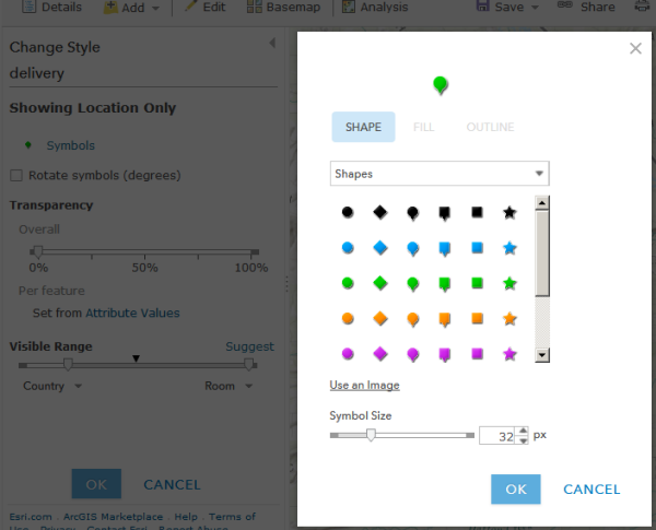
- Change the style of the dots to be Single Symbol. Click the blue Options button that appears, and adjust the symbol style to look how you want. If you click Symbols (next to the black dot), you’ll be presented with even more choices.
- Save the symbology settings, and then save your map with a name like Delivery analysis.