In this part of the walkthrough, we’ll try to learn a bit more about the customer base that lives within each 8-minute service area polygon we derived. We’ll accomplish this using what Esri calls “Data Enrichment”, in other words, joining and summarizing attributes from extensive demographic databases.
- In the ArcGIS.com map viewer, open your Delivery analysis map from the previous section of the lesson.
- Click Analysis, and choose Data Enrichment > Enrich Layer.
- Be sure your service areas polygon layer is chosen in the drop-down list.
- Click Select Variables, and make sure that United States is selected from the dropdown.
Here’s where you will be tempted to go crazy and add all kinds of interesting demographic and consumer information to your shopping cart of variables. Go ahead and add the following:
- Total Population (under Population)
- Total Housing Units (under Housing)
- Meals at Restaurants (under Spending)
- Have a Smartphone (under Behaviors)
- One other variable you think would be useful for our analysis - Ensure that you have just a handful of selected variables (in other words, make sure you didn’t accidentally click a whole category and get tons of variables added to your cart).
- Click Apply. This will close the variable selection dialog box.
- In the left menu of your viewer, scroll down and examine the other options for enrichment, but don’t change any of them. Then click Run Analysis and wait a few minutes for the enrichment to occur.
When the enrichment finishes, you’ll see a service area polygon layer just like the one you already have. The difference is in the attributes. - Open the attribute table for the Enriched travel time layer.
- Scroll over until you see some of the new attributes, such as Total Population.
Notice that some of the fields are more useful than others in their current state. We have a smartphone figure that isn’t normalized by anything. We could at least divide that by population to get some kind of an index of smartphone ownership, although it wouldn’t be perfect. - In your attribute table, click the Add Field menu item using the icon at the upper-right of the table.
- Add a field called PctSmartphone of type Double. (You may need to click the small plus icon to the right of the table to be sure all fields are visible.)
- After the PctSmartphone field is added to your table, click the field heading, and click Calculate using the SQL Option.
- Calculate the field as MP27002a_B/TOTPOP_CY as shown below. If the table goes blank after you calculate it, click onto another table and then come back to this one.
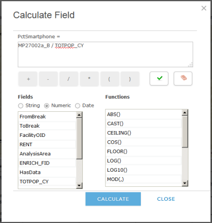 Figure 8.8: Calculating a field in ArcGIS Online
 - Examine your new index of smartphone ownership to see which service areas have the highest ownership.
- Calculate another field called TotalRestaurantSpending that represents the monthly restaurant spending multiplied by the number of housing units (NOT population). This gives some idea of the amount spent on restaurants in each service area each month.
- Look over all the attributes and think about questions like the following: Did the service area with the largest area also have the largest population? Is there any relationship between smartphone ownership and restaurant spending?
- Save your map.