Lesson 3: Understanding Spatial Data
Lesson 3, Lecture 1
Spatial Data

Understanding Spatial Data
In this lesson we’ll focus on spatial data itself – it’s what makes maps possible. To be a fabulously awesome geographer you need to understand how spatial data is created, who makes it, and what its limitations are.
Where are we now?
It all begins with measuring location. Back when dragons prowled the oceans [1] and headache relief was achieved by drilling a hole in your head, location was measured rather simply by taking angular measurements using the sun, moon, or stars. These methods are still taught and used [2] by some today, but since this MOOC isn’t about sailing a Sloop to pick up spices in the Orient, I want to focus instead on how locations are measured today.
You’re probably thinking, “Yeah, I know, everything uses GPS to know where things are.” And if I asked you how GPS works, you’d say, “Yeah, Google invented it and there are Magic Laser Genies that send location beam particles to my iPhone.” And that would be incorrect.
The Global Positioning System (GPS) is no doubt one of the most important methods we have available today for measuring locations. GPS is the system designed by the United States starting in the 1970s, originally for military purposes, to provide location services around the world using satellites. GPS is one example of a Global Navigation Satellite System (GNSS). There are several others, like the Russian GLONASS (jeez, awkward acronym - comrades) system or the European Union’s Galileo system. Every GNSS works using the same general principle. You need a network of satellites in space to broadcast signals down to Earth that include position information about the location of each satellite as well as the exact time when the signal was sent. A GNSS receiver (like the GPS antenna on your fancy phone) can listen for these signals and compare the times/locations from multiple satellites to triangulate your exact location on Earth.
There’s much more to learn about GPS and GNSS [3] if you’re so inclined. It’s quite a bit more complicated than my explanation might imply. For example, these systems only work when you have line-of-sight to a collection of satellites (which is why your Garmin is no good if you drive into a parking garage), and there’s an enormous amount of math going on to deal with signals that are constantly moving while you are moving yourself. You can also combine these satellite signals now with cell phone tower signals, wi-fi signals from routers, and other sources to improve accuracy and coverage.
The bottom line is that in the last decade it’s become much more likely for normal people to have access to handheld devices that use a GNSS to determine locations. The consumer-grade stuff you have in your phone or car can figure out where you are to within a few meters in some conditions, while in others you may be several hundred meters off target. Professional surveying equipment using big antennas and fancier computing hardware/software can be accurate to within several centimeters. If you’re trying to find the nearest curly fries while you’re sailing down the highway on a road trip, consumer-grade accuracy will do just fine. If you’re deciding exactly how much property tax someone should pay, you want to have the hardcore professional stuff.
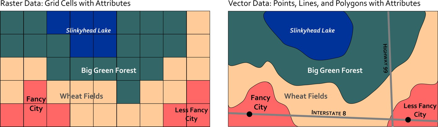
If I use the GPS on my phone, I can see that I'm sitting at [4] Latitude: 40.77004, Longitude: -77.896744 in my house writing this lesson. If I save that information I’ve effectively got a point location on Earth. If I walked around my house collecting multiple points, I could create a polygon by connecting multiple points. If I collected points in a row walking the shortest distance straight from my couch to the fridge (to retrieve delicious chocolate pie [5]) I could connect them and have a line feature. These three location types (point, line, and polygon) comprise the spatial data foundations of modern Geographic Information Systems (GIS). They are considered vector data, because they can represent any kind of geometry. The other major data type is raster data which we’ll cover in the next section.
The Earth from Above
The proliferation of Virtual Globe tools like Google Earth [6] has made imagery of the Earth more accessible than ever. This new mapping technology has also coincided with rapid advances in civilian satellite and airborne imaging systems that can provide extremely high detail images of the Earth. You can even build and launch your own little DIY Drone [7] and create your own imagery quite easily.
Geographic image data is raster data, which captures information by assigning values to cells in a grid. A satellite in space can detect visible light or other invisible parts of the electromagnetic spectrum [8] (infrared heat, for example) and assign values to each grid cell to develop an image. The size of those grid cells has an impact on how much resolution (detail) you have in the final image. Some satellites have a 30 kilometer resolution, meaning each grid cell is 30 km x 30 km in size. This is fine for mapping entire countries and stuff like that, but if you want to spy on what’s in your neighbor’s back yard, you’ll need a sensor that can resolve 10 centimeters x 10 centimeters, right?
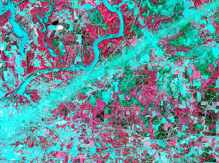
The science and technology associated with imaging the Earth from above is called Remote Sensing. It’s a thriving discipline focused on developing new ways of imaging the Earth as well as methods for interpreting and analyzing those images. In addition to the visible photography we all know and love, some sensors use radar, infrared imaging, and even lasers to create maps. Each has its own particular utility – for example, infrared imaging is often used to map the weather and land use. The infrared image shown here comes from a NASA satellite and shows the wake of a major Tornado [9] that impacted Tuscaloosa, Alabama in 2011. The image looks kind of weird, but because infrared is not visible light, you have to assign false colors to make the image, and in this case they chose red to signify areas where vegetation exists and blue to reveal man-made features and places where there isn’t much vegetation. Both types of land use give off different infrared heat signatures that can be detected by this particular sensor.
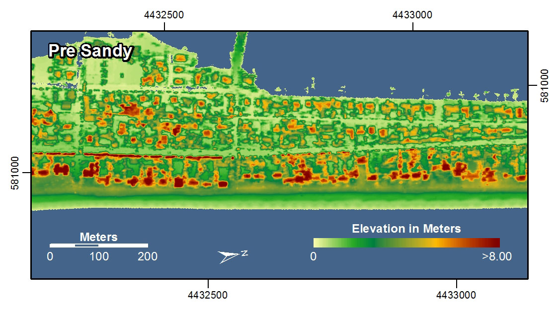
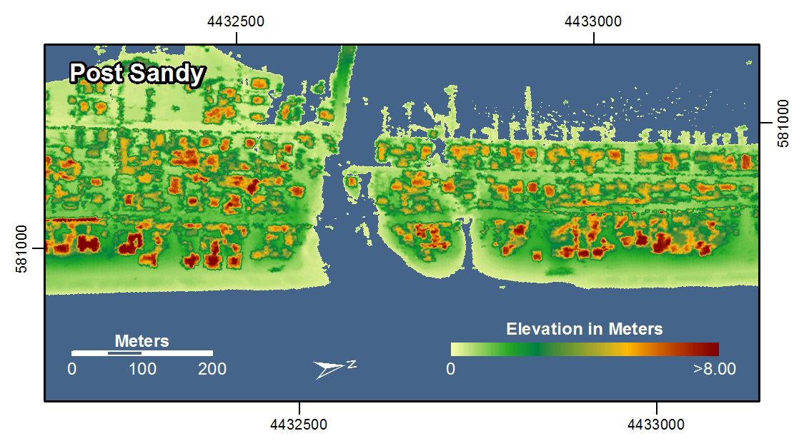
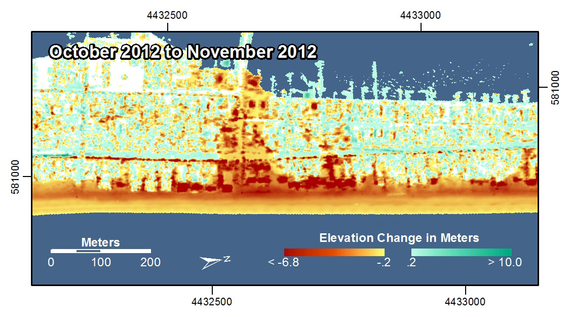
Lasers are now used for Light Detection and Ranging (LIDAR mapping [10]). This technique is capable of generating extremely high detailed 3-dimensional models of the Earth's surface. In the examples shown here, LIDAR was used to map the coastline [11] in New York and New Jersey before and after Hurricane Sandy in 2012. With these images you can see how it’s possible to study really intricate differences before and after the storm by using this radically precise new spatial data gathering method.
LIDAR [13] has also been used by one of my favorite bands to make a really cool music video [14]. If this sort of stuff intrigues you, there are great organizations in the U.S. [15] and worldwide [16] worth checking out that focus entirely on the science and professional practice of Remote Sensing. And, you could always take a class [17]...
Lesson 3, Lecture 2
Who Makes Spatial Data?
Who Makes Spatial Data? Good question. Today, the answer is more often than not: everyone.
It used to be that the primary developers of spatial data were governments, and more specifically, the military. Defense mapping remains a really important driving force for all-things-mapped, but it’s not the only game in town anymore. Consumer-grade location technology is now widely available, so if you want to make a map, you don’t need to launch your own satellites or enlist cavalry.
In the United States, a critically important source for civilian spatial data is the U.S. Census Bureau [18]. The Census collects all sorts of boundary (points, lines, and polygons – remember?) and attribute data during each decennial population census. These boundaries and their associated attributes allow industry and academia to study changes in population and to analyze social, economic, environmental, and health problems.
The business community often takes these public spatial datasets and modifies them for use in commercial applications. For example, you worked with Esri Tapestry data [19] in the Lesson 1 Lab assignment. Tapestry segment categories (like “Sophisticated Squires [20]” and “Dorms to Diplomas [21]”) are developed using combinations of Census population data [22] such as median age, average income, and home values along with other data sources gathered by private firms that focus on defining other consumer-related variables (most common makes/models of car in a county, for example). Because you’re cool and signed up for this MOOC, you got access to the Tapestry data for free. The idea, however, is to sell specialized data sets like Tapestry to businesses that are looking to improve their market share through location intelligence [23].
In addition to governments and industries that create tons of new spatial data all the time, there’s something more exciting that’s begun in the past few years. You’re creating new spatial data every day, whether you know it or not. Most mobile phone contracts allow for carriers to track your movements [24] and what you do with your device all the time. This information is then stored and analyzed [25] to try and sell you stuff, to design better devices, to sell you more stuff, and… to sell you stuff to go with your other stuff.
So you don’t have a phone, therefore nobody is tracking you? Well, if you’re reading this on the Coursera site, your IP address location [26] is logged. Granted, determining locations from internet site logs is not as tidy as tracking someone with a GPS (certainly less awkward to explain than if your girlfriend/boyfriend finds the GPS you stuck under their bumper), but it’s enough for us to do some basic analysis on which countries have the most visitors to this course page and stuff like that. Therefore, every interaction on this course site has the effect of creating new spatial data.
Now that I’ve gone and made geography scary again, let’s focus on the good stuff that’s happening too. There are now communities of volunteers who actively create spatial data to contribute to the greater good of humanity. OpenStreetMap [27] is one such effort – which aims to create a free basemap of the world, using only volunteer contributions. The basic way this works is that volunteers map their community using GPS trackers, or they digitize roads and features using existing satellite images. Why do this when Google, Bing, and others have already done this for most of the world? Well, those services are not actually “free” in the sense that you have no right to download or re-use the underlying data. All you can do is view the maps the way those companies want you to see them, and if Google decides someday to charge you for asking for directions to your Grandma’s house, you have no right to be upset. OpenStreetMap wants to create a free alternative that can be used and re-used by anyone for any purpose. OSM data is considered to be Volunteered Geographic Information (VGI), since it is spatial data created on a volunteer-basis. VGI [28] is now cropping up in all sorts of contexts; it is quite important for crisis management, as evidenced in the 2010 Haiti Earthquake, when thousands of reports on the ground in Haiti were collected, translated, and mapped by volunteers using a mapping system called Ushahidi [29].
The power of “the crowd” to create spatial data is pretty impressive when the goals are clear and the tools to develop those datasets are usable. Check out this time-lapse video showing how volunteers worked quickly after the 2010 Haiti Earthquake to develop a detailed OpenStreetMap basemap for Port-au-Prince (a place that didn’t have widely accessible digital basemaps before the disaster struck).
OpenStreetMap - Project Haiti [30] from ItoWorld [31] on Vimeo [32].
Describing Spatial Data
Once you have location information from a GNSS, celestial surveying, or carefully studying an Ouija Board, you’ll probably want to attach some attributes to that location data. Even if you’re only interested in mapping the boundaries of something, you’ll want to describe those locations in some way (e.g. this is a county boundary line, this is a highway with four lanes, etc…).
A typical snapshot of spatial data will look something like this.
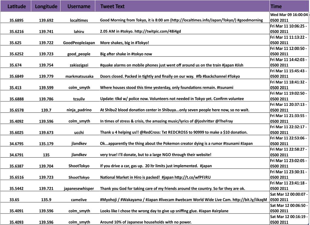
The basic spatial data items here are point locations (latitude and longitude for each Tweet). The attributes associated with each observation include the Twitter Username, the Tweet itself, and the date/time when the Tweet was posted. You could theoretically have all sorts of other additional attributes – you’d just need to define them and collect them (links to Twitter profile pictures, for example).
Beyond attributes, spatial datasets are often given broader descriptions to identify information sources, when the data was collected, its overall geographic coverage, and measurements of data quality. This data that describes the data is called metadata (have I used “data” enough in one sentence?). You often need metadata in order to understand the value of a particular spatial dataset. There are lots of existing models for defining spatial metadata, and you can read about them [33] if you pine for incredibly boring tasks. This becomes especially important when you make a map that includes multiple layers. Let’s say I’ve got road data from the U.S. Census Bureau, World Region polygons and water bodies from Natural Earth Data [34] (one of the best free sources for excellent geospatial data), and this set of Tweets that I want to map on top of those layers. I’d need to know how and when each dataset was created, and who created it, right?
The answers to these questions will almost always reveal that none of your data came from the same source, and none of it covers the exact same time range or level of detail. Fundamentally, mapping involves dealing with uncertainty at multiple levels. You may have to use data from multiple sources, each having its own relative quality. You may want to show the same phenomenon for two different countries, and have lower quality data for one of them.
Uncertainty sounds scary, but you deal with it every day. Weather predictions are imperfect, your recollection of what happened at last night’s office party is incomplete, and your dog may or may not have an accident on your new bedspread the day after you bought it. It’s OK. It doesn’t mean that maps are useless because they nearly always show less-than-perfect information. It just means that you should be a shrewd consumer of maps, and you should make sure you ask questions about their underlying information.
Video Activity
In this lesson I'd like you to watch Chapter Four from Episode Four of the WPSU Geospatial Revolution [35] series. This episode talks about the ways in which new geospatial technologies can empower community actions that go beyond what governments can (or are willing to) provide.
Mapping Assignment
Mapping Natural Hazards (And Understanding Spatial Data While We're At It)
This week you learned that an increasing amount of data is geographic. You read about and reflected on how data are collected—locations from GPS, and raster and vector data from remote sensing systems and GIS. You learned about how sensors use certain parts of the electromagnetic spectrum to provide fascinating data with which we can learn about the Earth. And the data at your fingertips on your fancy iPad is increasingly available in real time and at increasingly higher resolutions. With this vast increase in the amount of data available comes additional responsibilitu ny: yoeed to be a critical consumer of that data—and be able to evaluate data quality, decide whether you should use certain data, and know how to bring that data into a format that you can analyze.
This week’s lab gives you the opportunity to practice these concepts using GIS tools. You will be analyzing natural hazards at multiple scales. You will upload a data set into the GIS cloud. The maps you make will be glorious and compelling. Your skin will glow from your renewed intellectual energy. You will become inspired to knit a sweater with your professor's likeness on the back.
Let's Smash Some Plates
The earth is a dangerous place sometimes. The study of natural hazards gets into the nuts and bolts of Physical Geography and Plate Tectonics but is also important to Human Geography through understanding human perceptions of risk, human-environmental interactions, and the impacts that hazards have on the life of a community. Because all natural hazards have a spatial component, they can be analyzed geographically. Imagine trying to understand a disaster and its impacts *without* using a map. I bet you can’t.
Let's start with a common natural hazard that impacts people all over the world: Earthquakes.
First, head over to ArcGIS Online [36]. Log in using the account that you set up in Lab 2 [37].
In the search box in the upper right corner of the interface, click on the empty box to see a list of search options and select Search For Maps. Next, type “plates 4 types” (you don’t need the quotes) into the search box and hit Enter. You should see several search results, and the one you want is the first one in the list, which was authored by "jjkerski." Click on Open underneath the map thumbnail and select Open in map viewer. You should now be on this page [38].
Make sure you are still logged in to ArcGIS Online by checking the upper right of your web browser screen, above the map. If it says “Sign In,” it means you are not yet signed in. Fix that.
Now show the map legend by clicking the rightmost button where you can edit your map layers. Your map should look like the map below:
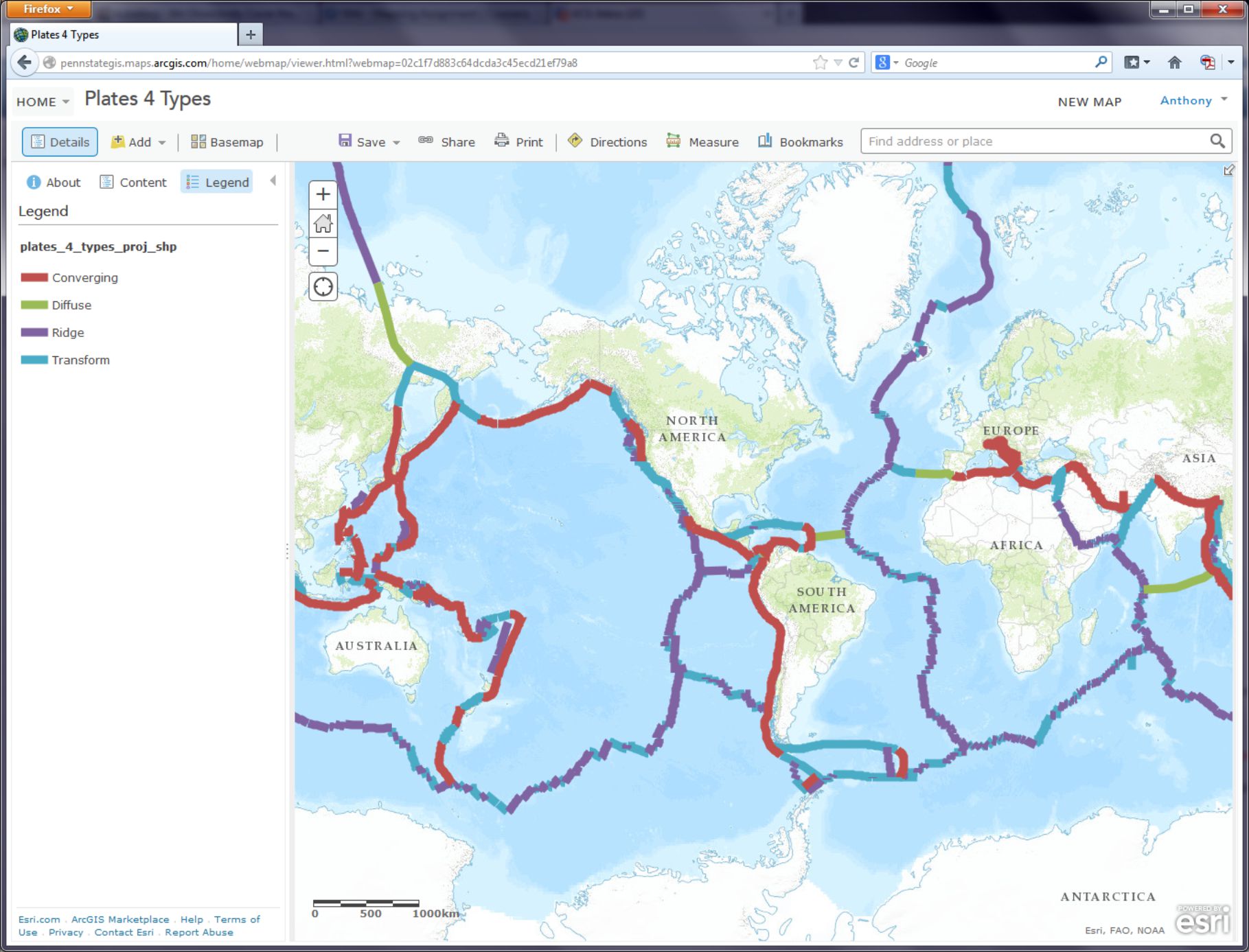
- How would you describe the pattern of plate boundaries around the world?
- Where do you hypothesize that most earthquakes around the world should occur?
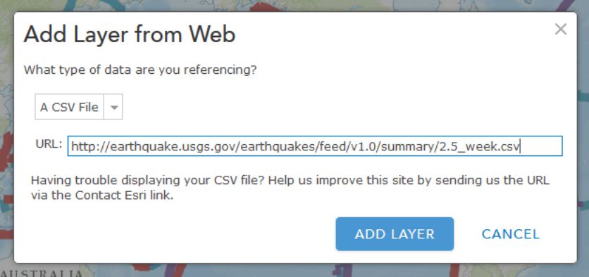
A Web GIS like the one you’re using can bring in all kinds of additional data. In the case of earthquakes, we can use the real-time earthquake data feed from the USGS to examine recent earthquakes. To test your hypothesis about where you think earthquakes are likely to occur, go to the USGS earthquakes feed: http://earthquake.usgs.gov/earthquakes/feed/v1.0/summary/2.5_week.csv [39]. On some browsers this action might prompt you to download a file, on others it will just display the raw data. If you are prompted to download a file, do that and view the resulting .CSV file in a text editor like Notepad or a spreadsheet application like Excel / Open Office Calc [40].
- Does the number of earthquakes surprise you? How many did you expect to see for the past 7 days?
This earthquake data is encoded in a comma-separated value (CSV) text file, meaning that its values are separated by commas (imagine that). The first line acts as a blueprint for the data that follows it: the first line is the header line, containing the field names. Each data line below the header line includes a latitude and longitude coordinate pair, which is all a GIS needs in order to map the data. Each line also contains information about each earthquake's magnitude and depth, and some other variables. As with any data, it is important to know the relevant units of measurement. The magnitude is given in the Richter Scale, and the depth is given in kilometers below the surface of the Earth.
- You can open the CSV by using a simple text editor or your favorite spreadsheet application. Look closely at the table: Why are some of the latitude values negative? Why are some of the longitude values negative?
It may seem confusing because in most everyday speech we refer to “latitude and longitude,” with latitude typically mentioned first. So when plotting point locations it’s tempting to think of these as being equivalent to x, y, with latitude being “x” and longitude being “y.” However, latitude is actually “y” and longitude is “x.” In location-enabled devices and tools, such the GIS you’re using here, latitude and longitude are entered as y and x, respectively. Confused yet? Sorry. Being a Geographer is Hard.
The Cartesian coordinate system helps us understand why the sign (positive or negative) of latitude and longitude is important. The Equator divides the area above the X axis, the northern hemisphere, from the area below the X axis, the southern hemisphere. The Prime Meridian divides the area to the right of the Y axis, the eastern hemisphere, from the area to the left of the Y axis, the western hemisphere. Any x value to the right, or east, of the Y axis is positive. Here's what that looks like when you abstract the coordinate system a lot:
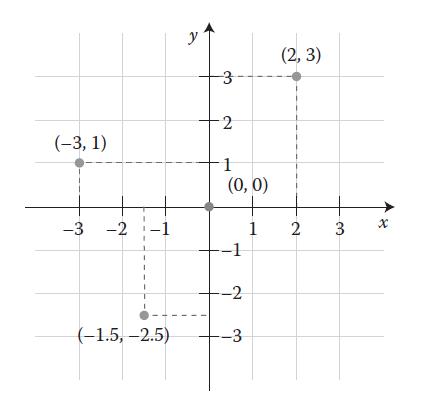
Therefore, when given the following coordinate pairs, one can determine their correct hemisphere:
X, Y Eastern and northern hemisphere
−X, Y Western and northern hemisphere
X, −Y Eastern and southern hemisphere
−X, −Y Western and southern hemisphere
- In which 2 hemispheres of the world do you live?
This earthquake data also provides a good illustration for the goals of this class: What’s the big deal about maps? Consider the following:
- How easy is it for you to determine spatial patterns just by looking at this table?
You know spatial patterns are there because you know that earthquakes don’t just happen in random or regular places around the planet (er… hopefully you know that). But unless you are really good at making a mental map from these latitude and longitude pairs, it will be virtually impossible for you to detect any sort of spatial pattern in the data. Therefore, you really need to make a map.
In ArcGIS Online, click the Add button as you have done before, but this time use Add Layer from Web, select the CSV choice from the dropdown list of options, and in the URL field, paste the link to the USGS data feed [39] that you have been examining.
Click Add Layer and you will be prompted to change the style for the symbols used to show your earthquakes. For Choose a Variable to Show select "mag" from the dropdown list. For Select a drawing style select Counts and Amounts (Size). Select Done once you've made these choices.
On your map, you should now see pin markers showing the last 7 days’ worth of earthquakes 2.5 magnitude and above.
- Describe the pattern you see with these earthquakes. Does it match your expectations?
Making Sense Out Of Your Data
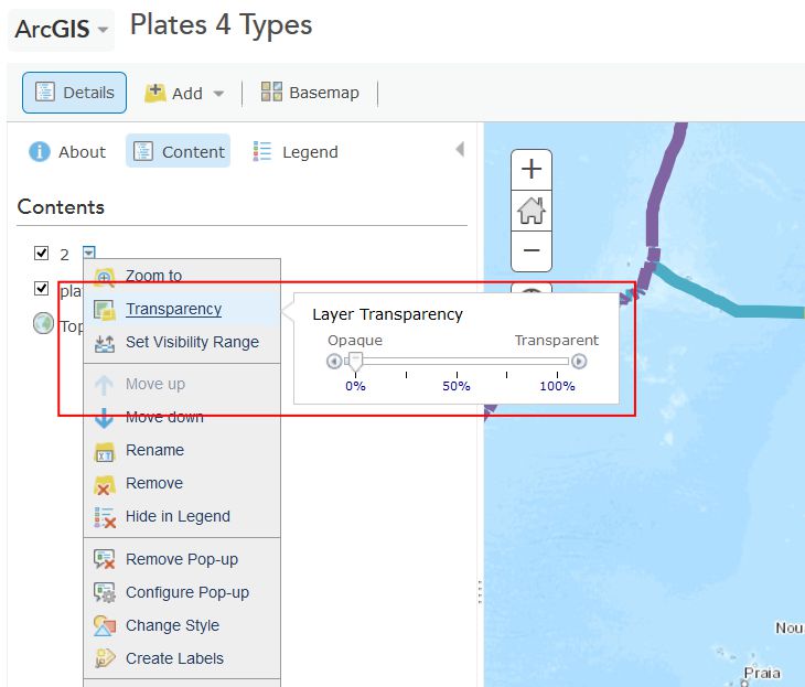
You will probably now need to change the visibility of the plate boundaries by clicking on the Content button and then the little arrow next to the layer called plates 4 types proj shp. Click Transparency there and adjust the slider over to the right to make those mostly transparent. While you're in this menu, click Rename to give your layer a more meaningful name than the default "2". Let's name it "Last 7 days of earthquakes 2.5 magnitude and above."
Now you should be able to see the colored points showing the magnitudes of recent earthquakes and their relation to plate boundaries. Cool, huh? This is a good time to save (and share if you like) your map.
- What is the pattern associated with large earthquakes that occur around the world?
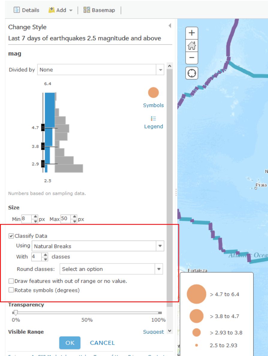
The way you classify your data has a big impact on how your map is interpreted and understood. Just like no single map projection is the best option for every situation, no single classification method is perfect either. Choosing one that best meets your needs is a complex subject, and we’ll talk about it more in Lesson 5, but let's play now with several different methods in ArcGIS Online. Try a few of these classification methods for your earthquake points by clicking on the arrow next to their layer (remember, you need to be in the Show Contents of Map mode to see this arrow) and selecting Change Style. From the menu, under Counts and Amounts, click the Options button. Check the box next to Classify Data and you will be able to select Natural Breaks (divides the data at natural breaking points); equal interval (creates the same numeric range for each class); standard deviation (divides your data into one or more standard deviations from the mean); quantile (places the same number of data observations into each class); and manual breaks (categories specified by you, the user).
- What do you think is the best classification method for your earthquake data? Why?
When you're finished playing around with different classification methods, click on the little arrow next to your earthquake layer and select Show Table. This shows you the raw data that’s driving your map (which you brought in from the USGS site). In the table, note how many earthquakes have occurred over 2.5 magnitude around the world over the past 7 days. Now click on the time field and Sort Descending. Observe how old the last earthquake in the table is (this is in UTC time). Now click on the mag field and Sort Descending. Click on the field containing the largest earthquake. Then, select Table Options and then select “Center on Selection.” You should see your highlighted earthquake that you highlighted in the table also appear highlighted on the map. Zoom to that earthquake. Set a Bookmark here if you like.
- In which country (or near which country) did the largest earthquake over the past 7 days occur, and what was its magnitude and depth? Fire up Google to research this earthquake to find out if anyone felt this quake and determine what its effects were. There may even be someone in this class who felt it. If that’s you, go post something about that experience in the forums, because that would be really neat and your professor would be forever grateful.
As this course has emphasized a lot, it is critical to understand the sources, dates, data authors, the scale at which data was created, why and how the data was created, and so on, because maps are so easily misinterpreted. In the case of the earthquake data, note the numerous low-magnitude earthquakes in the Western USA. This is due to the fact that the USGS earthquake center recording the data is in Colorado. The earthquake center receives signals from the global seismic network through satellite dishes on the grounds of its facility, but it can also sense seismic waves directly at its facility, and the nearby ones, from western North America, are also added to the data set. So there are not necessarily more small earthquakes in western North America than elsewhere in the world. So sometimes the location of where data is gathered affects the nature of the recorded data. Tobler is right, man.
- How far was the most recent earthquake from where you live? Use the Measure tool and note the units you are using. How long ago did it occur, and what was its magnitude?
Change your symbology now to map the earthquake depth instead of magnitude. Remember that depth is measured in this case in kilometers beneath the Earth’s surface. This is a good time to save your map if you haven't done so recently.
- What is the pattern of the deep earthquakes occurring around the world?
If you have time, visit the USGS feeds page [41] and download and map other earthquakes—for the past hour, past day, 30 days, or for historically significant earthquakes. If you’re not enjoying this at all then I will be happy to provide you a full refund within the next 90 days.
Tornadoes Are Freaking Scary
You have now analyzed one type of natural hazard from a global to local scale, spatially and temporally. Let's do the same thing with one more natural hazard that is unfortunately quite common in the United States - tornadoes.
Close the data table for your earthquake layer by clicking the X in the top right corner of the table. Next, turn off your plate boundary and earthquake layers by unchecking their checkboxes in the Content view of your layers. Add a new tornado data service by clicking Add and then Add Layer from Web, and select An ArcGIS Server Web Service, and enter the following address (noting the underscores in the URL):
http://maps1.arcgisonline.com/ArcGIS/rest/services/NOAA_US_Historical_Tornadoes/MapServer [42]
Save your map and adjust the metadata and title so it reflects the fact that you are now mapping earthquakes and tornadoes.
Zoom to the United States so that you can see the lower 48 states.
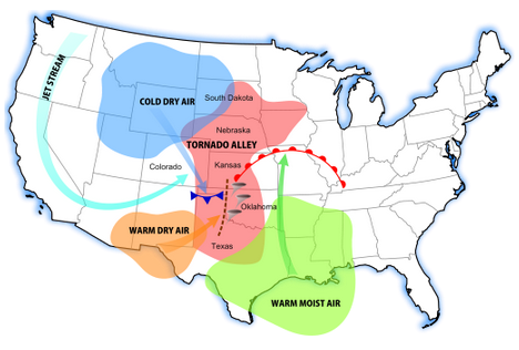
- What is the pattern of tornadoes at this scale in the USA? Does it reflect the map showing the most frequent tornado zones in “tornado alley” below? Why or why not?
Turn on the map legend. You can now see that you were only examining Fujita 4 and Fujita 5 intensity tornadoes at this scale. You can also see that the data set goes back to the 1950s.
- Even though you can zoom in to a very large scale for any particular tornado, do you think the spatial accuracy of a tornado recorded during the 1950s and 1960s is the same as that of a tornado recorded during recent years? Why or why not?
- Do you think that if you zoom in, you will see some tornadoes in Colorado and in other western states? Test your hypothesis by searching for “Colorado” in the search box in the upper right and zooming there.
- Was your hypothesis correct? Describe the pattern of tornadoes in Colorado and why the pattern looks the way it does.
Tornadoes are not devastating because they simply touch down, of course, but because they move across the landscape. Zoom in to a larger scale until you see some of the tracks of the tornadoes. Keep in mind what you learned about resolution from this week’s course discussion. The tornado data are stored not only as points, but as lines, and the storage is scale dependent.
- What is the predominant direction that tornadoes move in eastern Colorado? Does the map above help you understand why?
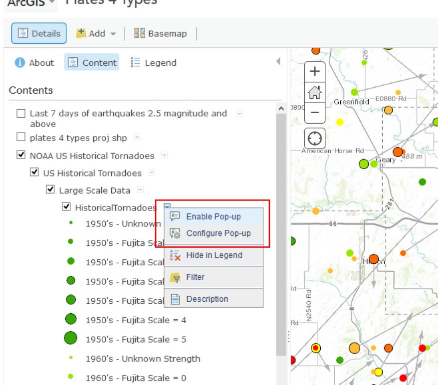
In May 2013, an enormous tornado destroyed parts of Moore, Oklahoma. Search for and zoom to Moore, Oklahoma on your map. In the Content panel click on the arrow next to the NOAA US Historical Tornadoes layer and expand the Large Scale Data group so that you can click the arrow next to Historical Tornadoes there and Enable Pop-ups. Now when you click on tornado points at large map scales (e.g. zoomed in fairly far) you can see a bunch of additional information about each Tornado.
- Describe the number, pattern, and direction of historical tornadoes to strike Moore in the past. How typical is the post 1990 activity in Moore compared to prior decades?
Wrap Up
You’re doing very well – you definitely know enough to be dangerous with maps at this point. You have used data spanning different resolutions and time periods. You classified data in different ways and examined tabular attributes. You have added data from different types of servers. You have saved new data into the GIS cloud and shared it with others. You’re becoming quite the Cartographer now!
Credit Where It's Due
This lab was developed by Joseph Kerski [43] and Anthony Robinson [44].
Discussion Prompts
Where Do Disasters Happen, And How Can Maps Help?
In the mapping assignment for this lesson you've been working with data on Earthquakes and Tornadoes. These aren't the only types of disasters that receive attention from mapmakers, and nearly every government agency or NGO that deals with disaster management has a wide range of geospatial needs in such circumstances. For our discussion this week I'd like to focus on disasters and the kinds of things we can learn about them from using maps and geospatial technology. Here are some prompts for this week's discussion:
- Identify the most frequent natural hazards in the region in which you live and work in terms of damage to infrastructure and human impact (injuries and fatalities)
- Compare these hazards to the ones that happen most frequently in another region
- Describe a natural hazard that you have personally witnessed, and talk about the scales at which the natural hazard had an impact (local, regional, global – some disasters impact all of these in some way), make a map to show what you experienced.
- Find and share examples of good (or bad) maps about recent disasters. Describe what you think makes them work well (or not work at all), and propose your vision for better disaster mapping in the future. What would need to happen to make your ideas possible?