Lesson 2: Spatial is Special
Lesson 2, Lecture 1
Spatial is Special
Leading off with a cliché is always dangerous, but I do really believe that Geography as the science of place and space depends in part on the axiom that what is Spatial is Special. This Lesson focuses on spatial thinking and spatial relationships that underpin everything we try do to with mapping and geographical analysis. A lot of this stuff will seem like common sense when you see the examples, and other aspects are likely to represent a new way of thinking about the world.
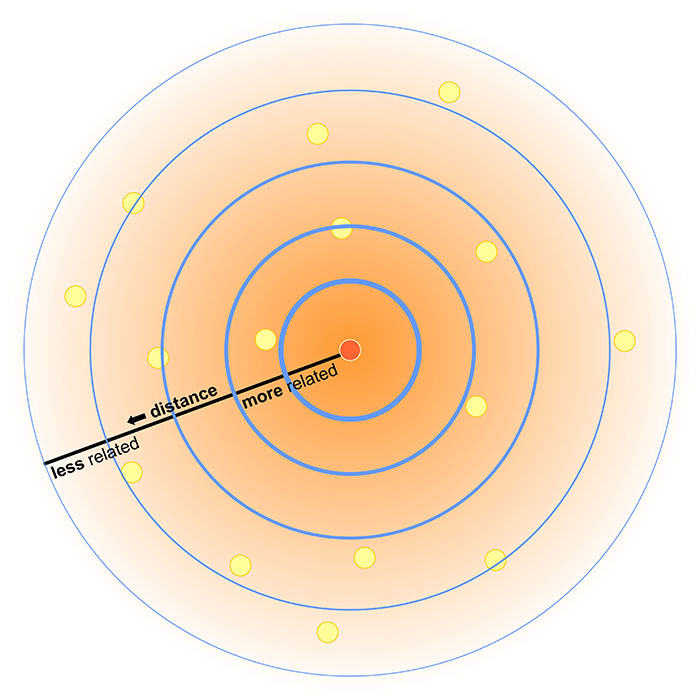
Most sciences have associated laws and axioms that govern fundamental principles and methodological approaches. In Geography we really just have one: Tobler’s First Law of Geography. In 1970, in a paper describing an urban growth model for the city of Detroit [1], Waldo Tobler proposed “the first law of geography: that everything is related to everything else, but near things are more related than distant things.”
If this law makes you say, “Well, yeah, duh!” – Great. That’s how I felt when I first encountered it too. Of course that’s true, as it makes perfect sense when you think about any possible example. I’m more likely to interact with people in my neighborhood in Central Pennsylvania than I am to interact with folks in Kolkata. The law of course extends well beyond stuff related to humans – you can expect animals, plants, and people sending too much email to each other to generally follow this law as well. Note that Tobler is talking about relationships between things. Near things are more related, but that doesn’t mean they’re necessarily more similar. The measure of similarity of observations that are close to one another is called spatial autocorrelation. While it’s not necessarily true that stuff nearby is in fact similar, there are often aspects of similarity that can be observed and measured (e.g. there are a lot of people at Dulles Airport who wear those annoying Bluetooth headset things, and they often buy very large Soy Lattes at Starbucks).
Plenty of studies have attempted to formally evaluate Tobler’s Law, and there remains consensus that it is a fundamental principle of Geography. It turns out that it even extends to something like Wikipedia if you explore the spatial relationships that underpin thousands of its articles [2].
So I think it’s quite clear that Spatial is Special, and it’s what helps separate Geographic analysis from all other forms of investigation. We aim to take location into account and leverage what we know about spatial relationships to answer questions.
However, I’d be remiss if I didn’t point out that Geographers are a really self-conscious lot (we cry if someone shouts), and there’s been considerable debate on whether or not Spatial is Special (maybe if we exclude the IT part? [3]), and whether or not Tobler’s Law is really a law [4] after all or if it matters. I’m pointing out these debates here to acknowledge that my perspective, while it’s certainly the most common one in Geography, isn’t the only valid point of view. Academics love some navel gazing, that's for sure.
Thinking like a Geographer
(by thinking Aspatially)
Chances are that you already think like a Geographer all the time, you just don’t know it yet. You compare places to one another based on their distance and their similarity across a range of attributes. You talk with your friends about Red States and Blue States [5] whenever there’s a Presidential election. You decide where to buy a house based on how long it takes for you to drive to the nearest delicious breakfast food [6] and based on which school district it’s in.
But I want you to go a couple steps deeper here, and a good way to do that is to first try to ignore space and place entirely while exploring a problem. Consider the following dataset:
| # of Annoying People | Total Population | Average Age | Average Income | # of SUVs | County | State |
|---|---|---|---|---|---|---|
| 72 | 998 | 26 | 48000 | 72 | Hatchback | Wholefood |
| 48 | 2000 | 65 | 32000 | 48 | Dialupia | Wholefood |
| 776 | 2250 | 44 | 72000 | 750 | Sriracha | Traderjo |
| 789 | 3500 | 36 | 12000 | 700 | Muffintown | Wholefood |
| 469 | 1200 | 31 | 22500 | 461 | Fixieplaid | Traderjo |
| 525 | 1400 | 43 | 66000 | 400 | Burb-on-Burb | Wholefood |
| 62 | 65 | 33 | 92000/td> | 59 | Bluetooth Village | Wholefood |
| 2300 | 16450 | 51 | 35000 | 1950 | Pabsto | Traderjo |
| 9654 | 52510 | 44 | 49000 | 8912 | University Collegeville | Traderjo |
| 779 | 1459 | 41 | 61000 | 398 | Kingo | Traderjo |
What are some things we could do to analyze this information *without* considering anything spatial? For starters, we could count how many annoying people exist (14,695). The overall rate of annoying people as compared to all people can be calculated (~18% of all people in this dataset are annoying). We could determine the average age of this sample dataset (~45 years old). You get the idea.
I’ll bet almost anything (a bag of the best Gummi bears ever [7]) that you’re finding it hard to ignore the spatial stuff that’s inherent in this data. You want to see these counties and states, compare them to one another, identify the possible urban areas and rural locales, explore possible cultural differences, etc… If so, then congratulations, you’re a spatial thinker! If not, then allow me to demonstrate further.
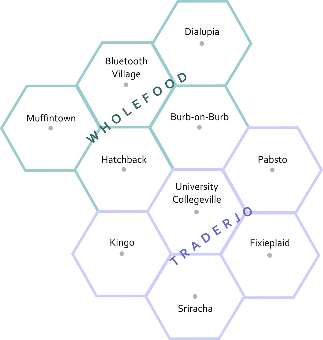
This is a map of the fake states and counties from Table 2.1. The top row of counties is Muffintown, Bluetooth Village, and Dialupia. Below that is Hatchback and Burb-on-Burb. These 5 counties make up the state of Wholefood. Below Wholefood is the 5 counties of Traderjo. The first row of Traderjo is Kingo, University Collegeville, and Pabsto. Below that is Sriracha and Fixieplaid.
Here’s the basic Geography of my fake states and counties.* Now you are able to compare the relative distances between places, right? Let’s overlay some additional information here to give you more context. I’ve made a little population map using graduated circles (each circle size represents a given range, so the smallest circle size here would include everything from 0-1000). Next to it I’ve made a choropleth map (not chloropleth – there’s no chlorine in this map). Choropleth is a fancy way of saying “colored areas.”
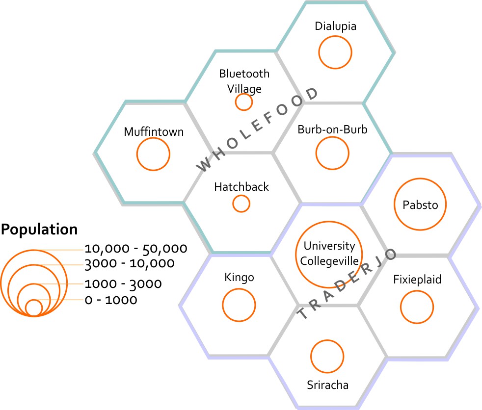
This map estimates the populations of each county. It shows that Bluetooth Village and Hatchback have the 2 smallest populations, at between 0 to 1000 people. Muffintown, Dialupia, Burb-on-Burb, Kingo, Fixieplaid, and Sriracha all have populations between 1000 to 3000. Pabsto has a population between 3000 and 10000. University Collegeville has a population between 10000 and 50000.
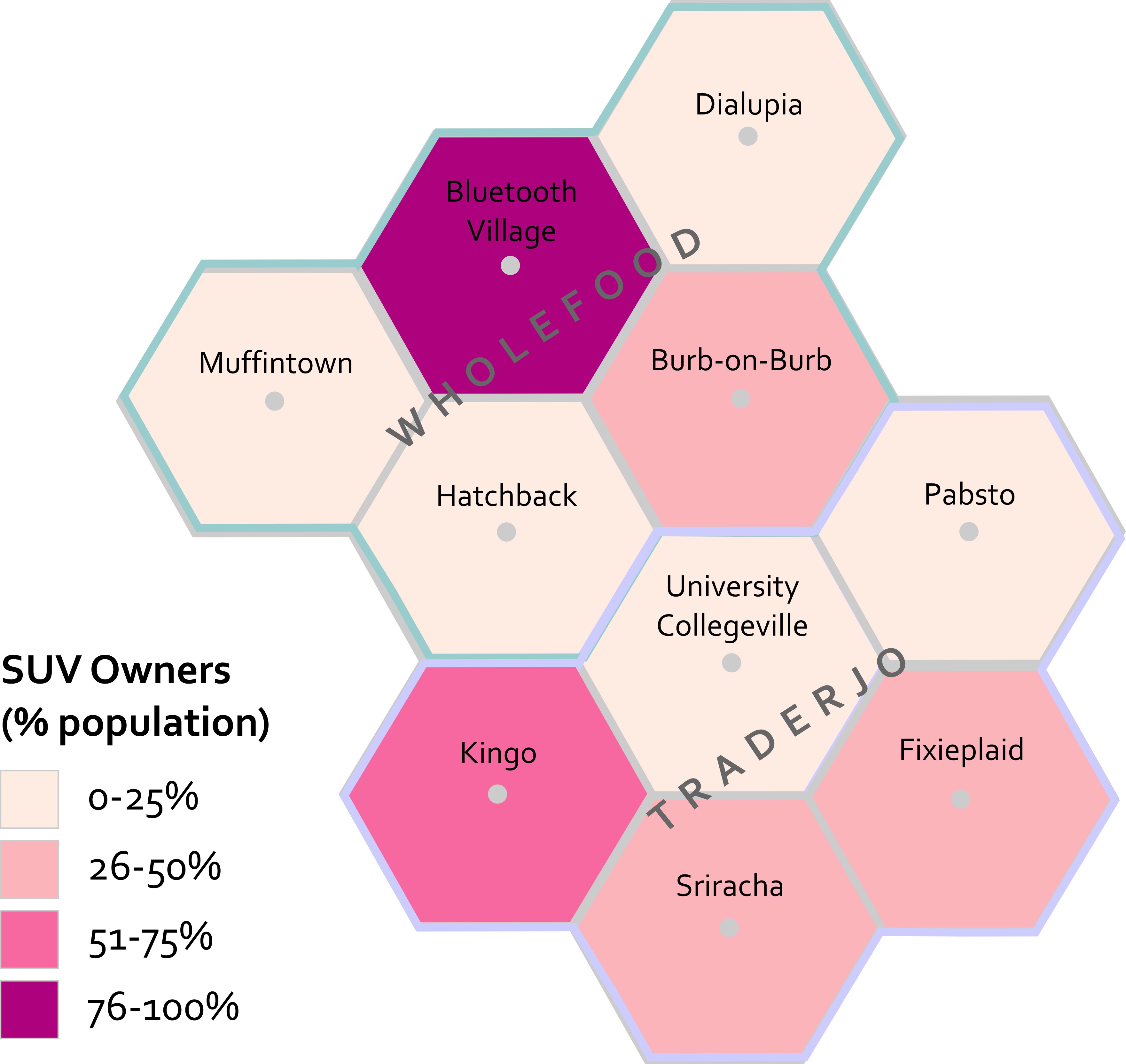
This map estimates the percentage of each county's population that owns SUVs. In Muffintown, Dialupia, Hatchback, University Collegeville, and Pabsto 0 to 25% own SUVs. In Burb-on-Burb, Fixieplaid, and Sriracha 26 to 50% of people own SUVs. In Kingo 51 to 75% of people own SUVs. In Bluetooth Village, 76 to 100% of people own SUVs.
Now that you’ve seen both of these maps, what can you start to say about possible spatial patterns? What other maps would you want to see in order to answer questions about this data? For instance – I’d want to know the location of major roads and businesses. I’d want to see how the population relates to those features. I’d want additional data showing the # of fancy coffee places in each county so I could compare SUVs to Coffee and see if I could develop a community profile much like the ones you explored in Lab 1 [8].
I’m sure you’re thinking spatially now. If you still think this is crazy talk then maybe we’re just not meant for each other after all. :(
*Want to know why I’m using hexagons? Check out Central Place Theory [9].
Lesson 2, Lecture 2
Spatial Relationships
To have a science of place and space, and to investigate whether or not Spatial is Special, you need to set some ground rules for what is possible when it comes to spatial relationships. Spatial Topology is the set of relationships that spatial features (points, lines, or polygons) can have with one another. To make this pretty dry topic a lot more interesting, let’s consider spatial relationships using our personal relationships as a metaphor.
Some common spatial topological relations include:
Equals – A is the same as B
When we first met each other, we felt like we were “one.”
Touches – A touches B
Our first kiss was gentle – no tongue.
Overlaps - A and B have multiple points in common
During our honeymoon we… <deleted>
Contains – A contains B
For 9 months the baby was inside (and much quieter).
Disjoint – A shares nothing with B
Later on, we got sick of each other and watched TV from opposite sides of the room.
Covers – A covers B (or vice versa)
The dog sleeps on top of me, creating a huge amount of heat.
Crosses – A and B have at least one point in common
Although we both know how to find our way home from the grocery store, the only routing point we have in common is our driveway.
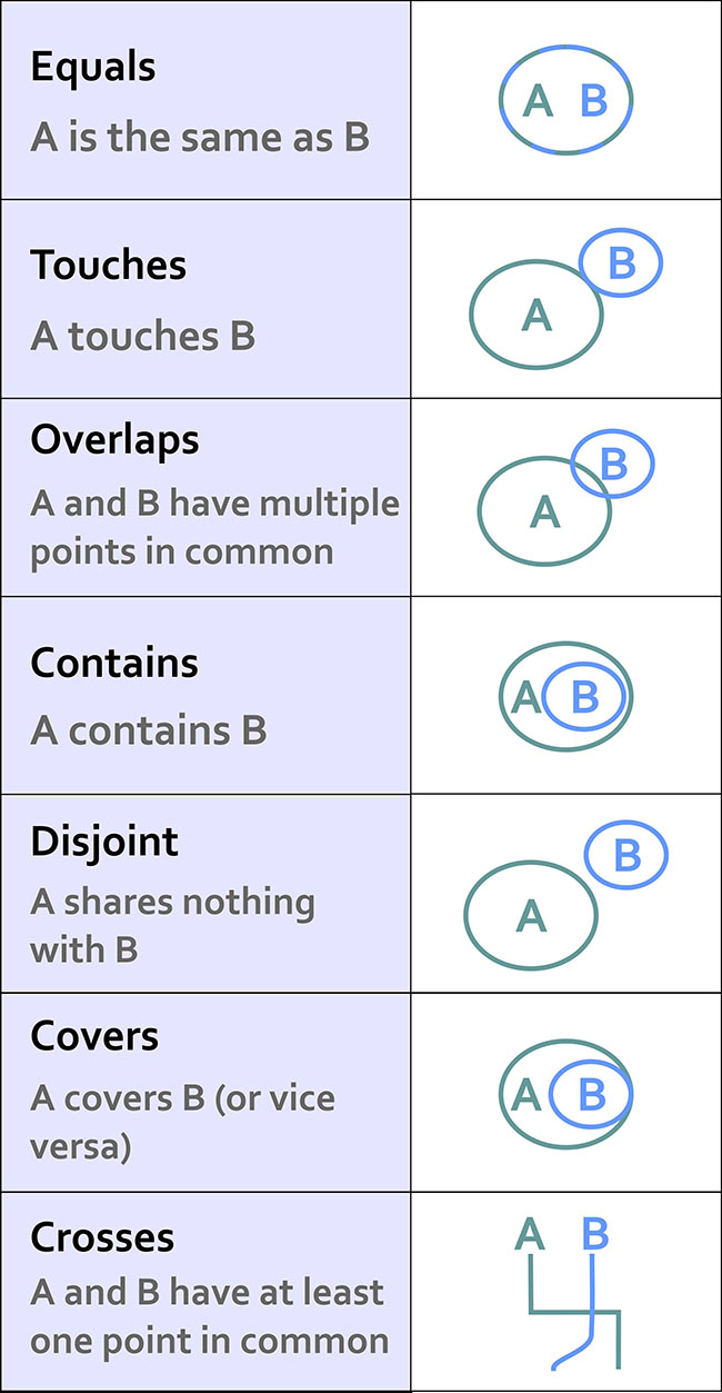
This list isn’t exhaustive, but it’s a good starting point. If you really get excited about this stuff (congratulations on being single!) then there is a ton of literature out there to review. I recommend starting with this paper [10] and spiraling out from there.
This stuff may seem a bit dry, but it’s really important because it formalizes the ways in which we can expect things to interact in space. Moreover, knowing all of the possible spatial relations allows us to create great software tools that can take these relationships into account.
Consider what would happen if we didn’t take these relationships into account. Let’s say you have 500 road segments that you’ve digitized to show your neighborhood’s streets. In order to ask a GIS to identify a driving route from one house to another, all of those road segments have to “know” how they are related to one another. So if your street intersects with the next street, we have to specify how both routes are topologically connected. This is how Mapquest or Google understands that when you leave a highway and go on an offramp that there are certain possibilities for navigation (the offramp is a one-way route and connects to a cross-street), and other things you can’t do (the offramp only allows right-hand turns at the end where it intersects with the cross-street). If you didn’t have a theory behind how things can relate, and ways to specify those spatial relations, you’d just have a zillion streets with their basic locations on Earth, but no way to actually use that information for routing.
Almost all of us have experienced the frustrating case where automagical navigation devices and websites have bad or missing topological information. We exit the highway believing we can make a left turn, but it turns out to be a one-way street and we can only go right. Much cursing ensues. Depending on how well we handle this problem, our topological relationship with our significant other may change drastically that night once we finally make it to the hotel.
Scale and Time
Scale
There are two concepts of scale that are fundamental to Geography. Let’s talk first about scale as it pertains to maps. Map scale is the ratio of the distance on the map to the corresponding real distance on Earth. You’ll often see a bar drawn on a map that says 1 inch equals 10 miles, or something to that effect. This means that one inch of distance measured on the map can be considered equivalent to 10 miles of actual distance on the Earth. It’s common to see these equivalencies written in fractional form instead of plain English, e.g. 1:100 or 1/24000. These are called representative fractions.
You learned a bit in Lesson 1 [11] about why it’s impossible to make perfect translations from the 3D Earth to 2D maps. This has an important impact on map scale. Depending on what map projection you’re using, your map scale will vary across your 2D map. This is another reason why map projections are important. Imagine if I gave you a paper map for a kayaking trip and I designed it using a projection that looked really cool but had scale varying wildly across the map (1 inch in the middle = 1 mile, 1 inch at the top = 50 miles). You might plan out your entire trip without realizing that you’re comparing completely different distances. That would be very mean of me to do, especially if there are lots of mosquitoes and you only brought one bag of beef jerky. At large scales (i.e. “zoomed in”), if you use a conformal projection, the differences in scale measurements are small enough to be insignificant for most users.
The second major concept of scale is a more general one. With Geography you have the power to explore and analyze phenomena at different levels of granularity. You could look at really large-scale (1:100) patterns in a neighborhood, or you could look at really small-scale (1:10,000,000) patterns across multiple countries. You did that last week in the lab assignment when you looked at Tapestry data at state, county, and finally neighborhood levels. At each scale the story you could tell totally changed, didn’t it? This kind of scale is often called the scale of analysis by Geographers, as opposed to the specific map scale that refers to how reality is directly translated by a map.
What About Time?
Geography requires space and spatial relationships in order to exist, but it also requires attention to time. Practically all geographic problems take place through some sort of dynamic process – meaning that things are changing from Day 1 to Day 100, for example. If you think about how most maps are made, this presents a problem, doesn’t it? How do you show changes over time? What if you don’t have data for every time step?
It’s outside the scope of this course to delve very deeply into this topic, but I want you to be aware of a couple of key examples so that you can understand the impact that time has on every map you read (and every map that you make).
I am still amazed that we can now poke around tons and tons of high-resolution satellite imagery to look at the Earth from above. Back in the old days when we had to yodel over the phone [12] to connect to the internet, this kind of thing was a total pipe dream. Anyway, let’s do a little exploring right now to have a peek at how time is inextricably linked to Geography.
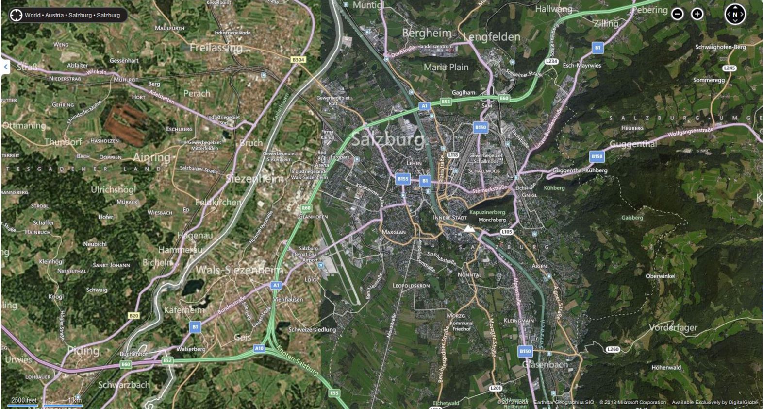
In the first example here, I’m playing around on Bing Maps [13] to look at satellite imagery of Salzburg. My Grandmother was born in Salzburg, met my Grandfather there after the war, and a lot of my extended family lives there today. A summer afternoon on the rooftop at the Hotel Stein [14] is an unforgettable experience if you ever have the opportunity. But I digress. Check out what’s happening on the west side of the city; see how it looks like two pictures have been abruptly slammed together?
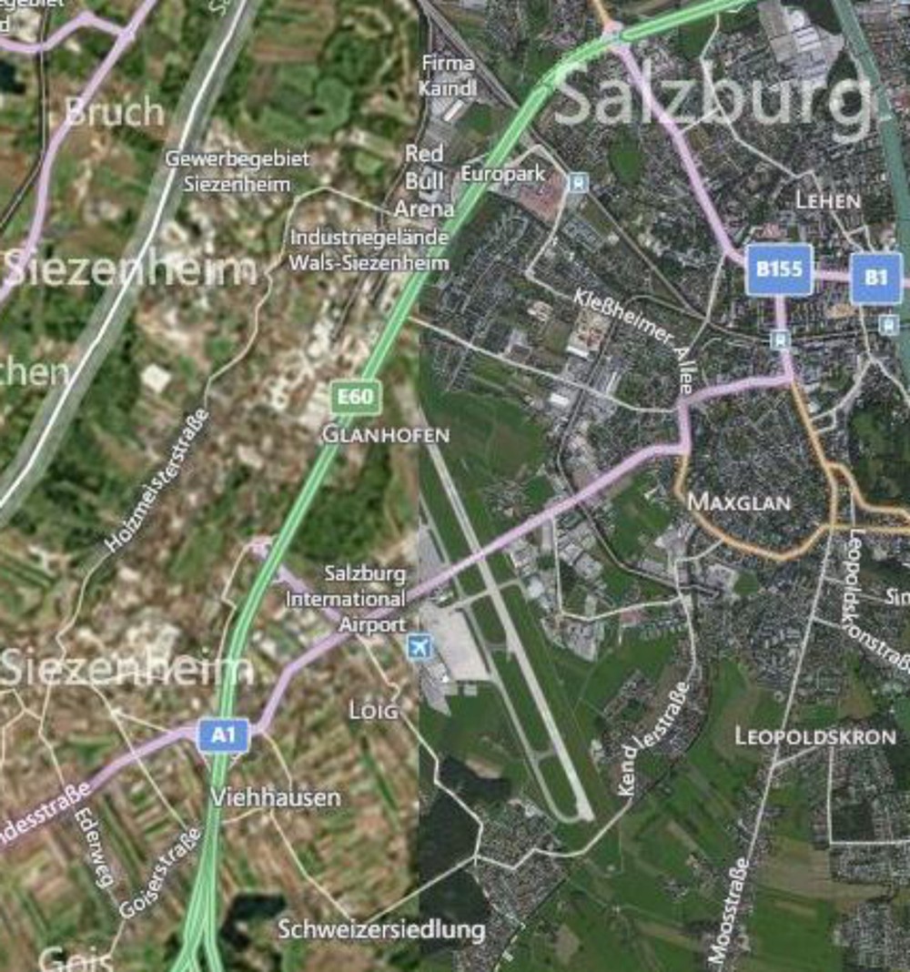
Furthermore, they’re of considerably different quality as well. The stuff on the west is blurry compared to the stuff on the east. So there’s a quality problem that’s immediately apparent, but there’s a bigger issue that you should always pay attention to – look at the lower right corner on any mapping service like this and you’ll see a copyright notice identifying who took the images and when they were copyrighted. In this case, there are two different sources cited from different times (2012 by Nokia and 2013 by Microsoft).
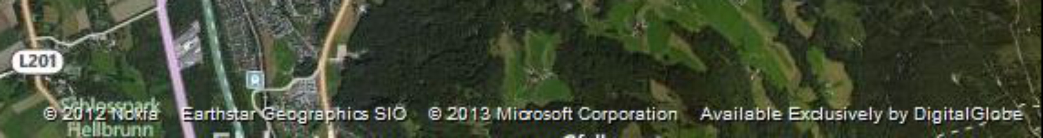
The images were taken at different times and from different sensors. This could be a good thing if you had complete coverage from both times and you wanted to look at changes happening to Salzburg, right? But it’s often the case that Geographers have exactly this sort of scenario where you have part of your data from one time and part from another, without any overlap at all. We don’t know when exactly in each year, but they could be taken during completely different seasons (which would explain some of the color differences), not to mention during different years.
The bottom line here is that time is an important factor to consider, and it’s rare to have perfect information covering every place you want to explore for every relevant time period. It doesn’t mean that you can’t make a useful map. Remember when you worked with demographic data in the Lesson 1 Mapping Assignment [15]? All of that data was based on snapshots at particular times, and frequently you were mixing together measurements taken at one time with measurements taken at another. The Geospatial Revolution has brought us closer, but we’re still a really long way away from having real-time Geographic information about everything at every second.
Video Activity
This Lesson's video assignment is to watch Chapter Two, from Episode Two of the WPSU Geospatial Revolution series [16]. This video highlights how businesses are using geospatial technologies to support better customer service and efficient operations.
Mapping Assignment
Changing Landscapes, Sharing Maps, and Fun With Projections
In this lesson you reflected on spatial relationships across space and time. This lab gives you the opportunity to practice these concepts using GIS tools. GIS was originally created way back in the 1960s to analyze these kinds of relationships. Sure, you could analyze spatial relationships via paper maps or plastic transparencies, but that’s clunky (ever tried to fold a paper map back into its original shape?). And what if you want to change the variables, or the way the data is classified, or the map scale? A GIS gives you the flexibility and power to analyze lots of data efficiently.
Ch-Ch-Ch-Changesm(sorry)
One type of change that is evident all around us is physical change and demographic change in our own communities. Think about your own community:
- What has changed since you moved there? What forces are causing that change? How did your community look in terms of the people who live there and the uses of the land in your community 10 or 100 years ago?
- How will your community look in 10 or 100 years? Could any of these changes be mapped? How do these changes compare in magnitude and scale from those changes in other parts of the world?
Unless you have been living under a rock since the 1950s, you know about space probes that have been launched to observe the Moon, Mars, and other objects in our own solar system and beyond. Since the early 1970s, satellites have also been launched specifically to observe the Earth. Some observe oceans, while others observe agricultural health, atmospheric composition, weather, or other phenomena. The first of these was Landsat [17], short for “land satellite.” Landsat became a series of satellites operated by NASA and the US Geological Survey since 1972. Landsat observes the Earth in the visible and infrared portions of the spectrum. In an infrared image, healthy vegetation appears red, cities appear gray, water appears black, and other interesting colors appear as well. The point is not actually to create weird colors, but that the infrared imagery allows for changes to be detected easily on the landscape, such as urban sprawl, agriculture, deforestation, and fluctuations in water elevation.
Open a web browser and access the Esri Change Matters site [18].
Change Matters uses Landsat imagery and ArcGIS Online. You should see three side-by-side web GIS maps, similar to the image below.
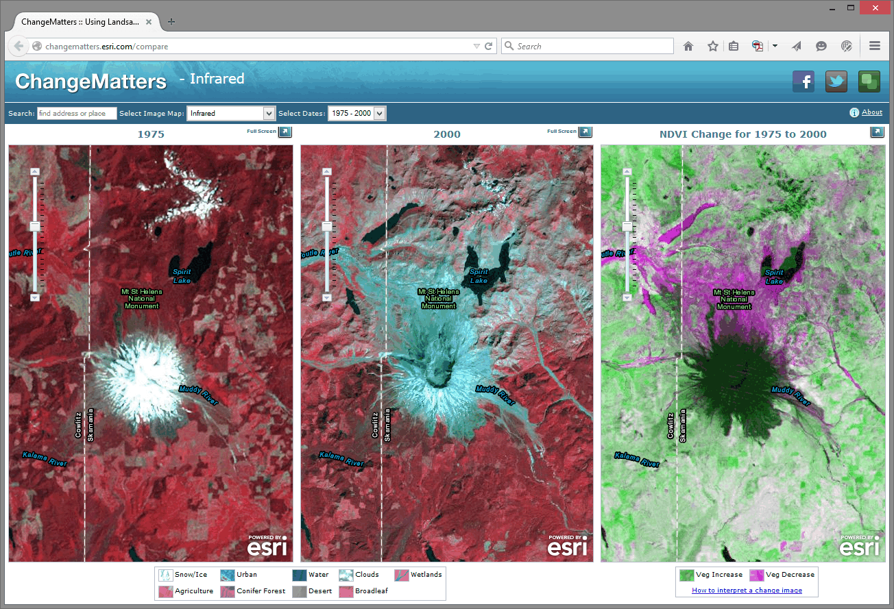
The first set of scenes is that of Mount St. Helens from 1975 and 2000. Use the information provided in the link at the lower right "how to interpret a change image" if you need it, to answer the following questions:
- Describe a few changes you observe in Mount St. Helens from 1975 to 2000.
- What do you think is the reason for those changes? Google about St. Helens if you need to.
Using the search box above the images, enter "Aral Sea."
- Describe the changes in the Aral Sea.
- What do you think are the reasons for those changes? Do some more research if you need to.
Now, examine other places around the world using this resource. What does your hometown look like?
Zoom in on one of the Change Matters image sets. The spatial resolution of Landsat imagery is now 30 meters x 30 meters (it was coarser in its earliest iterations). So, while you can’t peep on people sunbathing at this resolution, you can detect large changes across the Earth’s surface.
To share a map from the Change Matters site: click on the green box icon at the top right of the interface. That will give you a URL you can share, and those Twitter/Facebook buttons work nicely too.
Scale Matters
Now, head over to ArcGIS Online [19].
You are looking at the Northeastern Junior College campus in Sterling, Colorado. Click the Content button at the upper left of the interface to see the map layers that you have at your disposal. You should have Map Notes, USA Topo Maps, and Imagery with Labels.
Click on the pushpin at the intersection of the paths that form an “X” on campus. In the popup box that appears, you should see some notes and a photograph taken on the ground. In a few minutes you’ll create your own map notes and popups. Click on the photograph. You should be directed to a new website.
- What website was the photograph linked to?
Unlike the Landsat images, this satellite image was taken in the visible spectrum. It comes from a satellite operated by DigitalGlobe [20], and it has a much finer resolution than the Landsat imagery. You could definitely use this stuff to count the number of dog turds in someone’s lawn.
- What is the smallest object that you can see on this satellite image?
Now go to Bookmarks and select Sterling. You should now be looking at the town of Sterling, Colorado, with the USA Topo Maps layer as semi-transparent. Earlier, you used a side-by-side set of images to detect change over time. Here, using transparency on layers is another way you can look at change over time. Click the small arrow next to USA Topo Maps in the list of layers and adjust the visibility of that layer by clicking on Transparency and then drag the slider around. The USA Topo maps layer is a USGS [21] topographic map; and in the case of Sterling, the map was created in 1971. Your MOOC instructor was -9 years old at the time.
- Describe two changes you can detect in the town of Sterling from 1971 to 2011.
Now examine the Northeastern Junior College Campus, comparing the current campus as seen in the satellite image to the features on the 1971 topographic map by sliding the transparency control back and forth for the USA Topo Maps layer.
- What feature occupied most of the campus back in 1971?
Until now in our lab assignments you have been using maps and layers created by others. One of the revolutionary things about today’s mapping methods is that you can create your own content, save it, and share it with others quite easily. Let’s start doing that now. To do so, click on Sign In in the upper right hand corner of the map that you are examining.
Your screen should look similar to the one shown below. If it doesn't, navigate to the ARCGIS home page [22] directly.
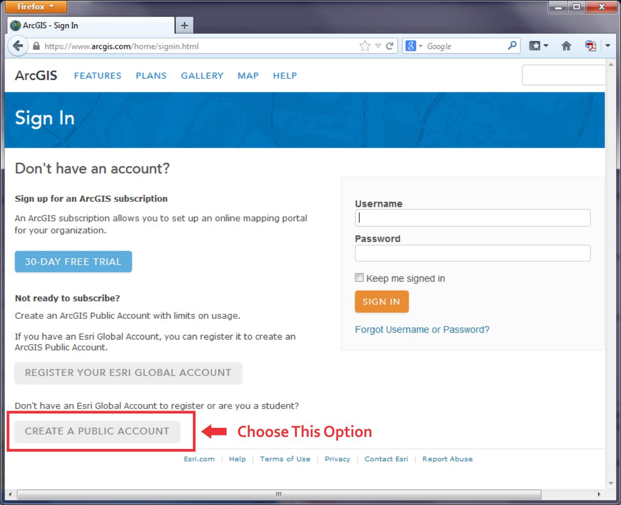
At the lower left, click the link to Create a Public Account. Follow the steps there to create your account. Where it asks you to name the Organization you're part of, you can just say "Coursera" there. You will also need to give Esri a phone number, but you don't have to give them a real one. Just plug in 999 instead. You also need to review and accept the terms of use before you can click Create My Account. Once you have created your account, you should be automatically logged in. It should drop you at a page where you can edit your profile details if you'd like.
None of this will cost you any money, result in 40 catalogs sent to your house or anything crazy like that – it’s just a way for you to be able to upload stuff, save your maps, and share things more easily.
Now that you are signed into ArcGIS Online, you can do everything that you have been doing last week and earlier in this current lab exercise, but now you can save your maps. You can build on them as you see fit. And because these maps live online, you can share them with colleagues; you can embed them into your own web pages, you can create web applications from them, and you can reduce your cholesterol by 30% while improving your ability to sing opera. But let’s not get ahead of ourselves: let’s begin with those pushpins, popups, and embedded images and links that you were examining earlier by creating your own. On the menu bar at the top of the page, click Map to continue.
Navigate now to a different location in the United States that is of interest to you. If your map still is titled “Northeast Junior College” then click on “New Map” to start creating a completely new map. I would navigate to Princeville, Hawaii because it’s freaking [23] awesome [24]. Add the USA Topo Maps layer from ArcGIS Online (uncheck the "within map area" option) and compare the Imagery layer from the Basemap to the USA Topo Maps layer for your chosen location. Zoom to a location where you can observe change on the landscape between the topographic map and the satellite image.
Add a pushpin, some text, an image, and a link to a point by following these steps: Using the Add button, Add Map Notes and select Create once you’ve given it a name. Select a Point, Line, or Areas from the Add Features menu. Click on the map then to add your point, line, or area to the map. Fill out the popup box that appears with the following:
- An appropriate title.
- A description of the changes on the landscape that you observe.
- Find an image of that community or your chosen location and enter its URL in the “Image URL” box. Note that this image URL should be a link to a JPG, PNG, TIF, or other image.
- Enter an Image Link URL that will take the reader of your map to an appropriate website. The website could be the government site for that community, a local restaurant that you think embodies that place, or whatever else you see fit to use.
Exit the Add Features panel by clicking the Close button at the bottom right corner of the popup. Test your popup by first exiting the "edit" mode and then clicking on your map note. You should see your note title, text, and image. Click on your image - you should be directed to the website that you selected.
Now go to Bookmarks and set up a few bookmarks at different locations and scales in your chosen community. You can do this by clicking Add Bookmark in the Bookmark list, type in a name, and hit Enter to save it. It'll use the map settings at that moment to make a Bookmark, so you'll need to navigate, change your layers, etc... before you add a specific Bookmark.
Once you’ve added a couple map notes and bookmarks, save your map by clicking the Save button. Give it an appropriate title. If you call it “Map” that’d be pretty lame.
In the Tags area you can enter keywords to help people discover your map. In the Summary field you can write a short description about your map that will be helpful to the readers of your map. This is known as the map’s metadata—information about the map. It is sort of like the list of ingredients on a bag of chips.
- Why do you think it would be important to spend time adding metadata like this?
Next, let’s make your map viewable to others: using the Share button, share your map with Everyone. Write down or copy the URL of your map to your clipboard. You can give this to anyone and they’ll be able to load and use your map.
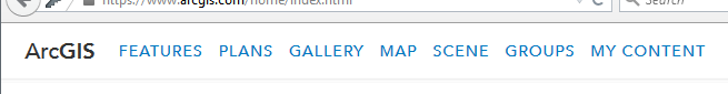
Now click on the ArcGIS in the top left corner of the interface and select My Content. You should see your map listed in your content. In subsequent labs, your content will grow as you create more maps.
Finally, let’s test your map: First, make sure you copied that URL for your map that you created when you shared it just a minute ago. Next, Log out of ArcGIS online. Open a new web browser frame. Add your map URL to the address bar in your browser and see if you can access your map without being logged into ArcGIS Online. This is possible because you shared your map with everyone in the step above. While you are in your map, test your bookmarks.
- Have you made something great? Feel free to share the URL of your map with a friend or classmate and describe what you’ve created.
Examining Resolution
As you learned in the reading this week, different locations on the planet contain different data at different resolutions. You saw a satellite image of Salzburg that featured two different resolutions, and earlier in this lab, you saw that the USA Topo map resolution was at a lower resolution than the imagery.
One reason why maps are noteworthy today is that you can easily create your own content. And so can others - this is commonly called crowdsourced data or volunteered geographic information. In the not too distant past, the only geospatial data providers were government agencies and nonprofit organizations. Nowadays, everyone is empowered to create their own data and share it. Esri has a program called the Community Maps program where folks can contribute content to a topographic basemap.
Log in to ArcGIS Online and start a new Map if you aren't already there. Change your Basemap to Topographic (it may already be set this way by default, that's OK too). Use the search box to search for the following address: 1000 Broadway, Boulder, CO. You should now be in Boulder, Colorado. Broadway is the street that runs from the southeast to the northwest across this part of Boulder. Compare the detail to the northeast of Broadway to the map details shown to the southwest of Broadway.
- Which part of the map – to the northeast of Broadway or to the southwest of Broadway—contains a more detailed basemap?
- What is the most detailed feature that is visible in the higher detail section of the basemap?
The higher detail section of this map was contributed to through the community maps program [25].
Recall that you populated the metadata with information about the map that you created.
- Now that citizens are contributing data to the spatial data “cloud,” what are the implications of data quality?
Projections Aren’t Just To Make Maps Pretty
Everything in a GIS is tied to a specific location on the Earth’s surface. All of those locations are measured based on a mathematically-computed map projection. Recall from Lesson 1 where we talked about why transforming stuff from the 3D globe to a 2D map requires some transformation (and therefore compromises).
The map projection that you use makes a big difference in your spatial analysis. If you are creating zones that consider Tobler’s First Law of Geography and want to determine which things are near other things, you usually create areas of proximity, or buffer zones around map features. These could represent the areas within 100 kilometers of the earthquakes of at least magnitude 7 that have occurred over the past year, for example, or areas within 100 meters of rivers in your local community. Those zones that you create, as well as everything else you do and create in a GIS, are all dependent on the map projection used. Using different map projections will yield different results. The results might not matter so much at a small scale for, say, the list of cities within a certain climate zone, but they would matter at a large scale to determine, say, all of the natural gas pipelines underneath a school building that you would need to be careful about when constructing a new library.
Now I’d like you to start a New Map, zoom out to show the whole world, and compare the size of Greenland versus that of South America. Greenland looks larger than South America, doesn’t it? Greenland is actually only about 12% as large as South America (~2 million square kilometers vs. ~17 million square kilometers). Why does Greenland look huge? The default projection in ArcGIS Online is a modified version of a Mercator [26] projection. In the Mercator projection, latitude and longitude lines are conveniently shown as straight lines and it allows us to plot navigational directions in straight lines. But as you can see, objects near the poles are really distorted.
Next, expand the ArcGIS list in the top left corner and click on Groups. Groups are, as the name implies, sets of maps with a specific theme. Click on the Search box in the top right corner and select Search For Groups and then type Projected Basemaps into the search field before hitting Enter. Click on the group name "Projected Basemaps" to open this group and you will see two pages of projected basemaps. Browse these basemaps and open a few of them. Each is based on a different map projection. Think about the advantages and disadvantages of each projection. The map projections represented here are just a few of the thousands of map projections that exist. Why so many? Each projection has advantages and disadvantages. Each projection preserves some, but not all, of the following properties: Area, shape, direction, bearing, and distance.
- What map projection do you like best, and why?
- Which map projection would be best to analyze tsunamis in the Pacific Basin? Why?
Wrap Up
Nice work! In this lab you’ve examined issues of resolution and map projection. You also explored issues related to change detection in Geography. And you created your own map with your own content and shared it with others. That’s pretty cool, huh?
Credit Where It's Due
This lab was developed by Joseph Kerski [27] and Anthony Robinson [28].
Discussion Prompts
Change Matters In Geography
As food for thought, I suggest building on what you've done in the mapping assignment [29], so if you haven't yet completed that assignment, make sure you do so now. The lab in this lesson focused on change detection, and I want you to find and explain the changes taking place in parts that we didn't explore during the lab activity. Then I'd like you to review what your classmates have posted and weigh in on their explanations and/or provide additional examples.
- Share map links with your classmates that shows another area (that we didn't look at as part of the lab assignment) where you've detected interesting changes, and describe your rationale for explaining those changes.
- Review the maps and explanations that your classmates have posted. Do their explanations make sense? Can you find another example in a different place that shows the same types of changes?
- Find and share a map you've come across on the web that you think does a nice job of showing and explaining Geographic changes. What works (or doesn't) about its design?