Lesson 3: Global and Local Controllers of Temperature
Motivate...
Overview
When you're getting ready to start your day, do you ever wonder, "what's the high temperature going to be?" As a meteorologist, it's a question I get asked all the time (it's an occupational hazard, I suppose). Perhaps the only question I get more frequently is, "Do you think it's going to rain today / tomorrow?"
Most likely, your expectations for daily temperatures help you make decisions about what clothes to wear (whether to wear a coat or not, etc.), and you might be tempted to think that this important meteorological variable is easily determined by a few simple factors, but it isn't. Temperature is affected by many processes at several different time and space scales. Some of these factors are well understood and very predictable (like the seasons), while others present bigger challenges.
To complicate things, weather forecasters must be aware of other aspects of the forecast when they make a temperature prediction. For example, you've already learned that one of the factors for determining temperature on a local scale is the surface's energy budget, and clouds have a great influence on surface temperature during both the day and night. Therefore, in order to properly predict surface temperatures, a meteorologist must get the cloud prediction correct first. The same goes for wind direction and speed, which affects mixing from mechanical eddies and something called "temperature advection," which we'll learn about in this lesson. Temperature is also affected by precipitation, ground cover, urban versus rural landscapes, etc., and the list goes on. While the science of weather forecasting has advanced to the point where high and low temperature forecasts for the next few days are usually pretty accurate, sometimes predicting the temperature can be a real challenge, even for professionals.
In short, this lesson is all about controllers of temperature--from the global scale (such as seasons) to the local scale (such as temperature advection, clouds precipitation, ground cover, etc.), and everything in between. There's a lot to learn, so let's get started!
Seasonal Tides of Solar Heating
Prioritize...
By the end of this section, make sure that you can discuss how the earth's tilt on its axis of rotation impacts sun angle throughout the year, and how seasons result from the changing angle at which the sun strikes the earth. You should also be able to explain how "meteorological seasons" differ from astronomical seasons.
Read...
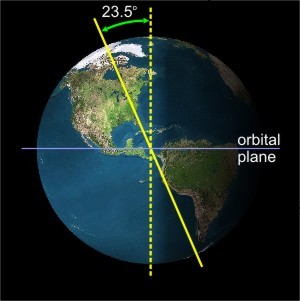
You've probably heard the saying, "It's a small world." But, that's not necessarily the case when we're talking about the seasons. If you live in the northern hemisphere, did you know that when it's winter where you are, it's summer in the southern hemisphere? It's as if the United States and Australia (for example) are worlds apart! While the depths of winter's chill numbs the middle latitudes of the northern hemisphere in January, temperatures can soar to the 90s during January in Australia (where it's summer). The reason for such seasonal disparity between hemispheres is that Earth's axis of rotation tilts at an angle of 23.5 degrees away from the line drawn perpendicular to the plane of our planet's orbit around the sun (as shown in the figure on the right).
The tilt of the earth's axis governs the heating power of the sun's energy. Just so you're not in the dark with regard to this claim, direct your attention to these side-by-side photos of a flashlight shining on a wall [5] (credit: David Babb). Please note that when the light from the flashlight strikes the surface at a rather direct angle, the light focuses on a rather small area. In other words, the light is intense. On the other hand, if the flashlight is tilted so that the light strikes the surface at a lower angle, the light spreads over a larger area, making the light less intense. If you're not convinced, find a dark room and a flashlight and try it out for yourself.
The sun's radiation, for all practical purposes, travels in parallel "rays" of energy because of its distance from the Earth. Therefore, like our flashlight, the tilt of the earth controls the heating power of solar radiation and, on a grander scale, the seasons. So the tilt of Earth's axis of rotation explains the seasonal disparity between the northern and southern hemispheres, but it doesn't explain why we have four seasons (winter, spring, summer, and autumn).
To explain why we have a climate with four seasons, I'll start with the observation that the Earth's axis always points to the same position in space (namely, toward Polaris, the North Star). In addition, Earth travels in an elliptical orbit around the sun, which means that the northern hemisphere can be tilted toward or away from the sun, depending on its orbital position. To see what I mean, check out this interactive animation showing earth's orbit around the sun [6], and click on the "summer" text in the animation.
When the northern hemisphere tilts toward the sun, solar energy strikes the ground more directly during the daytime. Like a nearly downward pointing flashlight shining directly on the surface, concentrated sunlight has heating power consistent with the elevated temperatures of summer. Note that, at the start of summer, the Arctic Circle, which spans from about 66.5 degrees latitude to the North Pole, lies in daylight 24 hours a day. Thus, "nighttime" forecasts such as "partly sunny and cold" are not far-fetched in northern Alaska. For proof, check out this time-lapse movie of the Arctic sun [7] and note that while it dips towards the horizon, it never sets!
At the same time the sun's rays are striking the ground more directly in the northern hemisphere, the southern hemisphere tilts away from the sun and sunlight strikes at a lower angle (like light from a nearly horizontally held flashlight spreading out over a large area). This diffuse sunlight has low heating power that is consistent with the typically low temperatures of winter.
Now click on "winter," "spring," and "fall" in the animation and investigate firsthand the effects of sun angle on seasonal heating power. I've also created a short video (3:45) using a virtual flashlight tool and the animation showing earth's orbit around the sun to discuss and summarize the reason for the seasons.
Click here for a transcript of the video.
Text on screen: The intensity of light that shines on a surface depends on the angle at which the beam strikes the surface. The shallower the angle, the more the light spreads out, resulting in a lower intensity. Grab the flashlight in the picture on the right and observe how the angle affects light intensity as you change the angle.
To understand the changing of the seasons, we have to understand the role of the changing Sun angle and the tilt of the Earth on its axis. To look at that, we're going to start with a virtual flashlight. We’ll begin with a situation where our virtual flashlight is pointed directly at an object, so the light comes in perpendicularly and strikes the object.
You can see that the light is fairly bright, and it's spread over a small area, so the amount of light per unit area is maximized, and the light is intense as it strikes the object. But if we change the angle of our flashlight and make the light come in at a lower angle and strike the surface, the light now gets spread out over a larger area. So the amount of light per unit area is reduced, and the light is dimmer on the surface. It's not as intense. So even though the same amount of light is coming out of the flashlight, it's dimmer on the surface because of the lower angle of the light that is striking the surface.
You could try that experiment at home with a real flashlight if you wanted. But in a nutshell, you've seen the reason for the change of seasons. Earth is tilted on its axis at a 23.5-degree angle, and as it revolves around the Sun, the location that gets the direct beam of light changes throughout the year.
The direct beam of light from the sun is always between 23.5 degrees north latitude and 23.5 degrees south latitude. For example, the equator gets the direct beam of light twice a year, on the spring equinox and on the autumnal equinox. On the other days of the year, the direct beam is over other various locations between 23.5 degrees north and 23.5 degrees south.
To better see how the changing Sun angle impacts the seasons, we have an animation here of the Earth revolving around the Sun, and the Earth is tilted on its axis at the 23.5-degree angle. The seasonal designations here are for the Northern Hemisphere. If we click on summer, we can see the situation in the Northern Hemisphere and why it's warmer in Northern Hemispheric summer.
When it's summer in the Northern Hemisphere, the Northern Hemisphere is tilted toward the Sun. So the Sun's light is striking the surface more directly and the heating power of the Sun is greater in the Northern Hemisphere during summer. Meanwhile, the Southern Hemisphere, it’s tilted away from the Sun, and the Sunlight is coming in at a lower angle and spreading out over a larger area. So, the heating power of the Sun is reduced in the Southern Hemisphere. That's why the Southern Hemisphere is having its winter while the Northern Hemisphere has its summer.
The situation during northern hemispheric winter is just the opposite. During the Northern Hemispheric winter, the Sun angle is low in the Northern Hemisphere, and the light is spreading out over a larger area, so the heating power of the Sun is reduced, because the Northern Hemisphere is tilted away from the Sun, and the light is coming in at a low angle.
Meanwhile, the Southern Hemisphere is pointed more directly at the Sun, so the sun is coming in more directly, and the heating power of the Sun is stronger in the Southern Hemisphere. That's why when it's winter in the Northern Hemisphere, it's summer and warmer in the Southern Hemisphere.
Finally, in spring and fall, the tilt of the earth's axis isn't directed toward or away from the sun, so the sun's rays strike similar latitudes at the same angle in both hemispheres, which means the radiation per unit area is the same and temperatures end up being similar. Ultimately, this set-up in spring and fall gives us an idea of what would happen if the earth was not tilted on its axis at all. We would not experience any seasonal variation as the earth revolves around the sun.
Astronomically speaking, the seasons break down like this for the northern hemisphere:
- Winter: Begins on the winter solstice (on or around December 22) when local midday rays of the sun shine at right angles on the Tropic of Capricorn (approximately 23.5 degrees South latitude).
- Spring: Begins when astronomical winter ends, on the spring equinox (on or around March 21) when local midday rays of the sun shine directly on the equator.
- Summer: Begins when astronomical spring ends, on the summer solstice (on or around June 22), when local midday rays of the sun shine directly on the Tropic of Cancer (approximately 23.5 degrees North latitude).
- Autumn: Begins when astronomical summer ends, on the autumnal equinox (on or around September 23), when local midday rays of the sun shine directly on the equator.
However, weather forecasters use different criteria to determine the "meteorological seasons" (also called "climatological seasons"). For example, meteorological winter in the northern hemisphere runs from December 1 to February 28 (or 29, if it's a leap year), a period that statistically includes the three coldest calendar months of the year. Meteorological summer in the northern hemisphere runs from June 1 to August 31, a period that includes the warmest three calendar months of the year. Meteorological spring and fall in the northern hemisphere (March 1 - May 31 and September 1 - November 30, respectively) mark the three-month periods that transition between the coldest and warmest seasons. So, meteorologists define their seasons by normal temperatures, not sun angle like astronomers do.
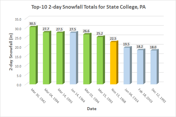
Of course, individual weather events can sometimes belie astronomical seasons (based on sun angle) and meteorological seasons (based on normal temperatures). To see what I mean, consider the average monthly snowfall for State College, PA [9]. As expected, most of the snow occurs during meteorological winter (December, January, February). However, record snowstorms in State College tend to occur during the spring (not necessarily winter). Check out the graph to the left, showing the top-ten 2-day snowfall totals for State College. Five out of six of the largest snowstorms occurred in March, and the biggest storm on record occurred near the end of March,1942, when 30.5 inches crippled the region.
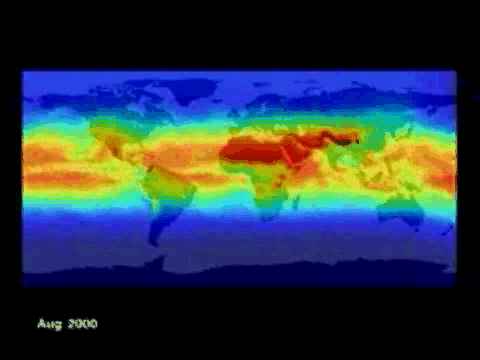
You should realize that while sun angle is the driving factor for seasonal temperature variations, there are other factors at play as well. For example, consider this NASA movie from 2000-2001 [10], which shows that the rhythms of the most intense ultraviolet radiation coincide with the most direct rays of the sun (around the summer solstices). Of course, there's nothing surprising about this movie. But what may be surprising to you is that average air temperatures lag behind the astronomical lead of the sun's most direct days.
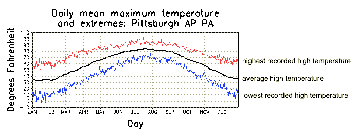
To see what I mean, let's look at the plot of annual average high temperatures for Pittsburgh, Pennsylvania (below). Note that the maximum daily temperature occurs in the latter half of July, on average, nearly a month after the summer solstice (the day when the midday rays of the sun strike Pittsburgh at their most direct angle). Similarly, the coldest days, on average, do not occur until the latter half of January, almost a month after the winter solstice. The bottom line here is that the greatest average daily high temperature at Pittsburgh does not occur on the day with the most intense radiation. Indeed, the greatest average daily high occurs about a month later when the sun's rays strike Pittsburgh at less direct angles.
To understand why this happens in the most simple terms, imagine that you take a piece of cold pizza from the refrigerator and place it in a preheated oven. After a minute or so, you get impatient and remove the pizza from the oven. In salivating expectation, you take your first bite and are immediately annoyed that it's still cold. You turn up the oven to maximum and cook the pizza another minute, but it's still not piping hot.
Just as it takes time for cold pizza to heat up in a hot oven, the atmosphere, chilled by winter's refrigerator, takes time to warm up, not reaching its highest temperature, on average, until after incoming solar radiation reaches its maximum around the summer solstice. As we'll see a bit later, temperature lags often occur in the daily temperature cycle as well. That is, the maximum incoming solar radiation occurs near local noon but the high temperature for the day usually is recorded in the mid- to late-afternoon.
Now that you know the reason for the seasons, let's examine some other "big picture" factors that control temperature. Read on.
Earth as a Temperature Controller: Part I
Prioritize...
In this section, make sure that you can describe and explain the effects of latitude and proximity to large bodies of water seasonal temperature variations.
Read...
In the last section you learned that seasons (that is, yearly temperature trends that occur over a large region of the earth) are created by the tilt of the earth's axis and that the amount of solar radiation impinging on a surface depends on the angle at which it strikes the surface. If we look at slightly smaller regions over shorter time spans, we'll discover that characteristics of the earth itself act as temperature controllers. Specifically, the average surface air temperature across the earth's surface depends on location. The "big three" controllers of temperature based on location are latitude, proximity to bodies of water, and altitude (we'll deal with the first two in this section).
Latitude
In the last section, we discussed the importance of sun angle on determining the seasons. A more direct sun angle in the northern hemisphere causes the warmth of summer, while simultaneously, a lower sun angle in the southern hemisphere brings less solar heating power and the chill of winter. But, the earth is (approximately) a sphere, and its surface is curved. The curvature of the earth's surface means all points in a given hemisphere are not receiving incoming solar radiation at the same angle, regardless of season.
The maximum height that the sun reaches at local "solar noon" (the time of day when the sun is highest in the sky) on any given day, and thus the maximum angle at which the radiation strikes the earth, depends on the date at the latitude of your location. For example, consider two locations -- Bismarck, North Dakota (located at 46.5 degrees North latitude) [11] and Oklahoma City, Oklahoma (located at 35.2 degrees North latitude) [12]. Clearly, Bismarck's latitude is greater than Oklahoma City's (Bismarck is farther from the equator). Using the NOAA Solar Calculator [13] (it's a neat tool, if you want to check it out) along with some math which I'll skip here, I calculated the peak sun angles and corresponding percentages of the maximum possible solar radiation (often called the "direct beam") for December 21 (near the winter solstice) and June 21 (near the summer solstice) at Bismarck and Oklahoma City. The results are in the table below:
| City |
Peak Sun Angle (December 21) |
% of the Direct Beam (December 21) |
Peak Sun Angle (June 21) |
% of the Direct Beam (June 21) |
|---|---|---|---|---|
| Bismarck | 19.8 degrees | 34 percent | 66.7 degrees | 92 percent |
| Oklahoma City | 31.1 degrees | 52 percent | 78.0 degrees | 98 percent |
You should take a couple of important messages from these numbers. First, the peak sun angle at the higher-latitude city (Bismarck) is lower than at Oklahoma City near both solstices. As you know from the last section, a lower sun angle means Bismarck consistently receives less intense solar radiation compared to Oklahoma City, ignoring clouds of course. To confirm, note that Bismarck's percentage of possible solar radiation compared to the "direct beam" is lower near both solstices.
Furthermore, the numbers in this table should match your experiences. Perhaps you've noticed that during the winter, the sun at local "solar noon" isn't as high in the sky as it is in the summer. These numbers support that observation: at both cities, the peak sun angle is much larger (meaning the sun is higher in the sky) near the summer solstice than near the winter solstice.
So, Oklahoma City consistently receives more radiation than Bismarck throughout the year because the sun's angle is always higher in Oklahoma City. How does this fact impact average temperatures? Check out the graph below, which compares daily average high temperatures at the two cities.
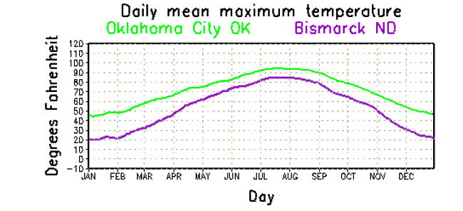
As we would expect, Oklahoma City is, on average, warmer than Bismarck, because Oklahoma City consistently receives more solar radiation. But, also notice that Bismarck has a much wider range in average temperatures than does Oklahoma City. Average high temperatures in Bismarck increase from about 20 degrees Fahrenheit in January to about 85 degrees Fahrenheit in July (a range of 65 degrees Fahrenheit), while Oklahoma City's average high temperatures increase from about 44 degrees Fahrenheit in January to 95 degrees Fahrenheit in July (a range of 51 degrees Fahrenheit). That's because the higher-latitude city (Bismarck) experiences a greater variation in solar radiation between winter and summer (34 percent to 92 percent of the sun's direct beam) than Oklahoma City (which receives 52 percent to 98 percent of the sun's direct beam during the year). So, a location's latitude impacts not only its average temperatures, but also the range in temperatures during the year. We can generalize our findings from Bismarck and Oklahoma City into the important "lesson learned" below:
Proximity to Bodies of Water
To begin our discussion on the effect of large bodies of water on local temperatures, consider this color-coded temperature map [14] (constructed from NASA satellite data). The top map indicates the average daytime air temperatures in January 1979, and the middle map represents the average nighttime temperatures during the same month (on both maps, brown represents the hottest regions and temperatures decrease from red to yellow to light blue to dark blue, which represents the coldest regions).
The bottom map represents the difference between daytime and nighttime temperatures during January 1979. The whitish appearance of Earth's oceans means that there was little or no change between daytime and nighttime temperatures over the course of the month. This map tells us that water is particularly slow to warm or cool -- much slower than land. That's because water has a heat capacity that is three times that of land, which means that water requires about three times as much energy compared to a similarly sized volume of land to achieve the same temperature increase. Because water, with its relatively high heat capacity, is relatively slow to warm or cool, we might expect locations that are near large bodies of water to have smaller seasonal temperature changes, and indeed that's the case. For what it's worth, locations near large bodies of water tend to have smaller diurnal (daily) temperature changes, too, because of the moderating influence of water.
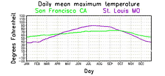
If you examine the average temperatures for a west-coast city such as San Francisco, where prevailing winds blow from the ocean most of the time, you can observe the moderating influence of the Pacific which limits the variation in temperature from day to day and month to month. Indeed, note the relative flatness of the plot of daytime average high temperatures at San Francisco compared to St. Louis, Missouri (both cities lie at approximately the same latitude). The flatness in San Francisco's trace of daily average highs indicates a smaller annual variation in temperature. Indeed, average daily highs during summer at San Francisco are not nearly as high as St. Louis. During winter, however, the average daily highs in San Francisco are higher than St. Louis, again due to the moderating influence of the ocean. Practically speaking, the Pacific Ocean keeps San Francisco from getting hot in summer and cold in winter. Also note that the average high temperatures at San Francisco peak later in the year (September) compared to St. Louis (where they peak in July), because the high heat capacity of water keeps ocean temperatures slowly rising through the summer into September.
Oceans do not own a monopoly on moderating temperatures. To a lesser extent, large lakes, rivers, and seas modify air temperatures. For example, the moderating effects of Lake Ontario and the Finger Lakes transform western New York into a favorable place to grow grapes for making wine. Because large bodies of water cool much more slowly than land, milder air overlying the Finger Lakes delays the first frost [15] (courtesy: PlantMaps.com) of autumn, extending the growing season and allowing grapes to adequately ripen before harvest (note in the image the later average date for the first frost in the region south of Lake Ontario). We say that bodies of water cause temperatures to "lag" those farther away from the water because air temperatures surrounding large bodies of water will stay milder in the fall and winter, but will also be slow to warm during the spring and early summer (because the nearby water will be slow to warm).
I should quickly point out that this effect is greater for locations "downwind" of the large body of water. For example, in the United States, the moderating influence of the Pacific Ocean over the course of individual days and through the entire year is more dramatic for West Coast cities than the moderating influence of the Atlantic Ocean is for cities on the East Coast. Why? Weather systems at these latitudes tend to move from west to east, and winds commonly blow onshore from the Pacific Ocean, ushering the air over the ocean into West Coast cities. Along the East Coast, winds sometimes blow onshore from the Atlantic, but not as often, which lessens its moderating influence, on average.
Other characteristics of the earth's surface beyond simply land versus water can alter local heating characteristics (and impact local temperatures), too. Urban landscapes absorb radiation differently than rural landscapes, etc., but we'll talk more about some of these finer details later on. For now, we have to leave the surface of the earth and start thinking about elevation. It's time to get vertical! Read on.
Earth as a Temperature Controller: Part II
Prioritize...
In this section, make sure that you can describe and explain the effects of altitude on a location's average yearly temperatures. You should also be able to apply terms associated with vertical temperature variations, such as lapse rate, environmental lapse rate, and tropopause.
Read...
In the last section, we saw the impact that latitude has on incoming solar radiation and seasonal temperature variations. But, now, we have to account for another characteristic of earth's surface: it has varying terrain. Earth has mountains and valleys, which range in elevation from below sea level (such as California's Death Valley) to over 29,000 feet above sea level (the peak of Mount Everest). The varying altitudes of the earth's surface impact average temperatures, too, and perhaps in a way that's not intuitive.
Altitude
How does altitude impact temperatures? Let me start with a personal story (perhaps you've experienced something similar). On a hot, summer day during August 2006, my family was in the midst of a cross-country road trip. As we approached Denver, Colorado from the north at elevations near 5,000 feet, temperatures were near 90 degrees as the clock turned to early afternoon. My family then drove west into Rocky Mountain National Park [16], where some of the roads crest over 12,000 feet. As we drove higher, temperatures dropped all the way to the low 50s, and sight-seers were wearing jackets at the scenic overlooks. Even in August, some patches of snow [17] (credit: Steve Seman) still remained from the snowstorms of winter and spring. Indeed, the relative chill of such high elevations is typical, and you might be wondering if mountains are closer to the sun, why are they colder?
Temperatures typically decrease with increasing height in the lower part of the atmosphere, and the reason for these temperature decreases is that the primary heat source in this region is the earth's surface. Remember that the earth's atmosphere is relatively transparent to solar radiation -- only the earth's surface absorbs most solar radiation. The absorption of solar radiation, of course, warms the ground, which then transfers its heat to the atmosphere via conduction, convection, and the emission of infrared radiation. The end result is that the farther away from the earth's surface you are, the colder the surrounding air.
Of course, mountain tops are still the surface of the earth and thus should have the same heating properties as lower elevation surfaces, but the key to this conundrum is that while the surface of the mountaintop may indeed heat up just like any similar surface, the air surrounding the mountaintop is vastly cooler than air at lower elevations. Therefore, as air near the surface of a mountain warms via conduction, air parcels over the mountaintop quickly become positively buoyant and rise. As convection quickly transports heat energy away from the mountaintop, the warm air is quickly replaced by much cooler air. If the wind is blowing, this effect is compounded, and the end result is that air at higher elevations (even on mountain tops) stays cooler than air at lower elevations.
As an example, consider two cities: Columbia, Missouri and Eagle, Colorado. Both cities lie at the same latitude and are located near the center of the United States. The difference between these two cities is elevation. Columbia's elevation is 705 feet above sea-level; Eagle's elevation is 6,600 feet above sea-level. Below is a comparison of the mean high temperatures for these two cities.
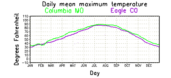
As you can see in the graph, Eagle's higher elevation causes it to have a slightly lower average high temperature than the lower-elevation city of Columbia.
The fact that temperatures tend to decrease with increasing altitude is an important part of your understanding about the structure of our atmosphere, so let's take a closer look at this issue and put a few numbers to it. First, let's start with an important term -- lapse rate. Formally, a lapse rate is the rate of decrease in temperature with increasing height, and while atmospheric lapse rates vary from time to time and place to place, the average environmental lapse rate is about 6.5 degrees Celsius per kilometer (3.6 degrees Fahrenheit per 1000 feet). In other words, for every kilometer of ascent, on average, the temperature decreases by 6.5 degrees Celsius (this applies to roughly the lowest 10 kilometers of the atmosphere).
Take special note that the "decrease" in temperature is built right into the definition, so when temperatures are decreasing with increasing height, lapse rates are expressed as positive numbers (as with the average environmental lapse rate). Only when a temperature inversion is present (temperatures increase with increasing height) is a lapse rate expressed as a negative number. So, if the lapse rate is -5 degrees Celsius per kilometer, temperatures are increasing by 5 degrees Celsius for every kilometer of ascent (it's getting warmer as you go up). That might not be intuitive from the negative number, so make sure you're aware of this quirk involving lapse rates.
You might be asking yourself, "if temperatures typically decrease with increasing height in the lower part of the atmosphere, is there a point where it stops getting colder as altitude increases?" The answer is "yes!" The lowest layer of the atmosphere, where most of the processes we call "weather" occur, is called the troposphere. Temperature decreases with increasing height in the troposphere (on average) until we reach the tropopause, which is the transition zone between the troposphere and the layer above, called the stratosphere.
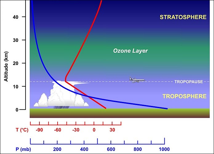
The graph above shows the idealized structure of the troposphere and stratosphere, with temperatures (red line) decreasing with increasing height until the tropopause, and then increasing with increasing height in the stratosphere. While the troposphere extends to an altitude of about 10 kilometers, on average, its height depends on latitude (it's higher at lower latitudes near the equator), along with other weather conditions. The atmosphere does contain layers above the stratosphere [18], but 99.9 percent of the air molecules that make up the atmosphere reside in the bottom two layers.
So, altitude is a major controller of average temperature, and along with latitude and proximity to bodies of water, altitude helps to determine average temperatures in a region throughout the year. But, what helps determine how temperatures change from one day to the next? Let's shift gears now and think shorter term, and examine some temperature controllers that impact day-to-day weather changes.
Air Masses and Fronts
Prioritize...
When you've finished this page, you should be able to explain air mass formation, name and describe the types of air masses, as well as discuss their source regions. You should also be able to define and describe "fronts" and describe the placement of fronts on weather maps.
Read...
So far, we've been talking about the controllers that affect the average temperature patterns all across the globe. In other words, we've been talking about temperature controllers that shape a region's climate. But, obviously, temperature changes from day to day (sometimes by quite a lot). So, what factors control the variations that we tend to notice on a daily basis? Let's explore.
For starters, weather forecasters track large blobs of warm and cold air, called "air masses," around the globe. By definition, an air mass is a large blob of air [19] with horizontal dimensions of several hundred to a couple of thousand miles, within which temperatures and moisture (dew points) at the surface (or at any other arbitrary altitude) are fairly uniform (they don't change very much with distance). In other words, temperature and moisture gradients within an air mass are small.
Essentially, air masses acquire their relatively uniform surface temperature and moisture characteristics by remaining over one region (its source region) for an extended period of time, and acquiring the characteristics from the underlying ground or body of water. For example, an air mass that sits over a warm, tropical ocean for a long period of time will become warm and humid. On the other hand, an air mass that sits over the very cold, ice-, and snow-covered ground near the North Pole will be very cold and dry.
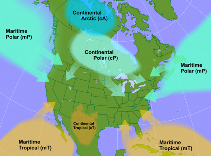
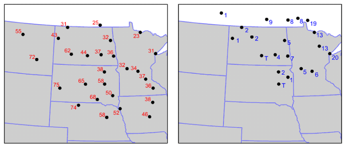
Meteorologists identify five main types of air masses, with designations like "maritime" (originating over the ocean) or "continental" (originating over land). The image below shows the source regions for the air masses that impact North America.
Let's break down these air masses and their specific characteristics:
- maritime-Tropical (mT): As its name suggests, a maritime-Tropical air mass forms over a tropical body of water. Given that tropical waters are typically warm, the overlying air becomes warm and humid (meaning that mT air masses have high dew points). Of course, summer mT air masses are the most stifling, particularly in the Deep South, where daytime temperatures often reach the 90s while merciless and muggy dew points edge toward the middle 70s or higher. The Gulf of Mexico, Caribbean Sea, and the tropical waters of the western Atlantic and eastern Pacific are also common source regions for mT air masses that affect the contiguous United States.
- continental-Tropical (cT): A hot, dry (meaning low dew points) air mass that originates over desert regions. In summer, temperatures in cT air masses can soar to more than 100 degrees Fahrenheit, but the low dew points often (perhaps jokingly) cause some folks to refer to the feeling in the air mass as "a dry heat." cT air masses that impact the United States tend to originate over Mexico and the Southwest United States.
- continental-Polar (cP): An air mass that forms over cold land. Chilly cP air masses often have low dew points, as well. While cP air masses in the summer might be considered refreshing, winter cP air masses are far more chilling, particularly over the northern-tier states, where daytime temperatures below 32 degrees Fahrenheit are the norm and dew points as low as the single digits often increase the demand for lip balm at local stores. Canada is the most common source region for cP air masses in the contiguous United States.
- continental-Arctic (cA): Winter's most frigid air masses. cA air masses are the coldest of the cold and the driest of the dry. Cold and dry cA air masses originate over the frozen hinterlands of Siberia and northern Canada, and to see just how cold and dry they can be in the winter, check out the 18Z surface analysis for December 3, 2002 [20]. Note the low temperatures and extremely low dew point temperatures on the station models along the U.S. / Canadian border. Temperatures and dew points in the single-digits above zero, or below zero degrees Fahrenheit are common.
- maritime-Polar (mP): An air mass that brings chilly conditions, but has relatively high dew point temperatures (that are often close to the air temperature). mP air masses typically originate over high-latitude bodies of cold water, and in the United States, mP air masses regularly spread from the Pacific Ocean into the Pacific Northwest states. Meanwhile, along the East Coast, mP air from the Northt Atlantic Ocean can invade coastal New England, bringing fog and keeping daytime temperatures in the upper 30s or 40s from eastern Long Island to Maine even in spring.
The Connection Between Air Masses and Fronts
While air masses are known for their relatively uniform temperature and moisture (dew point) characteristics, the edges of air masses are areas where the weather is anything but uniform. For example, if you have a maritime-Tropical (mT) air mass (warm and humid) adjacent to a continental-Polar (cP) air mass (cold and dry), temperature and dew point are bound to change quite a bit near the transition zone between air masses! Meteorologists have a name for the boundary that separates contrasting air masses -- a front. Not surprisingly, fronts lie in zones with large contrasts in temperature and dew point (large gradients of temperature and dew point).
For some quick background, the term "front" has roots traceable to World War I when opposing infantries clashed along battle lines called "fronts." Shortly after the war, a group of observant Norwegian meteorologists adopted the military term to describe zones where opposing cold and warm air masses met and vied for control. Befitting their wartime origin, fronts are often sites of active weather, with clouds and precipitation often drawing the battle lines between opposing air masses.
On the idealized weather map above, a continental polar (cP) air mass from Canada abuts against a maritime tropical (mT) air mass that originated over the Gulf of Mexico. Note the slight and gradual change in temperature and dew point with increasing distance from the center of each air mass. Furthermore, focus your attention on the narrow zone where the two air masses meet. Clearly, the gradients in temperature and dew point are large near the intersection of two air masses.
By convention, operational weather forecasters place fronts just on the warm side of the temperature gradient. In other words, a front lies just on the warm side of the narrow ribbon of tightly packed isotherms [21] that mark the boundary between the two contrasting air masses. Although fronts can indeed be located on maps that do not have isotherms plotted, it sure helps to have them when looking for fronts.
Recalling our study of gradients from earlier in the course, I mentioned that areas with large gradients tend to be areas where interesting weather happens, and fronts give us a great example. Big changes in temperature, dew point, wind speed and direction, as well as clouds and precipitation can all come with the passage of a front. We'll break down the different types of fronts and the temperature trends that go along with their passage coming up in the next section.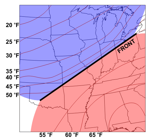
Types of Fronts
Prioritize...
At the end of this section, you should be able to define cold, warm, and stationary fronts, and identify them by their symbols. You should also be able to describe temperature trends associated with the passage of cold and warm fronts.
Read...
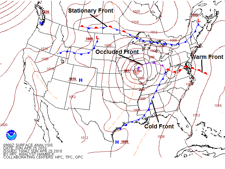
You just learned that air masses acquire the characteristics of their underlying land or water surface by remaining in place for an extended period of time, but air masses don't remain nearly stationary forever. Eventually, air masses move around, and that's when a particular location can see significant changes in the weather. Those big changes happen near fronts, and we're going to concentrate on three main types of fronts here -- cold fronts, warm fronts, and stationary fronts. There's also a fourth type of front, called an occluded front, which I'll briefly introduce, although we'll cover them more later on in the course. If you've ever looked at a surface weather map on television or online, you've probably seen the symbols for cold, warm, stationary, and occluded fronts, as shown on the surface analysis from April 25, 2010, below (I've labeled each type of front).
So, what's the difference between these types of fronts? Let's explore.
Cold fronts
Simply put, a cold front marks the leading edge of an advancing cold air mass, and is marked on a weather map as a chain of blue triangles [22] pointing in the direction of movement (toward the warmer air). Meteorologists track the winds on the cold side of the front to see if cold air is advancing. Given that a cold front marks the leading edge of advancing colder air, you can probably guess that temperatures decrease after a cold front passes a given location. Indeed, that's usually (although not always) the case. Furthermore, dew points typically drop in the wake of a cold frontal passage, since the advancing colder air masses are often drier, too.
To see what I mean, check out the graph below, from Findlay, Ohio from February 14, 2015. On this particular morning, a strong cold front, marking the boundary between continental-Polar (cP) air and continental-Arctic (cA) air was barreling through the Midwest [23]. The cold front passed through Findlay around 15Z (10 A.M. local time). Can you spot the footprint of the passing front in the temperature and dew point traces on the graph (note that local time is expressed at the bottom)?
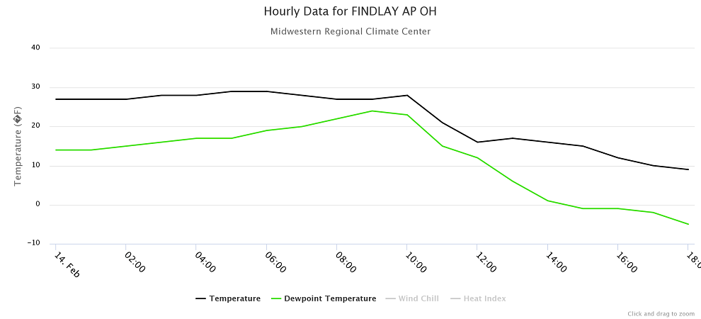
Note that at 10 A.M. local time, both temperature and dew point started a notable decline. The 10 A.M. temperature in Findlay was 28 degrees Fahrenheit, but just two hours later at noon, the temperature had dropped to 16 degrees Fahrenheit as cA air rushed in. By evening, temperatures were dropping into the single digits. Even more notable was the decline in dew points. At 10 A.M., the dew point was 23 degrees Fahrenheit, but just four hours later at 2 P.M., the dew point had dropped to 1 degree Fahrenheit (and eventually fell below zero). Remember, cA air is the coldest of the cold and the driest of the dry, so such temperatures and dew points are commonplace in cA air masses during winter.
While temperatures and dew points usually decline, and can sometimes really plunge in the wake of a cold front, occasionally temperatures don't drop much (if at all) behind a cold front. Especially during the summertime, strong solar heating behind a cold front can help warm things up and erase the temperature drop entirely.
In addition to typically bringing a drop in temperatures and dew points, the other weather associated with cold frontal passages can be quite dramatic. Cold frontal passages are often accompanied by sharp changes in wind direction, gusty winds, and precipitation. Arctic cold frontal passages like the one on February 14, 2015 are notorious for producing dangerous snow squalls (bursts of heavy snow and strong winds) in the Great Lakes region. In fact, when the Arctic cold front passed through State College, Pennsylvania later on February 14, a snow squall reduced visibility to a few hundred feet [24] (credit: Steve Seman), creating dangerous driving conditions.
Warm Fronts and Stationary Fronts
If a cold front marks the leading edge of advancing cold air, then a warm front must mark the leading edge of advancing warm air, right? It's actually not that simple. To see what I mean, take a look at the idealized weather maps below:
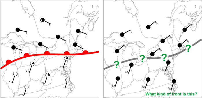
The image on the left shows a classic warm front, which is marked by a chain of red semicircles [25] directed toward the cold air. This boundary is a warm front because the cold air is retreating (winds on the cold side of the front are blowing away from the front). Why is the retreat of cold air important? Because cold air is more dense than warm air at the surface of the earth, cold air is "the boss" and can push its way around as it pleases. So, warm air can only advance if cold air retreats, and the presence of a warm front signals that cold air is retreating.
What about the boundary on the right? Is it a warm front? The winds in the warm air (south of the boundary) make it look like the warm air is advancing, but that's not the case because the cold air is not retreating: The winds on the cold side of the front are actually blowing slightly toward the front, meaning this is actually a cold front. So, determining the type of front is a matter of figuring out whether the cold air is retreating or advancing (and forecasters do so by examining the winds on the cold side of the front).
When a warm front passes a given location, temperatures tend to increase (as colder air retreats and a warmer air mass arrives). Winds often change direction, and clouds and precipitation can occur near warm fronts, too, though the weather changes are typically not as sudden and dramatic as they can be with cold frontal passages.
If cold air is neither advancing or retreating, then we have a stationary front, which is marked by a chain of alternating blue triangles and red semicircles [26]. In such a scenario, winds on the cold side of the front blow mostly parallel to the front, resulting in a frontal movement of less than five knots (fronts moving at less than 5 knots are considered stationary). Again, the winds on the warm side of the front don't really matter: Cold air is the boss, and if the cold air isn't advancing or retreating, the front is stationary.
Finally, there's a fourth type of front, called an "occluded front," marked by purple triangles and semicircles alternating on the same side of the front [27]. Occluded fronts tend to develop late in the life of low-pressure systems, and we'll talk a bit more about them later in the course. But, the bottom line for now is that the temperature and dew point changes, and the other "active" weather near fronts are really important for weather forecasting. A bad forecast for the movement of a strong front could mean huge forecast errors, and maybe you end up choosing to wear a t-shirt and shorts based on the forecast, when you really needed a sweater (brrrrr!). For now, however, let's explore just how temperature changes at a given location in the wake of a front's passage. Up next, we'll focus on the movement of warm and cold air by the wind. Read on.
Temperature Advection
Prioritize...
After you've completed this section, you should be able to discuss temperature advection and its proper units, discuss its impacts on temperature trends, and perform simple temperature predictions based on a given temperature and value of temperature advection.
Read...
We just learned about temperature trends that occur with the passage of cold and warm fronts, and now it's time to look at how those temperature trends occur. For starters, let's think really big-picture for a moment. Over polar regions in the winter hemisphere, where the sun doesn't rise above the horizon for months on end, very cold cA air masses form, and temperatures can occasionally plummet to minus 60 degrees Fahrenheit or lower! Meanwhile, over low latitudes, where sunshine remains relatively intense, daytime temperatures frequently reach the 80s or higher. The contrast between cold air at higher latitudes and warmer air at lower latitudes results in the existence of fronts (boundaries between air masses).
If air masses never moved, polar regions would get progressively colder and low latitudes would grow increasingly warmer, but the atmosphere tries to run a tidy ship, tirelessly working to smooth out large horizontal contrasts in temperature. How is this possible? Well, air masses move, and the wind carries cold air southward and warm air northward in an attempt to moderate the large north-south temperature contrasts. Meteorologists describe the horizontal movement of cold and warm air by the wind as temperature advection (the word "advection" loosely translates to "transport"). Specifically, cold-air advection (sometimes abbreviated "CAA") describes the horizontal transport of cold air by the wind, and warm-air advection (abbreviated "WAA") represents the horizontal transport of warm air by the wind.
Acting alone, warm-air advection causes local temperatures to increase with time, and is the primary cause of temperature increases associated with warm frontal passages. Meanwhile, acting alone, cold-air advection causes local temperatures to decrease with time, and it's the primary cause of temperature decreases behind cold frontal passages. Temperature advection is measured as a change in temperature per unit time, and the common units on temperature advection are degrees Fahrenheit per hour, with positive values indicating warm-air advection and negative values representing cold-air advection. To figure out the total change in temperature due to advection (in degrees F, for example), simply multiply the advection (degrees F per hour) by the time duration (hours).
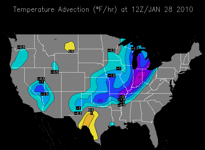
For example, check out the contour map of temperature advection above from 12Z on January 28, 2010, and imagine you're located near Cincinnati, Ohio (located on the -2 degrees Fahrenheit per hour temperature advection contour). If the 12Z temperature at Cincinnati was 30 degrees Fahrenheit, and temperature advection remained constant and was the only factor impacting temperature, what would the temperature be two hours later at 14Z? Well, if the temperature advection remains at -2 degrees Fahrenheit per hour, temperature will drop by 4 degrees Fahrenheit in two hours (-2 degrees Fahrenheit per hour multiplied by 2 hours). Subtract 4 degrees Fahrenheit from 30 degrees Fahrenheit (the 12Z temperature), and you get 26 degrees Fahrenheit. Pretty simple, right?
Granted, temperature forecasting is not really that simple. In our calculation, we assumed that temperature advection was the only factor controlling temperature, but as you already know, many factors can affect the temperature change at a particular location (such as the energy budget). Advection is only one temperature controller, so don't be surprised in reality if the observed temperature trend doesn't match up with the temperature trend from advection alone.
In many cases, the magnitude of surface temperature advection is 5 degrees Fahrenheit per hour or less, with larger values of cold-air advection sometimes observed during the throes of winter. Note in the image above that values of cold-air advection (blues and purples on the image below) reached minus 2.5 degrees Fahrenheit per hour in Indiana and western Ohio, with a very small pocket of minus 3 degrees Fahrenheit per hour over east-central Indiana. This broad area of cold-air advection was a result of northwesterly winds transporting cold air southeastward behind a cold front [30].
Lest I leave you with the impression that warm-air advection is inconsequential, keep in mind that profound warm-ups during winter over the northern tier of the nation typically result from strong warm advection. On the above image, warm advection wasn't particularly strong, however, with the strongest areas located over southwest Texas. Near the Big Bend in the Rio Grande River Valley, warm-air advection was greater than 1 degree Fahrenheit per hour, but less than 1.5 degrees Fahrenheit per hour.
Handy analyses of temperature advection aren't always available, so meteorologists are always looking at patterns of temperature and winds to get a handle on temperature advection. Take for example, the computer model forecast for temperatures and winds at an altitude of roughly 5,000 feet, valid at 21Z on March 8, 2016 (below). I've circled an area where winds were clearly predicted to blow from a region of colder air (indicated by blue shadings) toward a region of warmer air (green and yellow shadings), signifying cold advection. The impact of the cold advection (colder air surging southward) is evident in the temperature pattern, too.
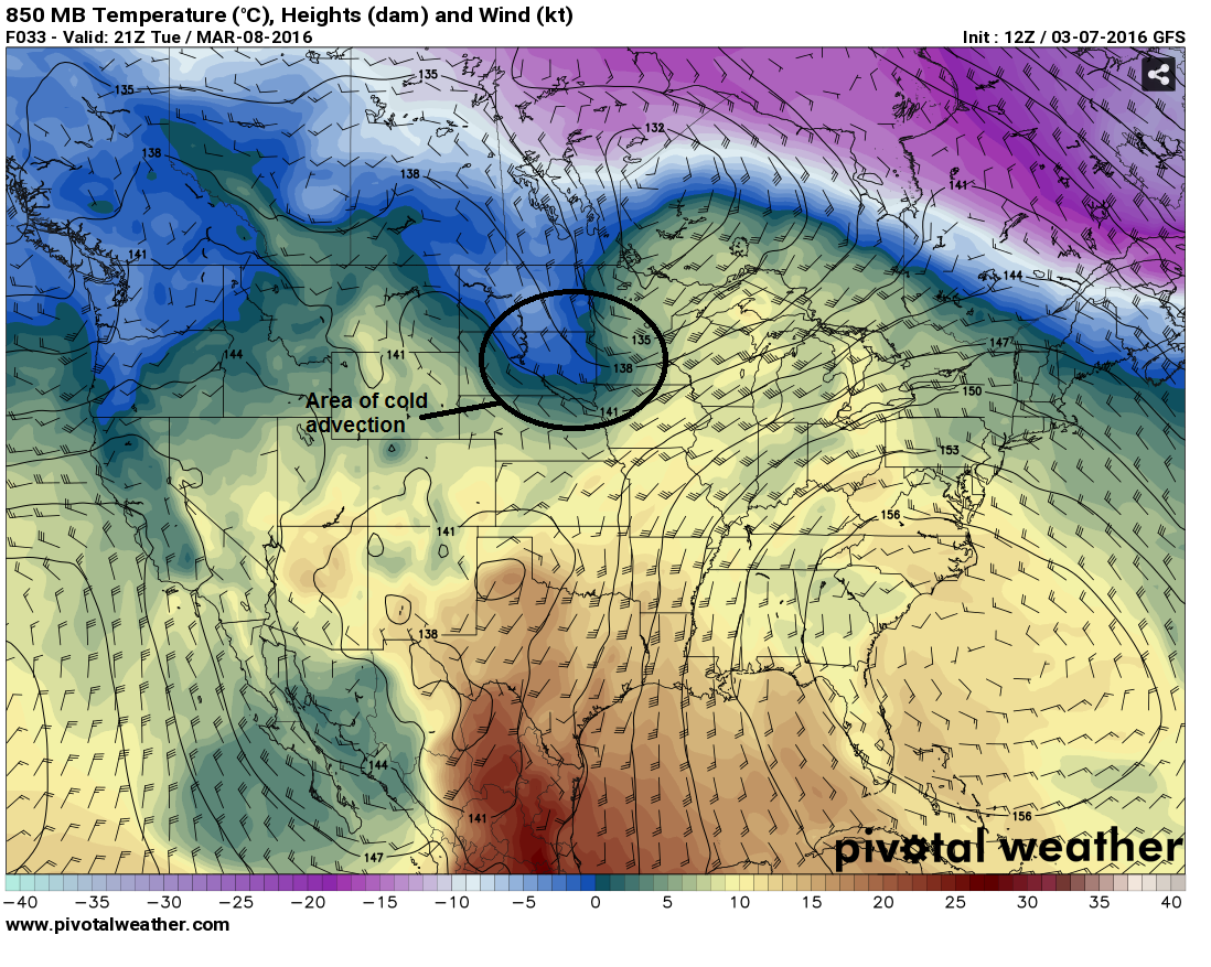
Note that other, unlabeled areas of temperature advection also exist on the map: Can you see an area of warm advection occurring north of the Great Lakes [31] where winds were predicted to blow from warmer air toward colder air? Weather forecasters couldn't have used such a map by itself to make specific temperature predictions, because temperature advection is only one factor that controls temperature. Still, when weather forecasters identify areas of warm and cold advection, they factor them into their temperature forecasts.
In fact, in the winter hemisphere, temperature advection can be the dominant temperature controller because low sun angles reduce the power of solar heating. Have you ever experienced a day when temperatures actually declined throughout the entire afternoon? Strong cold advection behind a cold front was likely a culprit, as it can overwhelm weak solar heating in the winter and cause temperatures to decrease during the daytime (recall our example from Findlay, Ohio when temperatures began falling at 10 A.M. local time [32] when a cold front passed). On the other hand, on winter nights, strong warm advection can actually cause temperatures to increase through the night, and sometimes daily maximum temperatures occur overnight, while it's dark out. Ah, the power of advection!
In the summer hemisphere, temperature advection is typically weaker, and has much stiffer competition from solar heating because higher sun angles provide more intense solar radiation. So, in the summer, cold advection can easily be overwhelmed by the strength of solar heating during the day, and temperatures can actually rise while cold advection is occurring behind cold fronts, for example (this is often true in the late spring and early autumn, too).
Finally, I should point out that the wind doesn't always produce temperature advection. Temperature advection would be "neutral" if winds transport air with equal temperature. Even in such cases, winds can still impact temperatures via mixing of mechanical eddies, as you know. So, there's no doubt that the wind can play a big role in determining day-to-day temperature changes. What other factors impact temperatures over short periods of time (during the course of a day)? We'll explore more in the next section! But, before you move on, try out the practice problems in the Key Skill box below.
Key Skill...
A key skill in this section is to make a temperature prediction based on an initial temperature and a value of temperature advection (assuming advection is the only factor impacting temperature).
Ready for some practice?
Example #1:
Assume that particular location has a current temperature of 45 degrees Fahrenheit and is experiencing a temperature advection of -3 degrees Fahrenheit per hour. If no other factors affect the local temperature, and the value of temperature advection doesn't change, what will the temperature be in two hours?
Answer: The temperature in two hours will be 39 degrees Fahrenheit. Temperature advection of -3 degrees Fahrenheit per hour for 2 hours results in a temperature change of -6 degrees Fahrenheit (-3 degrees Fahrenheit per hour multiplied by 2 hours). 45 degrees Fahrenheit - 6 degrees Fahrenheit = 39 degrees Fahrenheit.
Example #2:
Assume that particular location has a current temperature of 60 degrees Fahrenheit and is experiencing a temperature advection of 2 degrees Fahrenheit per hour. If no other factors affect the local temperature, and the value of temperature advection doesn't change, what will the temperature be in four hours?
Answer: The temperature in four hours will be 68 degrees Fahrenheit. Temperature advection of 2 degrees Fahrenheit per hour for 4 hours results in a temperature change of 8 degrees Fahrenheit (2 degrees Fahrenheit per hour multiplied by 4 hours). 60 degrees Fahrenheit + 8 degrees Fahrenheit = 68 degrees Fahrenheit.
Clouds, Water Vapor, and Temperature
Prioritize...
After reading this section, you should be able to describe how clouds and water vapor affect temperatures and diurnal (daily) temperature ranges.
Read...
In addition to the temperature controllers we've already covered, some other important factors act as temperature controllers, too. I'll start this section with a temperature controller we've already talked quite a bit about -- clouds. It's a good chance to review some concepts you've already learned, and tie things together.
Clouds
Clouds alter temperatures by both absorbing and scattering incoming solar radiation and by emitting infrared radiation. The net impact of this, as you should recall, is that all else being equal, a cloudy day is cooler than a sunny day, because clouds back-scatter much more solar radiation to space than the amount of infrared radiation that they emit toward the ground. At night, with solar radiation out of the picture, the emission of infrared radiation by clouds keeps the ground warmer than it would be on a clear night, so clouds act like space heaters (clouds emit more infrared radiation than a clear sky).
To see a quick example of this in action, check out the official daily observations from Penn State University on July 6, 2017 [33]. The day's high was 71 degrees Fahrenheit, while the day's low was 68 degrees Fahrenheit. That's only a three-degree diurnal range in temperature, which is really remarkable for July, in the midst of summer when solar heating is near maximum. In fact, it's one of the smallest diurnal temperature ranges on record for July at Penn State (records date back to 1893)!
Clouds were so persistent and thick throughout the day that the ground was absorbing less solar radiation than downwelling infrared radiation from clouds and air molecules (check out the surface radiation plot below). Still, the additional downwelling infrared didn't make up for the huge reduction in downwelling solar radiation, which helped limit the daytime high to just 71 degrees Fahrenheit (which is below normal for July).
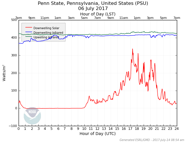
With no solar radiation to block at night, clouds took on their "space-heater" role, emitting infrared radiation toward the ground, and keeping nighttime temperatures higher than if skies had been clear. The end result? Temperatures only fell a few degrees, to a low of 68 degrees Fahrenheit.
I should point out that some other factors contributed to the small diurnal temperature range on July 6, 2017 at Penn State, but clouds were a major one. Even when clouds aren't present, however, invisible water vapor acts as a temperature controller, especially at night.
Dew Points and Nighttime Low Temperatures
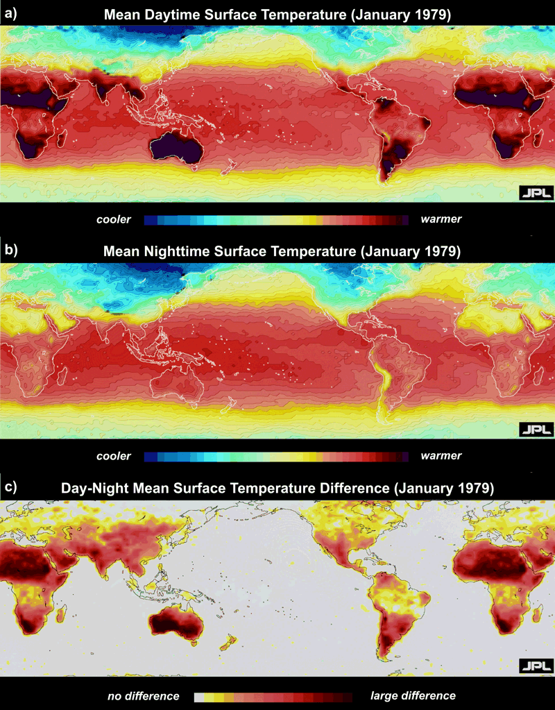
On sultry, very humid nights during the summer, lows in the 70s are common. However, in arid, desert regions, nighttime temperatures can fall considerably. For example, during the Gulf War in 1991-92, the military endured searing desert heat by day. Away from the tropical Persian Gulf, dew points were mercifully low, setting the stage for hot days to be followed by nights so chilly that soldiers needed blankets to stay warm. For further proof, check out the Sahara Desert in northern Africa in the global average temperatures for January, 1979 (below). Note that the Sahara is hot during the day (top map) and cool at night (middle map), making this desert and others the areas of the world with the greatest diurnal change (lower map).
Why do the largest diurnal temperature ranges occur in desert regions? For starters, frequently cloud-free skies during the day make for maximum solar heating and blazing hot afternoons. Furthermore, dry continental-Tropical (cT) air masses with low dew points allow for major cooling at night. For one example in the United States, El Paso, Texas frequently finds itself within cT air masses, and daytime highs near 90 degrees Fahrenheit are sometimes followed by nights with temperatures near 50 degrees Fahrenheit.
Why do lower dew points favor significant cooling at night? On the flip side, why do higher dew points favor warmer nights? Recall that dew point temperature is a way to assess the concentration of water vapor present, so low dew points equate to low concentrations of water vapor and high dew points equate to high concentrations of water vapor. To see how dew points affect nighttime temperatures, let's simplify things and assume the wind is calm, and the sky is clear.
On a night with high dew points, ample water vapor emits infrared radiation to the readily absorbing ground (remember that water vapor is the most prominent greenhouse gas), helping to slow its cooling rate. In turn, the ground, radiating at an elevated temperature courtesy of water vapor emissions, now provides a boost in infrared energy for water vapor to absorb and warm up. This radiative synergy between the ground and water vapor keeps the ground and the overlying air warmer at night, resulting in elevated nighttime temperatures. If you've ever spent time in the Southeast U.S. during summer, you've experienced this effect first hand. Temperatures during the day frequently reach 90 degrees or more in warm, moist, maritime-Tropical (mT) air masses, but high dew points (high concentrations of water vapor) often help keep nighttime lows in the 70s (even with clear skies and calm winds).
On nights with relatively low dew points (like you could find in a cT air mass, for example), reduced concentrations of water vapor limit the amount of infrared radiation that the ground receives from the atmosphere. Like you would expect when reducing a source of income, the ground's energy budget will run a much larger radiation deficit than when dew points are high. The result is that temperatures can fall like a rock toward the dew point. Indeed, on clear, relatively calm nights, the dew point serves as a reasonable lower bound for the nighttime minimum temperature (air temperatures do not measurably fall below the dew point temperature, for reasons we'll discuss later).
So, water (in the form of clouds or invisible water vapor) certainly impacts temperature. What about if we have precipitation? We'll tackle that in the next section, and we'll check out the impacts of varying ground cover (namely snow cover and urban versus rural landscapes). Read on!
Precipitation, Ground Cover, and Temperature
Prioritize...
After you complete this section, you should be able to describe how falling precipitation and the presence of snow cover affect temperature. You should also be able to discuss the effects of urbanization on temperature (the "urban heat-island effect").
Read...
If clouds and invisible water vapor can affect temperature, it stands to reason that precipitation falling from the sky (rain, snow, etc.), can also have an impact. And, indeed, it does! We'll explore that in this section, along with how ground cover (particularly snow cover and urbanization) affect temperature.
Precipitation
When precipitation falls from the clouds, the overall impact is usually a cooling of the air. Why is that? When precipitation falls, some rain drops typically evaporate, meaning that they change phase from liquid into water vapor. The process of evaporation requires energy, however, and that energy comes from the surrounding air. As you know, temperature is a measure of energy, so as energy is used for evaporation, the air cools.
You've probably experienced this when you get out of a swimming pool on a hot day -- water drops on your skin begin to evaporate, which cools your skin. You've also noticed "evaporative cooling" in action if you've ever felt a rush of cool air before a shower or thunderstorm arrives. Note that sometimes you'll hear weathercasters say that the rain cools the air, but it's really not the rain causing the cooling, it's the evaporation of rain drops. Of course, if a lot of rain falls and the ground remains wet for a time, daytime temperatures may be suppressed somewhat, because some of the sun's energy will be used to evaporate liquid water on the surface, instead of being absorbed by the ground.
I should also point out that a similar cooling can occur when other types of precipitation fall, like snowflakes. Furthermore, when enough snow falls to cover the ground, the impacts on temperature can last for days! Let's explore.
Snow Cover
A covering of snow increases the albedo of the earth's surface, which means a greater fraction of incoming solar radiation gets reflected back to space. So, during the day, the reflection of some of the sun's energy back to space means less incoming solar radiation gets absorbed by the ground. Plus, a portion of the sun's energy absorbed by the snowpack goes toward melting the snow pack, as well as evaporating meltwater. Like evaporation, melting requires energy, too, and energy used for phase changes is not available to warm the surface.
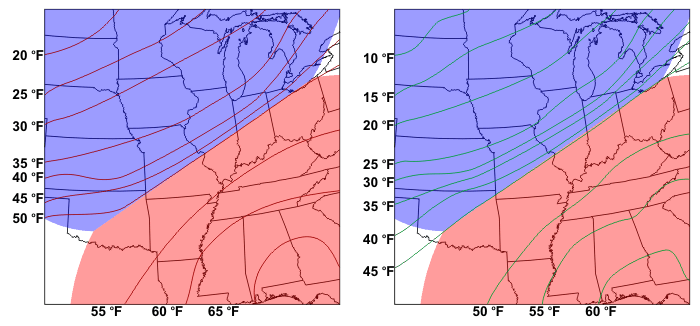
As a result of these two factors, daytime air temperatures are sometimes noticeably lower than if there had been no snow cover. In the case shown below, chilly air overlying a snow pack slowed the advance of the leading edge of much warmer air from the south and west. Notice the dramatic temperature change from western North and South Dakota (where there was little or no snow cover) to Minnesota (where many areas had at least six inches of snow on the ground).
I point out that the effect of lower daytime temperatures in regions that have snow cover is much more pronounced over the Middle West, where there is a lack of forests. In the northeastern U.S., for example, dense coniferous and deciduous forests (which have low albedos) often mask the high albedo of snow on the ground, presenting a much darker appearance to space.
The effect of snowpack on nighttime temperatures can be also be dramatic. Snow readily absorbs and emits infrared radiation, and at night, snow emits infrared radiation with similar efficiency as bare ground. So why would there be any difference in nighttime temperatures over snow cover compared to bare ground? Good question. Snow is an effective insulator, which is why people stranded in the wilderness during winter will dig a protective burrow in the snow to stay warm. In general, a snowpack of two inches or more seals off heat energy stored in the ground, and with heat energy stored in the ground effectively sealed off, the temperature of the snow surface drops precipitously on a clear, calm night. In turn, overlying air temperatures plummet, setting the stage for very low temperatures around dawn.
The bottom line is that the presence of snow cover tends to make both days and nights colder than they otherwise would be (ignoring potential impacts from temperature advection, etc.), and the underlying reasons have to do with the all-important surface energy budget! But, snow isn't the only "ground covering" that impacts the surface energy budget. Urban development, such as paving streets, parking lots, and constructing buildings, changes the surface energy budget, too, so let's look at the effects of urbanization.
Urbanization
On a sunny day with light winds, temperatures in any big city can be several degrees higher than surrounding rural areas, as paved surfaces and buildings readily absorb solar radiation due to their relatively low albedos. Moreover, heat from cars, industry and other human activities accent the warmer city environment. Meanwhile, over the surrounding countryside, higher albedos typical of vegetation, along with evaporation of water released from trees and plants (which "sweat" in a process called "transpiration") serve to help to keep the daytime rural environment cooler than its urban counterpart. The fact that urban environments tend to be warmer than surrounding suburban and rural areas is often referred to as the urban heat-island effect.
Though noticeable differences between urban and rural temperatures exist during the day, the effect of the urban-heat island stands out more dramatically at night, particularly on clear, calm winter nights that follow sunny days. This is because sunshine warms the city more than surrounding rural areas, so city temperatures are already higher than rural temperatures as the sun starts to set. The temperature gap between the warmer city and the cooler countryside widens throughout the night as concrete and buildings, which absorbed plenty of solar radiation by day, slowly and steadily conduct, convect, and radiate energy to other parts of the urban environment. So, urbanized landscapes tend to be warmer than surrounding suburban and rural landscapes, both during the day and at night.
During summer, when dew points are high, urban nights can be oppressive as water vapor absorbs large amounts of infrared radiation emitted by buildings and concrete. This absorption causes the water vapor to warm and emit even more radiation, thereby slowing or essentially halting nocturnal cooling in the city. To see an example of the urban heat-island effect in summer, check out the image below, showing temperatures in and around Philadelphia, Pennsylvania around dawn on August 5, 2015.
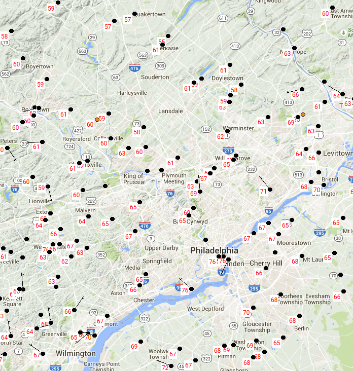
Note that temperatures in Center City Philadelphia and at the airport (just southwest of downtown along the Delaware River) were 76 degrees Fahrenheit. But, the surrounding suburbs were much cooler! Most suburbs were in the 60s, and a few toward the top of the map, such as Quakertown, were actually in the 50s. There was as much as a 20-degree difference between the suburbs and the city itself!
Clear, calm nights maximize the urban heat-island effect, and the above example was no exception (the black circles on the map are not station models, so they don't indicate cloud cover). Notably, wind reduces the temperature contrasts between urban and rural environments because as winds increase, the lower troposphere gets blended and mixed, thereby making surface temperatures more uniform (in much the same way that eddies help to diminish the effects of the nocturnal inversion). Widespread precipitation and its associated evaporative cooling also tend to equalize daytime temperatures between urban and rural environments.
That about wraps up our look at controllers of temperature. But, before we wrap up this lesson, I want to make a point about measuring temperature. As it turns out, it's not as simple as you might think, and not all measurements are trustworthy!
Measuring Temperature
Prioritize...
After completing this section, you should be able to describe proper thermometer placement to ensure accurate temperature measurements, as well as discuss reasons why common "air" temperature readings on bank thermometers, car thermometers, and "on the field" at sporting events may be inaccurate.
Read...
When deciding on a title for this section, I strongly considered, "Measuring Temperature: Why your Car Thermometer is Lying to You," but that seemed a little long. You see, measuring the temperature of the air might seem straightforward, but it's more complicated than you might think. And, while you can find many sources of temperature observations, some are certainly more accurate and meaningful than others. So, let's start with some common instruments for measuring temperature, and discuss the proper way to measure temperature. Then we'll talk about the flaws of some common temperature observations. As it turns out, you should be leery of temperatures from bank thermometers, car thermometers, and those taken "on the field" at sporting events!
Thermometers
For starters, did you know that multiple types of thermometers (instruments for measuring temperature) exist? I'll quickly describe some common types:
Liquid-in-glass thermometers [34] (credit: NOAA) have been around for more than 200 years, and haven't changed much because they're simple, inexpensive, and reasonably accurate. A liquid (usually alcohol or mercury) is free to move within a thin opening inside a glass enclosure. Temperature changes cause the liquid to either expand or contract, resulting in a change of the length of the liquid in the thermometer.
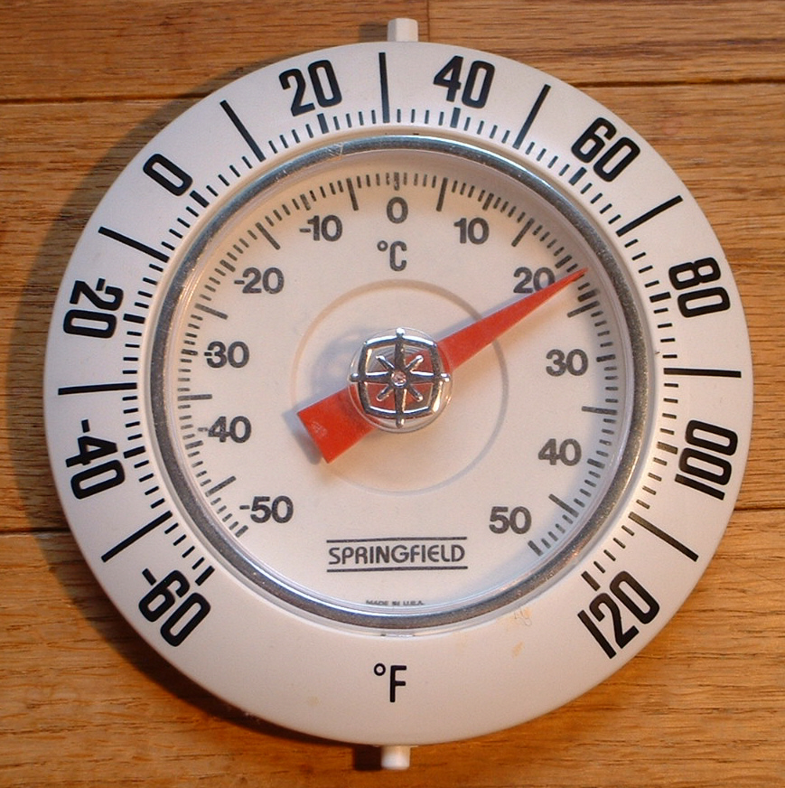
Bimetallic Thermometers, an example of which is shown on the right, are often mounted on patios or used for cooking thermometers, and don't contain any liquid. Instead, two types of metal are welded together into a strip that is coiled into a spiral (usually on the back side of the thermometer face). Temperature changes cause the strip to expand or contract unevenly, and move the pointer on the face of the thermometer.
Thermistors [35] (Credit: Ansgar Helwig [36] / CC-BY-SA 2.0 [37]) are a common breed of electrical thermometer that measures temperature using the relationship between temperature and electrical resistance. Thermistors are commonly the source of exterior temperature readings on car dashboards [38] (Credit: Steve Seman), and are also used to measure temperatures above the earth's surface when weather balloons are launched.
So, why is your car thermometer lying to you? The fact that it uses a thermistor to measure exterior temperature isn't the issue (thermistors are reasonably accurate), but it's the placement of the thermistor that's the problem. To see why, let's start with how temperatures should properly be measured.
Thermometer Placement
For temperature readings to be accurate and meaningful, thermometers should be located five to six feet above the ground (ideally not over a paved surface) to minimize the effect that the underlying ground itself might have on temperature. Thermometers also should not be exposed to direct sunlight. The bimetallic strip or "bulb" of a liquid-in-glass thermometer absorbs solar radiation more efficiently than surrounding air, so exposure to direct sunlight causes it to measure a temperature that's higher than the surrounding air. To truly measure air temperature, a thermometer should be in the shade, where the temperature of the thermometer itself should be the same as the air temperature. Finally, thermometers shouldn't be located too close to buildings since warmth from buildings (via emitted radiation or the escape of air through vents, etc.) could contaminate the temperature reading.
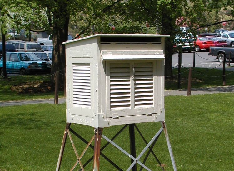
In order to accomplish proper thermometer "siting" at many of the nearly 10,000 official U.S. Cooperative Observer (COOP) Network [39] sites, thermometers are placed in "cotton-region shelters," (shown below) which are also known as "Stevenson Screens" (named after their designer, the father of author Robert Louis Stevenson). Cotton-region shelters sit roughly five feet above ground atop a base, and have open vents on the sides to allow air to flow freely through the shelter and contact the thermometers. To maximize the reflection of incoming solar radiation, cotton-region shelters are painted white, and in addition to protecting the thermometers from direct solar radiation, cotton-region shelters also protect the instruments inside from falling precipitation.
Other official temperature measurements taken via the Automated Surface Observing System (ASOS) [40], mostly located at airports, have shields that serve the same basic function of a cotton-region shelter [41], and if you have ever purchased a home weather station, its thermometer should have come with a shield to attempt to protect it from direct solar radiation, yet still allow for free air flow.
So, now that you know how temperature should be measured, what's the problem with temperatures measured by bank thermometers, car thermometers, or "on the field" at sporting events? For starters, bank thermometers are often housed very close to (or are attached to) buildings. Furthermore, they're often exposed to direct sunlight, or are encased in a dark-colored shelter, which maximizes the absorption of solar radiation. So, when you see a really high temperature on a bank thermometer on a sunny day, don't buy it! The thermometer is likely not sited properly, and is in an environment causing it to read much too warm.
What about your car thermometer? In most cars, the thermistor is located behind the car's front grille, which means it is influenced by the temperature of the car's engine, exhaust from surrounding vehicles, as well as the underlying road. Most automobile grilles are only a couple of feet off the ground, which is close enough to the hot pavement (which is efficiently emitting radiation), to additionally warm the thermistor's environment. As a result, like bank thermometers, your car's external temperature reading is often too high, especially when you're in stop-and-go traffic on a sunny day. When you're traveling down the road at highway speeds, the fast flow of air near the thermistor does help make temperature readings a bit more accurate and meaningful, although still not ideal. The temperature readings should also be a bit more accurate at night or on cloudy days (although again, still not ideal). Despite their shortcomings, however, a car's thermistor can give you a good idea about temperature changes while you travel (temperature increases and decreases as you drive up and down mountainous terrain, for example).
Finally, what about temperatures measured "on the field" at sporting events? Often, they're too high, as well. For starters, the thermometers are often exposed to direct sunlight. Furthermore, placing a thermometer on the field means that temperature is being measured inches above the ground, where conduction can make it blazing hot. Remember that temperatures can approach 140 degrees Fahrenheit in a thin layer of air in contact with the ground on a sunny, summer day thanks to conduction. Darker artificial playing surfaces only exaggerate the problem, since they more readily absorb solar radiation (similar to how paved surfaces more readily absorb solar radiation compared to grassy surfaces). Either way, temperatures measured on the playing surface are not representative of air temperatures five or six feet above ground, where official measurements are taken.
My final comments in our lesson on temperature are practical ones: If you ever invest in a home weather station, and you want to ensure accurate and meaningful temperature measurement, place your thermometer away from any buildings, five to six feet above ground (ideally not over a paved surface), and make sure it's shielded from direct solar radiation, yet can get as much open air flow as possible. Furthermore, don't buy into the temperatures displayed on car or bank thermometers. They're not sited properly and are usually lying to you!