Lesson 10: The Human Impact on Weather and Climate
Motivate...
So far in the course, our focus has been on weather. The topics we've covered generally, in one way or another, can be applied to day-to-day weather observations, forecasts, or safety. But now, we're going to shift away from issues of short-term weather and examine issues related to longer-term climate. We talked a bit about climate previously, in terms of long-term averages and extremes of temperature and precipitation for a given location (over the course of a few decades to a century or so). In this lesson, however, we're going to think bigger picture and examine climate on the scope of centuries or longer over the entire globe.
On these larger time and space scales, climate is not static; a variety of natural factors cause the climate to change. For example, millions of years ago, when dinosaurs roamed the earth, our world was likely warmer than it is now. In fact, evidence suggests that during that time, Earth was warm enough that it had no polar ice caps or ice sheets [1] at all. On the other hand, Earth has gone through "ice ages [2]," when it has been cold enough that ice sheets have expanded well outside the polar regions. In fact, the Great Lakes [3] formed more than 10,000 years ago when a huge continental ice sheet melted as Earth warmed.
So, there's no doubt that Earth's climate can change dramatically (albeit very slowly) due to natural factors. But, what about recent climate changes? Are they all natural? More than a century of research overwhelmingly indicates that human activities are contributing to climate change, too, and the potential impacts have sparked a fiery debate about how society should adapt and evolve. I suspect that most everyone has seen or read stories about climate change or global warming, and if you search around online, you can find articles with a wide range of takes. There's a lot of "noise" about climate change out there, and if you're uninformed about the basic science, it can be hard to separate fact from fiction.
You won't be a climate-change expert by the end of this lesson, but you should be able to better cut through the "noise" and separate climate-change fact from climate-change fiction. We'll explore the basic physics of climate change, the questions currently being asked by researchers, and some of the challenges that scientists face when trying to answer these questions. Specifically, we'll examine the major natural factors that can impact climate, and we'll examine a number of ways that human activities impact weather and climate on local to global scales. "Global warming" caused by an enhanced greenhouse effect will be one of our main topics, but as you'll see, the role that humans play in weather and climate is much broader than that. We'll also cover computer modeling of global climate, connections between climate change and extreme weather, and see how society has dealt with the effects of chlorofluorocarbons on ozone.
I think that most people would agree on the importance of these topics and in making wise decisions concerning our future as stewards of our planet. I hope that in the end you will be enriched by this lesson, and learn more about a topic that will likely remain in the forefront of our culture for many years to come. Let's get started by looking at some ways that human activity impacts local weather and climate.
Local Human Impacts
Prioritize...
When you finish this section, you should be able to discuss the impacts of urbanization and deforestation on temperature, precipitation, albedo, and local hydrology (local evaporation, drainage and flooding issues in cities, etc.).
Read...
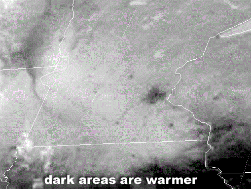
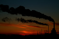
Perhaps you're skeptical that human activities can alter weather and climate. After all, the concept of global climate change is complex and may not be obvious to an individual on a daily basis. So, let's start local with some ways that humans alter their local environments. For starters, take a look at the infrared satellite image on the right from 1745Z on March 27, 2001. Since this is a conventional infrared satellite image, we're looking at temperature as determined by emitted infrared radiation, and since there were no clouds over Minnesota at this time, you're seeing the temperature of the surface of the earth (darker areas are warmer). Note the relatively large dark splotch in eastern Minnesota, along with a number of other tiny dark "dots" scattered about the landscape. Any ideas about what they are?
These local warm spots aren't random. They're cities [5], the largest of which is the Minneapolis / St. Paul metropolitan area. Smaller cities, like St. Cloud, Rochester, and Mankato are also evident. Essentially, you're seeing the results of the urban-heat island effect that you learned about previously. Recall that on a sunny day with light winds, temperatures in any big city can be several degrees higher than surrounding rural areas, as paved surfaces and buildings readily absorb solar radiation due to their relatively low albedos. Moreover, heat from cars, industry and other human activities accents the warmer city environment. Meanwhile, over the surrounding countryside, higher albedos typical of vegetation, along with evaporation of water released from trees and plants (which "sweat" in a process called "transpiration") serve to help to keep the daytime rural environment cooler than its urban counterpart.
Though noticeable differences between urban and rural temperatures exist during the day, the effect of the urban-heat island stands out more dramatically at night, particularly on clear, calm winter nights that follow sunny days. This is because sunshine warms the city more than surrounding rural areas, so city temperatures are already higher than rural temperatures as the sun starts to set. The temperature gap between the warmer city and the cooler countryside widens throughout the night as concrete and buildings, which absorbed plenty of solar radiation by day, slowly and steadily conduct, convect, and radiate energy to other parts of the urban environment. So, urbanized landscapes tend to be warmer than surrounding suburban and rural landscapes both during the day and at night.
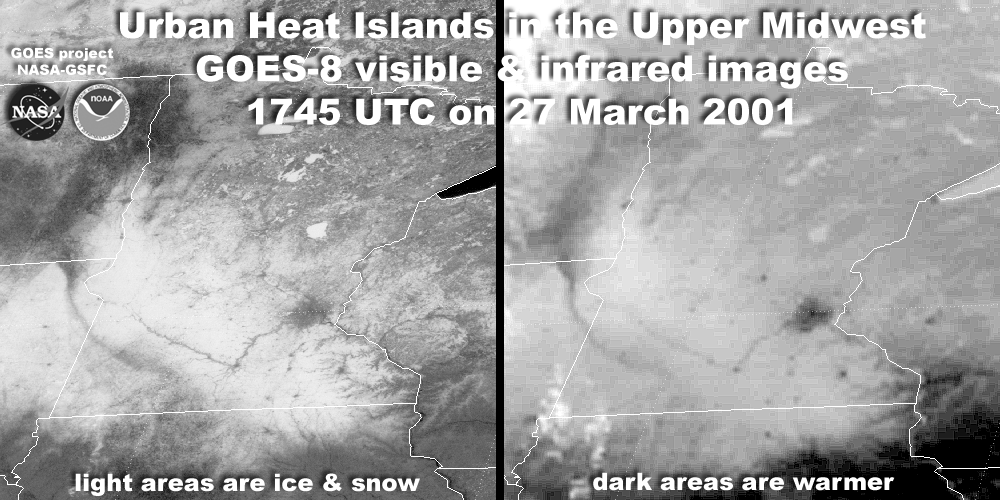
The urban-heat islands depicted on the infrared satellite image above were particularly obvious in this case because the surrounding countryside was covered by snow, as you can see on the simultaneous side-by-side visible and infrared satellite images below. On the visible satellite image, surrounding areas appear white because of the high albedo of snow, but much of the snow has melted in the warmer urban environments, revealing their lower albedo.
The bottom line is that these satellite images appear the way they do because of alterations to the local environment by humans. They're a clear demonstration of a local impact that human activity can have on weather and climate. But, localized warmth and lower albedo aren't the only changes that occur amongst the concrete jungles of cities. Several research studies indicate that rainfall tends to be enhanced downwind of a major metropolitan area, especially during summer when winds are relatively weak. This set-up paves the way for urban heat islands to act as local "hot spots," which promote instability and rising currents of air. In a nutshell, buoyant air over the urban environment begins to rise and form tall cumulus clouds, which eventually develop into showers and thunderstorms as they drift downwind from the city.
One of the first and most comprehensive attempts to measure an urban area's effect on precipitation was METROMEX, the METROpolitan Meteorological EXperiment, which was a multi-year research project that began in 1971 at St. Louis, Missouri. The results of METROMEX indicated that average summertime rainfall and the frequency of thunderstorms and hail increased as much as 25% in a broad area around St. Louis, which extended 40 miles east of the city. Less extensive studies around the Chicago and Washington, D.C., metropolitan areas produced similar results. For a visual of the impact that cities can have on convection, check out the image of lightning flash density (number of strikes per square kilometer per year) around Houston, Texas from 1989-2001 (below).
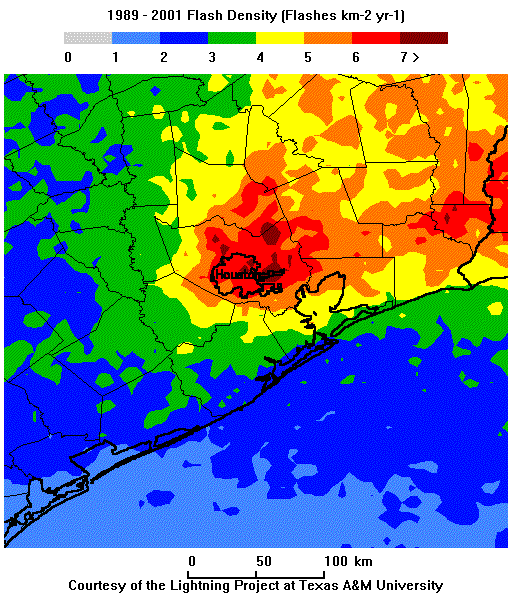
Note that lightning strikes were most common just downwind (east) of the city. In fact, this study showed that there was a 45 percent increase in flash density just downwind (east) of the city compared to nearby suburbs upwind of Houston (primarily west of the city). These findings were consistent with studies of cloud-to-ground lightning strikes around 16 Midwestern cities, which showed that the frequency of lightning strikes downwind of cities was, on average, about 40 percent higher than the frequency of lightning in rural areas upwind from each city. The increased frequency of thunderstorms just downwind of major cities also goes along with higher rainfall rates compared to rural upwind locations.
But, changes from urbanization aren't limited to temperature and precipitation. Changes in the landscape also affect what happens to precipitation after it falls. By removing vegetation and soil, and replacing it with largely impervious paved surfaces and drainage networks, more water runs off directly into rivers and streams instead of being partially absorbed by soil and plants. The increase in runoff means that urban streams tend to rise more quickly and are more prone to flooding than rural streams during episodes of heavy rain. So, changes in land use and development can be important factors for local weather and climate! Even if land is not urbanized, however, land use changes can still have important impacts. Let's look at the impacts of one more important land use change -- deforestation.
Deforestation
Deforestation refers to the destruction of forests to make land available for other uses like agriculture, pastures, or urban development, and it has a wide variety of global and local impacts. Here, I'm going to focus on the local impacts on temperature and the hydrologic cycle. For starters, the trees and other plant life in forests tend to hoard water and limit local warming because some of the sun's energy is used to evaporate water in the forested environment. On the other hand, in deforested areas, more water directly runs off into streams and rivers, which leaves less water to evaporate from the ground. With less moisture to evaporate, more of the sun's energy can work to warm the surface, which in turn warms the air above.
This effect is especially profound in cases where tropical rain forests are destroyed. NASA scientists estimate that clearing a rain forest to bare ground can increase local temperatures by as much as 3 degrees Fahrenheit, which translates to a huge impact on local climate. Furthermore, these forests in equatorial regions are very humid and rainy, and thus, they transfer a lot of water back to the atmosphere through evaporation and transpiration. The abundance of water vapor in the atmosphere, in turn, favors the formation of additional clouds and precipitation. As an extreme case, in the Amazon Basin, estimates suggest that trees help generate about half of the rain that falls there! So, destroying rain forests can significantly reduce the amount of rain that falls locally.
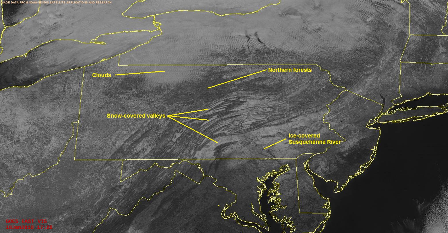
In addition to the impacts on moisture that I just described, deforestation also increases the albedo of the earth's surface, which in turn decreases the amount of solar energy absorbed by the surface and ultimately transferred into the lower troposphere. The difference in albedo between forested areas and non-forested areas is evident on visible satellite imagery on a perfectly clear day, as you can see in this example from 18Z on October 2, 2017 [6] (note that the northern forests and forested mountains of Pennsylvania appear darker than the agricultural valley regions). The difference in albedo between forested and non-forested areas is even more stark during winter when there's snow on the ground, as the visible satellite image from around 1730Z on January 18, 2018 (below) shows.
In most areas, estimates suggest that deforestation actually causes a slight cooling because the decrease in absorbed solar radiation caused by increased albedo slightly outweighs the impacts of local drying (more of the sun's power being used for warming instead of evaporation). Tropical rain forests, of course, appear to be an exception because changes to the local hydrologic cycle from deforestation are so huge (a major reduction in evaporation) that warming tends to win out.
Summary
- Urbanization tends to warm the local climate (urban heat islands) and decrease local albedo (which increases the absorption of solar radiation).
- Large cities tend to increase the precipitation that falls (typically via showers and thunderstorms) immediately downwind of the city.
- Paved surfaces and drainage systems increase water runoff directly into streams and rivers (since no water is being absorbed by plants and soil), which can make urban streams more prone to rapidly rising water and flooding.
- Deforestation also increases water runoff into rivers and streams, which locally reduces the amount of water that re-enters the atmosphere via evaporation and transpiration. This local drying of the atmosphere reduces local rainfall (most notably in rain forests), and contributes to localized warming in rain forest regions.
- Deforestation also increases the albedo of the earth's surface, which decreases the absorption of solar radiation, leading to an overall slight cooling effect in most areas (outside rain forests).
So, there's no doubt that changing forests into fields or cities affects the exchange of energy and water between the surface and the atmosphere, which alters local climates. And, I haven't even really touched on the consequences for local ecosystems and biodiversity. The tremendous variety of species of plants and animals in rain forests is unmatched in North America. Many plants that grow in rain forests contain substances that are used to develop prescription medications, so destruction of these forests has far-reaching effects that go well beyond local weather and climate.
Remember that the weather and climate impacts of land-use changes that I discussed in this section are ultimately local (I didn't address their larger-scale impacts). But, what about the bigger picture? Can human activity affect weather and climate on a global scale? We'll begin addressing that issue up next, and to do so, we first must briefly discuss naturally-occurring factors that can alter global climate. Read on.
Natural Drivers of Climate Change
Prioritize...
After completing this section, you should be able to describe natural climate changes resulting from the sun, changes to Earth's orbit, ocean cycles, and volcanoes (and other geologic activity). Specifically, you should be able to discuss how each can warm and/or cool Earth and over what time scales the changes are noticeable.
Read...
If we're going to analyze impacts of human activity on global weather and climate, we need to first have an understanding of what natural factors contribute to changes in the climate on a global scale. After all, remember that at previous times in Earth's long history, it's been warmer than it is now (during the time of the dinosaurs, for example, when no ice caps or ice sheets were present), and it's been cooler than it is now (during various ice ages, for example). So, climate changes can obviously happen with or without human influence.
In this section, I'm going to briefly summarize four major natural factors that contribute to climate changes on a global scale, and describe how these factors have contributed to global temperature changes from the early 1900s through today. The factors I'll focus on are the sun, changes to Earth's orbit, ocean cycles, and volcanoes (and other geologic activity).
The Sun
The sun is obviously the largest external source of energy for the earth. Our planet wouldn't be inhabitable without warmth from the sun! But, did you know that the energy output from the sun isn't constant? The sun is a "variable star," which means that its brightness changes in time. When the sun emits more energy, the earth warms up a bit. When the sun emits less energy, the earth cools a bit. Not surprising, right? In 1843, scientists discovered a roughly 11-year cycle in solar output by tracking sunspot activity (these cycles have since been reconstructed all the way back to 1755). During this cycle, the amount of energy emitted by the sun varies, as does its sunspot activity, as demonstrated in the image below showing the varying appearance of the sun each year from 1996 to 2006, during Solar Cycle 23 (the 23rd cycle since 1755).
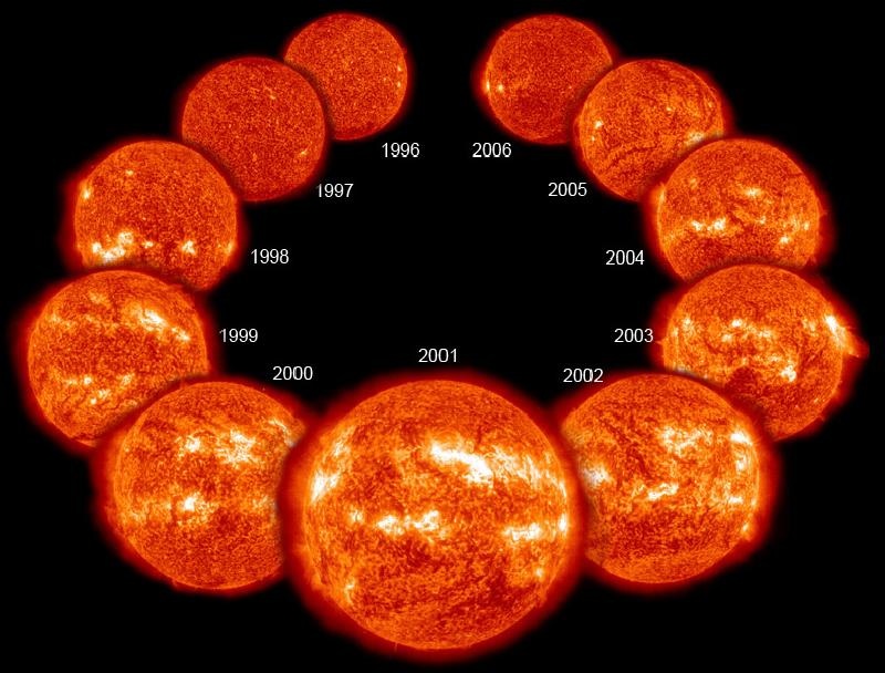
Ultimately, when the sun has lots of sunspots (dark areas) and bright spots (called faculae), solar energy output increases overall. On the other hand, when few sunspots and faculae are present, solar energy output decreases overall. The variation in solar energy during these cycles isn't large, however, only varying by about 0.1 percent.
Solar energy output also varies gradually on longer time scales. In other words, its peak intensity during each solar cycle is not the same. During most of the 20th century, the sun demonstrated a gradual increase in intensity, but starting around 1970 or so, the intensity of solar output has gradually decreased (a trend that you can see in this NASA graph of sunspot number during Solar Cycles 22-24 [8]). That means long-term solar trends favored a slight warming of the earth from the early 1900s up until about 1970, but have favored a slight cooling of the earth overall since then.
Changes to Earth's Orbit
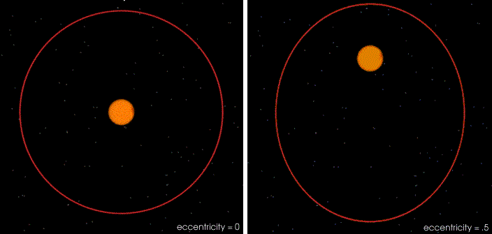
Like the sun, Earth's orbital characteristics also aren't constant, and changes to Earth's orbit are important for climate because its orbital characteristics determine how solar energy gets distributed across the surface of the planet. For starters, the shape of Earth's orbit changes very slowly with time, varying between elliptical and a nearly perfect circle, as illustrated by the images below. These changes in the "eccentricity" of earth's orbit occur in a cycle that lasts about 100,000 years.
Furthermore, Earth's tilt on its axis isn't perfectly constant. Right now, it's about 23.5 degrees, as you learned in a previous lesson, but over the course of about 40,000 years, it varies between 22.1 degrees and 24.5 degrees [9] (credit: NASA GSFC). Earth also wobbles a bit as it spins on its axis, similar to a spinning top (for a visual, check out this video of a spinning top [10] starting at about 10 seconds in). This "precession [11]" (credit: NASA GSFC) occurs in a cycle that completes itself approximately every 26,000 years.
As you know, Earth's tilt on its axis is the reason for the seasons, so precession and changes to its tilt can dramatically change the seasonality (contrasts between winter and summer) on Earth. But, over really long time-scales, orbital changes can also impact Earth's average temperature and are connected to past ice ages (ice coverage tends to grow during periods when Earth's orbital characteristics favor long, cold winters and short, relatively cool summers). The key is to remember that these changes are really slow: they occur over tens of thousands of years. So, their impact on climate changes of the past century or so are largely negligible.
Ocean Cycles
Earth's vast oceans aren't static, either. Large ocean currents speed up and slow down over time, and various portions of the oceans have their own warming and cooling cycles. We'll learn about one of these cycles that you may have heard about, which involves El Niño and La Niña, coming up in a later lesson. Because the oceans exchange moisture and energy with the atmosphere, these ocean cycles can affect the atmosphere, too. What happens in the ocean doesn't stay in the ocean!
But, it's important to note that ocean cycles don't add or subtract energy from the earth-atmosphere system overall; they simply redistribute energy within the system itself. In other words, when ocean cycles result in a net transfer of energy into the atmosphere (causing atmospheric warming), the oceans themselves lose energy. The opposite is true, too. When ocean cycles result in a net transfer of energy from the atmosphere into the ocean, the atmosphere loses energy and cools. The end result is that these cycles cause opposite impacts in the atmosphere and ocean. When one gains energy and warms, the other loses energy and cools overall. These cycles can result in atmospheric warming or cooling (usually a few tenths of a degree Celsius or less) that tends to last from months to a few years at a time, although a few ocean cycles last longer (generally several decades). Over the long term (the span of a century or more), these cycles don't really change global atmospheric temperature much because they result in shorter-term warming and cooling that over time tend to cancel each other out.
Volcanoes and Geologic Activity
Volcanoes and related geologic activity can impact global temperatures in a couple of ways. First, very powerful volcanic eruptions spew ash, dust, and sulfur particles all the way up in to the stratosphere, where they can linger for months (or longer) and drift around the entire globe. Furthermore, sulfur gases can react with water vapor in the stratosphere to form a haze of sulfuric acid droplets that spreads around the globe at high altitudes. The byproducts of these volcanic emissions block out some incoming solar radiation, which works to temporarily cool the troposphere for a period of up to a few years. To see what I mean, check out the composite changes in surface temperature in the years after five major volcanic eruptions (Krakatau in 1883, Santa Maria in 1902, Agung in 1963, El Chichon in 1982, and Pinatubo in 1991).
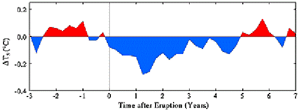
The global temperature drop after the Mount Pinatubo eruption in 1991 was about 0.6 degrees Celsius, and lasted for about two years, for example. But, such cooling is temporary. On the other hand, volcanic eruptions also emit greenhouse gases like carbon dioxide and methane, which you learned about previously. These gases actively absorb and emit infrared radiation, contributing to the so called "greenhouse effect," which warms the earth. These gases also can seep out of the earth in geologically active areas, too (even when volcanoes aren't erupting). But, these geologic sources add only a tiny amount of greenhouse gases to the atmosphere (much less than, say, the burning of fossil fuels), so over the course of the past century, while individual volcanic eruptions have caused temporary dips in global temperature, the net impacts of geologic activity on global temperature have been minor.
So, over the course of the past century, factors like volcanoes / geologic activity and ocean cycles have been responsible for short-term spikes and dips in global temperature lasting a few months to a few years, but little change over longer periods of time. Orbital changes are so slow to occur that their impacts are largely negligible over the course of a single century. Changes in solar output contributed to some warming up until around 1970, but have favored cooling since then. The combined effects of these natural drivers of climate change would likely lead to a slight warming until about 1970, followed by a slight cooling thereafter (ignoring shorter-term spikes and dips). But, that's not what has actually happened [12] -- Earth has continued warming in recent decades. Why? We haven't yet covered other climate-change drivers, namely the ones driven by human activities. We'll do that next. Read on.
Anthropogenic Climate Change
Prioritize...
After completing this section, you should be able to define anthropogenic and discuss anthropogenic contributions to climate change. Specifically, you should be able to identify anthropogenic greenhouse gases that are increasing in concentration, discuss their sources, and discuss the impacts of these increased concentrations. You should also be able to discuss anthropogenic sources of sulfur aerosols and the impacts of increased concentrations.
Read...
The natural drivers of climate change that we covered in the last section don't tell the whole climate-change story, because they can't account for the observed temperature changes that have occurred since the late 1800s [12] (especially the warming in the last 50 years or so). So, there must be other factors affecting Earth's climate. While you've already seen some ways that humans can affect weather and climate locally, now we're going to look at ways that human activities can affect climate on a global scale.
These human-caused changes to the climate are referred to as "anthropogenic climate change" (anthropogenic means human caused). A major component of anthropogenic climate change is global warming, which refers to a gradual warming of the earth caused by an unnatural (human-induced) increase of the greenhouse effect, as concentrations of greenhouse gases increase primarily from the burning of fossil fuels (coal, oil, and natural gas). To explore this contribution to climate change, let's first quickly review the greenhouse effect.
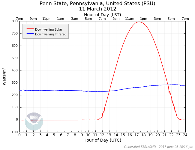
Remember that so-called "greenhouse gases," such as water vapor, carbon dioxide, methane, and nitrous oxide absorb and emit infrared radiation, and the contributions of downwelling infrared radiation from greenhouse gases to warming the planet are called the greenhouse effect. If you recall from our study of energy budgets, the emissions from clouds and invisible greenhouse gases contributed to the "downwelling infrared" traces on our energy graphs, like the one below from Penn State University. This particular graph came from a perfectly sunny day on March 11, 2012, so the downwelling infrared contributions primarily came from greenhouse gases.
Without greenhouse gases, Earth would be much, much colder; its average temperature would be nearly 60 degrees Fahrenheit lower! The greenhouse effect is natural, and the warming it causes is essential to sustaining life as we know it on Earth. But, since the Industrial Revolution in the late 1700s, humans have been burning carbon-rich, "fossil" fuels like coal, oil, and natural gas on a large scale, releasing additional carbon dioxide into the atmosphere. Emissions of carbon dioxide grew very slowly and gradually in the 1800s, but with population growth and still a heavy reliance on fossil fuels today, global carbon dioxide emissions have grown [13] (Credit: U.S. Department of Energy) more than ten times from 1900 through recent years. The percentage of the world's energy coming from fossil fuels has dropped a bit in recent decades with the growth of nuclear power, wind, solar, and other renewable energy sources, but still remains at nearly 80 percent.
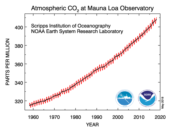
Before the Industrial Revolution, the atmospheric concentration of carbon dioxide was around 280 parts per million, but through the burning of fossil fuels like coal, oil, and natural gas, humans have added carbon dioxide to the atmosphere. The concentration of carbon dioxide in the atmosphere now exceeds 400 parts per million, and you can see the upward trend in atmospheric carbon-dioxide concentration since the late 1950s in the data from the Mauna Loa Observatory [14] in Hawaii below.
Remember that carbon dioxide is the second most important greenhouse gas (behind water vapor) so increasing its concentration gradually results in a stronger greenhouse effect, which means more downwelling infrared being emitted toward Earth, causing the planet to warm additionally (causing a "global warming"). The anthropogenic increase in the greenhouse effect in particular helps explain Earth's warming since roughly 1970, during a time when the major natural drivers of climate change have favored a slight cooling.
While global warming from a strengthening of the greenhouse effect didn't start making mainstream news until the late 1980s and 1990s, it's hardly a new idea scientifically. As early as 1903, a Swedish scientist named Svante Arrhenius (a Nobel Prize winner in chemistry) noted that the burning of carbon-rich coal would likely lead to a warming of the planet because of increased carbon dioxide concentrations. His ideas were largely ignored at the time, not because other scientists doubted the greenhouse effect (indeed, knowledge of the greenhouse can be traced back to Eunice Foote's research in 1856 [15] and John Tyndall's work in 1859 [16]), but because of incomplete knowledge of Earth's carbon cycle, which we'll study more in depth shortly.
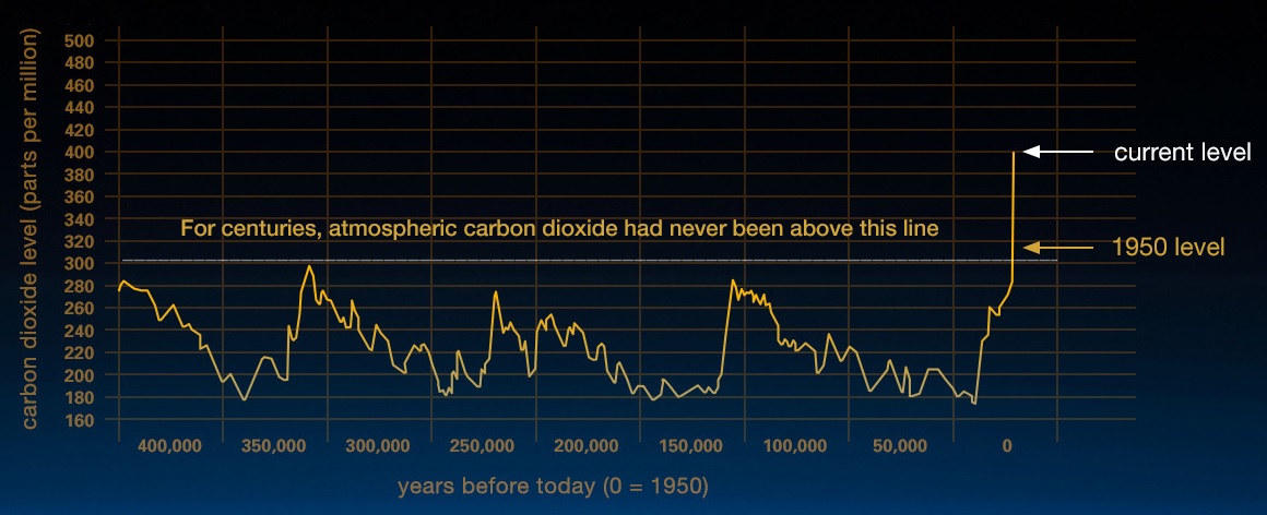
While the concentration of atmospheric carbon dioxide varies naturally (like many aspects of the earth system), studies of historical atmospheric composition based on air bubbles trapped in ice cores reveal that current-day concentrations of carbon dioxide are unprecedented in hundreds of thousands of years. As you can see from the graph below, carbon dioxide concentrations largely remained between roughly 180 parts per million and 300 parts per million for hundreds of thousands of years...until about 1950. Since then, carbon dioxide concentrations have continued to climb, and are now above 400 parts per million thanks in large part to the burning of fossil fuels.
While increased carbon dioxide concentrations from human activities get a lot of attention when it comes to anthropogenic climate change (for good reason), human impacts on the climate don't stop there. For starters, carbon dioxide isn't the only greenhouse gas that has increased in concentration. Atmospheric concentrations of methane have more than doubled since pre-industrial times, primarily from decomposition of organic matter (such as carbon-based garbage in landfills), agricultural and biological processes (livestock digestion and rice cultivation are two examples), and the production and distribution of fossil fuels. Nitrous oxide has also increased in concentration since pre-industrial times, mostly through agriculture (adding nitrogen to soils, which eventually gets released into the atmosphere), and through other various industrial activities that involve burning solid waste and fossil fuels.
I should add that while methane and nitrous oxide concentrations have increased from human activity, their concentrations remain much smaller than the concentration of carbon dioxide. However, each molecule of methane and nitrous oxide is actually more efficient at absorbing and emitting infrared radiation than is carbon dioxide, so while their concentrations are extremely small, we can't ignore these other greenhouse gases. Sometimes in our atmosphere, a little bit of something goes a long way!
The net result of the increases in greenhouse gases from human activities is that the atmosphere now retains about one percent more energy compared with pre-industrial times. That may not seem like much, but the increase in emission of downwelling infrared radiation helps explain the nearly 1 degree Celsius (1.8 degrees Fahrenheit) of warming that has occurred globally since 1970.
Interestingly enough, not all aspects of human activity, and the burning of fossil fuels in particular, lead to warming on a global scale. Burning coal, oil, and natural gas is also a source of air pollution, which includes sulfur gases and tiny solid particles (soot, ash, etc.). Additionally, sulfur gases (especially sulfur dioxide) can react with other substances in the atmosphere to form tiny liquid drops or solid particles (aerosols), which can serve as cloud condensation nuclei. The net effect of these aerosols (and any subsequent cloud formation) is to increase the amount of solar radiation that gets scattered back to space, which reduces the amount absorbed by Earth's surface. So, the aerosol byproducts of industrial activities actually favor a cooling of the planet.
Scientists estimate that during the first half of the 20th century, much of the human-induced warming from increasing greenhouse gases was actually offset by decreased incoming solar radiation because of aerosols. But, with many governments more heavily regulating air pollution by the 1970s (the Clean Air Act of 1970 [17] in the United States is a good example), aerosols are having less of a cooling effect in recent decades. The reduction in sulfur dioxide in the atmosphere is directly beneficial to human health (air pollution is bad for your respiratory system), but it has increased the rate of earth's warming due to human activities, as greenhouse gas emissions have become the dominant factor.
Summary
The video below (8:07), which features Dr. Katharine Hayhoe, Director of the Climate Science Center at Texas Tech University, provides a nice summary of how scientists have come to realize that recent global warming is driven by human activity. It combines many of the topics we've discussed in the last two sections. Before watching, however, I want to offer one caveat: In an effort to simplify the topic, Dr. Hayhoe uses common analogies for greenhouse gases, likening them to blankets that "trap heat." Remember that this is an oversimplification, and doesn't really describe how these gases keep the earth warmer. As you've learned, these gases are important because they actively absorb and emit infrared radiation. In other words, they're more like space heaters than a blanket (which warms you up by limiting convection away from your body). As long as you keep that in mind, I think the video will help you put the pieces of natural and anthropogenic climate change together.
KATHERINE HAYHOE: All this worry about warming when it's just a natural cycle. Climates always change. And today is no different, right? If we want to understand why the earth is warming, it just makes sense to start by taking a closer look at all the natural factors that have caused climate to change in the past. Are they to blame for the current warming? Or do these natural suspects have an alibi this time?
Let's start with the sun. We get nearly all our energy from our nearest star. And we know that the sun's energy tends to fluctuate a bit over time, because the sun is actually a variable star. When its energy goes up, the earth gets a bit warmer. When the sun's energy goes down, the earth gets a bit cooler.
What do we see then when we track how the sun's energy has changed over time? Observations show a repeating 11-year cycle that's correlated with sunspots and solar activity. But observations also show a small long-term increase in the sun's energy through the last century, that is until we hit the 1970s. Since then, the sun's energy has been going down, not up.
So over the first part of the 1900s, increasing energy from the sun did contribute to some of the warming of the planet, though not much. But over the last 40 years or more, the opposite has been happening. If the Earth's temperature were controlled primarily by changes in the sun's energy, we would have been cooling, not warming. So the sun can't be causing us to warm now. It has a perfect alibi.
What about volcanoes? Volcanoes can affect climate in two ways. First of all, when they erupt, they can spew enormous amounts of soot and dust and ash into the atmosphere. If the volcano is powerful enough, that dust and ash can reach all the way up into the stratosphere where the particles can circle the globe for months and even years.
But volcanic ash and dust doesn't warm the Earth. Instead, it acts like a giant umbrella, reflecting the sun's energy back to space, making the earth cooler. So, clearly, volcanic eruptions can't be responsible for the warming.
What's the second way that volcanoes can affect climate? Well, in geologically active areas like Sicily or Yellowstone National Park, powerful heat-trapping gases like carbon dioxide and methane can seep out from deep inside the Earth's crust. This can occur during volcanic eruptions. But the majority of it actually happens through what they call mud volcanoes, or mud domes.
We know that these gases are an important part of the Earth's natural blanket that keeps us nearly 60 degrees Fahrenheit or over 30 degrees Celsius warmer than we would be otherwise. So are the heat trapping gases that are seeping out of the ground in these areas responsible for our current warming? Well, no. It turns out regular volcanoes, little mud domes, and other geologic activity produce around 1% of the carbon dioxide and less than 15% of the methane that we humans produce every year. So while it's true that long-term geologic activity can warm the planet, its contribution over the past 100 years is pretty much minimal compared to how much of those same gases are being produced by humans.
So if it can't be the sun, and it's not volcanoes, what about natural cycles? Could they be causing our current warming? Natural cycles like El Niño and other lesser known cycles like the Atlantic Multidecadal Oscillation are all part of the variability that's built into the climate system. Because these cycles are internal to the climate system, they can't spontaneously generate heat. That would violate the fundamental physical law of conservation of energy. Rather, these cycles effect the Earth's temperature by redistributing heat around the world, usually by altering the balance of heat stored in the atmosphere versus the ocean.
During a La Niña episode, for example, more heat is transferred from the atmosphere into the ocean, so global average temperature tends to dip a little below average. In contrast, during an El Niño year, more heat is relocated from the ocean into the atmosphere, so global temperature tends to tick up. And El Niño years, like 2016, tend to be a little warmer than average. If natural cycles have been causing the atmosphere to warm, they could only be doing this by moving heat from the ocean into the atmosphere. Over the last century then, if the heat content of the atmosphere has increased due to natural cycles, then the heat content of the oceans should have decreased to balance out the total heat in the system. So is this happening? No, it isn't. The heat content of both the ocean and the atmosphere is going up. Not only that, but the increase in the ocean heat content is 20 times greater than the increase in the atmosphere and the land and the ice all put together.
If the entire climate system is warming, natural cycles inside the system can't be causing it to warm because all they do is move heat around. So the warming must be coming from somewhere else. And that leaves us to our last natural suspect, orbital cycles. Over time, the Earth's orbit around the Sun becomes more circular and then more elliptical. The Earth's axis of rotation also precesses, just like a top when you spin it. These slow, periodic, and, most importantly, predictable changes affect how sunlight falls on the earth, which in turn affects the Earth's temperature. We've known for almost 100 years that these orbital cycles are responsible for the ice ages and the warm periods in between, like the one we're in right now.
So it just makes sense to ask, are we still coming out of the last ice age? Well, no. If we look at the Earth's history, we see that warming after the last ice age peaked about 6,000 to 8,000 years ago. Since then, the Earth's temperature has been very gradually, slowly decreasing on a long slide into the next ice age. We can even calculate where we are in these orbital cycles. And when we do, it explains what we see in the observations. The next thing on our geologic calendar sometime in the next few thousand years was another ice age, was, that is, until that long, slow cooling trend stopped and then abruptly reversed just about 200 years ago.
The sun, volcanoes, and natural cycles, they all have an alibi. Now it's time to look for a new factor that might be causing the planet to warm. And it turns out that scientists have known about such a factor for over 150 years. The heat-trapping gases we produce whenever we burn coal or gas or oil as well as from deforestation, land use change, and agriculture, these gases are wrapping an extra blanket around our planet. This blanket is trapping heat inside the climate system that would otherwise escape to space. That's why we're warming. For the first time in the history of our planet, it's us.
Thank you for watching Global Weirding. Be sure to check out globalweirdingseries.com every other Wednesday for a new episode. Don't forget to subscribe to our YouTube page, like us on Facebook, and follow me on Twitter. Have a question about climate change? We want to hear it. We'll have a live Q&A on our Facebook page every other Thursday at 7:00 PM central. See you next time.
Since the dominant human influence on global climate has become the emission of greenhouse gases, particularly carbon dioxide, we need to spend some time exploring how carbon cycles throughout the earth system. The fact that carbon gets exchanged between the earth and atmosphere naturally complicates our climate picture somewhat. Read on!
The Carbon Cycle
Prioritize...
After completing this section, you should be able to discuss Earth's carbon cycle, including the primary reservoirs and anthropogenic transfer mechanisms. You need not remember specific transfer rates or reservoir "sizes", but you should be able to identify the largest reservoirs and transfer mechanisms, as well as describe the consequences of the unbalanced, anthropogenic portions of the carbon cycle.
Read...
Concentrations of atmospheric carbon dioxide are increasing, largely because of the burning of fossil fuels. But, are trends in atmospheric carbon dioxide concentrations that straightforward? If you refer to the data from the Mauna Loa Observatory [18], you can see that there's a clear increase since the late 1950s, but there's also a yearly cycle that's apparent (note the regular ups and downs in the red trace). Carbon dioxide concentrations vary throughout the year because of plant photosynthesis. During warmer months, when plants are more actively growing, the process of photosynthesis uses carbon dioxide, which removes it from the air. During colder months, with less plant growth, atmospheric carbon dioxide concentrations increase again because less is being consumed by photosynthesis.
So, not all carbon dioxide that human activities have added to the atmosphere stays in the atmosphere (and not all carbon dioxide in the atmosphere comes from anthropogenic sources). As it turns out, Earth has a carbon cycle, which contains several carbon "reservoirs" (places that retain carbon), and carbon continuously gets exchanged between the earth and the atmosphere. But, the carbon cycle deals with more than just anthropogenic emissions and plant growth.
For starters, the earth-atmosphere system has a "carbon budget" of sorts, which, ideally, would be approximately balanced (exchanges of carbon between the earth and atmosphere would be equal). Historically, we know that the cycle hasn't been perfectly balanced at all times, because concentrations of atmospheric carbon dioxide have varied [19] (historical concentrations have ups and downs). Still, over the long haul, the "ups" have been offset by the "downs" because of the earth-atmosphere system always seeking to balance the cycle. But, since the dawn of the industrial age, that balance has changed.
The primary reservoirs of carbon dioxide are the oceans, the terrestrial surface (primarily in plants and soil), and geological reserves of fossil fuels. The atmosphere is a carbon reservoir, too, but as you can see from the schematic of the carbon cycle below, the atmosphere contains a tiny fraction of the carbon (in the form of carbon dioxide) compared to the oceans and geological reserves.
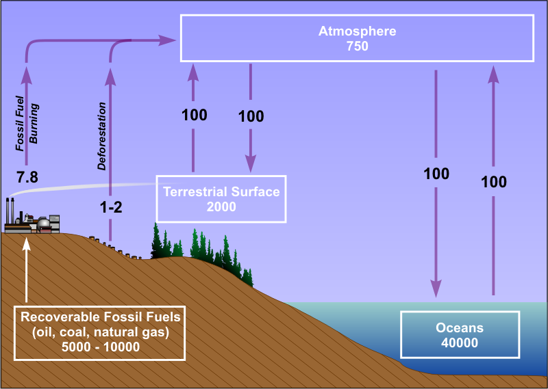
The oceans are, by far, the largest reservoir of carbon, followed by geological reserves of fossil fuels, the terrestrial surface (plans and soil), and the atmosphere. But, carbon moves naturally between the earth and atmosphere continuously. For example, volcanoes and other geologic activity emit carbon dioxide into the atmosphere. On the other hand, the weathering of some rocks results in chemical reactions with atmospheric carbon dioxide that removes it from the atmosphere. Plant photosynthesis also removes carbon dioxide from the atmosphere and returns it to the terrestrial surface. Note in the diagram above that the natural exchanges (marked by purple arrows) between the atmosphere, ocean, and terrestrial surface are balanced (emissions into the atmosphere are balanced by transfer back to the ocean and terrestrial surface).
Geological reserves were largely left out of the cycle until industrialization resulted in the large-scale recovery and burning of carbon-based fossil fuels, which creates carbon dioxide as a byproduct. The transfer of carbon dioxide into the atmosphere from the burning of fossil fuels is actually much smaller than that which naturally occurs from the ocean and terrestrial surface, but it's an unbalanced part of the cycle.
Deforestation also adds carbon dioxide to the atmosphere, because wood is roughly 50 percent carbon. So, when forests are cleared, much of that carbon eventually makes its way into the atmosphere. This process is exacerbated when deforestation occurs via burning. While the amount of carbon dioxide added to the atmosphere each year from deforestation is somewhat uncertain (that's why a range of 1 to 2 billion kilograms per year is shown in the diagram), deforestation on a global scale may be responsible for more than a quarter of anthropogenic emissions, and it's also an unbalanced part of the cycle. So, deforestation has some global climate impacts, too, in addition to the local ones we discussed previously.
The important thing to take away from this discussion is that the anthropogenic transfers of carbon dioxide to the atmosphere (via fossil fuels and deforestation) are unbalanced parts of the cycle. No mechanisms perfectly balance them and transfer equal amounts of carbon dioxide back into the oceans and terrestrial surface. So, while the anthropogenic additions of carbon dioxide to the atmosphere are small compared to natural ones (refer to the carbon cycle diagram above), since they're unbalanced, the anthropogenic contributions gradually add up over time, which is why carbon dioxide concentrations in the atmosphere have increased more than 40 percent since pre-industrial days, and more than 25 percent just since the late 1950s.
However, the earth-atmosphere system is very dynamic, and as the earth has warmed and atmospheric carbon dioxide has increased, the rate of natural processes that remove carbon dioxide from the atmosphere has also increased, which has had the overall effect of removing some anthropogenic carbon dioxide from the atmosphere. It turns out that roughly half of the carbon dioxide that humans have emitted into the atmosphere has been returned to the oceans and terrestrial surface by natural processes. In other words, nature is doing its very best to seek balance and offset the increasing carbon dioxide concentrations in the atmosphere from human activity. But, these natural removal processes haven't been able to keep up with the rate of anthropogenic emissions, and show no signs of being able to in the future. As long as more carbon dioxide is being emitted into the atmosphere than is being removed, atmospheric concentrations of carbon dioxide will continue to increase, just as your bank account balance grows if you deposit more money than you withdraw over a period of time.
Summary
- Carbon is stored in four main reservoirs -- oceans (the largest reservoir), geological reserves of fossil fuels, the terrestrial surface (plants and soil, mainly), and the atmosphere.
- Natural processes result in a continuous exchange of carbon between the atmosphere, oceans, and terrestrial surface, which ideally is approximately balanced.
- Fossil fuel use and deforestation represent unbalanced additions to atmospheric carbon dioxide. Only about half of anthropogenic carbon dioxide in the atmosphere has been removed and returned to oceans and terrestrial surface by natural processes.
- As long as more carbon dioxide is being emitted into the atmosphere than is being removed, atmospheric concentrations of carbon dioxide will continue to increase.
The end result of the increase in atmospheric carbon dioxide (and other greenhouse gases) is a strengthening greenhouse effect that gradually warms the planet. But, the observed warming trend since the late 1800s [12] has hardly been as smooth and consistent as the increase in greenhouse gas concentrations. Up next, we'll take a closer look at the how scientists take Earth's temperature, and dial in on the details of the observed warming trends.
Taking Earth's Temperature
Prioritize...
When you've finished this section, you should be able to describe different datasets used to assess Earth's temperature (namely paleoclimate proxies, the modern surface temperature record, and satellite temperature data) along with their limitations, and explain why Earth's temperature doesn't steadily increase each year, even with the anthropogenic strengthening of the greenhouse effect. You should also be able to discuss the dangers of using "cherry-picked" data, and explain why all locations on the planet are not warming equally.
Read...
Recall from our lesson on temperature controllers that measuring temperature is not a straightforward task. Different types of thermometers exist, and the specific environment around each thermometer can certainly affect your measurements (which is why car and bank thermometers aren't considered reliable official measurements, for example). When thinking about Earth's longer-term climate, the issue is even more complex. The "modern" surface temperature record only dates back to the 1800s, so it only covers a tiny fraction of Earth's history. So, how can we put recent global temperature changes in context if we only have temperature records since the 1800s?
Well, in short, we only have direct temperature measurements since the 1800s. But, scientists have discovered ways to learn about past atmospheric composition and temperatures and have created paleoclimate temperature proxies (temperature approximations of past climates), by studying things like ice sheets, tree rings, corals, and ocean sediment (among other things). These paleoclimate temperature reconstructions can go back thousands or even millions of years, but keep in mind that such historical temperature reconstructions are approximations; they're not perfect, and they have a range of uncertainties associated with them. Still, scientists have found some commonalities among various paleoclimate proxies of temperature and carbon dioxide based on different sources, which gives confidence that the reconstructions are reasonable (albeit imperfect) approximations of past climates.
One important aspect that such reconstructions have revealed is the connection between global temperature and carbon dioxide concentration. The graph below, which is based on data from ice cores retrieved from Antarctica, shows the close connection between atmospheric carbon dioxide and temperature over the 800,000 years leading up to the industrial age. The two traces don't match each other exactly, but it's pretty clear that warmer times have been times of higher carbon dioxide concentration and cooler times have been times of lower carbon dioxide concentration.
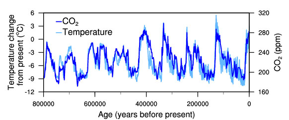
I should note that the correlation between carbon dioxide and temperature isn't simple cause and effect based on increased carbon dioxide strengthening the greenhouse effect and causing warming. Temperature also impacts the rates of various natural processes in the carbon cycle, so other factors (beyond the scope of the course) are involved in the similar historical trends you see in the graph above, but it's pretty clear that trends in temperature and carbon dioxide concentration go together!
In more modern times (since the 1800s), we have directly observed surface temperatures with thermometers. But, even with direct observations, determining an average temperature for the planet isn't an easy task. Temperature observation sites are primarily located on land, and most of them are located in the Northern Hemisphere. Furthermore, observation sites are irregularly spaced (more are located around cities), and the vast amounts of the earth covered by oceans have historically had relatively few direct temperature observations by comparison.
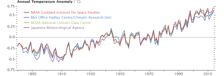
The complications don't stop there. Temperature observation sites use different measuring equipment (ranging from liquid-in-glass thermometers to more modern electrical thermometers), and even record their observations at different times of day (believe it or not, that matters in average temperature calculations, too). So, scientists from around the globe have analyzed millions of temperature observations in an effort to develop a homogeneous, representative temperature record for the earth. While there's no perfect solution to tackling some of these complications, the temperature records from independent agencies around the world (each of which has slightly different methods for calculating global temperature) all show nearly identical long-term warming trends (see graph below).
In more recent decades, with the invention of satellites, scientists have another tool at their disposal for assessing global temperature. As you know, satellites can remotely sense temperature, and although remotely sensed measurements are imperfect, satellites have been very important in improving our ability to measure temperatures over the oceans and in other areas of the globe with few (or no) surface observations. While satellite data has a short period of record (it only goes back to 1979), satellite measurements of global temperature match surface-based observations reasonably well (satellite records are "RSS" and "UAH" on this graph of 133-month average global temperatures [20] from skepticalscience.com). In yet another way to assess global temperature, scientists now use computer model analyses, which take available surface and satellite observations and use sophisticated algorithms to combine all the data together into one analysis.
While all of the datasets show warming over their period of record, they also show lots of year-to-year ups and downs. For example, here's a detailed look at NASA's temperature record [21]. The overall trend is up, but you can find periods (single years, or even a few decades at a time) where temperatures don't rise at all. Why is that, if atmospheric carbon dioxide is steadily increasing [18]?
The simple answer is that carbon dioxide, and greenhouse gases in general, aren't the only controllers of Earth's temperatures. Observed temperature changes are a result of a combination of all climate-change drivers -- natural and anthropogenic. So, over short periods of time (a few months to perhaps a few decades), global temperature may not rise at all, or may even decline. That's because a combination of other factors (solar cycles, ocean cycles, volcanoes, etc.) are working together to overwhelm the signal from anthropogenic warming. On the other hand, during times when natural factors (solar cycles, ocean cycles, etc.) favor warming, global temperature tends to spike upward because both natural and anthropogenic factors are favoring warmth. In other words, we shouldn't expect every single year to be warmer than the previous one. Global temperature has ups and downs, but over longer periods of time (decades to centuries), the anthropogenic warming is winning out.
So, don't be fooled by cherry-picked (selectively chosen and incomplete) data that you may come across from time-to-time. Internet blogs are rife with dubious graphics that claim to "disprove" global warming by showing some period of time (often a few years to a decade or two) which shows no warming (or even cooling). Take this example of cherry-picking I found on the Web, which used one of the satellite data sets to show that no global warming had occurred for a period of 18 years and 3 months [22] (from October 1996 through December 2014). Such a claim may have been true at the time, but it wasn't very meaningful. To see what I mean, check out how someone "cherry-picking" global temperature data from 1970 through 2016 may view it (top image, below), compared with the more relevant, longer-term trend (bottom image, below).
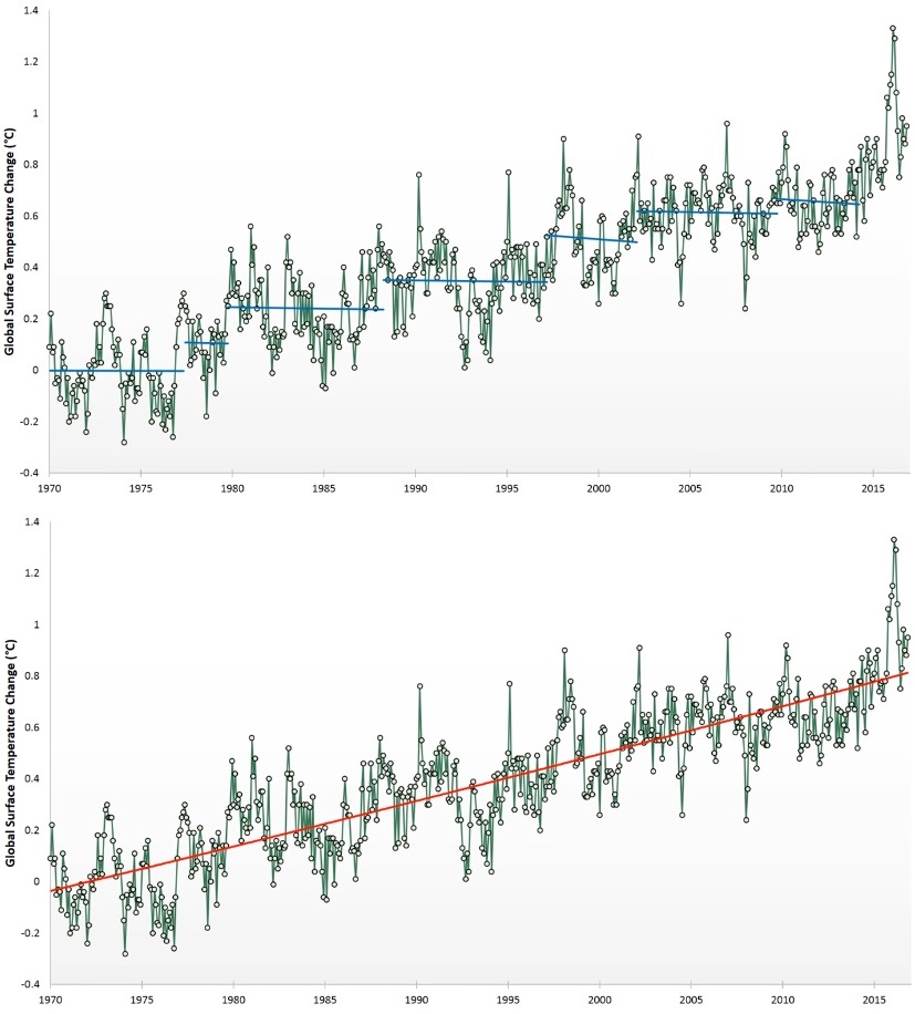
So, those shorter term periods (a few years to a decade or two) when global temperatures don't increase (or maybe even decrease slightly) are very real, but not particularly relevant in terms of longer-term warming. A person viewing one of the short periods with no warming (marked by the blue trend lines in the top graph above) would miss the more important trend (shown on the bottom graph). It's also telling that each cherry-picked period in the top graph may not have a warming trend itself, but each is warmer than the previous one! The main message is that you should beware of cherry-picked data (and not just with respect to climate change)!
Global Warming versus Local Warming
The graphs we've examined so far show an obvious upward trend in global atmospheric temperatures during since the late 1800s, but are all locations on the globe warming equally? The short answer is "no." Generally speaking, cities are tending to warm faster than surrounding rural areas, thanks to local urban-heat island effects combining with global trends. Still, many rural areas are warming, too. This map showing temperature changes in the United States between 1895 and 2017 [23] shows that some areas have warmed more than others. Some areas, such as parts of the Great Plains, Midwest and interior Southeast, have hardly warmed at all.
How could an area not be warming at all in the midst of global warming? Well, local and regional land-use changes are one likely culprit behind the relative lack of warming in those areas. As these former grassland prairies are used to grow an increasing number of crops, increased transpiration and evaporation are leading to local cooling during summer afternoons in particular, because some of the sun's energy is being used to evaporate water. Yes, daily maximum temperatures during summer [24] have actually declined in some areas between 1895 and 2017 because of increases in local and regional evaporation from agriculture. So, local and regional land use changes are certainly a factor in the temperature changes that a particular city or region experiences; therefore, you should keep in mind that temperature trends in your region may or may not be perfectly in line with global trends. I should also add that regional variations in atmospheric aerosol concentrations (from air pollution emitted from coal-fired power plants, for example) can affect incoming solar radiation on a local or regional basis, which can impact temperature trends.
Still, there's no doubt that most areas of the globe are warming, as this NASA animation of global temperatures from 1880 to 2017 [25] shows. The colors on the graphic represent differences from the global average temperatures between 1951 and 1980 (blues represent colder than that period's average; oranges and reds represent warmer). The animation reinforces the fact that all parts of the globe are not warming equally, and overall, higher latitudes in the Northern Hemisphere have warmed the most. But, regardless of regional variations, most areas of the planet are warming and every major temperature record (based on surface observations, satellite data, or some combination) show that Earth's average temperature is increasing. What are some consequences of our warming planet? We'll investigate up next.
A Little Warming, Big Consequences
Prioritize...
At the completion of this section you should be able to describe trends in ocean temperature, ocean acidification, global ice coverage, and sea level. You should also be able to define ice sheets and sea ice, discuss their respective contributions to sea-level rise, and discuss the consequences of sea-level rise.
Read...
Since the late 1800s, global average temperatures [21] have increased by a little more than 1 degree Celsius (about 2 degrees Fahrenheit). That doesn't sound like much, so what's the big deal about a little warming, especially if, in the past, Earth has been warmer than it is now? That's a reasonable question! The recent warming stands out because temperatures since the end of the last ice age (around 10,000 years ago) have likely varied by only about 1.7 degrees Celsius (about 3 degrees Fahrenheit). So, the rate of the warming (more than a degree Celsius in about a century, with much of it coming after 1980) really stands out as unusual.
Furthermore, when the earth was last this warm (or warmer), it wasn't inhabited by more than 7 billion people, and humans hadn't yet built extensive infrastructure across most of the continents. Humans have made decisions about the evolution of society (city growth, infrastructure needs, agricultural activities, etc.) based on the climate of the past several centuries, and a continued warming of the earth means that the climate characteristics that modern society was built upon will change. And, while a temperature increase of a few degrees may still seem like no big deal, allow me to use an analogy. Normal human body temperature is 98.6 degrees Fahrenheit. But, if your body temperature increases by just 2 or 3 degrees Fahrenheit, you have a fever and feel sick. Sometimes seemingly small changes can be important! With that in mind, let's explore some of the major changes that are occurring along with the rise in global atmospheric temperatures.
Ocean Warming and Acidification
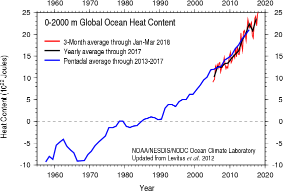
For starters, the atmosphere isn't the only part of the earth system that's warming. The oceans are, too. The graph below shows global ocean "heat content" from the ocean surface down to a depth of 2000 meters since the late 1950s. It turns out that much of the excess energy resulting from a strengthening greenhouse effect is actually being absorbed by the oceans. As a result, the oceans have also warmed, although not quite as much as the atmosphere because, if you recall, water has a much higher heat capacity than air (it takes more energy to warm water than an equivalent volume of air).
But, not only are the oceans warming, they're also becoming more acidic. Remember that the oceans are the largest reservoir of carbon on earth, and increasing amounts of carbon dioxide are being transferred from the atmosphere to the ocean. When carbon dioxide is dissolved in ocean water, carbonic acid forms, and with increased carbonic acid formation, ocean water is very gradually acidifying. On one hand, photosynthetic algae may benefit from from the increased carbon availability in the ocean since they rely on carbon dioxide for photosynthesis. But, on the other hand, the changing chemistry of ocean water negatively affects species like oysters, clams, sea urchins, various corals, and species that are vital parts of the food chain for larger fish. With about a billion people worldwide using food from the ocean as a primary source of nutrition, the health of fish and other species in the ocean is an important economic and food security issue.
Melting Ice
Not surprisingly, as the world has warmed, the amount of ice in polar regions has declined. In particular, it's warm enough to melt ice in the Arctic for a longer period of time during the year, leading to declining ice coverage, thickness, and volume. Scientists are keeping tabs on two main "types" of ice -- sea ice and ice sheets. Sea ice is simply frozen ocean water. Areas of sea ice tend to grow during the winter and shrink during the summer due to melting. Since 1979 (when satellite observations of sea ice began), Arctic sea ice has notably declined. Scientists often compare each year's minimum extent, which typically occurs in September in the Arctic, to decipher trends. As shown in the animation below, September sea ice extent in the Arctic has declined by about 13 percent per decade since 1979. Also note that, much like with global temperatures, there are some ups and downs -- short-term fluctuations driven by natural variability, but the overall trend is certainly downward.
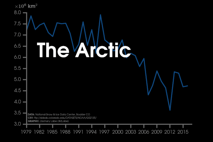
Longer-term reconstructions of Arctic sea ice, like this animation showing Arctic sea ice concentration between 1914 and 2013 [26] (credit: Zachary Labe) puts the recent decline in perspective. What are some consequences of the decline in Arctic sea ice? Well, for starters, less ice means lower albedo for the Arctic region as a whole, leading to additional warming from increased absorption of solar radiation. A warming Arctic with less sea ice also has the potential to alter temperature gradients across the Northern Hemisphere (temperature differences between the poles and equator), which as you know can affect the development of mid-latitude low-pressure systems and atmospheric circulation patterns.
Shrinking areas of sea ice also mean that the Northwest Passage [27] (the shortcut route from the Atlantic Ocean to the Pacific Ocean through the Arctic) more frequently becomes ice free, and can be a more viable route for commercial shipping during late summer. While having such an ice-free shortcut can have economic benefits, more open routes for ships also bring about security concerns, which have the attention of the United States Navy, in particular. In 2014, the Navy issued their "Arctic Roadmap [28]" through 2030 (NOTE: not required reading), which outlines how the Navy plans to deal with the consequences of increasing open waters in the Arctic. In case you're wondering, the Antarctic region also has sea ice, but it typically grows and disappears nearly completely each year with the changing seasons.
Moving out of the sea, ice sheets are huge masses of "glacial" ice on land, which cover at least 50,000 square kilometers (20,000 square miles). For the record, "glaciers" are merely old masses of ice on land that aren't as big as ice sheets. Ice sheets tend to grow over time as snow falls, and then never fully melts during the summer season. This allows new snow to fall on top of the "old" snow the following winter, compressing it, and as this cycle repeats itself over hundreds to thousands of years, large masses of ice can grow. Today, Earth has two ice sheets -- Greenland and Antarctica [29] (credit: NSIDC), which contain about 99 percent of the world's freshwater ice. During the last ice age, these ice sheets were much larger. The Greenland ice sheet, for example, covered much of North America and Northern Europe.
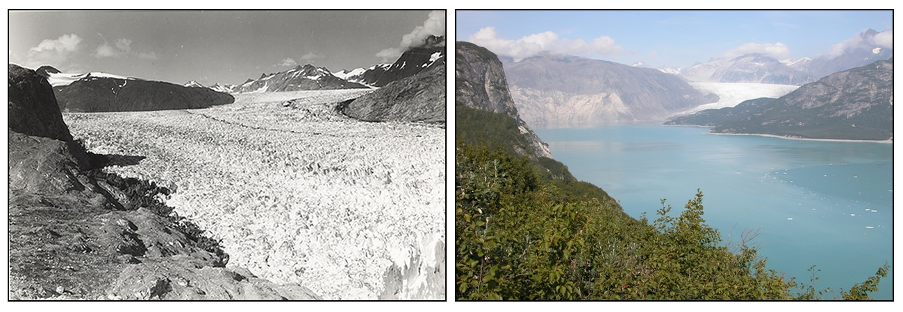
But, as the world warms, the Greenland and Antarctic ice sheets are also melting. Scientists began tracking these ice sheets via satellite in 2002, and you can see the trends in land-ice mass in these side-by-side graphs [30] (credit: Zachary Labe). Note that the Greenland ice sheet is melting more rapidly than the Antarctic ice sheet, in large part because the high latitudes of the Northern Hemisphere (where Greenland is located) are warming faster than anywhere else on the planet. As a result, in addition to the Greenland ice sheet, high-latitude glaciers in the Northern Hemisphere are melting, too (check out the side-by-side photos of Alaska's Muir Glacier in 1941 [left] and 2004 [right] below).
All in all, ice on land and in the water is melting much faster in the Arctic than it is in the Antarctic, where less warming has occurred and some Antarctic ice shelves [31] (floating masses of ice attached to a land mass) have actually grown slightly. But, when sea ice melts, the impacts on sea level are rather small because the ice was already in the ocean (like ice cubes floating in a cold beverage). The same goes for ice shelves. Melting ice sheets and glaciers on land, however, are another story.
Sea-Level Rise
Melting ice sheets and glaciers on land are a big concern because they contain such large amounts of fresh water, and when they melt, that water has to go somewhere. Much of the melted fresh water ends up in the ocean. For example, after the end of the last ice age, melting ice sheets and glaciers caused global sea level to rise by about 400 feet (about 120 meters) up until about 5,000 to 6,000 years ago. After that point, sea level didn't change much until the modern day melting began, which the observational data picked up on starting in the late 1800s. Just how much could sea levels rise if the existing ice sheets melted entirely? Well, scientists estimate that if the entire Greenland ice sheet melted, enough fresh water would pour into the ocean to increase sea level by about 20 feet (about 6 meters). If the entire Antarctic ice sheet melted, sea level would rise by roughly 200 feet (about 60 meters). Such melting would drastically reshape our planet!
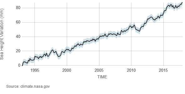
We're a long way from that happening, since the Greenland ice sheet still covers more than 600,000 square miles (more than three times the size of Texas) and the Antarctic ice sheet covers more than 5 million square miles (about the area of the contiguous United States and Mexico combined). Still, the melting that has occurred is already contributing to a rise in sea level. Since 1993 (when the satellite record for tracking sea level began), sea level has risen by more than 80 millimeters (more than 3 inches), as shown in the graph below. A longer-term record, using tidal gauges, indicates that increasing sea levels began before 1993 [32], and all told, global sea level has risen by nearly 10 inches since the late 1800s.
Much of the rise can be attributed to melting ice sheets and glaciers, but thermal expansion of the warming ocean waters is contributing, too (water expands slightly when it warms). As with trends in atmospheric temperature, complexities exist, however. For starters, there are short-term ups and downs (each year doesn't always have a higher mean sea level compared to the prior year), and sea levels aren't rising equally everywhere. Variations in ocean currents and local geography mean that sea levels in some parts of the world are rising more quickly than the global average, while in other areas sea levels have fallen or are remaining steady, even while the global average sea level increases. This graphic from NOAA [33] will give you an idea of where sea levels are rising and falling along the world's coasts. Furthermore, natural geologic factors affect sea level, too, such as the fact that the basins that hold Earth's oceans are constantly (albeit very slowly) changing shape, so scientists must take these long-term natural factors into account when calculating the rate of sea-level change due to global warming.
While a global average sea-level rise of 10 inches since the late 1800s may seem like no big deal, consider that 11 of the world's 15 largest cities are along coastlines. In the United States alone, about 40 percent of the population lives in densely-populated coastal areas. Even with the sea-level rise that has occurred so far, low-lying coastal areas of some large cities are flooding more frequently. Already in Miami, Florida, the highest tides of the year (called "king tides") are increasingly causing flooding in parts of the city [34]. Estimates show that king-tide flooding in Miami Beach has increased by four times since 2006. So, what may seem like a slow and minor sea-level rise is starting to have local and regional economic impacts. Continued warming and sea-level rise will likely cause more areas (and people) along the world's coastlines to become increasingly vulnerable to flooding.
I've only covered some of the major (and fairly straightforward) consequences of a warming planet, but one that I didn't touch on in this section is how the warming of the planet is impacting weather patterns and extreme weather in particular. I'll cover that next. Read on!
Climate Change and Extreme Weather
Prioritize...
When you've completed this section, you should be able to describe consequences of global warming on temperature extremes and atmospheric moisture. You should also be able to discuss which connections between global warming and extreme weather have higher confidence, and which have lower confidence (and why).
Read...
The link between climate change and extreme weather gets a lot of attention (see Exhibit A [35]and Exhibit B [36], as just a couple of examples). As I hope you've seen throughout this lesson, climate change is a complex, multi-faceted topic, ranging from local human-induced changes to natural and human-induced global-scale changes. So, it's important to note that most news stories you see about "climate change" and extreme weather are focusing on one particular aspect of climate change -- human-induced global warming. The question they're trying to tackle is "how is the warming of the planet affecting the weather?"
Unfortunately, this question often gets posed as "did climate change cause a particular heatwave / flood / drought / storm?" Asked in this way, the answer is "no." Global warming or other aspects of climate change, by themselves, do not cause weather events. Extreme weather events like blistering heatwaves, powerful thunderstorms, raging floods, and devastating tornadoes and hurricanes all occurred before human activities started influencing the climate on a global scale. So, climate change, by itself, doesn't cause, say, a heatwave here or a flood there. The real issues are to what extent extreme weather events are impacted by the warming of the planet (in terms of changes in intensity, frequency, impacts, common area of occurrence, etc.), or whether a certain extreme weather event was made more or less likely because of global warming.
These are complex topics, and it should come as no surprise that research relating extreme weather and climate change is very active. One thing that has become clear, however, is that changes in extreme weather have varied in differing regions of the globe. If that seems confusing, remember that while the world is warming, not all areas are warming equally, and while global sea levels are rising, they're not rising everywhere due to local effects. So, it's likely that all types of climate change (natural and anthropogenic) on the local, regional, and global scale all affect changing patterns of extreme weather in some way. Still, some basic physical relationships dictate that the human-induced warming of the oceans and atmosphere has resulted in some changes to atmospheric behavior.
Let's start with a couple of the more straightforward connections between global warming and extreme weather events. For starters, as the world has warmed, average temperatures in many areas have increased. Not surprisingly, so have outbreaks of hot weather. On a similar note, episodes of extremely cold weather have declined, which seems intuitive.
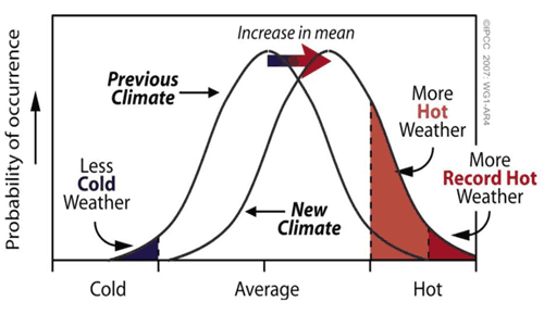
The above graph shows the probability of occurrence of "cold," near "average," and "hot" weather, and shows a shift in the temperature distribution as the climate warms. Temperatures near average are still the most common, but the average itself has shifted a bit warmer. In addition, the entire temperature distribution shifts a bit warmer, meaning that outbreaks of extremely cold weather become fewer and outbreaks of extremely hot weather become more common. Note that this doesn't mean cold outbreaks will cease as the world warms. Indeed, very cold weather can still occur. Take February 2015 as an example, when the eastern United States was extremely cold [37], and a couple of areas actually had their coldest February on record (since 1895). So, yes, the weather can still sometimes be frigid even amid global warming. But, added up over time, fewer cold outbreaks and more heatwaves occur. I should also point out that the increase in hot weather has been most notable at night (more record warm nights) than during the day. The same goes for the reduction in extreme cold; the decrease in very cold nights has been more notable than decreased extreme cold during the day.
Another consequence of the warming of the atmosphere and ocean relates to moisture. Remember our experiment from earlier in the course when we examined evaporation rates and condensation rates in a closed chamber [38] as temperatures increased? As temperatures increased, evaporation rates increased. Eventually condensation rates increased to match them, reaching a new state of equilibrium, but when the system was warmer, the number of water vapor molecules increased. In the atmosphere, that has an important consequence. If a warmer atmosphere has more water vapor molecules, that means when air rises and cools to the point of net condensation, there's more water available for cloud formation and precipitation.
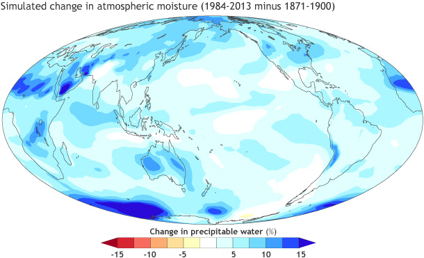
One way that meteorologists assess the amount of moisture available for precipitation is with a variable called "precipitable water," which is the amount of rain that would fall if all of the water vapor in a column of air from the surface of the earth to the top of the troposphere (approximately) fell as rain. The image below shows the simulated percent change in precipitable water between the 1984-2013 average and the 1871-1900 average. The prevalence of blue shadings across the globe shows that in most areas precipitable water has increased by a few percent to upwards of 15 percent as the world has warmed.
Therefore, it's not surprising to see an increase in heavy rain events, too. For example, the percentage of the contiguous United States receiving an unusually large portion of total annual rainfall from extreme one-day rainfall events has increased (here's the corresponding graph from NOAA [39]; the orange curve represents a running nine-year average). But, the increase in heavy rain events hasn't occurred equally everywhere. Breaking the United States down into regions [40] (credit: National Climate Assessment, 2014) reveals that from 1958 through 2012, the largest increase in rainfall from heavy rain events (defined here as the top one percent of all rainfalls for each region) has been in the Northeast. The smallest increase has been in the Southwest, while Hawaii actually showed a small decrease in the amount of rain falling in the heaviest events during the period.
Changes in precipitation patterns (both in amounts and frequency) have also impacted drought frequency and severity (for the record, a drought is a prolonged period with very little rainfall and subsequent water shortages). Some areas have experienced more intense and longer droughts (such as in parts of Europe), while in other areas, droughts have actually become shorter and less intense (over parts of North America). There is, however, some concern that as the world continues to warm, increased evaporation from soils may worsen droughts, particularly in areas that see little or no increase in rainfall.
While changes in extreme heat / extreme cold episodes and precipitation extremes have varied somewhat across the globe, scientists are pretty confident that global warming is playing a significant role in these trends. Determining the role of global warming gets more complicated with smaller-scale and / or shorter-lived storms, like hurricanes (tropical cyclones), mid-latitude low-pressure systems (extratropical cyclones), and severe thunderstorms (convective storms). The image below will give you an idea of what links between global warming and extreme weather trends are more certain (those farther toward the upper right of the graph) and which are less certain (those toward the bottom left of the graph). Note also that the graph includes "extreme rainfall," but not "flooding." It turns out that trends in flooding are highly dependent on local factors. Remember that urbanization changes the way that water is absorbed into the ground, and how quickly it drains into nearby streams and rivers. Therefore, poor urban planning can result in increased flooding regardless of changes in patterns of heavy rainfall. So, local land-use changes play a huge role in flooding trends, and they aren't always directly tied to trends in extreme rainfall related to global warming.
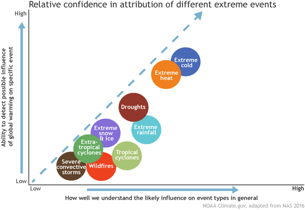
While there's great interest in potential links between global warming and destructive storms like hurricanes and severe thunderstorms or tornadoes, note that there's less certainty in these links. I'll focus on tornadoes and tropical cyclones (such as hurricanes) since they get a lot of attention. One unfortunate cause of the uncertainty regarding global warming and these weather features is that we only have a short period of quality observations. For example, the number of strong and violent tornadoes each year hasn't changed much since 1950 in the United States, but the number of weak tornadoes has increased dramatically [41] (credit: Ian Livingston / ustornadoes.com). Is that because of global warming? Probably not. Our ability to detect storms that may produce tornadoes greatly improved with the implementation of NEXRAD Doppler radars in the early 1990s, so at least some of this increase can be attributed the fact that we're better at detecting tornadoes than we used to be (fewer of them get missed).
It's a similar story with tropical cyclones. The top of the list of costliest weather disasters in the U.S from 1980 through 2017 [42] (credit: NCEI) is dominated by hurricanes, and there's little doubt that the societal impacts of tropical cyclones have increased. But, is it because human-induced warming is causing more and / or stronger tropical cyclones? Again, the lack of a long record of quality observations complicates the answer to this question, and makes it difficult to confirm the exact role of global warming. Before the era of global satellite coverage began in the 1970s, some storms were inevitably missed (those that didn't make landfall or weren't encountered by any ships traversing the oceans). When accounting for this idea, the data suggest that the number of tropical cyclones around the globe has changed very little as the world has warmed, but a larger percentage of hurricanes that form are becoming very strong (maximum sustained winds more than 110 miles per hour). Even with that signal, the increase in damage from tropical cyclone landfalls appears to be more closely driven by increased population and development near coastlines (more infrastructure for a storm to damage or destroy when it makes landfall) than human-induced warming (so far, at least).
Still, some interesting trends, which are consistent with global warming and have consequences for tropical cyclone damage, have become apparent in recent decades. For starters, we know that sea levels are gradually rising in many areas of the world, which means coastal flooding problems can be worse when tropical cyclones make landfall. Also, the area of the globe where tropical cyclones occur has gradually expanded, and tropical cyclones are, on average, reaching their peak intensities farther away from the equator than a few decades ago. As you'll learn later, tropical cyclones rely on warm ocean waters to thrive, so these observations showing that tropical cyclones are roaming a larger area of the globe than before are consistent with the warming of the oceans.
Tropical cyclones are also prolific rain-makers, and Hurricane Harvey (2017) [43] is an extreme example (40-60 inches of rain [44] fell in parts of Texas, causing catastrophic flooding). But, how much of Harvey's rain was "natural" and how much was caused by global warming? That's a tough question to answer! Harvey's immense rain totals in southeast Texas were largely caused by the fact that the storm moved so slowly. While we can't blame global warming specifically for Harvey's slow motion, some studies have shown a 10 percent decrease (on average) in the forward speed of tropical cyclones since 1949. The research in this area has shown some conflicting results, but slower-moving storms have the potential to dump more rain over a given area. Scientists also perform attribution studies using computer models to simulate the storm in a world without global warming for comparison. While such attribution simulations have uncertainties, the simulations for Harvey suggest that global warming made its deluge more likely and increased the intensity of the rainfall by anywhere from about 10 percent to near 40 percent.
Linking climate change to extreme weather events is a complex topic, and we've just scratched the surface! Keep in mind that global warming does not cause individual weather events, but it can make them more or less likely to occur, and can potentially change their intensity and impacts. Some connections between human-induced warming and extreme weather are more clear-cut than others, but being unsure about specific connections isn't the same as saying that there's no link at all. In cases where scientists are unsure, it may be that the connections are rather insignificant, or it may be that we just don't yet have a sufficiently long set of records to show a significant connection. Important research into better understanding the connections between global warming and extreme weather is ongoing, and while some of that research is focused on analyzing how our climate has changed, some is focused on how it will change in the future. Just how do scientists make projections about future climate characteristics, and even trends in various types of extreme weather? We'll explore that in the next section.
Predicting the Misty, Distant Future
Prioritize...
Upon completion of this section, you should be able to define general circulation models, discuss how their use in predictions is different than computer models created for weather forecasting, and discuss future temperature projections.
Read...
"It's tough to make predictions, especially about the future." This Danish "proverb" (which often gets attributed to the baseball great, Yogi Berra), is especially apt for this section. You see, to this point, we've focused on how the climate has already changed. The trends in temperature and their consequences for ice coverage, atmospheric moisture, extreme weather, etc., that I've discussed are things that scientists have already observed. But, what does the future hold? How will the climate change in the future? Answering those questions is a challenge for scientists because of all of the variables that exist in predicting the future.
For starters, how will greenhouse gas concentrations change in the future? Will they level off quickly, level off later this century, or keep increasing at the current rate (or even faster)? The answer depends on technological advances, as well as economic, energy, and environmental policies set by politicians and governments around the world. As if predicting future weather and climate wasn't hard enough, predicting human behavior is even harder! So, to assess a range of possibilities, scientists consider various future scenarios for greenhouse gas emissions and concentrations (as well as air pollution and land-use changes).
Scientists call these possible future scenarios "Representative Concentration Pathways," and they're based on assumptions about future economic activity, population growth, etc., and their consequences for atmospheric composition. The possibilities range from a "best-case scenario" for limiting future warming, in which yearly greenhouse gas emissions decline to zero late this century, to a "worst-case scenario," in which yearly emissions continue to rise through the year 2100. The graph below shows the predicted future warming based on the best-case (labeled RCP 2.6 in the graph below) and worst-case (labeled RCP 8.5 in the graph below) scenarios.
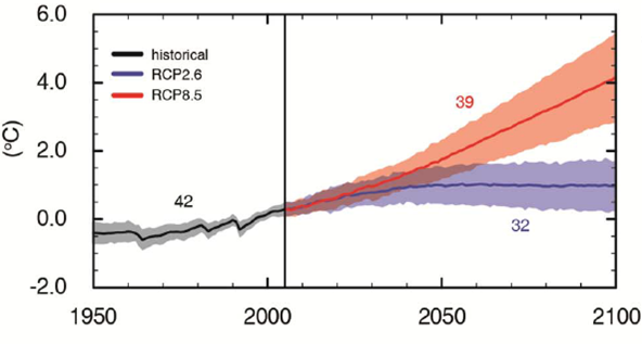
Note that severely limiting future greenhouse gas emissions leads to the least additional warming through 2100 (likely between 0.3 degrees Celsius and 1.7 degrees Celsius). Continuing to increase greenhouse gas emissions through 2100 leads to an additional warming likely between 2.6 degrees Celsius and 4.8 degrees Celsius. In reality, both of these scenarios (best- and worst-case) are less likely than some intermediate scenario (intermediate possibilities aren't shown on the graph), which would lead to some amount of warming in between these values. But where do these projections come from and how reliable are they?
In an ideal world, scientists could use an identical planet, just like Earth, to use as an experiment -- to compare observed changes to our climate to those without human influence on the identical planet. But, no such planet exists! Therefore, scientists have to use the next-best thing -- computer model simulations. Climate models are called general circulation models (GCMs), which use mathematical equations to simulate and predict atmospheric and oceanic motions and other processes. The basic equations to describe atmospheric motions and processes are actually the same as those in computer models used to predict short-term weather, but GCMs also include other equations to describe changes in greenhouse gas concentrations and other large-scale and long-duration oceanic processes. GCMs must include those equations because they're important for estimating trends in global average temperature over the course of a century, but short-term weather models can exclude them because they're insignificant when considering, say, a weather forecast a week into the future.
GCMs have become increasingly complex in the last few decades as computing power, and our understanding of some aspects of the earth-atmosphere system have improved. The graphic below pictorially describes the components included in climate models, and as you can tell, early GCMs in the 1970s were quite crude in their depiction of the earth, including only basic atmospheric processes and greenhouse gases. But, more recent GCMs (toward the bottom of the graphic) are far more sophisticated. They contain realistic representations of the land surface, oceans, ice coverage, and can simulate transfers of carbon and water between the earth and atmosphere. The most sophisticated GCMs include a "fully coupled" atmosphere and ocean, meaning that the atmosphere and ocean are "connected" in the model (changes in the atmosphere realistically affect the ocean and vice versa). These coupled GCMs are so sophisticated that they can only run on the world's fastest supercomputers.
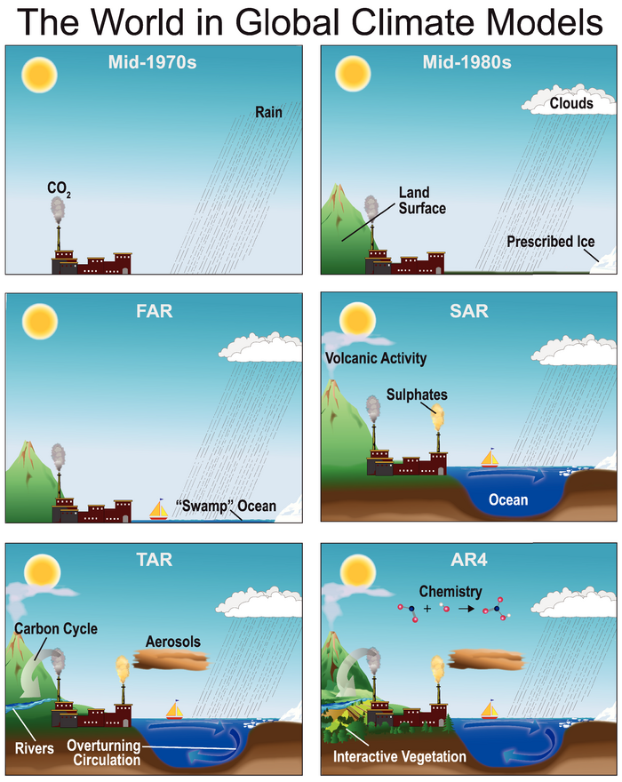
By the way, the acronyms, "FAR," "SAR," "TAR," and "AR4" in the image above refer to the state of GCMs at the times of the first, second, third, and fourth assessment reports of the Intergovernmental Panel on Climate Change [45], respectively. For perspective, the first assessment report (FAR) was published in 1990, and the fourth (AR4) in 2007. Since 2007, GCMs have become even more sophisticated, but even with the increasing sophistication of GCMs, the latest and greatest ones still can't match the true complexity of the real climate system.
So, if we have imperfect GCMs trying to predict the future, are the predictions accurate? After all, if weather forecasts from imperfect computer models can't accurately predict the weather two weeks in advance, how can a GCM accurately predict characteristics of the climate 100 years from now? That's a reasonable question! In reality, it's a bit of an "apples and oranges" comparison, though. Successful short-term weather forecasts require accurate predictions of the details of a weather pattern -- positions of high- and low-pressure systems, wind directions and speeds, exact temperatures at given times, locations of areas of precipitation, etc. Such predictions are highly sensitive to the initial state of the atmosphere. In other words, for a perfect prediction, the computer model must start out with a perfect picture of the current state of the atmosphere (exact wind, temperature, humidity, etc.) everywhere on Earth. Since we can't measure every inch of the atmosphere at all times, such perfection is impossible, and leads to errors in the weather forecast, which grow with time.
But, GCMs aren't trying to make such specific predictions about day-to-day weather features. They're trying to determine large-scale changes in climate (trends in temperature, melting ice, total amount of rainfall, etc.) over decades. Those predictions are much less sensitive to the current state of the atmosphere. In other words, how warm the climate is 100 years from now has very little to do with the exact wind direction or temperature today at any given location. So, small errors in the initial state of the atmosphere, which lead to errors in short-term weather forecasts, just don't have the same impact on GCMs.
Still, GCMs aren't perfect, and a quote from British statistician George Box comes to mind: "All models are wrong, but some are useful." In other words, GCM predictions are certainly imperfect, but they can still be helpful. One big cause of imperfections in GCMs relates to complexities in the ocean. Oceans, if you recall, are the world's largest reservoir of carbon, and they have absorbed roughly half of anthropogenic carbon dioxide emissions so far (helping to limit anthropogenic warming of the atmosphere). But, as the ocean takes on more carbon dioxide, its ability to continue absorbing it is diminished. The rate that it diminishes depends on complex interactions in the ocean that aren't perfectly modeled. But, this somewhat uncertain ocean behavior, along with the oceans' large heat capacity, will play a key role in the rate of future atmospheric warming.
Another "trouble spot" in GCMs is clouds and water vapor. Remember that clouds affect temperature by both blocking incoming solar radiation during the daytime (a cooling effect), and also efficiently absorbing and emitting infrared radiation (a warming effect). The effect that wins out largely depends on the types of clouds that dominate, and as the world warms and evaporation from warmer oceans increases, concentrations of atmospheric water vapor (the most abundant greenhouse gas) will increase. Increased water vapor will likely also lead to more cloud cover, but what types of clouds will dominate? Will their warming or cooling effect win out overall? The answers are unclear, and serve as another source of uncertainty in future projections.
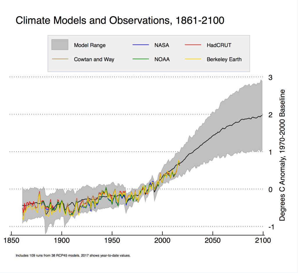
As a result, scientists take different approaches to tackling these and other uncertain aspects of future climate by running various versions of GCMs to create a range of future possibilities, indicated by the gray shaded area in the graph above. The black line marks the average of all of the model forecasts. To get an idea of how well these models perform, scientists run "hindcasts" to see how well the model-simulated climates compare to actual observations from the past (observations from the major surface temperature records are marked by the various colored lines on the graph above). If the model is able to simulate the climate of the past reasonably well, then scientists have more confidence that its projections will be useful.
Note a few important messages from the graph above. First, climate models don't necessarily handle the short-term temperature spikes and dips very well (which rely on various ocean cycles, volcanic eruptions, etc.). But, in the scheme of long-term climate change, those little "wiggles" aren't particularly important. The trend over decades to centuries is what scientists are more interested in, and climate models have performed fairly well in getting the trends right. If we look back at older climate model simulations [47] (credit: Gavin Schmidt), we can see that the warming that has occurred since 2000 has been within the range of projections from the climate models of the era.
So, the strong message from climate models is that the world will very likely continue warming through 2100, although there's some uncertainty about just how much. Additional warming, of course, has consequences for many of the observed trends that we've already discussed in this lesson (melting ice, sea-level rise, and even extreme weather). For example, climate models predict sea-level increases [48] (credit: Intergovernmental Panel on Climate Change) ranging from about a half meter (about 1.5 feet) to about one meter (a little more than 3 feet) by 2100, depending on future greenhouse gas emissions and additional warming. These are global averages, of course, and there's less skill in regional predictions. This is also true for extreme weather predictions. While GCMs suggest further increases in extreme heat episodes (and reductions in extreme cold), more heavy rain events and an increased intensity of tropical cyclones, they don't have much skill in describing where these trends may be felt the most (or the least). In other words, climate models aren't yet skillful at making detailed local predictions [49] about how the weather at your hometown or in your state may change over the next 100 years.
If the state of the climate for the next 100 years depends on human activity, what are we to do? That question is the source of most of the debate surrounding climate change, because potential solutions affect worldwide economic, energy, and environmental policies. Taking quick, far-reaching actions to reduce greenhouse gas emissions and limit future warming would require major policy and lifestyle changes in the developed world. On the flip side, doing nothing will likely cause a future warming toward the higher end of projections, which will likely cause the greatest strain on communities and infrastructure. Society can also act incrementally to reduce greenhouse gas emissions by increasing energy efficiency, reducing fossil fuel usage, and increasing the use of alternative energy sources like wind and solar power. Some liken such actions to "buying insurance" to protect against the worst potential consequences of global warming (spend some money now to protect against spending a lot more money later in dealing with the worst consequences). While we're not going to spend much time discussing various solutions, before we end the lesson, I want to cover one historical case when society essentially chose to "buy insurance" to protect against a harmful environmental change. Up next, we'll talk about the ozone layer.
Case Study: Ozone Depletion
Prioritize...
Once you've finished this page, you should be able to describe the effects of the stratospheric ozone layer, and ozone that forms low in the troposphere from air pollutants. You should also be able to name the class of human-made chemicals that destroys ozone and contributes to "greenhouse" warming, define the ozone hole and its location, and describe the actions that were taken to limit the depletion of ozone.
Read...
High above Earth's surface lies an "invisible shield" of sorts, which helps protect humans from the harmful effects of ultraviolet radiation from the sun. The invisible shield is the ozone layer located in the stratosphere, which starts about 10 miles above the surface and contains about 90 percent of all the ozone molecules in the atmosphere. Some ozone also exists in the troposphere, when industrial pollutants react in the presence of sunlight. Ozone itself is actually toxic to humans (it contributes to a variety of respiratory problems), and also harms plant life. So, ozone near the surface is harmful, but ozone high up in the stratosphere (where there are no people who need to breathe) is essential to life on the planet.
In the stratosphere, ozone absorbs ultraviolet radiation from the sun (specifically, harmful "UV-B" radiation), preventing it from ever reaching Earth's surface. That's a great thing for humans, because overexposure to UV-B radiation increases the likelihood of skin cancer, cataracts, and immune deficiencies in humans, and is harmful to marine phytoplankton that form the base of the ocean's food chain. Because of the threats posed by excess ultraviolet radiation, weather forecasts commonly include a "UV Index [50]" (a scale from 0 to 11+), which was introduced in the 1990s to help people take precautions to protect their skin and eyes.
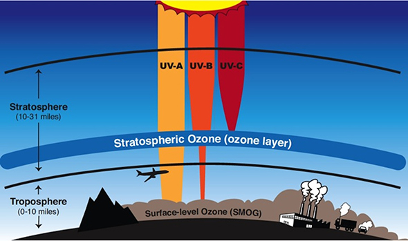
An ozone molecule consists of three oxygen atoms (its chemical symbol is O3), and its maximum concentration in the stratosphere is a result of ultraviolet radiation's interactions with oxygen gas (O2 -- the gas that humans need to breathe). When oxygen gas absorbs ultraviolet radiation, the oxygen atoms split. Some of the lone oxygen atoms bond with other lone oxygen atoms to create oxygen gas again, but some of the lone atoms actually bond with existing oxygen gas molecules to form ozone (O3). When ozone absorbs ultraviolet radiation, the ozone molecule is destroyed, creating an oxygen gas molecule (O2) and a single oxygen atom. Of course, these constituents can rebond to form ozone again, and a rough balance exists between natural processes in the stratosphere that create and destroy ozone. Some natural variations in ozone concentrations do exist (ozone levels vary by a couple of percent in connection with solar cycles, for example); however, human emissions have changed that approximate balance and led to a gradual decline in ozone.
In the 1920s and 1930s, engineers at General Motors were trying to develop refrigerants that weren't toxic or flammable. The culmination of their work was a class of chemicals called chlorofluorocarbons (CFCs), which are gaseous compounds of chlorine, fluorine, and carbon. CFCs were originally branded as "freon," a name which still gets used generically today, even for refrigerants which are not CFCs. Over time, use of CFCs expanded into aerosol cans and the production of foams and packing agents (like Styrofoam). Initially, CFCs were viewed as rather benign compounds because they are so "stable," meaning they're reluctant to react with other chemicals.
Later, CFCs were discovered to be greenhouse gases, although their concentrations are tiny compared to water vapor, carbon dioxide, and methane. More importantly, the fact that they don't react with many other gases and don't dissolve in water means that once they're released into the atmosphere, they stay there for a long time. With the rising and sinking air motions in the troposphere, inevitably, some CFCs get mixed up into the stratosphere (a fact which wasn't discovered until 1974), where it turns out, they're not so benign. In fact, CFCs end up being "ozone killers." I won't go into the nitty-gritty chemistry details, but basically, when a CFC molecule absorbs ultraviolet radiation, a chlorine atom gets separated, and the "loose" chlorine atom reacts with an ozone molecule, destroying the ozone molecule. What's worse is that the chlorine compound that forms in the process is also highly reactive, so it readily reacts with other molecules to free up the chlorine atom again, which allows the chlorine atom to go destroy more ozone molecules.
The end result is that one chlorine atom can destroy many ozone molecules (estimates are up to 100,000). Some natural sources of chlorine also exist (like volcanic eruptions), but it's not enough to explain the amounts of chlorine observed in the stratosphere. Other human sources of chlorine (like water that evaporates from swimming pools) largely don't make it to the stratosphere because, while CFCs don't dissolve in water, pure chlorine does. So, precipitation usually removes pure chlorine from the troposphere, preventing it from ever getting to the stratosphere.
The Ozone Hole
British scientists had been measuring ozone over Halley Bay (along the Antarctic Coast) since the late 1950s, but in the early 1980s, a group of British scientists led by Joseph Farman, noticed a gradual decline in ozone concentrations each year becoming more noticeable starting around 1975. In fact, Farman doubted his own data at first because nobody else had ever observed such low concentrations of ozone. American scientists were also measuring ozone via a NASA satellite, but didn't notice a decline.
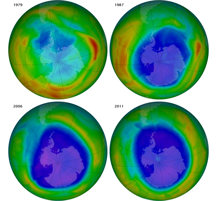
After the British published their results in 1985, American scientists took another look at their data and found the same depletion of ozone over Antarctica. The American scientists had missed the reduction because their computers had been programed to recognize ozone levels only within the range thought to be "normal." When ozone levels over Antarctica fell below that range, the computers tossed out the numbers as bad observations. Upon looking at the raw data, American scientists saw the same ozone hole that the British scientists had discovered. For the record, the ozone hole is a region in the Antarctic stratosphere where ozone levels dramatically decrease during early spring in the Southern Hemisphere (September - early October). In reality, there's not really a true "hole," but concentrations of ozone molecules decline sharply in the region, essentially creating a "thinning" of the ozone layer. The image above shows the state of the ozone hole as measured by satellite in September of 1979, 1987, 2006, and 2011 (blue and purple areas mark the lowest ozone concentrations).
Clearly, the ozone hole has gotten bigger since 1979, but if the ozone hole develops over Antarctica (where almost nobody lives), is it that big of a concern? Yes, because even though the greatest losses of ozone occur over Antarctica each spring (in the Southern Hemisphere), other parts of the globe have lost ozone, too, although not as dramatically. For example, ozone losses over the middle latitudes (where most of the U.S., most of Europe, and Asia are located in the Northern Hemisphere), range between about 3 and 10 percent, which equates to about 5 to 10 percent more harmful ultraviolet radiation reaching Earth's surface. But, why does the most dramatic loss of ozone occur each year over the Antarctic stratosphere? It turns out the answer lies in atmospheric circulations.
During winter, the Antarctic stratosphere is extremely cold (temperatures can drop below -130 degrees Fahrenheit). The bitter cold creates a temperature gradient between the stratosphere over the Antarctic and its surroundings, which leads to a ring of fast winds in the stratosphere surrounding Antarctica in the winter. This "polar vortex" basically isolates the Antarctic stratosphere from its surroundings. The dramatic loss of ozone occurs inside the vortex as ozone-destroying processes dominate, and air surrounding the vortex (with higher ozone concentrations) can't mix in. Also, even though Earth's stratosphere is mostly cloud-free because relative humidity values are so low, the Antarctic stratosphere is so cold that "polar stratospheric clouds" (clouds composed as ice and frozen nitrogen compounds) can form. The presence of polar stratospheric clouds also works to destroy ozone because gaseous nitrogen compounds react with free chlorine atoms, which prevents them from destroying ozone molecules. But, nitrogen compounds in solid form in polar stratospheric clouds don't react with free chlorine atoms, so they can't save any ozone molecules.
So, when Antarctic spring begins, and the region sees its first sunlight in months (remember that the sun never rises above the horizon during winter in the polar regions), the ultraviolet radiation and free chlorine atoms are a bad combination for ozone molecules, and concentrations drop, reaching their minimum in early spring. For what it's worth, the Arctic region of the Northern Hemisphere also has a polar vortex that forms in the winter time, but the geographic characteristics of Arctic latitudes (distribution of land masses, etc.) dictate that it's not as strong or consistent as the polar vortex in the Southern Hemisphere. So, while scientists have observed some loss of ozone over the Arctic, it doesn't compare to what happens over the Antarctic each year.
The scientists who first discovered that CFCs can destroy stratospheric ozone predicted a gradual loss of ozone, but leaders of industries that produced CFCs initially resisted the evidence, publicly calling the connection between CFCs and ozone depletion "science fiction" and "too uncertain" for immediate action. Even so, major chemical companies planned ahead and started working on replacement chemicals for CFCs just in case, and by 1986, some replacements, called hydrochlorofluorocarbons (HCFCs) were ready. All the while, surprised by the discovery of the ozone hole, government agencies scurried to better understand ozone depletion, and organized the National Ozone Experiment (NOZE) in 1986. This project strengthened the understanding of how human emissions of CFCs were leading to unnaturally-high levels of chlorine in the stratosphere, leading to ozone depletion.
Recognizing the potential harm to human health, the world's governments reacted by finalizing the Montreal Protocol in 1987, which required CFCs and some other ozone-depleting chemicals to be phased out. U.S. President Ronald Reagan supported the treaty [51], and the U.S. was one of its early signatories. The treaty went into effect in 1989, and since then has gone through several amendments and has been signed by over 190 nations. The Montreal Protocol is widely seen as the most successful global environmental treaty in history, and since the treaty's implementation, atmospheric CFC concentrations peaked in the late 1990s and have since declined (remember that CFCs can survive a long time in the atmosphere, so getting rid of them entirely will take a long time).
And, the ozone hole? It has stopped growing (it peaked in size in 2006) and seems to have started a gradual recovery, although its exact size varies from year to year based on stratospheric weather. Research published in 2018 [52] demonstrated that the recovery in ozone over the Antarctic is explicitly connected to the decline in CFCs, illustrating the effectiveness of the Montreal Protocol, and current projections suggest that ozone levels should return to pre-1980 levels some time late this century. Interestingly, the initial replacements for CFCs (HCFCs) also destroy ozone, but at a much slower pace because fewer of the molecules can survive into the stratosphere (most react or dissolve in water in the troposphere). So, HCFCs are also being phased out. The replacement for HCFCs are hydrofluorocarbons (HFCs), which pose no threat to the ozone layer because they don't contain chlorine.
However, HFCs (along with CFCs and HCFCs) are extremely active greenhouse gases (much more so than carbon dioxide). While concentrations of these gases in the atmosphere are minuscule (measured in parts per trillion), in order to get ahead of the curve, the member nations of the Montreal Protocol have also decided to start reducing HFC emissions. So, while the solutions are still evolving, ultimately, money spent to develop and implement alternatives to CFCs has helped stop ozone depletion, and has saved an estimated one trillion dollars (perhaps more) through public health benefits (millions of additional skin cancer and cataract cases prevented, for example). So, the case of ozone depletion is one aspect of human-induced climate change in which "buying insurance" is paying off.