
We have already looked at the relationship between climate (and climate change), and one particular type of severe weather—tropical cyclones & hurricanes. Let's now consider other types of severe weather and possible connections with climate change.
Heat Waves
It is perhaps obvious that global warming leads to more frequent and intense heat waves. What is not so obvious, however, is just how profound an impact even modest warming has on the frequency of heat extremes. It all has to do with the statistical properties of our friend, the Gaussian distribution.
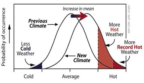
Note from this schematic that even a modest warming can lead to a dramatic increase in the shaded region that exceeds some threshold (i.e., that exceeds 1 or even 2 standard deviations above the mean). Let's work out a simple example based on things we already know about the standard deviation. Let us consider a hypothetical city where the mean daily high temperature in July is 28°C (82°F), and the standard deviation in that measure (i.e., the amplitude of typical day-to-day fluctuations) is 5°C (9°F). Then, using what we know about the standard deviation, roughly 16% of the time, the daily high temperature would be expected to exceed 1 s.d. above the mean (i.e., 33°C/91°F). [You can check this out yourself using Vassar's online calculator, setting z = 1 and using the one-sided test result.] Only roughly 2.5% of the time would it be expected to exceed 2 s.d. above the mean (i.e., 38°C/100°F). [Again, you can check this with the online calculator, using z = 2 and observing the one-sided result.] Put in even more basic terms, we would only expect one day in July when the temperature would exceed the 'century mark' of 100°F.
Now, consider the effect of a hypothetical warming of 1°C/2°F (the rough actual warming of the globe since pre-industrial time). We can represent the effect of this warming by shifting the entire temperature distribution to the right by 1°C as shown qualitatively in the schematic above. Now, with the mean of 29°C (and assuming the standard deviation is still 5°C), a 'century mark' temperature of 38°C/100°F is only 1.8 s.d. above the mean.
Think About It!
Use Vassar's online calculator to determine the probability of exceeding the 'century mark' after a warming of 1°C/2°F has occurred.
Click for answer.
That is nearly double the probability (2.5%) we calculated before the warming occurred.
We now would expect twice as many days in July (2 per year) to exceed the century mark. As we will see, a doubling of the probability of record heat extremes is not at all out of line with what we actually are seeing in the temperature observations.
So, is there evidence that this is really happening? Indeed, there is. Let's start with the single example of the 2003 European heat wave. This wasn't just 'another heat wave'. It killed more than 30,000 people as a result of exposure to extremely high temperatures coupled with a lack of widespread access to modern air conditioning in large parts of Europe. The entire summer was unusually warm, making individual record breaking heat waves exceptionally more likely.
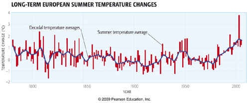
In Europe, there are reasonably reliable temperature records stretching back several centuries (including thermometer measurements back to the late 18th century—see figure below, and longer-term documentary evidence stretching back as far as 500 years). The 2003 summer temperatures were by far the warmest on record. So, there was a context for the summer 2003 European heat wave. It wasn't just a single random event, but it occurred in the larger-scale context of an unusually warm summer, imbedded in a long-term trend of warming European summer temperatures. One prominent study in the journal Nature in 2004 suggested that global warming had already played a significant role in the European heat waves, taking what might have been thought as a one-in-a-thousand-year event (what is termed a 'thousand year event') and instead turning it into a 20-year event. Additional projected warming, the authors argued, would turn it into a 2-year event, i.e., every other summer would have similar heat waves. Indeed, prolonged European heat waves in 2018 and 2019 eclipsed many of the records that were set in 2003!
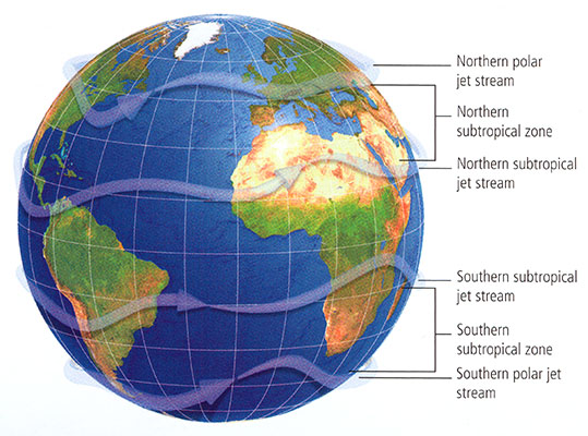
That unusually warm summer was associated with a poleward expansion of the jet stream relative to its typical position and a migration of the warm, dry descending air usually found in the descending limb of the Hadley circulation that is typically located in the subtropics (e.g., the Sahara desert), well into Northern Europe (see figure below).
© 2015 Pearson Education, Inc.
Indeed, as we will see later in the course when we cover projected changes in atmospheric circulation, this pattern of poleward migration of the descending limb of the Hadley circulation is a robust prediction of state-of-the-art climate models. Viewed in this context, the 2003 European summer heat wave is probably as good an example as any of the potential impact of anthropogenic climate change on heat extremes.
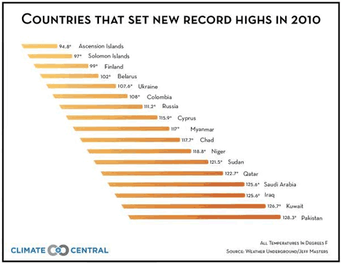
The year 2010 saw record heat around the globe. Perhaps best publicized was the record-breaking heat wave in Moscow and western Russia, where new all-time temperature records (111°F) were set, and temperatures hovered around or above 100°F for most of July, replete with massive wildfires and dangerously poor air quality. However, a large number of other countries set new heat records for maximum warmth, including Finland, Pakistan, Sudan, Saudi Arabia, Iraq, and Pakistan.
One might rightfully argue that pointing to any one year, be it 2003 in Europe, or 2010 in many other countries, is cherry-picking. And indeed, we need to look at the broader picture in which this fits.
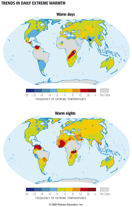
The plot below shows the change over the course of the latter half of the 20th century in the number of days per decade qualifying as unusually warm (defined as exceeding the 90 percentile). Most, though not all, regions have seen an increase in the frequency of extremely warm days. Even more striking is the fact that virtually all regions have seen increases in the frequency of extremely warm nights. As we will discuss further in our assessment of climate change impacts later in the course, it is actually the latter feature—the increase in very warm nights—that represents a greater threat from the standpoint of human mortality.
What about closer to home, i.e., the U.S.? 2010 was a record-breaking year for heat in many respects for the U.S.
On any given day, just by chance alone, there are likely some places in the U.S. where it is unusually cold, and other places where it is unusually warm. Record cold and record warm are often likely to be found somewhere. The real question to ask is, if we look at all of the reporting locations in the U.S. over all of the days of year, how often are we breaking warm records vs. cold records. As temperatures warm overall, we expect cold records to increasingly be outstripped by warm records. This was certainly the case for 2010.
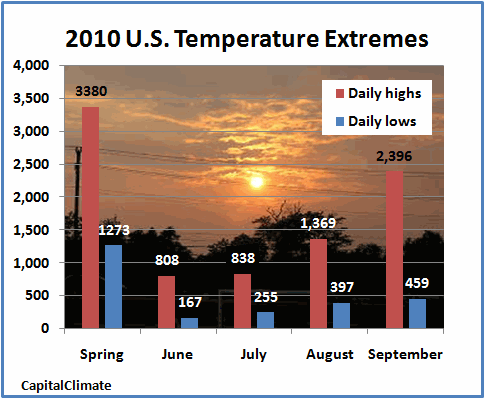
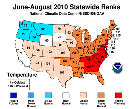
Not surprisingly, summer (June-August) 2010 was the warmest, or one of the few warmest, summers ever for a large swath of the southeastern and mid-Atlantic U.S. [for example, in State College, PA, daily maximum temperatures in the summer exceeded 90°F more than twice as often as usual] and were unusually warm over much of the rest of the U.S. Only in the northwestern corner of the U.S. was it relatively cool.
Again, one might be tempted to argue that focusing on any particular year is cherry-picking. So let us again step back, and look at the long-term context for this anomalous recent warmth. We will look at the trend from decade to decade in the frequency of warm and cold record-breakers, totaled over all locations of the U.S. and over all days of the year. This is what the trend looks like through 2015:
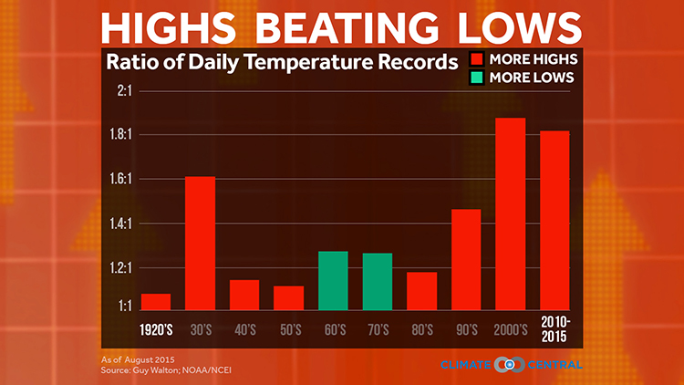
In the absence of global warming, one would expect record highs to occur as often as lows. This was true in the middle of the century. Then during the 60s and 70s as mean northern hemisphere temperatures—as we have seen before—actually cooled a bit, cold records began to slightly outpace warm records. Since then, we have seen a dramatic increase in the ratio of warm to cold record-breakers as the globe, northern hemisphere, and North America have continued to warm. This trend culminates in a warm/cold record-breaker ratio of more than two-to-one for the past decade. In other words, we've now seen a doubling in the relative frequency of hot vs. cold temperature extremes. Note that this increase (roughly a factor of two) in probability of heat extremes is similar to that motivated by the simple example I used at the very beginning of this section on heat waves.
An excellent analogy for the impact of global warming on temperature extremes involves the simple rolling of a six-sided die. So we're going to do a little experiment with die rolling—I think you'll find it both fun and instructive (and amusing—a special thanks to Penn State's David Babb and Matt Croyle for their help in constructing this!).
Start rolling the pair of dice. One of the dice is a fair die, and the other is "loaded", though just how, you'll need to figure out. It should become clearer and clearer as time goes on, and the number of rolls increases. Note that you can "roll" in rapid succession to get larger and larger samples (you don't need to wait for the animation to complete on each roll). Start out with 1 roll, then 5, then 10, 30, 50, 100, and so on, as many as 500 or more if you have the patience! rolls of the die. Pay attention to the number of numbers you've rolled for each of the two dice (the % of time each possible value of the die is rolled is conveniently recorded for you).
Do your rolls seem to be converging towards some well-defined fraction? Is one number showing up more often on one of the two die? How does it compare with your expectation for a fair die? When you think you're ready to guess which of the two dice is loaded, go for it. You can repeat the experiment over and over again. Sometimes it's the red die that will be loaded, other times it will be the blue die. How quickly can you successfully identify which is which?
Think About It!
Can you figure out which number is favored and how scewed (loaded) the results are?
Click for answer.
So, as you've figured out by now, I loaded the die so that sixes would come up twice as often as they ought to. The more rolls of the die you do, the more obvious that becomes. Consider your first incidence of rolling a six with the loaded die. Was the fact that you rolled a six on that roll directly attributable to the loading of the die? Of course not, you might rightly respond! Even with a fair die, there was a chance (1 in 6) of rolling a six. But the loading of the die nonetheless made it twice as likely that, on any given roll—including that one—you would roll a six. And this becomes increasingly clear as you roll the die more times.
This is a very useful analogy for talking about the influence of global warming on weather extremes such as heat waves. In our first example, we showed that a moderate amount of warming—equivalent to that which has occurred on average over the past century—nearly doubled the probability of breaching the 'century mark' of 100°F during mid-summer. We furthermore saw above that, on average, the relative frequency of extremely warm days in the U.S. has roughly doubled since the mid 20th century. Using the die rolling analogy, we can think of these changes as the equivalent of loading the die in the way we did in the above example. And just as we can't say for certain that any one extremely hot summer day was due to global warming, we can say that the chances were twice as high—and because of global warming. We are indeed seeing the loading of the weather die in the trends toward greater heat extremes in the U.S., and elsewhere.
Other Weather Extremes
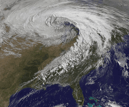
Climate change appears to have influenced other types of meteorological extremes (see table below). Not surprisingly, for example, extremely cold days, early frosts, etc., have decreased. Extremely heavy precipitation events and flooding episodes appear to have increased, consistent with the more vigorous hydrological cycle expected with a warming atmosphere. Extratropical cyclones (i.e., mid-latitude storm systems) appear to have strengthened, though the confidence on this observation is somewhat less. Ironically, on the day the first version of this lecture was written (October 27, 2010), the mid-west of the U.S. had just experienced their strongest extratropical cyclone on record, with a central low pressure of 954 millibars (that is lower than that of many category 2 Hurricanes!). This is what the October 2010 'superstorm' looked like:
Modeling studies suggest that human-caused climate change may actually decrease the number of extratropical cyclones because the projected polar amplification of warming is likely to reduce the equator-to-pole temperature gradient, which is ultimately what drives these storms through the process of baroclinic instability. However, it may at the same time increase the intensity of the storms systems that do form, because the greater amounts of water vapor available in a warmer atmosphere, once condensed into precipitation as the air rises along frontal boundaries, yield additional latent heating that can add to the energetics of the storm. You can find an excellent discussion of this topic here on Jeff Master's Weather Underground site).
Here is a summary of some extreme weather and other climate indicators from Figure 1.2 of the Fourth National Climate Assessment in 2018:
| Phenomenon | Change | Region | Period | Confidence | Section |
|---|---|---|---|---|---|
| Low-temperature days/nights and frost days | Decrease, more so for nights than days | Over 70% of global land area | 1951 - 2003 (last 150 years for Europe and China) | Very likely | 3.8.2.1 |
| High-temperature days/nights | Increase, more so for nights than days | Over 70% of global land area | 1951- 2003 | Very likely | 3.8.2.1 |
| Cold spells/snaps (episodes of several days) | Insufficient studies, but daily temperature changes imply a decrease | ||||
| Warm spells (heat waves) (episodes of several days) | Increase: implicit evidence from changes in inter-seasonal variability | Global | 1951 - 2003 | Likely | FAQ 3.3 |
| Cold seasons/warm seasons (seasonal averages) | Some new evidence for changes in inter-seasonal variability | Central Europe | 1961 - 2004 | Likely | 3.8.2.1 |
| Heavy precipitation events (that occur every year) | Increase, generally beyond that expected from changes in the mean (disproportionate) | Many mid-latitude regions (even where reduction in total precipitation) | 1951 - 2003 | Likely | 3.8.2.2 |
| Rare precipitation events (with return periods > ~10 yrs) | Increase | Only a few regions have sufficient data for reliable trends (e.g. UK and USA) | Various since 1893 | Likely (consistent with changes inferred for more robust statistics) | 3.8.2.2 |
| Drought (season/year) | Increase in total area affected | Many land regions in the world | Since 1970's | Likely | 3.3.4 and FAQ 3.3 |
| Tropical cyclones | Trends towards longer lifetimes and greater storm intensity, but no trend in frequency | Tropics | Since 1970's | Likely; more confidence in frequency and intensity | 3.8.3 and FAQ 3.3 |
| Extreme extratropical storms | Net increase in frequency/intensity and a poleward shift in track | NH land | Since about 1960 | Likely | 3.8.4, 3.5 and FAQ 3.3 |
| Small-scale severe weather phenomena | Insufficient studies for assessment |