Lesson 5: Linear Regression Analysis
Motivate...
In the previous lesson, we learned how to calculate the strength and sign of a linear relationship between two datasets. The correlation coefficient, itself, is not a directly useful metric. The correlation coefficient represents the linear dependence of the two datasets. If the correlation is strong, a linear model would be a good fit for the data, pending an inspection into the data and confirming whether a linear relationship is plausible.
Fitting a model to data is beneficial for many reasons. Modeling allows us to predict one variable based on another variable, which will be discussed in more detail later on. In this lesson, we are going to focus on fitting linear models to our data using the approach called linear regression. We will build off our previous findings in Lesson 4 on the relationship between drought, temperature, and precipitation. In addition, we will work through an example focused on climate - how the atmosphere behaves or changes on a long-term scale, whereas weather is used to describe short time periods [Source: NASA - What's the Difference Between Weather and Climate? [1]]. As the world becomes more concerned with the effects of climate and as more companies prepare for the long-term impacts, climate analytic positions will only continue to grow. Being able to perform such an analysis will be beneficial to you and your current or future employers.
Newsstand
- Latham, Ben. (2014, December 9). Weather to Buy or Not: How Temperature Affects Retail Sales [2]. Retrieved September 13, 2016.
- Tobin, Mitch. (2013, December 3). Snow Jobs: America's $12 Billion Winter Sports Economy and Climate Change [3]. Retrieved September 13, 2016.
- Bagley, Katherine. (2015, December 24). As Climate Change Imperils Winter, the Ski Industry Frets [4]. Retrieved September 13, 2016.
- Scott, D., Dawson, J. & Jones, B. Mitig. (2008). Climate Change Vulnerability of the US Northeast Winter Recreation-Tourism Sector [5]. Retrieved September 13, 2016.
- Vidal, John. (2010, November 26). A Climate Journey: From the Peaks of the Andes to the Amazon's Oilfields [6]. Retrieved September 13, 2016.
- Gordon, Lewis, and Rogers. (2014, June). A Climate Risk Assessment for the United States [7]. Retrieved September 13, 2016.
- Kluger, Jeffrey. Time and Space [8]. Retrieved September 13, 2016.
- Schmith, Torben. (2012, November). Statistical Analysis of Global Surface Temperature and Sea Level Using Cointegration Methods [9]. Retrieved September 13, 2016.
- Iwasaki, Sasaki, and Matsuura. (2008, April 1). Past Evaluation and Future Projection of Sea Level Rise Related to Climate Change Around Japan [10]. Retrieved September 13, 2016.
Lesson Objectives
- Remove outliers from a dataset and prepare for a linear regression analysis.
- Break down the steps of a linear regression analysis and describe the process.
- Perform a linear regression in R, plot results, and interpret.
Regression Overview
Prioritize...
At the end of this section you should have a basic understanding of regression, know what we use it for, why we use it, and what the difference is between interpolation and extrapolation.
Read...
We began with hypothesis testing, which told us whether two variables were distinctly different from one another. We then used chi-square testing to determine whether one variable was dependent on another. Next, we examined the correlation, which told us the strength and sign of the linear relationship. So what’s the next step? Fitting an equation to the data and estimating the degree to which that equation can be used for prediction.
What is Regression?
Regression is a broad term that encompasses any statistical methods or techniques that model the relationship between two variables. At the core of a regression analysis is the process of fitting a model to the data. Through a regression analysis, we will use a set of methods to estimate the best equation that relates X to Y.
The end goal of regression is typically prediction. If you have an equation that describes how variable X relates to variable Y, you can use that equation to predict variable Y. This, however, does not imply causation. Likewise, similar to correlation, we can have cases in which a spurious relationship exists. But by understanding the theory behind the relationship (do we believe that these two variables should be related?) and through metrics that determine the strength of our best fit (to what degree does the equation successfully predict variable Y?), we can successfully use regression for prediction purposes.
I cannot stress enough that obtaining a best fit through a regression analysis does not imply causation and, many times, the results from a regression analysis can be misleading. Careful thought and consideration should be given when using the result of a regression analysis; use common sense. Is this relationship realistically expected?
Types of Regression
The most common and probably the easiest method of fitting, is the linear fit. Linear regression, as it is commonly called, attempts to fit a straight line to the data. As the name suggests, use this method if the data looks linear and the residuals (error estimates) of the model are normally distributed (more on this below). We want to again begin by plotting our data.

The figures above show you two examples of linear relationships in which linear regression would be suitable and one example of a nonlinear relationship in which linear regression would be ill-suited. So what do we do for non-linear relationships? We can fit other equations to these curves, such as quadratic, exponential, etc. These are generally lumped into a category called non-linear regression. We will discuss non-linear regression techniques along with multi-variable regression in the future. For now, let’s focus on linear regression.
Interpolation vs. Extrapolation
There are a number of reasons to fit a model to your data. One of the most common is the ability to predict Y based on an observed value of X. For example, we may believe there is a linear relationship between the temperature at Station A and the temperature at Station B. Let’s say we have 50 observations ranging from 0-25. When we fit the data, we are interpolating between the observations to create a smooth equation that allows us to insert any value from Station A, whether it has been previously observed or not, to estimate the value from Station B. We create a seamless transition between actual observations from variable X and values that have not occurred yet. This interpolation occurs, however, only over the range in which the inputs have been observed. If the model is fitted to data from 0-25, then the interpolation occurs between the values of 0 and 25.
Extrapolation occurs when you want to estimate the value of Y based on a value of X that’s outside the range in which the model was created. Using the same example, this would be for values less than 0 or greater than 25. We take the model and extend it to values outside of the observed data range.
Assuming that this pattern holds for data outside the observed range is a very large assumption. It could be that the variables outside this range follow a similar shape, such as linear, but the parameters of the equation could be entirely different. Alternatively, it could be that the variables outside of this range follow a completely different shape. It could be that the data follows a linear shape for one portion and an exponential fit for another, requiring two distinctly different equations. Although we won’t be focusing on predicting in this lesson, I want to make it clear the difference between interpolation and extrapolation, as we will indirectly employ this throughout the lesson. For now, I suggest only using a model from a regression analysis when the values are within the range of data it was created with (both for the independent variable, X, and dependent variable, Y).
Normality Assumption
When you perform a linear regression, the residuals (error estimates-this will be discussed in more detail later on) of the model must be normally distributed. This is more important later on for more advanced analyses. For now, I suggest creating a histogram of the residuals to visually test for normality or if your dataset is large enough you can use the central limit theory and assume normality.
Basics of Fitting
Prioritize...
At the end of this section, you should be able to prepare your data for fitting and estimate a first guess fit.
Read...
At this point, you should be able to plot your data and visually inspect whether a linear fit is plausible. What we want to do, however, is actually estimate the linear fit. Regression is a sophisticated way to estimate the fit using several data observations, but before we begin discussing regression, let’s take a look at the very basics of fitting and create a first guess estimate. These basics may seem trivial for some, but this process is the groundwork for the more robust analysis of regression.
Prepare the Data
Removing outliers is an important part of our fitting process, as one outlier can cause the fit to be off. But when do we go too far and become overcautious? We want to remove unrealistic cases, but not to the point where we have a ‘perfect dataset’. We do not want to make the data meet our expectations, but rather discover what the data has to tell. This will take practice and some intuition, but there are some general guidelines that you can follow.
At the very minimum, I suggest following the guidelines of the dataset. Usually the dataset you are using will have quality control flags. You will have to read the ‘read me’ document to determine what the QC flags mean, but this is a great place to start as it lets you follow what the developers of the dataset envisioned for the data since they know the most about it. Here is an example of temperature data from Tokyo, Japan. The variables provided our mean daily temperature, maximum daily temperature, and minimum daily temperature. I’m going to compare the mean daily temperature to an average of the maximum and minimum. The figure on the left is what I would get without any quality control. The figure on the right uses a flag within the dataset that was recommended- it flags data that is bad or doubtful. How do you think the QC flags did?
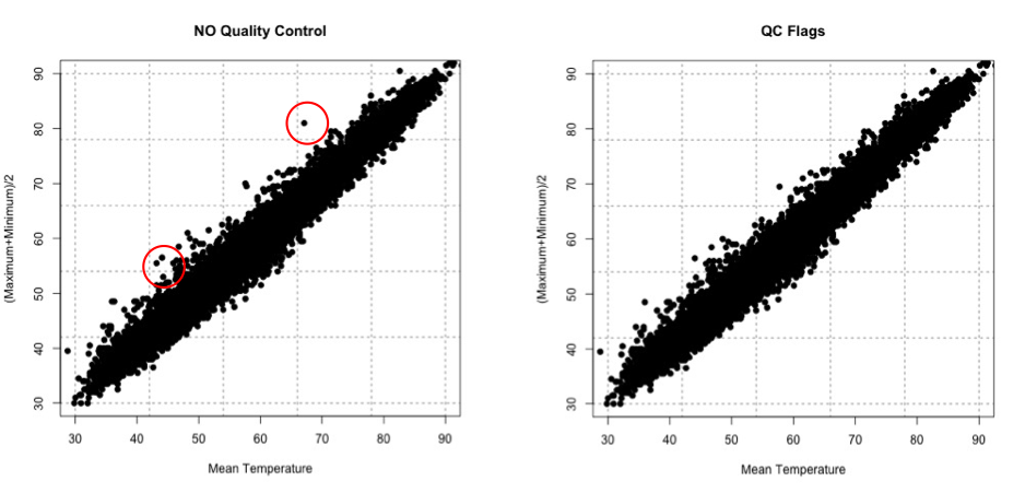
There are many ways to QC the data. Picking the best option will be based on the data at hand, the question you are trying to answer, and the level of uncertainty/confidence appropriate to your problem.
Estimate Slope Fit and Offset
Let’s talk about estimating the fit. A linear fit follows the equation:
Where Y is the predicted variable, X is the input (a.k.a. predictor), a is the slope and b is the offset (a.k.a intercept). The goal is to find the best values for a and b using our datasets X and Y.
We can take a first guess at solving this equation by estimating the slope and offset. Remember, slope is the change in Y divided by the change in X
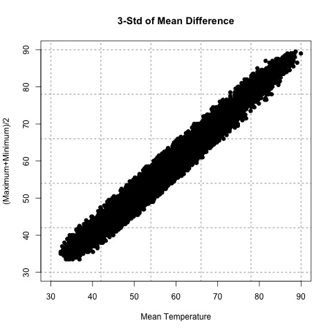
Let’s try this out. Here is a scatterplot of QCd Tokyo, Japan temperature data. I’ve QCd the data by removing any values greater or less than 3 Std. of the difference.
Now, let’s take two random points (using a random number generator) and calculate the slope. For this example, the daily mean temperature is my X variable and the estimated daily mean temperature from the maximum and minimum variables is my Y variable. For one example, I use indices 1146 and 7049 to get a slope of 0.812369. In another instance, I use indices 18269 and 9453 and get a slope of 0.7616487. And finally, if I use indices 6867 and 15221, I get a slope of 0.9976526.
The offset (b) is the value where the line intersects the Y-axis, that is, the value of Y when X is 0. Again, this is difficult to accurately estimate in such a simplistic manner, but what we can do is solve our equation for a first cut result. Simply take one of your Y-values and the corresponding X-value along with your slope estimate to solve for b.
Here are the corresponding offsets we get. For the slope of 0.812369, we have an offset of 8.178721. The slope of 0.7616487 has a corresponding offset of 8.280466. And finally, the slope of 0.9976526 has an offset of -0.1326291.
What sort of problems or uncertainties could arise using this method? Well, to start, the slope is based on just 2 values! Therefore, it greatly depends on which two values you choose. And only looking at two values to determine a fit estimate is not very thorough, especially if you have an outlier. I suggest only using this method for the slope and offset estimate as a first cut, but the main idea is to show you ‘what’ a regression analysis is doing.
Plot Fit Estimate
Once we have a slope and offset estimate, we can plot the results to visually inspect how the equation fits the data. Remember, the X-values need to be in the realistic range of your observations. That is, do not input an X-value that exceeds or is less than the range from the observations.
Let’s try this with our data from above. The range of our X variable, daily mean temperature, is 29.84 to 93.02 degrees F. I’m going to create input values from 30-90 with increments of 1 and solve for Y using the three slopes and offsets calculated above. I will then overlay the results on my scatterplot. Here’s what I get:
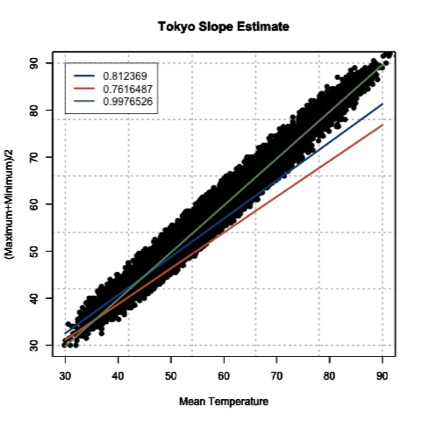
This figure shows you how to visually inspect your results. Right away, you will notice that the slope of 0.9976526 is the better estimate. You can see that it’s right in the middle of the data points, which is what we want. Remember to always visually inspect to make sure that your results make sense.
Best Fit-Regression Analysis
Prioritize...
This section should prepare you for performing a regression analysis on any dataset and interpreting the results. You should understand how the squared error estimate is used, how the best fit is determined, and how we assess the fit.
Read...
We saw that the two point fit method is not ideal. It’s simplistic and can lead to large errors, especially if outliers are present. A linear regression analysis compares multiple fits to select an optimal one. Moreover, instead of simply looking at two points, the entire dataset will be used. One warning before we begin. It’s easy to use R and just plug in your data. But I challenge you to truly understand the process of a linear regression. What is R ‘doing’ when it creates the best fit? This section should answer that question for you, allowing you to get the most out of your datasets.
Squared Error
One way to make a fit estimate more realistic is to estimate the slope and offset multiple times and then take an average. This is essentially what a regression analysis does. However, instead of taking an average estimate of the slope and offset, a regression analysis chooses the fit that minimizes the squared error over all the data. Say, for example, we have 10 data points from which we calculate a slope and offset. Then, we can predict the 10 Y-values based on the observed 10 X-values and compute the difference between the predicted Y-values and the observed Y-values. This is our error; 10 errors in total. The closer the error is to 0, the better the fit.
Mathematically:
Where is the predicted value (the line), and Y is the observed value. Next, we square the error so that we don't have to worry about the sign of the error when we sum up the errors across our dataset. Here is the equation mathematically:
With the regression analysis, we are calculating the squared error for each data point based on a given slope and offset. For each fit estimate, we will provide a mean of the squared error. Mathematically,
For each observation, (i) we calculate the squared error and sum up all of the errors (N). Then divide by the number of errors estimated (N) to obtain the Mean Squared Error or MSE. The regression analysis seeks to minimize this mean squared error by making the best choice for a and b. While this could be done by trial and error, R has a more efficient algorithm which lets it compute these best values directly from our dataset.
Estimate Best Fit
In R, there are a number of functions to estimate the best fit. For now, I will focus on one function called ‘lm’. ‘lm’, which stands for linear models, fits your data with a linear model. You supply the function with your data, and it will go through a regression analysis (as stated above) and calculate the best fit. There is really only one parameter you need to be concerned about, and that is ‘formula’. The rest are optional, and it’s up to you whether you would like to learn more about them or not. The ‘formula’ parameter describes the equation. For our purposes, you will set the formula to y~x, the response~input.
There are a lot of outputs from this function, but let me talk about the most important and relevant ones. The primary output we will use will be the coefficients, which represent your model's slope and offset values. The next major output is the residuals. These are your error estimates (predicted Y – true Y). You can use these to calculate the MSE by squaring the residuals and averaging over them. If you would like to know more about the function, including the other inputs and outputs, follow this link on "Fitting Linear Models [12]."
Let me work through an example to show you what ‘lm’ is doing. We are going to calculate a fit 3 times ‘by hand’ and choose the best fit by minimizing the MSE. Then we will supply the data to R and use the 'lm' function. We should get similar answers.
Let’s examine the temperature again from Tokyo, looking at the mean temperature supplied and our estimation of the average of the maximum and minimum values. After quality control, here is a list of the temperature values for 6 different observations. I chose the same 6 observations that I used to calculate the slope 3 different times from the previous example.
| Index | Average Temperature | (Max + Min)/2 |
|---|---|---|
| 1146 7049 |
37.94 57.02 |
39.0 54.5 |
| 18269 9453 |
39.02 50.18 |
38.0 46.5 |
| 6867 15221 |
62.78 88.34 |
62.5 88 |
Since I already calculated the slope and offset, I’m going to supply them in this table.
| Index | Slope | Offset |
|---|---|---|
| 1146 7049 |
0.8123690 | 8.1787210 |
| 18269 9453 |
0.7616487 | 8.2804660 |
| 6867 15221 |
0.9976525 | -0.1326291 |
We saw that the last fit estimate visually was the best, but let’s check it by calculating the MSE for each fit. Remember the equation (model) for our line is:
For each slope, I will input the observed mean daily temperature to predict the average of the maximum and minimum temperature. I will then calculate the MSE for each fit. Here is what we get:
| Index | MSE |
|---|---|
| 1146 7049 |
21.11071 |
| 18269 9453 |
54.16036 |
| 6867 15221 |
3.02698 |
If we minimize the MSE, our best fit would be the third slope and offset (0.9976525 and -0.1326291); confirming our visual inspection.
Let’s see how the ‘lm’ model in R compares. Remember, the model is more robust and will definitely give a different answer, but we should be in the same ballpark. The result is a slope of 1.00162 and an offset of -0.06058 with an MSE of 2.925. Our estimate was actually pretty close, but you can see that we’ve reduced the MSE even more by doing a regression analysis and have changed the slope and offset values slightly
Methods to Assess Goodness of Fit
Now that we have our best fit, how good is that fit? There are two main metrics for quantifying the best fit. The first is looking at the MSE. I told you that the MSE is used as a metric for the regression to pick the best fit. But it can be used in your end result as well. Let’s look at what the units are for the MSE:
The units for MSE will be the units of your Y variable squared, so for our example it would be (degrees Fahrenheit)2. This is kind of difficult to utilize. Instead, we will state the Root-Mean-Square-Error (RMSE) (sometimes called root-mean-square deviation RMSD). The RMSE is the square root of the MSE which will give you units that you can actually interpret, which in our example would be degrees Fahrenheit. You can think of the RMSE as an estimate of the sample deviation of the differences between the predicted values and the observed.
For our example, the MSE was 2.926 so the RMSE would be 1.71oF. The model has an uncertainty of ±1.71oF. This is the standard deviation estimate. Remember the trick we learned for normal distributions? 1 standard deviation is 66.7% of the data, 2 will be 95% and 3 will be 99%. If we multiply the RMSE by 2, you can attach the confidence level of 95%. That is, you are 95% certain that the predicted values should lie within this range of ±2 RMSE.
The second metric to calculate is the coefficient of determination, also called R2 (R-Squared). R2 is used to describe the proportion of the variance in the dependent variable (Y) that is predicted from the independent variable (X). It really describes how well variable X can be used to predict variable Y and capture not only the mean but the variability. R2 will always be positive and between 0 and 1-the closer to 1 the better.
In our example with the Tokyo temperatures, the R2 value is 0.9859. This means that the mean temperature explains 98.5% of the variability of the average max/min temperature.
Let’s end by plotting our results to visually inspect whether the equation selected through the regression is good or not. Here is our data again, with the best fit determined from our regression analysis in R. I’ve also included dashed lines that represent our RMSE boundaries (2*RMSE=95% confidence level).

By using the slope and offset from the regression, the line represents the values we would predict. The dashed lines represent our uncertainty or possible range of values at the 95% confidence level. Depending on the confidence level you choose (1, 2, or 3 RMSE), your dashed lines will either be closer to the best fit line (1 standard deviation) or encompass more of the data (3 standard deviations).
Best Fit-Regression Example: Precip, Tmax, & PZI
Prioritize...
After finishing this page, you should be able to set up data for a regression analysis, execute the analysis, and interpret the results.
Read...
In our previous lesson, we saw a strong linear relationship between precipitation and drought. We will continue with our study on the relationship between temperature, precipitation, and drought.
Precipitation and Drought
Let’s begin by loading in the dataset and extracting out precipitation and drought (PZI) variables.
Your script should look something like this:
# load in all annual meteorological variables available
mydata <- read.csv("annual_US_Variables.csv")
precip <- mydata$Precip
drought <- mydata$PZI
We know the data is matched up, we already saw that the relationship was linear, and we’ve already calculated the correlation coefficient, so let’s go right into creating the linear model. Use the following code to create a linear model between precipitation and drought.
Note that the only parameter I used was the formula, which tells the function how I want to model the data. That is, I want to use precipitation to estimate drought. The 'summary' command provides the coefficient estimates, standard error estimates for the coefficients, the statistical significance of each coefficient, and the R-squared values.
Let’s pull out the R-squared value and estimate the MSE. We do this by using the output variable ‘residuals’.
The result is an MSE of 0.17 and an R-squared of 0.80, which means that the model captures 80% of the variability in the drought index. The last step is to plot our results. Use the code below to overlay the linear model on the observations.
Here is a version of the figure:

Visually and quantitatively, the linear model looks good. Let’s look at maximum temperature next and see how it compares as a predictor of drought.
Maximum Temperature and Drought
Let’s look at the linear model for maximum temperature and drought. I have already extracted out the maximum temperature (Tmax). Fill in the missing code below to create a linear model.
I've pulled out the R-squared value, fill in the missing code below to estimate the MSE value and save it to the variable 'MSE_droughtTmax'.
You should get a MSE of 0.56 and an R-Squared of 0.37. Quantitatively, the fit is not as good compared to the precipitation. Let’s confirm this visually. I've set up the plot for the most part. You need to add in the correct coefficient index (1 or 2) for the plotting at 'b'.
Here is a larger version of the figure:

You can see that the line doesn't fit these data as well. Compared to the precipitation model (with an R^2 of 0.80), the maximum temperature does not do as well at predicting the drought index (R^2 of 0.37).
Application
We use linear models for prediction. Let’s predict the 2016 PZI value based on the observed 2016 precipitation and maximum temperature values. Since we are using the model for an application, we should check that the model meets the assumption of normality. To do this, I suggest plotting the histogram of the residuals. If you believe the model meets the requirement then continue on.
I've already set up the PZI prediction using precipitation, fill in the missing code to predict PZI using temperature.
The PZI index is predicted to be 0.76 using precipitation and -1.45 for maximum temperature. We can provide a range by using the RMSE from each model. For precipitation, the RMSE is 0.42 and for temperature it is 0.75. At the 95% confidence, the PZI is estimated to be in the range of -0.08 and 1.59 using precipitation and -2.94 and 0.05 using the maximum temperature. The actual 2016 PZI value was -0.2 which is within the range predicted for both models.
One thing to note. The 2016 observed value for precipitation and maximum temperature was within the range of observations used to create the linear models. This means applying the linear model to the 2016 value was a realistic action. We did not extrapolate the model to values outside the data range.
Best Fit-Regression Example: CO2 & SLC
Prioritize...
After reading this page, you should be able to set up data for a regression analysis, execute an analysis, and interpret the results.
Read...
We have focused, so far, on weather and how weather impacts our daily lives. But what about the impacts from long-term changes in the weather?
Climate is the term used to describe how the atmosphere behaves or changes on a long-term scale whereas weather is used to describe short time periods [Source: NASA - What's the Difference Between Weather and Climate? [1]]. Long-term changes in our atmosphere, changes in the climate, are just as important for businesses as the short-term impacts of weather. As the climate continues to change and be highlighted more in the news, climate analytics continues to grow. Many companies want to prepare for the long-term impacts. What should a country do if their main water supply has disappeared and rain patterns are expected to change? Should a company build on a new piece of land, or is that area going to be prone to more flooding in the future? Should a ski resort develop alternative activities for patrons in the absence of snow?
These are all major and potentially costly questions that need to be answered. Let’s examine one of these questions in greater detail. Take a look at this study from Zillow [13]. Zillow examined the effect of sea level rise on coastal homes. They found that 1.9 million homes in the United States could be flooded if the ocean rose 6 feet. You can watch the video below that highlights the risk of flooding around the world.
[ON SCREEN TEXT]: Carbon emission trends point to 4°C (7.2°F) of global warming. The international target is 2°C (3.6°F). These point to very different future sea levels.
GOOGLE EARTH GENERATED GRAPHICS OF HIGH SEA LEVELS IN PLACES SUCH AS NEW YORK CITY, LONDON, AND RIO DE JANEIRO.
[ON SCREEN TEXT]: These projected sea levels may take hundreds of years to unfold, but we could lock in the endpoint now, depending on the carbon choices the world makes today.
You can check out this tool [14] that allows you to see projected sea level rise in various U.S. counties.
Let’s try to determine the degree to which carbon dioxide (CO2) and sea level (SL) relate and whether we can model the relationship using a linear regression.
Data
Climate data is different than weather data. Thus, we need to view it in a different light. To begin with, we are less concerned about the accuracy of a single measurement. This is because we are usually looking at longer time periods instead of an instantaneous snapshot of the atmosphere. This does not mean that you can just use the data without any quality control or consideration for how the data was created. Just know that the data accuracy demands are more relaxed if you have lots of data points going into the statistics, as is often the case when dealing with climate data. Quality control should still be performed.
For this example, we are going to use annual globally averaged data. We can get a pretty good annual global mean because of the amount of data going into the estimation even if each individual observation may have some error. The first dataset is yearly global estimates for total carbon emissions from the Oak Ridge National Laboratory [15].
The second dataset will be global average absolute sea level change [16]. This dataset was created by Australia’s Commonwealth Scientific and Industrial Research Organization in collaboration with NOAA. It is based on measurements from both satellites and tide gauges. Each value represents the cumulative change, with the starting year (1880) set to 0. Each subsequent year, the value is the sum of the sea level change from that year and all previous years. To find more information, check out the EPA's website [17] on climate indicators.
CO2 and Sea Level
Before we begin, I would like to mention that from a climate perspective, comparing CO2 to sea level change is not the best example as the relationship is quite complicated. However, this comparison provides a very good analytical example and, thus, we will continue on.
We are interested in the relationship between CO2 emissions and sea level rise. Let’s start by loading in the sea level and the CO2 data.
Your script should look something like this:
# Load in CO2 data
mydata <- read.csv("global_carbon_emissions.csv",header=TRUE,sep=",")

# extract out time and total CO2 emission convert from units of carbon to units of CO2
CO2 <- 3.667*mydata$Total.carbon.emissions.from.fossil.fuel.consumption.and.cement.production..million.metric.tons.of.C.
CO2_time <- mydata$Year

# load in Sea Level data
mydata2 <- read.csv("global_sea_level.csv", header=TRUE, sep=",")

# extract out sea level data (inches) and the time
SL <- mydata2$CSIRO...Adjusted.sea.level..inches.
SL_time <- mydata2$Year
Now extract for corresponding time periods.
Your script should look something like this:
# determine start and end corresponding times
start_time <- max(CO2_time[1],SL_time[1])
end_time <- min(tail(na.omit(CO2_time),1),tail(na.omit(SL_time),1))

# extract CO2 and SL for corresponding periods
SL <- SL[which(SL_time == start_time):which(SL_time == end_time)]
time <- SL_time[which(SL_time == start_time):which(SL_time == end_time)]

CO2 <- CO2[which(CO2_time == start_time):which(CO2_time == end_time)]
And plot a time series.
Your script should look something like this:
plot.new()
frame()
grid(nx=NULL,lwd=2,col='grey')
par(new=TRUE)
plot(time,SL,xlab="Time",type='l',lwd=2,ylab="Sea Level Change (Inches)", main="Annual Global Sea Level Change", xlim=c(start_time,end_time))

# plot timeseries of CO2
plot.new()
frame()
grid(nx=NULL,lwd=2,col='grey')
par(new=TRUE)
plot(time,CO2,xlab="Time",type='l',lwd=2,ylab="CO2 Emissions (Million Metric Tons of CO2)", main="Annual Global CO2 Emissions",      xlim=c(start_time,end_time))
You should get the following plots:

As a reminder, the global sea level change is the cumulative sum. This means that the starting year (1880) is 0. Then, the anomaly of the sea level for the next year is added to the starting year. The anomaly for each sequential year is added to the previous total. The number at the end is the amount that the sea level has changed since 1880. Around the year 2000, the sea level has increased by about 7 inches since 1880. You can see that the two variables do follow a similar pattern, so let’s plot CO2 vs. the sea level to investigate the relationship further.
Your script should look something like this:
# plot CO2 vs. SL
plot.new()
frame()
grid(nx=NULL,lwd=2,col='grey')
par(new=TRUE)
plot(CO2,SL,xlab="CO2 Emissions (Million Metric Tons of CO2)",pch=19,ylab="Sea Level Change (Inches)", main="Annual Global CO2 vs. SL Change",
     ylim=c(0,10),xlim=c(0,35000))
par(new=TRUE)
plot(seq(0,40000,1000),seq(3,10,0.175),type='l',lwd=3,col='red',ylim=c(0,10),xlim=c(0,35000),
     xlab="CO2 Emissions (Million Metric Tons of CO2)",ylab="Sea Level Change (Inches)", main="Annual Global CO2 vs. SL Change"
The code will generate this plot. I’ve estimated a fit to visually inspect the linearity of the data.

You can see that there appears to be a break around 5,000-10,000 CO2. Below that threshold, the data drops off at a different rate. This actually may be a candidate for two linear fits, one between 0 and 10,000 and one after, but for now, let’s focus on the dataset as a whole. Let’s check the correlation coefficient next.
Your script should look something like this:
# estimate correlation
corrPearson <- cor(CO2,SL,method="pearson")
The correlation coefficient was 0.96, a strong positive relationship. Let’s attempt a linear model fit. Run the code below
This is the figure you would create:

Visually, the fit is pretty good except for CO2 emissions less than 10,000. Quantitatively, we get an R2 of 0.929 which is pretty good, but let’s split our data up into two parts and create two separate linear models. This may prove to be a better representation. I’m going to create two datasets, one for CO2 less than 10,000 and one for values greater. Let's also re-calculate the correlation.
Your script should look something like this:
# split CO2
lessIndex <- which(CO2 < 10000)
greaterIndex <- which(CO2 >= 10000)

# estimate correlation
corrPearsonLess <- cor(CO2[lessIndex],SL[lessIndex],method="pearson")

corrPearsonGreater <- cor(CO2[greaterIndex],SL[greaterIndex],method="pearson")
The correlation for the lower end is 0.96 and for the higher is 0.98. Both values suggest a strong postive linear relationship, so let’s continue with the fit. Run the code below to estimate the linear model. You need to fill in the code for 'lm_estimateGreater'.
The MSE for the lower end is 0.1379 and for the higher end is 0.057, which is significantly smaller than our previous combined MSE of 0.4323. Furthermore, the R2 is 0.9167 for the lower end and 0.9686 for the higher end. This suggests that the two separate fits are better than the combined. Let’s visually inspect.
Your script should look something like this:
plot.new()
frame()
grid(nx=NULL,lwd=2,col='grey')
par(new=TRUE)
plot(CO2,SL,xlab="CO2 Emissions (Million Metric Tons of CO2)",pch=19,ylab="Sea Level Change (Inches)", main="Annual Global CO2 vs. SL Change",
     ylim=c(0,10),xlim=c(0,35000))
par(new=TRUE)
plot(seq(0,10000,1000),seq(0,10000,1000)*lm_estimateLess$coefficients[2]+lm_estimateLess$coefficients[1],type='l',lwd=3,col='firebrick2',ylim=c(0 ,10),xlim=c(0,35000),
     xlab="CO2 Emissions (Million Metric Tons of CO2)", ylab="Sea Level Change (Inches)", main="Annual Global CO2 vs. SL Change")
par(new=TRUE)
plot(seq(10000,40000,1000),seq(10000,40000,1000)*lm_estimateGreater$coefficients[2]+lm_estimateGreater$coefficients[1],type='l',lwd=3,col='darkorange1',ylim=c(0 ,10),xlim=c(0,35000),
     xlab="CO2 Emissions (Million Metric Tons of CO2)", ylab="Sea Level Change (Inches)", main="Annual Global CO2 vs. SL Change"
The figure should look like this:

The orange line is the fit for values larger than 10,000 CO2 and the red is for values less than 10,000. This is a great example of the power of plotting and why you should always create figures as you go. CO2 can be used to model sea level change and explains 91-96% (low end – high end) of the variability.
CO2 and Sea Level Prediction
Sea level change can be difficult to measure. Ideally, we would like to use the equation to estimate the sea level change based on CO2 emissions (observed or predicted in the future). Again, since we are using the model for an application, we should make sure the model meets the assumption of normality. If you plot the histogram of the residuals, you should find that they are roughly normal.
The 2014 CO2 value was 36236.83 million metric tons. Run the code below to estimate the sea level change for 2014 using the linear model developed earlier.
The result is a sea level change of 9.2 inches. If we include the RMSE from our equation, which is 0.24 (inches), our range would be 9.2 ±0.48 inches at the 95% confidence level. What did we actually observe in 2014? Unfortunately, the dataset we used has not been updated. We can see that the 2014 NOAA adjusted value [18] was 8.6 inches. The NOAA adjusted value is generally lower than the CSIRO adjusted, so our estimate range is probably realistic.
But what sort of problems do you see from this estimation? The biggest issue is that the CO2 value was larger than what was observed before and thus outside our range of observations in which the model was created. We’ve extrapolated. Since we saw that this relationship required two separate linear models, extrapolating to values outside of the range should be done cautiously. There could very well be another threshold where a new linear model needs to be created, but that threshold maybe hasn’t been crossed yet. We will discuss prediction and forecasting in more detail in later courses.