Lessons
Use the links below to link directly to one of the lessons listed.
† indicates lessons that are Open Educational Resources.
Lesson 1: Introduction to Time Series Data
Motivate...
The interactive tool above from NASA called ‘Climate Time Machine’ showcases a selection of variables that have been documented over a period of time. These videos come from a variety of time series. In Meteo 815, you worked with time series data, but in this course, we are going to utilize this data in ways that take advantage of the time component. The two primary purposes for time series data in this course will be 1) to explore a natural phenomenon (such as changes in a variable, like temperature) and 2) for forecasting.
In this lesson, we will begin with the basics. We will focus on breaking down the time series into components, perform initial analyses, and begin to look at common patterns in weather and climate data. There are a lot of time series data out there. I highly recommend checking out the NASA App ‘Eyes on Earth [8]’ which allows you to look and play with some of this data. Or you can check out Science On a Sphere [9] which has a variety of movies (intended for a sphere but still pretty cool) that showcase an enormous amount of weather/climate variables through time. They are both great ways to appreciate the amount of data out there and the length of these datasets.
Lesson Objectives
- List the most important aspects to consider when performing a time series analysis.
- Distinguish between stationary and nonstationary.
- Identify common patterns in weather and climate data.
- Prepare and decompose a time series.
Newsstand
- Srivastava, Tavish. (2015, December 16). A Complete Tutorial on Time Series Modeling in R [10]. Retrieved August 14, 2017.
- NOAA. Natural Climate Patterns [11]. Retrieved August 14, 2017.
- NOAA. Locating Climate and Weather Data and Information [12]. Retrieved August 14, 2017.
- NASA. Eyes on the Earth [8]. Retrieved August 14, 2017.
- NOAA. Dataset Catalog [9]. Retrieved August 14, 2017.
Time Series Overview
Prioritize...
After reading this section, you should be able to define a time series and describe the importance of having long datasets.
Read...
As with Meteo 815, we need to be cautious before we begin an analysis. Before we dive into all the applications of a time series, we will first talk about the time series data itself. In this lesson, you will learn a very simplistic approach meant to illustrate how the components of a time series all add together. We will hit it with more powerful tools in later lessons. For now, let’s begin by defining a time series.
What is a time series?
A time series is a sequence of measurements spanning a period of time. Usually, these measurements are taken at equal intervals. Although we inadvertently used time series data in Meteo 815, we generally discussed the random samples of observations, not the sequence. In fact, the assumption for many of the statistics we computed in Meteo 815 included the need for randomly sampled data. For a time series, the key assumption will instead be that each successive value of the dataset represents consecutive measurements of the variable, usually at equal time intervals.
Why do we care about a time series?
There are two main goals, in this course, for examining a time series. The first is to identify the nature of a weather or climate phenomenon. We might observe something occurring and ask why that event occurred. We could use a time series to investigate that particular event in more detail.
Check out the video below for an example:
[THUNDEROUS SOUNDS]
PRESENTER: Here's the latest from Earth Now.
[BIRDS CAWING]
Extreme weather in the Northern Hemisphere is increasingly blamed on arctic amplification. What is arctic amplification, and how does it affect our weather? The display first shows a satellite image of Arctic sea ice from September 1980.
[WAVES ROLLING]
Ice is colored white. The temperature differences between the cold poles and the warm tropics, combined with the Earth's rotation, cause air to flow eastward fastest over the mid-latitudes, where most of us live. This is called the jet stream and is shown here in red and blue.
Approaching North America, the jet stream moves northward over the Rocky Mountains, then dips southward, forming a trough towards the east coast, then northward as a ridge over the Atlantic Ocean. It continues in a similar long wave pattern over Europe, Asia, and the Pacific. Storms develop and track along the jet stream, pushing cold air south, shown as the blue portion of the jet stream, and warm air north, shown as the red portions of the jet stream.
Now, the display shows the recent arctic sea ice from September 2012, the lowest ice extent ever recorded by satellites. The current typical jet stream location is now shown, with the previous ice extent and jet stream location typical of 30 years ago shown in pink for comparison.
[BIRDS CAWING]
During the past few decades, general warming in the atmosphere has accelerated arctic ice melt, leading to more seasonal ice cover, which is not as white and therefore absorbs more sunlight, in turn causing more warming. The Arctic has warmed twice as fast as the rest of the Northern Hemisphere. This is arctic amplification.
Scientists have observed that the reduced temperature difference between the North Pole and the tropics is associated with slower west to east jet stream movement and a greater north south dip in its path. This pattern causes storms to stall and intensify rather than move away, as they normally used to do. At mid-latitudes, more extreme weather results from this new pattern, including droughts, floods, cold spells, and heat waves.
[WAVES ROLLING]
And that is how arctic amplification is affecting our weather.
[WAVES ROLLING]
It shows how the Arctic affects extreme weather. You can find a description here of the video [14], but let me briefly describe the premise. The number of extreme weather events has increased over the past several decades. This could be due to a number of reasons, including better monitoring. But one hypothesis is that Arctic Amplification (rapid Arctic warming - twice as fast as the rest of the Northern Hemisphere) may be a cause. So by examining the time series of extreme weather events and Arctic ice melt, a scientist could understand the interaction in more detail.
The second reason we analyze a time series is for forecasting. By identifying patterns in time, we can extrapolate to predict occurrences in the future. We can also use a time series to identify the dominant time scales across which variability occurs. This tells us a lot about which extrapolation forecasts will be useful. Meteo 825 will focus on forecasting so it’s key that you understand this course to utilize the information for the follow on.
Check out the video below:
[ON SCREEN TEXT]: Ocean temperatures influence the atmosphere above, impacting weather and climate. Temperatures at the ocean's surface are constantly changing. Over time, seasonal patterns emerge. A band of warm weather shifts north and south as the seasons change.
The El Niño/Southern Oscillation (ENSO) cycle is a climate pattern that occurs approximately every five years. ENSO is marked by changing temperatures across the eastern tropical Pacific Ocean. ENSO has two phases: warmer than average and cooler than average When surface temperatures along the eastern tropical Pacific become warmer than average the phase is called El Niño. El Niño drives extreme weather worldwide. El Niño's opposite phase is called La Niña. In 2010, El Niño's warm waters cooled quickly, giving way to a strong La Niña. The 2010-2011 La Niña was behind many of the year's weather disasters. Scientists use sea surface temperature observations to forecast weather and understand the global climate system.
ENSO is an oscillation that will be discussed in more detail later on. The video is showing how we can use the ENSO cycle to predict weather events (like droughts, floods, cold temperatures, etc.) for the season. By analyzing the time series of ENSO and these other weather events, we can use the relationship to forecast future weather events.
In short, performing a time series analysis can be quite valuable both for investigating connections and utilizing the results for forecasting.
What do we need to consider when examining a time series?
Generally speaking, when we perform a time series analysis the main goal is to detect a reproducible pattern. This means that, in most cases, we will assume that the data has a pattern with some random noise and/or error. The random noise is what makes it difficult to pull out patterns.
Throughout the lesson, we will examine some potential issues that may arise with a time series. Whenever you begin a time series analysis, it would be beneficial to consider the points listed below (which will be discussed in more detail later on) as they may pose a problem in the actual analysis. We can correct these potential problems if we detect them before conducting the time series analysis:
- Are there any missing values?
- Are there any abrupt changes or shifts (could be natural or artificial)?
- Is there constant variance over the time period?
- Are there regularly repeating patterns (daily, monthly, etc.)?
- Is there a trend (steady increase or decrease over time)?
Prepare Data for Time Series Analysis
Prioritize...
After reading this section, you should be able to prepare a dataset for a time series analysis, check for inhomogeneity, deal with missing values, and smooth the data if need be.
Read...
As with the statistical methods we discussed in Meteo 815, preparing your data for a time series analysis is a crucial step. We need to understand the ins and outs of the data and account for any potential problems prior to the analysis. If you spend the time investigating and prepping the data up front, you will save time in the long term.
Plot
As with Meteo 815 and most other data analysis courses, you should always begin your analysis by plotting the data. This helps us understand the basics of the data and look for any potential problems. Plotting also allows us to check for missing values or inhomogeneities that may be missed from quantitative approaches. ALWAYS PLOT YOUR DATA!
For a time series analysis, the best plot is a time series plot (as opposed to boxplot, histograms, etc., that we used predominantly in Meteo 815). In R, you can use the function ‘plot’ and set X to time and Y to the data. Or you can use the specific function ‘plot.ts’ that can plot a time series object automatically. You can find more information on ‘plot.ts’ here [15].
Let’s work through an example. Consider this global SST and air temperature anomaly time series data from NASA GISS [16]. Let’s load the data using the code below:
Your script should look something like this:
# Install and load in RNetCDF
install.packages("RNetCDF")
library("RNetCDF")

# load in monthly SST Anomaly NASA GISS
fid <- open.nc("NASA_GISS_MonthlyAnomTemp.nc")
NASA <- read.nc(fid)
This time series data spans from January 1880 to present. The monthly data is on a 2x2 degree latitude-longitude grid. The base period for the anomaly is 1951-1980, meaning the anomalies are computed by subtracting off the average from the base period. This dataset is a mixture of observations and interpolation. Let’s compute the global average and save a time variable using the code below:
Your script should look something like this:
# create global average
NASAglobalSSTAnom <- apply(NASA$air,3,mean,na.rm=TRUE)

# time is in days since 1800-1-1 00:00:0.0 (use print.nc(fid) to find this out)
NASAtime <- as.Date(NASA$time,origin="1800-01-01")
Now, let’s plot the time series using the ‘plot’ function by running the code below.
You should get a plot like this:
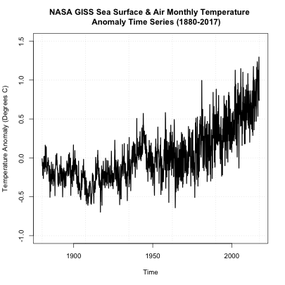
On first inspection, it appears there are no missing data points. There was a steady increase after 1950 and a spike in the 90s. There doesn’t appear to be any super-abnormal points, but the variance seems to change with noisier data points later on (notice the increase in fluctuation from month-month). The figure, to me, suggests we should perform an inhomogeneity test (which we will discuss later on). But before we move forward, let’s also take a look at another dataset of global SST and air temperatures. This dataset comes from NOAA and was originally called ‘MLOST’. You can download it here. [17] Let’s load it in and create our global average using the code below:
Your script should look something like this:
# load in monthly SST Anomaly NOAA MLOST
fid <- open.nc("NOAA_MLOST_MonthlyAnomTemp.nc")
NOAA <- read.nc(fid)

# create global average
NOAAglobalSSTAnom <- apply(NOAA$air,3,mean,na.rm=TRUE)

# time is in days since 1800-1-1 00:00:0.0  (use print.nc(fid) to find this out)
NOAAtime <- as.Date(NOAA$time,origin="1800-01-01")

# create ts object
tsNOAA <- ts(NOAAglobalSSTAnom,frequency=12,start=c(as.numeric(format(NOAAtime[1],"%Y")),as.numeric(format(NOAAtime[1],"%M"))))
tsNASA <- ts(NASAglobalSSTAnom,frequency=12,start=c(as.numeric(format(NASAtime[1],"%Y")),as.numeric(format(NASAtime[1],"%M"))))

# unite the two time series objects
tsObject <- ts.union(tsNOAA,tsNASA)
Now, let's plot the time series using the 'plot.ts' function by running the code below.
You should get a plot like this:

If you examine the figures, you will see that both follow a similar shape, but there are some discrepancies. Let’s overlay the plots to see how different the two datasets are. We will use another time series plot function called ‘ts.plot’. Run the code below.
You should get a figure like this:
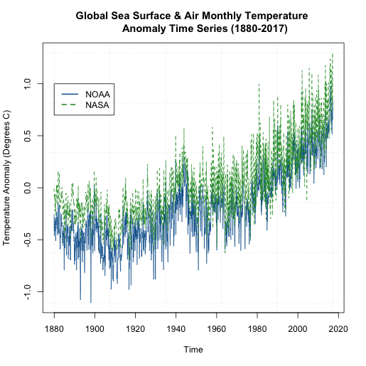
We can see that that the global NASA SST and air temperature anomalies are generally ‘above’ the NOAA dataset. But they are plotting the same thing? How can this be? Well, let’s take a closer look at what the NOAA dataset is. For starters, the temperatures come predominantly from observed data (Global Historical Climatology Network) with an analysis of SST merged in. In addition, the NOAA dataset is on a 5x5 degree grid instead of a 2x2 like the NASA GISS version. Furthermore, the NOAA dataset has limited coverage over the polar regions, so when we create the global averages, we are potentially including more points in the NASA version than the NOAA version, with a significant region being discounted in the NOAA version. You can read more about these two versions as well as a few other well documented and used air/SST datasets here [18].
But the bigger question is, if we pick one dataset over the other, are we creating a bias in our time series analysis? It really depends on the analysis, but noting these potential problems is important. I want you to start recognizing potential problems that can affect your outcome. Being skeptical at every step is a good habit to get into.
Missing Values
One of the main goals when performing a time series analysis, is to pull out patterns and model them for forecasting purposes. Missing values, as we saw in Meteo 815, can pose problems for the model fitting process. Before you continue on with a time series analysis, you need to check for missing values and decide on how you will deal with them. In most cases, for this course, you will need to perform an imputation. As a reminder, imputation is the process of filling missing values in. We discussed a variety of techniques in Meteo 815. Below is a list of some of the methods we discussed. If you need more of a refresher, I suggest you review the material from the previous course.
- Central Tendency Substitution - We replace missing values with the mean, median, or mode of the dataset.
- Previous Observation Carried Forward - We replace the missing value with the closest neighbor (both temporally and spatially).
- Regression - We fit one variable to another and use a linear regression to estimate the missing values.
I mentioned that a weakness in the NOAA data set was a lack of information in the polar regions. When we averaged globally, we just left out those values. Instead, let’s perform an imputation and then globally average the data. This is going to be a spatial imputation, so for each month, I will fill in missing values to create a globally covered product. I’m going to perform a simple imputation that takes the mean of the surrounding points.
Let’s start by plotting one month of the data using 'image.plot' to double check that there are missing values. To do this, let’s first extract out the latitudes and longitudes. Remember, when using ‘image.plot’ the values of ‘x’ and ‘y’ (your lat/lon) need to be in increasing order.
Your script should look something like this:
# extract out lat and lon accounting for EAST/WEST
NOAAlat <- NOAA$lat
NOAAlon <- c(NOAA$lon[37:length(NOAA$lon)]-360,NOAA$lon[1:36])

# extract out one month of temperature
NOAAtemp <- NOAA$air[,,1]
NOAAtemp <- rbind(NOAAtemp[37:length(NOAA$lon),],NOAAtemp[1:36,])
Now that we have the correct dimensions and order, let’s plot.
Your script should look something like this:
# load in tools to overlay country lines
install.packages("maptools")
library(maptools)
data(wrld_simpl)

# plot global example of NOAA data
library(fields)
image.plot(NOAAlon,NOAAlat,NOAAtemp,xlab="Longitude",ylab="Latitude",legend.lab="Degrees C",
            main=c("NOAA Air & SST Anomaly for ", format(NOAAtime[1],"%Y/%m")))
plot(wrld_simpl,add=TRUE)
You should get a plot similar to this:
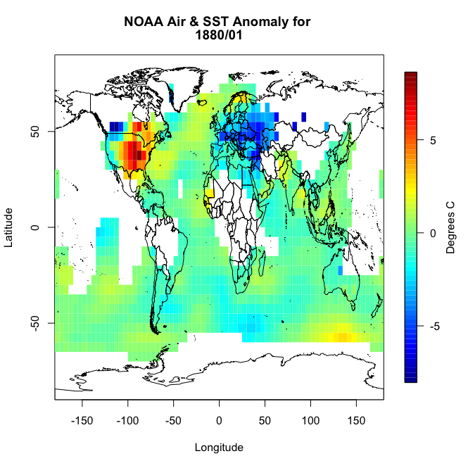
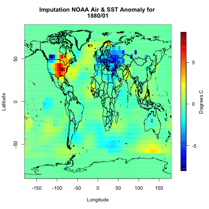
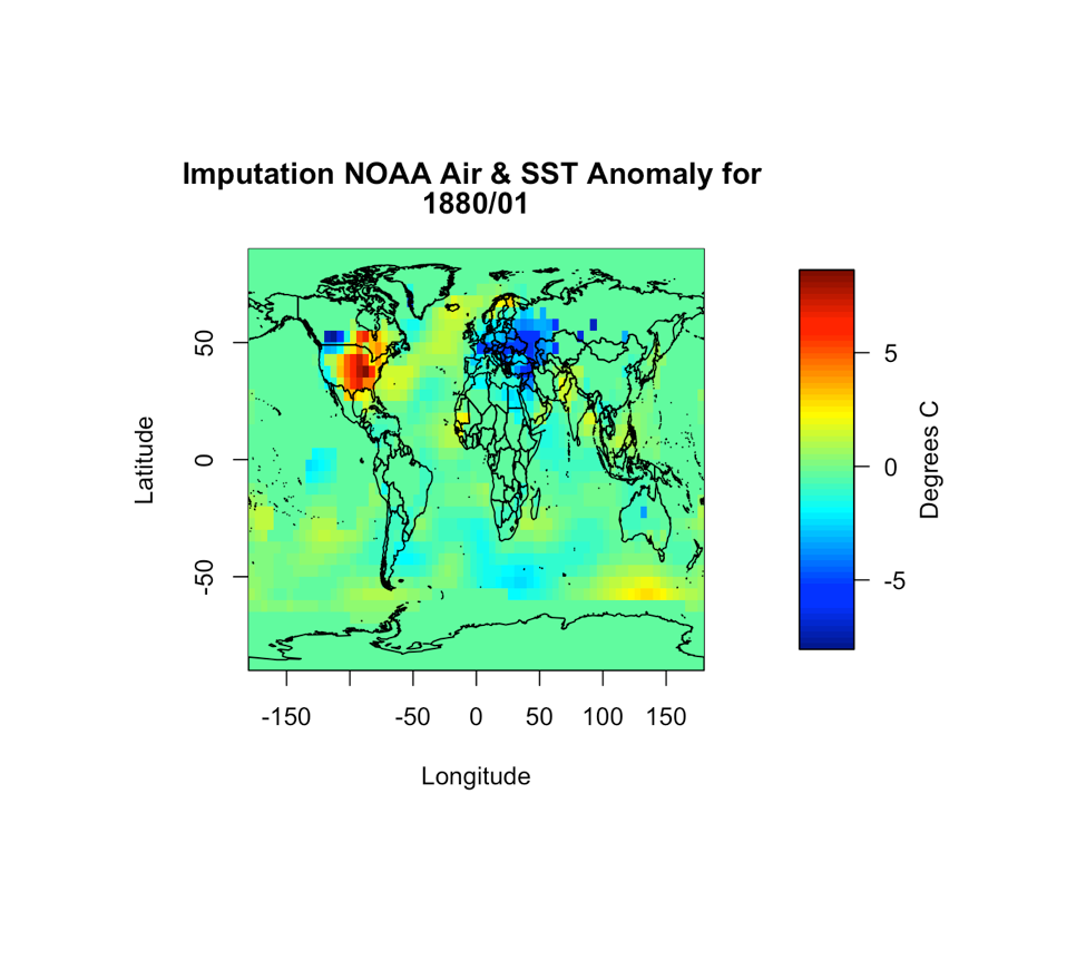
You will notice right away that there are a lot of missing values, not just at the polar regions. So let’s implement an imputation routine. We will apply it first to this particular month so we can replot and make sure it worked. Like I said above, I’m going to fill in a missing point at a particular grid box with the mean of the values surrounding it. Deciding on how far out to go will depend on what data is actually available. We will start with one grid box. Look at the visual below. Let’s say you have a missing point at the orange box. I’m going to look at all the grid boxes that touch the orange box and average them together. The mean of those 8 surrounding boxes will be the new orange value.

In R, you can use the following code:
Your script should look something like this:
# create a new variable to fill in
NOAAtempImpute <- NOAAtemp
# loop through lat and lons to check for missing values and fill them in
for(ilat in 1:length(NOAAlat)){
  for(ilon in 1:length(NOAAlon)){
    # check if there is a missing value
    if(is.na(NOAAtemp[ilon,ilat])){
      # Create lat index, accounting for out of boundaries (ilat=1 or length(lat))
      if(ilat ==1){
        latIndex <- c(ilat,ilat+1,ilat+2) }
      else if(ilat == length(NOAAlat)){
        latIndex <- c(ilat-2,ilat-1,ilat)
      }else{
        latIndex <- c(ilat-1,ilat,ilat+1)
      }
      # Create lon index, accounting for out of boundaries (ilon=1 or length(lon))
      if(ilon ==1){
        lonIndex <- c(ilon,ilon+1,ilon+2)
      }else if(ilon == length(NOAAlon)){
        lonIndex <- c(ilon-2,ilon-1,ilon)
      }else{
        lonIndex <- c(ilon-1,ilon,ilon+1)
      }
      # compute mean
      NOAAtempImpute[ilon,ilat] <- mean(NOAAtemp[lonIndex,latIndex],na.rm=TRUE)
    }
  }
}
This code is laid out to show you ‘mechanically’ what I did. I looped through the lats and the lons checking to see if there is a missing value. If there is, then we create a lat and lon index that encompasses the grid boxes (blue) we are interested in. You can double check this by running the code over one ilat/ilon and printing out the values ‘NOAAtemp[lonIndex,latIndex]’. This will display 9 values (matching each grid box above). I’ve put in caveats to deal with cases where we are out of the boundary (i.e. ilat=1). If you plot up ‘NOAAtempImpute’ you should get something like this:
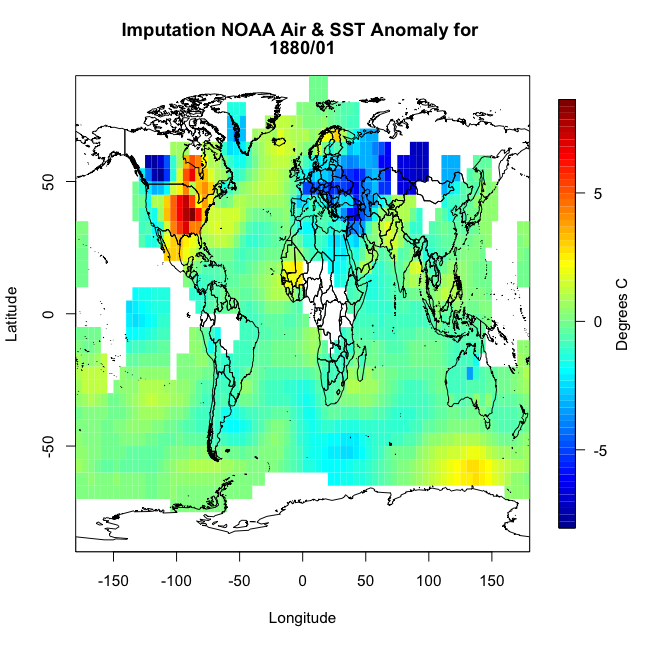
The method has filled in values but not enough. This is probably due to the size of the region in which data is missing. There are simply no data points within the corresponding grid boxes to average. We could expand the nearest neighbor, but instead let’s use a built-in R function called ‘impute’. This function (from the package Hmisc) will perform a central tendency imputation. Use the code below to impute with this function.
Your script should look something like this:
# impute using function from Hmisc
library(Hmisc)
NOAAtempImpute <- impute(NOAAtemp,fun=mean)
If you were to plot this up, you would get the following:
You can see we have a fully covered globe. Now, let’s apply this to the whole dataset.
Your script should look something like this:
# initialize the array
NOAAglobalSSTAnomImpute <- array(NaN,dim=dim(NOAA$air))
# impute the whole dataset
for(imonth in 1: length(NOAAtime)){
  NOAAtemp <- rbind(NOAA$air[37:length(NOAA$lon),,imonth],NOAA$air[1:36,,imonth])
  NOAAglobalSSTAnomImpute[,,imonth] <- impute(NOAAtemp,fun=mean)
}
Now, if we plot the same month from our example (first month), we should get the same plot as above. This is something I would encourage you to do whenever you are working with large datasets. It may take some extra time, but going through one example to check if what you are doing is correct and then applying it to your whole dataset and checking back with your first example is good practice.
Your script should look something like this:
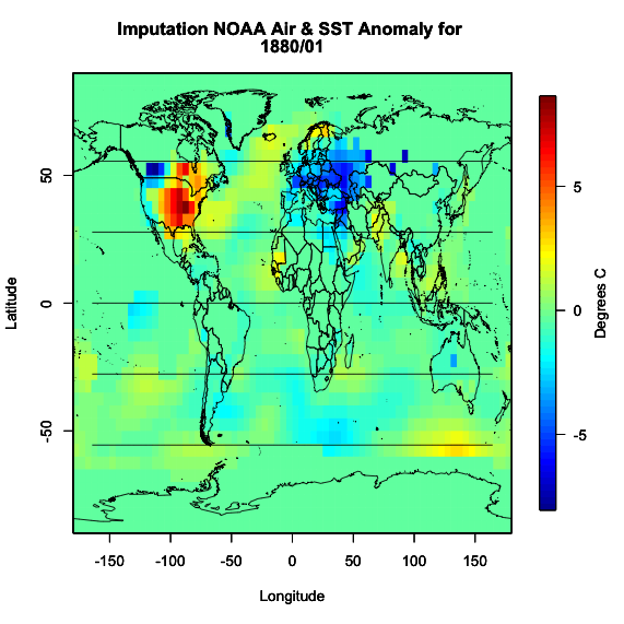
image.plot(NOAAlon,NOAAlat,NOAAglobalSSTAnomImpute[,,1],xlab="Longitude",ylab="Latitude",legend.lab="Degrees C",
           main=c("Imputation NOAA Air & SST Anomaly for ", format(NOAAtime[1],"%Y/%m")))
plot(wrld_simpl,add=TRUE)
I get the following image which is identical to the one used in our example month.
Now we know that the imputation was successful and did what we expected it to do. We have a full dataset and can now move on.
Inhomogeneity & Outliers
We’ve discussed homogeneity before in Meteo 815, but as a review, homogeneity is broadly defined as the state of being same. In most cases, we strive for homogeneity as inhomogeneity can cause problems. For time series analyses, inhomogeneities can result from abrupt shifts (natural and artificial), trends, and/or heteroscedasticity (variability is different across a range of values). This inhomogeneity can make it difficult to pull out patterns and model the data.
We will discuss some of these sources of inhomogeneity in more detail later on. I do, however, want to talk briefly here about artificial shifts. With a time series analysis, you are likely to encounter an artificial shift due to the issues involved in collecting a long dataset. A long dataset can lead to a higher probability of instruments being moved or malfunctioning, inconsistencies in updating algorithms, or a dataset that is pieced together from multiple sources. These can create artificial shifts in your dataset which in turn will skew your results.
It’s pretty hard to detect an inhomogeneity, especially artificial changes. You should really think about the source of your data, the instrument you are using, and where possible problems could arise. You should also utilize the tests for homogeneity of variance that we discussed in Meteo 815, like the Bartlett test, which applies a hypothesis test to determine whether the variance is stable in time. You can also use function 'changepoint' from the package ‘changepoint’ [19].
Let’s go back to our SST dataset and apply this new function to see whether our dataset is homogenous or not. Use the code below to create a new globally averaged dataset for NOAA (using the imputed data) and compute the change point test for the mean and variance.
Your script should look something like this:
# compute global average for NOAA
NOAAGlobalMeanSSTAnomImpute <- apply(NOAAglobalSSTAnomImpute,3,mean)

# load in changepoint
library('changepoint')

# test for change in mean and variance
cpTest <- cpt.meanvar(NOAAGlobalMeanSSTAnomImpute)
You can use the ‘print’ command or plot the result. What you will find is that there is one change point at index 1193 (corresponding to May 1979). If you plot, you would get this figure.
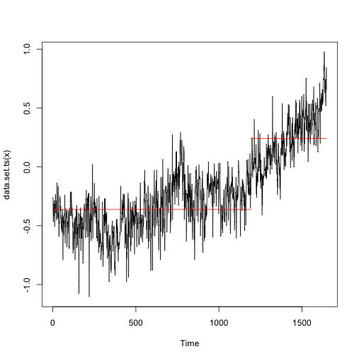
This suggests there are two distinctly different means and/or variances in the dataset. The red line is the mean estimate for each section with the ‘changepoint’ at index 1193 (showcased by the upward shift in the red line). So this dataset is definitely not homogenous throughout the whole time period.
Outliers can also be problematic depending on your analysis. In most cases, however, we rather keep the value than drop it for a missing value. But for reference, you can use the function ‘tsoutliers’ from the package ‘forecast’ [20] which will test for any outliers in your data. Let's try this out on the NOAA dataset.
Your script should look something like this:
# load in forecast
library('forecast')
tsTest <- tsoutliers(NOAAGlobalMeanSSTAnomImpute)
The result suggests one outlier at index 219 (corresponding to March 1898). What is great about this function is it includes a replacement value. In this example, the suggested replacement value is -0.628944, while the original value was -1.1049. It is up to you whether you would like to use the replacement value or not. Since there is only one ‘outlier’, I’m going to leave it as is for now. If there were a lot of outliers, then I would consider replacing them.
Basics of Time Series Modeling
Prioritize...
After reading this section, you should be able to describe the difference between a stationary and non-stationary time series and apply tests to your data to see which one best fits.
Read...
Now that we have prepared our data and checked for any missing values, outliers, and inhomogeneity, we can begin talking about modeling. The common goal of a time series analysis is modeling for prediction but, before we dive in, we need to cover the basics. In this section, we will focus on the assumptions required to perform an analysis and how we can transform the data to meet those requirements.
Stationary
The easiest time series to model is one that is stationary. Stationarity is a requirement to perform many time series analyses. Although there are functions in R that will avoid this requirement, it’s important to understand what stationarity means, so you can properly employ these functions. So read on!
There are three criteria for a time series to be considered stationary.
- The mean of the time series should be constant. It should NOT BE a function of time. Look at the graphs below. Notice the time-dependence increase in the orange one - in that case, the mean value changes with time and would not be considered stationary.
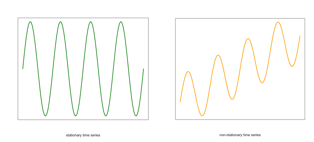 Visual of a stationary (left) and non-stationary (right) time seriesCredit: J. Roman
 - Similarly, the variance should be constant in time. This is called homoscedasticity. Look at the graphs below. Notice how the spread (range in values) changes with time in the orange one. This is an example of a time series that would not be considered stationary by breaking the requirements of homoscedasticity.
 Example of a stationary (left) and non-stationary heteroskedastic (right) time seriesCredit: J. Roman
 - The last requirement is that the covariance between sequential data points should NOT BE a function of time. Again, look at the graph below. Notice the change in the spread in the time direction of the orange one. This is an example of a time series that is non-stationary and does not meet the requirement of steady covariance.
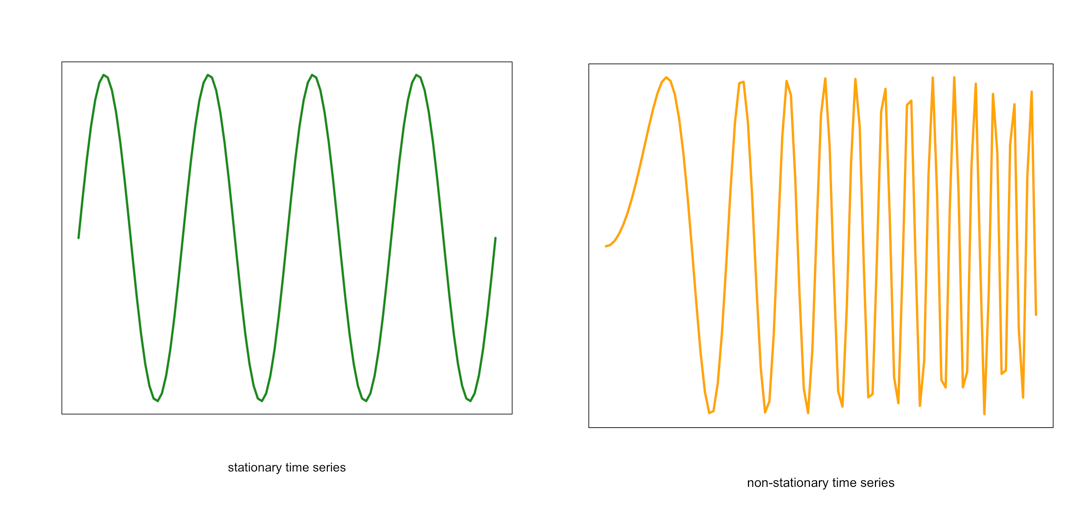 Example of a stationary (left) and non-stationary non-constant covariance (right) time seriesCredit: J. Roman
If your data meets these assumptions, you are good to go. If not, you need to explore methods for dealing with non-stationary datasets. Continue on to find out what we can do.
Non-stationary
For the purpose of this course, any time series that does not meet the stationary requirements will be called non-stationary. Like I said previously, some functions in R can automatically deal with a non-stationary time series, but there are ways to transform the data to make it stationary.
Data transformations were discussed briefly in Meteo 810. Because of this, I will only provide a review of the more common techniques. I suggest you re-read those sections if you need more of a refresher.
The first data transformation is differencing. Differencing is simply taking the difference between consecutive observations. Differencing usually helps stabilize the mean of a time series by removing the changes in the level of a time series. This, in turn, eliminates the trend. In R, you can use the function ‘diff()’.
We can also compute an anomaly to remove the seasonality cycle or cycles that repeat periodically. To compute the anomaly, we subtract off a climatology (a mean over a pre-determined period). For example, let’s say I have monthly temperature data. We know that the temperature in the Northern Hemisphere is warmest during summer months (JJA) and is coldest in winter (DJF). This is a cycle that repeats every year. We can remove this cycle by subtracting off the monthly climatology. That is subtracting off a mean monthly value. So for a given observation in January, we subtract off the mean of all Januarys in that dataset (or over a predetermined time period). For a February observation, we subtract off the mean of all Februarys, and so on. We are left with an anomaly that has removed this cycle.
The next common method is log. To transform the data this way, we take the natural log of each value. A log transformation is usually used if the variation increases with the magnitude of the local mean (e.g., if the range of potential instrument error increases as the true value increases). In such cases, the log transformation stabilizes the variance. In R, you can use the function ‘log’.
The last transformation we will review is the inverse. The inverse is just the reciprocal of the value (1/x). This is considered a power transformation, similar to the log, and is used to stabilize the variance in situations where small measurements are more accurate than large. In R, you can use the ‘1/x’ command.
When you run into a non-stationary dataset, my recommendation is to attempt a transformation to try and meet the stationary requirement. If this does not work, then you can exploit the functions in R that do not require a stationary dataset.
How to test for stationarity
We’ve discussed the requirements for a time series to be stationary, and I have shown a few figures that display a typical stationary and non-stationary time series. But sometimes it will be very difficult to simply look at the time series and determine if the assumptions are met. So we will talk about different ways to check for stationarity.
- Check the ACF and PACF
The function ‘acf’ estimates the autocorrelation. Autocorrelation is the correlation between elements in time. The correlation coefficient is computed between the values at two different time periods. For example, the value at time t is compared to the value at time t+1, t+2, t+3…. And so on. These are called ‘lags’. Similar to correlation, if the coefficient is close to 1, then the two values are strongly related. Autocorrelation will be discussed in more detail later on. For now, just know that if there is a high autocorrelation (close to 1) for all lags, the time series is not stationary.
The function ‘pacf’ computes the partial autocorrelation. It is similar to the autocorrelation function but controls for the values of a time series at all shorter lags. For example, if you are looking at the correlation between time t and t+3, the partial autocorrelation takes into account the values at time t, t+1, t+2, and t+3. Whereas the autocorrelation only examines the values at time t and t+3. Again, if the correlation is high for all lags, the series is not stationary.
Let’s test this out with our SST data. We will first compute the mean global SST anomaly. To do this, use the code below:Show me the code...Now we can compute the ACF and PACF. Run the code below:Your script should look something like this:
# compute global mean
meanGlobalSSTAnom <- apply(NOAAglobalSSTAnomImpute,3,mean)
You should get the following figures:The ACF shows strong correlation for all lags, while the PACF does not. So while the ACF suggest non-stationary, the PACF does not. How do we decide what to do? Let’s continue on to find out some more quantitative ways to check for stationarity. ACF (left) and PACF (right) of NOAA global mean SST and air temperature anomaliesCredit: J. Roman
 - Kwiatkowski-Phillips-Schmidt-Shin (KPSS) test
To confirm your visual results, you can run a KPSS test [21]. The KPSS is a hypothesis test that evaluates whether the data follows a straight line trend with stationary errors. The null hypothesis is that the trend does. The alternative is that it doesn't. So if the p-value is small, we reject the null in favor of the alternative and the trend is assumed to have non-stationary errors.
Let’s test this out with our SST data. Use the code below to compute the KPSS TestShow me the code...The result is a p-value less than 0.01. This means we reject the null in favor of the alternative. The trend does not have stationary errors, so our time series is not stationary.Your script should look something like this:
# load in tseries library library("tseries") # compute KPSS test kpss.test(meanGlobalSSTAnom, null=”Trend”) - Augmented Dickey-Fuller (ADF) test
Another test is the Augmented Dickey-Fuller t-statistic test [21]. This hypothesis test determines whether the unit root is in a time series. A unit root is a feature in some data that can cause problems in our analysis and suggests that the variable is non-stationary. For this test, the null hypothesis is that the unit root exists in the data. The alternative hypothesis is that it doesn’t exist, and the data is considered stationary. So, if the p-value is small, we reject the null in favor of the alternative suggesting the data is stationary.
Let’s test this out with our SST data. Use the code below to perform this test.Show me the code...The result is a p-value less than 0.01 suggesting the data is stationary.Your script should look something like this:
# compute ADF test
library(tseries)
adf.test(meanGlobalSSTAnom)
There are many more tests out there that you can try. These were just a few examples of what you can do to visualize and quantify the stationary aspect of your dataset. And like the example highlights, you might get conflicting answers. You will have to decide what route is the best route to go based on your results.
Now test yourself. Using the app below, select a variable from the list and examine the plots and output from the hypothesis tests. Try and decide, based on the quantitative and qualitative results, if the time series is stationary.
Identifying Patterns - Quasi-Periodic
Prioritize...
When you have completed this section, you should be able to recognize common quasi-periodic patterns in a dataset.
Read...
There are two general groups of patterns: periodic and trend. Periodic is a pattern that repeats at a regular timescale. We can break periodic down into quasi-periodic (roughly predictable across many cycles) and chaotic (predictable for only a cycle or so). You should note that trends and periodicity can and do occur in the same time series, which can make it difficult to detect and or differentiate the two patterns. For now, we are going to focus on some quasi-periodic patterns that are quite common in many datasets you will use for weather and climate analytics.
Diurnal
Some variables exhibit a daily pattern, i.e., they change systematically from night to day. These patterns are called diurnal and are the shortest time scales we will discuss. Specifically, think about temperature. At night, the temperature is generally cooler, while during the day it is warmer. This pattern is diurnal and can be seen if you plot hourly temperatures for multiple days.
Let’s check this out. Here are some hourly temperature data from Chicago, IL [22] during the month of August 2010. Open the file and extract the temperature out using the code below.
Your script should look something like this:
# load in data
mydata <- read.csv("hourly_temp_chicago.csv")

# extract out date and temperature
dtimes <-paste0(substr(mydata$DATE,1,4),"-",substr(mydata$DATE,5,6),"-",substr(mydata$DATE,7,8),
               " ",substr(mydata$DATE,10,11),":",00,":",00)
dtparts = t(as.data.frame(strsplit(dtimes,' ')))
thetimes = chron(dates=dtparts[,1],times=dtparts[,2],format=c('y-m-d','h:m:s'))

hourlyTemp <- mydata$HLY.TEMP.NORMAL
Now, let’s plot the hourly temperature for 3 days.
Your script should look something like this:
# plot hourly temperatures
grid(col="gray")
par(new=TRUE)
plot(thetimes[1:72],hourlyTemp[1:72],xlab="Time",
     ylab="Temperature (Degress F)",
     main="Chicago, IL Hourly Temperature",
     xaxt='n',type="l",lty=1)
axis.Date(1,thetimes[1:72],format="%Y%m%d")
You should get a figure like this:

You can see the continuous pattern over the three-day period, where the temperature reaches a maximum during the day and a minimum at night. This is a prime example of a diurnal cycle and falls under the quasi-periodic category.
Annual
Similar to the diurnal pattern, an annual pattern, especially in temperature, can be observed. In the Northern Hemisphere during the months of June, July, and August (summer), temperatures are warmer than in the months of December, January, February (winter). If you were to plot monthly temperatures, you would see this peak in summer and dip in winter. This is quasi-periodic because we can rely on this pattern to continuously occur for many cycles - meaning, every year we expect the temperatures to be warmer in summer and cooler in winter for the Northern Hemisphere.
Let’s test this out. Load in the monthly temperatures for Chicago, IL [23].
Your script should look something like this:
# load in data
mydata <- read.csv("monthly_temp_chicago.csv")

# extract out date and temperature
DATE<-as.Date(paste0(substr(mydata$DATE,1,4)
                     ,"-",
                     substr(mydata$DATE,6,7),"-","1"))
monthlyTemp <-mydata$TAVG
Now, plot the monthly temperatures over three years, and see if there is a repeating pattern.
Your script should look something like this:
# plot monthly temperatures
grid(col="gray")
par(new=TRUE)
plot(DATE,monthlyTemp,xlab="Date",ylab="Temperature (Degress F)",
     main="Chicago, IL Monthly Temperature",xaxt='n',type="l",lty=1)
axis.Date(1,DATE,format="%Y%m")
You should get a figure like this:
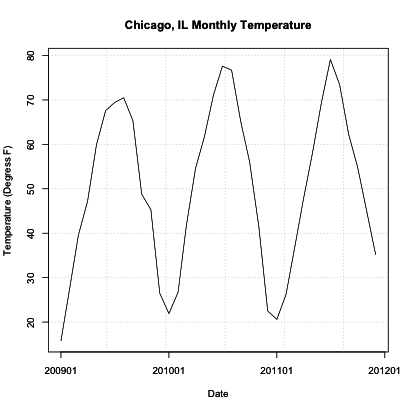
Similar to the diurnal example, we see a repeating pattern of warm and cool temperatures. In this case, though, we see very cold temperatures during the Northern Hemisphere winter months and warm temperatures during the Northern Hemisphere summer months. Although they are not constantly the same low monthly temperature, this pattern is quite visible and is to be expected each year (quasi-periodic).
In certain geographical regions, splitting up the year by the common seasons we are used to in the United States is not appropriate. Instead, we split the year up between wet and dry season. Sometimes called the monsoon season, this is another example of an annual cycle. This cycle, however, is characterized by periods of rain and periods of dry and is quite prominent in the Tropics.
Again, let’s test this out. We are going to plot monthly precipitation for Bangkok, Thailand. Start by loading in the data [24] and extracting out the time and precipitation variables.
Your script should look something like this:
# load in data
mydata <- read.csv("monthly_precip_bangkok.csv")

# extract out date and temperature
DATE<-as.Date(paste0(substr(mydata$DATE,1,4),"-",substr(mydata$DATE,6,7),"-","1"))
monthlyPrecip <-mydata$PRCP
Now, let’s plot the first 6 years of data.
Your script should look something like this:
# plot monthly precipitation
grid(col="gray")
par(new=TRUE)
plot(DATE[1:72],monthlyPrecip[1:72],xlab="Date",
     ylab="Precipitation (inches)",
     main="Bangkok, Thailand Monthly Precipitation",
     xaxt='n',type="l",lty=1)
axis.Date(1,DATE[1:72],format="%Y%m")
You should get a figure similar to this:

Identifying Patterns - Chaotic Periodicity
Prioritize...
Once done with this section, you should be able to recognize common meteorology-specific patterns in data and know the typical features of these patterns.
Read...
In the atmosphere and ocean, there are some common climatic patterns. A lot of these climatic patterns result in teleconnections - meaning when certain phases of this pattern occur, we can expect a particular meteorological feature elsewhere (spatially). Teleconnections are very useful for forecasting! You should note that the goal right now is simply for you to identify patterns in a dataset, know which variables you need to detect those patterns, and the potential teleconnections. In future lessons, you will have to account for these patterns when performing certain time series analyses. So being able to identify these patterns is key! If you are interested, there is a pretty good blog by NOAA climate that includes articles on natural climate patterns [11].
Teleconnections
Before we go into specifics, let’s talk a little bit more about teleconnections. The reason we are interested in these slowly varying multi-region patterns is that if we are in certain phases of these patterns, we can sometimes infer something about the weather (i.e., temperature, precipitation, etc.). This is a result of teleconnections.
Teleconnections are defined in the AMS (American Meteorological Society) glossary as a “linkage between weather changes occurring in widely separated regions of the globe.” Something occurring in one geographic location can impact another location. These teleconnections can help identify certain scenarios that may play out. For example, if we know increased SST in one region can bring droughts in another location, we can expect/predict when those droughts may occur based on observing the SST.
There are many atmospheric/oceanic teleconnections (ENSO, AO, NAO, MJO). These teleconnections are generally referred to as long timescale variability, but they can last for several weeks to several months and even years. Because of their long timescale, these teleconnections can aid in the understanding of both the inter-annual variability and inter-decadal variability. For more information on the general concept of teleconnections in weather and climate, check out this CPC site [25].
Now, let’s start looking at some common chaotic patterns that you may find in this field.
ENSO
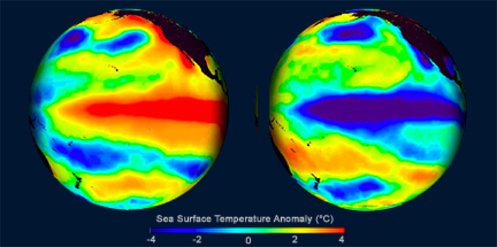
Out of all the patterns that exist in the atmosphere and or ocean, ENSO is probably the most well known. You’ve probably heard about it being talked about during extreme floods or droughts. The El Niño-Southern Oscillation (ENSO) is a natural pattern characterized by the fluctuations of Sea Surface Temperatures (SST) [26] in the equatorial Pacific.
With respect to ENSO, there are two main phases: warmer than normal central and eastern equatorial Pacific SSTs (called El Niño) and cooler than normal SSTs in central and eastern Pacific (called La Niña). Below is an example of El Niño conditions on the left and La Niña on the right.
You can check out the current conditions here [28]. These states last about 9–12 months, peaking in December-April and decaying during the months of May to June. Prolonged episodes have lasted 2 years in the past. The periodicity is chaotic but, on average, we expect the pattern to reoccur every 3–5 years.
There are several ways to monitor the ENSO state. One is using the Oceanic Niño Index (ONI). You can read more about the index here [29]. In short, a 3-month running SST anomaly mean is measured in an area called the Niño 3.4 region. If the value is above 0.5 °C, then it is considered to be in the warmer phase; if it’s less than -0.5 °C, it is characterized as being in the cooler phase. To be defined as the La Niña or El Niño phase, there must be 5 consecutive months in which the 3-month running average was below or above the threshold.
So why do we care about an anomaly in the equatorial Pacific Ocean? Well, it has to do with the teleconnections. The impacts of an El Niño or a La Niña vary by not only region but when, temporally, the phase is occurring.
For El Niño, this plot below shows the teleconnections during the months of December through February on the left and June through August on the right.
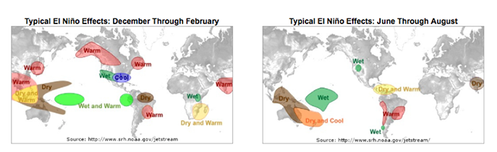
This figure shows the general impact. For example, the southwestern US generally has wetter than normal conditions during the months of December–February when an El Niño event is occurring.
Similarly, we expect teleconnections for La Niña. During the months of December through February, the typical La Niña effects are displayed on the left, while the months of June through August are displayed on the right.
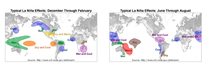
Again, we discuss the general regions as being wetter or drier than normal, and cooler or warmer than normal. For example, during the months of June through August, the western coast of South America extending from Peru down into Chile is generally characterized by cooler than normal conditions when the La Niña phase occurs.
To summarize:
- ENSO is characterized by fluctuations in SST.
- We use the Oceanic Niño Index to determine the phase.
- If there are 5 consecutive months with an anomaly greater than 0.5 °C, then we are in the warm phase called El Niño.
- If there are 5 consecutive months with an anomaly less than -0.5 °C, then we are in the cool phase called La Niña.
- The general periodicity is 3–5 years.
- Impacts vary not only by region, but by the month the phase is occurring in.
AO and NAO
The Arctic Oscillation (AO) and the North Atlantic Oscillation (NAO) are characterized by changes in pressure or geopotential heights [30].
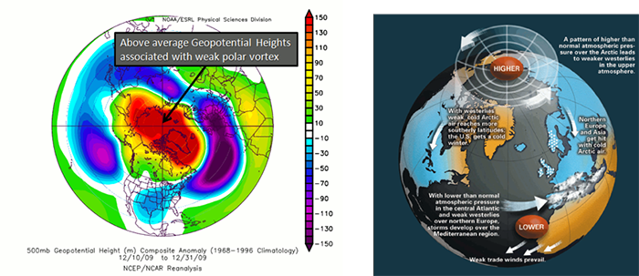
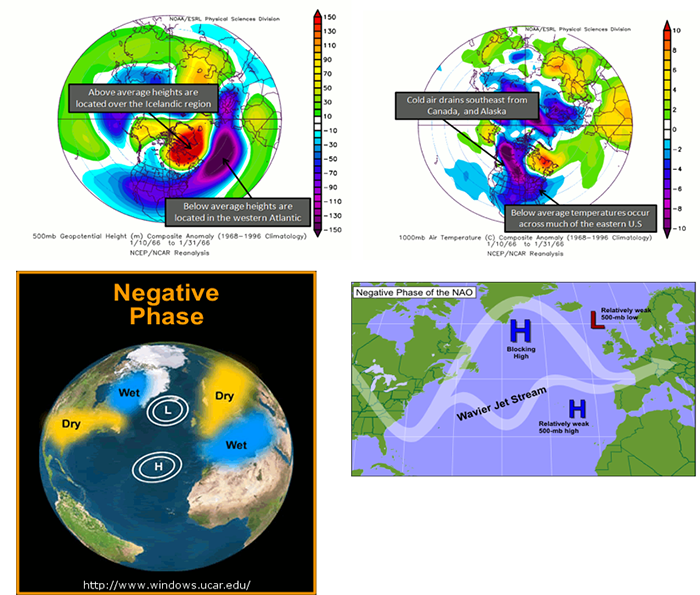
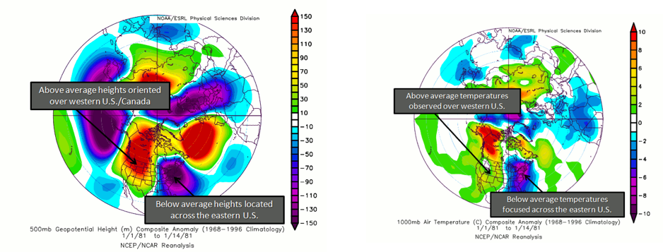
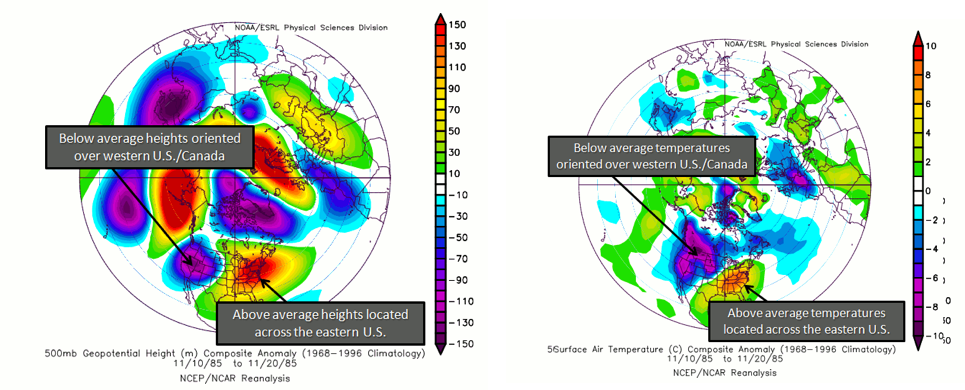
The AO consists of a negative and positive phase. If we know the phase of the AO, we have some clues about the large-scale weather patterns a week or two in the future. The negative phases occur when above-average geopotential heights are observed in the Arctic. This means there is a weaker than normal polar vortex. During this phase, the westerlies weaken, resulting in cold air plunging into the middle of the US and Western Europe. The figure on the left shows the above average geopotential heights associated with a weak polar vortex, highlighting the negative AO phase, while the right figure shows the consequences of this pattern change.
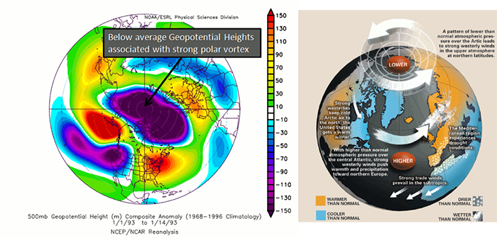
In contrast, the positive phase occurs when geopotential heights are below average in the Arctic. This means there is a stronger than normal polar vortex. During this phase, the westerlies are stronger, resulting in milder weather in the US and weaker storms. The figure on the left shows the below average heights associated with a strong vortex, highlighting the positive AO phase. The figure on the right shows the impacts of this pattern.
To check out the current state of the AO, look at this site [32]. The AO index is computed by projecting the daily (00z) 1000 mb height anomalies poleward of 20°N onto the pattern of the AO. If the AO index [33] is positive, it is in the positive phase, and if it’s negative, it’s in the negative phase. The AO is important for the weather in North America, but there is no preferred timescale.
To summarize:
- AO is characterized by changes in geopotential height or pressure in the Arctic.
- We use the AO index to determine the phase.
- If AO index > 0 positive phase.
- If AO index < 0 negative phase.
- There is no general periodicity.
- The negative phase results in stormy weather in Europe and generally colder weather in the US. During the positive phase, we expect milder weather in the US, with droughts in Europe.
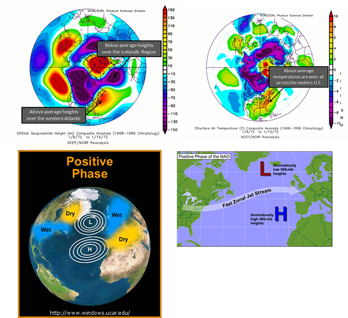
The NAO is similar to the AO, but the geopotential heights are observed near Iceland and the Azores islands in the Atlantic Ocean instead of the Arctic. During a positive NAO, the 500 mb heights over Iceland are anomalously low while the 500 mb heights over the Azores are anomalously high, favoring strong westerlies. During this phase, the temperatures in the eastern US tend to be milder with weaker storms. Northern Europe is also milder, but wetter than average, while central and Southern Europe are drier. The figures below characterize the heights during a positive NAO, the temperature anomalies, and the precipitation anomalies.
During a negative NAO, the Icelandic height anomalies are high, while the Azores are low. This tends to weaken the westerlies. What results is a pressure high over the North Atlantic that blocks and slows down the progression of a weather system across the US. This favors colder outbreaks in the eastern US and favors the development of strong mid-latitude cyclones leading to East Coast snowstorms. Particularly, during the winter season, a predominantly negative phase can lead to cold snow across the eastern part of the US and Europe. Below are figures demonstrating the cause and impacts of a negative phase.
To see the current NAO state, you can use the NAO index here [34]. A positive NAO index suggests a positive phase, while a negative index suggests a negative phase. Similar to the AO, there is no general periodicity.
To summarize
- NAO is characterized by changes in geopotential height or pressure near Iceland and the Azores.
- We use NAO index to determine the phase,
- If NAO index > 0 positive phase.
- If NAO index < 0 negative phase.
- There is no general periodicity.
- The negative phase results in cold, snowy weather across the eastern US and Europe. During the positive phase, milder weather is observed in the eastern US, while wetter than average weather can occur in Northern Europe and drier than average in central and Southern Europe.
You can see that the AO and NAO are very similar, and you might be wondering which one you should use. Some researchers believe the NAO is part of the AO and, therefore, you should use the AO, while others believe the measurements for the NAO are physically more meaningful and, therefore, more representative of the true nature of the westerlies, leading to stronger predictions. You will generally see both oscillations utilized.
PNA
The Pacific-North American (PNA) pattern is a complement to the NAO and is characterized by geopotential heights. It can be used to estimate the state of the westerlies over the Pacific and North America. Research suggests that there is a linkage between the PNA and ENSO.
Again, there are two phases. The positive phase consists of above normal geopotential heights over the western US and anomalous lows over the eastern US. During this phase, cold air in Canada is forced southeastward, leading to anomalously low temperatures over the eastern US and anomalously high temperatures over the western US. Cyclogenesis (formation of cyclones) is also enhanced near the west coast of North America. In addition, anomalously high precipitation along the west coast of Canada and the Pacific Northwest is generally observed. A positive PNA tends to dominate during El Niño years. Below is a figure showing the typical geopotential heights during the positive phase and the corresponding temperatures.
During the negative phase, there are anomalously low geopotential heights over the western US, with above normal over the eastern US. During this phase, the average temperatures for the western US are low, while for the eastern US they are high. It is more likely that Pacific air can cross the US, limiting outbreaks of cold weather and the development of major cyclones. Precipitation tends to be high in the Mississippi and Ohio Valleys, while the southeastern US is drier. Please note that the precipitation anomalies are less robust when it comes to the PNA than in other patterns. Generally, a negative PNA occurs during La Niña years. Below is a figure showing the typical geopotential heights during the negative phase with the corresponding temperature information.
You can check out the current conditions here [36] using the PNA index. The periodicity is again somewhat spontaneous, but due to the linkage with ENSO, you could expect every 3-5 years.
To summarize:
- PNA is characterized by changes in geopotential height over the western US and the eastern US.
- We use the PNA index to determine the phase.
- If PNA index > 0 positive phase.
- If PNA index < 0 negative phase.
- There is no general periodicity, but the connection to ENSO might suggest 3–5 years as a starting base.
- The negative phase brings anomalously low temperatures to the western US and high temperatures to the Eastern US, while limiting the outbreak of cold weather and the development of major cyclones. The positive phase forces cold air from Canada over the eastern US, with higher than normal temperatures over the western US. Cyclogenesis is also enhanced during this phase.
PDO
The variable of interest for the Pacific Decadal Oscillation (PDO) is SST. The PDO is considered a pattern of Pacific climate variability similar to ENSO. There is a warm and cool phase that can impact hurricane activity, droughts, and flooding. The interaction with ENSO can magnify or weaken the impacts, depending on if they are in phase. Please note that the PDO is still a highly researched teleconnection and not as much is known compared to other patterns. This is partly due to the long periodicity of 20–30 years.
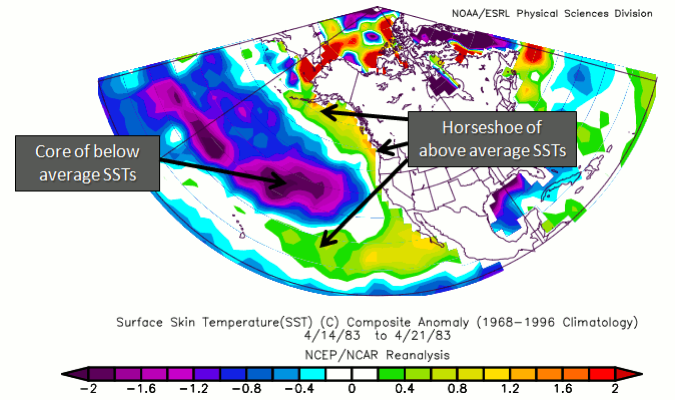
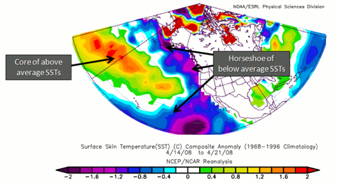
A warm phase of the PDO is characterized by anomalously high SSTs off the coast of North America from Alaska to the equator wrapping around cooler than normal SSTs in a horseshoe-like feature. If a warm PDO coincides with a La Niña, the impacts of a warm PDO weaken. If a warm PDO coincides with El Niño, the impacts magnify. It is believed that a warm PDO can enhance coastal biological productivity in Alaska but inhibit it off the west coast of the US. A warm PDO can result in warmer than average temperatures in the Pacific Northwest, British Columbia, and Alaska, with lower than average temperatures in Mexico and the southeastern US. In terms of precipitation, a warm PDO is associated with above-average precipitation in Alaska, Mexico, and the southwestern US, with below average in Canada. Here is an example of the signature SST for a warm PDO.
In contrast, the cold phase is the exact opposite in terms of SST, with anomalously low SSTs off the coast of North America wrapping around warmer than normal ones. If a cold PDO coincides with a La Niña, the impacts are magnified. Impacts are exactly opposite than in the warm phase. That is, coastal biological productivity in Alaska is reduced but enhanced off the west coast of the CONUS. Cooler than average temperatures in the Pacific Northwest, British Columbia, and Alaska are observed, with higher than average in Mexico and the southwestern US. For precipitation, lower than average is expected in Alaska, Mexico, and the southwestern US, with higher than average in Canada. Here is an example of the signature SST for a cold PDO.
To summarize:
- PDO is characterized by a horseshoe signature of cold or warm temperatures off the west coast of the US.
- If the temperatures along the coast are warm (cold), then the PDO is in a warm (cold) phase. If El Niño (La Niña) coincides with the warm (cold) phase, impacts are enhanced.
- This is a less studied pattern, but the periodicity is believed to be 20–30 years.
- The warm phases enhance coastal biological productivity in Alaska, while inhibiting it off the west coast of CONUS. During the warm phase, the PDO results in warmer than average temperatures in the Pacific Northwest, British Columbia, and Alaska, with lower than average in Mexico and the southwestern US. A cold phase results in below-average precipitation in Alaska and above average in Canada.
MJO
The Madden Julian Oscillation (MJO) is formally an intra-seasonal wave that occurs in the tropics, which manifests itself in the form of alternating areas of enhanced and suppressed rainfall that migrates eastward from the Indian Ocean to the central Pacific Ocean and sometimes beyond. Precipitation will be the variable of interest.
There are 8 phases of the MJO (Wheeler and Hendon 2004 [38]), with a timescale of about 6 days for each phase. However, there is large variability in the speed of the progression. A complete cycle can take 30–60 days, but there have been instances near 90 days. In addition, the intensity can be highly variable. Here is an animation of the cycle:
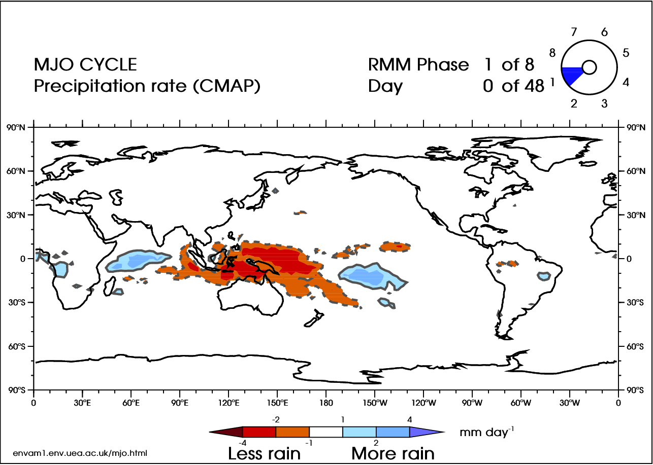
In the video above, blue shades are anomalously high rainfall rates (at least 1 mm/day more than normal), while orange represents low rainfall (at least 1 mm/day less than normal). Note the eastward progression of the MJO as it works through the eight phases (upper-right corner of animation).
There are many teleconnections with the MJO. For Tropical connections, the MJO acts as a modulator of global tropical cyclone activity. For Mid-Latitude connections, when the MJO is more intense, a 40% increase in extreme rainfall occurs globally (as compared to a weak MJO). Wintertime floods in the northwest are common when the MJO is in phase 2 or 3, while severe flooding in the northwest is most common in phase 6.
I suggest checking out this summary of the MJO for more detail, [40] as the scope of the pattern is too large to cover everything right here.
To summarize:
- MJO is characterized by precipitation anomalies that migrate eastward from the Indian Ocean to the central Pacific Ocean.
- There are 8 phases of the MJO typically lasting 6 days each.
- The progression is generally 30–60 days long, although a 90-day period has been observed.
- When the MJO is in phase 2 or 3, flooding during wintertime can occur in the northwest US, while severe flooding occurs during phase 6.
Identifying Patterns - Trends
Prioritize...
After reading this section, you should be able to define trend and note the impacts a trend can have on a time series analysis.
Read...
Unlike the patterns we just discussed that are periodic, trends (I specifically mean linear trends, but from here on out will refer to them as trends unless otherwise noted) are a constant increase or decrease over time. As a reminder, trends and periodicity can and do occur at the same time. Again, when performing different time series analyses, you may have to account for trends, but the main goal right now is to know how to identify trends in a given dataset.
What is a trend?
Let’s start with the very basics. What is a trend? For this course, specifically this lesson, a trend is a monotonic increase or decrease in the dataset over a time period. Sometimes, you will have different trends over different time periods, where the rates of change are different. While other times, it will be one long steady increase or decrease. There are other types of trends, such as exponential, that exist in weather and climate data, but right now, we will focus on linear trends.
How to identify a trend?
You might think it should be pretty evident if your data has a trend, but it can be much trickier. When trying to identify a trend, there are two components to consider. The first is the long-term trend you are trying to identify, and the second is the short-term variability. The short-term variability is what makes it difficult to identify the trend. The short-term variability can come from natural variability (the natural fluctuation that occurs in the variable you are measuring) or errors (anything that is non-natural, such as errors from the instrument). The short-term variability can also include any periodicity we discussed previously, further complicating the problem. For the purpose of finding the trend, the trend is the signal and the short-term variability is the noise. This will change later in the course when we start analyzing periodicities.
Rarely will you be able to visualize a trend by simply plotting your data. Usually, there is too much short-term variability to pull out the long-term trend. Many times, we need to either smooth the data or transform it to pull out the trend. Smoothing data will average out the noise, reducing the jagged fluctuations you observe. Once you smooth the data, you are usually left with a dataset that is easier to detect a trend with. We will learn more about this topic later on.
Steps to Explore a Time Series
Prioritize...
After reading this section, you should be able to prepare a dataset for a time-series analysis, apply various techniques to clean the dataset, and decompose the time series.
Read...
At this point, you should know the different components of a time series (trend, periodicity, and noise) and a variety of common patterns that may exist in your data. Now, we need to actually apply this knowledge to decompose the time series into each individual component. In this section, we are going to work through an example of how to prepare your data for a variety of time series analyses we will learn about in this course. Please note that depending on the time series analysis you pick, these steps may change a bit. But this is the general order you should follow to set up the data:
- Form a Question and Pick the Dataset
- Clean Data
- Plot Time Series
- Smooth Data
- Transform Data
- Plot Again
- Decompose Data into Components (trend, periodicity, and noise)
Forming a Question and Selecting a Dataset
There are a lot of questions we can ask when it comes to performing a time series analysis. However, we need to refine the question to be specific enough to actually perform an analysis and interpret the results. If your question is clear and concise, your interpretation of the results will be more straightforward. For example, let’s say we wanted to look at the global change in temperature. At first glance, you might think that is straightforward…..it’s not. Let’s start with the ‘global’ aspect. Is this a global average? How is global computed? And then, what is the change? The monthly change? The yearly change? How does the global value now compare to the global value 10 years ago? And then, finally, temperature. There are many temperature variables we could be talking about: air temperature, sea surface temperature, the temperature at 2 meters, deep ocean temperatures, temperatures at a specific pressure level... The problem with such a vague question is that if you don’t know what you are trying to ask, then you will have problems selecting the data and the appropriate analysis which, in turn, will lead to poor interpretations of the result.
In short, I tend to be as specific as possible, so I know what I’m trying to solve to make it easier for me to explain my results. You should include something about the spatial aspect, the temporal aspect, vertical if relevant, the name of the dataset, and the variable of choice. Sometimes, however, the question doesn’t fully present itself until after you try a few things….and that is totally fine! Refining your question is always acceptable based on limitations you may meet when it comes to obtaining data or other aspects of the analysis. But when presenting your material, make sure you are clear about what question you are asking.
Now that I said be specific, I’m going to be somewhat unspecific for this example, mostly because I’m trying to show you the different routes you might take based on the question you are asking. I’m going to say that I will look at the gridded monthly global sea surface temperature anomalies from January 1880 through April 2017 from the NOAA MLost dataset. The first caveat is that the NOAA grid is coarse (5 degrees x 5 degrees). This can potentially affect the spatial aspect if I average. Note that I didn’t exactly say what I’m looking at (a change in temperature or something else). That’s because I want to explore the dataset first with the intention of refining the question later on.
Let’s begin the exploration. Start by loading in the two datasets.
Your script should look something like this:
# load in monthly SST Anomaly NOAA MLOST
fid <- open.nc("NOAA_MLOST_MonthlyAnomTemp.nc")
NOAA <- read.nc(fid)

# create global average
NOAAglobalSSTAnom <- apply(NOAA$air,3,mean,na.rm=TRUE)

# time is in days since 1800-1-1 00:00:0.0  (use print.nc(fid) to find this out)
NOAAtime <- as.Date(NOAA$time,origin="1800-01-01")
Now, we can continue preparing the data for the analysis.
Clean Data
When I say ‘clean’ your data, I mean make sure the dataset is ready for the analysis. This means taking care of any known issues with the dataset and dealing with missing values. Whenever you clean your data, the first step is to always look at the ‘readme’ file. This will tell you about questionable data and possible quality control flags you should utilize. It’s a good starting point to make sure you have only good, reliable observations or data points. Unfortunately, with the data we have selected, there is no easily accessible readme file. This will happen from time to time. Instead, they have several journal articles to look through. You can also check the home pages of the datasets, like for NOAA [41], to see if there is any useful information. A further step is to 'dump' the netcdf file (print.nc command) to check for any notes by the authors of the datasets or for anything that might look like a QC flag. Based on looking through the references and dumping the file, there appear to be no QC flags or anything noted by the authors. So, we can move on.
After we’ve checked for any questionable data points, we need to decide what to do with the missing values. Missing values can come from bad data points (such as the removal process we just talked about) or from the lack of an observation. Sometimes you can just leave the missing values in and the R function will deal with it automatically, but this is incredibly risky if you don’t understand what the R function is doing (meaning the process it uses to deal with the missing values- does it fill it in, drop the point, etc.). We’ve discussed some methods already on how to fill the values in, so I will leave it up to your discretion, but let’s go ahead and fill in our values in the NOAA dataset as we did previously (using the ‘impute’ function from Hmisc package).
Your script should look something like this:
# extract out lat and lon accounting for EAST/WEST
NOAAlat <- NOAA$lat
NOAAlon <- c(NOAA$lon[37:length(NOAA$lon)]-360,NOAA$lon[1:36])

library(Hmisc)
# initialize the array
NOAAglobalSSTAnomImpute <- array(NaN,dim=dim(NOAA$air))

# impute the whole dataset
for(imonth in 1: length(NOAAtime)){
  NOAAtemp <- rbind(NOAA$air[37:length(NOAA$lon),,imonth],NOAA$air[1:36,,imonth])
  NOAAglobalSSTAnomImpute[,,imonth] <- impute(NOAAtemp,fun=mean)
}
Note that I had to reverse the latitudes so I can use the ‘image.plot’ command. Let’s plot the first month to ensure the imputation worked.
Your script should look something like this:
# load in tools to overlay country lines
library(maptools)
data(wrld_simpl)

# plot map of first month of data
image.plot(NOAAlon,NOAAlat,NOAAglobalSSTAnomImpute[,,1],xlab="Longitude",
           ylab="Latitude",legend.lab="Degrees C",
           main=c("Imputation NOAA Air & SST Anomaly for ", format(NOAAtime[1],"%Y/%m")))
plot(wrld_simpl,add=TRUE)
You should get the following figure:
Based on the figure, it appears the imputation worked and all the values are filled in. So now we have dealt with uncertain data values as well as missing values. We can continue on with the process.
Plot Time Series
At this point, we have a good quality dataset to work with. The next actions will be due to the analysis you wish to perform, not due to the data. The first step is to, as usual, plot. But specifically, we need to plot the time series. If you are working with only time (at one location or averaged), you can use the ‘plot’ or ‘plot.ts’ functions. If you are working with multiple locations (several stations, gridded data, etc) like we are, you will have to get creative. If it’s a relatively small number of locations, you can use different colors or symbols. But if it’s the whole globe (like what we have), you should think of ways to ‘chunk’ the data together for plotting. Here are two ways I use often.
The first is to break down the globe by latitude zone. You create the latitude zones to be however big or small as you want, but I typically create 6 zones: 90S-60S, 60S-30S, 30S-0, 0-30N, 30-60N, 60N-90N. You average spatially for all longitudes within each latitude zone. Then, you can plot each zone separately or color-code the lines on one plot. Let’s give this a try with the NOAA data. First, set up your latitude zones.
Your script should look something like this:
# create lat zones
lat_zones <- t(matrix(c(-90,-60,-60,-30,-30,0,0,30,30,60,60,90),nrow=2,ncol=6))
Here’s an example of the boundaries for the latitude zones I created:
Now, loop through each zone for each month and compute the average over all longitudes.
Your script should look something like this:
# create lat zone averages
NOAASSTAnomLatZone <- matrix(nrow=length(NOAAtime),ncol=dim(lat_zones)[1])
for(izone in 1:dim(lat_zones)[1]){
  # extract the latitudes in this zone
  latIndex <- which(NOAAlat < lat_zones[izone,2] & NOAAlat >= lat_zones[izone,1])
  for(itime in 1:length(NOAAtime)){
    NOAASSTAnomLatZone[itime,izone] <- mean(NOAAglobalSSTAnomImpute[,latIndex,itime])
  }
}
Plot the time series by running the code below:
Here is a larger version of the figure:
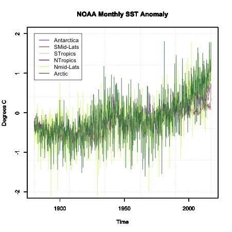
Note that the colors are random and will change each time you run the code.
Another way to chunk your global data is through a classification system. One such system is the Koppen Climate Classification System [42]. This system is broken into 5 major climatic types that are determined by temperature and precipitation climatologies. If you are creating a global analysis, this is a good way to break up the data into 5 plots or colors (1 for each region) and it makes synthesizing the data much easier. Similar to the latitude zones, you average all lats/lons that fall in each climate zone together. One caveat, the Koppen climate system is, in general, only used over land. For this reason, I will not show you an example of breaking our data into it. But what you can do is download the data for the Koppen climate classification [43]. The data is in the format lon/lat/koppen identifier. You can find the classification code on the same page. If you need help or an example of how to set this up, please let me know.
So now we have a time series plot. What next? Well, the next step depends on the analysis you are trying to perform. Since we do not have a clear question, I’m going to focus on the idea that we are trying to determine whether a trend is a component in our dataset. Now, at first glance, you can see some changes in the data suggesting a trend exists, but there is a lot of variability from month to month. So, what can we do? The two main options are to transform the data and/or smooth the data.
We’ve talked about transformation already, so I won’t go into much detail, but when it comes to trends, your best bet is to perform an anomaly conversion. Our example is already looking at the anomaly, so we don’t need to do this. But please remember, many times when examining data for trends, looking at the anomaly first is a good start.
The second aspect is smoothing the data. For smoothing data, we are trying to remove some of the noise by reducing the variability. Again, the most common type is a moving average. We’ve already applied a moving average imputation spatially, but let’s try a moving average temporally. Apply an 11-month smoother and plot the results for Antarctica (zone 1) by running the code below:
Below is a larger version of the overlay:
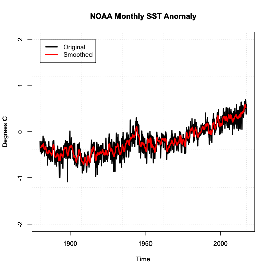
Notice how the variability has decreased. We have a nice smoothed running average of the SST anomaly. The noise has been decreased, and we can start to see the actual trend better.
Types of Decomposition
Now that we have a clean dataset that’s been smoothed to reduce noise and the time series plot suggests a trend exists, we can start to decompose the time series. Decomposing a time series means that we break a time series down into its components. For this course, we will have three components. A periodicity component (P), a trend component (T) and an irregular/remainder/error component (E).
There are two classical types of decomposition. These are still widely used, but please note more robust methods exist and will be talked about later on in the course. The first type is called the Additive Decomposition:
For each time stamp (t), the data (Y) at time t (Yt) can be decomposed into the periodicity component (Pt) at time t (which includes Quasi-Periodic and Chaotic), a trend component (Tt) at time t, and the remainder/error (Et) at time t.
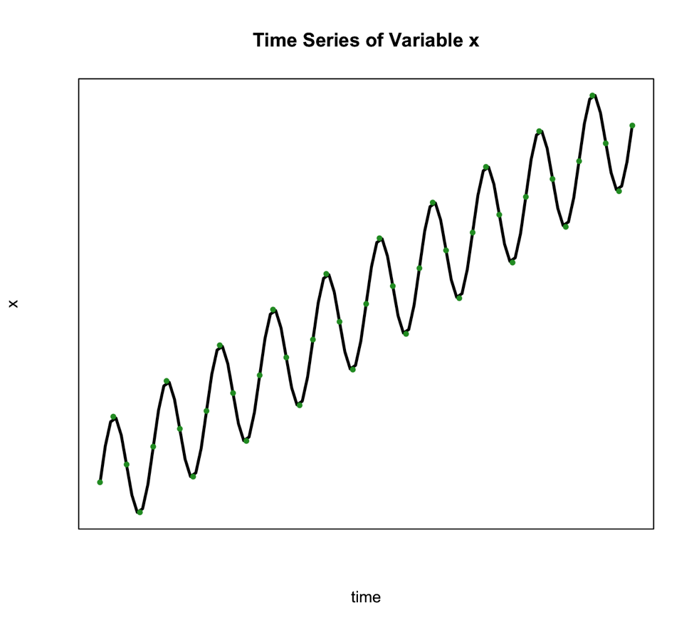
We use this type of decomposition primarily when the seasonal variation is constant over time. Such is the case in the figure below:
The second classical decomposition type is called Multiplicative and takes the form:
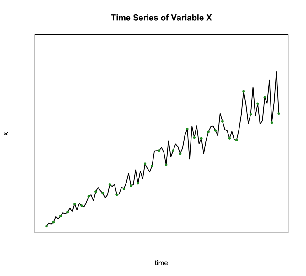
We use this method when the seasonal variation changes over time such as the figure below shows:
An alternative to the multiplicative model is to transform your data to meet the requirements of the additive. One of the best transformations to do this is log.
So, what would you select for our example? Well, for the Antarctica case, the additive might be reasonable as the variation doesn’t change much through time.
Basic Steps of Decomposition
Now that we know which method we are going to use, we can decompose the series into its components. Below is a basic step by step guide you can follow.
- Estimate the trend component (T)
We can do this by using a linear regression model, which you learned about in Meteo 815. The result is your trend component. If the trend, however, is not linear but perhaps exponential, we need to use a log transformation to obtain a linear trend and then perform the linear regression analysis. - Periodic Effects (P)
Before we can obtain the periodic effect, we need to de-trend the series. If the method is additive, you subtract the trend estimate from the series. If it’s multiplicative, you divide the series by the trend values. Then, we average the de-trended values over your periodic time span. For example, if you wanted a seasonal effect, you compute the average of the de-trended values for each climatological season. That is, take an average of all the Decembers, Januarys, and Februarys, then take the average of all March, April, May months, and so on. - Random Component (E)
To obtain the random component if you are using the additive format, you solve for E: To obtain the random component if you are using the multiplicative format, you solve for E again:
Please note that you do not have to perform these calculations yourself. Instead, you can use the function ‘decompose’ in R which allows you to decompose any time series by ‘type’ (set to additive or multiplicative). All you need is a time series function. What is important in these steps is that you understand what’s going on. That is, we simply pull out each component. If it seems basic, it is! Don’t overthink this.
Let’s decompose our Antarctica SST time series in R. Use the code below to first make a time series object.
Your script should look something like this:
# create a time series object
tsNOAA <- ts(movingAveNOAAAnom[,1],frequency=12,start=c(as.numeric(format(NOAAtime[1],"%Y")),as.numeric(format(NOAAtime[1],"%M")))
Now, let’s decompose by running the code below:
If you look at the variables in DecomposeNOAA, you will see each component: Trend, Seasonal (what we call Periodicity in our course) and Random (error). You can also plot the object. Below is a larger version of the figure.

This figure shows you the data in the first panel, the trend component in the second, the periodicity in the third, and the random in the fourth. Note that the seasonality component depends on how we adjust the ‘frequency’ parameter in the metadata (time series object). It is important that you get this right when decomposing.
So there you have it, your time series has been broken down. You know each component. Now, this may seem kind of pointless, but it will be helpful later on when we try to identify other patterns and diagnose different aspects of your time series. This is a very simplistic approach, one you will probably not use, but it is meant to illustrate how these components all add together. We will hit it with more powerful tools in later lessons.
Self Check
Test your knowledge...
Lesson 2: Autocorrelation and ARIMA
Motivate...
PRESENTER: How does rice grow? Rice is a grain. It looks like grass when it's fully grown. Most of the rice we eat in the UK comes from India, Thailand, Cambodia, Vietnam, Pakistan, and Italy. People in these countries have grown rice for thousands of years. Actually, you can grow rice in most places as long as the plants aren't exposed to the cold.
Rice grows in a paddy field. It's different from a field you might see in this country because it's usually flooded with water, which is just how the rice plants like it. The water protects the rice plants from extreme heat and cold and stops the weeds from growing by making the ground too waterlogged for them to take hold.
Some rice fields are irrigated with water from nearby rivers. Others are rain-fed areas containing water that falls during the monsoon season. The rice plants start their growing cycle in a nursery paddy field.
After one month, the seedling plants are put into small bunches and transplanted to a larger field to allow them to grow to their full size. The ground in the larger paddy field is prepared for the seedling rice plants by plowing. They use oxen to pull the plow through the waterlogged field.
The small bunches of rice seedlings are then planted in the main field by hand. The seedlings are given plenty of space in the ground because the rice plants will grow to be around a meter tall. It takes three months for the grains of rice to develop at the top of the plants' stalks. When the grains turn yellow and hard, it's time for them to be harvested.
In this field, the rice has to be harvested by hand. So during the harvest, the paddy field is drained to make it easier for the workers. The farmers harvest the rice by cutting the stalks with a sickle. Next, they separate the grain from the stalks by threshing it. This is usually done by hand.
In some places, the rice is spread out like this, and the heat of the sunshine dries it out. But often, the rice is stored in large silos, and using dryers, they heat up the air to dry out the rice. Once the rice is dry, the rice grain is separated from the outer husk using this machine. Now, it's ready to be placed into these one-ton bags and transported to rice mills in Europe.
Rice is an important crop in Thailand and represents a significant portion of the Thai economy and the labor force. As the video discussed, the rice grows in a flooded area, and farmers either rely on irrigation from rivers or rainfall. This rainfall, in Thailand and many other countries, comes from the monsoon. Monsoons are seasonal reversals, in this case from dry to wet. Since farmers in Thailand rely on the wet monsoon season to grow crops, variations in the monsoon season have severe implications for the economy. Being able to predict the wet season of the monsoon is imperative. Because of the general periodicity of the monsoon, we can utilize a time series to predict the coming and going of the wet season.
Newsstand
- (2011, October, 11). Thailand races to defend Bangkok from floods [44]. Retrieved November 16, 2017.
- Bundhun, Rachel. (2016, June 16). Indian economy’s fate depends on the monsoon [45]. Retrieved November 16, 2017.
- (2010, March 4). Drought Threatens Mekong Crops [46]. Retrieved November 16, 2017.
- Rochan, By M. (2014, July 21). Thailand to Reclaim Top Rice Exporter Status After Weak Indian Monsoon Rains [47]. Retrieved November 16, 2017.
- (2013, May 2017). Bangladesh Crop Insurance: Helping Farmers Weather the Storm [48]. Retrieved November 16, 2017.
Lesson Objectives
- Define, compute, and interpret autocorrelation in a dataset.
- Create an autoregressive model for a dataset.
- Create a moving average model for a dataset.
- Create an ARMA or ARIMA model for a dataset.
- Explain the differences between models, the strengths and weakness of each, as well as when to use each one.
Autocorrelation Overview
Prioritize...
At the end of this section, you should be able to describe autocorrelation.
Read...
At this point, we have seen that a time series can provide lots of information on a specific variable. In particular, we learned about the periodicity component of a time series which can include components that are partially cyclic, occurring at roughly equal intervals, or chaotic, occurring now and then with some consistency. But how do we determine that interval? Read on to find out!
Autocorrelation Definition
Let’s start by reminding ourselves about correlation. Correlation is the measure of strength and direction of a linear relationship between two variables. A linear relationship is when one variable X is scaled by a factor A with an offset B to fit another variable Y (Y=AX+B). The correlation coefficient quantifies the degree to which this scaling and offset can be used to fit the data.
Autocorrelation, sometimes called serial correlation, is the correlation of the value at a given point in time with other values of the same variable at different times. It is, thus, the relationship between the value at time t and the values lagged before (t-1, t-2, t-3,…) and/or after (t+1, t+2, t+3,…). So, instead of comparing one variable, Y, with another variable, X, you are comparing one variable against itself, offset in time.
Mathematically speaking, the autocorrelation is defined as:
The values Y1, Y2, …,YN are taken at time T1, T2,…., TN, where the values are equally spaced in time. This formula is similar to the correlation coefficient we previously saw in Meteo 815 and values closer to 1 indicate a strong relationship (positive or negative) while values closer to 0 suggest a weaker relationship.
Importance of Autocorrelation
There are two primary reasons we will look at autocorrelation in this course. The first is to test for stationarity (statistical properties such as mean, standard deviation, etc. are constant in time). Stationarity is a key assumption we will utilize in future analyses, so determining whether a time series meets the requirement is essential. If the autocorrelation decreases slowly from lag to lag (or remains relatively constant), the data is non-stationary. Furthermore, for non-stationary data, the autocorrelation at lag 1 is usually very large and positive. Whereas, if the autocorrelation drops to 0 relatively quickly, the data is considered stationary.
The second reason to compute autocorrelation is to determine if there are patterns with specific timescales. Many atmospheric variables will have periodic behavior that can be detected through the use of autocorrelation. However, this is not a rigorous method for forecasting. Remember from the correlation lesson, I emphasized that even if there is a strong correlation coefficient, it CANNOT be interpreted as causation. Similarly, even though there might be a strong autocorrelation coefficient at a particular lag, suggesting periodicity, it is ill-advised to use this for forecasting purposes. But, the autocorrelation can be used as a stepping stone to determine the significance of temporal patterns.
Plots
Unlike the correlation coefficient where the result was a single value, the autocorrelation coefficient is generally computed for a number of lags. So although you could look at individual autocorrelation coefficient values, it is generally easier to interpret the autocorrelation if you plot the values as a function of lags. This will allow you to look at as many lags as you want, which can be handy when trying to detect patterns.
In R, you can use the function ‘acf’ from the package ‘stats’ which will compute the autocorrelation for as many lags (lag.max parameter) as you want. You can also use the function ‘pacf’ which is the partial autocorrelation. The partial autocorrelation is similar to the autocorrelation but the linear dependence between lags is removed. The figure below shows an example of the ACF for a non-stationary dataset (left panel), an ACF for a stationary dataset (middle panel - notice how the values drop to 0 faster than in the left panel), and the PACF of a stationary dataset (right panel).
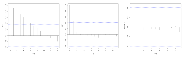
Autocorrelation Example
Prioritize...
At the end of this section, you should be able to perform and interpret the autocorrelation computed over a number of lags for a given dataset.
Read...
At this point, you probably have a vague idea of what autocorrelation is but may still be uncertain about why and how we use it. Well, let’s work through an actual problem that shows you not only the computational side (how we use R to compute the coefficient(s)), but also the interpretation and framework for a larger picture. So let’s begin!
Question and Data
For this example of autocorrelation, we want to determine if an event occurs regularly with a certain periodicity, i.e., time scale. That is, does a large autocorrelation coefficient occur at a specific lag? Monsoons are seasonal shifts in the wind that generally result in changes in precipitation. Bangkok, Thailand is one city impacted by monsoons. They have three main seasons: the hot season, the rainy season, and the cool season. Generally, during the months of July to October, Bangkok is wet. Every year, they can expect the rain to come during these months and be relatively (key word here) dry the other months. This is an example of a quasi-periodic event.
So, the real question is: Can we observe this seasonal pattern in the data? Let’s find out. Here is a 50-year dataset [50] of daily precipitation for Bangkok, Thailand. Let’s open and prepare the data for analysis using the code below.
Your script should look something like this:
mydata <-  read.csv("daily_precipitation_Bangkok.csv", header=TRUE, sep=",")

# replace data with bad quality flags with NA
mydata$PRCP[which(mydata$Quality.Flag != " " )] <- NA

# replace missing values with NA
mydata$PRCP[which(mydata$PRCP < 0)] <- NA

# extract out precipitation (units = inches)
precip <- mydata$PRCP;

# convert date string to a real date
date<-as.Date(paste0(substr(mydata$DATE,1,4),"-",substr(mydata$DATE,5,6),"-",substr(mydata$DATE,7,8)))
Setup and Computation
Now that our data is extracted, we can set up the data specifically to compute the autocorrelation. The goal here is to determine whether a seasonal shift is observed in the precipitation data. Monthly totals are more logical than daily totals. Use the code below to estimate the monthly totals.
Your script should look something like this:
# Determine the number of unique months/years
unique_time <- unique(format(date,'%m%Y'))

# create monthly totals for each unique month/year combo
monthlyPrecip <- {}
time_index <- {}
for(itime in 1:length(unique_time)){
  index <- which(format(date,'%m%Y') == unique_time[itime])
  monthlyPrecip[itime] <- sum(precip[index])
  time_index <- c(time_index,index[1])
}
Now we can begin the analysis. We will first, as usual, make a plot of our time series. This is again to visually inspect the data for any missing or bad values, as well as to check if we can visually detect the pattern. Run the code below to create a time series plot.
Here is a larger version of the figure you should generate from the code above.
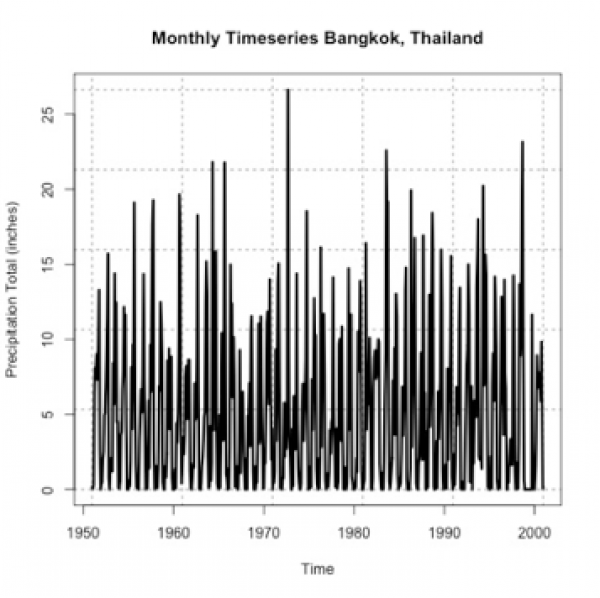
If you stare at it long enough, you will probably notice a pattern of high/low monthly precipitation totals. However, the timescale of the pattern is not entirely clear. So let’s compute the autocorrelation to assess the periodicity better. Use the function ‘acf’ on the monthly precipitation by running the code below.
I chose a max lag of 18 months, which is equivalent to a year and a half. We believe the correlation is seasonal, so we want to explore at least one cycle. A year and a half allow us to observe this pattern. Below is a larger version of the figure.
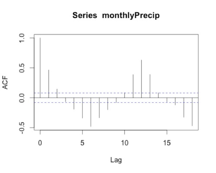
Interpretation
What does the result show? To start, we must ignore the correlation of 1 at lag 0 because this is the correlation of each month with itself. As a side note, you will sometimes see the ACF with lag 0 and sometimes without, so it’s important to always check. The correlation at lag 1 is almost 0.5. This means that there is a positive correlation for each month with the month after and the month before. We think of the lags as since correlation is symmetric. At lag 3, the correlation flips to negative. At lag 6, half a year, there is an equal but opposite correlation to that at lag 1. This suggests a shift in the opposite direction (positive to negative and vice versa) every 6 months. We then see at lags 11-13 we have positive correlations, again ranging between 0.3-0.5. Suggesting the precipitation of a given month is positively correlated with the precipitation 11-13 months before or after---or more simply every year. This type of pattern definitely signals a seasonal change of precipitation.
I know this can be confusing, so let’s think of the lags in another way. I mentioned above that the rainy season is June-October. If the month we are examining is August (lag 0), then lag 1 would be July/September. Lag 2 would be June/October. These both show positive correlations, which is what we expect because the rainy season is June - October. At lag 3 (or months May/November), the correlation flips. This marks the transition to a different season.
Autoregressive Models Overview
Prioritize...
After reading this section, you should be able to explain what an autoregressive model is and discuss its strengths and weaknesses.
Read...
It makes sense that if there is a repeating pattern, like the change from the rainy season to the dry, we should be able to use that, to some degree of accuracy, for prediction. Autocorrelation tells us the strength of the relationship of a variable in time. But it doesn’t really harness that information for prediction. To do this, we need to use the Autoregressive (AR) model.
Definition of an AR Model
An autoregressive model or AR model predicts future behavior using past behavior. The model utilizes the autocorrelation results, which means we must use past data to model the behavior. The AR model can be viewed as a linear regression model where the current data value is predicted from past values. The outcome variable (Y) at some point in time, t, is predicted using a linear regression with the lagged values (Y at points in time earlier than t) as predictors. In short, the AR model is a regression of the variable against its own history.
When and Why to use?
An AR model assumes that error terms are uncorrelated and have a mean of zero. This means we should only use an AR model if the data is stationary. We need to look at the ACF and or the PACF to determine whether an AR model is feasible. Generally, we are looking for 1 or 2 lags that are strongly correlated while the rest are not. Here is an example of the PACF for data that would make a good candidate.
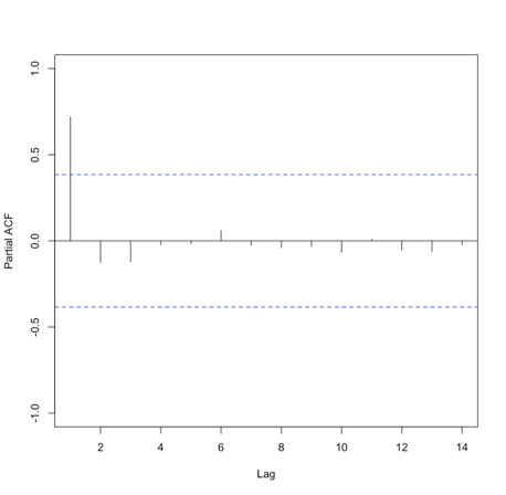
Please note that in this example, the function suppressed the useless lag zero value. So, the high correlation is at lag 1.
Solve Parameters
Mathematically, the AR model looks very similar to the linear regression equation and takes the form:
where A is the parameter stemming from the autocorrelation, B is a constant, and e is the white noise (random signal). When using this model, we use the order to describe the number of preceding values that we use to predict the new values. So the order represents the number of lags we will use. The equation above is for a first-order autoregressive model, written as AR(1), since only the previous value, Yt-1, is used to compute the new value, Yt. A second order AR model, AR(2), would be written as In this case, the Y value at time t is predicted using the value at t-1 and t-2, two previous values hence the order of 2. To generalize the model, we can say that the pth-order autoregressive model, AR(p), is:We can make a first guess at the order by looking at the ACF or PACF. Take a look at the example of the PACF from above that showed the data was stationary. There is one high correlation at lag 1. This suggests an order of 1. Whereas the PACF below is less clear.
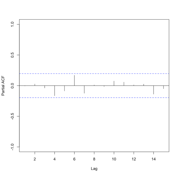
To create an AR model when the order is not known, we can use the function ‘ar’ from the ‘stats’ package. This particular function will choose the order by using the Akaike Information Criterion (AIC). As a reminder, the AIC is a measure of the relative quality of the models. The function will create multiple models of multiple orders, compute the AIC, and then select the best model by minimizing the AIC.
The results include the coefficients, ’ar’, the order, ‘order’, the aic score, ‘aic’, and the residuals from the fitted selected model, ‘resid’. Similar to our linear regression fits from Meteo 815, we can use the residuals to compute several metrics of best fit, such as MSE, RMSE, MAE, etc.
Advantages and Disadvantages
There are many advantages and disadvantages to the AR model, so I will only discuss a few. The most notable advantage is that it’s easy to compute. It’s a simple function and is not computationally expensive. This is great if you need to create many models. An AR model is also easy to understand - it’s the autocorrelation and a reflection of the periodicity that exists in the data.
A noticeable disadvantage is that the data must be stationary. This can be a difficult requirement to meet. Also, there needs to be a strong cycle in your dataset for the AR model to exploit. Furthermore, if there are extremes, an AR model can have trouble characterizing and modeling them, so this will create larger errors.
AR Example
Let’s return to our precipitation data from Bangkok. Run the code below to plot the PACF for the monthly precipitation data.
Below is a larger version of the figure: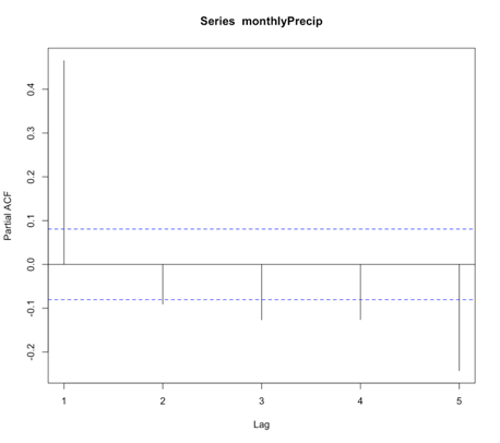
You will notice a strong correlation at lag 1 that drops significantly right after. This appears to be a candidate for an AR model, specifically of order 1. So let’s give it a try. Run the code below to create an AR(1) model of the monthly precipitation data.
Notice that I didn’t use all of the observations. I want to save some for comparison later on. For this particular model, the coefficient (Precip_AR1$ar) is 0.45. As a reminder, an AR(1) model follows the form:
‘a’ in this example is 0.45. The element ‘var.pred’ tells us the predicted variance or the variance of the time series that is not explained by the AR model. In this case, it is 20.6. But as a reminder, variance does not have easily understandable units (units^2). So instead, let’s compute some of our own metrics using the residuals. Start with the MSE (Mean Square Error) and RMSE (root MSE).
Similar to the variance, the MSE units are hard to utilize, so we use the RMSE. The RMSE is 4.53 inches. As a reminder, the RMSE represents the sample deviation between the predicted and observed values. So, we can say that each prediction value has a range of 4.53 inches.
Now, let’s use the model to predict some values and plot the observed vs. predicted. We will predict only for the values we didn’t use to create the model, i.e., we’ll test on independent data so as to get an honest assessment of how well the model will do in practice.
Your script should look something like this:
# predict values
dataPredict_input <- monthlyPrecip[(length(monthlyPrecip)-100):length(monthlyPrecip)-1]
precipAR1_predict<-{}
for(i in 1: length(dataPredict_input)){
  precipAR1_predict[i] <- predict(Precip_AR1,dataPredict_input[i])$pred
}
We loop through the data and take the prior value and use it to predict the future event one step forward (AR(1)). Now run the code below to plot the predicted values against the observed values.
Below is a larger version of the plot:
As a reminder, the closer the values (dots) are to the 1-1 line (blue dashed line) the better the model. We can definitely tell the AR(1) model is NOT a good model for monthly precipitation. So let’s revisit the PACF, and this time I’m going to expand the maximum lag length to 2 years or 24 months. Use the code below:
Your script should look something like this:
# plot pacf
BangkokPrecipPACF <- pacf(monthlyPrecip,lag.max=24)
You should generate a figure like this:
We see that there are multiple lags of relatively strong correlation. And therefore an AR(1) model is not ideal. But what is the correct number? Well, instead of figuring this out by hand, let R select the best order for you!
Using the function ‘ar’, we can choose to let the 'order.max' parameter be NULL, thereby allowing the function to estimate multiple AR models of varying order and selecting the best by using the AIC. Let’s see what it does!
Your script should look something like this:
# load in library
library(forecast)
# create AR model
Precip_AR <- ar(monthlyPrecip[1:(length(monthlyPrecip)-100)])
We can check the order of the AR selected by looking at the value $order. In this case, the order is 24! There are 24 coefficients ($ar), and we can compare the AIC scores ($aic) which shows you the difference in AIC between each model and the best model (in this case order 24). If you look at the AIC values, you will notice that it did compute models of order 25 and 26. So it really did create multiple models and minimize the AIC. Let’s compute the MSE and RMSE to see if it changed.
Your script should look something like this:
# compute MSE
precipMSEAR <- mean(Precip_AR$resid^2,na.rm=TRUE)

# compute RMSE
precipRMSEAR <- sqrt(mean(Precip_AR$resid^2,na.rm=TRUE))
In this case, the RMSE is 3.24 inches compared to 4.53 inches in the AR(1), so we have decreased the RMSE, which is good!. Now, let’s predict some values and compare them to the observed.
Your script should look something like this:
# predict values
dataPredict_input <- monthlyPrecip[(length(monthlyPrecip)-124):length(monthlyPrecip)-1]
precipAR_predict<-{}
for(i in 1:100){
  precipAR_predict[i] <- predict(Precip_AR,dataPredict_input[seq(i,24+i-1,1)])$pred
}
A note on the code, we need to look at the 24 values preceding the one we are trying to predict. This is shown by the sequence command for subsetting the data. If you look at how I created the data input values, I took the 100 values I want to predict plus the 24 preceding them. This allows me to use the AR model of order 24 for prediction. Let’s plot the predicted values against the observed values.
Your script should look something like this:
# plot predicted and observed values
dataObserved <- monthlyPrecip[(length(monthlyPrecip)-99):length(monthlyPrecip)]
plot.new()
grid(nx=NULL,ny=NULL,'grey')
par(new=TRUE)
plot(dataObserved,precipAR_predict,xlab="Observed Precipitation (inches)",
     ylab="Predicted Precipitation (inches)",main="Observed Monthly Bangkok Precipitation vs Predicted AR(24)",
     xlim=c(-5,25),ylim=c(-5,25),pch=16) par(new=TRUE) plot(seq(-5,30,1),seq(-5,30,1),type='l',lty=2,col='dodgerblue4',lwd=3,xlab="Observed Precipitation (inches)",
     ylab="Predicted Precipitation (inches)",main="Observed Monthly Bangkok Precipitation vs Predicted AR(24)",
     xlim=c(-5,25),ylim=c(-5,25))
This is the figure you should get:
You should notice something very suspicious in this figure. Negative precipitation is NOT possible! It is worth noting that many statistical models, including AR, lack a means of imposing such physical constraints. In this instance, there was no constraint that precipitation cannot be negative. We can fix this by replacing all the negative values with 0. This is a prime example of why we need to plot our results!
Your script should look something like this:
# replace negative values with 0
precipAR_predict[which(precipAR_predict < 0)] <- 0
If we replot, we get this figure (note that I changed the x and y limits, but I assure you there are no negative values)
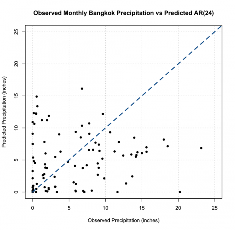
This, however, is not the most promising result. The predictions are not very close to the 1-1 line and this, paired with the RMSE, suggest the AR model, even with the seasonal repetition of the monsoon, may not be the best choice for prediction.
Moving Average Model Overview
Prioritize...
After reading this section, you should be able to explain what a moving average model is as well as its strengths and limitations.
Read...
So, we saw how we can use the periodicity of a variable for prediction through AR modeling. But, sometimes, that is not enough. Instead, it might be more beneficial to model the data based on the errors of the previous forecast. This is where a Moving Average (MA) model comes in.
General Description
The basic idea of an MA model is that the variable depends linearly on the past errors of forecasts. An MA model creates a forecast at time t and computes the forecast errors, then the model forecasts the next time stamp (t+1) using the errors computed from the previous forecast (time t) as predictors. In short, the moving average model is the weighted average of past errors. Mathematically, an MA model looks like:
where μ is the mean of Yt+1, are the forecast errors for the current forecast (time t) and the previous (t-1) and are the parameters of the model. Similar to the AR model, the MA model has an order saying how many past errors to include, denoted by MA(q). The above equation is an example of an MA model of order 1, MA(1). An MA(2) is given by the following equation:
And the qth order is:
There are some basic requirements for an MA model. For one, the time series is assumed to be stationary. The errors are assumed to be independently normally distributed. You can see this equation looks very similar to the AR model. So what is the main difference? A pure AR model depends on the lagged values of the data while a pure MA model depends on the previous forecast errors.
Advantages and Disadvantages
The MA model is great because it’s computationally efficient and yields a very stable forecast, in that it doesn’t change drastically from one value to another. In addition, an MA model can be updated every time a new forecast is made; that is, you add in the forecast errors and update the model.
There are, however, several disadvantages. For one, an MA model requires you to save past forecast errors to create a new model and predict the next value. This is costly in terms of computational memory. The MA model also ignores complex relationships; it is focused on characterizing the mean value instead of capturing the natural fluctuations that occur. This, in turn, can remove extreme values as the MA model focuses on the average.
How to tell if an MA model is a good fit?
Similar to the AR model, we look to the autocorrelation for insight. In this case, we will examine the ACF. We use an MA(1) when there is only a significant autocorrelation at lag 1. For example:
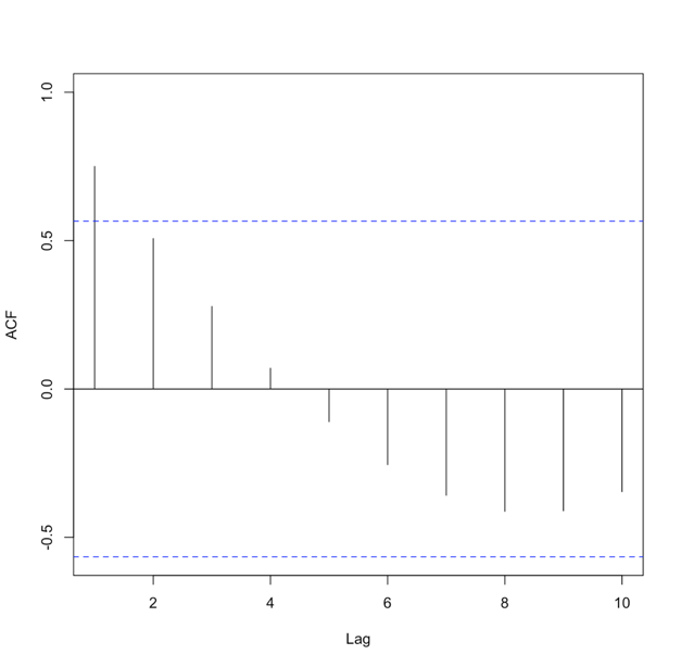
When there are significant correlations at lags 1 and 2 but no significant correlations at higher lags, we use an MA(2). The ACF would look like this:
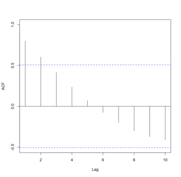
You should start to see the pattern. An MA(q) model would be selected when there are significant autocorrelation values for the first q lags and nonsignificant autocorrelation for lags>q. So, what’s the key difference between the AR and MA in terms of the ACF. An AR model will have an ACF that exponentially decreases to 0 as the lag increases, where an MA model will have an ACF that has significant correlations for the first q lags and then autocorrelation=0 (or nonsignificant) for all lags >q. For a PACF, in an AR model, the number of non-zero partial autocorrelation provides the order for the AR model (the most extreme lag of the variable that is used for prediction). Whereas, in an MA model, the PACF tapers toward 0. For the AR model, we tend to use the PACF, while for the MA model, we will use the ACF.
Let's try and create an MA model in R using our precipitation data from Bangkok. We start by creating the ACF. Use the code below:
Your script should look something like this:
# create acf of data
precipACF <- acf(monthlyPrecip)
You should get the following figure:
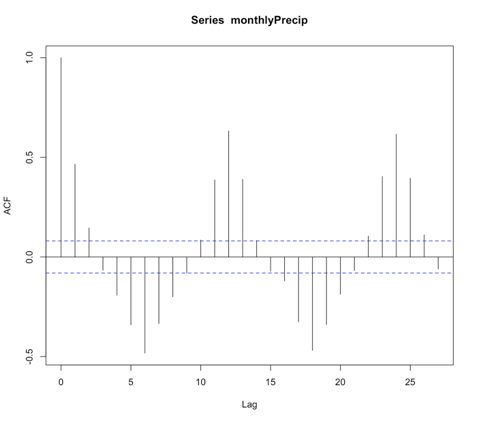
Like I said above, an MA model has an ACF with the characteristic that the correlation will be strong for q lags and then become nonsignificant. This is not a good candidate for MA modeling! However, we will test out an MA model to see how well It does compare to the AR model.
For the MA model, we will use the function ‘auto.arima’. I will not talk a lot about this function right now because we will use it in the following sections. For now, to create a pure MA model, we will set the following parameters: d=0, D=0, max.p=0, max.P=0, max.d=0, max.D=0. These parameters will be discussed in more detail later on. Use the code below to create an MA model. The ‘auto.arima’ function selects the best model by using either the AIC, AICC, or BIC metric.
Your script should look something like this:
# create MA model
precip_MA <- auto.arima(monthlyPrecip[1:(length(monthlyPrecip)-100)],ic="aic",d=0, D=0, max.p=0, max.P=0, max.d=0, max.D=0)
For this example, the best MA model was of order 2 (simply type out precip_MA and the information will pop up). If we use the summary function, we can obtain a number of error measures from the training data, including the RMSE which in this case was 4.5 inches, close to the AR(1) model.
Unlike the AR model, predicting data is not as simple as before because with the MA model, we update based on the errors of the previous forecast. So for each prediction, we need to update the MA model. Use the code below to forecast the last 100 points of precipitation.
Your script should look something like this:
# predict values
precipMA_predict<-{}
for(i in 1:100){
  dataSubset <- monthlyPrecip[(i:(length(monthlyPrecip)-101+i))]
  precip_MA=auto.arima(dataSubset,ic="aic",d=0, D=0, max.p=0, max.P=0, max.d=0, max.D=0)
  precipMA_predict[i] <- predict(precip_MA,n.ahead = 1)$pred
}
Now, plot the predicted vs the observed.
Your script should look something like this:
# predict values
dataObserved <- monthlyPrecip[(length(monthlyPrecip)-99):length(monthlyPrecip)]
plot.new()
grid(nx=NULL,ny=NULL,'grey')
par(new=TRUE)
plot(dataObserved,precipMA_predict,xlab="Observed Precipitation (inches)",
     ylab="Predicted Precipitation (inches)",main="Observed Monthly Bangkok Precipitation vs Predicted MA",
     xlim=c(0,25),ylim=c(0,25),pch=16) par(new=TRUE) plot(seq(0,30,1),seq(0,30,1),type='l',lty=2,col='dodgerblue4',lwd=3,xlab="Observed Precipitation (inches)",
     ylab="Predicted Precipitation (inches)",main="Observed Monthly Bangkok Precipitation vs Predicted MA",
     xlim=c(0,25),ylim=c(0,25))
You should get the following figure:
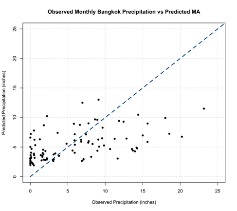
Now, a good thing to note is with an MA model you are less likely to get unrealistic values, but we should still check. You can do this by determining the minimum value of the predictions. Note that, depending on your variable, you may need to check multiple constraints (including a maximum value).
Back to the interpretation, similar to the AR model, this MA model does not look to be the best fit. We do not see many values along the 1-1 line and paired with the error measure scores, the MA model is not the greatest at modeling the monthly Bangkok Precipitation. But that doesn’t mean the MA model is worthless in this example; it just means that neither the AR or MA are the best, and each has its own skill. So, what if we could combine the strengths of both?
ARMA/ARIMA Overview
Prioritize...
After reading this section, you should be able to describe an ARMA and ARIMA model, explaining the strengths and weaknesses of each.
Read...
So now we have seen two models for time series data, the Autoregressive Model and the Moving Average Model. Each has their own strengths and weaknesses. There will be times when the AR model is more appropriate than the MA model and vice versa. But what if our data doesn’t fit a pure AR model or a pure MA model but is instead a mix of both? What if we could combine AR+MA? You can!
ARMA
We do not have to use the AR or MA models exclusively. Instead, we can combine the AR terms and the MA terms into the appropriately named model called ARMA. ARMA, in simple terms, is the combination of the p order AR terms and the q order MA terms. Mathematically:

The first part, in blue, is the AR model of order p. The second part, in green, is the MA model of order q. C is a constant and et is the error term. The equation estimates the Y value at time t as the sum of p terms of the AR component and the q terms of the MA component. As AR and MA have order, ARMA has an order that is reflective of each component. We say that the ARMA model has an order (p,q) or ARMA(p,q). As with the individual components, ARMA assumes the data is stationary.
ARIMA
It is highly likely with meteorological variables that your data will not be stationary and will exhibit trends and/or periodicities. So what can we do if the data does not meet this requirement? Removal of these nonstationary components can be carried out by differencing the data until it is approximately stationary. You difference the data until it meets this basic assumption and then run an ARMA model. Although that works, why don’t we take a shortcut and use the ARIMA (sometimes called the Box-Jenkins model) model instead? An ARIMA model is an ARMA model that has been initially (I) differenced. The results are integrated to create a forecast.
ARIMA has one more component, the differencing component. Formally, this parameter, d, is called the order of the differencing. ARIMA combines the differencing of a nonstationary time series with the ARMA model, following the form (p,d,q) or ARIMA(p,d,q).
So what exactly goes on in an ARIMA model? We start with the differencing. Differencing in statistics is used to transform a dataset to make it stationary. In short, you difference the time series until the stationary requirement is a reasonable assumption. Mathematically, first order differencing (d=1) looks like this:
We compute the value at time t as the value at time t minus the value at t-1. Second order differencing (d=2) mathematically looks like this:
Most times, you will only need to apply differencing once or twice (order 1 or 2). Once you difference, you simply create the ARMA model that best fits the new stationary time series.
You can probably start to see the benefits of ARIMA. It’s easy to use and allows for both stationary and non-stationary time series. However, there are three parameters now: p,d,q - meaning there are many possible models that can be created to fit your data. So, how do you pick the ‘best’ model? Here are some general guidelines:
- Similar to linear regression, we want the simplest form of a model. This means you want to minimize the values of p,d, and q. Simple is always better in this case.
- The model fit should be as good as possible. This is the least-squares approach we discussed in Meteo 815. We try to minimize the squared difference between the predicted and the observed.
- Finally, if we automate the process, we can create multiple models and select the best model by minimizing metrics such as the AIC or BIC.
But similar to linear regression, we won’t know how good a model is until we use it to predict future events.
Periodicity ARIMA
As you have probably seen throughout this course and Meteo 815, meteorological data tends to have a periodicity component, specifically referred to as a seasonal component. This requires us to do an additional differencing technique (outside of possible trends or other components that lead to non-stationarity). The differencing discussed above focused on non-stationary components, arising primarily from trends. Instead, we can use a periodicity ARIMA model that includes a quasi-periodicity or a seasonal periodicity component. We write a periodicity ARIMA as:
ARIMA(p,d,q)(P,D,Q)m
The purple part is the non-seasonal part of the model. Or in our course, we call this the non-periodic part of the model with the components, p=non-periodic AR order, d= non-periodic differencing, q=non-periodic MA order. The orange part of the model is the seasonal or periodic part of the model with the components: P=periodic AR order, D=periodic differencing, Q=periodic MA order, and m=time span of the repeating pattern.
We determine m by looking for the spike at lag m in the ACF or PACF. If you look back at the Bangkok precipitation, there are spikes at 6 months and 12 months. The periodic terms are then multiplied by the non-periodic terms to create the full model. Again, the main point here is we add a component that focuses on removing seasonality, whereas the original ARIMA model, talked about above, only removes non-quasi-periodic non-stationary components.
Model Type Selection
Although we will be able to automate the ARIMA function in R to select the best model and pick the best order, it’s still important to verify that the order makes sense. So let’s talk a little bit about how to select (or confirm) the values of p,d,q, and the model type. For the MA and AR models, we already discussed the visualization of the ACF or PACF to estimate the order. These same traits hold true for ARIMA, and therefore I will not discuss them here but focus instead on how we make the selection between using a pure AR, pure MA, an ARMA/ARIMA/ and a periodic ARIMA. We use the shape of the ACF or PACF plot to suggest the first guess of model type. But again, the function will automate this process to further refine the selection. Below is a summary table discussing the shape of the ACF and what model you should select. A summary table is also available from NIST [51].
| Shape | Model |
|---|---|
| Exponential, Decaying to Zero | AR model: use PACF to identify the order |
| Alternating positive and negative, decaying to zero | AR model: use PACF to identify the order |
| One or more spikes, rest are at 0 | MA model: order identified by the lag at which the correlation becomes zero |
| Decay starting after a few lags | ARMA |
| All 0 or close to 0 | Data is random |
| High values at fixed intervals | Include seasonal AR term |
| No Decay to 0 | Series is not stationary (possible trend or periodicity) - include differencing term |
If your ACF shows an exponential decay to 0, we would use the AR model. If there are one or more spikes but the rest are 0, we use an MA model. If there is a decay starting after a few lags, we use ARMA, if there are high values at fixed intervals, we use a periodic ARMA, and if there is no decay to 0, we use ARIMA.
Below is a clickable flowchart to help you through the process of selecting the correct model.
ARIMA Example
Prioritize...
After reading this section, you should be able to fit an ARIMA/ARMA model to data when applicable.
Read...
We saw in our previous examples that a pure AR model did not do a great job at predicting precipitation in Bangkok. Similarly, a pure MA model fell short. But both models provide quality information, so let’s try combining them to create a better model.
ARIMA Example
Before we create the ARIMA model, we actually should look into whether ARMA or ARIMA is more appropriate; that is, does a trend or other chaotic periodicities exist in our data? We can check this by plotting the time series.
Your script should look something like this:
# plot time series
plot.new()
grid(nx=NULL, ny=NULL, 'grey')
par(new=TRUE)
plot(date[time_index],monthlyPrecip,xlab="Time",ylab="Monthly Precipitation (inches)",
     main="Bangkok, Thailand Precipitation",type="l")
You should get a figure like this:
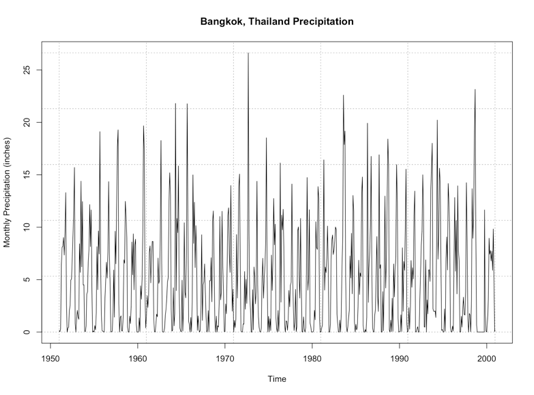
By examining this figure, there doesn’t appear to be an overall trend of increasing or decreasing precipitation. An alternative method is to look at the anomaly which tends to paint a clearer picture. Here is a time series of the anomaly, with the 0 line highlighted in blue.
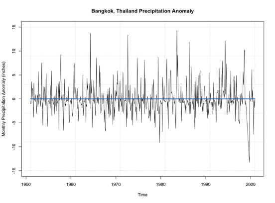
Note that the time series doesn’t really increase or decrease. It’s not drifting from the 0 line, but simply fluctuating around it. This leads me to believe that no differencing is needed for stationary as it pertains to non-periodicity. Let’s see if this is true and use the ‘auto.arima’ function. Again, this function will select the best ARIMA model with the best p,d,q parameters based on AIC scores of several models. Use the code below to create an ARIMA model.
Your script should look something like this:
# create ARIMA model
precip_ARIMA <- auto.arima(monthlyPrecip[1:(length(monthlyPrecip)-100)],ic="aic",seasonal=FALSE)
The main difference from our previous MA example is I let the function choose the p,d, and q values as opposed to the pure MA where I set p and d to 0 to ensure a pure MA model was selected. Ignore the seasonal parameter for now; we will discuss this in more detail later on. When I run this, the model selected is ARIMA(5,0,1) which can be called ARMA(5,1). So, like we saw in the plot, the ARIMA model selected d=0; differencing is not needed due to trends in the data.
We can look at the summary metrics again (using summary()). The RMSE is 4.1 inches. You can also compare how the model predicted the training dataset observations. Remember, this is not the best approach because the model is using these observations. But let’s give it a try.
Your script should look something like this:
# plot Training Data vs Predictions
plot.new()
grid(nx=NULL,ny=NULL,'grey')
par(new=TRUE)
plot(precip_ARIMA$x,precip_ARIMA$fitted,xlab="Observed Precipitation (inches)",
     ylab="Predicted Precipitation (inches)",main="Observed Monthly Bangkok Precipitation vs Predicted ARMA",
     xlim=c(0,25),ylim=c(0,25),pch=16)
par(new=TRUE)
plot(seq(0,30,1),seq(0,30,1),type='l',lty=2,col='dodgerblue4',lwd=3,xlab="Observed Precipitation (inches)",
     ylab="Predicted Precipitation (inches)",main="Observed Monthly Bangkok Precipitation vs Predicted ARMA",
     xlim=c(0,25),ylim=c(0,25))
You should get this figure:
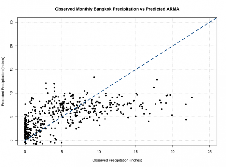
One of the things that hopefully popped out was the negative values once again. We must consider the constraints of the data and realize that our models don’t necessarily ‘know’ those constraints, so we must impose them ourselves.
One of the great things about ARMA/ARIMA is the opportunity to update the model regularly. And in reality, we probably would update the model with new observations to adjust it ever closer to reality. So let’s go ahead and set up an algorithm that forecasts the monthly precipitation one month out using the most relevant observations to create a model. Then, we can plot the observations vs the predictions.
Your script should look something like this:
# predict values
precipARIMA_predict<-{}
for(i in 1:100){
  dataSubset <- monthlyPrecip[(i:(length(monthlyPrecip)-101+i))]
  precip_ARIMA=auto.arima(dataSubset,ic="aic",seasonal=FALSE)
  precipARIMA_predict[i] <- predict(precip_ARIMA,n.ahead=1)$pred
}
And now, let’s plot.
Your script should look something like this:
# plot predicted and observed values
dataObserved <- monthlyPrecip[(length(monthlyPrecip)-99):length(monthlyPrecip)]
precipARIMA_predict[which(precipARIMA_predict <0)] <- NA
plot.new()
grid(nx=NULL,ny=NULL,'grey')
par(new=TRUE)
plot(dataObserved,precipARIMA_predict,xlab="Observed Precipitation (inches)",
     ylab="Predicted Precipitation (inches)",main="Observed Monthly Bangkok Precipitation vs Predicted ARIMA",
     xlim=c(0,25),ylim=c(0,25),pch=16)
par(new=TRUE)
plot(seq(0,30,1),seq(0,30,1),type='l',lty=2,col='dodgerblue4',lwd=3,xlab="Observed Precipitation (inches)",
     ylab="Predicted Precipitation (inches)",main="Observed Monthly Bangkok Precipitation vs Predicted ARIMA",
     xlim=c(0,25),ylim=c(0,25))
You should get a plot similar to the one below:
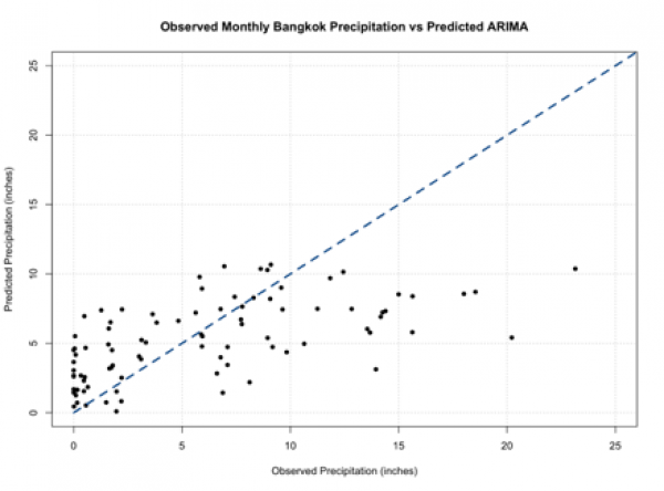
You should note that these predictions do not stem from the same model and can have different parameters (p,q) for each prediction. If you compare this to our other plots from a pure AR and pure MA model, you will see it’s not much different. So, we haven’t really improved the skill of the model.
Periodic ARIMA Example
One of the reasons why we haven’t improved the model may be due to the quasi-periodicity that exists in the dataset. Look back at the ACF for the data:
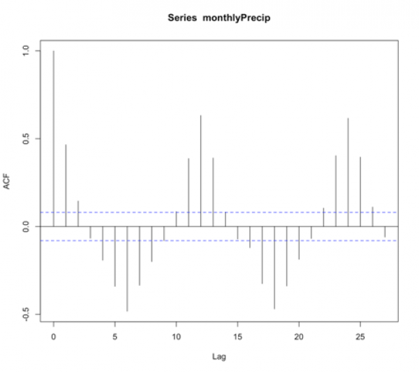
We see high values at fixed intervals. Consulting our summary table from before:
| Shape | Model |
|---|---|
| Exponential, Decaying to Zero | AR model: use PACF to identify the order |
| Alternating positive and negative, decaying to zero | AR model, use PACF to identify the order |
| One or more spikes, rest are at 0 | MA model, order identified by the lag at which the correlation becomes zero |
| Decay starting after a few lags | ARMA |
| All 0 or close to 0 | Data is random |
| High values at fixed intervals | Include seasonal AR term |
| No Decay to 0 | Series is not stationary (possible trend or periodicity)- include differencing term |
We need to include a seasonal term. Unfortunately, we can’t just supply the data to the ‘auto.arima’ function and let it do its magic. Instead, we need to create a time series function that creates this seasonal term. So let’s give this a try. To start, we need to look at the ACF to make a first guess at the periodicity. We see the strong positive correlation at lag 1, then again at lag 12 and lag 24. This is suggesting a strong annual periodicity. We will start by setting M to 12 (12 months in a year; we are working with monthly data), and we will create a time series object with the frequency set to 12.
Your script should look something like this:
# create a time series object
precipTS <- ts(monthlyPrecip, frequency=12)
The ‘ts’ function creates a time series object with a specified frequency for each time. So in this case, I said the frequency is 12, and it pulls out the observations every 12 months - which corresponds to the periodicity we saw in the ACF. Now we run the ‘auto.arima’ function and tell it to include a seasonal component.
Your script should look something like this:
# create Periodic ARIMA model
precip_PeriodicARIMA <- auto.arima(precipTS,ic="aic",seasonal=TRUE)
The printout tells us an ARIMA(2,0,0)(2,0,0)[12] was selected. So let’s review what this means. It’s an ARIMA model with p order of 2, d order of 0, and q order of 0 - meaning it’s an AR model of order 2. With a periodic ARIMA model of P order 2, D order 0, and Q order 0, meaning it’s a periodic AR model of order 2, and the periodicity is 12 months ([12]). If we run the summary function, we see that the RMSE is 3.55 inches. Now, if we wanted to automate the decision of the periodicity ([m]), we can use the following algorithm.
Your script should look something like this:
# automate the frequency
AICScore <- {} for(i in 1: 24){
  # create a time series object
  precipTS <- ts(monthlyPrecip,frequency=i)

  # create Periodic Arima Model
  precip_PeriodicARIMA <- auto.arima(precipTS,ic="aic",seasonal=TRUE)

  # save the AIC score
  AICScore[i] <- precip_PeriodicARIMA$aic
}
This is a very simple algorithm that saves the AIC score for the best ARIMA model with each periodicity [1:24]. Now we can look at the 'AICScore' and find the best model by minimizing the AIC.
Your script should look something like this:
# select optimal frequency choice
optimalFrequency <- which(min(AICScore) == AICScore)
We see that the optimal frequency is 12, which is what we previously selected, and confirms our observations in the ACF. So, now let’s automate the model to update after each observation. We can then predict the values and compare the observations to predictions.
Your script should look something like this:
# predict values
precipARIMA_predict<-{}
for(i in 1:100){
  # subset data
  dataSubset <- monthlyPrecip[(i:(length(monthlyPrecip)-101+i))]

  # create a time series object
  precipTS <- ts(dataSubset,frequency=12)
  precip_ARIMA <- auto.arima(precipTS,ic="aic",seasonal=TRUE, allowdrift=FALSE)
  precipARIMA_predict[i] <- predict(precip_ARIMA,n.ahead=1)$pred
}
As a reminder, each prediction was created with a unique model that potentially has different p,d,q and P, D, Q parameters. The added parameter here, 'allowdrift', tells the function to not include any drift (e.g., long term changes in data) in the model. Let’s plot the results.
Your script should look something like this:
# plot predicted and observed values
dataObserved <- monthlyPrecip[(length(monthlyPrecip)-99):length(monthlyPrecip)]
precipARIMA_predict[which(precipARIMA_predict <0)] <- NA
plot.new()
grid(nx=NULL,ny=NULL,'grey')
par(new=TRUE)
plot(dataObserved,precipARIMA_predict,xlab="Observed Precipitation (inches)",
     ylab="Predicted Precipitation (inches)",main="Observed Monthly Bangkok Precipitation vs Predicted Periodic ARIMA",
     xlim=c(0,25),ylim=c(0,25),pch=16)
par(new=TRUE)
plot(seq(0,30,1),seq(0,30,1),type='l',lty=2,col='dodgerblue4',lwd=3,xlab="Observed Precipitation (inches)",
     ylab="Predicted Precipitation (inches)",main="Observed Monthly Bangkok Precipitation vs Predicted Periodic ARIMA",
     xlim=c(0,25),ylim=c(0,25))
You should get a figure like this:
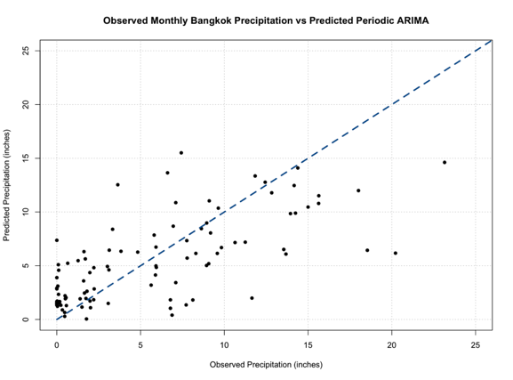
Out of all our figures, this one seems to be the best fit, following the 1-1 line better than the previous models.
ARIMA and Periodic ARIMAs are great because they are computationally efficient, easy to update, and are based on historical patterns. But they tend to not capture extreme values, and cannot model complex relationships. Nonetheless, these models are important steppingstones to more robust and complex models that we will learn about later on.
Self Check
Test your knowledge...
Lesson 6: Hovmöller Diagrams
Motivate...
The video above shows a 7-day satellite loop for the continental US. Movies, like the one mentioned, provide a great way to visualize weather. We can clearly see weather systems moving through, which can help with forecasting. Another great example is this video showing a satellite loop of the 2017 hurricane season [52]. Both loops highlight the weather on a large spatial scale over varying timescales.
While such loops are helpful for seeing short-term trends, it is often hard to see the recurring patterns in long-term loops, much less quantify them. So, when dealing with big data that is not only large temporally but also spatially, how can we best visualize the evolution and movement of the weather? In this lesson, you will learn about the Hovmöller diagram, a static spatial-temporal diagram used throughout meteorology that aids in the visualization of movement. Read on to find out more!
Lesson Objectives
- Describe what a Hovmöller diagram shows.
- Create Hovmöller diagrams in R.
- Interpret a Hovmöller diagram for a given variable.
Newsstand
- The Trough-and-Ride Diagram. [53] Wiley Online Library. Retrieved on June 21, 2018.
- Persson, A. (2017). The Story of the Hovmöller Diagram: An (Almost) Eyewitness Account [54]. Retrieved on June 21, 2018.
- Hocke, K. & Kämpfer, N. (2009, November 20). Hovmöller diagrams of climate anomalies in NCEP/NCAR reanalysis from 1948 to 2009 [55]. Retrieved on June 21, 2018.
- Video: How does a Hovmöller diagram work? [56] Retrieved on June 21, 2018.
- Di Liberto, T. Hovmöller Diagram: A climate scientist’s best friend [57]. Retrieved on June 21, 2018.
- CERES Data 2009-2015 [58]. Retreived on June 21, 2018.
- Chang, E. Wave Packet Diagnostics for Winter TPARC [59]. Retrieved on June 21, 2018.
- J. Mauro Vargas‐Hernandez, Susan Wijffels, Gary Meyers, & Neil J. Holbrook. (2015, July 21). Slow westward movement of salinity anomalies across the tropical South Indian Ocean [60]. Retrieved on June 21, 2018.
- Giovanni: The Bridge Between Data and Science [61]
Overview
Prioritize...
After reading this section, you should know the origins of the Hovmöller diagram, be able to explain what the diagram displays, and be able to interpret the results.
Read...
The Hovmöller diagram is used quite frequently in atmospheric science and has evolved over time. Originally, the diagram was intended for highlighting the movement of waves in the atmosphere. But now it is used for so much more. In this course, we have never really discussed the history of a topic, but I feel this iconic diagram deserves the highlight. In addition, by discussing the origins, we can see how the diagram evolved.
History
The Hovmöller diagram, as we know it today, was created by Ernest Hovmöller. One of the very first papers using the diagram can be found here [63]. At the time (the late 1940s - early 1950s), Ernest Hovmöller, a scientist working at the Swedish Meteorological and Hydrological Institute, was studying waves in the atmosphere. Specifically, he was interested in the intensity of troughs and ridges at the 500-mb level in the mid-latitudes as a function of time. The images below show a schematic of the wave (top panel) and an example of an analysis (bottom panel).
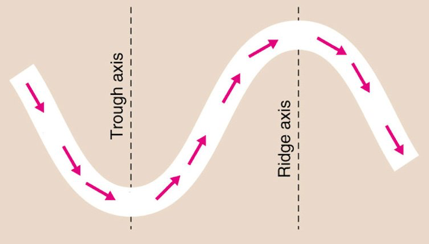
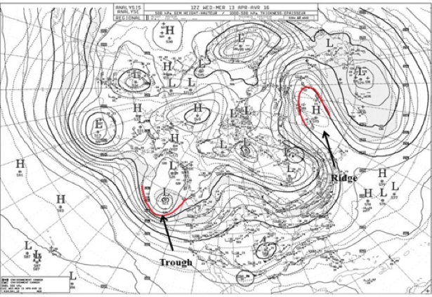
Hovmöller wanted to visualize the movement of the wave to determine whether another scientist’s (Carl-Gustaf Rossby) theory was true or not. The concept was that energy released in storms was transported at the group velocity (the velocity of a group or train of waves [65], in contrast to the phase velocity which is the velocity of the individual wave) and was, thus, faster than the speed of the storm itself.
In a previous study, Hovmöller created a time-latitude diagram that displayed weather over the Arctic waters. So, he applied the same approach to this problem by creating a time-longitude diagram of latitude-averaged 500-mb geopotential heights [66]. Longitude was plotted on the x-axis and time was plotted on the y-axis. He called this a trough-ridge diagram. Below is the original figure:
The diagram clearly showed the large-scale upper air wave pattern, along with the occasional rapid propagation eastward of the system that Rossby had theorized. He confirmed Rossby’s hypothesis!
Why is this important? Well, by confirming Rossby’s theory, Hovmöller’s diagram led to changes by operational forecasters who integrated the results into their synoptic predictions. The diagram linked theory with practice, impacting operational weather prediction. This was a big deal!
Some of this material may be difficult to understand or follow right now, especially if you do not have a background in meteorology. But what you should take from this is that data (real observations) were plotted in a way that made it easy to confirm a theory (Group Velocity). The confirmation of the theory had a profound impact (and is still used to this day) on the emerging science of weather prediction.
You can read more about the history and how the diagram became so important here [67].
Reading the Diagram
So Ernest Hovmöller created this trough-ridge diagram (now called the Hovmöller diagram). The x-axis had longitudes and the y-axis had time. You saw the diagram above and might be wondering…how do you read it? Before we dive in, let’s talk a little bit more about phase velocity and group velocity. Again, this is additional material related to the historical context of the diagram. You are not required to learn these concepts, but they will help in interpreting the original Hovmöller diagram. They will also help in interpreting the patterns you see in your own Hovmöller diagrams! Let's start by looking at the video below of a wave, as shared by Illinois.edu [68]. Please note that the video has no sound.
As mentioned previously, the phase speed is the velocity of the individual wave while the group velocity is the velocity of the train or envelope of waves. The figure below provides a visual of the difference between the two.
Let’s start with the phase velocity. The phase velocity of a wave is the rate at which the crests and troughs of the wave propagate. Mathematically, it is given by this equation:
where (lambda) is the wavelength and T is the period.
The group velocity, on the other hand, is the rate at which the envelope of the wave propagates through space. Mathematically, it is given by this equation:
This is the change in angular frequency divided by the change in the angular wavenumber. This may seem like quite a mouthful, but it’s just the rate at which energy shifts from one wave to the next as it propagates through a wave train.
Look at the atmospheric example below:
The heavy solid line is the group velocity and the dashed line is the phase speed. What we see in this figure is the mechanism of development downstream from the starting position (t=0). The central wave (peaked at the vertical line at t=0 and can be followed by the dashed black line) moves more slowly than the bulk of the energy that propagates downstream, so eventually, it dies out. The group velocity is moving faster than the phase speed, so the next wave in the train acquires the energy and, thus, grows in amplitude. This process continues from wave to wave through the wave train. This is what was confirmed in the original Hovmöller diagram.
So now, let’s look back at the original diagram with our new knowledge and see what we can deduce.
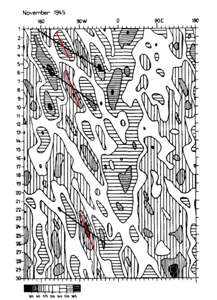
Again, the x-axis is longitude. The y-axis is time (days in November 1945). The values being shown are 500-mb geopotential heights (in decameters). The geopotential heights have been averaged over latitudes 35o- 60o N so that they capture the jet stream. High geopotential heights (in meteorology, these are referred to as ridges) have horizontal thatching. Areas of low geopotential heights (referred to as troughs) have vertical thatching. If you start at day 1 and then kind of look diagonally down (upper left to bottom right), you can see that while the individual ridges and troughs are short-lived and move slowly eastward (phase speed) before dying, strong ridges and troughs follow each other in a pattern that moves eastward much more rapidly (the group velocity).
If you start with a horizontal line as you move diagonally down, it switches to vertical lines and then back again. This is the ridge/trough/ridge propagation through the wave train. This eastward propagation is highlighted by the solid slanting lines. I have overlaid phase speed lines in red (these were not part of the original diagram). The Hovmöller diagram made it easy to see that the phase speed and group velocity differed.
We can extract the actual value of the group velocity from the diagram. The group velocity can be estimated by dividing the change in degree longitude by the change in time:
where the start and end are determined by the line drawn on the diagram for group velocity. You can also estimate the phase speed using the same equation but for the line that represents the phase.
Summary
In the late 1940s and early 1950s, Rossby hypothesized that energy released in storms was transported with a group velocity that was faster than the speed of the storm itself. Hovmöller created the trough-ridge diagram (now called the Hovmöller diagram), a latitude-band averaged longitude-time diagram, to prove that Rossby’s concept was true. This became important for forecasting and is still used today (not just for studying atmospheric waves).
Other Applications of Hovmöller Diagrams
Prioritize...
At the end of this section, you should be able to create Hovmöller diagrams for different applications.
Read...
As we saw in the previous section, the Hovmöller diagram was originally intended for highlighting the movement of waves in the atmosphere. Over the 50+ years since its creation, the Hovmöller diagram has been used in a variety of ways, greatly extending its utility. In this section, we will look at additional uses of a Hovmöller diagram. In each case, large amounts of data are utilized, but by using the Hovmöller diagram they are displayed in a compact and easy to interpret way. This is a skill I encourage you to try and learn.
Evolution of Cycles
Similar to wave propagation from the original Hovmöller diagram, we can use the diagram to examine the space-time evolution of any variable’s cycle. All the different patterns we discussed in earlier lessons could be analyzed or explored using a Hovmöller diagram.
For example, check out the figure below that shows the evolution of La Niña over a 12-month period from 2007/2008.
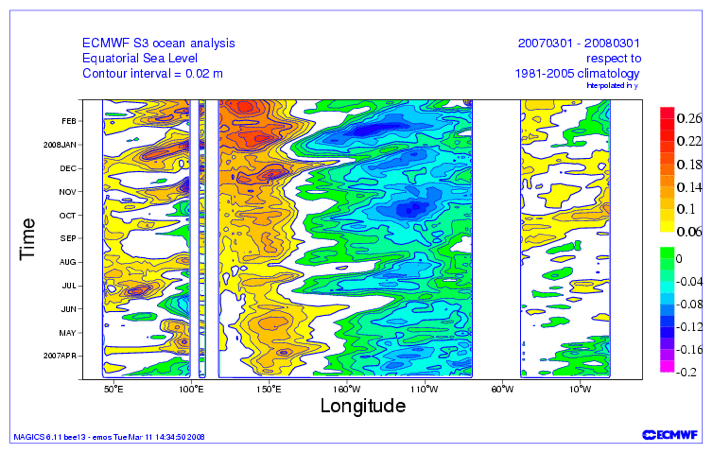
Let’s orient ourselves. Time is given by months on the y-axis and longitude is on the x-axis. The variable being shown is the sea-level anomaly with respect to a climatology from 1981-2005. As the author describes:
“The La Niña was not a continually growing event, but rather an event sustained and strengthened by the periodic intensification that would occur every couple of months.”
The figure highlights the evolution of the intensification.
We aren’t restricted to looking at only 12 months. We could see how the evolution changes over the years. Take a look at the Hovmöller diagram below:
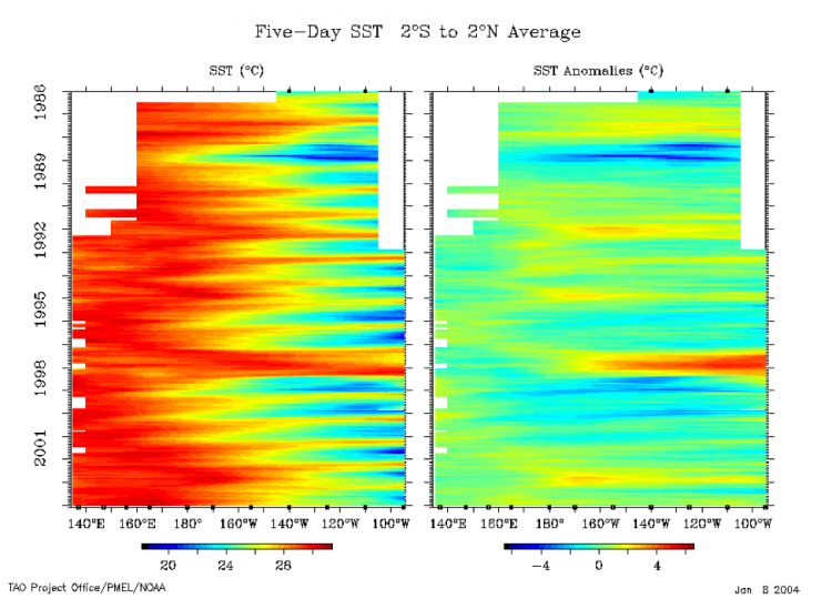
Again, let’s orient ourselves. The y-axis is time, the x-axis is longitude (note this is only over the equatorial Pacific), and the variable is the 5-day SST (left) and the anomaly (right). The data has been averaged from 2°S to 2°N. Focusing on the anomaly as it’s easier to see the strong patterns, positive anomalies (red) suggest El Niño while negative (blue) suggest La Niña. You can clearly see the ENSO cycle over the past 20 years. Particularly, you should notice the strong La Niña of 1988-89 and the very strong El Niño of 1997-1998.
By simply changing the timescale, we can either see the propagation of a particular cycle (like La Niña) or the evolution of the whole cycle (like ENSO). If you are interested in seeing more Hovmöller diagrams related to ENSO, you can check out this monitoring site from Columbia University [72]. Yes, Hovmöllers are still used today!
Climate
As the ENSO cycle image sort of alludes to, we can use Hovmöller diagrams to look for trends. Take a look at this paper [73]. In this study, the authors were trying to assess the trend of the local Hadley and Walker circulations. For more information on these circulations, check out the wiki pages here: Hadley cell [74] and Walker circulation [75].
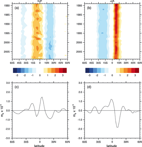
The two top panels are Hovmöller diagrams. The x-axis is latitude and the y-axis is time. The variable being shown is the meridional (north/south) vertical mass flux (rate of mass flow) at 500 mb averaged over 4 reanalyses for the months of December, January, and February (left) and June, July, and August (right). The variable has been averaged zonally (along all longitudes).
When examining a trend type figure, we want to look at how the variable has changed at one location from the start of the period (top of the figure) to the end of the period (bottom of the figure). I think the easiest example is between 15°N and 30°N for DJF. Notice how the light blue starting in 1980 is very prominent for most of the time period, but then darkens (becomes even more negative) as time goes on. This suggests a negative trend in vertical mass flux at 500 mb, that is stronger sinking motion.
The bottom two panels show the computed trend over the time period for each latitude. We confirm our initial assessment that a negative linear trend is observed over that spatial range. If you switch to the right panel, you’ll notice that between 0° and 15°N the colors are a dark red at the beginning but lightened with time. Again, this suggests a negative trend in JJA as well, which is also confirmed with the bottom panel (right).
So, when it comes to trends, Hovmöller diagrams can be used to look at multiple locations to see if one geographical region has a stronger trend over another. It does not confirm if a trend exists; it simply suggests where and when there might be a trend. Think of the Hovmöller diagram as an exploratory tool rather than a quantitative solution in this application.
Discrepancies Between Datasets
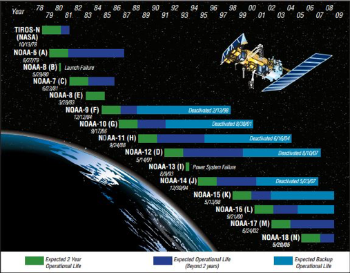
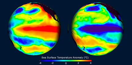
NOAA satellites have been in orbit since the late 1970s, providing consistent global observations for over 30 years! Stitching datasets together, however, can be problematic. For one, you may have the same instrument on multiple satellites, but there is no way the instruments are exact and, especially with satellites, discrepancies can occur. The same goes for ground-based instruments. For example, when the US updated their radars in the 90s; can you really combine the old data with the new?
Unfortunately, we sometimes need to combine these observations to get a sufficiently large sample size for our analysis, but we can check whether artifacts from the stitching arise in our dataset. We can do this by using a Hovmöller diagram. Take a look at this article [78]. In this study, specific humidity from a reanalysis and in-situ observations were compared. Now, differences will occur between datasets, that’s obvious, but the authors of the study noticed that the structure of the graph changed substantially at certain times (we will see that these times corresponded to data changes). In short, the difference between the datasets was not constant over time.
MERRA utilizes satellite observations, but since the instruments are only available over certain time periods, they can create artificial changes. Here is the Hovmöller plot of the MERRA integrated water vapor (lower right panel).
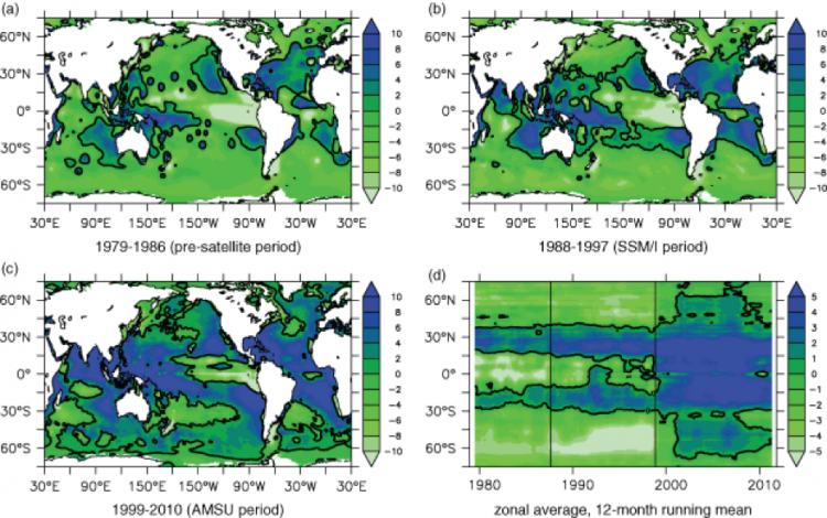
The authors created a longitudinal averaged Hovmöller. The x-axis is time, the y-axis is latitude, and the variable being displayed is longitudinally averaged (zonal averaged) integrated water vapor. Specifically, they are showing increments of integrated water vapor (time rate of change of water vapor integrated over the depth of the atmosphere); so if the value is negative the integrated water vapor was decreasing, if it was positive the integrated water vapor was increasing.
The solid vertical lines separate specific time periods with different observational systems: when MERRA didn’t have any satellite observations (1979-1986 the first line), when MERRA had SSM/I (1988-1997 up to the second line), and when AMSU was added in (1999-2010 second line to the end).
Even with a changing climate, you would not expect to see rapid changes in integrated water vapor. However, this is what you see in the figure; especially when AMSU was added. A big change occurred at the poles and the equator - an incredibly large shift from decreasing to increasing. So, here’s the question: should you use the whole dataset for climate trends? And if not, which section (temporally) is correct? That is, do I trust MERRA alone without any observations, or was adding AMSU and SMM/I, making the reanalysis more realistic?
This example was meant to show you that the Hovmöller diagram can highlight so much more than just the propagation of a wave. I also hope this example challenged you to not jump to conclusions. Your first answer may be that adding observations into the reanalysis has to be the correct thing to do…it has to make the model more realistic. Maybe yes, maybe no. There’s no sure way to tell.
Summary
In this section, we saw how the Hovmöller diagram can be used for many aspects of weather and climate. And there are more applications out there, such as vertical evolution, that we haven’t looked at. If you want to spend a little more time looking at Hovmöller diagrams of different variables, check out this site [61]. Here you will be able to create a longitude or latitude averaged Hovmöller for a variety of variables from the ocean to the earth to the atmosphere. The data comes from remotely sensed observations.
Steps
Prioritize...
At the end of this section, you should be able to recount the steps for making a Hovmöller diagram.
Read...
We’ve seen how the Hovmöller diagram can be used to visualize large amounts of time-space data. Now we need to learn how to create them ourselves. As with many other applications in R, using the function is relatively easy. The hard part is setting up the data for plotting. Selecting which variables will be plotted on which axis is key, and efficiently prepping your data can be difficult. Remember, a lot of data can go into these plots, so it can be a slow process. However, if you follow the steps below and really give careful thought prior to plotting, you will have no trouble making these diagrams.
Before beginning, I suggest you check out this link that provides a good visual of what we will be doing [57].
Define the Problem
Before you even begin prepping your data, there needs to be a clearly defined problem. Specifically, you need to decide on what you are trying to solve and how visualization will help you explore the problem. Once you feel the question is well defined, and you know what variable you will use, you can continue on.
Selecting Axis Variables
The next step is to decide on the axes. This is key! What you select drives the visualization. For example, if you select time and longitude, you are going to miss out on latitude variability. Whereas if you select time and a vertical axis, like pressure, you lose out on the spatial aspect.
Once you decide which variables will be used (e.g., longitude and time), selecting the specific axis (y or x) is not a big deal. It really depends on how you visualize. For example, it might be better to place longitude on the x-axis, as that’s how it’s normally displayed on a map. But you could reason that time should be on the x-axis, as that’s how we plot a time series. So, in the end, there’s no real right or wrong selection. What really matters is your careful description and interpretation of the visual. Just make sure you include labels!
Preparing the Data
Once you have selected the axes, you can prepare the data. This usually means averaging over some domain, often the spatial variable (latitude or longitude) you chose not to use as an axis variable. For example, if you are looking at longitude and time, you will probably have to average over latitude.
The next decision is to decide the domain to average over. It should cover the region of interest if you’re interested in looking at all the phenomena impacting that region. On the other hand, if you are focusing on just one phenomenon, it is often best to average over the region in which the phenomenon is strongest. This is what Hovmöller did when selecting his latitude averaging range to capture waves in the jet stream.
How you average over a dimension is up to you. We’ve discussed a lot of these techniques in Meteo 810/815. I will not go into more detail here, and I suggest you review the material if necessary. In most cases, you will probably be applying a latitudinal or longitudinal average.
I strongly encourage you to really think about the variable you are studying and the consequences of averaging on that variable. For example, if I’m examining air temperature, I might not average over all the latitudes but instead separate them into the northern and Southern Hemisphere. If you don’t know what to do, experiment.
R Functions to Plot
There are a few ways in which we can plot a Hovmöller diagram in R. Let’s start with what I will call ‘basic plotting’.
We can use any plotting function that displays 2D data using a color to plot the magnitude of the variable (e.g., contour.filled, ggplot, image, levelplot). To do this, we need to prepare the data ourselves and ensure we are averaging over the correct dimensions and plotting the dimensions on the correct axis. This is not difficult, and I actually prefer this method because you are in charge of what happens to the data.
Now there is another route, and that’s using the function ‘hovmoller’ from the package ‘rasterVis’ [80]. This function will automatically average the data for you; but with this ease, comes limitations. You have less flexibility in the methods for averaging and what you can actually display. I personally do not recommend this function as it’s a bit of a black box.
Hovmöller Example in R
Prioritize...
Once you have finished this section, you should be able to create a Hovmöller diagram in R.
Read...
For this example, we are going to recreate the original Hovmöller diagram [81] using reanalysis output. To follow along, download this dataset [82] of 4X daily geopotential heights from the NOAA 20th Century Reanalysis. To read more about the reanalysis, check out this link [83].
Define the Problem
We begin by defining the problem. Since we are recreating a diagram, the problem is already defined. We want to look at the evolution of troughs and ridges. This means we need to look at the time aspect and the longitudinal aspect (as waves generally progress west to east).
Select Variables and Dimensions
We are going to look at the 500-mb geopotential heights. Since we want to know the time evolution across longitudes, the dimensions will be time (y-axis) and longitude (x-axis). This means we need to average over latitude. Specifically, I will average over 35°N to 60°N (consistent with the original diagram and reflective of the mid-latitude jet stream region).
Prepare Data
We begin by loading in the data. This is a NetCDF file, so you need to use one of the many packages that will open it. My favorite is ‘RNetCDF’.
Your script should look something like this:
# install and load RNetCDF
install.packages("RNetCDF")
library("RNetCDF")

# load in 20CR monthly temperature
fid <- open.nc(“NOAA_20CR_dailyHeights.nc")
data20CR <- read.nc(fid)
The data frame contains the pressure levels for the vertical profile (level), latitudes (lat), longitudes (lon), time (time), and the geopotential heights (hgt-units meters). You can use the ‘print.nc’ command to read more about the file. The starting time is January 1st, 1945 and the ending time is December 31st, 1945. Each day has 4 observations.
The geopotential height has 4 dimensions (lonXlatXlevelsXtime). For the first step, I need to select out the 500-mb level. To do this, we need to determine the index of the 500-mb pressure.
Your script should look something like this:
# extract out pressure level
presLev <- which(data20CR$level==500)
Now, extract out the heights.
Your script should look something like this:
# extract out 500 height
hgt500 <- data20CR$hgt[,,presLev,]
We will plot time on the y-axis and longitude on the x-axis. This means we need to do something about the latitudes. Similar to the original, we will average over 35oN to 60oN. Start by extracting the latitude bounds.
Your script should look something like this:
# create latitude index
latIndex <- which(data20CR$lat < 61 & data20CR$lat > 34)
Now we average over this latitude range for every timestamp and every longitude. We will do this by using the ‘apply’ function.
Your script should look something like this:
# average over latitude index
LatAveHgt500<- apply(hgt500[,latIndex,],c(1,3),mean)
Now we have a variable with dimensions’ longitude by time. But the time is for the whole year, and I want to only extract out the November values. Let’s create a valid time index and then extract out the heights.
Your script should look something like this:
# time is in hours since 1800-1-1 00:00:0.0
time <- as.Date(data20CR$time/24,origin="1800-01-01")

# create a time index for November
timeIndex <- which(format(time,'%m')==11)

# Extract out heights for time period
tempHgt500 <- LatAveHgt500[,timeIndex]
Now we are left with a variable that has 2 dimensions (longitude and time) over our desired time period at our desired pressure level. We can finally plot the data.
Plot Hovmöller
For this example, I will use the function ‘filled.contour’. Let’s give it a try. Run the code below.
There are a few issues with this plot. For starters, the longitude values are not displayed in an intuitive manner. Second, to emulate the original plot, we should reverse the time so the starting date (November 1st) is at the top.
To fix the longitudes, we need to move the second half (180-360) to the front. This will create the 180 W (-180) to 180 E (+180) values similar to the original.
Your script should look something like this:
# determine half way point
halfLon <- length(data20CR$lon)/2

# change longitude order
finalLon <- c(data20CR$lon[(halfLon+1):length(data20CR$lon)]-360,data20CR$lon[1:halfLon])

# Change the matrix to match longitude
finalHgt500 <- matrix(NA,dim(tempHgt500)[1],dim(tempHgt500)[2])
finalHgt500[1:halfLon,] <- tempHgt500[(halfLon+1):length(finalLon),]
finalHgt500[(halfLon+1):length(finalLon),]<- tempHgt500[1:halfLon,]
The code above first determines the halfway point with the longitudes. Then the code changes the longitude values to make them -180 to 180 or 180W to 180E. Finally, the code changes the matrix to match this switch in longitude. Let’s plot to confirm we made the correct changes. Run the code below:
Below is a larger version of the figure:
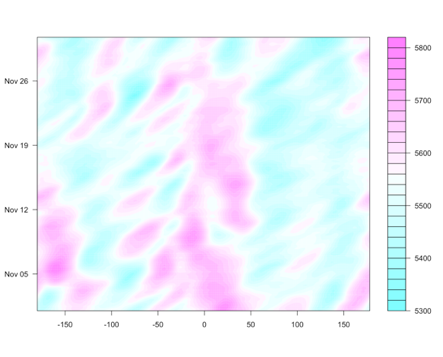
Now, let’s fix the time aspect. We can reverse this within the ‘filled.contour’ function by using the ‘ylim’ parameter. Run the code below:
Below is a larger version of the figure:
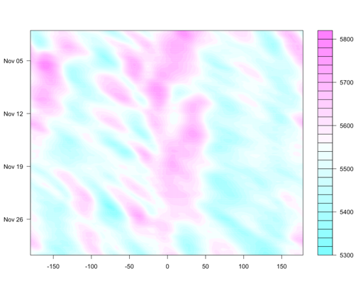
Now, let’s work on making this figure look nicer. First, let’s change the unit to decameters (consistent with the original). Run the code below:
Below is a larger version of the figure:
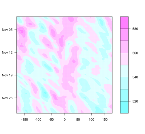
One thing to note, the range of the geopotential height is different compared to the original. This is a different dataset, and we would not expect them to be exactly the same.
Let’s add in labels by running the code below:
Below is a larger version of the figure:
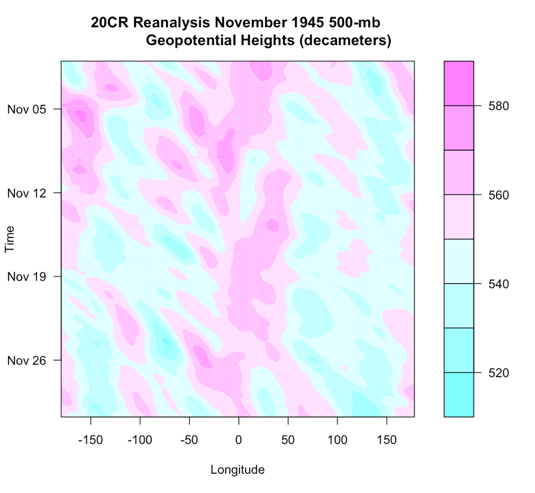
And there you have it! Your first Hovmöller diagram!
Interpret and Further Analyses
The last step is to interpret the diagram. High values are represented by the pinkish colors, while low values are the blueish colors. We see a downstream change from high values to low values, similar to the original. For reference, here is the original image next to the one we created.
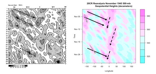
The solid black lines are again the group velocity, showing downstream development. The gray solid lines show the phase speed, moving slower than the group velocity. These two lines together (solid black and gray) represent the Rossby waves. There is another phenomenon going on, however. There are 3 westward moving ridges (high geopotential heights). These are highlighted by the black dashed lines and represent wider waves moving slowly west. In summary, this figure shows two phenomena going on, shorter waves (phase speed and group velocity) moving eastward and longer waves moving slowly west.
Depending on the question, further analyses may be needed. This could include performing an ARDL, spectrum or cross-spectrum analysis, or any of the other analyses we’ve learned in this course or in Meteo 815.
Strengths and Weaknesses
Prioritize...
Once you have completed this section, you should know the key strengths and weaknesses of the Hovmöller diagram and describe what it can and cannot provide.
Read...
As with all techniques we have learned, there are strengths and weaknesses to the Hovmöller diagram. In addition, sometimes we infer too much from the diagram. What can a Hovmöller diagram really provide to an analysis? Or more importantly, what can it not?
Strengths
Let’s start with the strengths. Hovmöller diagrams allow us to display A LOT of data, both spatially and temporally. Hovmöller diagrams allow us to assess the movement and evolution of spatial patterns in a variable over time. We can really start to look at the evolution of a meteorological event without watching a movie! In addition, the diagram highlights key places and times (as well as time and space scales) to examine in more detail. We saw a great ENSO example that highlighted strong events, pinpointing specific years we should examine in more detail. We can use the Hovmöller diagram as kind of a stepping stone…let it lead us. In short, the Hovmöller diagram is a fantastic exploratory tool. I would highly recommend using this sort of plot if you are studying anything with respect to the evolution of a variable or looking at a lot of data.
Weaknesses
Although the Hovmöller diagram may seem like a great tool, we must know its limitations. To start with, in most cases we will need to average over some dimension (e.g., latitude). When we average over a dimension, we lose the variability and characteristics of that variable with respect to that dimension (think back to the temperature example and averaging over the globe versus a hemisphere). This is why we need to carefully select the appropriate averaging technique and averaging domain. In addition, selecting the appropriate axes to display can be difficult. Although Hovmöller diagrams can provide quantifiable values for phase speed and group velocity, follow-up techniques may need to be added. In short, although the Hovmöller diagram is a great exploratory tool…that’s all it is…it is not the solution to a problem, but a step in the process.