Lesson 6: Hovmöller Diagrams
Motivate...
The video above shows a 7-day satellite loop for the continental US. Movies, like the one mentioned, provide a great way to visualize weather. We can clearly see weather systems moving through, which can help with forecasting. Another great example is this video showing a satellite loop of the 2017 hurricane season [1]. Both loops highlight the weather on a large spatial scale over varying timescales.
While such loops are helpful for seeing short-term trends, it is often hard to see the recurring patterns in long-term loops, much less quantify them. So, when dealing with big data that is not only large temporally but also spatially, how can we best visualize the evolution and movement of the weather? In this lesson, you will learn about the Hovmöller diagram, a static spatial-temporal diagram used throughout meteorology that aids in the visualization of movement. Read on to find out more!
Lesson Objectives
- Describe what a Hovmöller diagram shows.
- Create Hovmöller diagrams in R.
- Interpret a Hovmöller diagram for a given variable.
Newsstand
- The Trough-and-Ride Diagram. [2] Wiley Online Library. Retrieved on June 21, 2018.
- Persson, A. (2017). The Story of the Hovmöller Diagram: An (Almost) Eyewitness Account [3]. Retrieved on June 21, 2018.
- Hocke, K. & Kämpfer, N. (2009, November 20). Hovmöller diagrams of climate anomalies in NCEP/NCAR reanalysis from 1948 to 2009 [4]. Retrieved on June 21, 2018.
- Video: How does a Hovmöller diagram work? [5] Retrieved on June 21, 2018.
- Di Liberto, T. Hovmöller Diagram: A climate scientist’s best friend [6]. Retrieved on June 21, 2018.
- CERES Data 2009-2015 [7]. Retreived on June 21, 2018.
- Chang, E. Wave Packet Diagnostics for Winter TPARC [8]. Retrieved on June 21, 2018.
- J. Mauro Vargas‐Hernandez, Susan Wijffels, Gary Meyers, & Neil J. Holbrook. (2015, July 21). Slow westward movement of salinity anomalies across the tropical South Indian Ocean [9]. Retrieved on June 21, 2018.
- Giovanni: The Bridge Between Data and Science [10]
Overview
Prioritize...
After reading this section, you should know the origins of the Hovmöller diagram, be able to explain what the diagram displays, and be able to interpret the results.
Read...
The Hovmöller diagram is used quite frequently in atmospheric science and has evolved over time. Originally, the diagram was intended for highlighting the movement of waves in the atmosphere. But now it is used for so much more. In this course, we have never really discussed the history of a topic, but I feel this iconic diagram deserves the highlight. In addition, by discussing the origins, we can see how the diagram evolved.
History
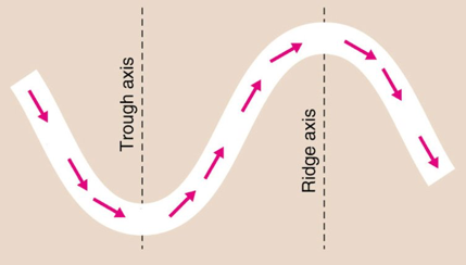
The Hovmöller diagram, as we know it today, was created by Ernest Hovmöller. One of the very first papers using the diagram can be found here [12]. At the time (the late 1940s - early 1950s), Ernest Hovmöller, a scientist working at the Swedish Meteorological and Hydrological Institute, was studying waves in the atmosphere. Specifically, he was interested in the intensity of troughs and ridges at the 500-mb level in the mid-latitudes as a function of time. The images below show a schematic of the wave (top panel) and an example of an analysis (bottom panel).
Hovmöller wanted to visualize the movement of the wave to determine whether another scientist’s (Carl-Gustaf Rossby) theory was true or not. The concept was that energy released in storms was transported at the group velocity (the velocity of a group or train of waves [14], in contrast to the phase velocity which is the velocity of the individual wave) and was, thus, faster than the speed of the storm itself.
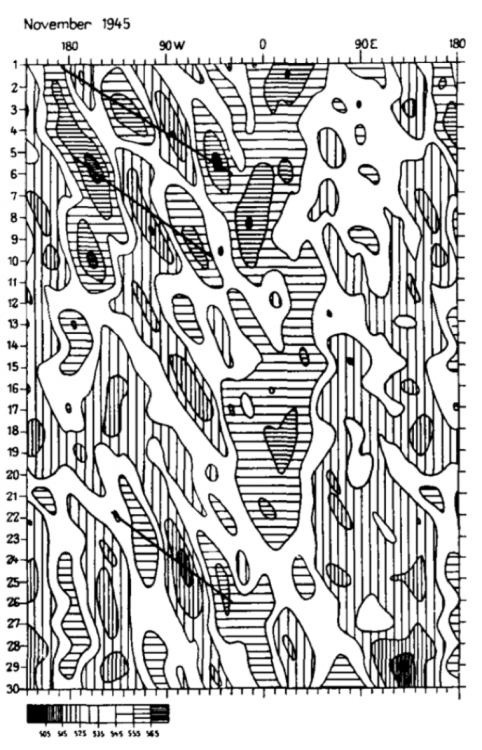
In a previous study, Hovmöller created a time-latitude diagram that displayed weather over the Arctic waters. So, he applied the same approach to this problem by creating a time-longitude diagram of latitude-averaged 500-mb geopotential heights [15]. Longitude was plotted on the x-axis and time was plotted on the y-axis. He called this a trough-ridge diagram. Below is the original figure:
The diagram clearly showed the large-scale upper air wave pattern, along with the occasional rapid propagation eastward of the system that Rossby had theorized. He confirmed Rossby’s hypothesis!
Why is this important? Well, by confirming Rossby’s theory, Hovmöller’s diagram led to changes by operational forecasters who integrated the results into their synoptic predictions. The diagram linked theory with practice, impacting operational weather prediction. This was a big deal!
Some of this material may be difficult to understand or follow right now, especially if you do not have a background in meteorology. But what you should take from this is that data (real observations) were plotted in a way that made it easy to confirm a theory (Group Velocity). The confirmation of the theory had a profound impact (and is still used to this day) on the emerging science of weather prediction.
You can read more about the history and how the diagram became so important here [16].
Reading the Diagram
So Ernest Hovmöller created this trough-ridge diagram (now called the Hovmöller diagram). The x-axis had longitudes and the y-axis had time. You saw the diagram above and might be wondering…how do you read it? Before we dive in, let’s talk a little bit more about phase velocity and group velocity. Again, this is additional material related to the historical context of the diagram. You are not required to learn these concepts, but they will help in interpreting the original Hovmöller diagram. They will also help in interpreting the patterns you see in your own Hovmöller diagrams! Let's start by looking at the video below of a wave, as shared by Illinois.edu [17]. Please note that the video has no sound.
As mentioned previously, the phase speed is the velocity of the individual wave while the group velocity is the velocity of the train or envelope of waves. The figure below provides a visual of the difference between the two.
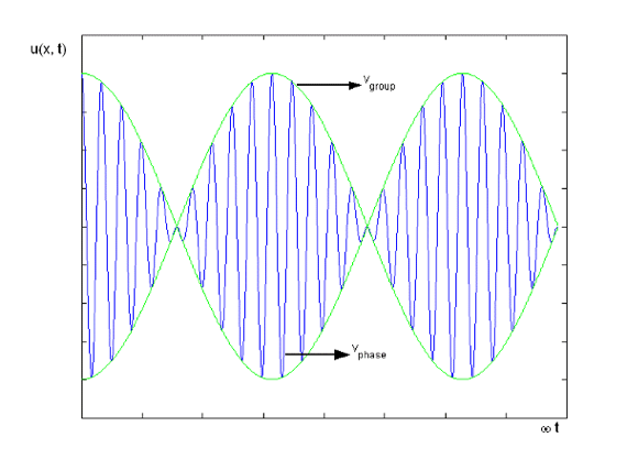
Let’s start with the phase velocity. The phase velocity of a wave is the rate at which the crests and troughs of the wave propagate. Mathematically, it is given by this equation:
where (lambda) is the wavelength and T is the period.
The group velocity, on the other hand, is the rate at which the envelope of the wave propagates through space. Mathematically, it is given by this equation:
This is the change in angular frequency divided by the change in the angular wavenumber. This may seem like quite a mouthful, but it’s just the rate at which energy shifts from one wave to the next as it propagates through a wave train.
Look at the atmospheric example below:
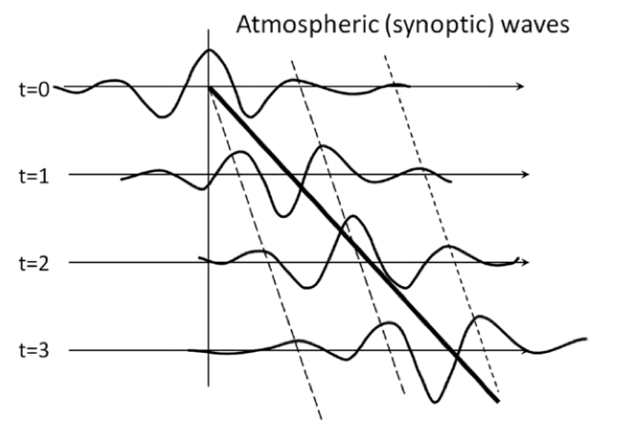
The heavy solid line is the group velocity and the dashed line is the phase speed. What we see in this figure is the mechanism of development downstream from the starting position (t=0). The central wave (peaked at the vertical line at t=0 and can be followed by the dashed black line) moves more slowly than the bulk of the energy that propagates downstream, so eventually, it dies out. The group velocity is moving faster than the phase speed, so the next wave in the train acquires the energy and, thus, grows in amplitude. This process continues from wave to wave through the wave train. This is what was confirmed in the original Hovmöller diagram.
So now, let’s look back at the original diagram with our new knowledge and see what we can deduce.
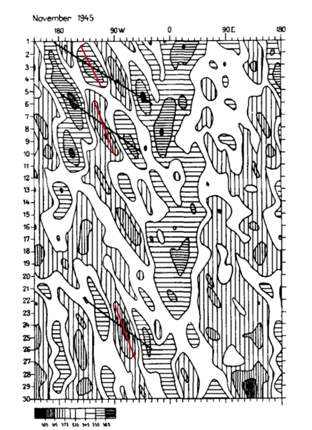
Again, the x-axis is longitude. The y-axis is time (days in November 1945). The values being shown are 500-mb geopotential heights (in decameters). The geopotential heights have been averaged over latitudes 35o- 60o N so that they capture the jet stream. High geopotential heights (in meteorology, these are referred to as ridges) have horizontal thatching. Areas of low geopotential heights (referred to as troughs) have vertical thatching. If you start at day 1 and then kind of look diagonally down (upper left to bottom right), you can see that while the individual ridges and troughs are short-lived and move slowly eastward (phase speed) before dying, strong ridges and troughs follow each other in a pattern that moves eastward much more rapidly (the group velocity).
If you start with a horizontal line as you move diagonally down, it switches to vertical lines and then back again. This is the ridge/trough/ridge propagation through the wave train. This eastward propagation is highlighted by the solid slanting lines. I have overlaid phase speed lines in red (these were not part of the original diagram). The Hovmöller diagram made it easy to see that the phase speed and group velocity differed.
We can extract the actual value of the group velocity from the diagram. The group velocity can be estimated by dividing the change in degree longitude by the change in time:
where the start and end are determined by the line drawn on the diagram for group velocity. You can also estimate the phase speed using the same equation but for the line that represents the phase.
Summary
In the late 1940s and early 1950s, Rossby hypothesized that energy released in storms was transported with a group velocity that was faster than the speed of the storm itself. Hovmöller created the trough-ridge diagram (now called the Hovmöller diagram), a latitude-band averaged longitude-time diagram, to prove that Rossby’s concept was true. This became important for forecasting and is still used today (not just for studying atmospheric waves).
Other Applications of Hovmöller Diagrams
Prioritize...
At the end of this section, you should be able to create Hovmöller diagrams for different applications.
Read...
As we saw in the previous section, the Hovmöller diagram was originally intended for highlighting the movement of waves in the atmosphere. Over the 50+ years since its creation, the Hovmöller diagram has been used in a variety of ways, greatly extending its utility. In this section, we will look at additional uses of a Hovmöller diagram. In each case, large amounts of data are utilized, but by using the Hovmöller diagram they are displayed in a compact and easy to interpret way. This is a skill I encourage you to try and learn.
Evolution of Cycles
Similar to wave propagation from the original Hovmöller diagram, we can use the diagram to examine the space-time evolution of any variable’s cycle. All the different patterns we discussed in earlier lessons could be analyzed or explored using a Hovmöller diagram.
For example, check out the figure below that shows the evolution of La Niña over a 12-month period from 2007/2008.
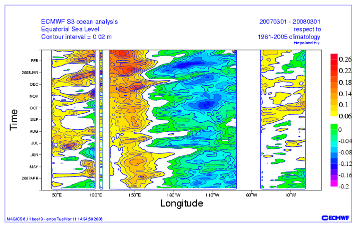
Let’s orient ourselves. Time is given by months on the y-axis and longitude is on the x-axis. The variable being shown is the sea-level anomaly with respect to a climatology from 1981-2005. As the author describes:
“The La Niña was not a continually growing event, but rather an event sustained and strengthened by the periodic intensification that would occur every couple of months.”
The figure highlights the evolution of the intensification.
We aren’t restricted to looking at only 12 months. We could see how the evolution changes over the years. Take a look at the Hovmöller diagram below:
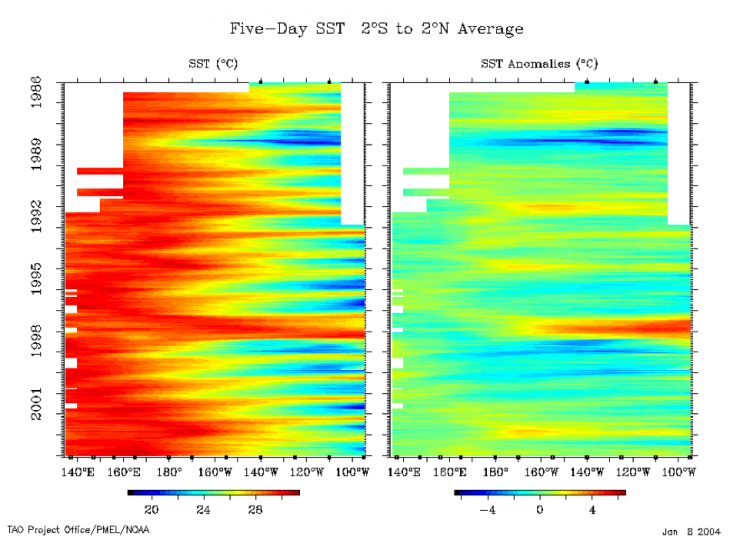
Again, let’s orient ourselves. The y-axis is time, the x-axis is longitude (note this is only over the equatorial Pacific), and the variable is the 5-day SST (left) and the anomaly (right). The data has been averaged from 2°S to 2°N. Focusing on the anomaly as it’s easier to see the strong patterns, positive anomalies (red) suggest El Niño while negative (blue) suggest La Niña. You can clearly see the ENSO cycle over the past 20 years. Particularly, you should notice the strong La Niña of 1988-89 and the very strong El Niño of 1997-1998.
By simply changing the timescale, we can either see the propagation of a particular cycle (like La Niña) or the evolution of the whole cycle (like ENSO). If you are interested in seeing more Hovmöller diagrams related to ENSO, you can check out this monitoring site from Columbia University [21]. Yes, Hovmöllers are still used today!
Climate
As the ENSO cycle image sort of alludes to, we can use Hovmöller diagrams to look for trends. Take a look at this paper [22]. In this study, the authors were trying to assess the trend of the local Hadley and Walker circulations. For more information on these circulations, check out the wiki pages here: Hadley cell [23] and Walker circulation [24].
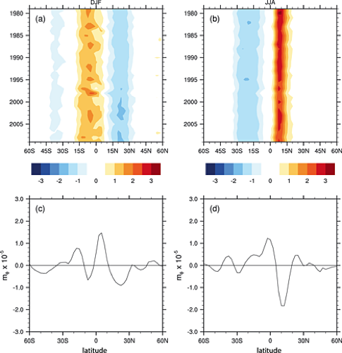
The two top panels are Hovmöller diagrams. The x-axis is latitude and the y-axis is time. The variable being shown is the meridional (north/south) vertical mass flux (rate of mass flow) at 500 mb averaged over 4 reanalyses for the months of December, January, and February (left) and June, July, and August (right). The variable has been averaged zonally (along all longitudes).
When examining a trend type figure, we want to look at how the variable has changed at one location from the start of the period (top of the figure) to the end of the period (bottom of the figure). I think the easiest example is between 15°N and 30°N for DJF. Notice how the light blue starting in 1980 is very prominent for most of the time period, but then darkens (becomes even more negative) as time goes on. This suggests a negative trend in vertical mass flux at 500 mb, that is stronger sinking motion.
The bottom two panels show the computed trend over the time period for each latitude. We confirm our initial assessment that a negative linear trend is observed over that spatial range. If you switch to the right panel, you’ll notice that between 0° and 15°N the colors are a dark red at the beginning but lightened with time. Again, this suggests a negative trend in JJA as well, which is also confirmed with the bottom panel (right).
So, when it comes to trends, Hovmöller diagrams can be used to look at multiple locations to see if one geographical region has a stronger trend over another. It does not confirm if a trend exists; it simply suggests where and when there might be a trend. Think of the Hovmöller diagram as an exploratory tool rather than a quantitative solution in this application.
Discrepancies Between Datasets
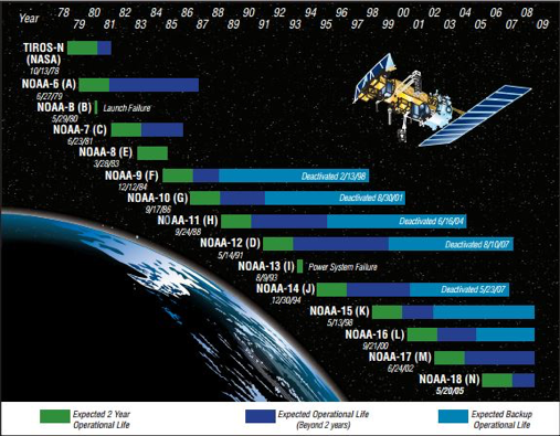
NOAA satellites have been in orbit since the late 1970s, providing consistent global observations for over 30 years! Stitching datasets together, however, can be problematic. For one, you may have the same instrument on multiple satellites, but there is no way the instruments are exact and, especially with satellites, discrepancies can occur. The same goes for ground-based instruments. For example, when the US updated their radars in the 90s; can you really combine the old data with the new?
Unfortunately, we sometimes need to combine these observations to get a sufficiently large sample size for our analysis, but we can check whether artifacts from the stitching arise in our dataset. We can do this by using a Hovmöller diagram. Take a look at this article [27]. In this study, specific humidity from a reanalysis and in-situ observations were compared. Now, differences will occur between datasets, that’s obvious, but the authors of the study noticed that the structure of the graph changed substantially at certain times (we will see that these times corresponded to data changes). In short, the difference between the datasets was not constant over time.
MERRA utilizes satellite observations, but since the instruments are only available over certain time periods, they can create artificial changes. Here is the Hovmöller plot of the MERRA integrated water vapor (lower right panel).
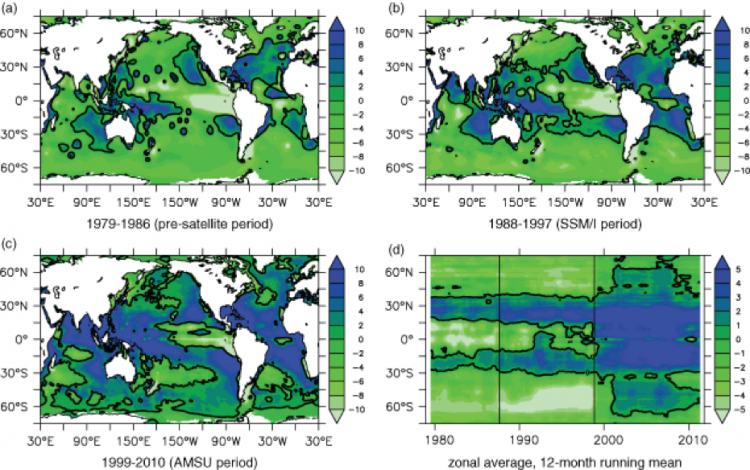
The authors created a longitudinal averaged Hovmöller. The x-axis is time, the y-axis is latitude, and the variable being displayed is longitudinally averaged (zonal averaged) integrated water vapor. Specifically, they are showing increments of integrated water vapor (time rate of change of water vapor integrated over the depth of the atmosphere); so if the value is negative the integrated water vapor was decreasing, if it was positive the integrated water vapor was increasing.
The solid vertical lines separate specific time periods with different observational systems: when MERRA didn’t have any satellite observations (1979-1986 the first line), when MERRA had SSM/I (1988-1997 up to the second line), and when AMSU was added in (1999-2010 second line to the end).
Even with a changing climate, you would not expect to see rapid changes in integrated water vapor. However, this is what you see in the figure; especially when AMSU was added. A big change occurred at the poles and the equator - an incredibly large shift from decreasing to increasing. So, here’s the question: should you use the whole dataset for climate trends? And if not, which section (temporally) is correct? That is, do I trust MERRA alone without any observations, or was adding AMSU and SMM/I, making the reanalysis more realistic?
This example was meant to show you that the Hovmöller diagram can highlight so much more than just the propagation of a wave. I also hope this example challenged you to not jump to conclusions. Your first answer may be that adding observations into the reanalysis has to be the correct thing to do…it has to make the model more realistic. Maybe yes, maybe no. There’s no sure way to tell.
Summary
In this section, we saw how the Hovmöller diagram can be used for many aspects of weather and climate. And there are more applications out there, such as vertical evolution, that we haven’t looked at. If you want to spend a little more time looking at Hovmöller diagrams of different variables, check out this site [10]. Here you will be able to create a longitude or latitude averaged Hovmöller for a variety of variables from the ocean to the earth to the atmosphere. The data comes from remotely sensed observations.
Steps
Prioritize...
At the end of this section, you should be able to recount the steps for making a Hovmöller diagram.
Read...
We’ve seen how the Hovmöller diagram can be used to visualize large amounts of time-space data. Now we need to learn how to create them ourselves. As with many other applications in R, using the function is relatively easy. The hard part is setting up the data for plotting. Selecting which variables will be plotted on which axis is key, and efficiently prepping your data can be difficult. Remember, a lot of data can go into these plots, so it can be a slow process. However, if you follow the steps below and really give careful thought prior to plotting, you will have no trouble making these diagrams.
Before beginning, I suggest you check out this link that provides a good visual of what we will be doing [6].
Define the Problem
Before you even begin prepping your data, there needs to be a clearly defined problem. Specifically, you need to decide on what you are trying to solve and how visualization will help you explore the problem. Once you feel the question is well defined, and you know what variable you will use, you can continue on.
Selecting Axis Variables
The next step is to decide on the axes. This is key! What you select drives the visualization. For example, if you select time and longitude, you are going to miss out on latitude variability. Whereas if you select time and a vertical axis, like pressure, you lose out on the spatial aspect.
Once you decide which variables will be used (e.g., longitude and time), selecting the specific axis (y or x) is not a big deal. It really depends on how you visualize. For example, it might be better to place longitude on the x-axis, as that’s how it’s normally displayed on a map. But you could reason that time should be on the x-axis, as that’s how we plot a time series. So, in the end, there’s no real right or wrong selection. What really matters is your careful description and interpretation of the visual. Just make sure you include labels!
Preparing the Data
Once you have selected the axes, you can prepare the data. This usually means averaging over some domain, often the spatial variable (latitude or longitude) you chose not to use as an axis variable. For example, if you are looking at longitude and time, you will probably have to average over latitude.
The next decision is to decide the domain to average over. It should cover the region of interest if you’re interested in looking at all the phenomena impacting that region. On the other hand, if you are focusing on just one phenomenon, it is often best to average over the region in which the phenomenon is strongest. This is what Hovmöller did when selecting his latitude averaging range to capture waves in the jet stream.
How you average over a dimension is up to you. We’ve discussed a lot of these techniques in Meteo 810/815. I will not go into more detail here, and I suggest you review the material if necessary. In most cases, you will probably be applying a latitudinal or longitudinal average.
I strongly encourage you to really think about the variable you are studying and the consequences of averaging on that variable. For example, if I’m examining air temperature, I might not average over all the latitudes but instead separate them into the northern and Southern Hemisphere. If you don’t know what to do, experiment.
R Functions to Plot
There are a few ways in which we can plot a Hovmöller diagram in R. Let’s start with what I will call ‘basic plotting’.
We can use any plotting function that displays 2D data using a color to plot the magnitude of the variable (e.g., contour.filled, ggplot, image, levelplot). To do this, we need to prepare the data ourselves and ensure we are averaging over the correct dimensions and plotting the dimensions on the correct axis. This is not difficult, and I actually prefer this method because you are in charge of what happens to the data.
Now there is another route, and that’s using the function ‘hovmoller’ from the package ‘rasterVis’ [29]. This function will automatically average the data for you; but with this ease, comes limitations. You have less flexibility in the methods for averaging and what you can actually display. I personally do not recommend this function as it’s a bit of a black box.
Hovmöller Example in R
Prioritize...
Once you have finished this section, you should be able to create a Hovmöller diagram in R.
Read...
For this example, we are going to recreate the original Hovmöller diagram [30] using reanalysis output. To follow along, download this dataset [31] of 4X daily geopotential heights from the NOAA 20th Century Reanalysis. To read more about the reanalysis, check out this link [32].
Define the Problem
We begin by defining the problem. Since we are recreating a diagram, the problem is already defined. We want to look at the evolution of troughs and ridges. This means we need to look at the time aspect and the longitudinal aspect (as waves generally progress west to east).
Select Variables and Dimensions
We are going to look at the 500-mb geopotential heights. Since we want to know the time evolution across longitudes, the dimensions will be time (y-axis) and longitude (x-axis). This means we need to average over latitude. Specifically, I will average over 35°N to 60°N (consistent with the original diagram and reflective of the mid-latitude jet stream region).
Prepare Data
We begin by loading in the data. This is a NetCDF file, so you need to use one of the many packages that will open it. My favorite is ‘RNetCDF’.
Your script should look something like this:
# install and load RNetCDF
install.packages("RNetCDF")
library("RNetCDF")

# load in 20CR monthly temperature
fid <- open.nc(“NOAA_20CR_dailyHeights.nc")
data20CR <- read.nc(fid)
The data frame contains the pressure levels for the vertical profile (level), latitudes (lat), longitudes (lon), time (time), and the geopotential heights (hgt-units meters). You can use the ‘print.nc’ command to read more about the file. The starting time is January 1st, 1945 and the ending time is December 31st, 1945. Each day has 4 observations.
The geopotential height has 4 dimensions (lonXlatXlevelsXtime). For the first step, I need to select out the 500-mb level. To do this, we need to determine the index of the 500-mb pressure.
Your script should look something like this:
# extract out pressure level
presLev <- which(data20CR$level==500)
Now, extract out the heights.
Your script should look something like this:
# extract out 500 height
hgt500 <- data20CR$hgt[,,presLev,]
We will plot time on the y-axis and longitude on the x-axis. This means we need to do something about the latitudes. Similar to the original, we will average over 35oN to 60oN. Start by extracting the latitude bounds.
Your script should look something like this:
# create latitude index
latIndex <- which(data20CR$lat < 61 & data20CR$lat > 34)
Now we average over this latitude range for every timestamp and every longitude. We will do this by using the ‘apply’ function.
Your script should look something like this:
# average over latitude index
LatAveHgt500<- apply(hgt500[,latIndex,],c(1,3),mean)
Now we have a variable with dimensions’ longitude by time. But the time is for the whole year, and I want to only extract out the November values. Let’s create a valid time index and then extract out the heights.
Your script should look something like this:
# time is in hours since 1800-1-1 00:00:0.0
time <- as.Date(data20CR$time/24,origin="1800-01-01")

# create a time index for November
timeIndex <- which(format(time,'%m')==11)

# Extract out heights for time period
tempHgt500 <- LatAveHgt500[,timeIndex]
Now we are left with a variable that has 2 dimensions (longitude and time) over our desired time period at our desired pressure level. We can finally plot the data.
Plot Hovmöller
For this example, I will use the function ‘filled.contour’. Let’s give it a try. Run the code below.
There are a few issues with this plot. For starters, the longitude values are not displayed in an intuitive manner. Second, to emulate the original plot, we should reverse the time so the starting date (November 1st) is at the top.
To fix the longitudes, we need to move the second half (180-360) to the front. This will create the 180 W (-180) to 180 E (+180) values similar to the original.
Your script should look something like this:
# determine half way point
halfLon <- length(data20CR$lon)/2

# change longitude order
finalLon <- c(data20CR$lon[(halfLon+1):length(data20CR$lon)]-360,data20CR$lon[1:halfLon])

# Change the matrix to match longitude
finalHgt500 <- matrix(NA,dim(tempHgt500)[1],dim(tempHgt500)[2])
finalHgt500[1:halfLon,] <- tempHgt500[(halfLon+1):length(finalLon),]
finalHgt500[(halfLon+1):length(finalLon),]<- tempHgt500[1:halfLon,]
The code above first determines the halfway point with the longitudes. Then the code changes the longitude values to make them -180 to 180 or 180W to 180E. Finally, the code changes the matrix to match this switch in longitude. Let’s plot to confirm we made the correct changes. Run the code below:
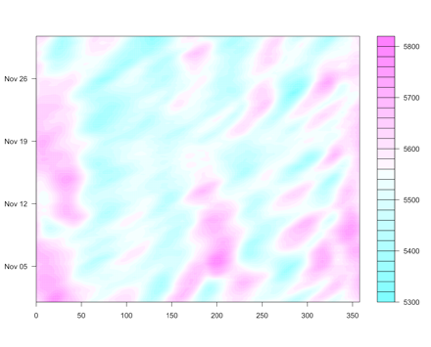
Below is a larger version of the figure:
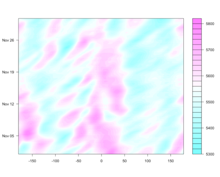
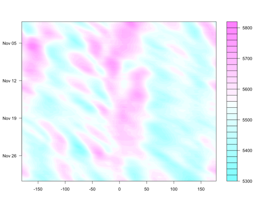
Now, let’s fix the time aspect. We can reverse this within the ‘filled.contour’ function by using the ‘ylim’ parameter. Run the code below:
Below is a larger version of the figure:
Now, let’s work on making this figure look nicer. First, let’s change the unit to decameters (consistent with the original). Run the code below:
Below is a larger version of the figure:
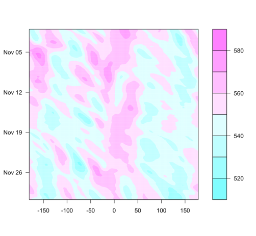
One thing to note, the range of the geopotential height is different compared to the original. This is a different dataset, and we would not expect them to be exactly the same.
Let’s add in labels by running the code below:
Below is a larger version of the figure:
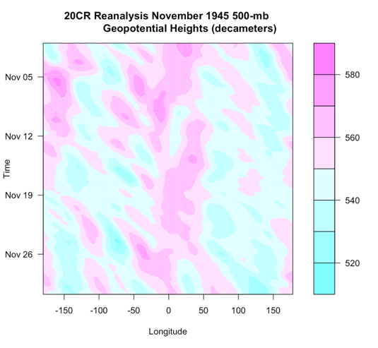
And there you have it! Your first Hovmöller diagram!
Interpret and Further Analyses
The last step is to interpret the diagram. High values are represented by the pinkish colors, while low values are the blueish colors. We see a downstream change from high values to low values, similar to the original. For reference, here is the original image next to the one we created.
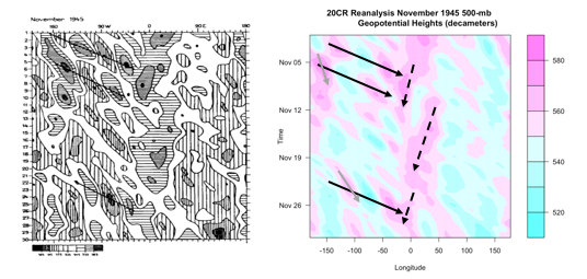
The solid black lines are again the group velocity, showing downstream development. The gray solid lines show the phase speed, moving slower than the group velocity. These two lines together (solid black and gray) represent the Rossby waves. There is another phenomenon going on, however. There are 3 westward moving ridges (high geopotential heights). These are highlighted by the black dashed lines and represent wider waves moving slowly west. In summary, this figure shows two phenomena going on, shorter waves (phase speed and group velocity) moving eastward and longer waves moving slowly west.
Depending on the question, further analyses may be needed. This could include performing an ARDL, spectrum or cross-spectrum analysis, or any of the other analyses we’ve learned in this course or in Meteo 815.
Strengths and Weaknesses
Prioritize...
Once you have completed this section, you should know the key strengths and weaknesses of the Hovmöller diagram and describe what it can and cannot provide.
Read...
As with all techniques we have learned, there are strengths and weaknesses to the Hovmöller diagram. In addition, sometimes we infer too much from the diagram. What can a Hovmöller diagram really provide to an analysis? Or more importantly, what can it not?
Strengths
Let’s start with the strengths. Hovmöller diagrams allow us to display A LOT of data, both spatially and temporally. Hovmöller diagrams allow us to assess the movement and evolution of spatial patterns in a variable over time. We can really start to look at the evolution of a meteorological event without watching a movie! In addition, the diagram highlights key places and times (as well as time and space scales) to examine in more detail. We saw a great ENSO example that highlighted strong events, pinpointing specific years we should examine in more detail. We can use the Hovmöller diagram as kind of a stepping stone…let it lead us. In short, the Hovmöller diagram is a fantastic exploratory tool. I would highly recommend using this sort of plot if you are studying anything with respect to the evolution of a variable or looking at a lot of data.
Weaknesses
Although the Hovmöller diagram may seem like a great tool, we must know its limitations. To start with, in most cases we will need to average over some dimension (e.g., latitude). When we average over a dimension, we lose the variability and characteristics of that variable with respect to that dimension (think back to the temperature example and averaging over the globe versus a hemisphere). This is why we need to carefully select the appropriate averaging technique and averaging domain. In addition, selecting the appropriate axes to display can be difficult. Although Hovmöller diagrams can provide quantifiable values for phase speed and group velocity, follow-up techniques may need to be added. In short, although the Hovmöller diagram is a great exploratory tool…that’s all it is…it is not the solution to a problem, but a step in the process.