Lesson 2: Autocorrelation and ARIMA
Motivate...
PRESENTER: How does rice grow? Rice is a grain. It looks like grass when it's fully grown. Most of the rice we eat in the UK comes from India, Thailand, Cambodia, Vietnam, Pakistan, and Italy. People in these countries have grown rice for thousands of years. Actually, you can grow rice in most places as long as the plants aren't exposed to the cold.
Rice grows in a paddy field. It's different from a field you might see in this country because it's usually flooded with water, which is just how the rice plants like it. The water protects the rice plants from extreme heat and cold and stops the weeds from growing by making the ground too waterlogged for them to take hold.
Some rice fields are irrigated with water from nearby rivers. Others are rain-fed areas containing water that falls during the monsoon season. The rice plants start their growing cycle in a nursery paddy field.
After one month, the seedling plants are put into small bunches and transplanted to a larger field to allow them to grow to their full size. The ground in the larger paddy field is prepared for the seedling rice plants by plowing. They use oxen to pull the plow through the waterlogged field.
The small bunches of rice seedlings are then planted in the main field by hand. The seedlings are given plenty of space in the ground because the rice plants will grow to be around a meter tall. It takes three months for the grains of rice to develop at the top of the plants' stalks. When the grains turn yellow and hard, it's time for them to be harvested.
In this field, the rice has to be harvested by hand. So during the harvest, the paddy field is drained to make it easier for the workers. The farmers harvest the rice by cutting the stalks with a sickle. Next, they separate the grain from the stalks by threshing it. This is usually done by hand.
In some places, the rice is spread out like this, and the heat of the sunshine dries it out. But often, the rice is stored in large silos, and using dryers, they heat up the air to dry out the rice. Once the rice is dry, the rice grain is separated from the outer husk using this machine. Now, it's ready to be placed into these one-ton bags and transported to rice mills in Europe.
Rice is an important crop in Thailand and represents a significant portion of the Thai economy and the labor force. As the video discussed, the rice grows in a flooded area, and farmers either rely on irrigation from rivers or rainfall. This rainfall, in Thailand and many other countries, comes from the monsoon. Monsoons are seasonal reversals, in this case from dry to wet. Since farmers in Thailand rely on the wet monsoon season to grow crops, variations in the monsoon season have severe implications for the economy. Being able to predict the wet season of the monsoon is imperative. Because of the general periodicity of the monsoon, we can utilize a time series to predict the coming and going of the wet season.
Newsstand
- (2011, October, 11). Thailand races to defend Bangkok from floods [1]. Retrieved November 16, 2017.
- Bundhun, Rachel. (2016, June 16). Indian economy’s fate depends on the monsoon [2]. Retrieved November 16, 2017.
- (2010, March 4). Drought Threatens Mekong Crops [3]. Retrieved November 16, 2017.
- Rochan, By M. (2014, July 21). Thailand to Reclaim Top Rice Exporter Status After Weak Indian Monsoon Rains [4]. Retrieved November 16, 2017.
- (2013, May 2017). Bangladesh Crop Insurance: Helping Farmers Weather the Storm [5]. Retrieved November 16, 2017.
Lesson Objectives
- Define, compute, and interpret autocorrelation in a dataset.
- Create an autoregressive model for a dataset.
- Create a moving average model for a dataset.
- Create an ARMA or ARIMA model for a dataset.
- Explain the differences between models, the strengths and weakness of each, as well as when to use each one.
Autocorrelation Overview
Prioritize...
At the end of this section, you should be able to describe autocorrelation.
Read...
At this point, we have seen that a time series can provide lots of information on a specific variable. In particular, we learned about the periodicity component of a time series which can include components that are partially cyclic, occurring at roughly equal intervals, or chaotic, occurring now and then with some consistency. But how do we determine that interval? Read on to find out!
Autocorrelation Definition
Let’s start by reminding ourselves about correlation. Correlation is the measure of strength and direction of a linear relationship between two variables. A linear relationship is when one variable X is scaled by a factor A with an offset B to fit another variable Y (Y=AX+B). The correlation coefficient quantifies the degree to which this scaling and offset can be used to fit the data.
Autocorrelation, sometimes called serial correlation, is the correlation of the value at a given point in time with other values of the same variable at different times. It is, thus, the relationship between the value at time t and the values lagged before (t-1, t-2, t-3,…) and/or after (t+1, t+2, t+3,…). So, instead of comparing one variable, Y, with another variable, X, you are comparing one variable against itself, offset in time.
Mathematically speaking, the autocorrelation is defined as:
The values Y1, Y2, …,YN are taken at time T1, T2,…., TN, where the values are equally spaced in time. This formula is similar to the correlation coefficient we previously saw in Meteo 815 and values closer to 1 indicate a strong relationship (positive or negative) while values closer to 0 suggest a weaker relationship.
Importance of Autocorrelation
There are two primary reasons we will look at autocorrelation in this course. The first is to test for stationarity (statistical properties such as mean, standard deviation, etc. are constant in time). Stationarity is a key assumption we will utilize in future analyses, so determining whether a time series meets the requirement is essential. If the autocorrelation decreases slowly from lag to lag (or remains relatively constant), the data is non-stationary. Furthermore, for non-stationary data, the autocorrelation at lag 1 is usually very large and positive. Whereas, if the autocorrelation drops to 0 relatively quickly, the data is considered stationary.
The second reason to compute autocorrelation is to determine if there are patterns with specific timescales. Many atmospheric variables will have periodic behavior that can be detected through the use of autocorrelation. However, this is not a rigorous method for forecasting. Remember from the correlation lesson, I emphasized that even if there is a strong correlation coefficient, it CANNOT be interpreted as causation. Similarly, even though there might be a strong autocorrelation coefficient at a particular lag, suggesting periodicity, it is ill-advised to use this for forecasting purposes. But, the autocorrelation can be used as a stepping stone to determine the significance of temporal patterns.
Plots
Unlike the correlation coefficient where the result was a single value, the autocorrelation coefficient is generally computed for a number of lags. So although you could look at individual autocorrelation coefficient values, it is generally easier to interpret the autocorrelation if you plot the values as a function of lags. This will allow you to look at as many lags as you want, which can be handy when trying to detect patterns.
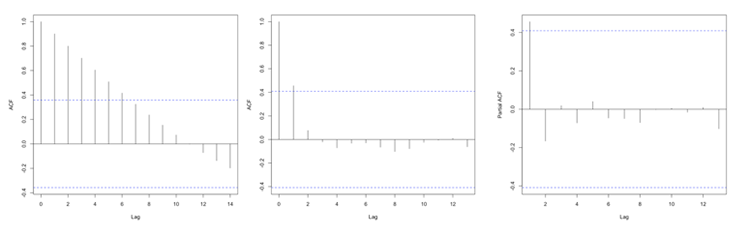
In R, you can use the function ‘acf’ from the package ‘stats’ which will compute the autocorrelation for as many lags (lag.max parameter) as you want. You can also use the function ‘pacf’ which is the partial autocorrelation. The partial autocorrelation is similar to the autocorrelation but the linear dependence between lags is removed. The figure below shows an example of the ACF for a non-stationary dataset (left panel), an ACF for a stationary dataset (middle panel - notice how the values drop to 0 faster than in the left panel), and the PACF of a stationary dataset (right panel).
Autocorrelation Example
Prioritize...
At the end of this section, you should be able to perform and interpret the autocorrelation computed over a number of lags for a given dataset.
Read...
At this point, you probably have a vague idea of what autocorrelation is but may still be uncertain about why and how we use it. Well, let’s work through an actual problem that shows you not only the computational side (how we use R to compute the coefficient(s)), but also the interpretation and framework for a larger picture. So let’s begin!
Question and Data
For this example of autocorrelation, we want to determine if an event occurs regularly with a certain periodicity, i.e., time scale. That is, does a large autocorrelation coefficient occur at a specific lag? Monsoons are seasonal shifts in the wind that generally result in changes in precipitation. Bangkok, Thailand is one city impacted by monsoons. They have three main seasons: the hot season, the rainy season, and the cool season. Generally, during the months of July to October, Bangkok is wet. Every year, they can expect the rain to come during these months and be relatively (key word here) dry the other months. This is an example of a quasi-periodic event.
So, the real question is: Can we observe this seasonal pattern in the data? Let’s find out. Here is a 50-year dataset [7] of daily precipitation for Bangkok, Thailand. Let’s open and prepare the data for analysis using the code below.
Your script should look something like this:
mydata <-  read.csv("daily_precipitation_Bangkok.csv", header=TRUE, sep=",")

# replace data with bad quality flags with NA
mydata$PRCP[which(mydata$Quality.Flag != " " )] <- NA

# replace missing values with NA
mydata$PRCP[which(mydata$PRCP < 0)] <- NA

# extract out precipitation (units = inches)
precip <- mydata$PRCP;

# convert date string to a real date
date<-as.Date(paste0(substr(mydata$DATE,1,4),"-",substr(mydata$DATE,5,6),"-",substr(mydata$DATE,7,8)))
Setup and Computation
Now that our data is extracted, we can set up the data specifically to compute the autocorrelation. The goal here is to determine whether a seasonal shift is observed in the precipitation data. Monthly totals are more logical than daily totals. Use the code below to estimate the monthly totals.
Your script should look something like this:
# Determine the number of unique months/years
unique_time <- unique(format(date,'%m%Y'))

# create monthly totals for each unique month/year combo
monthlyPrecip <- {}
time_index <- {}
for(itime in 1:length(unique_time)){
  index <- which(format(date,'%m%Y') == unique_time[itime])
  monthlyPrecip[itime] <- sum(precip[index])
  time_index <- c(time_index,index[1])
}
Now we can begin the analysis. We will first, as usual, make a plot of our time series. This is again to visually inspect the data for any missing or bad values, as well as to check if we can visually detect the pattern. Run the code below to create a time series plot.
Here is a larger version of the figure you should generate from the code above.
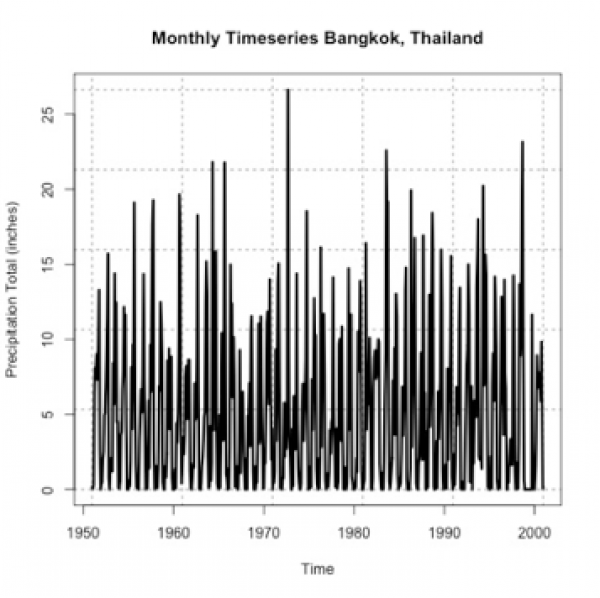
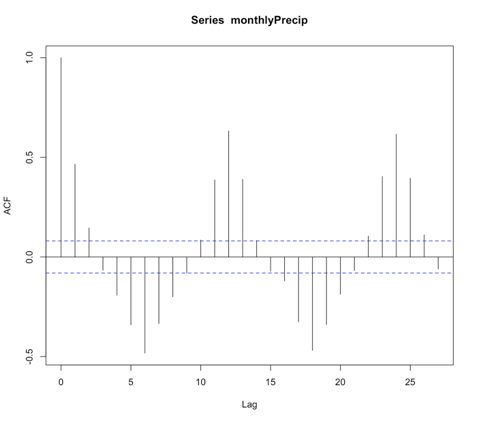
If you stare at it long enough, you will probably notice a pattern of high/low monthly precipitation totals. However, the timescale of the pattern is not entirely clear. So let’s compute the autocorrelation to assess the periodicity better. Use the function ‘acf’ on the monthly precipitation by running the code below.
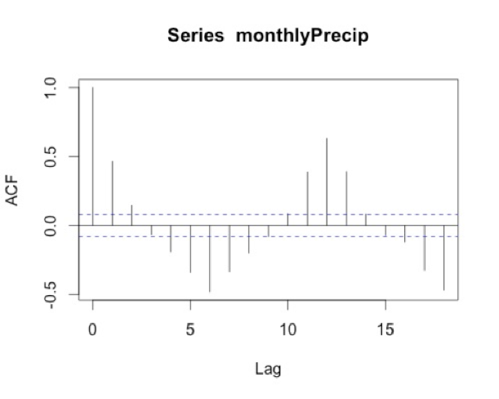
I chose a max lag of 18 months, which is equivalent to a year and a half. We believe the correlation is seasonal, so we want to explore at least one cycle. A year and a half allow us to observe this pattern. Below is a larger version of the figure.
Interpretation
What does the result show? To start, we must ignore the correlation of 1 at lag 0 because this is the correlation of each month with itself. As a side note, you will sometimes see the ACF with lag 0 and sometimes without, so it’s important to always check. The correlation at lag 1 is almost 0.5. This means that there is a positive correlation for each month with the month after and the month before. We think of the lags as since correlation is symmetric. At lag 3, the correlation flips to negative. At lag 6, half a year, there is an equal but opposite correlation to that at lag 1. This suggests a shift in the opposite direction (positive to negative and vice versa) every 6 months. We then see at lags 11-13 we have positive correlations, again ranging between 0.3-0.5. Suggesting the precipitation of a given month is positively correlated with the precipitation 11-13 months before or after---or more simply every year. This type of pattern definitely signals a seasonal change of precipitation.
I know this can be confusing, so let’s think of the lags in another way. I mentioned above that the rainy season is June-October. If the month we are examining is August (lag 0), then lag 1 would be July/September. Lag 2 would be June/October. These both show positive correlations, which is what we expect because the rainy season is June - October. At lag 3 (or months May/November), the correlation flips. This marks the transition to a different season.
Autoregressive Models Overview
Prioritize...
After reading this section, you should be able to explain what an autoregressive model is and discuss its strengths and weaknesses.
Read...
It makes sense that if there is a repeating pattern, like the change from the rainy season to the dry, we should be able to use that, to some degree of accuracy, for prediction. Autocorrelation tells us the strength of the relationship of a variable in time. But it doesn’t really harness that information for prediction. To do this, we need to use the Autoregressive (AR) model.
Definition of an AR Model
An autoregressive model or AR model predicts future behavior using past behavior. The model utilizes the autocorrelation results, which means we must use past data to model the behavior. The AR model can be viewed as a linear regression model where the current data value is predicted from past values. The outcome variable (Y) at some point in time, t, is predicted using a linear regression with the lagged values (Y at points in time earlier than t) as predictors. In short, the AR model is a regression of the variable against its own history.
When and Why to use?
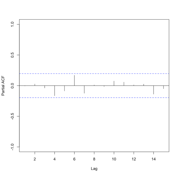
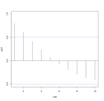
An AR model assumes that error terms are uncorrelated and have a mean of zero. This means we should only use an AR model if the data is stationary. We need to look at the ACF and or the PACF to determine whether an AR model is feasible. Generally, we are looking for 1 or 2 lags that are strongly correlated while the rest are not. Here is an example of the PACF for data that would make a good candidate.
Please note that in this example, the function suppressed the useless lag zero value. So, the high correlation is at lag 1.
Solve Parameters
Mathematically, the AR model looks very similar to the linear regression equation and takes the form:
where A is the parameter stemming from the autocorrelation, B is a constant, and e is the white noise (random signal). When using this model, we use the order to describe the number of preceding values that we use to predict the new values. So the order represents the number of lags we will use. The equation above is for a first-order autoregressive model, written as AR(1), since only the previous value, Yt-1, is used to compute the new value, Yt. A second order AR model, AR(2), would be written as In this case, the Y value at time t is predicted using the value at t-1 and t-2, two previous values hence the order of 2. To generalize the model, we can say that the pth-order autoregressive model, AR(p), is:We can make a first guess at the order by looking at the ACF or PACF. Take a look at the example of the PACF from above that showed the data was stationary. There is one high correlation at lag 1. This suggests an order of 1. Whereas the PACF below is less clear.
To create an AR model when the order is not known, we can use the function ‘ar’ from the ‘stats’ package. This particular function will choose the order by using the Akaike Information Criterion (AIC). As a reminder, the AIC is a measure of the relative quality of the models. The function will create multiple models of multiple orders, compute the AIC, and then select the best model by minimizing the AIC.
The results include the coefficients, ’ar’, the order, ‘order’, the aic score, ‘aic’, and the residuals from the fitted selected model, ‘resid’. Similar to our linear regression fits from Meteo 815, we can use the residuals to compute several metrics of best fit, such as MSE, RMSE, MAE, etc.
Advantages and Disadvantages
There are many advantages and disadvantages to the AR model, so I will only discuss a few. The most notable advantage is that it’s easy to compute. It’s a simple function and is not computationally expensive. This is great if you need to create many models. An AR model is also easy to understand - it’s the autocorrelation and a reflection of the periodicity that exists in the data.
A noticeable disadvantage is that the data must be stationary. This can be a difficult requirement to meet. Also, there needs to be a strong cycle in your dataset for the AR model to exploit. Furthermore, if there are extremes, an AR model can have trouble characterizing and modeling them, so this will create larger errors.
AR Example
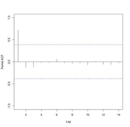
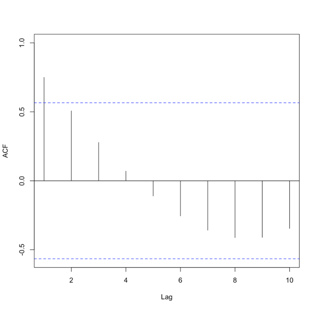
Let’s return to our precipitation data from Bangkok. Run the code below to plot the PACF for the monthly precipitation data.
Below is a larger version of the figure: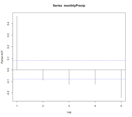
You will notice a strong correlation at lag 1 that drops significantly right after. This appears to be a candidate for an AR model, specifically of order 1. So let’s give it a try. Run the code below to create an AR(1) model of the monthly precipitation data.
Notice that I didn’t use all of the observations. I want to save some for comparison later on. For this particular model, the coefficient (Precip_AR1$ar) is 0.45. As a reminder, an AR(1) model follows the form:
‘a’ in this example is 0.45. The element ‘var.pred’ tells us the predicted variance or the variance of the time series that is not explained by the AR model. In this case, it is 20.6. But as a reminder, variance does not have easily understandable units (units^2). So instead, let’s compute some of our own metrics using the residuals. Start with the MSE (Mean Square Error) and RMSE (root MSE).
Similar to the variance, the MSE units are hard to utilize, so we use the RMSE. The RMSE is 4.53 inches. As a reminder, the RMSE represents the sample deviation between the predicted and observed values. So, we can say that each prediction value has a range of 4.53 inches.
Now, let’s use the model to predict some values and plot the observed vs. predicted. We will predict only for the values we didn’t use to create the model, i.e., we’ll test on independent data so as to get an honest assessment of how well the model will do in practice.
Your script should look something like this:
# predict values
dataPredict_input <- monthlyPrecip[(length(monthlyPrecip)-100):length(monthlyPrecip)-1]
precipAR1_predict<-{}
for(i in 1: length(dataPredict_input)){
  precipAR1_predict[i] <- predict(Precip_AR1,dataPredict_input[i])$pred
}
We loop through the data and take the prior value and use it to predict the future event one step forward (AR(1)). Now run the code below to plot the predicted values against the observed values.
Below is a larger version of the plot:
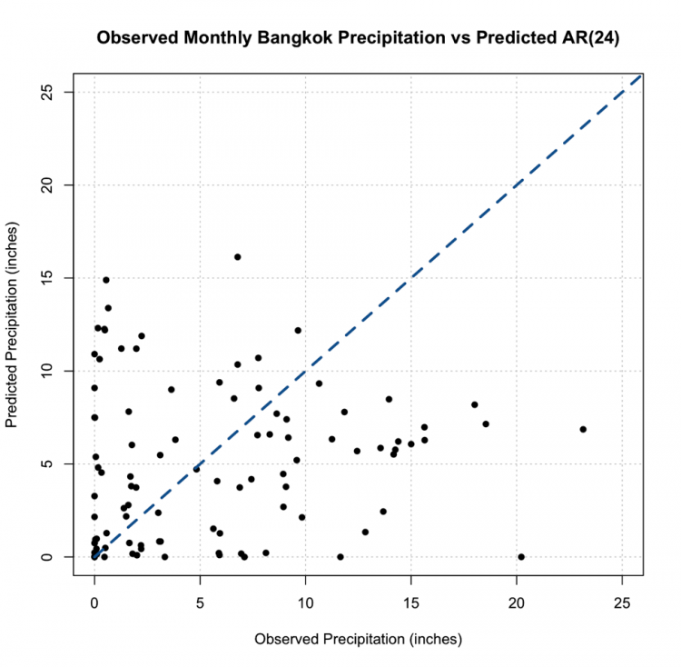
As a reminder, the closer the values (dots) are to the 1-1 line (blue dashed line) the better the model. We can definitely tell the AR(1) model is NOT a good model for monthly precipitation. So let’s revisit the PACF, and this time I’m going to expand the maximum lag length to 2 years or 24 months. Use the code below:
Your script should look something like this:
# plot pacf
BangkokPrecipPACF <- pacf(monthlyPrecip,lag.max=24)
You should generate a figure like this:
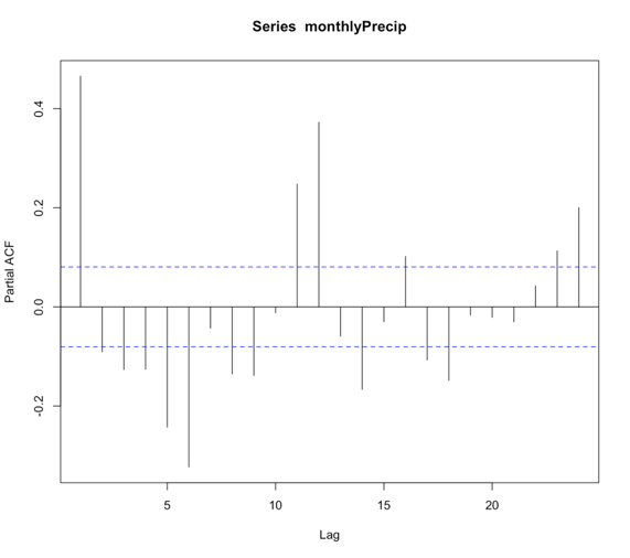
We see that there are multiple lags of relatively strong correlation. And therefore an AR(1) model is not ideal. But what is the correct number? Well, instead of figuring this out by hand, let R select the best order for you!
Using the function ‘ar’, we can choose to let the 'order.max' parameter be NULL, thereby allowing the function to estimate multiple AR models of varying order and selecting the best by using the AIC. Let’s see what it does!
Your script should look something like this:
# load in library
library(forecast)
# create AR model
Precip_AR <- ar(monthlyPrecip[1:(length(monthlyPrecip)-100)])
We can check the order of the AR selected by looking at the value $order. In this case, the order is 24! There are 24 coefficients ($ar), and we can compare the AIC scores ($aic) which shows you the difference in AIC between each model and the best model (in this case order 24). If you look at the AIC values, you will notice that it did compute models of order 25 and 26. So it really did create multiple models and minimize the AIC. Let’s compute the MSE and RMSE to see if it changed.
Your script should look something like this:
# compute MSE
precipMSEAR <- mean(Precip_AR$resid^2,na.rm=TRUE)

# compute RMSE
precipRMSEAR <- sqrt(mean(Precip_AR$resid^2,na.rm=TRUE))
In this case, the RMSE is 3.24 inches compared to 4.53 inches in the AR(1), so we have decreased the RMSE, which is good!. Now, let’s predict some values and compare them to the observed.
Your script should look something like this:
# predict values
dataPredict_input <- monthlyPrecip[(length(monthlyPrecip)-124):length(monthlyPrecip)-1]
precipAR_predict<-{}
for(i in 1:100){
  precipAR_predict[i] <- predict(Precip_AR,dataPredict_input[seq(i,24+i-1,1)])$pred
}
A note on the code, we need to look at the 24 values preceding the one we are trying to predict. This is shown by the sequence command for subsetting the data. If you look at how I created the data input values, I took the 100 values I want to predict plus the 24 preceding them. This allows me to use the AR model of order 24 for prediction. Let’s plot the predicted values against the observed values.
Your script should look something like this:
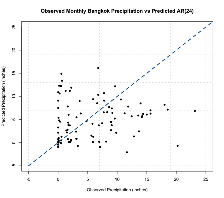
# plot predicted and observed values
dataObserved <- monthlyPrecip[(length(monthlyPrecip)-99):length(monthlyPrecip)]
plot.new()
grid(nx=NULL,ny=NULL,'grey')
par(new=TRUE)
plot(dataObserved,precipAR_predict,xlab="Observed Precipitation (inches)",
     ylab="Predicted Precipitation (inches)",main="Observed Monthly Bangkok Precipitation vs Predicted AR(24)",
     xlim=c(-5,25),ylim=c(-5,25),pch=16) par(new=TRUE) plot(seq(-5,30,1),seq(-5,30,1),type='l',lty=2,col='dodgerblue4',lwd=3,xlab="Observed Precipitation (inches)",
     ylab="Predicted Precipitation (inches)",main="Observed Monthly Bangkok Precipitation vs Predicted AR(24)",
     xlim=c(-5,25),ylim=c(-5,25))
This is the figure you should get:
You should notice something very suspicious in this figure. Negative precipitation is NOT possible! It is worth noting that many statistical models, including AR, lack a means of imposing such physical constraints. In this instance, there was no constraint that precipitation cannot be negative. We can fix this by replacing all the negative values with 0. This is a prime example of why we need to plot our results!
Your script should look something like this:
# replace negative values with 0
precipAR_predict[which(precipAR_predict < 0)] <- 0
If we replot, we get this figure (note that I changed the x and y limits, but I assure you there are no negative values)
This, however, is not the most promising result. The predictions are not very close to the 1-1 line and this, paired with the RMSE, suggest the AR model, even with the seasonal repetition of the monsoon, may not be the best choice for prediction.
Moving Average Model Overview
Prioritize...
After reading this section, you should be able to explain what a moving average model is as well as its strengths and limitations.
Read...
So, we saw how we can use the periodicity of a variable for prediction through AR modeling. But, sometimes, that is not enough. Instead, it might be more beneficial to model the data based on the errors of the previous forecast. This is where a Moving Average (MA) model comes in.
General Description
The basic idea of an MA model is that the variable depends linearly on the past errors of forecasts. An MA model creates a forecast at time t and computes the forecast errors, then the model forecasts the next time stamp (t+1) using the errors computed from the previous forecast (time t) as predictors. In short, the moving average model is the weighted average of past errors. Mathematically, an MA model looks like:
where μ is the mean of Yt+1, are the forecast errors for the current forecast (time t) and the previous (t-1) and are the parameters of the model. Similar to the AR model, the MA model has an order saying how many past errors to include, denoted by MA(q). The above equation is an example of an MA model of order 1, MA(1). An MA(2) is given by the following equation:
And the qth order is:
There are some basic requirements for an MA model. For one, the time series is assumed to be stationary. The errors are assumed to be independently normally distributed. You can see this equation looks very similar to the AR model. So what is the main difference? A pure AR model depends on the lagged values of the data while a pure MA model depends on the previous forecast errors.
Advantages and Disadvantages
The MA model is great because it’s computationally efficient and yields a very stable forecast, in that it doesn’t change drastically from one value to another. In addition, an MA model can be updated every time a new forecast is made; that is, you add in the forecast errors and update the model.
There are, however, several disadvantages. For one, an MA model requires you to save past forecast errors to create a new model and predict the next value. This is costly in terms of computational memory. The MA model also ignores complex relationships; it is focused on characterizing the mean value instead of capturing the natural fluctuations that occur. This, in turn, can remove extreme values as the MA model focuses on the average.
How to tell if an MA model is a good fit?
Similar to the AR model, we look to the autocorrelation for insight. In this case, we will examine the ACF. We use an MA(1) when there is only a significant autocorrelation at lag 1. For example:
When there are significant correlations at lags 1 and 2 but no significant correlations at higher lags, we use an MA(2). The ACF would look like this:
You should start to see the pattern. An MA(q) model would be selected when there are significant autocorrelation values for the first q lags and nonsignificant autocorrelation for lags>q. So, what’s the key difference between the AR and MA in terms of the ACF. An AR model will have an ACF that exponentially decreases to 0 as the lag increases, where an MA model will have an ACF that has significant correlations for the first q lags and then autocorrelation=0 (or nonsignificant) for all lags >q. For a PACF, in an AR model, the number of non-zero partial autocorrelation provides the order for the AR model (the most extreme lag of the variable that is used for prediction). Whereas, in an MA model, the PACF tapers toward 0. For the AR model, we tend to use the PACF, while for the MA model, we will use the ACF.
Let's try and create an MA model in R using our precipitation data from Bangkok. We start by creating the ACF. Use the code below:
Your script should look something like this:
# create acf of data
precipACF <- acf(monthlyPrecip)
You should get the following figure:
Like I said above, an MA model has an ACF with the characteristic that the correlation will be strong for q lags and then become nonsignificant. This is not a good candidate for MA modeling! However, we will test out an MA model to see how well It does compare to the AR model.
For the MA model, we will use the function ‘auto.arima’. I will not talk a lot about this function right now because we will use it in the following sections. For now, to create a pure MA model, we will set the following parameters: d=0, D=0, max.p=0, max.P=0, max.d=0, max.D=0. These parameters will be discussed in more detail later on. Use the code below to create an MA model. The ‘auto.arima’ function selects the best model by using either the AIC, AICC, or BIC metric.
Your script should look something like this:
# create MA model
precip_MA <- auto.arima(monthlyPrecip[1:(length(monthlyPrecip)-100)],ic="aic",d=0, D=0, max.p=0, max.P=0, max.d=0, max.D=0)
For this example, the best MA model was of order 2 (simply type out precip_MA and the information will pop up). If we use the summary function, we can obtain a number of error measures from the training data, including the RMSE which in this case was 4.5 inches, close to the AR(1) model.
Unlike the AR model, predicting data is not as simple as before because with the MA model, we update based on the errors of the previous forecast. So for each prediction, we need to update the MA model. Use the code below to forecast the last 100 points of precipitation.
Your script should look something like this:
# predict values
precipMA_predict<-{}
for(i in 1:100){
  dataSubset <- monthlyPrecip[(i:(length(monthlyPrecip)-101+i))]
  precip_MA=auto.arima(dataSubset,ic="aic",d=0, D=0, max.p=0, max.P=0, max.d=0, max.D=0)
  precipMA_predict[i] <- predict(precip_MA,n.ahead = 1)$pred
}
Now, plot the predicted vs the observed.
Your script should look something like this:
# predict values
dataObserved <- monthlyPrecip[(length(monthlyPrecip)-99):length(monthlyPrecip)]
plot.new()
grid(nx=NULL,ny=NULL,'grey')
par(new=TRUE)
plot(dataObserved,precipMA_predict,xlab="Observed Precipitation (inches)",
     ylab="Predicted Precipitation (inches)",main="Observed Monthly Bangkok Precipitation vs Predicted MA",
     xlim=c(0,25),ylim=c(0,25),pch=16) par(new=TRUE) plot(seq(0,30,1),seq(0,30,1),type='l',lty=2,col='dodgerblue4',lwd=3,xlab="Observed Precipitation (inches)",
     ylab="Predicted Precipitation (inches)",main="Observed Monthly Bangkok Precipitation vs Predicted MA",
     xlim=c(0,25),ylim=c(0,25))
You should get the following figure:
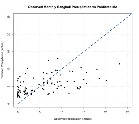
Now, a good thing to note is with an MA model you are less likely to get unrealistic values, but we should still check. You can do this by determining the minimum value of the predictions. Note that, depending on your variable, you may need to check multiple constraints (including a maximum value).
Back to the interpretation, similar to the AR model, this MA model does not look to be the best fit. We do not see many values along the 1-1 line and paired with the error measure scores, the MA model is not the greatest at modeling the monthly Bangkok Precipitation. But that doesn’t mean the MA model is worthless in this example; it just means that neither the AR or MA are the best, and each has its own skill. So, what if we could combine the strengths of both?
ARMA/ARIMA Overview
Prioritize...
After reading this section, you should be able to describe an ARMA and ARIMA model, explaining the strengths and weaknesses of each.
Read...
So now we have seen two models for time series data, the Autoregressive Model and the Moving Average Model. Each has their own strengths and weaknesses. There will be times when the AR model is more appropriate than the MA model and vice versa. But what if our data doesn’t fit a pure AR model or a pure MA model but is instead a mix of both? What if we could combine AR+MA? You can!
ARMA
We do not have to use the AR or MA models exclusively. Instead, we can combine the AR terms and the MA terms into the appropriately named model called ARMA. ARMA, in simple terms, is the combination of the p order AR terms and the q order MA terms. Mathematically:

The first part, in blue, is the AR model of order p. The second part, in green, is the MA model of order q. C is a constant and et is the error term. The equation estimates the Y value at time t as the sum of p terms of the AR component and the q terms of the MA component. As AR and MA have order, ARMA has an order that is reflective of each component. We say that the ARMA model has an order (p,q) or ARMA(p,q). As with the individual components, ARMA assumes the data is stationary.
ARIMA
It is highly likely with meteorological variables that your data will not be stationary and will exhibit trends and/or periodicities. So what can we do if the data does not meet this requirement? Removal of these nonstationary components can be carried out by differencing the data until it is approximately stationary. You difference the data until it meets this basic assumption and then run an ARMA model. Although that works, why don’t we take a shortcut and use the ARIMA (sometimes called the Box-Jenkins model) model instead? An ARIMA model is an ARMA model that has been initially (I) differenced. The results are integrated to create a forecast.
ARIMA has one more component, the differencing component. Formally, this parameter, d, is called the order of the differencing. ARIMA combines the differencing of a nonstationary time series with the ARMA model, following the form (p,d,q) or ARIMA(p,d,q).
So what exactly goes on in an ARIMA model? We start with the differencing. Differencing in statistics is used to transform a dataset to make it stationary. In short, you difference the time series until the stationary requirement is a reasonable assumption. Mathematically, first order differencing (d=1) looks like this:
We compute the value at time t as the value at time t minus the value at t-1. Second order differencing (d=2) mathematically looks like this:
Most times, you will only need to apply differencing once or twice (order 1 or 2). Once you difference, you simply create the ARMA model that best fits the new stationary time series.
You can probably start to see the benefits of ARIMA. It’s easy to use and allows for both stationary and non-stationary time series. However, there are three parameters now: p,d,q - meaning there are many possible models that can be created to fit your data. So, how do you pick the ‘best’ model? Here are some general guidelines:
- Similar to linear regression, we want the simplest form of a model. This means you want to minimize the values of p,d, and q. Simple is always better in this case.
- The model fit should be as good as possible. This is the least-squares approach we discussed in Meteo 815. We try to minimize the squared difference between the predicted and the observed.
- Finally, if we automate the process, we can create multiple models and select the best model by minimizing metrics such as the AIC or BIC.
But similar to linear regression, we won’t know how good a model is until we use it to predict future events.
Periodicity ARIMA
As you have probably seen throughout this course and Meteo 815, meteorological data tends to have a periodicity component, specifically referred to as a seasonal component. This requires us to do an additional differencing technique (outside of possible trends or other components that lead to non-stationarity). The differencing discussed above focused on non-stationary components, arising primarily from trends. Instead, we can use a periodicity ARIMA model that includes a quasi-periodicity or a seasonal periodicity component. We write a periodicity ARIMA as:
ARIMA(p,d,q)(P,D,Q)m
The purple part is the non-seasonal part of the model. Or in our course, we call this the non-periodic part of the model with the components, p=non-periodic AR order, d= non-periodic differencing, q=non-periodic MA order. The orange part of the model is the seasonal or periodic part of the model with the components: P=periodic AR order, D=periodic differencing, Q=periodic MA order, and m=time span of the repeating pattern.
We determine m by looking for the spike at lag m in the ACF or PACF. If you look back at the Bangkok precipitation, there are spikes at 6 months and 12 months. The periodic terms are then multiplied by the non-periodic terms to create the full model. Again, the main point here is we add a component that focuses on removing seasonality, whereas the original ARIMA model, talked about above, only removes non-quasi-periodic non-stationary components.
Model Type Selection
Although we will be able to automate the ARIMA function in R to select the best model and pick the best order, it’s still important to verify that the order makes sense. So let’s talk a little bit about how to select (or confirm) the values of p,d,q, and the model type. For the MA and AR models, we already discussed the visualization of the ACF or PACF to estimate the order. These same traits hold true for ARIMA, and therefore I will not discuss them here but focus instead on how we make the selection between using a pure AR, pure MA, an ARMA/ARIMA/ and a periodic ARIMA. We use the shape of the ACF or PACF plot to suggest the first guess of model type. But again, the function will automate this process to further refine the selection. Below is a summary table discussing the shape of the ACF and what model you should select. A summary table is also available from NIST [8].
| Shape | Model |
|---|---|
| Exponential, Decaying to Zero | AR model: use PACF to identify the order |
| Alternating positive and negative, decaying to zero | AR model: use PACF to identify the order |
| One or more spikes, rest are at 0 | MA model: order identified by the lag at which the correlation becomes zero |
| Decay starting after a few lags | ARMA |
| All 0 or close to 0 | Data is random |
| High values at fixed intervals | Include seasonal AR term |
| No Decay to 0 | Series is not stationary (possible trend or periodicity) - include differencing term |
If your ACF shows an exponential decay to 0, we would use the AR model. If there are one or more spikes but the rest are 0, we use an MA model. If there is a decay starting after a few lags, we use ARMA, if there are high values at fixed intervals, we use a periodic ARMA, and if there is no decay to 0, we use ARIMA.
Below is a clickable flowchart to help you through the process of selecting the correct model.
ARIMA Example
Prioritize...
After reading this section, you should be able to fit an ARIMA/ARMA model to data when applicable.
Read...
We saw in our previous examples that a pure AR model did not do a great job at predicting precipitation in Bangkok. Similarly, a pure MA model fell short. But both models provide quality information, so let’s try combining them to create a better model.
ARIMA Example
Before we create the ARIMA model, we actually should look into whether ARMA or ARIMA is more appropriate; that is, does a trend or other chaotic periodicities exist in our data? We can check this by plotting the time series.
Your script should look something like this:
# plot time series
plot.new()
grid(nx=NULL, ny=NULL, 'grey')
par(new=TRUE)
plot(date[time_index],monthlyPrecip,xlab="Time",ylab="Monthly Precipitation (inches)",
     main="Bangkok, Thailand Precipitation",type="l")
You should get a figure like this:
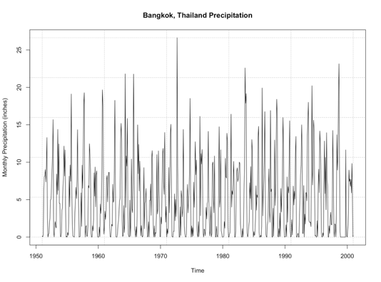
By examining this figure, there doesn’t appear to be an overall trend of increasing or decreasing precipitation. An alternative method is to look at the anomaly which tends to paint a clearer picture. Here is a time series of the anomaly, with the 0 line highlighted in blue.
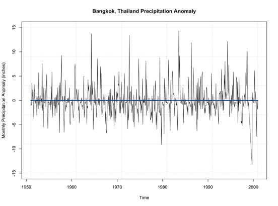
Note that the time series doesn’t really increase or decrease. It’s not drifting from the 0 line, but simply fluctuating around it. This leads me to believe that no differencing is needed for stationary as it pertains to non-periodicity. Let’s see if this is true and use the ‘auto.arima’ function. Again, this function will select the best ARIMA model with the best p,d,q parameters based on AIC scores of several models. Use the code below to create an ARIMA model.
Your script should look something like this:
# create ARIMA model
precip_ARIMA <- auto.arima(monthlyPrecip[1:(length(monthlyPrecip)-100)],ic="aic",seasonal=FALSE)
The main difference from our previous MA example is I let the function choose the p,d, and q values as opposed to the pure MA where I set p and d to 0 to ensure a pure MA model was selected. Ignore the seasonal parameter for now; we will discuss this in more detail later on. When I run this, the model selected is ARIMA(5,0,1) which can be called ARMA(5,1). So, like we saw in the plot, the ARIMA model selected d=0; differencing is not needed due to trends in the data.
We can look at the summary metrics again (using summary()). The RMSE is 4.1 inches. You can also compare how the model predicted the training dataset observations. Remember, this is not the best approach because the model is using these observations. But let’s give it a try.
Your script should look something like this:
# plot Training Data vs Predictions
plot.new()
grid(nx=NULL,ny=NULL,'grey')
par(new=TRUE)
plot(precip_ARIMA$x,precip_ARIMA$fitted,xlab="Observed Precipitation (inches)",
     ylab="Predicted Precipitation (inches)",main="Observed Monthly Bangkok Precipitation vs Predicted ARMA",
     xlim=c(0,25),ylim=c(0,25),pch=16)
par(new=TRUE)
plot(seq(0,30,1),seq(0,30,1),type='l',lty=2,col='dodgerblue4',lwd=3,xlab="Observed Precipitation (inches)",
     ylab="Predicted Precipitation (inches)",main="Observed Monthly Bangkok Precipitation vs Predicted ARMA",
     xlim=c(0,25),ylim=c(0,25))
You should get this figure:
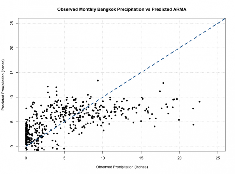
One of the things that hopefully popped out was the negative values once again. We must consider the constraints of the data and realize that our models don’t necessarily ‘know’ those constraints, so we must impose them ourselves.
One of the great things about ARMA/ARIMA is the opportunity to update the model regularly. And in reality, we probably would update the model with new observations to adjust it ever closer to reality. So let’s go ahead and set up an algorithm that forecasts the monthly precipitation one month out using the most relevant observations to create a model. Then, we can plot the observations vs the predictions.
Your script should look something like this:
# predict values
precipARIMA_predict<-{}
for(i in 1:100){
  dataSubset <- monthlyPrecip[(i:(length(monthlyPrecip)-101+i))]
  precip_ARIMA=auto.arima(dataSubset,ic="aic",seasonal=FALSE)
  precipARIMA_predict[i] <- predict(precip_ARIMA,n.ahead=1)$pred
}
And now, let’s plot.
Your script should look something like this:
# plot predicted and observed values
dataObserved <- monthlyPrecip[(length(monthlyPrecip)-99):length(monthlyPrecip)]
precipARIMA_predict[which(precipARIMA_predict <0)] <- NA
plot.new()
grid(nx=NULL,ny=NULL,'grey')
par(new=TRUE)
plot(dataObserved,precipARIMA_predict,xlab="Observed Precipitation (inches)",
     ylab="Predicted Precipitation (inches)",main="Observed Monthly Bangkok Precipitation vs Predicted ARIMA",
     xlim=c(0,25),ylim=c(0,25),pch=16)
par(new=TRUE)
plot(seq(0,30,1),seq(0,30,1),type='l',lty=2,col='dodgerblue4',lwd=3,xlab="Observed Precipitation (inches)",
     ylab="Predicted Precipitation (inches)",main="Observed Monthly Bangkok Precipitation vs Predicted ARIMA",
     xlim=c(0,25),ylim=c(0,25))
You should get a plot similar to the one below:
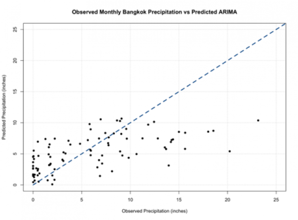
You should note that these predictions do not stem from the same model and can have different parameters (p,q) for each prediction. If you compare this to our other plots from a pure AR and pure MA model, you will see it’s not much different. So, we haven’t really improved the skill of the model.
Periodic ARIMA Example
One of the reasons why we haven’t improved the model may be due to the quasi-periodicity that exists in the dataset. Look back at the ACF for the data:
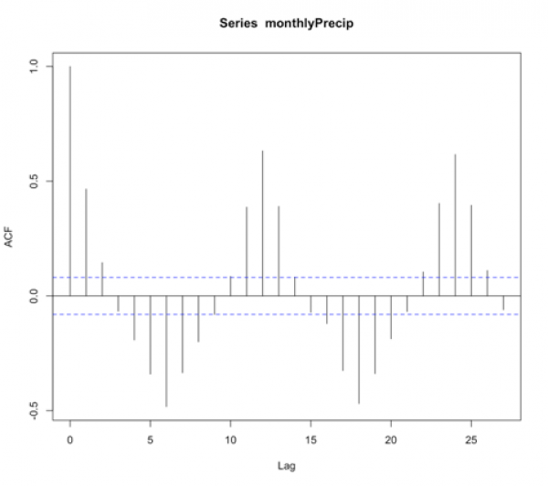
We see high values at fixed intervals. Consulting our summary table from before:
| Shape | Model |
|---|---|
| Exponential, Decaying to Zero | AR model: use PACF to identify the order |
| Alternating positive and negative, decaying to zero | AR model, use PACF to identify the order |
| One or more spikes, rest are at 0 | MA model, order identified by the lag at which the correlation becomes zero |
| Decay starting after a few lags | ARMA |
| All 0 or close to 0 | Data is random |
| High values at fixed intervals | Include seasonal AR term |
| No Decay to 0 | Series is not stationary (possible trend or periodicity)- include differencing term |
We need to include a seasonal term. Unfortunately, we can’t just supply the data to the ‘auto.arima’ function and let it do its magic. Instead, we need to create a time series function that creates this seasonal term. So let’s give this a try. To start, we need to look at the ACF to make a first guess at the periodicity. We see the strong positive correlation at lag 1, then again at lag 12 and lag 24. This is suggesting a strong annual periodicity. We will start by setting M to 12 (12 months in a year; we are working with monthly data), and we will create a time series object with the frequency set to 12.
Your script should look something like this:
# create a time series object
precipTS <- ts(monthlyPrecip, frequency=12)
The ‘ts’ function creates a time series object with a specified frequency for each time. So in this case, I said the frequency is 12, and it pulls out the observations every 12 months - which corresponds to the periodicity we saw in the ACF. Now we run the ‘auto.arima’ function and tell it to include a seasonal component.
Your script should look something like this:
# create Periodic ARIMA model
precip_PeriodicARIMA <- auto.arima(precipTS,ic="aic",seasonal=TRUE)
The printout tells us an ARIMA(2,0,0)(2,0,0)[12] was selected. So let’s review what this means. It’s an ARIMA model with p order of 2, d order of 0, and q order of 0 - meaning it’s an AR model of order 2. With a periodic ARIMA model of P order 2, D order 0, and Q order 0, meaning it’s a periodic AR model of order 2, and the periodicity is 12 months ([12]). If we run the summary function, we see that the RMSE is 3.55 inches. Now, if we wanted to automate the decision of the periodicity ([m]), we can use the following algorithm.
Your script should look something like this:
# automate the frequency
AICScore <- {} for(i in 1: 24){
  # create a time series object
  precipTS <- ts(monthlyPrecip,frequency=i)

  # create Periodic Arima Model
  precip_PeriodicARIMA <- auto.arima(precipTS,ic="aic",seasonal=TRUE)

  # save the AIC score
  AICScore[i] <- precip_PeriodicARIMA$aic
}
This is a very simple algorithm that saves the AIC score for the best ARIMA model with each periodicity [1:24]. Now we can look at the 'AICScore' and find the best model by minimizing the AIC.
Your script should look something like this:
# select optimal frequency choice
optimalFrequency <- which(min(AICScore) == AICScore)
We see that the optimal frequency is 12, which is what we previously selected, and confirms our observations in the ACF. So, now let’s automate the model to update after each observation. We can then predict the values and compare the observations to predictions.
Your script should look something like this:
# predict values
precipARIMA_predict<-{}
for(i in 1:100){
  # subset data
  dataSubset <- monthlyPrecip[(i:(length(monthlyPrecip)-101+i))]

  # create a time series object
  precipTS <- ts(dataSubset,frequency=12)
  precip_ARIMA <- auto.arima(precipTS,ic="aic",seasonal=TRUE, allowdrift=FALSE)
  precipARIMA_predict[i] <- predict(precip_ARIMA,n.ahead=1)$pred
}
As a reminder, each prediction was created with a unique model that potentially has different p,d,q and P, D, Q parameters. The added parameter here, 'allowdrift', tells the function to not include any drift (e.g., long term changes in data) in the model. Let’s plot the results.
Your script should look something like this:
# plot predicted and observed values
dataObserved <- monthlyPrecip[(length(monthlyPrecip)-99):length(monthlyPrecip)]
precipARIMA_predict[which(precipARIMA_predict <0)] <- NA
plot.new()
grid(nx=NULL,ny=NULL,'grey')
par(new=TRUE)
plot(dataObserved,precipARIMA_predict,xlab="Observed Precipitation (inches)",
     ylab="Predicted Precipitation (inches)",main="Observed Monthly Bangkok Precipitation vs Predicted Periodic ARIMA",
     xlim=c(0,25),ylim=c(0,25),pch=16)
par(new=TRUE)
plot(seq(0,30,1),seq(0,30,1),type='l',lty=2,col='dodgerblue4',lwd=3,xlab="Observed Precipitation (inches)",
     ylab="Predicted Precipitation (inches)",main="Observed Monthly Bangkok Precipitation vs Predicted Periodic ARIMA",
     xlim=c(0,25),ylim=c(0,25))
You should get a figure like this:
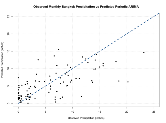
Out of all our figures, this one seems to be the best fit, following the 1-1 line better than the previous models.
ARIMA and Periodic ARIMAs are great because they are computationally efficient, easy to update, and are based on historical patterns. But they tend to not capture extreme values, and cannot model complex relationships. Nonetheless, these models are important steppingstones to more robust and complex models that we will learn about later on.