Chapter 3: Census Data and Thematic Maps
1. Overview
In Chapter 2, we compared the characteristics of geographic and plane coordinate systems that are used to measure and specify positions on the Earth's surface. Coordinate systems, remember, are formed by juxtaposing two or more spatial measurement scales. I mentioned, but did not explain, that attribute data also are specified with reference to measurement scales. In this chapter, we'll take a closer look at how attributes are measured and represented.
Maps are both the raw material and the product of GIS. All maps, but especially so-called reference maps made to support a variety of uses, can be defined as sets of symbols that represent the locations and attributes of entities measured at certain times. Many maps, however, are subsets of available geographic data that have been selected and organized in response to a particular question. Maps created specifically to highlight the distribution of a particular phenomenon or theme are called thematic maps. Thematic maps are among the most common forms of geographic information produced by GIS.
A flat sheet of paper is an imperfect, but useful, analog for geographic space. Notwithstanding the intricacies of map projections, it is a fairly straightforward matter to plot points that stand for locations on the globe. Representing the attributes of locations on maps is sometimes not so straightforward, however. Abstract graphic symbols must be devised that depict, with minimal ambiguity, the quantities and qualities that give locations their meaning. Over the past 100 years or so, cartographers have adopted and tested conventions concerning symbol color, size, and shape for thematic maps. The effective use of graphic symbols is an important component in the transformation of geographic data into useful information.
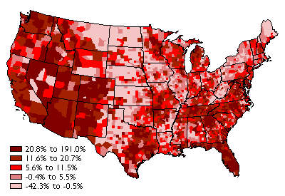
Consider the map above (Figure 3.1.1), which shows how the distribution of U.S. population changed, by county, from 1990 to 2000. To gain a sense of how effective this thematic map is in transforming data into information, we need only to compare it to a list of population change rates for the more than 3,000 counties of the U.S. The thematic map reveals spatial patterns that the data themselves conceal.
This chapter explores the characteristics of attribute data used for thematic mapping, especially attribute data produced by U.S. Census Bureau. It also considers how the characteristics of attribute data influence choices about how to present the data on thematic maps.
Objectives
Students who successfully complete Chapter 3 should be able to:
- use metadata and the World Wide Web to assess the content and availability of attribute data produced by the U.S. Census Bureau;
- discriminate between different levels of measurement of attribute data;
- explain the differences between counts, rates, and densities, and identify the types of map symbols that are most appropriate for representing each; and
- use quantile and equal interval classification schemes to divide census attribute data into categories suitable for choroplethic mapping.
"Try This!" Activities
Take a minute to complete any of the Try This activities that you encounter throughout the chapter. These are fun, thought provoking exercises to help you better understand the ideas presented in the chapter.
2. Census Attribute Data
A thematic map is a graphic display that shows the geographic distribution of a particular attribute, or relationships among a few selected attributes. Some of the richest sources of attribute data are national censuses. In the United States, a periodic count of the entire population is required by the U.S. Constitution. Article 1, Section 2, ratified in 1787, states that Representatives and direct taxes shall be apportioned among the several states which may be included within this union, according to their respective numbers ... The actual Enumeration shall be made [every] ten years, in such manner as [the Congress] shall by law direct." The U.S. Census Bureau is the government agency charged with carrying out the decennial census.

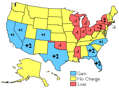
The results of the U.S. decennial census determine states' portions of the 435 total seats in the U.S. House of Representatives. The map below shows states that lost and gained seats as a result of the reapportionment that followed the 2000 census. Congressional voting district boundaries must be redrawn within the states that gained and lost seats, a process called redistricting. Constitutional rules and legal precedents require that voting districts contain equal populations (within about 1 percent). In addition, districts must be drawn so as to provide equal opportunities for representation of racial and ethnic groups that have been discriminated against in the past.
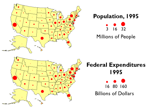
Besides reapportionment and redistricting, U.S. census counts also affect the flow of billions of dollars of federal expenditures, including contracts and federal aid, to states and municipalities. In 1995, for example, some $70 billion of Medicaid funds were distributed according to a formula that compared state and national per capita income. $18 billion worth of highway planning and construction funds were allotted to states according to their shares of urban and rural population. And $6 billion of Aid to Families with Dependent Children was distributed to help children of poor families do better in school. The two thematic maps below (Figure 3.3.3) illustrate the strong relationship between population counts and the distribution of federal tax dollars.
The Census Bureau's mandate is to provide the population data needed to support governmental operations including reapportionment, redistricting, and allocation of federal expenditures. Its mission, to be "the preeminent collector and provider of timely, relevant, and quality data about the people and economy of the United States," is broader, however. To fulfill this mission, the Census Bureau needs to count more than just numbers of people, and it does.
Try This!
3. Enumerations versus Samples
Sixteen U.S. Marshals and 650 assistants conducted the first U.S. census in 1791. They counted some 3.9 million individuals, although as then-Secretary of State, Thomas Jefferson, reported to President George Washington, the official number understated the actual population by at least 2.5 percent (Roberts, 1994). By 1960, when the U.S. population had reached 179 million, it was no longer practical to have a census taker visit every household. The Census Bureau then began to distribute questionnaires by mail. Of the 116 million households to which questionnaires were sent in 2000, 72 percent responded by mail. A mostly-temporary staff of over 800,000 was needed to visit the remaining households, and to produce the final count of 281,421,906. Using statistically reliable estimates produced from exhaustive follow-up surveys, the Bureau's permanent staff determined that the final count was accurate to within 1.6 percent of the actual number (although the count was less accurate for young and minority residences than it was for older and white residents). It was the largest and most accurate census to that time. (Interestingly, Congress insists that the original enumeration or "head count" be used as the official population count, even though the estimate calculated from samples by Census Bureau statisticians is demonstrably more accurate.)
The mail-in response rate for the 2010 census was also 72 percent. As with most of the 20th century censuses the official 2010 census count, by state, had to be delivered to the Office of the President by December 31 of the census year. Then within one week of the opening of the next session of the Congress, the President reported to the House of Representatives the apportionment population counts and the number of Representatives to which each state was entitled.
In 1791, census takers asked relatively few questions. They wanted to know the numbers of free persons, slaves, and free males over age 16, as well as the sex and race of each individual. (You can view photos of historical census questionnaires here) As the U.S. population has grown, and as its economy and government have expanded, the amount and variety of data collected has expanded accordingly. In the 2000 census, all 116 million U.S. households were asked six population questions (names, telephone numbers, sex, age and date of birth, Hispanic origin, and race), and one housing question (whether the residence is owned or rented). In addition, a statistical sample of one in six households received a "long form" that asked 46 more questions, including detailed housing characteristics, expenses, citizenship, military service, health problems, employment status, place of work, commuting, and income. From the sampled data, the Census Bureau produced estimated data on all these variables for the entire population.
In the parlance of the Census Bureau, data associated with questions asked of all households are called 100% data and data estimated from samples are called sample data. Both types of data are available aggregated by various enumeration areas, including census block, block group, tract, place, county, and state (see the illustration below). Through 2000, the Census Bureau distributes the 100% data in a package called the "Summary File 1" (SF1) and the sample data as "Summary File 3" (SF3). In 2005, the Bureau launched a new project called American Community Survey that surveys a representative sample of households on an ongoing basis. Every month, one household out of every 480 in each county or equivalent area receives a survey similar to the old "long form." Annual or semi-annual estimates produced from American Community Survey samples replaced the SF3 data product in 2010.
To protect respondents' confidentiality, as well as to make the data most useful to legislators, the Census Bureau aggregates the data it collects from household surveys to several different types of geographic areas. SF1 data, for instance, are reported at the block or tract level. There were about 8.5 million census blocks in 2000. By definition, census blocks are bounded on all sides by streets, streams, or political boundaries. Census tracts are larger areas that have between 2,500 and 8,000 residents. When first delineated, tracts were relatively homogeneous with respect to population characteristics, economic status, and living conditions. A typical census tract consists of about five or six sub-areas called block groups. As the name implies, block groups are composed of several census blocks. American Community Survey estimates, like the SF3 data that preceded them, are reported at the block group level or higher.
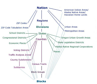
- Nation
- Zip Codes
- Zip Code Tabulation Areas
- Urban Areas
- Metropolitan Areas
- American Indian, Alaska Native & Native Hawaiian Areas
- Regions
- Divisions
- States
- School Districts
- Congressional Districts
- Economic Places
- Oregon Urban Growth Areas
- State Legislative Districts
- Alaska Native Regional Corporations
- Places
- Counties
- Voting Districts
- Traffic Analysis Zones
- County Subdivisions
- Subbarrios
- Census Tracts
- Block Groups
- Blocks
- Zip Codes
- Zip Code Tabulation Areas
- Urban Areas
- Metropolitan Areas
- American Indian, Alaska Native & Native Hawaiian Areas
- School Districts
- Congressional Districts
- Economic Places
- Oregon Urban Growth Areas
- State Legislative Districts
- Alaska Native Regional Corporations
- Places
- Voting Districts
- Traffic Analysis Zones
- County Subdivisions
- Subbarrios
4. American Community Survey
Beginning in 2010, the American Community Survey (ACS) replaced the "long form" that was used to collect sample data in past decennial censuses. Instead of sampling one in six households every ten years (about 18 million households in 2000), the ACS samples 2-3 million households every year. The goal of the ACS is to enable Census Bureau statisticians to produce more timely estimates of the demographic, economic, social, housing, and financial characteristics of the U.S. population. You can view a sample ACS questionnaire by entering the keywords "American Community Survey questionnaire" into your favorite Internet search engine.
Try This!
Acquiring and Understanding American Community Survey (ACS) Data
The purpose of this practice activity is to guide your exploration of ACS data and methodology. In the end, you should be able to identify the types of geographical areas for which ACS data are available; to explain why 1-year and 3-year estimates are available for some areas and not for others; and to describe how the statistical reliability of ACS estimates vary among 1-year, 3-year, and 5-year estimates.
- Return to the U.S. Census Bureau site.
- Click the Surveys/Programs tab and follow the link to American Community Survey (ACS). This takes you to the MAIN American Community Survey page.
- Begin by clicking the Guidance for Data Users link and looking through the information available there.
Note the link to Handbooks for Data Users.
Under the More Guidance for Data Users Topics heading, pay particular attention to the When to use… section with its descriptions of the various estimates (1-, 3- and 5-year), and to the section on Comparing ACS Data to other census data. If you are so inclined, there is also a link to a listing of Training Presentations under this same heading. (You might benefit from Understanding Multiyear Estimates... offering.) - Next, hover your mouse cursor over the Data link located in the navigation list on the left side of the ACS page, and note what entries are there:
You can download ACS data to make maps and analyses using your own GIS or statistical software. Find download links and pertinent information in the sections titled Data via FTP and Summary File Data.
There is also a section pertaining to Public Use Microdata Sample (PUMS). PUMS data are edited, however, to protect the confidentiality of individuals and households.
In the remaining steps, you will make a map or two to reinforce the geographies covered by the American Community Survey. You will map data from your home (or adopted) state. - You first need to go to the MAIN American FactFinder site, then follow the Advanced Search / SHOW ME ALL link, click the Topics search box, then expand the Program list and choose American Community Survey. Close the Select Topics overlay window.)
- Click the Geographies search options box (on the left) to reveal the Select Geographies overlay window.
Under Select, a geographic type, click County - 050.
Next, from the Select a state list, choose your state.
Then, from the Select one or more geographic areas... list, choose All Counties within <your state>.
Then, click ADD TO YOUR SELECTIONS. This will add the All Counties… entry to the Your Selections list.
Close the Select Geographies overlay window. - In the Search Results window, note that there are many datasets that have 1-, 3- and 5-year estimates entries.
Decide upon a 1-Year dataset to look at and check the box for it.
Then click View.
On the new Table Viewer page that you land on, be sure that the Create a Map choice is blue – not grayed out. (If it is grayed out, click the BACK TO ADVANCED SEARCH button and make sure only one dataset box is checked, or make a different choice, then click View again.)
Click on Create a Map. The data values in the table will turn blue, and you will be prompted to “Click on a data value in the table to map.” Clicking a single data value from any row will allow you to map the data in that row for all of the counties for which it is available. Click on a blue data value of your choice – remember which row you choose. Click on the SHOW MAP button in the small popup window that appears.Are all of the counties in the state symbolized as having data? Why not?
- Now, click the BACK TO ADVANCED SEARCH button. Un-check the box for the 1-year dataset, and check the box for the 5-year estimate of the same category. Proceed as above to map the data. After the map is refreshed, note how many counties now exhibit data.
Take a look at the 3-year estimates for the same dataset if you wish, though they may not be available for the more recent years.
5. International Data
The International Data Base is published on the web by the Census Bureau's International Programs Center. It combines demographic data compiled from censuses and surveys of some 227 countries and areas of the world, along with estimates produced by Census Bureau demographers. Data variables include population by age and sex; vital rates, infant mortality, and life tables; fertility and child survivorship; migration; marital status; family planning; ethnicity, religion, and language; literacy; and labor force, employment, and income. Census and survey data are available by country for selected years from 1950; projected data are available through 2050. The International Data Base allows you to download attribute data in formats appropriate for thematic mapping.
Try This!
Acquiring World Demographic Data via the World Wide Web
The purpose of this practice activity is to guide you through the process of finding and acquiring demographic data for the countries of the world from the U.S. Census Bureau data via the web. Your objective is to retrieve population change rates for a country of your choice over two or more years.
- Return to the U.S. Census Bureau site.
- Click the Topics tab, expand the Population list and click on International. That will take you to the International Programs page.
Click on the Data tab and then click on International Data Base (IDB). - Choose a data theme you are interested in from the Select Report pick list. The choices have to do with births and mortality, population change including such things as migration, population by age group, etc. (The Population Pyramid Graph choice gives you
a graph(s) rather than a data table.)
Data tables are available by Country or by Region.
From the Select one or more Countries or Areas pick list, you can specify that you want data for a single country or for a collection of countries, and from the Select up to 25 Years pick list you can specify that you want data for more than a single year. See the instructions in small text at the bottom of the window on how to select multiple entries from the selection boxes.
From the Select Region(s) selection box, you can choose from pre-selected groupings of countries. - Now, choose a single country under Country Search and select two or more years from the Select up to 25 Years pick list.
Then click SUBMIT.
You will see a summary table or plot of the data for your selected country and years. - Click the Search button to go back and experiment with the choices in the Select Region(s) selection box and the Aggregation Options choice list.
For your information: to download an Excel (.xls) or an comma-delimited text file (.csv) version of the data, find the respective link on the Results page: "Excel" or "CSV"
Download links may not appear when the search has been broad.
6. Counts, Rates, and Densities
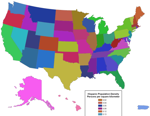
The raw data collected during decennial censuses are counts--whole numbers that represent people and housing units. The Census Bureau aggregates counts to geographic areas such as counties, tracts, block groups, and blocks, and reports the aggregate totals. In other cases, summary measures, such as averages and medians, are reported. Counts can be used to ensure that redistricting plans comply with the constitutional requirement that each district contain equal population. Districts are drawn larger in sparsely populated areas, and smaller where population is concentrated. Counts, averages, and medians cannot be used to determine that districts are drawn so that minority groups have an equal probability of representation, however. For this, pairs of counts must be converted into rates or densities. A rate, such as Hispanic population as a percentage of total population, is produced by dividing one count by another. A density, such as persons per square kilometer, is a count divided by the area of the geographic unit to which the count was aggregated. In this chapter, we'll consider how the differences between counts, rates, and densities influence the ways in which the data may be processed in geographic information systems and displayed on thematic maps.
7. Attribute Measurement Scales
Chapter 2 focused upon measurement scales for spatial data, including map scale (expressed as a representative fraction), coordinate grids, and map projections (methods for transforming three dimensional to two dimensional measurement scales). You may know that the meter, the length standard established for the international metric system, was originally defined as one-ten-millionth of the distance from the equator to the North Pole. In virtually every country except the United States, the metric system has benefited science and commerce by replacing fractions with decimals, and by introducing an Earth-based standard of measurement.
Standardized scales are needed to measure non-spatial attributes as well as spatial features. Unlike positions and distances, however, attributes of locations on the Earth's surface are often not amenable to absolute measurement. In a 1946 article in Science, a psychologist named S. S. Stevens outlined a system of four levels of measurement meant to enable social scientists to systematically measure and analyze phenomena that cannot simply be counted. (In 1997, geographer Nicholas Chrisman pointed out that a total of nine levels of measurement are needed to account for the variety of geographic data.) The levels are important to specialists in geographic information because they provide guidance about the proper use of different statistical, analytical, and cartographic operations. In the following, we consider examples of Stevens' original four levels of measurement: nominal, ordinal, interval, and ratio.
8. Nominal Level
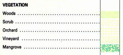
Data produced by assigning observations into unranked categories are said to be nominal level measurements. Nominal categories can be differentiated and grouped into categories, but cannot logically be ranked from high to low (unless they are associated with preferences or other exogenous value systems). For example, one can classify the land cover at a certain location as woods, scrub, orchard, vineyard, or mangrove. One cannot say, however, that a location classified as "woods" is twice as vegetated as another location classified "scrub." The phenomenon "vegetation" is a set of categories, not range of numerical values, and the categories are not ranked. That is, "woods" is in no way greater than "mangrove," unless the measurement is supplemented by a preference or priority.
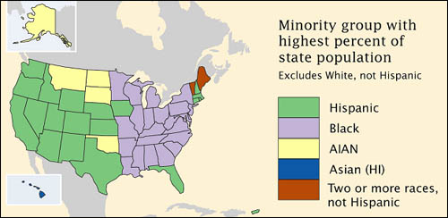
Although census data originate as counts, much of what is counted is individuals' membership in nominal categories. Race, ethnicity, marital status, mode of transportation to work (car, bus, subway, railroad...), type of heating fuel (gas, fuel oil, coal, electricity...), all are measured as numbers of observations assigned to unranked categories. For example, the map below in Figure 3.9.2, which appears in the Census Bureau's first atlas of the 2000 census, highlights the minority groups with the largest percentage of population in each U.S. state. Colors were chosen to differentiate the groups, but not to imply any quantitative ordering.
9. Ordinal Level
Like the nominal level of measurement, ordinal scaling assigns observations to discrete categories. Ordinal categories are ranked, however. It was stated in the preceding page that nominal categories such as "woods" and "mangrove" do not take precedence over one another unless an extrinsic set of priorities is imposed upon them. In fact, the act of prioritizing nominal categories transforms nominal level measurements to the ordinal level.
Examples of ordinal data often seen on reference maps include political boundaries that are classified hierarchically (national, state, county, etc.) and transportation routes (primary highway, secondary highway, light-duty road, unimproved road). Ordinal data measured by the Census Bureau include how well individuals speak English (very well, well, not well, not at all), and level of educational attainment. Social surveys of preferences and perceptions are also usually scaled ordinally.
Individual observations measured at the ordinal level typically should not be added, subtracted, multiplied, or divided. For example, suppose two 640-acre grid cells within your county are being evaluated as potential sites for a hazardous waste dump. Say the two areas are evaluated on three suitability criteria, each ranked on a 0 to 3 ordinal scale, such that 0 = unsuitable, 1 = marginally unsuitable, 2 = marginally suitable, and 3 = suitable. Now say Area A is ranked 0, 3, and 3 on the three criteria, while Area B is ranked 2, 2, and 2. If the Siting Commission was to simply add the three criteria, the two areas would seem equally suitable (0 + 3 + 3 = 6 = 2 + 2 + 2), even though a ranking of 0 on one criterion ought to disqualify Area A.
10. Interval and Ratio Levels
Interval and ratio are the two highest levels of measurement in Stevens' original system. Unlike nominal- and ordinal-level data, which are qualitative in nature, interval- and ratio-level data are quantitative. Examples of interval level data include temperature and year. Examples of ratio level data include distance and area (e.g., acreage). The scales are similar in so far as units of measurement are arbitrary (Celsius versus Fahrenheit, Gregorian versus Islamic calendar, English versus metric units). The scales differ in that the zero point is arbitrary on interval scales, but not on ratio scales. For instance, zero degrees Fahrenheit and zero degrees Celsius are different temperatures, and neither indicates the absence of temperature. Zero meters and zero feet mean exactly the same thing, however. An implication of this difference is that a quantity of 20 measured at the ratio scale is twice the value of 10, a relation that does not hold true for quantities measured at the interval level (20 degrees is not twice as warm as 10 degrees).
Because interval and ratio level data represent positions along continuous number lines, rather than members of discrete categories, they are also amenable to analysis using inferential statistical techniques. Correlation and regression, for example, are commonly used to evaluate relationships between two or more data variables. Such techniques enable analysts to infer not only the form of a relationship between two quantitative data sets, but also the strength of the relationship.
11. Levels and Operations
One reason that it's important to recognize levels of measurement is that different measurement scales are amenable to different analytical operations (Chrisman 2002). Some of the most common operations include:
- Group: Categories of nominal and ordinal data can be grouped into fewer categories. For instance, grouping can be used to reduce the number of land use/land cover classes from, say, four (residential, commercial, industrial, parks) to one (urban).
- Isolate: One or more categories of nominal, ordinal, interval, or ratio data can be selected, and others set aside. As a hypothetical example, consider a range of georeferenced soil moisture readings taken over a farm field. A subrange of readings that are amenable to a particular fertilizer or pesticide might be isolated so that application is limited to the appropriate areas of the field.
- Cross tab: Two or more sets of nominal or ordinal categories can be associated one to another in pairs, triplets, etc. Chrisman (2002) points to the multicharacter codes used in the National Wetland Inventory as an example of a cross tab. Each position in the NWI code represents a particular attribute. Each unique code, therefore, represents a cross tabulation of the possible combinations of attributes.
- Difference: The difference of two interval level observations (such as two calendar years) results in one ratio level observation (such as one age).
- Other arithmetic operations: Two or more compatible sets of ratio or interval level data can be added, subtracted, multiplied, or divided. For example, the per capita (average) income of a census tract can be calculated by dividing the sum of the income of every individual in a census tract (a ratio level variable) by the sum of persons residing in the tract (a second ratio level variable).
- Classification: Interval and ratio data are frequently sorted into ordinal level categories for thematic mapping.
12. Thematic Mapping
Unlike reference maps, thematic maps are usually made with a single purpose in mind. Typically, that purpose has to do with revealing the spatial distribution of one or two attribute data sets.
In this section, we will consider distinctions among three types of ratio level data, counts, rates, and densities. We will also explore several different types of thematic maps, and consider which type of map is conventionally used to represent the different types of data. We will focus on what is perhaps the most prevalent type of thematic map, the choropleth map. Choropleth maps tend to display ratio level data which have been transformed into ordinal level classes. Finally, you will learn two common data classification procedures, quantiles and equal intervals.
13. Graphic Variables
Maps use graphic symbols to represent the locations and attributes of phenomena distributed across the Earth's surface. Variations in symbol size, color lightness, color hue, and shape can be used to represent quantitative and qualitative variations in attribute data. By convention, each of these "graphic variables" is used to represent a particular type of attribute data.
14. Counts, Rates, and Densities
Ratio level data predominate on thematic maps. Ratio data are of several different kinds, including counts, rates, and densities. As stated earlier, counts (such as total population) are whole numbers representing discrete entities, such as people. Rates and densities are produced from pairs of counts. A rate, such as percent population change, is produced by dividing one count (for example, population in year 2) by another (population in year 1). A density, such as persons per square kilometer, is a count divided by the area of the geographic unit to which the count was aggregated (e.g., total population divided by number of square kilometers). It is conventional to use different types of thematic maps to depict each type of ratio-level data.
15. Mapping Counts
The simplest thematic mapping technique for count data is to show one symbol for every individual counted. If the location of every individual is known, this method often works fine. If not, the solution is not as simple as it seems. Unfortunately, individual locations are often unknown, or they may be confidential. Software like ESRI's ArcMap, for example, is happy to overlook this shortcoming. Its "Dot Density" option causes point symbols to be positioned randomly within the geographic areas in which the counts were conducted. The size of dots and the number of individuals represented by each dot are also optional. Random dot placement may be acceptable if the scale of the map is small so that the areas in which the dots are placed are small. Often, however, this is not the case.
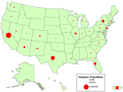
An alternative for mapping counts that lack individual locations is to use a single symbol, a circle, square, or some other shape, to represent the total count for each area. ArcMap calls the result of this approach a Proportional Symbol map. In the map shown below in Figure 3.16.2, the size of each symbol varies in direct proportion to the data value it represents. In other words, the area of a symbol used to represent the value "1,000,000" is exactly twice as great as a symbol that represents "500,000." To compensate for the fact that map readers typically underestimate symbol size, some cartographers recommend that symbol sizes be adjusted. ArcMap calls this option "Flannery Compensation" after James Flannery, a research cartographer who conducted psychophysical studies of map symbol perception in the 1950s, 60s, and 70s. A variant on the Proportional Symbol approach is the Graduated Symbol map type, in which different symbol sizes represent categories of data values rather than unique values. In both of these map types, symbols are usually placed at the mean locations, or centroids, of the areas they represent.
16. Mapping Rates and Densities
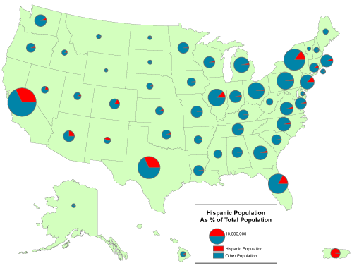
A rate is a proportion between two counts, such as Hispanic population as a percentage of total population. One way to display the proportional relationship between two counts is with what ArcMap calls its Pie Chart option. Like the Proportional Symbol map, the Pie Chart map plots a single symbol at the centroid of each geographic area by default, though users can opt to place pie symbols such that they won't overlap each other (This option can result in symbols being placed far away from the centroid of a geographic area.) Each pie symbol varies in size in proportion to the data value it represents. In addition, however, the Pie Chart symbol is divided into pieces that represent proportions of a whole.
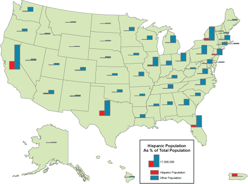
Some perceptual experiments have suggested that human beings are more adept at judging the relative lengths of bars than they are at estimating the relative sizes of pie pieces (although it helps to have the bars aligned along a common horizontal base line). You can judge for yourself by comparing the effect of ArcMap's Bar/Column Chart option.
Like rates, densities are produced by dividing one count by another, but the divisor of a density is the magnitude of a geographic area. Both rates and densities hold true for entire areas, but not for any particular point location. For this reason, it is conventional not to use point symbols to symbolize rate and density data on thematic maps. Instead, cartography textbooks recommend a technique that ArcMap calls "Graduated Colors." Maps produced by this method, properly called choropleth maps, fill geographic areas with colors that represent attribute data values.
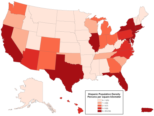
Because our ability to discriminate among colors is limited, attribute data values at the ratio or interval level are usually sorted into four to eight ordinal level categories. ArcMap calls these categories classes. Users can adjust the number of classes, the class break values that separate the classes, and the colors used to symbolize the classes. Users may choose a group of predefined colors, known as a color ramp, or they may specify their own custom colors. Color ramps are sequences of colors that vary from light to dark, where the darkest color is used to represent the highest value range. Most textbook cartographers would approve of this, since they have long argued that it is the lightness and darkness of colors, not different color hues, that most logically represent quantitative data.
Logically or not, people prefer colorful maps. For this reason some might be tempted to choose ArcMap's Unique Values option to map rates, densities, or even counts. This option assigns a unique color to each data value. Colors vary in hue as well as lightness. This symbolization strategy is designed for use with a small number of nominal level data categories. As illustrated in the map below (Figure 3.17.4), the use of an unlimited set of color hues to symbolize unique data values leads to a confusing thematic map.
17. Data Classification
You've read several times already in this text that geographic data is always generalized. As you recall from Chapter 1, generalization is inevitable due to the limitations of human visual acuity, the limits of display resolution, and especially to the limits imposed by the costs of collecting and processing detailed data. What we have not previously considered is that generalization is not only necessary, it is sometimes beneficial.
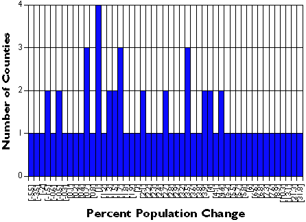
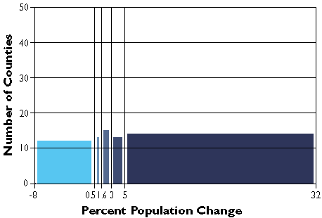
Generalization helps make sense of complex data. Consider a simple example. The graph below (Figure 3.18.1) shows the percent population change for Pennsylvania's 67 counties over a five-year period. Categories along the x axis of the graph represent each of the 49 unique percentage values (some of the counties had exactly the same rate). Categories along the y axis are the numbers of counties associated with each rate. As you can see, it's difficult to discern a pattern in these data.
The following graph shows exactly the same data set, only grouped into 7 classes. It's much easier to discern patterns and outliers in the classified data than in the unclassified data. Notice that the mass of population change rates are distributed around 0 to 5 percent, and that there are two counties (x and y counties) whose rates are exceptionally high. This information is obscured in the unclassified data.
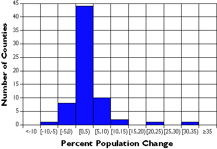
| Percent Population Change | Number of Counties |
|---|---|
| Less than -10 | 0 |
| [-10, -5) | 1 |
| [-5, 0) | 8 |
| [0, 5) | 44 |
| [5, 10) | 10 |
| [10, 15) | 2 |
| [15, 20) | 0 |
| [20, 25) | 1 |
| [25, 30) | 0 |
| [30, 35) | 1 |
| Greater than or equal to 35 | 0 |
Data classification is a means of generalizing thematic maps. Many different data classification schemes exist. If a classification scheme is chosen and applied skillfully, it can help reveal patterns and anomalies that otherwise might be obscured. By the same token, a poorly-chosen classification scheme may hide meaningful patterns. The appearance of a thematic map, and sometimes conclusions drawn from it, may vary substantially depending on data classification scheme used.
18. Two Classification Schemes
Many different systematic classification schemes have been developed. Some produce "optimal" classes for unique data sets, maximizing the difference between classes and minimizing differences within classes. Since optimizing schemes produce unique solutions, however, they are not the best choice when several maps need to be compared. For this, data classification schemes that treat every data set alike are preferred.
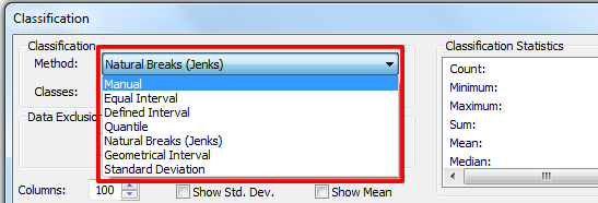
Two commonly used schemes are quantiles and equal intervals ("quartiles," "quintiles," and "percentiles" are instances of quantile classifications that group data into four, five, and 100 classes respectively). The following two graphs illustrate the differences.
The graph in Figure 3.19.2 groups the Pennsylvania county population change data into five classes, each of which contains the same number of counties (in this case, approximately 20 percent of the total in each). The quantiles scheme accomplishes this by varying the width, or range, of each class.
In the second graph, Figure 3.19.3, the width or range of each class is equivalent (8 percentage points). Consequently, the number of counties in each equal interval class varies.
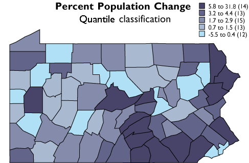
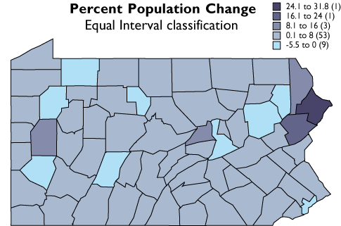
As you can see, the effect of the two different classification schemes on the appearance of the two choropleth maps above is dramatic. The quantiles scheme is often preferred because it prevents the clumping of observations into a few categories shown in the equal intervals map. Conversely, the equal interval map reveals two outlier counties which are obscured in the quantiles map. A good point to take from this little experiment is that it is often useful to compare the maps produced by several different map classifications. Patterns that persist through changes in classification scheme are likely to be more conclusive evidence than patterns that shift.
19. Calculating Quantile Classes
The objective of this section is to ensure that you understand how mapping programs like ArcMap classify data for choropleth maps. First, we will step through the classification of the Pennsylvania county population change data. Then you will be asked to classify another data set yourself.
Step 1: Sort the data.
Attribute data retrieved from sources like the Census Bureau's website are likely to be sorted alphabetically by geographic area. To classify the data set, you need to resort the data from the highest attribute data value to the lowest.
Step 2: Define the number of classes.
There are no absolute rules on this. Since our ability to differentiate colors is limited, the more classes you make, the harder they may be to tell apart. In general, four to eight classes are used for choropleth mapping. Use an odd number of classes if you wish to visualize departures from a central class that contains a median (or zero) value.
Step 3: Determine class breaks by dividing the number of observations by the number of classes.
For example, 67 counties divided by 5 classes yields 13.4 counties per class. Obviously, in cases like this, the number of counties in each class has to vary a little. Make sure that counties having the same value are assigned to the same class, even if that class ends up with more members than other classes.
Step 4: Assign color symbols to differentiate the categories.
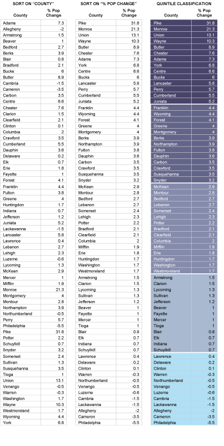
Figure 3.20.1, below, shows three iterations of a data table. The first (on the left) is sorted alphabetically by county name. The middle table is sorted by percent population change, in descending order. The third table breaks the re-sorted counties into five quintile categories. Normally, you would classify the data and symbolize the map using GIS software, of course. The illustration includes the colors that were used to symbolize the corresponding choropleth map on the preceding page. If you'd like to try sorting the data table illustrated below, follow this link to open the spreadsheet file.
20. Summary
National censuses, such as the decennial census of the U.S., are among the richest sources of attribute data. Attribute data are heterogeneous. They range in character from qualitative to quantitative; from unranked categories to values that can be positioned along a continuous number line. Social scientists have developed a variety of different measurement scales to accommodate the variety of phenomena measured in censuses and other social surveys. The level of measurement used to define a particular data set influences analysts' choices about which analytical and cartographic procedures should be used to transform the data into geographic information.
Thematic maps help transform attribute data by revealing patterns obscured in lists of numbers. Different types of thematic maps are used to represent different types of data. Count data, for instance, are conventionally portrayed with symbols that are distinct from the statistical areas they represent, because counts are independent of the sizes of those areas. Rates and densities, on the other hand, are often portrayed as choropleth maps, in which the statistical areas themselves serve as symbols whose color lightness vary with the attribute data they represent. Attribute data shown on choropleth maps are usually classified. Classification schemes that facilitate comparison of map series, such as the quantiles and equal intervals schemes demonstrated in this chapter, are most common.
The U.S. Census Bureau's mandate requires it to produce and maintain spatial data as well as attribute data. In Chapter 4, we will study the characteristics of those data, which are part of a nationwide geospatial database called "TIGER."