Chapter 4. Equations, Figures, and Tables
Chapter 4 Introduction
To underscore the importance of good figure design and captioning, I like to use the following example. Consider this dubiously famous roughhewn figure, which includes no caption:
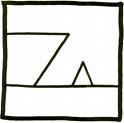
I wager that few viewers of this figure would be able to fathom what it is meant to represent, and those who guess correctly would probably do so only because they had seen the figure before, properly captioned.
Now consider the figure with the caption added:
to Save a Drowning Witch (Zappa, 1982).
Without the caption—even though we have all seen simple line drawings, ships, and witch hats—we’re unlikely to grasp the figure’s meaning. With the aid of the helpful, thoroughly worded caption, however, we can easily understand (and be delighted by) the figure’s intended purpose. And with the citation at the end of the caption, we can turn to a References page to discover that this figure is cover art from a 1982 Frank Zappa album cover. This example provides a simple demonstration of how critical it is to write helpful figure captions, and shows how even the simplest graphic can be enigmatic to the reader (especially when not drawn to scale, as in the Zappa figure) when effective clues about its meaning are absent.
Figures, equations, and tables must be presented so that readers can rapidly understand their purpose in your work. They represent opportunities to present your ideas, explanations, and experimental results in a form that is professional, aesthetic, and—tell the truth—even fun. The computer has truly revolutionized the typing of equations and the presentation of graphics for us. However, some professors long for the days when figures had to be drawn laboriously by hand, because the cost and the labor made it inviting to keep figures and tables to a minimum. Now, graphic overkill is common, especially by advanced students; some professors call it the USA Today mentality. We must keep in mind that graphics are a means to an end, not an end in themselves.
Also, since readers might leap right to a table or figure while reading an article, it is vital that each table or figure is meaningfully presented and works both independently and as part of the text. Carefully study the tables and figures published in the best journals in your field, and apply the same conventions of presentation to your own work.
This chapter’s aim is not to make it easier for you to create equations, figures, or tables—computer software has made their creation easy enough—but to teach you how to make your presentation of them professional. For much more on how to present tables and figures, and for a nifty review of the different types, I highly recommend Paul V. Anderson’s Technical Writing: A Reader-Centered Approach. I have looked at over 40 textbooks that give space to the subject, and Anderson’s chapters are the best I have seen.
Self-Study
Browse these two websites for advice on presenting data in research papers:
The aptly named "resources for the ambitious undergraduate or beginning graduate researcher in astronomy and astrophysics"
"The Data Analysis BriefBook" on statistics, computing, analysis, and related fields
Style for Equations
This section offers concrete advice about some of the mechanics of style for presenting equations. For specific rules about such details as punctuation, spacing, or the flushing of elements, the best idea is to check out a journal or textbook in your field and learn by example.
Self-Study
To review basic principles of equations, study these sites:
"How to Set Up Algebraic Equations to Match Word Problems" page from homeschoolmath.net
"Fundamental Principles of Algebra" page from ibiblio.org
In the absence of any rules about how equations are presented in a particular class, follow these best practices when using equations:
- Set off and center equations on their own separate lines of text if the equations are long, contain more than one or two symbols that must be identified, or contain expressions with numerators and denominators that fall on different lines.
- When you center an equation, skip a line above and below it, and skip an extra line or two if the equation includes any symbols of more than letter height. Make the equation easy to find and easy to read.
- When appropriate, define any symbols that you use.
- If possible, do not let an equation spill from one page to another.
- Equations are not always numbered, especially if only a handful occur in a paper. However, if you need to refer back to equations already introduced in the text, you should number all equations in sequence. Do this by identifying the number of the equation in parentheses at the right-hand margin of the line on which the equation appears. Then you can readily refer back to it with a phrase such as "Equation 3 describes a contrasting relationship."
- When numbering an equation, be sure the number is set far enough away from it that it does not seem to be a member of the equation.
Equations as Sentence Parts
The following advice will help you to integrate equations into your sentences and understand them as grammatical units.
- Grammatically, you can think of an equation as a single noun and generally treat it as such. Usually an equation is followed by a comma after it is presented (especially when followed by descriptions of its individual members) or by a period if the sentence has ended. Some journals do not follow the equation with any punctuation marks, relying on the wording of the sentence alone to carry the meaning.
- Short and uncomplicated equations can simply be included as part of a sentence without any special spacing. However, be sure that the equation flows as a readable unit of the sentence. Example:
The equation 2H2+1O2 →2H2O represents how hydrogen and oxygen react to form water.
- It is common to use the word "we" to introduce equations to enhance efficiency, foster readability, and promote the active voice. Handy phrases with which to introduce equations include "we can express," "we can approximate," and "we can describe." Example:
We can express the distance of this transition region by the equation . . .
- If an equation is too long for a single line, break it just before a "verb" (such as the = sign) or a "conjunction" (such as the + sign) and make the following symbol the first member of the next line, then continue the equation.
- When appropriate, define members of the equation just after you present it, usually by introducing them with the word "where." For example, if you wanted to define "t" and "n" just after they appeared in an equation, a phrase such as this would appear: "where t is the film thickness and n is a constant equal to 0.4."
- Unlike a figure or table, an equation does not "stand alone" in a paper. Always use the wording that precedes an equation to introduce it, thus making it a distinct member of a particular sentence.
Sample Equation
In the simple sample equation that follows, note how the equation is followed by a comma and is presented as a grammatical member of a smooth, simple, fluid sentence. Note also the use of semicolons and commas to separate members of the equation as each is described.
The duration of the heating cycle can be approximated by the equation
t = 2RtCt,
where t = cycle time, s; Rt= resistance, Ω and Ct = capacitance, F.
Writing Equations with LaTeX
If your field requires you to use equations regularly, and especially if you plan to write a paper or publish an article or book that includes multiple and complex equations, the computer language that you are likely to have to use is called LaTeX. LaTeX, originally developed in the 1980s by Leslie Lamport, allows you to generate camera-ready format and equations using predefined macros rather than all manual text. If you need to publish your material on the web, LaTeX is especially valuable, since you can easily convert an equation to a pdf and post it on the web in a format that will be readable no matter what browser your reader is using.
Writers unfamiliar with using LaTeX tend to start with a tutorial, such as this basic "quick and dirty LaTeX tutorial", this one from Drexel University, or with Leslie Lamport’s definitive book LaTeX: A Document Preparation System.
Self-Study
Free tips and tricks for using LaTeX abound on the web. Here are two recommended sites:
Basic LaTeX tips from the University of Illinois Department of Mathematics
"LaTeX: Tips and Tricks" from wikibooks.org
Figures and Tables Overview
Because figures and tables can now be created by just a few keystrokes, it is tempting to swamp the reader with them or get caught up so much in bells and whistles that fundamentals are ignored. Some papers include oversized three-dimensional objects to display one-dimensional data, the illogical use of a different color to represent each data point, or fancy fonts and special effects that dazzle the eye but confuse the mind. Just as commonly, there is a lack of elemental detail or care: Xeroxed figures or tables from a textbook with the original (and therefore inaccurate) page numbers not even whited out; a figure whose caption is simply "Costs"; undefined terms, unlabeled axes, uncited data. The list could go on for too long.
Yet these errors are just as easily avoided as committed, especially if you only use figures and tables when it is appropriate to do so. Tables and figures are supposed to be designed to simplify and condense the presentation of what is otherwise complex information. Their function is to save the reader time, enhance comprehension, and allow rapid comparison and interpretation of relationships or trends. Remember this as you prepare figures and tables, and present them accordingly. Further, understand the inherent problems associated with data sets that are either too large or too small, the need for proper scale, both the pitfalls and value of color, and that good graphics are purposed to make sense of data, not vice versa.
Self-Study
Excellent discussions of figure and table basics await you at these sites:
"Advice on creating tables and figures" from Bates College
Using Statistics in Figures and Tables
As you prepare figures and tables, remember how not to lie with statistics. One could accurately report that the real income of United States households was nearly the same in 1969 and 1992. However, according to an April 24, 1995, article in Forbes magazine, the real income per person grew by almost 40 percent in that span of time, because average family size and average household size declined. As this example demonstrates, effective data presentation and description often require you to set proper context.
For an excellent review of how to achieve graphical excellence, chase down and study Edward R. Tufte’s The Visual Display of Quantitative Information. To gain insight into how to avoid choosing statistics merely for the occasion, track down a copy of Darrell Huff’s ironically titled classic, How to Lie with Statistics.
Self-Study
Entertaining webpages written by scientists on typical errors of data analysis reside at:
"Popular Pitfalls of Data Analysis" from a Research Fellow at the Norwegian University of Science and Technology
"Pitfalls of Data Analysis" article from Clay Helberg
Fundamentals for Figures
Whether they be pie charts or digital stills, figures are fundamentally defined as drawn or photographed pictures. Basics about how they are used follow:
- Be sure to name figures properly; do not accidentally call them tables, even if they include words and numbers.
- As a general rule, orient figures from left to right, in that readers are used to following that path with their eyes.
- Use line graphs to plot continuous variables, such as time or temperature. Line graphs are especially handy to show relationships among measured variables.
- Use pie charts or bar graphs to depict discontinuous variables, such as percentages or sampling that occurred in intervals. Pie charts are especially useful when you wish to show the relation of parts to a whole.
- Use photographs or drawings for material that is large in scale, such as a cloud or an office building, or very small in scale, such as the grain boundaries of a sample.
- Use flowcharts to represent pathways of activities and outcomes. Most flowcharts use simple geometric shapes (circles, rectangles) to represent activities and arrows to indicate change from one event to the next.
- If possible, label the axes of graphs with full words: "Temperature versus time" rather than "T versus t."
- Be certain that your legend—that part of the figure where you define any symbols or other visual markers that appear—is readable, clear, and meaningfully placed. As long as it does not overwhelm the rest of the figure, do not be afraid to make the legend large to enhance its readability.
- Use footnotes (a simple asterisk to indicate them will do) for explanatory material such as the number of respondents to a survey or the fact that certain values were estimated.
Fundamentals for Tables
By definition, tables are lists of words or numbers arranged in columns and rows. Follow these practices when creating them:
- Be sure to name tables properly; do not accidentally call them figures. The basic difference between them is that tables do not involve pictures.
- Make certain that each entry in the left-most column (called the stub) applies across its entire row, and that each column heading pertains to all entries beneath it.
- Arrange stub items by a logic suited to the context—largest to smallest, alphabetically, by category, or for emphasis.
- Straight lines are often used to separate the table’s title from the column heads, the column heads from the body of the table, and the bottom of the table from the paper’s text or the table’s footnotes. Boxes around and within the table are also appropriate, especially if they aid the eye in vertical movement.
- If possible, construct a table so that the reader’s eye can primarily travel down a column rather than have to read along a row.
- Use footnotes (a simple asterisk to indicate them will do) for important explanatory material such as the provider of testing equipment or the fact that a particular sample became contaminated.
Aesthetics for Figures and Tables
Making figures and tables look good requires you to consider elements such as color, organization, readability, and visual clarity. To be certain your figures and tables have aesthetic appeal, heed these practices:
- Do not crowd a table or figure, neither within itself nor within your text; give it room to breathe. When it appears amidst your body text, skip at least one line above and below it.
- Always beware of creating a 3-D or special effects monster. Do not clutter any visual information with needless items or parts. Every item in the table or figure should have a function—therefore do not do things such as number items unless the numbers actually carry meaning.
- Organize information so that it is prioritized and easily seen. It is acceptable to highlight a part of a picture or boldface a column of a table to emphasize it, but be certain to explain such emphasis in the caption.
- As a general rule, place figures and tables right in the text as soon as possible after they are mentioned. If the figure or table cannot be imbedded into the body text, it is common to put it on a separate numbered page that appears on the page immediately following the first body text reference. It is also generally acceptable to include all tables and figures, in order, on separate pages at the end of the document just after the references page, especially in a lengthy paper or thesis.
- Give each table and figure its own separate page unless it is logical to group them together.
- If it can be avoided, no single figure or table should spill over to a second page. To keep this from happening, you may orient the table or figure horizontally or break it into parts.
- Rule of thumb: Try to present the table or figure so that it would make sense even if ripped from the paper.
Textual References to Figures and Tables
When integrating references to figures and tables within your text, follow these guidelines:
- Number figures and tables consecutively in the text, beginning with the number 1. Be sure to number figures and tables separately from each other.
- Capitalize the "t" in "table" and the "f" in "figure" when you refer to a specific table or figure created in your text. (Some journals do not follow this convention, but most do.)
- "Table 3 and 4" is incorrect because each table is a separate entity. If you refer to more than one table or figure at a time, pluralize the reference. "Tables 3 and 4" is correct.
- Introduce figures and tables in your text in logical places and in logical ways. In some cases, it may simply be appropriate to write "see Figure 7" in parentheses at the end of a paragraph that prepared the reader to view the figure; in other cases, it is appropriate to introduce a figure or table at the beginning of the paragraph and build the entire paragraph around it.
- In your body text, always spell out the point that you want your reader to get from your figure or table. Example:
As Figure 8 indicates, the modulus of the transverse direction was always equal to or greater than the modulus of the machine direction.
- Use some of your body text to interpret a table or figure, but only to a sensible degree, and after it is introduced rather than before. When interpreting, avoid needless redundancy. If your pie chart shows percentages for the market distribution of platinum, say, there is no point in your repeating all these percentages in your body text unless you have something meaningful to say about them.
- When a reference to a table or a figure is a sentence subject, match it with an interpretive verb to describe the work that the table or figure performs. Examples:
Figure 2 illustrates the predominant orientation of acicular particles in magnetic storage material.
Figure 5 compares two magnetization curves for hard and soft magnetic materials.
- "Show" is generally a safe verb to use to describe a table or figure, but beware of overusing it or using it too loosely. Good alternatives to "show" include "display," "demonstrate," "illustrate," "depict" (for figures), and "list" (for tables). As always, search for the best verb to describe your figure or table. For ideas on active verbs you can use to refer to figures and tables, see the handy table on the "Using Active Verbs" page in chapter 1 of this manual.
Captions for Figures and Tables
In papers written for classes and submitted to journals, every table and figure should include a caption, honoring these common practices:
- The caption for a figure appears below the graphic; for a table, above. It is easy to get this wrong accidentally.
- Typically, boldface or underscore the word "Figure" or "Table" and the associated number in the caption, then present the caption in plain text with only the initial letter of the caption and any proper names in the caption capitalized (see example below).
- Always concentrate on completeness and concreteness as you caption figures and tables. "Figure 3: Air flow" is far less illuminating and accurate than the following:
Figure 3. The motion of a parcel of air as it flows across a mountain.
- Do not be afraid to use lengthy figure and table captions—better that than confusing or incomplete ones.
- If your figure or table is essentially the same as or based on another author’s, but you recreated or adapted it, it is standard to include the words "Adapted from" or "After" followed by the author’s name and a citation at the end of the caption.
- Always cite the figure or table if it—or its data—came from a source, using the same citation style that you have used throughout the paper. The most logical place for the citation to appear is at the end of the caption. See chapter 5 of this manual for a thorough discussion of rules for source citation.
Sample Figures
Artful figure presentation takes some practice to master, but two basic categories—a simple figure and a complex figure—provide for a useful starting point.
Simple Figure
The purpose of a simple figure, often in the form of a picture or a map, is typically to give the reader basic visual context. The simple figure that follows is in the form of a cartoon cutaway, with its purpose to give the viewer an idea of how a fan from a heater can stir up dust at a worker’s feet in an enclosed cab.
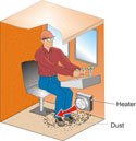
dust in an enclosed cab.
Complex Figure
Complex figures are handy when we want readers to compare multiple pieces of information or to establish analytical relationships among parts. The complex figure and corresponding text that follow were published in the proceedings of the year 2000 Conference of The International Emergency Management Society. I chose this figure because, as often occurs in papers, it is effectively introduced at the end of a paragraph describing its function, and because it includes a thorough, descriptive caption.
This figure is especially useful because it visually aids us in understanding the possible relationships among various players in a rescue operation—something that would not easily be described by text alone. Given that the viewers of the figure are intended to understand human movement and interactions within two different field areas (an "area of operation" and a "command post"), depiction of these interactions greatly simplifies our understanding and connects us to the place of activity better than text alone could.
To analyze command and control in rescue operations, we need to capture the temporal aspects of the interaction between the command post and the units in the area of operation. Figure 1 illustrates the data collection needs and the applicability of the corresponding support tools.
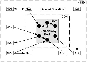
As this sample figure demonstrates, the caption to a figure, especially a complex one, can do far more work than just identify the nature of the picture. The caption can describe the trend being demonstrated, can explain to the reader how to view the figure, and can build on the text within the paper beyond the figure caption (thus the references in the example to ELA and MIND).
Sample Tables
Tables used in papers can be so simple that they are "informal" enough to be a sentence member and not require a caption, or they can be complex enough that they require spreadsheets spanning several pages. A table’s fundamental purpose should always be to visually simplify complex material, in particular when the table is designed to help the reader identify trends. Here, a simple table and a complex table are used to demonstrate how tables help writers to record and "visualize" information and data.
Simple Table
The simple table that follows, from a student’s progress report to his advisor, represents how tables need not always be about data presentation. Here the rows and columns simply make it easy for the writer to present the necessary information with efficiency. This unnumbered and informal table, in effect, explains itself.
| Week of 11/28 | Contact Dr. Berinni for relevant literature suggestions. Read lit reviews from Vibrational Spectroscopy. Research experimental methods used to test polyurethanes, including infrared (IR) spectroscopy and nuclear magnetic resonance (NMR). |
| Week of 12/5 | Define specific ways that polyurethanes can be improved. Develop experimental plan. |
| Week of 12/12 | Create visual aids, depicting chemical reactions and experimental setups. Prepare draft of analytical report. |
| Week of 12/18 | Turn in copy of preliminary analytical report, to be expanded upon next semester. |
Complex Table
The following sample table is excerpted from a student’s senior thesis about tests conducted on Pennsylvania coal. Note the specificity of the table’s caption. Also note the level of discussion following the table, and how the writer uses the data from the table to move toward an explanation of the trends that the table reveals.
Table 1 summarizes the results of borehole dilution testing and slug testing on wells B2, B3, and B4. The hydraulic conductivities computed from the borehole dilution test velocities for these wells range over an order of magnitude—a reasonable spread for hydraulic properties of close, but varying, test sites.
|
Well # |
Velocity: BD tests |
Hydraulic Conductivity: BD tests (pe = 0.01) |
Hydraulic Conductivity: BD tests (pe = 0.05) |
Hydraulic Conductivity: slug tests |
| B2 | 0.054 ft/d | 1.1 x 10⁻² ft/d | 0.054 ft/d | 0.19 ft/d |
| B3 | 0.32 ft/d | 0.07 ft/d | 0.32 ft/d | 8.9 x 10⁻³ ft/d |
| B4 | 0.06 ft/d | 1.2 x 10⁻² ft/d | 6.0 x 10⁻² ft/d | 2.8 x 10⁻² ft/d |
The hydraulic conductivities computed from the borehole dilution test velocities are significantly lower than those predicted by Huang and Sheltons' core analysis of Middle Kittanning coal. As shown in Table 1, the borehole dilution hydraulic conductivity values for wells B2 and B4 agree reasonably well with their corresponding slug test values, assuming an effective porosity between 0.01 and 0.05. This effective porosity seems high, but the dip of bedding in the study area is opposite the regional dip. This implies slumping, which could increase the effective porosity significantly.
Above, we see how the table caption and supporting text are tightly intertwined, with the aim of describing a trend. In this case, the writer compares her table data to the work of other authors and extracts key test results and quantities from the table to discuss in the paper’s text. Here, we learn that "wells B2 and B4 agree reasonably well with their corresponding slug test values," and we can retreat to the table for verification if we wish. Put simply, the table records the facts; the writer selects from the facts to interpret the trend.
Discipline-Specific Advice on Equations, Figures, and Tables
The material in this chapter is intended as a broad and fundamental look at how to manage equations, figures, and tables in your writing. Style manuals within your field will offer much more detailed advice, possibly devoting a chapter or more to the subject. For instance, an excellent book by Dr. David Schultz, chief editor for Monthly Weather Review, offers about 30 pages of advice on equations, figures, and tables. Schutz’s chapter covers specialized forms such as the Cartesian grid, thermodynamic diagrams, and the use of GEMPAK software in meteorology, while also discussing nuances of legibility during rescaling, the use of nonlinear axes, shading and color, and line graphs vs. scatterplots. Schultz's book is titled Eloquent Science: A Practical Guide to Becoming a Better Writer, Speaker & Atmospheric Scientist.
If you intend to be taken seriously as a published writer within your field, shelling out the cash for handbooks within your field will pay handsome dividends. For some additional recommended titles of style manuals and handbooks—where you will find discipline-specific advice that goes well beyond equations, figures, and tables—see the page "Some Recommended Print Resources" in chapter 5 of this manual.