Chapter Outline
1. Introduction
Introduction
When defensive football coaches study game films of an upcoming opponent, they look for tendencies in the formations and plays used by the opposing team’s offense. By recognizing such patterns, defensive coaches can design strategies to predict the play the opposition will run on any given down.
In similar fashion, weather forecasters look for patterns on weather maps in order to predict the tendencies of potentially offensive weather. Such pattern recognition can play an instrumental role in short-term forecasts (one to three days ahead), medium-range forecasts (four to ten days) or long-range outlooks (several weeks to months to seasons).

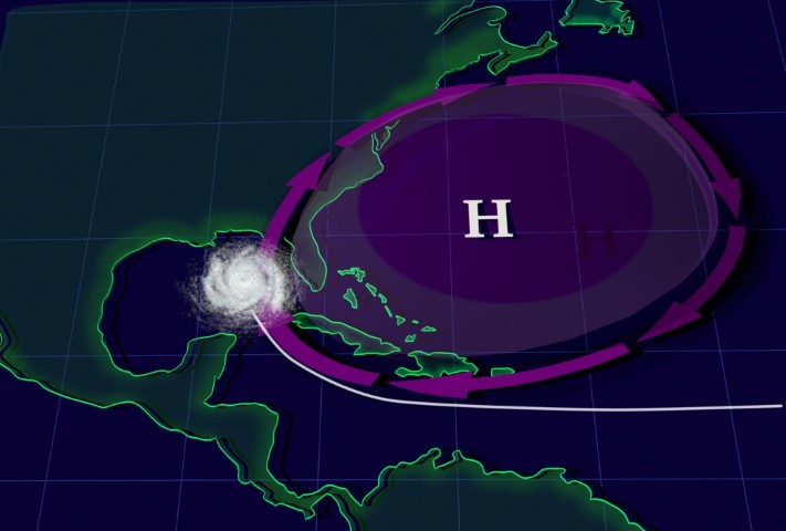
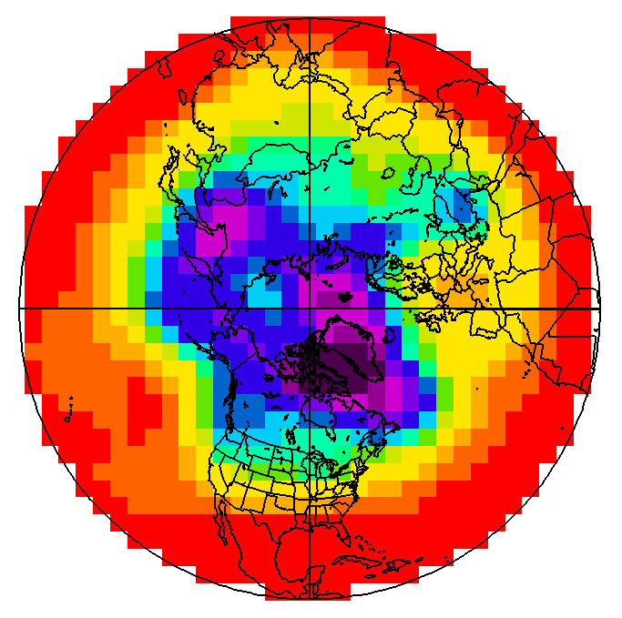
For an example of pattern recognition, suppose it’s mid-September, the heart of Atlantic hurricane season. If upper-level winds resembled the pattern shown in the figure above, forecasters at the Tropical Prediction Center in Coral Gables, FL would watch for the possibility of a tropical system running a northward “fly pattern” up the East Coast. Indeed, with a lethargic trough of low pressure drifting over the Midwest and the Bermuda high lined up in its typical formation, the mean wind in the steering layer (determined by the tropical system's central low pressure) would tend to direct any tropical system over the Caribbean or the tropical Atlantic right up the Eastern Seaboard (like football pass patterns, the directions of the mean winds in the steering layer are marked by arrows in the figure).
Hurricane Irene (August, 2011) took such a track, courtesy of the Bermuda high. On the evening of August 24, 2011, as Hurricane Irene's central pressure gradually decreased toward 950 mb, the mean wind in the steering layer from 850 mb to 300 mb associated with the clockwise circulation around the Bermuda high steered the hurricane up the East Coast. Check out the 00 UTC analysis [1] of the mean wind direction (streamlines) in the 850-300-mb layer on August 25 and the subsequent track of Hurricane Irene [2].
The Bermuda high doesn't always steer hurricanes up the East Coast, of course. Sometimes the Bermuda high will expand westward and steer tropical cyclones farther west (see image below, for an idealized example).
In August and September 2004, the prevailing pattern did not invite tropical cyclones up the East Coast, but steered Hurricanes Charley, Frances, Ivan and Jeanne [3] more westward on a collision course with Florida (check out the 500-mb pattern during the period, September 1-4 [4], when Hurricane Frances approached the Sunshine State).
In summary, this NASA visualization [5] shows two of the possible roles that the Bermuda high plays in steering tropical cyclones. Forecasters keep both steering patterns in mind when forecasting the tracks of tropical cyclones approaching the United States from the east.
Shifting away from the Tropics, forecasters at the Storm Prediction Center (SPC) in Norman, OK, apply the method of pattern recognition to predict outbreaks of severe thunderstorms. For example, they don’t hesitate to issue severe thunderstorm watches when they see a pattern like the one shown in the figure below.

When composing seasonal outlooks, meteorologists look at (among other factors) teleconnections from either El Niño or La Niña, if one of these is present or imminent in the tropical Pacific Ocean. Recall that a teleconnection is a correlation between an atmospheric or oceanic anomaly in one part of the world and an anomaly somewhere else. Both El Niño and La Niña involve significant departures from average sea-surface temperatures. These anomalies incite anomalous exchanges of heat, moisture, and momentum between the ocean and the overlying atmosphere that can have far-reaching effects on seasonal weather patterns in other parts of the globe.
There are many other examples of pattern recognition that meteorologists use to make short-term, medium-range, and long-range forecasts. But pattern recognition will only take forecasters so far. In this world of fast-paced technology, computer simulations play an integral role in any weather forecaster's game plan. So, just as some football coaching staffs rely on computers to quantify the tendencies of opposing teams, forecasters look at computer simulations of the atmosphere to help them mold a forecasting strategy within the context of the prevailing weather pattern.
2. Computer Simulations
Computer Simulations: Forecasting Gambit
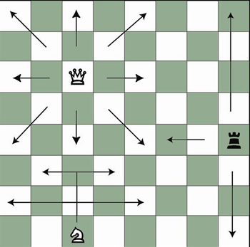
Computers are chess masters. In this highly mathematical game, a geometric grid of squares partitions the board, and chess pieces move in a variety of linear directions (see the figure below). Computer-chess software must include rules and a variety of mathematically logical strategies, making the computer a formidable chess opponent.
Numerical weather prediction (NWP) is the name of the "game" of creating a weather forecast on a computer. In the geometric spirit of chess, the rules of NWP are very mathematical, derived from a set of complex equations that relate meteorological variables such as air pressure, temperature, air density, moisture, wind, and vertical motion. Meteorologists refer to a list of mathematical instructions that produces a virtual weather forecast as a computer model, or, more simply, a model.
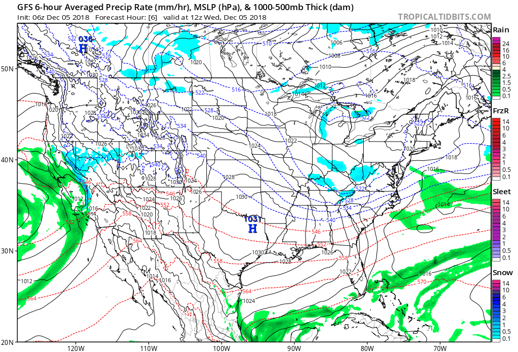
The output produced by computer models routinely takes the form of weather charts. For example, the loop of model output shown below was based on a computer simulation that began at 06 UTC on December 5, 2018, and extended 60 hours into the future to 18 UTC on December 7, 2018. Each chart in the loop below is a computer forecast that's valid six hours into the future (the first chart is the 6-hour forecast from the time the simulation began, which was 06 UTC on December 5, 2018). So the "forecast charts" are valid at 12 UTC on December 5, 2016, 18 UTC on December 5, 2018, 00 UTC on December 6, 2018, ... 18 UTC on December 7, 2018. Each forecast chart displays predicted mean sea-level isobars (thin, black contours), 1000-500-mb thickness (dashed lines), and precipitation type and intensity. Output data from computer models allow meteorologists to generate all kinds of weather charts, and you'll learn more about them in this chapter. But we wanted to give you a sneak preview of what's to come.
In chess, a player sometimes sacrifices a pawn or other piece in order to gain advantage (such a move is called a gambit). In the game of numerical weather prediction, meteorologists sacrifice computational perfection to gain advantage in making an informed forecast, as you will soon discover.
2a. Playing Weather on the Computer
Playing Weather on the Computer: Making a "Mesh" out of Things
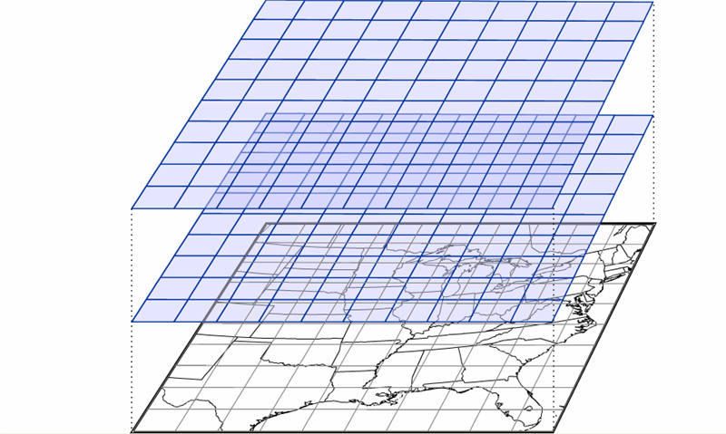
For U.S. forecasters, the “board” used for “playing the game” of NWP is typically North America and adjacent oceans. Like a chess board, this geographical arena can be neatly divided into a mesh of regularly spaced points called a grid [7]. For the record, these grid points are the locations at which the computer calculates the numerical forecast (meteorologists refer to this type of model as a grid-point model). The spacing between grid points varies from grid-point model to grid-point model (and sometimes even within a single model). Some grid-point models have a "coarse" mesh, with large spacing between relatively few grid points. Other grid-point models are "fine" mesh, with a small spacing between relatively many grid points. Whether the mesh of grid points is coarse or fine ideally governs the quality of the forecast (we'll explore this idea in just a moment).
Mimicking a game of three-dimensional chess, there are also meshes of regularly spaced points at specified altitudes, stacking from the ground to the upper reaches of the atmosphere (see the figure below). Thus, a three-dimensional array emerges that covers a great volume of the atmosphere, ready to be filled with weather data at each grid point. The typical horizontal spacing of grid points for operational computer models is typically on the order of ten kilometers. The vertical spacing of grid points varies from tens to hundreds of meters.
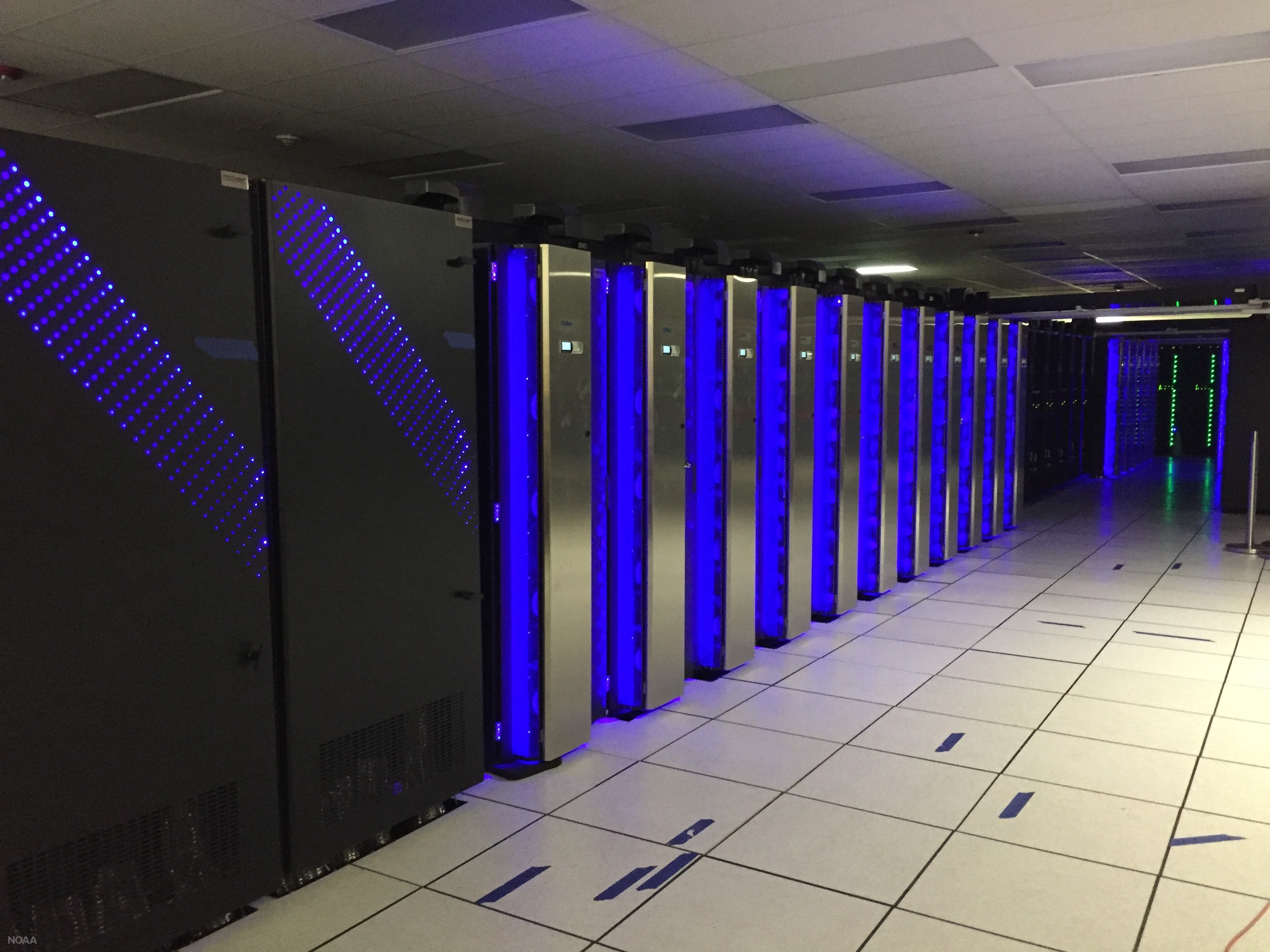
Once a simulation (sometimes called a "model run" or just plain “run”) has begun, the computer predicts (calculates) the values of moisture, temperature, wind, and so on, at each grid point at a future time, typically a few virtual minutes into the future. To perform this feat, powerful, high-speed supercomputers make trillions to quadrillions of calculations each second (see photograph farther down on the page). Thereafter, the computer calculates the same parameters for the next forecast time (a few more minutes into the future), and so on. For a short-range prediction, this "leapfrog time scheme [8]" typically ends 84 hours into the virtual future, taking on the order of an hour of real time to complete.
Even leap-frogging just a few virtual minutes into the future is fraught with error because the computer makes calculations for one time and then “leaps” to make calculations a few more virtual minutes later, skipping calculations for intermediate times between the starting and ending points of the leap. Like taking short cuts while solving a complicated algebra problem, skipping steps inevitably leads to errors.
This sacrifice in accuracy is a gambit with which forecasters must live. They could, theoretically, make a more accurate computer forecast by reducing the size of the time interval in the leapfrog scheme. However, a smaller time interval would require faster and more powerful computers to support the increased computational load. Also, meteorologists could increase the number of grid points to improve forecasts with the hope that smaller grid spacings could better capture smaller-scale weather phenomena. But such a scheme also demands faster and faster supercomputers. Though technology continues to advance, there is a practical limit to what computers can do, so there will never be a perfect computer forecast. Never.
Another shortcoming of computer guidance results from the way each simulation is initialized. By initialization, we mean the mathematical scheme used to represent the state of the atmosphere at the time the computer simulation begins. In other words, to initialize a model means to assign appropriate values of pressure, temperature, moisture, wind, and so on, to each grid point before the leapfrog scheme begins. These values typically come from both observations and previous forecasts.
Another complication arises in grid-point models because the grid points don’t necessarily fall directly on the locations where weather observations are routinely taken. In addition, the observations themselves have deficiencies: Instrument error is unavoidable, and the observational network, particularly over the oceans, has many gaps. As a result, the best “first guess” for the initialization is often a forecast from the previous model run. This first guess is then adjusted by incorporating real weather observations, taken both at the surface and aloft. Weather-balloon-toted radiosondes take upper-air measurements at 00 UTC and 12 UTC each day, so these are typically the times at which computer runs are initialized (short-range models are also initialized at 06 UTC and 18 UTC). By way of example, the “first-guess” initialization for a model initialized at 12 UTC might be the 12-hour forecast from the previous 00 UTC run. Though the complicated process of initialization is imperfect, it’s the best meteorologists can do to produce the starting values for a computer simulation.
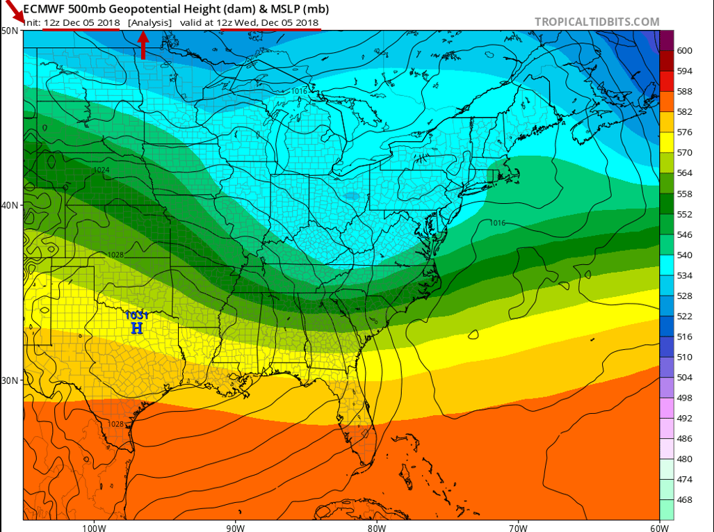
In practice, the initialization is sometimes referred to as the 0-hour forecast or the model analysis. Below is the initialization / 0-hour forecast / model analysis (whichever term you prefer) of a computer simulation that was run at 12 UTC on December 5, 2018. This chart represents the model's best representation of the current state of the atmosphere at 12 UTC on December 5, 2018. For the record, this initialization shows mean sea-level isobars (thin, black contours) and 500-mb heights (color-coded in dekameters). Again, any errors in this representation will be magnified as the simulation proceeds in time.
Worldwide, there are many different computer models run on a day-to-day basis that provide guidance for weather forecasters. The various models differ in their geographical area, initialization technique, representation of topography, mathematical formulation, length of forecast (in other words, how far into the future they are run), and other factors.
In 2011, the NEMS NMM-B became the flagship grid-point model that U.S. meteorologists use for short-term weather forecasts. NOAA is big on acronyms, and NEMS stands for NOAA Environmental Modeling System, which is the super-framework within which the National Centers for Environmental Prediction [10] (NCEP) in Washington, DC, initializes, runs, and post-processes its suite of computer models. NMM-B is the Non-Hydrostatic Multiscale Model based on a "B staggering in the horizontal." Don't get nervous. Without getting too complicated here, "B-staggering in the horizontal" means that the predicted north-south and east-west components of the wind lie on the four corners of each grid cell. All other forecast variables (temperature, pressure, vertical motion, etc.) lie in the center of the cell. Yes, it's inside baseball, and you really don't need to know such details, but we at least wanted you to have a sense for what the "B" in "NMM-B" means.
Let's just drop all the formality here and call the NEMS NMM-B the NAM, which is short for the North American Model (now that's an acronym we can live with). For the record, the NAM has a horizontal grid spacing of 12 kilometers (though some versions of the model run with a horizontal grid spacing of 4 kilometers). NCEP runs the NAM four times a day at 00 UTC, 06 UTC, 12 UTC and 18 UTC. The NAM produces numerical weather forecasts out to 84 hours into the future.
A few years prior to October 18, 2011, the Weather Research and Forecasting Model (WRF, for short) served as the North American Model. The only reason we point this out to you is that you'll see "WRF" labeled on some of the progs we present as case studies in this chapter. Don't get nervous. All the concepts you'll learn about interpreting NAM progs are universal (they apply to both the old WRF and the newer NEMS NMM-B).
Another example of a grid-point model used by U.S. weather forecasters is the High-Resolution Rapid Refresh [11] (HRRR) model, which has a horizontal grid spacing of 3 kilometers and produces a new 18-hour forecast every hour.
We'll talk more about the NAM later in the chapter. For now, we want to introduce another numerical weather prediction model called the Global Forecast System (GFS), which NCEP runs daily at 00 UTC, 06 UTC, 12 UTC and 18 UTC. As it turns out, the GFS is not a grid-point model. Let's investigate.
2b: Spectral Models: Riding the Atmospheric Wave
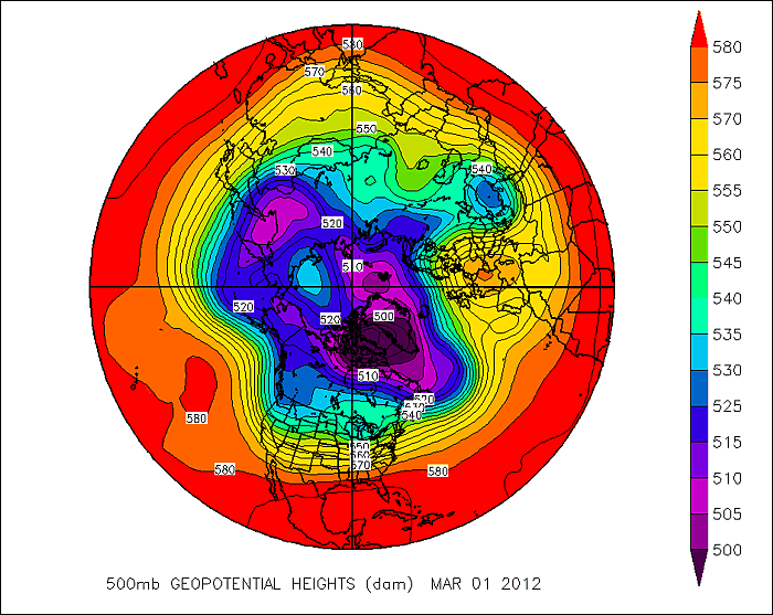
With a little imagination, you can perhaps see the problem with using a grid-point model to simulate atmospheric processes. Consider the map below that shows the 500-mb height pattern for March 1, 2012. From this polar stereographic perspective, you can see numerous long waves positioned around the globe. Now check out a gridded version of this height data [12]. One of the first things you'll notice is that we have almost completely lost the sense of the waves that make up the pattern. Furthermore, by gridding the data in such a way, some of the finer features of the height pattern have vanished. Since many variables in the atmosphere can be visualized by wave-like structures (rather than square boxes), wouldn't it be better to model the atmosphere this way? It turns out there is a numerical weather prediction model that uses waves instead of grid boxes ... a spectral model.
The primary spectral model used by the National Centers for Environmental Prediction [10] is the Global Forecast System, or GFS, for short. Rather than dividing the atmosphere into a series of grid boxes, the GFS describes the present and future states of the atmosphere by solving mathematical equations whose graphical solutions consist of a series of waves.
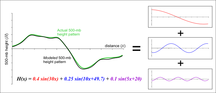
How is this done? As you might imagine, the mathematics of spectral modeling are beyond the scope of this book, but the key concept lies in the idea that any wavelike function can be replicated by adding various basic waves together. As an example, check out the figure below. Think of the green line as an actual 500-mb height line that could, for example, stretch across the U.S. and represent a long-wave ridge and trough. A spectral model first approximates this pattern by adding together a set of simple wave functions -- in this example, variations of a trigonometric function called the "sine" are used. We were able to closely duplicate the green curve by adding together three different wave functions (the red, blue, and purple curves). The resulting black curve is fairly close to the green curve and has a simple equation (mathematically speaking, of course) that a computer has no difficulty interpreting.
Thus, the first step in using a spectral model is to analyze the current patterns in the observed atmospheric variables and then closely replicate these patterns using sums of simple wave functions. One advantage to this approach is that the way in which wave functions change in space and time is well known. This mathematical fact helps illustrate a major advantage of spectral models -- they run faster on computers. Given these computational time savings, spectral models better lend themselves to longer-range forecasts than grid-point models like the NAM. Grid-point models push modern supercomputers to their limits just to churn out a respectable three- or four-day forecast. However, the GFS is routinely run out to 384 hours (16 days) four times a day (starting at 00 UTC, 06 UTC, 12 UTC and 18 UTC). One final advantage of spectral models is that their solutions are available for every point on the globe, rather than being tied to a regular grid array.
Lest you think that spectral models are the end-all-be-all of numerical weather prediction models, let us point out some of their shortcomings. While we just raved about the versatility of spectral models to crank out long-range forecasts, we would be remiss not to point out that they sometimes take a back seat to grid-point models. First, spectral models don't perform well on finite domains (regions with boundaries - see figure below). That's because the mathematical functions that represent the waves in the model are unbounded. Conveniently, however, we live on a sphere. This means that the wave functions can extend all the way around the globe, reconnecting where they began. Therefore, spectral models typically cover the entire globe rather than a relatively focused region, as grid-point models often do.
Another shortcoming of spectral models is that, while many atmospheric variables exhibit a wavelike appearance (the 500-mb height pattern, for example), some most definitely do not. Think about a day with showery or convective precipitation. The often-irregular spatial pattern of precipitation on such a day certainly does not lend itself to smooth, wavelike functions. For predicting such variables, spectral models just can't cut it. To overcome such problems, the GFS incorporates its own internal grid-point model to calculate troublesome variables and feed them back into the spectral mathematics. Yes, numerical weather prediction gets complicated awfully fast!
Bottom Line: When it comes to choosing between the grid-point and spectral techniques, there are indeed trade-offs.
Before we move on to actually interpreting some numerical weather prediction charts, let us point out that spectral models (despite being based on sound mathematical functions) are not immune from computational error. Simply put, a finite sum of wave functions cannot exactly reproduce every wave pattern. Notice the subtle differences between the black and green curves in this previous figure [13]. These differences arise because only three different wave patterns are being added together. If we were to increase that number to 10 or 20 different waves, the match would be much closer (but still not perfect). Spectral models measure their "resolution" in terms of the number of waves that are added together to reproduce a particular pattern. At some point, there is a computational limit to how many new functions can be summed – thus, some error will be always be introduced, owing to the difference between the actual pattern and the pattern produced by the spectral model. As we demonstrated in this figure [13], our approximation of the observed pattern might be very good, but it takes only a very small amount of error to start leading the model astray (more on this later).
Now that you understand some of the basics behind numerical weather prediction models, let's get down to actually learning how to interpret model charts – sometimes called the "progs" – short for “prognostications.” Read on.
3. Four-Panel Progs
Interpreting Four-Panel Progs: Taking the Next Step in Your Forecasting Apprenticeship
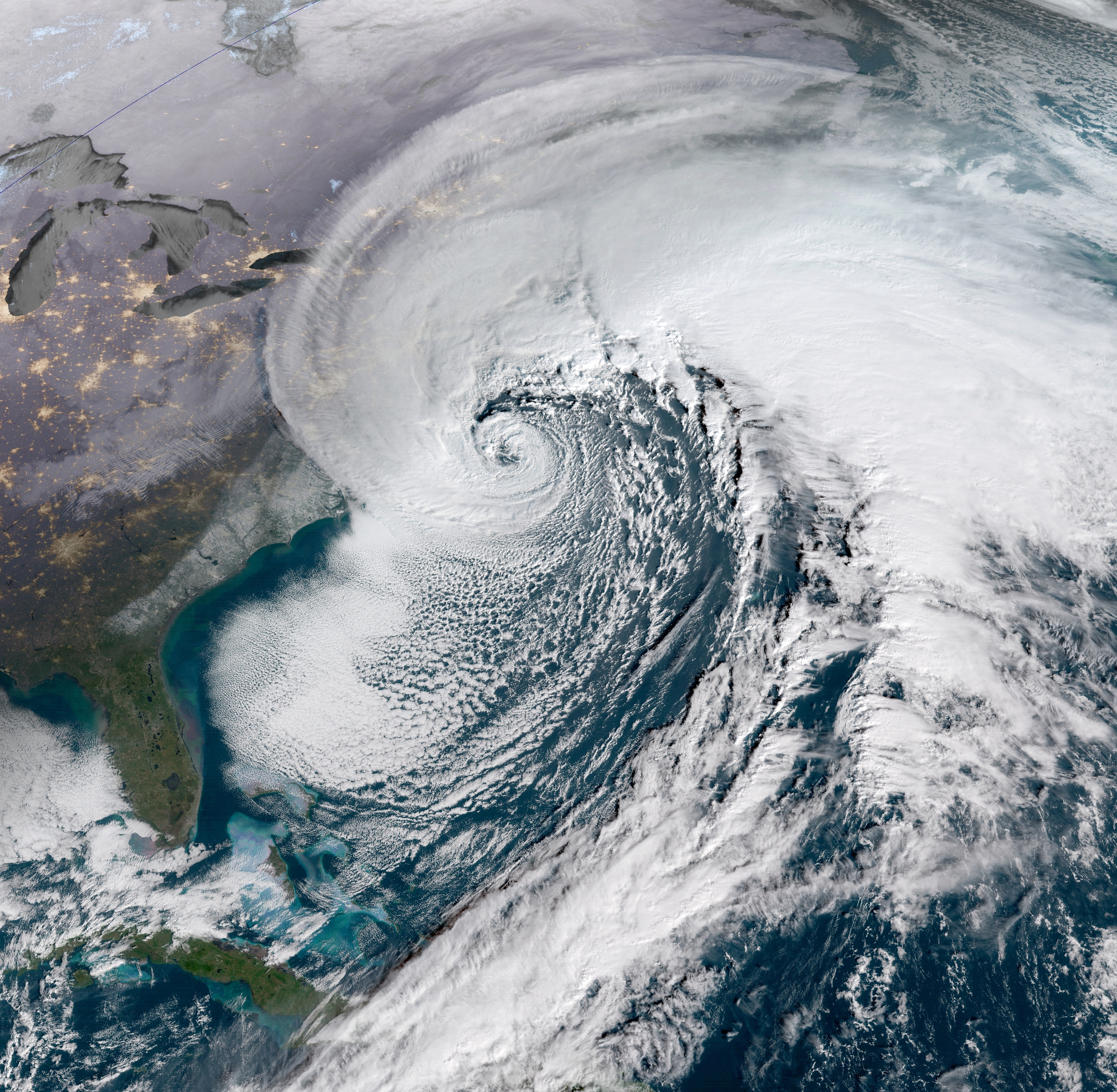
During the period, January 3-5, 2018, an historic winter storm along the East Coast produced snowfall [14] between 10 and 20 inches (locally up to two feet) across the Middle Atlantic Seaboard and New England. Needless to say, this fierce storm caused severe disruption to the daily routine of life. As its tightly spiraling cloud pattern suggests (check out the visible satellite image below), this low-pressure system was a "bomb" (12 UTC analysis on January 4, 2018 [15]), with its central barometric pressure dropping a whopping 53 millibars in 21 hours by the morning of January 4. For the record, this negative pressure tendency was one of the largest ever observed in the Western Atlantic. How did meteorologists use numerical weather prediction (NWP) to forecast this historic storm? Read on.
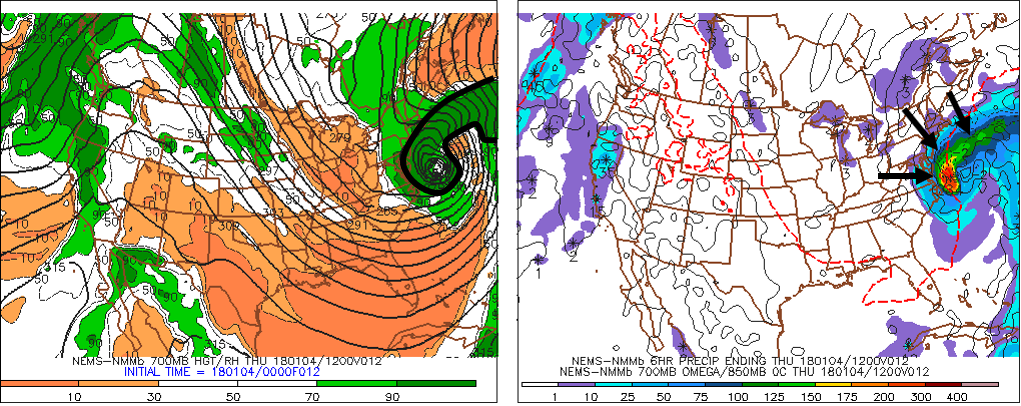
To make an accurate prediction for this historic winter storm, meteorologists studied NWP output in a weather-map format. For this discussion, we will rely on a common way to present NWP data; ladies and gentlemen, we introduce the data-packed, four-panel prog (the example below was likely one of the progs some forecasters used to predict the historic winter storm of January 3-5, 2018). Yes, there are a lot of lines and colors, so please don't be intimidated. You'll be able to interpret these charts by the end of this chapter, and thereby be ready to access current numerical weather prediction maps on the Web and gain a sense for the short-term forecast at any place in the country, including your home town.
As the upper-right panel on the standard four-panel prog (below) indicates (the upper-right panel includes sea-level pressure isobars... more details in a moment), this historic East-Coast low-pressure system was predicted to be quite formidable at the time this forecast was valid. "Time" is a key word here because your first responsibility as an apprentice forecaster is to master the time codes listed below each of the four panels. After all, if you don’t know the time when the model was initialized and the forecast time when the prog is valid, you might apply the guidance to the wrong future time, causing your forecast to “bust.”
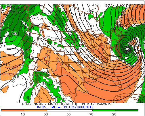
Let's get up close and personal with initialization and forecast times by zooming into the code below the upper-right panel (see image below). First of all, the "NEMS-NMMb" indicates that we've accessed the NAM (North American Model). In case you're wondering, the "NMM" stands for "Nonhydrostatic Mesoscale Model."
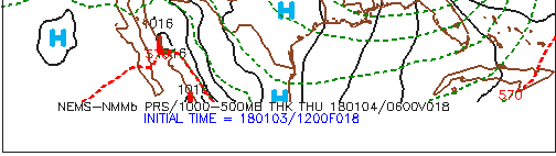
Okay, back to the business at hand. Following a fundamental rule of forecasting, you must first determine when the model was initialized so that you're sure you're looking at the most current computer guidance. Focus your attention on the bottom entry, INITIAL TIME = 180103/1200F018. The first two digits represent the year (2018), the middle two digits correspond to the month (January), and the last two digits represent the day (the 3rd). The 1200 indicates that the NAM was initialized at 12 UTC on this date (0000 would indicate 00 UTC as the initialization time). Putting it all together, this NAM run for this specific prog was initialized on January 3, 2018, at 12 UTC. Finally, F018 means that this NAM prog was the eighteen-hour forecast ("F" stands for "forecast").
It's not rocket science to deduce that this prog should be valid 18 hours after the initialization time ... at 06 UTC on January 4, 2018. The top line of time code, 180104/0600V018, verifies our simple deduction. Keeping in mind that the "V" stands for "Valid", 180104/0600V018 translates to: "This 18-hour forecast is valid at 06 UTC on January 4, 2018." So we were correct!
Although it might seem a bit tedious to you, always remember to check the time and date that a specific prog is valid before you use it to make your forecast. There's nothing more embarrassing to a forecaster than using the wrong computer guidance!
Okay, let's get down to brass tacks and learn how to interpret the four panels on a standard prog.
3a. Top Two Panels
Top Two Panels: X's and N's Instead of X's and O's
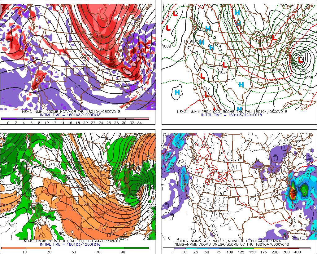
Let's dissect all of the information available on four-panel progs by starting with the upper-left panel. For sake of continuity, let's stay with our theme of the "bomb" along the East Coast of the United States that produced 10 to 20 inches of snow [19] across parts of the Middle Atlantic States and New England during the period, January 3-5, 2018. Specifically, we will discuss, in detail, the 12-hour four-panel prog [20] based on the NAM initialization at 12 UTC on January 3, 2018. For the record, this four-panel prog was valid at 00 UTC on January 4, 2018, six hours before the prog we just showed you in the previous section. At this earlier time (00 UTC on January 4), the developing "bomb" along the East Coast was predicted to be already undergoing rapid intensification.
Football coaches draw X's and O's to map out a play. In a similar spirit, the 500-mb game plan highlights X's and N's on the upper-left panel of any standard four-panel prog. That's because the upper-left panel provides forecasts for 500-mb absolute vorticity, whose closed centers contain X's (vort maXes) and N's (vort miNs). Indeed, the upper-left panel (see below) on our chosen four-panel prog [20] displays the predicted 500-mb heights (solid, dark lines, labeled in dekameters = tens of meters) and predicted contours of 500-mb absolute vorticity (color-filled). As you recall from Chapters 7 and 12, patterns of 500-mb heights reveal short- and long-wave troughs and ridges. In general, a vort max ("X") marking a short-wave trough on weather charts allows forecasters to locate the associated area of upper-level divergence to the east of the vort max. Likewise, a vort min ("N") indicating a short-wave ridge alerts forecasters to an associated area of upper-level convergence to its east.
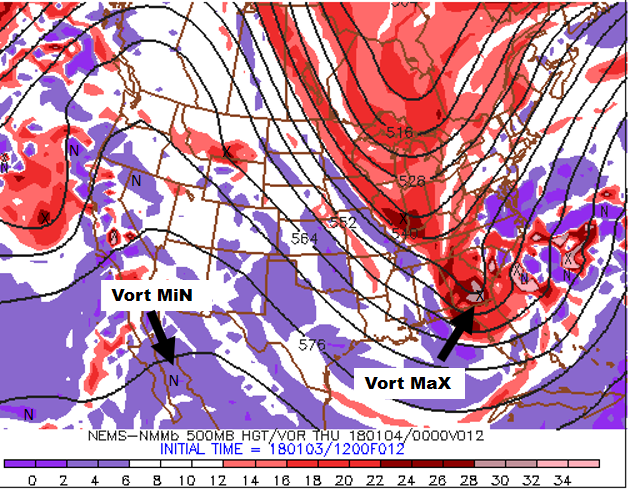
For convenience, areas of large absolute vorticity associated with 500-mb troughs appear in shades of red, with the deepest red designating relatively large values. As a result, the cores of deepest red typically contain an "X" (for the strongest short waves, the corresponding deepest red might contain a pinkish color, indicating an extremely large value of absolute vorticity). On the other hand, areas of relatively small absolute vorticity associated with 500-mb ridges (and low latitudes, in general), appear in shades of purple, with the brightest purple marking the smallest values (as a result, the cores of brightest purple typically contain an "N").
How should you incorporate the upper-left panel into your forecasting routine? Just keep in mind that surface low-pressure system tends to develop (or strengthen) to the east of relatively strong 500-mb short-wave troughs (vort maxes), while surface highs tend to form (or strengthen) to the east of robust 500-mb short-wave ridges (vort mins).
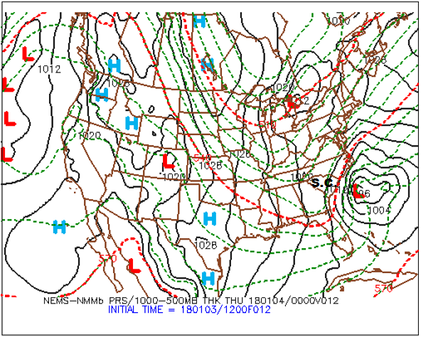
Practicing what we preach, please note, on the upper-left panel shown above, the primary short-wave trough and its associated vort max that were predicted to be over Georgia at 00 UTC on January 4, 2018 (the pinkish area inside the deep red that houses an "X"). There should be surface low to the east/northeast of this short-wave trough. Let's see. Shift your focus to the upper-right panel (below), and notice the intense "L" to the east of South Carolina (and east-northeast of the primary vort maX), clearly indicating that the upper-right panel predicts sea-level pressure (the thin, black lines represent predicted isobars). For all practical purposes, the upper-right panel is the model's forecast for how the surface weather map will look like at the time the prog is valid. By the way, the labeling of the predicted isobars follows the same convention of pressure analysis you learned in Chapter 6: 1000 mb is the standard contour and 4 mb is the standard contour interval.
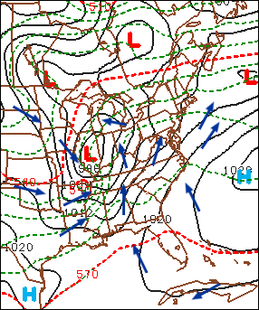
The bottom line here is that the upper-right panel affords you the opportunity to identify centers of high and low sea-level pressure (they’re even labeled for you) as well as surface troughs and ridges. From these patterns of predicted isobars, you can infer surface wind direction using the upper-right panel. Keep in mind that, in the Northern Hemisphere, winds blow counterclockwise around a low, crossing local isobars slightly inward toward low pressure. As you learned in Chapter 6, the angle the surface wind crosses local isobars averages about 30 degrees ... it can be as large as 45 degrees (or more) in rough terrain, and as small as 10 degrees over smooth seas. On the flip side, winds circulate clockwise around a surface high , crossing local isobars slightly outward away from the high’s center. We added a sample of surface wind vectors to an upper-right panel (below) from a generic four-panel prog (which is not shown here) in order to show you how to infer wind directions using the predicted sea-level isobars as your guide.
During your apprenticeship in weather forecasting, your success hinges, in part, on a sound, working knowledge of the cyclone model (recall Chapter 13). For example, you should be able to locate fronts associated with mid-latitude cyclones on the upper-right panel. Remember that, in order to do this, just locate the surface troughs!
While it's true that surface fronts lie in troughs, it's also true that there are troughs that don't contain a front. All is not lost, however, because large horizontal temperature gradients are also the hallmark of fronts. So, in order to get a more complete picture of a surface low-pressure system and its associated fronts, we somehow need to introduce temperature on the upper-right panel. Besides, we also need to think about cold and warm advection, which would be impossible to predict without some sort of temperature field.
Enter the dashed lines on the upper-right panel [21], which are the predicted isopleths of 1000-500 mb thickness (in dekameters). Recall, from Chapter 16, that thickness is the vertical distance between any two pressure levels (see the figure below for a review). Given that pressure decreases more rapidly with altitude in cold air than in warm air, thickness is smallest where the average temperature is lowest in the layer of air between 1000 mb and 500 mb. Similarly, the 1000-500 mb thickness is largest where the average temperature is highest in this layer. So the thickness between the 1000-mb level and the 500-mb level is proportional to the average temperature in this layer. For supporting evidence, notice, on our chosen upper-right panel [21], that larger values of the 1000-500 mb thickness tend to lie over warmer, southern latitudes, while smaller values tend to congregate over northern latitudes. The reason that the layer between 1000 mb and 500 mb gets a lot of attention is that most of the weather action occurs in this layer. As a matter of practice, all computer models routinely calculate thickness between 1000 mb and 500 mb. The standard contour for 1000-500 mb thickness is 552 dekameters (5520 meters), with contour intervals of 6 dekameters (60 meters).
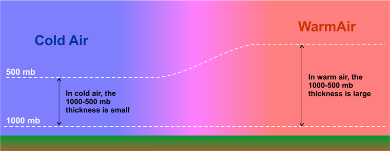
We point out that, on Penn State's version of the upper-right panel [21], the 510, 540, and 570-dekameter thickness lines are highlighted in red – they are special markers. You may recall that the “540 line” is a reasonable first estimate for the rain-snow line east of the Rockies. Operational weather forecasters use 510 dekameters to roughly indicate an Arctic air mass. Indeed, the average temperature in the layer of air between 1000 and 500 mb that corresponds to a thickness of 510 dekameters is a frigid -22oC (-8oF). At the other extreme, a thickness of 570 dekameters, which corresponds to an average layer temperature of about 8oC (46oF), is used by forecasters to indicate a very warm air mass. If 8oF sounds low for a very warm air mass, remember that it represents the average temperature from 1000 mb to 500 mb. So, while it's hot at the surface, temperatures at 500 mb are typically at least several degrees below 0oC (you'd need a winter coat).
The bottom line here is straightforward: Because 1000-500 mb thickness directly corresponds to the average temperature in this layer, you can treat isopleths of 1000-500 mb thickness as if they were isotherms. With this connection in mind, large horizontal gradients in thickness contours can help you to locate surface fronts. Recall that surface fronts typically lie just on the warm side of tight packings of isotherms. Thus, forecasters place fronts just on the warm side of tight packings of thickness contours (while simultaneously using troughs of low pressure to pinpoint the position of the front).
For example, look (above) at a generic upper-right panel of a NAM forecast for sea-level pressure and 1000-500 mb thickness (the full prog is not shown here). Focus your attention on the surface low-pressure system near the Kentucky-Indiana border. Note the pressure trough elongating to the south of the low, and the ribbon of tightly packed thickness lines that mark the large temperature gradient associated with the low's cold front.
And now for the pièces de résistance: We placed the cold front in the trough of low pressure just on the warm side of this tight packing of thickness contours (see our analysis below).
Now let’s turn to the low's warm front. For starters, a friendly word of advice: Drawing warm fronts on progs is usually more difficult than drawing cold fronts. There are a couple of reasons why locating warm fronts is harder than locating cold fronts. First, the horizontal temperature gradients associated with cold fronts tend to be larger than the temperature gradients corresponding to warm fronts (but not always). Second, the pressure troughs that contain warm fronts tend to be less pronounced than those that mark a cold front.
In this generic case, we're in luck because there is a fairly well-defined trough and a fairly well-defined thickness gradient that mark the warm front associated with the low predicted to be centered over the Indiana-Kentucky border. So, we placed the warm front in the trough and just on the warm side of the thickness packing (see our analysis above). In the area south of the warm front and east of the cold front, note the weak temperature gradient that's consistent with the warm sector of a mid-latitude cyclone.
Thus, the top two panels on standard four-panel progs allow you to locate 500-mb short-wave troughs, 500-mb short-wave ridges, and surface low- and high-pressure systems. From the predicted patterns of sea-level isobars and thickness contours, you can infer surface wind direction, the positions of surface fronts, and, based on the wind direction and the pattern of thicknesses, warm and cold advection.
The bottom two panels of the four-panel prog pertain to clouds and precipitation. We'll turn to them next.
3b. Bottom Two Panels
Bottom Two Panels: Clouds and Precipitation
In keeping with the theme of our previous spotlight on four-panel progs, the historic winter storm of January 3-5, 2018 [22], will serve as the backdrop for our discussion on the bottom-two panels. Let's start with the bottom-left panel of the NAM 12-hour prog [23] intialized at 00 UTC on January 4, 2018 (see below), which we've conveniently cropped from the four-panel prog. This forecast was valid at 12 UTC on January 4, 2018.
For the record, the designated pressure level on this panel is 700 mb. Why the 700-mb level? This mandatory pressure level is approximately midway between 1000 mb and 500 mb at altitudes near 3000 meters (10000 feet), which places it near the epicenter of the "weather action" in the lower half of the troposphere. Moreover, 700 mb marks the first mandatory pressure level that lies almost completely in the "free atmosphere." In other words, 700 mb is high enough to essentially be removed from the constraints of the earth's surface, except for some of the highest peaks in the Rockies and the tops of other mountains in the western United States (the Cascades in Washington and Oregon, for example; here's a photograph of Mount Ranier [24], whose elevation is 14,410 ft, or about 4400 m).
To get your bearings, we point out that the relatively thick, black contours represent 700-mb heights (labeled in dekameters). Without reservation, the predicted 700-mb heights provide forecasters with a more complete picture of the evolving weather pattern at this pressure level . Arguably, the most useful field on this bottom-left panel is the color-coded forecast for relative humidity. For starters, contours of predicted 700-mb relative humidity (the thin, black isopleths) are drawn for 10%, 30%, 50%, 70% and 90%. Green shades represent regions with high 700-mb relative humidity (greater than 70%). The darkest green marks areas with 700-mb relative humidity greater than 90%, which is getting pretty close to saturation. Meanwhile, shades of orange indicate low 700-mb relative humidity, with the darkest orange marking areas with 700-mb relative humidity less than 10%.
Let's get up to speed by first looking at the top two panels [25] of the NAM's 12-hour prog initialized at 00 UTC on January 4, 2018. The screaming message from the top-right panel is, not surprisingly, the intense surface low-pressure system off the Middle Atlantic Coast. Now shift your attention to the supporting closed 500-mb low on the top-left panel. Without reservation, the surface low and supporting 500-mb low were expected to be almost vertically stacked, indicating that the low-pressure system was still in its powerful occlusion stage (revisit Chapter 13 to review the Cyclone Model if you need a refresher).
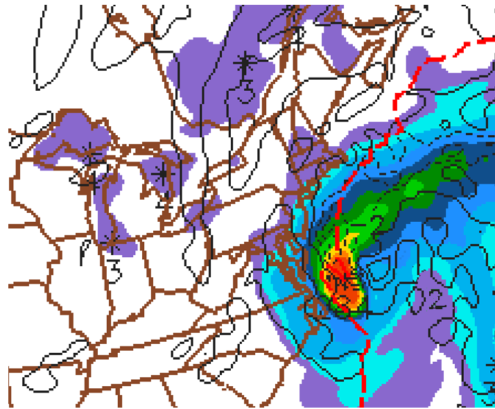
Given that the low-pressure system was in its occlusion stage, we should expect the low to have conveyor belts. And, indeed, it did! On the bottom-left panel below, the ribbon of low 700-mb relative humidity apparently drawn northward into the low's cyclonic circulation marks the system's dry slot. More formally, the dry slot shown on this 700-mb panel is the footprint of the low's dry conveyor belt.
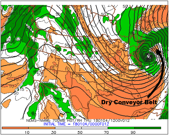
The intense low also had a cold conveyor belt, which can be drawn along the central axis of the arcing swath of high 700-mb relative humidity (90% or greater). You can see how we drew the cold-conveyor belt on this annotated bottom-left panel [26]. Note that the swath of high 700-mb RH appears to wrap counterclockwise around the center of the 700-mb low, which is exactly the description of a cold conveyor belt.
There was also a warm-conveyor belt associated with this intense low, but it's too far off the Atlantic Coast for us to see (the limited eastward extent of the domain on this bottom-left panel does not completely capture the roughly north-to-south ribbon of relative high 700-mb relative humidity that we typically associate with a warm conveyor belt).
Obviously, very intense, mid-latitude cyclones with well defined conveyor belts don't routinely appear on daily weather maps of the United States ... which then begs the question: Does the 700-mb relative bottom-left panel have a more routine forecasting application? The answer is, "yes." Based on empirical evidence, there is a strong statistical correlation between the presence of clouds and predicted 700-mb relative humidity greater than 70%. Though this initially seems at odds with your understanding of how clouds form when the air becomes saturated (relative humidity = 100%), keep in mind that we're talking about a statistical correlation here. Indeed, over the long history of numerical weather prediction, forecasters have observed a relatively strong correlation between patterns of rather high 700-mb relative humidity (70% or greater) and the presence and patterns of clouds (especially stratiform clouds).
On the flip side, very low 700-mb relative humidity on the bottom-left panel can translate to a cloudless (clear) or mostly clear sky. There are exceptions to this "flip-side" statistical link, and we will reveal, in just a moment, how this link sometimes breaks down.
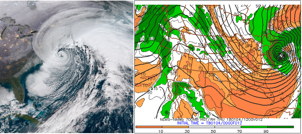
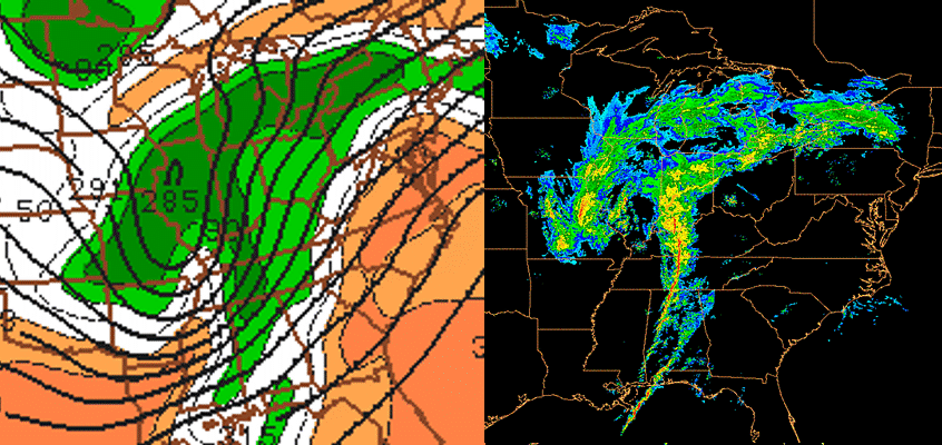
Let's investigate the strong correlation between high 700-mb relative humidity and clouds. The visible satellite image on the left (above) at 1345 UTC on January 4, 2018, shows the "bomb" off the Middle Atlantic Coast. The bottom-left panel (on the right, above) of the four-panel prog [27] was valid at 12 UTC on January 4, 2018. Although the two time stamps are not exactly the same, they are close enough in time to make a reasonably valid comparison. Note how the pattern of high 700-mb relative humidity around the low (especially the dark green = 700-mb relative humidity of 90% or greater) closely matches the low's cyclonic swirl of clouds on the satellite image.
The match is really good, wouldn't you agree? Yes, the statistical correlation that we're discussing here can be impressively right on the money, even for features that seem to be too small. Indeed, note, on the bottom-left panel, the rather tiny, white "island" of lower 700-mb relative humidity at the center of the 700-mb low (relative humidity values between 30% and 70%). This "island" of lower 700-mb relative humidity near the center of the low-pressure system closely mimics the corresponding small, partially clear area on the satellite image. Formally, this "island" of lower 700-mb relative humidity at the center of an intense coastal storm is called a seclusion [16]. So you now have a better sense for how strong the statistical correlation between patterns of 700-mb relative humidity and corresponding cloud structures can really be.
Lest you get the impression that there must be a very intense low in the forecast for this statistical correlation to ring true, check out the "generic" example (above) of a weaker low-pressure system over the central United States. Again, the statistical correlation between rather high 700-mb relative humidity and the presence and pattern of clouds associated with the low seems golden, doesn't it? Indeed, the bottom-left panel essentially predicted the shape of the cloud structure associated with the low, correctly capturing the position and shape of the comma head west and southwest of the low's center. The bottom-left panel also did a pretty good job on the dry slot / dry conveyor belt.
Does the statistical link relating very low 700-mb relative humidity to a clear or mostly clear sky always work? In simple but blunt terms, the answer is, "no." Let's investigate.
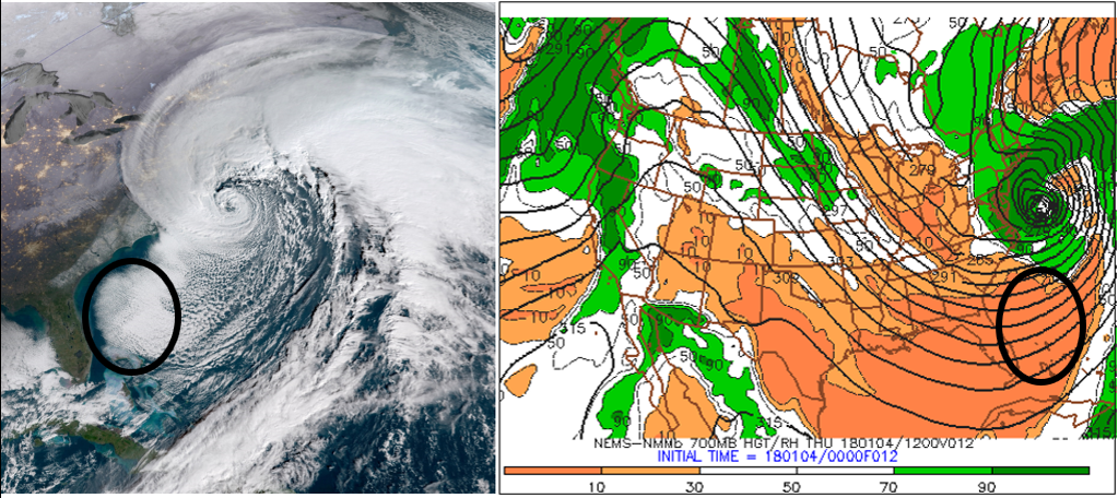
On the morning of January 4, 2018, west-northwesterly winds transported relatively cold air from Georgia and northern Florida over the Atlantic Ocean off the Southeast Coast. This cold advection over warmer water produced ocean-effect clouds (the shallow clouds within the black oval on the satellite image). The tops of these clouds did not reach up to 700 mb because the corresponding 700-mb relative humidity shown on the bottom-left panel (within the black oval) was very low (less than 10%). If you looked only at the bottom-left panel, you might expect the sky to be clear within the black oval, given such extremely low 700-mb relative humidity. But you would be wrong. Lesson learned: The statistical link between very low 700-mb relative humidity and a clear or mostly-clear sky can break down when shallow, low clouds are present.
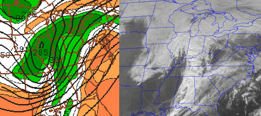
Take a little time to study the bottom-two panels (see above) on the NAM 12-hour four-panel prog [23] (generated by the model run initialized at 00 UTC on January 4, 2018). For your convenience, we outlined, in black, the ribbon of high 700-mb relative humidity (90% or greater) associated with the deep low-pressure system along the Middle Atlantic Coast (except for the lower humidity inside the relatively tiny warm seclusion). Note the similarity between this pattern of high 700-mb relative humidity and the color-coded ribbon of predicted precipitation (marked by black arrows) on the bottom-right panel. The details about predicted precipitation on the bottom-right panel will be forthcoming. For now, we want you to simply recognize that, without reservation, there is a correlation between predicted precipitation (especially stratiform) and 700-mb relative humidity of 90% or greater.
Okay, let's begin to fill in the details about the predicted precipitation shown on the bottom-right panel of a traditional four-panel prog. The first label just below the map (NEMS-NMMb 6HR PRECIP ENDING THU 180104/12V012) contains a very important clue (highlighted in red): The predicted precipitation available from bottom-right panels is cumulative. Indeed, the color-filled areas represent the total liquid precipitation that the NAM predicts will fall in the six-hour period ending at the time that the computer prog was valid (in this case, 12 UTC on January 4, 2018). In other words, the color-filled contours represent a cumulative forecast of the liquid precipitation that will fall during the entire six-hour period (in this case, between 00 UTC and 12 UTC on January 4, 2018).
For the record, liquid precipitation translates to rainfall or the equivalent amount of meltwater (assuming it snows or sleets). We want to emphasize here that the color-filled areas on the bottom-right panel do not constitute a snapshot of future radar reflectivity at the specific time the prog is valid. Rather, the color-filled contours correspond to cumulative liquid precipitation that is expected to fall over the six-hour period ending at the time the prog was valid. An important distinction, don't you agree?
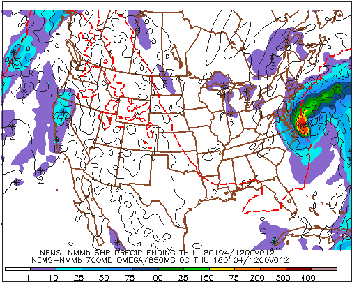
For reference, the row of numbers along the bottom of this panel corresponds to precipitation totals expressed in hundredths of an inch. So, for example, "10" means 0.10 inches, while "150" equals 1.50 inches. Putting what you just learned into action, please note that purple areas (1 to 10 on the color scale) represent regions where the NAM predicted between 0.01 and 0.10 inches of liquid precipitation during the six-hour period ending at 12 UTC on January 4, 2018 (over the Great Lakes, for example), while the dark-orange area off the Middle Atlantic Coast indicates predicted six-hour liquid equivalents between 2.00 and 3.00 inches.
In summary, the graduated color key along the bottom of this panel indicates the predicted ranges of cumulative liquid equivalents, expressed in hundredths of an inch, for the six-hour period ending at the time the prog is valid.
If you look closely and magnify this bottom-right panel [28], you'll see numbers within a few of the color-filled areas. For example, there's a "284" very close to the dark-orange area off the Middle Atlantic Coast (look again [28]). Reading off the color scale along the bottom, note that dark orange corresponds to a six-hour predicted rainfall between 2.00 inches and 3.00 inches. This range is consistent with the "284" near the center of the dark-orange blob, which is the prog's way of designating a relative maximum of 2.84 inches of rain. Lesson learned: Numbers appearing within a colored area on this panel represent a relative maximum in cumulative precipitation. Moreover, a snowflake-like icon marks the exact location where the model predicts the relative maximum to occur.
The bottom-right panel also includes the predicted position of the 0°C isotherm at 850 mb (check it out [29]). Recall from Chapter 16 that the 0°C isotherm at 850 mb can be used as a tool to estimate the rain-snow line. In this way, forecasters looking at the bottom-right panel can get a cursory sense for frozen versus unfrozen precipitation (keeping in mind, of course, that the bottom-right panel shows predicted cumulative precipitation and that it is not a future radar).
We're almost home. There's one other 700-mb parameter plotted on the bottom-right panel of the NAM four-panel progs. Below is a zoomed-in portion of the bottom-right panel of the 12-hour prog initialized at 00 UTC on January 4, 2018 (valid at 12 UTC on January 4). The thin, dashed lines that are labeled with minuses indicate areas of predicted upward motion at 700 mb. In this case, the ribbon of stronger upward motion (and heavier six-hour precipitation totals) was associated with the intensifying low's cold conveyor belt [26]. Meanwhile, the thin, solid isopleths on this bottom-right panel mark areas of predicted downward motion at 700 mb. In this case, there is downward motion (and very light six-hour precipitation totals) in the purple swath (0.01" - 0.10") just to the east of the slug of heaviest cumulative precipitation off the East Coast. This purple ribbon of downward motion and very light six-hour precipitation totals coincided with the intensifying low's dry conveyor belt [30].
The use of "-" for upward air motions and "+" for downward motions might seem counterintuitive to you. To reconcile this seemingly contradictory sign convention, consider a parcel of rising air. Over time, the parcel's pressure decreases as it ascends higher into the atmosphere. Hence, the ascending parcel's change in pressure with time is negative. For subsiding parcels, pressure increases during descent. So downward motion is positive in the context of pressure changes with time.
Please file this link between vertical motion and an air parcel's pressure change with time away for future reference. And note that some websites reverse this convention, but you can usually tell which sign convention prevails because precipitation will generally correspond (or lie close to) areas of upward motion (as it does in the image above).
Revisit the bottom-right panel above and focus your attention off the Middle Atlantic Coast. The "-2" and "2" that label two of the contours of vertical motion at 700-mb represent the speeds of the air's ascent and descent. Formally, the units of vertical motion at 700 mb on the bottom-right panel are microbars per second (a microbar is one-thousandth of a millibar). A speed of 1 microbar per second is about 1 centimeter per second (which is less than half an inch per second). These tortoise-like, up-and-down air motions are representative of synoptic-scale values because vertical pressure gradients are, on average, balanced by gravity. Such slow ascent and descent are the rule rather than the exception.
We pause this discussion of the NAM four-panel progs (accessed from the Penn State e-Wall) to point out that the corresponding GFS bottom-right panel does not include vertical motion (sample GFS four-panel prog [31]). In addition to 6-hour precipitation totals ending at the time the prog was valid (the same as the NAM), the GFS bottom-right panel displays 850-mb isotherms instead of 700-mb vertical motion (sample GFS bottom-right panel [32] accessed from the Penn State e-Wall).
During our discussion of the bottom-two panels, we've made a couple of references to statistical correlations having greater application to stratiform precipitation (as opposed to convective precipitation). In the context of the bottom-right panel, let's further investigate the bases for making such claims.
Let's consider a "generic" case of a low-pressure system over the central United States (above; here's the corresponding generic surface analysis [33]). Compare the bottom-left panel (left, above) showing predicted 700-mb relative humidity and heights with a mosaic of composite reflectivity produced at the same time the bottom-left panel was valid (right, above).
Though the NAM 700-mb relative humidity prediction on the bottom-left panel did a pretty good job capturing the precipitation north and west of the low (recall the statistical correlation between predicted 700-mb relative humidity and precipitation), you might have noticed that the lines of showers and thunderstorms developed ahead of the low's cold front [33] (over Alabama) in an environment bereft of 700-mb relative humidity greater than or equal to 90%.
To resolve this apparent contradiction, keep in mind that the spatial scale of a thunderstorm (a cumulonimbus cloud) is typically less than the horizontal spacings of one grid box in most operational short-range computer models (see the schematic below ). Although the relative humidity inside a thunderstorm is essentially 100%, the relative humidity surrounding the thunderstorm is typically much lower. This has the effect of decreasing the overall average relative humidity in the grid box. Thus, in convective situations, the model-predicted 700-mb relative humidity can be misleading if you use it as the sole indicator of precipitation.
The bottom line here is that showers and thunderstorms can form in environments where the bottom-left panel sometimes predicts the 700-mb relative humidity to be noticeably less than 90%. So the statistical correlation between predicted 700-mb relative humidity on the bottom-left panel and precipitation gets a little tricky when the precipitation is convective.
There you have it. A complete whirlwind tour of a standard four-panel prog. You now have the basics to navigate the models listed on the Penn State e-Wall [34]. We should caution you, however, that there are few permutations of the four-panel prog on the World-Wide Web. These variations can range from simple color differences to wholesale substitutions of a prog from a different pressure level. So just keep your wits about you if (and when) you access four-panel progs from other websites.
Armed with the ability to interpret four-panel progs from the Penn State e-Wall, how do weather forecasters resolve the inherent imperfections in the NAM, GFS, and other computer models?
4. Using the Models
Using the Models: All for One, and One for All
Let’s mentally conduct a simple but revealing test of human fallibility. Imagine that the first person in a fairly long line of people whispers a bit of information to the second person in line [35]. Then the second person whispers what he or she heard to the third person, and so on. By the time the chain of whispers reaches the last person in line, the original bit of information has likely been jumbled and changed. These changes or “errors” grew as each person in line slightly altered the previous whisper as she or he passed it on.
In similar fashion, a computer model takes the initialized state of the atmosphere and then passes on its numerical forecast to the first virtual time interval (perhaps a minute or two into the future). In light of the inherent errors associated with the leap-frog scheme used by computer models (not to mention the imperfect process of initialization), it should come as no surprise that the forecast is a bit off the mark. The first time interval then passes on this error to the second time interval, which passes on a slightly different version to the third time interval, and so on. By the end of the forecast run, slight errors near the start of the simulation will have likely worsened.
Now suppose that there are two lines of people of equal length, and the first person in each line whispers an identical message to the second person. In keeping with the fallibility idea, the last two people in each line would likely hear two different messages. However, an independent interpreter, after listening to the last two people in line, might be able to blend the different messages and thereby deduce a more accurate form of the original whisper.
In a similar way, forecasters routinely compare the forecasts made by several computer models (see example below). Even though these forecasts might not be the same, an experienced meteorologist can blend the predictions of the models (a consensus forecast), with the hopes of improving the forecast.
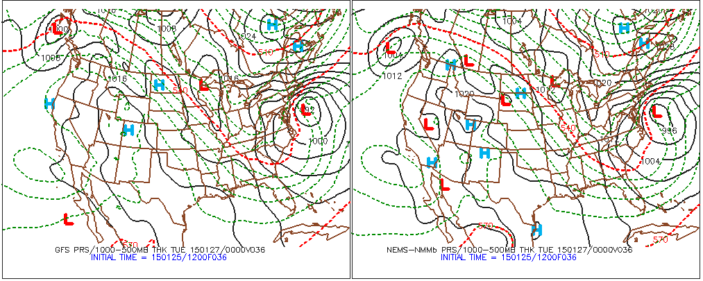
When different models (the GFS, the NAM, etc.) produce similar forecasts for a specific area at a specific forecast time (or a specified period), meteorologists typically have higher confidence issuing their forecasts because there is rather high consensus. For example, on January 25, 2015, there were only slight differences between the 12 UTC model predictions for the track and strength of a nor'easter expected to dump heavy snow on the major metropolitan areas in the Northeast on January 26-27, 2015 (revisit the comparison above).
As a result, meteorologists were fairly confident about their deterministic forecasts for total snowfall. For example, the forecast below was issued Sunday afternoon, January 25, 2015, by the National Weather Service for the New York City metropolitan and southern New England areas (the brunt of the storm was slated to occur on Monday and Tuesday). For the record, a deterministic forecast is one in which the forecaster provides only a single solution. This snowfall forecast clearly qualifies as a deterministic forecast.
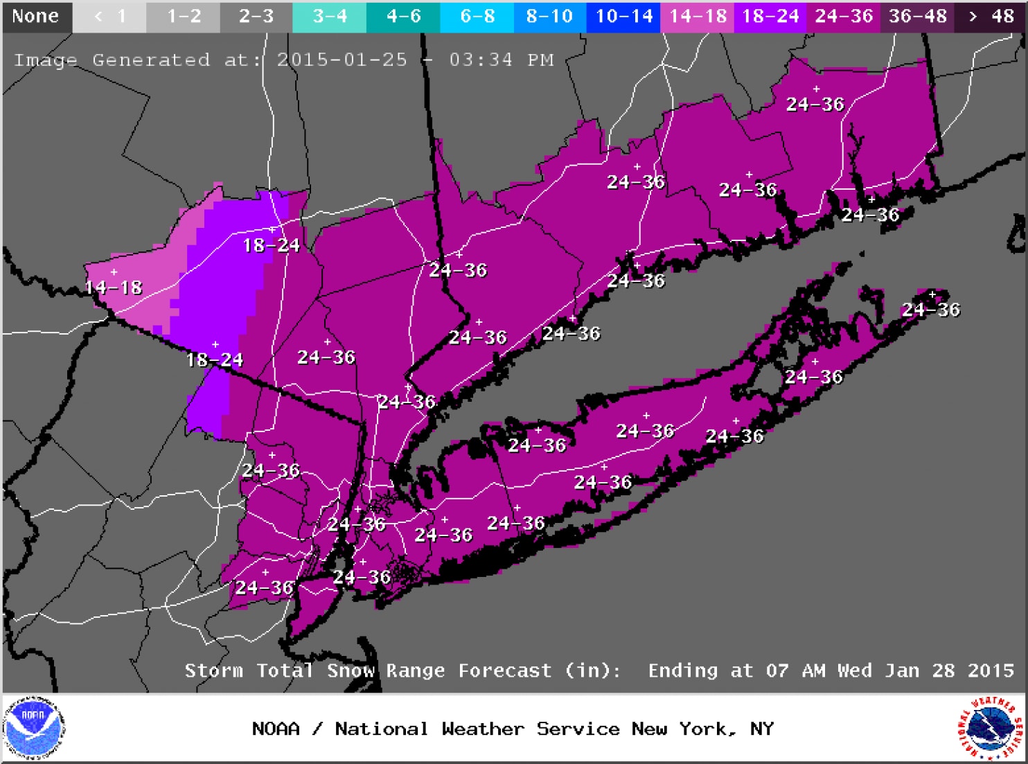
Once forecasts for historic snowfalls were issued, seven states of emergencies were declared from Pennsylvania to New Hampshire, and major highways were closed throughout the Northeast. Aviation was not spared as roughly 7,000 flights were cancelled. Businesses and schools also closed, and public transit was either shut down or severely curtailed. The subway system in New York City was shut down for the first time in its history due to an imminent snowstorm (2-3 feet of snow were predicted for the Big Apple). Needless to say, the pressure on forecasters was quite high (unlike the falling barometric pressure of the developing nor'easter).
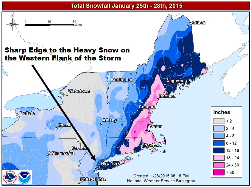
In 20-20 hindsight, forecasters probably should have conveyed some uncertainty to the public on January 25, 2015, because a "historic snowstorm" did not materialize in some areas (see image below). For example, the National Weather Service predicted up to three feet of snow in New York City, and, yet, "only" 10 inches fell [40] (a significant snowfall, no doubt, but hardly three feet). In Philadelphia, PA, the National Weather Service predicted 14 inches. Only two inches were measured. That's a really big deal as far as emergency planning is concerned.
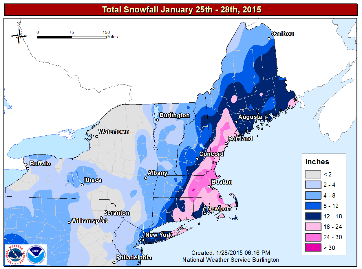
On the flip side, the National Weather Service's forecast for eastern New England had exactly the right tenor of a "historic snowstorm." For example, Worcester, Massachusetts, recorded 34.5" of snow, the city's greatest snowfall on record (records date back to 1892). So the National Weather Service was egregiously wrong in some places while they were right on target in others.
How could a great forecast at many cities and towns be so wrong in other places? The simple answer is that the eventual track of the storm was 50 to 100 miles east of where earlier runs of the models had predicted (here's the storm verification [42]). As a result of the eastward shift in the low's path (from the models' predicted track), cities and towns farther west, which were slated to receive potentially historic totals, got much less snow than forecast. In the grand scheme of numerical weather prediction, the eastward shift from the predicted storm track might seem like a relatively small error, but it made a huge difference in snowfall at Philadelphia and New York City.
Although deterministic forecasts such as the snowfall forecast for January 25-28, 2015, are pretty much standard practice these days, the specificity of deterministic forecasts makes them vulnerable, especially when there's a rather high degree of uncertainty. A more realistic approach is used by some forecasters when they recognize that the forecast uncertainty makes it too risky to issue a deterministic forecast without adding important qualifiers. In these situations, forecasters attempt to convey the uncertainty to the general public by providing probabilities for various possible outcomes.
What specific strategies do weather forecasters have at their disposal to make forecasts when there is a meaningful degree of uncertainty? Read on.
4a. Forecasting Strategies
Forecasting Strategies: An Introduction to Ensemble Forecasting
During the late afternoon of January 25, 2015 (2034 UTC, to be exact), the National Weather Service in New York City issued a short-term, deterministic forecast for historic snowfall [43] in the Big Apple. This dire forecast came hours after earlier model runs at 06 UTC, 12 UTC, and 18 UTC predicted that the track of the approaching nor'easter would be closer to the coast than previously predicted. The European Center's model, whose forecasts are routinely given heavier weight by some forecasters, led the charge toward a more westward track and a potentially crippling snowstorm [44] in New York City and the surrounding metropolitan areas.
It is not our intention here to criticize forecasters, who were trying their very best to get the forecast correct. The purpose of this section is to show you that there are other ways to present forecasts to the general public without such a high deterministic tenor. For example, below is the 72-hour probabilistic forecast for the 90th percentile of snowfall issued by the Weather Prediction Center at 00 UTC on January 26, 2015 (about four hours after the deterministic snowfall forecast issued by the National Weather Service in New York City). What exactly does this mean? Read on.
Look at New York City in the orange shading (Larger image [45]). In a nutshell, there was a 90% probability that 33 inches of snow or less would fall during the specified 72-hour period. Now this forecast might strike you as a huge hedge by forecasters, but at least it alerts weather consumers that accumulations less than 33 inches are possible. Here's an alternative way to think about it: There was only a 10% probability of more that 33 inches of snow (some consolation, eh?). And yes, we realize that most folks will probably focus only on the high end of this probabilistic snowfall forecast, but we wanted to show you that there are, indeed, probabilistic alternatives, even if this probabilistic forecast seems to leave a lot to be desired. In its defense, this probabilistic forecast gave forecasters a sense for the maximum potential snowfall.
Okay, now that you're up to speed with regard to the existence of probabilistic alternatives to deterministic forecasts, let's go back and fill in some of the forecasting details surrounding the Blizzard of January 25-29, 2015. From a forecasting perspective, what happened? Was there a more scientifically sound alternative to the deterministic snowfall forecast?
On January 25, within a period of roughly 12 hours after the 06 UTC model runs became available, the forecast in New York City evolved from a Winter Storm Watch (snow accumulations of 10 to 14 inches) at 3:56 A.M. (local time) to a Blizzard Warning (snow accumulations of 20 to 30 inches) at 3:19 P.M (local time). Compare the two forecasts [46]. The model runs at 06, 12, and 18 UTC were at the heart of the busted forecast in New York City and other cities and towns on the western flank of the storm's heavier precipitation shield.
Of course, we realize that hindsight is always 20-20, but we want to share our fundamental approach to using computer guidance in such situations: In a nutshell, don't simply choose "the model of the day." Unfortunately, on January 25, 2015, some forecasters defaulted too quickly to the European model and elevated it to "the model of the day." This decision to essentially use the solution from one specific deterministic forecast eventually led to a public outcry in New York City and other cities and towns of the western flank of the storm, where actual snowfall totals were far less than predicted.
Why was the western flank of this nor'easter such an issue? The simple answer is that the greatest forecast uncertainty lay on the storm's western flank. To understand this claim, check out the image below. The image displays the probability of 30 millimeters (a little more than one inch) of liquid precipitation during the 30-hour period from 00 UTC on January 27 to 06 UTC on January 28, 2015. For the record, the probabilities were determined by a series of 52 model simulations using the European model. All 52 simulations were initialized with slightly different conditions at 00 UTC on January 25, 2015. At New York City during this forecast period, there was a 60% to 70% probability of a little more than one inch of liquid precipitation = ten inches of snow (assuming a 10:1 ratio).
Note the large gradient in probabilities from New York City westward. Such a large gradient means that probabilities decreased rapidly westward from New York City. Thus, determining the western edge of heavy snowfall was fraught with potential error (as opposed, for example, to the smaller gradient in probabilities over eastern Long Island). In other words, there was high uncertainty in the snowfall forecast over New York City. The bottom line here is that the large gradient in probabilities was the footprint of an imminent sharp edge to the heavy snow on the western flank of the storm. A slight eastward shift in the low's track would have meant that a lot less snow would have fallen at New York City and cities and towns to the west of the Big Apple (hence, the high uncertainty). And, of course, that's exactly what happened.
In general, how should forecasters deal with the dilemma of uncertainty? Our approach to weather forecasting is akin to playing bingo ... the more bingo cards [48] you play, the greater the odds that you'll win. Indeed, we strive to include the input of as many computer models as we can into our forecasts, and this approach logically includes ensemble forecasts.
We'll share more details about ensemble forecasting later in Chapter 17. For now, all you need to know is that the most basic kind of ensemble forecasts is a series of computer predictions (all valid at the same time) that were generated by running a specific model multiple times. Each run, called an ensemble member, in the series is initialized with slightly different conditions than the rest. If all the ensemble members of, say, the GFS model, have slightly different initial conditions but essentially arrive at the same forecast, then forecasters have high confidence in the ensemble forecast. By the way, the ensemble forecasting system tied to the GFS model is formally called the GEFS, which stands for the Global Ensemble Forecast System. For the record, the GEFS is run daily at 00, 06, 12, and 18 UTC.
Before we look at the GEFS in action, we should point out here that sometimes an ensemble prediction system [49] (EPS) is based on more than one model, and we will look at a multi-model EPS in just a moment.
For now, let's examine forecasts from the GEFS in the context of the Blizzard of January 25-28, 2015. The image below displays the individual 24-hour forecasts by all the ensemble members of the GEFS. Each of these ensemble members were initialized with slightly different initial conditions at 12 UTC on January 26, 2015 (and, thus, they were all valid at 12 UTC on January 27, 2015). The color-filled circles indicate each ensemble member's predicted center of the nor'easter's minimum pressure. The black star marks the analyzed center of the low-pressure system.
Clearly, there were ensemble members whose forecasts for the low's center were too far west and too far east (compared to the analyzed center). In other words, there was uncertainty associated with the predicted center of low pressure even at this rather late time. Meanwhile, the multi-colored contours represent each ensemble member's forecast for the westernmost extent of a snowfall of ten inches. Even with roughly 24 hours remaining before the storm hit New York City, the large "spread" in the positions of these contours still indicated a fairly high degree of uncertainty on the storm's western flank. Stated another way, this was, without reservation, not the time to be choosing the "model of the day."
Presenting a probabilistic forecast, such as the European ensemble forecast for probabilities that we discussed above (revisit this image [47]), is a much more scientifically sound way to convey uncertainty to the general public. Yes, there was a big difference between the probabilistic forecast by the European ensemble forecast and the deterministic forecast based on a single run of the operational European model. To be perfectly honest, however, probabilistic predictions for snowstorms have yet to catch on in this country because the public demands deterministic forecasts for snowfall.
In lieu of a probabilistic presentation of the forecast when there's high uncertainty, the mean prediction of all the ensemble members of a specified model (or a multi-model ensemble prediction system) can be robust and fairly reliable. At the very least, the mean ensemble forecast can get you in the neighborhood of a reasonable deterministic weather forecast.
Take LaGuardia Airport, for example, which is not very far from New York City (map [51]). LaGuardia Airport received 11.4 inches of snow from the Blizzard of January 25-28, 2015 (9.8 inches of snow were measured at Central Park in New York City). Given LaGuardia's proximity to New York City, the forecast at LGA also had a fairly high degree of uncertainty. But the mean ensemble forecast from a multi-model ensemble prediction system called the Short Range Ensemble Forecast (SREF [52], for short) produced a snowfall forecast much more accurate than the historic deterministic forecast issued by the National Weather Service. For the record, the SREF has 26 ensemble members from two different models (13 members associated with each model). The mean ensemble forecast yields a total of 27 forecasts available from the Short Range Ensemble Forecast. For the record, the SREF is run four times a day (at 03, 09, 15, and 21 UTC).
Above is the SREF plume for LaGuardia Airport. An ensemble plume such as this is like a forecast meteogram - it plots the time evolution of a predicted meteorological parameter from all 26 SREF ensemble members (in this case, total snowfall). The upward swing in the plots of all 26 ensemble members (multi-colors) from 18 UTC on January 26 indicates that snow was accumulating at the specified time, and any point on the upward-slanting plots represents the running predicted snowfall total up to this time. For example, the maximum predicted snow accumulation at LaGuardia at 00 UTC on January 27 was 5 inches (you can read the running total snowfall [53] off the vertical axis of the plume). The mean ensemble forecast is plotted in black.
Almost all the ensemble members had snow accumulating until roughly 18 UTC on January 27 (the vertical gray line). A few ensemble members had snow accumulating at LaGuardia for a short time after 18 UTC on January 27. Thereafter, all the ensemble members "leveled out" and ran parallel to the time axis, indicating that accumulating snow was predicted to have stopped.
Focus your attention on the mean forecast. If you project the rightmost portion of the mean forecast that is parallel to the horizontal time axis to the snow totals on your left (see image below), you can read off the mean forecast for total snowfall at LaGuardia during this time period, which essentially covered the entire snowstorm. The mean forecast for total snowfall was approximately 18 inches, a little more than 6 inches too high, but much closer than the 2-3 feet predicted by the National Weather Service. A much more palatable forecast, wouldn't you agree?
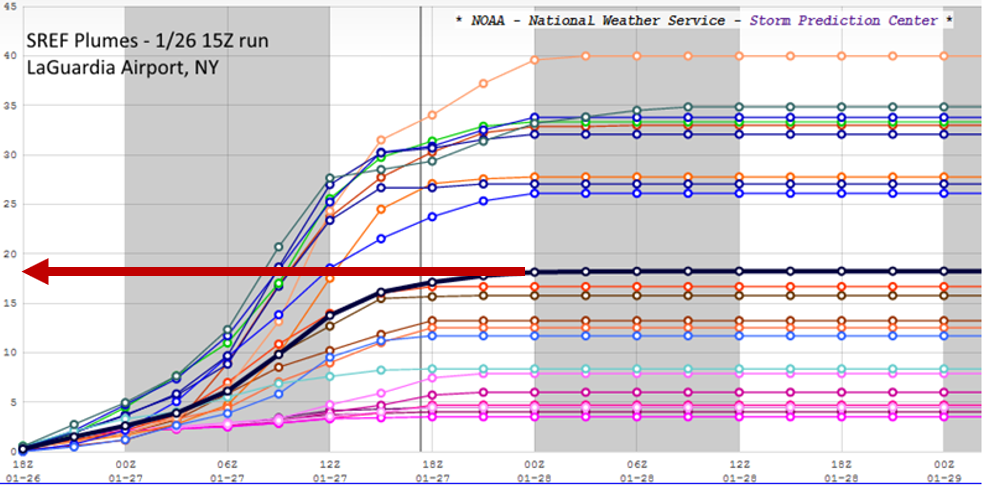
Needless to say, there was a large spread in the forecast by ensemble members, varying from snowfalls of only a few inches to as much as 40 inches. A deterministic forecast of 3-40 inches would never be acceptable, but the mean ensemble forecast of 18 inches was, at the very least, reasonable compared to the historic predictions of 2-3 feet. A word of caution ... If the individual predictions by all the SREF ensemble members had been clustered almost strictly above or strictly below the mean ensemble forecast, then the mean forecast might not have been reasonable. In such situations, a probabilistic forecast would be much more prudent. Maybe one day in the future, weather forecasts will have a more probabilistic tenor, especially in cases that have a high degree of uncertainy (such as New York City in the build-up to the Blizzard of January 25-28, 2015).
In fairness to the "favored" European model, its ensemble mean forecast [54] for New York City was practically spot on. As you recall, the operational European model was way too high in the Big Apple. Such is the potential of forecasting using the ensemble mean as a starting point. Always remember, however, that the ensemble mean is no guarantee.
We offer this preview of ensemble forecasting to make a first impression that looking at more than one computer model is like playing bingo with more than one card ... it increases the odds of winning. Odds are higher that you will make a more accurate forecast if you don't wander too far from the mean ensemble forecast, as long as there's roughly the same number of ensemble members above and below the mean forecast (revisit the LaGuardia Airport SREF plume above).
Parting Words
Having just warned you about "choosing the model of the day," we point out that forecasters can still glean valuable insight by looking for trends in successive runs of individual models. In the case of the Blizzard of January 25-28, 2015, the pivotal forecast period, as we mentioned earlier, was 06 UTC to 18 UTC on January 25, when there was a westward trend (shift) in the predictions for the track of the surface low and the corresponding areas of heaviest liquid equivalent. Both the operational models (the European model, for example) and a group of ensemble members in the 09 UTC run of the SREF were at the heart of these two trends. Forecasters "jumped" at the trends and accordingly increased their earlier forecasts to historic levels. In retrospect, the westward shift in the 09 UTC SREF apparently produced a "confirmation bias" in forecasters, which seemed to confirm the western shift in earlier operational models. This confirmation supported their instincts to predict potentially historic snowfall, despite the uncertainty on the western flank of the storm.
Even after the operational models and ensemble forecasts started to slowly back off a historic snowstorm on the nor'easter's western flank (in New York City, most notably), forecasters stuck to their guns and kept the snowfall predictions in New York City at 2-3 feet. "Loss aversion," which is essentially the resistance by forecasters to admit to themselves that their historic snowfall forecasts were way too high, might have played a role in the relatively slow response in backing off historic snowfall forecasts. Loss aversion is not restricted to weather forecasting, however. It is a facet of the human condition. Indeed, loss aversion is "our tendency to fear losses more than we value gains" (New York Times, November 25, 2011 [55]).
The internal consistency of individual models is still a consideration that experienced forecasters routinely weigh. Forecasters have higher confidence in models whose successive runs do not waver from a specific weather scenario (the models were not very internally consistent leading up to the Blizzard of January 25-28, 2015). Fickle models that flip-flop between different solutions (as they did before the Blizzard of January 25-28, 2015) do not instill much confidence, so forecasters should give them less weight.
When computer models suggest the potential for a big snowstorm, a few "old-school" forecasters might wait as long as a couple of days to see whether consecutive model runs are internally consistent before going public with deterministic predictions for snowfall. Even though this wait-and-see approach is somewhat conservative, jumping the gun with regard to predicting snow totals sometimes results in forecasters having "egg" on their collective faces, which only serves to diminish public confidence in the profession of meteorology. However, waiting until the last possible moment to issue deterministic snowfall forecasts is, unfortunately, an approach no longer followed in this fast-paced world of data shoveling.
Forecasters also check to see if a model’s solution agrees with evolving weather conditions. For example, if a particular six-hour forecast from the NAM predicted rain in southern Ohio with surface temperatures at or just above the melting point of ice, but observations at that time indicated heavy snow with temperatures several degrees below 32oF (0oC), forecasters would tend to discount (or at least view with a wary eye) the model's solution beyond that time.
Until now, we've focused our attention on short-range forecasting, which typically deals with a forecast period that covers up to 72 hours into the future. Let's now turn our attention to medium-range forecasting.
5. Medium-Range Forecasting
Medium-Range Forecasting: Sticks in a Stream
If you throw a stick into a stream, you might be able to visually follow the stick for a short while, but eventually the stream carries it out of sight. By knowing the locations of fast white waters and slower currents farther downstream, you might be able to make an extended forecast of the stick’s position a few minutes later, but it still would be impossible to predict exactly. A detailed forecast of the stick’s location several hours into the future seems like a mission impossible.
Such are the drawbacks of numerical weather prediction and weather forecasting in general – the farther you attempt to forecast into the future, the more difficult it is to predict details about an atmospheric "stick" (a metaphor for weather systems such as a mid-latitude low) embedded within the fast currents of the jet stream. Medium-range forecasts in fast-flow patterns during the cold season are particularly prone to error. These forecasting limitations are especially true in medium-range forecasting (the medium range [56] generally represents three to seven days in the future).

With this idea in mind, we would like to comment about the five-, ten-, and fifteen-day (and even longer) forecasts that are routinely reported in the news media and offered on the Web. Typically, these extended forecasts give specific high and low temperatures for each day. They also include icons that specifically describe sky conditions and precipitation. We are even aware of instances in which television meteorologists, eager to beat their competition to the punch, boldly predicted snow accumulations for a storm slated by a medium-range model to occur four or five days in the future. Such specificity more than a few days in advance is difficult to justify in most cases, given that errors in computer models magnify in time, just like the distortion of whispered information grows as the line of people gets longer. Though there have been occasions in which medium-range models pegged big storms more than a few days in advance (the March 1993 Superstorm is a good example), such specificity in medium-range forecasting invariably hurts the credibility of operational meteorology.
The American Meteorological Society has some sage advice for anyone who routinely accesses deterministic forecasts more than eight days into the future: "Presently, forecasts of daily or specific weather conditions do not exhibit useful skill beyond eight days, meaning that their accuracy is low" (AMS official statement on Weather Analysis and Forecasting). [57]
One tried-and-true piece of advice that’s useful for medium-range forecasting (any forecasting, for that matter) is: “Emphasize what you know, not what you don’t know.” For example, instead of specific numbers for high and low temperatures and precipitation, some forecasters employ descriptions such as “below average,” “above average,” “a wet pattern,” “a dry period,” and other conservative but useful outlooks. Or, rather than ascribing specific predictions for a particular location, some forecasters expand the spatial and time horizons of their medium-range forecasts. For example, instead of predicting a snowstorm for a certain town or region in Pennsylvania for a Saturday in the extended forecast prepared on the prior Monday, forecasters might say “an important storm will affect the Northeast States over the weekend.” Such an approach informs, but does not raise the red flag of imminent storminess.
Many forecasters will make such statements about medium-range forecasts only when there’s agreement between several models and some run-to-run consistency in each model. In addition to the GFS, another medium-range model that forecasters commonly consult is referred to as the "European." This global model is produced at the European Centre for Medium-Range Weather Forecasts [58] (thus the name), and, in the long run, has proven to be slightly more skillful than the GFS.
So how do meteorologists use guidance from these two models (and others) to approach the challenge of medium-range forecasting?
5a. Looking for an Edge in the Medium Range
Looking for an Edge in the Medium Range: Pattern Recognition
Days before the Blizzard of January 25-28, 2015, the medium-range forecast by the GFS model indicated that the possibility of a big snowstorm in the Northeast seemed like a non-starter because the predicted nor'easter would be sufficiently far out to sea. To see what we mean, focus your attention on the 108-hour forecast from the GFS initialized at 00 UTC on January 23 (the evening of January 22 in the Eastern U.S.). For the record, this forecast was valid at 12 UTC on January 27 (larger image [59]). Note, on the upper-right panel, the intense low-pressure system off the Northeast Coast. Yes, the GFS predicted a formidable low in the medium range, but the nor'easter was far enough off the coast that hardly any precipitation was predicted to fall over New England and the Middle Atlantic States during the six-hour period ending at 12 UTC on January 27 (note the general lack of precipitation over these regions on the lower-right panel).
For sake of continuity, here are the GFS 96-hour [60] and 114-hour [61]forecasts, valid at 00 UTC and 18 UTC on January 27, respectively. Together with the 108-hour prog, these three GFS forecasts (96-, 108-, and 114-hour) will give you the sense that the nor'easter would all but miss New England and the Middle Atlantic States during the 18-hour period ending at 18 UTC on January 27.
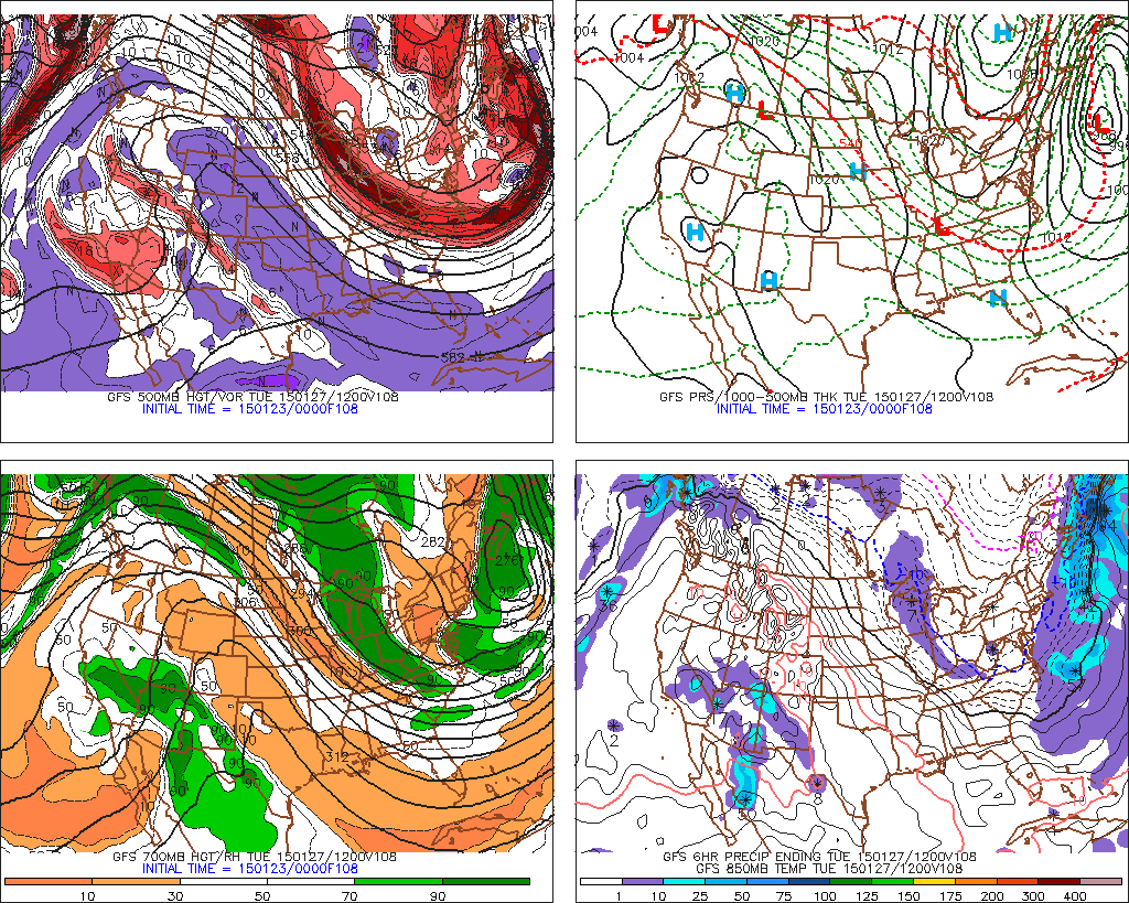
Of course, nothing could have been further from the truth. Indeed, it was snowing to beat the band [62] at 12 UTC on January 27 over eastern New England. For example, check out the meteogram at Boston's Logan International Airport below. Note that heavy snow was falling at 12 UTC on January 27, as it had hours before, and as it did hours later. Lesson learned: Beware of deterministic forecasts in the medium range that have a potential to bust big time if the track of a deep low-pressure system shifts far enough from its predicted path.
Such an important forecast for major metropolitan areas in the Northeast demanded a multi-model ensemble approach (the topic of the next section) and a cautious, deliberate tenor on Thursday night's 11-o'clock news. Something along these lines would have been appropriate: "A major storm system will develop early next week and make its way northward off the Atlantic Coast of the United States. Depending on its path, this storm could impact the Northeast or simply brush by the coast on Monday and Tuesday. We'll have more details on the implications of the various possible paths of the storm over the next couple of days."
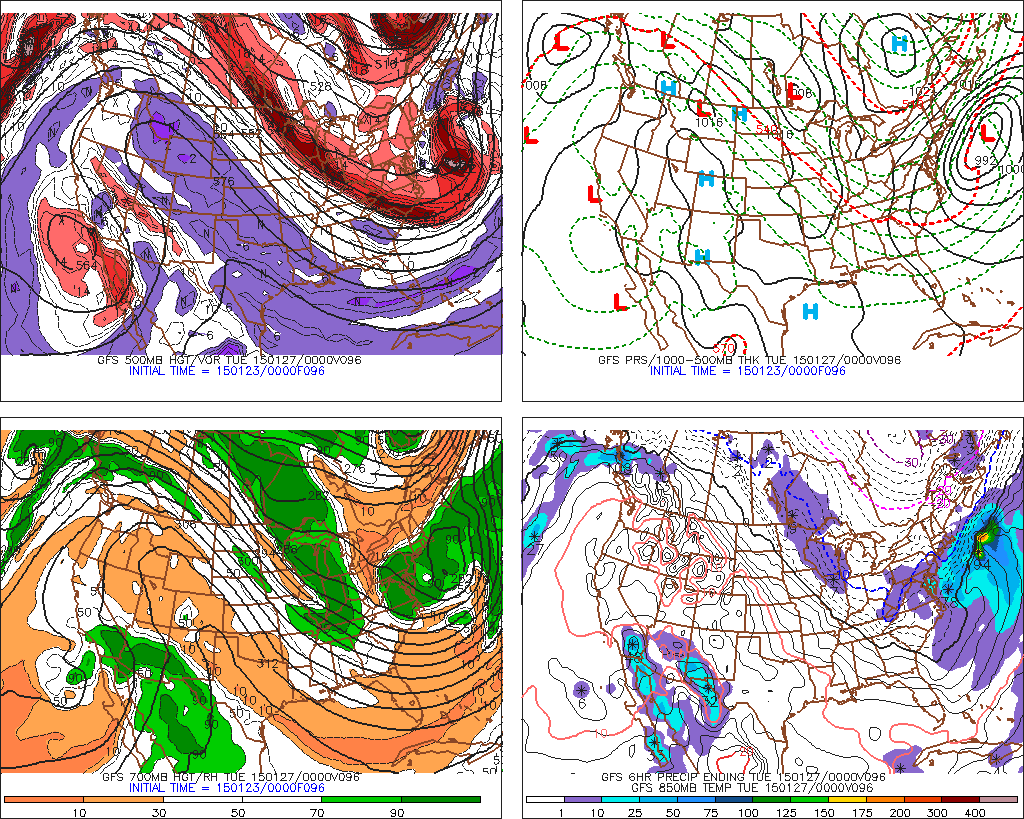
Obviously, we shouldn't try to glean deterministic details about a winter storm from the medium-range progs. This doesn't mean, however, that we can't extract some other useful and reliable forecast information from them. Take, for example, the 96-hour GFS forecast that was valid at 00 UTC on January 27, 2015 (see the four-panel presentation above; larger image [60]).
For starters, does pattern recognition come into play on this prog? Indeed it does. The upper-left panel indicates that a high-amplitude 500-mb pattern would cover much of North America on January 27, 2015, with a sprawling ridge over the West and the Plains and a full-latitude trough over the East (a full-latitude trough is old-school terminology for an upper-level trough that essentially spans from Canada to the Gulf of Mexico). Based on what you learned in Chapter 7, you could have then inferred that surface temperatures would likely be above average in the West as well as the Plains and below average in the East. Although such information is not really a determininistic forecast, it most certainly is a useful "heads-up" for weather consumers.
In order to validate our medium-range "heads-up," check out the chart of temperature anomalies (below; larger image [63]) on January 27, 2015 (anomalies were calculated from daily averages and are expressed in degrees Celsius). As you can readily observe, the regions with above-average temperatures (orange and red) and below-average temperatures (blues) closely corresponded to the high-amplitude 500-mb pattern we just discussed - ridge over the West and the Plains and a trough over the East. In case you're wondering why the positive temperature anomalies were not larger over the Rockies and the Great Basin [64], we note that there was very dry air over the region (status quo). Dry air combined with the rather long winter night of January 26-27, set the stage for very low nighttime temperatures [65] (expressed in degrees Celsius), which apparently offset the anomalously warmer daytime hours.
This analysis conveniently includes the daily averaged sea-level pressure isobars (labeled in millibars) on January 27, 2015. Note that the deep low-pressure system off the Northeast Coast was much closer to the coast than the medium-range GFS progs had predicted on January 22.
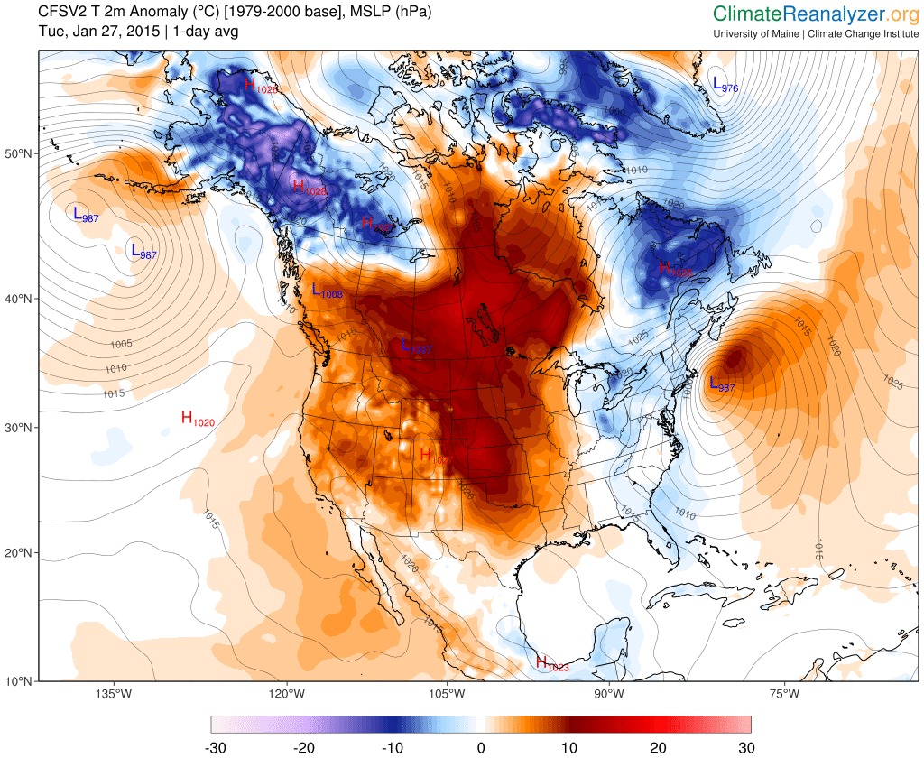
There were other useful forecast tidbits associated with the GFS 96-hour prog [60] that we've been discussing. Turn your attention to the closed 500-mb low off the southern California Coast (check out the top two panels of this prog below; larger image [67]). This closed low represented a pool of cold air aloft, whose footprint was the closed contour of 1000-500 mb thickness just off the Pacific Coast (the black arrow on the right panel pinpoints this closed thickness contour, whose value, by the way, is 5520 meters).
This closed 500-mb low was a component of the high-amplitude pattern we noted earlier, and, as such, the predicted position of the 500-mb low was fairly reliable in the medium range. That's because high-amplitude 500-mb patterns tend to evolve exceptionally slowly. In contrast, zonal flow at 500 mb (low-amplitude patterns), especially during winter, presents all sorts of medium-range challenges in the timing and forecasting of the future positions of weather systems (thus, the forecasting mantra, "Fast flow, weatherperson's woe").
Let's get back to the business at hand. Referring to the upper-left panel, please note the lobe of positive vorticity to the east and southeast of the closed 500-mb low (light and dark red shading). Within the dark-red shading, there are at least two vorticity maxima. We highlighted the most relevant vort max with a bold, black "X." The predicted position of this vort max suggested that there would be upper-level divergence and upward motion over a portion of southern California (and, in general, downstream of the entire lobe of positive vorticity). Hold this thought for a moment.
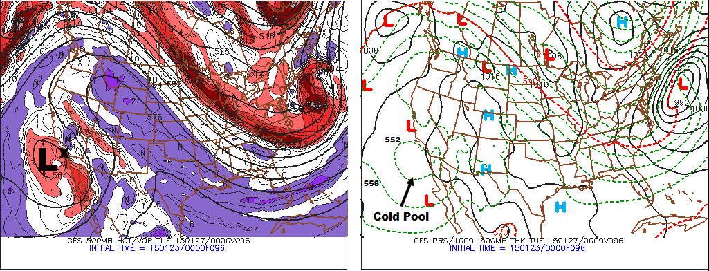
Meanwhile, the flow in the lower troposphere was from the southeast. The arrow on the left panel below (from the 96-hour GFS prog) represents a 850-mb streamline, indicating that moisture from the relatively warm Gulf of California was being transported into southern California. Note the areas with 700-mb relative humidity greater than 70% and 90%, statistically indicating clouds and precipitation, respectively, would likely be present at 00 UTC on January 27. The right panel below (from the 96-hour GFS prog) confirms this statistical relationship by predicting that there would be measurable precipitation during the six-hour period ending at 00 UTC on January 27.
The meteogram [68] at the Los Angeles International Airport confirms these cloud and precipitation (rain) forecasts. A medium-range prediction issued on Thursday (January 23) for the possibility of rain developing late Monday (January 26) in the Los Angeles area would have been a reasonable forecast, especially if there were a probabilistic tenor to the forecast.
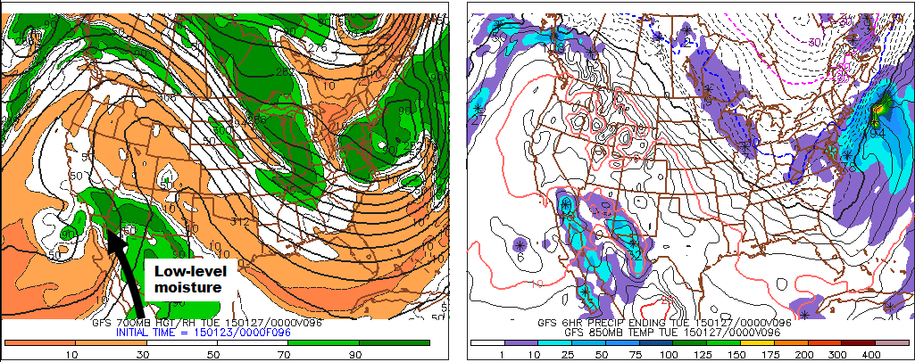
Let's look at one more facet of the medium-range forecast based on the GFS 96-hour prog valid at 00 UTC on January 27, 2015. Focus your attention on the lower-right panel, and note the area of generally light precipitation predicted to fall over south-central Canada and the western Great Lakes during the six-hour period ending at 00 UTC on January 27.
First, recall that the lower-right panel of the GFS prog displays predicted 850-mb isotherms. The 850-mb isotherm corresponding to 0o Celsius is the solid, black contour; 850-mb isotherms representing temperatures below 0o Celsius are dashed and 850-mb isotherms corresponding to temperatures above 0o Celsius are solid.
The area of precipitation on the lower-right panel of the 96-hour GFS prog was predicted to lie well on the cold side of the 0oC isotherm, so snow was the likely precipitation type. But before forecasting snow in the medium range, it would have helped meteorologists to get a sense for the basic meteorology explaining the predicted snow, in order to competently convey any probabilistic information in the medium-range forecast.
To establish the basic meteorology, we start with the observation that it was cold in the East and unusually warm over the West and the Plains. Therefore, it's reasonable to speculate that there was a front somewhere over the middle of the nation. With such sound logic in mind, note the low-pressure system just to the north of Minnesota (check out the upper-right panel of the 96-hour GFS prog below). No doubt that surface convergence around the low would contribute to some of the expected light snowfall, but mid-latitude lows typically have fronts, and fronts - especially warm fronts - can produce stratiform snow by way of overrunning. Let's investigate.
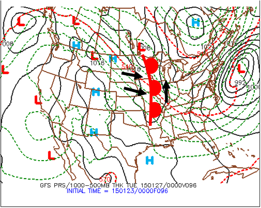
This upper-right panel of the 96-hour GFS prog predicted a trough of low pressure extending southward from a low centered over south-central Canada. The black arrows indicate a reasonable surface wind pattern in and around the trough, including the northwesterly surface winds to the west of the trough. To get a better sense for the northwesterly flow throughout the lower troposphere over the Plains, check out the lower-left panel of the 96-hour GFS prog [69], which clearly indicates northwesterly flow at 700 mb (northwesterly flow extended down to the ground). At any rate, these northwesterly surface winds were slated to produce warm advection (black arrows point from lower to higher thickness values). As a result, the trough of low pressure extending southward from the low over south-central Canada contained a warm front, and the generally light snow predicted by the 96-hour GFS prog would be a result of warm air overrunning colder air to the east of the warm front.
This knowledge about northwesterly winds overrunning the warm front helps to solidify a reasonable reference to the possibility of snow in the medium-range forecast during the six-hour period ending at 00 UTC on January 27, 2015.
We were a bit fortunate in this instance. We extracted fairly reliable information from medium-range progs in a high-amplitude pattern, whose evolution (in general) is rather slow and more predictable. Thus, on Thursday evening, January 22, 2015, forecasters had reasonably high confidence in predicting above-average and below-average temperatures over the West and East, respectively, as well as the possibility of rain over southern California from the closed low at 500 mb. These predictions were not a done deal, however, but the uncertainty in both forecasts was relatively small (in the case of the closed 500-mb low off the southern California Coast, forecasters were confident about the general possibility of rain, but predicting specific rainfall at specific locations would have been highly uncertain).
The forecasts for the possibility of snow over the western Great Lakes on Monday, January 27, 2015, and, of course, the deep storm off the Northeast Coast, had more uncertainty, primarily because both low-pressure systems were associated with relatively fast-moving, short-wave troughs at 500 mb. Although these short waves were embedded in the high-amplitude, long-wave pattern, they were not part of the long-wave pattern, so their speed and positions had more forecast uncertainty, especially in the medium range.
In these more uncertain situations, forecasters would have been better off had they taken a probabilistic approach and incorporated the science of ensemble forecasting. Read on.
5b. More on Ensemble Forecasting
More on Ensemble Forecasting: Spaghetti Plots
Computer forecasts can go awry for several reasons. Right off the bat, numerical weather predictions can "bust" pretty quickly if the model is initialized poorly - in other words, if it does not reasonably represent the current state of the atmosphere. Even "good" initializations have flaws, so they never quite represent the current state of the atmosphere with perfect accuracy. Either way, uncertainty in varying degrees is almost always introduced into numerical weather prediction, and this uncertainty grows with increasing forecast time.
As you learned earlier, meteorologists compensate by implementing a technique called ensemble forecasting, which gauges the sensitivity of a computer model's prediction to the way it's initialized. Specifically, meteorologists make minor changes to the initialization of a lower-resolution version of a specified operational model called the control member. For example, the control member in the GEFS has lower resolution [70] than the operational GFS model. At any rate, the control member is run using this slightly different initial state. Then meteorologists tweak the initialization of the control member yet another time, in a slightly different way, and run the control member again using this new initial state. This process of "tweaking" the initial conditions of the control member is repeated a number of times (for some models, several dozen times), yielding a set of ensemble members.
If all or most of the ensemble members come up with basically the same numerical prediction for a specific forecast day, meteorologists have a relatively high degree of confidence in that day's forecast. If, however, the tweaked model runs predict several noticeably different scenarios for the day in question, then forecasters have a fairly low degree of confidence in the numerical prediction.
In our previous introduction to short-range ensemble forecasts, we examined the Blizzard of January 25-28, 2015, and showed you the efficacy of short-range ensemble forecasting technique, especially when there's a high degree of uncertainty in the forecast. Revisit the image above and focus your attention on the spread in the ensemble forecasts for the western edge of snowfall equal to ten inches. This spread indicated high uncertainty for short-range predictions of heavy snowfall on the western flank of the nor'easter. Such a spread of contours almost looks like spaghetti noodles, assuming you let your imagination run a bit wild. Hold this "pasta" thought for a moment.
To investigate the role of "spaghetti," forecast uncertainty, and ensemble forecasting in medium-range predictions, let's shift away from winter weather and take a look at a case from the field of tropical weather forecasting. We will focus our attention on Hurricane Michael, which made landfall on October 10, 2018, near Mexico Beach on the panhandle of Florida as a high-end Category-4 hurricane (see the 4.5-hour loop of visible images from GOES 16 below). Maximum sustained winds were 155 mph and the minimum pressure in the eye was 919 mb. These two images show the catastrophic damage produced by storm surge and wind at Mexico Beach: (Image #1 [71], Image #2 [72]).
One of the tools that tropical forecasters sometimes use is a multi-model ensemble system to predict the track of tropical cyclones in both the short and medium range. In tropical forecasting, this multi-model approach sometimes includes three ensemble prediction systems. As you already learned, the GFS model has an ensemble prediction system called the Global Ensemble Forecast System (GEFS). The Canadian Modeling Centre has an ensemble prediction system called the Canadian Global Ensemble Prediction System (GEPS). The U.S. Navy also has an ensemble prediction system based on their own model, the Navy Global Environmental Model (NAVGEM).
When Hurricane Michael threatened the Gulf Coast, forecasters likely looked at a multi-model ensemble system that incorporated all three of the above ensemble prediction systems (see example below). These forecast tracks were based on the 12 UTC run on October 8, 2018, of these three ensemble prediction systems. You can interpret the color coding as follows: red = GEFS (the GFS ensemble prediction system), yellow = GEPS (the Canadian EPS), and green = NAVGEM EPS (from the U.S. Navy). The black track corresponds to the National Hurricane Center's official forecast track. This ensemble display of possible predicted tracks for Hurricane Michael includes the mean ensemble forecast from each of the three ensemble prediction systems, the control members of the GEFS, GEPS, and the NAVGEM EPS, and the deterministic forecast by each of the operational models. Looks like a bunch of spaghetti noodles, wouldn't you say?
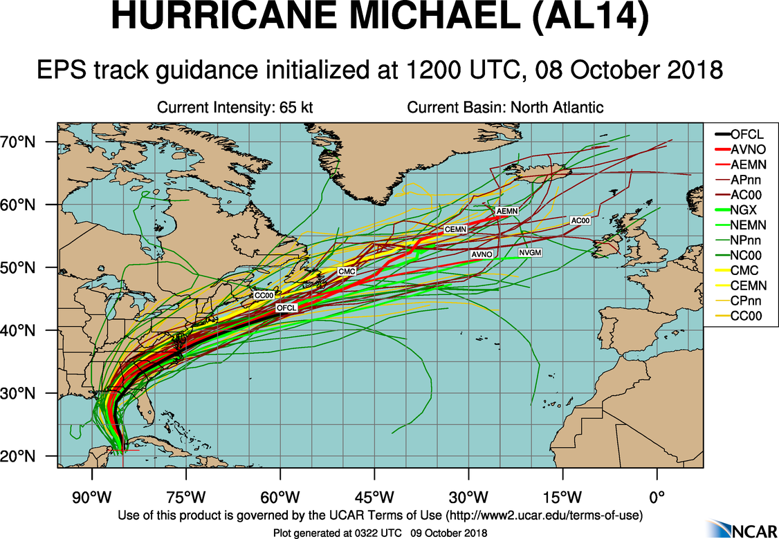
With regard to medium-range forecasting, meteorologists along the Middle Atlantic Coast [73], for example, would have used this multi-model approach. Why would these forecasters incorporate this multi-model EPS in their process for preparing their medium-range forecast? Research has shown that a multi-model ensemble is usually more useful than a single ensemble, even if some of the ensemble members have lower skill. In the medium range, the GEFS, for example, tends to be underdispersive.
What does this mean? In the context of the predicted tracks of tropical cyclones, the spread in the forecasts is often suspiciously too small (this can occur in both in the short and medium range). You can see what we mean by looking at the GEFS track forecast for Hurricane Michael (below; larger image [74]) and comparing its spread to the spread in the multi-model ensemble system shown above (please note that the GEFS was run at the same time as the multi-model EPS: 12 UTC on October 8, 2018). The bottom line here is that having all three ensemble forecast systems (including the GEFS) plotted on the same chart allows forecasters to see other possibilities that the GEFS might not be picking up on. Multi-model ensemble forecasts are another tool that meteorologists consult to gain insight into future tracks of tropical cycones and to help them establish the cone of uncertainty [75].
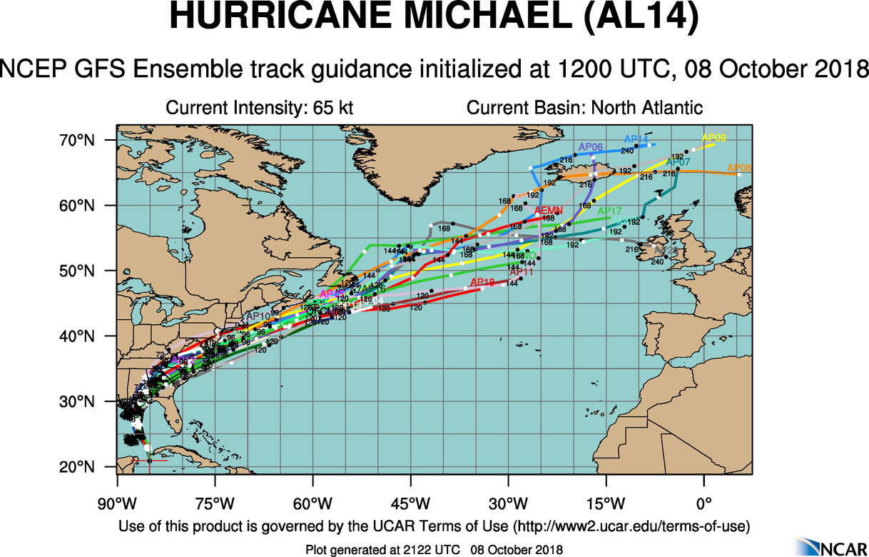
Of course, ensemble forecasting has more routine applications than pinning down the the possible tracks for major hurricanes. Indeed, weather forecasters use ensemble forecasting on a day-to-day basis to gauge the uncertainty of weather patterns for medium-range (and, of course, short-range) prediction. For example, forecasters will look an the ensemble forecasts for specific 500-mb heights in order to assess the uncertainty of regional medium-range forecasts.
To illustrate our point, check out the 24-hour GFS ensemble forecast (below) for the 5760-meter 500-mb height line (21 different members in blue) and 5940-meter 500-mb height line (21 different members in red) over Europe from the 00 UTC run on August 6, 2009. During summer, a 500-mb height of 5760 meters typically marks the southern edge of the relatively fast" 500-mb westerlies, while heights above 5940 meters typically correspond to hot weather. On the ensemble forecast below, the more northern green contour represents the average position of the 5760-meter height at that time of year, while the more southern green contour marks the average position of the 5940-meter height line. Having the climatological positions of these heights helps meteorologists to gauge whether heights are forecast to be above or below average at this time of year.
Given that this is only a 24-hour forecast, it's not surprising that there was a high degree of confidence with the predicted position of the 5760-meter height line (and the general 500-mb pattern) over Europe (the blue lines are pretty much in agreement). With a ridge over Scandinavia and much of central Europe [76], for example, a pattern of generally warmer-than-average, dry weather seemed likely over the region at the forecast time. There was a bit more uncertainty associated with the closed 5940-meter contour over northern Africa, but any slight shift in the position of this rather stagnant 500-mb high would not have much impact on the weather pattern over northern Africa; it was going to be hot no matter what!
Okay, now let's look at the 168-hour GFS ensemble forecast from the same run (see below). Look at all those lines! Is it any wonder why some meteorologists call such a graphical depiction of an ensemble forecast a spaghetti plot? Looks like they would have to use their "noodles" to figure out the forecast! Indeed, there was clearly more uncertainty in the forecast, as you would expect from a 168-hour forecast. There were even a few blue lines south of the climatological position of the 5760-meter height, suggesting cooler-than-average weather over central Europe - but these were the exception, rather than the rule. Eyeballing the mean ensemble forecast (the average position of the 21 members), you might conclude that there would be warmer-than-average weather over northern Europe around the forecast time, given that a lot of blue lines are north of the climatological position of the 5760-meter height. Meanwhile, the 168-hour GFS ensemble forecast suggested that it would get warmer over Spain (compared to the 24-hour ensemble forecast) . But how much warmer? Those red lines, representing ensemble forecasts for the 5940-meter height, are all over the place (lots of spaghetti), with a few lines never really making it to Spain. To complete our story, here's the animation [77] of this GFS ensemble forecast out to 360 hours. Note how the uncertainty associated with the predicted position of the 5760-meter height grows with time.
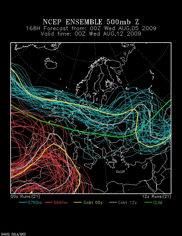
We note that the European Centre for Medium-Range Weather Forecasting runs an ensemble version of its medium-range model, known as the Ensemble Prediction System (EPS). The EPS has 51 ensemble members and produces 15-day forecasts twice a day, initialized at 00 UTC and 12 UTC. Unlike the suite of ensemble forecasts produced by NCEP, the entire set of EPS forecasts is generally not available for free to the public.
As computational power has dramatically increased, the ensemble approach has also been applied to short-range forecasting (we already discussed SREF [52] in the context of the Blizzard of January 25-28, 2015). As you learned in our introduction to ensemble forecasting, the ensemble approach provides weather forecasters with a way to gauge the sensitivity of short-range forecasts to small changes in initial conditions. Most of the time, the SREF mean forecast (the average forecast derived from the 26 SREF members) provides a reasonable starting point for meteorologists to hone their predictions. The bottom line here is that ensemble forecasting is revolutionizing the way meteorologists use computer models, both in the short range and medium range.
What about forecasts beyond the medium range, at monthly and even seasonal time scales? Research has shown that the medium-range forecasting models lose any hint of skill after approximately two weeks; in other words, to return to one of our original metaphors, the line of people becomes so long that the message of the original whisper is too twisted and mangled to be trusted. Yet the National Weather Service and many private forecasting companies routinely issue monthly and even seasonal forecasts. Let's see how they do it.
6. Seasonal Outlooks
Seasonal Outlooks: Much More than a Crystal Ball
Over the years, various individuals and businesses have claimed that they can make specific daily forecasts up to a year in advance. The truth is, as the science of meteorology stands in the early 21st century, forecasts of specific weather conditions beyond about 10 days in the future are no better than coin flips (or climatology) most of the time (sorry Old Farmer's Almanac). The official statement of the American Meteorological Society on the subject reads:
"Claims of skillful predictions of day-to-day weather changes beyond this limit [a week or two] have no scientific basis and are either misinformed or calculated misrepresentations of true capabilities."
The best that science can perform over time periods beyond a week or two is to identify (with varying degrees of certainty) some general patterns. For example, long-range forecasters can often determine whether temperature or precipitation will be above average, near average, or below average. This kind of rather general information won't help someone planning a wedding for a specific weekend next June, but there still is useful information in describing the general weather patterns in the months or seasons to come. And the skill in such monthly and seasonal forecasts has improved quite a bit in recent years.
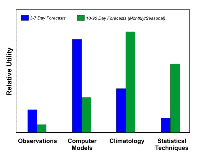
For monthly or seasonal forecasts, current weather observations help very little; climatology becomes a much more important player. But if long-range outlooks were only a reflection of climatology, what good would they be? For monthly and seasonal outlooks, statistical techniques such as teleconnections [78] are indispensable. The graph above reflects the relative utility of the four basic components of medium-range forecasting and monthly-to-seasonal outlooks. Notice that forecasters don't rely very much on observations in creating long-range outlooks (compared to medium-range forecasts). Meanwhile, the relative utility of climatology and statistical techniques increases dramatically in transitioning from medium-range to long-range forecasts.
That's not to say that personal insights and the experience of long-range forecasters is set on auto-pilot. Like short-range and medium-range forecasts, pattern recognition still plays an integral role in creating monthly and seasonal outlooks.
6a. Teleconnections
Teleconnections: Looking for Seasonal Signals
The Climate Prediction Center [79] (CPC) is the climate-forecasting cousin of the National Weather Service. Around the middle of each month, CPC forecasters issue outlooks for temperature and precipitation for the next calendar month and for all three-month periods during the coming year. The outlooks are simple, categorical, probability forecasts. The categories are "above average," "near average," and "below average."
As an example, let's say forecasters are preparing an outlook for temperature for the upcoming three months. They begin by assuming that each of the three categories is equally likely; in other words, that each of the three categories (warmer-than-average, near-average, and colder-than-average) has a 33 1/3 percent probability of occurring. Not surprisingly, this forecast essentially boils down to "climatology." Forecasters then adjust the percentages up or down for each region of the country to reflect their degree of confidence in one of the three categories. Usually, the adjustments aren't very large; only occasionally would any of the probabilities be increased to more than 50 percent. In some areas, no adjustments are made because forecasters really can't do much better than climatology (equal chances of all three categories). The end product is a map that shows regions of the country where forecasters increased the "warmer-than-average" probability above 33 1/3 percent or the "colder-than-average" probability above 33 1/3 percent, with the rest of the country essentially equal chances of all three categories (climatology).
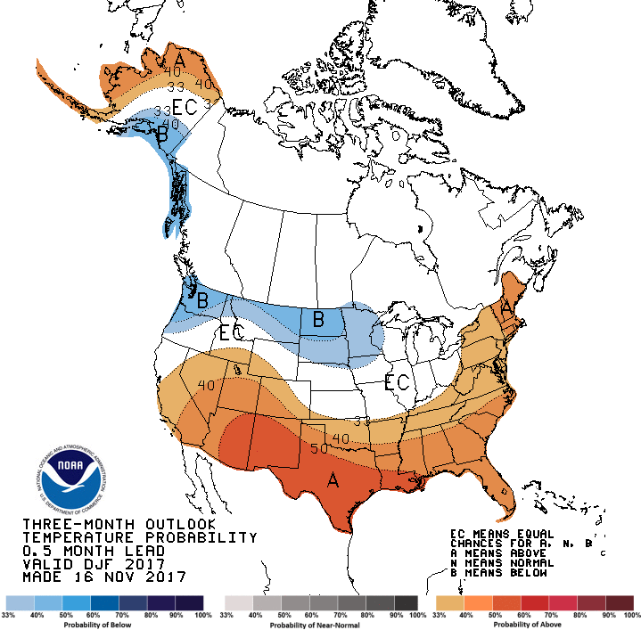
The long-range forecast shown above is the temperature outlook issued by CPC in mid-November 2017 for the three-month period of December 2017 through February 2018. In the brown-shaded regions, forecasters leaned toward above-average temperatures; the darker the shading, the greater the level of confidence for above-average temperatures in these regions during the period. Forecasters placed their greatest confidence in an area from eastern Arizona to southern Louisiana where the pocket of darkest brown (marked by an "A") indicates a probability of 50 percent or slightly higher that temperatures would be above-average. Forecasters had less confidence in above-average temperatures for this period in the region extending from southern California and Nevada into the Southeast (as well as extreme northern and western Alaska), where the moderately dark brown indicates probabilities of 40 percent or slightly higher (but still more likely than climatology).
The darkest blue shading that extends from parts of Oregon and Washington into the Dakotas, and also includes southeastern Alaska, indicates a probability of 40 percent or slightly higher that temperatures would be below average for the three-month period. Here, forecasters had a relatively high confidence, but they were not quite as confident as their prediction for above-average temperatures from eastern Arizona to Louisiana. The lighter blue indicates where the probability for below-average temperatures was between 33 1/3 and 40 percent. Again, these percentages simply mean that the odds were slightly greater than climatology that temperatures would be below average from December to February. By the way, "EC" translates to "Equal Chances," meaning that all three categories (above-, below- and near-average) are equally probable - essentially, a forecast of climatology.
We cannot emphasize enough that, even in the areas of greatest confidence (dark brown and moderately dark blue on these forecast charts), you should not interpret the forecast as a sure bet, as the media sometimes implies. The bottom line here is that the brown- and blue-shaded regions represent areas where forecasters place the odds higher than climatology for above-average or below-average temperatures.
Not to be overlooked, we include the corresponding outlook for precipitation during the period December 2017 to February 2018 (above). You should invest some time and interpret the long-range outlook for yourself.
So how do forecasters make adjustments to climatology? Tracking the current high- and low-pressure systems has no value in monthly and seasonal forecasting; these transient weather systems will be long gone a month or two in the future. Instead, forecasters focus on determining the large-scale pattern of the jet stream. Specifically, they are interested in the position of the long-wave troughs and ridges. If forecasters can ascertain the average positions of the long waves with any degree of accuracy, then they have a scientific basis for adjusting the overall temperature and precipitation patterns.
Long-range forecasters sometimes look to the past to predict the future. Yes, you read that correctly. To do this, forecasters rely on a technique called analog forecasting. Analog comes from the word "analogy," which means "likeness" or "similarity." Here's how it works. Meteorologists first determine the average positions of the long-wave troughs and ridges in the jet stream during the weeks and months leading up to the present. Then they look for previous years during which a similar pattern occurred during the same season. Stated simply, they look for "analogs." Forecasters then follow the evolution of the upper-air flow during those analog years, note the evolution of the general temperature and precipitation patterns, and then incorporate these patterns into their seasonal outlooks.
Analog forecasting has been around for decades, but it's utility for monthly and seasonal forecasting has increased in recent years. That's almost entirely a result of our evolving understanding of teleconnections [78]. El Niño and La Niña are two of the "biggie" teleconnections that have proven useful for forecasting on times scales of months and seasons.
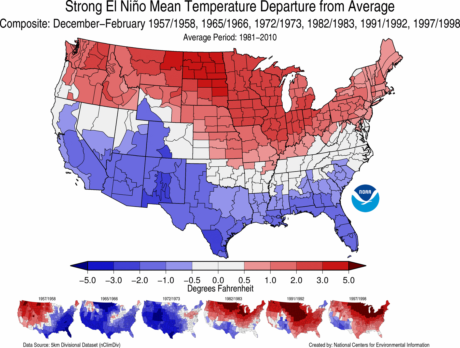
Strong El Niño episodes can have the most dramatic impacts on global weather patterns. For the record, sea-surface temperatures between the International Date Line [81] and the west coast of South America during a strong El Niño can be 2.0-3.5°C (4 - 6°F) above average. With an El Niño looming in the equatorial Pacific Ocean, seasonal forecasters can prepare their winter forecasts based on how weather patterns evolved during other strong El Niño episodes in the past. The image above shows how winter (December to February) temperatures ranked among the climate division [82] records dating back to 1895, during winters when a strong El Niño was in progress (the years of the strong El Niño episodes used in the analysis are listed across the top of the image). Clearly, with a strong El Niño in progress, a seasonal forecaster worth his or her salt would likely not predict colder-than-average conditions across the northern tier of the country. Indeed, winters when a strong El Niño was in progress were some of the warmest on record in northern Montana and northern North Dakota (darkest red). In fact, this diagram suggests that much of the northern tier of the United States, from Washington and Oregon to Upstate New York and parts of New England, tends to have a warmer-than-average winter when a strong El Niño is underway. Here's the twin image of winter precipitation for strong El Niño episodes [83]. You should study it and decide how you would introduce this teleconnection into your own seasonal forecast the next time a strong El Niño develops. In case you' interested, here's the most recent loop of sea-surface temperatures and anomalies over the equatorial Pacific Ocean [84].
Admittedly, because strong El Niños don't happen that often, being able to use the teleconnection to strong El Niños seasonal forecasts doesn't happen very often. But there are teleconnections from weaker El Niños (and La Niñas) that long-range forecasters more frequently incorporate into their seasonal outlooks (read more [85]).
We end this chapter by expanding our focus on teleconnections.
6b. Other Teleconnections
Other Teleconnections: It's More than El Niño
The links between El Niño and La Niña and climate anomalies in other parts of the globe are indisputable, especially during strong events when the temperature anomaly in the tropical Pacific is relatively large. In the words of one senior meteorologist at NOAA, "The El Niño/La Niña events are no-brainers. Their forcing on extreme weather events is well-known. The real challenge is linking the "neutral" years [years with neither an El Niño nor a La Niña] with characteristic jet stream patterns."
El Niño and La Niña are not the only teleconnections that long-range forecasters consider. Another cycle now coming under closer scrutiny is the North Atlantic Oscillation, or NAO. It's not a cycle in water temperature, but rather a relatively persistent pattern of air pressure at high altitudes. Though it hasn't received the publicity that El Niño and La Niña have, the NAO explains, to a large degree, the variability of winter weather over the eastern United States.
Forecasters track the NAO by comparing the 500-mb heights over the far North Atlantic (typically near Iceland) with those several thousand miles to the south near the Azores Islands [86]. Sometimes, heights over the far North Atlantic are anomalously low, while those near the Azores are abnormally high. This large gradient results in a persistent pattern of fast upper-air westerly winds blowing across the North Atlantic (see schematic above). This configuration is known as the positive phase of the NAO. The fast westerly flow means that cold air masses invading the eastern United States move quickly out to sea. So do low-pressure systems that form along the East Coast (these lows also tend to be weaker in such a fast, zonal regime). As a result, the positive phase of the NAO typically translates to milder winters in the eastern U.S. with fewer, weaker storms and, in turn, less snow.
At other times, the north-to-south 500-mb height gradient over the North Atlantic can be unusually weak, often occurring when a pronounced 500-mb ridge (or a closed 500-mb high) stalls over the region (usually near Greenland or Iceland), blocking and diverting the normal west-to-east progression of low-pressure systems from North America. This pattern of unusually high heights over the North Atlantic constitutes the negative phase of the NAO (see schematic below). In this configuration, cold air masses aren't as quick to move off the North American continent. Plus, the highly meridional 500-mb pattern associated with the negative phase favors more frequent and more powerful low-pressure systems along the Eastern Seaboard. Needless to say, this stormy pattern increases the odds for snow. The NAO was strongly in its negative phase during the winter of 1995-96, which turned out to be the snowiest on record in many eastern cities, including Philadelphia, New York City, and Boston.
Like El Niño and La Niña, accurate forecasts of the NAO can pave the way for much more accurate longer-range forecasts. At present, however, the NAO is much less predictable than El Niño and La Niña. That's because the NAO switches from one phase to another more frequently (sometimes from week to week). The reasons for this variability are still poorly understood.
There are plenty of other teleconnections that go by an alphabet soup of acronyms - the PNA (Pacific / North-American) pattern, the AO (Arctic Oscillation), and the EPO (Eastern Pacific Oscillation), to name a few. NOAA monitors all these via various indices [87] that characterize the individual patterns.
These teleconnections — El Niño/La Niña, the NAO, and others — are evidence that the climate system is a very complex mingling of factors on many different time and spatial scales. Yet the awareness of the impacts associated with these teleconnections is evidence of the sound science that goes into creating seasonal outlooks. Even though monthly and seasonal forecasting remains a challenging and humbling task, the success in detecting and predicting El Niño and La Niña has inspired new research in the scientific field of air-sea interaction. As meteorologists and oceanographers more thoroughly understand these teleconnections and how to model them, increasingly accurate monthly and seasonal forecasts are sure to follow.