
Sun Charts: Projections of Solar Events and Shadowing from the Sky Dome
The emphasis of this lesson is the Sun Chart tool (or Sun Path). These flat diagrams are found in many solar design tools, but may look completely foreign to the new student in solar energy. How do we interpret the arcs and points plotted on a sun chart? Why do we have two different types of plots (one looks like a rectangle, and one looks like a circle)? Why do some plots go from 0-360°, while others go from -180° to +180°?
Video: Angles Sunchart 1 (4:45)
OK, we're going to do a little preliminary review of where we've been and why these angles are important to the measurement or the plotting of sun charts. So, we know that we have a set of several earth, sun angles. So, earth, sun angles. Excuse my wonderful writing. And we're going to break those down into the latitude phi, the longitude.
So, we've got latitude and longitude. And we're also going to need the declination, the declination which is going to be a function of the day number n, and the hour angle. And the hour angle, again, is omega. And that's going to be just converting time into an angular value, which we do for the location at hand.
So, along with those earth, sun angles, we have our sun observer angles. And the sun observer angles is going to be broken down into just three simple angles which is going to be the solar altitude, altitude angle alpha with the subscript s relating it to the behavior of the sun. Gamma s is going to be the azimuth angle of the sun. And the third angle is going to be theta z which is the zenith angle for the sun.
Now, I'm going to use the information from latitude, longitude, declination, and hour angle to ultimately calculate the sun observer angles over here. The important angles for our future shading plots and for our sun path diagrams are going to boil down to plotting altitude and azimuth.
So, we're going to use these earth, sun angles to calculate sun observer angles right here. And if we plot those angles over the course of the day, over the number of hours in a day, we're going to ultimately plot the altitude and azimuth angles according to their hour angle. And the complement, of course, of the altitude angle is the zenith angle. I forgot to mention that.
But we're going to be able to make these plots that are going to look like this. They're going to be a square plot where on the x-axis, we're going to have a plot of azimuths. And on the y-axis, we're going to have a plot of altitude angles. So, the altitude angle will go from zero to 90 degrees.
And depending on the system that we're using, negative values might be to the west and positive values-- or negative to the east and positive to the west. We could also plot here the complement. From zero down to 90 would be theta z, just so we know.
And again, if I plotted the solar altitude and solar azimuth angles, what I'm going to get is a plot of the arc over the hour angles. And this lower plot will be for winter, when the sun is low in the sky. Low in the sky means a low altitude angle. When the summer comes, the sun is high in the sky. And so, we have a higher angle in the summer.
And basically, this boundary from here to here is going to be the winter solstice and the summer solstice. These plots are basically plotting a series of altitude and azimuth angles for our sun charts. We will next be plotting a series of angles for shading that we will use.
So, that's our basic overview. Let's go on to the next stage.
What are Sun Charts?
If we want to visually convert our observations of the sky-dome onto a two-dimensional medium, we can either use an orthographic projection or a spherical projection on a polar chart. These projections are useful for calculating established times of solar availability or shadowing for a given point of solar collection.
The Sun Path describes the arc of the sun across the sky in relation to an earth-bound observer at a given latitude and time.
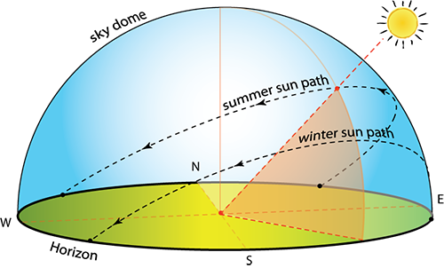
All light incident upon Earth's surface must pass through the atmosphere and be attenuated (lost from absorption or back scattering). In order to simplify the many points of origin of light, we divide the sky and the Earth's surface into components, or spatial blocks of an imaginary hemispherical projection on the sky. The Sky Dome refers to the sum of the components for the entire sky from horizon to zenith, and in all azimuthal directions. In our following sections, a collecting surface is assumed to be horizontal first, as a pyranometer measuring device is mounted horizontally and facing the sky to measure the Global Irradiance/Irradiation in the shortwave band for the sky dome. Most of our solar collectors will be tilted up from horizontal in some way (PV, solar hot water, windows, walls, even your eyes). Those surfaces oriented otherwise are termed a Plane of Array measurement (POA), requiring specific tilt and azimuth information in the description. For those solar collecting surfaces that are not horizontal, the reflectance of the ground is an additional source of light, through the albedo effect. The beam, sky diffuse, and ground diffuse light sources incident upon the tilted collector are estimated using models of light source components.
Projections
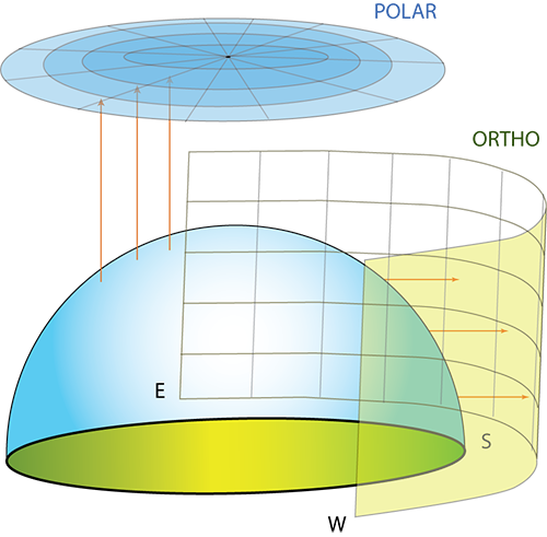
The sky dome can be projected onto flat surfaces for analysis of shading and sky component behavior.
Video: Angles Sunchart 2 (6:01)
So, if we go back and we think about the Sky Dome-- and I'm going to do this little diagram of-- this is the Sky Dome that we've talked about in the textbook and in the class. And this is going to be the ground. And so we have this Sky Dome.
And you can kind of see that this dome that we have could be-- is a hemisphere, first of all. And we could project that dome onto multiple different surfaces.
So, the first projection that we will do is going to be orthographic. And essentially, an orthographic projection is going to be what happens if I were to try to take a flat piece of paper. maybe like a cylinder of paper, and I were to try to wrap that cylinder right around this Sky Dome.
So, I'm going to have-- everybody see the cylinder that's wrapping around? So, I'm going to want to project points onto that flat surface. And ultimately, that flat surface is going to be printed out.
And we're going to have our basis for our sun charts in terms of the azimuth angle. So, the rotation along here, along the plane or rotation along the horizontal is the azimuth angle. And the angle from the ground up, the vertical rotation, is going to be the altitude angle.
Of course, the complement of that, if we were talking about the sun, would be the zenith angle. Which is why we could represent this is 0 to 90 and 90 down to 0 with the zenith angle.
We have two conventions for plotting the azimuth angle. The one is to make east negative. So, we can go negative 180 degrees. And west positive 180 degrees. Where this 0 is pointed at the equator.
The alternate is to begin in the north with 0 degrees and to work your way clockwise to-- all the way around to 360 degrees, in which case south, not the equator, is going to be positive 180 degrees.
Now, this is the convention that a lot of the solar world has used for some time. However, this is the standard convention that has been established through meteorology. And so, we tend to use both flexibly. But just know that, in general, the 360 degree is an accepted standard.
So, if we then go to the next page and we think about that same Sky Dome. And got our ground. And instead of trying to project it off to the side, we are effectively lying on the ground. And we're going to project upwards.
And this way, the azimuth angles are rotating around in a circle just like the azimuth angles will be doing here on the ground.
The altitude angles, however, are going to be represented as arcs across where the higher in the sky you are, the closer to the center of the circle.
And how do we see that? Well, we look at it like this. And we're going to start to see a center point. And I'm going to put south here. We know that south is in the northern hemisphere where the sun is at its highest point.
So, we're going to see arcs in the sky that look like this going from-- in our case-- east to west. This is going to be summertime. This is going to be wintertime. When the sun is low in the sky versus high in the sky.
Here is going to be an alpha 90 degrees. And the ring around the bottom is going to be an alpha of zero degrees. It's a little different plot. The lines are going to be flipped from what you were used to in an orthographic projection, if you can do both of these at the Oregon site for sun plots.
- Orthographic Projection: takes the sky dome and projects altitude and azimuth values outward onto a surrounding vertical cylinder. The cylinder is then opened flat. Figure 2.19, below, shows the sun rising in the East (to the left) and setting in the West (to the right). Proper observation shows that the largest arc in the chart at the top, June 21, is the Northern Solstice, while the smallest, December 21, is the Southern Solstice.
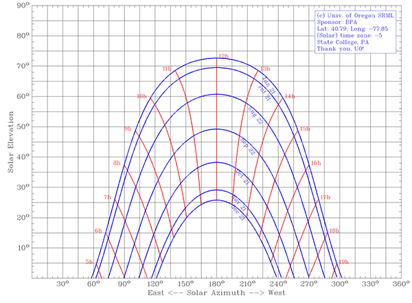 Figure 2.19: Orthographic Projection.Credit: J. Brownson © Penn State University is licensed under CC BY-NC-SA 4.0
 - Polar Projection: takes the sky dome and projects altitude and azimuth values down onto a circular plane. However, in the polar projection, the arc for December 21 is at the top while the arc for June 21 is at the bottom. This happens because we are effectively lying on the ground with our heads facing south, and holding that large piece of paper straight up to the sky.
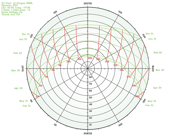 Figure 2.20: Polar ProjectionCredit: Jeffrey R. S. Brownson © Penn State University is licensed under CC BY-NC-SA 4.0
How do We Make and Read Sun Charts?
Go to the University of Oregon Solar Radiation Monitoring Laboratory website. The scientists at the site have provided an excellent tool for plotting sun paths onto orthographic projections or polar/spherical projections. The default page is for creating an orthographic projection of your site of interest. The alternate page for polar projections will use the same data you can input, but will output the alternate form. Note that both use the meteorological standard for azimuth angles, where North is set at 0°, increasing clockwise to 360°.
- Specify the location by and . (Latitude is important for our calculations of sun-observer angles).
- Specify the time zone (software does the correction from UTC to local time zone).
- Choose data to be plotted (Choose to plot hours in local solar time: default). These plots are symmetrical for half of the year when you plot them in arcs of solar time. Hence, when you plot in solar time, "Plot dates 30 or 31 days apart, between solstices, December through June" will look the same as "Plot dates 30 or 31 days apart, between solstices, June through December." Side note: if you do plot in "local standard time," you will observe half of an analemma each hour, where only the Equation of Time ($E_t$) has not been corrected for in the time correction.
- Set chart format parameters: These are your choice to personalize the output file. Be creative, and try to present clear data visualization.
- Choose file format for chart. (I prefer the PDF for working.)
- Enter the code to make sure you are not a web bot roaming about.
- Download the image, print it out, and use it for shading analysis!
What about Shadows?
When designing a solar energy conversion system for any application, we must pay special attention to the occurrence of shadows throughout the year. We discuss a method to assess the shading using 2-D projections.
The next page gives you an opportunity to print and analyze your own sun chart.