Visual perception constraints
So far this lesson, we have talked about multiple ways to specify colors, and how we might apply them to maps. As we discuss color, however, we also need to discuss color vision deficiency—the inability to discriminate between certain (or occasionally, all) colors. Though color blindness varies by gender and ethnicity, you can generally expect that about five percent of your map readers will have some form of color deficiency. You may have some form of color vision deficiency yourself.
The good news is that several web tools exist to help you design more accessible maps. Viz Palette, developed by Elijah Meeks and Susie Lu, is one useful example. It permits you to import your own color schemes from popular color-picking tools such as ColorBrewer and view their appearance through the eyes of those with different types of color vision deficiencies.
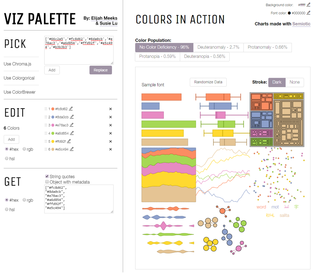
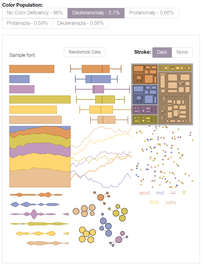
Tools such as Viz Palette are useful for understanding how different people might view your data visualizations and maps. You can then decide for yourself whether your chosen palette is acceptable. ColorBrewer also lets you select from among only color schemes that have been empirically-verified as colorblind friendly - its interface includes an option to show only “colorblind safe” color schemes. Unsurprisingly, the scheme in Figure 4.4.1(2) does not appear.
How much you factor color accessibility into your map design will depend greatly on its audience, medium, and purpose. Color discriminability is affected by many factors outside of genetics, including reader age, lighting conditions, and map resolution. It is also more crucial in some mapping contexts than in others. A map for entertainment, for example, may sacrifice accessibility for increased aesthetics and visual interest among the not color-vision impaired. When a map’s purpose is emergency management or vehicle routing, however, the cartographer may place a greater value on ensuring readability for all map users.
Even among those without color vision impairments, human color perception does not come without flaws. View the squares labeled A and B in Figure 4.4.3—do they look the same to you?
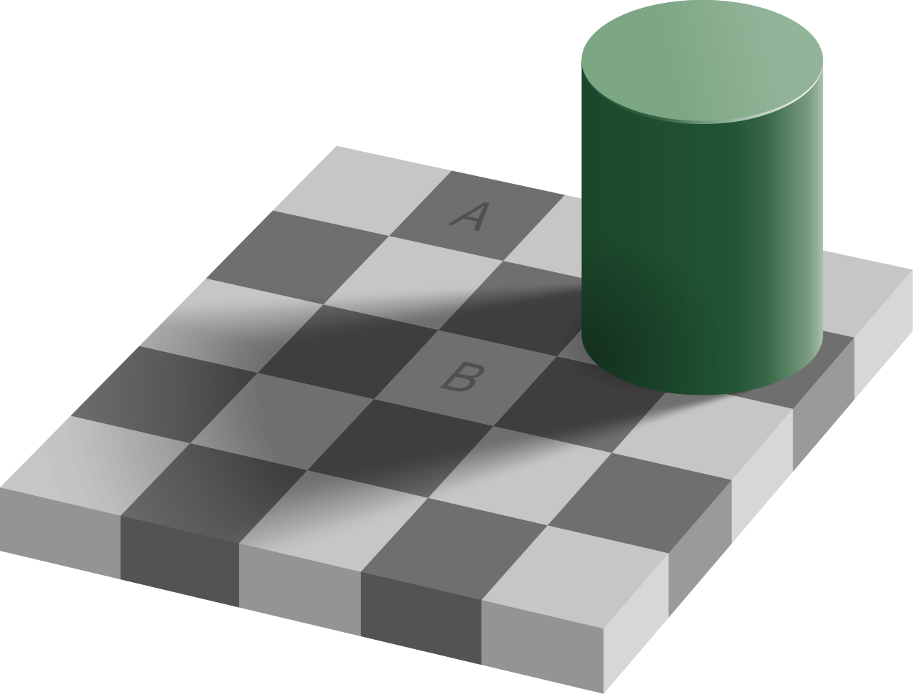
Your eyes are deceiving you—these two squares are exactly the same shade of grey. (If you don't believe it, check out the interactive version of this graphic at illusionsindex.org). This is the result of a principle of color interpretation called simultaneous contrast, or induction—colors appear differently, dependent on the backdrop against which they appear.
Student Reflection
View the maps in Figure 4.4.4: which colors in the second map (1, 2, 3, 4) do you think match the colors in areas A and B?
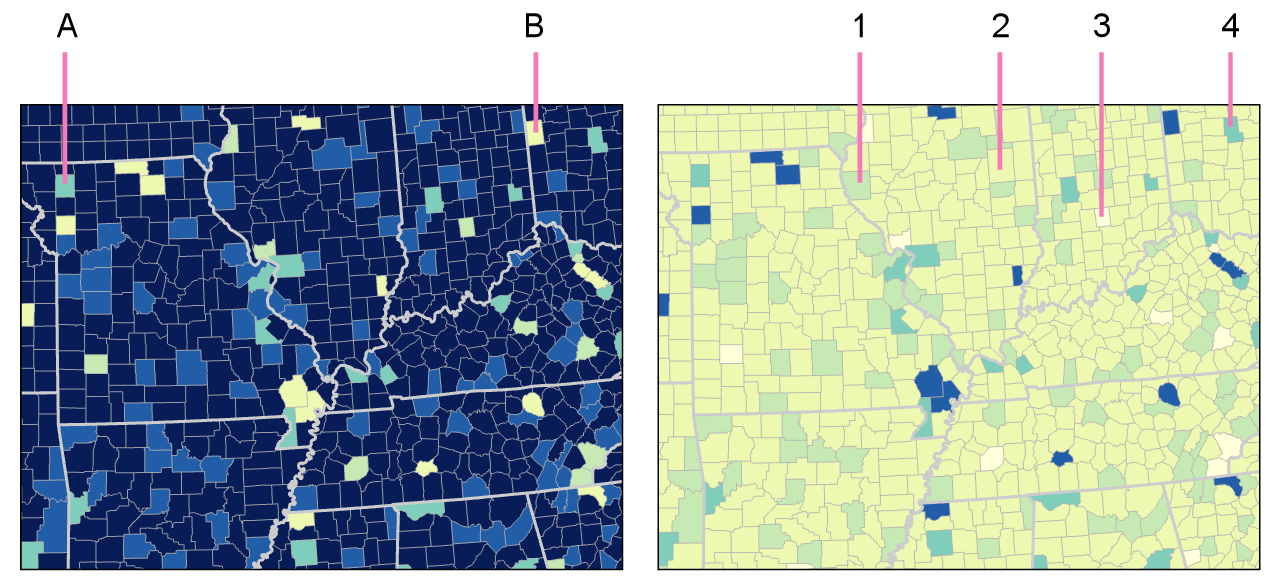
Student Reflection answer: The color in A matches the color in 4; the color in area B matches area 2. Is this what you were expecting?
To date, little empirical research in cartography has evaluated the influence of induction on map interpretation, and, thus, few suggestions exist for minimizing its effects in practice. You should, however, anticipate the effects that varied backgrounds will have on the interpretation of your map symbol colors, particularly for maps in which such comparisons are common and/or critical.
So far in this lesson, many of our examples have been choropleth maps—the most common thematic mapping technique, and one which typically makes extensive use of color as a visual variable. In the next section, we will focus on other aspects of choropleth mapping, including data standardization and classification, as a deeper understanding of how these maps are built using data is required for selecting an effective color scheme.
Recommended Reading
- Chapter 8: Color on Maps. Brewer, Cynthia A. 2015. Designing Better Maps: A Guide for GIS Users. Second. Redlands: Esri Press. Bach, M. (n.d.).
- The Illusions Index