Module 4: Introduction to General Circulation Models
Module 4: Introduction to General Circulation Models Introduction
On the evening weather report on October 15th, 1987, weatherman Michael Fish uttered the now infamous words "Earlier on today a woman rang the BBC to say she'd heard there was a hurricane on the way. Well, if you're watching: don't worry, there isn't." As it happens, an extra-tropical hurricane swept across the British Isles that night with wind speeds up to 100 mph leading to 18 deaths, $1.6 billion in damage and the loss of 15 million trees. And Michael Fish now is a weather legend for all the wrong reasons. Up to the latest part of the 20th century, British weather forecasters, in general, had a miserable reputation. If forecasters back then said rain, it was just as likely to be sunny and no one took much notice. However, since 1987, weather forecasting has become much more of a science than an art, with highly sophisticated models operated by powerful computers making weather predictions. You can rely on weather forecasts to be accurate in the most part. For example, extreme weather forecasts for events like hurricanes, tornadoes and snow storms are generally accurate as a result of these improved models. Some of these same models are now used to make projections about climate change. In this module, you will learn how models work and what predictions they are giving for the future.
We have already learned about very simple climate models that represent the whole earth in one box and slightly more advanced models that represent the Earth in a few latitudinal bands. As you might imagine, there is a whole spectrum of models, and at the far end in terms of complexity are GCMs — which can mean either General Circulation Model or Global Climate Model. There are GCMs that model just the atmosphere (AGCMs), just the oceans (OGCMs) and those that include both (AOGCMs). These models divide the Earth up into a big 3-D grid and then treat each little cube or cell similar to the way we treat reservoirs in STELLA models. The basic structure of a GCM can be seen in the figure below:
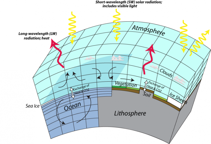
This image is a diagram illustrating the Earth's energy balance, showing the interactions between short-wavelength (SW) solar radiation and long-wavelength (LW) radiation with the atmosphere, lithosphere, and ocean. The diagram highlights the exchange of heat and CO2 across different components of the Earth system.
- Diagram Type: 3D schematic
- Components:
- Atmosphere: Top layer
- Contains clouds
- Receives short-wavelength (SW) solar radiation (yellow arrows) from the sun
- Emits long-wavelength (LW) radiation (red arrows) as heat
- Lithosphere: Bottom layer
- Includes vegetation, soil, and ice sheets
- Interacts with the atmosphere through the exchange of heat and CO2 (black arrows)
- Ocean: Middle layer
- Contains sea ice
- Shows circulation patterns (curved arrows)
- Exchanges heat and CO2 with the atmosphere (black arrows)
- Atmosphere: Top layer
- Processes:
- SW solar radiation (yellow arrows) enters the atmosphere, some reflecting off clouds
- LW radiation (red arrows) is emitted from the Earth’s surface and atmosphere
- Heat and CO2 exchange occurs between the atmosphere, lithosphere, and ocean
The diagram visually represents how solar energy drives Earth's climate system, with interactions between the atmosphere, land, and ocean influencing heat distribution and CO2 cycling.
As you can see, the models include land, air, and ocean domains, and each of these domains is treated somewhat separately since different processes act within the various domains. The more cells in a model, the closer it can approximate the real Earth, but too many cells would require more computing power than is available. The history of these models is closely connected to the history of advances in computing power, and the current generation of high-end GCMs are among the most computationally-intensive programs in existence. Models are in a continuing state of development and evolution, so in the future, they will be more complex and realistic; with continued advances in computational power and reduction in the cost of runs, models are set to take on more ambitious tasks such as making very fine projections about an ever-expanding number of environmental variables. Combine them with robots and look out!
What’s so important about these models that people would devote their careers to building and refining programs that take days to run on the fastest computers? The power and utility of these models is that they can show us how climate changes on a regional scale, which is of utmost importance in planning for our future. In our future, we are probably going to be the most effective in dealing with climate change on the scale of regions like states and countries, so having a model that shows us what those regional changes are likely to be is a very important tool.
A key aspect of using models is understanding the uncertainty of their predictions. They are simulations, after all. As you will see, most of the results are cast in terms of ranges, for instance, the temperature predictions for 2100 under the different emission scenarios are given with significant bands of uncertainty. The reading for this module is the Summary of the Intergovernmental Panel on Climate Change for Policy Makers. When you read this, you will see how scientists convey the uncertainty of model predictions.
Goals and Learning Outcomes
Goals and Learning Outcomes
Goals
On completing this module, students are expected to be able to:
- explain how general circulation climate models work;
- describe the different emission scenarios that are used for future model predictions and distinguish their relative impact;
- evaluate regional climate model predictions for the worst-case emissions scenario;
- assess how scientists communicate model predictions to policymakers.
Learning Outcomes
After completing this module, students should be able to answer the following questions:
-
What does GCM stand for?
- What does the typical model grid look like?
- What are the inputs that drive models?
- What is the significance of pressure in models?
- Key to this module: What are the economic and environmental bases for the four main emission scenarios, A2, A1B, B1, and B2?
- What is the main driver for each scenario, and how does it change in the next century?
- Predicted temperature increase for each scenario in 2100?
- Which part of the globe warms the most and which the least under the different scenarios?
- Under A2, how much does the US warm in summer and winter?
- What parts of the US become drier under A1B and A2?
- Globally, where does stream flow decrease most drastically under A1B?
Assignments Roadmap
Below is an overview of your assignments for this module. The list is intended to prepare you for the module and help you to plan your time.
| Action | Assignment | Location |
|---|---|---|
| To Do |
|
|
Understanding GCMs
Understanding GCMs
Ever wonder how weather forecasts are so accurate? How predictions are made over days and weeks? How hurricanes and blizzards are forecasted? General circulation models (GCMs) are instrumental in weather forecasting. They are highly detailed grid-based simulations of weather that use atmospheric physics to predict events over hours, days, and even further into the future. These models are commonly used to predict climate change over years, decades, and centuries. GCMs have become more and more accurate as the physics of the atmosphere has become better understood. As computers have become more capable computationally, the models have become more accessible to the general public. Before, they required a mainframe computer. You can now run them on laptops! In this module, we explore how GCMs work.
How do GCMs Work?
How do GCMs Work?
In a highly simplified sense, the operation of GCMs can be thought of in a few basic steps.
- Divide up the atmosphere and oceans into a complex 3-D grid; each grid may represent 2° of latitude and 2° of longitude (roughly 200 km on a side), and the models typically have 20 - 40 vertical layers, which would give you about half a million cells.
- Assign the starting conditions for each grid — the type of material (air, soil, water, etc.), temperature, salinity of the oceans, humidity of the air, greenhouse gas concentrations, insolation, and a whole host of other variables and constants. Typically, these starting conditions are a simplified snapshot of the current climate on Earth.
- Based on the temperature, salinity, and humidity, the program calculates the pressure in each grid cell, which combines with the rotation of the Earth to determine the velocities in each cell (see figure below). The velocities then determine how the cells will exchange heat, moisture, salinity, etc., with their neighboring cells. The program then makes all of these transfers, and then updates the conditions of each cell — these new conditions then determine how things will move in the next time step. These calculations are done in very short time increments (typically a few minutes), and the result is that they can simulate the circulation of the atmosphere and the oceans.
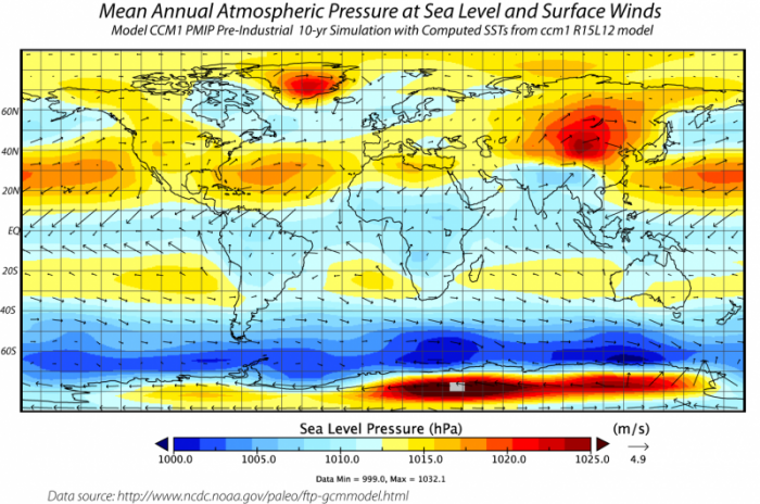 Mean Atmospheric Pressure and Winds from the NCAR GCM. The air pressure at the surface is shown in the colors — blue represents low pressure; red is high pressure. Also shown are the approximate average wind directions and strengths that would result from this map of pressure difference. The winds move from high-pressure areas to low-pressure areas, but they are bent by the Coriolis effect.Click for a text description of Air Pressure and Winds map.
This image is a world map titled "Mean Annual Atmospheric Pressure at Sea Level and Surface Winds," showing a 10-year simulation from the CCM1 PMIP Pre-Industrial model with computed sea surface temperatures from the cm1 R15L12 model. The map displays sea level pressure in hectopascals (hPa) and surface wind patterns, sourced from the National Center for Atmospheric Research (NCAR).
Map Type: World map Measurement:- Sea level pressure (hPa)
- Surface winds (m/s)
- Pressure: 1000 hPa (blue) to 1020 hPa (red)
- Wind speed: 0 m/s (no arrows) to 4.9 m/s (longer arrows)
- High Pressure (red, 1015–1020 hPa):
- North Pacific (Aleutian High)
- South Pacific (near South America)
- North Atlantic (Azores High)
- Low Pressure (blue, 1000–1005 hPa):
- Equatorial regions (near the Intertropical Convergence Zone)
- Southern Ocean (around Antarctica)
- Represented by black arrows
- Stronger winds (longer arrows) in the Southern Ocean and North Atlantic
- Weaker winds (shorter arrows) in equatorial regions
- Data source: NCAR
- Data specifics: Min = 999.0 hPa, Max = 1032.1 hPa
The map illustrates global atmospheric pressure patterns and surface wind circulation, highlighting high-pressure systems in the subtropical regions and low-pressure zones near the equator and polar regions, with corresponding wind patterns.
Credit: David Bice © Penn State University is licensed under CC BY-NC-SA 4.0 [1]This figure comes from a run of the NCAR model, called CCM (Community Climate Model) and represents the atmospheric pressure at sea level averaged over 10 years. Also shown is the pattern of winds that results from the combination of the forces due to the pressure differences (air flows from high to low pressure, driven by a Pressure Gradient Force and the Coriolis Force, which is related to the rotation of the Earth. The length of the arrows is proportional to the strength of the winds. Note that the model produces belts of pressure that are very similar to the observed pressure belts — low pressure near the equator, high pressure at 30N and 30S, low pressure at 50-60N and 50-60S, and high pressure again near the poles, patterns we learned about in Module 3.
- Based on temperature, pressure, flow patterns, and humidity, the models simulate the formation of clouds, which then impact the albedo (reflectance of sunlight) and the absorption of heat emitted from the surface.
- The models also calculate the evaporation of water from the surface and the precipitation of water, and its runoff over the land back to the oceans. The evaporation and precipitation are associated with big transfers of energy, and the model keeps track of this, too.
- All models represent land topography. Many models also include representations of photosynthesis on land, the exchange of CO2 between the plants, soil, oceans, and atmosphere, and sedimentation in the ocean.
Check Your Understanding
How Good are GCMs?
How Good are GCMs?
This is obviously a very important question — if we are to rely on these models to guide our decisions about the future, we need to have some confidence that the models are good. The most important approach is to see if the model can simulate the known climate history. We set the model up to represent the state of the climate at some point in the past — say 1900 — and then we see how well the model can reproduce what actually happened.
As you can see in the figure below, the models are collectively quite good:
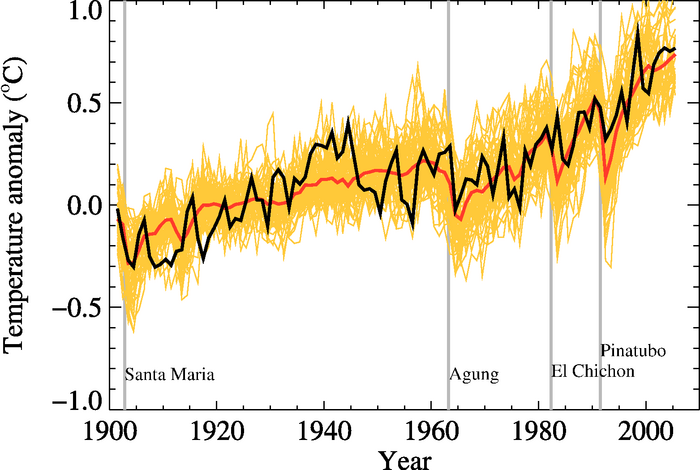
This image is a line graph showing global temperature anomalies from 1900 to 2000, measured in degrees Celsius. The graph includes multiple data series to represent uncertainty, with annotations marking significant volcanic eruptions that influenced global temperatures.
- Graph Type: Line graph
- Y-Axis: Temperature anomaly (°C)
- Range: -1.0°C to 1.0°C
- X-Axis: Years (1900 to 2000)
- Data Representation:
- Temperature Anomalies: Multiple black lines
- Represent various data series, showing uncertainty
- Fluctuate between -0.5°C and 0.5°C until 1980
- Rise sharply after 1980, reaching around 0.8°C by 2000
- Mean Trend: Red line
- Smoothed average of the black lines
- Starts around -0.3°C in 1900
- Shows a gradual increase, with a steeper rise after 1980
- Temperature Anomalies: Multiple black lines
- Annotations (Volcanic Eruptions):
- Santa Maria: Around 1902
- Agung: Around 1963
- El Chichón: Around 1982
- Pinatubo: Around 1991
- Each eruption corresponds to a temporary dip in temperature
- Trend:
- General upward trend in temperature anomalies over the century
- Temporary cooling periods following major volcanic eruptions
The graph illustrates a long-term warming trend in global temperatures over the 20th century, with notable short-term cooling events caused by volcanic eruptions, followed by a significant temperature increase after 1980.
In this figure, the black line is the instrumental global average temperature (as an anomaly, which is a departure from the mean value from 1901 to 1950), the yellow lines represent the output from 58 model runs by 14 different models, and the red is the average of those 58 runs. The vertical gray lines are times of major volcanic eruptions, which are always followed by a few years of cooler temperatures.
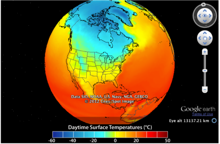
Now, let’s look at how closely the models can simulate the spatial pattern of temperatures over the Earth. To begin with, we’ll look at January temperatures for the time between 2003 and 2005 — here is what we can reconstruct from observations (which are better in some places than others — we know the Sea Surface Temperature (SST) much better than the land temperature, since SST is very precisely measured by satellites).
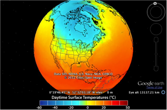
This image is a globe view showing daytime surface temperatures across North America, with data sourced from SIO, NOAA, U.S. Navy, NGA, and GEBCO, and presented via Google Earth. The map uses a color gradient to represent temperatures in degrees Celsius, captured at a specific location and altitude.
- Map Type: Globe view (North America focus)
- Measurement: Daytime surface temperature (°C)
- Location and Altitude:
- Coordinates: 0°19'46.45" N, 52°32'03.18" W
- Elevation: 0 m
- Eye altitude: 131372.71 km
- Color Scale (bottom of the map):
- Range: -60°C to 50°C
- Colors: Dark blue (-60°C) to dark red (50°C), with green, yellow, and orange in between
- Regions with Notable Temperatures:
- Coldest (dark blue, -60°C to -20°C):
- Arctic regions (northern Canada, Greenland)
- Cool (green to light blue, -20°C to 0°C):
- Central and northern Canada
- Parts of Alaska
- Moderate (yellow to orange, 0°C to 20°C):
- Most of the continental U.S.
- Southern Canada
- Warm (red, 20°C to 50°C):
- Southern U.S. (Texas, Arizona, Florida)
- Mexico and Central America
- Coldest (dark blue, -60°C to -20°C):
- Additional Info:
- Data source: SIO, NOAA, U.S. Navy, NGA, GEBCO
- Copyright: 2012 Cnes/Spot Image
- Platform: Google Earth
The globe view highlights a stark temperature gradient, with extremely cold temperatures in the Arctic, moderate temperatures across most of the U.S., and warmer conditions in the southern U.S. and Central America.
Now, we look at the same time period from a model simulation.
This image is a globe view showing daytime surface temperatures across North America, with data sourced from SIO, NOAA, U.S. Navy, NGA, and GEBCO, and presented via Google Earth. The map uses a color gradient to represent temperatures in degrees Celsius, captured at a specific altitude.
- Map Type: Globe view (North America focus)
- Measurement: Daytime surface temperature (°C)
- Altitude:
- Eye altitude: 131372.71 km
- Color Scale (bottom of the map):
- Range: -60°C to 50°C
- Colors: Dark blue (-60°C) to dark red (50°C), with green, yellow, and orange in between
- Regions with Notable Temperatures:
- Coldest (dark blue, -60°C to -20°C):
- Arctic regions (northern Canada, Greenland)
- Cool (green to light blue, -20°C to 0°C):
- Central and northern Canada
- Parts of Alaska
- Moderate (yellow to orange, 0°C to 20°C):
- Most of the continental U.S.
- Southern Canada
- Warm (red, 20°C to 50°C):
- Southern U.S. (Texas, Arizona, Florida)
- Mexico and Central America
- Coldest (dark blue, -60°C to -20°C):
- Additional Info:
- Data source: SIO, NOAA, U.S. Navy, NGA, GEBCO
- Copyright: 2012 Cnes/Spot Image
- Platform: Google Earth
The globe view highlights a significant temperature gradient, with extremely cold temperatures in the Arctic, moderate temperatures across most of the U.S., and warmer conditions in the southern U.S. and Central America.
You can see that in general, they are quite similar to each other, but we can gain a bit more insight into the relationship between the observations and the model by subtracting the model from the observations — the result is this:
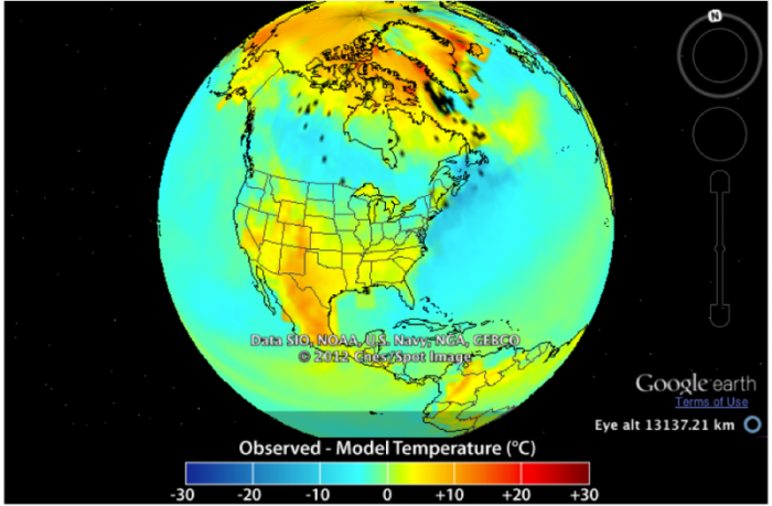
This image is a globe view showing the difference between observed and modeled surface temperatures across North America, with data sourced from SIO, NOAA, U.S. Navy, NGA, and GEBCO, and presented via Google Earth. The map uses a color gradient to represent temperature differences in degrees Celsius, captured at a specific altitude.
- Map Type: Globe view (North America focus)
- Measurement: Observation minus model temperature (°C)
- Altitude:
- Eye altitude: 131372.71 km
- Color Scale (bottom of the map):
- Range: -30°C to 30°C
- Colors: Dark blue (-30°C) to dark red (30°C), with green, yellow, and orange in between
- Regions with Notable Differences:
- Colder than Modeled (blue, -30°C to -10°C):
- Arctic regions (northern Canada, Greenland)
- Slightly Colder than Modeled (green to light blue, -10°C to 0°C):
- Central and northern Canada
- Parts of Alaska
- Near Model Prediction (yellow to orange, 0°C to 10°C):
- Most of the continental U.S.
- Southern Canada
- Warmer than Modeled (red, 10°C to 30°C):
- Southern U.S. (Texas, Arizona, Florida)
- Mexico and Central America
- Colder than Modeled (blue, -30°C to -10°C):
- Additional Info:
- Data source: SIO, NOAA, U.S. Navy, NGA, GEBCO
- Copyright: 2012 Cnes/Spot Image
- Platform: Google Earth
The globe view highlights discrepancies between observed and modeled temperatures, with the Arctic showing colder-than-modeled conditions, the U.S. generally aligning with model predictions, and the southern U.S. and Central America being warmer than modeled.
Here, you can see that the model and the observations are generally quite close, within a couple of degrees of zero, where zero would be a perfect match. Areas that are yellow to orange are regions where the actual temperature is greater than the modeled temperature; blue areas are regions where the actual temperature is lower than the model. It would be a challenging task to figure out the cause of these differences, but at a very fundamental level, it is related to the fact that things like clouds are very important to the climate system, and the processes that actually form clouds occur on such a small scale that the models cannot resolve them. Cloud formation is one example of what the modelers call a sub-grid process, and modelers have to devise clever ways of getting around this. This is an area where refinements continue to occur, but for the time being, we see that the models do an impressive job, but not a perfect job. As you can see in the above results, models tend to underestimate the temperatures on land, so we should consider model results for the future to also underestimate the true temperatures.
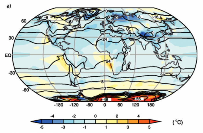
If we average over longer time periods and also average many model results together, we get what climate modelers refer to as an ensemble mean, and these ensemble means do a remarkably good job of matching the observations, as is shown below.
This image is a world map labeled "a)" showing temperature anomalies in degrees Celsius across the globe. The map uses a color gradient to indicate deviations from the average temperature, with contour lines marking specific temperature values.
- Map Type: World map
- Measurement: Temperature anomaly (°C)
- Color Scale (bottom of the map):
- Range: -5°C to 5°C
- Colors: Dark blue (-5°C) to dark red (5°C), with light blue, white, and yellow in between
- Regions with Notable Anomalies:
- Colder than Average (blue, -5°C to -1°C):
- Northern North America (Canada, Alaska)
- Parts of Siberia
- Contour lines: -16°C in northern Canada, -8°C in Siberia
- Warmer than Average (red, 1°C to 5°C):
- Southern Ocean (around Antarctica)
- Contour lines: 48°C near Antarctica
- Near Average (white to yellow, -1°C to 1°C):
- Most of Europe, Africa, and South America
- Contour lines: 0°C in central Africa, 24°C in the equatorial Pacific
- Colder than Average (blue, -5°C to -1°C):
- Additional Features:
- Latitude lines: 60°N, 30°N, EQ, 30°S, 60°S
- Longitude lines: -180°, -120°, -60°, 0°, 60°, 120°, 180°
The map highlights significant temperature anomalies, with colder-than-average conditions in northern North America and Siberia, and much warmer-than-average conditions in the Southern Ocean near Antarctica.
In this figure, the observed annual mean temperatures for the time period 1961-1990 are represented by the black contour lines, labeled in °C (-56°C in Antarctica and about 24°C in equatorial Africa). The colors represent the model temperatures (from 14 models, for the same 1961-1990 time period) minus the observations; positive values mean the models estimate temperatures that are too high. On the whole, the models slightly underestimate the temperatures, and they have particular problems at very high latitudes and in areas that are topographically complex.
As mentioned above, one of the important aspects of GCMs is that they calculate the precipitation, and this provides another means of evaluating how good the models are. The figure below shows a comparison of the observed annual precipitation and the average of the 14 models used by the IPCC study.
This image consists of two world maps, labeled "a)" and "b)," showing sea surface height anomalies in centimeters across the globe. The maps use a color gradient to indicate variations in sea surface height, likely related to oceanographic phenomena such as El Niño or La Niña.
- Map Type: Two world maps (a and b)
- Measurement: Sea surface height anomaly (cm)
- Color Scale (bottom of the maps):
- Range: 0 cm to 330 cm
- Colors: Yellow (0 cm) to dark blue (330 cm), with orange, red, and purple in between
- Map a):
- Regions with Notable Anomalies:
- High Anomalies (blue, 240–330 cm):
- Equatorial Pacific (stretching from South America to Indonesia)
- Moderate Anomalies (red to purple, 120–240 cm):
- Surrounding areas of the equatorial Pacific
- Low Anomalies (yellow to orange, 0–120 cm):
- Most of the Atlantic and Indian Oceans
- Polar regions
- High Anomalies (blue, 240–330 cm):
- Latitude Lines: 60°N, 30°N, EQ, 30°S, 60°S
- Longitude Lines: 0°, 60°, 120°, 180°, -120°, -60°
- Regions with Notable Anomalies:
- Map b):
- Regions with Notable Anomalies:
- High Anomalies (blue, 240–330 cm):
- Central equatorial Pacific (more concentrated than in map a)
- Moderate Anomalies (red to purple, 120–240 cm):
- Surrounding areas of the equatorial Pacific
- Low Anomalies (yellow to orange, 0–120 cm):
- Most of the Atlantic and Indian Oceans
- Polar regions
- High Anomalies (blue, 240–330 cm):
- Latitude Lines: 60°N, 30°N, EQ, 30°S, 60°S
- Longitude Lines: 0°, 60°, 120°, 180°, -120°, -60°
- Regions with Notable Anomalies:
The maps illustrate variations in sea surface height, with map a) showing a broader high anomaly across the equatorial Pacific, and map b) showing a more concentrated high anomaly in the central equatorial Pacific, suggesting changes in ocean conditions between the two periods.
As can be seen, the models, on average, do quite well at simulating the global pattern of precipitation.
AOGCMs calculate the circulation and temperature of the world’s oceans, and we compare their ability in that regard by comparing the model-generated temperatures averaged over 1957 to 1990 with the observations from that time period.
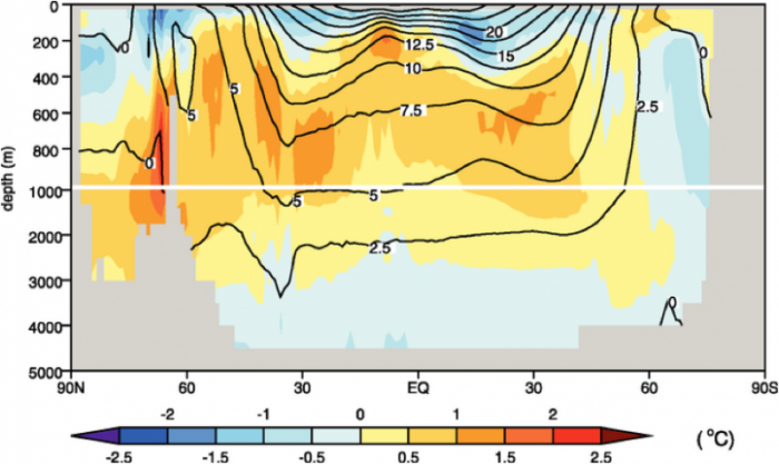
This image is a cross-sectional diagram showing ocean temperature anomalies in degrees Celsius across a latitudinal range from 90°N to 90°S, with depth extending from the surface to 4000 meters. The diagram uses a color gradient and contour lines to indicate temperature variations at different depths and latitudes.
- Diagram Type: Cross-sectional view
- Y-Axis: Depth (meters)
- Range: 0 m to 4000 m
- X-Axis: Latitude
- Range: 90°N to 90°S
- Color Scale (bottom of the diagram):
- Range: -2.5°C to 2.5°C
- Colors: Dark blue (-2.5°C) to dark red (2.5°C), with light blue, white, and yellow in between
- Temperature Anomalies:
- Colder than Average (blue, -2.5°C to -0.5°C):
- Near the surface at 90°N (Arctic)
- Contour lines: -2.5°C at the surface
- Warmer than Average (red, 0.5°C to 2.5°C):
- Surface waters from 60°N to 60°S
- Contour lines: 15°C at the surface near the equator, 12.5°C at 200 m depth
- Near Average (white to yellow, -0.5°C to 0.5°C):
- Deeper waters (below 1000 m) across all latitudes
- Contour lines: 0°C at 1000 m depth
- Colder than Average (blue, -2.5°C to -0.5°C):
- Additional Features:
- Contour lines: 0°C, 2.5°C, 5°C, 7.5°C, 10°C, 12.5°C, 15°C, 20°C
- Latitude markers: 90°N, 60°N, 30°N, EQ, 30°S, 60°S, 90°S
The diagram illustrates that surface waters, particularly in the tropics, are significantly warmer than average, while deeper waters remain closer to average temperatures, with the Arctic surface showing colder-than-average conditions.
In this figure, we see the latitude-averaged observed ocean temperature from 1957 to 1990 in the contours, and the average model ocean temperatures minus the observed temperatures in colors. For most of the oceans, the models are ± 1°C from the observations.
In sum, it should be fairly clear that although these models are incredibly complicated, they do a fairly good job of reproducing the temporal and spatial characteristics of our climate, especially when we look at longer time averages. In other words, if we compare the model results for a given day with the actual observations of that day, the agreement is not very good; the agreement gets better on a monthly-averaged basis, and it gets even better on an annually-averaged basis. Today, models are in a constant state of improvement, with certain elements, such as the impact of clouds, needing a lot more understanding.
Check Your Understanding
Model Scenarios
Model Scenarios
Before we look at the results of GCMs that run into the future, we have to understand a few things about the experimental setups that go into these models. In order to do these experiments, the modelers have to apply forcings just as we did with our simple climate model in Module 3, and the primary variable is CO2 (carbon emissions) added to the atmosphere through human activities such as burning fossil fuels, farming, making cement, etc.
The IPCC (Intergovernmental Panel on Climate Change) has developed a whole set of scenarios (about 40) that represent the possible carbon emissions history for the next 100 years. The carbon emission is used as a key variable in driving climate modeling for each scenario. These scenarios are known as Representative Concentration Pathways (RCPs) and each one is based on an emissions trajectory. The IPCC has focused on several individual RCPs that provide a range of emissions and climate scenarios. At the outset for simplicity in this module we do not use the RCP emissions terminology because it is not very intuitive. Instead, we use groups of RCPs known as families (also developed by the IPCC) defined by the severity of the cuts (or lack thereof!) and the amount of cooperation between countries. Each family or scenario is based on a bunch of assumptions about population growth, economic growth, and choices we might make regarding steps to minimize carbon emissions. You can read more about the whole set of emissions scenarios at Wikipedia: Special Report on Emissions Scenarios [4]. But for our purposes, we'll focus on 3 families representing very different emissions scenarios.
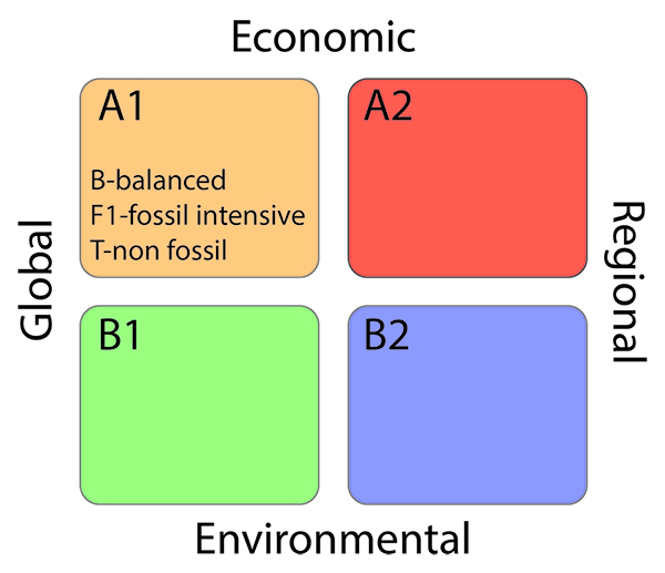
This image is a 2x2 matrix diagram illustrating four climate change scenarios based on two axes: economic focus (global vs. regional) and environmental focus (economic vs. environmental). Each quadrant represents a different scenario, labeled A1, A2, B1, and B2, with distinct characteristics.
- Diagram Type: 2x2 matrix
- Axes:
- X-Axis: Economic focus
- Left: Global
- Right: Regional
- Y-Axis: Environmental focus
- Top: Economic
- Bottom: Environmental
- X-Axis: Economic focus
- Quadrants:
- A1 (Top Left, Orange):
- Global economic focus
- Economic priority
- Labels: B-balanced, F1-fossil intensive, T-non fossil
- A2 (Top Right, Red):
- Regional economic focus
- Economic priority
- B1 (Bottom Left, Green):
- Global economic focus
- Environmental priority
- B2 (Bottom Right, Blue):
- Regional economic focus
- Environmental priority
- A1 (Top Left, Orange):
The matrix visually categorizes future climate scenarios based on whether societies prioritize global or regional economic development and whether they focus on economic growth or environmental sustainability, with A1 including sub-scenarios emphasizing different energy strategies.
The first of these scenarios is called SRES A2, and it is commonly known as business-as-usual — in other words, it leads to a continuation of increased annual carbon emissions that follows the recent history. In effect, this scenario represents a somewhat divided world, one in which we just can't reach agreements on what to do about limiting emissions of CO2, so each country does what seems to be in its own best interests. This world is characterized by independently operating, self-reliant nations. This world also includes a continuously increasing population — it does not level off during this time period. Above all, in this world, decisions are based primarily on perceived economic interests, and the assumption is made that these interests do not include the development of alternative energy sources.
The second scenario, called SRES A1B is a bit more optimistic. This scenario envisions an integrated world characterized by rapid economic growth, a population that reaches 9 billion by 2050 and then declines gradually, and the rapid development of alternative energy sources that facilitate increased economic growth while limiting and eventually reducing carbon emissions. This scenario also assumes that there will be rapid development and sharing of technologies that help us reduce our energy consumption. One of the keys to this scenario is that countries are integrated — they act together and find ways to improve the conditions for everyone on Earth. At this point in time, A1B is an optimistic but realistic scenario; B1 would take a revolution in the way the world economies work. And A2 or "business as usual," well, we will show you this is not the road we want to travel!
The third scenario, called SRES B1, represents an even more integrated, more ecologically friendly world, but one in which there is still steady and strong economic growth. As in scenario SRES A1B, the population in this scenario peaks at 9 billion in 2050 and then declines. One way to think of this scenario is that it represents a rapid, strong, and global commitment to the reduction of carbon emissions — it represents the best we could possibly do, and yet it does not rely on miracle technologies. The only real miracle it requires is that we all quickly figure out how to think and act globally and not focus solely on our own national interests. Most projections ignore scenario B2, as the combination of regional and environmental strategies is highly unlikely.
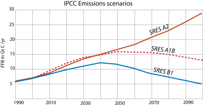
In graphical form, here are the three emissions scenarios.
This image is a line graph comparing three different trends over time, represented by three distinct lines in blue, pink, and brown. The graph lacks labeled axes, but it appears to show changes in some variable over a period, possibly related to climate or environmental data.
- Graph Type: Line graph
- Lines:
- Blue Line:
- Starts low, rises to a peak around the midpoint
- Declines steadily afterward, ending lower than the starting point
- Pink Line (with dots):
- Starts low, rises gradually
- Peaks slightly after the blue line, then declines slowly
- Ends slightly above the starting point
- Brown Line:
- Starts low, rises steadily throughout
- Shows a consistent upward trend with no decline
- Ends significantly higher than the starting point
- Blue Line:
- Trend:
- Blue line shows a rise and fall pattern
- Pink line shows a moderate rise with a slight decline
- Brown line shows a continuous increase
The graph illustrates three distinct trends over time, with the blue line peaking and declining, the pink line showing a more moderate rise and fall, and the brown line indicating a steady increase throughout the period.
Each scenario shows emissions of carbon to the atmosphere (mainly from fossil fuel burning — FFB) in units of Gigatons of carbon per year (Gt C/yr; a GT is a billion tons!), so this is an annual rate. In terms of a STELLA model (which we will return to in the next Module), this represents a flow into the atmosphere. Roughly half of the carbon emitted will remain in the atmosphere and lead to a stronger greenhouse effect, which will, in turn, increase global temperature and change the climate in a variety of ways.
Next, we'll have a look at the main driver for emissions reduction, the Paris Climate Agreement and then frame the model scenarios in terms of their implications for climate change and climate policy.
Check Your Understanding
The Paris Climate Agreement
The Paris Climate Agreement
The Paris Accord is a really big deal. This global climate agreement brokered by the United Nations and signed in December 2015 by some 195 countries went into effect in October 2016. A key goal of the accord is for all member countries to reduce greenhouse gas emissions to keep global temperature rise below 2o C of pre-industrial levels (measured in 1880). This is a threshold level above which most scientists agree that the impacts of climate change will be catastrophic, including flooding of large coastal cities by sea level rise, brutal heat waves, and droughts that could cause widespread starvation in developing countries. The agreement also lays the groundwork for countries to strive to reduce emissions to keep temperature increase below 1.5o C or 2o C. 1.5o C is considered to be the best case scenario given that we are currently at 1.1o C above 1880 levels, and it would need very drastic emissions cuts very quickly. Above 1.5o C low-lying island nations in the Pacific and Indian Oceans would likely end up underwater. The agreement also acknowledges that 2o C is a more likely warming target. As we've seen before, this is a significant amount of warming but much more favorable than the 3 or 4oC which would produce catastrophic climate effects.
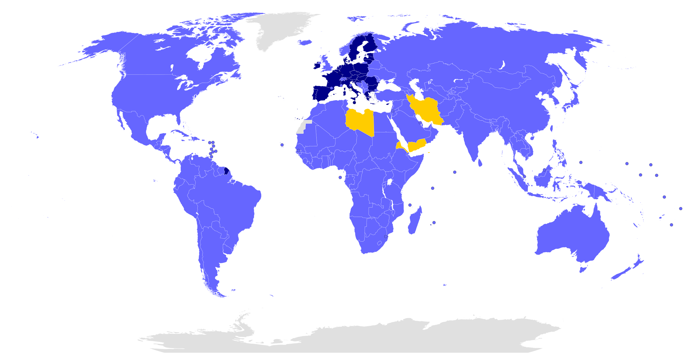
This image is a world map highlighting specific regions in different colors, likely indicating participation in a global agreement, organization, or event. The map uses color coding to differentiate between regions with distinct statuses.
- Map Type: World map
- Color Coding:
- Dark Blue:
- Most of Europe
- Represents a specific group, possibly indicating full participation or membership
- Yellow:
- Middle Eastern countries: Iraq, Syria, Lebanon, Jordan, and parts of North Africa (Libya, Egypt)
- Represents a different status, possibly indicating partial participation or a specific regional grouping
- Light Blue:
- Rest of the world (North and South America, most of Africa, Asia, Australia)
- Represents another status, possibly indicating non-participation or a different level of involvement
- Dark Blue:
- Additional Features:
- Country borders are outlined in black
- Oceans are in black, and polar regions (Arctic and Antarctic) are in white
The map visually distinguishes between regions with different levels of involvement in a global context, with Europe in dark blue, parts of the Middle East and North Africa in yellow, and the rest of the world in light blue.
There have been numerous previous climate agreements in the past, most notably the 1997 Kyoto Protocol that laid out stringent emissions targets for the countries that signed on. One of the reasons the Paris Accord was adopted by so many nations (only Syria and Nicaragua did not sign initially, but both now have) is because the impacts of climate change are becoming increasingly urgent. Although 127 countries signed on to Kyoto, the US did not.
The second reason the accord was so widely adopted is that the emission targets are voluntary, set by the individual countries based on what they believe is feasible. For example, the US’s goal was to reduce emissions by 26 percent by 2025. Once a country sets its target, it is required to abide by it and present supporting monitoring data. A country can change targets every five years. The downside of the flexibility is that many experts believe that with current targets, 1.5o C is impossible, 2o C is highly unlikely and 3o C is more realistic. So, countries will have to reduce emissions radically and rapidly to stave off the highly adverse impacts of climate change.
Two other key provisions of the Paris Accord is that richer developed countries have made a financial commitment to help poorer developing nations meet their targets, although there were no firm amounts in the agreement. President Obama pledged $2.5 billion to this fund while he was in office, but only $500 million was paid. Another key provision is that the agreement recognizes and addresses deforestation as a key element of emission reduction and for countries to use forest management strategies as part of their emissions goals. In fact at the climate summit in 2021, 100 countries including Brazil where deforestation has been particularly devastating, agreed to stop deforestation entirely by 2030, which would be a major step forward.
For the US, one of the key components of the emissions reduction strategies was the Clean Power Plan, introduced in 2014 under President Obama. The CPP set out to reduce emissions from electrical power generation by 32% based on the reduction of emissions from coal-fired power plants and the conversion to renewable sources of energy including wind, solar, and geothermal.
So, the strength of the Paris accord is that it is voluntary, highly transparent and collaborative. The downside is that it is voluntary! The general fear is that the agreement may not go far enough, fast enough.
Back and Forth History of the Paris Agreement
However, that said, this is by far the most widely adopted agreement and the global scope is a massive accomplishment. So, it was a major disappointment on June 1st, 2017 when President Donald Trump signaled that the US would withdraw from the Paris Accord in 2020, the earliest time the US could pull out under the agreement guidelines. The fear is that if the US, the second largest producer of carbon, does not abide by its emissions goals, other countries might not as well. Trump's reasons were largely economic, that the conversion to renewable energy would be too expensive and hinder the bottom line of businesses, especially the fossil fuel industries. However, as we will see in this class, conversion to renewables has begun and has the potential to be a very large and highly profitable business. Moreover, cities, states, and businesses themselves, especially those in the northwest and on the west coast are already committed to reducing emissions, so at least part of the US will continue to collaborate with other countries to address the critical issue of climate change.
Trump's overall strategy involves defunding and repealing the Clean Power Plan, which happened in 2019. It was replaced by the Affordable Clean Energy Rule, which was invalidated by the courts in 2021.
Former President Biden reentered the Paris Agreement on 19 February 2021 and set even more ambitious US emissions targets than those originally agreed upon. The Inflation Reduction Act passed in 2022 includes $369 billion to help individuals, communities, and industries switch to renewable energy. This would help the US meet its Paris targets, and possibly more importantly, the legislation shows important leadership on the international stage. However, fast forward to 2025 and President Trump signed an executive order to leave the Paris agreement on 2026. if this happens the US will be one of four countries outside of the agreement along with Iran, Libya and Yemen. After this announcement Former New York Mayor Michael Bloomberg committed to funding the US financial commitments to the agreement. So stay tuned on that. Also in 2025 most of the clean energy funding for the Inflation Reduction Act was repealed by Congress, a majot setback for the US meeting its Paris goals.
We will refer to the Paris Agreement in the remainder of the course. In this module, we discuss how models simulate the climate of the future. In closing, remember the 2oC number, it's going to come up over and over again.
Highlights of GCM Predictions
Highlights of GCM Predictions
In this section, we explore GCM predictions for future changes in temperature, precipitation, and surface water using three of the emission scenarios, A2, A1B, and B1. The models are driven primarily by estimates of CO2 input over the coming decades in each scenario.
Temperature
Temperature
In this section, we explore the predictions from GCMs regarding the temperature under different IPCC emissions scenarios described in the previous section. As part of the 2022 IPCC Assessment Report, all of the major GCM modeling groups around the world ran their models with the same Representative Concentration Pathways (RCPs) and emissions scenario families (A2, A1B, and B1) in order to provide the best estimate of what the future climate might look like under these scenarios. Each model is different, and so their results are also different. The figure below gives a sense of how much variability and similarity there is in these models. Remember that climate scientists believe that it is key that we maintain the warming below 2oC; above that level the consequences, including drought, heatwaves, melting of ice sheets, could be dire.
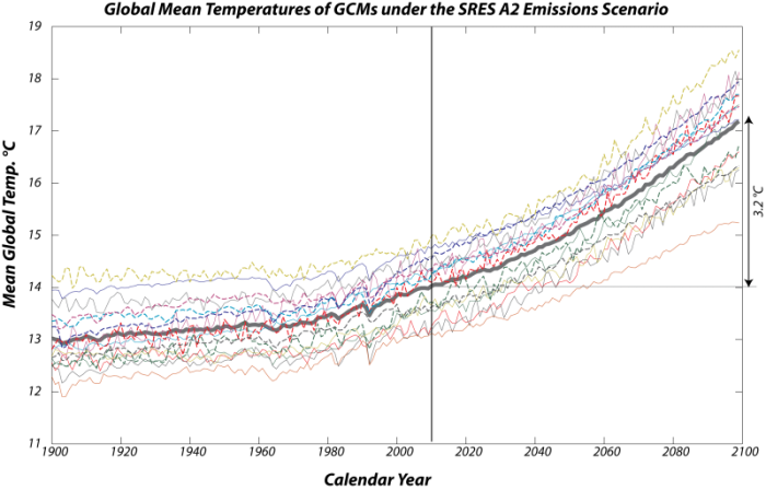
This image is a line graph displaying the output of multiple Global Climate Models (GCMs) under the SRES A2 scenario, often referred to as the "business as usual" scenario. The graph shows the average global temperature anomaly in degrees Celsius from 1900 to 2099, with each thin colored line representing a different GCM's projection.
- Graph Type: Line graph
- Y-Axis: Global temperature anomaly (°C)
- Range: Not explicitly labeled, but spans approximately -1°C to 5°C
- X-Axis: Years (1900 to 2099)
- Data Representation:
- Individual GCMs: Multiple thin colored lines (blue, red, green, yellow, orange, purple, etc.)
- Each line represents a different GCM's projection
- Lines start around -0.5°C in 1900, showing historical fluctuations
- All lines exhibit a general upward trend, with increasing spread by 2099
- Spread in 2099: Roughly 2°C to 5°C, showing a similar range of warming
- Mean of GCMs: Thick gray line
- Represents the average of all GCM outputs
- Starts around -0.5°C in 1900
- Rises steadily, reaching approximately 3.2°C above the present temperature by 2099
- Individual GCMs: Multiple thin colored lines (blue, red, green, yellow, orange, purple, etc.)
- Trend:
- 1900–2000: Lines show historical warming of about 1.1°C, with fluctuations
- 2000–2099: All models project continued warming, with the mean increasing by about 3.2°C
- The projected warming by 2099 is roughly three times the warming experienced in the last century (1.1°C)
The graph illustrates the projected global temperature increase under the SRES A2 scenario, with a significant spread among GCMs but a consistent upward trend, culminating in a mean warming of 3.2°C by the end of the century, highlighting the potential for substantial climate change under a business-as-usual emissions pathway.
Each of the thin colored lines represents the output from a different GCM — here we see the average global temperature through time, starting in 1900 and going until 2099, using the SRES A2 scenario, which is the one we sometimes call "business as usual." There is obviously a big spread in the results, but they all have more or less the same general form and a similar range (the difference between the minimum and maximum temperatures). The thicker gray line is the mean from all these models, and we can see that by the end of the century, the mean rises by about 3.2 °C above the present temperature — this is roughly three times the warming we have experienced in the last century (about 1.1oC).
The differences in these curves reflect, among other things, different starting conditions, and if we force them to all have the same temperature today, the similarities are more apparent:
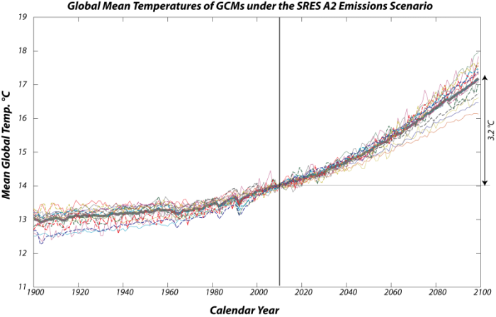
This image is a line graph showing the relative global temperature changes projected by multiple climate models over the period from 1900 to 2099. Each thin colored line represents the output from a different climate model, illustrating the variability in their projections.
- Graph Type: Line graph
- Y-Axis: Relative temperature change (°C)
- Range: Not explicitly labeled, but spans approximately -1°C to 5°C
- X-Axis: Years (1900 to 2099)
- Data Representation:
- Individual Models: Multiple thin colored lines (blue, red, green, yellow, orange, purple, etc.)
- Each line represents a different climate model's projection
- Lines start around -0.5°C in 1900, showing historical fluctuations
- All lines exhibit a general upward trend, with increasing spread by 2099
- Spread in 2099: Less than 2°C (roughly 2°C to 4°C)
- Most models fall within 0.5°C of the mean temperature
- Mean Temperature: Thick gray line
- Represents the average of all model outputs
- Starts around -0.5°C in 1900
- Rises steadily, reaching approximately 3.2°C by 2099
- Individual Models: Multiple thin colored lines (blue, red, green, yellow, orange, purple, etc.)
- Trend:
- 1900–2000: Lines show historical fluctuations with a slight upward trend
- 2000–2099: All models project continued warming, with the mean increasing to 3.2°C
- The mean warming of 3.2°C by the end of the century is noted as disastrous for the planet
The graph highlights the variability among climate models in projecting future temperature changes, with a spread of less than 2°C by 2099, but most models clustering within 0.5°C of the mean. The mean warming of 3.2°C underscores the potential for significant and harmful climate impacts.
This view gives a sense of how much the models differ in their relative temperature changes over the next century. You can see that by the end of the century, the spread of temperatures is a bit less than 2°C, but most of the models fall within a half a degree from the mean temperature — the thick gray line. As we have discussed, this mean warming of 3.2 °C would be disastrous for the planet.
The lesson here is that the similarities in the models are far more important than their differences, and that they forecast a significant temperature rise by the end of the century as we essentially continue with our emissions of carbon into the atmosphere.
Next, let’s have a look at what the models say about the different emissions scenarios. Just to refresh your memories, here are those emissions scenarios again:
This image is a line graph comparing three different trends over time, represented by three distinct lines in blue, pink, and brown. The graph lacks labeled axes, but it appears to show changes in some variable over a period, possibly related to climate or environmental data.
- Graph Type: Line graph
- Lines:
- Blue Line:
- Starts low, rises to a peak around the midpoint
- Declines steadily afterward, ending lower than the starting point
- Pink Line (with dots):
- Starts low, rises gradually
- Peaks slightly after the blue line, then declines slowly
- Ends slightly above the starting point
- Brown Line:
- Starts low, rises steadily throughout
- Shows a consistent upward trend with no decline
- Ends significantly higher than the starting point
- Blue Line:
- Trend:
- Blue line shows a rise and fall pattern
- Pink line shows a moderate rise with a slight decline
- Brown line shows a continuous increase
The graph illustrates three distinct trends over time, with the blue line peaking and declining, the pink line showing a more moderate rise and fall, and the brown line indicating a steady increase throughout the period.
Recall that in these emissions scenarios, we talk about the annual rate of carbon emissions to the atmosphere and that carbon takes the form of CO2 in the atmosphere.
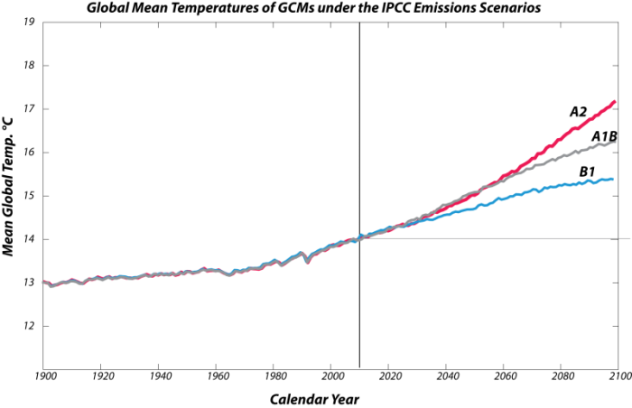
Here are the corresponding global temperature histories from the collection of models for these different scenarios:
This image is a line graph comparing three different trends over time, represented by three distinct lines in blue, pink, and gray. The graph lacks labeled axes, but it appears to show changes in some variable over a period, possibly related to climate or environmental data.
- Graph Type: Line graph
- Lines:
- Blue Line:
- Starts low, shows small fluctuations initially
- Rises steadily after the midpoint, continuing upward
- Pink Line (with dots):
- Starts low, mirrors the blue line initially
- Rises more sharply after the midpoint, surpassing the blue line
- Ends significantly higher than the starting point
- Gray Line:
- Starts low, rises steadily throughout
- Shows a consistent upward trend, similar to the blue line but slightly higher
- Ends above the blue line but below the pink line
- Blue Line:
- Trend:
- Blue and gray lines show a steady, gradual increase
- Pink line shows a steeper increase in the latter half
- All lines exhibit an overall upward trend
The graph illustrates three distinct trends over time, with the blue and gray lines showing a steady increase, while the pink line demonstrates a more pronounced rise in the latter part of the period.
As expected, the A2 scenario results in the highest temperature rise, followed by the A1B and the B1 scenarios. Remember that the A1B scenario represents a pretty optimistic view of how we will react to the challenge of climate change, but even in that case, the temperature rises by about 2.3 °C in the next century, which is above the Paris 2.0oC target. And even in the dramatic reduction in emissions envisioned in the B1 scenario, the temperature still rises by about 1.4°C — greater than what we’ve experienced in the last century. The lesson here is that we need to be prepared for continued climate change even if we take steps to limit carbon emissions into the atmosphere. And note that only B1 keeps us below the catastrophic 2.0oC threshold discussed earlier.
Next, we turn to the really interesting aspect of the GCM results, which are the spatial patterns of climate change. Why is this so interesting and important? The reason is that what really matters to us is how the climate changes in key areas -- areas that will affect sea level through melting of glacial ice, areas where people are concentrated, and areas where we produce food to feed ourselves. Remember that the climate of the Earth is highly variable, and if we talk about a global temperature rise of 3.2 °C, we have to remember that the temperature will rise more than that in some places (such as the polar regions) and less than that in the tropics.
We begin with a look at the climate of the future as predicted by the NCAR (National Center for Atmospheric Research in Boulder, Colorado) model — this model seems to often fall close to the mean of all the other models.
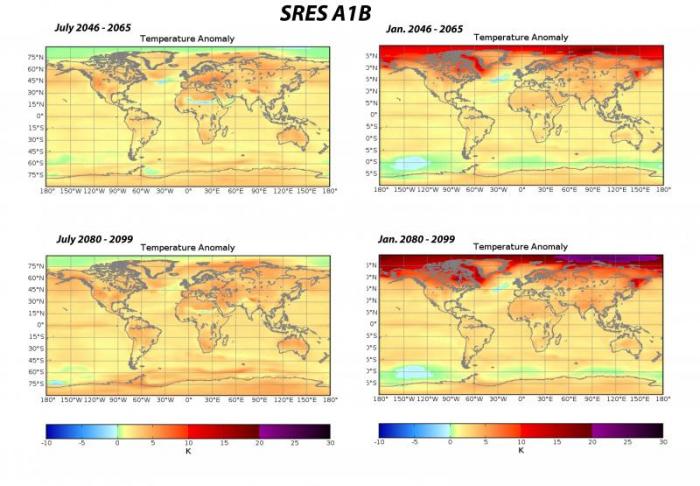
This image consists of four world maps showing temperature anomalies in Kelvin (K) under the SRES A1B scenario for two different periods: July 2046–2065 and July 2080–2099, as well as January 2046–2065 and January 2080–2099. Each map uses a color gradient to indicate temperature changes relative to a baseline.
- Diagram Type: Four world maps
- Measurement: Temperature anomaly (K)
- Color Scale (bottom of the maps):
- Range: -3.0 K to 3.0 K
- Colors: Dark blue (-3.0 K) to dark red (3.0 K), with light blue, white, and orange in between
- Maps:
- July 2046–2065 Temperature Anomaly (Top Left):
- Warmer than Average (red, 1.5 K to 3.0 K):
- Central Africa, Middle East, India
- Slightly Warmer (orange, 0 K to 1.5 K):
- Most of North America, Europe, Asia
- Near Average or Cooler (white to blue, -3.0 K to 0 K):
- Parts of the Arctic, southern South America
- Warmer than Average (red, 1.5 K to 3.0 K):
- January 2046–2065 Temperature Anomaly (Top Right):
- Warmer than Average (red, 1.5 K to 3.0 K):
- Arctic regions, northern North America, Siberia
- Slightly Warmer (orange, 0 K to 1.5 K):
- Most of the Northern Hemisphere
- Near Average or Cooler (white to blue, -3.0 K to 0 K):
- Southern Hemisphere, especially southern South America
- Warmer than Average (red, 1.5 K to 3.0 K):
- July 2080–2099 Temperature Anomaly (Bottom Left):
- Warmer than Average (red, 1.5 K to 3.0 K):
- Central Africa, Middle East, India, central North America
- Slightly Warmer (orange, 0 K to 1.5 K):
- Most of the globe
- Near Average or Cooler (white to blue, -3.0 K to 0 K):
- Small areas in the Arctic, southern South America
- Warmer than Average (red, 1.5 K to 3.0 K):
- January 2080–2099 Temperature Anomaly (Bottom Right):
- Warmer than Average (red, 1.5 K to 3.0 K):
- Arctic regions, northern North America, Siberia
- Slightly Warmer (orange, 0 K to 1.5 K):
- Most of the Northern Hemisphere
- Near Average or Cooler (white to blue, -3.0 K to 0 K):
- Southern Hemisphere, especially southern South America
- Warmer than Average (red, 1.5 K to 3.0 K):
- July 2046–2065 Temperature Anomaly (Top Left):
- Additional Features:
- Latitude lines: 90°N to 90°S
- Longitude lines: 180°W to 180°E
The maps illustrate projected temperature anomalies under the SRES A1B scenario, showing significant warming in July and January for both periods, with the most pronounced increases in the Arctic during January and in tropical regions during July, intensifying by the end of the century.
Here, we see 4 views of the surface temperature anomaly relative to the 1960-1990 mean. The upper 2 panels represent the mean temperature anomaly for the 20-year period from 2046 to 2065 in the month of July on the left and January on the right. In the lower 2 panels, we see similar views for the 20-year period from 2080 to 2099. The color scale below is for all of the panels and shows the anomaly in °K, but you can also think of this as °C.
Let’s start with the mid-century forecast. It calls for moderate warming in the range of 2 °C relative to the 1960-1990 mean. For both months, the warming is slightly higher on land than in the oceans, and there are a couple of spots of cooling: at the southern edge of the Sahara, one in the Southern Ocean around Antarctica, and one in the North Atlantic. The striking feature of this model result is the big change in the high latitudes of the Northern Hemisphere in January, where a large region will experience much warmer winter temperatures — up to 10° C warmer. The changes are even more dramatic for the end of the century, with the northern winters warming by up to 20° C above the 1960-1990 mean! This clearly spells the end of polar ice, which already is at its lowest extent ever. Notice also that much of Canada and Siberia warm by up to 10° C; this has important implications for the reduction in permafrost, which will increase the flow of carbon into the atmosphere via positive feedback (more on this in the next module).
The pattern of warm winters is important for a number of reasons. For one thing, it means that there will be less growth of ice in glaciers during the time of the year that they accumulate ice; thus they will shrink faster, and sea level will rise at a higher rate. Another unexpected result of warmer winters is increased problems from some insect pests whose populations normally are greatly reduced by cold winters, and when it does not get cold enough in the winter, they expand their range and cause greater damage. This is already happening in the western US with the pine bark beetle, whose population has exploded in recent years, leading to the decimation of large forested areas. These dead pine trees are then fuel for large forest fires whose scale exceeds fires in the historical record.
On the other hand, warmer winters lead to lower energy demands for heating, but this is offset by the greater energy demands for cooling during the summer months (the season where cooling would be required will also increase).
For comparison, we now compare the end-of-century forecast for the other 2 scenarios, A2, which is our business as usual case, and B1, which is our optimistic case with the A1B forecast.
First, we have the A2 scenario, which leads to the highest warming:
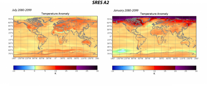
For July, this scenario leads to warming of the continents that is between 5 and 10° C — very little of the US would escape warming in excess of about 6° C; the same is true for much of Europe. Winter shows an even more dramatic warming, with vast regions warming by more than 20 °C. A2 would result in a major increase in the number of days over 90o F in places such as Atlanta Austin, Dallas and Phoenix literally half of the days of the year would exceed that level of discomfort. And polar ice would melt much faster than in A1B or B1.
Now, for the other extreme, the B1 scenario at the end of the century:
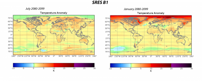
As expected, the warming is far less dramatic, but still shows an impressive warming at the high latitudes of the Northern Hemisphere in the winter months. But, for most of the land areas, where people are concentrated and where we grow a lot of our food, the climate changes generally do not exceed a warming of 2°C.
These comparisons demonstrate the importance of reducing emissions to scenario B1 levels.
Check Your Understanding
Precipitation
Precipitation
Next, we turn to precipitation, and we will be looking at anomaly maps, showing the difference between the model’s precipitation rate (i.e., mm/month or mm/day) and the average precipitation rate for 1960-1990. It will help us to begin with a glimpse of actual typical precipitation rates for the two months of interest here — January and July. Below, we see this pair of maps:
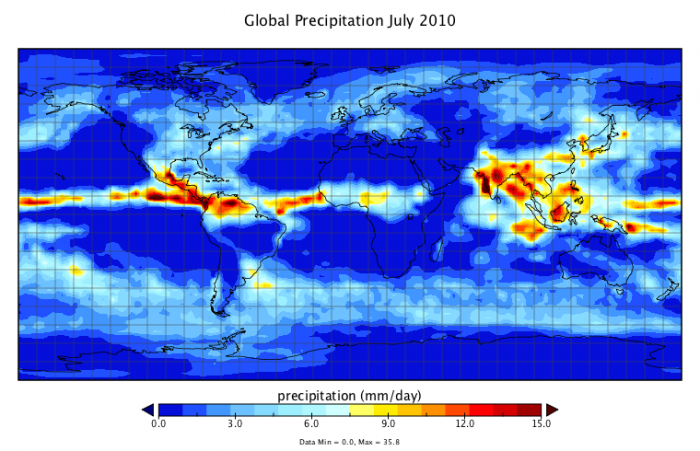
This image is a world map titled "Global Precipitation July 2010," showing the distribution of precipitation in millimeters per day (mm/day) across the globe for that month. The map uses a color gradient to indicate precipitation levels, with data statistics provided at the bottom.
- Map Type: World map
- Measurement: Precipitation (mm/day)
- Color Scale (bottom of the map):
- Range: 0.0 mm/day to 15.0 mm/day
- Colors: Dark blue (0.0 mm/day) to dark red (15.0 mm/day), with light blue, yellow, and orange in between
- Regions with Notable Precipitation:
- High Precipitation (red, 12.0–15.0 mm/day):
- Equatorial regions, particularly the Intertropical Convergence Zone (ITCZ)
- Central America, northern South America (Amazon Basin)
- West Africa, India, and Southeast Asia
- Moderate Precipitation (yellow to orange, 3.0–12.0 mm/day):
- Parts of the eastern U.S., eastern China, and northern Australia
- Low Precipitation (blue, 0.0–3.0 mm/day):
- Most of the Northern Hemisphere (outside the ITCZ)
- Southern South America, southern Africa, and central Australia
- High Precipitation (red, 12.0–15.0 mm/day):
- Data Statistics (bottom of the map):
- Minimum: 0.0 mm/day
- Maximum: 35.8 mm/day
- Mean: 2.7 mm/day
The map illustrates global precipitation patterns for July 2010, with the highest rainfall concentrated along the equator, particularly in Central America, the Amazon, West Africa, and Southeast Asia, while much of the Northern and Southern Hemispheres outside these regions experienced lower precipitation.
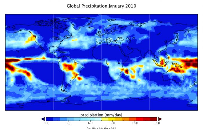
This image is a world map titled "Global Precipitation January 2010," showing the distribution of precipitation in millimeters per day (mm/day) across the globe for that month. The map uses a color gradient to indicate precipitation levels, with data statistics provided at the bottom.
- Map Type: World map
- Measurement: Precipitation (mm/day)
- Color Scale (bottom of the map):
- Range: 0.0 mm/day to 15.0 mm/day
- Colors: Dark blue (0.0 mm/day) to dark red (15.0 mm/day), with light blue, yellow, and orange in between
- Regions with Notable Precipitation:
- High Precipitation (red, 12.0–15.0 mm/day):
- Equatorial regions, particularly the Intertropical Convergence Zone (ITCZ)
- Northern South America (Amazon Basin), Central America
- Southeast Asia, parts of Indonesia, and northern Australia
- Moderate Precipitation (yellow to orange, 3.0–12.0 mm/day):
- Southern Brazil, parts of West Africa
- Eastern Australia, parts of the southern U.S.
- Low Precipitation (blue, 0.0–3.0 mm/day):
- Most of the Northern Hemisphere (North America, Europe, Asia)
- Southern Africa, central Australia, and southern South America
- High Precipitation (red, 12.0–15.0 mm/day):
- Data Statistics (bottom of the map):
- Minimum: 0.0 mm/day
- Maximum: 26.2 mm/day
- Mean: 2.8 mm/day
The map illustrates global precipitation patterns for January 2010, with the highest rainfall concentrated along the equator, particularly in the Amazon Basin, Southeast Asia, and northern Australia, while much of the Northern Hemisphere and non-equatorial Southern Hemisphere regions experienced lower precipitation.
Here, red is used to show high rainfall, and blue is used to show low rainfall. The precipitation rates here are shown in terms of millimeters of rain per day (the high value here of 15 mm/day is about 0.6 inches/day). In the eastern US, for instance, the July rainfall is about 1 mm/day.
Looking into the future, we will again utilize the results from the NCAR model, looking at 20-yr. means from the climate model results to get a smoothed out version of the results. We focus here on the SRES A1B scenario, looking at the months of July and January.
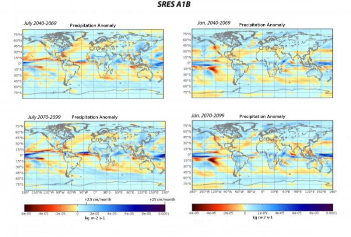
This image consists of four world maps showing precipitation anomalies under the SRES A1B scenario for two different periods: July 2040–2069 and July 2070–2099, as well as January 2040–2069 and January 2070–2099. The anomalies are measured in kg m^-2 s^-1, with a color gradient indicating changes in precipitation relative to a baseline.
- Diagram Type: Four world maps
- Measurement: Precipitation anomaly (kg m^-2 s^-1)
- Color Scale (bottom of the maps):
- Range: -0.0001 to 0.0001 kg m^-2 s^-1
- Colors: Dark blue (-0.0001) to dark red (0.0001), with light blue, white, and yellow in between
- Maps:
- July 2040–2069 Precipitation Anomaly (Top Left):
- Increased Precipitation (red, 0.00005 to 0.0001 kg m^-2 s^-1):
- Central Africa, northern South America, Southeast Asia
- Decreased Precipitation (blue, -0.0001 to -0.00005 kg m^-2 s^-1):
- Mediterranean, parts of the Middle East, southern North America
- Near Average (white to yellow, -0.00005 to 0.00005 kg m^-2 s^-1):
- Most of the Northern Hemisphere, Australia
- Increased Precipitation (red, 0.00005 to 0.0001 kg m^-2 s^-1):
- January 2040–2069 Precipitation Anomaly (Top Right):
- Increased Precipitation (red, 0.00005 to 0.0001 kg m^-2 s^-1):
- Northern North America, northern Europe, Siberia
- Decreased Precipitation (blue, -0.0001 to -0.00005 kg m^-2 s^-1):
- Parts of the Southern Hemisphere, including southern South America
- Near Average (white to yellow, -0.00005 to 0.00005 kg m^-2 s^-1):
- Equatorial regions, most of Africa
- Increased Precipitation (red, 0.00005 to 0.0001 kg m^-2 s^-1):
- July 2070–2099 Precipitation Anomaly (Bottom Left):
- Increased Precipitation (red, 0.00005 to 0.0001 kg m^-2 s^-1):
- Central Africa, northern South America, Southeast Asia (more pronounced than 2040–2069)
- Decreased Precipitation (blue, -0.0001 to -0.00005 kg m^-2 s^-1):
- Mediterranean, Middle East, southern North America (more intense than earlier period)
- Near Average (white to yellow, -0.00005 to 0.00005 kg m^-2 s^-1):
- Parts of the Northern Hemisphere, Australia
- Increased Precipitation (red, 0.00005 to 0.0001 kg m^-2 s^-1):
- January 2070–2099 Precipitation Anomaly (Bottom Right):
- Increased Precipitation (red, 0.00005 to 0.0001 kg m^-2 s^-1):
- Northern North America, northern Europe, Siberia (more pronounced than 2040–2069)
- Decreased Precipitation (blue, -0.0001 to -0.00005 kg m^-2 s^-1):
- Southern South America, parts of the Southern Hemisphere
- Near Average (white to yellow, -0.00005 to 0.00005 kg m^-2 s^-1):
- Equatorial regions, most of Africa
- Increased Precipitation (red, 0.00005 to 0.0001 kg m^-2 s^-1):
- July 2040–2069 Precipitation Anomaly (Top Left):
- Additional Features:
- Latitude lines: 90°N to 90°S
- Longitude lines: 180°W to 180°E
The maps illustrate projected precipitation anomalies under the SRES A1B scenario, showing increased precipitation in tropical regions during July and in northern high latitudes during January, with decreased precipitation in the Mediterranean and southern regions, intensifying by the end of the century.
The units here are a bit odd — kilograms per meter squared per second — but it is still a rate, and if we do a conversion, we find that 0.0001 of these units equals 25 centimeters per month, or a bit less than one centimeter per day, which is 10 millimeters per day. Have a look at the map for July 2040 to 2069. In the eastern US, the precipitation anomaly is about 2e-5 kg/m2s. At first, it is difficult to get a sense of whether this is important. This anomaly translates to about 45 mm/month, or about 1.5 mm/day. From the July 2001-December 2019 map above, we see that the typical rate for July in this region is on the order of about 4-5 mm/day, so an increase of 1.5 mm/day is about a 30% increase — fairly significant.
Interestingly, there is not much of a change in the anomaly for this region (eastern US) as we move to the end-of-the-century map in the lower left panel above. And in both cases, the western US is drier by a bit. If we look at the January maps, we see a bigger change between the two time periods, getting drier by the 2080-2099 period. For January, it is important to note that in the Western US, the precipitation is decreased; this could mean problems for the water supply out west, where the winter snows, as they melt in the summer, represent a major part of the water budget.
What about the other scenarios? Below, we see the precipitation anomaly maps for the A2 scenario — the one that leads to a hotter climate — for the 2080-2099 time period.
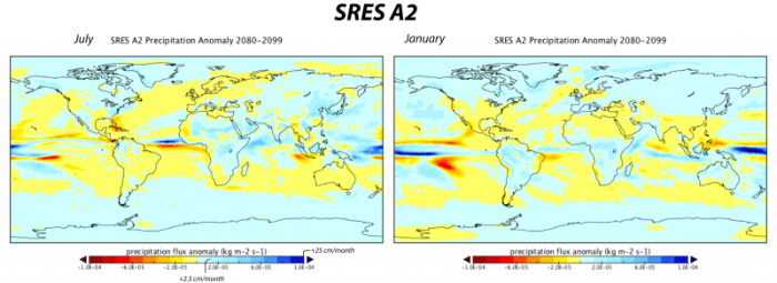
This image consists of two world maps showing precipitation flux anomalies under the SRES A2 scenario for the period 2080–2099, one for July and one for January. The anomalies are measured in kg m^-2 s^-1, with a color gradient indicating changes in precipitation relative to a baseline, and additional scales for percentage changes and millimeters per month.
- Diagram Type: Two world maps
- Measurement: Precipitation flux anomaly (kg m^-2 s^-1)
- Color Scale (bottom of the maps):
- Range: -1.8e-4 to 1.8e-4 kg m^-2 s^-1
- Colors: Dark blue (-1.8e-4) to dark red (1.8e-4), with light blue, white, and yellow in between
- Additional Scales:
- Percentage change: -42% to 42%
- mm/month: -125 to 125 mm/month
- Maps:
- July 2080–2099 Precipitation Anomaly (Left):
- Increased Precipitation (red, 0.9e-4 to 1.8e-4 kg m^-2 s^-1, 21% to 42%, 62.5 to 125 mm/month):
- Central Africa, northern South America, Southeast Asia
- Decreased Precipitation (blue, -1.8e-4 to -0.9e-4 kg m^-2 s^-1, -42% to -21%, -125 to -62.5 mm/month):
- Mediterranean, Middle East, southern North America, parts of Australia
- Near Average (white to yellow, -0.9e-4 to 0.9e-4 kg m^-2 s^-1, -21% to 21%, -62.5 to 62.5 mm/month):
- Most of the Northern Hemisphere, southern South America
- Increased Precipitation (red, 0.9e-4 to 1.8e-4 kg m^-2 s^-1, 21% to 42%, 62.5 to 125 mm/month):
- January 2080–2099 Precipitation Anomaly (Right):
- Increased Precipitation (red, 0.9e-4 to 1.8e-4 kg m^-2 s^-1, 21% to 42%, 62.5 to 125 mm/month):
- Northern North America, northern Europe, Siberia
- Decreased Precipitation (blue, -1.8e-4 to -0.9e-4 kg m^-2 s^-1, -42% to -21%, -125 to -62.5 mm/month):
- Southern South America, parts of the Southern Hemisphere
- Near Average (white to yellow, -0.9e-4 to 0.9e-4 kg m^-2 s^-1, -21% to 21%, -62.5 to 62.5 mm/month):
- Equatorial regions, most of Africa, Australia
- Increased Precipitation (red, 0.9e-4 to 1.8e-4 kg m^-2 s^-1, 21% to 42%, 62.5 to 125 mm/month):
- July 2080–2099 Precipitation Anomaly (Left):
The maps illustrate projected precipitation anomalies under the SRES A2 scenario for 2080–2099, showing increased precipitation in tropical regions during July and in northern high latitudes during January, with significant decreases in the Mediterranean, southern North America, and parts of the Southern Hemisphere.
Compared to the A1B scenario for the same time period, we see a generally drier picture for the US, though the differences are actually quite small. Note that in this scenario, as in others, the tropics get wetter.
For scenario SRES B1, the one where the temperature at the end of the century is only slightly higher than the present, the precipitation changes are generally quite small, as can be seen in the map below:
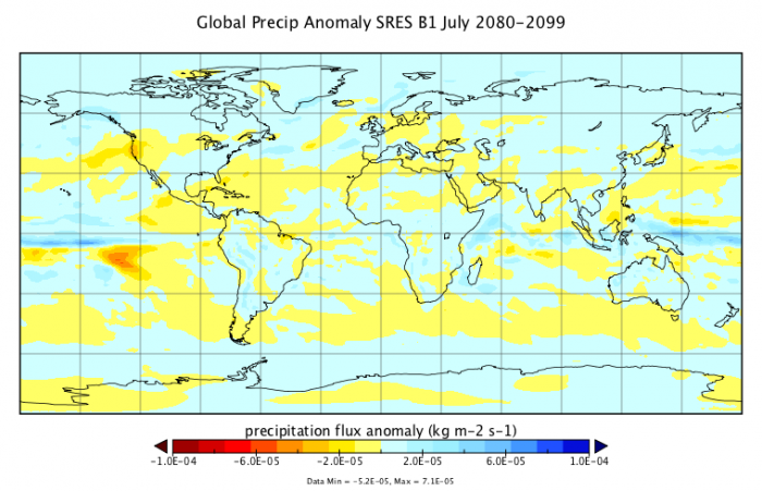
This image is a world map titled "Global Precip Anomaly SRES B1 July 2080-2099," showing precipitation flux anomalies in kg m^-2 s^-1 under the SRES B1 scenario for the period of July 2080–2099. The map uses a color gradient to indicate changes in precipitation relative to a baseline, with data statistics provided at the bottom.
- Map Type: World map
- Measurement: Precipitation flux anomaly (kg m^-2 s^-1)
- Color Scale (bottom of the map):
- Range: -1.0e-04 to 1.0e-04 kg m^-2 s^-1
- Colors: Dark red (-1.0e-04) to dark blue (1.0e-04), with yellow, white, and light blue in between
- Regions with Notable Anomalies:
- Increased Precipitation (blue, 0.5e-05 to 1.0e-04 kg m^-2 s^-1):
- Northern North America, northern Europe, Siberia
- Parts of Southeast Asia and the equatorial Pacific
- Decreased Precipitation (red, -1.0e-04 to -0.5e-05 kg m^-2 s^-1):
- Central America, northern South America (Amazon Basin)
- Parts of West Africa and the Mediterranean
- Near Average (white to yellow, -0.5e-05 to 0.5e-05 kg m^-2 s^-1):
- Most of the Southern Hemisphere, including southern South America, Africa, and Australia
- Parts of the Northern Hemisphere, including central North America and central Asia
- Increased Precipitation (blue, 0.5e-05 to 1.0e-04 kg m^-2 s^-1):
- Data Statistics (bottom of the map):
- Minimum: -5.2e-05 kg m^-2 s^-1
- Maximum: 7.1e-05 kg m^-2 s^-1
The map illustrates projected precipitation anomalies under the SRES B1 scenario for July 2080–2099, showing increased precipitation in northern high latitudes and parts of the equatorial Pacific, while regions like Central America, the Amazon Basin, and the Mediterranean experience decreased precipitation.
Here, the very light colors indicate slight increases and decreases in the precipitation rate for July — the same picture holds for January as well.
In summary, the precipitation results indicate that in general, there are very complicated patterns of precipitation change, and for much of the globe, they are quite minimal. The model predicts that there will be wetter areas and drier areas, and what really matters is how these changes correlate with the regions where people live and grow their food. Under the A2 scenario (business-as-usual), we should expect a generally drier western and south-central US and a generally wetter northeastern U.S. We will revisit this issue in Module 8.
Check Your Understanding
Surface Water
Surface Water
As was mentioned in the previous section on precipitation predictions from GCMs, there are some important implications for water supplies. In this section, we will take a look at how the model results might impact surface water in the future.
Surface water is of great importance since it is the primary source of water for agriculture. It is estimated that 69% of worldwide water use is for irrigation, and of this, about 62% comes from surface water which includes streams, lakes, and reservoirs.
When rain falls on the surface, most of it is absorbed by the soil, and then from there, it slowly migrates to streams, and from there into lakes and reservoirs, but it ultimately leaves a region, through stream flow and evaporation, to return to the oceans or the atmosphere — this is just a part of the large global water cycle. The total amount of water flowing in the streams of a region provides a useful measure of how much water is available for agriculture. We'll discuss this in depth in Module 9.
It takes around 3,000 liters of water to produce enough food to satisfy one person's daily dietary needs. This is a considerable amount when compared to that required for drinking, which is just 2-5 liters. To produce food for over 7 billion people who inhabit the planet today requires the water that would fill a canal ten meters deep, 100 meters wide and 7.1 million kilometers long – that's enough to circle the globe 180 times!
As we have seen, a GCM will predict the amount of rainfall over the surface of the Earth, and if we combine that with a model of the topography of the land areas (which is included in the GCMs), we can figure out how much water will flow as surface water through different regions. This has been done by taking the average precipitation from 20 GCMs operating under the SRES A1B scenario and then calculating how that surface water flow compares to the long-term average from 1900 to 1970. The resulting data provide us with a very good idea of what to expect in the future if we follow the A1B scenario.
The results of the surface water predictions can be seen here, but we will focus in on 3 snapshots from this history in a series of maps. We begin with a view of the predictions for the year 2020.
This image is a world map titled "% Runoff Change, Relative to 1900-1970 for the SRES A1B scenario." The map shows projected changes in runoff (the flow of water over the Earth's surface) as a percentage relative to the 1900–1970 baseline, based on the SRES A1B climate scenario, which assumes rapid economic growth and balanced energy sources.
- Map Type: World map
- Measurement: Percentage change in runoff (%)
- Color Scale (bottom of the map):
- Range: -60.0% to 60.0%
- Colors: Red (decrease, -60.0%) to blue (increase, 60.0%), with white at 0% (no change)
- Data range: Min -28.7%, Max 65.8%
- Regions with Notable Changes:
- Significant Decrease (red, -60% to -12%):
- Southern Europe (Mediterranean region)
- Parts of Central America
- Small areas in the Middle East
- Moderate Decrease (orange, -12% to 0%):
- Western U.S.
- Parts of South America (southern Brazil, Argentina)
- Central Africa
- No Change (white, around 0%):
- Most of North America, Australia, and Asia
- Large parts of South America and Africa
- Moderate Increase (light blue, 0% to 12%):
- Northern Europe
- Parts of Russia and Central Asia
- Eastern Africa
- Significant Increase (blue, 12% to 60%):
- Arctic regions (northern Canada, Siberia)
- Parts of Southeast Asia
- Small areas in South America (northern Andes)
- Significant Decrease (red, -60% to -12%):
The map illustrates a varied global impact on runoff, with significant reductions projected in southern Europe and parts of Central America, while increases are expected in Arctic regions and parts of Southeast Asia under the SRES A1B scenario.
This image is a 30-year average, centered on the year 2020. The blue areas will see an increase in streamflow, and the red areas will see a decrease. The map includes contour lines that separate the values according to the labeled tick marks on the map scale. As we might expect, the changes are relatively small at this point, but the Mediterranean region has noticeably less streamflow.
As we move forward in time, to 2050, the changes become more dramatic.
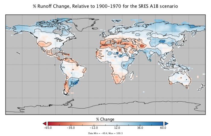
This image is a world map titled "% Runoff Change, Relative to 1900-1970 for the SRES A1B scenario." The map illustrates projected changes in runoff (surface water flow) as a percentage compared to the 1900–1970 baseline, according to the SRES A1B climate scenario, which assumes rapid economic growth and balanced energy sources.
- Map Type: World map
- Measurement: Percentage change in runoff (%)
- Color Scale (bottom of the map):
- Range: -60.0% to 60.0%
- Colors: Red (decrease, -60.0%) to blue (increase, 60.0%), with white at 0% (no change)
- Data range: Min -45.4%, Max 100.3%
- Regions with Notable Changes:
- Significant Decrease (red, -60% to -12%):
- Southern Europe (Mediterranean region)
- Parts of Central America
- Small areas in the Middle East
- Moderate Decrease (orange, -12% to 0%):
- Western U.S.
- Parts of South America (southern Brazil, Argentina)
- Central Africa
- Northern Australia
- No Change (white, around 0%):
- Most of North America, eastern Brazil, and sub-Saharan Africa
- Large parts of Asia and Australia
- Moderate Increase (light blue, 0% to 12%):
- Northern Europe
- Parts of Russia and Central Asia
- Eastern Africa
- Significant Increase (blue, 12% to 60%):
- Arctic regions (northern Canada, Siberia)
- Parts of Southeast Asia
- Southern South America (southern Chile, Argentina)
- Significant Decrease (red, -60% to -12%):
The map highlights a varied global pattern of runoff changes, with notable reductions projected in southern Europe and Central America, and increases in Arctic regions and Southeast Asia under the SRES A1B scenario.
And as we continue into the future, the picture in 2080 looks like this:
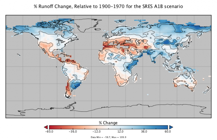
This image is a world map titled "% Runoff Change, Relative to 1900-1970 for the SRES A1B scenario." It shows projected changes in runoff (surface water flow) as a percentage compared to the 1900–1970 baseline, based on the SRES A1B climate scenario, which assumes rapid economic growth and balanced energy sources.
- Map Type: World map
- Measurement: Percentage change in runoff (%)
- Color Scale (bottom of the map):
- Range: -60.0% to 60.0%
- Colors: Red (decrease, -60.0%) to blue (increase, 60.0%), with white at 0% (no change)
- Data range: Min -58.7%, Max 100.9%
- Regions with Notable Changes:
- Significant Decrease (red, -60% to -12%):
- Southern Europe (Mediterranean region)
- Parts of Central America
- Small areas in the Middle East and Central Asia
- Moderate Decrease (orange, -12% to 0%):
- Western U.S.
- Parts of South America (southern Brazil, Argentina)
- Central Africa
- Northern Australia
- No Change (white, around 0%):
- Most of North America, eastern Brazil, and sub-Saharan Africa
- Large parts of Asia and Australia
- Moderate Increase (light blue, 0% to 12%):
- Northern Europe
- Parts of Russia and Central Asia
- Eastern Africa
- Significant Increase (blue, 12% to 60%):
- Arctic regions (northern Canada, Siberia)
- Southern South America (southern Chile, Argentina)
- Parts of Southeast Asia
- Significant Decrease (red, -60% to -12%):
The map depicts a varied global pattern of runoff changes under the SRES A1B scenario, with significant reductions in southern Europe and Central America, and notable increases in Arctic regions and southern South America.
By the year 2080, we see that there are some fairly stark differences in streamflow. A large swath around the Mediterranean, including much of Europe, North Africa, and the Middle East all will have significant reductions in streamflow, which will add stress to an agricultural system that is already operating at close to its limit. Consider also that the world by this time will certainly have a minimum of 10 billion people. Much of the Southwestern US (including California) and Central America will also experience a reduction in streamflow. This is clearly bad news for a place like California, which is already going to great lengths to bring surface water to its cities and major agricultural production areas via a system of canals. And for Central America, continuing drought will lead to even more mass migration to the US southern border. We will discuss this in much more detail in Module 9.
On the other hand, consider where most of the Earth's population is — China and India. Both of these regions, according to the model results, should experience an increase in surface water availability, which is good news.
Another big trend is that the high latitudes of the Northern Hemisphere experience a very large increase in surface runoff. This could be important if population patterns shift northward in a warming world.
We now consider how these changes add up over the whole globe — is surface runoff increasing or decreasing as we go into the future? The 3 maps shown above have been averaged along lines of latitude to give a simpler sense of the change, and then these latitudinal averages are summed and weighted according to the different areas each latitudinal band represents to give a global sum.
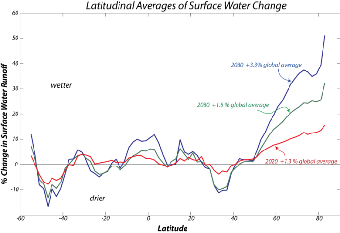
This image is a line graph showing the percentage of global average sea ice extent over time, with data for the years 2000, 2012, and 2020. The graph compares the sea ice extent for these specific years against the global average, expressed as a percentage above or below the average.
- Graph Type: Line graph
- Y-Axis: Percentage of global average sea ice extent (%)
- Range: Not explicitly labeled, but visually spans from below -3% to above 3%
- X-Axis: Time (not explicitly labeled with months or days, but implied to cover a yearly cycle)
- Data Representation:
- 2000: Green line
- Labeled as +1.6% global average
- Starts above the average, fluctuates slightly, and ends slightly above the average
- 2012: Red line
- Labeled as +1.3% global average
- Starts below the average, dips significantly mid-year, and recovers slightly but remains below the average
- 2020: Blue line
- Labeled as -3.2% global average
- Starts below the average, fluctuates with notable dips, and ends significantly below the average
- 2000: Green line
- Trend:
- 2000 shows a relatively stable extent above the global average
- 2012 shows a significant decline mid-year, ending slightly above the average
- 2020 shows consistently lower extent, with a marked decrease compared to the average
The graph illustrates a trend of decreasing sea ice extent over the two decades, with 2020 showing a substantial reduction compared to 2000 and 2012, indicating a loss of global sea ice relative to the average.
As can be seen, the tropics and the high latitude regions tend to get wetter through time, while the mid-latitudes tend to become drier, and on a global scale, there is slightly more surface water runoff as we move into the future — though a 3.3% change is not too large. Nevertheless, remember the map pattern of the change — this is the more important aspect of the model data.
So, in summary, as with precipitation, the future seems to hold a mixture of more and less surface water runoff, and this will have some important implications for where we will produce our food in the future and which places may be better suited for human habitation in the future. We will discuss the implications of the projections for regional drought in places such as the south-central US and Australia in more detail in Modules 9.
Check Your Understanding
Module Summary and Final Tasks
Module Summary and Final Tasks
End of Module Recap:
In this module, you should have grasped the following concepts:
- General Circulation Models (GCMs) provide us with a means to generate detailed pictures of the climate of the future. They are complex models that try to simulate the physics of the circulation of the atmosphere and oceans and the movement of heat, water, and greenhouse gases through the climate system.
- GCMs, taken as a group, do a very good job of simulating the present climate and the climate of the recent past — this is the primary basis for trusting these models with respect to their predictions of the future climate.
- A GCM model typically involves an imposed history of greenhouse gas emissions into the atmosphere as the force that drives changes; the emissions scenarios discussed here represent 3 very different ideas about how the world will work together (or not!) to limit carbon dioxide emissions. Even in the most optimistic scenario, the temperature of the planet rises by more than 1.4°C by the end of the century. In the least optimistic scenario, the temperature rise in the next century is more than 3°C, taking the mean of more than 20 GCM model results.
- The Arctic region experiences the greatest warming in these GCM results — warming in excess of 20°C over the next century. This kind of Arctic warming was last seen about 3 million years ago, at a time when the atmospheric CO2 concentration is believed to have been about 400 ppm (close to today's) and sea level was about 20 m higher than today.
- The regional differences and the month-to-month differences have important implications for where we will live and how much we will have to spend on cooling in the future.
- GCMs also predict important changes in precipitation and surface water availability, that, for some important regions of the globe (the US and Europe) will mean not only hotter climates, but less water for agricultural use, which will present some serious challenges given the fact that we will have about 10 billion people to feed at the end of the century.
Assignments
You should have read the contents of this module carefully, completed and submitted any labs, the Yellowdig Entry and Reply, and taken the Module Quiz. If you have not done so already, please do so before moving on to the next module. Incomplete assignments will negatively impact your final grade.
Reading
- IPCC, 2007: Summary for Policymakers. In: Climate Change 2007: The Physical Science Basis. Contribution of Working Group I to the Fourth Assessment Report of the Intergovernmental Panel on Climate Change [Solomon, S., D. Qin, M. Manning, Z. Chen, M. Marquis, K.B. Averyt, M.Tignor and H.L. Miller (eds.)]. Cambridge University Press, Cambridge, United Kingdom and New York, NY, USA.