Module 2: Recent Climate Change
Module 2: Recent Climate Change
Video: Module 2 Introduction (1:13)
TIM BRALOWER: Hi, everybody. Welcome to module 2 on recent climate. And I'm standing here in Duke Gardens. It's 2019, and if you came to Duke Gardens 12 years ago, 15 years ago, you would never see so much lush subtropical vegetation. And the vegetation has changed here because climate has changed in this region, and that is happening everywhere. And the predictions are for more severe storms, and that has already borne out with Hurricane Katrina, 2005, Hurricane Sandy, 2012, that struck New York, and Hurricane Harvey in 2017 that dumped 56 inches of rain in metro Houston.
So all of the predictions are coming true for climate change, and this is what's being borne out in the recent climate record. I just wanted to mention one other thing. Last year was a devastating fire year in California, and drought and fires are definitely part of the prediction for global climate change in arid regions such as the US Southwest. So I think in this module, you'll learn a lot about the recent climate record and how that projects to the future of what we'll see with continued global climate change. I hope you enjoy the module.
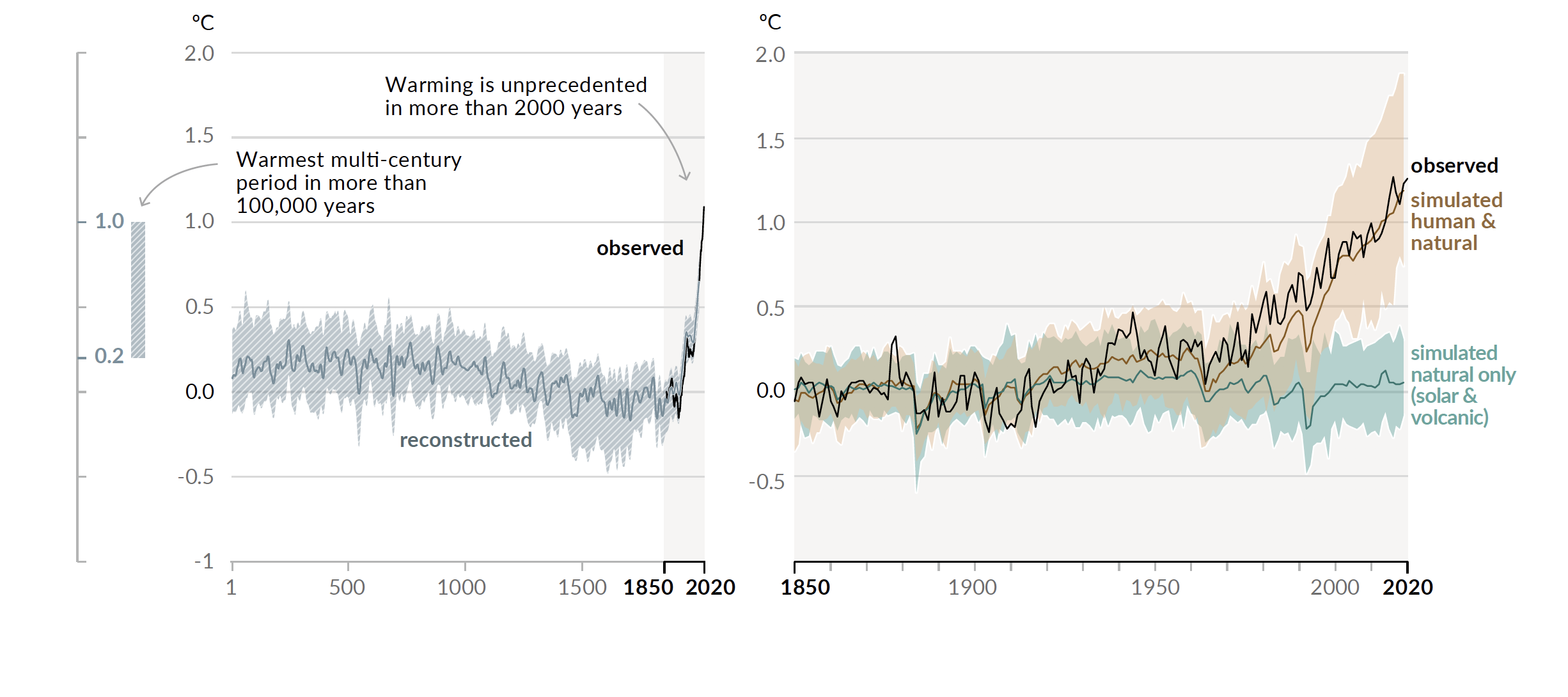
The image consists of two graphs showing global temperature anomalies over time, measured in degrees Celsius (°C), with a focus on historical climate data and the influence of human and natural factors.
- Left Graph (Historical Temperature Reconstruction):
- Time Scale: Spans from the year 1 to 2020.
- Y-Axis: Temperature anomaly in °C, ranging from -1.0 to 2.0°C.
- Data Representation: A shaded area represents the reconstructed temperature anomaly, showing fluctuations over time.
- Key Annotations:
- A label at around 1850-2020 states: "Warming is unprecedented in more than 2,000 years."
- Another label at around 500-1000 states: "Warmest multi-century period in more than 100,000 years."
- The graph shows a relatively stable temperature anomaly (around 0°C) until around 1850, followed by a sharp increase to about 1.0°C by 2020, labeled as "observed."
- Right Graph (Simulated vs. Observed Temperature):
- Time Scale: Spans from 1850 to 2020.
- Y-Axis: Temperature anomaly in °C, ranging from -0.5 to 2.0°C.
- Data Representation:
- Two sets of data are plotted:
- "Simulated human & natural" (black line with a shaded uncertainty range in beige), showing a steep rise in temperature after 1950, reaching around 1.5°C by 2020.
- "Simulated natural only (solar & volcanic)" (black line with a shaded uncertainty range in blue), showing minimal change, fluctuating around 0°C throughout the period.
- The "observed" temperature anomaly (black line) closely follows the "simulated human & natural" trend, reaching around 1.5°C by 2020.
- Two sets of data are plotted:
- Key Observation: The graph highlights that natural factors alone (solar and volcanic) cannot account for the observed warming, which aligns with the combined human and natural simulation.
The overall message of the image is to illustrate the significant role of human activity in driving recent global warming, as the observed temperature increase since 1850 far exceeds what would be expected from natural factors alone.
One of the key findings of paleoclimate research (Module 1) is that the temperatures we are experiencing today have not been observed for about 125,000 years. The left panel in the figure above shows the recent temperature record reconstructed from proxies and observations. What you see is the sharp rate of warming Earth is experiencing today has not been recorded in the past. What is also very clear is that the rate (very fast) and amount (about 1.1 degrees C) of warming we have observed over the last 120 years cannot have been caused by natural processes, for example sunspots and volcanism. Climate models can simulate the temperature records pretty well based on the physics of the atmosphere and the amount of carbon input from various sources including fossil fuels. In the right panel of the figure above, the simulated natural inputs are shown in green, the simulated natural and current fossil fuel inputs are shown in brown, and the observed temperature curve in black (the Hockey Stick we briefly referred to in Module 1). Ranges of simulations are shown in shading. What they show very clearly is that the current rate and amount of warming cannot be caused by natural processes. The only way that this rapid rate and amount can occur in the simulations is to add fossil fuels at the rate we are adding them today. This is one of the central conclusions of the 2022 Intergovernmental Panel on Climate Change (IPCC) report, and we will come back to it in Modules 4 and 5
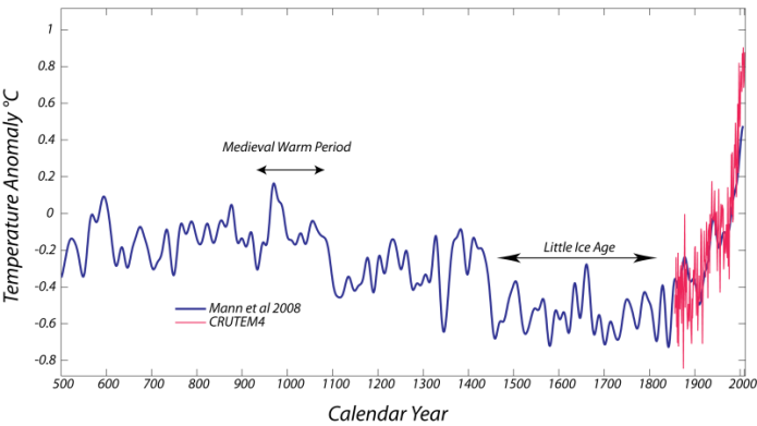
Earth’s climate is ever-changing and this is one of the main conclusions of Module 1. Before accurate measurements of temperature existed, we have historic records in addition to proxy records. We can observe in them the fall of dynasties as a result of climate change, for example the fall of the Mayans as a result of devastating drought in Central America in 900AD. Now, fast forward just a little, and we have multiple accounts and proxy records of two significant changes in climate that impacted medieval societies— the Medieval Warm Period (AD 950 to 1250) and the Little Ice Age (AD 1450-1850) see figure below. The Medieval Warm Period is famous because of its connection to some interesting events in the European and North Atlantic regions. During this time, it appears that wine production in Great Britain was abundant, even though in today's climate, wine grapes struggle at this high northern latitude. This is also the period of time when the Vikings colonized Greenland (they originally called it "Vinland"), indicating that this region was warmer than it is today. In a recent examination of climate proxy records from around the world, Penn State’s Michael Mann and his colleagues determined that the temperatures in the North Atlantic region were indeed warmer than the 1961 - 1990 period, but globally, the climate was not as warm as today, as can be seen in the below figure.
The Little Ice Age is similarly famous for its connections to European history. During this period, the winters in Europe were cold enough that the canals in the Netherlands froze over, allowing for skaters to travel through the countryside on these frozen pathways — this activity is recorded in some of the masterpieces of Dutch painters such as Bruegel. The Little Ice Age was a time of minor advances in many of the Alpine glaciers, and it also signaled the end of the Greenland colonization experiment. This was generally a difficult period in European history, marked by plagues, famine, fighting, and political turmoil. The cause of the Little Ice Age, like the cause of the Medieval Warm Period, is not entirely settled, but it does coincide with a period of volcanic eruptions, which should cool the climate and a period of decreased solar activity known as the Maunder Minimum. It has also been suggested that a slowdown in the thermohaline circulation in the oceans (see Modules 3 and 6) may have contributed to this cooling.
In the Medieval accounts, we can see that proxies and historic information are consistent. But the recent warming in the iconic Hockey Stick most certainly stands out in terms of its magnitude and its abruptness. In this module, we take a look at the wide range of observations that give us a sense of how the climate has been changing over past centuries but especially today. We will see the dire threats from persistent droughts, more devastating fire seasons, stronger hurricanes and melting ice sheets.
Goals and Learning Outcomes
Goals and Learning Outcomes
Goals
On completing this module, students are expected to be able to:
- describe climate trends from recent changes in temperature, atmospheric water content and glacier length and mass;
- explain the difference between weather, climate, and the importance of time scales when looking at climate data;
- infer temperature trends from instrumental and borehole data.
Learning Outcomes
After completing this module, students should be able to answer the following questions:
- How was climate related to the rise and fall of the Mayans?
- What were the Medieval Warm Period and the Little Ice Age?
- What is the difference between weather and climate?
- How are global temperatures calculated?
- Where is the “blade” of the Hockey Stick, and what is the change in global temperature since then?
- What is El Niño-Southern Oscillation, and how does it impact global climate?
- How do volcanic eruptions impact global temperatures?
- In what latitudes has temperature increased most since 1880?
- How do boreholes reflect temperature change?
- How and why do ocean temperatures change differently from air temperatures?
- How has the water content of the atmosphere changed in the last 40 years and why?
- How has global precipitation changed over the last few decades?
- How has the frequency and intensity of large storms changed recently?
- Where in the US has drought increased since 1950?
- How are changes in ice sheet area determined?
- How has the volume of ice on glaciers changed recently?
- How has Arctic sea ice changed recently?
Assignments Roadmap
Below is an overview of your assignments for this module. The list is intended to prepare you for the module and help you to plan your time.
| Action | Assignment | Location |
|---|---|---|
| To Do |
|
|
Trends, Weather, and Climate Change
Trends, Weather, and Climate Change
On June 29, 2021, the mercury at Portland, Oregon reached 116oF. December 10 and 11, 2021 saw EF4 tornadoes roar through Kentucky and other states, killing 88 and wounding more than 630. In December 2021, 202 inches of snow fell in the Sierra Nevada of California. Hurricane Sandy made landfall in New Jersey on October 29th, 2012, a very late point in the year for a storm to reach the northeastern US coast. January 8th, 2013 was the hottest day ever for Australia with an average temperature for the entire continent of 40.3oC (nearly 105oF). The AVERAGE (day and night) temperature in Phoenix in June 2017 was almost 95 degrees. And nearly 61 inches of rain fell around Houston during Hurricane Harvey in August 2017. Each of these events provoked arguments in favor or against global warming. Yet, on their own, none of them were definitive proof one way or another.
To make a case for climate change, we need to find the average global climate signal, which is often difficult to discern from the noise of short-term variations and regional differences associated with what we call weather. It is very important to remember that climate is the time-averaged weather, so when we are talking about climate change, we are not talking about the weather that you experience on a daily or seasonal basis — a single heat wave is not evidence of global climate warming, just as one cold snap does not constitute global climate cooling. But repeated, unusual heat waves will shift the average temperature of a region, and this can be taken as a manifestation of a warming climate. The climate is inherently variable over time and space, so detecting a meaningful trend is a challenge that requires great care, a lot of data and often some complex statistics.
Now, a word of warning, you might find the remainder of this page a little dull! However, it happens to be one of the most essential topics of the whole issue of climate change. We absolutely have to understand the significance of trends if we are going to interpret them!
Let’s consider a hypothetical case to help you better understand the nature of the problem. The mean annual temperature is the average temperature over the course of a year, and it varies in a way that we can simulate with a randomly generated string of numbers (geoscientists often refer to such variation as “noise”) added to a constant, long-term mean temperature. We would see something like this:
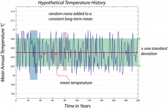
This is a line graph titled "Hypothetical Temperature History." The graph represents a dataset described as "random noise added to a constant long-term mean temperature." Here’s a detailed breakdown of the graph’s components:
Axes:
- The horizontal axis (x-axis) represents "Time in Years." It spans from 0 to 200 years, with major markers at intervals of 20 years (0, 20, 40, 60, 80, 100, 120, 140, 160, 180, 200).
- The vertical axis (y-axis) represents "Mean Annual Temperature" in degrees Celsius (°C). It ranges from 19.6°C at the bottom to 21.4°C at the top, with major markers at intervals of 0.2°C (19.6, 19.8, 20.0, 20.2, 20.4, 20.6, 20.8, 21.0, 21.2, 21.4).
Main Data:
- The graph shows a single blue line that represents the mean annual temperature over the 200-year period. The line fluctuates up and down in a jagged, irregular pattern, indicating random variations in temperature.
- These fluctuations are described as "random noise" added to a constant long-term average temperature.
Mean Temperature:
- A red dashed line runs horizontally across the graph at 20.4°C. This line is labeled "mean temperature," representing the constant long-term average temperature around which the data fluctuates.
- The blue line (temperature data) oscillates above and below this red dashed line throughout the graph.
Standard Deviation Band:
- A shaded green band surrounds the red dashed line (mean temperature). This band extends from 20.2°C to 20.6°C, meaning it covers a range of 0.2°C above and below the mean of 20.4°C.
- The band is labeled "± one standard deviation," indicating that most of the temperature data points (the blue line) fall within this range, as expected in a dataset with random noise following a normal distribution.
- The green band spans the entire width of the graph, from 0 to 200 years.
Highlighted Sections:
- There are two specific time periods highlighted on the graph:
- Blue Shaded Area (20 to 40 years):
- Between the 20-year and 40-year marks on the x-axis, a vertical blue shaded rectangle highlights this time period.
- During this period, the blue temperature line dips slightly below the mean temperature of 20.4°C, with some points approaching 20.2°C or slightly lower.
- This suggests a short-term cooling trend within the random fluctuations.
- Pink Shaded Area (100 to 120 years):
- Between the 100-year and 120-year marks on the x-axis, a vertical pink shaded rectangle highlights this time period.
- During this period, the blue temperature line shows a noticeable peak, rising above the mean temperature.
- A specific data point around the 110-year mark is marked with a red arrow pointing to the blue line, where the temperature reaches approximately 20.8°C.
- This indicates a short-term warming trend within the random fluctuations.
- Blue Shaded Area (20 to 40 years):
General Trend:
- Despite the short-term fluctuations highlighted in the blue and pink sections, the overall long-term trend of the temperature remains constant at the mean of 20.4°C.
- The random noise causes the temperature to vary, but there is no consistent upward or downward trend over the 200 years.
Purpose of the Graph:
- The graph illustrates how random noise can create short-term variations in temperature data, even when the long-term average temperature remains constant.
- The highlighted sections (cooling between 20-40 years and warming between 100-120 years) show how random fluctuations can sometimes appear as temporary trends, but these do not reflect a change in the long-term mean.
In this case, you might say that if the temperature strayed out of the green zone, you have unusually hot or cold weather, and you would expect this kind of temperature excursion to be a standard feature of the natural variability of the region's climate. But, the green zone has more or less fixed limits, so the standard for calling something a heat wave does not change over time.
Now, let’s look at another hypothetical case where the climate really is warming, but there is still the natural variability or noise on a shorter timescale.
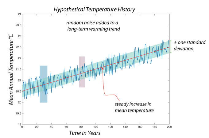
This is a line graph titled "Hypothetical Temperature History." The graph represents a dataset described as "random noise added to a long-term warming trend." Here’s a detailed breakdown of the graph’s components:
Axes:
- The horizontal axis (x-axis) represents "Time in Years." It spans from 0 to 200 years, with major markers at intervals of 20 years (0, 20, 40, 60, 80, 100, 120, 140, 160, 180, 200).
- The vertical axis (y-axis) represents "Mean Annual Temperature" in degrees Celsius (°C). It ranges from 19.0°C at the bottom to 24.0°C at the top, with major markers at intervals of 0.5°C (19.0, 19.5, 20.0, 20.5, 21.0, 21.5, 22.0, 22.5, 23.0, 23.5, 24.0).
Main Data:
- The graph shows a single blue line that represents the mean annual temperature over the 200-year period. The line fluctuates up and down in a jagged, irregular pattern, indicating random variations in temperature.
- These fluctuations are described as "random noise" added to a long-term warming trend.
Mean Temperature Trend:
- A red dashed line runs diagonally across the graph, sloping upward from the bottom left to the top right. This line is labeled "steady increase in mean temperature," representing the long-term warming trend.
- The red dashed line starts at approximately 19.5°C at year 0 and rises steadily to about 23.5°C by year 200, indicating a consistent increase in the mean temperature over time.
- The blue line (temperature data) oscillates above and below this red dashed line throughout the graph, but the overall trend of the blue line follows the upward slope of the red dashed line.
Standard Deviation Band:
- A shaded light blue band surrounds the red dashed line (mean temperature trend). This band extends approximately 0.2°C above and below the red dashed line at any given point.
- The band is labeled "± one standard deviation," indicating that most of the temperature data points (the blue line) fall within this range, as expected in a dataset with random noise following a normal distribution.
- The light blue band spans the entire width of the graph, from 0 to 200 years, and slopes upward along with the red dashed line.
Highlighted Sections:
- There are two specific time periods highlighted on the graph:
- Blue Shaded Area (20 to 40 years):
- Between the 20-year and 40-year marks on the x-axis, a vertical blue shaded rectangle highlights this time period.
- During this period, the blue temperature line dips slightly below the red dashed line (mean temperature trend), with some points approaching 19.5°C or slightly lower.
- This suggests a short-term cooling anomaly within the overall warming trend.
- Pink Shaded Area (100 to 120 years):
- Between the 100-year and 120-year marks on the x-axis, a vertical pink shaded rectangle highlights this time period.
- During this period, the blue temperature line shows a noticeable peak, rising above the red dashed line.
- A specific data point around the 110-year mark is marked with a red arrow pointing to the blue line, where the temperature reaches approximately 21.5°C, while the red dashed line (mean trend) is around 21.0°C at that point.
- This indicates a short-term warming spike within the overall warming trend.
- Blue Shaded Area (20 to 40 years):
General Trend:
- The overall long-term trend of the temperature shows a steady increase, as indicated by the upward-sloping red dashed line. The mean temperature rises from about 19.5°C at year 0 to about 23.5°C by year 200, an increase of approximately 4°C over 200 years.
- The random noise causes the temperature to fluctuate around this trend, creating short-term variations like the cooling between 20-40 years and the warming spike between 100-120 years.
- Despite these fluctuations, the overall direction of the temperature data (blue line) follows the upward trend of the red dashed line.
Purpose of the Graph:
- The graph illustrates how random noise can create short-term variations in temperature data, even when there is a clear long-term warming trend.
- The highlighted sections (cooling between 20-40 years and warming between 100-120 years) show how random fluctuations can sometimes appear as temporary anomalies, but the long-term warming trend remains consistent.
If you think of the upper edge of the green zone on the previous figure as indicating the line for defining a heat wave, look what happens in a case where there is a steady warming of the climate, with the same kind of weather causing the rapid ups and downs. If at time 0, we said that a temperature of 21°C was a heat wave, that becomes the mean climate temperature by time 60 in the above figure — so, what previously was a rare warm spell is now just the standard. This means that, by older standards, "heat waves" become more common as time goes on.
Note that, once again, we can find areas in this above figure where a shorter time period would seem to indicate cooling or warming. This reinforces the idea that we can’t really talk about climate change by looking at just a few years, and leads to the question of how much time we do need to look at to get a good understanding of climate change. In general, the longer, the better. But just to illustrate this, consider the following, where we take the same kind of hypothetical temperature record as above and systematically find the linear trends over time, with windows of varying length that slide along through the 200-year record.
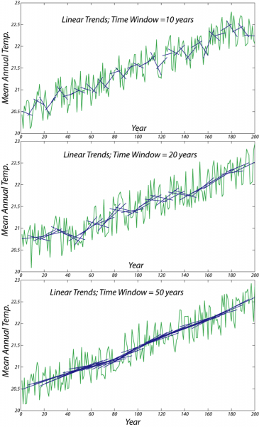
The image consists of three line graphs stacked vertically, each showing the mean annual temperature over a span of approximately 200 years, from around year 0 to year 200. The y-axis of each graph represents the mean annual temperature, ranging from 20.0 to 22.5 degrees. The x-axis represents the years.
Each graph illustrates the temperature data with two types of lines:
- A blue line representing the raw mean annual temperature data, which fluctuates significantly year to year.
- A green line showing the linear trend of the temperature data over a specific time window.
The three graphs differ in the time window used to calculate the linear trend:
- The top graph uses a time window of 10 years. The green linear trend line shows more variability, closely following the short-term fluctuations in the blue temperature data, but still indicates a general upward trend over the 200-year period.
- The middle graph uses a time window of 20 years. The green linear trend line is smoother than in the 10-year window, showing less short-term variability but still reflecting an overall upward trend in temperature.
- The bottom graph uses a time window of 50 years. The green linear trend line is the smoothest of the three, with minimal short-term fluctuations, clearly depicting a steady upward trend in mean annual temperature over the 200 years.
Overall, all three graphs demonstrate a consistent long-term increase in mean annual temperature, with the longer time windows (20 and 50 years) providing a clearer view of the overall trend by smoothing out short-term variations.
Why do we care about this? There are all sorts of reasons why this is important and interesting, but here are three primary reasons.
- The first reason for studying recent climate is that if we understand how climate has been changing in the recent past, we can establish a trend that we can use to project into the future.
- The second reason for studying recent climate is that knowing the history of climate change gives us a chance to understand how the climate system responds to various controls; for instance, we know the histories of solar insolation, fossil fuel burning, land clearing, addition of other pollutants to the atmosphere (other greenhouse gases and particles that block sunlight), and volcanic eruptions. Knowing these histories and knowing how the climate has changed, we are in a position to develop a good understanding of the role that each of these controls plays in changing the climate, which helps us predict future climate change with greater confidence.
- Finally, if climate change is real, then we cannot ignore it when planning for our future. The consequences of future climate change may require some difficult choices, so we had better be sure that there is a firm basis for the reality of climate change.
Check Your Understanding
Temperature: Instrumental Records
Temperature: Instrumental Records
Temperature is probably the most important observation regarding the global climate, but how to measure the temperature of something as large as the Earth is complex. Climate scientists have taken a variety of approaches to answering this question, depending on the timescale of interest; we’ll have a look at the results of these different approaches in this section.
The first approach is the most obvious — you use thermometer data; this is usually called the instrumental record of climate. Let’s take a look at what some of these data look like for a place familiar to the authors — State College, PA. These data come from the US Historical Climatology Network, [4] where you can find data from stations around the US. These data are the monthly mean temperatures from 1849 to 1994, so there has already been some averaging of the data to remove the day-to-day variability.

Outline Description of Audio Waveform Visualization
- Overview
- Three line graphs stacked vertically.
- Each graph displays monthly mean temperature over approximately 200 years.
- X-axis: Years (from 0 to 200).
- Y-axis: Monthly mean temperature (ranging from 20.0 to 22.5 degrees).
- Graph Components
- Thin Blue Line: Represents the monthly mean temperature data.
- Shows significant variation due to the annual cycle of temperature change.
- Variation is a bit more than 20°C, reflecting seasonal fluctuations.
- Green Line: Represents the linear trend of the temperature data.
- Calculated over different time windows for each graph.
- Thin Blue Line: Represents the monthly mean temperature data.
- Graph Details by Time Window
- Top Graph: Time Window = 10 Years
- Title: "Linear Trends; Time Window = 10 years".
- Thin blue line fluctuates widely due to monthly and seasonal changes.
- Green trend line shows more variability, following short-term trends.
- Indicates a general upward trend over the 200-year period.
- Middle Graph: Time Window = 20 Years
- Title: "Linear Trends; Time Window = 20 years".
- Thin blue line continues to show significant monthly variation.
- Green trend line is smoother than the 10-year window, reducing short-term variability.
- Still reflects an overall upward trend in temperature.
- Bottom Graph: Time Window = 50 Years
- Title: "Linear Trends; Time Window = 50 years".
- Thin blue line displays the same monthly variation of over 20°C.
- Green trend line is the smoothest, minimizing short-term fluctuations.
- Clearly shows a steady upward trend in temperature over 200 years.
- Top Graph: Time Window = 10 Years
- Overall Trend
- All three graphs indicate a consistent long-term increase in monthly mean temperature.
- The monthly data highlights a significant annual cycle with temperature variations exceeding 20°C.
- Longer time windows (20 and 50 years) provide a clearer view of the upward trend by smoothing out monthly and seasonal fluctuations.
What we are seeing in the above figure is weather, which is "noisy"; what we want is the climate record from this station, which is not obvious, but we will find it in the first lab exercise for this module. The data for this one station can give us a climate record for the immediate surroundings, but going from this record at one point to the global temperature requires a bit more work.
One approach is shown in the figure below. Say you have an array of weather stations on a map:

- Overview
- A schematic diagram illustrating a method to calculate the area represented by a weather station's temperature record.
- Depicts one of several strategies for this purpose.
- Set against a solid black background.
- Central Element
- Hexagonal Shape:
- A gray hexagon with black outlines, positioned centrally.
- Represents a weather station's area of influence.
- Central Star:
- A blue star located at the center of the hexagon.
- Likely represents the weather station itself.
- Hexagonal Shape:
- Surrounding Elements
- Blue Stars:
- Six blue stars of varying sizes scattered around the hexagon.
- Positioned at different distances and directions from the central hexagon.
- Likely represent other weather stations or reference points.
- Connecting Arrows:
- Red Arrows:
- Three red arrows with dashed lines.
- Extend from the central blue star to three of the surrounding blue stars (top-right, right, and bottom-right).
- Indicate connections or distances between the central weather station and others.
- Green Arrow:
- One green arrow with a dashed line.
- Extends from the central blue star to the top-left corner of the hexagon.
- May represent a specific direction or boundary of influence.
- Red Arrows:
- Blue Stars:
- Interpretation
- The hexagon likely defines the area of influence for the central weather station.
- The surrounding stars and arrows suggest a method of triangulation or spatial analysis.
- Red arrows may indicate distances or relationships to nearby stations for calculating the area.
- The green arrow might highlight a specific boundary or direction in the method.
- The diagram simplifies a strategy for determining how much area a weather station's temperature record represents.
The general approach is to draw lines between a station and all of its nearest neighbors, then find the midpoints of these lines (circles in the figure) then make a polygon that connects the circles, giving an area (in gray). This area (in km2) represents a tiny fraction, fi, of the Earth’s surface that is associated with the temperature, Ti, of this station. If you do this for all stations, and sum all the Ti x fi values from each station, you would have a global temperature (all of the fi values would add up to 1.00).
You can see from the above example that if you have good weather stations spread uniformly across the planet (land and sea) and they have been recording continuously for a long time, then one can take the mean annual temperature of each station and calculate a simple global average for each year, and thus the history of temperature change for our planet. But, as you might imagine, the stations are not uniformly distributed — they are clustered in populated countries — and the number of stations declines as you go backward in time, so the actual process of assembling an instrumental record takes some care. A variety of groups have done this using slightly different data sets and approaches. The trick here is in how you combine the individual temperature records to come up with a global average. This is complicated by the fact that some weather stations may have problems related to things like the "urban heat island effect." Man-made materials retain heat better than open land and the lack of trees also amplifies warming in cities, which are currently warming at double the rate of the global average! Thus, if urban development encroaches on a weather station, the urban heat island effect will make the local temperature rise for reasons that are unrelated to any regional climate change. Researchers have found ways of ensuring that this effect does not skew the results, and many different groups come up with results that are nearly identical, giving us confidence that the data analysis is sound. Just in case you are wondering, the mean surface temperature of the Earth as a whole is 15o C (59o F)!
There are a number of good estimates of the recent history of global temperature change, and they are shown, plotted at the same scale, in the figure below.
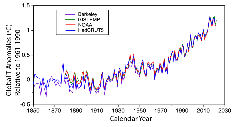
The image is a line graph displaying global temperature anomalies from 1850 to around 2025. The x-axis represents the calendar year, ranging from 1850 to 2030, with major ticks at intervals of 20 years (1850, 1870, 1900, 1930, 1950, 1970, 1990, 2010, 2030). The y-axis represents the global temperature anomalies in degrees Celsius (°C) relative to the mean for the period 1961–1990, ranging from -0.5°C to 1.5°C, with major ticks at intervals of 0.5°C.
The graph includes four distinct lines, each representing temperature anomaly data from a different research group, as indicated by a legend in the top left corner:
- Berkeley (Berkeley Earth Surface Temperature project from the University of California) is shown in purple.
- GISTEMP (from NASA) is shown in green.
- NOAA (from the National Oceanic and Atmospheric Administration) is shown in red.
- HadCRUT5 (from the Climate Research Unit of the University of East Anglia, England) is shown in light blue.
Each line shows the global temperature anomalies over time, with all four datasets exhibiting a similar overall trend: a general increase in temperature anomalies from 1850 to the present. The lines fluctuate year to year, reflecting natural variability, but the upward trend becomes more pronounced after around 1980. From 1850 to 1900, the anomalies are mostly negative (below 0°C), ranging between -0.5°C and 0°C, with some variability. From 1900 to 1980, the anomalies hover around 0°C, with fluctuations between -0.3°C and 0.3°C. After 1980, all four lines show a steady increase, reaching approximately 1.2°C to 1.5°C by 2025.
The four lines are closely aligned, indicating that the different groups—Berkeley, GISTEMP, NOAA, and HadCRUT5—produce similar results despite using slightly different approaches to data selection and conversion of station data into global temperatures. However, there are minor differences in the year-to-year fluctuations, reflecting the variations in methodology among the groups. The graph effectively illustrates the consensus on global warming trends across these
The figure above shows anomalies relative to the mean for 1960-1980. GISTEMP is from NASA, CRUTEM4 is from the Climate Research Unit of the University of East Anglia in England, Berkeley is from the Berkeley Earth Surface Temperature project from the University of California, and NOAA is from NOAA (no surprise here). These different groups use essentially the same data, but they have slightly different approaches to selecting which data to use and how to convert the station data into global temperatures.
It is interesting to see how similar the curves are given that they use different strategies for averaging the data, and some of the records are based on slightly different sets of weather stations. In particular, note that none of these estimates show a general cooling trend over this length of time — they all show warming. Back in the 1800s, there were fewer weather stations, and so it is more difficult to estimate global temperature back then (see figure below), but it gets steadily better as time goes on, and for the last few decades, we have excellent data due to the satellites that now circle the globe taking temperature measurements of every spot on Earth (more on this in a bit). What we see in the figure above is a detail of the blade of the "Hockey Stick" — beginning about 1900, the temperature starts to rise, then it flattens out a bit in the 1950s and early 1960s, and then it increases again at a faster pace since that time. The total warming since 1900 is about 1.1°C as a global average. And many recent years have broken records, 2024 was the warmest year on average and about 1.5°C above 1900 (but its too early to say that this number if permanent warming).
Looking in more detail at the Berkeley temperature estimate, which is based on about 1.6 billion measurements, we can see that the uncertainty, indicated in the figure below by the green band surrounding the red line, gets progressively larger as we go back in time, but the uncertainty is practically zero for more recent decades.
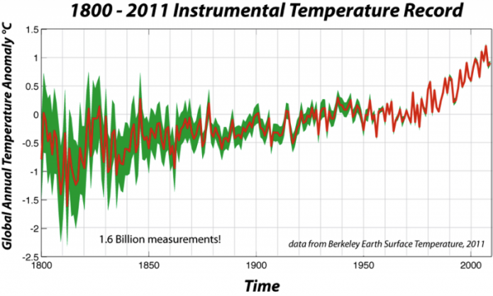
- Overview
- A line graph titled "1800–2011 Instrumental Temperature Record."
- Displays global annual temperature anomalies from 1800 to 2011.
- Data sourced from the Berkeley Earth Surface Temperature project (noted as "data from Berkeley Earth Surface Temperature, 2011").
- Includes a note: "1.6 Billion measurements!" indicating the dataset's scale.
- Axes
- X-Axis: Time
- Spans from 1800 to 2010.
- Major ticks at 50-year intervals (1800, 1850, 1900, 1950, 2000).
- Y-Axis: Global Annual Temperature Anomaly (°C)
- Ranges from -2.5°C to 1.5°C.
- Major ticks at 0.5°C intervals.
- X-Axis: Time
- Graph Elements
- Thick Red Line: Global Mean Temperature Anomaly
- Represents the global mean temperature as an anomaly over the period.
- Starts around -1.5°C in 1800.
- Fluctuates between -1.5°C and -0.5°C until around 1900.
- Shows a gradual increase from 1900 to 1980.
- Rises more sharply after 1980, reaching approximately 1.0°C by 2011.
- Green Shaded Area: Uncertainty Zone
- Surrounds the red line, indicating the uncertainty in the Berkeley temperature reconstruction.
- Wider in earlier years (1800–1850), around ±0.5°C, reflecting greater uncertainty.
- Narrows over time, especially after 1900, to about ±0.1°C by 2011.
- Reflects improved data reliability as more measurements become available.
- Thick Red Line: Global Mean Temperature Anomaly
- Trend and Interpretation
- Shows a clear long-term warming trend over the 211-year period.
- Significant temperature increase observed, especially in the 20th and early 21st centuries.
- Uncertainty decreases over time, correlating with the increase in measurement data.
- Highlights the reliability of the temperature reconstruction, with more precise data in later years.
This is a good point to explore a question about these records. Why does the annually averaged temperature rise and fall in such a complicated fashion? The sun does not vary in its brightness in such a dramatic fashion (the solar cycle related to sunspots can account for a global temperature variation of about a tenth of a degree), and the greenhouse gases that keep our planet warm do not vary in their concentration this much. Instead, it appears that a good deal of the variability seen in these records is related to things like volcanic eruptions and climate system oscillations like the El Niño – La Niña Southern Oscillation (ENSO), which is discussed in detail in Module 6. In short, ENSO is essentially a huge, sluggish, sloshing back and forth of warm water along the equator in the Pacific Ocean — it is like a wave that reflects back and forth between the two edges of the Pacific, and it has a global reach in terms of climate. During the El Niño phase of this oscillation, the warm water is pooled up on the eastern side of the equatorial Pacific and this has the effect of making the whole Earth warmer (the reasons for this are complex, but the effect is quite clear). Conversely, during the La Niña phase, the warm water is pooled up at the western edge of the equatorial Pacific and the whole globe tends to be cooler. The El Niño stage causes flooding rains in California, wet conditions in Florida (recommend you visit Disney during the La Niña!), but crippling drought in Australia and southern Africa.
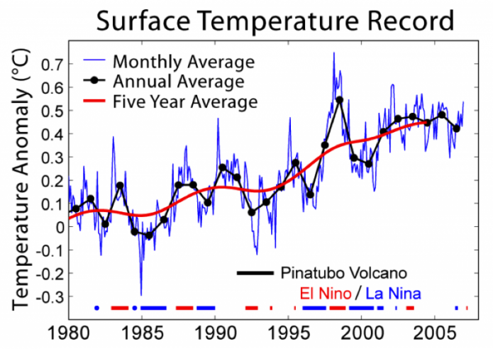
The image is a line graph displaying global surface temperature anomalies from 1980 to around 2008. The x-axis represents the years, ranging from 1980 to 2010, with major ticks at 5-year intervals (1980, 1985, 1990, 1995, 2000, 2005). The y-axis represents the temperature anomaly in degrees Celsius (°C), ranging from -0.3°C to 0.7°C, with major ticks at intervals of 0.1°C.
The graph includes three types of data representations, as indicated by a legend in the top left corner:
- A blue line represents the monthly average temperature anomaly, showing significant short-term fluctuations.
- Black dots represent the annual average temperature anomaly, plotted at yearly intervals, providing a clearer view of year-to-year changes.
- A red line represents the five-year average temperature anomaly, smoothing out short-term variations to highlight longer-term trends.
The temperature anomaly data shows a general upward trend over the period. In 1980, the monthly average starts around 0°C, with the five-year average slightly below 0°C. There are noticeable dips and peaks in the monthly data, such as a dip around 1992 and peaks around 1998 and 2005. The annual averages (black dots) follow a similar pattern but with less variability, while the five-year average (red line) shows a steady increase, rising from near 0°C in 1980 to about 0.5°C by 2008.
Additional annotations on the graph include:
- A black vertical line labeled "Pinatubo Volcano," marking the 1991 eruption of Mount Pinatubo, which corresponds to a noticeable dip in temperature anomalies around 1992–1993 due to the cooling effect of volcanic aerosols.
- Horizontal dashed lines in blue and red, labeled "El Niño/La Niña," indicating periods of El Niño (red) and La Niña (blue) events. These events correspond to peaks (El Niño, e.g., 1998) and dips (La Niña, e.g., 1985, 1999) in the temperature anomalies, reflecting their influence on global temperatures.
Overall, the graph illustrates a clear warming trend over the 28-year period, with short-term variations influenced by natural events like volcanic eruptions and El Niño/La Niña cycles, while the five-year average highlights the long-term increase in global surface temperatures.
The above figure shows the last 25 years of globally averaged instrumental surface temperature measurements. Also shown is the recent history of fluctuations in ENSO and the period of atmospheric disturbance due to the eruption of Mount Pinatubo in the Philippines in 1991, one of the largest of the 20th century; the volcano injected ash and sulfur gases into the upper atmosphere, where they blocked enough sunlight to cool the global climate for a period of about 3 years.
Satellites offer another way of studying temperature changes and they are not subject to the same problems associated with weather station data — they provide a complete coverage of surface temperature on land and at sea. But, as can be seen below, there is a very good agreement between satellite measurements and the weather station data (NOAA surface in the figure below). The only problem is that the satellite data only go back to about 1980.
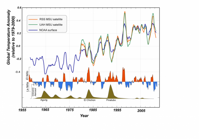
- Overview
- A line graph showing global temperature anomalies from 1955 to around 2010.
- Compares data from satellite and surface measurements.
- Includes annotations for significant climate events affecting temperature.
- Axes
- X-Axis: Year
- Spans from 1955 to 2010.
- Major ticks at 10-year intervals (1955, 1965, 1975, 1985, 1995, 2005).
- Y-Axis: Global Temperature Anomaly (°C)
- Ranges from -0.4°C to 0.6°C.
- Relative to the 1979–2000 average.
- Major ticks at 0.2°C intervals.
- X-Axis: Year
- Graph Elements
- Data Sources (Lines):
- RSS MSU Satellite: Orange line.
- Represents temperature anomalies from the Remote Sensing Systems (RSS) Microwave Sounding Unit (MSU) satellite data.
- UAH MSU Satellite: Green line.
- Represents temperature anomalies from the University of Alabama in Huntsville (UAH) MSU satellite data.
- NOAA Surface: Blue line.
- Represents temperature anomalies from NOAA surface measurements.
- RSS MSU Satellite: Orange line.
- Trends:
- All three lines show a general upward trend in temperature anomalies over the period.
- From 1955 to 1980, anomalies fluctuate around -0.2°C to 0°C.
- After 1980, a steady increase is observed, with anomalies reaching around 0.4°C to 0.5°C by 2010.
- The three datasets are closely aligned, with minor differences in year-to-year fluctuations.
- Data Sources (Lines):
- Climate Event Annotations
- Shaded Areas and Labels:
- La Niña/El Niño:
- Blue shaded areas indicate La Niña events (e.g., 1975, 1989, 1999), corresponding to dips in temperature anomalies.
- Red shaded areas indicate El Niño events (e.g., 1983, 1998), corresponding to peaks in temperature anomalies.
- Volcanic Eruptions:
- Brown shaded areas mark major volcanic eruptions with cooling effects:
- "Agung" (1963): A dip in temperature around 1963–1964.
- "El Chichón" (1982): A dip around 1982–1983.
- "Pinatubo" (1991): A significant dip around 1991–1993.
- Brown shaded areas mark major volcanic eruptions with cooling effects:
- La Niña/El Niño:
- Impact:
- Volcanic eruptions cause temporary cooling, visible as dips in the temperature anomaly lines.
- El Niño events cause temporary warming, visible as peaks, while La Niña events cause cooling, visible as dips.
- Shaded Areas and Labels:
- Interpretation
- The graph shows a clear long-term warming trend from 1955 to 2010, consistent across satellite (RSS, UAH) and surface (NOAA) data.
- Short-term fluctuations are influenced by natural climate events like El Niño, La Niña, and volcanic eruptions.
- The agreement between satellite and surface data reinforces the reliability of the observed warming trend.
The figure above shows the global instrumental temperature record in blue (NASA GISTEMP) is compared to two versions of the microwave sounder [7] satellite (MSS) data of lower atmospheric temperatures (UAH from Univ. of Alabama, Huntsville; RSS from Remote Sensing Systems, Inc.). The timing of the ups and downs in the satellite record are a near-perfect match with the instrumental record, but the magnitude of change is greater according to the satellite measurements. For comparison, we show the history of the El-Niño La-Niña oscillation and periods of volcanic eruptions that load the atmosphere with tiny particles of sulfuric gas that block sunlight and cool the planet. The eruption of Pinatubo in the Philippines had a big effect, and strong El-Niño periods lead to warming — together, these two variables (volcanoes, and El-Niño) along with small fluctuations in sunlight, account for the majority of the "noise" in these records. Another important point of this figure is that it confirms that the instrumental temperature record does a good job of representing what actually happened.
Next, we look at the spatial variations in the temperature over different spans of time.
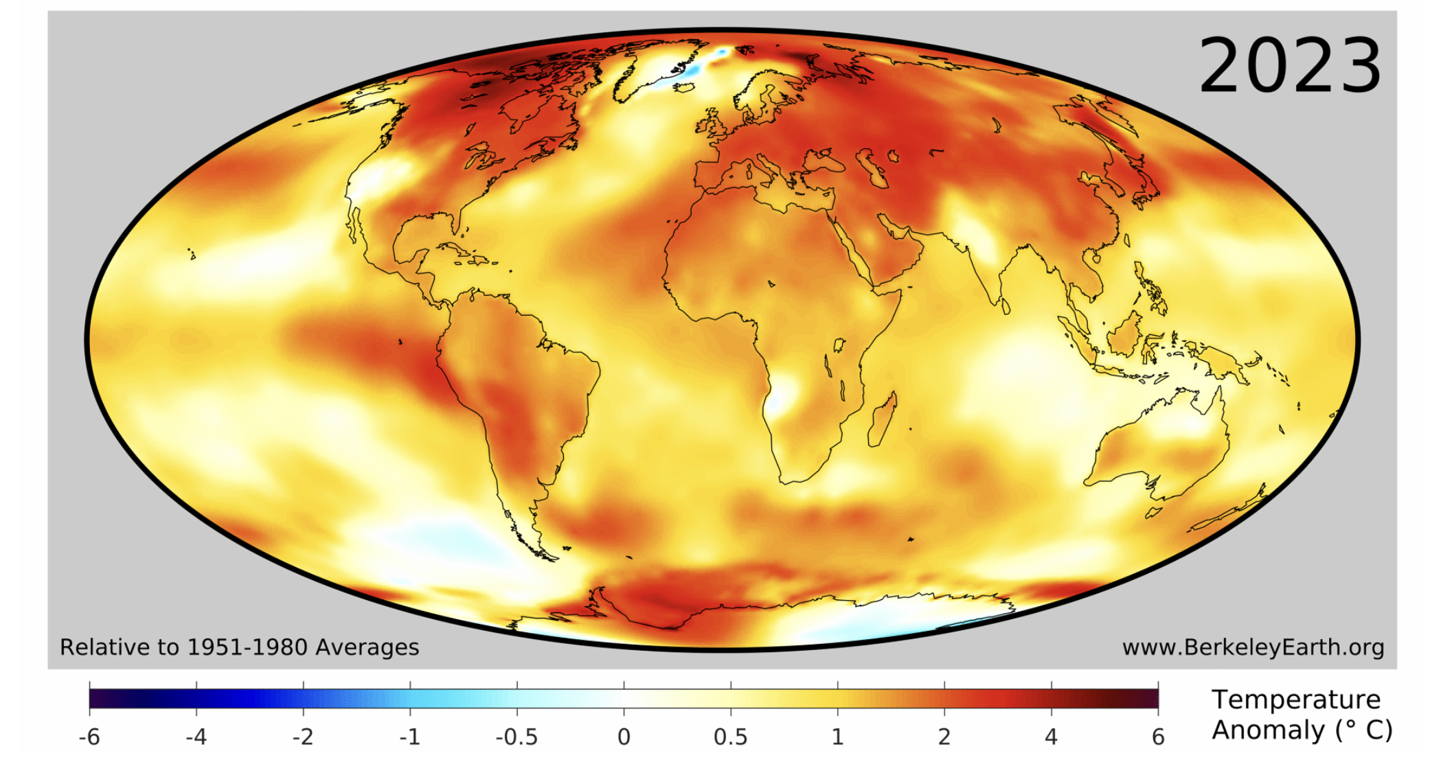
- Overview
- A world map displaying global temperature anomalies for the year 2023.
- Sourced from Berkeley Earth, as indicated by the website "www.BerkeleyEarth.org [8]" in the bottom right corner.
- Temperature anomalies are relative to the 1951–1980 average.
- Map Projection
- Uses an elliptical map projection (likely a Mollweide projection).
- Shows the entire globe, with continents outlined in black.
- Centered on the Atlantic Ocean, with Africa in the middle, North and South America to the left, and Europe, Asia, and Australia to the right.
- Color Scale and Legend
- Color Gradient:
- Represents temperature anomalies in degrees Celsius (°C).
- Ranges from -6°C (dark blue) to +6°C (dark red).
- Gradient: Dark blue (-6°C), light blue (-1°C), white (0°C), yellow (0.5°C), orange (2°C), red (4°C), dark red (6°C).
- Label:
- Located at the bottom, reads "Relative to 1951–1980 Average" and "Temperature Anomaly (°C)."
- Color Gradient:
- Temperature Anomaly Distribution
- Warming (Positive Anomalies):
- Most of the globe shows positive temperature anomalies (yellow to dark red).
- North America, Europe, and Asia exhibit significant warming, with large areas in orange to red (2°C to 4°C).
- Parts of the Arctic, northern Canada, and Siberia show the highest anomalies, reaching dark red (up to 6°C).
- Africa, South America, and Australia also show widespread warming, mostly in yellow to orange (0.5°C to 2°C).
- Cooling (Negative Anomalies):
- Very few areas show negative anomalies (blue).
- A small region in the Arctic near Greenland shows light blue (-1°C to 0°C).
- Neutral Areas:
- Some regions, particularly in the southern oceans and parts of the Pacific, are near neutral (white, around 0°C).
- Warming (Positive Anomalies):
- Interpretation
- The map indicates widespread global warming in 2023 compared to the 1951–1980 baseline.
- The most significant warming occurs in the Northern Hemisphere, particularly in the Arctic, consistent with polar amplification.
- Minimal cooling is observed, limited to a small area in the Arctic.
- The predominance of yellow, orange, and red colors underscores a global trend of rising temperatures.
The figure above shows the difference in instrumentally determined surface temperatures between the period January 1999 through December 2008 and "normal" temperatures at the same locations, defined to be the average over the interval January 1940 to December 1980. The average increase on this graph is 0.48 °C, and the widespread temperature increase is considered to be an aspect of global warming. The most striking feature of this map is that the temperature changes have not been uniform across the globe; the high latitudes (above about 50 degrees) in the Northern Hemisphere have warmed more than any other part of the Earth, while the tropics warmed far less. But Antarctica has been warming significantly too, and, most recently in 2022 there have been record temperatures 20 °C warmer than normal!
We now turn our attention to the spatial pattern of temperature change over a much longer range of time — back to 1884. Below is an animation of the temperature change based on the instrumental record. It is worth remembering that the quality and quantity of the data get better and better as time goes on, so the early parts of this animation have more uncertainty connected to them.
The movie below is from NASA’s reconstruction of surface temperature since 1884, and it shows how Earth has warmed over the last century plus in a very, very graphic and indisputable way. Just in case you can't see this, 2016 was the warmest year on record, and 16 of the 17 warmest years have occurred since 2000!
Video: Global Warming: 1880-2021 (00:31) This video is not narrated.
Click here if the video above does not play [10]
Play this movie and watch as the globe becomes dominated by the yellow, orange, and red colors signifying warmer temperatures. Note that the warming is not uniform across the globe, nor is it steady through time, but the warming trend is nevertheless clear to see.
Another way of looking at this history of warming is by taking the average temperature at each latitude for each year and then stringing those along the horizontal axis, as below:
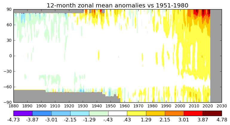
- Overview
- A heatmap titled "12-month zonal mean anomalies vs 1951–1980."
- Displays global temperature anomalies across different latitudes over time.
- Covers the period from 1850 to around 2025.
- Axes
- X-Axis: Time (Years)
- Spans from 1850 to 2030.
- Major ticks at 10-year intervals (1850, 1860, 1870, ..., 2020, 2030).
- Y-Axis: Latitude
- Ranges from -90° (South Pole) to +90° (North Pole).
- Major ticks at 30° intervals (-90°, -60°, -30°, 0°, 30°, 60°, 90°).
- X-Axis: Time (Years)
- Color Scale and Legend
- Color Gradient:
- Represents temperature anomalies in degrees Celsius (°C) relative to the 1951–1980 average.
- Ranges from -4.73°C (dark purple) to +4.78°C (dark red).
- Intermediate colors: purple (-3.87°C), blue (-3.01°C), light blue (-2.15°C), cyan (-1.29°C), light green (-0.43°C), white (0°C), yellow (0.43°C), orange (1.29°C), red (2.15°C), dark orange (3.01°C), dark red (3.87°C to 4.78°C).
- Label:
- Located at the bottom, indicating the color scale and temperature anomaly values.
- Color Gradient:
- Temperature Anomaly Distribution
- 1850–1950 (Cooler Period):
- Predominantly cooler anomalies (blues and purples) across most latitudes.
- Southern Hemisphere (-90° to 0°) and Northern Hemisphere (0° to 90°) show temperatures below the 1951–1980 average.
- Polar regions (near -90° and 90°) exhibit darker purples (up to -4.73°C).
- Equatorial regions (around 0° latitude) are closer to neutral (white) or slightly negative (light blue).
- 1950–1980 (Transition Period):
- Gradual shift toward warmer anomalies.
- Some areas, especially in the Northern Hemisphere, begin showing yellows (0.43°C).
- Southern Hemisphere remains mostly neutral or slightly cool (white to light blue).
- 1980–2025 (Warming Period):
- Warmer anomalies (yellows, oranges, reds) become dominant across most latitudes.
- Northern Hemisphere (30° to 90°) shows significant warming, with large areas in orange and red (1.29°C to 3.01°C).
- Arctic (60° to 90°) exhibits extreme warming, with dark red patches (up to 4.78°C) by 2020–2025, indicating polar amplification.
- Southern Hemisphere (-90° to 0°) warms more slowly, with yellows and oranges (0.43°C to 2.15°C).
- Antarctic (-90° to -60°) shows some neutral or slight cooling areas (white to light blue).
- 1850–1950 (Cooler Period):
- Interpretation
- Illustrates a clear global warming trend over the 175-year period.
- Most pronounced temperature increases occur in the Arctic (60° to 90°) after 1980.
- Earlier periods (1850–1950) and southern latitudes show cooler anomalies relative to the 1951–1980 baseline.
- Polar amplification is evident, with the Arctic experiencing the most extreme warming.
In the figure above, as in the movie above, the temperatures are given as anomalies, or differences relative to a mean established from some arbitrary period of time (1951-1980 in this case). One thing that is clear is that the polar region of the Northern Hemisphere is the area that has warmed the most — more than 6°C during this time period, when the mean global temperature has risen by a bit less than 1°C. Also clear is the fact that, starting around 1990, nearly all of the globe is warming. It's pretty hard to argue with this plot, isn't it?
But if you are still unconvinced, we have another dataset up our sleeves that is completely independent of all of the atmospheric data we have shown so far: the ground has also warmed up!
Temperature: Borehole Temperatures
Temperature: Borehole Temperatures
We next turn our attention to a very different means of reconstructing the temperature — studies of the temperatures measured in boreholes (i.e., holes drilled into the ground) at various locations around the Earth. The temperature profiles (how temperature changes with depth) for three representative boreholes in eastern Canada are shown in the figure below:
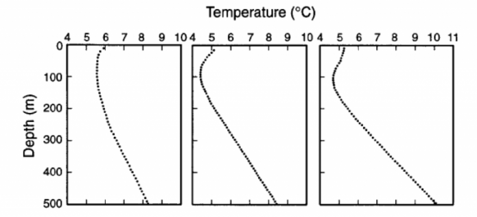
The image contains three line graphs, each depicting the relationship between ocean depth and temperature in degrees Celsius (°C). The graphs are arranged side by side, sharing a common y-axis but with slightly different x-axis ranges for temperature.
The y-axis, labeled "Depth (m)," represents the ocean depth, ranging from 0 meters at the top to 500 meters at the bottom, with major ticks at 100-meter intervals (0, 100, 200, 300, 400, 500). The x-axis, labeled "Temperature (°C)," represents the water temperature, with each graph having a slightly different range:
- The left graph ranges from 4°C to 10°C, with major ticks at 4, 5, 6, 7, 8, 9, and 10.
- The middle graph ranges from 4°C to 10°C, with major ticks at 4, 5, 6, 7, 8, 9, and 10.
- The right graph ranges from 4°C to 11°C, with major ticks at 4, 5, 6, 7, 8, 9, 10, and 11.
Each graph features a single dashed line representing the temperature profile:
- In the left graph, the temperature starts at around 9°C at the surface (0 m), decreases gradually to about 7°C at 100 m, then drops more sharply to around 5°C at 300 m, and continues to decrease slowly, reaching approximately 4°C at 500 m.
- In the middle graph, the temperature begins at around 8°C at the surface, decreases steadily to about 6°C at 100 m, then continues to drop to around 5°C at 300 m, and stabilizes near 4°C at 500 m.
- In the right graph, the temperature starts at around 10°C at the surface, decreases to about 8°C at 100 m, then drops to around 6°C at 300 m, and reaches approximately 5°C at 500 m.
The graphs illustrate the typical ocean temperature profile, where temperature decreases with increasing depth, reflecting the thermocline—a layer in the ocean where temperature decreases rapidly with depth. The slight variations in the temperature ranges and profiles across the three graphs may indicate different locations, seasons, or conditions affecting the ocean's thermal structure.
Note that in all three cases, the temperature curves around to higher temperatures near the surface — this reflects a response of soil and bedrock to warming from the atmosphere. In the absence of warming at the surface due to climate change, these temperature profiles would tend to follow the trends represented in the lower few hundreds of meters, and this would intersect the surface at around 3-4°C.
The basic idea here is a surprising one — that the way temperature changes down a borehole at the present time tells us something about how the surface temperature has changed in the past. This is indeed a remarkable and useful reality of some fairly basic physics of heat flow. It also provides us with an excellent way to filter out the “noise” in the climate record and focus on the main trends.
Heat is just a measure of the kinetic or vibrational energy of the atoms in some substance. If something is hot, its atoms are vibrating very fast, and because vibrating atoms affect neighboring atoms, heat can be transmitted; we often talk about this heat transmission as heat flow. Heat flows from hot regions to cold regions, and the rate of heat flow is proportional to what we call the thermal gradient — the rate of temperature change with distance. In our case, for distance, we are talking about depth in the Earth, and the center of the Earth is very hot — about 5000°C. The surface, instead, is quite cool at 15°C, so heat from the Earth tends to flow out to the surface, and this process is cooling the Earth very slowly. This situation leads to a geothermal gradient (rate of change of temperature with depth) that tends to be more or less steady at around 20 or 30°C per kilometer. The heat released to the surface is tiny compared to the energy coming from the Sun, so this geothermal heat, on a global basis, does not affect the climate.
When the surface temperature rises and becomes hotter than the temperature just below the surface, heat moves down into the ground, but it does this quite slowly. When the surface temperature becomes colder, heat flows up from the ground, cooling the ground, and this cooling is transmitted downward slowly. This general idea is illustrated schematically in the figure below:
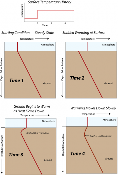
- Overview
- A schematic diagram titled "Surface Temperature History."
- Illustrates the process of heat penetration into the ground over four sequential time stages.
- Consists of four panels, each showing a temperature-depth profile at a different time.
- Top Section: Surface Temperature History
- A small graph at the top showing surface temperature over time.
- X-axis: Time, labeled with four points (1, 2, 3, 4).
- Y-axis: Temperature (not labeled with specific values).
- The graph shows:
- A flat line from Time 1 to Time 2 (labeled "Starting Condition – Steady State").
- A sudden increase at Time 2 (labeled "Sudden Warming at Surface").
- A flat line from Time 2 to Time 4, indicating sustained higher surface temperature.
- Main Panels: Temperature-Depth Profiles
- Four panels labeled Time 1, Time 2, Time 3, and Time 4.
- Each panel shows a vertical cross-section of the ground with the atmosphere above.
- Y-Axis: Depth
- Labeled "Depth" on the left side of each panel.
- Extends from the surface (top) downward into the ground (bottom).
- No specific depth values provided.
- X-Axis: Temperature
- Labeled "Temperature" at the top of each panel.
- No specific temperature values provided.
- Arrows indicate increasing temperature to the right.
- Panel Details
- Time 1: Starting Condition – Steady State
- A straight red line slopes downward from the surface to deeper ground.
- Indicates a linear temperature gradient, typical of a steady-state condition where temperature decreases with depth.
- Time 2: Sudden Warming at Surface
- The red line shows a sharp increase in temperature at the surface (top of the panel).
- The line then slopes downward, similar to Time 1, but starts at a higher temperature.
- Indicates the immediate effect of surface warming, with heat beginning to penetrate downward.
- Time 3: Ground Begins to Warm as Heat Flows Down
- The red line shows a curved profile.
- Near the surface, the temperature is high (same as Time 2).
- The temperature decreases with depth but more gradually than in Time 1.
- A label "Depth of Heat Penetration" with an arrow points to the depth where the curve begins to steepen, indicating how far the heat has penetrated.
- Time 4: Warming Moves Down Slowly
- The red line continues to show a curved profile.
- The temperature near the surface remains high.
- The curve is less steep than in Time 3, indicating that heat has penetrated deeper.
- The "Depth of Heat Penetration" label and arrow show a greater depth compared to Time 3, reflecting the slow downward movement of heat over time.
- Time 1: Starting Condition – Steady State
- Interpretation
- The diagram illustrates how surface warming affects subsurface temperatures over time.
- Initially, the ground is in a steady state with a linear temperature gradient (Time 1).
- A sudden increase in surface temperature (Time 2) initiates heat flow downward.
- Over time, the heat penetrates deeper into the ground (Time 3 and Time 4), with the depth of penetration increasing gradually.
- The process demonstrates the slow conduction of heat through the ground in response to surface temperature changes.
Each of the four rectangles shows the variation of temperature with depth above and below the surface at different times. At the beginning (Time 1), the temperature below the surface increases steadily, while it is constant above the surface. Then at Time 2, the surface temperature suddenly rises and is hotter than the ground right at the surface. By Time 3, the ground temperature right near the surface warms, but that warming does not penetrate very deeply. At Time 4, the surface temperature has continued to remain high, and the heat flowing down into the ground has reached a greater depth.
Rocks have a very low thermal conductivity (conductivity is the term used to describe the way heat is transported at the molecular level) compared to many other materials, which means that it can take a long time for rocks underground to respond to changes in surface temperatures. Because of the way that the heat flows through rocks, short-term changes are smoothed out as the heat diffuses through the rocks. This means that the borehole temperature profiles provide information only about changes in the long-term average temperature.
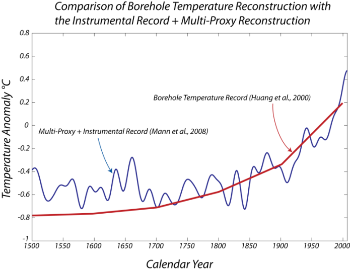
Unlike most other methods for studying paleoclimate, borehole thermometry does not need to be calibrated against the instrumental record. Hence, borehole thermometry provides an independent record of paleoclimate against which other paleoclimate techniques can be validated. Below, we see the results of the analysis of a global data set of borehole temperatures, which give us an estimate of the global temperature change.
- Overview
- A schematic diagram titled "Surface Temperature History."
- Illustrates the process of heat penetration into the ground over four sequential time stages.
- Consists of four panels, each showing a temperature-depth profile at a different time.
- Top Section: Surface Temperature History
- A small graph at the top showing surface temperature over time.
- X-axis: Time, labeled with four points (1, 2, 3, 4).
- Y-axis: Temperature (not labeled with specific values).
- The graph shows:
- A flat line from Time 1 to Time 2 (labeled "Starting Condition – Steady State").
- A sudden increase at Time 2 (labeled "Sudden Warming at Surface").
- A flat line from Time 2 to Time 4, indicating sustained higher surface temperature.
- Main Panels: Temperature-Depth Profiles
- Four panels labeled Time 1, Time 2, Time 3, and Time 4.
- Each panel shows a vertical cross-section of the ground with the atmosphere above.
- Y-Axis: Depth
- Labeled "Depth" on the left side of each panel.
- Extends from the surface (top) downward into the ground (bottom).
- No specific depth values provided.
- X-Axis: Temperature
- Labeled "Temperature" at the top of each panel.
- No specific temperature values provided.
- Arrows indicate increasing temperature to the right.
- Panel Details
- Time 1: Starting Condition – Steady State
- A straight red line slopes downward from the surface to deeper ground.
- Indicates a linear temperature gradient, typical of a steady-state condition where temperature decreases with depth.
- Time 2: Sudden Warming at Surface
- The red line shows a sharp increase in temperature at the surface (top of the panel).
- The line then slopes downward, similar to Time 1, but starts at a higher temperature.
- Indicates the immediate effect of surface warming, with heat beginning to penetrate downward.
- Time 3: Ground Begins to Warm as Heat Flows Down
- The red line shows a curved profile.
- Near the surface, the temperature is high (same as Time 2).
- The temperature decreases with depth but more gradually than in Time 1.
- A label "Depth of Heat Penetration" with an arrow points to the depth where the curve begins to steepen, indicating how far the heat has penetrated.
- Time 4: Warming Moves Down Slowly
- The red line continues to show a curved profile.
- The temperature near the surface remains high.
- The curve is less steep than in Time 3, indicating that heat has penetrated deeper.
- The "Depth of Heat Penetration" label and arrow show a greater depth compared to Time 3, reflecting the slow downward movement of heat over time.
- Time 1: Starting Condition – Steady State
- Interpretation
- The diagram illustrates how surface warming affects subsurface temperatures over time.
- Initially, the ground is in a steady state with a linear temperature gradient (Time 1).
- A sudden increase in surface temperature (Time 2) initiates heat flow downward.
- Over time, the heat penetrates deeper into the ground (Time 3 and Time 4), with the depth of penetration increasing gradually.
- The process demonstrates the slow conduction of heat through the ground in response to surface temperature changes.
Clearly, the shapes of the curves, or the rates of temperature change over this time period, are in close agreement, which is important since they come from very different, independent data sources. The borehole temperature reconstruction does not match the last bit of this time period, in part because the measurements begin further down the hole, and many of the measurements were made in the 1980s and 1990s before the instrumental record ends.
Temperature: Ocean Warming
Temperature: Ocean Warming
The oceans have absorbed over 90% of the excess heat resulting from greenhouse gas emissions since the 1970s. So if it weren’t for the ocean, the land would be a lot hotter than it is today. Since water absorbs a lot of heat, the ocean’s temperature has not increased as fast as the land’s though, but there have been some alarming trends in the last year or so (2023-2024).
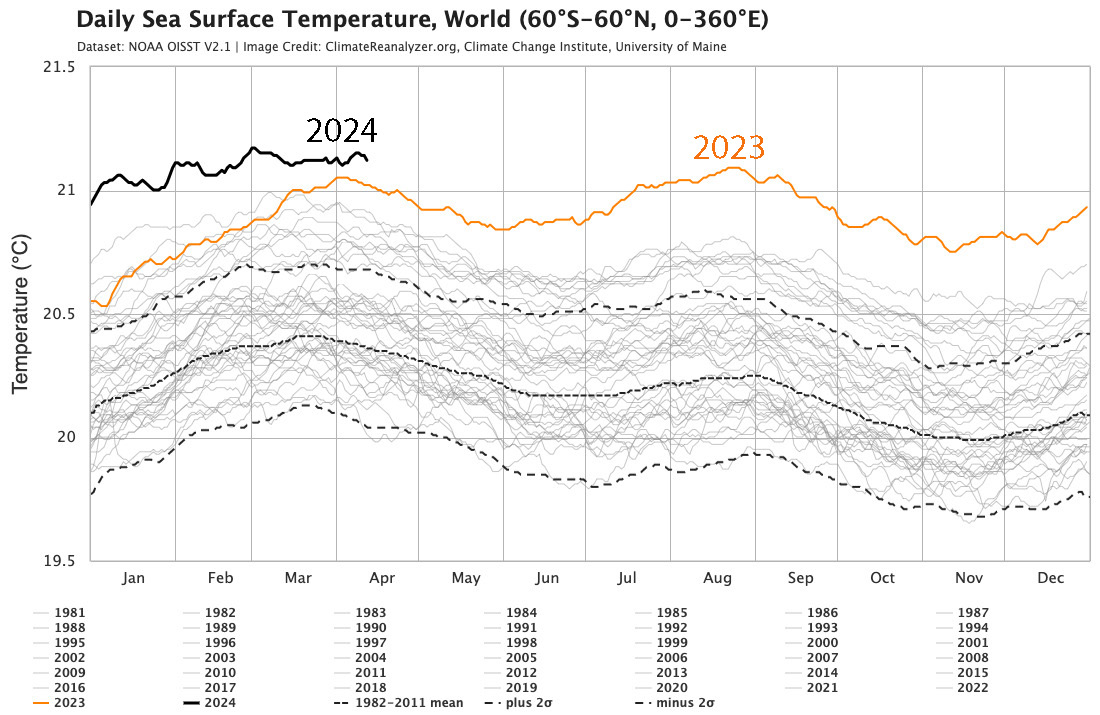
This image is a line graph titled "Daily Sea Surface Temperature, World (60°S–60°N, 0–360°E)." The data comes from NOAA OISST version 2.1, and the image is credited to ClimateReanalyzer.org, Climate Change Institute, University of Maine.
- Y-Axis: Sea surface temperature in degrees Celsius
- Range: 19.5°C to 21.5°C
- X-Axis: Months of the year (January to December)
- Data Representation:
- Years 1981–2022: Thin, dashed black lines (dense cluster showing historical variability)
- 1982–2011 Mean: Solid black line
- 1982–2011 Mean ± 2σ: Dotted black lines
- 2023: Solid orange line
- Peaks mid-year, just above 21°C
- 2024: Solid black line
- Peaks early at 21.5°C, declines but stays above 2023 for most of the year
- Legend (at bottom):
- Lists years 1981–2024
- 2023 (orange), 2024 (black), historical mean, and ±2σ labeled
The graph highlights a notable increase in global sea surface temperatures in 2023 and 2024 compared to the historical data from 1981 to 2022.
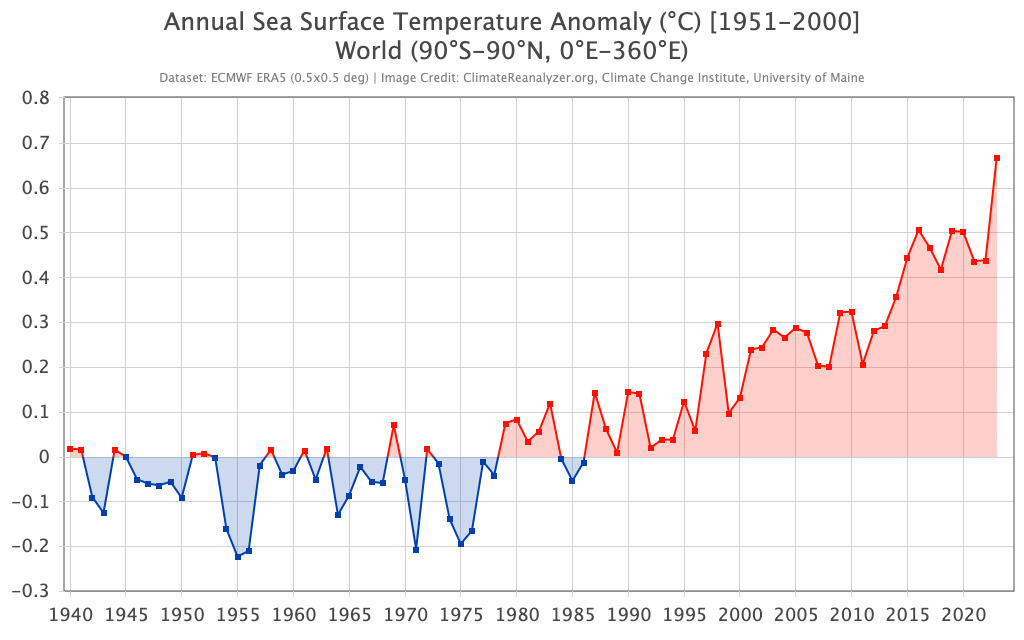
This image is a line graph titled "Annual Sea Surface Temperature Anomaly (°C) [1951-2000] World (90°S–90°N, 0°E–360°E)." The data is sourced from ECMWF ERA5 (0.5°x0.5° deg), and the image is credited to ClimateReanalyzer.org, Climate Change Institute, University of Maine.
- Y-Axis: Sea surface temperature anomaly in degrees Celsius
- Range: -0.3°C to 0.8°C
- X-Axis: Years (1940 to 2020)
- Data Representation:
- 1940–1980: Blue line with data points
- Fluctuates mostly below 0°C, with dips to -0.2°C
- Shaded blue area around the line indicates variability
- 1980–2020: Red line with data points
- Starts near 0°C, shows a general upward trend
- Peaks around 0.7°C in 2020
- Shaded red area around the line indicates variability
- 1940–1980: Blue line with data points
- Trend:
- Early years (1940–1980): Mostly negative anomalies (cooler than the 1951–2000 average)
- Later years (1980–2020): Increasingly positive anomalies (warmer than the 1951–2000 average)
The graph illustrates a clear warming trend in global sea surface temperatures from 1940 to 2020, with anomalies shifting from negative to significantly positive over the decades.
The instrumental record of temperature change in the oceans goes back to about 1850 and consists of thermometer measurements made on water samples taken by merchant and navy ships as they sailed the world’s oceans. The data are understandably best for parts of the oceans along major trade routes, and they are less abundant further back in time. These measurements, just like the land-based weather station data, have to be gridded to come up with a global average sea surface temperature. As might be expected, the sea surface temperature record is similar to the global temperature records, in part because the oceans make up almost 75% of Earth’s surface. But even if we separate out the land surface temperature from the global record and compare it to the ocean surface temperature, they are quite similar, as seen in the figure below.
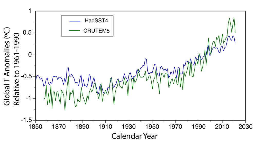
This image is a line graph showing global sea surface temperature anomalies from 1850 to 2030. The data is presented relative to the 1961–1990 average, with two datasets compared: HadSST4 and CRUTEM5.
- Y-Axis: Global temperature anomalies in degrees Celsius
- Range: -1.5°C to 1°C
- X-Axis: Calendar years (1850 to 2030)
- Data Representation:
- HadSST4: Blue line
- Represents sea surface temperature anomalies
- Starts around -0.5°C in 1850, fluctuates, and rises to about 0.8°C by 2030
- CRUTEM5: Green line
- Represents land surface temperature anomalies
- Starts around -0.5°C in 1850, fluctuates, and rises to about 0.9°C by 2030
- HadSST4: Blue line
- Trend:
- Both datasets show similar patterns with fluctuations
- General upward trend from 1850 to 2030
- CRUTEM5 (land) shows slightly higher anomalies than HadSST4 (sea) in recent years
- Legend (top left):
- HadSST4 (blue line)
- CRUTEM5 (green line)
The graph illustrates a clear long-term increase in both sea and land surface temperature anomalies over the 180-year period, with land temperatures warming slightly more than sea temperatures in recent decades.
Although the two records are quite similar, there are some differences — the SST changes over a smaller range than the land surface temperature, and the land temperature is subject to more dramatic swings. This difference is largely due to the greater heat capacity of the oceans relative to the air — it takes a long time to heat and cool the oceans, but air temperature can change quite rapidly.
Measurements from a system of hundreds of buoys stationed throughout the oceans allow us to take the temperature of the oceans over a depth range of 2000 m. These measurements go back in time to 1955 and show that not just the surface of the oceans, but the whole upper half of the oceans are slowly warming — only about 0.1 to 0.2 °C averaged over the globe during the past 50 years — but this is a vast amount of water that has been warmed.
So, while the whole ocean has absorbed a huge amount of heat, its overall temperature has changed little. Nevertheless, the very surface of the ocean has warmed almost as much as the rest of Earth’s surface and from the middle of 2023 through to 2024 the surface warming has been quite alarming with temperatures almost a degree warmer than in 2016.
Summary of Temperature Reconstructions
Summary of Temperature Reconstructions
We should pause and make a point or two about these temperature reconstructions because they are very important to our understanding of how Earth's climate has been changing.
- The temperature reconstructions from multiple proxies (see the Borehole Temperatures page) compare well with the instrumental record — this gives us a basis for thinking that the reconstructions are reliable. They are also in good agreement with the temperature reconstructed from borehole data — this gives us even more confidence in the multi-proxy reconstruction.
- What we see is a very dramatic warming that begins around 1900 — the blade of the "Hockey Stick" — that is far larger in magnitude and far more abrupt than any climate change we see in the reconstructed climate history.
- The recent warming does not appear to be part of a cycle — if it were part of a cycle, then we should expect to see a similar abrupt large cooling that preceded the warming, but nothing of the sort appears in the record.
- The oceans have been warming slower than the land and are absorbing the majority of the excess heat as a result of greenhouse gas emission.
Check Your Understanding
Atmospheric Water
Atmospheric Water
We now turn our attention to water in the atmosphere. Water is a tremendously important part of the climate system, and it has a huge influence on the weather we experience every day. Clouds are made of water droplets or tiny ice crystals, and obviously, precipitation is water; but you also can sense the hidden water vapor in the form of humidity. If you don't understand the concept of humidity, plan a trip to the Magic Kingdom in Orlando, or, worse still, New Orleans in August! As we will learn in Module 3, water is one of the most important ways of transporting energy in the climate system. When water evaporates, it takes heat energy from the surface and carries that heat with it until it condenses back into liquid water, at which point it releases that heat into the atmosphere — this is what powers energetic storms. If you watch a large fluffy cloud building up on a summer day, expanding and growing up to greater and greater heights, just remember that all of that swirling movement is driven by the energy releases from water vapor.
The evaporation of water speeds up when it gets warmer. You could confirm this by doing an experiment with two pots of water on the stove, with the burner beneath each set to a different temperature — the hotter one will always evaporate faster. The same is also true with Earth's climate system — a warmer planet means more evaporation, which means more energy added to the atmosphere. And warmer air can hold more moisture than can colder air. If we study the laws of thermodynamics, we find that for a 1°C increase in the air temperature, the atmospheric water content should increase by about 7%. Until recently, it was difficult to measure the global water content in the atmosphere, but with the advent of satellites, we can now do this.
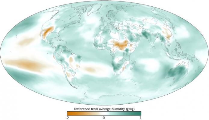
This image is a world map showing the difference from average humidity levels globally, measured in grams per kilogram (g/kg). The map uses a color gradient to indicate variations in humidity compared to the average.
- Map Type: World map
- Measurement: Difference from average humidity (g/kg)
- Color Scale (bottom of the map):
- Range: -2 g/kg to 2 g/kg
- Colors: Orange (drier, -2) to green (wetter, 2), with white at 0 (average)
- Regions with Notable Differences:
- Drier Areas (orange):
- Western North America
- Central Africa
- Parts of the Middle East
- Northern South America
- Wetter Areas (green):
- Central Asia
- Parts of Southeast Asia
- Southern Africa
- Eastern South America
- Near Average (white):
- Most of Europe, Australia, and the polar regions
- Drier Areas (orange):
The map highlights global variations in humidity, with significant drying in parts of North America and Africa, and increased moisture in regions like Central Asia and Southeast Asia.
This map above shows the relative changes in humidity (atmospheric water content) at the end of 2010 compared to the average over the period of satellite observations (1981 - 2010) — so this is a type of humidity anomaly map for the year 2011. The green areas are more humid than normal and the brown/orange areas are drier than normal. On the whole, you can see that the globe is moister than normal. You can also see that the eastern side of the equatorial Pacific Ocean is drier than normal — this is because 2010 was a La Niña year, and warm water was pooled up on the western side, cooler water on the eastern side; the cooler water evaporates less, hence the drier atmosphere above that region.
If we look at the longer record of the globe as a whole, we can see how the water content of the atmosphere has been changing over the last 40 years.
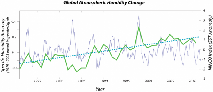
This image is a line graph titled "Global Atmospheric Humidity Change," showing changes in specific humidity from 1970 to 2010. The data is presented as an anomaly in grams of water per kilogram of air, relative to the 1979–2003 mean, with an additional comparison to the Niño 3.4 SST Index.
- Y-Axis (Left): Specific humidity anomaly (g water/kg air)
- Range: -0.2 to 0.4 g/kg
- Y-Axis (Right): Niño 3.4 SST Index anomaly (°C)
- Range: -3°C to 4°C
- X-Axis: Years (1970 to 2010)
- Data Representation:
- Specific Humidity Anomaly: Green line
- Fluctuates around 0 g/kg
- Peaks around 1998 at 0.3 g/kg, dips around 1992 to -0.1 g/kg
- Shows a slight upward trend over time
- Niño 3.4 SST Index Anomaly: Blue dashed line
- Fluctuates more dramatically
- Peaks around 1998 at 3°C, dips around 1975 and 1989 to -2°C
- Also shows a slight upward trend
- Background: Light purple shading
- Represents variability in the Niño 3.4 SST Index
- Specific Humidity Anomaly: Green line
The graph illustrates a correlation between global atmospheric humidity and the Niño 3.4 SST Index, with both showing a slight increase over the 40-year period, alongside significant fluctuations tied to El Niño and La Niña events.
The thick green line in the figure above is the global humidity anomaly (data from NOAA), with its best fit linear trend as the blue dashed line. Over this time period, the water content has risen by about 5%. The thin blue line is the history of the El Niño - La Niña oscillation — the seesaw sloshing of warm water back and forth along the equatorial Pacific Ocean. Positive values (scale on the left) indicate an El Niño year when more of the warm water sloshes over to the eastern Pacific (the South American side); negative values mean the warm water is pooled up on the western side near Indonesia. As can be seen, some of the fluctuations in global humidity correspond to the El Niño history, with more moisture generally associated with an El Niño year. But the general trend is rising humidity, and the El Niño history does not show a similar rise — this tells us that while El Niño is important, the underlying trend is more likely related to a warmer planet.
The central point here is that a warming Earth should have a more humid atmosphere and indeed that is the case, and more water vapor means more energy in the atmosphere.
Precipitation
Guadeloupe River Flooding Summer 2025
Summer 2025 will long be remembered for the deadly flooding along the Guadeloupe River in central Texas. The devastating flooding was caused by massive amounts of rain from the remnants of a tropical system. Up to 20 inches of rain fell over a few hours early on July 4. The area is prone to flash flooding because the steep limestone cliffs and thin soils do not allow much water to infiltrate. So much of the water ends up in the Guadeloupe. On July 4, the river in rose by 26 feet in 45 minutes in some places and crested up to 38 feet above normal in other places. Numerous summer camps for kids and other campgrounds were situated in the flood plain and these were ravaged by the rapidly rising water. At least 136 people were killed by the floodwaters, tragically including many young campers. There have been tough discussions about the lack of warning to the camps along the river. The NWS put out a warning for life threatening flash flooding early on July 4, but for a variety of reasons word did not reach the campers. That will clearly change in the future.
There is no doubt that the intensity of the rainfall that caused this devastating flooding is related to climate change. A key fact to understand is that for every one degree of temperature increase, an air mass can hold 3 % more moisture, so as the atmosphere warms it becomes wetter. The type of downpours that occurred in central Texas are now happening in many parts of the country and flash flooding is now part of life in many areas.
In the summer of 2021, Western Europe experienced severe and deadly flooding. The rainfall was extraordinary, possibly a 1000 year event as a storm system stalled for several days dumping 11 inches in 48 hours in eastern Belgium including 9 inches in the populated city of Liege, and up to 8 inches of rain in 9 hour period in Germany. Flooding occurred over a wide area including Belgium, Germany, Luxembourg, the Netherlands, Switzerland, and Austria. In Germany 243 people died, including 196 in Germany. In Belgium, floodwaters caused buildings to collapse and washed away cars. The floods were called the greatest natural disaster the country has ever experienced. In Germany, the Ahr river valley was particularly bad because gorges caused extensive flooding. The country’s flood warning system was cited for a monumental failure, although it appears that local authorities take some of the blame.
Fast forward to California in the winter of 2022-2023 and a series of atmospheric rivers bringing moisture from the tropics dumped huge amounts of rain on the coast and inland areas and snow on the Sierra Nevada. 78 trillion gallons of moisture fell during this time with over 30 inches and major flooding in lowland areas and up to 58 feet of snow in the mountains.
Video: Atmospheric rivers hitting California in January 2023 (0:12) (No Narration)
One near unanimous source of blame among scientists was climate change, with the flooding even exceeding current forecasts. Warmer atmosphere can hold more moisture. In addition, melting Arctic ice is causing the jet stream to weaken and this is leading the storms systems that move slower or stall. Combined these factors are leading to more extreme events including days of flooding rains.
As stated above, warm air holds more moisture than cooler air. What does a moister atmosphere mean for precipitation? It means two things — more precipitation over the globe and a higher frequency of extreme precipitation events. The spatial pattern of precipitation is complex — far more so than for temperature — and measuring the frequency of extreme events is a challenging statistical problem. But some progress has been made on these questions, at least for certain regions of the globe.
First, let's take a quick look at the precipitation pattern of the globe, which is now being measured in great detail by NASA's Aquarius satellite.
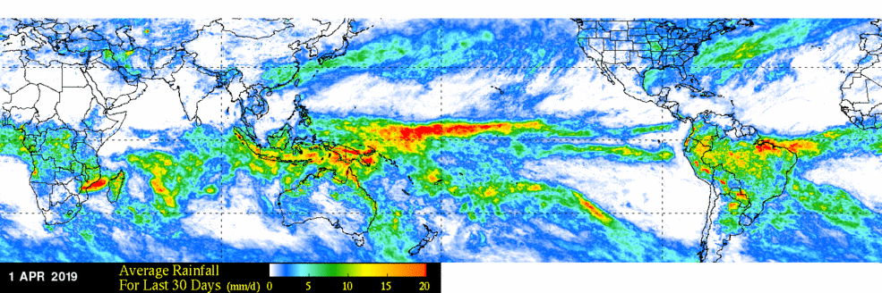
This image is a world map showing average rainfall over the last 30 days as of April 1, 2019. The map uses a color gradient to indicate rainfall amounts in millimeters per day across the globe.
- Map Type: World map
- Measurement: Average rainfall for the last 30 days (mm/day)
- Date: April 1, 2019
- Color Scale (bottom of the map):
- Range: 0 mm/day to 20 mm/day
- Colors: Blue (0 mm/day) to red (20 mm/day), with green and yellow in between
- Regions with Notable Rainfall:
- High Rainfall (red, 15–20 mm/day):
- Equatorial Pacific (stretching across the ocean)
- Parts of Southeast Asia
- Northern South America (Amazon region)
- Southern Africa
- Moderate Rainfall (yellow to green, 5–15 mm/day):
- Central Africa
- Parts of South America
- Southeast Asia
- Low Rainfall (blue, 0–5 mm/day):
- Most of North America, Europe, and Australia
- Northern Africa and the Middle East
- High Rainfall (red, 15–20 mm/day):
The map highlights significant rainfall in equatorial regions, particularly the Pacific and Amazon, while showing drier conditions in North America, Europe, and Australia during this period.
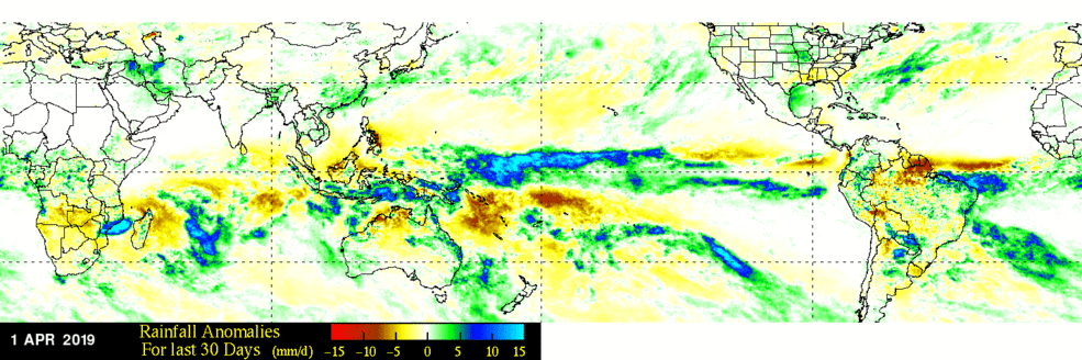
This image is a world map showing rainfall anomalies over the last 30 days as of April 1, 2019. The map uses a color gradient to indicate deviations from average rainfall in millimeters per day across the globe.
- Map Type: World map
- Measurement: Rainfall anomalies for the last 30 days (mm/day)
- Date: April 1, 2019
- Color Scale (bottom of the map):
- Range: -15 mm/day to 15 mm/day
- Colors: Red (drier, -15) to blue (wetter, 15), with yellow at 0 (average)
- Regions with Notable Anomalies:
- Drier Areas (red, -15 to -5 mm/day):
- Northern South America (Amazon region)
- Parts of Southeast Asia
- Wetter Areas (blue, 5 to 15 mm/day):
- Equatorial Pacific (stretching across the ocean)
- Southern Africa
- Parts of South America (southern Brazil)
- Near Average (yellow, -5 to 5 mm/day):
- Most of North America, Europe, and Australia
- Central Africa
- Drier Areas (red, -15 to -5 mm/day):
The map highlights significant rainfall deficits in the Amazon and Southeast Asia, while showing above-average rainfall in the equatorial Pacific and parts of southern Africa during this period.
The two images above show the rainfall averages in terms of mm/day for the month of March 2019, above, and the rainfall anomaly for the same month, below.
Earlier satellites did not have the same resolution, but the record goes back to the late 1970s, allowing us to get a picture of the longer-term mean precipitation patterns, which can be seen in the video below. Watch this movie a few times through to see the annual patterns of precipitation, and focus especially on the region around India, where the summer monsoons show up beautifully.
Video:IMERG Monthly Precipitation Climatology (2001 - 2022) (00:16) This video is not narrated.
On a global scale, there is no clear sign that the amount of precipitation is increasing, as can be seen in this next figure, which plots the global average precipitation rate for each month.
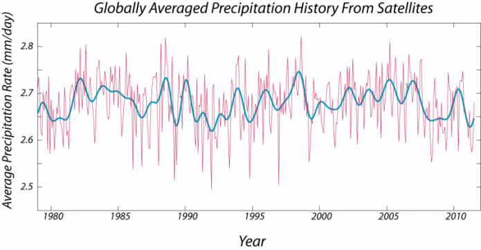
This image is a line graph titled "Globally Averaged Precipitation History From Satellites," showing the average precipitation rate from 1980 to 2010. The data is derived from satellite measurements and presented in millimeters per day.
- Y-Axis: Average precipitation rate (mm/day)
- Range: 2.5 mm/day to 2.8 mm/day
- X-Axis: Years (1980 to 2010)
- Data Representation:
- Raw Data: Pink line
- Shows high-frequency fluctuations
- Varies between 2.5 and 2.8 mm/day
- Smoothed Data: Blue line
- Represents a smoothed trend of the raw data
- Fluctuates more gradually, staying around 2.6 to 2.7 mm/day
- Raw Data: Pink line
- Trend:
- No clear long-term increase or decrease
- Periodic fluctuations, with peaks around 1983, 1998, and 2007
- Dips around 1992 and 2001
The graph indicates that global precipitation rates have remained relatively stable over the 30-year period, with short-term variations but no significant long-term trend.
The figure above shows the history of the monthly average precipitation rates, averaged over the globe — kind of a difficult thing to swallow at first. Think of the values plotted along the y-axis as being the precipitation rate, averaged over the whole globe for a given month. As you can perhaps see, there is a strong seasonal cycle (with peaks in the fall each year) — I've removed the seasonal variation from the raw data to give the thicker blue line, showing variability that is not related to the seasonal cycle. One thing that is clear is that there is no general upward or downward trend over this period, although there are ups and downs, some of which correspond to the El Niño oscillations.
So, global precipitation, on the whole, is not going up, as far as the data reveal. What this means is that although the atmosphere is getting moister, the new addition of moisture is not coming out as precipitation — the atmosphere is retaining this extra water vapor.
But because the trend suggests there will be extra water vapor in the atmosphere in the future, when the conditions are right for a big precipitation event, the event might be bigger than today or in the past. In addition, predictions suggest there might be more storm events that exceed a certain threshold so that they are classified as extreme precipitation events.
More regionally, the El Niño cycle produces a dramatic change in precipitation patterns in parts of the globe, with Southeastern Australia becoming dry in summer and more prone to bushfires. In the US, El Niño corresponds to heavy winter rainfall in California as the so-called "Pineapple Express" picks up and transports heat and moisture from the tropical Pacific. Folks in California always hope that El Niño events put an end to drought. More on that in Module 8. El Niño is generally not a good time to visit Florida in the winter, as the same pattern extends across the southern US.

This image is a diagram titled "Typical January-March Weather Anomalies and Atmospheric Circulation During Moderate to Strong El Niño & La Niña." It consists of two maps of North America, one for El Niño and one for La Niña, showing weather patterns and anomalies during these climate events.
- El Niño Map (Top):
- Title: El Niño
- Atmospheric Features:
- Low pressure (marked "L") over the eastern Pacific
- Persistent extended Pacific jet stream (red arrow) stretching across the Pacific
- Polar jet stream (purple arrow) over northern North America
- Weather Anomalies:
- Warm (red): Western Canada and Alaska
- Wet (green): Southern U.S. and Mexico
- Cool (blue): Central U.S.
- Dry (brown): Northern U.S. and parts of Canada
- La Niña Map (Bottom):
- Title: La Niña
- Atmospheric Features:
- High pressure (marked "H") over the eastern Pacific
- Variable Pacific jet stream (orange arrow) with a wavy pattern
- Polar jet stream (purple arrow) over northern North America
- Weather Anomalies:
- Cold (blue): Western Canada and Alaska
- Wet (green): Pacific Northwest and Great Lakes region
- Dry (brown): Southern U.S. and Mexico
- Warm (red): Southeastern U.S.
The diagram illustrates how El Niño brings wetter and cooler conditions to the southern U.S. with a strong jet stream, while La Niña results in drier conditions in the south, wetter conditions in the northwest, and a more variable jet stream.
Drought
Drought
Drought is a very familiar foe in parts of the US, significant regions of Africa, and much of Australia. Drought is often called a creeping disaster, as it decimates a region slowly. We will talk a lot more about drought in Modules 8 and 9. Here, we briefly consider the recent record of drought. As we saw previously with research on drought and the Mayans, oxygen isotopes of stalactites can be interpreted in terms of precipitation. Another indicator of drought is the width of tree rings. One of the most comprehensive tree-ring data sets is shown in a compilation of precipitation in New Mexico from 137 BC to 1992 (The New York Times, The Longest Measure of Drought: 21 Centuries of Rainfall in New Mexico [21]). The data set shows that with the exception of a wet phase in the last decade, much of the 20th century was dry in New Mexico, and, in general, the data suggest that western North America has become drier over the last 1000 years.
As it turns out, there is solid evidence that the severity of droughts has increased over the long term in many parts of the world. And, as it turns out, climate models predict that drought will become a part of everyday life in many regions in the coming century. In the US, these areas include large parts of the west and south central (Kansas, Oklahoma, Texas). Especially in California, climate models suggest that warmer years in the future are more likely to also be drier years, and this will increase the severity of future droughts.
So, how is the severity of drought quantified? The most widely used method to measure drought today and in the past is the Palmer Drought Severity Index (PDSI). This index is an accounting of the balance of supply of moisture via precipitation and demand for moisture via potential evapotranspiration (PE). The PE is the amount of water that could be evaporated given an unlimited supply of water. The National Oceanic and Atmospheric Association (NOAA) publishes a map of the PDSI over the US every month (see figure below).
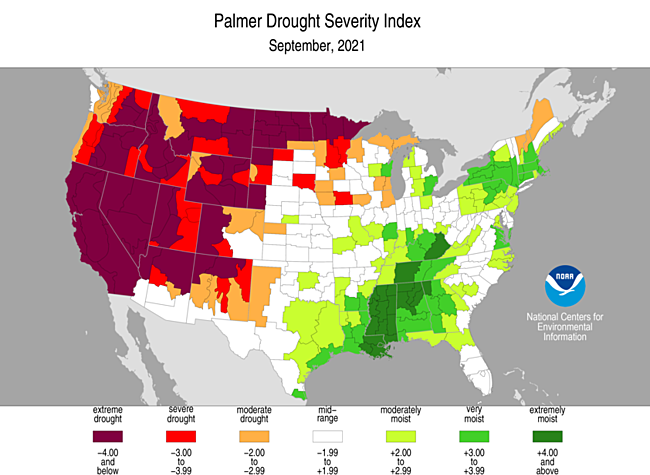
This image is a map of the United States titled "Palmer Drought Severity Index, September 2021," produced by the National Centers for Environmental Information (NOAA). The map uses a color gradient to show drought severity across the U.S. during this period.
- Map Type: U.S. map
- Measurement: Palmer Drought Severity Index (PDSI)
- Date: September 2021
- Color Scale (bottom of the map):
- Range: -4.00 (extreme drought) to 4.00 (extremely moist)
- Colors: Dark red (extreme drought, -4.00) to dark green (extremely moist, 4.00)
- Categories: Extreme drought, severe drought, moderate drought, mid-range, moderately moist, very moist, extremely moist
- Regions with Notable Conditions:
- Extreme Drought (dark red, -4.00):
- Western U.S. (California, Nevada, Utah, Montana, Idaho)
- Parts of the Upper Midwest (Minnesota, North Dakota)
- Severe Drought (red, -3.00 to -3.99):
- Much of the Western U.S. (Oregon, Washington, Wyoming, Colorado)
- Parts of the Great Plains (Nebraska, South Dakota)
- Moderate Drought (orange, -2.00 to -2.99):
- Southwest (Arizona, New Mexico)
- Parts of the Midwest (Iowa, Wisconsin)
- Mid-Range (white, -1.99 to 1.99):
- Central U.S. (Kansas, Oklahoma, Missouri)
- Parts of the Northeast (New York, Pennsylvania)
- Moderately Moist (light green, 2.00 to 2.99):
- Southeast (Georgia, Alabama, Mississippi)
- Parts of the Midwest (Illinois, Indiana)
- Very Moist (green, 3.00 to 3.99):
- Parts of the Southeast (Louisiana, Arkansas)
- Parts of the Northeast (Maine, Vermont)
- Extremely Moist (dark green, 4.00):
- Small areas in the Southeast (parts of Louisiana)
- Extreme Drought (dark red, -4.00):
The map shows severe to extreme drought conditions dominating the Western U.S. and Upper Midwest, while the Southeast and parts of the Northeast experienced moist to extremely moist conditions in September 2021.
The PDSI has increased (become drier) for the driest parts of the globe since 1950. For most of the US, the PDSI has decreased for this time period. However, the last century has seen severe droughts in certain regions. For example, the major drought of the 1930s Dust Bowl in the Central US caused severe hardship for farmers and others in this region. The 1950s and 1980s also saw severe droughts in the Great Plains of the US. We will find out in Module 4 how models project that the severity of droughts will increase in many parts of the globe with future climate change. Moreover, we will learn more about the impact of drought on water supply in Module 8 and on food in Module 9.
Drought is currently at a critical level out west. Lake Powell, which is the second largest reservoir in the western US is currently at its lowest level in history and approaching the level where water and hydroelectric power supplies are threatened. This event would be especially devastating for communities that rely on the lake for water, such as Las Vegas, Nevada. We will come back to this issue in Module 8.
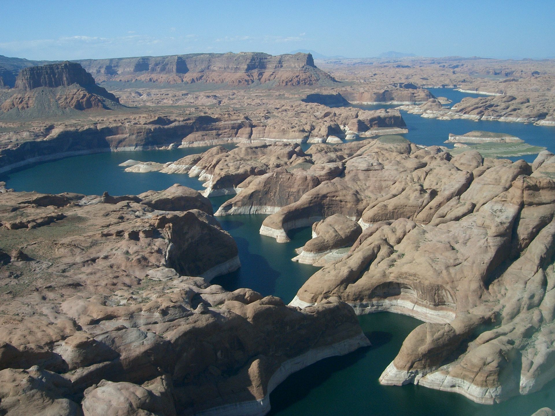
The latest (2022) report of the Intergovernmental Panel on Climate Change (IPCC), the large international team of scientists tasked with predicting our climate future and its impact, issues stern warnings about drought in the western US, Australia, the Mediterranean region and sub-Saharan Africa. Drought will have a major impact on human health, largely because of its effect on accessibility to clean drinking water, and require major adaptation of communities. Adaptation can involve conservation measures as well as finding new sources of water, for example desalinization. Such adaptation will be easier in developed countries like the US compared to the developing world, where countries like Yemen and Madagascar are already struggling with the devastating impact of drought and do not have the resources required to adapt.
Fire
Fire
Los Angeles Fires 2025
January 2025 will forever be remembered for the fires that decimated parts of Los Angeles. The fires lasted for 24 days caused a total of $250-275 billion in damage, an estimate that will likely keep rising. The fires destroyed 18,000 structures, burned 57,000 acres and caused 29 fatalities; 200,000 people were forced to evacuate. The fires started during a stretch of warm and very dry conditions, the driest 9-month period in California history with almost no rain at all, and were spread by strong Santa Ana winds which gusted up to 100 mph, producing literal firestorms that proved very difficult to contain.
It's still uncertain what triggered the fires, but it is likely sparks from electrical equipment. There were eight separate blazes, but two areas were most devastated, Pacific Palisades near the coast and Altadena more inland. The scale of the fires was unprecedented and firefighters had a hard time fighting so many fires simultaneously.
The Palisades fire in Pacific Palisades, Topanga and Malibu destroyed 6800 structures, burned 23,000 acres and killed 12 people. The fire spread extremely rapidly and covered 1200 acres in a matter of hours. Major evacuations were ordered because of the major threat and major traffic jams resulted. Residents reported leaving homes without most of their possessions and pets were also left behind. The area covered by the Palisades fire is the home of many Hollywood celebrities, so the fire got a lot of press coverage. The fire got so large so fast that hydrants ran out of water for a short period of time early in the blaze and this hindered firefighting efforts. The fire burned for 24 days till it was contained and became the third most destructive fire in California history.
The Eaton fire in Altadena destroyed 9000 structures including 4400 family homes and killed 17 people with 24 still missing. When the fire started the winds were so strong embers settled on structures a mile away and the fire spread very quickly, rapidly burning 1000 acres and growing to 2200 acres including surrounding mountainous areas. 100,000 people were placed under evacuation orders. The cause of the fire is unknown, but it was likely started by sparks from powerlines. Lawsuits have already been brought against Southern California Edison, the local power company. Like the Palisades fire, it took 24 days to extinguish the Eaton fire. By that time, it was the second most destructive fire in California history
The aftermath of the two fires included severe air pollution as the burnt structures that contained lead paint, asbestos, and vehicles, and solar powered batteries and panels, that contained various heavy metals. Wildfire smoke contains a number of pollutants including fine particulate matter (PM 2.5). These tiny particles can invade the lungs and penetrate the bloodstream causing a number of respiratory and cognitive illnesses along with cancer. Residents were told to stay inside even after the fires were extinguished. The threat continued as subsequent heavy rainfall led to mudflows laden with toxic materials.
Hawaii Fires 2023
Summer 2023 will be remembered for the truly devastating and catastrophic fires that destroyed the historic tourist city of Lahaina in Maui. As of the date of writing the fire caused 115 fatalities with 66 people still unaccounted for. More than 2200 buildings were destroyed and damage expected to exceed $6 billion. The cause of the tragedy is still under investigation, but it was likely sparked by electric utility poles downed by hurricane force winds. These same winds were responsible for the exceedingly rapid spread of the fires that made evacuation extremely difficult. The failure of warning systems to alert residents is also under investigation. Almost certainly, climate change is at least partially responsible for the fires. A lush tropical island, Maui like the rest of Hawaii, has become much drier since 1990 especially during the summer wet season. Hotter temperatures result in thinner clouds which hold less rainfall. Another critical factor is the area around Lahaina, once the site of sugar cane farms, is now covered by invasive grasses that acted like a tinderbox during the fires. Sadly the Lahaina tragedy is a sign of the future of many places around the globe.
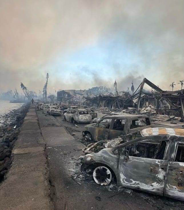
The 2023 summer began with smoke-filled skies across the eastern US from fires raging in Canada. The quality of the air in New York City was the worst of any large city in the world. The last five years have brought devastating fires to California and other western states! Images from the news have shown San Francisco’s air full of smoke and glowing red. Every year brings new records and new tragedies. Deadly fires are not unique to California; in fact, Australia has a history of particularly devastating fires. And climate change is going to provide all of the ingredients for more fires in the future: more fuel (from extreme rainfall events), more effective natural ignition (often dry lightning) and often, sadly, arson, as well as the conditions to keep fires burning (drought and heat). The latest IPCC report issues some stern warnings about fire, predicting that the livelihood of millions of people will be impacted by wildfires in the future. The citizens of California, Australia and other parts of the world need to get used to apocalyptic fires. The last five years have been a wake up call.
The Camp Fire, November 2018
The deadly Camp fire, the most deadly and destructive fire in California history, began November 8th, 2018 from a spark from an electrical wire. By the time it was finished two weeks later, the fire had burned more than 1500,000 acres around the town of Paradise. The fire occurred late in the season and was whipped up by strong winds and abundant fuel from the previous rainy season. A virtual firestorm quickly converged on Paradise, a ridge-top town that was used to fires but had grown fast and without good evacuation planning. On November 8th, the evacuation order came too late, and many folks did not receive it because cell towers were down. Because the call was so late, evacuation could not occur in an orderly fashion, from one side of the town to the other. Hundreds of vehicles quickly jammed the three routes out of town and the fire quickly trapped many people in their cars. Folks who did not get the evacuation order were trapped in their homes. A total of 86 people in Paradise were killed and the town was almost completely burned down.
In the wake of the fire, the large utility company PG&E filed for bankruptcy to avoid major lawsuits. Turns out the company discussed turning off the power grid in the days before the fire began but decided not to. Now in the wake of the fire, companies will be much more likely to turn off the grid if there is a chance of fire and this will impact millions of customers in California.
As it turns out the Camp fire was only one of two major fires that began on November 8th. The massive Woolsey fire west of LA also began that day, burned 97,000 acres, killed three people, and forced the evacuation of 295,000 people.
The Camp and Woolsey fires are the “new normal” for California and the state must deal with difficult issues such as vegetation management, sensible development, evacuation planning, and regulation of power companies.
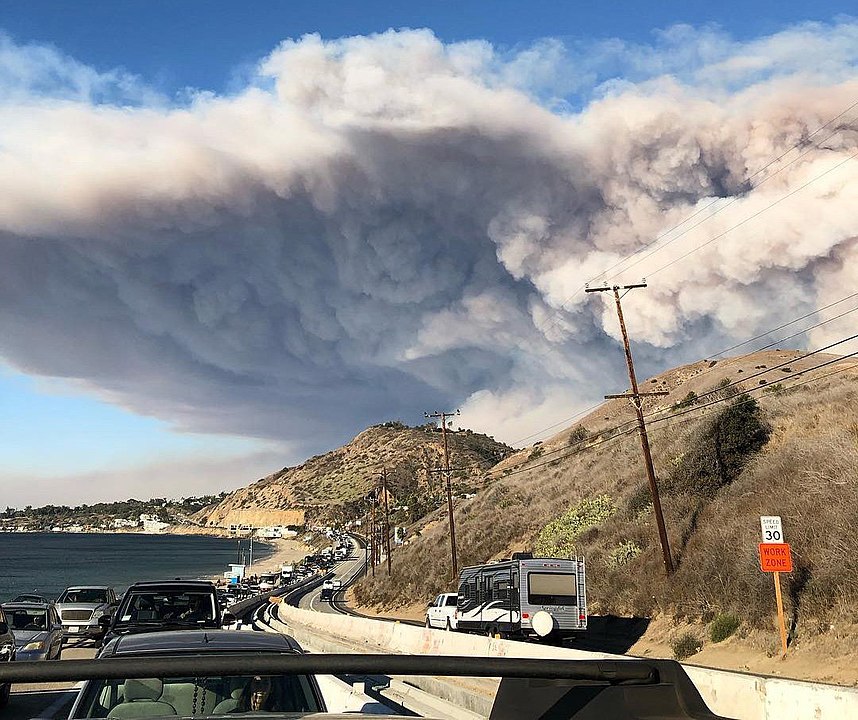
The record breaking 2020 fire season
2020 was a record-breaking fire year in California. More acres burned than ever before (over 4.3 million), at least in recent times, with over 9200 separate fires including the first “gigafire”, the August Complex Fire that burned more than 1 million acres (over 1500 square miles)! Total damages exceeded $2.5 billion and 32 people perished. Although arson was to blame for some of the fires, more often they were sparked by lightning that occurred in thunderstorms without rain. The largest fires in Northern California, the SZU Lightning Complex fire, the LNU Lightning Complex Fire, and the August fire were all started by lightning strikes.
Video: California wildfires evening update: September 9, 2020 (9:32)
MADISON WADE, ABC10 NEWS ANCHOR: The wildfires are raging throughout the state.
CHRIS THOMAS, ABC10 NEWS ANCHOR: That’s right, more than two and a half quarter million acres burned in California this year already.
MADISON WADE: We have live team coverage tonight. Abc10’s John Bartell and Monica Coleman, covering the Bear fire which is burning in the Plumis National Forest.
CHRIST THOMAS: Mayde Gomez is live at the newest threat at the Willow fire burning in Yuba County near Collins lake. And meteorologist Monica Woods is tracking the air-quality from all of the smoke. But first, let’s get you up to speed on the Bear fire. This is part of the North Complex which has burned more than 250,000 acres and is only 38 percent contained. Fire officials say it is moving so fast it’s burning at a rate of 1000 acres per half hour. Evacuation orders are in effect for parts of Yuba, Plumas, and Butte counties. This is actually just south of where the camp fire burned back in 2018. Let’s go back to abc10’s John Bartell, live in Lake Orville where many are being evacuated. John.
JOHN BARTELL, NEWS ANCHOR: Yeah, Curtis. The smoke is very thick and the burn scars here are still very fresh. Take a look over here. This is what’s left of a house right off of Simmons Road. That’s on the eastern side of Lake Orville here, right off Highway 162. And this is one of the areas that was actually evacuated. And the reason that it was evacuated is that this fire was moving very fast, and it was very windy. Take a look.
With smoke so thick it’s difficult to see, but boats are still floating at Bidwell Canyon Marina, and California’s first mother orange tree is still standing next to the historic Bidwell Bridge. But it’s a much different story up on Highway 162. There is a reason these roads are shut down here. Oh my gosh, it’s so hard to see! There is fire everywhere. Burn scars cover the hillside all along the eastern edge of Lake Oriville. Flames are not far up Simmons Road. So these house fires are really random in this area. You’ll find a house like this on fire down the road, and then just up the road you’ll find houses untouched by the flames. Intermittent winds intensify the fire. This time lapse video shows just how fast the flames can burn through a home.
Fire crews spread out in an attempt to put out flames and create a fire line as wildlife of all kinds flee the area. It really further down Simmons Road, water hoses were left around the home but with weak water pressure our efforts were minimal to get the ground wet. With each gust of wind, Phil and I watch as brush piles around his home of eighteen years burn like matches.
PHIL, RESIDENT: Seems pretty safe here, you know? Got everything pretty cleaned up around here and....
JOHN BARTELL: Fire crews keep a close eye. But Phil went to great lengths this spring to create defensible space around his home. So this doesn’t worry at all. Like, it’s pretty close.
PHIL: Nah. It should be okay.
JOHN BARTELL: Phil ignored evacuation orders. Defensible space or not, the fire on Simmon’s road is dangerous and unpredictable.
And thankfully, that wind has died down out here in this area, but I want you to take a look at this here. The major fire has gone through, but there’s still some of these small fires burning within these trees making it extremely dangerous for anyone walking through these forests here. And it is extremely dangerous as we go up to the lake here and my colleague, Monica Coleman, is actually at Berry Creek. It’s about 25 miles from here. And Monica I can only imagine the damage you’re seeing up in that area.
MONICA COLEMAN, NEWS ANCHOR: Yeah, John. Let me show you exactly what the damage looks like. I’m right off the Highway 162 and this power line behind me is down. And I want to show you the power pole that fell right before my eyes. Right here there’s still flames coming out of the pole. You can smell it. You can feel the heat. And you can see the smoke coming out of this power pole right here. Just destruction everywhere you go when you’re coming down Highway 162. When I went to Berry Creek, we spoke with some people who said they’re staying to defend their homes while others evacuated and now for the first time without anything.
RESIDENT: We ran last night. We got half of our animals. We couldn’t get the other half. We had to run and get the truck and go. I’m 55 years old, and I’ve never been homeless. It’s gonna be rough.
MONICA COLEMAN: I want you all to take a look right behind me. This is lake Orville. You can barely see it, but there are still a couple boats docked out that way. But earlier today it was a little bit clearer, as the night comes to a fruition it’s getting smokier and smokier. The skies are orange. The sun is red. As the smoke just fills the air. Chris.
CHRIS THOMAS: It is just heartbreaking to hear him talking about his new reality right now. The community really is devastated from these fires our Monica Coleman giving us a live look at what they’re dealing with tonight. And I want to show you this from all the fires people in the Bay Area woke up to - look at that - orange and red skies. The smoke blocking the sun, some say it feels apocalyptic. Want to show you a live look at the Bay Bridge right now. Again you see that orange haze in the sky. Monica tells us more about the air quality and how dangerous it is for all of us right now. Monica.
MONICA WOODS, WEATHER ANCHOR: Absolutely. Now we’re starting to see a shift in our wind coming out of the southwest. We have those predominate north and east winds yesterday, which brought in this smoke from the north complex fire. Now we’re starting to pull in just a little bit from the August complex which is, by the way, now the second largest fire in California history. Here’s a look at our current air quality, and you can see some of the dots they’re representing unhealthful and unhelpful for sensitive groups. Who we have some very unhelpful and hazardous air a little closer to the coast where we’re seeing some of those golden pictures. Those eerie pictures coming out of the Bay Area.
Southwest winds are like I said, starting to change up this smoke pattern ever so slightly. Here’s what it’s looking like for most of the day. You can see what appears to be cloud cover. That’s all smoke moving through the valley. There’s no clouds to be found out there. Up the Tahoe Basin, it’s actually clear skies with blue skies up there. Temperatures meantime, because of the dense smoke have stayed about fourteen to almost thirty degrees cooler than yesterday at this time, holding in the sixties and seventies for the most part. It’s warmer for some of the foothill locations that are actually seeing just a little bit less smoke. Again, tonight we see a shift in our weather pattern with our winds. That’s going to push some of that smoke a little further off to the east in the foothills and the Sierra. We’ll talk about that and the cooler weather ahead coming up.
MADISON WADE: Thank you, Monica. The winds are not helping the newest fire. The Willow Fire in Yuba County. This one started overnight in Loma Rica and burned 1000 acres. It is not contained, and mandatory evacuations are in effect. We’re going to go abc10 Mayde Gomez, when we can, but reception… Mayde actually is here. Let’s go right to her about this Willow fire. Mayde what’s the latest with this one burning in Yuba County?
MAYDE GOMEZ, NEWS ANCHOR: Hey Madison, so what I can tell you is that right now the Thousand Trails community is currently under voluntary evacuation orders. We’re on Marysville Road in unincorporated Yuba County. This is about five miles southwest of Loma Rica where 3000 people were evacuated overnight because of the Willow fire. Now you can’t see much from where I’m standing here, except that ominous glow behind me in the sky. But let me show you what the affected area looked like last night. This video was taken by Cal Fire as their trucks were driving by. A couple, you can definitely see the flames on their left and on their right side as they’re driving by. Now, a couple hours ago we were told by Cal Fire that the Willow fire currently stands at over 30 hundred acres, with zero percent containment. Over 700 structures are threatened. Fourteen homes have either been destroyed or damaged. Luckily, no injuries have been reported. Cal Fire says the cooler temps have helped, but the fire fight is not over.
FIREFIGHTER: The wind is obviously subsided here, and so that worked in our advantage. So now we have to deal with the low humidities we’re still experiencing. Some of the rapid fire growth and spread has to do with these steep hills and canyons that we’re dealing with.
[HELICOPTER NOISE]
MAYDE GOMEZ: you heard there, the fire fight continues. Now, I asked Cal Fire when the evacuated community of Loma Rica would be able to return. They said as soon as the fire is out, and it is determined to be safe. They will, of course, let people know. Now they couldn’t give me an exact timeline because as we know, fire is very unpredictable. But as things stand right now, we are looking a little bit better. I also wanted to mention that a cat was saved from a burning area by a firefighter. Now this was on Sky View road. So if this is your cat. If you’re missing your cat, please let us know, and of course, we’re going to help you reunite with your cat. I’m going to turn it back to you, Madison.
MADISON WADE: Oh, Mayde, thank you so much! It’s so sweet of you to mention that. I know so many people right now are searching for answers, and hopefully, we will be able to bring that to you comping up on the news at five.
The fires were caused by the continued drought in the state and across the western US, and, indeed, large fires occurred over much of the region as far east as Colorado and as far north as Washington state. In all over 52,000 fires consumed almost 9 million acres.
The year was also notable for fires that encroached on Seattle and especially Portland. In fact, wildfires caused an especially scary situation in the latter metropolitan area where 40,000 people had to be evacuated and 500,000 lived in evacuation warning zones at the height of the blazes. These fires in the northern part of California, Oregon, and Washington were responsible for extremely hazardous air quality for weeks, and in all over 17 million people experienced unhealthy or hazardous air this year. In fact, the air in Marion County in Oregon was so polluted it registered off the measurement scale. The air quality in Northern California, including Sacramento and San Francisco, was unhealthy for weeks, and young, elderly, and people with asthma, COPD, and other preexisting conditions were advised to remain indoors. The smoke can cause burning eyes and lung ailments including bronchitis, and aggravate heart and lunch diseases. The elevated levels of fine particulates, including hazardous compounds, may also cause longer-term health issues. This public health situation was especially difficult as it superimposed on Covid-19.
2020 will be remembered for the scale of the western fires but also for their profound impact on public health. On top of the possibility of evacuation and loss of property, many residents of the western states were awakened to the prospect that their “new normal” fire season included toxic air.
Australian Bushfires
The 2020 fire season in California was the worst on record. However, these are not the most devastating fires in Earth’s recent past. Black Saturday Bushfires in February 2009 in Victoria, Australia were fueled by extraordinary heat and strong winds. At the peak of the inferno, there were some 400 blazes. Conditions leading up to the fires were extraordinary. Mercury hit 116 degrees in Melbourne in a heatwave that started the week before the fire, and in the peak of the summer drought, the dry brush was perfect fuel. On the fateful Saturday, the first fire was started by arson. Falling power lines and lightning ignited other fires. Fires consumed some 1.1 million acres, destroyed whole towns, caused some $4.4 billion in damage, and killed 173 people. Most of the damage was done in the first few days, but the blazes raged for weeks. One of the astounding aspects of the fires were observations by firefighters of sideways mini-tornadoes, technically called horizontal convective rolls. As the air at the surface warmed and rose, it was forced to move in a corkscrew pattern-oriented parallel to the ground. This created bands of alternating fast and slower surface winds. Fast winds surpassed 30 mph and ignited huge swaths of land in a catastrophic fire. There are terrifying stories of people getting swept up in the flames trying to escape the inferno on tiny mountain roads.
The late part of 2019 and the early stages of 2020 have brought more intense wildfire to Australia, especially near Sydney in the southeast. The season began very early as a result of the decade long drought and intense heatwaves (see Heatwave page this module). As of this reporting fires have burned millions of acres, destroyed thousands of buildings, and killed dozens of people and millions of animals including koala and kangaroos. The smoke has caused unhealthy air in eastern Australian cities and the plume has drifted as far as New Zealand. The fires have caused a political upheaval because Australia has a large emission of carbon per capita and produces a significant amount of energy from coal. Given how susceptible it is to climate change, many citizens feel that the country is not doing enough to curb emissions. 2019-2020 is a glimpse of the future for Australians.
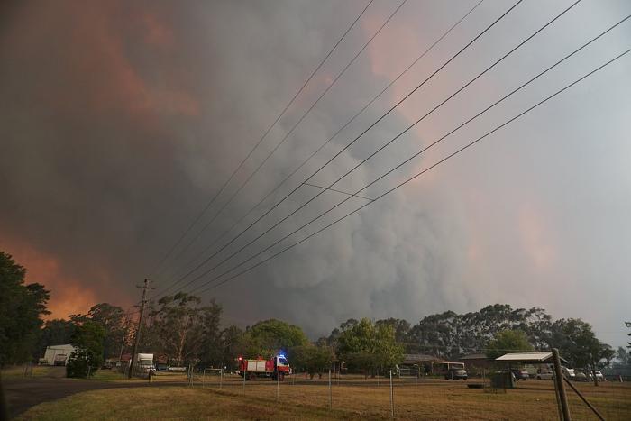
Relationship between fire and climate change
So, how is increased fire activity related to climate change? Fire is very much a part of the ecosystem in places like Australia, California, South Africa, and Southern Europe. Even before people were around, fires ignited by lightning occur regularly in environments with dry seasons, as nature’s way of germinating drought-resistant species and fertilizing the soil. But people have made fire events much more common. First, many fires are started by arson or in the cases of the Lahaina and Camp fires by downed electric utility poles. Clearly, heat and drought are good for fire, and as we have seen, both of these ingredients will increase in the future as a result of anthropogenic climate change. But the other key aspect of fire is fuel and which is supplied by precipitation and active growth of vegetation. Climate change is likely to cause more variability in temperature and precipitation that will create more contrast between drought and wet years. This will lead to greater fire risk. The heavy rains in California in the winter of 2016-2017 caused a significant growth of vegetation in uncultivated hills and canyons surrounding residential areas and this dried out in the hot and dry 2017 summer. Then, once the warm fall Santa Ana winds arrived, the recipe for disaster was all ready.
The main culprit for the increase in fires in the western US and Hawaii is the long-term drought. However, development in forested and brushy areas that are prone to burn. Clearing of brush in populated areas has led to the establishment of invasive plant species that grow very rapidly and provide fuel when they die back in the dry season. There has been constant friction between responsible forest management with regulation and development. The potential for gigafires will force a reckoning between planning and forestry departments in the future so that forest and brush can be managed through controlled burns. Many communities are also replanting native plant species and using animals to clear out areas overwhelmed by invasives. At the same time, growth needs to be managed so that safe evacuation can occur in the case of a large fire. Sadly, highly destructive wildfires are part of California’s future.
As are mudslides. The huge Thomas fire destroyed so much vegetation that held hill-slopes in place. They were followed in early January by major rains that led to torrents of mud from hills into valleys. The catastrophic mudslides killed at least 20 people and caused massive property damage. Fire and mud are intricately related.
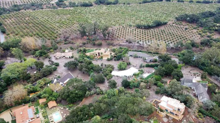
One of the main messages from the 2022 IPCC report is the need to adapt to a future in which fire is more common and more deadly. In fact California is already making progress adapting its communities to live with the threat. In some areas, development is being banned in risky locations near forests for example, and best practices are being applied for clearing brush and maintaining fire breaks. Australia has been applying these best practices for a number of years also.
What is also clear from the IPCC report is that wildfires like drought will have a major impact on human health especially for children, the elderly and the poor. The impact will also be more severe in the developing world where fires set for the purpose of deforestation are having a major effect on human health as well as wiping out large numbers of species, a topic we will return to in Module 11.
Heatwaves
Heatwaves
Heat waves are days to week-long events with extremely high temperatures. These events are becoming more common with a changing climate, are forecasted to become frequent in many parts of the world in the future and occur earlier in the year (June 2022 has been a dress rehearsal for that!). Heatwaves are often part of extended droughts and associated with wildfires. They are major public health risks, especially for very young and older populations, as well as the poor who do not have access to air conditioning or basic hydration. In the developing world, heat waves can be very deadly, in India in 2015 more than 2200 people died due to excessive heat.
Some of the most drastic heatwaves occur in Australia, a continent which is also characterized by devastating drought and perilous wildfires. The last few years have seen major heatwaves across the continent, shattering local and continental temperature records. In 2013 Australia got so hot that they had to add new colors to the temperature map. There were days that year when the center of the continent topped 125 degrees F (52 degrees C).
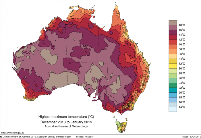
This image is a map of Australia titled "Highest Maximum Temperature (°C) December 2018 to January 2019," produced by the Australian Bureau of Meteorology. The map uses a color gradient to show the highest maximum temperatures recorded across Australia during this period.
- Map Type: Australia map
- Measurement: Highest maximum temperature (°C)
- Period: December 2018 to January 2019
- Color Scale (right side of the map):
- Range: 14°C to 48°C
- Colors: Light blue (14°C) to dark purple (48°C), with green, yellow, orange, and red in between
- Regions with Notable Temperatures:
- Extremely High (dark purple, 46°C to 48°C):
- Central Australia (Northern Territory, parts of South Australia)
- Very High (red to purple, 40°C to 46°C):
- Most of Western Australia, Northern Territory, and South Australia
- Parts of Queensland and New South Wales
- High (orange to red, 34°C to 40°C):
- Eastern Australia (Queensland, New South Wales)
- Parts of Victoria
- Moderate (yellow to green, 26°C to 34°C):
- Coastal areas of Western Australia and Victoria
- Tasmania
- Lower (blue, 14°C to 26°C):
- Small areas in Tasmania and southern Victoria
- Extremely High (dark purple, 46°C to 48°C):
The map shows that central and northern Australia experienced extremely high temperatures, often exceeding 40°C, while coastal and southern regions, including Tasmania, had cooler maximum temperatures during this period.
In 2019 Australia broke records again in a summer of wildfires, drought, and heat. On December 19, the average high for the whole continent was 107.4 degrees F (41.9 degrees C) shattering the record set the day before by over a degree C.
In the US, heatwaves in the desert southwest including Phoenix and Las Vegas are part of a normal summer. Phoenix regularly reaches 112 degrees F (44.4 degrees C) and it has been known to exceed 120 degrees F (48.9 degrees C). These are shade temperatures, corresponding temperatures can reach 168 degrees F (76 degrees C) in the sun right above the ground level. Because concrete traps heat, cities like Phoenix get particularly hot and are prone to heatwaves. In fact, this “heat island” effect makes cities as much as 7 degrees F warmer during the day. Nighttime often does not provide much relief, with temperatures above 80 deg F for many nights in a row.
June 2021 was a sign of things to come in the northwest US and western Canada, with temperatures topping out at 116 degrees F in Portland and 108 degrees F in Seattle. Lytton in British Columbia reached 121 degrees F, the hottest temperature ever recorded in Canada. These temperatures smashed records for these cities that are normally cool in the early summer.
This image is a temperature forecast map for the Pacific Northwest of the United States, titled "High Temperatures June 28, 2021," produced by NOAA's National Weather Service in Seattle. The map shows predicted high temperatures in degrees Fahrenheit for various locations in Washington state on that date.
- Map Type: Regional map (Pacific Northwest, Washington state)
- Measurement: High temperatures (°F)
- Date: June 28, 2021
- Color Scale (bottom of the map):
- Range: 65°F to 115°F
- Colors: Green (65°F) to dark purple (115°F), with yellow, orange, and red in between
- Regions and Temperatures:
- Extremely High (purple, 110°F to 115°F):
- Seattle: 113°F
- Olympia: 112°F
- Bremerton: 109°F
- Kent: 112°F
- North Bend: 113°F
- Snoqualmie Pass: 102°F
- Very High (red, 100°F to 110°F):
- Forks: 108°F
- Quinault: 106°F
- Aberdeen: 101°F
- Everett: 107°F
- Monroe: 113°F
- Darrington: 109°F
- High (orange to yellow, 90°F to 100°F):
- Port Angeles: 94°F
- Port Townsend: 90°F
- Friday Harbor: 92°F
- Mount Vernon: 105°F
- Stevens Pass: 94°F
- Mount Baker: 93°F
- Moderate (green, 65°F to 90°F):
- Neah Bay: 87°F
- Westport: 79°F
- Chehalis: 110°F (outlier in a cooler zone)
- Paradise: 88°F
- White Pass: 93°F
- Extremely High (purple, 110°F to 115°F):
- Additional Info:
- Created: 04:52 AM PDT, June 28, 2021
- Source: weather.gov/Seattle
The map indicates an extreme heatwave across Washington state, with most areas experiencing temperatures above 100°F, and some coastal areas slightly cooler but still unusually warm for the region.
The heat caused a minimum of 500 fatalities in the US and Canada among vulnerable populations, including the elderly. These cities are not adapted to extreme heat, with a low percentage (about 40%) of homes having air conditioning. The heat was so extreme that up to a billion of clams and other shellfish were cooked inside their shells in an ecologic catastrophe. The heat caused major wildfires to rage throughout the area, including the town of Lytton which was virtually destroyed. Several weeks later and further south, temperatures reached 130 deg G in Death Valley, matching the world record the hottest temperature ever recorded.
July 2022 saw record breaking temperatures in Europe and notably in London where it reached 40.2 deg C or 104.4 deg F, an all-time record. That city is not adapted to temperatures that high and will have to invest significantly in areas like air-conditioning public transportation in the future.
Heatwaves will become more common and more extreme in most places in the future as the planet warms. Europe and Australia are going to experience more and more of them, as are places in India. The southern US will seem more like the Middle East in the future, with cities like Austin and El Paso becoming as hot as Dubai is today and Phoenix approaching Baghdad, Iraq temperatures. Washington DC is going to seem more like Austin in the summer, Boston will seem more like Philly and Billings, Montana more like El Paso.
More dramatically, there may be places in the Middle East and Northern India where humans may not be able to live in the future because it is impossible for the human body to cope with the searing heat. To be more precise, a wet bulb temperature that factors heat and humidity of 95 degrees F or 35 degrees C is where it is thought that a combination of kidney, heart, or even brain failure may commence, especially for vulnerable populations.
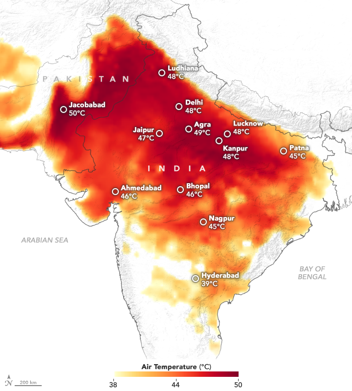
This image is a temperature map of India showing air temperatures in degrees Celsius across various cities. The map uses a color gradient to indicate temperature variations, highlighting a significant heatwave in the region.
- Map Type: India map
- Measurement: Air temperature (°C)
- Color Scale (bottom of the map):
- Range: 38°C to 50°C
- Colors: Yellow (38°C) to dark red (50°C), with orange and red in between
- Regions and Temperatures:
- Extremely High (dark red, 48°C to 50°C):
- Jacobabad (Pakistan, near the border): 50°C
- Delhi: 48°C
- Lucknow: 48°C
- Very High (red, 45°C to 47°C):
- Ludhiana: 48°C
- Agra: 49°C
- Kanpur: 48°C
- Patna: 45°C
- Bhopal: 46°C
- Nagpur: 45°C
- Jaipur: 47°C
- High (orange, 40°C to 44°C):
- Ahmedabad: 46°C
- Moderate (yellow, 38°C to 40°C):
- Hyderabad: 39°C
- Extremely High (dark red, 48°C to 50°C):
- Geographic Context:
- Surrounding areas: Pakistan, Arabian Sea, Bay of Bengal
- Scale: 200 km (bottom left)
The map shows a severe heatwave affecting northern and central India, with temperatures reaching up to 50°C in Jacobabad and exceeding 45°C in many cities, while southern regions like Hyderabad are relatively cooler at 39°C.
Like drought and fire, the 2022 IPCC report stresses the need for adaptation to heat. This is already taking place in the developed world where cities are reducing the heat island effect by, for example, planting more trees, making roofs green by covering with plants, and using materials for pavement that reflects heat as opposed to absorbing it. Unfortunately, these strategies are more difficult to apply in developing nations where necessities like air conditioning are also less available. Thus, it is likely that heatwaves will become increasingly deadly in coming decades.
Ice
Antarctica and Greenland, the two large ice sheets, represent some of the most bleak and hostile places on Earth. Not many geoscientists have the mettle to explore these remote places, but they remain one of the essential frontiers for research. These large and thick ice sheets look relatively homogeneous compared to other parts of the planet, but in fact, their behavior is not completely understood. The fact remains that if the ice sheets on Antarctica and Greenland were to melt, a feat that cannot happen over decades or even centennial time scales, don't worry, global sea level would rise by about 70 meters which would drown most coastal cities such as New York, Shanghai, Mumbai, and Jakarta. Just this threat should cause global leaders to stay up at night, though!
Ice is the frozen segment of the atmospheric moisture cycle. As you will remember from the discussions of Snowball Earth and the Pleistocene ice ages in Module 1, it is a very important component of Earth’s climate system — ice is the most reflective material on the surface, and as such it can exert an important control on how much sunlight the Earth absorbs, which directly affects the Earth’s temperature.
Ice is also an important and highly sensitive indicator of climate change in the polar regions and in areas of high altitude where mountain glaciers occur. Glaciers will grow or shrink in response to changes in temperature and precipitation. The temperature response is pretty obvious — glaciers melt as the temperature rises. The precipitation response is perhaps less obvious, but glaciers can expand if winter precipitation increases, and they shrink if the winter precipitation decreases. Just as the ground temperatures respond somewhat sluggishly to surface temperature changes, glaciers respond sluggishly to climate changes, which is good in the sense that they give us a better sense of the important trends in climate change that might otherwise be obscured by short-term variations. In the following pages we discuss the key different types of ice and how it is changing: glaciers in mountainous regions, sea ice in the Arctic, and the large Antarctic and Greenland ice sheets.
Mountain Glaciers
Mountain Glaciers
We’ll start with some striking images taken by glaciologists around the world — these are photos of mountain glaciers taken from the same spot at different times, and they provide us with some fairly shocking observations on just how much glaciers can change and have done so recently.
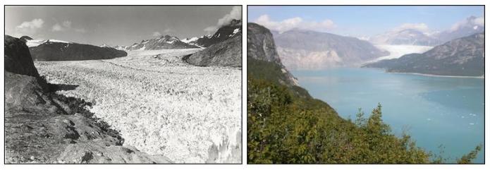
For another Alaskan example, we turn to satellite imagery of Columbia Glacier, which obviously does not reach back into time as far, but nevertheless, there are some dramatic changes evident here:
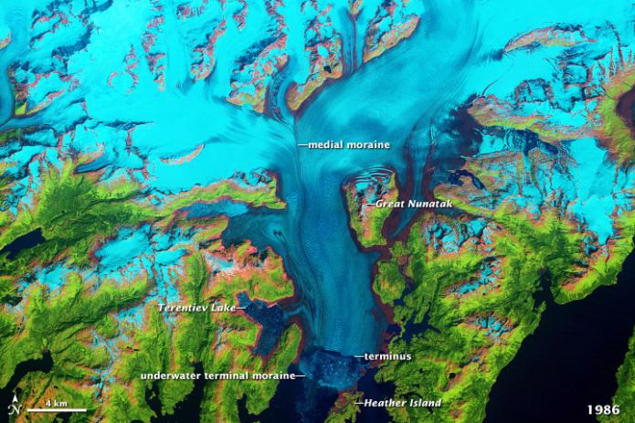
The above scene is from 1986, and at this point in time, the end of the glacier (terminus) is located down near the bottom of the image. Below, we jump forward in time to 2011:
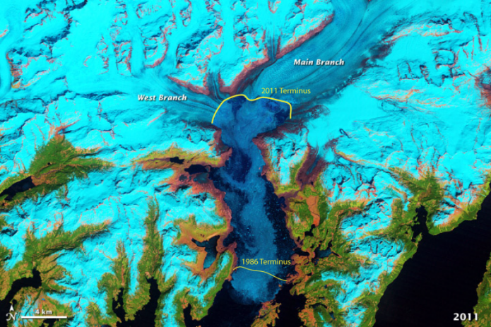
As you can see, the terminus here has retreated by about 15 km in just 25 years — a very impressive rate.
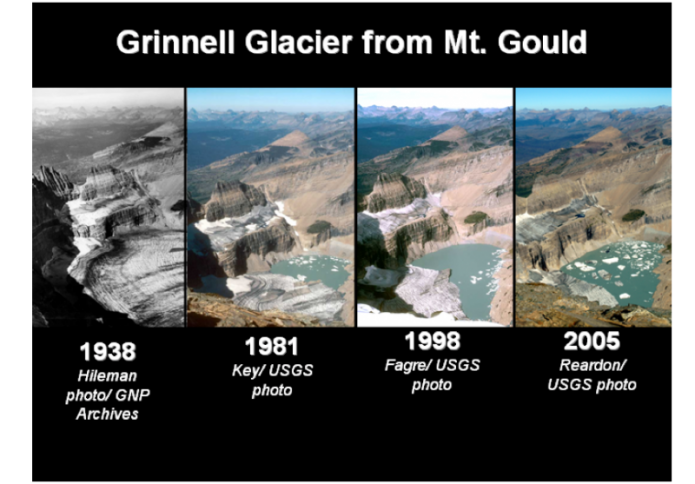
Grinnell Glacier, in Glacier National Park, Montana, as seen from the same vantage point over a 67 year period. The glaciers in this famous national park are all in such rapid retreat that the park may need a new name in a few decades.
Glaciers in the Alps are shrinking too. Check out SwissEduc Glaciers online [47] to see one good example — at the bottom of the page is a comparison that flips back and forth from the past to the present as you move your mouse over the image.
The same story as seen in Alaska, Montana, and the Alps holds for glaciers in more tropical settings, as can be seen from the images of Qori Kalas glacier in the Andes Mountains of Peru, below.
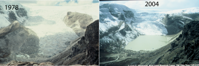
Studies of glaciers around the world show that an overwhelming majority are losing mass over time. In most cases, this loss of mass is reflected in the glaciers' retreating, so the length of the glacier becomes smaller. The figure below shows a selection of data from glaciers around the world, documenting this pattern of retreat.
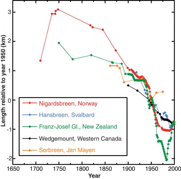
This image is a scatter plot showing the retreat of several glaciers over time, titled with the data points representing the length of glaciers relative to their 1950 positions. The glaciers tracked are from different regions, and the data spans from around 1650 to 2000.
- Graph Type: Scatter plot
- Y-Axis: Length relative to 1950 (km)
- Range: -2 km to 3 km
- X-Axis: Years (1650 to 2000)
- Data Representation:
- Nigardsbreen, Norway: Red line with dots
- Starts at 3 km in 1650, steadily decreases to around 0 km by 2000
- Hansbreen, Svalbard: Blue line with dots
- Starts at 1 km in 1900, decreases to around -1 km by 2000
- Franz-Josef Glacier, New Zealand: Green line with dots
- Starts at 0 km in 1900, fluctuates, and ends around -1 km by 2000
- Wedgemount, Western Canada: Black line with dots
- Starts at 0 km in 1900, decreases to around -1 km by 2000
- Sorbreen, Jan Mayen: Orange line with dots
- Starts at 0 km in 1900, decreases to around -1 km by 2000
- Nigardsbreen, Norway: Red line with dots
- Trend:
- All glaciers show a general retreat (negative length change) over time
- Nigardsbreen has the longest record and most significant retreat, losing about 3 km since 1650
The scatter plot illustrates a consistent retreat of glaciers across different regions over the past few centuries, with a notable acceleration in retreat since the 1900s.
The vast majority of glaciers on Earth are melting, and this melting began about the time that the temperature records indicate the beginning of warming, around the beginning of the 1900s.
If you combine the records of glacier length changes from around the world into one graph, we can get a pretty clear idea of what is happening.
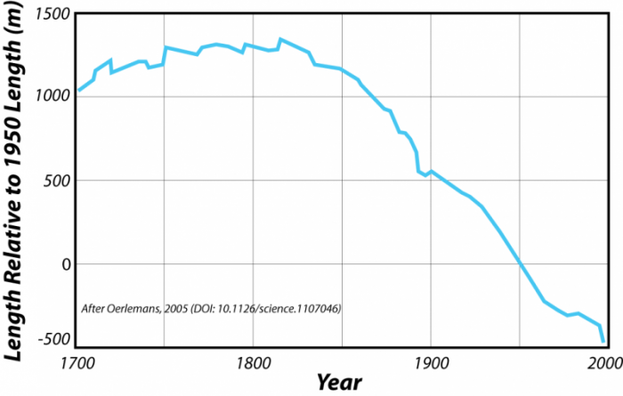
This image is a line graph showing the retreat of a glacier over time, with the data representing the glacier's length relative to its 1950 position. The graph is sourced from a study by Oerlemans (2005), published in Science (DOI: 10.1126/science.1107046).
- Graph Type: Line graph
- Y-Axis: Length relative to 1950 (meters)
- Range: -500 m to 1500 m
- X-Axis: Years (1700 to 2000)
- Data Representation:
- Glacier Length: Blue line
- Starts around 1200 m in 1700
- Remains relatively stable with minor fluctuations until around 1850
- Begins a steady decline after 1850
- Drops to around -500 m by 2000
- Glacier Length: Blue line
- Trend:
- Stable length from 1700 to 1850
- Significant retreat (about 1500 m) from 1850 to 2000
The graph illustrates a clear and consistent retreat of the glacier over the past 150 years, with the most significant length reduction occurring after 1850.
On the graph above, the y-axis plots the length of the glaciers relative to their length in 1950 — so this is a kind of length anomaly. A positive number means that on average, glaciers were longer than they were in 1950; negative numbers mean they were shorter. Here, we can see that beginning around 1850, glaciers around the world begin to shrink, and this trend continues to the present. The average glacier has retreated almost 2 kilometers in this time.
It is possible to estimate the magnitude and history of temperature change needed to produce this history of glacial retreat, and Oerlemans (2005) did this using a simple model; the results are shown below.
This image is a line graph showing global temperature anomalies from 1600 to 2000, derived from three different data sources: glacier records, multi-proxy reconstructions, and instrumental measurements. The anomalies are measured in degrees Celsius relative to a baseline.
- Graph Type: Line graph
- Y-Axis: Temperature anomaly (°C)
- Range: -0.4°C to 0.5°C
- X-Axis: Calendar years (1600 to 2000)
- Data Representation:
- Glaciers: Blue line
- Starts around -0.3°C in 1600
- Remains relatively stable with minor fluctuations until 1850
- Rises sharply after 1850, reaching about 0.4°C by 2000
- Multi-Proxy: Green line
- Starts around -0.2°C in 1600
- Shows more variability, with fluctuations between -0.3°C and 0.1°C until 1900
- Rises after 1900, reaching about 0.3°C by 2000
- Instrumental: Red line
- Starts around 1850 at 0°C
- Shows high variability, with peaks and dips
- Rises steadily after 1900, reaching about 0.4°C by 2000
- Glaciers: Blue line
- Trend:
- All three datasets show a general increase in temperature anomalies after 1850
- Glacier and instrumental data align closely in the 20th century, showing a sharp rise
The graph illustrates a significant warming trend in global temperatures since the mid-19th century, with all three data sources confirming a rise of about 0.4°C by the year 2000.
The thick blue line here is the temperature history needed to produce the timing and magnitude of the glacial retreat history shown in the previous figure. For comparison, we also see the instrumental temperature record in red (Jones and Moburg, 2003) and the temperature reconstruction based on multiple climate proxies (Mann et al., 1999). Note the excellent match with the instrumental record in the last century.
Greenland and Antarctic Ice Sheets
Greenland and Antarctic Ice Sheets
Just like their smaller counterparts, the huge ice sheets of Greenland and Antarctica are also shrinking. This is critical as melting of these ice sheets impacts climate through albedo feedback (Module 3) as well as global sea level (Module 10). Melting of all of the ice in these ice sheets would raise global sea level by about 70 meters (actually, Greenland would produce 6 meters and Antarctica about 60 meters). Don't worry, this isn’t going to happen any time soon, but the concern is that large glaciers on the edge of the continents are becoming increasingly unstable and will fail in coming years. The Thwaites glacier also known as the doomsday glacier is the one scientists are most concerned about. Collapse of this glacier could happen very rapidly and raise global sea level by 65 cm. We discuss this glacier in more detail in Module 10.
Given the remoteness and difficulty associated with studying these ice sheets, we only have good data on their size for the last decade, thanks to the advent of satellite systems that can monitor these glaciers. In particular, the GRACE satellite system has provided some very important data on the changes occurring in Greenland and Antarctica. This ingenious satellite system consists of a pair of satellites that are chasing each other in the same orbit around the Earth. The distance between the satellites changes according to subtle changes in gravity on the surface of Earth. As the lead satellite approaches a region of stronger gravity (due to more mass near the surface), it pulls away from the trailing satellite and then slows down as it passes the region of excess mass. In this way, the satellites can measure the subtle changes in gravity, and since the satellites pass over the same area every few days, they can detect changes in the gravity of a certain spot over time. If a big ice sheet loses mass due to melting, its gravitational effect on the satellites diminishes, and in this way, the satellites can detect the changes in the mass of these ice sheets — they are effectively “weighing” these glaciers, which is an extraordinary achievement. The results can be seen in the videos below. Note: videos do not have audio.
Video: Greenland Ice Loss as measured by GRACE and GRACE-FO (52 seconds) (No Audio)
Download simulation [49]
https://svs.gsfc.nasa.gov/31156
Video: Antarctic ice sheet mass loss with superimposed ice sheet velocity streamlines (52 seconds) (No Audio)
Download simulation [50]
https://svs.gsfc.nasa.gov/31158
These simulations above show the time series of Greenland and Antarctic ice mass changes from GRACE satellite data. You can see that melting is concentrated near the edges of the ice sheets and occurs in fits and starts (i.e., it is not gradual). The edges of the ice sheets, the ice shelves that float on the ocean, are holding the ice sheets back in a process known as buttressing. So once the ice shelves melt fast, this speeds up the melting of the edges of the ice sheet.
Other satellites passing over these ice sheets can measure the areas where surface melting produces small ponds of melt during the melting season. Much of the meltwater freezes back into the ice, but in some places near the edges of the ice sheets, the water sinks down into crevasses and travels all the way to the bottom of the ice, where it can lubricate the base and help accelerate the flow of the ice.
The above image shows the Greenland melt anomaly, measured as the difference between the number of days on which melting occurred in 2007 compared to the average annual melting days from 1988-2006. The areas with the highest amounts of additional melt days appear in red, and areas with below-average melt days appear in blue. Although faint streaks of blue appear along the coastlines, namely in northwestern and southeastern Greenland, red and orange predominate, especially in the south.
Video: Antarctic ice loss 2002-2016 (00:37) This video does not have audio.
The video below shows the dramatic loss of ice on Antarctica between 2002 and 2016. The loss is mostly around the edges of the continent and focused in a few areas.
Sea Ice
Sea Ice
One of the most striking examples of climate change is related to the Arctic sea ice; the video below shows the drastic changes in the extent of Arctic sea ice over the last 40 years. The ocean is now permanently open to shipping in the summer.
Video: Annual Arctic Sea Ice Minimum Area 1979-2023, With Graph (00:46) (No Narration)
The graph is titled "Annual Arctic Sea Ice Minimum Area" and displays the extent of Arctic sea ice at its annual minimum, measured in millions of square kilometers (km²), over a time period from 1975 to 2025.
- X-Axis (Time): The horizontal axis represents the years, ranging from 1975 to 2025, with major ticks marked at 5-year intervals (1975, 1980, 1985, etc.).
- Y-Axis (Sea Ice Area): The vertical axis represents the Arctic sea ice area in millions of km², ranging from 3 to 7 million km², with major ticks at intervals of 1 million km².
- Data Representation: The data is plotted as a red line with red dots at each yearly data point, showing the annual minimum sea ice area.
- Trend and Observations:
- In 1975, the sea ice area starts at around 7 million km².
- From 1975 to around 1995, the sea ice area fluctuates between approximately 6 and 7 million km², showing some variability but no clear long-term trend.
- Starting around 1995, a noticeable downward trend begins.
- By 2005, the sea ice area drops below 6 million km² and continues to decline with significant year-to-year variability.
- The decline becomes more pronounced after 2010, with several years dipping below 4 million km².
- By 2025, the sea ice area reaches its lowest point on the graph, around 3 million km².
- Overall Trend: The graph shows a clear long-term decline in the annual minimum Arctic sea ice area over the 50-year period, with a more rapid decrease occurring after the mid-1990s.
The graph visually emphasizes the significant reduction in Arctic sea ice over the past five decades, likely reflecting the impacts of global warming and climate change.
This visualization shows the age of the Arctic sea ice between 1979 and 2023. Younger sea ice, or first-year ice, is shown in a dark shade of blue, while the ice that is four years old or older is shown as white. The graph displayed quantifies the area covered sea ice 4 or more years old in millions of square kilometers.
The Arctic sea ice undergoes large fluctuations over the course of a year, and, like all aspects of the climate system, there is a good deal of natural variability. So, while one or two extreme years do not necessarily make a trend, they may be part of a trend. Visit NASA's Earth Observatory [53] to see a nice set of maps looking down on the North Pole showing the sea ice extent over the last 12 years; each map shows the long-term mean ice extent in a yellow line. One thing that becomes apparent is that there is much more variability in the end-of-summer minimum ice extent than the end-of-winter maximum; another thing that is apparent is that the reduction in Arctic sea ice is now a long term trend.
In the figure below, we see a summary of data on the ice extent, reported as an anomaly (departure from the mean), and it now becomes apparent that there has been a more or less steady decline since about 1970.
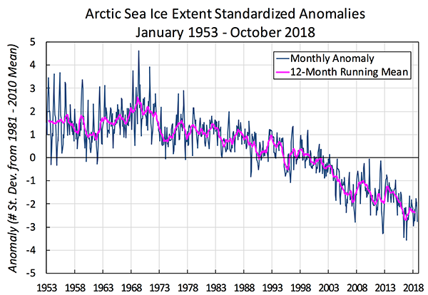
This image is a line graph titled "Arctic Sea Ice Extent Standardized Anomalies, January 1953 – October 2018." The graph shows the deviation of Arctic sea ice extent from the 1981–2010 mean, measured in standard deviations, over the specified period.
- Graph Type: Line graph
- Y-Axis: Anomaly (standard deviations from 1981–2010 mean)
- Range: -5 to 5 standard deviations
- X-Axis: Years (1953 to 2018)
- Data Representation:
- Monthly Anomaly: Blue line
- Shows high variability, fluctuating between -4 and 4 standard deviations
- Peaks around 1955 and 1975, dips significantly after 2000
- 12-Month Running Mean: Pink line
- Smoothed trend of the monthly data
- Starts around 0 in 1953, fluctuates slightly until 1980
- Shows a steady decline after 1980, reaching around -3 by 2018
- Monthly Anomaly: Blue line
- Trend:
- Early years (1953–1980): Fluctuations around the mean (0)
- Post-1980: Consistent decline in sea ice extent
- By 2018: Anomaly reaches approximately -3 standard deviations
The graph illustrates a significant and ongoing decline in Arctic sea ice extent since the 1980s, with the 12-month running mean showing a clear downward trend over the 65-year period.
In addition to the reduced area of coverage, the Arctic ice is also becoming thinner. The thickness of the ice in the Arctic has been monitored for a long time by the US Navy, using submarines. Now, satellites can measure ice thickness. The comparison below shows a 40% to 50% decrease in the thickness of ice from the average over 1958-1976 compared to the present.
| Thickness at: | 1958-1976 | 1993-1997 | 2003-2007 |
|---|---|---|---|
| Chukchi Cap | 1.9m | 1.0m | 0.7m |
| Beaufort Sea | 1.9m | 1.0m | 1.0m |
| Canada Basin | 3.4m | 2.1m | 1.7m |
| North Pole | 3.7m | 2.3m | 1.8m |
| Nansen Basin | 3.8m | 2.0m | 2.2m |
| Eastern Arctic | 3.3m | 1.3m | 1.2m |
This reduction in the coverage of Arctic sea ice is significant since it means that during the summer months when the sun is at its brightest in the polar region, and there are 24 hours of daylight, the reflective ice cover is being reduced, allowing for the absorption of a much greater quantity of solar energy that can then warm the whole polar region. This change in sea ice coverage is not just an Arctic phenomenon — in the Antarctic, the sea ice is also decreasing in area as the map below illustrates.
Finally, a word on sea level. The melting of ice sheets and mountain glaciers is partially responsible for a significant rise in sea level---20 cm in the last 100 years. However, thermal expansion of seawater as a result of warming is equally, if not more, important. Also, since sea ice is already at ocean level, its melting does not contribute to sea level rise.
Check Your Understanding
Hurricanes
Hurricanes
Like many Americans, I used to dream of owning coastal property. I have experienced hurricanes - I went to help friends recover from Andrew in Miami in 1992, and I lived through Hurricane Fran in NC in 1996, so I’ve seen the destruction they can cause. But I still maintained my dream. Every time I go to the beach, I pick up real estate brochures; on a cold, snowy weekend, I would look at coastal properties on Zillow. But my dream is being replaced by practicality. Coastal property is a risky investment in the 21st century! The research shows that fueled by increased heat from global warming, hurricanes are becoming stronger, slower moving and wetter, all recipes for increased devastation of coastal communities.
We are going to focus on storms from 2017, 2019, and 2020. We start by looking at the year 2017. Harvey, Irma, Maria, three massive hurricanes occurred in three weeks! The big question is whether 2017 was just an unusually active year, or if these monster storms are a new normal, the grand result of a warming planet.
Hurricane Harvey, August 2017
Each of these storms had some incredible elements. The eye of Harvey roared ashore in south Texas more than a hundred miles south of the booming metropolis of Houston, the fourth-largest city in the US with a population of close to 6 million people. The storm moved north towards the city and literally parked there for 4 or 5 days drawing moisture in from the warm Gulf of Mexico. By the time the storm moved on to the north, parts of Houston had received close to 52 inches of rain. Harvey dumped a grand total of 33 trillion gallons of water on Houston and points north, causing catastrophic flooding. Just for context, 33 trillion gallons would fill a cube with sides of 3 miles, it’s a massive amount of water! Several small creeks north of the city were over 19 feet over their banks. The storm was the single largest rain event in the lower 48 states of the US ever! The total damage, still rising as I write this, is estimated to be about $150 billion, again one of the largest ever catastrophes. Harvey caused 82 deaths in the US.
At the outset, Houston is a very flood-prone city. Houston lies on a flat plain near the ocean. The natural landscape is grassland that is drained by creeks called bayou. The city lies very close to the Gulf of Mexico, which gets very warm in the late summer, close to 87 degrees F! This warmth is transferred to the air keeping coastal areas warm and humid. The Gulf is an enormous heat and water factory. A key fact to understand is that for every one degree of temperature increase, an air mass can hold 3 % more moisture, so as the Gulf has warmed over recent years it contributes more energy and rain to hurricanes making them most intense and much wetter.
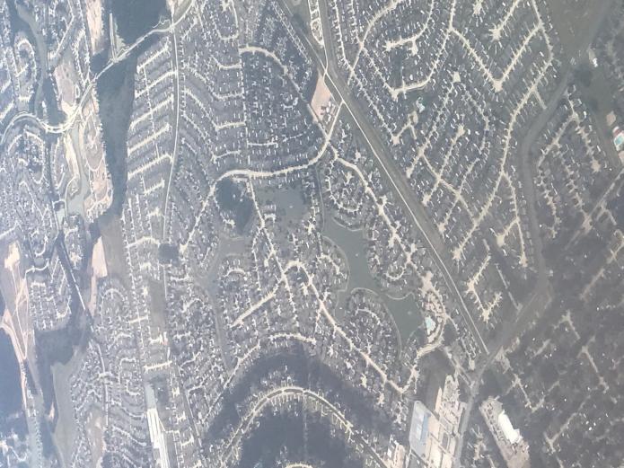
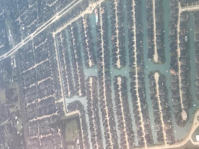
Houston might have been able to absorb this change in its natural state, but the city has grown very rapidly over the last two decades as industry has surged and jobs have been plentiful. The city prides itself on being business-friendly and as a result, it has no zoning, meaning that there are few limits on construction. A shopping mall or factory can be located right next to a housing development or a city park. As a result, the city has a massive amount of concrete, roads, parking lots, and rooftops with very little consideration paid to drainage. This contributed in a major way to flooding during Harvey as the photographs below testify. Harvey was a 1000-year event, meaning the levels of rainfall are only expected that rarely. But as it turns out, the storm was the third 500-year event in the last three years. So, it is clear that it is part of a new normal. After Harvey the city has started to make minor changes to the way it is developing requiring new homes in the floodplain to be built higher, but it still is resisting zoning measures that would keep homes out of flood-prone areas.
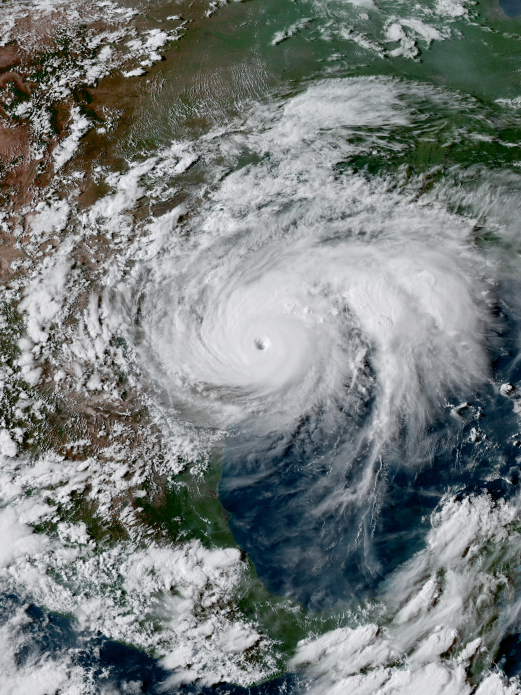
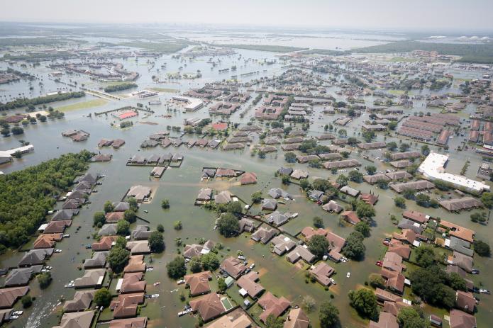
_(50).jpg)
Video: When the roads turned to rivers: Texas in the aftermath of Hurricane Harvey (11:38)
GLORIA ANDERS: It start thundering. And the lights like kind of flickered. Then the rain came. It was fine. It stopped. Saturday, the rain came. It start thundering and the lights, the lights went off.
MELVIN WOOLRIDGE: Forty-two years been living in Houston Texas, this is the worst that we have ever had on record. You know, whole city's under water.
TILFORD CURTIS: It was wild. It was like, I would think I wouldn't believe it till I seen it. When I seen all that water, you know what I'm saying. Oh sure. So you know the water was up here to me in my home. My neighbor was taller than me. So the water was up to his chest. So I had to tiptoe. I know, I know it flood out there, but when I seen it for myself and I had to get in the water, oh man, I was terrified. I was like, oh man they got snakes and stuff out there.
MARVA DANIELS: I really got frightened when the water came inside the house. And the water came all the way up to my knees.
GREG WHITE: I live right there. He just comes by and asks you if you need help.
HOWARD HARRIS: I live right there and the last time we flooded like this I went and bought this jon boat. And I'm like, if it ever happens again I'm going to have a boat here. If anybody needs anything I'll help them the best I can. I want everybody to be safe and be able to get out of the neighborhood and stuff, you know.
MAN: Don't wait on the help. We are the help.
WOMAN: Coordinate. Maybe one team go with these boats one team go with these boats. And another team go with these boats. That way we know medical training is in that area.
JOHN MCQUEEN: This is a chance for us to do some good. We will certainly give it a shot.
BEN THERIOT: We're heading over to try to head as far west as we can see if we can help people out. Man I flooded last year in 2016 in August and people came and helped me and it's a chance for me to give back.
BRYAN RAUBEND: You know we'll never forget, you know, when they came to our rescue basically. So we just want to help out in any way we can.
ANDRE MCDANIEL: I was able to take some time away from home. I've got an able body and some hands and my cousin's got a boat, and there's a lot of people that need help right now.
DYLAN GAUDET: We're going to help out as much as we can. We was in the flood last year. We know how it feels. So we're gonna give, help out as much as we can.
TIM ISOM: And it looks like we're headed towards a subdivision. There's an area where the roads are washed out. They're saying that they need some help.
WOMAN: You're in a situation like this, and myself, I can't swim. And when you're in a situation like this and you don't know what to do or where to run, that's hard. And some people you know, when they tell you to evacuate, do it.
MAN: Normally I'm fixing these things not riding in the bucket of it.
WOMAN: We just wanted to get out. It was just too much. No water. No lights. And we know that there's going to be another rainstorm coming in.
MAN: Hello.
MAN: We're going to come back by here in just a minute okay?
WOMAN:Just being there, seeing all of this and not being able to do anything, for anybody.
JENNIFER WADYKA: We're just helping people. These streets that are flooded. And we thought we saw a couple of people down here in boats. They looked like they need help. So we decided to come out here and help them. I've never seen nothing like this in my life. I wasn't here for any of the hurricanes or nothing like that. So this is craziness. A lot of sadness.
GABE VAUGHN: We just look for people on their porch waving. Or you try to find somebody who maybe who has help written on their door. Maybe a white towel hanging or something like that so that they can signal somebody that they need some help. Everybody wants to stay till it gets dark. And when it gets dark everybody wants to get out.
LEE WHEELER: I may not be in as good a shape as I used to be, but the least I can do to help.
KAREN MORENO: We lost everything. Everything.
JAMIE MORENO: Yeah my mom lost everything. So, it sucks.
MAN: OK, we've got room. We're coming to get you.
WOMAN: I'm worried, I ain't gonna have a place to lay down or nothin.
EAN DUPLANZAN: You'll have a place to lay down, I can take care of that. Look at me. Look at me. I can promise you that.
MAN: Search and rescue, anyone home? We are search and rescue, you all OK?
WOMAN: Yeah we're good.
MAN: If ya'll need to get out now's the time.
JAMAR CRISWELL: Wasn't no running water no electricity, so we started dipping buckets to flush toilets and stuff. I was ready to get out of here.
WOMAN: It had already gotten up to the furniture in the living room. And I'm sure that my bed and my television, all of this is gone.
MAN: Watch that curb guys, fire hydrant.
JAY DILLON: We were dispatched to a house on fire and was surrounded by three feet of water. The only thing we could do was connect a hose directly to the fire hydrant, which was underwater. We had a little bit of challenge finding the hydrant that was underwater. Once we were able to find the hydrant and connect to it we got our initial hose line on there and we basically just protected the exposure surrounding the house. It was burning. It was nearly fully involved when we arrived.
MAN: Fire, I mean they're keeping it off of the (inaudible), but we just don't have enough water pressure.
TWYLA LADAY: Everybody on the bottom floor were evacuated or they left, but we tried to stick it out on the second floor because we were on the second floor, but the water kept rising. So we had to get really just leave when the police officers came by.
GLORIA ANDERS: Just like that we went in and before we can do anything the water had already gushed into the house. And I said well y'all we can't stay here so. And it was coming up higher and higher. I lost everything, everything. I lost stove, refrigerator, food. We had just grocery shopped and just filled up the deep freezer for the month. And we lost everything.
MAN: Clothes, shoes, furniture. I gotta start all over again.
WOMAN: Our apartment, we had over six feet of water. My car, I lost it. This is a truck and this is my car here underwater.
WOMAN: I lost everything. And I was praying and hoping that it wasn't going to be this bad, but it was.
AMBREEN RAJAN: We opened the door and looked inside. It was all broken. The smell is really bad. It's really, really, really bad. I mean, I can't even breathe. I was about to throw up. A lot to clean up. The whole city is a mess right now. It's a mess.
YASMIN MEDRANO: I came inside and the first thing that I went to see my room. I was like, oh my room. It was the first one to get flooded, my room. The water started coming from my room first. So I went inside and it was still water in there. And I was like wow. And all my clothes they were just on the ground. My bed, it up to my bed. Everything got ruined. I was, I started crying because it was really bad.
AUSTIN FINEFROCK: The water damage, you can see the line. It was about two feet up in here. It happens. Stuff happens, you know, but everyone's all right, everyone's safe. You know my family's safe, my kid's safe. So we're just on to the next phase of what happened.
OPAL RODRIQUEZ: We care about each other. We love each other. And when things get hard, we all come out, hundreds and thousands, to help each other.
JAMES MCBRIDE: I'm 50 years old, and it's enough to make you cry. It's amazing to see. A lot of people come out and help those that are, that are in need. Had it not been for the volunteers, a lot of people probably would have lost their lives.
NATALIE MOTT: And we're going to get through this. We got through Katrina and we're going to get through any other storm, anything that comes our way.
LUIS CARTDENAS: I've lived here all my life. And with this disaster coming, it was just amazing how people have stepped out, you know, to help.
NOEL GEER: It's the best part of people. And it gives me hope for the future that, you know, people are able to come together for this and that we're more alike than we are different.
CJ BROWN: People coming down from Dallas, from Austin, and San Antonio, you know, just to, you know, spend their life to help us, you know, regroup, and you know get back on our feet again and start going.
ANDRE AZIZI: People care more than you think. And people are more resilient than you think.
Hurricane Irma, September 2017
Irma arose rapidly in the tropical Atlantic, and at one point it had sustained wind speeds of 185 mph. This storm intensified rapidly, which is a characteristic of a large hurricane, increasing by 45 mph in one day. hit the islands of Barbuda, Antigua, St Martin and St. Barthelemy and caused catastrophic damage in these locations. The island of Barbuda, in particular, was literally flattened. Irma next set her eyes on Cuba, where it came ashore as a magnitude 5 storm with sustained winds of 160 mph and a massive storm surge. The storm led to collapsed buildings and flooding of coastal areas including the historic Malecón in Havana. Fortunately, Cuban authorities had evacuated close to a million people from low-lying areas.
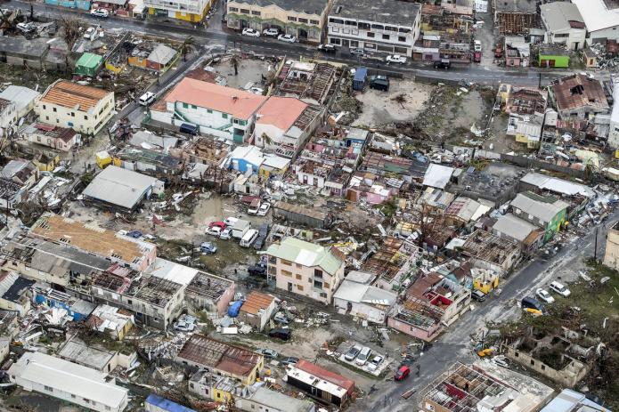
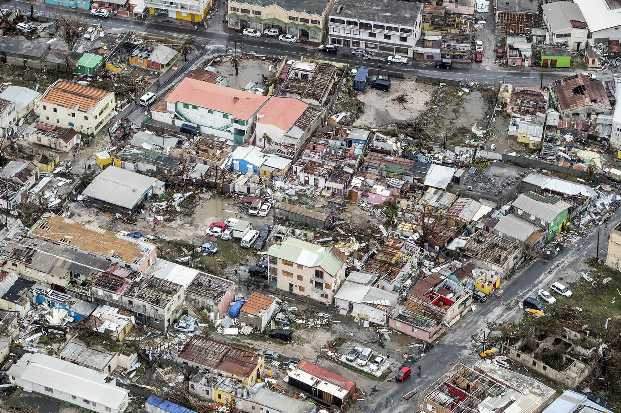
A few kilometers make a major difference in the history of a hurricane and the landfall in Cuba, which was not initially predicted, weakened the storm significantly. Initial forecasts were for Irma to come ashore near Miami with wind speeds near 155 mph, but the storm tracked a little further to the west and made landfall in the Florida Keys with maximum winds of 130 mph, then again in Marco Island on the west coast of Florida with winds of 115 mph. As it turns out, there have been far larger storms in Florida, including Hurricane Andrew in 1992, which flattened the Miami suburbs. But Irma was yet another reminder of how vulnerable the state is to storms. Much of the southern half of Florida is a natural swamp or marshland that originally looked like the Everglades National Park. But as in Houston, commercial interests, and in the case of Florida, the desire of citizens to own a small piece of paradise, have led to massive construction in the last decade, runaway development with insufficient environmental regulation. So, instead of swampland that served to absorb moisture and drain it back towards the ocean, large expanses of concrete funnel it into walls of water in cities and suburbs. Mangroves forest that previously protected the coast has been flattened. In fact, the Florida environment was destroyed a long time before this, as the Army Corps of Engineers modified the natural drainage to provide water for the sugar industry.
As it turns out, Irma was less of a wind event than a storm surge event. As a hurricane moves towards land, it pushes water ahead of it, literally a wall of water. The result is storm surge. Hurricane Katrina in 2005 was also a storm surge event, with a surge of 28 feet measured at Pass Christian, Mississippi, just outside of New Orleans, the largest surge ever measured in a US hurricane. New Orleans is at or even below sea level and its levee system, upgraded after Katrina, is designed to deal with surge, but still, it remains highly vulnerable. The surge from Irma was about 10 feet in the Keys and Marco Island, enough to cause significant damage. Nevertheless, the storm was generally viewed by experts as another wake-up call to what will likely happen in the future if a major storm with winds over 160 miles an hour and a 20-foot storm surge hits Miami or Tampa which is extremely flood-prone. In all, Irma caused over 100 fatalities, most of which were in the Caribbean.
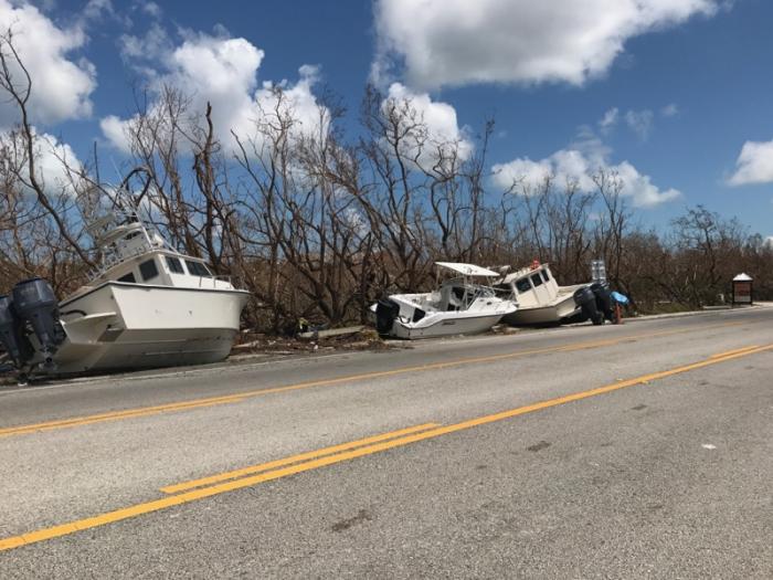
.jpg)
Hurricane Maria, September 2017
Barely a week later, monster storm Maria developed as Irma had…this storm also developed by rapid intensification with an increase in wind speed of over 60 mph in one day! By the time it hit Dominica, Maria had sustained winds of 160 mph and it caused utter devastation and killed 15 people, then it took aim at Puerto Rico. The storm hit the east coast of the island with sustained winds of 155 mph and dumped up to 3 feet of rain in mountainous areas. The impact on Puerto Rico is like the combined effect of Harvey in Houston and Irma in Barbuda. Maria caused massive destruction on the island. The power grid was destroyed leaving all 3.4 million residents without electricity. Many people had no running water for days, and sewers and cell phone networks were also out. Dams were in danger of breaching. 60,000 homes lost most or all of their roofs and only 392 out of 5000 miles of roads remained open. The storm defoliated a large number of trees on the island and led to the loss of 80 percent of the agriculture. The total damage is estimated at $90 billion, but that does not include the misery the storm caused humans. Diseases spread due to the lack of clean drinking water. The water-borne bacterial infection leptospirosis was widespread. Overall, the storm directly or indirectly led to as many as 3000 deaths but the true number may never be known, and, years later, the island is still recovering from the storm.
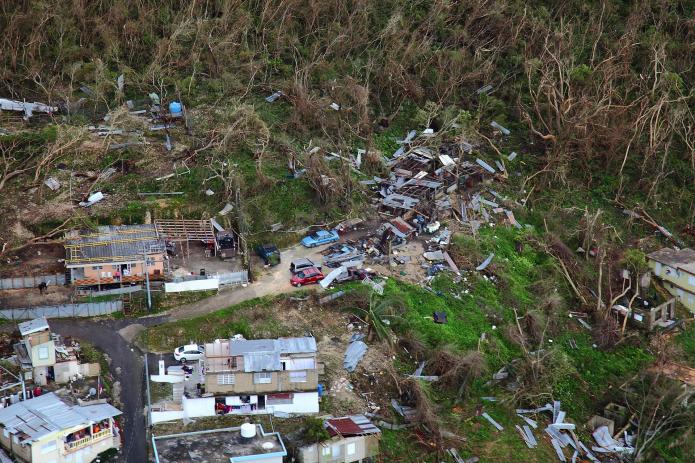
_170923-H-NI589-0007_(36602415074).jpg)
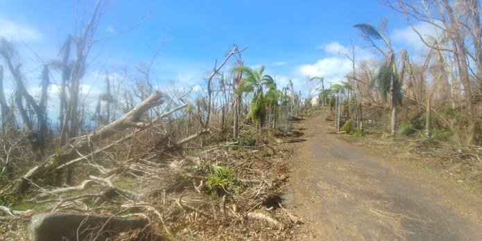
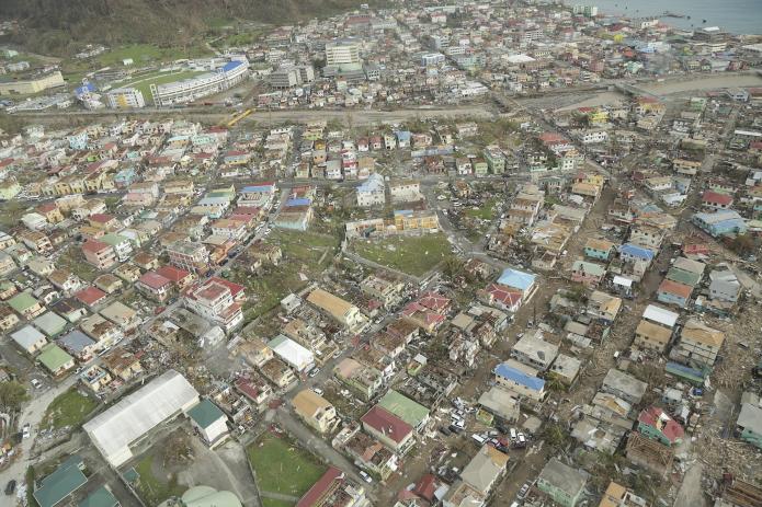
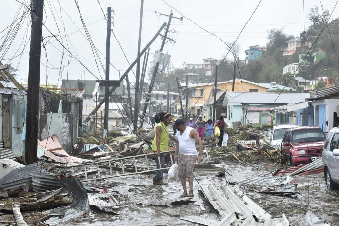
Hurricane Dorian, September 2019
None of these storms compared to Dorian that hammered the Bahamas in 2019. Dorian made landfall on September 1, 2019, on Grand Abaco Island with sustained winds of 185 mph and gusts over 220 mph making it one of the strongest storms on record in the Atlantic and Pacific.
Dorian was an unusual storm in several ways. The storm was enormous. Dorian was particularly deadly because the devastating winds were combined with an extremely slow forward motion of about 5 mph so that the storm ravaged the Bahamas for days. Devastating storms like Andrew and Katrina had much faster motion but the slow speed of Dorian made the damage much, much worse. After pummeling the Abacos, a group of islands in the northeast Bahamas, the storm went back over open water and made landfall without weakening on September 2 on Grand Bahama, the largest Bahama island, where it literally stalled for a day before weakening a little and moving back over open water. The damage to the Bahamas was truly catastrophic.
At landfall on the Abacos and again on Grand Bahama, Dorian’s intense winds were accompanied by a massive storm surge of about 6-9 meters (20-25 feet) and heavy rain. In total about a meter (3 feet) of rain fell over most of the northern Bahamas. There are harrowing tales of people clinging on to trees and other harrowing survival stories, but sadly many were not so fortunate. The official death toll from Dorian is 70 but is almost certainly much, much higher because there were many undocumented citizens living in shantytowns. Initially, there were over 1000 people missing, and now that number is around 300, so the death toll is likely to be 500-600. The true number may never be known.
Hurricane Ian, late September, 2022
Now to Hurricane Ian that hit southwest Florida in late September 2022. The storm was notable because of how rapidly it intensified, with windspeeds increasing from 75 mph to a 155 mph in just two days. The very large storm came ashore at Cayo Costa island just to the north of Fort Myers on September 28th 2022. Sustained windspeeds at landfall were 150 mph likely with higher gusts. It was the fifth strongest storm ever to hit the 50 contiguous states.
But the damage in southwest Florida was not just inflicted by the wind. Since the path of the storm closely paralleled the coast as it approached land, and because the highest surge is in the right front quadrant of the storm due to its counter-clockwise circulation, the storm surge over large areas was devastating.
The storm surge was between up to 15 feet above normal sea level along the barrier islands of Captiva, Sanibel and Fort Myers Beach. This wall of water caused massive devastation in these areas as observed in the photographs below.
Ian moved slowly to the northeast direction across the Florida peninsula and this slow path caused heavy rainfall over a wide area, with precipitation totals up to 17 inches over a 12-24 hour period. This rainfall caused widespread flooding well inland in places such as Orlando.
One of the main stories of the storm was prediction. The different forecast models agreed closely as the storm approached southwest Florida, but because the path was so close to parallel to the coast a small change led to a major difference in the landfall location. Two days out the path was more northerly with the eye forecasted to make landfall near Tampa, but then a day out a minor jog in the forecast to the east shifted the eye well south. This change led to some delays in evacuation in the Fort Myers area.
The storm caused massive damage over a widespread area with catastrophic damage to housing along the coast, especially in Fort Myers, Sanibel Captiva and Port Charlotte. More than 2.7 million people lost power at the height of the storm and a large number without clean water. Overall the storm led to 136 fatalities in Florida and a total of $50 billion in damage.
Hurricane Helene, September 2024
Hurricane Helene arose as a depression in the Caribbean. The storm rapidly intensified over the unusually warm Gulf of Mexico as it moved towards the Big Bend region of Florida where it made landfall on the evening of September 26, 2024, as a category 4 hurricane with sustained winds of 140 mph. The hurricane was also very large and had a high storm surge along a long area of the western Florida coastline from about 10 feet in the Big Bend to about 7 feet in the Tampa Bay region, causing extensive flooding along the whole coast.
Since the storm was moving so rapidly it maintained its strength inland and it was still a hurricane when it hit southern Georgia. Wind damage was severe well inland in both states.
Helene was still a tropical storm when it moved across northern Georgia near Atlanta, South Carolina near Greenville, and North Carolina near Asheville. In these regions, some damage was caused by wind, but most of it was done by water. A stalled frontal boundary had dumped up to 9 inches of rain over the mountains of western North Carolina before the storm arrived. The ground was therefore already saturated when the storm arrived, and this led to extensive tree damage from tropical-storm-force winds. Rainfall totals of up to 32 inches in the mountainous terrain caused many landslides and mudslides. The water rushed down the hillslopes causing rivers to rise rapidly, and overflow their banks leading to extensive flash flooding. River levels were at record levels, for example, the French Broad and Swannanoa rivers in Asheville were up to 5 feet above historic levels, breaking a record set in 1916. The results were absolutely catastrophic in Asheville and small mountain towns all over western South Carolina, North Carolina, and Tennessee. Extensive flash flooding swept away single-family homes and mobile homes, and flooded businesses.
The most dire result of Helene was loss of life. The storm was the most deadly since Hurricane Katrina with over 280 dead. Over 100 of these deaths occurred in western North Carolina, where many more are still missing at the time of writing. The storm was also the costliest since Katrina with estimates of over $50 billion with billions of dollars of uninsured flood damages.
Hurricanes and climate change
So, finally, we come back to the question of whether climate change is responsible for the surge in powerful hurricanes in 2017-2022. At the outset, we must stress that this question cannot be answered unequivocally. However, there are several factors that make it safe to say that large storms will be more common in the future and that they will cause increasing amounts of damage. To develop, storms need warm temperatures (over 80 degrees), abundant moisture, and circulation, as you can see in the video below.
Video: Fuel for the Storm (2:19)
As we will see in the lab at the end of this module, the ocean has warmed by 1 to 2 degrees C (3-4 degrees F) over the last century, and this leads to a 12-16 percent increase in moisture (3% per degree). Thus, there is a lot more fuel for hurricane development. The formation of hurricanes is also helped by weather disturbances often off West Africa, but there is not yet a relationship between these events and climate change.
In the case of Harvey, the volume of water is clearly a result of an extra warm ocean; for Irma and Maria, the ferocity of the winds and the rapid intensification is also related to water temperature. For Dorian, size and slow movement is a result of a warmer atmosphere. So, climate change is adding fuel to the fire for large hurricane development, and 2017 is a harbinger of things to come. There is one other factor to consider, perhaps one that will prove the most devastating in decades to come. Sea level rise. The ocean is now about a foot higher than it was in 1900. Projections are for a possible 6-foot rise in sea level by the end of this century if we don’t cut greenhouse gas levels significantly. We will discuss the issue of sea-level rise in great detail in Module 10. Such a rise would mean that even a storm such as Irma with a moderate storm surge would be catastrophic.
As with other impacts of climate change, the latest IPCC report stresses the need for adaptation to the threat of stronger hurricanes. Coastal communities will need to adapt to this threat by building homes higher and stronger, building sea walls and surge barriers, and gradually pulling back from the coast, an initiative called managed retreat. This is already happening near New York City and elsewhere in the US but again will be much more difficult to achieve in the developing world.
Severe Storms (not including Hurricanes)
Severe Storms (not including Hurricanes)
The night of December 10 and early morning of December 11, 2021 saw devastating tornadoes tear across the central US from Arkansas to Kentucky. Up to 71 different tornadoes have been confirmed rated up to EF-4 with wind speeds up to 190 miles per hour. The tornadoes caused massive damage totaling $3.9 billion, destroying whole communities, causing 88 fatalities and over 600 injured. 71 tornadoes have been confirmed. The worst damage was in the town of Mayfield, Kentucky, which was leveled by a strong EF-4 tornado. Much of the center of the town was irreparably damaged with houses and stores receiving devastating damage, 22 people died in that town alone. The tornado forecasts were generally highly accurate that night, but sadly, warnings weren’t always acted upon. What was particularly significant about the outbreak is how late in the season they occurred. Tornadoes in the central US are frequent in spring, when warm and cold air-masses collide over the region. It is very unusual for these strong storms to occur in the winter.
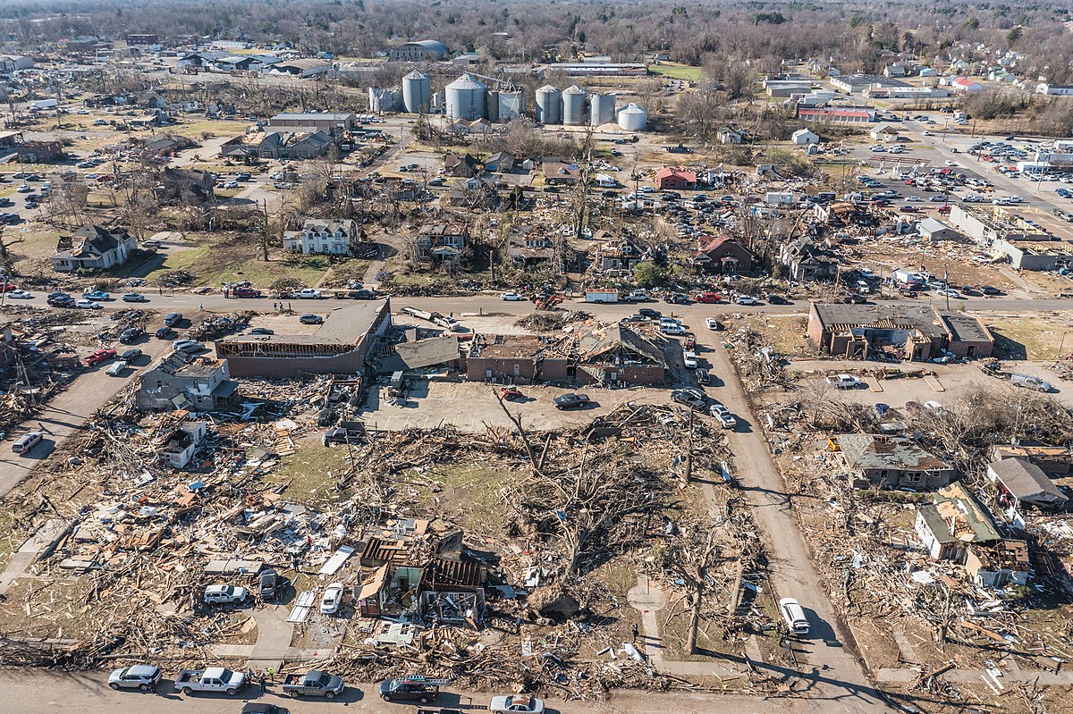
By studying the network of weather stations across the US, researchers have found a couple of interesting results — the biggest storms recorded in a given year not including tornadoes are increasing in strength, and the frequency of extreme storms is also increasing. In addition the area known as "tornado alley" where touch-downs are common is shifting eastward from Texas, Oklahoma and Kansas to Arkansas, Louisiana, Mississippi, Alabama and Tennessee.
In addition, the frequency of extreme storms is also increasing. An extreme storm is one where the rate of precipitation exceeds by a certain amount the long-term mean rate of precipitation for a given site (so an extreme storm in a wet region like the northeast US has a much higher precipitation rate than an extreme storm for a drier region). So, you might be asking yourselves whether these results translate into more frequent, massive tornadoes. This is a somewhat controversial topic. The consensus answer is that with a warmer atmosphere, tornadoes will definitely become more powerful (just like hurricanes), but the word is still out whether they will become more frequent. What is obvious from the December 2021 tornadoes is that these powerful weather systems will occur throughout the year in the future.
Check Your Understanding
Lab 2: Hurricanes
Lab 2: Hurricanes
Download this lab as a Word document: Lab 2: Hurricanes [94] (Please download required files below.)
In this lab, we will observe the tracks of the largest storms of the last century, and learn about the impacts of those storms on land.
The goals of the lab are:
- to determine the main causes of damage from storms including wind, rainfall and flooding, and storm surge;
- to observe the relationship between storm intensity and warming.
Files to Download:
- Hurricane Tracks [95]
- Temperature Anomalies [96]
Instructions
There are two Google Earth maps to load, the first, Hurricane Tracks kmz file [95], shows tracks of storms from 1900 to 2017. The second, Temperature Anomalies kmz file [96], shows average August temperatures for each year calculated relative to the average temperature between 1900 and 1910. You can switch back and forth between maps. Both maps have sliders at the top left of the screen that allow you to look at storms as well as temperature over time. The storm tracks have points that show the wind speed and pressure at different stages in its development. We definitely recommend that you don’t try to look at the storms all at once or you will see a maze of lines. Please make sure that the slider at the top left has the relevant range of dates on it. Otherwise, you will not be able to view tracks for the desired storm. Also, there are a few storms including Betsy whose names do not show unless you zoom in close. Note also, we break up the 2000-2010 and 2010-2017 decades.
As in the lab for Module 1, we begin with some practice questions that you can take in the Lab 2 practice submission, where you will receive the answers to the questions. Once you feel good about these questions, move on to the graded assignment. If you have any questions about the practice questions, please let us know. Remember, you only get one attempt at the graded assignment.
The video below will help you with operations in Google Earth. We HIGHLY recommend you watch it to learn exactly how to manipulate the files and use the historical imagery.
Video: Controls for Module 2 Lab (06:35)
TIM BRALOWER: Okay, students. So today I'm going to show you the controls for the module 2 lab. And I have two files that I've opened over here at the KMZ files - temperature anomalies and hurricane tracks, on the left side here. And I'm gonna start by showing you hurricane track controls. Click on the triangle to open up the different decades. These hurricanes are grouped by decades, and you can see here 2015's, which is 2015 to 2017. Here are my three recent hurricanes - Maria, Irma, and Harvey. And I'm gonna open these. And here you can see the tracks for these three storms - Harvey, Maria, and Irma. And why don't these all three occur? The problem is here I've got my historical imagery up on the left, which we're going to use for later on, and I'm gonna back this out a little bit, and I'm gonna go forward a little bit, and you can see them all come on. The problem was that I didn't have the right time window in my historical imagery. So if anything goes wrong with this lab, with the Google Earth buzzes lab, please look at your historical imagery to make sure you're in the right time window. Okay, so here I'm showing all data between 2014 and 2017.
Okay, so I'm going to start off by looking at meteorological data for Hurricane Harvey, for example, which will show you the sorts of controls you need. And I'm going to zoom in on the Texas coast, and you can see these points, which provide the actual data for landfall, and you can see this point here is Harvey 10, which is very close to the landfall. You click on the point, the wind speed is 115, the pressure is 938 millibars, and the precipitation is 60.6 inches. That is an example. So if I go back out aways again, and I look at Hurrican Irma when it came into Florida. Click on this point here, I get 95 miles per house wind speed, 938 pressure.
Okay, so that's the first control that you're gonna need to know how to do for the first part of the lab. And then we're going to start looking at historical imagery for the labs. This is a little bit more tricky. So let's say I'm gonna go to New Orleans. Let me go to North Claiborne Avenue in New Orleans, which is one of your locations. And I can't type. Claiborne. C L A B O U R NE Avenue in New Orleans. I'm gonna go search. Should take me right in there. Here we go. So in we go towards North Claiborne Avenue. Hope you don't get dizzy. And I'm gonna look at this general vicinity for the storm, which was called Katrina, most of you probably remember Hurricane Katrina. And this part of the lab is all about your historical imagery, which is up here. Okay, my historical imagery is on, and I can turn it off with this little globe here, it's actually a clock. So I'm turning it off, turning it on. Okay, so it's on/off. Sometimes I don't know which is which, but you just have to click back and forth. Now the critical thing here is, remember that you're looking in 2005, so you've got to arrange this historical imagery thing - slider not a thing - to show 2005 in detail. So here I am, I'm going to slide it back to start in 2005. Here it is. I'm going to slide this back a little bit further to 2008. You can see the images changing. I'm going to move this forward here to about 2005, beginning of 2005, and then I'm gonna press plus, plus, plus. And the critical thing is, this is showing you the date here, so as I run this back the way to control this is not with the arrows, but running them back like this. So here we are getting all the dates and I go 2007, 2006, and here I am 2005, November. And then we go November 10th, October 10th, oh that's 2006, I'm sorry. You just got to play with this, guys. So I'm going back further. Here is December, November, 2005. We're now in 2005. Here we are in early November. Sliding this further, October, late September. You can see a lot of damage. Early, late August, before the storm, and then here we are just after the storm is flooding. So my overarching direction is make sure that you have this in the right place using this using the controls on either end. But when you want to look in detail you have to be using this here, this control here, rather than the arrows because I spent a large amount of time using these arrows and fumbling around and not getting the resolution so that you can look at really fine changes over short time periods. So make sure you use the slider. Slide this along once you have the right time window. Okay? So that is historical imagery, which I think you'll really enjoy.
And now I'm going to zoom out and show you how to look at the temperature anomaly data. I'm just going to go out to Florida and come way out. And so I'm going to turn this image off here. And I'm gonna close my hurricane tracks. And now I'm going to open my temperature anomaly file. And this will allow you to look at changes in temperature over decades. So this is 1960 relative to 1900 to 1910. 1965 you can see things cooling and then warming up again. And what's critical is, if you're going to be looking at Katrina, 2005, you click in 2005 you can see it was a fairly warm year. And then if you want to look at 2017, you click in here. That's very straightforward. You're gonna be able to rotate the globe so you can see the temperature and the Eastern Equatorial Atlantic, where the storms originated. So that's basically the controls for the module 2 lab. Once again the historical imagery can be really tricky, but just spend some time and play with it. Make sure it's on. And I think you'll really enjoy the lab. So let us know if you have any questions and we'll talk to you later on.
Practice Questions
Part A. In the first part of the lab, we look at the tracks of hurricanes. You will need to look for the storm names. Load the name of the storm once you have found it and click on a point to find the wind speed and pressure. For certain storms, we will include the storm surge as well as the precipitation in areas near the landfall. You will also need to observe the elevation of areas close to the coast and look at historical imagery to determine the impact of the storm on coastal communities.
- What was the wind speed of Hurricane Gilbert just before US landfall (click on the point closest to land)?
- What was the strongest storm in the 1960s at US landfall based on wind speed?
- Observe the storm surge of Hurricane Rita at Gueydan, LA (10 feet) and from the elevation, which is the closest to the extent of inland flooding? (Make sure terrain is switched on to read elevations and run the cursor over the map to see how elevation changes around the location of interest).
A. About half of the town would be flooded
B. None of the town would be flooded
C. All of the town would be flooded - What is the percentage of rainfall from Hurricane Georges near landfall compared to the average annual rainfall of southern Alabama (60 inches)? Please give your answer as a percentage.
- Here we are going to look at historical imagery to answer questions about the impact of storms on urban areas and the landscape. We will look at the 2005 Hurricane Katrina and its impact on Gulfport Mississippi. Enter “Gulfport” in the search box and fly to an elevation between 2000 and 4000 feet above the city. Turn on the historical imagery (clock at top left) and go back and forth between July 2005 and August 29, 2005 (right after the storm) photos using the slider. You will need to click the + button on the slider to get that scale of time change. Answer the following questions:
- What is the yellow material in the streets and parking lots very close to the coast after the storm?
- What is missing from the marina after the storm after the storm? We are looking for single words so your answers can be one word.
- Look at the parking lot across the four-lane road from the harbor area, what are the white boxes? (Look at both photos.)
- Does it look like the neighborhoods a block away from the four-lane road are inhabited? Yes or No
Part B. In the second part of the lab, we will observe the change in temperatures of the Atlantic Ocean over the last century that is related to the generation of more powerful hurricanes. Load and turn on the temperature anomaly kmz. By pressing the year buttons on the left, you can observe the temperature anomalies in August every five years (from 1910 to 2000) and annually from (2000 to 2017) relative to the average temperature from 1900 to 1910 file.
Center the map over the Atlantic Ocean so you can see Africa as well as North America including the Gulf of Mexico. As we have learned, the warmer the temperature the more energy to fuel hurricanes as well as the ability to hold more moisture.
- Which is the warmest year in the central Atlantic Ocean between 1910 and 1950?
- Which of the following is a year that the Gulf of Mexico had the highest potential to fuel strong storms based on temperature?
A. 1965
B. 1975
C. 1985
D. 1995
E. 2005 -
Which year would temperatures in the Atlantic have been favorable for hurricane development?
A. 1960
B. 2017
C. 1990
D. 2000
E. 2007 -
What is the general trend for temperature change between 1900 and 2017?
A. Warming
B. Cooling
C. Stayed consistent -
Which decade would have been slow for hurricane generation in the Atlantic based on temperatures?
A. 2000-2010
B. 1990-2000
C. 1970-1980
Conclusions
Conclusions
In this module, we have covered a broad range of observations that are pertinent to recent climate change. Here is a quick recap:
Surface Temperature
Instrumental Record
This goes back to 1880; multiple analyses yield similar results, indicating a warming of about 1-1.5°C averaged over the globe in the past 150 years. The majority of the warming has occurred in the last 50 years. The map-view pattern reveals that the polar region of the Northern Hemisphere has warmed much more than other regions of the globe.
Satellite Measurements
Available for a much shorter time period, these results essentially confirm the analysis of the instrumental temperature record.
Ocean Warming
Sea surface temperature (SST) records from ships go back to 1850 and make up an important part of the data that provide global temperature estimates; these records are similar, though somewhat subdued in comparison to just land surface temperatures. The SST, though, represents just the skin of the oceans; to see deeper, we rely on measurements from a system of buoys that shows the oceans are slowly warming — only about 0.1 to 0.2 °C averaged over the globe during the past 50 years — but this is the temperature change in the whole upper 700 m of the oceans, which is a vast amount of water. So while the ocean has absorbed a huge amount of heat, its overall temperature has changed little.
Proxy Reconstructions
Through the use of multiple proxies, the average global temperature has been reconstructed about 2000 years into the past. These results indicate a Medieval Warm Period (AD 950 – 1250) that was almost as warm as today, and a Little Ice Age (AD 1350 - 1850) that was more than a degree colder than today, followed by the modern warming trend.
Borehole Reconstructions
The temperature versus depth measurements from boreholes preserve a smoothed record of the history of surface temperature change; global studies of these records provide a smoothed temperature history that goes back to the year 1500. This temperature history is in good agreement with the instrumental record.
Ice
Glacier Lengths
Mountain glaciers from around the world are shrinking; some at astounding rates. The history and magnitude of melting indicate a warming history that closely matches the results from the instrumental surface temperature record.
Ice Sheet Mass
Satellite data reveal the mass changes of the two large ice sheets; both are losing mass fast (2.3e15 kg of ice in 6 yr), contributing about 8 mm to sea level rise in this short period.
Arctic Sea Ice
Submarine sonar readings and satellite measurements show that the sea ice in the Arctic Ocean is declining in thickness and in areal extent, so much so that the Northwest Passage is now open for a month or two each summer.
Sea Level
Based on tide gauges, this record shows that sea level has risen about 20 cm in the past 100 years (2 mm/yr). This rise is a result of the melting of ice combined with the thermal expansion of the warmer ocean. Much more on this is Module 11.
After reviewing all of the data, here is what the leading scientific academies of the US, UK, Russia, China, France, Germany, Italy, Brazil, Japan, Canada, and India (the G8 climate change roundtable first held in Davos, Switzerland in 2005) jointly concluded:
Climate change is real. There will always be uncertainty in understanding a system as complex as the world’s climate. However, there is now strong evidence that significant global warming is occurring. The evidence comes from direct measurements, of rising surface air temperatures and subsurface ocean temperatures and from phenomena such as increases in average global sea levels, retreating glaciers, and changes to many physical and biological systems. This warming has already led to changes in the Earth's climate.
This is the consensus from leading scientists around the world, not politicians, journalists, or business people who may stand to gain financially from taking a stand on climate change. The motivation of these scientists is to understand what the data mean and to help the broader public understand the implications of the data. At the end of the day, the data tell us that the climate is changing; the real challenge before us lies in finding ways to respond to this change through some combination of taking steps to minimize the change and finding ways to adapt to the change.
Module Summary and Final Tasks
Module Summary and Final Tasks
End of Module Recap:
In this module, you should have mastered the following concepts:
- the difference between weather and climate; the importance of averaging over a long enough time period to remove the "noise" of weather;
- how temperature records are analyzed to reveal meaningful information about climate change;
- many different groups have used different approaches to estimate the history of global temperature, and they all reach similar conclusions — the Earth is warming;
- looking further back in time, we see that recent warming is unusually abrupt and is not part of a natural cycle — but natural variation in climate is important, and it is superimposed on the warming trend;
- virtually everything we can think of measuring that records the temperature at the surface and the near sub-surface tell us the same general story about the warming — there has been about 1.1°C warming over the past 70 or so years, with most of it in the last 50, and most of it concentrated in the high latitude regions of the Northern Hemisphere, where warming reduces the area and time period of coverage by snow and ice, and where, consequently, the snow-free ground absorbs much more solar energy;
- glaciers are shrinking around the globe, and the shrinking coincides in time with the warming trend seen in the instrumental temperature record. Arctic sea ice is also shrinking, and at an alarming rate. The big ice sheets of Greenland and Antarctica are also melting, contributing to sea level rise.
- sea level is on the rise during the same time period that the other records indicate warming. Seawater expands as it gets warmer, so it takes up more room, and so sea level must rise. Melting glaciers and ice sheets (but not sea ice) contribute to sea level rise as well.
- along with a warming climate comes increased water vapor in the atmosphere, which means more energy in the atmosphere, thus increasing the chances for extreme weather events; The evidence indicates that heat waves and extreme rainfall events are increasing along a trajectory that is similar to the surface temperature warming; in contrast, the total amount of precipitation does not appear to be changing in a significant way for the Earth as a whole (although various regions have been getting drier or wetter).
Assignments
You should have read the contents of this module carefully, completed and submitted any labs, the Yellowdig Entry and Reply and taken the Module Quiz. If you have not done so already, please do so before moving on to the next module. Incomplete assignments will negatively impact your final grade.
Lab
- Lab 2: Hurricanes