The NSDI Framework Introduction and Guide (FGDC, 1997, p. 19) points out that "elevation data are used in many different applications." Civilian applications include flood plain delineation, road planning and construction, drainage, runoff, and soil loss calculations, and cell tower placement, among many others. Elevation data are also used to depict the terrain surface by a variety of means, from contours to relief shading and three-dimensional perspective views.
The NSDI Framework calls for an "elevation matrix" for land surfaces. That is, the terrain is to be represented as a grid of elevation values. The spacing (or resolution) of the elevation grid may vary between areas of high and low relief (i.e., hilly and flat). Specifically, the Framework Introduction states that:
Elevation values will be collected at a post-spacing of 2 arc-seconds (approximately 47.4 meters at 40° latitude) or finer. In areas of low relief, a spacing of 1/2 arc-second (approximately 11.8 meters at 40° latitude) or finer will be sought (FGDC, 1997, p. 18).
The elevation theme also includes bathymetry--depths below water surfaces--for coastal zones and inland water bodies. Specifically,
For depths, the framework consists of soundings and a gridded bottom model. Water depth is determined relative to a specific vertical reference surface, usually derived from tidal observations. In the future, this vertical reference may be based on a global model of the geoid or the ellipsoid, which is the reference for expressing height measurements in the Global Positioning System (FGDC, 1997, p. 18).
USGS has lead responsibility for the elevation theme of the NSDI. Elevation is also a key component of USGS' National Map. The next sections consider how heights and depths are created, how they are represented in digital geographic data, and how they may be depicted cartographically.
8.2.1 Vector and Raster Approaches
The terms raster and vector were introduced back in Chapter 4 to denote two fundamentally different strategies for representing geographic phenomena. Both strategies involve simplifying the infinite complexity of the Earth's surface. As it relates to elevation data, the raster approach involves measuring elevation at a sample of locations that are evenly spaced. The vector approach, on the other hand, involves measuring the locations of a sample of elevations and depicting the surface with elevation contours.
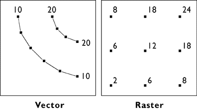
The illustration above compares how elevation data are represented in vector and raster data. On the left are elevation contours, a vector representation that is familiar to anyone who has used a USGS topographic map. Contours are a kind of isarithm, from the Greek words for "same" and "number." A contour line, then, is a line along with an elevation value (number) that remains equal (the same). There are many kinds of isarithm, with the variants reflecting the kind of thing depicted (an isobaths is a line of equal bathymetry, or depth under water; an isotherm is a line of equal temperature). Contours are one of the few isarithmic line types with a name that does not include “iso” as a prefix.
As you will see later in this chapter, when you explore Digital Line Graphs, elevations in vector data are encoded as attributes of line features. The distribution of locations with precisely specified elevations across the quadrangle is therefore irregular. Raster elevation data, by contrast, consist of grids at which elevation is encoded at regular intervals at each intersection. Raster elevation data are what is called for by the NSDI Framework and the USGS National Map. Contours can now be rendered easily from digital raster data. However, much of the raster elevation data used in the National Map was produced from digital vector contours and hydrography (streams and shorelines). For this reason, we will consider the vector approach to terrain representation first.
8.2.2 Contours
Drawing contour lines is a way to represent a terrain surface with a sample of elevations. Instead of measuring and depicting elevation at every point, you measure only along lines at which a series of imaginary horizontal planes slice through the terrain surface. The more imaginary planes, the more contours, and the more detail is captured with a smaller the contour interval (the magnitude of difference from one contour to the next).
Until photogrammetric methods came of age in the 1950s, topographers in the field sketched contours on the USGS 15-minute topographic quadrangle series. Since then, contours shown on most of the 7.5-minute quads were compiled from stereoscopic images of the terrain, as described in Chapter 7. Today computer programs draw contours automatically from the spot elevations that photogrammetrists compile stereoscopically.
Although it is uncommon to draw terrain elevation contours by hand these days, it is still worthwhile to know how to develop an understanding of how automated methods work and of the kinds of error they can produce. In the next few pages, you'll have a chance to practice the technique, which is analogous to the way computers do it.
8.2.3 Contouring by Hand
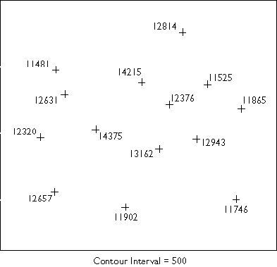
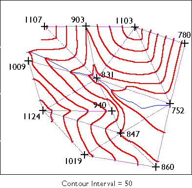
This page will walk you through a methodical approach to rendering contour lines from an array of spot elevations (Rabenhorst and McDermott, 1989). To get the most from this exercise, we suggest that you print the illustration in the attached image file. Find a pencil (preferably one with an eraser!) and a straightedge, and duplicate the steps illustrated below. A "Try This!" activity will follow this step-by-step introduction, providing you a chance to go solo.
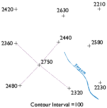
Starting at the highest elevation, draw straight lines to the nearest neighboring spot elevations. Once you have connected to all of the points that neighbor the highest point, begin again at the second highest elevation. (You will have to make some subjective decisions as to which points are "neighbors" and which are not.) Taking care not to draw triangles across the stream, continue until the surface is completely “triangulated,” where triangles connect any given three neighbors.
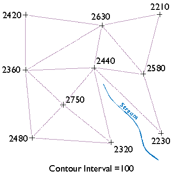
The result is a triangulated irregular network (TIN). A TIN is a vector representation of a continuous surface that consists entirely of triangular facets. The vertices of the triangles are spot elevations that may have been measured in the field by leveling, or in a photogrammetrist's workshop with a stereoplotter, or by other means. (Spot elevations produced photogrammetrically are called mass points.) A useful characteristic of TINs is that each triangular facet has a single slope degree and direction. With a little imagination and practice, you can visualize the underlying surface from the TIN even without drawing contours.
Wonder why we suggest that you not let triangle sides that make up the TIN cross the stream? Well, if you did, the stream would appear to run along the side of a hill, instead of down a valley as it should. In practice, spot elevations would always be measured at several points along the stream, and along ridges as well. Photogrammetrists refer to spot elevations collected along linear features as breaklines (Maune, 2007). We omitted breaklines from this example just to make a point.
You may notice that there is more than one correct way to draw the TIN. As you will see, deciding which spot elevations are "near neighbors" and which are not is subjective in some cases. Related to this element of subjectivity is the fact that the fidelity of a contour map depends in large part on the distribution of spot elevations on which it is based. In general, the density of spot elevations should be greater where terrain elevations vary greatly, and sparser where the terrain varies subtly. Similarly, the smaller the contour interval you intend to use, the more spot elevations you need. In the example below, we use a contour interval of 100.
There are algorithms for triangulating from irregular arrays of point elevations that produce unique solutions. One approach is called Delaunay Triangulation which, in one of its constrained forms, is useful for representing terrain surfaces. The distinguishing geometric characteristic of a Delaunay triangulation is that a circle surrounding each triangle side does not contain any other vertex.

Now, draw ticks to mark the points at which elevation contours intersect each triangle side. As noted above, we will use a contour interval of 100 feet in this example, with each contour line representing some increment of 100. For instance, see the triangle side that connects the spot elevations 2360 and 2480 in the lower left corner of the illustration above? One tick mark is drawn on the triangle where a contour representing elevation 2400 intersects. Now find the two spot elevations, 2480 and 2750, in the same lower left corner. Note that three tick marks are placed where contours representing elevations 2500, 2600, and 2700 intersect.
This step should remind you of the equal interval classification scheme you read about in Chapter 3. The right choice of contour interval depends on the goal of the mapping project. In general, contour intervals increase in proportion to the variability of the terrain surface. It should be noted that the assumption that elevations increase or decrease at a constant rate is not always correct, of course. We will consider that issue in more detail later.
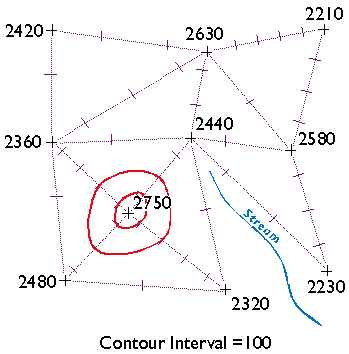
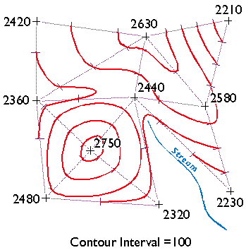
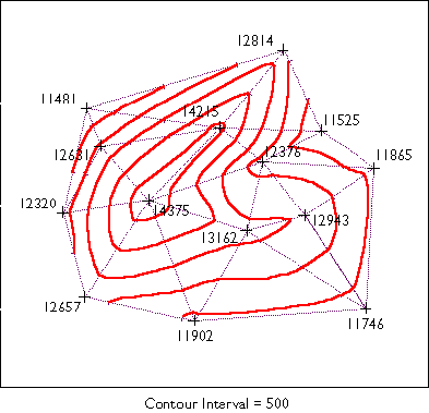
Finally, draw your contour lines. Working downslope from the highest elevation, thread contours through ticks of equal value. Move to the next highest elevation when the surface seems ambiguous.
Keep in mind the following characteristics of contour lines (Rabenhorst and McDermott, 1989):
- Contours should always point upstream in valleys.
- Contours should always point downridge along ridges.
- Adjacent contours should always be sequential or equivalent.
- Contours should never split into two.
- Contours should never cross or loop.
- Contours should never spiral.
- Contours should never stop in the middle of a map.
How does your finished map compare with the one we drew below?
Try This!
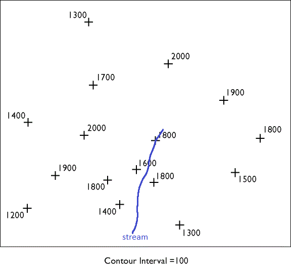
Now try your hand at contouring on your own. The purpose of this practice activity is to give you more experience in contouring terrain surfaces.
- First, view an image of an irregular array of 16 spot elevations.
- Print the image.
- Use the procedure outlined in this lesson to draw contour lines that represent the terrain surface that the spot elevations were sampled from. You may find this to be a moderately challenging task that takes about a half hour to do well. TIP: Label the tick marks to make it easier to connect them.
- When finished, compare your result to an existing map.
Here are a couple of somewhat simpler problems and solutions in case you need a little more practice.
You will be asked to demonstrate your contouring ability again in the Lesson 7 Quiz and in the final exam.
Kevin Sabo (personal communication, Winter 2002) remarked that "If you were unfortunate enough to be hand-contouring data in the 1960's and 70's, you may at least have had the aid of a Gerber Variable Scale. (See Joe Gerber's Pajamas) After hand contouring in Lesson 7, I sure wished I had my Gerber!"
8.2.4 Digital Line Graph (DLG)
Identification
Digital Line Graphs (DLGs) are vector representations of most of the features and attributes shown on USGS topographic maps. Individual feature sets (outlined in the table below) are encoded in separate digital files. DLGs exist at three scales: small (1:2,000,000), intermediate (1:100,000) and large (1:24,000). Large-scale DLGs are produced in tiles that correspond to the 7.5-minute topographic quadrangles from which they were derived (Digital Line Graphs).
|
Layer |
Features |
|---|---|
|
Public Land Survey System (PLSS) |
Township, range, and section lines |
|
Boundaries |
State, county, city, and other national and State lands such as forests and parks |
|
Transportation |
Roads and trails, railroads, pipelines and transmission lines |
|
Hydrography |
Flowing water, standing water, and wetlands |
|
Hypsography |
Contours and supplementary spot elevations |
|
Non-vegetative features |
Glacial moraine, lava, sand, and gravel |
|
Survey control and markers |
Horizontal and vertical monuments (third order or better) |
|
Man-made features |
Cultural features, such as building, not collected in other data categories |
|
Woods, scrub, orchards, and vineyards |
Vegetative surface cover |
Table 8.2. Layers and contents of large-scale Digital Line Graph files. Not all layers available for all quadrangles. Credit: USGS, 2006.
Data quality
Like other USGS data products, DLGs conform to National Map Accuracy Standards. In addition, however, DLGs are tested for the logical consistency of the topological relationships among data elements. Similar to the Census Bureau's TIGER/Line, line segments in DLGs must begin and end at point features (nodes), and line segments must be bounded on both sides by area features (polygons).
Spatial Reference Information
DLGs are heterogenous in terms of the projection they are based upon. Some use UTM coordinates, others State Plane Coordinates. Some are based on NAD 27, others on NAD 83. Elevations are referenced either to NGVD 29 or NAVD 88 (USGS, 2006a).
Entities and attributes
The basic elements of DLG files are nodes (positions), line segments that connect two nodes, and areas formed by three or more line segments. Each node, line segment, and area is associated with two-part integer attribute codes. For example, a line segment associated with the attribute code "050 0412" represents a hydrographic feature (050), specifically, a stream (0412).
Distribution
Not all DLG layers are available for all areas at all three scales. Coverage is complete at 1:2,000,000. At the intermediate scale, 1:100,000 (30 minutes by 60 minutes), all hydrography and transportation files are available for the entire United States. At 1:24,000 (7.5 minutes by 7.5 minutes), coverage remains spotty. The files are in the public domain, and can be used for any purpose without restriction.
Large- and Intermediate- scale DLGs are available for download through EarthExplorer system (EarthExplorer). You can plot 1:2,000,000 DLGs on-line at the USGS' National Atlas of the United States (National Atlas).
Digital Line Graph Hypsography
In one sense, DLGs are as much "legacy" data as the out-of-date topographic maps from which they were produced. Still, DLG data serve as primary or secondary sources for several themes in the USGS National Map, including hydrography, boundaries, and transportation. DLG hypsography data are not included in the National Map, however. It is assumed that GIS users can generate elevation contours as needed from DEMs.
Hypsography refers to the measurement and depiction of the terrain surface, specifically with contour lines. Several different methods have been used to produce DLG hypsography layers, including:
- scanning contour lines on photographic film or paper maps, converting the scanned raster data to vectors, then editing and attributing the vector features;
- manually digitizing and attributing contour lines on photographic film or paper maps;
- producing contours by photogrammetric processes; and
- deriving contours from LiDAR (discussed later in section 8.2.8).
Try This!
Exploring DLGs with Global Mapper (dlgv32 Pro)
Now I'd like you to use Global Mapper (or dlgv32 Pro) software to investigate the characteristics of the hypsography layer of a USGS Digital Line Graph (DLG). The instructions below assume that you have already installed software on your computer. (If you haven't, return to installation instructions presented earlier in Chapter 6). First you'll download and a sample DLG file. In a following activity, you'll have a chance to find and download DLG data for your area.
- If you haven't done so already, create a directory called "USGS Data" on your hard disk, where you file your course materials.
- Next, Download the DLG.zip data archive. The ZIP archive is 1.2 Mb in size and will take approximately 15 seconds to download via high speed DSL or cable, or about 4 minutes and 15 seconds minutes via 56 Kbps modem.
- Now decompress the archive into a directory on your hard disk.
- Open the archive DLG.zip.
- Create a subdirectory called "DLG" within the directory in which you save data for this class.
- Extract all files in the ZIP archive into your new subdirectory.
The end result will be five subdirectories, each of which includes the data files that make up a DLG "layer," along with a master directory.
- Launch Global Mapper or dlgv32 Pro.
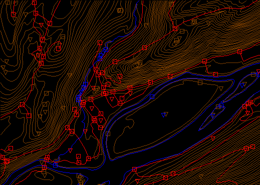
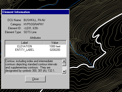
- Open a Digital Line Graph by choosing File > Open as New..., then navigate to the directory "DLG/Hypso." Open the file 'Hp01catd.ddf' (you can open up to four files at once in the trial version of Global Mapper). The data correspond with the 7.5 minute quadrangle for Bushkill, PA. The file is encoded in Spatial Data Transfer Standard (SDTS) format. For information about SDTS, see the SDTS Tutorial (PDF format).
- Global Mapper may ask you to direct it to a 'Master Data Dictionary' file. If so, navigate to, and select, the file 'Dlg/MasterDlg/Dlg3mdir.ddf'.
- Experiment with Global Mapper's tools. Use Zoom and Pan to magnify and scroll across the DLG. The Full View button (the one with the house icon) refreshes the initial full view of the data set.
- TheFeature Info tool allows you to query the attributes of a particular feature. Try clicking a single line segment. Note that you can display the attributes of a feature in the lower left portion of the application window by simply hovering over the feature.
- The Measure tool (ruler icon) allows you to not only measure distance as the crow flies, but also to see the area enclosed by a series of line segments drawn by repeated mouse clicks. Note again the location information that is given to you near the bottom of the application window.
- Certain tools, e.g., the 3D Path Profile/Line of Sight tool (next to the Feature Info tool) are not functional in the free (unregistered) version of Global Mapper.
- The trial version of Global Mapper allows you to open and view up to four files at once. You might find it interesting to open and compare the Bushkill DLG hypsography file and the corresponding DRG you viewed in Lesson 6. Note that you can turn layers on and off, and even adjust their transparency at Tools > Control Center. How do the contours in the DLG compare with those in the DRG? What explains the difference?
- Global Mapper provides the metadata you'll need to answer questions in a practice quiz. To access the metadata, navigate to Tools > Control Center, then click the Metadata button.
Practice Quiz
Registered Penn State students should return now to Canvas to take a self-assessment quiz about Elevation: Vector-Raster, Contours, and DLGs.
You may take practice quizzes as many times as you wish. They are not scored and do not affect your grade in any way.
8.2.5 Digital Elevation Model (DEM)
The term "Digital Elevation Model" has both generic and specific meanings. Generically, a DEM is any raster representation of a terrain surface. Specifically, in relation to the NSDI, a DEM is a data product of the U.S. Geological Survey. Here we consider the characteristics of DEMs produced by the USGS. Later in this chapter, we'll consider sources of global terrain data.
Identification
USGS DEMs are raster grids of elevation values that are arrayed in series of south-north profiles. Like other USGS data, DEMs were produced originally in tiles that correspond to topographic quadrangles. Large scale (7.5-minute and 15-minute), intermediate scale (30 minute), and small scale (1 degree) series were produced for the entire United States. The resolution of a DEM is a function of the east-west spacing of the profiles and the south-north spacing of elevation points within each profile.
DEMs corresponding to 7.5-minute quadrangles are available at 10-meter resolution for much, but not all, of the United States. Coverage is complete at 30-meter resolution. In these large scale DEMs, elevation profiles are aligned parallel to the central meridian of the local UTM zone, as shown in Figure 8.19, below. See how the DEM tile in the illustration below appears to be tilted? This is because the corner points are defined in unprojected geographic coordinates that correspond to the corner points of a USGS quadrangle. The farther the quadrangle is from the central meridian of the UTM zone, the more it is tilted.
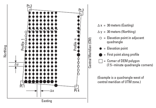
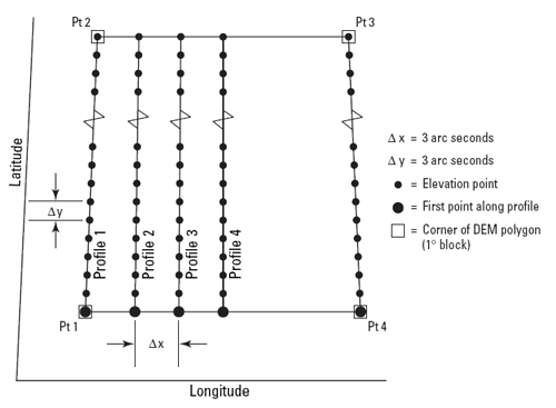
As shown below, the arrangement of the elevation profiles is different in intermediate- and small-scale DEMs. Like meridians in the northern hemisphere, the profiles in 30-minute and 1-degree DEMs converge toward the North Pole. For this reason, the resolution of intermediate- and small-scale DEMs (that is to say, the spacing of the elevation values) is expressed differently than for large-scale DEMs. The resolution of 30-minute DEMs is said to be 2 arc seconds and 1-degree DEMs are 3 arc seconds. Since an arc second is 1/3600 of a degree, elevation values in a 3 arc second DEM are spaced 1/1200 degree apart, representing a grid cell about 66 meters "wide" by 93 meters "tall" at 45º latitude (the width expands to over 80 meters in the southern US).
DEMs are produced from a wide range of sources, using the highest quality date available for each location. The sources in order of descending priority are:
- High-resolution data, typically derived from lidar or digital photogrammetry, and often with edited water bodies. If collected at a ground sample distance no coarser than 5 meters, such data may also be offered within the NED at a resolution of 1/9th arc-second.
- Moderate-resolution data, other than that compiled from cartographic contours. These data may also be derived from lidar or digital photogrammetry, or less often by Interferometric Synthetic Aperture Radar IFSAR. A typical ground sample distance is 10 meters, though it is commonly called “1/3 arc-second data”.
- 10-meter DEMs derived from cartographic contours and mapped hydrography. Most often, such data are produced by or for the USGS as a standard elevation product, and they currently account for the bulk of the NED.
- 30-meter cartographically derived DEMs. Similar in most respects to their 10-meter counterparts, though usually of lower overall quality.
- 30-meter photogrammetrically derived DEMs. These are the oldest DEMs in the 7.5-minute series. These data were derived directly from stereo photography, either by a human operator or by an early form of electronic image correlation. They are badly marred by production artifacts that are addressed to the greatest practical extent by digital filtering within the NED production process.
- 2-arc-second DEMs are a standard USGS product. They are derived from cartographic contours at a scale of 1:63,360 over the state of Alaska, and a scale of 1:100,000 elsewhere.
- 1-arc-second Shuttle Radar Topography Mission (SRTM) data, to date, are only used in preference to 3 arc-second data in the Aleutian Islands.
- 3-arc-second DEMs are another standard USGS product and are generally only used within the NED as a source of fill values over large water bodies.
The list above comes from the NED FAQ site
Some older DEMs were produced from elevation contours digitized from paper maps or during photogrammetric processing, then smoothed to filter out errors. Others were produced photogrammtrically from aerial photographs.
Data quality
The vertical accuracy of DEMs is expressed as the root mean square error (RMSE) of a sample of at least 28 elevation points. The target accuracy for large-scale DEMs is seven meters; 15 meters is the maximum error allowed.
Spatial Reference Information
Like DLGs, USGS DEMs are heterogeneous in terms of their relationship to position on the Earth. They are cast on the Universal Transverse Mercator projection used in the local UTM zone. Some DEMs are based upon the North American Datum of 1983, others on NAD 27. Elevations in some DEMs are referenced to either NGVD 29 or NAVD 88.
Entities and attributes
Each record in a DEM is a profile of elevation points. Records include the UTM coordinates of the starting point, the number of elevation points that follow in the profile, and the elevation values that make up the profile. Other than the starting point, the positions of the other elevation points need not be encoded, since their spacing is defined. (Later in this lesson, you'll download a sample USGS DEM file. Try opening it in a text editor to see what we are talking about.)
Distribution
DEM tiles (subregions divided into areas for easier download) are available for free download through many state and regional clearinghouses. You can find these sources by searching GeoData.Gov.
As part of its National Map initiative, the USGS has developed a "seamless" National Elevation Dataset that is derived from DEMs, among other sources. NED data are available at three resolutions: 1 arc second (approximately 30 meters), 1/3 arc second (approximately 10 meters), and 1/9 arc second (approximately 3 meters). Coverage ranges from complete at 1 arc second to extremely sparse at 1/9 arc second. An extensive FAQ on NED data is published at: NED FAQ. The second of the two following activities involves downloading NED data and viewing it in Global Mapper.
8.2.6 Interpolation
When DEMs are derived from contours and when other surface representations (e.g., see bathemitry mapping below) are derived from sample data at points, the process used is interpolation. In general, interpolation is the process of estimating an unknown value from neighboring known values. It is a process used to create gridded surfaces for many kinds of data, not just elevation (an example will be shown below).
The elevation points in DLG hypsography files are not regularly spaced. DEMs need to be regularly spaced to support the slope, gradient, and volume calculations they are often used for. Grid point elevations must be interpolated from neighboring elevation points. In Figure 8.22, below, for example, the gridded elevations shown in purple were interpolated from the irregularly spaced spot elevations shown in red.
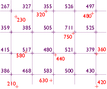
Elevation data are often not measured at evenly-spaced locations. Photogrammetrists typically take more measurements where the terrain varies the most. They refer to the dense clusters of measurements they take as "mass points." Topographic maps (and their derivatives, DLGs) are another rich source of elevation data. Elevations can be measured from contour lines, but obviously contours do not form evenly-spaced grids. Both photogrammetry and topographic maps give rise to the need for interpolation.
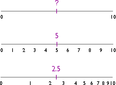
The illustration above shows three number lines, each of which ranges in value from 0 to 10. If you were asked to interpolate the value of the tick mark labeled "?" on the top number line, what would you guess? An estimate of "5" is reasonable, provided that the values between 0 and 10 increase at a constant rate. If the values increase at a geometric rate, the actual value of "?" could be quite different, as illustrated in the bottom number line. The validity of an interpolated value depends, therefore, on the validity of our assumptions about the nature of the underlying surface.
As was mentioned in Chapter 1, the surface of the Earth is characterized by a property called spatial dependence. Nearby locations are more likely to have similar elevations than are distant locations. Spatial dependence allows us to assume that it is valid to estimate elevation values by interpolation.
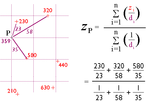
Many interpolation algorithms have been developed. One of the simplest and most widely used (although often not the best) is the inverse distance weighted algorithm. Thanks to the property of spatial dependence, we can assume that estimated elevations are more similar to nearby elevations than to distant elevations. The inverse distance weighted algorithm estimates the value z of a point P as a function of the z-values of the nearest n points. The more distant a point, the less it influences the estimate.
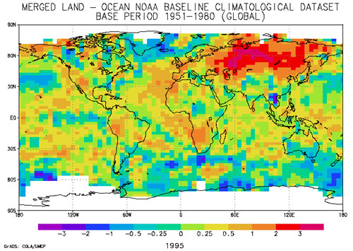
As indicated above, interpolation is used for many kinds of data beyond elevation. One example is to generate a temperature estimate from sample values at weather stations. The map below shows how 1995 average surface air temperature differed from the average temperature over a 30-year baseline period (1951-1980). The temperature anomalies are depicted for grid cells that cover 3° longitude by 2.5° latitude.
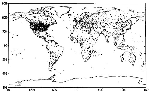
The gridded data shown above were estimated via interpolation from the temperature records associated with the very irregular array of 3,467 locations pinpointed in the map below.
8.2.7 Slope
Slope is a measure of change in elevation. If you have ever ridden a bike up a hill, you have an understanding of slope. Slope is also a crucial parameter in several well-known predictive models used for environmental management, including the Universal Soil Loss Equation (that deal with soil erosion driven by water, which moves faster with steeper slope) as well as for agricultural non-point source pollution models (that deal with agricultural run-off, which is also obviously influenced by slope).
One way to express slope is as a percentage. To calculate percent slope, divide the difference between the elevations of two points by the distance between them, then multiply the quotient by 100. The difference in elevation between points is called the rise. The distance between the points is called the run. Thus, percent slope equals (rise / run) x 100.
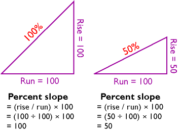
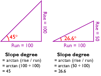
Another way to express slope is as a slope angle, or degree of slope. As shown below, if you visualize rise and run as sides of a right triangle, then the degree of slope is the angle opposite the rise. Since degree of slope is equal to the tangent of the fraction rise/run, it can be calculated as the arctangent of rise/run.
You can calculate slope on a contour map by analyzing the spacing of the contours (relatively, on any contour map, the slope is steepest in locations where contour lines are most closely spaced). If you have many slope values to calculate, however, you will want to automate the process. It turns out that slope calculations are much easier for gridded elevation data than for vector data, since elevations are more or less equally spaced in raster grids.
Several algorithms have been developed to calculate percent slope and degree of slope. The simplest and most common is called the neighborhood method. The neighborhood method calculates the slope at one grid point by comparing the elevations of the eight grid points that surround it.
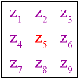
The neighborhood algorithm estimates percent slope at grid cell 5 (Z5) as the sum of the absolute values of east-west slope and north-south slope, and multiplying the sum by 100. The diagram below illustrates how east-west slope and north-south slope are calculated. Essentially, east-west slope is estimated as the difference between the sums of the elevations in the first and third columns of the 3 x 3 matrix. Similarly, north-south slope is the difference between the sums of elevations in the first and third rows (note that in each case the middle value is weighted by a factor of two).
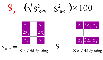
The neighborhood algorithm calculates slope for every cell in an elevation grid by analyzing each 3 x 3 neighborhood. Percent slope can be converted to slope degree later. The result is a grid of slope values suitable for use in various soil loss and hydrologic models.
Practice Quiz
Registered Penn State students should return now to Canvas to take a self-assessment quiz about Slope.
You may take practice quizzes as many times as you wish. They are not scored and do not affect your grade in any way.
8.2.8 Relief Shading
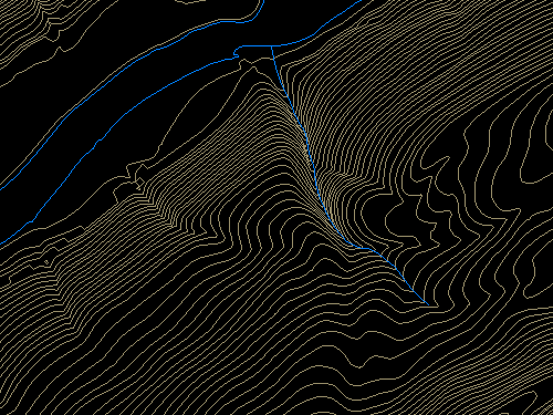
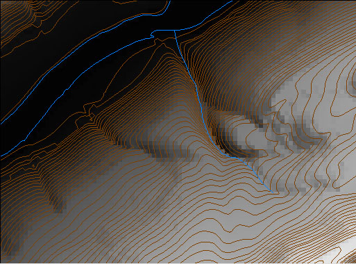
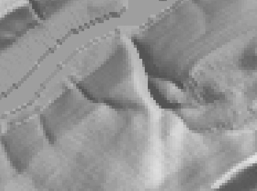
You can see individual pixels in the zoomed image of a 7.5-minute DEM below. We used dlgv32 Pro's "Gradient Shader" to produce the image. Each pixel represents one elevation point. The pixels are shaded through 256 levels of gray. Dark pixels represent low elevations, light pixels represent high ones.

It's also possible to assign gray values to pixels in ways that make it appear that the DEM is illuminated from above. The image below, which shows the same portion of the Bushkill DEM as the image above, illustrates the effect, which is called shaded relief (also referred to as terrain shading or hill shading).
The appearance of a shaded terrain image depends on several parameters, including vertical exaggeration. Click the buttons under the image below to compare the four terrain images of North America shown below, in which elevations are exaggerated 5 times, 10 times, 20 times, and 40 times respectively. (You will need to have the Adobe Flash player installed in order to complete this exercise. If you do not already have the Flash player, you can download it for free from Adobe.)
Another influential parameter for hill shading is the angle of illumination. Click the buttons to compare terrain images that have been illuminated from the northeast, southeast, southwest, and northwest. Does the terrain appear to be inverted in one or more of the images? To minimize the possibility of terrain inversion (where hills look like valleys and the reverse), it is conventional to illuminate terrain from the northwest.
8.2.9 LIDAR
For many applications, 30-meter DEMs whose vertical accuracy is measured in meters are simply not detailed enough. Greater accuracy and higher horizontal resolution can be produced by photogrammetric methods, but precise photogrammetry is often too time-consuming and expensive for extensive areas. Lidar is a digital remote sensing technique that provides an attractive alternative.
Lidar stands for LIght Detection And Ranging. Like radar (RAdio Detecting And Ranging), lidar instruments transmit and receive energy pulses, and enable distance measurement by keeping track of the time elapsed between transmission and reception. Instead of radio waves, however, lidar instruments emit laser light (laser stands for Light Amplifications by Stimulated Emission of Radiation).
Lidar instruments are typically mounted in low altitude aircraft. They emit up to 5,000 laser pulses per second, across a ground swath some 600 meters wide (about 2,000 feet). The ground surface, vegetation canopy, or other obstacles reflect the pulses, and the instrument's receiver detects some of the backscatter. Lidar mapping missions rely upon GPS to record the position of the aircraft, and upon inertial navigation instruments (gyroscopes that detect an aircraft's pitch, yaw, and roll) to keep track of the system's orientation relative to the ground surface.
In ideal conditions, lidar can produce DEMs with 15-centimeter vertical accuracy, and horizontal resolution of a few meters. Lidar has been used successfully to detect subtle changes in the thickness of the Greenland ice sheet that result in a net loss of over 50 cubic kilometers of ice annually.
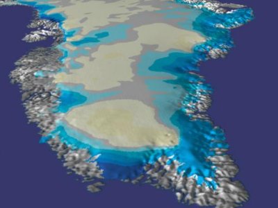
To learn more about the use of lidar in mapping changes in the Greenland ice sheet, visit NASA’s Scientific Visualization Studio Greenland's Receding Ice.
8.2.10 Global Elevation Data
This section profiles three data products that include elevation (and, in one case, bathymetry) data for all or most of the Earth's surface.
ETOPO1
ETOPO1 is a digital elevation model that includes both topography and bathymetry for the entire world. It consists of more than 233 million elevation values which are regularly spaced at 1 minute of latitude and longitude. At the equator, the horizontal resolution of ETOPO1 is approximately 1.85 kilometers. Vertical positions are specified in meters, and there are two versions of the dataset: one with elevations at the “Ice Surface" of the Greenland and Antarctic ice sheets, and one with elevations at “Bedrock" beneath those ice sheets. Horizontal positions are specified in geographic coordinates (decimal degrees). Source data, and thus data quality, vary from region to region. You can download ETOPO1 data from the National Geophysical Data Center at the NOAA ETOPO1 site.
GTOPO30
GTOPO30 is a digital elevation model that extends over the world's land surfaces (but not under the oceans). GTOPO30 consists of more than 2.5 million elevation values, which are regularly spaced at 30 seconds of latitude and longitude. At the equator, the resolution of GTOPO30 is approximately 0.925 kilometers -- two times greater than ETOPO1. Vertical positions are specified to the nearest meter, and horizontal positions are specified in geographic coordinates. GTOPO30 data are distributed as tiles, most of which are 50° in latitude by 40° in longitude.
GTOPO30 tiles are available for download from USGS' EROS Data Center at the EROS GTOPO30 site. GTOPO60, a resampled and untiled version of GTOPO30, is available through the USGS products and data site.
Shuttle Radar Topography Mission (SRTM)
From February 11 to February 22, 2000, the space shuttle Endeavor bounced radar waves off the Earth's surface, and recorded the reflected signals with two receivers spaced 60 meters apart. The mission measured the elevation of land surfaces between 60° N and 57° S latitude. The highest resolution data products created from the SRTM mission are 30 meters. Access to 30-meter SRTM data for areas outside the U.S. are restricted by the National Geospatial-Intelligence Agency, which sponsored the project along with the National Aeronautics and Space Administration (NASA). A 90-meter SRTM data product is available for free download without restriction (Maune, 2007).
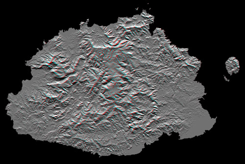
The image above shows Viti Levu, the largest of the some 332 islands that comprise the Sovereign Democratic Republic of the Fiji Islands. Viti Levu's area is 10,429 square kilometers (about 4000 square miles). Nakauvadra, the rugged mountain range running from north to south, has several peaks rising above 900 meters (about 3000 feet). Mount Tomanivi, in the upper center, is the highest peak at 1324 meters (4341 feet).
Learn more about the Shuttle Radar Topography Mission at Web sites published by NASA and USGS.