Prioritize...
After reading this section, you should be able to describe what is displayed on infrared satellite imagery, and describe the connection between cloud-top temperature retrieved by satellite and cloud-top height. You should also be able to discuss the key assumption about vertical temperature variation in the atmosphere that meteorologists make when interpreting infrared imagery. Finally, it is important that you be able to differentiate an IR image from visible, water vapor, and radar imagery. This skill involves knowing what clues distinguish one type of imagery from another.
Read...
Visible satellite imagery is of great use to meteorologists, and for the most part, its interpretation is fairly intuitive. After all, the interpretation of visible imagery somewhat mimics what human eyes would see if they had a personal view of the earth from space. But, visible satellite imagery also has its limitations: It's not very useful at night, and it only tells us about how thick (or thin) clouds are.
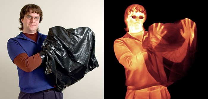
By limiting our "vision" only to the visible part of the spectrum, we diminish our ability to describe the atmosphere accurately. Consider the images below. The image on the left shows a photo (which uses the visible portion of the spectrum) of a man holding a black plastic trash bag. On the right is an infrared (IR) image of that same man. Notice that switching to infrared radiation gives us more information (we can see his hands) than we had just using visible light. Furthermore, the fact that the shading in the infrared image is very different from the visible image suggests that perhaps we can gain different information from this new "look."
Before we delve into what we can learn from infrared satellite imagery, we need to discuss what an infrared satellite image is actually displaying. Just like visible images, infrared images are captured by a radiometer tuned to a specific wavelength. Returning to our atmospheric absorption chart, we see that between roughly 10 microns and 13 microns, there's very little absorption of infrared radiation by the atmosphere. In other words, infrared radiation at these wavelengths emitted by the earth's surface, or by other objects like clouds, gets transmitted to the satellite with very little absorption along the way.
You may recall from our previous lesson on radiation that the amount of radiation an object emits is tied to its temperature. Warmer objects emit more radiation than colder objects. So, using the mathematics behind the laws of radiation (namely Kirchhoff's Law and Planck's Law), computers can convert the amount of infrared radiation received by the satellite to a temperature (formally called a "brightness temperature" even though it has nothing to do with how bright an object looks to human eyes). Finally, these temperatures are converted to a shade of gray or white (or a color, as you're about to see), to create an infrared satellite image. Conventionally, lower temperatures (colder objects) are represented by brighter shades of gray and white, while higher temperatures (warmer objects) are represented by darker shades of gray.
One challenge of working with infrared images is that they can "look" very different, even if they're displaying the exact same data. Some infrared images use grayscale so that they resemble visible images (like the first example in the slideshow below), while others include all the colors of the rainbow! Infrared images that contain different color schemes are usually called enhanced infrared images, not because they are "better," but because the color scheme highlights a particular feature on the image (usually very low temperatures). Click through the slideshow below to see a few examples. All four images in the slideshow display the exact same data; there's really no fundamental difference between a "regular" (grayscale) infrared image and an enhanced infrared image even though different color schemes change the look of the image. The key with any IR image is to locate the temperature-color scale (usually along the top, side, or bottom of the image) and match the shading to whatever feature you're looking at.
So, we know that an infrared radiometer aboard a satellite measures the intensity of radiation and converts it to a temperature, but what temperature are we measuring? Well, because atmospheric gases don't absorb much radiation between about 10 microns and 13 microns, infrared radiation at these wavelengths mostly gets a "free pass" through the clear air. This means that for a cloudless sky, we are simply seeing the temperature of the earth's surface. To see what I mean, check out this loop of infrared images of the Sahara Desert in northern Africa. Note the very dramatic changes in ground temperatures from night (light gray ground) to day (black ground) and back to night again. This is because dramatic diurnal changes in ground temperatures often occur over the deserts, where the broiling sun bakes the earth's surface by day. At night, however, the desert floor often cools off rapidly after sunset.
Of course, sometimes clouds block the satellite's view of the surface; so what's being displayed in cloudy areas? Well, while atmospheric gases absorb very little infrared radiation at these wavelengths (and thus emit very little by Kirchhoff's Law), that's not the case for liquid water and ice, which emit very efficiently at these wavelengths. Therefore, any clouds that are in the view of the satellite will be emitting infrared radiation consistent with their temperatures. Furthermore, infrared radiation emitted by the earth's surface is completely absorbed by the clouds above it. So, even though there is plenty of IR radiation coming from below the cloud and even from within the cloud itself, the only radiation that reaches the satellite is from the cloud top. Therefore, IR imagery is the display of either cloud-top temperatures or the Earth's surface temperature (if no clouds are present).
So, infrared imagery can tell us the temperature of the cloud tops, but how is that useful? Well, if we make the simple assumption that temperature decreases with increasing height in the lower atmosphere (that is, the troposphere), then we can equate cloud-top temperature to cloud-top heights. In other words, clouds with very cold tops have high-altitude cloud tops (for example: cirrostratus, cirrocumulus, cumulonimbus). Clouds (such as stratus, stratocumulus, or cumulus) with warmer tops have tops that reside at a low altitude.
Given that infrared imagery can tell us about the altitude of cloud tops, and visible imagery can tell us about the thickness of clouds, meteorologists use both types of images in tandem. Using them together makes for a powerful combination that helps to specifically identify types of clouds. Let's apply this quick summary to a real case so I can drive home this point using the short video below (2:39).
PRESENTER: Let’s use these side-by-side visible and infrared images to see how weather forecasters use both types of images to diagnose cloud types. Even though these images look pretty similar at first glance, they’re displaying very different things. Visible satellite imagery is most like what we see with our eyes. It’s based on the amount of visible light that gets reflected back to the satellite. But, it’s critical to realize that infrared imagery is different. It’s showing us temperature, either of cloud tops or the earth’s surface. Note that even though no temperature scale is shown on the infrared image, brighter shades of gray and white correspond to lower temperatures, as is typically the case.
Let’s start by looking at Point A, which is located in the line of bright white clouds extending from the Outer Banks of North Carolina down into Florida. Their brightness on visible imagery indicates that these are thick clouds. These clouds also appear bright on infrared imagery, so they have cold tops, indicating that the tops are high in the troposphere. Thus, given that these clouds are thick and have cold tops, we can assume that they are cumulonimbus, which can have tops reaching altitudes upwards of 60,000 feet.
Now let’s look at Point B, located in the area of "feathery" clouds over the Atlantic. Obviously, these feathery clouds are not as bright as the area of cumulonimbus on visible imagery, which means the clouds at Point B are much thinner. On the infrared image, these thin clouds appear bright white, meaning that they have cold tops, which are high in the troposphere. Therefore, they must be cirrus clouds, which are high and thin. I should add the caveat that sometimes when clouds have very thin spots, infrared radiation from the earth's surface can leak through holes in the clouds and reach the satellite. That bit of extra radiation from the warm earth can make the tops of very thin clouds appear a little warmer and lower than they really are.
Finally, let’s turn our attention to Point C, which is located in the region of clouds over the Great Lakes and upper Ohio Valley. The darker grayish appearance on infrared imagery tells us that they're low clouds with warm tops. These clouds are fairly bright on the visible image, meaning that they must be moderately thick. Given the somewhat "cellular" nature and breaks in between blobs of clouds, these are likely stratocumulus clouds, although farther north in the Great Lakes there's likely a more solid deck of stratus.
The lesson learned here is that both visible and infrared imagery can be used together to identify cloud types during the daytime.
While both visible and infrared imagery can be used together to identify cloud types during the daytime, at night, routine visible imagery is not feasible, so weather forecasters must rely almost exclusively on infrared imagery. Though infrared imagery is indispensable at night, it has some drawbacks. Detecting nighttime low clouds and fog can be tantamount to impossible because the radiating temperatures of the tops of low clouds and fog are often nearly the same as nearby ground where stratus clouds haven't formed.
The Challenges of Infrared Images
To learn more about the shortcomings of IR images at night and to review what you've already learned in this section check out this short video (2:22) showing an infrared satellite simulator (video transcript). As the video demonstrates, in cases where our assumption about temperatures decreasing with increasing height breaks down, the appearance of infrared images might not be what we expect. By the way, I encourage you to give the infrared imagery simulator a try for yourself. I suggest trying a few different hypothetical situations as in the video to see how they might look on infrared imagery, which can help you see what factors can affect the appearance of infrared satellite images.
One of the scenarios shown in the video is something that you might encounter at night or early in the morning: The ground in cloud-free areas can sometimes actually be colder than the tops of nearby low clouds, and it can cause IR images to look a bit strange. Take a look at the image below, collected at 1315Z on a February morning. Keep in mind that 1315Z is 7:15 AM Central Time in February (right around sunrise). Focus your attention on the slightly darker patch that's circled. Given that it's darker (and warmer), we must be looking at bare ground, right? Now toggle the slideshow to the visible image from about one hour later (when there was enough sunlight for a visible image).
The visible image shows a bank of low clouds and fog where the darker shading was located on the infrared image. So, why did those low clouds and fog appear darker than their surroundings on the infrared image? Their tops were actually warmer than the surrounding bare ground in areas with clear skies. The map of regional station models from 1343Z shows that it was very chilly in the area of the Texas and Oklahoma panhandles where skies were clear. In other words, this situation violated our assumption that temperatures decrease with increasing height in the troposphere. We'll explore the reasons why these exceptions exist later in the course, but ground temperatures overnight in the cold season are often colder than overlying air. The time of the infrared image is 1315Z (right around sunrise), which is near the time when ground temperatures are often at their lowest (and it's most likely for surrounding ground to be colder than nearby cloud low cloud tops).
On the other hand, it can also be easy to assume that colors equating to low temperatures must mean we're looking at high, cold cloud tops. While that's usually the case, take a look at this enhanced infrared image from 13Z on December 23, 2022. The entire northern United States is awash in colors indicating temperatures of -20 degrees Celsius (-4 degrees Fahrenheit) or lower. So, do all the colors represent high, cold cloud tops? Nope! You're looking at very cold ground in much of the north-central U.S. and into the Midwest. The clue that the colored area isn't all clouds is that we can see surface features -- the unfrozen Missouri and Illinois Rivers appears warmer than surroundings, as do several cities, such as Madison, Wisconsin. An outbreak of frigid air caused the ground to be so cold that it met the threshold to be colorized on this particular image!
The bottom line here is that you have to be careful when examining IR imagery, especially in cases where you're dealing with low clouds and/or the ground is very cold. While the assumption that temperatures decrease with increasing height in the troposphere is usually correct, exceptions do exist! Just remember that you are looking at temperatures and that lighter gray or coloring doesn't always mean cloudy skies. There are methods for detecting low clouds, which involve subtracting data collected at different IR wavelengths to extract only the low cloud field (if you're interested in seeing an example, check out the Explore Further section below).
This concludes our discussion of infrared satellite imagery. Now it's time to tackle water vapor imagery. But first, review the key points from this section.
Infrared satellite imagery...
- is based on the fact that measuring an object's infrared emission tells you something about its temperature.
- displays the temperature of either cloud tops or the earth's surface (if the sky is clear).
- can be combined with the assumption that temperature decreases with increasing height to allow cloud-top heights to be determined. Lower temperatures typically mean higher cloud tops.
- is not able to give any direct indication of cloud thickness or the presence of precipitation (although inferences can be made in some cases).
- should not be confused with radar imagery. Inexperienced forecasters sometimes confuse enhanced infrared satellite images with similarly colored radar images. If you are uncertain, look at the color key (an infrared image will always have units of temperature).
Explore Further...
As you learned in this section, one of infrared imagery's main advantages is that it's useful at night, but one of the challenges of interpreting IR images at night is that the tops of low clouds or fog can sometimes have similar temperatures as the surface of the earth in surrounding areas where it's not cloudy. In these situations, it can be difficult or impossible to pick out the areas of low clouds or fog with conventional infrared imagery, but subtracting data at different infrared wavelengths can be help us with this problem. For an example, check out the short video below (2:30). If you're interested in learning more about the satellite product featured in this video, called the "Nighttime Microphysics RGB," check out this quick guide.
PRESENTER: Detection of low clouds and fog using infrared imagery can sometimes be tricky at night and early in the morning because one of the main assumptions that forecasters use when interpreting infrared images – that temperatures decrease with increasing height – isn’t always true.
Take this enhanced infrared image as an example. Assuming that temperatures decrease with increasing height might lead us to believe that this dark area has clear skies, meaning that the satellite is seeing emissions from the relatively warm ground, while the lighter shaded areas, which are colder, represent cloud cover.
But, that’s not the case at all. The brighter gray shaded areas actually have clear skies, and they appear colder on this enhanced infrared image because the ground is colder than the tops of the low clouds and fog in this area. For the record, these very brightly colored areas, actually do represent very cold cloud tops which are high in the troposphere.
Difficulty in discerning between low clouds or fog and clear skies on enhanced infrared imagery at night or early in the morning isn’t all that uncommon because the tops of low clouds can be warmer or have similar temperatures to the ground in surrounding areas with clear skies.
But, using multiple wavelengths of the electromagnetic spectrum gives forecasters another tool for more easily identifying low clouds or fog at night. This image was created by using multiple wavelengths from the infrared portion of the electromagnetic spectrum, differencing their contributions in order to better identify cloud thickness, composition, and temperature, and then applying different colors. Using this approach causes low clouds and fog to appear much more intuitively – we can see the area of low clouds across southeast Texas over into Louisiana and Arkansas in this whitish tan shading. The really high clouds to the northwest here now appear very dark, while the slice of cold ground in between appears pink.
Finally, once the sun rose on this particular day, traditional visible imagery confirmed our interpretation of the multi-channel approach – with a thick area of low clouds and fog, surrounded by clear skies. So, the multi-channel approach at night really made the interpretation of low clouds and fog much more intuitive compared to traditional infrared imagery.