Lessons
Use the links below to link directly to one of the lessons listed.
† indicates lessons that are Open Educational Resources.
Lesson 3. Working with R
Motivate...

What role do tools play in your daily life? Perhaps you might respond, "I'm not really a handy person... I don't use tools very often." Well, I'm not just talking about the hammer or screwdriver kind of tools. If you search for a general definition of a tool, you might run across something like the following: "A broader definition of a tool is an entity used to interface between two or more domains that facilitates more effective action of one domain upon the other." (definition from Wikipedia). What does this mean, exactly? One simple interpretation is this, "A tool makes a particular task easier". Think about it. Everything that you use to make something easier is a tool. When you clean your teeth, you use a tool. When you communicate with someone, you most often use some sort of tool. When you want to collect and analyze information, you use tools. Indeed, you are surrounded by a multitude of tools that you use without even thinking about it.
If we are to make sense out of the mountain of weather data available to us, we are going to need some tools specifically designed for this task. There are certainly some excellent data analysis tools available. Perhaps you even make use of them now. As I mentioned in the orientation material, we are going to use the open-source statistical package "R" (You should already be somewhat familiar with how R works). Before we dive into using "R", first let me give you my philosophy on using statistical tools such as this...
- This is not a programming course. The purpose of this course is to get you analyzing data, not teach you to become an "R" programming expert. Indeed, you may explore all you wish, but you need do so only as you feel comfortable. "R" is a tool and we will use it as such. Think of "R" as just another electrical appliance. I'm sure that you know of someone who can't rest until they take that appliance apart and understand how it works. The rest of us just want to know how to use it. You are free to treat "R" in the same manner -- just use it, or take it apart and learn everything there is to know about it.
- That said, you must become comfortable using R. As I have said, R is especially designed for data analysis.The software contains some powerful tools that you will learn to use, not only in this course, but in the courses that follow. Some folks ask me why they can't just use Excel. Indeed, Excel can handle some of the tasks that we will be performing early on, but at some point relatively soon in this course, our needs will far exceed Excel's capabilities.
- In learning R, know that it is OK (even encouraged) to copy the commands that I provide. Since "R" is open source, users from all over the world have designed and shared some very useful extensions for analyzing almost anything you can imagine. I will show you how to find and make use of others' efforts to help solve your own problems.
- If you are an "R" super-user, feel free to use your own workflow. There are many different ways to do the same task in "R". Perhaps you know of a better way than I present in the lesson material. You are welcome to continue using that method (you might even consider sharing it with the class).
I hope this allays any remaining uneasiness you might have about learning programming. Remember that you can always turn to me or your fellow classmates if you lose your way.
"R" you ready? Read on!
Lesson Objectives
After completing this lesson, you should be able to:
- execute scripts, load data and perform simple manipulations in R;
- use R to create simple and sophisticated 2D plots;
- use R to plot histograms and box plots;
- create image and contour plots in R;
- load and use custom library plotting tools for specialized data sets;
- describe several methods for incorporating (or excluding) missing values from data;
- describe methods for transforming data which might be easily interpreted due to its values; and
- discuss approaches for debugging R script which may not be working correctly.
First Steps: Loading Data
Prioritize...
After completing this section, you will have executed your first script in R-Studio. NOTE: If you have not completed the lessons in "swirl" [12], I suggest you do that now.
Read...
In most of the tutorials that you have explored (especially the "swirl" examples), you entered every command in the console window. This approach is occasionally useful when we want to query an previously-loaded dataset, or when we want test a command or procedure. However, most of the time, we are going to place all of our commands in an R-script file (mainly because we don't want to have to retype every command each time we want to perform some sort of calculation). Secondly, saving everything in script files means that we can retrieve processes created for previous tasks -- to be either reused or modified to fit your needs.
A word of advice!
You will find that we will constantly be building on (or reusing) snippets of R-code. You do not want to be reinventing the wheel every time. Therefore, I suggest keeping an organized directory structure of R-script files (for example, by course and lesson perhaps) that have explanatory filenames (e.g., basic_scatterplot.R; not, my_code.R). Furthermore, I suggest that you have a few lines of comments at the beginning of each script that explains what the code does (and allows for easy searching). This will help tremendously if you need to find a particular piece of code sometime in the future -- and you will, trust me. You might also consider storing this directory in the cloud to both keep it safe and also allow access from various computers. There are several free cloud services that give you plenty of storage space.
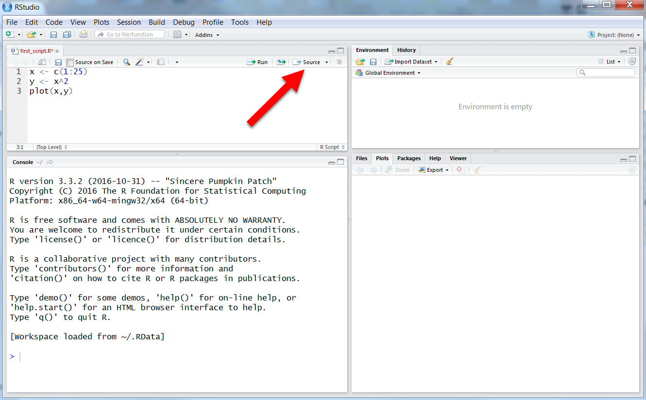
Once you've set up a place to put your R-scripts, let's create your first one. Open up R-Studio and select "File > New File > R script". Next, select "File > Save". Save the script in the folder structure you just created and name this script "first_script.R". Notice that after you save it, the name appears in the tab [13]. Now, copy and paste the code below into your new script (remember to save it afterwards).
# assign some variables
x <- c(1:25)
y <- x^2
z <- seq(1, 21, by=2)
rand_nums <- runif(100, min=-1, max=1)
my_colors <- c("red", "blue", "green")
I know, since you've completed the swirl tutorials, you are familiar with the commands above. If you can't quite remember, recall you can always type ?<command> in the console window to find out more about a particular command. Give it a try on the command runif() to learn more about it (Of course, you could also just Google: "R runif" as well. Try it!). To execute this bit of code, click on the "Source" button [14] in the upper-right corner of the script window. After sourcing the script, you should notice that in the upper-right panel you should see a list of values for x, y, z, rand_nums, and my_colors. You'll find the information in the environment panel helpful when checking to see if your code is working like you'd expect. Notice that the panel shows you what variables are currently being stored by R, how many elements they contain, what "type" of data (numbers, characters, integers, etc.) each variable contains, along with some values.
Return to the script and focus your attention on variable "y". In the assignment statement, we defined "y" as the square of variable "x". In many programming languages, "x" would be considered an array. Therefore, to perform calculations on "x" you would have to loop through each value of the array sequentially. Remember however, that R performs what we refer to as Vector Arithmetic. When you add two variables (say, x + y), R interprets this as adding the vector "x" to the vector "y", term by term. R's approach to variable arithmetic saves us a tremendous amount of time because we don't need to loop over all the values for every computation we need to perform. Instead, we simply tell R what to do, and the program figures out how to do it. (Review Lesson 4 of the "swirl" tutorial for more information on R vector variables.)
Importing Data From a File
Now, you might have guessed that we could never enter the vast amounts of data we need into R using assignment statements like we just did above. So, let’s explore how to import data into R from a file. Start by saving this comma delimited file, UNV_maxmin_td_2014.csv [15], to your local machine by right-clicking the link and selecting “Save Link As…”. Save your file to the same folder that contains the script you created above.
Add the following line of code to your R-script file that you have open:
mydata <- read.csv("UNV_maxmin_td_2014.csv")
Now, source the file. You probably received an error telling you that R couldn’t find the file. This is because we only specified the filename the we want to open, not the entire file path. You can specify the entire path like this:
mydata <- read.csv("C:/Files/Meteo810/Lesson3/R_code/UNV_maxmin_td_2014.csv")
Your path will be different, of course, but you get the idea.
Using the full path name can be useful in some instances (you can even specify HTTP or FTP addresses). However, most of the time, I suspect that you will find typing all the path names tiring. Never fear! You can just tell R to use a default "working" directory whenever it looks for files. You can find out what the current working directory is by typing: getwd() in the console. To change the working directory, you use the command setwd(<directory>). You can use this command either in the console or right at the top of your script. For example, modify your script by adding a line containing setwd():
setwd("C:/Files/Meteo810/Lesson3/R_code/")
mydata <- read.csv("UNV_maxmin_td_2014.csv")
Notice above that we use the backslash (like an Internet address) even if we have the Windows OS (which uses the "\" to designate file paths). If you are uncomfortable figuring out the path to a particular folder, R-Studio offers an even easier way to set the working directory. You can set the working directory by selecting (Session->Set Working Directory->Choose Directory…) from the main menu of R-Studio. Once you point R-Studio to the proper directory, try re-sourcing the original code (with just the filename). If you don't get an error in the console window, you did it correctly.
Before moving on...
Take a moment to explore the options available for the read.csv() command. Type ?read.csv() into the R-Studio console or Google "R read.csv". Here's some documentation [16] describing read.csv() and its sister functions. Note the host of arguments that you can pass the function. You can skip rows, rename columns, and recast the datatypes, just to name a few.
Now that you have loaded the data file, examine the Environment tab in the upper-right panel [17]. You should see a new variable called “mydata” located under a the new heading "Data" instead of "Values". This variable is referred to as a dataframe. Dataframes are used for storing tables of values in lists of equal-sized vectors. In R-studio, you can expand the dataframe by clicking the little blue arrow directly in front of the name. This gives you information about each variable in the dataframe. For example, you’ll note that it contains three variables: date, max_dwpf, and min_dwpf. You can also view the data in table format by clicking on the grid icon located to the right of its name in the Environment tab. This gives you a spreadsheet view of the dataframe where you can examine, sort, and filter the data (but you cannot edit it).
Now that we've loaded some data, let's look at how we might interact with it. Read on.
Accessing and Manipulating Data
Prioritize...
In this section, you will learn how to import comma-delimited datafiles into R. You'll also learn some ways to begin exploring the data.
Read...
So, now that we have some data loaded, let's look at how we might learn some things about our data. To help me walk you through some basic R, I have set up a DataCamp session below. DataCamp will allow you to run R right from this webpage (pretty cool, don't you think?). Start by clicking the "Run" button to source the code. When you do so, DataCamp executes the R-code and switches to the Console panel. Now, let's look at the data...
First, you can view any variable simply by typing its name in the Console (try typing "y" at the Console prompt and hitting "Return"). You should see the value of the variable "y" displayed. You can look at a specific value(s) of "y" by adding square brackets containing an expression. Try the following commands: y[3], y[3:4], y[seq(1,9, by=2)]. We can also look at values of a variable that meet certain criteria by using the which() command. For example, try this command (don't type the command prompt ">"):
> rand_nums[which(rand_nums>0)]
You'll find this type of data access to be very powerful. The which() command produces a vector of indices that satisfy the condition (in this case, all the indices of rand_nums whose value is greater than zero. The output indices that satisfy the condition, which if used inside the "[...]" retrieve the actual values of rand_nums that are greater than zero. By the way, you can make the condition statement as complex as you like, allowing you to filter data in numerous ways. And remember, you can use these commands not only in the console, but also in a script, storing the values in new variables as well.
Solve It!
In the DataCamp window above, can you come up with a command to count the number of random numbers between 0.25 and 0.5? There are lots of ways to do it. Hint: You might want to look up the length() and sum() commands.
Here are some possible answers:
> length(rand_nums[which(rand_nums>0.25 & rand_nums<0.5)])

> length(which(rand_nums>0.25 & rand_nums<0.5))

# Why does this work? ...Look at the output passed to sum()
> sum((rand_nums>0.25 & rand_nums<0.5))
Working with Dataframes
Dataframes can be accessed in ways that are similar to simple variables. In the DataCamp window below, I have loaded the .CSV file from the last section into a dataframe called mydata. Switch over to the Console tab and start with the command: str(mydata). This command displays the structure of the dataframe in much the same format as the environment tab in R-studio. You can see a listing of the variable within the dataframe, the variable types along with some sample data.
Remember that dataframes are basically tables of data (if you don't remember, you might want to revisit the Swirl Tutorial: Lesson 7). In some cases, we might want to look at a sampling of the dataframe across all of its columns. Below are some commands for you to try in the console window (remember to omit the ">").
# list the variable names (header) of mydata
> names(mydata)

# list the first 5 lines of mydata
> head(mydata, n=5)

# list the last 5 lines of mydata
> tail(mydata, n=5)
We can also access data within a dataframe a few other ways. First, if we want just one variable (a single column), remember that we use the "$" character. For example, mydata$date. This command selects only the column named "date" (if you type that in the Console, R will print out the values in that column. Try it!). You can also use the bracket [...] notation that we learned above. The reference mydata[1] is the same as mydata$date because "date" is the first column in the dataframe. To access individual data values, we can use a combination of the $ and [...] notations. For example, the third date value can be found with mydata$date[3], or mydata[3,1]. (note that the 2-D index is in the format [row, column]).
The dataframe mydata contains the daily minimum and maximum dew point temperatures for each day in 2014 at the University Park Airport (State College, PA). In case you are unfamiliar with dew point, you can read this article in Wikipedia [18]. Meteorologists use dew point as a proxy for the amount of water vapor in the air because, unlike relative humidity, its value is not affected by air temperature. Let's look at some other commands we can use to query this dataframe. The first thing that you might want to do is look at some bulk characteristics of the data. For example, try out this command in the console tab of the DataCamp window.
> max(mydata$max_dwpf)
This command asks for the maximum value of the column (“max_dwpf”). Notice that the “$” is again used to select a variable from a dataframe. I get a value of 75.2 F. Note that we also get the same result with the commands: max(mydata[2]) and max(mydata[, 2]). This is because "max_dwpf" is the second column in the dataframe. I should comment that, for clarity's sake, using the actual name of the column is preferable to just its number. Using the column's name makes it immediately clear what we are calculating when looking at the code.
How about the date on which this maximum value occurred? Now try:
> mydata$date[which(mydata$max_dwpf==max(mydata$max_dwpf))]
Can you see what this command does? First, we find the position in the data where the dew point temperature equals the maximum value. The statement: which(mydata$max_dwpf==max(mydata$max_dwpf)) returns a value of 182 (the max occurs on the 182nd row). Now we can retrieve the specific date by placing the which() statement inside the mydata$date[…] selector. You could also use the following command:
> mydata$date[which.max(mydata$max_dwpf)]
Note, however, the function which.max() always returns the first instance of the maximum value. If the data had two maximum values, only the first command above will tell you, not the second. I point this out simply to emphasize that there are many ways to accomplish similar things in R. However, you have to make sure that the command does exactly what you think it does.
Let’s perform a more complex calculation. For example, let's count the number of days where the daily maximum dew point was between 40 F and 50 F:
> sum(mydata$max_dwpf <= 50 & mydata$max_dwpf >= 40)
or, the number of days where dew point temperature changed by more than 30 degrees during the day:
> sum((mydata$max_dwpf - mydata$min_dwpf) > 30)
I hope that you are beginning to see how powerful R can be. Let’s look at one final example. What if we wanted to know when such large changes in dew points occur (as organized by month)? Here’s the code to find out:
> table(strftime(mydata$date[(mydata$max_dwpf - mydata$min_dwpf) > 30], "%b"))
This command looks for large differences in the maximum and minimum daily dew point (greater than 30F), gets the dates associated with those differences, extracts and formats the months (learn more about strftime [19]) of the occurrences, and finally places the results in a frequency table. Remember that you can always look up each one of these commands in R-studio (or on the web for that matter) to find out what it does. You can find lots of information and examples by Googling... "R strftime", for example.
Here’s the output…
Apr Dec Feb Jan Mar

 3   1   1   5   5
Pretty cool, huh? Can you think of a meteorological reason why the dew point temperature (the moisture content of the air) would change drastically during the day?
We'll look at many other ways to explore large data sets in future lessons. Now, however, let's resume our brief survey of R with a look at other ways of managing data. Read on.
Managing Data
Prioritize...
In this section, you will learn how to manage variables in R by changing data classes, formatting times, and adding and deleting columns/rows from dataframes.
Read...
We've looked at how to query variables and dataframes to retrieve values but we haven't discussed ways that variables and dataframes can be modified. Let's return to the DataCamp window where we load the dew point data file into the mydata dataframe (click "Run" to start the session).
Let's look at the structure of the dataframe using the following command (entered in the R Console window):
> str(mydata)
This command gives you the same information as the Environment tab in R-studio. Note that the $max_dwpf and $min_dwpf have a data class of "numeric". (You can also verify this fact with the command class(mydata$max_dwpf)). The "$date" variable however has a strange class "Factor". What is a "factor"? You might want to read about them in this documentation page [20]. Basically, a factor variable is a list of indices that point to a lookup table (called the "levels" table in R). You can think of a factor variable as a finite list of categories rather than actual numbers (called a "categorical variable" in statistics). The problem is that factors are not sequential variables and thus don't always play nice with other R functions (like plots, for example). In many cases, we are going to want to change these factor-type variable to something more manageable. So, how can we transform one class of variable into another?
The process is rather easy, but does come with some caveats. R has a set of functions having the form: as.numeric(...), as.integer(...), as.character(...), etc., that can transform one class of variable into another (where possible). For example, try the command:
# Convert max_dwpf to characters and display the first 5 values

> head(as.character(mydata$max_dwpf))
Notice that all the values for $max_dwpf are now surrounded by quotes. This means that they are no longer numbers, but strings of characters instead (We can no longer perform any mathematics on them. For example, try: max(as.character(mydata$max_dwpf)). Conversions from numbers to characters are pretty straightforward (everything converts, no problem). The opposite however, is not always the case. Let's consider the following scenario (enter just the commands in the console window):
# Create a variable of character data
# This is what you might get after reading a data file
#   with mixed numbers and non-numbers.
> temperature <- c("25", "-2", "10.5", "M", "16*")

# Try doing some math... Nope, can't do it
> temperature/10

# Now convert the temperature to numbers
> temperature <- as.numeric(temperature)

# Look at the values... Notice that some values
#   cannot be converted and are assigned 'NA'
> temperature

# Try doing some math now...
> temperature/10
Notice that you must be careful when changing data from one type/class to another, particularly when you have mixed types assigned to one variable. Factors can be particularly troublesome because the values stored in a "factors" variable are numbers pointing to a look-up table, not actual values. To see what I mean, run the DataCamp console below. This console loads a data file called daily_obs_may2016.csv [21] (I linked to the file in case you want to download and play with it in R-Studio).
First, after running the console, use str(daily_obs) to look at the loaded dataframe. Note the $PRCP variable which was loaded as a factor. By using the levels(daily_obs$PRCP) we can see all the possible values of the variable (and why the variable is listed as a factor... the "T" stands for "trace of precip" and is represents values less than 0.01 inches). So, how do we convert this variable into something we can use (find the maximum value, for example)? First, let me say that you can't just convert using as.numeric(daily_obs$PRCP). Try it... what do you get? You do, in fact, get numbers, but those numbers represent the position of the values in the look-up table. Now try: as.character(daily_obs$PRCP). This gets you closer, doesn't it? Now the output is a list of the proper values pulled from the look-up table, but they are still character values, not numbers. Let's add the as.numeric(...) conversion to what we have and take a look at the output. If you want to see how some other data scientists solved the "Trace" problem, you can check out their paper, published in the Journal of Service Climatology (2013) [22],
> as.numeric(as.character(daily_obs$PRCP))
Now we've got what we want, but we've lost something in the process (the "T" observations have been transformed into "NA"s). NA is a bit misleading because the observation is not missing. In fact, a "Trace" is perfectly valid observation. So what to do? Well that's up to you. If it suites your purpose, you might leave those values as NA (if you are tabulating a "Total Precip", for example). Or, you might assign the T's a numerical value before converting (0.00 or 0.001 perhaps). Or, you may wish to create a "flag" column in the dataframe which stores a letter designating the type of observation (Number, Trace, or Missing) for each value. As the data scientist, you must decide how you are going to treat data that is not so nicely behaved. Just be cautious! My mantra is to always perform operations that preserve the original data and that only alter that data in a manner consistent with the type of result I need to compute.
Now that we've dealt with the factors, let's talk about dates. If you noticed, the dataframe mydata contained dates in the form of factors, while daily_obs dates were read in as integers. Both of these formats are not acceptable -- dates should be dates! For dates that are already in character format (and in some sort of recognizable date format), you can use the as.Date(...) function. For example, you might want to recast the mydata$date variable like this (remember it starts as a factor):
> mydata$date <- as.Date(as.character(mydata$date))
The function as.Date(...) is quick and dirty, but not all that powerful. In the daily_obs case, the dates data are listed as integers (namely because they don't have any non-digit characters). This format is troublesome for as.Date(...) because R thinks that these numbers represent a time (in seconds) from some point of t=0 (called the origin). So, to convert these times (and in a general sense, ALL dates/times), we are going to use the even more powerful function strptime(...) [23]. Here's the command to try:
> daily_obs$DATE <- strptime(daily_obs$DATE, "%Y%m%d", tz="EST")
Notice that strptime(...) can take almost any input form (number, character, even factor), it can handle dates and times in a format of your choosing, and can even embed timezone information. It creates a data class called POSIXlt which is a one-stop-shop for storing date/time information. You have already encounter its sister function, strftime(...), which is used to format output of POSIXlt objects in much the same way. Take my advice and format all of your time/dates using strptime(...).
Manipulating Dataframes
You've probably figured out that dataframes are nice, compact structures for storing data. Ideally, we are going to want to keep all similar data together rather than having to keep track of several independent variables. Adding columns to an existing dataframe is easy (Run the DataCamp session below before continuing).
Let's say that we wanted to convert the dew point temperature in mydata to degrees Celsius instead of Fahrenheit. We could issue the following command (don't run it):
# Don't run me!....
> mydata$max_dwpf<-(mydata$max_dwpf-32)*5/9
However, this will overwrite the original data. Instead, let's create a new column in mydata called max_dwpC.
# This is better... it creates a new column
#   without overwriting the original data.
> mydata$max_dwpC<-(mydata$max_dwpf-32)*5/9
You can remove columns from a dataframe as well by simply assigning the NULL values to an existing column like such:
> mydata$max_dwpC<-NULL
Note that NULL is not the same as NA. Assigning a variable to the NULL state will remove it from R's memory space. The value NA is treated as an actual value even though it's usually used to signify an undefined or missing value.
What about adding and deleting rows? You guessed it... that's pretty easy too. To add rows, we simply use the command rbind(...) to bind together rows from one dataframe with rows from another. Look at the following series of commands:
# start with the original 'mydata' (not the one with added columns)

# create a new dataframe with two rows of data
> mydata2 <- data.frame(date=c("2015-01-01","2015-01-02"),
           max_dwpf=c(9.1, 12.6), min_dwpf=c(2.7, 1.6))

# bind the new rows to the original dataframe
> mydata <- rbind(mydata, mydata2)

# look at the result (the last 10 lines)
> tail(mydata, n=10)
Note that the two dataframes must be the same size (same number of columns). Therefore, if you added a Celsius column to mydata, you must also add that variable to mydata2. Otherwise, you will get an error.
Deleting rows, on the other hand, is a bit different. Instead of directly deleting rows, we need to tell R what rows we want to keep, and then reassign that selection to the original dataframe. For example, let's say that we want to delete the rows added in the commands above.
# Select only the first 365 rows and delete the rest
> mydata <- mydata[1:365,]
This method of parsing a data set is quite powerful when combined with the selection functions we've previously discussed. For example, the command:
> mydata <- mydata[which(mydata$max_dwpf > 20), ]
deletes all rows in the dataframe where the max dew point is not greater than 20F. We might also want to use the function is.na(...) to delete rows that contain missing or corrupt data. We'll discuss what to do with data sets that contain missing values at the end of this lesson (it's more involved than you might think).
For now, let's move on to how we might display our data. Read on.
Plotting Basics
Prioritize...
After finishing this section, you should be able to create a simple plot using various points and lines. Emphasis should be placed on learning how to create proper titles and axis labels.
Read...
Now that you know your way around data and dataframes, let's spend some time talking about how to present that data in meaningful ways. In this course, we won't get into any heavy statistical analyses; instead we'll focus on retrieving and presenting data in a way that can answer basic questions. Certainly, the first step in presenting data is simply a visualization in the form of a plot.
Let's start with an example using the data from the daily_obs data set:
Click the run button to see the plot produced by the script I provided. Note that the plot window is a bit cramped... you can hit the pop-up button [24] to produce a bigger floating window.
I encourage you to switch over to R-Studio at this point and run the same script. Create a new script file in R-Studio and paste in the code from the DataCamp window. Make sure you swap out the read.csv statements for the data file you saved locally (daily_obs_may2016.csv [21]). You'll notice that the lower right panel of R-Studio switches to the Plots tab and automatically displays the same plot. There’s not much to this basic plot. In fact, it's not very helpful, is it? Before we tackle some more complicated data sources and plot types, review some of the rules of good data communication.
In the last lesson, we learned the importance of crafting a message and using data to communicate or support that message. Indeed, it's true that a picture is worth a thousand words, but only if that picture is in focus and is properly composed. Remember that the process begins with choosing the correct display of the data. In addition, your graphs or charts should include the following elements...
- Every graph should have a title which clarifies what is being displayed.
- Axes should be labeled (with both a title and units where appropriate).
- For graphs with multiple sets of symbols or lines, use both color and symbol/line type to distinguish each set (provide a legend as well).
- An appropriate range for each axis such that data are clearly visible and are in no way misleading (check out this article on misleading graphs) [25].
Let’s examine how each of these key elements can be added to a graph we just produced.
In your R-Studio script, replace the last two lines with the following code and run (source) it:
# Find the range for the independent and dependent variables
xrange<-range(daily_obs$DATE)
yrange<-range(daily_obs$TMAX,daily_obs$TMIN, na.rm=TRUE)

# Create the plot... but this time with no data
plot (xrange,yrange,type="n",
      main="Maximum and Minimum Observed Temperature",
      sub="(May 2016, University Park, PA)",
      xlab="Date",
      ylab="Temperature (F)"
)
Check out the plot produced by the code above [26]. Let’s look closer at the lines we added. First, there are the variables xrange and yrange that contain two numbers each that are the maximum and minimum values of any variables passed to the range(...) function. Now, if I wanted to plot a single variable (say the maximum temperature), I could just pass this variable to the plot function (the axes are set by the x and y variables you want to plot. But if I want to plot both max and min temperatures and I want the y-axis to accommodate both sets of values, I first must pass the variables to the range(...) function which calculates the total range for both variable. Then I pass that value to the plot(...) function. Another trick that I often find helpful is to create a blank plot first (that's what the type=”n” does in the plot command) and then add the data in a second step. Breaking a process into discrete steps gives you more control, especially in situations where you are plotting more than one set of results. Ultimately, how you go about producing plots is up to you. Please take a moment to peruse this article [27]which reviews all of the various scatter-plot types available.
I also take the opportunity to add the plot title (“main”), subtitle (“sub”), the x-axis label (“xlab”) and the y-axis label (“ylab”) at this time. These commands can also be added separately (outside the plot command) and have a long list of formatting options.
Now, let’s add some data to our graph. Add the following line to the end of your script and run it:
# Add a scatter plot of TMAX vs time with red, empty circles
points(daily_obs$DATE,daily_obs$TMAX,pch=1,col="red")
Here we are plotting points (TMAX versus date). The “pch” property specifies the type of point (the value "1" is an non-filled circle) and col=”red” dictates the color. Now add:
# Add a line plot of TMAX vs time with a red, solid line
lines(daily_obs$DATE,daily_obs$TMAX,lwd=2,lty=1,col="red")
Here we are drawing a solid (lty=1) red line of width (lwd) of 2 for the same data (graph [28]). If you don’t like the fact that the line over plots the points you can change the line to:
lines(daily_obs$DATE,daily_obs$TMAX,lwd=2,lty=1,col="red",type="c")
Or you can change the points to be solid. Try changing the “points” command to:
points(daily_obs$DATE,daily_obs$TMAX,pch=19,col="red")
Now, add another series of points, lines, or both to your graph for the daily_obs$TMIN series (use: pch=17, lty=3, col= "blue"). Here is a great reference if you want to explore the different types of points and lines available [29].
Finally, let’s add a legend to our graph.
# Draw a legend
legend ("topleft", inset=0.03,
         c("Max T","Min T"),
         col=c("red","blue"),
         pch=c(19,17),
         lty=c(1,3),
         lwd=2 )
These are just a few of the options you can use to customize a legend. The “topleft” and “inset” properties position the legend, then follow the labels, colors, plot symbols, line types, and line thicknesses. You can use this code block as a template, or you can play around to find one that you like. Remember, if you want help on a particular command, you can always type: help(<command>) or ?<command> in the console window. For example, type: help(legend) in the console window to see information on how to create a legend. In R-Studio, the help dialog tab opens with information on your requested topic. Here's my final graph [30] as exported from R-Studio. Make sure that you can duplicate a graph like this in R-Studio before moving on to the next section.
You may be thinking, "Wow, that's a lot of work to make a simply scatter/line plot... Why not just push a few buttons in Excel?" You're right to some degree... making simple plots may in fact be easier in a package such as Excel. However, don't rush to judgment just yet. R's power and flexibility will become evident as we progress; soon our data needs will far exceed Excel's capabilities. In the next section, we'll look at more possibilities for displaying data.
Read on.
Graphs Galore
Prioritize...
In this section, you will learn how to create more complex plots, including graphs for comparisons and graphs using special elements.
Read...
Graphs Making Comparisons
Previously, we saw how R could be used to graph simple relationships. Now, let’s examine how we might present more complex ideas. For these exercises, we'll be moving to R-Studio exclusively. You'll need to save the T_compare2017.csv [31] data file to your R working directory. This file contains the daily maximum temperatures for three locations in central Pennsylvania [32] (State College - SCE, Lewistown - LEW, and Philipsburg - PLB). We want to see how closely the observations from these three relatively close stations agree. Open a new R-script file and load the data using the following code:
# you can find this code in: max_temp_compare.R

# This code plots the comparison between two station's
#  temperature observations

# read in the dew point data file
T_compare2017 <- read.csv("T_compare2017.csv", header=TRUE, sep=",")

# tell R about how the date column is structured
T_compare2017$Date<-strptime(T_compare2017$Date, "%m/%d/%Y")
Now, let's plot a comparison of daily maximum temperature for State College vs. Lewistown using the following commands:
# get the full range of all the data
data_range<-range(T_compare2017$SCE_T,T_compare2017$LEW_T,T_compare2017$PLB_T)

# force a square plot
par(pty="s")

# set up the plot
plot(T_compare2017$SCE_T,T_compare2017$LEW_T, type="n",
     xlim=data_range,
     ylim=data_range,
     main="Comparison of 2017 Daily Maximum Temperatures\n(State College vs. Lewistown)",
     xlab="State College Temperature (F)",
     ylab="Lewistown Temperature (F)")

# plot the points
points(T_compare2017$SCE_T, T_compare2017$LEW_T, pch=16)

# plot a comparison line with intercept=0 and a slope of 1
abline(0,1)

# Note you can also use the line below to replace the
# second line in the main title. It give you slightly
# better control... notice I decreased the font size.
# Uncomment the line below.
#title(main = ("(State College vs. Lewistown)"),  line = 0.5, cex.main = 0.9)
Here is the graph that this code produces [33]. Before we talk about what the graph actually shows, let's look at a few new commands and parameters introduced in this code snippet. First, notice that I calculate the total range of all the temperature data. The range(...) function returns the absolute maximum and minimum values from a series of variables that you provide. That range is then used in the xlim and ylim plot parameters to set the axis limits on the plot. For comparison plots, equal axis values make for easier interpretation. I also fix the plot to be square using par(pty="s"). Next, notice that I have split the title into two lines using a "new line" character (\n). You might want to use this technique when you have a long title (alternatively, you can use the title(...) function to add subtitles). Finally, notice that I plotted a reference line using the abline function [34]. This function plots a line with a specific slope and intercept.
Now, on to examining the plot itself... what do you notice? Certainly there is alignment between the two observations; however, notice that Lewistown is consistently warmer than State College (by an average of 4 degrees). The reason? Well, I would say that some of the discrepancy would be due to State College's increased elevation (~600 ft higher), but we would need to look at other factors such as site selection to really understand the different. The real question is, could we use Lewistown temperature data as a proxy for State College if we needed to? What about Philipsburg? Change the plot script to compare State College and Philipsburg temperature data to judge for yourself.
Graphs Using Polygon Regions
Before we get into creating some more sophisticated graphs, I though I would show you how to make the following graph climatology graph...
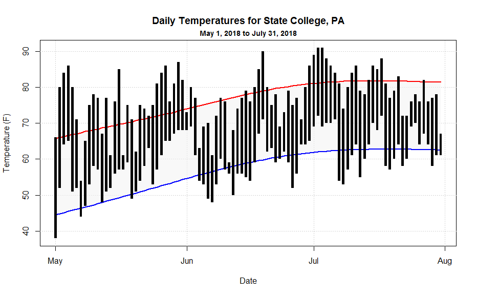
In this graph, I'm doing several interesting plots that you might make use of when looking at your data. Grab the may_july_2018.csv [35] data file and then let's walk through the code:
# you can find this code in: climatology_graph.R

# This script plots a standard climatology graph showing
#  max/min temperature observations along with normals

# read in the data file
may_july_2018 <- read.csv("may_july_2018.csv", header=TRUE, sep=",")

# tell R about how the date column is structured
may_july_2018$Date<-strptime(may_july_2018$Date, "%Y-%m-%d")

# I need to make the graph fit all of the data, so I will set up
# the plot using the "range" command
X_range<-range(may_july_2018$Date)
Y_range<-range(may_july_2018$MaxTemperature,may_july_2018$MaxTemperatureNormal,
               may_july_2018$MinTemperature, may_july_2018$MinTemperatureNormal)

# standard plot set-up
plot(X_range,Y_range, type="n",
     main="Daily Temperatures for State College, PA",
     xlab="Date",
     ylab="Temperature (F)"  )

# adding a subtitle
title(main = ("May 1, 2018 to July 31, 2018"),  line = 0.5, cex.main = 0.9)
In this first chunk of code, I first grab and condition the data. Next, I'm going to set up the plot, but instead of using a one specific variable to base the plot on, I calculate the total range of all y-axis variables then make the plot based on that range (I have to do the same with the x-axis variable to keep the inputs the same size). If you don't do this, then likely part of your data will not be shown. Finally, I show you how I made the subtitle (as we just discussed). You're also welcome to use the "\n" method as well.
Now, let's work on the plot...
# plotting some gridlines, notice how I plotted the date axis
abline(h=seq(40,90,10),col = "lightgray", lty = "dotted")
abline(v=seq(may_july_2018$Date[1], by="month", length.out = 4),col = "lightgray", lty = "dotted")

# draws the shaded region between the normal min and max temperatures
polygon(c(may_july_2018$Date,rev(may_july_2018$Date)),
     c(may_july_2018$MaxTemperatureNormal,rev(may_july_2018$MinTemperatureNormal)),
     col=rgb(0.85,0.85,0.85, 0.5), border=NA)

# plots the normal min and max temperature lines
lines(may_july_2018$Date,may_july_2018$MaxTemperatureNormal, lwd=2, col="red")
lines(may_july_2018$Date,may_july_2018$MinTemperatureNormal, lwd=2, col="blue")
First, we add some grid lines using the abline command. Note that when drawing horizontal or vertical lines, you can just use "h" and "v" respectively. Also, note how I use the seq(...) command to draw a series of lines (even for the "date" axis!). Next, I draw the the shaded polygon region that bounds the normals. I pass the function an ordered sequence of x and y coordinates. Note that I first do the dates in ascending order and then (for the return trip) in descending order by rev(...) the variable. I follow suit with the normals data so that they match the dates. Finally, I draw two colored lines for the normals.
Now I'm ready to draw the black rectangles that represent the observed temperature range for each day. The tricky thing here is that the width of the rectangles must be a function of time (seconds actually) because my x-axis is time. Because I wanted to be able to easily adjust the width of the bars, I first defined a variable that gave me seconds as a function of hours. This is a standard coding practice... anywhere you have a value, used in many places, that you might want to change, define it as a variable instead. That way, you can make one change to the variable and the value will be updated everywhere. It will make your life so much easier. Here's the final section of code:
# plots the rectangle bars for observed min and max temperatures
# notice that I define a bar width in seconds because the x-axis is
# a date.
bar_width=3600*7

rect(may_july_2018$Date-bar_width, may_july_2018$MinTemperature,
     may_july_2018$Date+bar_width, may_july_2018$MaxTemperature,
     col="black", border = NA)
Once you've played with this code and understand how it works, you're ready to move on to histograms and box-and-whisker plots.
Note:
Did you get a square plot when you tried climatology_graph.R? If you did, then the R-Studio graphics device is remembering the square comparison plot that you created earlier (remember the par(pty="s") command on line 16 of max_temp_compare.R?). Graphics settings are remembered as long as the graphics device is open. So, you can do a few things to clear out the square plot setting. First, you can "Clear All Plots" in R-Studio using the little broom icon in the plots toolbar. This resets the graphics device in R-Studio (but it also erases all of your plots). Or, you can add the line par(pty="m")right above the plot command (line 18). This switches the graphics device from making square plots to maximal area (default) plots. If you are curious, you can read more about R's many Graphical Parameters [36].
Histograms and Box Plots
Prioritize...
In this section, you will learn the "histogram(...)" and "boxplot(...)" commands to produce quick looks at the distribution of a data set.
Read...
Remember, in the last lesson, we discussed ways to visualize the distribution of large data sets without too much computational hassle. Namely, we looked at histograms and box plots. Let's look at some code.
Histograms
First, let's load the dew point data set (UNV_maxmin_td_2014.csv [15]) that we have used before. I realize that this data set may already be loaded in your R memory space, but unless the file is very large, I always have my script reload and re-parse the data. This prevents the data that may have been changed (in a previous exercise) from being used in my current calculations. I've learned the hard way to always start with "fresh" data. (I also suggest opening a new R-script file rather than just appending on to an existing one.):
# you can find this code in: histogram.R

# This code plots a histogram of daily differences in
#  dew point temperatures.

# read in the dew point data file
mydata <- read.csv("UNV_maxmin_td_2014.csv", header=TRUE, sep=",")

# tell R about how the date column is structured
mydata$date<-strptime(mydata$date, "%Y-%m-%d")
Now add the following lines of code to plot the histogram of daily dew point difference.
hist_output<-hist(mydata$max_dwpf-mydata$min_dwpf,
     main="Distribution of Daily Difference Dew Point in 2014",
     xlab="Daily Dew Point Difference (F)",
     ylab="Number of Observations",
     las=1,
     breaks=10,
     col="green",
     xlim=c(0,60)
)
Here’s the graph that you should see…
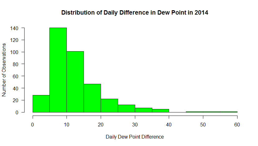
This histogram shows the frequency of occurrence for dew point observations that fall within select “bins”. You can control the number of bins with the “breaks” command. Breaks can be a number or a sequence of numbers. If you just specify a number, R makes a judgment on how to divide the data. If you use a sequence, you can precisely control how the data are distributed.
For example, substitute: breaks=20, in the histogram command. Now you can see counts for every 5 degrees [37]. Does this new graph communicate some different information than a standard time series graph? Later, you will learn more about distributions and how they can help you make inferences about the probability that a certain event will occur.
Note: I also added a new parameter, “las”. This sets the orientation of the tick labels. Play around with the values to see what happens (valid values are: 0, 1, 2, 3).
There's one more thing I wanted to point out. The hist(...) function not only creates a plot. Like many functions of R, the hist(...) returns a data structure that contains all of the precise values for the bins. I captured this information in the variable hist_output (remember, you can examine its contents by simply typing the name in the console or using R-studio's Environment tab. With this data, you can use the values to perform computations on the data, or add this information to the plot itself (like labeling values, etc). Adding a line such as...
text (hist_output$mids, hist_output$counts+5, labels=hist_output$counts, cex=1.2, col="black")
allows you to add custom text to your graph (here's my example [38]). You can read more about the text command [39] and play around with the settings if you wish.
Finally, allow me to show you one more bit of code that combines what we have learned so far. Substitute the following code for the single histogram plot command
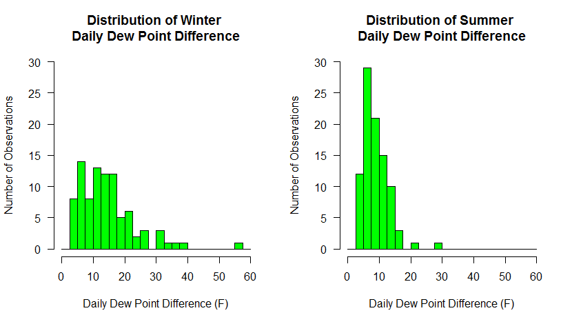
# make two plots... 1 row x 2 columns
par(mfrow=c(1,2))

# calculate a column of dew point differences
# BTW, I could have done this for the last set of histograms
mydata$dwpt_diff<-mydata$max_dwpf-mydata$min_dwpf

# plot only the differences in DEC, JAN, and FEB
hist(mydata$dwpt_diff[mydata$date > "2014-11-30" |
    (mydata$date >= "2014-01-01" & mydata$date < "2014-03-01" )],
     main="Distribution of Winter \nDaily Dew Point Difference",
     xlab="Daily Dew Point Difference (F)",
     ylab="Number of Observations",
     las=1,
     breaks=seq(0,60,2.5),
     col="green",
     xlim=c(0,60),
     ylim = c(0,30)
)

# plot only the differences in JUN, JUL, and AUG
hist(mydata$dwpt_diff[(mydata$date >= "2014-06-01" & mydata$date < "2014-09-01" )],
     main="Distribution of Summer \nDaily Dew Point Difference",
     xlab="Daily Dew Point Difference (F)",
     ylab="Number of Observations",
     las=1,
     breaks=seq(0,60,2.5),
     col="green",
     xlim=c(0,60),
     ylim = c(0,30)
)
Here we've done a couple of things. First, we've divided the plotting region into two panels (1 row by 2 columns). That means that each hist(...) call will go to a different panel, rather than one replacing another. Next, we have created a column in our data frame to hold the dew point differences. We could have done this at the very beginning of the histogram discussion but we do it now so that it makes the winter/summer selection easier. Finally, we make two hist(...) calls, using the technique we learned to partition the data. Make sure you understand how subsetting like this is accomplished... it is so powerful. To ensure that both graphs had the same breakpoints and axis scales, I specified the breaks explicitly with a sequence of numbers and I also added an explicit axis limits using xlim and ylim. Make sure you experiment with each of these new commands to see how they work.
Below are the graphs produced. What trends do you observe in the data? Do these graphs tell you something different about the data than the first set of graphs did?
Box Plots
Remember that box plots are also a nice way to look at distributions of data, especially discriminated by a third variable. In this example, we will look at the distribution of dew point temperature in State College by month for the year 2014. To begin, start a new R-script file, enter the following code and source it:
# you can find this code in: boxplot.R

# This code plots a box-and-whisker plot of daily differences in
#  dew point temperatures.

# read in the dew point data file
mydata <- read.csv("UNV_maxmin_td_2014.csv", header=TRUE, sep=",")

# tell R about how the date column is structured
mydata$date<-strptime(mydata$date, "%Y-%m-%d")

# create a column of numerical months
mydata$month<-as.integer(format(mydata$date, "%m"))

# reset the plot area just in case you have just
# come from the two histogram exercise
par(mfrow=c(1,1))

boxplot(max_dwpf~month, mydata,
        xlab="Month",
        ylab="Daily Maximum (F)",
        main="Daily Maximum Dew Point Observations for 2014",
        las=1,
        xaxt="n",
        pars=list(medcol="red", whisklty="solid", whiskcol="blue", staplecol="blue")
)

# create custom axis labels
axis(1, at=c(1:12), labels=rep(month.abb, 1))
Your graph should look like the one below. If we look at the code, you will notice it resembles the histogram code with the exception of a few lines. First, there is the line that creates a new column in the data frame called "month". We parse the date column and extract a numerical representation of the month. We need this information because a box-and-whiskers plot needs to know how to partition the data. In this case, we want the max_dwpf variable to be binned by month and we indicate that by the expression: max_dwpf~month in the boxplot function call (the tilda symbol "~" is often used in R as a representation of the word "by"). A second addition is the line that contains the function: axis(...). This adds a custom axis to the bottom of the graph. Notice in the plot call, I have the command xaxt="n". This means to turn off the default x-axis so that I can add one of my own (try it without the custom axis to see what you get). You can learn more about the many ways to customize plots and axis values by simply Googling "R custom axis".
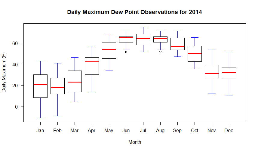
Remember that in a box-and-whiskers plot, the median is represented by a line running through the center of the box (in the code above I have set the median line to red). The second and third quartiles are defined by the top and bottom of the box. Fifty percent of the observations, therefore, lie within the box (the width of the box is called the interquartile range). The first and fourth quartiles are represented by the whiskers on either side of the box. An outlier is a point that lies more than one and a half times the length of the box from either end of the box. In R, outliers are shown as small circles plotted beyond the end of the whiskers.
Finally, know that you can also add lines and points to box graphs, just like you did to other kinds of plots. For example, if we wanted to plot the mean of the observations along with the boxes, you might add the following code:
# Calculate and plot the mean max dew point for each month
points(aggregate(max_dwpf~month, mydata, mean), pch=18, cex=2)
The aggregate(...) function is a very powerful way to calculate simple statistics on columns of data. The result is a data structure that in our case provides the x and y coordinates for plotting our mean values for each month. Run the script again to see the means plotted as diamonds on top of the box plots [40].
Image & Contour Plots
Prioritize...
After completing this section, you will be able to plot data sets that contain two independent variables. Plots covered in this section are contour plots, filled contour plots, and image plots.
Read...
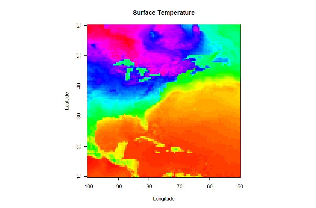
Up to this point, we have been working with data that only contains one independent variable (for example, temperature versus time). However, meteorological data is inherently spatial and often requires two or more independent variables. The simplest type of 2-D plot you might use to visualize this type of data is an image plot. Image plots essentially display pixelated values of a single dependent variable as a function of two independent variables (latitude and longitude, for example).
Open a new script file and copy the script below. You will need to load this gridded dataset of surface temperature [41] that I have prepared for you. Save the file (right-click -> Save As...) to your R-script directory (and don't forget to set R-Studio's working directory to match). Note this is an .RData file. These files are essentially R-objects (variables) saved from a previous session of R. Because they are already defined as an R-object, you don't need to "read" them in. Instead you simply "load" them. It's a nice way of storing a permanent copy of some R-data that you've been working on and want to keep between sessions. If you want to read more, check out this article about various ways to save R data [42].
# you can find this code in: image_plot.R

# This code creates an image plot of surface temperature

# load a pre-made R dataframe called model.grid
load("sample_grid.RData")

# define a palette of colors
colormap<-rev(rainbow(100))

# Set the display to be a square
par(pty="s")

# create an image plot
image(model.grid$x, model.grid$y, model.grid$z, col = colormap,
           xlab = "Longitude", ylab = "Latitude",
           main = "Surface Temperature")
There are a few new commands in the script above that I want to highlight. In addition to the aforementioned load command, note that I defined a specific color palette for my plot. I first define a vector of 100 colors selected from the default palette "rainbow" (I also reverse the order). Then I set the col parameter equal to my vector of colors in the image(...) command (col=colormap). R can give you almost any color scheme you might want. If you want to read more about color, I suggest starting with this color cheatsheet [43]. You might try removing the col=colormap to see the default color map for image(...).
Finally let's look at the image(...) command. First, remember that you can ?image or Google "R image" to find out all of the possible optional parameters that this plotting function takes. As a bare minimum, you must specify a vector of X-values, vector of Y-values, and a matrix (2-D) of Z values that map onto the X and Y space. I have provided you these basic vectors as part of the dataframe model.grid that was saved in the RData file (Can you see it in your environment space?). However, you will likely find that the data you want rarely comes in such a format (for example, some data might be a triplet-pair: {x, y, z}). Therefore, know that you might have to do some data manipulation to get things in the right format... this function is picky! Also note that image(...) does not give you a legend strip along with the plot. If you want the legend, you can substitute the command: image.plot(...) instead. This function however is not built-in to the base functions of R. To use image.plot(...) you are going to need to install the package "fields" (we'll discuss packages on the next page).
Contour Plots
Perhaps a pixel-by-pixel plot will not tell us what we want to know about a particular 2-D data field. In such cases we might want to look at a contour plot of the data. Contour plots strive to group regions of similar value. Contour lines can pinpoint specific values better and the contouring process tends to smooth the data. In case you’re not familiar with interpreting contour plots, you can take this little detour...
Let's now look at how we might contour our pre-loaded data set. Modify your image.plot script or start a new one.
# you can find this code in: contour_plot.R

# This code creates an contour plot of surface temperature

# load a pre-made R dataframe called model.grid
load("sample_grid.RData")

# Set the display to be a square
par(pty="s")

# create a contour plot
contour(model.grid$x, model.grid$y, model.grid$z,
           xlab = "Longitude", ylab = "Latitude",
           main = "Surface Temperature")
Here's the contour plot this script produces [44]. Note that the contour function and image function take input data in the same structure and the function call is quite similar. Let's look at what else we can do with this command. Try specifying the contour intervals using the levels parameter:
# create a contour plot
contour(model.grid$x, model.grid$y, model.grid$z,
           levels=seq(-30,80, by=5),
           xlab = "Longitude", ylab = "Latitude",
           main = "Surface Temperature")
What about stacking two contour plots For example, let's add a second contour plot that consists only of the freezing (32F) contour as a thick blue line. Directly below the first contour function call, add (don't replace) this command to your script:
# create another contour plot
contour(model.grid$x, model.grid$y, model.grid$z,
           levels=c(32),
           xlab = "Longitude", ylab = "Latitude",
           main = "Surface Temperature",
           lty=1, lwd=2, col="blue",
           add=TRUE)
Note the addition of the add=TRUE parameter. This simply adds the second contour plot on top of the first one.
Solve It!
Using the data set from this page, create the following image [45] showing an image plot with an overlaid contour.
Here is a possible solution:
# This code creates an image plot with contours of surface temperature

# load the data
load("sample_grid.RData")

# specify our color palette
colormap<-rev(rainbow(100))

# Set the display to be a square
par(pty="s")

# draw the image plot
image(model.grid$x, model.grid$y, model.grid$z,
           col = colormap,
           xlab = "Longitude", ylab = "Latitude",
           main = "Surface Temperature")

# now draw the contours on top (note the "add=TRUE")
contour(model.grid$x, model.grid$y, model.grid$z,
        add=TRUE)
Remember that you need not memorize all of these commands (recall my philosophy statement). Just make sure that you save examples of each type of graph for future reference. We’ll make use of such plots in greater detail in future lessons and you'll probably develop a few key "go-to" plots that you can tweak, depending on what is needed. Now let's examine R's ability to display data using custom plots created by others.
Read on.
Custom Plots
Prioritize...
After completing this section, you will know how to download and install custom packages that give the user access to specialized functionality. We demonstrate this functionality by exploring a package that plots wind roses.
Read...
We have looked at many different types of plots so far in this lesson. But what if we want a plot that is not included in the standard libraries? A wind rose [46] for example.
Think of a wind rose as a circular histogram of wind directions and speeds. These graphics are used by those interested in wind climatology. So, how might we get R to generate a wind rose? Certainly, given R’s powerful programming language, we could figure out the commands necessary to generate the plot that we want. However, there’s a better way. We can look for someone who has already done the work for us. Because R is open-source, people from all over the world are actively writing and contributing new functions that everyone can use. These new functions are grouped together into packages found on the R-project website [47].
With a little searching, I discovered a package named “openair” [48] which (among other things) plots wind roses. If you look at the user’s manual, you’ll discover all sorts of functions that deal with the analysis and display of air pollution data. At this time, I’m only interested in accessing the wind rose function.
First, I need to download and install the package. Here, R-studio is of great help. In the lower-right panel, click on the “Packages” tab. This displays all of the currently downloaded packages. Click on the “install” button, and in the dialog box that appears, type the package’s name: “openair” in the space available (leave everything else as default). You can also have the script check for and install the package by adding code such as lines 7-8 below.
Open a new R-script file and enter the following code (but don't source the file yet):
# you can find this code in: wind_rose.R

# This code plots the a wind rose using the package "openair"

# check to see if openair has been installed
# if not, install it
if (!require("openair")) {
  install.packages("openair") }

# connect to the openair package
library(openair)

# Read in the RAW 5-minute ASOS file...
wind_data <- read.fwf("64010KPHL201401.dat",
                       widths=c(-28, 17, -21, 3,2),
                       header=FALSE,
                       col.names = c("date","wd","ws"))

# Convert the fields to the proper data types
# Packages often require strict adherence to data rules
wind_data$date <- as.POSIXct((strptime(wind_data$date, format = "%m/%d/%y %H:%M:%S")))
wind_data$wd<-as.numeric(as.character(wind_data$wd))
wind_data$ws<-as.numeric(as.character(wind_data$ws))

# plot the wind rose
windRose(wind_data, angle=10,
         paddle=F, breaks=c(0,5,10,15,20,25), seg=0.65,
         offset=5, main = "Winds at KPHL, January 2014",
         key=list(footer="knots", height=1)
)
Let's break it down.... First, we must tell R that we are including functions that are not part of its core set of commands. The line, library(openair) tells R to recognize all of the functions included in the package openair. If you don’t include this line, you will get an error when you try to use the windRose command which is only defined as part of the openair library. Next, we read the raw ASOS file of 5-minute averaged data for the Philadelphia International Airport [49]during January 2014 (to download the file, right-click -> Save As... on the link). If you want to grab your own data, you can get it from the ASOS NCDC page [50] (click on the 5-minute data link). Take a look at the file... it's a mess of numbers. After reviewing the "td6401b.txt" documentation found in the data directory, I decided to read the file into R using read.fwf() which reads in fixed-width files. Pay particular attention to the widths fields. I start out by ignoring the first 28 characters, then I read in the next 17, ignore 21 more, then read in 3 characters and 2 characters. I name the columns that I kept as "date", "wd", and "ws" (the "wd" and "ws" are required column names for the windrose command). Next, I needed to convert the columns into their proper data type (there's that nebulous type called a "factor" again).
Finally, let's look at the windRose command. How did I know how to use it? Remember that you can always type “?command” in the console window to see how a command is used. Or better yet, click on the packages tab (that you just used to install the openair package), find the “openair” package in the list, and click on it. Now you are given a listing of all the functions contained in the package. Scroll to the bottom and select the windRose function. Now you can see the usage and all the possible parameters that can be included.
You're welcome to play around with various settings to see how they affect the plot. I did, however, want to point out a fact about the input data. It's very important to make sure that your data match what the functions are expecting. In the case of windRose, the function requires a data frame that has columns with names "ws" (for speed) and "wd" (for direction). In the interest of full disclosure, I note that the documentation says that you can specify by name which columns are speed and direction, but I have found if you deviate from the "ws" and "wd" names, the function can behave unpredictably.
Finally, if you haven't already, source the file and generate the plot (seen below). We can see a few interesting trends. First, the winds during this time appear to come from two general quadrants: southwest, and northwest. The winds from the southwest tend to be lighter -- less than 10 knots. Northwest winds have higher observed wind speeds. We can see these trends if we examine the histograms of wind speed [51] for NW versus SW directions. Since this is January, I suspect the strong NW winds follow in the wake of strong cold fronts.
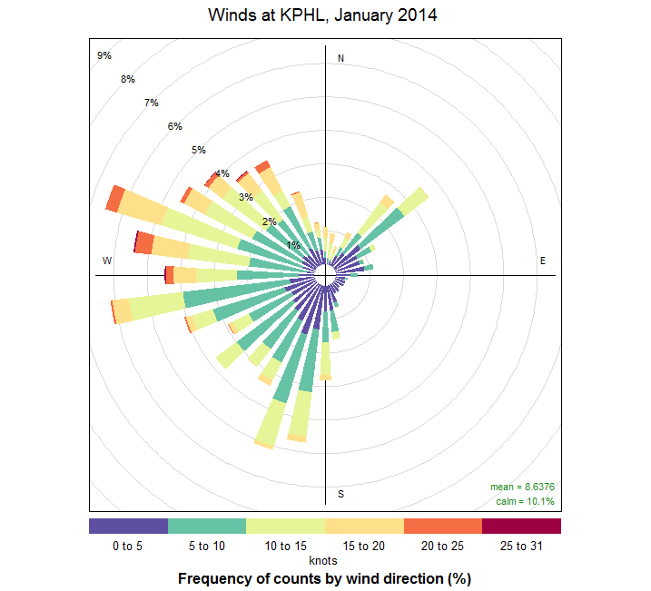
Throughout this course, we will be using packages built by others. You will discover that doing so is extremely convenient in retrieving and navigating large data sets. Some institutions like NOAA or NCDC even offer their own packages specially designed to interface with their own data. This saves us a great deal of time and effort. If you find you want to do something unique (or even find a better set of plotting tools) look first for a package to do the job.
Missing Values
Prioritize...
By the end of this section, you should be able to apply different methods for replacing missing values and list the pros and cons for each method.
Read...
Remember that in R, missing data, or data that is "not available" is designated by the constant "NA". You can think of NA as a place holder that has no value. Now, let's assume we have a data set where known bad/questionable/missing values have been replaced with NA's (using a line of code like: my_obs$temp[which(my_obs$temp=="-99999")]<-NA). The next question becomes, how do we deal with these non-existent values? There are three main actions we can take: remove rows of data with NA's completely, fill them in (with a proxy value), or leave them alone. What you choose will depend on your analysis and how sensitive that analysis is to having missing data.
Removal
Generally, if we are interested in some bulk characteristic of the data (and depending on the amount of data we have), simply removing missing values may be the best option. There are two ways to remove missing values. The first is listwise deletion. Listwise deletion removes all rows containing a missing value from the data set. For example, if I have a time series of temperature with 100 values, and the values at space 2 and 24 are missing, I would delete those values reducing my time series to 98 values. In R, you can use the function na.omit(...) which will perform a listwise deletion. But what if you are examining more than one variable. Let’s say you want to look at a temperature and relative humidity time series at a station -- again, there are 100 values for each. As with the first example, we have 2 days with missing data, but now in the relative humidity time series, 3 values are missing at spaces 2, 18, and 44. With listwise deletion, all cases with missing values are deleted. So, for the example above, we would delete the 2nd, 18th, 24th, and 44th values, resulting in a matched time series that is only 96 values long. In this case, you can think of listwise deletion as a "complete-case analysis", only obtaining cases where all variables have real data. Let's consider some code to demonstrate the use of na.omit(...)
#generate some random data and place it in a data frame
# the function "rnorm" creates random normal data with the
# given mean and standard deviation
my_obs<-data.frame("day"=1:100,
                   "temp"=rnorm(100,mean=50,sd=15),
                   "rh"=rnorm(100,mean=70,sd=15))

# Create some missing entries
my_obs$temp[which(my_obs$temp<25)]<-NA
my_obs$rh[which(my_obs$rh>100)]<-NA

# Print out number of observations and number of NAs for each variable
print(paste("Num obs:",length(my_obs$day),", Missing T:",sum(is.na(my_obs$temp)),", Missing RH:",sum(is.na(my_obs$rh))))

# Throw out rows with missing data
my_obs<-na.omit(my_obs)

# Print out number of new number of observations and verify no NAs left
print(paste("Num obs:",length(my_obs$day),", Missing T:",sum(is.na(my_obs$temp)),", Missing RH:",sum(is.na(my_obs$rh))))
A second type of omission is called pairwise deletion, which can be described as an ‘available-case analysis’. A pairwise deletion attempts to minimize the loss created by listwise deletion. In pairwise deletion, only the missing values that occur in both data sets are removed. So, in the example above, only 1 case (space 2) would be eliminated. This means that the statistics will be calculated with some missing values included. If you have a substantially long data set with few missing values, or your analysis requires complete samples (containing no missing values), I suggest going with listwise deletion. However, if you can’t take the loss of small sample size, pairwise elimination may be an option.
Imputation
Imputation is a general term used to describe the process of replacing missing data with generated (artificial) values. You should only use imputation if missing values will adversely affect your analysis or visualization of the data.There are many methods of imputation and the choosing the best method will depend on the data itself as well as the analysis you wish to perform. We will only discuss a few simple methods here, while more advanced approaches will be discussed in future courses.
One of the more common and easy methods of imputation is interpolation. Interpolation creates a new value that "fits" within the surrounding context of other observations and works particularly well for temporal or spatial data sets. Interpolation comes in many flavors. Linear interpolation approximates the missing value by first constructing a trend ‘line’ that spans two know observations. Then, a value is selected from that trend line at a point contingent on the distance the missing value is from the two locations. Linear interpolation assumes that a observations vary quasi-linearly between sets of points. This is a decent approximation if the resolution of the observations is higher than the significant natural variability. For example, interpolating a missing hourly temperature will be more accurate than interpolating a daily temperature. Because hourly temperature can, in most cases, be seen as varying linearly while average daily temperature show considerably more variability from day-to-day.
R has several built-in functions for linear interpolation. Check out the use of the approx(...) function [52] which creates a liner approximation for a given data set containing missing values.
# Create some fake temperature data
time<-c(1:48)
temp<-(-30)*sin(time/24*pi+pi/10)+70

# Pick 10 random times and replace those temperatures with NAs
missing_times<-sample(2:47, 10, replace=F)
temp[missing_times]<-NA

# plot the time series using square symbols
plot(time, temp, pch=0, cex=2,
     main="Using approx() to Fill in Missing Values",
     xlab="Observations",
     ylab="Temperature (F)")

# interpolate the missing data
# data that's not missing will just be the same
complete_temp<-approx(time, temp, xout=time)

# plot the interpolated data using stars
points(complete_temp$x, complete_temp$y, pch=8)

# How good is it? This computes the root mean squared
# error caused by the interpolation and writes it on the plot.
text(35,50, paste0("RMSE: ",
    mean(sqrt((complete_temp$y[missing_times]-
        ((-30)*sin(missing_times/24*pi+pi/10)+70))^2))))
Here is the graph created by the R-script above [53]. The squares represent the original "observed" data with some random missing values. The stars show the interpolated time series. Note that the root mean squared error is less than 0.5 degree.
Another method is to use a more complex function to model the gap created by the missing data. In R, we can use the function spline(...) [54] to use cubic splines (3rd-order polynomials) instead of lines to find the missing values. Modify the code above by replacing the line containing the approx(...) function with: complete_temp<-spline(time, temp, xout=time, method = "fmm"). Here's the graph of the spline interpolation [55] for our simulated data. Notice how small the RMS error is! Mind you, real data won't behave quite so nicely, but you can see how higher order approximations are better than linear ones.
In the case of spatial data, you can also fill the missing value by considering surrounding points. There are many different methods of varying complexity. If you are looking for some simple bi-linear or bi-cubic interpolation routines, check out the package "akima" [56].
Leave the Missing Values In
The last option, of course, is to leave the missing values in the data set. This is perhaps the most informative choice for the users of the data and may itself provide additional information pertinent to your analysis. For example, let's say you wanted to compute the mean daily temperature at a location for December, January and February. However, on February 2 an ice storm caused a two-week data loss (the sensor was damaged) at your site. Should you simply calculate a mean with the data you have? Or, is two weeks (out of 12 total) too much missing data? We'll tackle such questions in future courses, but suffice to say, you should give serious consideration to at least providing a notation that a significant amount of data was missing from your calculation of the mean.
Leaving missing data in the data set need not sabotage your analysis, however. In R, many functions have parameters which allow you to ignore the NA values. You can look for parameters such as na.rm or na.omit when looking at the help page for a particular function. Setting this value to TRUE will cause the function to ignore the NA values from any calculations that the function performs. Consider the help page for the function mean(...) [57]. Modify the code above (remove the listwise deletion) to see the difference na.rm=TRUE makes when computing a mean with NA values.
You will also see in future courses that the number of samples is a key parameter in the calculation of various statistics. If you leave in the missing numbers, the number of samples stay the same but no added information is gained. Deleting the missing values reduces the number of samples which can change the results. The size of the effect varies depending on the specific statistic. You can perform sensitivity analyses to determine this size (compute the statistic with missing values in and with missing values removed).
Transforming Data
Prioritize...
After this section, you should be able to perform various transformations on a dataset and determine which type of transformation would work best.
Read...
Sometimes unruly data is not caused by missing values, but rather is difficult to visualize due to range or clustering issues. In such cases, we may want to apply a data transformation to better visualize or communicate your message. A data transformation is the application of a mathematical function on each data value. In essence, while data transformations may change the value of the data, they do so in a known (and reversible) manner.
To illustrate when a data transformation might be needed, consider the histogram below that shows the distribution of hourly non-zero rainfall observations during the year 2010 for Alexandria, LA. You'll note right away that this graph is not at all informative. This is because most hourly observations are located in the first bin (<0.5 inches) while at the same time, there are some observations that exceed an inch. Increasing the bin number [58] doesn't help us that much because once again, 1) most of the observations are contained in the lowest bin and 2) that bin is so large that smaller count values are difficult to read. This type of distribution is referred to as having a right skew because most values are small (a left-skewed distribution would have mostly large values).
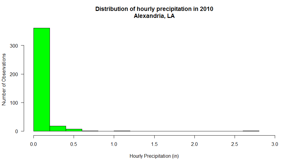
But what if we wanted to understand the distribution of observations better? How might we transform the data to give us more insight? In order to combat the large discrepancy in scale of the histogram bins, let's look at what happens if we apply a base-10 logarithmic transform to the observations. In case you are not familiar with logarithms, all you basically need to know is that a logarithm transforms a number into the exponent of its base. For example, the base-10 logarithm of 100 is 2 because 100=102. Likewise, log10(10)=1 and log10(1)=0. Logarithms of numbers smaller than 1 are negative, so log10(0.1) is -1 because 10-1=0.1. This means that I can represent a large range such as 0.1 to 100 on an axis that only spans -1 to 2. To plot the log-base-10 histogram, you just need to make your histogram call: hist(log10(mydata$precip), ....). Here's the log10 histogram of the precipitation observations [59]. (Note: I should also point out that a logarithmic transformation cannot be applied to negative or zero data values).
Working with transforms can be a bit tricky to interpret, for you and your audience. Make sure that you clearly label any transform that you have performed and be prepared to explain what you have done (and why). Notice in the log10 histogram, I have changed the x-axis label to reflect that I have taken the log10 of the data before binning. Still, it may be hard to recognize that "-2" on the x-axis is actually 0.01 inches. One approach is to change your x-axis labels back to the untransformed values. In R, you can turn off the automatic x-axis using the plot parameter xaxt='n', then add your own axis command such as: axis(side=1, at=seq(-2,0.5, 0.5), labels=c(0.001, 0.031, 0.1, .31, 1, 3)). The result is a histogram that is much easier to read [60] even though the labels are not equally spaced.
Finally, note that the first bin has a very large number of counts and the bins to the right have very small count values -- so much so, that it's hard to determine their actual values. Perhaps we could apply a log10 scale to these values as well. The answer is "yes" of course, but we need to approach things a bit differently. Examine the code and output below...
 # Let's assume that column "precip" is in a dataframe "mydata"
# I have assigned NA to all missing, trace, and 0 values.

# Perform the histogram calculation but do not plot the results
# Save the results in a dataframe called "hist_plot"
hist_plot<-hist(log10(mydata$precip),breaks=20,plot=FALSE)

# Now make the plot.  Notice the log="y" that sets the y axis to a log scale
plot(hist_plot$breaks[1:25],hist_plot$counts, log="y", type='h',
     lwd=25, lend=3,col="green",
     main="Distribution of hourly precipitation in 2010\nAlexandria, LA",
     xlab="Hourly Precipitation (in)",
     ylab="Number of Observations" )
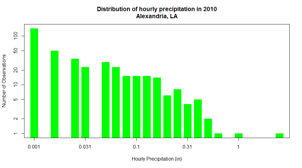
Notice now, that not only can we see all of the detail in bins of the histogram, we can clearly distinguish the values of each bar (from the largest to the smallest). I should note that we might lose the perspective on the shape of the distribution of observations, we gain detailed insight into the various amounts of precipitation and their frequency of occurrence over during the year.
While log transforms are by far the most common, there are several other methods to chose from depending on the characteristics of your data. Check out the table below for a summary of various other data transforms.
| Method | Math Operation | Good for: | Bad for: |
|---|---|---|---|
| Log | ln(x) log10(x) |
Right skewed data log10(x) is especially good at handling higher order powers of 10 (e.g., 1000, 100000) |
Zero values Negative values |
| Square root | √x | Right skewed data | Negative values |
| Square | x2 | Left skewed data | Negative values |
| Cube root | x1/3 | Right skewed data Negative values |
Not as effective at normalizing as log transform |
| Reciprocal | 1/x | Making small values bigger and big values smaller | Zero values Negative values |
NOTE: Before we leave this topic, there are two points that I think are very important... 1) Data transformation is only useful when displaying data. Do not transform your data if you are going to be applying any sort of statistical analysis on them. Applying a data transform before you process it may have unpredictable and erroneous results. 2) When you show transformed data, make sure that you are very clearly indicating the type of transform that has been applied. You should do this both in a graphic's title (e.g., "Log10(Pressure) versus Temperature") and in axis labels (e.g., "1/Temperature (1/oC)").
Debugging Code
Prioritize...
After reading this section, you should be able to follow the debugging process, google problems effectively, and find solutions for the some of the more common errors you may encounter in R.
Read...
Learning to code is like learning a new language. It’s hard, you’ll stumble, you’ll make mistakes, but learning to correct those mistakes is one of the most important parts of the process. If you mispronounce a word, you don’t just move on, you keep trying until you get the pronunciation right. Similarly, in coding, you can’t just move on in the code if there’s an error. You must keep trying until you fix the code and it runs smoothly. The good thing about coding is that once you figure out the debugging process for one language, you can apply it to almost all languages. The content here is meant to guide you and help you along in the debugging process. My goal is for you to become self-reliant when it comes to coding errors. Asking questions and seeking help is still a part of the process! I’m just not the first step.
Debug 101
There is no set process for debugging. The route I take to debug will be different from the route that you take; it comes down to personal preference. As you write more and more code, your debugging method will be refined. But if you are just starting to code, it can be quite challenging to know where to even begin. Therefore, I will present my debugging process. You don’t need to follow it step-by-step; it’s merely here to show you what I do when I get a coding error.
- I start by opening RStudio and clearing out everything. It’s important to start with a clean slate. To do this, I run the command rm(list=ls()). This clears out the environment.
- Before debugging, I actually highly recommend you perform this step and rerun your code to see if the error still occurs. Sometimes, we override variables when testing out code, so this is a good first check to ensure we really have an error or not.
- Next, I open the script and load in the data needed.
- Then, I run the script line by line until the error occurs.
- Sometimes, I luck out and know the error message, but most times that’s not the case. I start by stating the goal of the line. What is the purpose of the function? What sort of outcome do I expect (very important if you have no error but are getting unexpected values)? Stating the objective will help you focus on the problem at hand.
- Once I know the goal, I figure out what I need to reach that goal. Maybe the function selected was not the right function to use (typical when we have unexpected results instead of error messages).
- If the function selection is correct, I then move on to the inputs. What goes into the function (do a help on the function)? Am I providing all the parameters? Maybe I’m missing an input?
- Once I know I’m providing all the right input, I check to see if the input is correct. That is, I’ll print out the values in each input or plot them or use the summary command. The goal is to make sure the input is realistic.
- If the input is NOT realistic, then I go to where I create that input and check the code there. Usually, I’ll have one little mistake; like missing an index or I didn’t convert to numeric values. Generally speaking, this is the type of error I see the most.
- If the input looks realistic, then my next step is usually to google the error message. You can read more about how to google coding problems in the next section.
- At this point, I either have fixed the problem or I’m stumped. If I’m stumped, it’s probably time to reach out for help; either to peers, mentor, instructor, or online (Stack Overflow [61] is a great website to post coding questions).
- Now I should have a solution. The next step is to fix the code and then clear out my environment again. I rerun each line of code and see if the error is fixed. If I have a new error, then I go through the process again. Otherwise, my code is fixed and I can move on.
Again, the steps presented here are not meant to be the holy grail of debugging, but instead are meant to help guide you through the process. What works for you will be different from what works for me or your peers. Refining this process will only make you a better coder.
Google It!
Googling is an important step in the debugging process. But googling efficiently is a challenge. If done correctly, you’ll land on the perfect result instantly. Done poorly, and well, you’ll be sifting through hundreds of pages before coming to the right answer.
As you debug more and more code, and thus google more and more errors, you’ll become more efficient (e.g., you’ll know what gets you to the answer quicker and what doesn’t). For me, I have more luck then expected by simply copying the error output and pasting it directly in the google search bar and adding ‘in R’ to the search. If this doesn’t work, my next search is usually the function name + ‘error in R’. I’ll have to look through a couple stack overflow pages, but this usually does the trick.
Searching to find a function can be a bit more tricky. Finding the right phrase to describe the function you need is important. I usually start by googling a broad idea with the phrase ‘in R’ attached. Then after looking through a few pages I start to see a more common phrase and I’ll google that instead, again with ‘in R’ attached. I’ll usually find some functions at this point that let me do what I wanted. I then search for examples of these functions to see how I should set up my code.
There are some great links in the resources that discuss best practices for googling. Similar to your debugging process, your googling process will be unique and probably change over time.
Quiz Yourself...
Before we work through some examples, let me introduce you to the DataCamp setup. Although you've seen DataCamp examples before, we will be using it here in a 'quiz mode'. You'll run the code, but an error will pop up. Your task is to fix the code so the error message goes away. You can change and rerun the code as much as you want. If you are having trouble or need a little extra guidance, click the 'Hint' button. Let's give it a try. Run the code below without changing anything.
You should have gotten the following error: "Your code contains a syntax error". If you look in the console, you'll see the error is specifically at line 2 (where you assign "a") and the specific error is a parsing error. Do you know why the error is occurring? Try fixing the code and rerunning. Did you get the right answer now? If not, try clicking on the 'Hint' button. Now fix the code again, and see if you get the right answer. If you are still stuck, you can always click the 'Solution' button to see what 'a' should be assigned to.
Now that you've seen how DataCamp can help you practice your debugging skills, take a look at the coding examples below. Each has a unique error. Your task is to find the error and fix the code. You can try as many times as you want. All examples will use 36 years of monthly temperature data from NYC. There are two variables: Date and Temperature. The variable Date is a date object while the variable Temperature contains the temperature data in degrees Celsius.
For the first example, estimate the 36-year mean for the month of August. There is one error in the code:
For the second example, I've estimated the 36-year mean for each season (DJF, MAM, JJA, and SON). The results are saved to the variable seasonMean. I want to replace the DJF estimate with an NA. Again, there is one error in the code:
For the third example, plot a time series of monthly temperature for NYC from 2000-2010. There is one error in the code:
Explore Further...
I highly suggest you check out the resources listed below. Seeing how other people debug is of great use. There are some great tutorials, specific to R, and some more broader views on how to debug in general. I encourage you to take some time now and read through the material.
Advanced R (Debugging) by Hadley Wickham [63]
Exceptions Debugging (Advanced R by Hadley Wickham) [64]
Debugging in R [65]
R Debugging Tutorial [66] (video)
Lesson 3 Activity
Assignment Objective...
You will use the skills you have learned in R to dive into some large, weather data sets. The goal of this assignment is to create the required graphics to answer the various posed questions. Note: We'll also include some of the concepts about communicating your message from Lesson 2.
Let's get started.
Download the data...
Here is the file containing the weather data that you will need [69]. It is a comma-delimited file containing temperature and precipitation data at O'Hare International Airport from 1 January 1976 to 31 December 2016 (40 years). Assume for the moment that the data is accurate and that no changes to the site have occurred that would affect the record. We'll learn in the next lesson how to make such determinations, but let's not complicate things at this point. WARNING! Editing this file in Excel will change the date formats (just be aware of that).
Deliverables...
Please use R to create graphics that answer the following questions regarding the data. You can build on the pieces of code that I provided in the lesson, but know that I have intentionally left a few challenges in your way that you are going to have to overcome (as does working with any new data set). You are welcome to convey the answers to the questions in any manner you wish, however, you are expected to have a clear resultant message for each problem you are asked to examine. (Correct graphics, correctly formatted, are a critical requirement.)
Each question should contain the following components:
Question and Answer Summary – Start each section of your report with the question you are trying to answer and your key message (no more than a paragraph) of what the data tell you. All of the questions here are simply asking you to present what the data say, without any deeper meteorological analysis or editorial. This, of course, is not what would happen in the real world, but visualizing the data is a key first step in any analysis procedure. If you are a statistics whiz, please refrain from providing calculation more complex than an "average" or "sum".
Graphic(s) – You may provide no more than two graphics for each question. Your client is busy and doesn't want to be bored to death with a stream of endless graphs. Please make sure that each graph is appropriate for your message and contains all of the things that good graphs should have (titles, labels, legends, etc.). You are not limited to only the look and feel of the graphs that I have presented in this lesson. Indeed, you may (and are encouraged to) experiment with different looks and ways of presenting the information as well. However, don't worry if such exploration is beyond your coding abilities. Most often, a simple approach is best to convey the proper message.
Reasoning – Provide the reasoning as to why you chose to present the data in a certain way. Why did you use a line graph instead of a bar graph? Why did you choose a histogram instead of a scatter plot? This section is key. It is meant to show me how you thought about your approach. You would never get into this much detail with a client, but you might have to argue such reasoning to members of your team.
R-Code – Finally, provide the code that produced the graphic(s) in each question. As I have stated earlier, I am not grading your code, per se. However, I would like to be able to provide feedback on your approach. Please make sure that your code is nicely formatted and has enough comments so that I can understand what you did.
Questions...
- Over the course of the year, what is the "normal" climate (normal max temperature, normal min temperature, and precipitation) like in Chicago? As a point of suggestion, check out this page from the NWS [70] illustrating how precipitation with respect to normal is plotted. I'm not saying that you have to do it this way (if you feel there's a better way), but I wanted you to see some examples.
- The normal mean temperature for a particular day is usually based on the past 30 years of the record. But how "normal" is normal? Focus on the normal mean temperature at different months of the year. How "good" (in a qualitative sense) is the "normal" temperature at describing what you might observe? For what month(s) is the normal temperature a good measure of what to expect? What month(s) is the worst?
- The meteorological winter (Dec, Jan, Feb) of 2014-2015 seemed awfully cold... was it?
- The Chicago Heatwave of 1995 is fairly notable in its severity (Wikipedia article [71]) and in its "estimated" death toll. My grandparents lived just outside Chicago and I know that summers there can be hot! But, just how remarkable was this string of temperatures from 12 July to 16 July 1995 compared to other hot summer periods (not necessarily those exact days, but rather a "hot" string of days)?
- They call Chicago the "Windy City". Is this true? Is it windier in Chicago than in, say, Kansas City, Kansas (yes, no, sometimes)? Note that the original data set doesn't have wind. No problem. Here are 10-year records for O'Hare International [72] and Kansas City International [73]. These files are straight out of the ISD Database [74] so you might need to do some tweaking of
read.csv(...)to get them read in. Please use this library along with "openair" to discuss this question. For this question alone, I am suspending my 2-graphic limit (you may need a few here, but don't go crazy)!
The Fine Print...
- Please submit your report in either MSWord or PDF format.
- Saving images: R-Studio makes saving graphs a piece of cake. Notice that at the top of the plot window there is an "Export" pull-down where "Save as Image" is an option. When you choose "Save as image" you are given a dialog box where you can set the type (PNG is best), location, and filename of your image. I would set aside a folder for this assignment where you can save your images and then paste them into your word-processing document.
- Unlike your last assignment, please just paste all of your images in-line. I envision one page for each question with all of the required parts with the exception of the R-code perhaps.
- Proofreading is a must. It shows professionalism and care for your work. This includes not only basic spelling and grammar, but readability as well. If you struggle with proofreading, have someone give your draft a once-over and provide suggestions.
- Grading: I want to foster an environment where you can focus more on what you are learning that what "grade" you are getting. However, that said, I have to give some sort of grade and feedback for each assignment. Please see my assignment grading rubric in the Orientation section for general guidelines on assignment grades.
Submit Your Assignment
Please follow the instructions listed on the submission page in Canvas.Lesson 3 Activity Hints and Tricks
Hints and Tricks...
I know that this activity might be a bit rough for folks who are new to coding. So, I thought that I would use this page to provide some tips and tricks to help you get started. I have listed them according to each question that you are trying to answer. As more questions come in, I hope to add to this page.
General Thoughts
- Be careful if you open/edit/save your data file in Excel. Excel changes the format of the date column. You can still read it, but you will need to use a different format. You can use the following command to properly format dates in R (you can google "R as.Date" for more information.
# Format a column in dataframe "mydata" to be dates
# You have to tell R the format of the dates in the file
mydata$Date<-strptime(mydata$Date, format="%Y-%m-%d")

#but if you edited the file in Excel, you might need:
mydata$Date<-strptime(mydata$Date, format="%m/%d/%y")
- Make sure that you don't try to do too much in each line of code. If you keep each step separate, you can better figure out what's happening when things go awry.
Question 1: Normal Climate
- It's best to extract a year's worth of Normals you are going to need to plot. For example:
# Get a year's worth of dates
dates1976<-mydata$Date[(mydata$Date >= "1976-01-01" & mydata$Date < "1977-01-01" )]

# Get a year's worth of Max Temperature Normals
maxtemps1976<-mydata$MaxTemperatureNormal[(mydata$Date >= "1976-01-01" & mydata$Date < "1977-01-01" )]

#etc
Then, make your plots using these new variables. - For Normal precipitation, you might want to create a cumulative precipitation graph (which shows average accumulation over an entire year). You can use the function
cumsum(...)to perform this task.
Question 2: How Normal is Normal
- You can easily compute the deviation of the mean daily temperature from normal for a given month by using the following...
JanmeanTempdiffs<-mydata$AvgTemperature[(strftime(mydata$Date,"%m"))=="01"]-mydata$AvgTemperatureNormal[(strftime(mydata$Date,"%m"))=="01"]
Question 3: Cold Winter?
- Building on what you did in Question 2, there are lots of ways to go about this. What if we created a variable of daily temperature differences for every January day (like we did above) and then averaged them by year. Start with a variable of differences and the dates on which they occur...
JanmeanTempdiffs<-mydata$AvgTemperature[(strftime(mydata$Date,"%m"))=="01"]-mydata$AvgTemperatureNormal[(strftime(mydata$Date,"%m"))=="01"]

Jan_dates<-mydata$Date[which(strftime(mydata$Date,"%m")=="01")]
Now, to average these by year, we need to use theaggregate(...)function. This function takes one column of data and performs a function on it using grouping (specified in the "by" column). In the case below, I create a list of years by which to do the averaging.# use the aggregate function to get a mean January # departure by year. meanTempdiffs<-aggregate(JanmeanTempdiffs, by=list(strftime(Jan_dates,"%Y")), mean, na.rm=TRUE) colnames(meanTempdiffs) <- c("Year", "MeanDiff")Finally, we can sort the result by coldest January.coldest_Jans<-monthyTempdiff[order(monthyTempdiff$MeanDiff),]
- I'm not saying this is the best way to do this. What defines a "cold winter"? There may be several answers.
Question 4: Heat Wave
- Much like the Cold Winter question, there are some interesting ways however of visualizing this. Histogram? An image plot perhaps?
Question 5: Windy City
- For reading in the files, you might need to add the parameter
skip=2toread.csv(...). This will skip the first two header rows of the file (you can rename the columns you want to keep). I also suggest using the parameter,colClasses = "character", so that you can do the data conversions yourself (better this way). - The function windRose is picky... You will need your dates/time combined into a single data.frame column called "date". You will also need to make sure that the wind columns are properly labeled, converted to numeric, and have any missing data (999) converted to NA's. Here's the algorithm...
# read the data

# keep the date, time, direction, and speed columns

# create a single date column. Here's an example
# I labeled my unformatted date/time accordingly
wind_data$date<-as.POSIXct(strptime(paste(wind_data$date_uf,wind_data$time_uf), format = "%Y%m%d %H%M", tz="UTC"))

# convert wd and ws columns to numeric and set 999 to NA

# plot the wind rose
Lesson 5. Numerical Model Data Sets
Motivate...
In the quest to peer into the weather's future, perhaps the most enticing source of data is the numerical weather models. No doubt in the course of the nightly weathercast, you've heard the on-air meteorologists say something like, "We just don't know the path of the storm at the moment because the models are not in agreement." Just who or what are these "models" anyway? Is there some ultra-secret consortium of good-looking weather prognosticators? Furthermore, are these "models" even worth considering if they can't even agree on a weather forecast?

Indeed, insights about the current and future state of the atmosphere can be gained from weather data created by computers (that is, computer models). Such data are powerful tools but are certainly not all-knowing. You will need to tread carefully when gathering and interpreting the weather data in this lesson. But first, you need to become familiarized with how computers can be used to predict the future state of the atmosphere.
Let's get started!
Computer Simulations
Prioritize...
Most of this section is what I consider to be background knowledge. That is, it's not quite an 'Explore Further' section... rather the opposite. This section introduces the idea behind using a computer to solve the equations that govern how the atmosphere works. I am not going to assess you on the details of this material, but you should be familiar with it so that when we get to the meat of the lesson, you will understand what you are looking at.
Read...
Numerical weather prediction (NWP) is the term given to the process of predicting the future state of the atmosphere using a computer. Meteorologists call a list of instructions that produces a virtual weather forecast a computer model, or just a model for short. So, just how can a computer be made to forecast the weather? To answer that question, we have to talk briefly about some fairly complicated topics -- some fairly mathematical in nature. However, the following discussion is solely for your general understanding of how computers are used to predict the weather. Now, let's get down to business.
The first thing that you should realize is that a computer knows nothing about the "weather." That is, there is not a special "weather program" that can be loaded onto the computer so that it can analyze weather maps and make forecasts in a way that you or I do. Instead, the computer uses mathematical equations and the current state of the atmosphere to calculate what the atmosphere might look like at some future time (often called a "prog"). The exact nature of these equations is far beyond the scope of this course. Suffice to say, however, some of the equations are pretty straightforward and all of the inputs to the equations are easily measured, while others are far more complicated and must be approximated (the technical term is parameterized) by more simple functions or values.
The end result of all of this mathematical manipulation can be quite astounding. Take the animation below as an example. This numerical simulation is based on a set of equations that describe how simple water waves behave (called the shallow-water wave equations [78]). In the simulation below, these equations are used to simulate water in a square, imaginary "bathtub." The waves that you see are generated by an occasional "drip" that splashes down on the surface and sends ripples bouncing off the sides of the tub. Looks pretty real, doesn't it? This animation demonstrates very clearly that for some processes, simple mathematical equations (yes, I know "simple" is relative) can produce astoundingly realistic results. Similar wave models can even be used to predict the propagation of a tsunami across the Pacific Ocean. Check out this animation showing the tsunami [79] that devastated Japan on March 11, 2011.
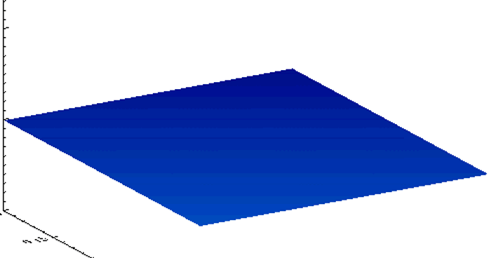
Understanding Model Terminology
As I have stated before, your first step when looking at data is to figure out the when, what, and where. This is especially key with model data because you have to not only know what you are looking at but when. It is important to understand that for a computer prediction of the atmosphere, the data represent what the computer predicts for the atmosphere at a single, specific time, called the valid time. So if a prog is "valid" at 12Z on April 23, 2009, then the features that you observe on the prog are predicted to be in those exact positions at exactly 12Z (on April 23, 2009). The second vital piece of time information that you need to glean from the forecast prog is the initial time. The initial time is the time that the computer model was started (or more precisely, the time that the data used to start the model was collected). Most of the major forecast models are run at 4 times during the day -- 00Z, 06Z, 12Z, and 18Z. Therefore, when we refer to the "00Z model run", we are referencing the computer model that was started using atmospheric data collected and fed into the simulation at 00Z.
Finally, the difference between the initial time and valid time is called the forecast lead time. The forecast lead time is basically how far in the future the model is trying to predict. The larger the forecast lead time, the less accurate the model tends to be. So, you will often hear meteorologists refer to model data in the following format: "the 48-hour prog of the 12Z April 23, 2009, model run...". This means that this prog was valid at 12Z on April 25, 2009 (48 hours after the initial time). You also might hear, "the 36-hour prog valid 00Z April 25, 2009...". This means that if the 36-hour prog was valid at 00Z on April 25, then the model must have been started (its initial time) at 12Z April 23 (36 hours before).
Model "Analysis" vs. Model "Forecast"
You will notice that some websites provide a model output that begins with a "zero-hour forecast". These plots show the state of the atmosphere that was used to initialize the model run. The correct terms for this data are model analysis or initialization. All other outputs from the model (describing some future state of the atmosphere) are model forecasts. To avoid strange looks from other meteorologists, don't interchange these two terms (analysis and forecast). It is not correct to say "tomorrow's model analysis shows...." Instead, refer to all model outputs as forecasts, except the initialization data. Furthermore, regardless of the data source, know that the term analysis is used to describe only current or past data, while the term forecast is used to describe only future atmospheric conditions.
In the next section, we will look at some of the common types of numerical weather models, each of which has its advantages and disadvantages. If you are going to use data from weather models, you need to be aware of these differences.
Read on.
Types of Computer Models
Prioritize...
After completing this section, you should be able to describe the difference between a grid-point model and a spectral model. This description should include advantages and disadvantages of each type.
Read...
Worldwide, there are many different computer models run on a day-to-day basis that provide guidance for weather forecasters. Computer models are extremely complex, and those who design them must make decisions about how to handle many complicated mathematical problems.That means there's more than one approach to creating a numerical weather prediction model. Indeed, various models differ in their geographical area, initialization technique, representation of topography, mathematical formulation, length of forecast (in other words, how far into the future they are run), and other factors. In this section, we'll cover some basic types of computer models, along with their pros and cons. Indeed, each type has both pros and cons; no matter what benefits come with a particular approach, each has its own drawbacks.
For starters, models differ in the geographic area that they cover, which is called the model domain. Some models cover the entire Earth (they have a "global domain"), and are therefore often called "global models." Some of the most rigorously developed and commonly used global models are the:
- Global Forecast System (GFS) model (run by the National Centers for Environmental Prediction [80] in the United States)
- ECMWF (run by the European Centre for Medium-Range Weather Forecasts [81] -- sometimes called "the Euro")
- CMC GDPS (Global Deterministic Prediction System run by the Canadian Meteorological Centre [82] -- sometimes called "the Canadian model")
- UKMET (run by the UK Met Office [83]).
However, other nations, such as Germany, France, Japan, and India also run global weather prediction models. Forecast data from many of these models are publicly available on the web for free, although some models like the ECMWF only offer a limited suite of free forecast data (the complete set of forecast data is only available to paying customers).
Other models have more limited domains and only cover specific regions of the globe. One such commonly used model is the North American Mesoscale model (NAM; pronounced "nam" -- rhymes with "jam"). As you probably guessed from the name, the NAM focuses on North America and its immediate surroundings. Regional models can only produce forecasts for locations within their domain, which is clearly a limitation. The main benefit of regional models is that they can often produce more "detailed" forecasts than global models can. To get a better idea of what I mean by "detailed," let's investigate "grid-point models" and "model resolution."
Grid-Point Models
Many weather models, such as the NAM, are referred to as a grid-point models because the mathematical equations are calculated on a grid in three dimensions (see image below). The spacing of the grid is referred to the model resolution, and usually, the larger the model domain, the coarser the resolution (larger grid spacing). So, regional models like the NAM are often capable of higher resolutions (less space between the grid points where the model performs calculations), which allows for more detailed forecasts. That's definitely an advantage for regional models!
Over the years, the NAM model has operated using various calculation schemes -- the "guts" of the model. Currently, the model uses a scheme called NEMS-NMMB (short for: NOAA Environmental Modeling System - Non-hydrostatic Multi-scale Model), which allows for multiple domains and resolutions to be run simultaneously. Note the various resolutions of the different NAM domains [84]. Some of the NAM's domains have resolutions of just a few kilometers, which can generate very detailed forecast simulations.
But, even grid-point models that can create detailed forecast simulations have a problem. To see what I mean, check out the image below, which shows a type of map commonly used by weather forecasters to assess weather patterns above the Earth's surface. Forecasters often look at analyses showing the height at which the atmospheric pressure is a specific value (a pressure of 500 millibars is one common pressure level, which is about half of typical pressure values at sea level), and this is a polar stereographic perspective of the 500-mb height pattern for March 1, 2012. This perspective allows you to easily see the numerous waves positioned around the globe. Now, compare to this "gridded" version of this height data [85]. It looks a lot different, doesn't it? We've largely lost the sense of the waves that make up the 500-mb pattern, and some of the finer features have vanished. In reality, most atmospheric variables aren't really well represented by "boxes." Grid-point models with high resolutions have smaller "boxes", but they still can't perfectly simulate the real atmosphere, even though they employ sophisticated interpolation schemes to smooth out the data.
Model developers have come up with some sophisticated techniques for reducing the "box-like" nature of model grids, so not all grid-point models use square or rectangular grids to perform their calculations about future states of the atmosphere. Indeed, some models employ grids that look more like hexagons [86] (credit: NCAR), and some models have flexible grids, which allow for different grid sizes over different parts of the globe [87] (credit: NOAA) in order to "zoom in" and give more detailed predictions in and around important weather features. The grid style that a particular model employs can have consequences for calculation efficiency and accuracy, so model developers often have to balance computational speed and forecast accuracy when deciding what type of grid to use (each has pros and cons).
Spectral Models
Still, many variables in the atmosphere, like the 500-mb heights you saw above, are better represented by wave-like structures than any type of grid, and it turns out there's another type of model, called a spectral model, that isn't based on grids. Rather than dividing up the atmosphere into a series of grid boxes, spectral models describe the present and future states of the atmosphere by solving mathematical equations whose graphical solutions consist of a series of waves. I'll skip the details of the mathematics since they're outside the scope of this class, but the key concept lies in the idea that any wave-like function can be replicated by adding various simple waves together. As an example, check out the figure below. Consider a 500-mb height pattern that follows the green line. A spectral model first approximates this pattern by adding a series of simple wave functions, described mathematically by the function called "sine." In our example, I was able to closely duplicate the green curve by adding together three different wave functions (the red, blue, and purple curves). The resulting black curve is fairly close to the green curve and has a simple (relatively speaking) equation that the computer has no problem interpreting.
Spectral models thus begin by first analyzing current patterns in the observed atmospheric variables and then recreating those patterns using sums of simple wave functions. The advantage of a spectral model is that the way in which the sine function changes is well known, and we don't need a set of gridded observations at all!
The fact that we know exactly how a wave function will change in time and space brings us to the major advantage of spectral models: They save computational time, and that can be a big advantage when a model is producing longer-range forecasts. But, spectral models have shortcomings, too. First, spectral models don't perform well on regional domains (domains with fixed boundaries) because the sine functions that make up the "waves" in the model are unbounded. They don't artificially end at the boundary of some arbitrary regional domain. The waves extend all the way around the earth, reconnecting where they began; therefore, most spectral models are global models (although some global models are grid-point models).
Another shortcoming of spectral models is that while many atmospheric variables exhibit a wave-like appearance (the 500-mb height pattern, for example), some most definitely do not. Think about a day with spotty showers and thunderstorms. The spatial pattern of precipitation in this case certainly does not lend itself to smooth, wave-like functions. The same goes for any variable with an abrupt gradient or discontinuity. For predicting such variables, spectral models just aren't ideal. Model developers try to overcome such obstacles by incorporating internal grids to calculate troublesome variables and feed them back into the spectral mathematics. It's a rather complex and imperfect process, but it's part of the never-ending process of trying to limit model shortcomings.
Finally, I should point out that spectral models are not immune from computational error. It turns out that a finite sum of wave functions cannot exactly reproduce every wave pattern. Notice the subtle differences between the black and green curves in the figure above. These differences arise because I am only adding together three different wave patterns. If I were to increase that number to 10 or 20 different waves, the match would be much closer (but still not perfect). Spectral models measure their "resolution" in the number of waves that can be added together to reproduce a particular pattern. At some point, you have to stop adding in new functions and the difference between the actual pattern and the pattern that you reproduced is called truncation error. As in the figure above, our approximation of the observed pattern may be very good, but it takes only a very small amount of error to start leading the model astray. There's also the ever-persistent problems of observational error and round-off error to contend with as well (not to mention the computational error from the grid-point part of the model). Thinking about all of the sources of error makes you wonder how computer models predict the weather as well as they do!
Now that you understand some of the basics behind numerical weather prediction, let's get down to actually retrieving model data from the rNOMADS server.
Read on.
An Introduction to rNOMADS
Prioritize...
After completing this section, you should be able to query the NOMADS model database using the R-library "rNOMADS". You should also be familiar with the types of parameters that must be defined in order to correctly query model data.
Read...
The suite of numerical models run by the United States is coordinated through the National Centers for Environmental Prediction [88] (NCEP). More specifically, you can access numerical model data using the NOAA Operational Model Archive and Distribution System [89] (or NOMADS). NOMADS provides several means for exploring and retrieving a vast volume of numerical prediction data. As with other data sets that we have examined, the sheer quantity of data (along with arcane file types) make routine data retrieval somewhat of a chore.
Enter rNOMADS. This R-library will help you to select and retrieve model data for a variety of uses. You might want to refer to the rNOMADS documentation [90], but, as always, you can just dive in using my example code.
Let's start with the basics...
# check to see if the libraries have been installed
# if not, install them
if (!require("rNOMADS")) {
  install.packages("rNOMADS") }
if (!require("maps")) {
  install.packages("maps") }

library(rNOMADS)
library(maps)
library(fields)

#get a list of available models (abrev, name, url)
model.list<- NOMADSRealTimeList("dods")
From the documentation, there appear to be two different methods for accessing data: GRIB access (a WMO file standard) and the DODS server. While GRIB retrieval might be faster, I find that retrieving files from the DODS server is more intuitive. You can print out model.list to see all the model types available. It should mirror the list given on the NOMADS page. By the way, we'll examine the GRIB file format in a later lesson.
Once you choose a model (in this case "gfs_0p50", the 0.5-degree resolution GFS), you can query the available model dates that are contained in URLs pointing to the data server. In the code below, I retrieve the most current date, retrieve the run times for that date, and finally choose the most recent runtime. Finally, I use GetDODSModelRunInfo to query the server for specifics about the model I have requested. From this query, I can learn about the extent of the 3-dimentional model domain, resolution, and variables computed.
#get the available dates and urls for this model (14 day archive)
model.urls <- GetDODSDates("gfs_0p50")

latest.model <- tail(model.urls$url, 1)

# Get the model runs for a date
model.runs <- GetDODSModelRuns(latest.model)

latest.model.run <- tail(model.runs$model.run, 1)

# Get info for a particular model run
model.run.info <- GetDODSModelRunInfo(latest.model, latest.model.run)

# Type model.run.info at the command prompt
#    to see the information

# OR You can search the file for specific model
#   variables such as temperature:
#   model.run.info[grep("temp", model.run.info)]
Note that you can simply print out model.run.info, or you can search the output using the command "grep" to look for certain phrases, such as those containing the word "temp" (often short for temperature). Granted, the output of model.run.info can be daunting (there are over 41 variables that contain the word temperature). However, rest assured that you don't need to have an understanding of them all. Just know that numerical models keep track of temperature at many levels. At the moment, let's just focus on the temperature at 2 meters above the ground (variable: "tmp2m").
The next portion of the code sets the parameters to retrieve and then calls the retrieval routine DODSGrab(...). Note that we can request vectors of forecast time, lat/lon, and pressure level (if applicable). The numbers for each vector represent different quantities. For example, the time vector the numbers represent each forecast hour with 0 being the analysis run. So, if the model generates forecasts every 6 hours and we wanted only the 24-hour and 30-hour forecasts, how would we structure the vector? (answer: time <- c(4,5)) Likewise, the lat/lon vectors are based on the grid points of the 0.5x0.5 degree grid. Remember that we can get the precise dimensions of the grid by looking at the output of GetDODSModelRunInfo(...). In this case, grid point (0,0) represents a lat/lon of -90N 0E. Can you figure out what the grid point of 45N 80W is and construct the proper vector calls? (answer lon <- c(560,560) and lat <-c(270,270))
variable <- "tmp2m"
time <- c(0, 0) # Analysis run, index starts at 0
lon <- c(0, 719) # All 720 longitude points (it's total_points -1)
lat <- c(0, 360) # All 361 latitude points
lev <- NULL      # DO NOT include level if variable is non-level type

print("getting data...")
model.data <- DODSGrab(latest.model, latest.model.run,
                       variable, time, levels=lev, lon, lat)
You can imagine that this host of parameters means that we can extract a variety of time series, profiles, and cross-sections through the model data. We'll discuss some of these approaches later in the lesson. But, for now, let's look at how we might display the data. We are going to be using the maps and fields library to display the data along with various maps. To further make sense of the model output, we must execute the following steps... 1) switch the lat/lon coordinate system around so that east longitudes are positive and west longitudes are negative; 2) re-grid the model data (more on this in a minute); 3) swap out-of-bounds (very large numbers) values with the "NA" value; and 4) change the model temperature (in Kelvin) to Fahrenheit.
# reorder the lat/lon so that the maps work
model.data$lon<-ifelse(model.data$lon>180,model.data$lon-360,model.data$lon)

# regrid the data
model.grid <- ModelGrid(model.data, c(0.5, 0.5), model.domain = c(-100,-50,60,10) )

# replace out-of-bounds values
model.grid$z <- ifelse (model.grid$z>99999,NA,model.grid$z)

#convert data to Fahrenheit
model.grid$z[1,1,,]=(model.grid$z[1,1,,]-273.15)*9/5+32
Let's look closer at the ModelGrid function that is included in the rNOMADS library. This function distills the output of DODSGrab and formats it into a grid format suitable for plotting. The second parameter is the output resolution of the grid (less than or equal to the model resolution). The third parameter is the type of grid ("latlon" in this case), and the fourth parameter is the sub-sampled domain. This function allows you to perform a variety of subsections of the model data only using one retrieval call from the NOMADS server.
Finally, we can plot the data using a modified image.plot function and several map functions. If you don't alter the code, your data should resemble this GFS analysis (initial data) of 2-meter temperatures [91] for the eastern half of the United States.
# specify our color palette
colormap<-colormap<-rev(rainbow(100))

# make the graph square 4"x4"
# Note: Remember if you get an error that says, "plot too large"
# either expand your plot window, or reduce the "pin" values
par(pin=c(4,4))

# image.plot is a function from the fields library
# It automatically adds a legend
image.plot(model.grid$x, sort(model.grid$y), model.grid$z[1,1,,], col = colormap,
           xlab = "Longitude", ylab = "Latitude",
           main = paste("Surface Temperature",
           model.grid$fcst.date))

map('state', fill = FALSE, col = "black", add=TRUE)
map('world', fill = FALSE, col = "black", add=TRUE)
You might also try looking at 2-meter dew point temperatures. If you do, you could change the color palette line to: colormap<-colorRampPalette(c(rgb(0,0,0,1), rgb(0,1,0,1)))(100)
Next, let's look at a few other ways of displaying model data. Read on.
Explore Further...
It can be tedious to copy the appropriate model information from model.run.info into other parts of the code. Therefore, I wrote a function that automatically extracts information such as the latitude/longitude of the model domain and the resolution in each dimension. You are welcome to add it to your code if you like. The function should be defined above where you call it. I put mine right after the "library" statements.
#function that extracts pertinent model information from model.run.info
extract_info <- function(x) {
  lonW<-as.numeric(as.character(sub("^.*: (-?\\d+\\.\\d+).*$","\\1", x[3])))
  lonE<-as.numeric(as.character(sub("^.*to (-?\\d+\\.\\d+).*$","\\1",x[3])))
  lonPoints<-as.numeric(as.character(sub("^.*\\((\\d+) points.*$","\\1", x[3])))
  lonRes<-as.numeric(as.character(sub("^.*res\\. (\\d+\\.\\d+).*$","\\1", x[3] )))
  latS<-as.numeric(as.character(sub("^.*: (-?\\d+\\.\\d+).*$","\\1", x[4])))
  latN<-as.numeric(as.character(sub("^.*to (-?\\d+\\.\\d+).*$","\\1",x[4])))
  latPoints<-as.numeric(as.character(sub("^.*\\((\\d+) points.*$","\\1", x[4])))
  latRes<-as.numeric(as.character(sub("^.*res\\. (\\d+\\.\\d+).*$","\\1", x[4] )))
  out<-data.frame(lonW,lonE,lonPoints,lonRes,latN,latS,latPoints,latRes)
  return (out)
}

#.... later on in the code, after you retrieve model.run.info ....

# your function can be called like this...
model.params<-extract_info(model.run.info)

# and used like this...
variable <- "tmp2m"
time <- c(0, 0) #Analysis run, index starts at 0
lon <- c(0, model.params$lonPoints-1)
lat <- c(0, model.params$latPoints-1)
lev<-NULL  # DO NOT include level if variable is non-level type

# and this...
model.grid <- ModelGrid(model.data, c(model.params$latRes, model.params$lonRes), "latlon", model.domain = c(-100,-50,60,10) )
Model Data in Time
Prioritize...
At this point, you should be familiar with retrieving model analysis data from the NOMADS server. In this section, we will look at how to retrieve various numerical forecast data from the server as well. Make sure you spend time experimenting with the code below, as this is the only way of becoming comfortable with using the R-code. When you are ready, complete the Quiz Yourself challenge.
Read...
Of course, the reason why we are interested in retrieving model data in the first place is to get a suggestion of what the future might hold. As always, use numerical predictions with caution, especially at forecast times beyond 48-hours. Over the course of this program, you will learn the proper treatment of computer model data, but, for now, let's just see what kinds of data we can retrieve from the NOMADS server.
Remember that computer models gather all sorts of observations that are used to form the initial state or model analysis. At that point, the model equations are "run" forward in time, and forecasts for numerous variables are generated at prescribed intervals in the future. You might imagine the possibilities for analysis... The GFS model contains 251 variables (some at multiple levels) predicted for over 250K points at 80 different forecast times! This is a massive amount of data, but, fortunately, R can do the heavy lifting.
Let's start with a simple form of the code from the previous page. Since we know what we are looking for, we can skip a few steps...
# check to see if rNOMADS has been installed
# if not, install it
if (!require("rNOMADS")) {
  install.packages("rNOMADS") }

library(rNOMADS)

#get the latest GFS 0.5x0.5 model url
latest.model <- tail(GetDODSDates("gfs_0p50")$url, 1)

# Get the latest model run for this date
latest.model.run <- tail(GetDODSModelRuns(latest.model)$model.run, 1)

variable <- "tmp2m"  # 2-meter temperatures
time <- c(0, 80)     # Get all 80 forecast times
lon <- c(560, 580)   # Get only a small subset of points
lat <- c(260, 270)   #   around my location of interest
lev<-NULL            # DO NOT include level if variable is non-level type

model.data <- DODSGrab(latest.model, latest.model.run,
                       variable, time, levels=lev, lon, lat)
Notice that the main difference in this script is that we are asking the server for all of the model forecasts (for this model, there are 8 forecasts per day for 10 days). What we are after is a time series of forecast 2-meter temperatures at one particular grid point (the nearest grid point to State College, PA). After retrieving the data, we simply need to clean it up a bit and plot it using the following code.
# Switch the lat/lon coordinate system around
model.data$lon<-ifelse(model.data$lon>180,model.data$lon-360,model.data$lon)

# Get two vectors one temperature and one dates/times
# at only a single grid point
model.temperature<-model.data$value[which(model.data$lon==-78 & model.data$lat==41)]
model.fdate<-model.data$forecast.date[which(model.data$lon==-78 & model.data$lat==41)]

# Convert to Fahrenheit
model.temperature<-(model.temperature-273.15)*9/5+32

# Display times in GMT
attr(model.fdate, "tzone") <- "GMT"

# Make a plot
plot(model.fdate,model.temperature,
     xlab = "Date", ylab = "Temperature (F)",
     main = paste0("GFS Forecasted 2-m Temperature\n",
                  head(model.fdate,1),"Z to ",tail(model.fdate,1),"Z")
     )
lines(model.fdate,model.temperature,lwd=2,lty=1,col="red")
Your plot of forecast 2-m temperatures should resemble the one below. You might see if you can figure out how to alter the entire script to select a point of your choosing. For more flexibility, you could retrieve a larger set of points (the entire U.S., for example) but bear in mind that you are retrieving 80 grids (one for each forecast time) worth of data. So, your retrieved file will grow substantially if your requested domain is large.
Quiz Yourself...
The HRRR (model code: "hrrr") is a very high-resolution, short-term model centered over the continental U.S (check out this sample 2-m temperature plot from the HRRR [92]). Instead of producing output four times a day, the HRRR creates a forecast for each hour. Can you alter the code above to retrieve the 2-meter temperature for the meteorology building at Penn State (40.793313 N, 77.866796 W) or any other point of your choosing? I have hidden my script, but show you the resulting plot below.
My solution:
You may have approached the problem in an entirely different manner (and that's fine). However, I wanted to point out a few extra changes I made to the code. First, I used the extract_info function that I introduced in the "Explore Further" section on the previous page. It's not necessary that you do so; you could have simply copied down the model parameters from the model.run.info file. Since I already had the function, I reused it. This is an important lesson to remember... if you write good scripts with plenty of commenting, you can likely reuse/adapt them for future projects. Being organized when it comes to creating scripts will pay off, believe me.
Next, since the HRRR model resolution is not 0.5 degrees like the GFS, it can be quite a pain to figure out what model points in order to capture my location of interest within the smallest box possible. You certainly don't want to retrieve them all (the HRRR has many thousands more points than the GFS). Therefore, I created the formulas to solve for the number of points needed, given a longitude/latitude and the model resolution. I discovered in this process that the model resolution given in model.run.info was not the actual resolution but instead a rounded value (why, I have no idea). This caused problems, and thus I needed to figure out the actual resolution by doing a test retrieval first, figuring out the step-size in lat/lon, and then entering those values in my formula. It occurred to me that it might have been easier and quicker just to guess the number of points necessary, but in the end, I now have something that works for any point I choose.
Finally, after I retrieved the model data, I needed to figure out what grid point was closest to my chosen location. This process is easy for the GFS because I know that the points fall every half of a degree (70.0, 70.5, 71.0, etc). With the HRRR, the task is a bit more complicated. Therefore, I use a pseudo-distance test to determine the best grid point being the one that is less than half the model resolution in each direction.
# check to see if rNOMADS has been installed
# if not, install it
if (!require("rNOMADS")) {
  install.packages("rNOMADS") }

library(rNOMADS)

extract_info <- function(x) {
  lonW<-as.numeric(as.character(sub("^.*: (-?\\d+\\.\\d+).*$","\\1", x[3])))
  lonE<-as.numeric(as.character(sub("^.*to (-?\\d+\\.\\d+).*$","\\1",x[3])))
  lonPoints<-as.numeric(as.character(sub("^.*\\((\\d+) points.*$","\\1", x[3])))
  lonRes<-as.numeric(as.character(sub("^.*res\\. (\\d+\\.\\d+).*$","\\1", x[3] )))
  latS<-as.numeric(as.character(sub("^.*: (-?\\d+\\.\\d+).*$","\\1", x[4])))
  latN<-as.numeric(as.character(sub("^.*to (-?\\d+\\.\\d+).*$","\\1",x[4])))
  latPoints<-as.numeric(as.character(sub("^.*\\((\\d+) points.*$","\\1", x[4])))
  latRes<-as.numeric(as.character(sub("^.*res\\. (\\d+\\.\\d+).*$","\\1", x[4] )))
  out<-data.frame(lonW,lonE,lonPoints,lonRes,latN,latS,latPoints,latRes)
  return (out)
}

#get the latest HRRR model url
latest.model <- tail(GetDODSDates("hrrr")$url, 1)

# Get the latest model run for this date
latest.model.run <- head(GetDODSModelRuns(latest.model)$model.run, 1)

# Get info for a particular model run
model.run.info <- GetDODSModelRunInfo(latest.model, latest.model.run)
model.domain<-extract_info(model.run.info)

# Here's the point I want
my_lat <- 40.793313
my_lon <- -77.866796

# I used a formula to calculate what points I should retrieve
variable <- "tmp2m"  # 2-meter temperatures
time <- c(0, 18)     # Get all 80 forecast times
lon <- c(floor((floor(my_lon)-model.domain$lonW)/0.029240189), floor((ceiling(my_lon)-model.domain$lonW)/0.029240189))
lat <- c(floor((floor(my_lat)-model.domain$latS)/0.027272727), floor((ceiling(my_lat)-model.domain$latS)/0.027272727))
lev<-NULL            # DO NOT include level if variable is non-level type

model.data <- DODSGrab(latest.model, latest.model.run,
                       variable, time, levels=lev, lon, lat)

# Get two vectors one temperature and one dates/times
# at only a single grid point
model.temperature<-model.data$value[which(abs(my_lon-model.data$lon) < model.domain$lonRes/2 & abs(my_lat-model.data$lat) < model.domain$latRes/2)]
model.fdate<-model.data$forecast.date[which(abs(my_lon-model.data$lon) < model.domain$lonRes/2 & abs(my_lat-model.data$lat) < model.domain$latRes/2)]

# Convert to Fahrenheit
model.temperature<-(model.temperature-273.15)*9/5+32

# Display times in GMT
attr(model.fdate, "tzone") <- "GMT"

# Make a plot
plot(model.fdate,model.temperature,
     xlab = "Date/Time (GMT)", ylab = "Temperature (F)",
     main = paste0("HRRR Forecasted 2-m Temperature\n",
                   head(model.fdate,1),"Z to ",
                   tail(model.fdate,1),"Z")
)
lines(model.fdate,model.temperature,lwd=2,lty=1,col="red")
Did your graph resemble mine?
Automating Retrieval
Prioritize...
In this section, we will again use R's ability to loop over a list of data. Such loops are important in automating tasks such as retrieving data from a list of model runs.
Read...
The NOMADS database archives as many as 50 past model runs. For example, at any one time, you are able to retrieve any GFS model output for the past 14 days. This means that we can do some fairly interesting data retrievals including looking at the initialization state of a model variable over time and studying how a predicted variable changes in time (sometimes referred to as "D-model, D-T"). The problem arises in that each model run is stored separately in the database. Unlike retrieving all of a single model's forecasts in a single call, we now need to retrieve all of the models' single forecasts. This will require some automation on R's part. Let's start a new script.
First, we start with a modified rNOMADS script...
# check to see if rNOMADS has been installed
# if not, install it
if (!require("rNOMADS")) {
  install.packages("rNOMADS") }

library(rNOMADS)

#get the available dates and urls for this model (14 day archive)
model.urls <- GetDODSDates("gfs_0p50")
model.url.list <- model.urls$url

# Here's the point I want
my_lat <- 40.793313
my_lon <- -77.866796

# Define our retrieval parameters
variable <- "tmp2m"
time <- c(0, 0)    # Analysis run, index starts at 0
lon <- c(560, 580) # Just a rough estimate of
lat <- c(260, 270) # where the point is located
lev<-NULL  # DO NOT include level if variable is non-level type

# This will be our placeholder for the specific point data we want
model.timeseries <- data.frame()
Notice that in this script, we do not worry about the latest model date, nor do we care what the latest model run is. The reason is that we are going to retrieve them all and build a time series of the result. Therefore, we need to define two functions. The first takes specific model runs on a specific day, retrieves the partial grid of data, and extracts the value from the grid point nearest my location. This result is then added as a row to the model.timeseries data frame.
retrieve_data <- function (run, model) {

     # get the partial grid
     model.data <- DODSGrab(model, run, variable, time, levels=lev, lon, lat)

     # reorder the lat/lon
     model.data$lon <- ifelse(model.data$lon>180,model.data$lon-360,model.data$lon)

     # select the closest point
     model.value <- model.data$value[which(abs(my_lon-model.data$lon)<0.5/2 & abs(my_lat-model.data$lat)<0.5/2)]
     model.fdate <- model.data$forecast.date[which(abs(my_lon-model.data$lon)<0.5/2 & abs(my_lat-model.data$lat)<0.5/2)]

     #convert to degrees F
     model.fvalue <- (model.value-273.15)*9/5+32

     # add the row to the data frame
     # remember that we have to use the <<- operator
     # to pass the value outside the function
     row <- data.frame(Date=model.fdate, Value=model.fvalue)
     model.timeseries <<- rbind(model.timeseries,row)
}
Now, we need a function that will loop over all of the daily runs for a given model. Notice that in this function we use sapply which says, "take all of the data in model.runs$model.run and apply it to the function retrieve_data. The parameter "model" is an extra variable that gets passed to the retrieve_data function as well. If you think in terms of programming "loops", this is the inner loop.
loop_over_runs <- function (y) {
     # Get the model runs for a date
     model.runs <- GetDODSModelRuns(y)

     # run the loop_over_runs function for each time in model.runs
     sapply(model.runs$model.run, retrieve_data, model=y)
}
Now that we have our two functions, we can add the rest of the code. It's relatively simple. First, there's the primary sapply call that sends the list of models to the function loop_over_runs. This command is the outer loop of the retrieval process. Next, there is just the standard plotting routine that we have been using in the last few tutorials.
# for each model in model.url.list, loop over all of the runs
sapply(model.url.list, loop_over_runs)

# Display times in GMT
attr(model.timeseries$Date, "tzone") <- "GMT"

# Make a plot
plot(model.timeseries$Date,model.timeseries$Value, type="n",
     xlab = "Date/Time (GMT)", ylab = "Temperature (F)",
     main = paste0("GFS Initialized 2-m Temperature\n",
         format(head(model.timeseries$Date,1), "%m-%d-%Y %HZ")," to ",
         format(head(model.timeseries$Date,1), "%m-%d-%Y %HZ"))
)
lines(model.timeseries$Date,model.timeseries$Value,lwd=2,lty=1,col="red")
Voila! Here is the plot I generated [93]. Can you think of other interesting things we might want to look at using this approach? What about how the temperature forecast for a certain time is changing as the forecast interval decreases? What would such a plot tell you about the stability of that temperature forecast?
Profiles of Model Data
Prioritize...
We have retrieved model data in the horizontal plane and in time. In this section, we will look at retrieving profiles of model data. As always, make sure that you follow along with your own version of the code. After you get this sample working, experiment with variations so that you are comfortable with the commands.
Read...
So far, we have examined how to access model data both in horizontal space and in time. Before moving on to other forms of model data, I wanted to demonstrate an example of extracting model data in the vertical dimension.
Computer models have several different vertical coordinate systems. At lower levels, there are many variables defined at specific heights above the ground (2-meter temperature is an example). There are also a group of variables that are defined over an array of pressure levels (called the mandatory levels). These variables are defined by both lat/lon coordinates and a height coordinate. Let's see how we can retrieve them from a model file.
We start with the standard query of the NOMADS dataset...
# check to see if rnoaa has been installed
# if not, install it
if (!require("rNOMADS")) {
  install.packages("rNOMADS") }

library(rNOMADS)
library(reshape2)

#get the available dates and urls for this model (14 day archive)
model.urls <- GetDODSDates("gfs_0p50")

latest.model <- tail(model.urls$url, 1)

# Get the model runs for a date
model.runs <- GetDODSModelRuns(latest.model)

latest.model.run <- tail(model.runs$model.run, 1)

# Get info for a particular model run
model.run.info <- GetDODSModelRunInfo(latest.model, latest.model.run)

# variables that are pressure level dependent...
# model.run.info[grep("1000 975", model.run.info)]
If you want to identify what variables are defined at the mandatory levels, you can query model.run.info using the command directly above. Notice below that I am retrieving three variables in one call. I am also limiting my lat/lon box to save space, and I am requesting all 46 levels.
# I'm retrieving temperature, RH, and geopotential height
variable <- c("tmpprs","rhprs","hgtprs")
time <- c(0, 0) #Analysis run, index starts at 0
lon <- c(560, 580)
lat <- c(260, 270)
lev<-c(0,46)  # Requesting level-type variables, so we can use this parameter

model.data <- DODSGrab(latest.model, latest.model.run, variable, time, levels=lev, lon, lat)
model.data$lon<-ifelse(model.data$lon>180,model.data$lon-360,model.data$lon)

# Get the lat/lon point I want (41N, 78W)
# I could have made this a variable
profile.data <- data.frame(
   Level=model.data$levels[which(model.data$lon==-78 & model.data$lat==41)],
   Vars=model.data$variables[which(model.data$lon==-78 & model.data$lat==41)],
   Values=model.data$value[which(model.data$lon==-78 & model.data$lat==41)]
)

# reshape the output into proper columns
profile.dcast <- dcast(profile.data, Level~Vars)

# add a column of converted temperature
profile.dcast <-transform(profile.dcast, TempC=(tmpprs-273.15))
Now, let's plot the results. Notice that I used my mfrow command again so that I can plot two graphs side-by-side.
# multiple plots... 1 row, 2 columns
# we also do some margin and graph size control here
par(mfrow=c(1,2), oma=c(0,1,2,1)+0.1, mar=c(0,0,3,0), pin=c(3.4,5))

# make the first plot...
# Note that I am plotting only a subset of points
# I do this so that the two graphs can have different y-axes
# with the same range.

plot(profile.dcast$TempC[which(profile.dcast$Level>49)],
     profile.dcast$Level[which(profile.dcast$Level>49)],
     type="n", xlab = "Temperature (C)",
     ylab = "Log P (mb)", log="y", ylim = c(1000,50),
     main="Temperature")
lines(profile.dcast$TempC,profile.dcast$Level,lwd=2,lty=1,col="#CC0000")
points(profile.dcast$TempC,profile.dcast$Level,pch=19,col="#CC0000")

# make the second plot...
plot(profile.dcast$rhprs[which(profile.dcast$Level>49)],
     profile.dcast$hgtprs[which(profile.dcast$Level>49)],
     type="n", xlab = "Relative Humidity (%)", ylab = "Height (m)",
     main="Relative Humidity")
lines(profile.dcast$rhprs,profile.dcast$hgtprs,lwd=2,lty=1,col="#009900")
points(profile.dcast$rhprs,profile.dcast$hgtprs,pch=19,col="#009900")

# overall title...
title(paste0("GFS Model Profile from (41N, 78W) at ",
      format(head(model.data$forecast.date,1), "%m-%d-%Y %HZ", tz="GMT")),
      outer=TRUE, cex.main=1.6)
Here's my plot. Yours should look similar although the data itself will likely be different.
Ensemble Forecasting
Prioritize...
Upon completion of this page, you should be able to discuss the basic concepts of ensemble forecasting.
Read...

Imagine you're competing in an archery contest. Would you rather shoot one arrow at a target (left target) or increase your chances of hitting the bull's eye by shooting a quiver full of arrows (right target)?
Choosing a single model of the day's output is akin to having only one "shot" at the target (in this case, the correct forecast). However, some numerical weather models are run over a variety of initial conditions, producing a variety of solutions. These ensembles represent a quiver full of arrows, all launched at the same target. For a pending forecast fraught with uncertainty, utilizing ensembles may give you a better chance of hitting the target near the center.
To get a more "meteorological" idea of what I mean, check out the schematic below. It shows the spread in the solutions of two different ensemble forecasts (one is a medium-range forecast; the other is a shorter-range forecast). In turn, this spread defines the model uncertainty for the given forecast (note that the uncertainty decreases as forecast time decreases). In most cases, the bull's eye lies somewhere within that spread. Although we can never really hope to hit the bull's eye dead center, we can at least use ensemble forecasts to make informed probabilistic forecasts that better convey the uncertainty of the situation. In archery terms, we have a better chance of hitting at least something.
So, ensembles help us to identify the signals of uncertainty associated with the forecast. Since predicted weather data always contain some level of uncertainty, it behooves us to dig a bit deeper into the theory of ensemble forecasting.
Tweaking initializations: Generating a quiver of arrows
What allows us to shoot more than one "arrow" at the target? As it turns out, the initial conditions fed into the model lie at the heart of the problem of model uncertainties (imperfect physics and parameterizations don't help either). That's because model initializations rely heavily on the previous run's forecast. Granted, these initializing forecasts are tempered by real observations, but, in the grand scheme of things, they fall short of the mark because observing stations, particularly upper-air sites, are simply too far apart over land and too infrequent. To make matters worse, in-situ upper-air observations are virtually non-existent over the vast expanse of oceans (this deficiency obviously has more impact on global models).
Needless to say, initializations are fraught with error. For example, model initializations can be quite suspect with regard to the intensity and evolution of weather features within regions of sparse observational coverage (such as the Pacific Ocean), and these can inject huge uncertainties into a pending forecast period. NCEP has taken some innovative approaches to help remedy the problem presented by large data voids, such as using targeted aircraft reconnaissance to try to observe important features over the Pacific. If you're interested, you can read more about such adaptive observations [94]. However, regardless of these targeted efforts, initializations will never be perfect.
In some cases, initializations more accurately capture the essence of the current pattern. In general, forecasters have greater confidence making predictions in such patterns. Still, there can be relatively large uncertainties in the forecast in some regions of the country as compared to others. And, not surprisingly, those uncertainties grow with time. As an example, check out this loop of GFS ensemble forecasts of the upper air pattern [95] based on the 00Z run on October 26, 2006. Each colored contour corresponds to an ensemble member with slightly different initial conditions. You can see little spread in the forecasts early on (great confidence), but the spread then increases with time (growing uncertainty). You can see why these types of forecasts are appropriately called spaghetti plots.
In recent decades, numerous ensemble forecast systems have been developed. The GFS is the basis of the "GEFS" (Global Ensemble Forecast System), which is also sometimes called the MREF (Medium-Range Ensemble Forecast). Other ensemble forecast systems are based on multiple models. One such system is NCEP's Short-Range Ensemble Forecast (SREF). The SREF is a 26-member ensemble run four times per day (03Z, 09Z, 15Z, and 21Z) out to 87 hours.
The Bottom Line
So, what does all this mean? Ultimately, the members of an ensemble represent arrows in your quiver (if you recall the metaphor we used previously). But, how do meteorologists gather relevant messages from all the ensemble members? One way is to look at the ensemble mean and the spread. For example, take a look at the image below, showing a portion of the 39-hour forecast for MSLP isobars and three-hour precipitation valid at 00Z on September 22, 2006. Not only can you see individual members, but the large panel at the bottom right of the image shows the ensemble mean (average of all the members). Here's the uncropped chart of the forecasts [96], if you're interested.
In certain situations, the ensemble mean has a higher statistical chance of striking the target. For example, compare the mean 39-hour ensemble mean forecast (above) with the verification chart of MSLP isobars and radar reflectivity [97] at 00Z on September 22, 2006. Focus on the mid-latitude cyclone and its associated precipitation over the Upper Middle West. Granted, no measurable precipitation had yet fallen in northern Minnesota, but the mean 39-hour ensemble forecast from 09Z on September 20 essentially captured the tenor of the forecast over Minnesota.
But, please don't think that the mean ensemble forecast is infallible. To the contrary, it can fail miserably at times. Think about a situation in which ensemble members cluster themselves into two distinct "camps." For example, say, half of the ensemble members predict near an inch of rain to fall in a particular town, while the other half predict much less, roughly 0.10 inches (almost an "all or nothing" scenario). The mean of all those forecasts would be right in the middle... where none of the ensemble members are! In this case, the mean ensemble forecast would be a very low-confidence forecast. The lesson learned is that ensembles can give you an overall qualitative sense for the spread of the individual solutions. An assessment of the uncertainty of the model's forecast will provide insight about how useful the ensemble mean (or other statistics) might be.
Now that you know the story of how ensembles work and what their advantages are, let's use rNOMADS to retrieve some ensemble data.
The NOMADS Ensembles
Prioritize...
After completing this section, you will be able to retrieve data from the ensemble runs of a particular model. Ensemble data gives you an indication of the variability (and to some degree uncertainty) regarding a particular model solution. Creating model "spaghetti plots" helps visualize how the solutions to the ensembles diverge over time.
Read...
To retrieve model ensemble members from NOMADS, we start with code that looks very similar to previous retrievals. There are two exceptions... First, we need to specify a model that contains the ensemble members. In this case, we chose the model name "gens". Remember that you can query all of the model names and other information with NOMADSRealTimeList("dods"). Second, we need to define the number of ensembles to retrieve. This variable is passed to DODSGrab along with the other parameters.
# check to see if rnoaa has been installed
# if not, install it
if (!require("rNOMADS")) {
  install.packages("rNOMADS") }

library(rNOMADS)

# get the available dates and urls for this model (14 day archive)
# "gens" is the GFS ensemble run
model.urls <- GetDODSDates("gens")
latest.model <- tail(model.urls$url, 1)

# Get the model runs for a date
model.runs <- GetDODSModelRuns(latest.model)
latest.model.run <- tail(model.runs$model.run, 1)

# set the variable, location, times, levels (if needed)
# and most importantly the ensemble members
variable <- c("tmp2m")
time <- c(0, 40)
lon <- c(280, 290)
lat <- c(130, 135)
levels    <- NULL
ensemble <- c(0, 20)  #All available ensembles

# retrieve the data. Notice the included the "ensemble" keyword
model.data <- DODSGrab(latest.model, latest.model.run, variable, time, lon, lat, levels = levels, ensemble = ensemble)

# reorient the lat/lon (makes it easier to navigate)
model.data$lon<-ifelse(model.data$lon>180,model.data$lon-360,model.data$lon)
Now the ensemble members exist as one of the dimensions of the retrieved data (just as time and lat/lon). There are many ways to look at this data. They way I do it here is to create a function called assemble_data which subsets each ensemble, looks for the point I need and then adds those values to a data frame called model.timeseries. The sapply command loops through a sequence of all the ensembles.
# This will be our placeholder for the specific point data we want
model.timeseries <- data.frame()

assemble_data <- function (ens_member) {

  model.data.sub <- SubsetNOMADS(model.data, ensemble = ens_member)

  model.value<-model.data.sub$value[which(model.data.sub$lon==-78 & model.data.sub$lat==41)]
  model.fdate<-model.data.sub$forecast.date[which(model.data.sub$lon==-78 & model.data.sub$lat==41)]
  model.value<-(model.value-273.15)*9/5+32

  # add the row to the data frame
  row <- data.frame(Ensemble=ens_member, Date=model.fdate, Value=model.value)
  model.timeseries <<- rbind(model.timeseries,row)
  }

sapply(seq(ensemble[1]+1,ensemble[2]+1), assemble_data)
Now we have all of the ensemble predictions stored in model.timeseries. To plot all of these solutions, I do something a bit different. I first create a series of arrays of the x and y values. Next, I create the empty plot (without an x-axis... xaxt="n"). Then I add a custom x-axis that has specific times, rather than letting the plot draw them in. Finally, I use the command mapply to plot a line for each ensemble member, using the arrays of x and y values and a rainbow color scheme.
attr(model.timeseries$Date, "tzone") <- "GMT"

xvals <- tapply(model.timeseries$Date,model.timeseries$Ensemble,
                function(x) return(x))
yvals <- tapply(model.timeseries$Value,model.timeseries$Ensemble,
                function(x) return(x))

# plot out all of the ensemble solutions (called "plumes")
plot(model.timeseries$Date,model.timeseries$Value,type="n",
     xlab = "Date", ylab = "Temperature (F)", xaxt="n",
     main = paste0("GFS Ensembele 2-m Temperature\n",
                   head(model.timeseries$Date,1),"Z to ",
                   tail(model.timeseries$Date,1),"Z")
)

times=seq(xvals[[1]][1],xvals[[1]][length(xvals[[1]])], by="24 hours")
axis(1, at=times, labels=format(times, "%HZ %b %d"))

mapply(lines, xvals, yvals,lwd=2,lty=1,col=rainbow(21))
Here is the "spaghetti" plot [98] that is produced by the above code. Notice that the ensemble members start out following nearly the same solution, but as time goes on, the ensemble members began to diverge. The timing of the divergence along with the amount can tell you something about how unstable a given model forecast is. Be suspect of the forecast when the predicted variable ensembles diverge rapidly.
As an alternative, let's instead consider a box plot of the suite of solutions. The code below produces this box plot [99]. Notice here we can see clearly where the ensemble solutions begin to diverge substantially. However, as discussed in the previous section, bulk statistics computed on ensemble members (such as the median value) can be misleading if the solutions are, for example, bi-modal.
# Make a boxplot of the same data
boxplot(model.timeseries$Value~model.timeseries$Date,
        xlab = "Date", ylab = "Temperature (F)",
        main = paste0("GFS Ensembele 2-m Temperature\n",
                      head(model.timeseries$Date,1),"Z to ",
                      tail(model.timeseries$Date,1),"Z"),
        las=1,
        xaxt="n",
        pars=list(medcol="red", whisklty="solid",
                  whiskcol="blue", staplecol="blue")
        )
times=seq(xvals[[1]][1],xvals[[1]][length(xvals[[1]])], by="24 hours")
axis(1, at=seq(1,length(xvals[[1]]),4), labels=format(times, "%HZ %b %d"))
Before we leave the topic of model data, let me give you a warning and some advice on using numerical weather prediction. Read on.
The Problem with Models
Read...
A famous Penn State meteorology professor, long since retired, had a famous saying with regard to model output. “All that I can be sure of,” he’d say, pointing at the forecast map, “is that the weather is not going to look anything like that.” Was this the reaction of a curmudgeon, a disbeliever in “new-fangled” weather forecasting technology? Or was there more to his statement than simple disbelief?
Early in my career, numerical weather models were just gaining steam and their flaws were quite obvious, even in the short term. Still, it was difficult not to latch on to the “model of the day” and run with what it had to say. Today, I think that the temptation to blindly believe what the models are telling us is even greater. Why is that? Well, you’ve probably realized by now that there is an avalanche of model data available to even the casual user. Models that produce output every hour and at a resolution of just a few kilometers surely must be accurate, aren’t they? Plus, when displayed properly, this data looks awesome. Some precipitation output looks “just like” live radar data. That must mean it’s for real, yes?
What about all the arguments about who has the better model? Is the “Euro” better than the “GFS” at 60-72 hours? Have you perhaps heard someone argue that the “NAM is really the model to believe for a particular developing storm system?” The temptation to bet on a model as you would a racehorse is great, but I strongly caution against it. While models can provide general guidance in any one instance, relying too heavily on any particular model solution has no basis in science whatsoever and WILL get you in trouble more times than not.

All is not lost, however. Because you have access to all of the raw data, you can use model output (along with some numerical wrangling) to shape your final decision-making process. Model Output Statistics (MOS) are a good example. In a nutshell, MOS runs the output of a dynamical model through a multi-variable regression algorithm in order to better predict surface variables. Believe it or not, dynamical models perform as poor predictors of surface variables. This is because surface processes are extremely complex, and dynamical models often parameterize these processes. However, if model predictions are compared with observations over a long period of time, certain patterns emerge that allow for a better prediction of surface variables.
So, what’s the takeaway? Model data IS a valuable resource… if used properly. In addition to peering into the future, the small resolution of numerical models makes for an ideal way to “fill in” observational gaps, as long as techniques are used to marry numerical and observational data. In later courses, you will learn such techniques. But for now, know that numerical model data should be used with care.
Lesson 6. Reanalysis Data Sets
Motivate...
During your exploration of weather and climate data, you might have encountered data sets either in "NetCDF" (pronounced "net C-D-F") or "GRIB" (sounds like "rib") formats. If so, you can be assured that you have left the realm of the casual data user and have entered the domain of the true data scientist. These file types were created to have a machine-independent way to store and transport vast arrays of meteorological or geophysical data. The GRIB (or GRidded Binary) data standard was developed by the WMO and is the most basic format of gridded meteorological data, from satellite images to model data. NetCDF, on the other hand, is what I would describe as a high-level data standard that was developed by Unidata [101] (a consortium of research and educational partners). NetCDF files are highly versatile, are also machine independent, and (more importantly) are self-describing, which means that all the information you need to know about the data is packaged right along with the data itself.
I'll provide links with more details on these file standards later in the lesson. However, before you dive in, let me point out some important points to keep in mind. First, both file types are binary files. That means that they are only readable by a computer (you can't just open the files and expect to see numbers). This means that you must have a special set of library functions and/or programs to read both NetCDF and GRIB files (remember that these files are meant for the scientists, not the casual consumer). These libraries and programs are machine dependent and can be a real pain to install on your particular system, which is particularly the case if you are not running a Linux system (data scientists must all run Linux systems). We'll need to overcome some technological challenges in order to develop a workflow that suits our needs. However, there are tools out there if you look around. Hopefully, with the programs that I point you to, you'll be able to perform most (if not all) of the analyses you need.
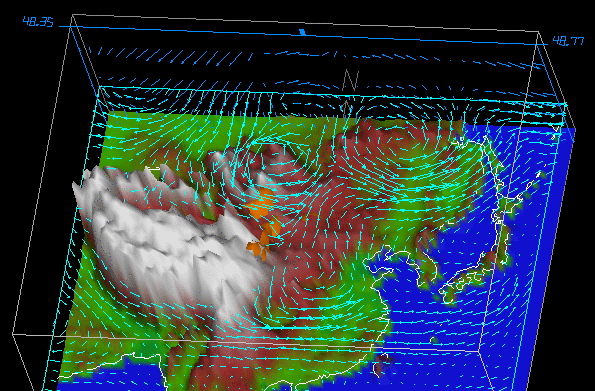
If I had to identify a significant difference between NetCDF and GRIB files, it would be in how the data are stored and accessed in each. GRIB files are simply a series of sequential records packed into a single file. Each record represents a grid of a single variable at a single time (like pages in an atlas). Each page has a description at the top (called the "header") describing the grid... what it is, how big, what the numbers are, etc. Grids can be extracted from the file and displayed/processed using the information in the header, but you are limited to extracting only an entire record at a time. Extracting a value at a particular latitude/longitude (for example) requires much more work because, for the sake of file size, that information is not stored with the actual data. If this seems annoying, I agree... it is. But remember that GRIB format files are simply containers for large data sets likely processed automatically by some heavy-duty computer power. That's not to say we can't do likewise, but know that if you need GRIB data of any kind, you'd better need a lot of it to make up for the time you will spend writing the scripts needed to process the data.
The good news is that NetCDF files are much more friendly. They are still in binary format, however, and you will need the proper set of tools to read them. The thing that makes NetCDF files better than their GRIB cousins are that NetCDF files are totally self-contained. That is, they have ALL the information you would need to know about the data included within their description section. This includes variable dimensions/units, a time-base definition, and the specific data structure within the file. What's more, NetCDF files are not sequential records of 2D data. Unlike the single book analogy where the data are stored on individual pages, NetCDF files represent a hypercube (more than 3 dimensions) of data that you may interact with in any way you wish. For example, in a NetCDF file, you might have model temperatures over a 3D domain (latitude, longitude, height) AND in time. In this 4-dimensional configuration, you might retrieve a horizontal grid, a vertical slice, a profile, or a time-series at a particular point in space -- all with relative ease. These are pretty amazing files and I think once you get the hang of it, you are going to wish everything was in NetCDF format.
So, in this lesson, we are going to start off by working with the NetCDF file structure, then move on to GRIB. Along the way you'll also be introduced to two new data sources: model reanalyses (specifically the North American Regional Reanalysis) and the National Digital Forecast Database. This will give you even more choices when it comes to finding data that will suit your needs.
Read on!
What is NetCDF?
Prioritize...
After completing this section, you will have the NetCDF files installed on your computer.
Read...
If you're not familiar with NetCDF files, please read the following sections/links before installing the libraries:
NetCDF Reading Assignment
- For an overview, start with the Wikipedia page [102].
- Next, read the "What Is NetCDF" section of the NetCDF FAQ [103].
- Finally, read the first four sections of the NetCDF User's Guide [104]. Make sure that you understand the various parts of a NetCDF file (and what they are used for).
Now that you know more about NetCDF files, it's time to install the libraries which are operating-system dependent. Depending on your level of technical skill you can get pre-built libraries or build them yourself from the source code. I just grabbed the pre-built Windows version of NetCDF-4 (64-bit) [105]. If you are a MAC user, you will want to use a package manager called Homebrew [106]or MacPorts [107]to facilitate the install. Here is a set of instructions [108] using MacPorts that you might find helpful (searching "netcdf library homebrew" will provide useful pages for that manager). There are instructions for LINUX users [109] as well, but you guys are likely well-versed in performing such installs.
It is absolutely imperative that you get the NetCDF libraries installed correctly! You won't be able to proceed without them. To verify your install, you should be able to type "ncdump" at any command prompt and see a set of usage instructions (and no errors). Please contact me ASAP if you are having trouble. In the next section, we will link up the NetCDF libraries with the R interface.
Read on after you've completed this step.
NetCDF, the NARR, and R
Prioritize...
In this section, you will link the NetCDF libraries with R through the package "ncdf4". You will also retrieve a file from the North American Regional Reanalysis to test the R/NetCDF interface.
Read...
The first thing that we want to do is install the ncdf4 package which is a set of function calls that connect R to the NetCDF libraries that you installed. This will allow us to read NetCDF files directly into R and perform all the graphing and analysis that we have done with other sources of data.
Do you remember how to install a package in R-Studio? When you are finished, you should be able to type the command: nc_version() at the R-prompt and be answered back with the version of the installed library. If you don't remember, I have placed the commands below (click to reveal).
> install.packages("ncdf4")
> library(ncdf4)
Now that we have the ncdf4 library installed, let's get some data. There are many sources of geophysical data in NetCDF format. However, we are going to be looking at data from the North American Regional Reanalysis (NARR, pronounced like "car").
To understand how a model reanalysis is created, recall that a traditional numerical model is "initialized" by mapping various point and spatial observations onto a defined grid (a process called "data assimilation"). The numerical model then applies mathematical equations to advance the model forecast variables in time. As time goes on, however, errors grow within these predicted fields so that eventually they are useless as predictors. A model reanalysis differs from a prognostic model in that it uses historical data for its initialization. This means that at regular time periods, more observations can be added to the model to "correct" (or nudge) the predicted fields. This technique doesn't eliminate error altogether, but it gives you a long-term, continuous (in time and space) record of data for vast numbers of observed and calculated variables. If used properly, reanalysis data can prove an invaluable input stream to weather and climate analytics decisions.
Before proceeding further, read these two articles on model reanalysis...
NARR Reading Assignment
- For an overview, start with the Wikipedia page. [110]
- Next, read this paper on the NARR [111] published in the Bulletin of the American Meteorological Society.
- Finally, go to the ESRL/PSD NARR homepage [112] and browse the information/links provided. Note that there are some handy plotting pages that will allow you to get quick graphics of NARR output.
If you go looking for NARR data, you will find the raw source to be Research Data Archive (RDA) at the National Centers for Atmospheric Research (NCAR) [113]. Here all of the NARR data is housed, from 1979 to present day. The problem with this site is that all of the raw data are stored in huge (~1 GB) files in GRIB format. This means that we will need to do considerable work to dig out the variables that we might want to analyze. We'll get to that problem later in the lesson. For now, let's return to the ESRL/PSD NARR homepage [114] where the NARR files have been segmented and converted to NetCDF format. Yay!
Your next goal is to select a NARR output file (in NetCDF format) and save it to your local hard drive. Notice on the page that NARR data is separated into three categories: pressure-level data, subsurface data, and mono-level data. We are interested in the mono-level data because we want surface temperatures (mono-level data is any surface in the model that is not defined by a constant pressure level). Clicking on the mono-level link takes you to a page with a huge table [115] which lists all of the available variables. Find the variable for 3-hour temperature and click on the download file prefix (should be "air.sfc.yyyy.nc"). This will take you to a folder containing all of the yearly files. Grab one of your choosing (scroll down) and save it to your local drive (I chose 1988). To check that everything worked correctly, you can open a command prompt in the folder you saved the file and type: ncdump -h air.sfc.1988.nc (or whatever your file is named) and see a description of the file header (the different variables and dimensions that describe the data).
Now we are ready to dig into the data! Read on.
Plotting NARR data
Prioritize...
After completing this section, you will have successfully installed the "ncdf4" library in R and retrieved data from a NetCDF file.
Read...
At this point, you have installed the NetCDF libraries, the ncdf4 R-library, and you have a data file. Let's crack it open... (at this point, you should be familiar with what we are doing in R). Start a new R-script file, enter the code below, and save it in the same directory as your data file (for simplicity's sake). By the way, don't forget to set your working directory to that of the source file.
# if for some reason we need to reinstall the
# package, then do so.

if (!require("ncdf4")) {
  install.packages("ncdf4") }

# include the NetCDF library
library(ncdf4)

# We'll also need these libraries for plotting maps of data
library(fields)
library(maps)

# open the NetCDF file
nc <- nc_open("air.sfc.1988.nc")
Source this code and then type "nc" at the R command prompt. You should see a description of the file contents. Notice that it contains 4 variables (3 actually, if we ignore the map projection information) and 3 dimensions (x, y, and time). You can also see that latitude and longitude are a function of x and y, while the temperature variable ("air") is a function of space (x and y) as well as time. We can extract the total size of the "air" variable by typing the command: nc$var$air$varsize at the command prompt (notice that the variable information is stored in a complex data frame called nc$var). The values for each dimension can be obtained by querying the $dims data frame: nc$dim$time$vals. If you do so, you'll notice that the times are in some strange integer format. If we go back to the file definitions (typing nc or specifically nc$dim$time$units) we see that the time base is "hours since 1800-01-01 00:00:00". Therefore, we need to do a bit of manipulation to have times that make some sense. Fortunately, R comes to the rescue...
# First get the time data in hours
ncdates = nc$dim$time$vals  #hours since 1800-1-1

# Next set a date/time object at the start of the time base
origin = as.POSIXct('1800-01-01 00:00:00', tz = 'UTC')

# Now convert the time string to seconds and add it to the origin.
# ncdates should be a series of dates and times which matches the
# file you chose.
ncdates = origin + ncdates*(60*60)

# Let's pick a date/time we want to plot
# This should actually go at the top of your code
target_datetime<-"1988-05-04 12:00 UTC"

# Find the index of the time entry that matches the target
time_index=which(ncdates==as.POSIXct(target_datetime, tz='UTC'))
Now that we have time sorted out, what about the latitude and longitude? If you haven't already, notice that NetCDF files are not like serialized text files. By that, I mean that there are no entries like: "lat1, long1, temp1". That would be an unnecessary repetition of the variables "lat" and "lon" for each grid of temperature. Instead, latitude and longitude are defined by their own grid which is equal in size to the temperature grids. You might also have noted that latitude and longitude are variables, not dimensions. The dimensions "x" and "y" define the data space and latitude/longitude are mapped onto each (x,y) pair. This is because latitude and longitude are not equally spaced, due to the map projection (Lambert conformal). So, if we are going to plot a grid of temperature versus (latitude/longitude), we need to compute arrays for those variables as well.
# How big is the dataset?
# Note: the "$air" portion must match your variable name
data_dims<-nc$var$air$varsize

#Get the lats/lons using ncvar_get
lats=ncvar_get(nc, varid = 'lat',
               start = c(1,1),
               count = c(data_dims[1],data_dims[2]))

lons=ncvar_get(nc, varid = 'lon',
               start = c(1,1),
               count = c(data_dims[1],data_dims[2]))

# The longitude values are not compatible with my map
# plotting function, so I need to fix this.
lons<-ifelse(lons>0,lons-360,lons)
Let's look at the function ncvar_get(). Notice that for the retrieval of lat/lon we need to know how many values to get in each dimension. I could hard-code this, but why not just query the file to get the dimensions (that's the advantage of the self-describing nature of NetCDF). The "get" function takes a pointer to the file, the variable ID, a starting point and a counter in each dimension. Since we want the entire grid, we'll start at (1,1) and retrieve the max value for each dimension. Now, let's get the temperature data...
# Because we are retrieving a multi-dimensional array, we must
# set aside some space beforehand.
temp_out = array(data = NA, dim = c(data_dims[1],data_dims[2],1))

# get the temperature data (notice the start and count variables)
temp_out[,,] = ncvar_get(nc, varid = 'air',
                       start = c(1,1,time_index),
                       count = c(data_dims[1],data_dims[2],1))

# convert the temperature grid to Fahrenheit
temp_out[,,1]<-(temp_out[,,1]-273.15)*9/5+32
Finally, we're ready to plot the data. We'll use the image.plot() function and then overlay some maps.
# set the color map and plot size
colormap<-rev(rainbow(100))
par(pin=c(7,4.5))

# plot the data
image.plot(lons, lats, temp_out[,,1], col = colormap,
           xlab = "Longitude", ylab = "Latitude",
           main = paste("NARR Surface Temperature (F): ",target_datetime))

# plot some maps
map('state', fill = FALSE, col = "black", add=TRUE)
map('world', fill = FALSE, col = "black", add=TRUE)
If you want just a close-up of the US, you can modify the plot call like this...
image.plot(lons, lats, temp_out[,,1], col = colormap,
           xlim=c(-130,-60), ylim=c(25,55),
           xlab = "Longitude", ylab = "Latitude",
           main = paste("NARR Surface Temperature (F): ",target_datetime))
Here are the two surface temperature plots: Entire domain [116]; Contiguous U.S. only [117].
Finally, before we move on, I want to give you one more useful command from the ncdf4 library. Just as we opened the NetCDF file with nc<-nc_open(...), we can also release the file from memory using nc_close(nc). Strictly speaking, nc_close is only absolutely necessary when creating/writing a NetCDF file because this flushes any unwritten data stored in memory to disk. Still, it's always good to manually close the connection when you are finished with the file, even if you are only reading from it. One caveat that you should be aware of, however... Note that if you put this command at the end of your file, once you source it, you won't be able to query the pointer to the file ("nc" in our case) manually via the command line. Once you sever the connection to the file, the pointer is destroyed.
Now that you have the hang of NetCDF files, let's see how else we might parse the data. Read on!
Time Series NARR data
Prioritize...
You will learn how to extract different "slices" through a NetCDF dataset by retrieving variables in various dimensions.
Read...
Now that you've performed a basic plot from a NetCDF file, let's try something more interesting. Let's plot the daily mean temperature for a point closest to a chosen latitude and longitude. For this task, we will want to go back to the PSD mono-level website [115] and get a daily means file for temperature. I'm sticking with 1988, however, notice that the file names for the means are the same as the 3-hourly data (so I renamed my new file: "air.sfc.1988mean.nc"). Here's the code:
# if for some reason we need to reinstall the
# package, then do so.

if (!require("ncdf4")) {
  install.packages("ncdf4") }

# include the library
library(ncdf4)

# open the CDF file
nc <- nc_open("air.sfc.1988mean.nc")

# instead of a specific date, we need a location
location<-c(40.85, -77.85)

# How big is the dataset?
data_dims<-nc$var$air$varsize

#Get the properly formatted date strings
ncdates = nc$dim$time$vals  #hours since 1800-1-1
origin = as.POSIXct('1800-01-01 00:00:00', tz = 'UTC')
ncdates = origin + ncdates*(60*60)

# obtain the lat/lon grids
lats=ncvar_get(nc, varid = 'lat',
               start = c(1,1),
               count = c(data_dims[1],data_dims[2]))

lons=ncvar_get(nc, varid = 'lon',
               start = c(1,1),
               count = c(data_dims[1],data_dims[2]))
lons<-ifelse(lons>0,lons-360,lons)

# Here's where we find the grid index of closest point
distance<-(lats-location[1])**2+(lons-location[2])**2
closest_point<-which(distance==min(distance), arr.ind = TRUE)

# create the temperature array... Notice the different dim parameter
temp_out = array(data = NA, dim = c(1,1,data_dims[3]))

# get the temperature array and convert it
temp_out[,,] = ncvar_get(nc, varid = 'air',
                         start = c(closest_point[1],closest_point[2],1),
                         count = c(1,1,data_dims[3]))
temp_out[1,1,]<-(temp_out[1,1,]-273.15)*9/5+32

# Create a standard line plot but with no x-axis lables
plot(ncdates,temp_out[1,1,],type="n",
     xlab = "Date", ylab = "Temperature (F)",
     xaxt="n",
     xlim=c(as.POSIXct('1988-01-01 00:00:00', tz = 'UTC'),
            as.POSIXct('1988-12-31 00:00:00', tz = 'UTC')),
     main = paste0("NARR Mean Daily Surface Temperature\n University Park, PA\n",
                   head(ncdates,1)," to ",tail(ncdates,1))
)
lines(ncdates,temp_out[1,1,],lwd=2,lty=1,col="red")

# create some custom labels
labs<-format(ncdates, "%b-%d")
spacing<-seq(1,length(ncdates),30)
axis(side = 1, at = ncdates[spacing], labels = labs[spacing],
     tcl = -0.7, cex.axis = 1, las = 1)

# close the file
nc_close(nc)
Here is the graph of mean daily surface temperature [118] produced by the code above. You can narrow the view by changing the dates in the xlim plot parameter. How might these daily means compare with the observed daily means? Hmm.... that's a good question to try and answer. But before we get to that, let's look at some vertical data from the NARR.
Read on.
Retrieving Vertical Profiles
Prioritize...
In this section, you will use pressure level NARR files to extract profiles of temperature and other variables. This will further enhance your understanding of multidimensional NetCDF data blocks.
Read...
We've looked at NARR data in both space and time, now let's look at retrieving vertical data. We'll need to retrieve a levels file from the PSD Pressure Levels [119] page. I grabbed the daily mean air temperature file for June 1988 and renamed the file "air.198806levels.nc". Notice that for the mono-level data, I was able to retrieve an entire year at a time, but for these data, I am only able to get a month's worth. To see why, run the following three lines of code from the command line (you can skip the library command if ncdf4 is already loaded).
> library(ncdf4)
> nc <- nc_open("air.198806levels.nc")
> nc
This, as you know, will dump the header for the file, giving you information about the dimensions of the file data. Look closely at the temperature variable "air". Can you see what's different? Instead of just 3 dimensions (lat, lon, time), this variable now has 4 dimensions (lat, lon, level, time). Furthermore, if you query the size of air with: nc$var$air$varsize, you will see that there are 29x30 grids in each file. That's why each level file covers only one month (each month's file is 2.5X larger than an entire year's worth of surface data).
Now, open up a new R-script, and let's look at how we might explore this data. My goal is to extract a daily mean temperature profile from the grid point nearest my lat/lon location and on a day of my choosing (in June). Could you modify the time-series code we used on the last page? Give it a try... or start with the code below... (you've seen much of this before).
# if for some reason we need to reinstall the
# package, then do so.
if (!require("ncdf4")) {
  install.packages("ncdf4") }

library(ncdf4)

filename<-"air.198806levels.nc"

nc <- nc_open(filename)

# choose a location/time
location<-c(40.85, -77.85)
target_datetime<-"1988-06-04"

# How big is the dataset?
data_dims<-nc$var$air$varsize

#Get the properly formatted date strings/target time index
ncdates = nc$dim$time$vals  #hours since 1800-1-1
origin = as.POSIXct('1800-01-01 00:00:00', tz = 'UTC')
ncdates = origin + ncdates*(60*60)
time_index<-which(ncdates==as.POSIXct(target_datetime, tz='UTC'))

#Get the pressure levels
nclevels <- nc$dim$level$vals  #in mb

lats<-ncvar_get(nc, varid = 'lat',
               start = c(1,1),
               count = c(data_dims[1],data_dims[2]))

lons<-ncvar_get(nc, varid = 'lon',
               start = c(1,1),
               count = c(data_dims[1],data_dims[2]))
lons<-ifelse(lons>0,lons-360,lons)

# Find the closest point by minimizing the distance
distance<-(lats-location[1])**2+(lons-location[2])**2
closest_point<-which(distance==min(distance), arr.ind = TRUE)
In this code, I combine techniques of the spatial grid plotting script and the time-series script. Basically, I need to find the correct time and the lat/lon indices. Then, I can get the data and plot it. Notice that temp_out now has four dimensions, not three. Also, notice that I retrieve all of the times and levels for my given location. This is only a matrix of 870 values, so I'm not concerned with space. This way, I can plot not only a single profile, but a series of profiles or even a time-series at a particular level if I want.
temp_out = array(data = NA, dim = c(1,1,data_dims[3],data_dims[4]))

temp_out[,,,] = ncvar_get(nc, varid = 'air',
                         start = c(closest_point[1],closest_point[2],1,1),
                         count = c(1,1,data_dims[3],data_dims[4]))
# change to degrees C
temp_out[1,1,,]<-(temp_out[1,1,,]-273.15)

# Do a line plot of the profile
plot(temp_out[1,1,,time_index],nclevels,type="n",
     xlab = "Temperature (C)", ylab = "Pressure",
     ylim=c(1000,200), log="y",
     main = paste0("NARR Mean Daily Temperature Profile\n University Park, PA\n",
                   ncdates[time_index])
)
lines(temp_out[1,1,,time_index],nclevels,lwd=2,lty=1,col="red")
Check out the profile of temperature [120] plot. Notice that I changed a few lines in the plot routine. First, I reversed the order of the y-axis with ylim=c(1000,200). This puts the 1000mb tick on the bottom and lets pressure decrease upwards. Second, I made the y-axis log(P) with the parameter: log="y". If you wanted to think about it, you might play with how to plot temperature on a skewed-T axis. You might also want to check out the package RadioSonde for plotting proper skew-T/Log P diagrams (some data reformatting will be required). If someone wants to explore this package, I'll add your write-up as an Explore Further (and give you the by-line!).
How about one more way of looking at the data (this one's pretty interesting). Replace the plotting commands for the temperature profile with the following code:
# *** ADD THIS TO THE TOP!
library(fields)    # needed for image.plot

# *** REPLACE PLOT(...) AND LINES(...) WITH:
# Create a 2D matrix of values and reorder the columns of the matrix
z<-t(temp_out[1,1,,])
z<-z[,ncol(z):1]

# Create an image plot
colormap<-rev(rainbow(100))
image.plot(ncdates, rev(nclevels), z, col = colormap,
           ylim=c(1000,500),log="y", zlim=c(-30,30),
           xlab = "Date", ylab = "Pressure (mb)",
           main = paste0("NARR Mean Daily Temperature Profiles\n University Park, PA\n June 1988")
)
This plots all of the profiles as a time-series and gives you a contour plot of sorts. In order to fit the restrictions of the image.plot(...) command, I had to pull out the temperature data into a 2-D array, transpose the rows and columns, and finally reverse the order of the levels (must be increasing values). Then I was able to plot the image (with the lowest 500mbs plotted, log y-axis, and limiting the colors to a -30C to 30C temperature range). Check out the resulting image [121]... what do you observe?
Automating Downloads
Prioritize...
In this section, we'll look at functions in R that can automatically download files from FTP or HTTP sites. This allows for automation techniques that can harvest data across many different files.
Read...
It might have occurred to you that if you wanted any kind of data analysis that spanned many years or a suite of different variables, you might have to spend a great deal of time downloading and processing the various required files. However, what if you wanted to automate the process? We've already seen that having an R-script can assist in the parsing, analysis, and display of large data sets. Can the file download process be included in the script as well?
It turns out the answer is "yes". R provides you access to your local file system as well as tools for retrieving files directly from FTP and HTTP sites.
Let's consider the problem that we want to retrieve the Christmas Day mean surface temperatures for University Park, PA for the years 1990 through 2010. How might we do that in an automated manner? Let's look at some code... (Don't forget to set your working directory!)
# if for some reason we need to reinstall the
# package, then do so.

if (!require("ncdf4")) {
  install.packages("ncdf4") }

library(ncdf4)

# specify the file name and location URL
filename<-"air.sfc.1990.nc"
saved_filename<-"air.sfc.1990mean.nc"
url <- "ftp://ftp.cdc.noaa.gov/Datasets/NARR/Dailies/monolevel/"

# get the file... the mode MUST be "wb" (write binary)
download.file(paste0(url,filename), saved_filename, quiet = FALSE, mode="wb")

# open the file
nc <- nc_open(saved_filename)

# print some info to show a good retrieval
print(head(nc$dim$time$vals))

# close the file
nc_close(nc)

# delete the file (this is optional)
file.remove(saved_filename)
Notice in this code we send the filename and its location to a function: download.file(...) which fetches the file and places it in your working directory (as a default). There are numerous parameters that can be set but notice that you can control the saved file name as well as the appearance of the progress bar via the quiet parameter. In fact, we can get quite fancy here if we want. For example, I can create a sub-directory (manually) named "data" within the working directory where I can store the data files that I download (by adding "data/" to the saved file name). I can also check to see if the file I want to download already exists in my directory by using the file.exists(...) function. See the modified code snippet below that only downloads the file if it doesn't exist in the "data/" subdirectory. Note that I have commented out the file.remove(saved_filename) command at the end of the script. In this context (and for the sake of speed) I want to keep the files that I download, but when I run the script for real, I will delete them to save space (it will take much longer to run the script though).
filename<-"air.sfc.1990.nc"
saved_filename<-"data/air.sfc.1990.nc"
url <- "ftp://ftp.cdc.noaa.gov/Datasets/NARR/Dailies/monolevel/"

# get the file... the mode MUST be "wb" (write binary)
if(!file.exists(saved_filename)) {
    download.file(paste0(url,filename), saved_filename, quiet = FALSE, mode="wb")
}
Are you getting a feel for where this is going? If we could create a list of filenames to retrieve then we could loop over those names and retrieve the information we need for each year. This is easy and can be accomplished by these three lines located right after the library call...
dates<-seq(1990,2010,1)
in_file_list<-paste0("air.sfc.",dates,".nc")
out_file_list<-paste0("air.sfc.",dates,"mean.nc")
Run these three lines of code and look at the variables in_file_list and out_file_list in the environment inspector. Easy, right? Now, we need the automation part... do you remember how to do it? We put everything that we want to automate and place it in a function. Then we run the command: mapply(...) with the function name and the variables we want to send the function. Here are the basics...
# ALL THE HEADER STUFF GOES HERE

# get our list of dates (keep the list short for testing)
dates<-seq(1990,1992,1)
in_file_list<-paste0("air.sfc.",dates,".nc")
out_file_list<-paste0("air.sfc.",dates,"mean.nc")
url <- "ftp://ftp.cdc.noaa.gov/Datasets/NARR/Dailies/monolevel/"

# make a placeholder for the specific point data we want
narr.timeseries <- data.frame()

# make the retrieve function
retrieve_data <- function(filename, saved_filename) {
  #
  # PUT ALL THE AUTOMATION STUFF IN HERE
  #
}

# call the automation function with the in and out file lists
mapply (retrieve_data, in_file_list, out_file_list)

# ALL THE PLOT STUFF GOES HERE
All that's left is for you to build the data retrieval code in the automation section and add a plot function after the mapply(...). Can you do it? You've done all the pieces before, and there's a small issue or two to sort out... but give it a try. My version of the Christmas daily mean temperatures histogram is below. If you get stuck, I have put my complete copy of the code in the Quiz Yourself section.
Quiz Yourself...
Were you able to figure everything out? If not, click on the bar below to reveal my complete code. Remember (yes, I forgot) that inside of the automation function all of the variables disappear every time the function restarts. If you want to access a variable after the function finished (called a global variable), you must use the "<<-" assignment operator, not just "<-".
# if for some reason we need to reinstall the
# package, then do so.

if (!require("ncdf4")) {
  install.packages("ncdf4") }

library(ncdf4)

# Set up my date range and file info
dates<-seq(1990,2010,1)
in_file_list<-paste0("air.sfc.",dates,".nc")
out_file_list<-paste0("data/air.sfc.",dates,"mean.nc")
url <- "ftp://ftp.cdc.noaa.gov/Datasets/NARR/Dailies/monolevel/"

# choose a day and location
target_datetime<-"12-25"
location<-c(40.85, -77.85)

# This will be our placeholder for the specific point data we want
narr.timeseries <- data.frame()

# we are going to only compute the cloest_point once,
# so let's delete any old versions.
if (exists("closest_point")) { rm(closest_point) }

retrieve_data <- function(filename, saved_filename) {

# get the file
if(!file.exists(saved_filename)) {
  print(paste0("Retrieving <", filename, "> ... Saving <",saved_filename, ">"))
    download.file(paste0(url,filename), saved_filename, quiet = TRUE, mode="wb")
}

  # open the file
  nc <- nc_open(saved_filename)
  data_dims<-nc$var$air$varsize

  #Get the properly formatted date strings/target time index
  ncdates<-nc$dim$time$vals  #hours since 1800-1-1
  origin<-as.POSIXct('1800-01-01 00:00:00', tz = 'UTC')
  ncdates<-origin + ncdates*(60*60)

  # time_index may change due to leap days so we have to calulate it every time
  time_index<-which(strftime(ncdates,format="%m-%d")==target_datetime)

  # lat and lon index will not change, let's find it only once
  if (!exists("closest_point")) {
    lats<-ncvar_get(nc, varid = 'lat',
                     start = c(1,1),
                     count = c(data_dims[1],data_dims[2]))

    lons<-ncvar_get(nc, varid = 'lon',
                     start = c(1,1),
                     count = c(data_dims[1],data_dims[2]))
    lons<-ifelse(lons>0,lons-360,lons)

    distance<-(lats-location[1])**2+(lons-location[2])**2

  # I want closest_point defined outside of the function (global) so I used <<-
    closest_point<<-which(distance==min(distance), arr.ind = TRUE)
  }

  temp_out<-array(data = NA, dim = c(1,1,1))

  temp_out[,,]<-ncvar_get(nc, varid = 'air',
                            start = c(closest_point[1],closest_point[2],time_index),
                            count = c(1,1,1))
  temp_out[,,]<-(temp_out[,,]-273.15)*9/5+32

  # add the row to the data frame
  row <- data.frame(Year=strftime(ncdates[time_index], format="%Y"), Temperature=temp_out[1,1,1])

  # use the global variable
  narr.timeseries <<- rbind(narr.timeseries,row)

  # close the file
  nc_close(nc)

  # delete the file (optional)
  file.remove(saved_filename)

}

# The main loop
mapply (retrieve_data, in_file_list, out_file_list)

# Write the data out to a file (just so we don't have to calculate it again
write.csv(narr.timeseries, "data/christmas_temps.csv")

# converts $Year from a factor to a number
# need this if you want a line/scatter plot
narr.timeseries$Year<-as.numeric(levels(narr.timeseries$Year))[narr.timeseries$Year]

# I think a histogram makes more sense here than a line/scatter plot
hist(narr.timeseries$Temperature,
     ylab = "Occurances", xlab = "Temperature (F)",
     main = paste0("NARR Mean Daily Surface Temperature\n University Park, PA\n",
            "December 25,", head(narr.timeseries$Year,1),"-",tail(narr.timeseries$Year,1)),
     las=1,
     breaks=10,
     col="red",
     xlim=c(10,50)
)
To GRIB or not to GRIB
Prioritize...
The ability to decode GRIB files crosses perhaps the final boundary of data retrieval methods. However, there are significant technical hurdles that must overcome in order to do so. Therefore, I am labeling this section as an Explore Further (rather than a required reading). If you are interested in retrieving, decoding, and working with data in GRIB format, you should invest some time in figuring out an acceptable workflow. If you are a casual user, however, I suggest experimenting with these data, but don't give yourself a headache.
Explore Further...
As I mentioned in the beginning of this lesson, the "raw"-est form of environmental data you'll run across is likely to be the WMO standard GRIdded Binary (GRIB) data. I say "raw" because GRIB files were not created with the casual end-user in mind. The GRIB format was created for transmitting large volumes of gridded data via computer-to-computer communications. GRIB also serves as an efficient storage and retrieval data format and is specially designed for use in autonomous systems. What this all means for you and me is that we are not meant to be rooting around inside GRIB files (Is it a secret club?... maybe). If you are so inclined, peruse the GRIB User's Guide [122]. However, don't delve too deeply because we are going to get some tools to help us decode the raw files into something more meaningful.
We will explore two possible approaches for reading GRIB files. Both involve installing other tools to decode the files and convert them into something more meaningful.
Method 1: WGRIB/WGRIB2
The first place I started looking was R libraries to handle GRIB files. There are some out there, and you are welcome to play around with them (rNomads even has some built-in GRIB functions). Many of these R libraries, however, are merely wrappers that execute exterior tools (and to make matters worse, I found significant compatibility issues when trying to run pre-built commands). That said, I was able to read and plot GRIB files from the NARR. Let me show you how.
First, we need some data to play with. The GRIB versions of the NARR are hosted by the NCAR/UCAR Research Data Archive [123]. In fact, there are many different types of data housed at this site (feel free to browse). You will need to register but the account is free, so go ahead and do that now. After you are registered, proceed to the NARR page [113] and after reading about the data set, click on the "Data Access" tab and then on the "regrouped 3-hourly files". To start, go to "Faceted Browse", then pick a single date before hitting continue. On the next page, select "Temperature" from the parameter list, and "Ground or water surface" from the level list. Click on the "Update the List" button and then select one of the files below (it doesn't really matter for our example... each file spans 10 days). Download the compressed ".tar" file and extract the contents in your target directory. You should have a directory of filenames that look like "merged_AWIP32.2017030100.RS.sfc". Copy one of those files to your R-script directory (just to make it easy).
Now that we have the data, we need to get the tools that will actually process the GRIB files. We are going to use the Climate Prediction Center's WGRIB and WGRIB2 decoders. Start by going to the WGRIB website [124] and finding the instructions for your operating system. Windows users can get pre-compiled (exe's and dll's); Mac users will need to compile their own. For Windows users (of which I am one), you need to place all of the pre-compiled WGRIB files in a directory (I placed it under "Program Files") and then add that directory to your system path (if you don't know how to do that, just Google it). Now do the same for WGRIB2 by starting at the CPC's WGRIB2 website [125]. You should know that it works when you can type "wgrib" or "wgrib2" in a command window and get a display of the usage instructions (see a picture of mine [126]).
I should point out that there are two different formats for GRIB files. The older one, GRIB1 or just GRIB, and the newer one GRIB2. You must use the proper form of WGRIB/WGRIB2 depending on the file that you want to decode (newer files tend to be GRIB2), but some systems like the NARR still use the older GRIB format (for compatibility, I suspect). Generally, the site you download from will tell you, but you'll know if you are using the wrong command if you get a "not in GRIB format" type of error. If you stumble upon files in a GRIB2 format, it's an easy fix, you just have to replace wgrib with wgrib2 for all of the code below.
Whew! The good news is that we are over the hump in terms of the technical stuff. Now, let's plot the data. Open a new R-script, and enter the following lines of code:
# set the file name
grib.file<-"merged_AWIP32.2017030100.RS.sfc"

# query the GRIB file for the headers
file.info<-shell(paste0("wgrib -s ", grib.file), shell=NULL, flag="", intern = TRUE, wait = TRUE)
These three lines first define a file name and variable name. Then we run the external program wgrib command using R's shell(...) function. Basically, this function is the same as running wgrib -s merged_AWIP32.2017030100.RS.sfc from a command prompt window, except we can capture the result and paste it into the R-object: file.info. Take a look at file.info... it's a listing of the file's record headers. To interpret them, you can read WGRIB's user's guide [127]. The important thing to note is the variable and level information stored in each record. Now we can run the next four commands in our script:
# specify the variable/level I want
var<-"TMP:sfc"

# run wgrib decoding the proper record and write output file
shell(paste0("wgrib -d ", grep(var, file.info), " -text -o wgrib_output.txt ", grib.file), shell=NULL, flag="", intern = TRUE, wait = TRUE)

# read the output file into R
values<-read.csv("wgrib_output.txt")

# delete the output file (we don't need it anymore)
file.remove("wgrib_output.txt")
First, we define the variable string we want (by browsing the file.info table). Note that if we already know what we want, there's no need to even collect file info at all. Next, we run a shell command again telling wgrib that we want to decode "-d" the record number containing the variable string (that's what grep(...) gives us). We want the output to be "-text" and the output to be sent to "wgrib_output.txt". All that's left to do is read in the output file and then delete it (because we don't need it anymore). The variable values is a data frame with a single column of numbers rather than a grid, so now we need to fix that before we plot it.
# Replace the missing value: 999999 with NA
values$X349.277[which(values$X349.277>500)]<-NA

# convert from K to degrees F
values$X349.277<-(values$X349.277-273.15)*9/5+32

# make the single column into a matrix (grid)
grid=matrix(values$X349.277, nrow=349, ncol=277)
So how do we know how many rows and columns the data are? And even more important, what are the latitudes and longitudes of each point? These GRIB data grids don't contain any specific spatial information because it is assumed that you know this already. So how do we figure this out? First, we know from previous explorations that NARR data is generated on a 349x277 grid with a Lambert conformal projection. We know this from the NARR documentation and also from a more thorough investigation of the GRIB header information (try: wgrib -V merged_AWIP32.2017030100.RS.sfc and see what you get.). Furthermore, we previously generated the lat/lon grids from one of the NetCDF files. You can run one of these scripts again to strip out the lat and lon from the NetCDF files, or you can simply create an R-data object that contains those variables. I saved those two lat/lon grids as an R-object that you can just load into your current script. Copy this file: narr_lats_lons.RData [128] into your working directory and add the line: load("narr_lats_lons.RData") to the top of your script. Notice when you source the script, variables lats and lons now appear in the Environment tab.
Finally, you can read the latitude and longitude in from another GRIB file. This file contains all of the constant fields of the NARR [129] such as the elevation, soil type and lat/lon of each grid point (you want to grab the file named "rr-fixed.grb". You can read in these fields just as you did the temperature data and then make your plot. Give it a try, you should have all the pieces to produce the plot below. Start with the NetCDF plotting code and swap the GRIB lines. If you need a hint, click below to reveal the code (one for reading the lat/lon values and one for reading and plotting the NARR data).
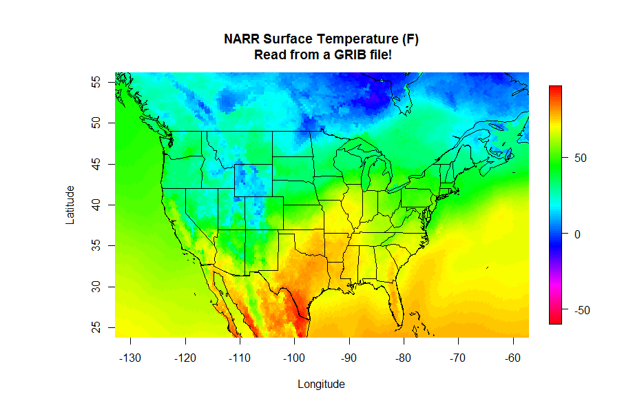
# THIS SCRIPT READS IN THE FIXED VALUES GRIB
# FILE TO RETRIEVE THE LATITUDE AND LONG GRIDS

# set the file name
grib.file<-"rr-fixed.grb"

# specify the latitude variable
var<-"NLAT:sfc"

# query the GRIB file for the headers
file.info<-shell(paste0("wgrib -s ", grib.file), shell=NULL, flag="", intern = TRUE, wait = TRUE)

# run wgrib decoding the latitudes and write output file
shell(paste0("wgrib -d ", grep(var, file.info), " -text -o wgrib_output.txt ", grib.file), shell=NULL, flag="", intern = TRUE, wait = TRUE)

# read the output file into R
grib_lats<-read.csv("wgrib_output.txt")

# delete the output file (we don't need it any more)
file.remove("wgrib_output.txt")

# specify the longitude variable
var<-"ELON:sfc"

# run wgrib decoding longitude and write output file
shell(paste0("wgrib -d ", grep(var, file.info), " -text -o wgrib_output.txt ", grib.file), shell=NULL, flag="", intern = TRUE, wait = TRUE)

# read the output file into R and delete it
grib_lons<-read.csv("wgrib_output.txt")
file.remove("wgrib_output.txt")

# make the single columns into matrices (grid)
grid_lats=matrix(grib_lats$X349.277, nrow=349, ncol=277)
grid_lons=matrix(grib_lons$X349.277, nrow=349, ncol=277)

# swap the longitudes for the map routine
grid_lons<-grid_lons-360

# remove the objects that we don't need anymore
rm(grib_lats, grib_lons)
# THIS SCRIPT READS NARR DATA FROM A GRIB FILE

# We'll need these libraries for plotting
library(fields)
library(maps)

# Read and process the lat/lon script first
source("read_lat_lon.R")

# set the file name
grib.file<-"merged_AWIP32.2017030100.RS.sfc"

# query the GRIB file for the headers
file.info<-shell(paste0("wgrib -s ", grib.file), shell=NULL, flag="", intern = TRUE, wait = TRUE)

# specify the variable/level I want
var<-"TMP:sfc"

# run wgrib decoding the proper record and write output file
shell(paste0("wgrib -d ", grep(var, file.info), " -text -o wgrib_output.txt ", grib.file), shell=NULL, flag="", intern = TRUE, wait = TRUE)

# read the output file into R
values<-read.csv("wgrib_output.txt")

# delete the output file (we don't need it any more)
file.remove("wgrib_output.txt")

# Replace the missing value: 9.99E+20 with NA
values$X349.277[which(values$X349.277>50000)]<-NA

# convert from K to degrees F
values$X349.277<-(values$X349.277-273.15)*9/5+32

# make the single column into a matrix (grid)
grid=matrix(values$X349.277, nrow=349, ncol=277)

# plot the data
colormap<-rev(rainbow(100))

# Note: Remember, if you get an error that says, "plot too large"
# either expand your plot window, or reduce the "pin" values
par(pin=c(6.25,4))

image.plot(grid_lons, grid_lats, grid, col = colormap,
           xlim=c(-130,-60), ylim=c(25,55),
           xlab = "Longitude", ylab = "Latitude",
           main = "NARR Surface Temperature (F)\n Read from a GRIB file!")

# draw the map
map('state', fill = FALSE, col = "black", add=TRUE)
map('world', fill = FALSE, col = "black", add=TRUE)
Method 2: DEGRIB
We saw in the first method that R has no native functions that can decode GRIB files, and thus we need to interface with some tools to help up do so. We were able to use R to automate the calling of either "wgrib.exe" or "wgrib2.exe" by using the shell command. The output of these GRIB decoders is fed into a file which is then read back into R. The advantage of this method is that many operations can be automated, extracting and analyzing large quantities of data. However, technical considerations may limit the effectiveness of this approach.
A second method is to first decode the GRIB files manually into a format better suited for R. This method also uses a third-party tool but is not called by the R program. Its implementation is far more straightforward (in most cases) but in my opinion less powerful because of the lack of automation available. The utility that we are going to use is called DEGRIB [130] and is available from the Meteorological Development Laboratory of the National Weather Service. It was initially developed for decoding output from the National Forecast Database. However, it is a great tool for decoding both GRIB1 and GRIB2 files. Start with the installation instructions [131]... if you have Windows or Linux, the process is relatively simple (with a Mac, it may be more complex). You eventually want to run the program "tkdegrib.exe".
Once in the program, select the "GIS" tab and then use the top portion of the GUI window [132] to navigate to the proper folder/file. The file details appear in the middle section of where you can choose one of the records to decode. Finally, choose an export method (lower-left... I recommend either .csv or NetCDF) and adjust your precision and units in the lower right and generate your file. You can now load this file into R using the methods that you already know. One advantage of this method is that you also get latitude and longitude columns along with your selected data. Give it a try if you like!
Thoughts on Reanalysis Datasets
Prioritize...
As with all data, care must be taken not to assume too much with regards to what information reanalysis products can provide. In this section, I provide a few reading assignments that revisit the pros and cons of how reanalysis data sets can be useful.
Read...
In this lesson, we have been playing around with reanalysis data sets as a means of learning about NetCDF and GRIB file formats. All along I have cautioned you about not treating reanalysis data as an observational data set -- they are not. Yet, reanalysis data sets can (and do) provide us with remarkably accurate records of the past atmospheric state, in a temporally coherent and spatially gridded format. While I wouldn't use reanalysis output to construct a daily record of temperature for a certain location, I might consider using such data to reconstruct a reasonably accurate climatology, especially when observations are lacking.
The Climate Data Guide from NCAR/UCAR [133] has a wealth of global data sets, including an excellent series of pages on reanalysis data sets. Rather than reinvent their thoughts and findings, I will send you there in the following reading assignment.
Reading Assignment
From the Climate Data Guide from NCAR/UCAR read...
- Atmospheric Reanalysis Overview [134] (including the table of available reanalysis data)
- Expert Guidance Section [135] for the Reanalysis Overview
Lesson 6 Activity
Assignment Objective...
You will use the knowledge and scripts you have gained from this lesson to assess feasibility of using reanalysis climatology in data-sparse regions.
Let's get started.
Setup...
In this lesson, we practiced retrieving data from NetCDF and GRIB files by looking at the North American Regional Reanalysis data set. One might argue the need for such a data set as a historical reference over observation-rich regions. However, over the oceans, NARR data may be the only source of climatological data available. But how accurate are the data? In this assignment, we will examine a host of observations from ocean buoys and then compare those observations with NARR data. Our goal is not necessarily to make fine-scale comparisons, but rather determine on what scales the NARR data are an acceptable proxy for climatologies over the oceans.
Deliverables...
Please use R to answer the questions posed below. In some cases, you will need to paste the output from R, and in other cases, you will need to provide a written analysis along with a graphic or two.
Questions...
- Use the ISD map-generating code located in Lesson 3 to locate a buoy or offshore observing platform off the coast of the United States (in the Atlantic, Pacific, or Gulf of Mexico). Note: The further offshore the better (greater than 100 miles) and choose a station that has been in operation for at least 10 years. Do some research to find out what you can about this observing platform. You might want to visit the National Data Buoy Center [136] to see if you can locate your station and determine what type of instrumentation that it provides. Write up a brief description of what you discover. Is this observing platform a reliable "ground truth" for the comparison that we will be making?
- Retrieve the ISD data from your offshore station for a recently completed year. You're going to want air temperature, sea-surface temperature, wind speed and wind direction. Please retrieve all of the quality flags too, so that you can throw out everything that is flagged as suspicious. Provide 1) a graph of air temperature and sea-surface temperature for the year and 2) a wind rose for the year.
Here's the algorithm I used to retrieve/format the ISD data...
# check to see if rnoaa has been installed # add the library and NOAA key # Get the ISD data # Grab the following columns # Note: your station might not have all of these isd_trimmed <- isd_data[c("date","time", "wind_direction","wind_direction_quality", "wind_speed", "wind_code", "wind_speed_quality", "temperature","temperature_quality", "SA1_temp","SA1_quality")] # Throw out all values where the quality flag is not "1" # You might find that "9" is acceptable for SA1_temp # You can check your data first with: table(isd_trimmed$temperature_quality) # This shows you how many of each temperature quality flags you have isd_trimmed$temperature[isd_trimmed$temperature_quality!=1]<-NA isd_trimmed$SA1_temp[isd_trimmed$SA1_quality!=9]<-NA # Fix the wind values so that calm winds have speed=0 # and direction=NA # Fix the date/time code # Change the coded values to actual values # make a new data frame for the windRose plot (remember it's picky) # Put your plotting code here - Now, retrieve the corresponding NARR data for your chosen year and the lat/lon of your station. You want the highest temporal resolution available (the 3 hourly files). You want the surface temperature, 2-m air temperature and the U- and V-winds at 10m. Models compute the N/S (v-wind) and E/W (u-wind) components of the wind rather than speed and direction. Once you modify and run the two scripts below, generate a temperature plot and windrose similar to the ones above. What do you observe?
Algorithm for the NARR temperature retrievals...
# load ncdf4 if we need to
# include the library

# open the two temperature CDF files

# set the location of our station

# determine the dimensions of the data set?

#Get the properly formatted date strings

# obtain the lat/lon grids

# find the grid index of closest point

# create the temperature arrays... Notice the different dim parameter
temp2m_out = array(data = NA, dim = c(1,1,data_dims[3]))
tempsfc_out = array(data = NA, dim = c(1,1,data_dims[3]))

# load the 2m temperature array and convert it to C

# load the sfc temperature array and convert it to C

# Make a new dataframe to hold the data

# Put any plotting codes here
Algorithm for the NARR Wind retrieval...# load ncdf4 if we need to # include the library # open the two wind CDF files # set the location of our station # determine the dimensions of the data set? #Get the properly formatted date strings # obtain the lat/lon grids # Find the grid index of closest point # Create the wind arrays # load the u-wind array uwind_out[,,] = ncvar_get(nc1, varid = 'uwnd', start = c(closest_point[1],closest_point[2],1), count = c(1,1,data_dims[3])) # get the v-wind array vwind_out[,,] = ncvar_get(nc2, varid = 'vwnd', start = c(closest_point[1],closest_point[2],1), count = c(1,1,data_dims[3])) # Calculate speed and direction from U and V components NARR_windsp<-sqrt(uwind_out[1,1,]^2+vwind_out[1,1,]^2) NARR_winddir<-(270-(atan2(vwind_out[1,1,],uwind_out[1,1,])*(180/pi)))%%360 # Create a new dataframe with the final data NARR_wind_data<-data.frame(ncdates,NARR_winddir,NARR_windsp) colnames(NARR_wind_data)<- c("timecode","wd","ws") # Put the windRose(...) plotting code here - Now, you are going to be asked to argue whether the NARR data over this part of the ocean might be a good proxy for in situ observations (and on what time scales those proxies are suitable). To do this, you are going to need to compare the two sets of of data. You might have noticed that the ISD data are every hour and the NARR data are every 3 hours, and in my case, there are some missing observations in the ISD data. So, if you wanted to do a direct comparison, you will need to use only the dates/times common to both files. Fortunately, R has a function that's called
merge(...)that does exactly this. I have provided a few more lines of code below that will help you merge your data together. Show a scatter plot ofall_data$T2mvsall_data$temperature, orall_data$SSTvsall_data$SA1_temp. What do these graphs tell you about the comparability of the model data versus the observations? Plot the error between observation and model. Is a histogram a good way to do this? How about the error as a function of model temperature (maybe a box plot)?Merge code...> # First let's merge all of the NARR data together > all_data<-merge(NARR_temp_data, NARR_wind_data, by="timecode", all=FALSE) > # Now merge in the ISD data > all_data<-merge(all_data,isd_trimmed, by="timecode", all=FALSE)
- How do we change the time scales of the observations? Again, R comes to the rescue with the
aggregate(...)function. Use the code below as a template to compare the daily means for air temperature and sea-surface temperature. What do you observe? Is one measurement more in agreement than the other? If so, speculate on why that might be.Aggregate code...# sample aggregate function. daily_temp_means<-aggregate(cbind(T2m,temperature)~format(all_data$timecode, "%m-%d"), data=all_data, FUN=mean, na.rm=TRUE) # Note how this function works... # cbind(... lists the columns to compute # ~format(... gets a list of month-date (this is the "aggregate by" variable) # data=... this is the data frame to aggregate # FUN=... the function to apply (you can also try "max" or "min") # na.rm... removes any NA's from the aggregating process
- Modify the aggregate code to create a
daily_windsp_meansdataset. Make a scatter plot comparing model and observed daily mean wind speeds and comment about what you observe. Can you think of a reason for the difference (hint: consider where the model is computing the wind speed versus where it is observed). How might you correct for this difference? - Extra Credit: Note that I didn't have you compute means of wind direction (in the format it is now). Why is that? What errors might arise? How might we obtain accurate means of wind direction. Write a snippet of R code to do this given just wind speed and direction.
The Fine Print...
- Please submit your report in either MSWord or PDF format.
- Saving images: R-Studio makes saving graphs a piece of cake. Notice that at the top of the plot window there is an "Export" pull-down where "Save as Image" is an option. When you choose "Save as image", you are given a dialog box where you can set the type (PNG is best), location, and filename of your image. I would set aside a folder for this assignment where you can save your images and then paste them into your word-processing document.
- Proofreading is a must. It shows professionalism and care for your work. This includes not only basic spelling and grammar, but readability as well. If you struggle with proofreading, have someone give your draft a once-over and provide suggestions.
- Grading: I want to foster an environment where you can focus more on what you are learning than what "grade" you are getting. However, that said, I have to give some sort of grade and feedback for each assignment. Please see my assignment grading rubric in the Orientation section for general guidelines on assignment grades.