Lesson 5. Numerical Model Data Sets
Motivate...
In the quest to peer into the weather's future, perhaps the most enticing source of data is the numerical weather models. No doubt in the course of the nightly weathercast, you've heard the on-air meteorologists say something like, "We just don't know the path of the storm at the moment because the models are not in agreement." Just who or what are these "models" anyway? Is there some ultra-secret consortium of good-looking weather prognosticators? Furthermore, are these "models" even worth considering if they can't even agree on a weather forecast?

Indeed, insights about the current and future state of the atmosphere can be gained from weather data created by computers (that is, computer models). Such data are powerful tools but are certainly not all-knowing. You will need to tread carefully when gathering and interpreting the weather data in this lesson. But first, you need to become familiarized with how computers can be used to predict the future state of the atmosphere.
Let's get started!
Computer Simulations
Prioritize...
Most of this section is what I consider to be background knowledge. That is, it's not quite an 'Explore Further' section... rather the opposite. This section introduces the idea behind using a computer to solve the equations that govern how the atmosphere works. I am not going to assess you on the details of this material, but you should be familiar with it so that when we get to the meat of the lesson, you will understand what you are looking at.
Read...
Numerical weather prediction (NWP) is the term given to the process of predicting the future state of the atmosphere using a computer. Meteorologists call a list of instructions that produces a virtual weather forecast a computer model, or just a model for short. So, just how can a computer be made to forecast the weather? To answer that question, we have to talk briefly about some fairly complicated topics -- some fairly mathematical in nature. However, the following discussion is solely for your general understanding of how computers are used to predict the weather. Now, let's get down to business.
The first thing that you should realize is that a computer knows nothing about the "weather." That is, there is not a special "weather program" that can be loaded onto the computer so that it can analyze weather maps and make forecasts in a way that you or I do. Instead, the computer uses mathematical equations and the current state of the atmosphere to calculate what the atmosphere might look like at some future time (often called a "prog"). The exact nature of these equations is far beyond the scope of this course. Suffice to say, however, some of the equations are pretty straightforward and all of the inputs to the equations are easily measured, while others are far more complicated and must be approximated (the technical term is parameterized) by more simple functions or values.
The end result of all of this mathematical manipulation can be quite astounding. Take the animation below as an example. This numerical simulation is based on a set of equations that describe how simple water waves behave (called the shallow-water wave equations [4]). In the simulation below, these equations are used to simulate water in a square, imaginary "bathtub." The waves that you see are generated by an occasional "drip" that splashes down on the surface and sends ripples bouncing off the sides of the tub. Looks pretty real, doesn't it? This animation demonstrates very clearly that for some processes, simple mathematical equations (yes, I know "simple" is relative) can produce astoundingly realistic results. Similar wave models can even be used to predict the propagation of a tsunami across the Pacific Ocean. Check out this animation showing the tsunami [5] that devastated Japan on March 11, 2011.

Understanding Model Terminology
As I have stated before, your first step when looking at data is to figure out the when, what, and where. This is especially key with model data because you have to not only know what you are looking at but when. It is important to understand that for a computer prediction of the atmosphere, the data represent what the computer predicts for the atmosphere at a single, specific time, called the valid time. So if a prog is "valid" at 12Z on April 23, 2009, then the features that you observe on the prog are predicted to be in those exact positions at exactly 12Z (on April 23, 2009). The second vital piece of time information that you need to glean from the forecast prog is the initial time. The initial time is the time that the computer model was started (or more precisely, the time that the data used to start the model was collected). Most of the major forecast models are run at 4 times during the day -- 00Z, 06Z, 12Z, and 18Z. Therefore, when we refer to the "00Z model run", we are referencing the computer model that was started using atmospheric data collected and fed into the simulation at 00Z.
Finally, the difference between the initial time and valid time is called the forecast lead time. The forecast lead time is basically how far in the future the model is trying to predict. The larger the forecast lead time, the less accurate the model tends to be. So, you will often hear meteorologists refer to model data in the following format: "the 48-hour prog of the 12Z April 23, 2009, model run...". This means that this prog was valid at 12Z on April 25, 2009 (48 hours after the initial time). You also might hear, "the 36-hour prog valid 00Z April 25, 2009...". This means that if the 36-hour prog was valid at 00Z on April 25, then the model must have been started (its initial time) at 12Z April 23 (36 hours before).
Model "Analysis" vs. Model "Forecast"
You will notice that some websites provide a model output that begins with a "zero-hour forecast". These plots show the state of the atmosphere that was used to initialize the model run. The correct terms for this data are model analysis or initialization. All other outputs from the model (describing some future state of the atmosphere) are model forecasts. To avoid strange looks from other meteorologists, don't interchange these two terms (analysis and forecast). It is not correct to say "tomorrow's model analysis shows...." Instead, refer to all model outputs as forecasts, except the initialization data. Furthermore, regardless of the data source, know that the term analysis is used to describe only current or past data, while the term forecast is used to describe only future atmospheric conditions.
In the next section, we will look at some of the common types of numerical weather models, each of which has its advantages and disadvantages. If you are going to use data from weather models, you need to be aware of these differences.
Read on.
Types of Computer Models
Prioritize...
After completing this section, you should be able to describe the difference between a grid-point model and a spectral model. This description should include advantages and disadvantages of each type.
Read...
Worldwide, there are many different computer models run on a day-to-day basis that provide guidance for weather forecasters. Computer models are extremely complex, and those who design them must make decisions about how to handle many complicated mathematical problems.That means there's more than one approach to creating a numerical weather prediction model. Indeed, various models differ in their geographical area, initialization technique, representation of topography, mathematical formulation, length of forecast (in other words, how far into the future they are run), and other factors. In this section, we'll cover some basic types of computer models, along with their pros and cons. Indeed, each type has both pros and cons; no matter what benefits come with a particular approach, each has its own drawbacks.
For starters, models differ in the geographic area that they cover, which is called the model domain. Some models cover the entire Earth (they have a "global domain"), and are therefore often called "global models." Some of the most rigorously developed and commonly used global models are the:
- Global Forecast System (GFS) model (run by the National Centers for Environmental Prediction [6] in the United States)
- ECMWF (run by the European Centre for Medium-Range Weather Forecasts [7] -- sometimes called "the Euro")
- CMC GDPS (Global Deterministic Prediction System run by the Canadian Meteorological Centre [8] -- sometimes called "the Canadian model")
- UKMET (run by the UK Met Office [9]).
However, other nations, such as Germany, France, Japan, and India also run global weather prediction models. Forecast data from many of these models are publicly available on the web for free, although some models like the ECMWF only offer a limited suite of free forecast data (the complete set of forecast data is only available to paying customers).
Other models have more limited domains and only cover specific regions of the globe. One such commonly used model is the North American Mesoscale model (NAM; pronounced "nam" -- rhymes with "jam"). As you probably guessed from the name, the NAM focuses on North America and its immediate surroundings. Regional models can only produce forecasts for locations within their domain, which is clearly a limitation. The main benefit of regional models is that they can often produce more "detailed" forecasts than global models can. To get a better idea of what I mean by "detailed," let's investigate "grid-point models" and "model resolution."
Grid-Point Models
Many weather models, such as the NAM, are referred to as a grid-point models because the mathematical equations are calculated on a grid in three dimensions (see image below). The spacing of the grid is referred to the model resolution, and usually, the larger the model domain, the coarser the resolution (larger grid spacing). So, regional models like the NAM are often capable of higher resolutions (less space between the grid points where the model performs calculations), which allows for more detailed forecasts. That's definitely an advantage for regional models!
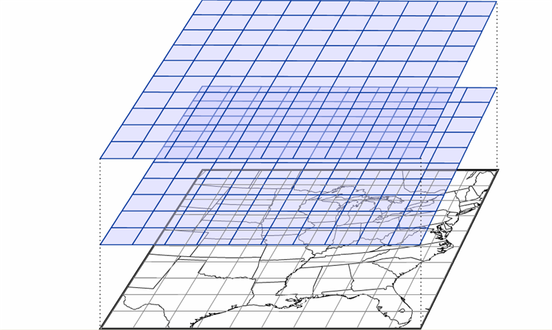
Over the years, the NAM model has operated using various calculation schemes -- the "guts" of the model. Currently, the model uses a scheme called NEMS-NMMB (short for: NOAA Environmental Modeling System - Non-hydrostatic Multi-scale Model), which allows for multiple domains and resolutions to be run simultaneously. Note the various resolutions of the different NAM domains [10]. Some of the NAM's domains have resolutions of just a few kilometers, which can generate very detailed forecast simulations.
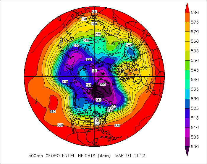
But, even grid-point models that can create detailed forecast simulations have a problem. To see what I mean, check out the image below, which shows a type of map commonly used by weather forecasters to assess weather patterns above the Earth's surface. Forecasters often look at analyses showing the height at which the atmospheric pressure is a specific value (a pressure of 500 millibars is one common pressure level, which is about half of typical pressure values at sea level), and this is a polar stereographic perspective of the 500-mb height pattern for March 1, 2012. This perspective allows you to easily see the numerous waves positioned around the globe. Now, compare to this "gridded" version of this height data [11]. It looks a lot different, doesn't it? We've largely lost the sense of the waves that make up the 500-mb pattern, and some of the finer features have vanished. In reality, most atmospheric variables aren't really well represented by "boxes." Grid-point models with high resolutions have smaller "boxes", but they still can't perfectly simulate the real atmosphere, even though they employ sophisticated interpolation schemes to smooth out the data.
Model developers have come up with some sophisticated techniques for reducing the "box-like" nature of model grids, so not all grid-point models use square or rectangular grids to perform their calculations about future states of the atmosphere. Indeed, some models employ grids that look more like hexagons [12] (credit: NCAR), and some models have flexible grids, which allow for different grid sizes over different parts of the globe [13] (credit: NOAA) in order to "zoom in" and give more detailed predictions in and around important weather features. The grid style that a particular model employs can have consequences for calculation efficiency and accuracy, so model developers often have to balance computational speed and forecast accuracy when deciding what type of grid to use (each has pros and cons).
Spectral Models
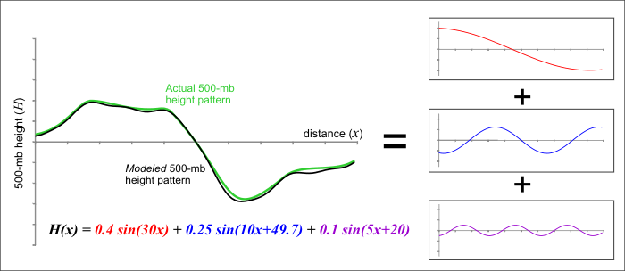
Still, many variables in the atmosphere, like the 500-mb heights you saw above, are better represented by wave-like structures than any type of grid, and it turns out there's another type of model, called a spectral model, that isn't based on grids. Rather than dividing up the atmosphere into a series of grid boxes, spectral models describe the present and future states of the atmosphere by solving mathematical equations whose graphical solutions consist of a series of waves. I'll skip the details of the mathematics since they're outside the scope of this class, but the key concept lies in the idea that any wave-like function can be replicated by adding various simple waves together. As an example, check out the figure below. Consider a 500-mb height pattern that follows the green line. A spectral model first approximates this pattern by adding a series of simple wave functions, described mathematically by the function called "sine." In our example, I was able to closely duplicate the green curve by adding together three different wave functions (the red, blue, and purple curves). The resulting black curve is fairly close to the green curve and has a simple (relatively speaking) equation that the computer has no problem interpreting.
Spectral models thus begin by first analyzing current patterns in the observed atmospheric variables and then recreating those patterns using sums of simple wave functions. The advantage of a spectral model is that the way in which the sine function changes is well known, and we don't need a set of gridded observations at all!
The fact that we know exactly how a wave function will change in time and space brings us to the major advantage of spectral models: They save computational time, and that can be a big advantage when a model is producing longer-range forecasts. But, spectral models have shortcomings, too. First, spectral models don't perform well on regional domains (domains with fixed boundaries) because the sine functions that make up the "waves" in the model are unbounded. They don't artificially end at the boundary of some arbitrary regional domain. The waves extend all the way around the earth, reconnecting where they began; therefore, most spectral models are global models (although some global models are grid-point models).
Another shortcoming of spectral models is that while many atmospheric variables exhibit a wave-like appearance (the 500-mb height pattern, for example), some most definitely do not. Think about a day with spotty showers and thunderstorms. The spatial pattern of precipitation in this case certainly does not lend itself to smooth, wave-like functions. The same goes for any variable with an abrupt gradient or discontinuity. For predicting such variables, spectral models just aren't ideal. Model developers try to overcome such obstacles by incorporating internal grids to calculate troublesome variables and feed them back into the spectral mathematics. It's a rather complex and imperfect process, but it's part of the never-ending process of trying to limit model shortcomings.
Finally, I should point out that spectral models are not immune from computational error. It turns out that a finite sum of wave functions cannot exactly reproduce every wave pattern. Notice the subtle differences between the black and green curves in the figure above. These differences arise because I am only adding together three different wave patterns. If I were to increase that number to 10 or 20 different waves, the match would be much closer (but still not perfect). Spectral models measure their "resolution" in the number of waves that can be added together to reproduce a particular pattern. At some point, you have to stop adding in new functions and the difference between the actual pattern and the pattern that you reproduced is called truncation error. As in the figure above, our approximation of the observed pattern may be very good, but it takes only a very small amount of error to start leading the model astray. There's also the ever-persistent problems of observational error and round-off error to contend with as well (not to mention the computational error from the grid-point part of the model). Thinking about all of the sources of error makes you wonder how computer models predict the weather as well as they do!
Now that you understand some of the basics behind numerical weather prediction, let's get down to actually retrieving model data from the rNOMADS server.
Read on.
An Introduction to rNOMADS
Prioritize...
After completing this section, you should be able to query the NOMADS model database using the R-library "rNOMADS". You should also be familiar with the types of parameters that must be defined in order to correctly query model data.
Read...
The suite of numerical models run by the United States is coordinated through the National Centers for Environmental Prediction [14] (NCEP). More specifically, you can access numerical model data using the NOAA Operational Model Archive and Distribution System [15] (or NOMADS). NOMADS provides several means for exploring and retrieving a vast volume of numerical prediction data. As with other data sets that we have examined, the sheer quantity of data (along with arcane file types) make routine data retrieval somewhat of a chore.
Enter rNOMADS. This R-library will help you to select and retrieve model data for a variety of uses. You might want to refer to the rNOMADS documentation [16], but, as always, you can just dive in using my example code.
Let's start with the basics...
# check to see if the libraries have been installed
# if not, install them
if (!require("rNOMADS")) {
  install.packages("rNOMADS") }
if (!require("maps")) {
  install.packages("maps") }

library(rNOMADS)
library(maps)
library(fields)

#get a list of available models (abrev, name, url)
model.list<- NOMADSRealTimeList("dods")
From the documentation, there appear to be two different methods for accessing data: GRIB access (a WMO file standard) and the DODS server. While GRIB retrieval might be faster, I find that retrieving files from the DODS server is more intuitive. You can print out model.list to see all the model types available. It should mirror the list given on the NOMADS page. By the way, we'll examine the GRIB file format in a later lesson.
Once you choose a model (in this case "gfs_0p50", the 0.5-degree resolution GFS), you can query the available model dates that are contained in URLs pointing to the data server. In the code below, I retrieve the most current date, retrieve the run times for that date, and finally choose the most recent runtime. Finally, I use GetDODSModelRunInfo to query the server for specifics about the model I have requested. From this query, I can learn about the extent of the 3-dimentional model domain, resolution, and variables computed.
#get the available dates and urls for this model (14 day archive)
model.urls <- GetDODSDates("gfs_0p50")

latest.model <- tail(model.urls$url, 1)

# Get the model runs for a date
model.runs <- GetDODSModelRuns(latest.model)

latest.model.run <- tail(model.runs$model.run, 1)

# Get info for a particular model run
model.run.info <- GetDODSModelRunInfo(latest.model, latest.model.run)

# Type model.run.info at the command prompt
#    to see the information

# OR You can search the file for specific model
#   variables such as temperature:
#   model.run.info[grep("temp", model.run.info)]
Note that you can simply print out model.run.info, or you can search the output using the command "grep" to look for certain phrases, such as those containing the word "temp" (often short for temperature). Granted, the output of model.run.info can be daunting (there are over 41 variables that contain the word temperature). However, rest assured that you don't need to have an understanding of them all. Just know that numerical models keep track of temperature at many levels. At the moment, let's just focus on the temperature at 2 meters above the ground (variable: "tmp2m").
The next portion of the code sets the parameters to retrieve and then calls the retrieval routine DODSGrab(...). Note that we can request vectors of forecast time, lat/lon, and pressure level (if applicable). The numbers for each vector represent different quantities. For example, the time vector the numbers represent each forecast hour with 0 being the analysis run. So, if the model generates forecasts every 6 hours and we wanted only the 24-hour and 30-hour forecasts, how would we structure the vector? (answer: time <- c(4,5)) Likewise, the lat/lon vectors are based on the grid points of the 0.5x0.5 degree grid. Remember that we can get the precise dimensions of the grid by looking at the output of GetDODSModelRunInfo(...). In this case, grid point (0,0) represents a lat/lon of -90N 0E. Can you figure out what the grid point of 45N 80W is and construct the proper vector calls? (answer lon <- c(560,560) and lat <-c(270,270))
variable <- "tmp2m"
time <- c(0, 0) # Analysis run, index starts at 0
lon <- c(0, 719) # All 720 longitude points (it's total_points -1)
lat <- c(0, 360) # All 361 latitude points
lev <- NULL      # DO NOT include level if variable is non-level type

print("getting data...")
model.data <- DODSGrab(latest.model, latest.model.run,
                       variable, time, levels=lev, lon, lat)
You can imagine that this host of parameters means that we can extract a variety of time series, profiles, and cross-sections through the model data. We'll discuss some of these approaches later in the lesson. But, for now, let's look at how we might display the data. We are going to be using the maps and fields library to display the data along with various maps. To further make sense of the model output, we must execute the following steps... 1) switch the lat/lon coordinate system around so that east longitudes are positive and west longitudes are negative; 2) re-grid the model data (more on this in a minute); 3) swap out-of-bounds (very large numbers) values with the "NA" value; and 4) change the model temperature (in Kelvin) to Fahrenheit.
# reorder the lat/lon so that the maps work
model.data$lon<-ifelse(model.data$lon>180,model.data$lon-360,model.data$lon)

# regrid the data
model.grid <- ModelGrid(model.data, c(0.5, 0.5), model.domain = c(-100,-50,60,10) )

# replace out-of-bounds values
model.grid$z <- ifelse (model.grid$z>99999,NA,model.grid$z)

#convert data to Fahrenheit
model.grid$z[1,1,,]=(model.grid$z[1,1,,]-273.15)*9/5+32
Let's look closer at the ModelGrid function that is included in the rNOMADS library. This function distills the output of DODSGrab and formats it into a grid format suitable for plotting. The second parameter is the output resolution of the grid (less than or equal to the model resolution). The third parameter is the type of grid ("latlon" in this case), and the fourth parameter is the sub-sampled domain. This function allows you to perform a variety of subsections of the model data only using one retrieval call from the NOMADS server.
Finally, we can plot the data using a modified image.plot function and several map functions. If you don't alter the code, your data should resemble this GFS analysis (initial data) of 2-meter temperatures [17] for the eastern half of the United States.
# specify our color palette
colormap<-colormap<-rev(rainbow(100))

# make the graph square 4"x4"
# Note: Remember if you get an error that says, "plot too large"
# either expand your plot window, or reduce the "pin" values
par(pin=c(4,4))

# image.plot is a function from the fields library
# It automatically adds a legend
image.plot(model.grid$x, sort(model.grid$y), model.grid$z[1,1,,], col = colormap,
           xlab = "Longitude", ylab = "Latitude",
           main = paste("Surface Temperature",
           model.grid$fcst.date))

map('state', fill = FALSE, col = "black", add=TRUE)
map('world', fill = FALSE, col = "black", add=TRUE)
You might also try looking at 2-meter dew point temperatures. If you do, you could change the color palette line to: colormap<-colorRampPalette(c(rgb(0,0,0,1), rgb(0,1,0,1)))(100)
Next, let's look at a few other ways of displaying model data. Read on.
Explore Further...
It can be tedious to copy the appropriate model information from model.run.info into other parts of the code. Therefore, I wrote a function that automatically extracts information such as the latitude/longitude of the model domain and the resolution in each dimension. You are welcome to add it to your code if you like. The function should be defined above where you call it. I put mine right after the "library" statements.
#function that extracts pertinent model information from model.run.info
extract_info <- function(x) {
  lonW<-as.numeric(as.character(sub("^.*: (-?\\d+\\.\\d+).*$","\\1", x[3])))
  lonE<-as.numeric(as.character(sub("^.*to (-?\\d+\\.\\d+).*$","\\1",x[3])))
  lonPoints<-as.numeric(as.character(sub("^.*\\((\\d+) points.*$","\\1", x[3])))
  lonRes<-as.numeric(as.character(sub("^.*res\\. (\\d+\\.\\d+).*$","\\1", x[3] )))
  latS<-as.numeric(as.character(sub("^.*: (-?\\d+\\.\\d+).*$","\\1", x[4])))
  latN<-as.numeric(as.character(sub("^.*to (-?\\d+\\.\\d+).*$","\\1",x[4])))
  latPoints<-as.numeric(as.character(sub("^.*\\((\\d+) points.*$","\\1", x[4])))
  latRes<-as.numeric(as.character(sub("^.*res\\. (\\d+\\.\\d+).*$","\\1", x[4] )))
  out<-data.frame(lonW,lonE,lonPoints,lonRes,latN,latS,latPoints,latRes)
  return (out)
}

#.... later on in the code, after you retrieve model.run.info ....

# your function can be called like this...
model.params<-extract_info(model.run.info)

# and used like this...
variable <- "tmp2m"
time <- c(0, 0) #Analysis run, index starts at 0
lon <- c(0, model.params$lonPoints-1)
lat <- c(0, model.params$latPoints-1)
lev<-NULL  # DO NOT include level if variable is non-level type

# and this...
model.grid <- ModelGrid(model.data, c(model.params$latRes, model.params$lonRes), "latlon", model.domain = c(-100,-50,60,10) )
Model Data in Time
Prioritize...
At this point, you should be familiar with retrieving model analysis data from the NOMADS server. In this section, we will look at how to retrieve various numerical forecast data from the server as well. Make sure you spend time experimenting with the code below, as this is the only way of becoming comfortable with using the R-code. When you are ready, complete the Quiz Yourself challenge.
Read...
Of course, the reason why we are interested in retrieving model data in the first place is to get a suggestion of what the future might hold. As always, use numerical predictions with caution, especially at forecast times beyond 48-hours. Over the course of this program, you will learn the proper treatment of computer model data, but, for now, let's just see what kinds of data we can retrieve from the NOMADS server.
Remember that computer models gather all sorts of observations that are used to form the initial state or model analysis. At that point, the model equations are "run" forward in time, and forecasts for numerous variables are generated at prescribed intervals in the future. You might imagine the possibilities for analysis... The GFS model contains 251 variables (some at multiple levels) predicted for over 250K points at 80 different forecast times! This is a massive amount of data, but, fortunately, R can do the heavy lifting.
Let's start with a simple form of the code from the previous page. Since we know what we are looking for, we can skip a few steps...
# check to see if rNOMADS has been installed
# if not, install it
if (!require("rNOMADS")) {
  install.packages("rNOMADS") }

library(rNOMADS)

#get the latest GFS 0.5x0.5 model url
latest.model <- tail(GetDODSDates("gfs_0p50")$url, 1)

# Get the latest model run for this date
latest.model.run <- tail(GetDODSModelRuns(latest.model)$model.run, 1)

variable <- "tmp2m"  # 2-meter temperatures
time <- c(0, 80)     # Get all 80 forecast times
lon <- c(560, 580)   # Get only a small subset of points
lat <- c(260, 270)   #   around my location of interest
lev<-NULL            # DO NOT include level if variable is non-level type

model.data <- DODSGrab(latest.model, latest.model.run,
                       variable, time, levels=lev, lon, lat)
Notice that the main difference in this script is that we are asking the server for all of the model forecasts (for this model, there are 8 forecasts per day for 10 days). What we are after is a time series of forecast 2-meter temperatures at one particular grid point (the nearest grid point to State College, PA). After retrieving the data, we simply need to clean it up a bit and plot it using the following code.
# Switch the lat/lon coordinate system around
model.data$lon<-ifelse(model.data$lon>180,model.data$lon-360,model.data$lon)

# Get two vectors one temperature and one dates/times
# at only a single grid point
model.temperature<-model.data$value[which(model.data$lon==-78 & model.data$lat==41)]
model.fdate<-model.data$forecast.date[which(model.data$lon==-78 & model.data$lat==41)]

# Convert to Fahrenheit
model.temperature<-(model.temperature-273.15)*9/5+32

# Display times in GMT
attr(model.fdate, "tzone") <- "GMT"

# Make a plot
plot(model.fdate,model.temperature,
     xlab = "Date", ylab = "Temperature (F)",
     main = paste0("GFS Forecasted 2-m Temperature\n",
                  head(model.fdate,1),"Z to ",tail(model.fdate,1),"Z")
     )
lines(model.fdate,model.temperature,lwd=2,lty=1,col="red")
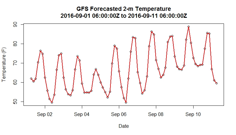
Your plot of forecast 2-m temperatures should resemble the one below. You might see if you can figure out how to alter the entire script to select a point of your choosing. For more flexibility, you could retrieve a larger set of points (the entire U.S., for example) but bear in mind that you are retrieving 80 grids (one for each forecast time) worth of data. So, your retrieved file will grow substantially if your requested domain is large.
Quiz Yourself...
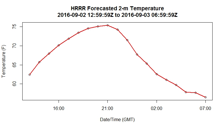
The HRRR (model code: "hrrr") is a very high-resolution, short-term model centered over the continental U.S (check out this sample 2-m temperature plot from the HRRR [18]). Instead of producing output four times a day, the HRRR creates a forecast for each hour. Can you alter the code above to retrieve the 2-meter temperature for the meteorology building at Penn State (40.793313 N, 77.866796 W) or any other point of your choosing? I have hidden my script, but show you the resulting plot below.
My solution:
You may have approached the problem in an entirely different manner (and that's fine). However, I wanted to point out a few extra changes I made to the code. First, I used the extract_info function that I introduced in the "Explore Further" section on the previous page. It's not necessary that you do so; you could have simply copied down the model parameters from the model.run.info file. Since I already had the function, I reused it. This is an important lesson to remember... if you write good scripts with plenty of commenting, you can likely reuse/adapt them for future projects. Being organized when it comes to creating scripts will pay off, believe me.
Next, since the HRRR model resolution is not 0.5 degrees like the GFS, it can be quite a pain to figure out what model points in order to capture my location of interest within the smallest box possible. You certainly don't want to retrieve them all (the HRRR has many thousands more points than the GFS). Therefore, I created the formulas to solve for the number of points needed, given a longitude/latitude and the model resolution. I discovered in this process that the model resolution given in model.run.info was not the actual resolution but instead a rounded value (why, I have no idea). This caused problems, and thus I needed to figure out the actual resolution by doing a test retrieval first, figuring out the step-size in lat/lon, and then entering those values in my formula. It occurred to me that it might have been easier and quicker just to guess the number of points necessary, but in the end, I now have something that works for any point I choose.
Finally, after I retrieved the model data, I needed to figure out what grid point was closest to my chosen location. This process is easy for the GFS because I know that the points fall every half of a degree (70.0, 70.5, 71.0, etc). With the HRRR, the task is a bit more complicated. Therefore, I use a pseudo-distance test to determine the best grid point being the one that is less than half the model resolution in each direction.
# check to see if rNOMADS has been installed
# if not, install it
if (!require("rNOMADS")) {
  install.packages("rNOMADS") }

library(rNOMADS)

extract_info <- function(x) {
  lonW<-as.numeric(as.character(sub("^.*: (-?\\d+\\.\\d+).*$","\\1", x[3])))
  lonE<-as.numeric(as.character(sub("^.*to (-?\\d+\\.\\d+).*$","\\1",x[3])))
  lonPoints<-as.numeric(as.character(sub("^.*\\((\\d+) points.*$","\\1", x[3])))
  lonRes<-as.numeric(as.character(sub("^.*res\\. (\\d+\\.\\d+).*$","\\1", x[3] )))
  latS<-as.numeric(as.character(sub("^.*: (-?\\d+\\.\\d+).*$","\\1", x[4])))
  latN<-as.numeric(as.character(sub("^.*to (-?\\d+\\.\\d+).*$","\\1",x[4])))
  latPoints<-as.numeric(as.character(sub("^.*\\((\\d+) points.*$","\\1", x[4])))
  latRes<-as.numeric(as.character(sub("^.*res\\. (\\d+\\.\\d+).*$","\\1", x[4] )))
  out<-data.frame(lonW,lonE,lonPoints,lonRes,latN,latS,latPoints,latRes)
  return (out)
}

#get the latest HRRR model url
latest.model <- tail(GetDODSDates("hrrr")$url, 1)

# Get the latest model run for this date
latest.model.run <- head(GetDODSModelRuns(latest.model)$model.run, 1)

# Get info for a particular model run
model.run.info <- GetDODSModelRunInfo(latest.model, latest.model.run)
model.domain<-extract_info(model.run.info)

# Here's the point I want
my_lat <- 40.793313
my_lon <- -77.866796

# I used a formula to calculate what points I should retrieve
variable <- "tmp2m"  # 2-meter temperatures
time <- c(0, 18)     # Get all 80 forecast times
lon <- c(floor((floor(my_lon)-model.domain$lonW)/0.029240189), floor((ceiling(my_lon)-model.domain$lonW)/0.029240189))
lat <- c(floor((floor(my_lat)-model.domain$latS)/0.027272727), floor((ceiling(my_lat)-model.domain$latS)/0.027272727))
lev<-NULL            # DO NOT include level if variable is non-level type

model.data <- DODSGrab(latest.model, latest.model.run,
                       variable, time, levels=lev, lon, lat)

# Get two vectors one temperature and one dates/times
# at only a single grid point
model.temperature<-model.data$value[which(abs(my_lon-model.data$lon) < model.domain$lonRes/2 & abs(my_lat-model.data$lat) < model.domain$latRes/2)]
model.fdate<-model.data$forecast.date[which(abs(my_lon-model.data$lon) < model.domain$lonRes/2 & abs(my_lat-model.data$lat) < model.domain$latRes/2)]

# Convert to Fahrenheit
model.temperature<-(model.temperature-273.15)*9/5+32

# Display times in GMT
attr(model.fdate, "tzone") <- "GMT"

# Make a plot
plot(model.fdate,model.temperature,
     xlab = "Date/Time (GMT)", ylab = "Temperature (F)",
     main = paste0("HRRR Forecasted 2-m Temperature\n",
                   head(model.fdate,1),"Z to ",
                   tail(model.fdate,1),"Z")
)
lines(model.fdate,model.temperature,lwd=2,lty=1,col="red")
Did your graph resemble mine?
Automating Retrieval
Prioritize...
In this section, we will again use R's ability to loop over a list of data. Such loops are important in automating tasks such as retrieving data from a list of model runs.
Read...
The NOMADS database archives as many as 50 past model runs. For example, at any one time, you are able to retrieve any GFS model output for the past 14 days. This means that we can do some fairly interesting data retrievals including looking at the initialization state of a model variable over time and studying how a predicted variable changes in time (sometimes referred to as "D-model, D-T"). The problem arises in that each model run is stored separately in the database. Unlike retrieving all of a single model's forecasts in a single call, we now need to retrieve all of the models' single forecasts. This will require some automation on R's part. Let's start a new script.
First, we start with a modified rNOMADS script...
# check to see if rNOMADS has been installed
# if not, install it
if (!require("rNOMADS")) {
  install.packages("rNOMADS") }

library(rNOMADS)

#get the available dates and urls for this model (14 day archive)
model.urls <- GetDODSDates("gfs_0p50")
model.url.list <- model.urls$url

# Here's the point I want
my_lat <- 40.793313
my_lon <- -77.866796

# Define our retrieval parameters
variable <- "tmp2m"
time <- c(0, 0)    # Analysis run, index starts at 0
lon <- c(560, 580) # Just a rough estimate of
lat <- c(260, 270) # where the point is located
lev<-NULL  # DO NOT include level if variable is non-level type

# This will be our placeholder for the specific point data we want
model.timeseries <- data.frame()
Notice that in this script, we do not worry about the latest model date, nor do we care what the latest model run is. The reason is that we are going to retrieve them all and build a time series of the result. Therefore, we need to define two functions. The first takes specific model runs on a specific day, retrieves the partial grid of data, and extracts the value from the grid point nearest my location. This result is then added as a row to the model.timeseries data frame.
retrieve_data <- function (run, model) {

     # get the partial grid
     model.data <- DODSGrab(model, run, variable, time, levels=lev, lon, lat)

     # reorder the lat/lon
     model.data$lon <- ifelse(model.data$lon>180,model.data$lon-360,model.data$lon)

     # select the closest point
     model.value <- model.data$value[which(abs(my_lon-model.data$lon)<0.5/2 & abs(my_lat-model.data$lat)<0.5/2)]
     model.fdate <- model.data$forecast.date[which(abs(my_lon-model.data$lon)<0.5/2 & abs(my_lat-model.data$lat)<0.5/2)]

     #convert to degrees F
     model.fvalue <- (model.value-273.15)*9/5+32

     # add the row to the data frame
     # remember that we have to use the <<- operator
     # to pass the value outside the function
     row <- data.frame(Date=model.fdate, Value=model.fvalue)
     model.timeseries <<- rbind(model.timeseries,row)
}
Now, we need a function that will loop over all of the daily runs for a given model. Notice that in this function we use sapply which says, "take all of the data in model.runs$model.run and apply it to the function retrieve_data. The parameter "model" is an extra variable that gets passed to the retrieve_data function as well. If you think in terms of programming "loops", this is the inner loop.
loop_over_runs <- function (y) {
     # Get the model runs for a date
     model.runs <- GetDODSModelRuns(y)

     # run the loop_over_runs function for each time in model.runs
     sapply(model.runs$model.run, retrieve_data, model=y)
}
Now that we have our two functions, we can add the rest of the code. It's relatively simple. First, there's the primary sapply call that sends the list of models to the function loop_over_runs. This command is the outer loop of the retrieval process. Next, there is just the standard plotting routine that we have been using in the last few tutorials.
# for each model in model.url.list, loop over all of the runs
sapply(model.url.list, loop_over_runs)

# Display times in GMT
attr(model.timeseries$Date, "tzone") <- "GMT"

# Make a plot
plot(model.timeseries$Date,model.timeseries$Value, type="n",
     xlab = "Date/Time (GMT)", ylab = "Temperature (F)",
     main = paste0("GFS Initialized 2-m Temperature\n",
         format(head(model.timeseries$Date,1), "%m-%d-%Y %HZ")," to ",
         format(head(model.timeseries$Date,1), "%m-%d-%Y %HZ"))
)
lines(model.timeseries$Date,model.timeseries$Value,lwd=2,lty=1,col="red")
Voila! Here is the plot I generated [19]. Can you think of other interesting things we might want to look at using this approach? What about how the temperature forecast for a certain time is changing as the forecast interval decreases? What would such a plot tell you about the stability of that temperature forecast?
Profiles of Model Data
Prioritize...
We have retrieved model data in the horizontal plane and in time. In this section, we will look at retrieving profiles of model data. As always, make sure that you follow along with your own version of the code. After you get this sample working, experiment with variations so that you are comfortable with the commands.
Read...
So far, we have examined how to access model data both in horizontal space and in time. Before moving on to other forms of model data, I wanted to demonstrate an example of extracting model data in the vertical dimension.
Computer models have several different vertical coordinate systems. At lower levels, there are many variables defined at specific heights above the ground (2-meter temperature is an example). There are also a group of variables that are defined over an array of pressure levels (called the mandatory levels). These variables are defined by both lat/lon coordinates and a height coordinate. Let's see how we can retrieve them from a model file.
We start with the standard query of the NOMADS dataset...
# check to see if rnoaa has been installed
# if not, install it
if (!require("rNOMADS")) {
  install.packages("rNOMADS") }

library(rNOMADS)
library(reshape2)

#get the available dates and urls for this model (14 day archive)
model.urls <- GetDODSDates("gfs_0p50")

latest.model <- tail(model.urls$url, 1)

# Get the model runs for a date
model.runs <- GetDODSModelRuns(latest.model)

latest.model.run <- tail(model.runs$model.run, 1)

# Get info for a particular model run
model.run.info <- GetDODSModelRunInfo(latest.model, latest.model.run)

# variables that are pressure level dependent...
# model.run.info[grep("1000 975", model.run.info)]
If you want to identify what variables are defined at the mandatory levels, you can query model.run.info using the command directly above. Notice below that I am retrieving three variables in one call. I am also limiting my lat/lon box to save space, and I am requesting all 46 levels.
# I'm retrieving temperature, RH, and geopotential height
variable <- c("tmpprs","rhprs","hgtprs")
time <- c(0, 0) #Analysis run, index starts at 0
lon <- c(560, 580)
lat <- c(260, 270)
lev<-c(0,46)  # Requesting level-type variables, so we can use this parameter

model.data <- DODSGrab(latest.model, latest.model.run, variable, time, levels=lev, lon, lat)
model.data$lon<-ifelse(model.data$lon>180,model.data$lon-360,model.data$lon)

# Get the lat/lon point I want (41N, 78W)
# I could have made this a variable
profile.data <- data.frame(
   Level=model.data$levels[which(model.data$lon==-78 & model.data$lat==41)],
   Vars=model.data$variables[which(model.data$lon==-78 & model.data$lat==41)],
   Values=model.data$value[which(model.data$lon==-78 & model.data$lat==41)]
)

# reshape the output into proper columns
profile.dcast <- dcast(profile.data, Level~Vars)

# add a column of converted temperature
profile.dcast <-transform(profile.dcast, TempC=(tmpprs-273.15))
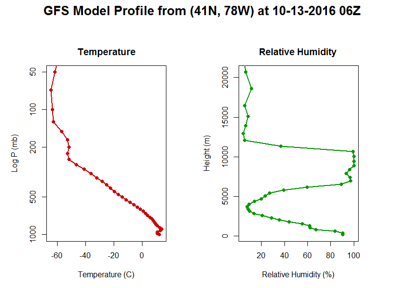
Now, let's plot the results. Notice that I used my mfrow command again so that I can plot two graphs side-by-side.
# multiple plots... 1 row, 2 columns
# we also do some margin and graph size control here
par(mfrow=c(1,2), oma=c(0,1,2,1)+0.1, mar=c(0,0,3,0), pin=c(3.4,5))

# make the first plot...
# Note that I am plotting only a subset of points
# I do this so that the two graphs can have different y-axes
# with the same range.

plot(profile.dcast$TempC[which(profile.dcast$Level>49)],
     profile.dcast$Level[which(profile.dcast$Level>49)],
     type="n", xlab = "Temperature (C)",
     ylab = "Log P (mb)", log="y", ylim = c(1000,50),
     main="Temperature")
lines(profile.dcast$TempC,profile.dcast$Level,lwd=2,lty=1,col="#CC0000")
points(profile.dcast$TempC,profile.dcast$Level,pch=19,col="#CC0000")

# make the second plot...
plot(profile.dcast$rhprs[which(profile.dcast$Level>49)],
     profile.dcast$hgtprs[which(profile.dcast$Level>49)],
     type="n", xlab = "Relative Humidity (%)", ylab = "Height (m)",
     main="Relative Humidity")
lines(profile.dcast$rhprs,profile.dcast$hgtprs,lwd=2,lty=1,col="#009900")
points(profile.dcast$rhprs,profile.dcast$hgtprs,pch=19,col="#009900")

# overall title...
title(paste0("GFS Model Profile from (41N, 78W) at ",
      format(head(model.data$forecast.date,1), "%m-%d-%Y %HZ", tz="GMT")),
      outer=TRUE, cex.main=1.6)
Here's my plot. Yours should look similar although the data itself will likely be different.
Ensemble Forecasting
Prioritize...
Upon completion of this page, you should be able to discuss the basic concepts of ensemble forecasting.
Read...

Imagine you're competing in an archery contest. Would you rather shoot one arrow at a target (left target) or increase your chances of hitting the bull's eye by shooting a quiver full of arrows (right target)?
Choosing a single model of the day's output is akin to having only one "shot" at the target (in this case, the correct forecast). However, some numerical weather models are run over a variety of initial conditions, producing a variety of solutions. These ensembles represent a quiver full of arrows, all launched at the same target. For a pending forecast fraught with uncertainty, utilizing ensembles may give you a better chance of hitting the target near the center.
To get a more "meteorological" idea of what I mean, check out the schematic below. It shows the spread in the solutions of two different ensemble forecasts (one is a medium-range forecast; the other is a shorter-range forecast). In turn, this spread defines the model uncertainty for the given forecast (note that the uncertainty decreases as forecast time decreases). In most cases, the bull's eye lies somewhere within that spread. Although we can never really hope to hit the bull's eye dead center, we can at least use ensemble forecasts to make informed probabilistic forecasts that better convey the uncertainty of the situation. In archery terms, we have a better chance of hitting at least something.

So, ensembles help us to identify the signals of uncertainty associated with the forecast. Since predicted weather data always contain some level of uncertainty, it behooves us to dig a bit deeper into the theory of ensemble forecasting.
Tweaking initializations: Generating a quiver of arrows
What allows us to shoot more than one "arrow" at the target? As it turns out, the initial conditions fed into the model lie at the heart of the problem of model uncertainties (imperfect physics and parameterizations don't help either). That's because model initializations rely heavily on the previous run's forecast. Granted, these initializing forecasts are tempered by real observations, but, in the grand scheme of things, they fall short of the mark because observing stations, particularly upper-air sites, are simply too far apart over land and too infrequent. To make matters worse, in-situ upper-air observations are virtually non-existent over the vast expanse of oceans (this deficiency obviously has more impact on global models).
Needless to say, initializations are fraught with error. For example, model initializations can be quite suspect with regard to the intensity and evolution of weather features within regions of sparse observational coverage (such as the Pacific Ocean), and these can inject huge uncertainties into a pending forecast period. NCEP has taken some innovative approaches to help remedy the problem presented by large data voids, such as using targeted aircraft reconnaissance to try to observe important features over the Pacific. If you're interested, you can read more about such adaptive observations [20]. However, regardless of these targeted efforts, initializations will never be perfect.
In some cases, initializations more accurately capture the essence of the current pattern. In general, forecasters have greater confidence making predictions in such patterns. Still, there can be relatively large uncertainties in the forecast in some regions of the country as compared to others. And, not surprisingly, those uncertainties grow with time. As an example, check out this loop of GFS ensemble forecasts of the upper air pattern [21] based on the 00Z run on October 26, 2006. Each colored contour corresponds to an ensemble member with slightly different initial conditions. You can see little spread in the forecasts early on (great confidence), but the spread then increases with time (growing uncertainty). You can see why these types of forecasts are appropriately called spaghetti plots.
In recent decades, numerous ensemble forecast systems have been developed. The GFS is the basis of the "GEFS" (Global Ensemble Forecast System), which is also sometimes called the MREF (Medium-Range Ensemble Forecast). Other ensemble forecast systems are based on multiple models. One such system is NCEP's Short-Range Ensemble Forecast (SREF). The SREF is a 26-member ensemble run four times per day (03Z, 09Z, 15Z, and 21Z) out to 87 hours.
The Bottom Line
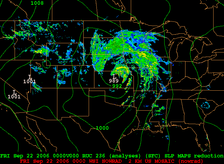
So, what does all this mean? Ultimately, the members of an ensemble represent arrows in your quiver (if you recall the metaphor we used previously). But, how do meteorologists gather relevant messages from all the ensemble members? One way is to look at the ensemble mean and the spread. For example, take a look at the image below, showing a portion of the 39-hour forecast for MSLP isobars and three-hour precipitation valid at 00Z on September 22, 2006. Not only can you see individual members, but the large panel at the bottom right of the image shows the ensemble mean (average of all the members). Here's the uncropped chart of the forecasts [22], if you're interested.

In certain situations, the ensemble mean has a higher statistical chance of striking the target. For example, compare the mean 39-hour ensemble mean forecast (above) with the verification chart of MSLP isobars and radar reflectivity [23] at 00Z on September 22, 2006. Focus on the mid-latitude cyclone and its associated precipitation over the Upper Middle West. Granted, no measurable precipitation had yet fallen in northern Minnesota, but the mean 39-hour ensemble forecast from 09Z on September 20 essentially captured the tenor of the forecast over Minnesota.
But, please don't think that the mean ensemble forecast is infallible. To the contrary, it can fail miserably at times. Think about a situation in which ensemble members cluster themselves into two distinct "camps." For example, say, half of the ensemble members predict near an inch of rain to fall in a particular town, while the other half predict much less, roughly 0.10 inches (almost an "all or nothing" scenario). The mean of all those forecasts would be right in the middle... where none of the ensemble members are! In this case, the mean ensemble forecast would be a very low-confidence forecast. The lesson learned is that ensembles can give you an overall qualitative sense for the spread of the individual solutions. An assessment of the uncertainty of the model's forecast will provide insight about how useful the ensemble mean (or other statistics) might be.
Now that you know the story of how ensembles work and what their advantages are, let's use rNOMADS to retrieve some ensemble data.
The NOMADS Ensembles
Prioritize...
After completing this section, you will be able to retrieve data from the ensemble runs of a particular model. Ensemble data gives you an indication of the variability (and to some degree uncertainty) regarding a particular model solution. Creating model "spaghetti plots" helps visualize how the solutions to the ensembles diverge over time.
Read...
To retrieve model ensemble members from NOMADS, we start with code that looks very similar to previous retrievals. There are two exceptions... First, we need to specify a model that contains the ensemble members. In this case, we chose the model name "gens". Remember that you can query all of the model names and other information with NOMADSRealTimeList("dods"). Second, we need to define the number of ensembles to retrieve. This variable is passed to DODSGrab along with the other parameters.
# check to see if rnoaa has been installed
# if not, install it
if (!require("rNOMADS")) {
  install.packages("rNOMADS") }

library(rNOMADS)

# get the available dates and urls for this model (14 day archive)
# "gens" is the GFS ensemble run
model.urls <- GetDODSDates("gens")
latest.model <- tail(model.urls$url, 1)

# Get the model runs for a date
model.runs <- GetDODSModelRuns(latest.model)
latest.model.run <- tail(model.runs$model.run, 1)

# set the variable, location, times, levels (if needed)
# and most importantly the ensemble members
variable <- c("tmp2m")
time <- c(0, 40)
lon <- c(280, 290)
lat <- c(130, 135)
levels    <- NULL
ensemble <- c(0, 20)  #All available ensembles

# retrieve the data. Notice the included the "ensemble" keyword
model.data <- DODSGrab(latest.model, latest.model.run, variable, time, lon, lat, levels = levels, ensemble = ensemble)

# reorient the lat/lon (makes it easier to navigate)
model.data$lon<-ifelse(model.data$lon>180,model.data$lon-360,model.data$lon)
Now the ensemble members exist as one of the dimensions of the retrieved data (just as time and lat/lon). There are many ways to look at this data. They way I do it here is to create a function called assemble_data which subsets each ensemble, looks for the point I need and then adds those values to a data frame called model.timeseries. The sapply command loops through a sequence of all the ensembles.
# This will be our placeholder for the specific point data we want
model.timeseries <- data.frame()

assemble_data <- function (ens_member) {

  model.data.sub <- SubsetNOMADS(model.data, ensemble = ens_member)

  model.value<-model.data.sub$value[which(model.data.sub$lon==-78 & model.data.sub$lat==41)]
  model.fdate<-model.data.sub$forecast.date[which(model.data.sub$lon==-78 & model.data.sub$lat==41)]
  model.value<-(model.value-273.15)*9/5+32

  # add the row to the data frame
  row <- data.frame(Ensemble=ens_member, Date=model.fdate, Value=model.value)
  model.timeseries <<- rbind(model.timeseries,row)
  }

sapply(seq(ensemble[1]+1,ensemble[2]+1), assemble_data)
Now we have all of the ensemble predictions stored in model.timeseries. To plot all of these solutions, I do something a bit different. I first create a series of arrays of the x and y values. Next, I create the empty plot (without an x-axis... xaxt="n"). Then I add a custom x-axis that has specific times, rather than letting the plot draw them in. Finally, I use the command mapply to plot a line for each ensemble member, using the arrays of x and y values and a rainbow color scheme.
attr(model.timeseries$Date, "tzone") <- "GMT"

xvals <- tapply(model.timeseries$Date,model.timeseries$Ensemble,
                function(x) return(x))
yvals <- tapply(model.timeseries$Value,model.timeseries$Ensemble,
                function(x) return(x))

# plot out all of the ensemble solutions (called "plumes")
plot(model.timeseries$Date,model.timeseries$Value,type="n",
     xlab = "Date", ylab = "Temperature (F)", xaxt="n",
     main = paste0("GFS Ensembele 2-m Temperature\n",
                   head(model.timeseries$Date,1),"Z to ",
                   tail(model.timeseries$Date,1),"Z")
)

times=seq(xvals[[1]][1],xvals[[1]][length(xvals[[1]])], by="24 hours")
axis(1, at=times, labels=format(times, "%HZ %b %d"))

mapply(lines, xvals, yvals,lwd=2,lty=1,col=rainbow(21))
Here is the "spaghetti" plot [24] that is produced by the above code. Notice that the ensemble members start out following nearly the same solution, but as time goes on, the ensemble members began to diverge. The timing of the divergence along with the amount can tell you something about how unstable a given model forecast is. Be suspect of the forecast when the predicted variable ensembles diverge rapidly.
As an alternative, let's instead consider a box plot of the suite of solutions. The code below produces this box plot [25]. Notice here we can see clearly where the ensemble solutions begin to diverge substantially. However, as discussed in the previous section, bulk statistics computed on ensemble members (such as the median value) can be misleading if the solutions are, for example, bi-modal.
# Make a boxplot of the same data
boxplot(model.timeseries$Value~model.timeseries$Date,
        xlab = "Date", ylab = "Temperature (F)",
        main = paste0("GFS Ensembele 2-m Temperature\n",
                      head(model.timeseries$Date,1),"Z to ",
                      tail(model.timeseries$Date,1),"Z"),
        las=1,
        xaxt="n",
        pars=list(medcol="red", whisklty="solid",
                  whiskcol="blue", staplecol="blue")
        )
times=seq(xvals[[1]][1],xvals[[1]][length(xvals[[1]])], by="24 hours")
axis(1, at=seq(1,length(xvals[[1]]),4), labels=format(times, "%HZ %b %d"))
Before we leave the topic of model data, let me give you a warning and some advice on using numerical weather prediction. Read on.
The Problem with Models
Read...
A famous Penn State meteorology professor, long since retired, had a famous saying with regard to model output. “All that I can be sure of,” he’d say, pointing at the forecast map, “is that the weather is not going to look anything like that.” Was this the reaction of a curmudgeon, a disbeliever in “new-fangled” weather forecasting technology? Or was there more to his statement than simple disbelief?
Early in my career, numerical weather models were just gaining steam and their flaws were quite obvious, even in the short term. Still, it was difficult not to latch on to the “model of the day” and run with what it had to say. Today, I think that the temptation to blindly believe what the models are telling us is even greater. Why is that? Well, you’ve probably realized by now that there is an avalanche of model data available to even the casual user. Models that produce output every hour and at a resolution of just a few kilometers surely must be accurate, aren’t they? Plus, when displayed properly, this data looks awesome. Some precipitation output looks “just like” live radar data. That must mean it’s for real, yes?
What about all the arguments about who has the better model? Is the “Euro” better than the “GFS” at 60-72 hours? Have you perhaps heard someone argue that the “NAM is really the model to believe for a particular developing storm system?” The temptation to bet on a model as you would a racehorse is great, but I strongly caution against it. While models can provide general guidance in any one instance, relying too heavily on any particular model solution has no basis in science whatsoever and WILL get you in trouble more times than not.
All is not lost, however. Because you have access to all of the raw data, you can use model output (along with some numerical wrangling) to shape your final decision-making process. Model Output Statistics (MOS) are a good example. In a nutshell, MOS runs the output of a dynamical model through a multi-variable regression algorithm in order to better predict surface variables. Believe it or not, dynamical models perform as poor predictors of surface variables. This is because surface processes are extremely complex, and dynamical models often parameterize these processes. However, if model predictions are compared with observations over a long period of time, certain patterns emerge that allow for a better prediction of surface variables.
So, what’s the takeaway? Model data IS a valuable resource… if used properly. In addition to peering into the future, the small resolution of numerical models makes for an ideal way to “fill in” observational gaps, as long as techniques are used to marry numerical and observational data. In later courses, you will learn such techniques. But for now, know that numerical model data should be used with care.