Prioritize...
At the end of this section, you should be able to prepare your data for fitting and estimate a first guess fit.
Read...
At this point, you should be able to plot your data and visually inspect whether a linear fit is plausible. What we want to do, however, is actually estimate the linear fit. Regression is a sophisticated way to estimate the fit using several data observations, but before we begin discussing regression, let’s take a look at the very basics of fitting and create a first guess estimate. These basics may seem trivial for some, but this process is the groundwork for the more robust analysis of regression.
Prepare the Data
Removing outliers is an important part of our fitting process, as one outlier can cause the fit to be off. But when do we go too far and become overcautious? We want to remove unrealistic cases, but not to the point where we have a ‘perfect dataset’. We do not want to make the data meet our expectations, but rather discover what the data has to tell. This will take practice and some intuition, but there are some general guidelines that you can follow.
At the very minimum, I suggest following the guidelines of the dataset. Usually the dataset you are using will have quality control flags. You will have to read the ‘read me’ document to determine what the QC flags mean, but this is a great place to start as it lets you follow what the developers of the dataset envisioned for the data since they know the most about it. Here is an example of temperature data from Tokyo, Japan. The variables provided our mean daily temperature, maximum daily temperature, and minimum daily temperature. I’m going to compare the mean daily temperature to an average of the maximum and minimum. The figure on the left is what I would get without any quality control. The figure on the right uses a flag within the dataset that was recommended- it flags data that is bad or doubtful. How do you think the QC flags did?
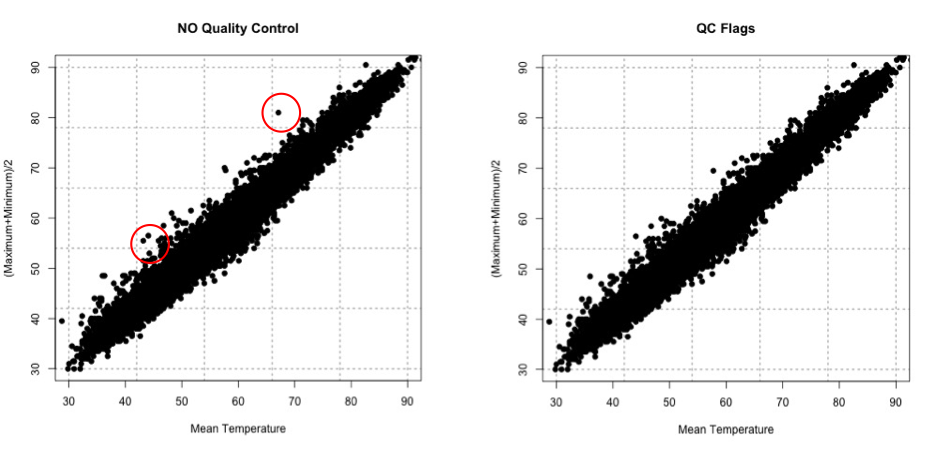
There are many ways to QC the data. Picking the best option will be based on the data at hand, the question you are trying to answer, and the level of uncertainty/confidence appropriate to your problem.
Estimate Slope Fit and Offset
Let’s talk about estimating the fit. A linear fit follows the equation:
Where Y is the predicted variable, X is the input (a.k.a. predictor), a is the slope and b is the offset (a.k.a intercept). The goal is to find the best values for a and b using our datasets X and Y.
We can take a first guess at solving this equation by estimating the slope and offset. Remember, slope is the change in Y divided by the change in X
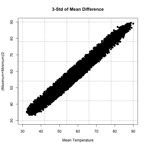
Let’s try this out. Here is a scatterplot of QCd Tokyo, Japan temperature data. I’ve QCd the data by removing any values greater or less than 3 Std. of the difference.
Now, let’s take two random points (using a random number generator) and calculate the slope. For this example, the daily mean temperature is my X variable and the estimated daily mean temperature from the maximum and minimum variables is my Y variable. For one example, I use indices 1146 and 7049 to get a slope of 0.812369. In another instance, I use indices 18269 and 9453 and get a slope of 0.7616487. And finally, if I use indices 6867 and 15221, I get a slope of 0.9976526.
The offset (b) is the value where the line intersects the Y-axis, that is, the value of Y when X is 0. Again, this is difficult to accurately estimate in such a simplistic manner, but what we can do is solve our equation for a first cut result. Simply take one of your Y-values and the corresponding X-value along with your slope estimate to solve for b.
Here are the corresponding offsets we get. For the slope of 0.812369, we have an offset of 8.178721. The slope of 0.7616487 has a corresponding offset of 8.280466. And finally, the slope of 0.9976526 has an offset of -0.1326291.
What sort of problems or uncertainties could arise using this method? Well, to start, the slope is based on just 2 values! Therefore, it greatly depends on which two values you choose. And only looking at two values to determine a fit estimate is not very thorough, especially if you have an outlier. I suggest only using this method for the slope and offset estimate as a first cut, but the main idea is to show you ‘what’ a regression analysis is doing.
Plot Fit Estimate
Once we have a slope and offset estimate, we can plot the results to visually inspect how the equation fits the data. Remember, the X-values need to be in the realistic range of your observations. That is, do not input an X-value that exceeds or is less than the range from the observations.
Let’s try this with our data from above. The range of our X variable, daily mean temperature, is 29.84 to 93.02 degrees F. I’m going to create input values from 30-90 with increments of 1 and solve for Y using the three slopes and offsets calculated above. I will then overlay the results on my scatterplot. Here’s what I get:
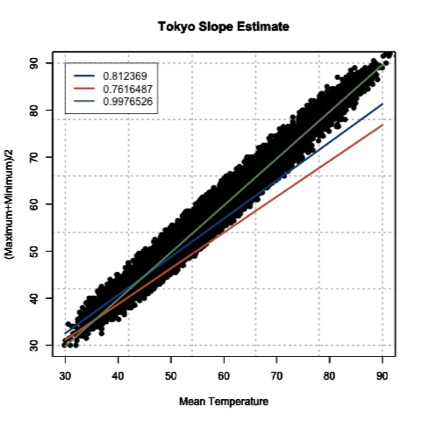
This figure shows you how to visually inspect your results. Right away, you will notice that the slope of 0.9976526 is the better estimate. You can see that it’s right in the middle of the data points, which is what we want. Remember to always visually inspect to make sure that your results make sense.