Now that you have identified the software you want to use to create plots of datasets, I want you to reproduce three plots and submit these to me for review.
This activity will be graded based on participation only (either you made three plots or you didn't). I will provide constructive feedback to you about the way your plots look. Even though I will not grade this particular exercise for accuracy, the rest of the lessons in this course (as well many lessons in other courses in the program) will require you to make some plots. Your grades on those activities will in part depend on your ability to produce a clear and satisfactory plot, so consider this exercise free practice.
Reproduce 3 Plots
Directions
-
Below is the first plot you have to reproduce. Graph the functions y = x2 and y = 2x on the same set of axes. The satisfactory plot will include a title, labeled axes, axes' tick marks and labels, two different line styles (doesn't have to be color) to differentiate the functions, and a correct legend identifying the two functions. All fonts should be large enough to be legible. You may choose the range of your axes, the aspect ratio of your plot, and the line style of each function.
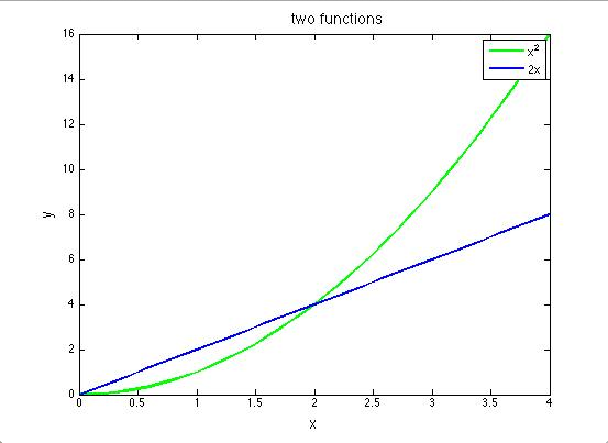 Figure 1.4 - Line plot of the functions y=2x (blue) and y=x2(green)E. Richardson, created with MATLAB
 - Next shown is the second plot you have to reproduce. Penn State's Beaver Stadium is second only to Michigan Stadium in Ann Arbor ("The Big House") in terms of attendance capacity. The official capacity of Michigan Stadium, after recent renovations, is 109,901. The plot below shows a scenario in which Michigan Stadium is filled to capacity at the start of a hypothetical football game between PSU and Michigan, but each time PSU scores a touchdown, half the fans leave. You must envision PSU scoring touchdowns until only one fan is left in the stadium. Generate such a dataset (a table of x and y values) and make a plot from it showing the number of touchdowns vs. the number of fans at Michigan Stadium. Remember, no fractional people! Always round down to the nearest whole number for your y values. I have made a sample table of values and filled in the first few for you. Continue your own table until there is just one fan left.
Table of values for Exercise 2 Number of PSU touchdowns Number of fans at the Big House 0 109,901 1 54,950 2 27,475 3 ? 4 ? 5 ? This plot should be made on linear axes. The satisfactory plot will include a title, labeled axes, axes' tick marks, and labels. Since you are plotting discrete data points that are part of a time series, please plot them with a symbol and connect the symbols with a line. All fonts should be large enough to be legible. You may choose the aspect ratio of your plot and what kind of symbol and line style to use.
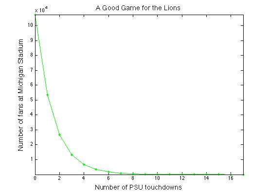 Figure 1.5 - Example linear line plot of the table of values in Exercise 2E. Richardson, created with MATLAB
 - For your third plot, use the table of values you generated in Exercise 2 to make the same plot, but using a logarithmic y-axis. The satisfactory plot will include a title, labeled axes, axes' tick marks, and labels. Since you are plotting discrete data points that are part of a time series, please plot them with a symbol and connect the symbols with a line. All fonts should be large enough to be legible. You may choose the aspect ratio of your plot and what kind of symbol and line style to use. *Alternative: If you have trouble making log axes, you may instead take the log (base 10) of each y-value in your table and plot the resulting dataset instead. Your plot should still look like the plot below, but if you choose this option, you must label your y-axis accordingly.
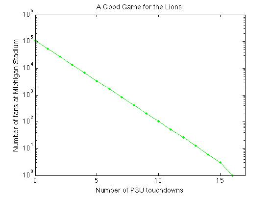 Figure 1.6 - Example log-linear plot of the table of values from Exercise 2E. Richardson, created with MATLAB
Submitting your work
You may choose to submit these plots one of two ways: you may save them as graphics files (.jpg, .pdf or .tiff) or, if you use a web plotting program that allows you to save your plot as a link, then you may submit the links to the plots.
Save your three plots in the following format:
L1_plot1_AccessAccountID_LastName.jpg (or .png or .pdf or .tiff).
For example, Cardinals outfielder Marcell Ozuna's file would be named "L1_plot1_mio13_ozuna.jpg"
Submit your three plots to the Canvas assignment in Preinstructional Activities called "Three Plots." Try to get this done by the due date listed on the first page of this lesson.
Grading criteria
As I mentioned at the top of the page, this activity will be graded based on participation only (either you made three plots or you didn't). However, I will provide constructive feedback to you about your plots.