
Visualization
Geography is regularly identified as the discipline that makes maps. While geography is, of course, much more than this, geographers do create maps to show how processes play out across space at various scales. Why maps? It's because maps are very effective at helping us see what's happening within some region. When spatial patterns are important - and they very often are - then looking at maps can be much more efficient and effective than looking at paragraphs of text or tables of data.
For example, suppose we want to learn the presidential election results by county in a given year, The animated map below shows the information. By displaying the information geographically, the map helps us learn what we want to know. In particular, the map makes it easier to identify the patterns in the data across space and over time. Throughout Geog 30N, we will view and even create maps to visualize spatial information.
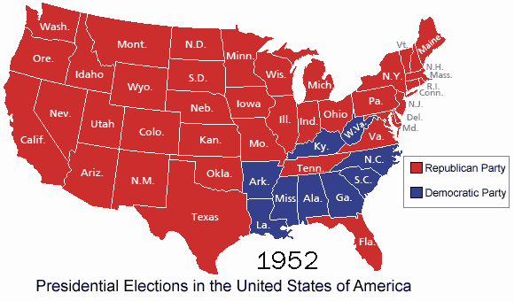
See the raw data.
Cartographic Projection
The world is round, but maps are flat. A projection is a scheme for converting points on the round world to points on a flat map. There are many different types of projections, each with advantages and disadvantages. Some projections make it easy to see what is north, south, east, and west. Some projections make it easy to see how large a given land mass is. Some projections make it easy to navigate ships on the ocean. (Cartography has a long history of association with navigation.) Finally, some projections can even be used to advance political agendas, as this excerpt from the TV show The West Wing shows (four minute video):
[CJ Cregg]: Hi, I'm sorry.
[Dr. John Fallow]: Oh?
[CJ]: Sorry to be late.
[Dr. John Fallow]: Not a problem.
[CJ]: I'm CJ Cregg.
[Dr. John Fallow]: Of course you are I’m Dr. John Fallow with Dr. Cynthia Sales and Professor Donald Hyuk.
[CJ]: Hyuk?
[Dr. John Fallow]: Hyuk.
[CJ]: Okay and you are the organization of cartographers for social equality.
[Dr. John Fallow]: Well we're from the OCSE we have many members.
[CJ] How many?
[Dr. John Fallow]: 4,300 dues-paying members.
[CJ]: What are the dues?
[Dr. John Fallow]: Now $20 a year for the newsletter.
[CJ]: Let's start.
[Josh Lyman]: Wait I want to see.
[CJ]: This is Josh Lyman.
[Dr. John Fallow]: Indeed you are.
[CJ]: Josh, this is Dr. Fallow and his Merry Men.
[Dr. John Fallow]: Yes.
[CJ]: Should we begin?
[Dr. John Fallow]: Yes. Plain and simple. We'd like President Bartlet to aggressively support legislation that would make it mandatory for every public school in America to teach geography using the Peters projection map instead of the traditional Mercator.
[Josh Lyman] Give me 200 bucks, and it's done.
[Professor Donald Hyuk]: Really?
[CJ]: No, why are we changing maps?
[Dr. Cynthia Sales]: Because CJ, the Mercator projection has fostered European imperialist attitudes for centuries and created an ethnic bias against a third world.
[CJ]: Really?
[Dr. John Fallow]: The German cartographer Mercator originally designed this map in 1569 as a navigational tool for European sailors. The map enlarges areas at the poles to create straight lines of constant bearing or geographic direction.
[Dr. Cynthia Sales]: So it makes it easier to cross an ocean.
[Dr. John Fallow]: But-
[CJ]: Yes.
[Dr. John Fallow]: It distorts the relative size of nations and continents.
[CJ]: are you saying the map is wrong
[Dr. John Fallow]: Oh dear, yes. Now look at Greenland.
[CJ]: Okay.
[Dr. John Fallow]: Now look at Africa.
[CJ]: Okay.
[Dr. John Fallow]: The two land masses appear to be roughly the same size.
[CJ]: Yes.
[Dr. John Fallow]: Would it blow your mind I told you that Africa is in reality 14 times larger.
[CJ]: Yes
[Dr. Cynthia Sales]: Here, we have Europe drawn considerably larger than South America, when it's six point nine million square miles. South America is almost double the size of Europe's 3.8 million.
[Professor Donald Hyuk]: Alaska appears three times as large as Mexico when Mexico is larger by 0.1 million square miles.
[Dr. Cynthia Sales]: Germany appears in the middle of the map when it's in the northernmost quarter of the earth.
[Josh Lyman]: Oh wait, relative size is one thing but you're telling me that Germany isn't where we think it is.
[Dr. John Fallow]: Nothing's where you think it is.
[CJ]: Where is it?
[Dr. John Fallow]: I'm glad you asked. The Peters projection.
[Dr. Cynthia Sales]: It has fidelity of axis.
[Professor Donald Hyuk]: Fidelity of position.
[Dr. Cynthia Sales]: East-West lines are parallel and intersect North-South axes at right angles.
[CJ]: What hell is that?
[Dr. John Fallow]: It's where you've been living this whole time should we continue?
[CJ]: Uh-huh.
[Dr. John Fallow]: So you're probably wondering what all of this has to do with social equality.
[CJ]: No I'm wondering where France really is.
[Josh Lyman]: Guys, we want to thank you very much for coming in.
[CJ]: Hang on, we're going to finish this.
[Dr. John Fallow]: Okay, what do maps have to do with social equality, you asked?
[Josh Lyman]: She asked.
[Professor Donald Hyuk]: Salvatore Anatoly of the National Council for social studies argues in our society we unconsciously equate size with importance and even power.
[Josh Lyman]: I'm going to check in on Tommy if these guys find Brigadoon on that map you'll call me right.
[CJ]: Probably not.
[Josh Lyman]: Okay.
[Dr. John Fallow]: When Third World countries are misrepresented they're likely to be valued less when Mercator maps exaggerate the importance of Western civilization. When the top of the map is given him Northern Hemisphere and the bottom is given to the southern then people will tend to adopt top and bottom attitudes.
[CJ]: But wait where else could you put the Northern Hemisphere but on the top.
[Dr. Cynthia Sales]: On the bottom.
[CJ]: How?
[Dr. John Fallow]: Like this.
[CJ]: Yeah, but you can't do that.
[Dr. John Fallow]: Why not?
[CJ]: Because it's freaking me out.
Which of the projections shown in the video do you think should be used? Why? Note that the video claims that a certain projection is wrong. Technically, all projections are in some ways wrong, in the sense that they do not accurately portray the world. The only way to achieve accuracy is to use a spherical object - a globe. A projection should be chosen to fit the purpose of the map, so the best projection to use will depend on the circumstances of the map.
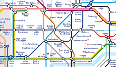
Some maps don't even try to have an accurate projection. They distort distances in ways that are geographically inaccurate but useful for other purposes. A classic example of this is the map of the London subway system, which is known as the London Underground or the Tube and operated by a government agency called Transport for London. Here is a portion of the standard system map:
The full map can be found on the Transport for London website. This map is beautifully designed and user-friendly. The mix of colors and layout of the different subway lines on the map make it easy to interpret. However, the map is very geographically inaccurate, meaning the relative distances between the different stops are not shown. In fact, the center of the map (which is downtown London) shows the stops at some distance from each other when in reality they are very close to each other. Alternatively, the stops further out from the city (in the corners of the maps) are some distance away from each other. This makes it impossible to know how long a particular trip will be from the map. So while the map aids in the comprehension of the different lines and stops, it sacrifices accuracy in terms of distances. Maps, therefore, are imperfect documents that can distort or omit information, and, in some cases, bias our understandings of spatial patterns and processes.
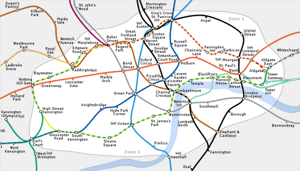
Here is a geographically accurate Tube map, produced independently of Transport for London:
If you were riding the Tube, which map would you rather have?