Required Reading:
Before we go any further, you need to read the following text, which is available through the Library Resources tab in Canvas:
- Chapter 13: GIS - Fundamentals: A First Text On Geographic Information Systems by Paul Bolstad, 2005
The underlying idea here is a simple one. Boolean overlay is effectively a multiplication operation between binary encoded maps. If each layer is coded '1' in areas of interest and '0' in areas not of interest, then the product of all layers at each location produces an output map coded '1' in the area of interest on all criteria.
This is a map algebra operation. In the terminology of Lesson 7, it is a local operation applied across multiple map layers. It is worth noting how this reinforces the idea introduced right at the beginning of this course, that vector and raster representations of geospatial data are effectively interchangeable. If map overlay, which we usually think of as performed on vector-based polygon layers, is precisely equivalent to a map algebra operation (which we usually think of as a raster operation), then clearly differences between the two data representations are more apparent than real.
The different favorability functions introduced below are really just a series of alternative map algebra operations, all of them local operations applied across multiple layers.
Indexed overlay
The most obvious alternative to Boolean overlay is to allow shades of gray in the black and white picture, and the easiest way to do this is to sum the 0/1 input layers. If we are combining n layers, then the resulting range of possible output values is 0 through n with regions of more interest on the criteria in question scoring higher.
As soon as we introduce this approach, it is obvious that allowing 'shades of gray' in the input layers is also straightforward, so instead of values of 0 or 1 only, each input layer becomes an ordinal or interval/ratio scale.
One problem to look out for here is that input layers on different numerical scales can bias results in favor of those scales with larger numerical ranges. For example, a slope layer with numerically precise slopes (in the range 0 to 90 degrees) should not be combined directly by simple summation with an ordinal three-point scale of population density (low-medium-high) coded 0-1-2. Instead, input layers should be standardized to the same scales, with a 0 to 1 scale being usual.
A further refinement is to weight the input layers according to some predetermined judgment of their relative importance to the question at hand. This is a huge subfield in itself, for the obvious reason that it immediately opens up the question, "How do I choose the weights?" The short answer is, "Any way you can get away with." The only difficulty is that you have to get everyone involved in the decision at hand to agree that the chosen weights are appropriate. Given that the choice of weights can dramatically alter the final analysis outcome, this is never easy. Although many different methods for choosing weights have been suggested, ultimately this is not an area where nifty technical methods can help out very much, and choosing weights is always difficult.
My personal favorite method of multicriteria evaluation (as this topic is known) is called Pareto ranking. It is theoretically interesting and attempts to make no assumptions about the relative importance of different factors. The unfortunate side-effect is that, in all but the simplest cases, this method produces more than one possible result! This is a commonly faced problem in this sort of work: there are as many answers to real problems as there are ways of ranking the relative importance of factors. Furthermore, the answers are not technical ones at all, but, more often than not, political ones. Weighting is discussed in the Bolstad text on p. 437-443.
Weights of evidence
Weights of evidence is another possible approach to multicriteria evaluation. The idea is to determine, for the events of interest, how much more likely they are on one particular land-cover class than they are in general. This 'multiplication factor' is the weight of evidence for the event associated with the land-cover class.
Combining layers by weights of evidence values is relatively involved. In fact, combining weights of evidence involves logarithms and other complex manipulations. Full details are discussed in Geographic Information Systems for Geosciences by Gerard Bonham-Carter (Oxford: Pergamon, 1995). I strongly recommend that text if you need to follow up on this approach. Also, for additional information about different types of multi-criteria analyses see J Cirucci's 596A presentation (click on link below Figure 8.1 to watch J. Cirucci's presentation).
Video: Multi-Criteria Analyses (1:32:19)
DOUG MILLER: Hi, everyone. This is Doug Miller and I want to welcome everyone to our fall 2 version of geography 596A, the capstone proposal process. We have three evenings of talks this week. Tonight, tomorrow night, and Thursday night, I guess. This is Tuesday.
At any rate, I want to welcome you all. We have a kind of a sparse crowd. Hopefully, we'll have some more folks joining us tonight. And I know all of our students have been busy working on their proposals with their advisors during the semester and I'm looking forward to hearing what everybody has been busy working on.
I'll point out a couple of things to you. We ask that all in attendance, not just the students taking the course, to fill out the evaluation form. It's in the upper right hand pod under Notes. There's a link there for you to fill out that peer review evaluation form. And again, it's a bit of a misnomer. We ask the faculty, staff, students, casual attendees take a couple minutes to fill out the evaluation. That goes directly to the student and provides them some feedback.
Additionally, we have a question and answer session at the end of each talk. Presenters will have 25 minutes to present their work and then they'll be five minutes for interaction. Speakers, I will send you a private chat message when 10 minutes remain, five minutes remain and then one minute remains. And so check that, you'll get some sense of where we are with timing.
Our speakers today are John Cirucci, Josh DeWees, Chris Dunn, and Matthew White. And our first speaker is John Cirucci. John began this semester as a gainfully employed person. And then in the middle of the semester, he retired from his first career, and he's now jumping into his capstone work over the next two months.
And it was great to get him started. Justin has done the bulk of the advising with John. But it's really interesting project. And the MCDA work is actually something that we should be doing more of in terms of trying to quantify decision approaches. So John, I'll let you get it when you're ready and take it away.
JOHN CIRUCCI: OK, thank you very much, Doug. Yes this is John Cirucci. I have the coveted first time slot here tonight, so I'll get things rolling. The subject of my capstone project is retrospective GIS-based multi criteria decision analysis. Bit of a mouthful and I'll try to explain what that is and describe the objectives of my project. I've selected as a case study topic, the sighting of waste transfer stations in California. And my advisors are Justine Blanford and Doug Miller.
There we go. OK, so this is an overview of what I'll cover. I'll go over a background on multi criteria decision analysis, MCDA, talk about its applications with GIS-based MCDA. And then get into the objectives of the work that I intend to do, taking a retrospective view on GIS-based MCDA. I'll cover the selection of my case study, the methodology that I'll use, expected outcomes, and the timeline for my capstone project.
So I think we all appreciate that we're making decisions every day. And most of those decisions entail considering multiple criteria. the Decisions are usually intuitive, the process is simple the criteria are implicit, and more often than not, there's just one person making the decision.
When we talk about MCDA, we're really describing a collection of formal processes that take explicit account of multiple criteria. And these methods are especially applied-- when the decisions are complicated, they involve perhaps conflicting objectives. Often, there's multiple stakeholders involved. And ultimately, the results have a high impact.
Of course, many decisions are spatial in nature. And perhaps many of you have been involved with using a GIS to provide spatial decision support. So it's quite logical to marry these disciplines of GIS and MCDA. And that intersection is in fact an expanding niche field. I've shown a plot there in the lower left corner that depicts the peer reviewed articles on GIS-based data. This was as of 2006. There were about 300 articles. That number is now upwards of 500 to 600.
This is a graphic showing the general MCDA process. Of course, we start off with identification of the problem. And then go through a problem structuring phase. This is the point at which we identify the criteria that will be involved in the decision process. We explicitly identify alternatives. We characterize the uncertainties with our criteria and other constraints. We identify the stakeholders who will influence the decision and other environmental system factors and constraints.
These all feed into then a model building step, which is really the meat of the MCDA. And in model building, a variety of different kinds of decision rules are applied to develop a criteria preference and aggregate that criteria data into something that tells us the rank or value of the alternatives. And I'm going to take a little bit of time to deep drill decision rules.
The model then has an outcome that provides information to the stakeholders. They have to process that information and synthesize that into an action plan.
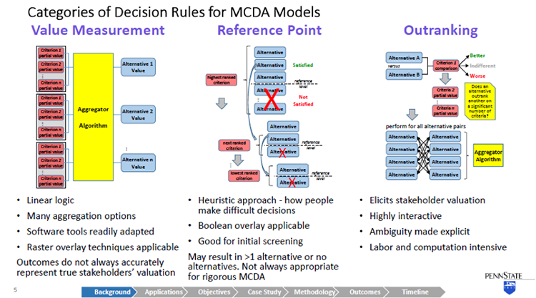
So getting into the decision rule models now, I've taken a rather simplistic view categorize them into three different buckets. And this is simplistic. There are really literally, dozens of different MCDA methodologies that have been developed over the last couple of decades. And they don't all neatly fit into these categories. But more or less, this is a way of looking at them and I think it will serve us well as a basic starting point for MCDA.
The first type of MCDA, decision rule model, is value measurement. And this is perhaps the most logical intuitive concept around decision making. For a given alternative, the criteria are assigned a partial value that may be a direct measurement of something that can be determined objectively. Or it may actually be a stakeholder's subjective value.
And for all those criteria, the partial value associated with an alternative then is aggregated in some way to derive a value for each alternative. And then once the alternatives have been valued, they can be ranked and compared.
This follows a rather linear logic. And it's easily handled by a lot of software tools. Certainly, our GIS has a lot of tools in the tool set that apply to this, lends itself to two raster algebra, and overlay techniques. Unfortunately, the critics of value measurement point out that although it gives you a neat answer, it doesn't always accurately represent really, the subjective valuation of stakeholders. So other methods have been developed and proposed.
Second category is reference point models. And in a reference point model, for every criterion, a reference level is identified. Again, this might be an objective measurement or more than likely it's a value a subjective value of the stakeholders and alternatives have to satisfy that reference level. So starting with the perceived highest ranked criterion, alternatives that don't meet the reference point are eliminated. And we march down through the other criteria and do the same.
So it's a heuristic approach. It's purportedly more like the way that people actually think about making decisions. Because it has a number of binary switches in it, a Boolean overlay is very ethical here. On the downside, you may not get one alternative at the end of this. You may have more than one or you may have none. So to really use it thoroughly, it has to be iterative. You make a pass through this and then you go back and adjust your reference levels. And as such, it's a really good screening technique, may not be appropriate, always for rigorous MCDA.
The final category I'll describe is outranking. Outranking results in a ranked set of alternatives. And it's a rather rigorous process, where alternatives are compared pair wise for each discrete criterion. And for a given criterion, an alternative is either determined to be better, indifferent, or worse than another alternative. And again, this is a stakeholder's value judgment. So the stakeholder doesn't have to assign a value he or she just needs to make this determination. And then we march through all of the criterion for that pair, and then repeat this for all the pure combinations of alternatives.
So it's a way of eliciting stakeholder valuation. This is what your eye doctor does when you get the lenses to look through, and is it lens one, lens two, which is clear. Lens three or lens four. You're not assigning a value to the clarity of the picture. But by comparing two things, you essentially are doing that. And when you take the results of all these pairwise comparisons then, that can be aggregated in a number of different ways to develop a ranking of alternatives.
So it's highly interactive. On the downside, that involves a lot of involvement from the stakeholders. It's very labor intensive and computationally intensive. So it may not always be an option for some decisions.
I'm going to take a look at two specific examples of GIS-based MCDAa in these next two slides. The first example I'm pulling up is a some work that was done this year, published this year by Lawrence Berkeley on the land suitability for agave crop used for bioenergy feedstock.
They applied a value measurement method. Actually, specifically, the analytical hierarchy process method, which some consider to be a category in its own right. It's a rather popular rigorous method. And they've used it here. The gist of it is that as opposed to having kind of a flat level of criteria which then is aggregated to derive an alternative value, the criteria is grouped into subsets into a sort of a logical tree structure hierarchy to develop intermediate levels of criteria valuation.
You can see this in the-- it's a rather busy slide-- but in the center there, I have a large blue circle around soil. So you see that there's a number of discrete criteria for soil. And then those are rolled up together into a soil suitability criteria valuation. By doing this, first of all, you simplify the model, but also avoid some overweighting of criteria that is related to each other.
In the case of their work here after arriving at a theoretical suitability, then they really used a hybrid approach where although they didn't call it out as such, it's a reference point method, where they've then looked at their theoretical suit suitability, and eliminated alternatives that don't meet certain constraints that they've applied.
In the next example, this is the sighting of a housing development in Switzerland using an outranking method. And what I found interesting about this work was that with outranking, you have to identify specific. Alternatives but in many siting decisions, you theoretically have an infinite number of alternatives. So to work around that issue, they used a closeness relationship methodology to identify homogeneous zones, which would represent discrete alternatives that they could then take through the outer ranking methodology to derive a siting map that indicates suitability as favorable or unfavorable. Or in the case that is a possible outcome from outranking, uncertainty about the suitability.
So I've gone through about 30 different GIS-based MCDA descriptions and case studies, and I've summarized them here. I found predominantly in the work that I've pulled up that value measurement, and specifically, analytical hierarchy process methods, were predominant. I've also indicated the types of decision problems. And most of these were associated with land suitability and site selection.
There was a rather comprehensive literature survey done by Jacek Malczewski in 2006 in a highly cited review article, where he did a lot of categorization. These are the results from his work. You see this matrix of decision problem and application domain.
So he identified that the most predominant decision problems were land suitability scenario evaluation, site selection, and resource allocation. And application domains included environmental applications, urban planning forestry, transportation, hydrology, and waste management. But there was quite a distribution. So it gives a flavor of the breath of the application of GIS-based MCDA.
So now let's talk about retrospective GIS-based MCDA. This is something that I have not come across in the literature, but intrigue me. I put forward the hypothesis that given a large enough population set of similar historical spatial decisions, that we can take an inverse problem approach to determine the subjective valuation of criteria from the stakeholders without a primary knowledge.
So in a traditional forward theory, we take parameters, we plug them into our model and we derive a predicted result. In inverse theory, you take observed results, assume a model, and work backwards to try to come up with the model parameters. Now I intend to apply that to a prior GIS-based MCDA decision set.
So this is the summary of my capstone. I will integrate GIS and MCDA to retrospectively examine a prior site decision case study data set, and I will look at a case study, which fits the bill for the type of problems that come up with MCDA that have multiple stakeholders, conflicting motivations, and uncertainty in the data.
My approach will be to actually look at the decision results for a domain case, and contrast predictive results using regression and stochastic analysis to look at criteria weighting and its uncertainty, without any explicit information about what the stakeholders actually did to come up with that decision. In my objectives, I hope to be able to create a probabilistic model for prediction of future related decision outcomes, and provide insights, really, trying to get inside the head of the stakeholders. So get insights in their strategies.
And this is a novel methodology. So I hope an outcome of this is that I can demonstrate this is a new methodology applicable to other GIS decision domains.
So I had to choose a case study topic. This is really, of course, an MCDA problem in its own right. Of course, I start off with areas though that we're familiar to me from my work experience, particularly in the energy and environmental field. So I really considered a number of different potential topics, but made my selection really based on the availability of the data, because it's important.
Because I expect them going into new territory, with statistical analysis, I wanted to ensure that I have a large population set that there is some consistency in that set that I can get at the source information readily. And a result of this selection process I arrived at selecting waste transfer stations as my case study domain. The siting of waste transfer stations.
Waste transfer stations are intermediate points for solid waste. It comes from its source, and residences, or businesses. Ultimately, it ends up in a landfill or an incinerator. But it's not always cost effective to deliver it from the source point to the final destination, because of the cost of the small vehicles that drive around and pick up peoples municipal waste. So often, waste transfer sites are located at an intermediate point representing the optimal location, so that the solid waste can be in some cases, sorted, compacted, but then transferred into a larger haul vehicle.
Now of course, waste transfer stations on the one hand, have to be near the source where people live, but no one wants them near where they live. So it's a good NIMBY problem and has a lot of conflicting issues associated with siting.
There's a lot of information available on best practices. There's some EPA manuals and documents that I've shown there. There's also organizations that deal with this. So I find it's interesting, it's a field in its own right. But having best practices doesn't necessarily ensure that how decisions were actually made. And that's what I'm going to dig into.
Also with these decisions, one of the complexities is that there's many stakeholders. And because of the NIMBY issues, of course, it's community and neighborhood issue. Sometimes, the waste transfer stations are commercially owned and operated. There may be industry involved, environmental organizations. Of course, local and state officials, and public work officials, and sometimes, academic institutions. So it's a right MCDA GIS problem.
Waste transfer station permitting varies from state to state, so I wanted to stay within state boundaries. And looking over the large state, I arrived at California because of its large population, large number of waste transfer stations. And also, a good database that has a lot of transparent information about their waste transfer stations.
There's over 3,000 solid waste facilities identified in California's solid waste information system database. 700 of those are active waste transfer stations. And then I'd pare that down to about half of them, deal with mixed municipal wage waste, which is what I'm going to focus on.
In addition to having a lot of information about the waste transfer stations, they also have linked access to the permits, which I'm going to have to dig into to understand when these were built and other details that I'm going to have to deal with and looking at criteria.
So as an example here, I'll zoom in on Orange County. There's 41 waste transfer stations in Orange County. They serve three county landfills. In the middle of this slide, you'll see the area I've shown one waste transfer station, the CBT Regional Transfer Station, it's privately owned and operated for the city of Anaheim. There are a number of other waste transfer stations within a three mile radius. So they're effectively competing for the same solid waste. And that waste then is delivered to the Olinda Alpha Sanitary Landfill about 10 miles over the road.
Over on the right hand aerial-- you can see a bird's eye view of what that waste transfer station looks like. It's a covered facility, ready access to the highway in industrially zoned area. But it is fairly proximate to a residential area with townhouses and single family dwellings just across the highway.
Now one of the challenges I'll have, just to contrast that with another waste transfer station in Western California. So I don't have to describe too much about the details of these waste transfer stations for you to understand there's substantial differences that went into the sighting of these two locations. The one on the right is in San Bernardino County. It's actually operated by the California transportation department co-located with a maintenance facility, and doesn't quite have the same kind of NIMBY issues.
So I'm going to certainly have to go through this database and identify subsets of similar types of facilities so that I can have a reasonable opportunity to be able to do good statistical analysis.
Here is an overview of my methodology. There is no pure inverse problem, because you can't just take results and work backwards without any knowledge of what happens. You really have to come at it from both sides. So I have to really go through the problem structuring phase, and then take the results, and converge on the model building, trying to identify a useful model. And develop through statistical analysis, the parameters that went into the criteria and its aggregation.
I've completed our preliminary data preparation, and in the process, reviewing and deep drilling several site locations, will actually go into beyond what I will be able to do with the broad set of data-- that is get into the public record and understand exactly what transpired when these were cited.
Then with that information, I'll prepare the balance of the data. It's going to require some automation techniques to pull up information for permits. And then breakout some homogeneous subsets that I'll work with. I'll develop model structures. I'm going to focus on value measurement a reference point decision rule models because it's more logical to reverse engineer them.
And then applying both deterministic regression methods and stochastic analysis, I will try to derive create criteria parameters, partial values, and the reference points for these data. I'll evaluate the model effectiveness, goodness of fit to try to understand what the uncertainty is in the model.
And then as outcomes, I hope that I'm able to characterize these site decisions in the form of a probabilistic model that actually would serve to predict future decisions. And also with this criteria valuation, gain some useful insights into the stakeholder's own subjective valuation process. With this, I'll have performed an assessment of this new retrospective GIS MCDA methodology.
I'll learn what other kinds of insights can be gained in terms of stakeholder strategy, and the predictive effectiveness of the method, as well as its deficiencies in development needs. I will assess the methods and then ability to other application domains and other GIS decision problems, and recommend future work requirements and practical applications. It's my intention to publish the results of this study in a refereed journal in addition to presenting at one or more conferences.
So this is my timeline. I plan to complete this work in the spring two semester. So I'm on a rather short fuse to submit an abstract with the intention of being able to make a presentation sometime during that semester, ideally in April. But I also will be preparing a journal paper, and submitting it towards the end of the semester.
The body of work I described in my methodology then, it's under way now and it's going to be rather intensive for the next couple of months. I will largely have to have completed that work by April.
I've pored over dozens of articles about GIS MCDA, and I kind of feel like I've just scratched the surface. There is a lot of rich information out there. I learn a little bit every time I look at something that's going to be an ongoing process.
I'd like to acknowledge a few people, two individuals from Arizona State University, Professor Tom Seager and Valentina Prado, who I've worked with on MCDA as it relates to sustainability analysis. And that was the inspiration for looking at it from the perspective of a GIS. I'd also like to thank Doug Miller, who I started conversations with this going back to last summer, and got me started for the semester. And Justine, who took over afterwards and has been very, very helpful and who I will rely on very heavily as I get into the rigorous statistical work in the next couple of months.
So with that, I want to thank you and I'll be happy to take questions.
OK I see some folks typing.
Dan asked, will this model be developed as an application down the road. That's a little bit hard to imagine right now. I think it's a possibility. That seems to be the route for a lot of these MCDA methodologies. They start off as concepts and methods. And many of them have developed into applications.
There are also some application toolboxes that have a lot of different pieces to them. One of them discussed by both Doug Miller and Justin Blanford is IDRISI, which is a toolbox that does a lot of things with GIS, including MCDA. So it's possible, but I'm not thinking that far ahead yet. It won't be an outcome of my work this next semester.
Thanks.
Regarding the peer reviewed articles, there's an individual-- I mentioned his name, Jacek Malczewski. He's at Western Ontario University. He's kind of then the guy who's done much of the survey work through a number of papers. He actually wrote a book it's sitting in front of me, it's called GIS and Multi Criteria Decision Analysis. It's the only book on the subject, and he's about ready to put another one out.
So he did the footwork on that 2006 survey, and I expect he'll be doing update work on that as well with his new book that will be coming out probably just about the time I've finished my work.
Thanks, Dan.
OK, perhaps that's it.
DOUG MILLER: We'll give it a second here to see if there are questions here.
JOHN CIRUCCI: Thanks.
DOUG MILLER: Great talk, John. And again, the MCDA is something that has been overlooked in a lot of quarters. And It is a really interesting way to be able to think about how do we quantify decision making. And we're looking forward to your work. It is an aggressive schedule, but I think you're set for it, and ready to jump into it. And we'll check in with you at the end of spring two.
JOHN CIRUCCI: OK, thanks.
DOUG MILLER: Josh Dewees is our next speaker. And, Josh, if you want to go ahead and load your--
You can get started whenever you'd like, Josh.
JOSHUA DEWEES: I'm starting at the end, going back to the beginning. Good evening. I'm Josh DeWees, and my project is regarding utility vegetation management application.
I'm going to be designing a mobile geospatial application to streamline some field collection processes in my current job, and maybe improve the report record keeping that we currently do.
I'd like to introduce this presentation with just a quick overview of the topics that I will cover. I want to start by laying out a few goals for the design. I'll talk about what makes a good utility vegetation management program. I'm going to cover a few basic operations of the distribution utility, and present a case study of the vegetation manager program here at Spoon River Electric Cooperative.
And then from there, I'll move on to talk about my prototype design strategy, and the basic information products that are required, and a proposed timeline for this project. After that, I'll open it up for any questions.
The goal of this project is to design a prototype for a mobile application that can be used to streamline the vegetation management field survey work here at Spoon River Electric Cooperative. This application will improve the consistency in quantifying vegetation management work and improve the record keeping and documentation of the work performed by the crews.
I put a few photos on the slide to use as examples of vegetation management work. You'll see some manual work here and right away mower that we use, and some bucket trucks here doing some side work in the right away areas.
Vegetation management is one of the most expensive maintenance activities in the electric utility business. It's necessary for safe and reliable electric grid. Safety and reliability are two things that will cause public action on our mandated and regulated by government agencies.
Maintaining vegetation requires a dedicated program that uses a solid planning strategy. This can be based on certain time schedules or of rotation. It can involve contracted workers or dedicated staff. But it requires a consistent policy and budget to be effective. It requires detailed records to track the spatial characteristics over time.
The important factors our tree species, volume, and location. Tracking this helps to identify the best integrated vegetation management strategies over time.
Here are three main ways that vegetation impacts primary distribution lines, direct contact, overhanging branches, and underbrush that prevents access to the line for inspection and maintenance activities.
This is just a photo that shows an example of what happens when trees make direct contact with high voltage bare conductors. The area inside that yellow diamond shows where vegetation is self pruning by burning off at the wire. This causes a broom effect that you can see clearly in this photo. It also causes flickering lights and outages.
The yellow diamond here just indicates where the wire is in this photo. It was a little bit hard to see where the wires were going through there. The branches overhanging the wire can be a major cause for outage during storm events that include high wind or freezing rain. And this time of year in Illinois, we often have periods of freezing rain that can cause branches to become heavy and fail during wind events. And when they break off, they interrupt power either by physically breaking the line or activating the protective devices.
This picture includes some trees growing directly under and around the lines that can definitely impact not only power quality, but also, the access to the line. If it happens to break or come down, if maintenance activities are required, even though this is right along a county road, it still would pose a very difficult challenge to get back in there and repair that.
There are a few basic things to understand about the electric grid and how vegetation impacts it. Faults occur when vegetation provides a path to ground for electricity flowing through the power line. These can be high current or low current events. High current events can cause outages by activating current protective devices. The picture on this slide are examples of two basic system protective devices.
The picture on the left is a fuse cutout. And it works very much like a fuse in a fuse box at home. When the current becomes too high it contains a sacrificial braided fuse link that burns through, and interrupts the flow of power. The picture on the right is a simple oil circuit recorder.
This acts like a breaker that can reset itself automatically. This allows transient types faults to clear before reenergizing the line. So if you have a branch that falls into the wire, sometimes it will go ahead and fall down through and then this will open long enough to let that fault pass.
OK, can everybody hear me now?
OK, I'll just start over here with this slide. There are a few basic things about the electric grid and how vegetation impacts it. Faults here can occur when vegetation provides a path to ground for the electricity flowing to the power line. They can be high current events or low current events.
High current events can cause outages by activating the current protective devices. These are fuses and oil circuit recorders a fuse basically acts like a fuse in your fuse box at home.
When the line is overloaded, it'll activate, blowing the fuse. It'll open the trapdoor and disconnect power. A recloser acts like a breaker that can reset itself. So it will open temporarily, allowing a transient fault to pass through the line, such as when a branch falls into the wire it might cause a high current event that will cause the power to disconnect, allowing the branch to fall through. And then it'll close back in power will be restored with just a momentary interruption.
These issues cause customer dissatisfaction, economic disturbance, and ultimately, regulatory issues. So proper vegetation management minimizes the number of faults caused by trees and animals.
Spoon River Electric Cooperative operator vegetation management division. They perform vegetation management work for three rural electric cooperatives here in central Illinois. The graphic shows the general location for these cooperatives. Spoon River has about 15 employees, whose primary function is to perform vegetation management activities. This program currently uses Esri software and hand-held GPS equipment to plan and document the work activities there are several manual steps to transcribe data from the field into the GIS database.
The current GIS model utilizes linear referencing and route event tables to create paper work maps for the field crews. The field work is then documented in a similar way, where GPS points and paperwork logs are manually recorded in the database.
These can be sources of error or places where transcription errors can occur.
This is the current workflow for the vegetation management program. The planning process starts with the job foreman and myself performing a pre-work inspection of a substation. This involves traveling the entire route and documenting work areas with Garmin 72H GPS.
Handwritten notes are taken regarding the type of equipment required, that access constraints, steepness of the terrain, percent canopy coverage, and special notes such as notes about member concerns or access issues.
The GPS is downloaded in the office and paper notes are transcribed into the GIS database. Color coded maps are then printed from that GIS for the field crews to use when they go to do the work.
After the workers perform, the field crew collect GPS points and documents what was done and when it was done. Also, any customer issues that come up can be recorded during that. The worksheets are collected weekly, and this data is also transcribed into the database for long term record keeping. This can be used to calculate work footage and operation reports.
This an example of the field sheet that we use for data collection of the pre-work inspection. This sheet was developed over time working with the job foreman to make data collection simpler and more consistent. One of the places for error were in the handwritten notes.
The more variation there was between different job foremen, the more issues I had in transcribing that into the database to get an accurate picture of what was required in the field. So that was a place to introduce transcription errors and misinterpretation in those field notes.
This is the current database table that we use. And the database reflects many of the same fields as the data worksheet from the previous slide. It includes additional fields used to calculate the footage and work units needed for estimating and budgeting. The calculation used for this is shown here at the top. And it's very simple, but it has really improved our ability to estimate accurately how long it's going to take, and what's going to be required at the job site.
So just having the consistency of the work unit didn't give you a hardcoded value for what that work unit was going to cost or how long it was going to take. But it allows you to kind of make an interpretation based on the crew, whether they're capable of accomplishing 10 work units in a day or 20. You can at least evaluate how long it will take to do that work based on any given crew.
So this is a sample of the field map that we would typically print out for the workers.
This along with the written notes that are taken are used by the foreman to identify the work in the field. Yellow indicates a bucket tram. Green might be some sort of manual work. And the orange might indicate the need for the right away mower. In this case, there might be multiple lines. And this indicates that you're going to need multiple crews to perform that work.
So the goal of this project is to create a prototype for a mobile application that streamlines this manual process. This will improve the efficiency and both the planning and the record keeping steps of the workflow. It would also reduce the need for print maps for the field crews. And these could be replaced by the mobile version So the updates appear as the changes were made.
To start the process, I have a workflow diagram showing my anticipated workflows. I'm using the case study here, Spoon River Electric Cooperative, as a starting point. And from that, I want to design a survey that will go to all the distribution cooperatives in Illinois. The purpose of the survey will be to identify vegetation management strategies at these other cooperatives. And this will be used to identify any additional design criteria.
The initial prototype will be tested here Spoon River Electric Cooperative in our vegetation management program. Due to time constraints for this project, I realize it may not be possible to do all of this within the scope for this particular educational project, but I'd like to continue to develop this after that point.
The survey will be sent out to the cooperative managers in Illinois. And this serves a couple of purposes. First, it gets the upper management involved and lets them know why I'm asking questions about their private business. And the manager is also the best person to talk to identify who's actually the boots on the ground that I need to talk to regarding the more detailed questions about the work methods.
I also want to take a look at what is available from commercial off the shelf solutions. And so discussing that with all the other co-ops, I feel like if there is anything out there that they're currently using that I can evaluate that might be a good idea to get that feedback from them, as well as any research they do on my own. So another big consideration for me is the server implementation. Options include the cloud services such as our RGIS Online and an Amazon AWS. And using even the traditional RGIS server that I have here behind my firewall to publish to one of those services will be considered.
Deciding whether to use cloud technology or whether it's better to just use our existing technology will basically be a financial decision. I think that cloud makes a good case for the web server, for sure, and using a tool like RGIS online.
While the main focus for this design is on the features of the application, another important aspect will be the interface that will be used for data entry. Certain constraints will be included to maintain the consistency in the database. And these include features like coded domains and some Boolean fields. And they can be accessed through different types of interfaces, like drop downs, checkboxes, radio buttons.
And this paper prototype will help me identify a user focused preference for those things. And I would like to work that out in case there is custom programming that I need to do to create this type of interface to the web application.
My initial design requirements include a mobile design that works with tablets or smartphones. And this application needs to be capable of disconnected editing, and capable of synchronizing back with a distributed database when a network connection is available.
This application also has to be very easy for my employees to use in the field, as this will be a change in the workflow for the current field personnel. If it's not easy, there'll be resistance from them, probably, to adopt it. And that'll be a problem moving forward with the application. If they're not using it, it'll be hard for me to make a case that it's something that we should move to.
I think the most important aspects of the design process are identifying the primary information products. I identified these products. They are listed here, from the current workflow. Number one, create maps for communicating the work type in the location to field crews. I think that is the primary goal.
Number two, create records showing the daily work progress and the long term maintenance records. And number three, creating the estimates for the work units in describing each substation or circuit. This list really boils down the primary functions of the current system.
So product one is mass for communicating the work type and location to the field crews. This product should answer job performance question, where are the trees, and what equipment will I need to clear them from right away.
Product 2 is about records showing daily progress and long term maintenance history. And this is really meant to answer somebody in my position, the line clearance manager's question, of, is the work complete, when was it complete, and were there any problems or concerns from the members that need to be documented or dealt with?
And product number 3, estimates for work unit describing each substation or circuit. This really focuses on what does the CEO need to know. What does the board of directors want to know about this. And it's how long should this work take, how much will it cost, and how are we performing against our budget and our work estimates?
Without answering that last question. It's uncertain whether funding will be available to actually produce this product. So my capstone timeline, I proposed this timeline of approximately six months. Kind of the seventh month will be used to review the results and develop my conclusions from the design process. I anticipate presenting this at the Esri User Conference in July.
And I hope to have a working prototype by then to show at the conference. I recognize that this may be a little out of the scope for the design proposal. But I hope to have that ready by July to present this work.
And this is just a Gantt chart showing my timeline. It kind of breaks the work into manageable pieces and helps me stay on track for my presentation so I have a baseline at least to gauge against as I go through this.
I'd like to thank Dr. Anthony Robinson for serving as my advisor and for patience and assistance in this endeavor. And I also have some references if anybody's interested. The last couple of slides here are my references, but they'll be posted later if you want to see them. If there's any questions, now would be the time for questions.
It says, sounds like a very useful app. What device is it aimed at? It would probably be aimed at iPads at this point, just because we have those available to us at the co-op.
There is also a lot of guys now have their own Android phones. And so it will probably be a balance, but I suspect the iPad will be a little more user friendly just because the size.
Asking about including pictures. And yes, there's definitely GPS units that are capable of pictures. There's also pictures from the iPad and using the GPS in those units. And those are definitely things that I would look at. They're probably out of the scope for this part of the project, but definitely in the future, That's something that we would want to include.
No, probably not native apps, at least not right at the beginning. Web based applications, the stuff that's available through ArcGIS online is probably more what I had in mind to begin with, at least to get through the prototyping.
Would you consider letting users design their own interface from the paper parts? Yes. Actually, that's part of the idea behind the paper prototype testing for the interface, to let them make some suggestions. Leave it a little more open ended so they can describe what they like.
Does this need to work in all weather using gloves? Ideally, it would be better if you could use it in any and all weather conditions, especially in our business, and be able to use it using gloves. But I think a lot of that record keeping can be done from inside the truck as far as filling in the blanks. So that probably won't be part of this first prototype, anyway.
Yes, that's what I've been looking into. Especially as every generation of ArcGIS comes out, it seems like they have more to offer in technology. And one of the things is the offline ability to have disconnected editing, even on their web applications. And so that's definitely a concern for me, because there's still a lot of places where you can't get cell service in the areas where we're working.
If the majority of other co-ops are using off the shelf solutions, I guess that means that I should look at those same solutions. I'm somewhat confident that at least the co-ops here in Illinois aren't doing that, mainly due to expense. I'll be interested to see what I learned from those other co-ops, because that's definitely an area where I don't have a good answer. So if there are other off the shelf solutions, then that's what I want to look at.
Are there any other questions?
DOUG MILLER: OK, Josh, thanks a lot. Great project in the sense getting your workflow, and essentially streamlining your processes for something as this is every day you do this stuff. And those kinds of applications are worth their weight in gold. We'll be really looking forward to see how this comes out when we're out at the User Conference.
Our next speaker is Chris Dunn. And Chris, if you can load up your slides whenever you get a chance. I'll remind everyone again that all of our speakers value your feedback. And if you weren't able to ask a question or if you think of something later, please use the URL in the upper right corner there to provide feedback. That goes directly immediately to the student, and they can see those comments.
I'll also remind everyone that we'll do this again tomorrow evening and again on Thursday evening. And I believe we'll have a total of 11 talks this fall 2 semester. And Chris, I'll let you get started whenever you're ready to go in and we'll learn about your work in Portland.
CHRISTOPHER DUNN: All right, thank you. Good evening, everyone. I'm Christopher Dunn. My project is a quantitative analysis of the bicycle infrastructure of Portland, Maine, which is where I live. My advisor is Dr. Alexander Klippel.
So here in Portland, it really feels like bicycling is becoming more and more common as a lot more people move towards more sustainable lifestyles. And bicycling is frequently used by many people as a way to commute, to get exercise, or to simply just get outside and explore.
There are multiple benefits to bicycling, including personal health benefits, and benefits as far as environmental sustainability. But despite those benefits, many people are concerned about safety when riding a bicycle. And a lot of people can be deterred by the risk of getting into an accident, especially one with a car. Nobody wants that.
Not only has cycling become a more mainstream activity for the general public, but government guidance documents are including cycling guidelines at both the federal level, and at least here in Maine, we have state specific recommendations as well.
So at the federal level, the United States Department of Transportation has a specific policy statement regarding cycling and pedestrians. Basically, they acknowledge that infrastructure specific to bicycling or pedestrians is equally as important as infrastructure for vehicles. Then they have minimum recommendations for design features to maximize bicycle and pedestrian safety.
Not only do they have those minimum recommendations, but they recommend that municipalities, and transportation planners, and other agencies go beyond the minimum requirements as a way to ensure that long term transportation demands can be met.
And at the state level, Maine has the Sensible Transportation Policy Act, which I think is just a great name. It requires that all options including things like improving bicycle infrastructure be considered before a municipality simply improves their vehicle capacity with more lanes or wider lanes or higher speed limits or something like that. This policy also provides incentives for non-automobile based transportation planning.
And at the local level around Portland, there is the Portland area comprehensive transportation system, which covers Portland and several surrounding towns. And they have a regional transportation plan which has some even more specific details about cycling. And it calls for improved and expanded bicycle infrastructure, both to help with safety concerns and for sustainability.
Really, in both the federal and the state cases the policies and recommendations are not just designed for safety, but it feels like they're actually there to help planners find ways to encourage people to use alternative means of transportation as a way to curb vehicle traffic growth and help deal with population growth in a more sustainable manner.
So when I talk about bicycle infrastructure, what bike bicycle infrastructure is it physical characteristics of a roadway that are intended for use by cyclists as a way to better integrate them with the automobile traffic. There's many different types. They can be defined in a few different ways, but some of the common ones you'll see include bike lanes, which probably everybody has seen. It's probably what most people will think of when I start talking about bicycle infrastructure. This is a delineated lane intended to be used by cyclists that's part of the regular roadway.
Another one you might see is a paved shoulder, which is just a small area to the right of a travel lane that is marked off, but it's not really bicycle specific. And there may or may not be parking in it or bus stops, as you can see in this picture.
There are also shared lanes, which are frequently denoted by shared use arrows, which are the ones you can see right here. Those are also called sharrows. They tend to be used in situations where the road is too narrow for a paved shoulder or a bike lane. And they are frequently accompanied by signs that say, share the road, or something indicating that cyclists have the right to use the lane as well as cars.
You'll also see mixed use paths, which are physically separated from the road. They provide alternate routes for pedestrians and cyclists. This picture here is a very popular path in Portland called the Back Cove Trail, which connects many dense residential neighborhoods that are off of the Portland downtown peninsula. And it connects them to routes which lead downtown while also avoiding major arterials.
It's a very popular path. I've walked around at many times, and there's always lots of cyclists. And it's popular for recreation, and running. And it's just really pretty in the summer as well.
You'll also see bike boulevards, which are slower, smaller local streets where cycling is encouraged as a way to avoid more dangerous roads. So sometimes, they'll plan to indicate that specific side streets are bike boulevards to help cyclists avoid specific areas or specific roads. So roads that have low amounts of traffic, and low speed limits can be given additional signage to help cyclists find their way along the boulevards.
Another major type is the cycle track, which is a bicycle only lane that is physically separated from the road. They tend to be highly favored by cyclists. They're fairly safe and we don't actually have any here in Portland. I think you probably see them more in major cities because they require a bit more infrastructure and a lot more work to put in. And you need a wider street or a specific situation where you can actually have one installed.
This is the current bicycle infrastructure here in Portland. I will show a few specific spots.
This road here is Brighton Ave. And that is one of the major routes into the city. And as you can see, that is a shared lane, so there are sharrows marking that along the road. And then this route here is Forest Avenue, which is the other major route that a lot of cyclists and a lot of cars use, it gets very heavy use. And that has some bike lanes, but then there are spots where the bike lane stops, and it drops down to a shared lane because of just whatever the situation is, or how the road was designed. Because the roads were there for a long time before they added the bike lanes.
And there's also the Back Cove that I mentioned. That's this right here. You can see the multi-use path goes around the cove. And the road on the Western side of the cove actually has a bike lane as well.
So earlier, I mentioned that cycling has quite a few benefits. There are a lot of documented benefits, people have done research into this. The personal health and fitness benefits are kind of the most obvious that a lot of people might think of. Cycling can burn a lot of calories, and regular exercise helps with cardiovascular health, and can greatly reduce rates of obesity, and related ailments like diabetes.
Financially, if you cycle as an alternative to using your car, such as for commuting or to run errands, you can save money on gas, and car maintenance. And depending on where you live, you might be able to give up owning a car altogether.
And as far as sustainability goes, choosing a bicycle over a car will reduce air pollution, and noise pollution, and lessen the consumption of fossil fuels. One study analyzed the various benefits and risks of cycling, and found that the benefits are substantially larger than the associated risks.
So what are some of those risks? The first thing most people think of that I mentioned earlier is personal injury due to a crash. That could be a crash for the vehicle or also, pedestrians, other cyclists, or a stationary object like a fire hydrant or a signpost.
While there are the health benefits, there are also the health risks other than crashes of personal injury. Increased exposure to air pollution is a major one, especially fine particulate submitted by automobiles. Particulates are linked to respiratory problems like asthma and other conditions of the heart and lungs. One study actually found that car drivers are exposed to a higher concentration of particulates, but because of increased respiration during cycling, cyclists we'll inhale more air, so their lungs absorb more particulates than if you're driving a car. So presumably, the problem of air pollution exposure would be lessened as more and more people choose walking or biking over driving a car.
But despite these risks, the health benefits of cycling alone have been found to have a net positive benefit to personal health. And then the additional societal and sustainability benefits on top of that from bicycling are just kind of icing.
So as far as bicycle use rates go, the USA is fairly low. You can see in this graph, about 1% trips are estimated to be taken via bicycle. Some other countries are much higher. The Netherlands is a pretty common one that most people reference there at around 26%.
There also is a study that has looked at rates over the past 40 years or so, which interestingly, a lot of these countries have stayed relatively stagnant or have even dropped off a little bit. So at least the USA has not dropped. We've actually raised that a teeny tiny bit.
And other countries, there's a lot of different factors that go into bicycle usage than other ones in particular. Public opinion is very different the infrastructure is very different. Their health system is very different. So there are a lot of things that go into know into these numbers.
And even with the higher per capita ridership in the Netherlands, fatal accident rates are very similar between the US and the Netherlands, which I thought was interesting. They were both roughly at around two per 100,000 people, riders. So like I said, a lot of different things go into that.
And there are two specific studies that I wanted to highlight. So while researching this project, I was steered towards these. They're frequently cited in the world of bicycle research and advocacy. One is Safety in numbers-- more walkers and bicyclists, Safer walking and bicycling is the title, which you can probably guess what that's going to be about. And the second one is Route Infrastructure and the Risk of Injuries to Bicyclists-- A Case-Crossover Study by K. Teschke.
So the first study by PL Jacobson. Basically, they looked at the relationship between the number of pedestrians and cyclists and the rate of accidents involving cars and those pedestrians and bicyclists. They had several data sets for a variety of countries. And they wanted to find out if increased bicycle and pedestrian traffic actually resulted in more accidents between cars and non-cars. A lot of people seem to think that that would be the case.
What they actually found was a strong inverse relationship, meaning that as the amount of pedestrians and bicyclists relative to automobile traffic increased, the number of accidents actually went down. So in other words, if more people are walking or cycling in an area, then it is less likely that they will be injured by a motorist, and the safer it then become for pedestrians and cyclists. Which I think is a pretty important conclusion as far as the world of cycling goes.
And the Teschke study compared the relative risk of injury associated with various types of bicycle infrastructure. They surveyed several hundred people who were injured in cycling accidents to find out the details of their route. And then they compared their routes to the routes where injury occurred with randomly selected routes with the same start and endpoint as a control. And then they calculated the relative risk of each type of cycling infrastructure using regression analysis.
And this is a figure from the Teschke study. They have compared the risk associated with each type of bicycle infrastructure to route preference, which came from surveys of cyclists done in another study. And they've highlighted the infrastructure types that are both viewed favorably by cyclists and are considered more safe based on the results of their study.
So here you can see the cycle track, which as I said, we don't have in Portland, is both highly favored and considered very safe based on their data. There is also the bike only path here, local street with a bike route, a local street without a bike, or major street with no parked cars and a bike lane. Those are the types of infrastructure that are most highly favored-- highly favored and considered the safest by the study.
What I think is important about both of these studies is how they show the importance of increasing ridership as far as safety goes, and making planning decisions based around both perceptions of safety and empirical safety data. Because even if a type of bicycle infrastructure is considered safe by the people that have studied these, it may not actually be utilized if the public doesn't see it that way. And if we want to increase ridership to increase safety, we need these things to kind of happen in tandem.
So I'm going to go over the data that I've gathered in order to do this project. This map shows the locations of accidents in Portland involving bicycling and cars. This just covers 2011 to 2013. I have been on the hunt for more data. And actually, about four hours ago, I finally got an email with some crash data covering 2004 to 2013. So hopefully, that gives me a much more robust data set to work with.
So in order to start developing an understanding of what may be the driving factors in Portland's crashes, I started looking at different attributes that came with the crash data. So I have time of day, which is broken down. I've got daylight, dawn or dusk, and then at night, either in the dark with a light or without a light.
Road conditions. Most of the accidents appear to be on dry roads, which actually I was kind of surprised about. But there's also someone sand, slush, or wet roads.
Then I also have information about the type of location, such as a curved road a straight road. Various types of intersections or driveways.
Weather when the accident took place, whether it was clear, cloudy, raining, et cetera.
I also have more quantitative data associated with each road segment that I could join with the crash data to perform an analysis. I've got the speed limits, which are shown here. And the average annual daily traffic as well. I am looking for additional data. The accident data-- like I said, I just got some. So hopefully, that helps out a lot.
The other key piece is bicycle ridership data. We want to know how many people are actually riding their bikes on these roads. Having those counts will let me compare the number of cyclists relative to the number of cars, which I think could add a lot of depth to the analysis. There are two automated stations that count bicycles along that Back Cove Trail, but I haven't actually been able to get that over those data yet. But I would really like to see bicycle counts and the actual roads with the cars.
The Greater Portland Council of Governments, which is one of the organizations I talk to a few times during this project, they have some count data, but it's very sporadic. I'm still kind of looking at that to see if it'll be useful. They're also planning on purchasing ridership data from Strava, which is an app similar to Map My Ride, it's an iPhone app. And people can track where they know where they start and end. And they have a lot of data available.
This map shows the data that they have on their website. They only show it for Portland. You can't download anything. But they have a lot of coverage. So I think that would be really interesting and useful to look at. I could also calculate a few things to add into the analysis, such as the distance to intersections at each accident location, or accident density along road segments, or population density. So there's a few different things that could be involved.
So for the analysis, we're looking at a few different ways and sort of still assessing the data to see what sort of analysis will be most appropriate. We can start with simple visualizations, looking for spatial patterns like a hot spot analysis or heat map. We can use statistical methods such as chi-square test to look for dependents using the qualitative variables like the time of day, and the road conditions, and the bicycle infrastructure, which is, of course, one of the big ones. I could also use the quantitative variables like the speed limit, the traffic, or anything that I might calculate on top of that for a regression model to start really looking at what might be most influencing or causing accidents to happen here in Portland.
So my anticipated results, I really just am looking to find or get a better understanding of factors that are contributing to the safety are either increasing or decreasing safety for bicyclists here in Portland.
And beyond actually completing the project, I would like to make recommendations to the city or to the GPCOG for steps that could increase the safety of the current bicycle infrastructure or to assess the safety of any proposed bicycle infrastructure. I've also thought about maybe making a web map, a safety website map showing routes that people might want to avoid or really safe areas or high crash rates or things like that.
Here's a map showing the proposed infrastructure for Portland. And you can see there's quite a bit of shared lanes that they're hoping to put in the downtown area along with some bike lanes leading downtown off of that Back Cove path.
So my timeline, the next two months or so, I want to continue to gather and assess all of the data. And then conduct the analysis, write my paper. And I've submitted an abstract to the American Association of Geographers Conference in Chicago at the end of April. So I will be presenting something there.
And I just have my references page, which people can review later if they'd like. And then just a few thank yous to my advisor, Alexander Klippel. Rick Harbison, the transportation coordinator with the Greater Portland Council of Governments. Jim Tasse at the Bicycle Coalition of Maine, who pointed me to some studies. And to Rick and Duane Brunell, who just sent me that crash data from the Maine Department of Transportation. So I think I still have a few more minutes if anyone has any questions.
So Dan says, have I considered making a generalized model that can be used by other cities? I think that would be great. It definitely will sort of depend on my results. And I think it will be interesting to look at because Portland is a fairly small city, and we have limited bicycle infrastructure. So I don't know if the model would be that scalable, but it's definitely something I would want to look into. And
I think other people have done similar things in some bigger cities. Most of the studies I looked at were actually from Canadian cities. So I'm not sure how much has been done here in the US.
Matthew says, where you're getting the detailed information on road conditions, like conditions?
You're right. I think that is unusual for bicycle accident reports. This all came from the Maine Department of Transportation. And I believe they are getting it from the police database. So I guess that would be considered some bias in my data, is all these crashes are only ones that actually ended up getting police reports. So if it was a minor altercation or then nobody called the police, then it wouldn't end up in this database.
There is a voluntarily reported bike accident database that the Bicycle Coalition of Maine has that hopefully they'll be willing to share with me. They just have to scrub some of the personal information out of it. So hopefully, that can supplement what I have from the police department from the main DOT. But it might not have some of the same attributes, so I don't know how well I'll be able to meld the two.
Dan says, is Portland perceived by cyclists as generally safe or is there community-wide unease? I think it is considered fairly safe. One of the biggest issues are those two main roads I pointed out, Forest Ave. and Brighton Ave. They really are the best way to get to certain parts of the city, and they're not really great for cyclists. They're just very old roads they're not always that well maintained. The infrastructure isn't great.
I'm a member of a couple bike commuting groups on Facebook and on MeetUp, and people definitely have some issues. But for the most part, I think Portland is considered a very bikeable city, even though it's really hilly, so it gets difficult sometimes.
Nicholas says Toledo, Ohio has a well-supported public park network, but I don't know how many bike riders I've ever seen. They might be a good possibility for future comparison. Yeah, that's true. The Back Cove Trail is actually maintained by an organization called Portland Trails, and they have quite a few trails around the city, some of which they encourage people to bicycle on. And some of those might not actually be on the bicycle infrastructure map I have, so I should look into combining those or seeing if they have any idea of how many people use their trails for cycling to avoid specific roads other than using Back Cove.
Yes, though. John says, planning to do some fieldwork on the subject. Unfortunately, between now and April, it's not really prime cycling weather here in Maine. But I might have to ground truth some results next summer.
Well, thank you, everyone.
It doesn't look like anybody else is typing.
DOUG MILLER: Thanks, Chris. I know that the subject is near and dear to your advisor's heart as a European who enjoys his bicycle, and finds it strange the way we failed to have connected with that device in America. So looking forward to your results.
CHRISTOPHER DUNN: He has mentioned that once or twice.
DOUG MILLER: Yes, just a couple times, Alex Klippel.
OK, our next speaker is scheduled to be Matthew White. He's actually in Uganda. So it's about, if I'm correct, I think it's probably 3:00 or 4:00 in the morning there. And he doesn't seem to be with us. One of the first times this has happened. But not surprising that in a developing country, he may be experiencing an inability to get on the internet.
We're going to work at tracking that down for either one of the next two evenings to see if we can get Matthew connected and have him give his talk. We'll start to work on that as soon as we can. And we do have a time slot on the last evening that is unfilled. There are only three speakers that evening.
So I'll let everyone go at this point. And please tune back in again tomorrow evening. We will begin again at 6:30. We'll have four speakers tomorrow evening. And we also ask you, remind you again, to consider providing feedback to the speakers through the evaluation form at the URL the top of the Notes pod.
I want to take this time to thank all of our speakers tonight. Great projects. Really just shows the breadth and depth of our program, and the quality of our students, and the impact that they make in their everyday jobs and in their communities. So I want to thank you all for that. And I'm very proud of the work that I saw tonight. And I know that tomorrow evening, we'll have another set of equally good talks.
So good evening. And see you again tomorrow evening at 6:30 in the chat room here. Good night.
Model-driven overlay using regression
It is worth emphasizing here that many researchers who use this approach do not think of their work as overlay analysis at all. Although it is clear that what they are doing is a form of overlay analysis combining map layers, it is equally clear that much of the process is non-spatial in that it is simply based on the input layers' attribute data and not on the spatial patterns. This approach is extremely common. GIS is increasingly important in organizing, manipulating, preparing, and managing spatial data in the context of this type of research, and comes into its own in presenting the results of such analysis; however, little use is made of the spatial aspects of data.
Fuzzy-logic overlay methods
Lastly, fuzzy logic overlay methods are useful for assigning different membership values on a continuum from 0 to 1 depending on the algorithm that you use. Here are some papers for you to skim through that capture how fuzzy methods have been useful for incorporating expert knowledge with spatial data.
To Do (papers are available on Canvas):
- Skim Paper by Craig et al. 1999 to see how MCDA and in particular fuzzy logic was used in IDRISI to create one of the first continental malaria maps.
- Raines, G.L., Sawatzky, D.L. and Bonham-Carter, G.F. (2010) Incorporating Expert Knowledge: New fuzzy logic tools in ArcGIS 10. ArcUser Spring 2010: 8-13
Quiz
Ready? Take the Lesson 8 Quiz on Overlay Analysis to check your knowledge! Return now to the Lesson 8 folder in Canvas to access it. You have an unlimited number of attempts and must score 90% or more.