The History, Tools, and Techniques of Quality Management
Overview
Many of the tools and techniques in current use have their roots in post-World War II Japan. Dr. W. Edwards Deming used statistical methods to improve quality with a strong focus on the customer or end user, while in the process making organizations more productive and profitable. Although this user-needs focus is now widely accepted, it was an unconventional perspective at the time. Deming's approach was plan, do, check, and act; later he expanded these ideas to:
- design the product
- make it; test it in the production line and the laboratory
- put it on the market
- test it in service; find out what the user thinks of it, and why the nonuser has not bought it
Fitness of use is defined as both 1) freedom from defects and deficiencies, and 2) product features that meet the user's needs. These two ideas continue to evolve in more recent quality management ideas and practices. For example, the Six Sigma principle, which attempts to limit defective units per billion to two, is a disciplined example of the first definition of fitness of use above. Individuals working with human factors to understand how end users interact with various graphical user interfaces would be an example of the second definition. The concept of "fitness of use" relates directly to the PMI definition of "quality", the degree to which project deliverables meet requirements.
Tools/Techniques for Monitoring and Evaluating Quality
There are a number of tools and techniques to monitor, evaluate, and report on the quality of GIS services and project deliverable quality. A Pareto diagram is a histogram with columns or bars ordered from most common to least. Figure 7-1, below, shows an example of a Pareto diagram. It is a graphical way of summarizing where most problems occur with a product, or what most users would like to see included in a product. It is an important graphical display tool, as often a great majority of problems or needs fall into the same category. Often, the number of individuals providing input is somewhat limited, so that issues can be classified and enumerated from the entire population.
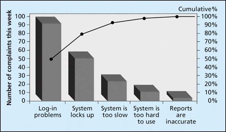
Click for text description of Figure 7-1: Pareto Diagram
This figure is a Pareto diagram an explains the concept of quality analysis--a portrayal of the frequency of system problems. it is in the form of a bar graph with 5 vertical bars arranged horizontally. The five bars represent different types of system problems including (left to right): "Log-in problems", "System locks up", "system is too slow", "System is too hard to use", and "Reports are inaccurate". There is a vertical scale on the left side called "Number of complaints this week" with a scale that goes from 0 to 100, incremented in 10s. From left to right, the height of the bars are: 100 Complaints (Log-in problems), 55 Complaints (System locks up), 30 (System is too slow), 20 (System is too hard to use), and 5 (Reports are inaccurate). There is a vertical scale on the left side called "Number of complaints this week" with a scale that goes from 0 to 100 incremented in 10s. which corresponds to a solid line graph line which starts at 50% at the 1st bar (Log-in problems) and moves gradually upward and to the right, reaching 100% above the last bar (Reports are inaccurate).
Statistical sampling may be appropriate for testing the quality of products produced, as looking at each individual product would be very time-consuming and cost prohibitive. The sample must be random, and large enough to represent the entire population of products with some degree of certainty. Statistical sampling as part of a quality control program is used most frequently in high-volume manufacturing processes. But it may be appropriate as a basis for automated and manual checks for large-scale GIS database development projects, especially in cases where data collection is more or less random. Whether or not statistical methods are used for determining a sample, the main point is that for some aspects of quality control and quality assurance checking, choosing a sample of the full project set is appropriate and effective. For instance, to check for positional accuracy of field data collection (e.g., positions of signs, hydrants, trees, etc.), a subset (e.g., 2% to 5%) of the full data set could be visually checked by comparing the captured position to the actual location on a high-resolution orthoimage or even with GNSS in the field.