Breaking Up Is Hard To Do
Most thematic maps require the mapmaker to assign individual data observations to categories. The act of assigning observations to categories in mapmaking is called data classification. We use it as a verb in Cartography – I classify my data before I design a map. If you map everything on a 1-to-1 basis, e.g. you show every observation and identify it as a unique thing on your map, then you’re not using classification. An example would be if I had reports from every city in the world about the number of babies who refuse to sleep through the night. I could report each value individually, but most likely I’d want to group similar values together to make it easier to reveal patterns in the data. In every choropleth map in this course, you’ve seen classified data – I collected values within a certain range and assigned one color to describe them.
There are three major types of classification that I want you to know about. There are many other types too, but I’m sure someone will be along shortly to teach a MOOC just about data classification. Equal Interval classification sets category boundaries at a specified data value interval. Quantile classification works the other way around – you decide how many categories you want and then add observations to each class until you’ve got equal members in each subset. This can help your map look nice and visually balanced because there are equal numbers of each color for a choropleth map, for example. The last type I want you to know about is called Natural Breaks, which uses some fancy math to look for “natural” breakpoints in the overall data distribution to place category boundaries there. There’s no best solution for every map – you have to understand your data, understand the story you want to tell, etc… and choose a method that makes sense given those constraints.
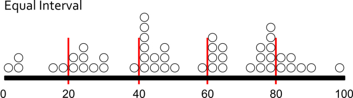
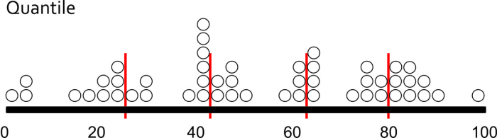
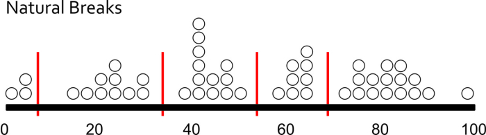
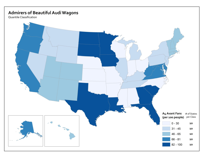
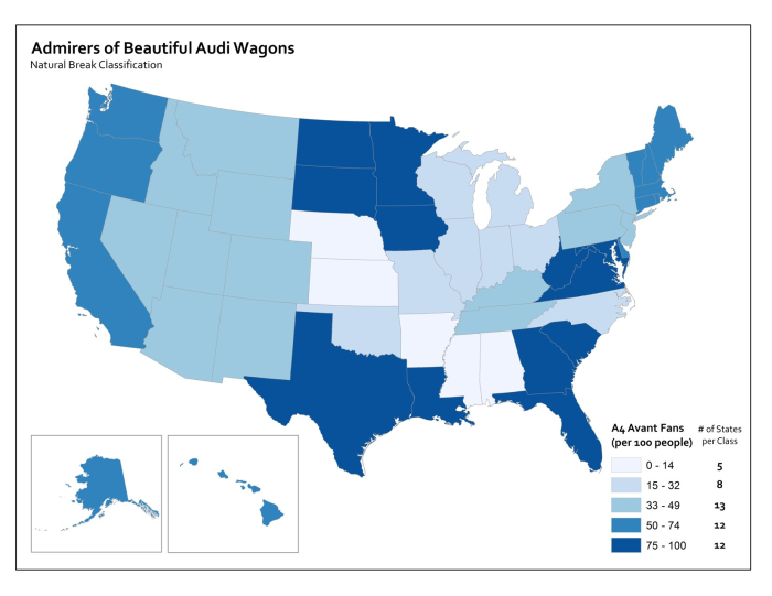
Each method is shown below on a histogram showing some fake data. I’ve got 50 observations (hollow circles), and each observation has a particular value (shown on the axis). In this case let’s say I did a survey of all 50 U.S. States to identify the number Audi A4 Avant admirers per 100 people. I would really enjoy doing this survey.
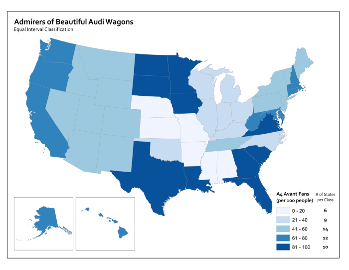
Map Examples
Using Equal Interval classification, I would set class breaks at intervals of 20 Avant Fans Per 100 People and end up with five classes to represent my data.
With Quantile classification, I decide I want five classes first, and then add observations to each class until I’ve got equal numbers in each one. Since I have 50 people who responded to my survey, I need to put 10 observations in each class. So I move from left to right on the data distribution axis and set my classes accordingly.
Using Natural Breaks, I let the fancy math decide where to put breaks in between the most consistent groupings that appear in the responses.
If you’re intrigued by this stuff, check out this excellent article (Visualizing Cancer Data using GIS) by Cindy Brewer on how classification impacts mapping in the context of public health.