Chapter 8: Remotely Sensed Image Data
1. Overview
Chapter 7 concluded with the statement that the raster approach is well suited not only to terrain surfaces but to other continuous phenomena as well. This chapter considers the characteristics and uses of raster data produced with airborne and satellite remote sensing systems. Remote sensing is a key source of data for land use and land cover mapping, agricultural and environmental resource management, mineral exploration, weather forecasting, and global change research.
Summarizing the entirety of remote sensing in a single brief chapter is a daunting task. You may know that the Penn State Online Geospatial Education program offers a four-course remote sensing curriculum [1]. This introduction is meant to familiarize you with the remote sensing-related competencies included in the U.S. Department of Labor's Geospatial Technology Competency Model [2]. If the chapter interests you, consider enrolling in one or more of the specialized remote sensing courses if your schedule permits.
Objectives
The overall goal of the chapter is to acquaint you with the properties of data produced by airborne and satellite-based sensors. Specifically, students who successfully complete Chapter 8 should be able to:
- identify the common characteristics and sources of remotely sensed image data;
- demonstrate familiarity with trends in remote sensing technologies, methods, and organizations;
- explain why and how remotely sensed image data are processed; and
- identify examples of active and passive remote sensing systems and applications.
"Try This!" Activities
Take a minute to complete any of the Try This activities that you encounter throughout the chapter. These are fun, thought provoking exercises to help you better understand the ideas presented in the chapter.
2. Nature of Remotely Sensed Image Data
Data consist of measurements. Here we consider the nature of the phenomenon that many, though not all, remote sensing systems measure: electromagnetic energy. Many of the objects that make up the Earth's surface reflect and emit electromagnetic energy in unique ways. The appeal of multispectral remote sensing is that objects that are indistinguishable at one energy wavelength may be easy to tell apart at other wavelengths. You will see that digital remote sensing is a little like scanning a paper document with a desktop scanner, only a lot more complicated.
(Just for fun: Can you think of a remote sensing technology that does not measure electromagnetic energy? We'll name one in the last page of this chapter.)
3. Electromagnetic Spectrum
Most remote sensing instruments measure the same thing: electromagnetic radiation. Electromagnetic radiation is a form of energy emitted by all matter above absolute zero temperature (0 Kelvin or -273° Celsius). X-rays, ultraviolet rays, visible light, infrared light, heat, microwaves, and radio and television waves are all examples of electromagnetic energy.
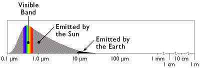
The graph above shows the relative amounts of electromagnetic energy emitted by the Sun and the Earth across the range of wavelengths called the electromagnetic spectrum. Values along the horizontal axis of the graph range from very short wavelengths (ten-millionths of a meter) to long wavelengths (meters). Note that the horizontal axis is logarithmically scaled so that each increment represents a ten-fold increase in wavelength. The axis has been interrupted three times at the long wave end of the scale to make the diagram compact enough to fit on your screen. The vertical axis of the graph represents the magnitude of radiation emitted at each wavelength.
Hotter objects radiate more electromagnetic energy than cooler objects. Hotter objects also radiate energy at shorter wavelengths than cooler objects. Thus, as the graph shows, the Sun emits more energy than the Earth, and the Sun's radiation peaks at shorter wavelengths. The portion of the electromagnetic spectrum at the peak of the Sun's radiation is called the visible band because the human visual perception system is sensitive to those wavelengths. Human vision is a powerful means of sensing electromagnetic energy within the visual band. Remote sensing technologies extend our ability to sense electromagnetic energy beyond the visible band, allowing us to see the Earth's surface in new ways, which, in turn, reveals patterns that are normally invisible.
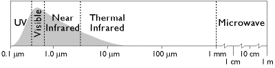
The graph above names several regions of the electromagnetic spectrum. Remote sensing systems have been developed to measure reflected or emitted energy at various wavelengths for different purposes. This chapter highlights systems designed to record radiation in the bands commonly used for land use and land cover mapping: the visible, infrared, and microwave bands.
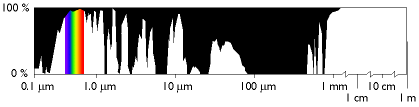
At certain wavelengths, the atmosphere poses an obstacle to satellite remote sensing by absorbing electromagnetic energy. Sensing systems are therefore designed to measure wavelengths within the windows where the transmissivity of the atmosphere is greatest.
4. Spectral Response Patterns
The Earth's land surface reflects about three percent of all incoming solar radiation back to space. The rest is either reflected by the atmosphere or absorbed and re-radiated as infrared energy. The various objects that make up the surface absorb and reflect different amounts of energy at different wavelengths. The magnitude of energy that an object reflects or emits across a range of wavelengths is called its spectral response pattern.
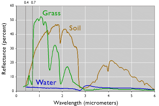
The graph below illustrates the spectral response patterns of water, brownish gray soil, and grass between about 0.3 and 6.0 micrometers. The graph shows that grass, for instance, reflects relatively little energy in the visible band (although the spike in the middle of the visible band explains why grass looks green). Like most vegetation, the chlorophyll in grass absorbs visible energy (particularly in the blue and red wavelengths) for use during photosynthesis. About half of the incoming near-infrared radiation is reflected, however, which is characteristic of healthy, hydrated vegetation. Brownish gray soil reflects more energy at longer wavelengths than grass. Water absorbs most incoming radiation across the entire range of wavelengths. Knowing their typical spectral response characteristics, it is possible to identify forests, crops, soils, and geological formations in remotely sensed imagery, and to evaluate their condition.
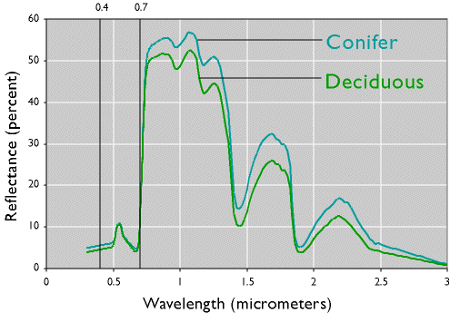
The next graph demonstrates one of the advantages of being able to see beyond the visible spectrum. The two lines represent the spectral response patterns of conifer and deciduous trees. Notice that the reflectances within the visual band are nearly identical. At longer, near- and mid-infrared wavelengths, however, the two types are much easier to differentiate. Land use and land cover mapping were previously accomplished by visual inspection of photographic imagery. Multispectral data and digital image processing make it possible to partially automate land cover mapping, which, in turn, makes it cost effective to identify some land use and land cover categories automatically, all of which makes it possible to map larger land areas more frequently.
Spectral response patterns are sometimes called spectral signatures. This term is misleading, however, because the reflectance of an entity varies with its condition, the time of year, and even the time of day. Instead of thin lines, the spectral responses of water, soil, grass, and trees might better be depicted as wide swaths to account for these variations.
5. Raster Scanning
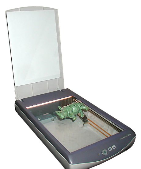
Remote sensing systems commonly work in much the same way as the digital scanner you may have attached to your personal computer. Scanners like the one pictured below create a digital image of an object by recording, pixel by pixel, the intensity of light reflected from the object. The component that measures reflectance is called the scan head, which consists of a row of tiny sensors that convert light to electrical charges. Color scanners may have three light sources and three sets of sensors, one each for the blue, green, and red wavelengths of visible light. When you push a button to scan a document, the scan head is propelled rapidly across the image, one small step at a time, recording new rows of electrical signals as it goes. Remotely sensed data, like the images produced by your desktop scanner, consist of reflectance values arrayed in rows and columns that make up raster grids.
After the scan head converts reflectances to electrical signals, another component, called the analog-to-digital converter, converts the electrical charges into digital values. Although reflectances may vary from 0 percent to 100 percent, digital values typically range from 0 to 255. This is because digital values are stored as units of memory called bits. One bit represents a single binary integer, 1 or 0. The more bits of data that are stored for each pixel, the more precisely reflectances can be represented in a scanned image. The number of bits stored for each pixel is called the bit depth of an image. An 8-bit image is able to represent 28 (256) unique reflectance values. A color desktop scanner may produce 24-bit images in which 8 bits of data are stored for each of the blue, green, and red wavelengths of visible light.
As you might imagine, scanning the surface of the Earth is considerably more complicated than scanning a paper document with a desktop scanner. Unlike the document, the Earth's surface is too large to be scanned all at once, and so must be scanned piece by piece, and mosaicked together later. Documents are flat, but the Earth's shape is curved and complex. Documents lie still while they are being scanned, but the Earth rotates continuously around its axis at a rate of over 1,600 kilometers per hour. In the desktop scanner, the scan head and the document are separated only by a plate of glass; satellite-based sensing systems may be hundreds or thousands of kilometers distant from their targets, separated by an atmosphere that is nowhere near as transparent as glass. And while a document in a desktop scanner is illuminated uniformly and consistently, the amount of solar energy reflected or emitted from the Earth's surface varies with latitude, the time of year, and even the time of day. All of these complexities combine to yield data with geometric and radiometric distortions that must be corrected before the data are used for analysis. Later in this chapter, we'll discuss some of the image processing techniques that are used to correct remotely sensed image data.
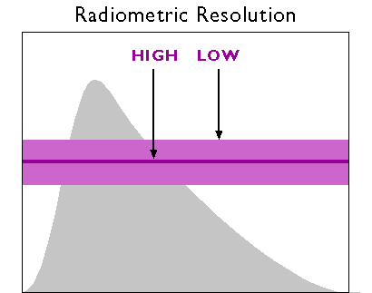
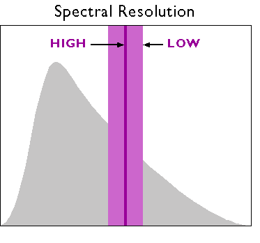
6. Resolution
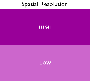
So far, you've read that remote sensing systems measure electromagnetic radiation, and that they record measurements in the form of raster image data. The resolution of remotely sensed image data varies in several ways. As you recall, resolution is the least detectable difference in a measurement. In this context, four of the most important kinds are spatial, radiometric, spectral, and temporal resolution.
Spatial resolution refers to the coarseness or fineness of a raster grid. It is sometimes expressed as ground sample distance (GSD), the nominal dimension of a single side of a square pixel measured in ground units. High-resolution data, such as those produced by digital aerial imaging or by the Quickbird satellite, have GSDs of one meter or less. Moderate-resolution data, such as those produced by Landsat sensors, have GSDs of about 15-100 meters. Sensors with low spatial resolution like AVHRR and MODIS sensors produce images with GSDs measured in hundreds of meters.
The higher the spatial resolution of a digital image, the more detail it contains. Detail is valuable for some applications, but it is also costly. Consider, for example, that an 8-bit image of the entire Earth whose spatial resolution is one meter could fill 78,400 CD-ROM disks, a stack over 250 feet high (assuming that the data were not compressed). Although data compression techniques reduce storage requirements greatly, the storage and processing costs associated with high-resolution satellite data often make medium and low-resolution data preferable for analyses of extensive areas.
A second aspect of resolution is radiometric resolution, the measure of a sensor's ability to discriminate small differences in the magnitude of radiation within the ground area that corresponds to a single raster cell. The greater the bit depth (number of data bits per pixel) of the images that a sensor records, the higher its radiometric resolution. The AVHRR sensor, for example, stores 210 bits per pixel, as opposed to the 28 bits that older Landsat sensors recorded. Thus, although its spatial resolution is very coarse (~4 km), the Advanced Very High-Resolution Radiometer takes its name from its high radiometric resolution.
A third aspect is spectral resolution, the ability of a sensor to detect small differences in wavelength. For example, panchromatic sensors record energy across the entire visible band - a relatively broad range of wavelengths. An object that reflects a lot of energy in the green portion of the visible band may be indistinguishable in a panchromatic image from an object that reflects the same amount of energy in the red portion, for instance. A sensing system with higher spectral resolution would make it easier to tell the two objects apart. “Hyperspectral” sensors can discern up to 256 narrow spectral bands over a continuous spectral range across the infrared, visible, and ultraviolet wavelengths.
Finally, there is temporal resolution, the frequency at which a given site is sensed. This may be expressed as "revisit time" or "repeat cycle." High temporal resolution is valued in applications like monitoring wildland fires and floods, and is an appealing advantage of a new generation of micro- and nano-satellite sensors, as well as unmanned aerial systems (UAS).
7. Site Visit to USGS Earthshots
Try This!
Landsat is the earliest and most enduring mission to produce Earth imagery for civilian applications. The U.S. National Aeronautics and Space Administration (NASA) and Department of Interior worked together to launch the first Earth Resource Technology Satellite (ERTS-1) in 1972. When the second satellite lifted off in 1975, NASA renamed the program Landsat. Landsat sensors have been producing medium-resolution imagery more or less continuously since then. We'll look into the most recent sensor system - Landsat 8 - later in this chapter. Meanwhile, let's see what we can learn from Landsat data and applications about the nature of remotely sensing image data.
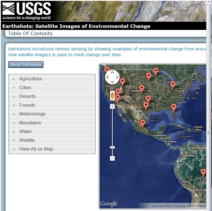
This activity involves a site visit to Earthshots, a website created by the USGS to publicize the many contributions of remote sensing to environmental science. We've been sending students to Earthshots for years. However, USGS has recently revised the site to make it more layman-friendly. The new site is less useful, but fortunately the older pages were archived and are still available. So, after taking you briefly to the new Earthshots homepage, we'll direct you to the older pages that are more instructive.
1. To begin, point your browser to the newer Earthshots site [5]. Go ahead and look around the site. Note the information found by following the About Earthshots button.
2. Next, go to the archived older version of the USGS Earthshots site [6].
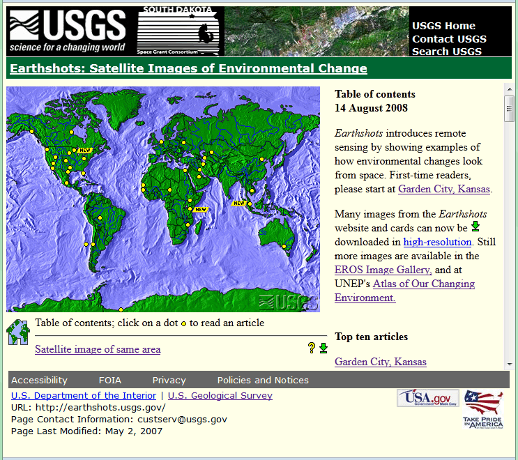
3. View images produced from Landsat data. Follow the link to the Garden City, Kansas example. You'll be presented with an image created from Landsat data of Garden City, Kansas in 1972. By clicking the date link below the lower left corner of the image, you can compare images produced from Landsat data collected in 1972 and 1988.
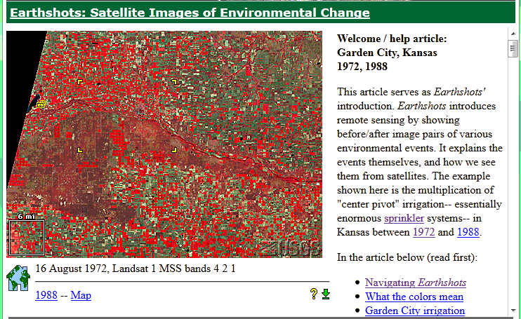
4. Zoom in to a portion of the image. Four yellow corner ticks outline a portion of the image that is linked to a magnified view. Click within the ticks to view the magnified image.
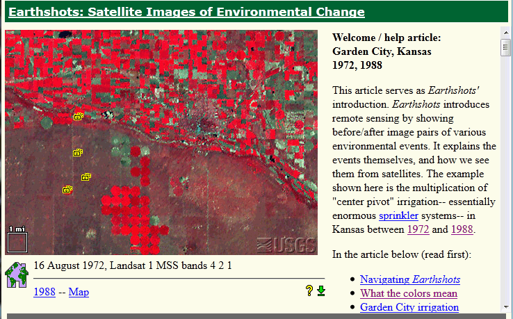
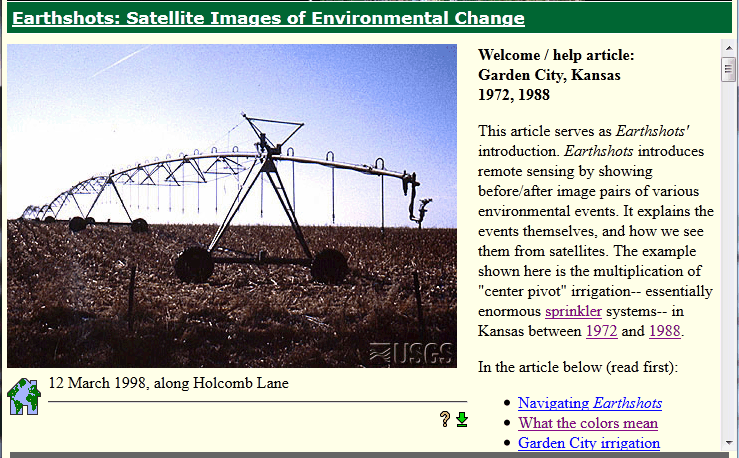
5. View a photograph taken on the ground. Click on one of the little camera icons arranged one above the other in the western quarter of the image. A photograph taken on the ground will appear.
6. Explore articles linked to the example. Find answers to the following questions in the related articles entitled What the colors mean, How images represent Landsat data, MSS and TM bands, and Beyond looking at pictures.
- What is the spectral sensitivity of the Landsat MSS sensor used to captured the image data?
- Which wavelength bands are represented in the image?
- What does the red color signify?
- How was "contrast stretching" used to enhance the images?
- What is the spatial resolution of the MSS data from which the images were produced?
8. Passive Sensing at Visible and Infrared Wavelengths
Over the next four pages, we'll survey some of the sensing systems used to capture Earth imagery in the visible, near-infrared, and thermal infrared bands. A common characteristic of these systems is the passive way in which they measure electromagnetic energy reflected or emitted from Earth's surface. One weakness of the desktop scanner analogy is that the sensors discussed here don't illuminate the objects they scan. We begin by considering aircraft and other platforms used for high-resolution sensing of relatively small areas from relatively low altitudes. Then we consider the origins, current status, and the outlook for remote sensing from space. The section concludes with a site visit to a leading commercial imagery provider.
9. Aerial Imaging
In contrast to remote sensing satellites that orbit the earth at altitudes of hundreds of kilometers (often upwards of 50 miles), “aerial imaging” refers to remote sensing from aircraft that typically fly 20,000 feet “above mean terrain.” For applications in which maximum spatial and temporal resolutions are needed, aerial imaging still has its advantages.
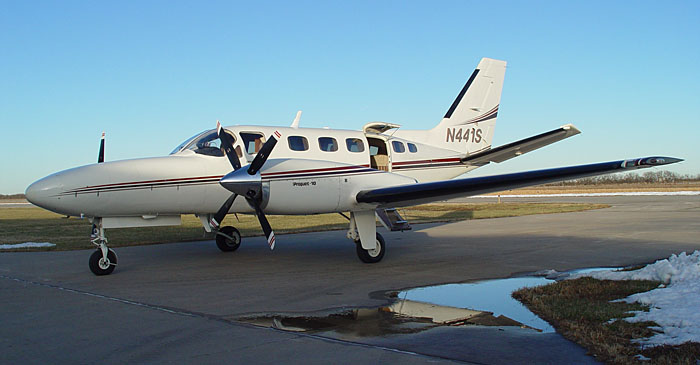
Aircraft platforms range from small, slow, and low flying, to twin-engine turboprops (like the one shown below) even and small jets capable of flying at altitudes up to 35,000 feet.
In chapter 6, you learned (or perhaps you already knew) that the U.S. National Agricultural Imagery Program (NAIP) flies aerial imaging missions over much of the lower 48 states every year. Just as digital cameras have replaced film cameras for most of us on the ground, digital sensors have all but replaced cameras for aerial surveys like NAIP. One reason for this transition is improved spatial resolution. Whereas the spatial resolution of a high-resolution aerial photograph was about 30-50 cm, the resolution that can be achieved by modern digital aerial imaging systems is great as 3 cm GSD. Another reason is that digital instruments can simultaneously capture imagery in multiple bands of the electromagnetic spectrum.
One example of a digital camera that’s widely used for mapping is the Leica DMC series [7], which provide four-band imagery at ground resolutions from 3cm to 80 cm GSD. Sophisticated instruments like this can cost more than the aircraft that carry them.
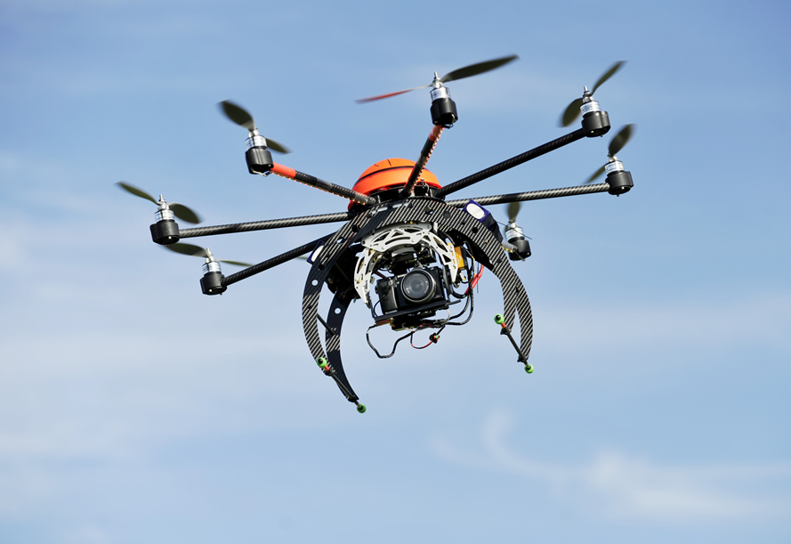
Unmanned Aerial Vehicles
UAVs (or, more generally, Unmanned Aerial Systems - UAS) are tantalizing platforms for aerial imaging. Unlike aircraft, UAVs are affordable to end users. So, one benefit to users is autonomy - the ability to collect one’s own imagery on one’s own timetable. And even equipped with relatively inexpensive imaging instruments, UAVs can deliver high-quality imagery because they fly at such low altitudes (typically around 400 feet). An important disadvantage is that the use of UAVs for civilian mapping is restricted in the U.S. by the Federal Aviation Administration. Still, interest in UAVs for mapping is so keen that xyHt magazine dubbed 2014 the “Year of the UAS [8].” Penn State’s Online Geospatial Education program offers an elective course called “Geospatial Applications of Unmanned Aerial Systems [9]."
10. Early Space Imaging Systems
Christopher Lavers published an informative short history of the "Origins of High Resolution Civilian Satellite Imaging [10]" in Directions Magazine in 2013. He points out that remote sensing from space began in the 1960s as a surveillance technology, in the wake of the Soviet Union's disruptive launch of Sputnik I in 1958.
Corona
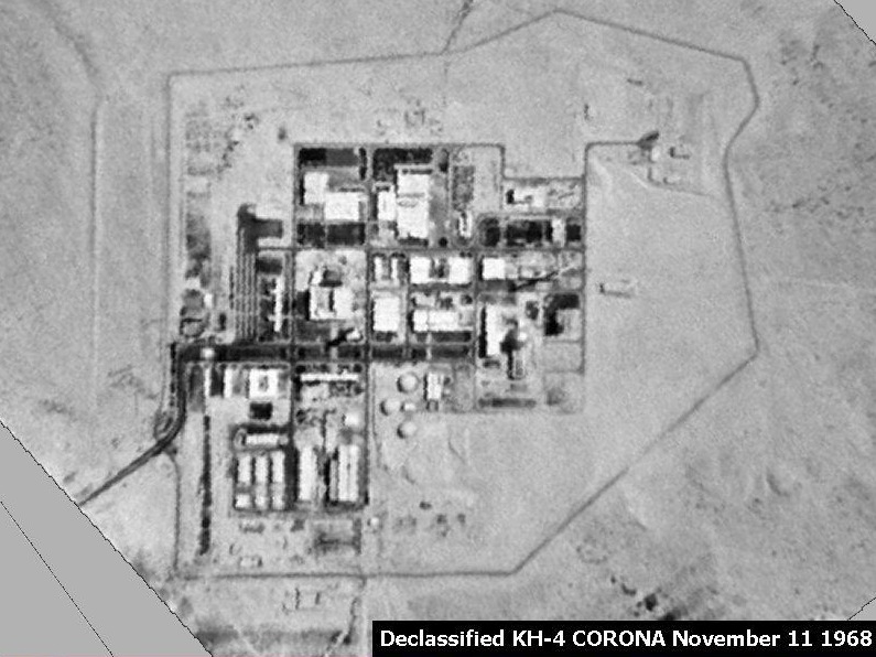
In 1959, the U.S. launched its first Corona satellite (then called Discoverer 4), one in a series of launches that performed secret photographic reconnaissance until 1972 from an altitude of about 160 km. Photographic film exposed in space was returned to Earth in reentry capsules that were subsequently retrieved by aircraft and returned to the U.S. for processing and analysis. Not declassified until 1992, the panchromatic image below reveals an Israeli nuclear reactor.
KVR-1000 / SPIN-2
High-resolution panchromatic image data first became available to civilians in 1994, when the Russian space agency SOVINFORMSPUTNIK began selling surveillance photos to raise cash in the aftermath of the breakup of the Soviet Union. The photos were taken with a camera system called KVR 1000 which was mounted in unmanned space capsules like the Corona satellites. After orbiting Earth at altitudes of 220 km for about 40 days, the capsules separate from the Cosmos rockets that propelled them into space, and spiral slowly back to Earth. After the capsules parachute to the surface, ground personnel retrieve the cameras and transport them to Moscow, where the film is developed. Photographs were then shipped to the U.S., where they were scanned and processed by Kodak Corporation. The final product was two-meter resolution, georeferenced, and orthorectified digital data called SPIN-2.
IKONOS
Also in 1994, a new company called Space Imaging, Inc. was chartered in the U.S. Recognizing that high-resolution images were then available commercially from competing foreign sources, the U.S. government authorized private firms under its jurisdiction to produce and market remotely sensed data at spatial resolutions as high as one meter. By 1999, after a failed first attempt, Space Imaging successfully launched its Ikonos I satellite into an orbital path that circles the Earth 640 km above the surface, from pole to pole, crossing the equator at the same time of day, every day. Such an orbit is called a sun synchronous polar orbit, in contrast with the geosynchronous orbits of communications and some weather satellites that remain over the same point on the Earth's surface at all times.
Ikonos' panchromatic sensor records reflectances in the visible band at a spatial resolution of one meter, and a bit depth of eleven bits per pixel. The expanded bit depth enables the sensor to record reflectances more precisely, and allows technicians to filter out atmospheric haze more effectively than is possible with 8-bit imagery.
A competing firm called ORBIMAGE acquired Space Imaging in early 2006, after ORBIMAGE secured a half-billion dollar contract with the National Geospatial-Intelligence Agency. The merged companies were called GeoEye, Inc. In early 2013, DigitalGlobe corporation acquired GeoEye. Ikonos is still in operation, and Ikonos data are available from DigitalGlobe.
DMSP
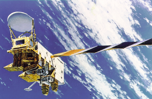
The U.S. Air Force initiated its Defense Meteorology Satellite Program (DMSP) in the mid-1960s. By 2001, they had launched fifteen DMSP satellites. The satellites follow polar orbits at altitudes of about 830 km, circling the Earth every 101 minutes.
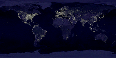
The program's original goal was to provide imagery that would aid high-altitude navigation by Air Force pilots. DMSP satellites carry several sensors, one of which is sensitive to a band of wavelengths encompassing the visible and near-infrared wavelengths (0.40-1.10 µm). The spatial resolution of this panchromatic sensor is low (2.7 km), but its radiometric resolution is high enough to record moonlight reflected from cloud tops at night. During cloudless new moons, the sensor is able to detect lights emitted by cities and towns. Image analysts have successfully correlated patterns of night lights with population density estimates produced by the U.S. Census Bureau, enabling analysts to use DMSP imagery (in combination with other data layers, such as transportation networks) to monitor changes in global population distribution.
11. Multispectral Imaging from Space
The preceding page on early space imaging systems focused on panchromatic photographs and images. However, a key takeaway from this chapter is that multispectral remote sensing enables analysts to differentiate objects that are hard to tell apart in the visible band. This page considers characteristics and applications of some of the most important multispectral sensing systems operated by government agencies as well as private commercial firms.
Government Systems
Some of the earliest space imaging platforms included multispectral sensors. One of those, which you explored a little earlier, is the Landsat program. Other U.S. government programs we'll consider briefly are AVHRR and MODIS.
Landsat MSS, TM and ETM+
Landsat satellites 1-5 (1972-1992) carried a four-band Multispectral Scanner (MMS) whose spectral sensitivity included visible green, visible red, and two near IR wavelengths. A new sensing system called Thematic Mapper (TM) was added to Landsat 4 in 1982. TM featured higher spatial resolution than MSS (30 meters in most channels) and expanded spectral sensitivity (seven bands, including visible blue, visible green, visible red, near-infrared, two mid-infrared, and thermal infrared wavelengths). An Enhanced Thematic Mapper Plus (ETM+) sensor, which included an eighth (panchromatic) band with a spatial resolution of 15 meters, was onboard Landsat 7 when it successfully launched in 1999.
Characteristics of the Landsat 5 TM and Landsat 7 ETM+ - including orbital height, spatial resolution, pass over time, spectral coverage, and data access and uses - are documented at Wikipedia's Remote Sensing Satellite and Data Overview [11] page.
Try This!
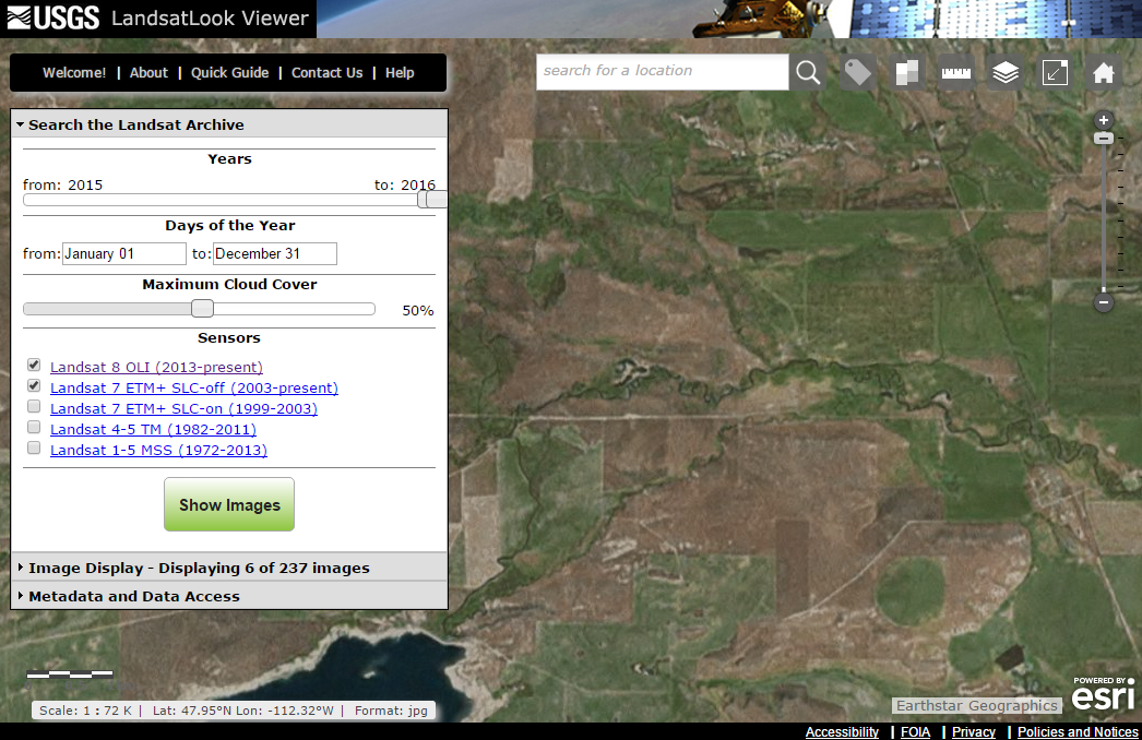
Visit the USGS' LandsatLook Viewer [12], which displays natural color images for all Landsat 1-8 images in the USGS archive.
 [12]
[12]
Landsat 8 - OLI and TIRS
NASA's Landsat Data Continuity Mission (LDCM) launched the Landsat 8 satellite in February 2013. The satellite payload includes two sensors, the Operational Land Imager (OLI) and the Thermal Infrared Sensor (TIRS).
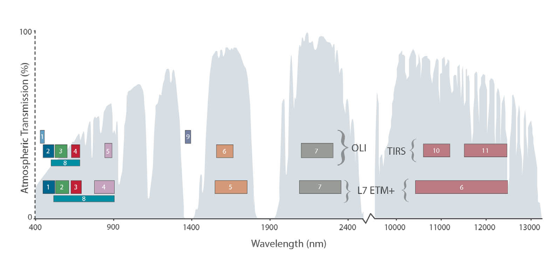
The spatial resolution of the Landsat 8 data is comparable to that of the Landsat 7 data. In regard to spectral resolution, six of the Landsat 8 bands have spectral sensitivities comparable to Landsat 7, but they have been refined somewhat. For example, the NIR band has been fine-tuned to decrease the effects of atmospheric absorption. The spectral sensitivities of Landsat 7 and 8 are compared in the figure below.
Landsat 7 is still collecting data. Landsat 8 orbits at the same altitude as Landsat 7. Both satellites complete an orbit in 99 minutes, and complete close to 14 orbits per day. This results in every point on Earth being crossed every 16 days. But, because the orbits of the two satellites are offset, it results in repeat coverage every 8 days. Approximately 1000 images per day are collected by Landsat 7 and Landsat 8 combined. That is almost double the images collected when Landsat 5 and Landsat 7 were operating concurrently.
While characteristics of Landsat 8 are documented at and is documented at Wikipedia's Remote Sensing Satellite and Data Overview [11] page, the following table outlines scientific applications associated with each sensor band.
| Spectral Bands | Spatial Resolution | Phenomena Revealed/Use |
|---|---|---|
| 0.43 - 0.45 μm (Band 1 - visible deep-blue) |
30 m | Coastal/aerosol; increased coastal zone observations |
| 0.45 - 0.51 μm (Band 2 - visible blue) |
30 m | Bathymetric mapping; distinguishes soil from vegetation; deciduous from coniferous vegetation |
| 0.53 - 0.59 μm (Band 3 - visible green) |
30 m | Emphasizes peak vegetation, which is useful for assessing plant vigor |
| 0.64 - 0.67 μm (Band 4 - visible red) |
30 m | Emphasizes vegetation on slopes |
| 0.85 - 0.88 μm (Band 5 - near IR) |
30 m | Emphasizes vegetation boundary between land and water, and landforms |
| 1.57 - 1.65 μm (Band 6 - SWIR 1) |
30 m | Used in detecting plant drought stress and delineating burnt areas and fire-affected vegetation, and is also sensitive to the thermal radiation emitted by intense fires; can be used to detect active fires, especially during nighttime when the background interference from SWIR in reflected sunlight is absent |
| 2.11 – 2.29 μm (Band 7 - SWIR-1) |
30 m | Used in detecting drought stress, burnt and fire-affected areas, and can be used to detect active fires, especially at nighttime |
| 0.50 – 0.68 μm (Band 8 - panchromatic) |
15 m | Useful in ‘sharpening’ multispectral images |
| 1.36 – 1.38 μm (Band 9 - cirrus) |
30 m | Useful in detecting cirrus clouds |
| 10.60 - 11.19 μm (Band 10 - Thermal IR 1) |
100 m | Useful for mapping thermal differences in water currents, monitoring fires, and other night studies, and estimating soil moisture |
| 11.50 - 12.51 μm (Band 11 - Thermal IR 2) |
100 m | Same as band 10 |
AVHRR
Another longstanding U.S. remote sensing program is AVHRR. The acronym stands for "Advanced Very High-Resolution Radiometer." AVHRR sensors have been onboard sixteen satellites maintained by the National Oceanic and Atmospheric Administration (NOAA) since 1979. The data the sensors produce are widely used for large-area studies of vegetation, soil moisture, snow cover, fire susceptibility, and floods, among other things.
AVHRR sensors measure electromagnetic energy within five spectral bands, including visible red, near infrared, and three thermal infrared. The visible red and near-infrared bands are particularly useful for large-area vegetation monitoring. The Normalized Difference Vegetation Index (NDVI), a widely used measure of photosynthetic activity that is calculated from reflectance values in these two bands, is discussed later.
MODIS
First launched in 1999, NASA's 36-band Moderate Resolution Imaging Spectroradiometer (MODIS) sensor has superseded AVHRR for many applications, including NDVI calculations for vegetation mapping.
Characteristics of the AVHRR and MODIS sensors are documented at Wikipedia's Remote Sensing Satellite and Data Overview [11] page.
Commercial Systems
Christopher Lavers' 2013 article Origins of High-Resolution Civilian Satellite Imaging - Part 2 [13] profiles several commercial systems, including SPOT, IKONOS, OrbView, and GeoEye. Characteristics of these and other contemporary sensing systems are documented at Wikipedia's Remote Sensing Satellite and Data Overview [11] page. Not included in that page is DigitalGlobe's WorldView-3 sensor, which launched in August 2014. WorldView-3 provides panchromatic imaging at 31 cm GSD and 1.24 m multispectral. Datasheets for WorldView-3 and other DigitalGlobe sensors are available at its Satellite Information page [14]. Coming up next in this chapter is a site visit to DigitalGlobe.
Next Generation Satellite Imaging
Also missing from the Wikipedia summary table is the new generation of micro- and nano-satellite space imaging providers like Skybox and Planet Labs. A 2014 article in IEEE Spectrum entitled "9 Earth-Imaging Startups to Watch [15]" suggests that while "there's at most two dozen nonmilitary satellites doing Earth imaging ... Five years from now [that is, in 2020] there might be 200 or more."
12. Site Visit to DigitalGlobe
Try This!
DigitalGlobe began as WorldView Imaging Corporation, one of several companies founded inanticipation of the 1992 Land Remote Sensing Policy Act, which created thecommercialsatellite imaging business in the U.S. Another startup was ORBIMAGE, which was renamed GeoEye after acquiring Space Imaging Corporation. DigitalGlobe became theworld’s largest commercial provider of earth imaging products after it acquired GeoEye in 2013.This site visit is meant to acquaint you with with the kinds of sensors, data products and services a provider like DigitalGlobe offers.

The instructions below are based on the October 2015 version of the website. Please bear in mind that websites change without notice.
1. First, go to DigitalGlobe’s home page [17] and scroll to the bottom, where you’ll find a list of CONTENT.
Follow links in that list to explore DigitalGlobe’s various products and services, including Imagery, Elevation, and Human Landscape.

2. In the list of CONTENT, follow the Imagery Suitelink and explore DigitalGlobe’s imagery products, including Basic Imagery, Standard Imagery, Precision Aerial, and New Collection Request. The latter allows satellite tasking requests to be made.

4. Near the bottom of each Imagery product page you should find a link to a Datasheet. Click the link to view the datasheet. (It will open in a new window or tab.)

5. Study the data sheets with a few questions in mind: What’s the difference between “Basic” and “Standard” imagery? Which sensing systemscontribute to each imagery product? Which image bands are available? What information about spatial (pixel) and radiometric resolution are provided?

6. Next, let’s see whatimagery products are available for your area of interest.Go back to the main page and scroll all the way to the bottom again and follow the Quick Link to Search Imagery.

Following the Search Imagery link will open the ImageFinder tool. As of this writing, it looked like the image below.
7. Enter a place name in the Go To: field to search the gazetteer. I was interested in chose Perth, Australia, but I just typed Perth into the field.
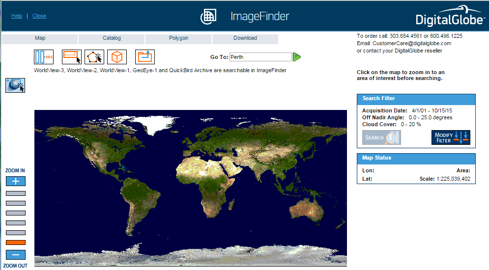
8. Next, click the green “Go to this location” arrow head. That will open the ImageFinder Gazetteer window, showing in my case a list of locations in the world named Perth.

8. In the Gazetteer list I clicked on the first entry, for Perth, Australia. The Gazetteer window closes and the map zooms to the vicinity of Perth, Australia.

9. Next, in the Search Filter box to the right of the map, click Search to query for imagery tracks that intersect the map bounding box.
Wait for it... eventually you should get a new Catalog window that lists the imagery available for your selected area. Here’s what I got:
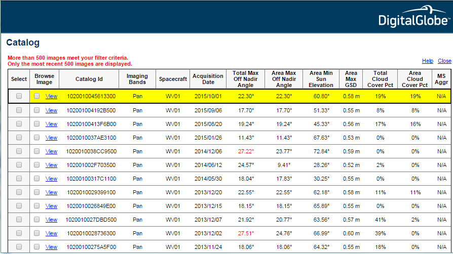
In the Catalog list above, notice the variety of spacecraft (sensor “vehicles”), bands, dates, andmaximum spatial resolution (Ground Sample Distance). Why do you suppose a maximum is given, rather than a single GSD value?
10. Clicking on an entry in the Catalog list turns it yellow and also highlights the area on the map covered by the selected image.

11. Finally, here’s what I received after clicking to View the most recent image listed.
You can zoom in or out by choosing from the Image Resize pick list.

Maybe you’re wondering how much you’d have to pay to acquire that scene? You won’t find prices on DigitalGlobe’s web site. However, we were able to find a bootleg copy of DigitalGlobe’s price book with a simple web search. Or of course you can contact DigitalGlobe or an authorized reseller.
That’s it for our site visit. Hope you enjoyed it.
13. Multispectral Image Processing
Obviously, one of the main advantages of digital data is that they can be processed using digital computers. Over the next few pages, we focus on digital image processing techniques used to correct, enhance, and classify remotely sensed image data.
14. Image Correction
As suggested earlier, scanning the Earth's surface from space is like scanning a paper document with a desktop scanner, only a lot more complicated. Raw remotely sensed image data are full of geometric and radiometric flaws caused by the curved shape of the Earth, the imperfectly transparent atmosphere, daily and seasonal variations in the amount of solar radiation received at the surface, and imperfections in scanning instruments, among other things. Understandably, most users of remotely sensed image data are not satisfied with the raw data transmitted from satellites to ground stations. Most prefer preprocessed data from which these flaws have been removed.
Geometric correction
You read in Chapter 6 that scale varies in unrectified aerial imagery due to the relief displacement caused by variations in terrain elevation. Relief displacement is one source of geometric distortion in digital image data, although it is less of a factor in satellite remote sensing than it is in aerial imaging because satellites fly at much higher altitudes than airplanes. Another source of geometric distortions is the Earth itself, whose curvature and eastward spinning motion are more evident from space than at lower altitudes.
The Earth rotates on its axis from west to east. At the same time, remote sensing satellites orbit the Earth from pole to pole. If you were to plot on a cylindrical projection the flight path that a polar-orbiting satellite traces over a 24-hour period, you would see a series of S-shaped waves. As a remote sensing satellite follows its orbital path over the spinning globe, each scan row begins at a position slightly west of the row that preceded it. In the raw scanned data, however, the first pixel in each row appears to be aligned with the other initial pixels. To properly georeference the pixels in a remotely sensed image, pixels must be shifted slightly to the west in each successive row. This is why processed scenes are shaped like skewed parallelograms when plotted in geographic or plane projections, as shown in the image below.
In addition to the systematic error caused by the Earth's rotation, random geometric distortions result from relief displacement, variations in the satellite altitude and attitude, instrument misbehaviors, and other anomalies. Random geometric errors may be corrected through a process known as rubber sheeting. As the name implies, rubber sheeting involves stretching and warping an image to georegister control points shown in the image to known control point locations on the ground. First, a pair of plane coordinate transformation equations is derived by analyzing the differences between control point locations in the image and on the ground. The equations enable image analysts to generate a rectified raster grid. Next, reflectance values in the original scanned grid are assigned to the cells in the rectified grid. Since the cells in the rectified grid don't align perfectly with the cells in the original grid, reflectance values in the rectified grid cells have to be interpolated from values in the original grid. This process is called resampling. Resampling is also used to increase or decrease the spatial resolution of an image so that its pixels can be georegistered with those of another image.
Radiometric correction
The reflectance at a given wavelength of an object measured by a remote sensing instrument varies in response to several factors, including the illumination of the object, its reflectivity, and the transmissivity of the atmosphere. Furthermore, the response of a given sensor may degrade over time. With these factors in mind, it should not be surprising that an object scanned at different times of the day or year will exhibit different radiometric characteristics. Such differences can be advantageous at times, but they can also pose problems for image analysts who want to mosaic adjoining images together or to detect meaningful changes in land use and land cover over time. To cope with such problems, analysts have developed numerous radiometric correction techniques, including Earth-sun distance corrections, sun elevation corrections, and corrections for atmospheric haze.
To compensate for the different amounts of illumination of scenes captured at different times of day, or at different latitudes or seasons, image analysts may divide values measured in one band by values in another band, or they may apply mathematical functions that normalize reflectance values. Such functions are determined by the distance between the Earth and the sun and the altitude of the sun above the horizon at a given location, time of day, and time of year. Analysts depend on metadata that include the location, date, and time at which a particular scene was captured.
Image analysts may also correct for the contrast-diminishing effects of atmospheric haze. Haze compensation resembles the differential correction technique used to improve the accuracy of GPS data in the sense that it involves measuring error (or, in this case, spurious reflectance) at a known location, then subtracting that error from another measurement. Analysts begin by measuring the reflectance of an object known to exhibit near-zero reflectance under non-hazy conditions, such as deep, clear water in the near-infrared band. Any reflectance values in those pixels can be attributed to the path radiance of atmospheric haze. Assuming that atmospheric conditions are uniform throughout the scene, the haze factor may be subtracted from all pixel reflectance values. Some new sensors allow "self calibration" by measuring atmospheric water and dust content directly.
The data sheets you viewed during your site visit to DigitalGlobe.com outlined different radiometric and geometric corrections applied to Basic and Standard imagery,
15. Image Enhancement
Correction techniques are routinely used to resolve geometric, radiometric, and other problems found in raw remotely sensed data. Another family of image processing techniques is used to make image data easier to interpret. These so-called image enhancement techniques include contrast stretching, edge enhancement, and deriving new data by calculating differences, ratios, or other quantities from reflectance values in two or more bands, among many others. This section considers briefly two common enhancement techniques: contrast stretching and derived data. Later you'll learn how vegetation indices derived from the visible red and near-infrared bands are used to monitor vegetation health at a global scale.
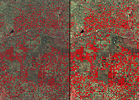
Contrast stretching
Consider the pair of images shown side by side in Figure 8.16.1. Although both were produced from the same Landsat MSS data, you will notice that the image on the left is considerably dimmer than the one on the right. The difference is a result of contrast stretching. MSS data have a precision of 8 bits; that is, reflectance values are encoded as 256 (28) intensity levels. As is often the case, reflectances in the near-infrared band of the scene partially shown below ranged from only 30 and 80 in the raw image data. This limited range results in an image that lacks contrast and, consequently, appears dim. The image on the right shows the effect of stretching the range of reflectance values in the near-infrared band from 30-80 to 0-255, and then similarly stretching the visible green and visible red bands. As you can see, the contrast-stretched image is brighter and clearer.
Derived data: NDVI
One advantage of multispectral data is the ability to derive new data by calculating differences, ratios, or other quantities from reflectance values in two or more wavelength bands. For instance, detecting stressed vegetation amongst healthy vegetation may be difficult in any one band, particularly if differences in terrain elevation or slope cause some parts of a scene to be illuminated differently than others. The ratio of reflectance values in the visible red band and the near-infrared band compensates for variations in scene illumination, however. Since the ratio of the two reflectance values is considerably lower for stressed vegetation regardless of illumination conditions, detection is easier and more reliable.
Besides simple ratios, remote sensing scientists have derived other mathematical formulae for deriving useful new data from multispectral imagery. One of the most widely used examples is the Normalized Difference Vegetation Index (NDVI). NDVI scores are calculated pixel-by-pixel using the following algorithm:
NDVI = (NIR - R) / (NIR + R)
R stands for the visible red band (MODIS and AVHRR channel 1), while NIR represents the near-infrared band (MODIS and AVHRR channel 2). The chlorophyll in green plants strongly absorbs radiation in the visible red band during photosynthesis. In contrast, leaf structures cause plants to strongly reflect radiation in the near-infrared band. NDVI scores range from -1.0 to 1.0. A pixel associated with low reflectance values in the visible band and high reflectance in the near-infrared band would produce an NDVI score near 1.0, indicating the presence of healthy vegetation. Conversely, the NDVI scores of pixels associated with high reflectance in the visible band and low reflectance in the near-infrared band approach -1.0, indicating clouds, snow, or water. NDVI scores near 0 indicate rock and non-vegetated soil.
Applications of the NDVI range from local to global. At the local scale, the Mondavi Vineyards in Napa Valley California can attest to the utility of NDVI data in monitoring plant health. In 1993, the vineyards suffered an infestation of phylloxera, a species of plant lice that attacks roots and is impervious to pesticides. The pest could only be overcome by removing infested vines and replacing them with more resistant root stock. The vineyard commissioned a consulting firm to acquire visible and near-infrared imagery during consecutive growing seasons using an airborne sensor. Once the data from the two seasons were georegistered, comparison of NDVI scores revealed areas in which vine canopy density had declined. NDVI change detection proved to be such a fruitful approach that the vineyards adopted it for routine use as part of their overall precision farming strategy (Colucci, 1998). Many more recent case studies abound.
The case study described on the following page outlines the image processing steps involved in producing a global NDVI data set.
16. Case Study: Processing a Global Land Dataset
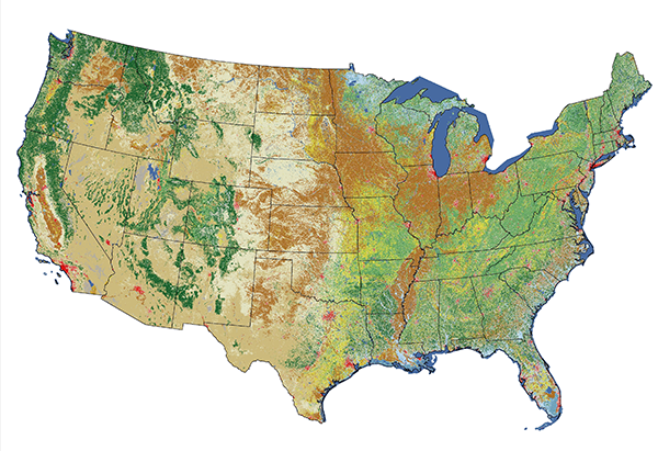
Environmental scientists rely on global vegetation and land cover data to monitor drought conditions that may lead to famine and to calibrate global- and regional-scale climate models, among other uses. Land cover studies around the world vary greatly both temporally and spatially. The most detailed contemporary global land datasets we're aware of is GlobeLand30 [18], which depicts ten land cover types at 30-meter resolution for Earth's entire land surface, for both 2000 and 2010. China's National Geomatics Center produced the datasets from over 20,000 Landsat and Chinese HJ-1 [19] scenes and donated them to the United Nations in September 2014. Other global datasets include GlobCover [20], a 22-class, 300-meter resolution dataset created by the European Space Agency. They created GlobCover from imagery produced by the Envisat Medium Resolution Imaging Spectrometer (MERIS) from 2004-06, then again in 2009. The Global Land Cover Facility at the University of Maryland offers more recent if lower resolution MODIS [21]land cover and vegetation [21] annual mosaics for 2001-2017. Meanwhile, beginning in 2014, Esri collaborated with USGS to create a Global Ecological Land Units [22] map that characterizes each 250-meter resolution "facet" of Earth's surface as a function of four input layers that drive ecological processes: bioclimate, landform, lithology, and land cover.
The following case study describes the production of one of the earliest global composite vegetation maps. While it is a historical example, it is an exceptionally well-documented one that illuminates an image processing workflow that remains relevant today.
The Advanced Very High-Resolution Radiometer (AVHRR) sensors aboard NOAA satellites scan the entire Earth daily at visible red, near-infrared, and thermal infrared wavelengths. In the late 1980s and early 1990s, several international agencies identified the need to compile a baseline, cloud-free, global NDVI data set in support of efforts to monitor global vegetation cover. For example, the United Nations mandated its Food and Agriculture Organization to perform a global forest inventory as part of its Forest Resources Assessment Project. Scientists participating in NASA's Earth Observing System program also needed a global AVHRR data set of uniform quality to calibrate computer models intended to monitor and predict global environmental change. In 1992, under contract with the USGS, and in cooperation with the International Geosphere Biosphere Programme, scientists at the EROS Data Center in Sioux Falls, South Dakota started work. Their goals were to create not only a single 10-day composite image, but also a 30-month time series of composites that would help Earth system scientists to understand seasonal changes in vegetation cover at a global scale.
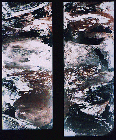
From 1992 through 1996, a network of 30 ground receiving stations acquired and archived tens of thousands of scenes from an AVHRR sensor aboard one of NOAA's polar orbiting satellites. Individual scenes were stitched together into daily orbital passes like the ones illustrated below. Creating orbital passes allowed the project team to discard the redundant data in overlapping scenes acquired by different receiving stations.
Once the daily orbital scenes were stitched together, the project team set to work preparing cloud-free, 10-day composite data sets that included Normalized Difference Vegetation Index (NDVI) scores. The image processing steps involved included radiometric calibration, atmospheric correction, NDVI calculation, geometric correction, regional compositing, and projection of composited scenes. Each step is described briefly below.
Radiometric calibration
Radiometric calibration means defining the relationship between reflectance values recorded by a sensor from space and actual radiances measured with spectrometers on the ground. The accuracy of the AVHRR visible red and near-IR sensors degrade over time. Image analysts would not be able to produce useful time series of composite data sets unless reflectances were reliably calibrated. The project team relied on research that showed how AVHRR data acquired at different times could be normalized using a correction factor derived by analyzing reflectance values associated with homogeneous desert areas.
Atmospheric correction
Several atmospheric phenomena, including Rayleigh scatter, ozone, water vapor, and aerosols were known to affect reflectances measured by sensors like AVHRR. Research yielded corrections to compensate for some of these.
One proven correction was for Rayleigh scatter. Named for an English physicist who worked in the early 20th century, Rayleigh scatter is the phenomenon that accounts for the fact that the sky appears blue. Short wavelengths of incoming solar radiation tend to be diffused by tiny particles in the atmosphere. Since blue wavelengths are the shortest in the visible band, they tend to be scattered more than green, red, and other colors of light. Rayleigh scatter is also the primary cause of atmospheric haze.
Because the AVHRR sensor scans such a wide swath, image analysts couldn't be satisfied with applying a constant haze compensation factor throughout entire scenes. To scan its 2400-km wide swath, the AVHRR sensor sweeps a scan head through an arc of 110°. Consequently, the viewing angle between the scan head and the Earth's surface varies from 0° in the middle of the swath to about 55° at the edges. Obviously, the lengths of the paths traveled by reflected radiation toward the sensor vary considerably depending on the viewing angle. Project scientists had to take this into account when compensating for atmospheric haze. The further a pixel was located from the center of a swath, the greater its path length, and the more haze needed to be compensated for. While they were at it, image analysts also factored in terrain elevation, since that, too, affects path length. ETOPO5, the most detailed global digital elevation model available at the time, was used to calculate path lengths adjusted for elevation. (You learned about the more detailed ETOPO1 in Chapter 7.)
NDVI calculation
The Normalized Difference Vegetation Index (NDVI) is the difference of near-IR and visible red reflectance values normalized over the sum of the two values. The result, calculated for every pixel in every daily orbital pass, is a value between -1.0 and 1.0, where 1.0 represents maximum photosynthetic activity, and thus maximum density and vigor of green vegetation.
Geometric correction and projection
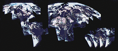
As you can see in the stitched orbital passes illustrated above, the wide range of view angles produced by the AVHRR sensor results in a great deal of geometric distortion. Relief displacement makes matters worse, distorting images even more towards the edges of each swath. The project team performed both orthorectification and rubber sheeting to rectify the data. The ETOPO5 global digital elevation model was again used to calculate corrections for scale distortions caused by relief displacement. To correct for distortions caused by the wide range of sensor view angles, analysts identified well-defined features like coastlines, lakeshores, and rivers in the imagery that could be matched to known locations on the ground. They derived coordinate transformation equations by analyzing differences between positions of control points in the imagery and known locations on the ground. The accuracy of control locations in the rectified imagery was shown to be no worse than 1,000 meters from actual locations. Equally important, the georegistration error between rectified daily orbital passes was shown to be less than one pixel.
After the daily orbital passes were rectified, they were transformed into a map projection called Goode's Homolosine. This is an equal-area projection that minimizes shape distortion of land masses by interrupting the graticule over the oceans. The project team selected Goode's projection in part because they knew that equivalence of area would be a useful quality for spatial analysis. More importantly, the interrupted projection allowed the team to process the data set as twelve separate regions that could be spliced back together later. Figure 8.17.2 shows the orbital passes for June 24, 1992, projected together in a single global image based on Goode's projection.
Compositing
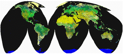
Once the daily orbital passes for a ten-day period were rectified, every one-kilometer square pixel could be associated with corresponding pixels at the same location in other orbital passes. At this stage, with the orbital passes assembled into twelve regions derived from the interrupted Goode's projection, image analysts identified the highest NDVI value for each pixel in a given ten-day period. They then produced ten-day composite regions by combining all the maximum-value pixels into a single regional data set. This procedure minimized the chances that cloud-contaminated pixels would be included in the final composite data set. Finally, the composite regions were assembled into a single data set, illustrated below. This same procedure has been repeated to create 93 ten-day composites from April 1-10, 1992 to May 21-30, 1996.
17. Image Classification
Back in Chapter 3, we considered the classification of thematic data for choropleth maps. Remember? We approached data classification as a kind of generalization technique, and made the claim that "generalization helps make sense of complex data." The same is true in the context of remotely sensed image data.
A key trend in image classification is the emergence of object-based alternatives to traditional pixel-based techniques. A Penn State lecturer has observed, "For much of the past four decades, approaches to the automated classification of images have focused almost solely on the spectral properties of pixels" (O'Neil-Dunne, 2011). Pixel-based approaches made sense initially, O'Neil-Dunne points out, since "processing capabilities were limited and pixels in the early satellite images were relatively large and contained a considerable amount of spectral information." In recent years, however, pixel-based approaches have begun to be overtaken by object-based image analysis (OBIA) for high-resolution multispectral imagery, especially when fused with lidar data. OBIA is beyond the scope of this chapter, but you can study it in depth in the open-access Penn State courseware GEOG 883: Remote Sensing Image Analysis and Applications [23].
Pixel-based classification techniques are commonly used in land use and land cover mapping from imagery. These are explained below and in the following case study.
The term land cover refers to the kinds of vegetation that blanket the Earth's surface, or the kinds of materials that form the surface where vegetation is absent. Land use, by contrast, refers to the functional roles that the land plays in human economic activities (Campbell, 1983).
Both land use and land cover are specified in terms of generalized categories. For instance, an early classification system adopted by a World Land Use Commission in 1949 consisted of nine primary categories, including settlements and associated non-agricultural lands, horticulture, tree and other perennial crops, cropland, improved permanent pasture, unimproved grazing land, woodlands, swamps and marshes, and unproductive land. Prior to the era of digital image processing, specially trained personnel drew land use maps by visually interpreting the shape, size, pattern, tone, texture, and shadows cast by features shown in aerial photographs. As you might imagine, this was an expensive, time-consuming process. It's not surprising, then, that the Commission appointed in 1949 failed in its attempt to produce a detailed global land use map.
Part of the appeal of digital image processing is the potential to automate land use and land cover mapping. To realize this potential, image analysts have developed a family of image classification techniques that automatically sort pixels with similar multispectral reflectance values into clusters that, ideally, correspond to functional land use and land cover categories. Two general types of pixel-based image classification techniques have been developed: supervised and unsupervised techniques.
Supervised classification
Human image analysts play crucial roles in both supervised and unsupervised image classification procedures. In supervised classification, the analyst's role is to specify in advance the multispectral reflectance or (in the case of the thermal infrared band) emittance values typical of each land use or land cover class.
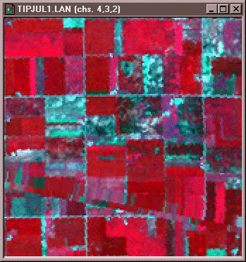
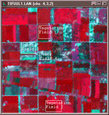
For instance, to perform a supervised classification of the Landsat Thematic Mapper (TM) data shown above into two land cover categories, Vegetation and Other, you would first delineate several training fields that are representative of each land cover class. The illustration below shows two training fields for each class; however, to achieve the most reliable classification possible, you would define as many as 100 or more training fields per class.
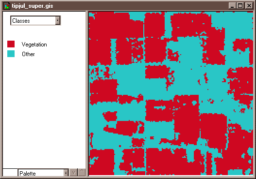
The training fields you defined consist of clusters of pixels with similar reflectance or emittance values. If you did a good job in supervising the training stage of the classification, each cluster would represent the range of spectral characteristics exhibited by its corresponding land cover class. Once the clusters are defined, you would apply a classification algorithm to sort the remaining pixels in the scene into the class with the most similar spectral characteristics. One of the most commonly used algorithms computes the statistical probability that each pixel belongs to each class. Pixels are then assigned to the class associated with the highest probability. Algorithms of this kind are known as maximum likelihood classifiers. The result is an image like the one shown below, in which every pixel has been assigned to one of two land cover classes.
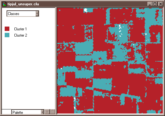
Unsupervised classification
The image analyst plays a different role in unsupervised classification. They do not define training fields for each land cover class in advance. Instead, they rely on one of a family of statistical clustering algorithms to sort pixels into distinct spectral classes. Analysts may or may not even specify the number of classes in advance. Their responsibility is to determine the correspondences between the spectral classes that the algorithm defines and the functional land use and land cover categories established by agencies like the U.S. Geological Survey. The example that follows outlines how unsupervised classification contributes to the creation of a high-resolution national land cover data set.
The following case study contrasts unsupervised and supervised classification techniques used to create the U.S. National Land Cover Database.
18. Case Study: Image Classification for the National Land Cover Dataset
The USGS has used remotely sensed imagery to map land use and land cover since the 1970s. Analysts compiled the first Land Use and Land Cover dataset (LULC) by manual interpretation of aerial photographs acquired in the 1970s and 80s. The successor to LULC was the National Land Cover Dataset (NLCD), which USGS created from Landsat imagery in 1992, 2001, 2006, and 2011 at a spatial resolution of 30 meters. The following case study outlines the evolving workflow used to produce the NLCD, including a change in image classification approaches between the 1992 NLCD and later versions.
Preprocessing
The primary source data used to create NLCD 92 were the visible red, near-infrared, mid-infrared, and thermal infrared bands of cloud-free, leaf-off Landsat TM scenes acquired in 1992. In comparison, source data used for NLCD 2001 and later versions were more diverse. NLCD 2001 sources included "18 or more layers" of "multi-season Landsat 5 and Landsat 7 imagery ... and Digital Elevation Model derivatives" (Homer and others, 2007; USGS 2014). In 1992 as well as subsequent versions, selected scenes were geometrically and radiometrically corrected, then combined into sub-regional mosaics. Mosaics were then projected to the same Albers Conic Equal Area projection based upon the NAD83 horizontal datum, and then were resampled to 30-meter grid cells.
Image classification
From the outset, the LULC and NLCD datasets have used variations on the Anderson Land Use/Land Cover Classification [24] system. The number and definitions of land use and land cover categories have evolved over the years since their original 1976 publication [25].
For NLCD 92, analysts applied an unsupervised classification algorithm to the preprocessed mosaics to generate 100 spectrally distinct pixel clusters. Using aerial photographs and other references, they then assigned each cluster to one of the classes in a modified version of the Anderson classification scheme. Considerable interpretation was required since not all functional classes have unique spectral response patterns.
From NLCD 2001 on, the USGS project team used "decision tree" (DT), "a supervised classification method that relies on large amounts of training data, which was initially collected from a variety of sources including high-resolution orthophotography, local datasets, field-collected points, and Forest Inventory Analysis data" (Homer and others, 2007). The training data were used to map all classes except the four urban classes, which were derived from an imperviousness data layer. A series of DT iterations was followed by localized modeling and hand editing.
For more information about the National Land Cover Datasets, visit the Multi-Resolution Land Characteristics Consortium [26]
Accuracy Assessment
As you'd expect, the classification accuracy of NLCD data products has improved over the years.
The USGS hired private sector vendors to assess the classification accuracy of the NLCD 92 by checking randomly sampled pixels against manually interpreted aerial photographs. Results indicated that the likelihood that a given pixel was classified correctly was only 38 to 62 percent. USGS therefore encouraged NLCD 92 users to aggregate the data into 3 x 3 or 5 x 5-pixel blocks (in other words, to decrease spatial resolution from 30 meters to 90 or 150 meters), or to aggregate the (then) 21 Level II Anderson classes into the nine Level I classes.
A similar assessment of NLCD 2006 demonstrated that accuracy had indeed improved. Wickham and others (2013) found that overall accuracies for the NLCD 2001 and 2006 Level II Anderson class were 79% and 78%, respectively.
If that still doesn't seem very good, you'll appreciate why image processing scientists and software engineers are so motivated to perfect object-based image analysis techniques that promise greater accuracies. Even in the current era of high-resolution satellite imaging and sophisticated image processing techniques, there is still no cheap and easy way to produce detailed, accurate geographic data.
19. Unsupervised Classification by Hand
Try This!
This activity guides you through a simulated pixel-based unsupervised classification of remotely sensed image data to create a land cover map. Our goal is for you to gain a hands-on appreciation of automated image classification technique. Begin by viewing and printing the Image Classification Activity PDF file [27].
1. Plot the reflectance values.
The two grids on the top of the second page of the PDF file represent reflectance values in the visible red and near infrared wavelength bands measured by a remote sensing instrument for a parcel of land. Using the graph (like the one below) on the first page of the PDF file you printed, plot the reflectance values for each pixel and write the number of each pixel (1 to 36) next to its location in the graph. Pixel 1 has been plotted for you (Visible Red band = 22, Near Infrared band = 6).
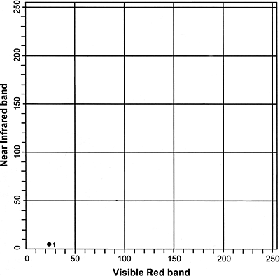
- After you have completed filling in the graph, you can check your progress by following this link to a completed graph [28].
2. Identify four land cover classes.
Looking at the completed plot from step one, identify and circle four clusters (classes) of pixels. Label these four classes A, B, C, and D.
- After you have circled the four clusters of pixels in the graph, you can check your progress by following this link to view the identified clusters [29].
- Note: You may have labeled the clusters differently, but the four clusters should contain the same points, more or less, as the example.
3. Complete the land cover map grid.
Using the clusters you identified in the previous step, fill in the land cover map grid with the letter that represents the land use class in which each pixel belongs. The result is a classified image.
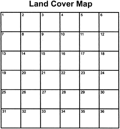
- If you would like to check your land cover map, you can follow this link to view a completed land cover map [30].
- Note: If you labeled the clusters in step two differently than the example, your land cover map may look different, but the patterns should look similar.
4. Complete a legend that explains the association.
Using the spectral response data provided on the second page of the PDF file, associate each of the four classes with a land use class.
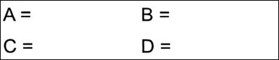
- You can check your results by following this link to view a completed legend [31].
- Note: Depending on how you labeled your clusters, your legend may differ from the example legend; however, when you apply your legend to your Land Cover Map, the land use classes on your map should match the example map.
You have now completed the unsupervised classification activity in which you used remotely sensed image data to create a land cover map.
20. Active Remote Sensing Systems
The remote sensing systems you've studied so far are sensitive to the visible, near-infrared, and thermal infrared bands of the electromagnetic spectrum, wavelengths at which the magnitude of solar radiation is greatest. Quickbird, WorldView, Landsat and MODIS are all passive sensors that measure only radiation emitted by the Sun and reflected or emitted by the Earth.
Although we used the common desktop document scanner as an analogy for remote sensing instruments throughout this chapter, the analogy is actually more apt for active sensors. That's because desktop scanners must actively illuminate the object to be scanned. Similarly, active airborne and satellite-based sensors beam particular wavelengths of electromagnetic energy toward Earth's surface, and then measure the time and intensity of the pulses' returns. Over the next couple of pages, we'll consider two kinds of active sensors: imaging radar and lidar.
There are two main shortcomings to passive sensing of the visible and infrared bands. First, reflected visible and near-infrared radiation can only be measured during daylight hours. Second, clouds interfere with both incoming and outgoing radiation at these wavelengths. Though Lidar can be flown at night, it can't penetrate cloud cover.
Longwave radiation, or microwaves, are made up of wavelengths between about one millimeter and one meter. Microwaves can penetrate clouds, but the Sun and Earth emit so little longwave radiation that it can't be measured easily at altitude. Active imaging radar systems solve this problem. Active sensors like those aboard the European Space Agency's ERS and Envisat, India's RISAT, and Canada's Radarsat, among others, transmit pulses of longwave radiation, then measure the intensity and travel time of those pulses after they are reflected back to space from the Earth's surface. Microwave sensing is unaffected by cloud cover, and can operate day or night. Both image data and elevation data can be produced by microwave sensing, as you'll see in the following page.
21. Imaging Radar
One example of active remote sensing that everyone has heard of is radar, which stands for RAdio Detection And Ranging. Radar was developed as an air defense system during World War II and is now the primary remote sensing system air traffic controllers use to track the 40,000 daily aircraft takeoffs and landings in the U.S. Radar antennas alternately transmit and receive pulses of microwave energy. Since both the magnitude of energy transmitted and its velocity (the speed of light) are known, radar systems are able to record either the intensity or the round-trip distance traveled of pulses reflected back to the sensor. Chapter 7 mentioned the Shuttle Radar Topography Mission (SRTM) in the context of global elevation data. SRTM and other satellite altimeters measure the distance traveled by microwave pulses transmitted from the space shuttle Endeavor. Imaging radars, in contrast, measure pulse intensity.
In addition to its indispensable role in navigation, radar is also an important source of raster image data about the Earth's surface. Radar images look the way they do because of the different ways that objects reflect microwave energy. In general, rough-textured objects reflect more energy back to the sensor than smooth objects. Smooth objects, such as water bodies, are highly reflective, but unless they are perpendicular to the direction of the incoming pulse, the reflected energy all bounces off at an angle and never returns to the sensor. Rough surfaces, such as vegetated agricultural fields, tend to scatter the pulse in many directions, increasing the chance that some back scatter will return to the sensor.
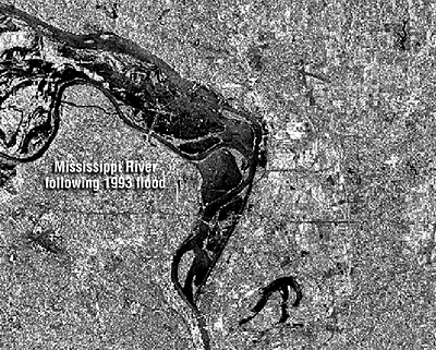
The imaging radar aboard the European Resource Satellite (ERS-1) produced the data used to create the historical image shown above. The smooth surface of the flooded Mississippi River deflected the radio signal away from the sensor, while the surrounding rougher-textured land cover reflected larger portions of the radar pulse. The lighter an object appears in the image, the more energy it reflected. Imaging radar can be used to monitor flood extents day or night, regardless of weather conditions. Passive instruments that are sensitive only to visible and near-infrared wavelengths are useless as long as cloud-covered skies prevail.
22. Lidar
Lidar (LIght Detection And Ranging) also came up in Chapter 7, in the context of elevation data. But lidar is about much more than elevation. Along with GPS, it is one of the technologies that has truly revolutionized mapping.
So important has lidar become that Penn State has developed an entire course on it—Geography 481: Topographic Mapping with Lidar [32]. The course is part of our Open Educational Resources Initiative, so you're free to browse its in-depth treatments of lidar system characteristics, data collection and processing techniques, and applications in topographic mapping, forestry, corridor mapping, and 3-D building modeling.
In this text, we'll emphasize just a few key points.
First, lidar is an active remote sensing technology. Like radar, lidar emits pulses of electromagnetic energy and measures the time and intensity of "returns" reflected from Earth's surface and objects on and above it. Unlike radar, lidar uses laser light. The wavelength chosen for most airborne topographic mapping lasers is 1064 nanometers, in the near-infrared band of the spectrum.
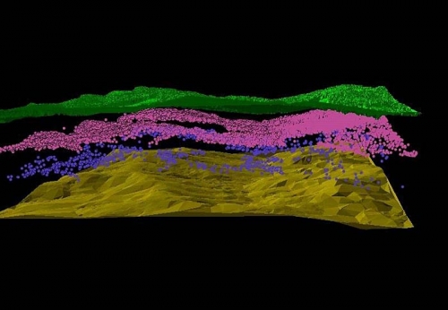
The product of a lidar scan is a 3-D cloud of mass point data. The density of points on the ground varies according to the mapping mission and platform from one to a few to hundreds of points per square meter, with corresponding accuracies of 10-15 cm to 1 cm or better. Crucial to data quality is the integration of GPS with inertial navigation systems—together called "direct georeferencing"—which enables precise positioning of mass points.
Processing lidar data involves systematically classifying points according to the various surfaces they represent—the ground surface, or above-ground surfaces like tree canopy and structures. The ability to view and interact with pseudo-stereopair images created from lidar time and intensity data make it possible to apply traditional photogrammetric techniques like break line delineation in a process called "lidargrammetry." One of the most exciting potentials of lidar data is the object-based image analysis and feature extraction its fusion with multispectral data makes possible.
23. Summary and Outlook
Remotely sensing image data are diverse, but most have some common characteristics. One is that the data represent measurements of electromagnetic energy (sonar is an exception to this rule). Another is that the data can be compared in terms of spatial, radiometric, spectral, and temporal resolution. We stressed that a key advantage of multispectral remote sensing is that objects that "look" the same in the one band of the electromagnetic spectrum may be easier to tell apart when viewed in multiple bands.
This chapter identified a couple of key trends in the remote sensing field. One is the miniaturization and, some would say, democratization of aerial and space-based platforms (UAVs and small satellites). Another is the emergence of object-based analysis of high resolution multispectral imagery, and the corresponding decline of pixel-based classification techniques.
Throughout the chapter, we suggested that earth imaging is analogous to desktop document scanning, only a lot more complicated. Earth's shape, rotation, and semi-transparent atmosphere, along with aircraft flightpaths and satellite orbits, necessitate geometric and radiometric corrections, as well as image enhancements. Finally, we pointed out that the desktop scanner analogy is more fitting for active remote sensing like radar and lidar than it is for passive sensors that measure solar radiation emitted by the Sun and reflected or re-emitted by Earth.
Analysts in many fields have adopted land remote sensing data for a wide array applications like land use and land cover mapping, geological resource exploration, precision farming, archeological investigations, and even validating the computational models used to predict global environmental change. Once the exclusive domain of government agencies, an industry survey suggests that the gross revenue earned by private land remote sensing firms exceeded $7 billion (U.S.) in 2010 (ASPRS, 2011).
The fact that remote sensing is first and foremost a surveillance technology cannot be overlooked. State-of-the-art spy satellites operated by government agencies, high resolution commercial sensors, and now cameras mounted on UAVs are challenging traditional conceptions of privacy. In a historical precedent, remotely sensed data were pivotal in the case of an Arizona farmer who was fined for growing cotton illegally (Kerber, 1998). Was the farmer right to claim that remote sensing constituted unreasonable search? More serious, perhaps, is the potential impact of the remote sensing industry on defense policy of the United States and other countries. Some analysts foresee that "the military will be called upon to defend American interests in space much as navies were formed to protect sea commerce in the 1700s" (Newman, 1999).
Geospatial professionals should be mindful and conscientious about the ethical implications of remote sensing technologies. However, the potential of these technologies and methods to help us to become more knowledgeable, and thus more effective stewards of our home planet, is compelling. Several challenges must be addressed before remote sensing can fulfill this potential. One is the need to produce affordable, high-resolution data suitable for local scale mapping—the scale at which most land use decisions are made. UAV-based aerial imaging seems to have great potential in this context. Another is the need to further develop object-based image analysis techniques that will improve the accuracy and cost-effectiveness of information derived from remotely sensed imagery.
Of course this brief overview cannot adequately convey the depth and dynamism of the remote sensing field. For those interested in learning more, we suggested specialized Penn State courses in remote sensing, image analysis, lidar, and even unmanned aerial systems (UAS). Meanwhile, if you really want to geek out, check out the Earth Observation Portal [33], which provides a searchable database of over 600 in-depth articles of satellite missions from 1959 to 2020, as well as a complementary database of airborne sensors containing detailed information of almost 40 flight campaigns from the last 20 years.