Changing Landscapes, Sharing Maps, and Fun With Projections
In this lesson you reflected on spatial relationships across space and time. This lab gives you the opportunity to practice these concepts using GIS tools. GIS was originally created way back in the 1960s to analyze these kinds of relationships. Sure, you could analyze spatial relationships via paper maps or plastic transparencies, but that’s clunky (ever tried to fold a paper map back into its original shape?). And what if you want to change the variables, or the way the data is classified, or the map scale? A GIS gives you the flexibility and power to analyze lots of data efficiently.
Ch-Ch-Ch-Changesm(sorry)
One type of change that is evident all around us is physical change and demographic change in our own communities. Think about your own community:
- What has changed since you moved there? What forces are causing that change? How did your community look in terms of the people who live there and the uses of the land in your community 10 or 100 years ago?
- How will your community look in 10 or 100 years? Could any of these changes be mapped? How do these changes compare in magnitude and scale from those changes in other parts of the world?
Unless you have been living under a rock since the 1950s, you know about space probes that have been launched to observe the Moon, Mars, and other objects in our own solar system and beyond. Since the early 1970s, satellites have also been launched specifically to observe the Earth. Some observe oceans, while others observe agricultural health, atmospheric composition, weather, or other phenomena. The first of these was Landsat, short for “land satellite.” Landsat became a series of satellites operated by NASA and the US Geological Survey since 1972. Landsat observes the Earth in the visible and infrared portions of the spectrum. In an infrared image, healthy vegetation appears red, cities appear gray, water appears black, and other interesting colors appear as well. The point is not actually to create weird colors, but that the infrared imagery allows for changes to be detected easily on the landscape, such as urban sprawl, agriculture, deforestation, and fluctuations in water elevation.
Open a web browser and access the Esri Change Matters site.
Change Matters uses Landsat imagery and ArcGIS Online. You should see three side-by-side web GIS maps, similar to the image below.
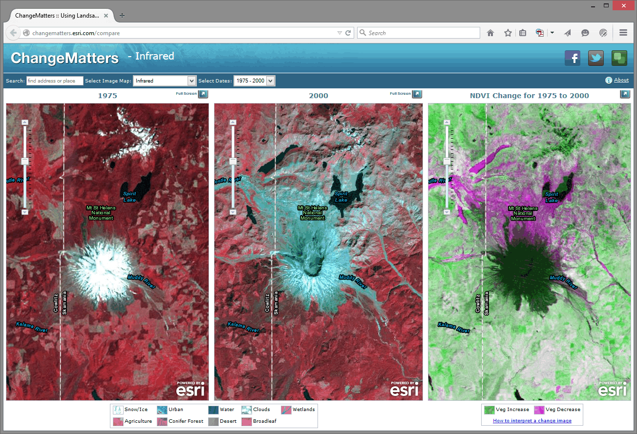
The first set of scenes is that of Mount St. Helens from 1975 and 2000. Use the information provided in the link at the lower right "how to interpret a change image" if you need it, to answer the following questions:
- Describe a few changes you observe in Mount St. Helens from 1975 to 2000.
- What do you think is the reason for those changes? Google about St. Helens if you need to.
Using the search box above the images, enter "Aral Sea."
- Describe the changes in the Aral Sea.
- What do you think are the reasons for those changes? Do some more research if you need to.
Now, examine other places around the world using this resource. What does your hometown look like?
Zoom in on one of the Change Matters image sets. The spatial resolution of Landsat imagery is now 30 meters x 30 meters (it was coarser in its earliest iterations). So, while you can’t peep on people sunbathing at this resolution, you can detect large changes across the Earth’s surface.
To share a map from the Change Matters site: click on the green box icon at the top right of the interface. That will give you a URL you can share, and those Twitter/Facebook buttons work nicely too.
Scale Matters
Now, head over to ArcGIS Online.
You are looking at the Northeastern Junior College campus in Sterling, Colorado. Click the Content button at the upper left of the interface to see the map layers that you have at your disposal. You should have Map Notes, USA Topo Maps, and Imagery with Labels.
Click on the pushpin at the intersection of the paths that form an “X” on campus. In the popup box that appears, you should see some notes and a photograph taken on the ground. In a few minutes you’ll create your own map notes and popups. Click on the photograph. You should be directed to a new website.
- What website was the photograph linked to?
Unlike the Landsat images, this satellite image was taken in the visible spectrum. It comes from a satellite operated by DigitalGlobe, and it has a much finer resolution than the Landsat imagery. You could definitely use this stuff to count the number of dog turds in someone’s lawn.
- What is the smallest object that you can see on this satellite image?
Now go to Bookmarks and select Sterling. You should now be looking at the town of Sterling, Colorado, with the USA Topo Maps layer as semi-transparent. Earlier, you used a side-by-side set of images to detect change over time. Here, using transparency on layers is another way you can look at change over time. Click the small arrow next to USA Topo Maps in the list of layers and adjust the visibility of that layer by clicking on Transparency and then drag the slider around. The USA Topo maps layer is a USGS topographic map; and in the case of Sterling, the map was created in 1971. Your MOOC instructor was -9 years old at the time.
- Describe two changes you can detect in the town of Sterling from 1971 to 2011.
Now examine the Northeastern Junior College Campus, comparing the current campus as seen in the satellite image to the features on the 1971 topographic map by sliding the transparency control back and forth for the USA Topo Maps layer.
- What feature occupied most of the campus back in 1971?
Until now in our lab assignments you have been using maps and layers created by others. One of the revolutionary things about today’s mapping methods is that you can create your own content, save it, and share it with others quite easily. Let’s start doing that now. To do so, click on Sign In in the upper right hand corner of the map that you are examining.
Your screen should look similar to the one shown below. If it doesn't, navigate to the ARCGIS home page directly.
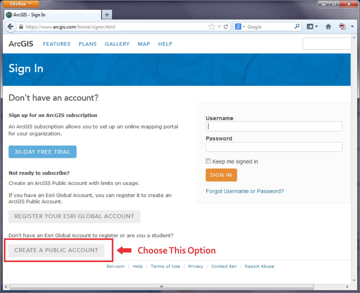
At the lower left, click the link to Create a Public Account. Follow the steps there to create your account. Where it asks you to name the Organization you're part of, you can just say "Coursera" there. You will also need to give Esri a phone number, but you don't have to give them a real one. Just plug in 999 instead. You also need to review and accept the terms of use before you can click Create My Account. Once you have created your account, you should be automatically logged in. It should drop you at a page where you can edit your profile details if you'd like.
None of this will cost you any money, result in 40 catalogs sent to your house or anything crazy like that – it’s just a way for you to be able to upload stuff, save your maps, and share things more easily.
Now that you are signed into ArcGIS Online, you can do everything that you have been doing last week and earlier in this current lab exercise, but now you can save your maps. You can build on them as you see fit. And because these maps live online, you can share them with colleagues; you can embed them into your own web pages, you can create web applications from them, and you can reduce your cholesterol by 30% while improving your ability to sing opera. But let’s not get ahead of ourselves: let’s begin with those pushpins, popups, and embedded images and links that you were examining earlier by creating your own. On the menu bar at the top of the page, click Map to continue.
Navigate now to a different location in the United States that is of interest to you. If your map still is titled “Northeast Junior College” then click on “New Map” to start creating a completely new map. I would navigate to Princeville, Hawaii because it’s freaking awesome. Add the USA Topo Maps layer from ArcGIS Online (uncheck the "within map area" option) and compare the Imagery layer from the Basemap to the USA Topo Maps layer for your chosen location. Zoom to a location where you can observe change on the landscape between the topographic map and the satellite image.
Add a pushpin, some text, an image, and a link to a point by following these steps: Using the Add button, Add Map Notes and select Create once you’ve given it a name. Select a Point, Line, or Areas from the Add Features menu. Click on the map then to add your point, line, or area to the map. Fill out the popup box that appears with the following:
- An appropriate title.
- A description of the changes on the landscape that you observe.
- Find an image of that community or your chosen location and enter its URL in the “Image URL” box. Note that this image URL should be a link to a JPG, PNG, TIF, or other image.
- Enter an Image Link URL that will take the reader of your map to an appropriate website. The website could be the government site for that community, a local restaurant that you think embodies that place, or whatever else you see fit to use.
Exit the Add Features panel by clicking the Close button at the bottom right corner of the popup. Test your popup by first exiting the "edit" mode and then clicking on your map note. You should see your note title, text, and image. Click on your image - you should be directed to the website that you selected.
Now go to Bookmarks and set up a few bookmarks at different locations and scales in your chosen community. You can do this by clicking Add Bookmark in the Bookmark list, type in a name, and hit Enter to save it. It'll use the map settings at that moment to make a Bookmark, so you'll need to navigate, change your layers, etc... before you add a specific Bookmark.
Once you’ve added a couple map notes and bookmarks, save your map by clicking the Save button. Give it an appropriate title. If you call it “Map” that’d be pretty lame.
In the Tags area you can enter keywords to help people discover your map. In the Summary field you can write a short description about your map that will be helpful to the readers of your map. This is known as the map’s metadata—information about the map. It is sort of like the list of ingredients on a bag of chips.
- Why do you think it would be important to spend time adding metadata like this?
Next, let’s make your map viewable to others: using the Share button, share your map with Everyone. Write down or copy the URL of your map to your clipboard. You can give this to anyone and they’ll be able to load and use your map.
Now click on the ArcGIS in the top left corner of the interface and select My Content. You should see your map listed in your content. In subsequent labs, your content will grow as you create more maps.
Finally, let’s test your map: First, make sure you copied that URL for your map that you created when you shared it just a minute ago. Next, Log out of ArcGIS online. Open a new web browser frame. Add your map URL to the address bar in your browser and see if you can access your map without being logged into ArcGIS Online. This is possible because you shared your map with everyone in the step above. While you are in your map, test your bookmarks.
- Have you made something great? Feel free to share the URL of your map with a friend or classmate and describe what you’ve created.
Examining Resolution
As you learned in the reading this week, different locations on the planet contain different data at different resolutions. You saw a satellite image of Salzburg that featured two different resolutions, and earlier in this lab, you saw that the USA Topo map resolution was at a lower resolution than the imagery.
One reason why maps are noteworthy today is that you can easily create your own content. And so can others - this is commonly called crowdsourced data or volunteered geographic information. In the not too distant past, the only geospatial data providers were government agencies and nonprofit organizations. Nowadays, everyone is empowered to create their own data and share it. Esri has a program called the Community Maps program where folks can contribute content to a topographic basemap.
Log in to ArcGIS Online and start a new Map if you aren't already there. Change your Basemap to Topographic (it may already be set this way by default, that's OK too). Use the search box to search for the following address: 1000 Broadway, Boulder, CO. You should now be in Boulder, Colorado. Broadway is the street that runs from the southeast to the northwest across this part of Boulder. Compare the detail to the northeast of Broadway to the map details shown to the southwest of Broadway.
- Which part of the map – to the northeast of Broadway or to the southwest of Broadway—contains a more detailed basemap?
- What is the most detailed feature that is visible in the higher detail section of the basemap?
The higher detail section of this map was contributed to through the community maps program.
Recall that you populated the metadata with information about the map that you created.
- Now that citizens are contributing data to the spatial data “cloud,” what are the implications of data quality?
Projections Aren’t Just To Make Maps Pretty
Everything in a GIS is tied to a specific location on the Earth’s surface. All of those locations are measured based on a mathematically-computed map projection. Recall from Lesson 1 where we talked about why transforming stuff from the 3D globe to a 2D map requires some transformation (and therefore compromises).
The map projection that you use makes a big difference in your spatial analysis. If you are creating zones that consider Tobler’s First Law of Geography and want to determine which things are near other things, you usually create areas of proximity, or buffer zones around map features. These could represent the areas within 100 kilometers of the earthquakes of at least magnitude 7 that have occurred over the past year, for example, or areas within 100 meters of rivers in your local community. Those zones that you create, as well as everything else you do and create in a GIS, are all dependent on the map projection used. Using different map projections will yield different results. The results might not matter so much at a small scale for, say, the list of cities within a certain climate zone, but they would matter at a large scale to determine, say, all of the natural gas pipelines underneath a school building that you would need to be careful about when constructing a new library.
Now I’d like you to start a New Map, zoom out to show the whole world, and compare the size of Greenland versus that of South America. Greenland looks larger than South America, doesn’t it? Greenland is actually only about 12% as large as South America (~2 million square kilometers vs. ~17 million square kilometers). Why does Greenland look huge? The default projection in ArcGIS Online is a modified version of a Mercator projection. In the Mercator projection, latitude and longitude lines are conveniently shown as straight lines and it allows us to plot navigational directions in straight lines. But as you can see, objects near the poles are really distorted.
Next, expand the ArcGIS list in the top left corner and click on Groups. Groups are, as the name implies, sets of maps with a specific theme. Click on the Search box in the top right corner and select Search For Groups and then type Projected Basemaps into the search field before hitting Enter. Click on the group name "Projected Basemaps" to open this group and you will see two pages of projected basemaps. Browse these basemaps and open a few of them. Each is based on a different map projection. Think about the advantages and disadvantages of each projection. The map projections represented here are just a few of the thousands of map projections that exist. Why so many? Each projection has advantages and disadvantages. Each projection preserves some, but not all, of the following properties: Area, shape, direction, bearing, and distance.
- What map projection do you like best, and why?
- Which map projection would be best to analyze tsunamis in the Pacific Basin? Why?
Wrap Up
Nice work! In this lab you’ve examined issues of resolution and map projection. You also explored issues related to change detection in Geography. And you created your own map with your own content and shared it with others. That’s pretty cool, huh?
Credit Where It's Due
This lab was developed by Joseph Kerski and Anthony Robinson.