(by thinking Aspatially)
Chances are that you already think like a Geographer all the time, you just don’t know it yet. You compare places to one another based on their distance and their similarity across a range of attributes. You talk with your friends about Red States and Blue States whenever there’s a Presidential election. You decide where to buy a house based on how long it takes for you to drive to the nearest delicious breakfast food and based on which school district it’s in.
But I want you to go a couple steps deeper here, and a good way to do that is to first try to ignore space and place entirely while exploring a problem. Consider the following dataset:
| # of Annoying People | Total Population | Average Age | Average Income | # of SUVs | County | State |
|---|---|---|---|---|---|---|
| 72 | 998 | 26 | 48000 | 72 | Hatchback | Wholefood |
| 48 | 2000 | 65 | 32000 | 48 | Dialupia | Wholefood |
| 776 | 2250 | 44 | 72000 | 750 | Sriracha | Traderjo |
| 789 | 3500 | 36 | 12000 | 700 | Muffintown | Wholefood |
| 469 | 1200 | 31 | 22500 | 461 | Fixieplaid | Traderjo |
| 525 | 1400 | 43 | 66000 | 400 | Burb-on-Burb | Wholefood |
| 62 | 65 | 33 | 92000/td> | 59 | Bluetooth Village | Wholefood |
| 2300 | 16450 | 51 | 35000 | 1950 | Pabsto | Traderjo |
| 9654 | 52510 | 44 | 49000 | 8912 | University Collegeville | Traderjo |
| 779 | 1459 | 41 | 61000 | 398 | Kingo | Traderjo |
What are some things we could do to analyze this information *without* considering anything spatial? For starters, we could count how many annoying people exist (14,695). The overall rate of annoying people as compared to all people can be calculated (~18% of all people in this dataset are annoying). We could determine the average age of this sample dataset (~45 years old). You get the idea.
I’ll bet almost anything (a bag of the best Gummi bears ever) that you’re finding it hard to ignore the spatial stuff that’s inherent in this data. You want to see these counties and states, compare them to one another, identify the possible urban areas and rural locales, explore possible cultural differences, etc… If so, then congratulations, you’re a spatial thinker! If not, then allow me to demonstrate further.
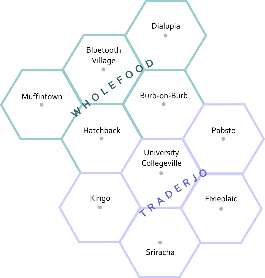
This is a map of the fake states and counties from Table 2.1. The top row of counties is Muffintown, Bluetooth Village, and Dialupia. Below that is Hatchback and Burb-on-Burb. These 5 counties make up the state of Wholefood. Below Wholefood is the 5 counties of Traderjo. The first row of Traderjo is Kingo, University Collegeville, and Pabsto. Below that is Sriracha and Fixieplaid.
Here’s the basic Geography of my fake states and counties.* Now you are able to compare the relative distances between places, right? Let’s overlay some additional information here to give you more context. I’ve made a little population map using graduated circles (each circle size represents a given range, so the smallest circle size here would include everything from 0-1000). Next to it I’ve made a choropleth map (not chloropleth – there’s no chlorine in this map). Choropleth is a fancy way of saying “colored areas.”
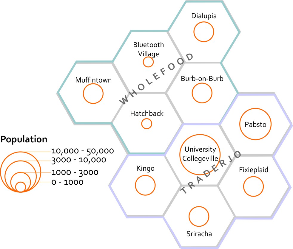
This map estimates the populations of each county. It shows that Bluetooth Village and Hatchback have the 2 smallest populations, at between 0 to 1000 people. Muffintown, Dialupia, Burb-on-Burb, Kingo, Fixieplaid, and Sriracha all have populations between 1000 to 3000. Pabsto has a population between 3000 and 10000. University Collegeville has a population between 10000 and 50000.
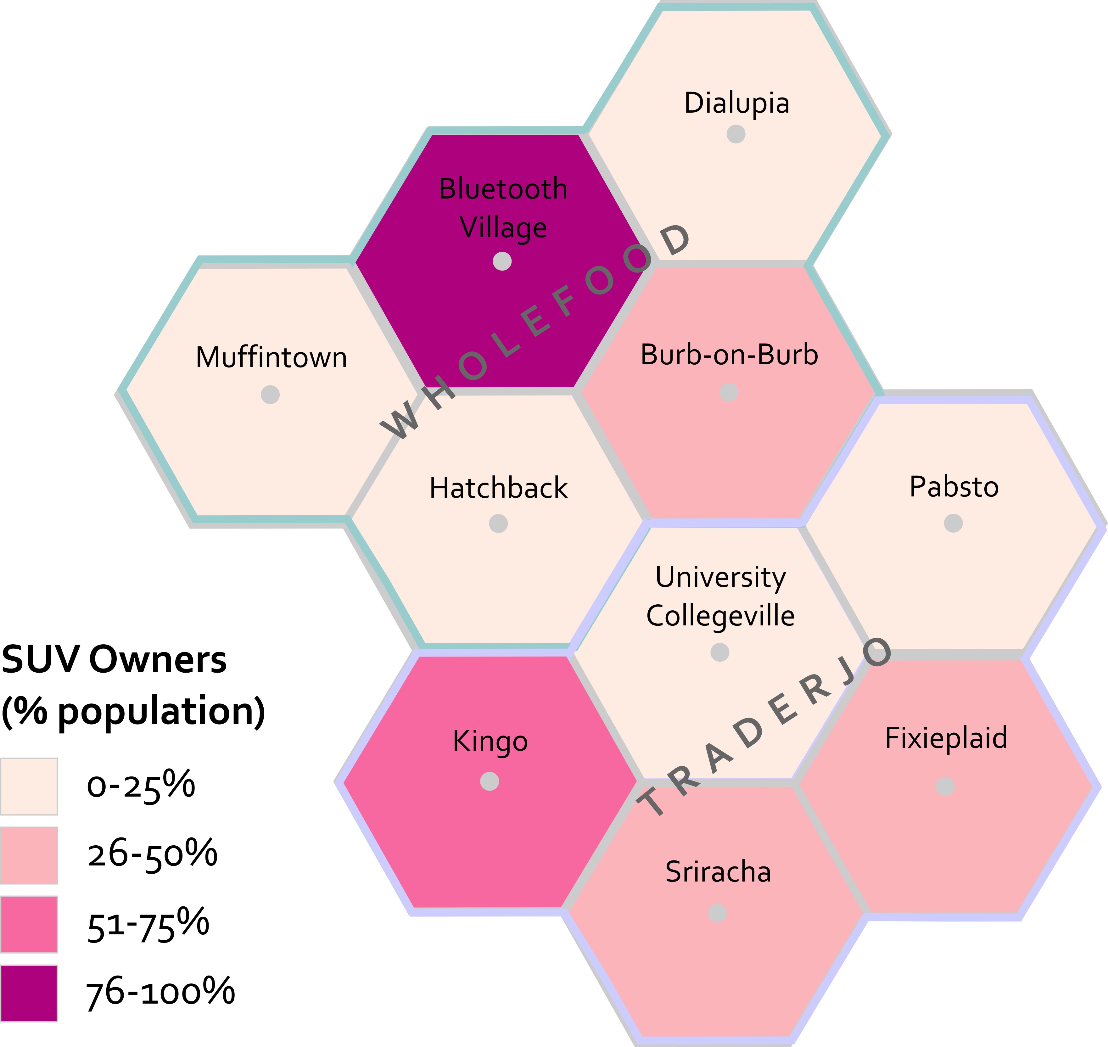
This map estimates the percentage of each county's population that owns SUVs. In Muffintown, Dialupia, Hatchback, University Collegeville, and Pabsto 0 to 25% own SUVs. In Burb-on-Burb, Fixieplaid, and Sriracha 26 to 50% of people own SUVs. In Kingo 51 to 75% of people own SUVs. In Bluetooth Village, 76 to 100% of people own SUVs.
Now that you’ve seen both of these maps, what can you start to say about possible spatial patterns? What other maps would you want to see in order to answer questions about this data? For instance – I’d want to know the location of major roads and businesses. I’d want to see how the population relates to those features. I’d want additional data showing the # of fancy coffee places in each county so I could compare SUVs to Coffee and see if I could develop a community profile much like the ones you explored in Lab 1.
I’m sure you’re thinking spatially now. If you still think this is crazy talk then maybe we’re just not meant for each other after all. :(
*Want to know why I’m using hexagons? Check out Central Place Theory.