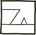
To underscore the importance of good figure design and captioning, I like to use the following example. Consider this dubiously famous roughhewn figure, which includes no caption:

I wager that few viewers of this figure would be able to fathom what it is meant to represent, and those who guess correctly would probably do so only because they had seen the figure before, properly captioned.
Now consider the figure with the caption added:

to Save a Drowning Witch (Zappa, 1982).
Without the caption—even though we have all seen simple line drawings, ships, and witch hats—we’re unlikely to grasp the figure’s meaning. With the aid of the helpful, thoroughly worded caption, however, we can easily understand (and be delighted by) the figure’s intended purpose. And with the citation at the end of the caption, we can turn to a References page to discover that this figure is cover art from a 1982 Frank Zappa album cover. This example provides a simple demonstration of how critical it is to write helpful figure captions, and shows how even the simplest graphic can be enigmatic to the reader (especially when not drawn to scale, as in the Zappa figure) when effective clues about its meaning are absent.
Figures, equations, and tables must be presented so that readers can rapidly understand their purpose in your work. They represent opportunities to present your ideas, explanations, and experimental results in a form that is professional, aesthetic, and—tell the truth—even fun. The computer has truly revolutionized the typing of equations and the presentation of graphics for us. However, some professors long for the days when figures had to be drawn laboriously by hand, because the cost and the labor made it inviting to keep figures and tables to a minimum. Now, graphic overkill is common, especially by advanced students; some professors call it the USA Today mentality. We must keep in mind that graphics are a means to an end, not an end in themselves.
Also, since readers might leap right to a table or figure while reading an article, it is vital that each table or figure is meaningfully presented and works both independently and as part of the text. Carefully study the tables and figures published in the best journals in your field, and apply the same conventions of presentation to your own work.
This chapter’s aim is not to make it easier for you to create equations, figures, or tables—computer software has made their creation easy enough—but to teach you how to make your presentation of them professional. For much more on how to present tables and figures, and for a nifty review of the different types, I highly recommend Paul V. Anderson’s Technical Writing: A Reader-Centered Approach. I have looked at over 40 textbooks that give space to the subject, and Anderson’s chapters are the best I have seen.
Self-Study
Browse these two websites for advice on presenting data in research papers:
The aptly named "resources for the ambitious undergraduate or beginning graduate researcher in astronomy and astrophysics"
"The Data Analysis BriefBook" on statistics, computing, analysis, and related fields