Additional reading from www.astronomynotes.com
Like we did when we looked first at planetary orbits and gravity, and then later at the spectra of objects and atomic physics, we will need to consider some historical context as we move from the study of the properties of stars into an understanding of the true physical nature of stars. So, given what we've covered on the past few pages, you should understand that astronomers have long been able to obtain the following empirical data for stars:
- Apparent brightness
- Color
- Spectrum
- Trigonometric parallax
Using the mathematical relationships we have since presented (and they were uncovering) for parallax, the inverse-square law of light, Wien's Law, the Stefan-Boltzmann Law, and the classification scheme for stellar spectral types, the observables listed above could be used to deduce the following:
- Distance
- Luminosity
- Temperature
- Spectral type
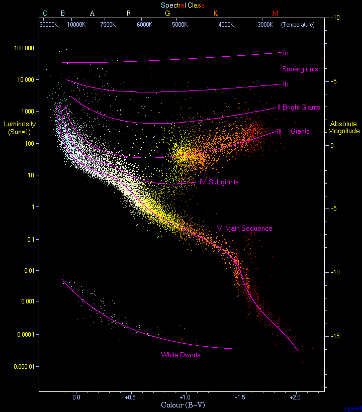
During roughly the same time period, two astronomers created similar plots while investigating the relationships among the properties of stars, and today we refer to these plots as "Hertzsprung-Russell Diagrams," or simply HR diagrams. Even though this is quite a simple two dimensional plot, over the course of the next few lessons, you will see exactly how powerful they are for uncovering a host of information on the nature of stars.
In a true HR diagram, you would plot the effective temperature of a star on the X-axis and the luminosity of a star on the Y-axis. The quantities that are easiest to measure, though, are color and magnitude, so most observers plot color on the X-axis and magnitude on the Y-axis and refer to the diagram as a "Color-Magnitude diagram" or "CMD" rather than an HR diagram.
In practical terms, the range of values for stars is smaller in temperature than it is in luminosity. Most stars have temperatures between about 3000 K (M class stars) and 50,000 K (O stars). The range in luminosities is much larger—the faintest stars may be 10,000 times fainter than the Sun, while the brightest stars may be 10,000 times brighter than the Sun. In order to represent this wide range of values in one diagram, the Y-axis of a CMD or HR diagram is usually plotted on a logarithmic scale. What this means is that instead of each tick mark on the y-axis increasing by 1 unit (1,2,3,4,5…), the y-axis tick marks increase by a factor of 10 (0.001, 0.01, 0.1, 1, 10, 100, 1000…). The X-axis is also logarithmic, although if it is labeled with color or spectral type, this may not be obvious. Another peculiarity of the HR diagram is that the X-axis is backwards from normal conventions–that is, the left hand side of the diagram has the hottest stars and the right hand side has the coolest stars, so the X-axis values decrease from left to right. Here are a few examples:

- From Astronomy Picture of the Day—the CMD for a star cluster called M55
- From the European Space Agency and Hipparcos Mission—a schematic HR diagram and a real one using Hipparcos data
- From Jim Kaler's excellent website on stars—an HR diagram for many familiar stars
If you look at these diagrams closely, you will see that a lot of the plot region is empty space. That is to say, most of the stars are concentrated in a narrow band that snakes from the upper left to the lower right of the diagram. This band can be explained very simply if you remember the luminosity / temperature relationship for blackbodies (and if you realize that stars behave almost like blackbodies):
If we assume that all stars are roughly the same size—that is, assume that R is approximately a constant, then the equation above tells us that the hotter a star is—the brighter it will be, and since L (luminosity) depends on T4 (temperature), small differences in T will cause large differences in L. We should, therefore, expect that hot, blue stars will be much brighter than cool, red stars. The upper left corner of an HR diagram includes the hot, bright, blue stars. The coolest stars are much fainter than the hot stars, and they lie at the lower right. The band connecting the hot, bright stars at the upper left to the cool, faint stars at the lower right is called the Main Sequence. Most stars on the Main Sequence (like the Sun, which is a G star), are referred to as dwarfs, but the hottest Main Sequence stars (O stars) are sometimes referred to as giants or supergiants.
You should also notice that there are stars found off the Main Sequence in the upper right and the lower left of most of these diagrams. The objects in the upper right have the same temperature as M dwarf stars, but they are much brighter. Again, consider the equation above. If two stars have the same T, the only way that one can be brighter than the other is if one has a larger R. Thus, the stars in the upper right are much larger than those directly below them on the Main Sequence. Since these are red stars, we refer to them as Red Giants. Using this same logic, we can estimate the size of the stars in the lower left of the HR diagram. They have the same temperature as O, B, or A stars, but are much less luminous. Thus, these stars must be much smaller than the stars directly above them on the Main Sequence. The stars in this category are called White Dwarfs.
We will spend much more time investigating the different types of stars and their location in the HR diagram in the next lesson.