Lesson 4: Is the New Madrid Seismic Zone at Risk for a Large Earthquake?
Overview
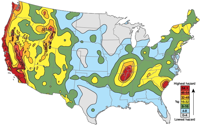
The map below is a seismic hazard map of the continental United States produced by the USGS. The red bull's eye covering the bootheel of Missouri is the New Madrid Seismic Zone. In this lesson, we will learn about the 1811-12 earthquake sequence in the New Madrid Seismic Zone and discuss the controversy regarding the extent of seismic risk in the central United States today. We will learn how to estimate earthquake recurrence interval using a variety of methods.
Video: USGS Seismic Hazard Maps Explained (1:05)
PRESENTER: This is a seismic hazard map of the continental US produced by the US Geological Survey. There's two types of data that go into making a map like this. And one is knowledge of where earthquakes happen. The second is knowledge of how far away you can feel shaking from any given earthquake. How far away you can feel shaking is a function of both the size of the earthquake and also some characteristics of the rocks in that area of the country.
Now, the colors denote the level of horizontal shaking that is calculated to have a 1 in 50 chance of being exceeded in a 50-year period. And the colors are all percentages of little g, where little g is 9.8 meters per second squared.
So for the next three weeks, we will explore why the [INAUDIBLE] seismic zone, which is right here, has a color that is just as high as the West Coast of the United States over here. So this is far away from a plate boundary. Why is the seismic hazard so high there?
About Lesson 4
Most people on the West Coast of the United States who live near faults or volcanoes (or both) are somewhat familiar with the risks involved with these phenomena. Far fewer East Coast dwellers have felt an earthquake. However, the central U.S. is actually fairly seismically active for a continental interior. This region has experienced large earthquakes in the past and these may happen again. How should residents of this area plan for a potential earthquake hazard? In this lesson, we will explore intraplate seismicity and the New Madrid region in particular. We'll use seismic catalogs to estimate earthquake recurrence interval and we'll discuss the scientific controversy surrounding the potential for large earthquakes in this region.
What will we learn in Lesson 4?
By the end of Lesson 4 you should be able to:
- Describe the cyclical process of strain accumulation, earthquake generation, and post-seismic relaxation along plate boundaries.
- Define "recurrence interval."
- Explain ways in which recurrence interval is estimated for a given fault, and compare the inherent uncertainties with each method.
- Explain the basic mathematical and physical tenets of plate tectonics.
- Summarize various hypotheses for the existence of seismicity away from plate boundaries.
- Describe the 1811–1812 sequence of large events on the New Madrid Seismic Zone and explain how scientists have determined the properties of these events.
- Describe potential hazards/consequences of a sequence similar to the 1811–1812 sequence occurring today.
- Construct a frequency-magnitude plot using earthquake catalog data
- Compare frequency-magnitude diagrams for intraplate regions, plate boundary regions, and global datasets
- Extrapolate from a frequency-magnitude diagram to estimate an earthquake recurrence interval
- Analyze a collection of various datasets to compare their predictions of seismic hazard at New Madrid.
What is due for Lesson 4?
Lesson 4 will take three weeks to complete. 9 -29 Oct 2019. You will complete reading assignments by the end of the first week. You'll submit the data analyses at the end of the second week. The team reading and discussion assignments will take place over the second week. The whole class paper discussion and the teaching and learning discussion will take place during the third week. The fact sheet paper is due at the end of the third week. See the table below for complete details.
| Requirement | Submitted for Grading? | Due Date |
|---|---|---|
| Reading: "The Mississippi Valley Earthquakes of 1811 and 1812: Intensities, Ground Motion, and Magnitudes" | No | 15 Oct (end of 1st week) |
| Reading: "Earthquake hazard in the heart of the homeland" | No | 15 Oct (end of 1st week) |
| Reading: series of papers about glacial rebound, failed rift, and the Farallon slab. | No | 15 Oct (end of 1st week) |
| Problem set: Earthquake catalog data analyses | Yes - Submitted to "Earthquake catalog problem set" assignment in Canvas | 22 Oct (end of 2nd week) |
| Reading/Discussion: "Debating hazard at New Madrid" | Yes - Graded group discussion in Canvas | participation spanning 16 - 22 Oct (2nd week) |
| Reading/Discussion: "Debating hazard at New Madrid" | Yes - Graded whole-class discussion in Canvas | participation spanning 23 - 29 Oct (3rd week) |
| Paper: NMSZ Fact Sheet paper | Yes - Submitted to the "Fact Sheet Paper" assignment in Canvas | 29 Oct (end of 3rd week) |
| Discussion: "Teaching and Learning About Earthquakes" | Yes - graded whole class to the "Teaching and Learning About Earthquakes" discussion forum in Canvas | participation spanning 23 - 29 Oct (3rd week) |
Questions?
If you have any questions, please post them to our Questions? discussion forum (not e-mail). I will check that discussion forum daily to respond. While you are there, feel free to post your own responses if you, too, are able to help out a classmate.
The 1811-1812 New Madrid Earthquakes
Rumbling on the Reelfoot Fault
Video: Isoseismal Maps Explained (3:03)
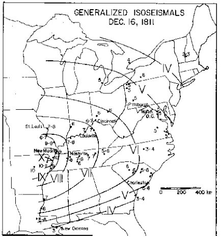
PRESENTER: This is an isoseismal map from Otto Nuttli's paper about the 1811-1812 sequence of three earthquakes that happened in New Madrid. An isoseismal map is one in which similarly felt seismic intensities are contoured so that you can see how far away different intensities of shaking were felt from the epicenter of the earthquake. It helps you figure out where the epicenter probably was, and it helps you figure out what the magnitude probably was. So these kinds of maps are normally used when we don't have the instrumentation to actually have determined where the epicenter was or the magnitude with a seismometer.
In this case, the way Nuttli made this map is that he combed through old newspaper accounts of eyewitness reports of felt shaking from this earthquake, and then he put those on a scale of one to 12, one being hardly felt it at all or not at all, and 12 being absolute destruction, hell on Earth. So for example, near New Madrid, where the epicenter was, there are some reports of 10 to 11. Far away in New England, this earthquake was felt but at a much smaller intensity, so there's an intensity of two or three. Then after you collect a lot of this data and put it on a map, you can try to connect up similar intensities and, basically, you end up drawing rings of intensity around your epicenter.
So here is the contour for intensity 10, say. Out here is the contour that separates the fours from threes, and so on. One thing to notice from this map is that there weren't a lot of people west of the Mississippi, so all the rings kind of die out here at the Mississippi. That's the best we can do. These maps are actually still used today, but they're usually used for ground truthing, as best we can, historic earthquakes. For example, when the magnitude 5.8 earthquake happened in August of 2011, you could have logged into the USGS site, told them your zip code, told them how much shaking you thought you felt, and then they compiled the map. And this is the map they compiled that shows how much shaking there were in different places around the country.
So the folks in Richmond felt very strong shaking between intensity six and seven, estimated. And up into Canada, people felt this earthquake too. So of course, we know the actual magnitude in this earthquake because we have instrumentation now. We can calculate it. So what this is useful for is to take a map like this and, if you know you have historic earthquakes in this area, you can try to figure out how far away people felt that and then guess about what magnitude it probably was compared to where people felt it today where we do know what the magnitude was. So when you read Nuttli's paper, keep in mind how these isoseismal maps are made and how much detective work it takes to actually do this.
Please read this article describing the 1811–1812 New Madrid earthquake sequence, then proceed with the rest of the lesson.
Reading assignment
Nuttli, O. W. (1973). The Mississippi Valley Earthquakes of 1811 and 1812: Intensities, Ground Motion, and Magnitudes. Bulletin of the Seismological Society of America, 63(1), 227–248.
This paper was written by Otto Nuttli, a seismologist at Saint Louis University. He looked at many historical accounts of the 1811–1812 New Madrid earthquake sequence in order to describe the physics of these events with as much accuracy as possible. This is a technical paper, intended for an audience of other seismologists. I don't expect you to digest every detail of Nuttli's analysis.
Read these sections and their included figures: Abstract, Introduction, Intensity data, Discussion, Reflections.
Skim the following sections: Relations between intensity and ground motion, Magnitudes and ground motion of the 1811–1812 earthquakes, Appendix.
When you read this article try to answer or at least think about the following:- Why don't we know the exact magnitudes of these earthquakes?
- How many earthquakes were there?
- Where is the New Madrid Seismic Zone?
- Different magnitude scales are mentioned, such as MM, Ms, and Mb. What are these? Do you know how each one is measured?
- What's an isoseismal map?
- What is attenuation? What is important about attenuation with regard to these earthquakes?
Tell us about it!
What other questions do you have after reading this article? Post to the Questions discussion.
Today's Risk at New Madrid
What if the 1811–1812 sequence happened today?
Check this out!
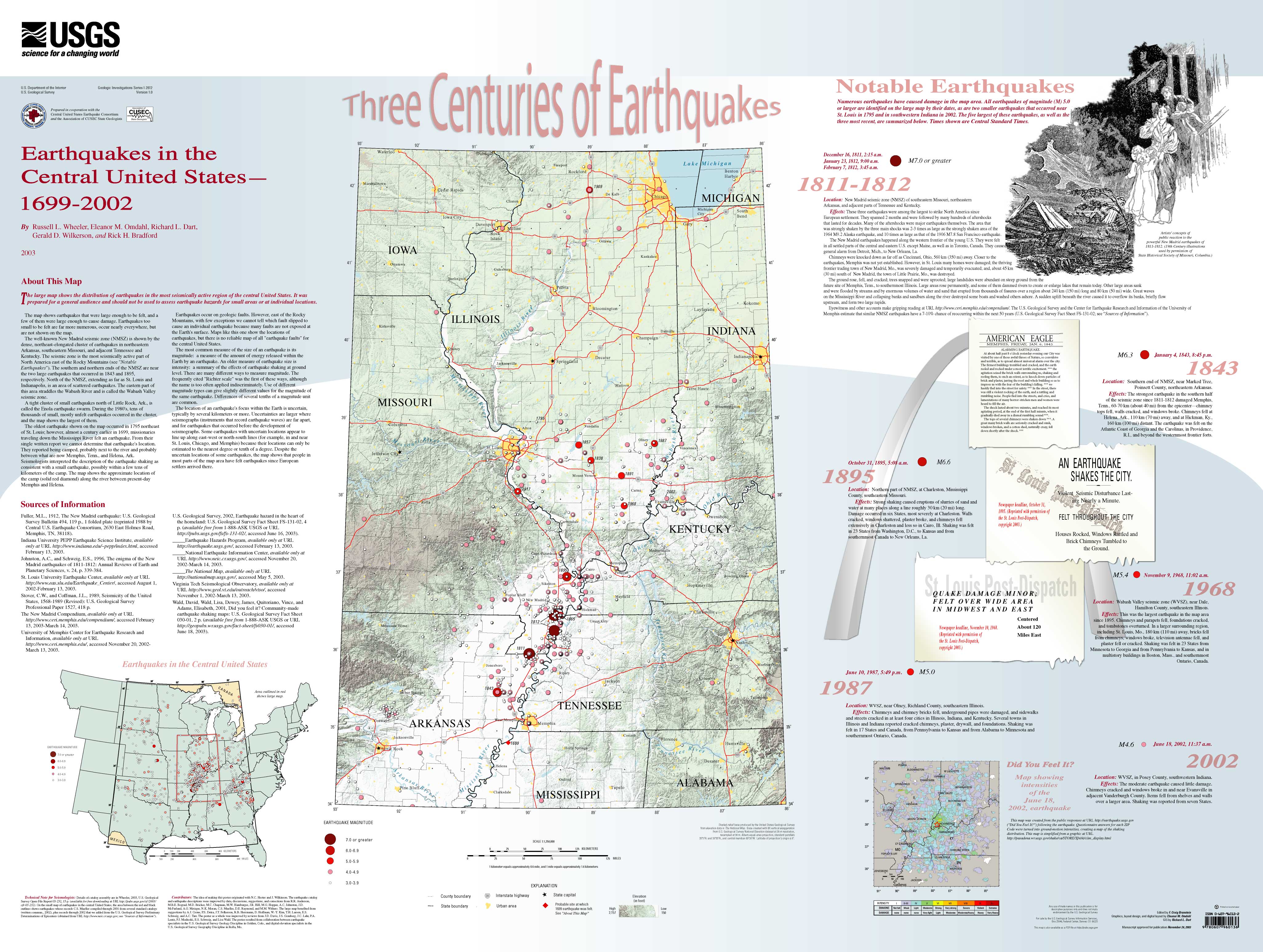
This is a slick USGS-produced poster with an overview of historical earthquakes in the New Madrid Seismic Zone. For best viewing, you will want to download the file from the USGS so you can zoom in and read the text.
Before you proceed, please complete the following reading assignment. Then, in the next part of the lesson, we will discuss the scientific background necessary to appreciate why there is a scientific controversy over the level of seismic hazard in the central USA.
Reading assignment
Gomberg, J., & Schweig, E. (2002). Earthquake hazard in the heart of the homeland [4]. Fact Sheet - U. S. Geological Survey, 4.
This reading is a fact sheet published by the USGS [5]in 2002 that addresses the level of present-day earthquake hazard in the central USA. As you read, think about the following:
- Why does the USGS produce different seismic hazard maps for different probabilities and time periods? In practice, what does this mean to you when you look at a hazard map?
- On the hazard map shown on page 2 of the fact sheet, why is the central USA given a hazard rating as high as that for the San Andreas fault area in California?
- Why is paleoseismology important in determining the seismic hazard of a region?
- What are the probabilities of various sizes of earthquakes happening in given time periods? How were these numbers determined? (Can you tell from this fact sheet? Can you list everything you'd need to estimate or assume in order to make a probability prediction?)
Tell me about it!
If you have questions or comments, especially pertaining to the questions I have posed above, please post to the Questions discussion. There is nothing to submit for this assignment, but you will want to read this fact sheet thoughtfully because your final assignment for this lesson will be to rewrite and update it with new data.
Plate Tectonics and Intraplate Earthquakes
The theory of plate tectonics makes two mathematical assumptions:
- The Earth is a sphere.
- Plates are rigid, except at their boundaries.
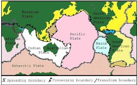
In fact, the Earth is not a perfect sphere; it bulges at the equator a bit. The second assumption is also not quite true. If plates were perfectly rigid in their interiors, then earthquakes could only happen at plate boundaries. Nearly all earthquakes (98%+) do happen at the plate boundaries, but there are some anomalous events, called intraplate earthquakes, that happen far from the boundaries.
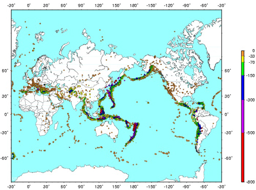
The map below shows earthquake locations around the world for a six-month period. Compare it to the plate boundary map below it and you will see that earthquakes roughly define the plate boundaries. Focus on the North American plate. It is bounded on the west at the edge of the continent and on the east by the Mid-Atlantic Ridge. The East Coast and the central United States are quite far away from any plate boundaries, yet you may notice a fair amount of seismicity locating there. Seismologists are interested in these earthquakes because plate tectonics doesn't explain their existence very well.

Video: Why Intraplate Seismicity (1:04)
PRESENTER: Appear on top is a map that I made with data from the National Earthquake Information Center. It's six months of global seismicity. And down here is a map of plate boundaries in the world.
I hope you'll agree with me that earthquake locations are pretty good at telling you where the plate boundaries are. But let's look at North America for a second. Down here on this map on the bottom, you'll see that there's a plate boundary on the western edge of North America. And then here is a plate boundary. This is the mid-Atlantic ridge. There's a little plate boundary down here.
But if you look up at the top, you'll see a lot of shallow seismicity that locates far away from any of those plate boundaries. Specifically, here's the new [INAUDIBLE] seismic zone right there.
Now, scientists are interested in intraplate earthquakes because the theory of plate tectonics doesn't really explain them very well. And the reading assignment further down this page will allow you to check out three different hypotheses for why these earthquakes happened.
Reading Assignment
Why do earthquakes happen in the center of the continent? Different scientists have different favorite explanations. Below are three scientific papers that each present a different hypothesis to explain why the New Madrid Seismic Zone is seismically active. I have also included three companion articles written for the popular press. For this activity, you will read the articles. You don't need to turn anything in, but you will want to internalize the main arguments of each hypothesis in order to include this information in your fact sheet paper (the culminating assignment for this lesson).
Directions
Read each of the following popular press articles and scientific papers. Keep track of any points made in the scientific papers that you don't understand so you can ask about them. There's no formal graded discussion of these papers, but feel free to post comments/questions in the Questions discussion forum. My suggestion is to read the companion popular press article in each set first so that you are already familiar with the main points of the hypothesis before tackling the scientific paper.
- Hypothesis I: Glacial rebound
- Do Old Glaciers Cause New Earthquakes In New Madrid, Missouri? [7] (26 March 2001).ScienceDaily. Retrieved April 22, 2008, from http://www.sciencedaily.com/releases/2001/03/010309080443.htm.
- Grollimund, B., & Zoback, M. D. (2001). Did deglaciation trigger intraplate seismicity in the New Madrid seismic zone? Geology, 29(2), 175–178.
- Hypothesis II: Mantle Convection
- Lloyd, Robin. Source of Major Quakes Discovered Beneath U.S. Heartland [8] (02 May 2007). LiveScience. Retrieved 09 September 2008 from http://www.livescience.com/environment/070502_newmadrid_quake.html
- Forte, A. M., Mitrovica, J. X., Moucha, R., Simmons, N. A., & Grand, S. P. (2007). Descent of the ancient Farallon slab drives localized mantle flow below the New Madrid seismic zone. Geophysical Research Letters, 34(4).
- Hypothesis III: Ancient Failed Rift (this one is probably the most popular)
- Johnston, A. C., & Kanter, L. R. (1990). Earthquakes in stable continental crust. Scientific American, 262(3), 42–49.
- Braile, L. W., Keller, G. R., Hinze, W. J., & Lidiak, E. G. (1982). An ancient rift complex and its relation to contemporary seismicity in the New Madrid seismic zone. Tectonics, 1(2), 225–237.
- What does the glacial rebound hypothesis predict regarding future seismicity at New Madrid? What about the other two hypotheses?
- What is the Farallon slab? Where did it come from? How do we know where it is? Why does it have an effect on the crust above it?
- What is a failed rift? Are there any places on the globe today where a rift might be failing?
- What is the evidence for and against each hypothesis? Could they all be true or do any of them exclude the possibilities of the others being correct? Which hypothesis seems most plausible to you and why?
- Can you suggest some studies that would help refine any of these three hypotheses or rule any of them out?
In the next part of this lesson, you will analyze seismic data and learn how to estimate earthquake recurrence times with seismicity catalogs. Then you'll read some scientific articles that detail the other ways recurrence intervals can be estimated. You will have to synthesize the uncertainties and limitations inherent with each method in order to get the complete picture of how earthquake risk is determined.
Earthquake Population Statistics and Recurrence Intervals
How many earthquakes?
Here is an important observation about earthquake populations worldwide: earthquakes of a given magnitude happen about 10 times as frequently as those one magnitude unit larger.
| Magnitude | Average Annually | How we know |
|---|---|---|
| 8 and higher | 1 | observations since 1900 |
| 7.0-7.9 | 15 | observations since 1900 |
| 6.0-6.9 | 134 | observations since 1990 |
| 5.0-5.9 | 1319 | observations since 1990 |
| 4.0-4.9 | 13,000 | estimated |
| 3.0-3.9 | 130,000 | estimated |
| 2.0-2.9 | 1,300,000 | estimated |
Annual earthquake population statistics compiled by the USGS [9].

Video: Earthquake Frequency-Magnitude Relationships Introduced (3:41)
PRESENTER: This data table comes from the USGS and it tells you how many earthquakes of a given magnitude happen on average every year all over the world. So you can see that there are way fewer really big earthquakes than small earthquakes, and that's a good thing.
I like to make a plot out of this data because I think it's more instructive to make a plot. So over here, I've already drawn my axes. This is magnitude on the x-axis, and this is number of earthquakes on the y-axis. And you can see that I've made a log scale plot here. So this is 10, this is 100 million up here.
Why don't we just plot this data from this table onto this and we'll see what it looks like? So how many earthquakes of eight and higher are there? Well, there's about one, and that is right about here on my plot. For magnitude seven, it's about 15. That's about here. For magnitude sixes, 134, that's about here. And fives, a little bit over 1,000. Magnitude fours, a little bit over 10,000. Magnitude threes, estimated to be a little over 130,000. Magnitude twos, estimated to be a little over a million.
Magnitude ones and anything smaller aren't in this table. But I bet we can just extrapolate it, can't we? Because if we connect up all these points, we have drawn a line. So I can extrapolate that magnitude ones are probably a little over 10 million, and magnitude zeros, anything smaller, is a little over a hundred million. Magnitude is a log scale, so it actually is meaningful to have a magnitude zero.
All right, so we've drawn this line. And when I was a kid in school, I learned that the formula for a line is y equals mx plus b. So why don't we write this formula in terms of what we know about this plot, all right? What's y? Well, y is the number of earthquakes as a log scale, right? So it's actually log of the number.
Slope. Slope is rise over run, right? So the rise is actually negative minus one unit on our plot, and the run is plus one unit on our plot. So that's a slope of negative 1. And x is magnitude. And the y-intercept is a little over 100 million. It's probably 130 million, right? That's how the numbers are going up. So we could just guess 130 million.
So the log-- log of the number of earthquakes equals negative 1 times the magnitude plus 130 million for the whole world for a year. Now who cares, right? Why why are we bothering to write this down? Well, the reason is that, in fact, you will verify in your problem set that this slope is always negative one. No matter what part of the world it is and no matter what the timescale is. The only thing that changes when you don't look at the whole world annually is that this y-intercept will change, right? Because if you look at, say, California, there's fewer earthquakes in California than the whole world, right?
But this line is basically always true. So if you want to predict how often a really big earthquake is going to happen, then it's important to keep track of how many small ones happen because then you can draw this line and guess how often the big ones happen. That's what you're going to do in your problems set.
Earthquake populations approximately follow this relationship:
log N = a - bM.
This is a power-law equation in which N is the number of earthquakes whose magnitude exceeds M and a and b are constants. For the majority of earthquake catalogs, the constant b is approximately equal to 1. When b≈ 1, this equation describes a line whose slope is about -1.
Seismologists can test the validity of the equation above using catalogs of earthquakes to make "frequency-magnitude diagrams." These diagrams show how many earthquakes of a given magnitude there are in a population of earthquakes.
A frequency-magnitude plot with real data! [10]You can also read a transcript of my discussion of a frequency-magnitude diagram [11] of a year's worth of earthquakes from around the world.
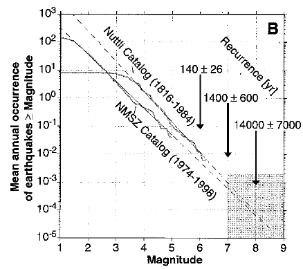
Now observe the plot below. For two separate catalogs of earthquakes that occurred in the New Madrid region, magnitude is plotted vs. the mean annual occurrence of earthquakes greater than or equal to a given magnitude. This plot is only different from the example plot above in that the N values on the y-axis have been normalized to one year. This is so two catalogs that span different lengths of time can be compared directly.
Video: Earthquake frequency-magnitude data for the NMSZ Explained (3:32)
PRESENTER: What do I see when I look at this plot? I see that we have magnitude on the x-axis and we have mean annual occurrence of earthquakes greater than or equal to some magnitude on the y-axis. So this means this plot is the same as the plot that we sketched earlier, showing how often earthquakes of different magnitudes happen.
But this data is not for the whole world. It's just for the New Madrid seismic zone. And there's two different data sets being plotted on top of each other here. So let's just look at those.
One is Otto Nuttli's catalog. And it spans 1816 through 1984. It might be a little hard to see, so I'll just draw over it. But it looks like this. It goes down here and there's some kind of jaggedy curves like that.
OK. The other catalog is the New Madrid Seismic Zone catalog. This is the digital catalog. And it's shorter. It only spans 24 years. It looks sort of like this.
Great. So the difference between these two catalogs is that one spans a lot longer in time. But since it isn't a digital catalog, it doesn't have as many small earthquakes in it. The other one has more small earthquakes, but isn't as long in time, so it doesn't have as many big earthquakes.
And neither of these looks exactly like the plot we sketched. Remember the plot we sketched looks sort of like this. We had magnitude here and log of the number here. And there was this perfect straight line.
And these don't have that perfect straight line. They tip over and kind of go flat at some point. But you can extrapolate if they did have a perfect straight line it would look like this.
So what this is saying is that earthquakes smaller than about magnitude 3 in the Nuttli catalog, or about magnitude 1 and 1/2 or so in the digital catalog, those earthquakes are there, but they're just not getting recorded. So when a plot like this flatlines, that's what it means.
At this end, it's not a pretty straight line. It's kind of jaggedy. That's just because the catalog is limited in time, so there's just not enough big earthquakes to really do useful statistics.
In order to get a recurrence interval, these researchers extrapolate from the part where they have data to the part where they don't. And they calculate these time intervals.
This is how often you can expect a magnitude 6 to happen in this region based on this earthquake data. Here's how often you can expect a magnitude 7. And here's how often you can expect a magnitude 8.
Now is a good time to point out that uncertainty in the magnitude of those historic earthquakes in 1811 and 1812 becomes uncertainty in calculating the recurrence interval, because it makes a big difference if you know you're trying to calculate how often a magnitude 7 is going to happen as opposed to how often a magnitude 8's going to happen, right? See how different these numbers are.
So there's kind of two big ways that you can have uncertainty in one of these calculations. One is just the limit of your catalog. The shorter your catalog is in time, the more you have to extrapolate from what you know to what you don't know. And the more uncertainty you have in the magnitude of the earthquake that you're looking for, like whether it's a 8 or an 8, the more uncertain you're going to be in calculating a recurrence time also.
Both of the curves in the plot above deviate from a straight line relationship log N = a - bM at small magnitudes. For the Nuttli Catalog, the line has a slope of about -1 at magnitudes greater than 3.5 and for the NMSZ catalog, the line has a slope of about -1 for approximately magnitude 1.5 and greater. Doesn't it look like in the Nuttli Catalog, there is the same number of magnitude 2 earthquakes every year as there are magnitude 3 earthquakes? But didn't we say that there should be ten times more magnitude 2's? What's going on?
Furthermore, how come there aren't any big earthquakes in this plot? The New Madrid Seismic Zone (NMSZ) catalog peters out at about magnitude 5 and the Nuttli Catalog doesn't have anything much over magnitude 6. But we know there have been big earthquakes in this region in the past, (or else why argue about seismic risk here), so where are they?
Limits of our observations
The answer to both of these problems is simply that any catalog of earthquakes is limited in two ways (pencast graphical explanation of observation limits [12]). The first way is that not every piece of the Earth has a seismometer sitting on it, therefore there will be some small earthquakes that don't get recorded, even though they happened. For most catalogs, some standard is applied with regard to how many seismometers have to record an earthquake in order to include it in the catalog. This is for quality control reasons. It is hard to locate an earthquake and calculate its origin time within acceptable error limits if not enough stations recorded it. Therefore, the farther apart the seismometers are, the fewer small earthquakes will end up being included in the catalog. For the Nuttli Catalog, we can say that the catalog is incomplete below the threshold of M ≈ 3.5 because that is where the slope of the line (or the "b-value") begins to deviate from -1. The threshold for the NMSZ catalog is lower. Why do you think this is?
The second way a catalog is limited is that it is finite in time. Let's say for a given region, magnitude 8 earthquakes happen once every 1,000 years or so. If your catalog only spans 10 years, how likely are you to have a magnitude 8 in your catalog? For that matter, how likely are you to have a magnitude 7 in your catalog? How many magnitude 6's can you expect in 10 years? In the plot above, the time ranges for both catalogs are listed on the plot. Why does the NMSZ catalog have a lower maximum magnitude than the Nuttli Catalog?
Calculating a recurrence interval from a seismic catalog
In order to assess seismic risk, we want to know how often a large earthquake happens in this region. How do we do that if our seismometers haven't ever recorded a big earthquake? We have to extrapolate using the data that we do have. Extrapolation is a tricky business because small uncertainties turn into huge uncertainties the farther away you get from what you've actually measured. For a catalog of seismicity, we rely on the assumption that the relationship log N = a - bM holds true overall magnitudes and times. We then extend our catalog data into the realm of the unknown and predict how often large magnitude earthquakes are expected. In the plot above from Newman et al., 1999, they use dashed lines to show their extrapolations. How often do they predict a magnitude 7 will happen in the NMSZ? What about a magnitude 8? What uncertainties do they associate with these predictions?
How to extrapolate seismic catalog data in order to calculate a recurrence interval! [13]You can also read a transcript of my explanation of extrapolating catalog data [14] to calculate a recurrence interval.
Earthquake Catalog Data Analysis Problem Set
For the following problem set, you will work with the seismicity catalog maintained by the University of Memphis for the New Madrid region in order to make your own frequency-magnitude diagrams and calculate a recurrence interval for a large earthquake at the NMSZ. You will also compare NMSZ data to seismicity catalogs for southern California and the world. The point of this comparison is that you will see that the overall shape of a frequency-magnitude diagram is scale-independent. It doesn't matter how big your regional area is, or how many years your catalog covers, the same basic -1 slope coupled to two sections on either end that deviate from -1 will always be there. What changes is the place on the diagram where the deviation occurs? Pay attention to this when you make your different plots.
Part 1: Get familiar with the NMSZ and its seismicity
 Go to the New Madrid Earthquake Catalog Search. [15]
Once you get there, follow my directions to make a 1-year catalog of NMSZ seismicity:
Video: How to Make a 1-year Catalog of NMSZ Seismicity (2:18)
PRESENTER: So you've landed on the New Madrid Earthquake Catalog search page. And here's how we're going to get our first catalog of earthquakes out of here. First, I'm going to change the year to 2011, and then in this box, I'm going to change it to 2012. And you'll notice that this gives me a full year of earthquakes. It's actually not crucial that you pick the exact same year I did, but in this example, I'm just going to pick 2011.
I do want you to get a full year. So now in the magnitude range, we'll just leave this alone. The lat long box search, we are going to change these numbers around slightly from the defaults. The minimum latitude we're going to use is 34 degrees, and the maximum latitude we're going to use is 39 degrees. The minimum longitude we are going to use is negative 92 degrees. That's 92 degrees west. And the maximum longitude is going to be negative 87 degrees. So that's 87 degrees west.
Now, leave the radial search numbers alone, and we are ready to just click Begin Search. So now we pop up the catalog search results page. You can click here, and you'll see your catalog. You can go to the File menu and save the page as some plain text suitable for importing into your favorite plotting program.
You go back to the catalog search results page by clicking the Back button on your browser, you can also read a description of the catalog information which tells you what's in every column of your text file. And I also want you to generate a map. You can play around with all of these options on your own, but clicking generate map will generate a map of the catalog you've just made. Looks like this. I want you to save this map somewhere to your computer and paste it into your problem set for turning in later on. That's all there is to it.
Here is video above as plain text [16]
Create a word processing document (Microsoft Word, Macintosh Pages, Google Docs, or PDF) to record your work for this problem set.
On the worksheet, paste in your map of the 1-year catalog you made. Then answer the following questions:
1.1 How many earthquakes are in your catalog?
1.2 What is the largest magnitude earthquake in your catalog? How many earthquakes are there of this magnitude in your catalog?
1.3 What's the smallest magnitude earthquake in your catalog? How many earthquakes are there of this magnitude in your catalog?
1.4 Describe your map in a few sentences. (What part of the country is it? Are the earthquakes sprinkled randomly about or do they cluster in patterns? If the latter, describe what the patterns look like.)
Double-Check! Your worksheet should now have a map and answers to the Part 1 questions. If it does, you are ready to take on Part 2.
Part 2: Making frequency-magnitude plots of NMSZ seismicity
Make three different frequency-magnitude plots using the New Madrid Earthquake Catalog data: The first plot will use the one-year catalog you made in Part 1 of the problem set. In the second plot, you will add curves that correspond to a 10-year, 20-year, and 30-year catalog. The third plot will depict the same data as in the second plot, except that you will normalize all the catalogs to one year. Specific directions follow:
Plot 1: Make a frequency-magnitude plot using the one-year-long catalog that you just made in Part 1 of this problem set.
For this plot, all you need are the magnitudes, which are in column 7 of your plain text catalog file. Post to Questions if you need help isolating that column. My recommendation is to create a new file in whatever plotting/spreadsheet program you like and then you will type your counting statistics into this new file. In your new file, you want to create the values that will be on the x-axis of your plot. They will be magnitudes from your catalog's lowest to your catalog's highest in 0.1-unit bins. To create the values that will be on the y-axis of your plot, count how many earthquakes in your catalog are equal to or greater than each value of magnitude. These are your y-values: cumulative frequency. It's easier to count if you sort your magnitudes first, which is fine to do because we do not care what order they are in for this plot.
Then plot cumulative frequency vs. magnitude.
Use a logarithmic (base 10) scale for the y-axis or take the log of your cumulative frequency data and plot that on a linear axis. You can use a linear x-axis because magnitude is already a power of 10. [Is this confusing? Post to the Questions forum if you need help.]
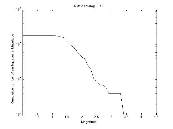
If you are having trouble, see my example plot [17] for a one-year catalog of earthquakes in the New Madrid Seismic Zone (NMSZ). I used the year 1975, so this plot will not be precisely the same as yours, but it should look pretty close.
Plot 2: Make a plot that has four different frequency-magnitude curves on it.
Start with the plot you just made.
Go back to the New Madrid Earthquake Catalog and make a catalog for a ten-year time period (you can choose any ten-year period). Overlay the frequency-magnitude curve for this ten-year catalog onto the curve you made in the first plot.
Repeat for a twenty-year period.
Repeat for a thirty-year period.
You should now have one plot with four curves on it.
Make sure each curve is distinguishable (by color or linestyle) and labeled.
Plot 3: Make a plot that has four different normalized frequency-magnitude curves on it.
Start with the original one-year catalog plot you made.
Overlay the curve for the ten-year catalog, but normalize the curve to one year. This is accomplished by dividing each of your y-values by 10.
Repeat for the twenty-year catalog (divide y-values by 20)
Repeat for the thirty-year catalog (divide y-values by 30)
You should now have one plot with four curves on it.
Use the same distinguishing color or linestyle for each curve as you did in your second plot.
Dust off your worksheet from Part 1. On the worksheet, first paste your three plots into the worksheet, then answer the following questions:
2.1 Look at the first frequency-magnitude plot you made of the one-year catalog. Approximately what is the lower magnitude threshold for this catalog? (Follow your data from right to left and tell me at about what magnitude the line flattens out to having zero slope?)
2.2 Now look at the other two plots you made. Do the other curves show a significantly different lower magnitude threshold? From this observation, what do you conclude about the relationship between catalog timespan and lower magnitude sensitivity?
2.3 Look at the second plot you made. Describe the differences and similarities among the four curves in a few sentences. For example, are the curves of the same shape? Where are the x- and y-intercepts relative to each other? What makes the y-intercepts different? What causes the x-intercepts to be different?
2.4 Look at the second plot you made. Imagine having a catalog that spans 100 years. Using the four curves you made as a guide, extrapolate where the x and y intercepts would each be for a 100-year catalog. What is the largest earthquake you would expect for a 100-year catalog?
2.5 Look at the third plot you made. Extrapolate your curves and predict how often a magnitude 7 earthquake will occur in this region and how often a magnitude 8 will occur in this region. I want you to make a reasonable eyeball-fit. I am not asking you to calculate a best fit line. **If the answer is a fraction less than one, then you can take the reciprocal and predict how many years go by in between magnitude 7's and in between magnitude 8's.
2.6 You have just used frequency-magnitude relationships to predict a recurrence interval for a large New Madrid earthquake. Cool! What are the sources of uncertainty in the prediction you made in problem 2.5? (One way to realize just how much uncertainty there is in an extrapolation like this one is to try making several slightly different fits to the data that all look "pretty good" to you and see how different your final answers end up being.)
Double-Check! Now your worksheet should have the map and answers from Part 1 as well as three plots and answers for Part 2. Hang on to the worksheet and use it for Part 3.
Part 3: Comparing the NMSZ to Southern Cal and to the world
Plot: Southern California
Use the Southern California Earthquake Center Web site to make a seismicity catalog, map, and frequency-magnitude plot.
Go to the Southern California Earthquake Data Center's Earthquake Catalog Search [18] page.
Video: How to Make a One-Year Catalog of Seismicity (2:10)
PRESENTER: Here we are at the Southern California Earthquake Data Center catalog search page. What we're about to do is create a catalog that is the same length in time as our one year New Madrid catalog, and also covers the same latitude and longitude box area. So that way, we can really compare how active this area is in terms of number of earthquakes produced compared to New Madrid, because we'll be looking at the same size and length of time.
All right, so the catalog to search is this one. The output format default is fine. Let's make a one year catalog for the same year as we did before. So let's make it 2011, day one, month one. Like that.
We'll leave the magnitude and depth defaults alone. For latitude, let's change it to 33 and 38. And for longitude, we're going to change it to West 124 and West 119. I'm going to Shift Click to select local, regional, and teleseisms.
And I want to send this output to a file. So you're going to save this as plain text somewhere on your computer so that you can manipulate it to make a frequency magnitude plot later on. Let's get rid of that right now.
Now, I also want you to make a map. So in that case, what you do is go back up here to the output format, leaving everything else the same. And change the output to a Google map. Now you're going to want to output this to a web page. Submit request. Stare off into space while this thing happens.
And you have a map. You might want to zoom out or center it differently. And then take a screenshot of this map and paste it into your problems set.
Or follow along as a plain text [19] to make a one-year catalog of seismicity.
Take a screenshot of the google map you made and paste it into your problem set.
Make a frequency-magnitude plot for the events in this catalog:
- Start with your frequency-magnitude plot for the one-year NMSZ catalog.
- Overlay the frequency-magnitude curve for your Southern California catalog on the same axes. The magnitudes are in column 5 of the SCEDC catalog file, and they are all you need.
- Make sure each of your curves are distinguishable and labeled.
- Save this plot because you are going to add another curve to it.
Add to your plot: The World
Use the United States Geologic Survey catalog to make a one-year global seismicity catalog, and add this data to your frequency-magnitude plot that has Southern Cal and the NMSZ on it.
Go to the USGS Earthquake Search [20] page.
Once you are there, follow my plain text directions for making a one-year global catalog [21].
Add to your plot!
- Start with the frequency-magnitude plot you made that has a curve for the one-year NMSZ catalog and a curve for the SCEDC catalog.
- Overlay the frequency-magnitude curve for the global catalog on the same axes.
- Make sure each of your curves are distinguishable and labeled.
- Paste this plot into your problem set.
A few more questions
3.1 How many earthquakes are in your one-year catalog for Southern California? What is the largest magnitude earthquake in the catalog? How many earthquakes are there of this magnitude?
3.2 How many earthquakes are in your one-year catalog for the world? Are you surprised by this number? What is the largest magnitude earthquake in the world catalog? How many earthquakes are there of this magnitude? Remember that we cut off our global catalog at a minimum magnitude of 4.5. Look at your frequency-magnitude curve for the global catalog and estimate how many earthquakes there would be in your catalog if we had gone all the way down to zero for the minimum magnitude. Translate that into an approximate number of earthquakes per day in the world. (wow, huh!)
3.3 Look at your map of Southern Californian earthquakes. Describe it in a few sentences (i.e., Where are the earthquakes? Do they cluster in space? Beware of artificial clustering that we induced by where we set our search parameters.).
3.4 Look at the map of one year's worth of earthquakes made by the Advanced National Seismic System [22] and describe it in a few sentences. How do the earthquakes cluster?
3.5 Compare the frequency-magnitude curves for New Madrid and Southern California. Which one of the two catalogs is has its lower magnitude threshold at a smaller magnitude? Which region is more seismically active in terms of the number of earthquakes? Which region is more seismically active in terms of earthquake magnitude?
3.6 Compare all three frequency-magnitude curves. How often does a big earthquake (M > 7 or so) happen in the global catalog vs. in the two regional catalogs? Why is this?
Submitting your work
Now your worksheet should contain the map and answers from Part 1, the three plots and answers from Part 2, and the map, plot, and answers from Part 3. And the green grass grows all around and the green grass grows all around. Haha, but seriously, save your file in the following format:
L4_catalog_AccessAccountID_LastName.doc (or .yourExtension)
For example, Cardinal pitcher Michael Wacha's file would be named "L4_catalog_mjw52_wacha.doc"
Create one document that contains:
- Part 1 NMSZ map
- Part 1 answers to follow-up questions
- Part 2 three frequency-magnitude diagrams
- Part 2 answers to the follow-up questions
- Part 3 a map for southern Cal
- Part 3 one frequency-magnitude diagram with the NMSZ, SCEC, and USGS catalog data on it
- Part 3 answers to the follow-up questions.
Once you've finished this whole problem set, submit it to the "Earthquake catalog problem set" assignment in Canvas by the due date listed on the table on the first page of this lesson.
Grading rubric
I will use my general rubric for grading problem sets [23] to grade this activity.
Different Methods for Determining Recurrence Interval
Why the disagreement about seismic risk at New Madrid?
The New Madrid Seismic Zone presents a difficult problem. We know that large earthquakes have happened in the past. If earthquakes of that magnitude happened today, the damage and recovery would be difficult. Here is the problem: how big were those historical earthquakes actually? How likely are they to happen again? How should the cost of retrofitting be weighed against the predicted cost of a large earthquake? Scientists and policymakers have different training. Scientists are trained to assess the recurrence interval and estimate the ground motion of hypothetical events, while policymakers are trained to assess normative problems (i.e. given a seismic risk at some level, what should we do about it?)
In the data analyses you just completed, you became familiar with earthquake catalogs, including their strengths and limitations. You practiced looking at frequency-magnitude diagrams and you used this data to estimate the recurrence interval for earthquakes of various sizes. In fact, seismological data is just one of the tools scientists use to estimate earthquake recurrence interval. In the reading activity on the next page, you will break up into groups to investigate other methods of studying the NMSZ.
Geodetic Surveys
Over the past ten or fifteen years, global positioning system satellite data has become an invaluable tool for measuring plate motion and strain accumulation across faults. This data is gathered by installing geodetic markers in the ground. Scientists then use GPS receivers at the sites of the markers to find out their exact locations from satellites. Over time, the position of some markers may shift relative to each other; for example, markers on opposite sides of a fault may move closer together or further apart or be offset laterally as the years go by. This motion can be used to infer the strain rate in the crust. In the case of the New Madrid Seismic Zone, the faults are buried, so GPS data can help to find out exactly where the faults are and to determine the direction and extent of motion along them.
After several years of repeated measurements, the motion of the markers over the measurement time period is assessed. At active plate boundaries, such as along the San Andreas Fault on the West Coast of the United States, geodetic surveys have been used in concert with detailed records of seismicity to estimate stress buildup on faults and to predict seismic hazard. For example, a suite of geodetic markers may be placed around a fault of interest. After many measurements, the motion of the markers relative to each other can confirm the sense of motion on the fault, how fast the plates on either side of the fault are moving, and whether the fault itself is creeping or locked.
There have been several GPS campaigns over the last decade whose purpose has been to discover how much strain is building up at the New Madrid Seismic Zone. This work has been tricky because the faults involved are not well mapped, so the decision about where to place the markers hasn't been straightforward. The debate is still ongoing concerning whether the strain rates are high, thus posing a great seismic risk, or whether the strain rates are low, thus posing a lesser seismic risk to the area.
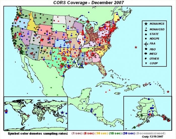
The map below shows current GPS stations operating in the USA.
Paleoseismology
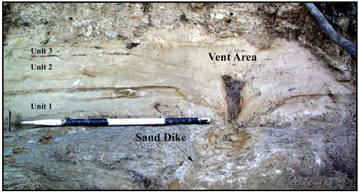
Some faults can be excavated and mapped geologically in order to find out about the recurrence interval for large earthquakes. This sort of work is often done by digging a big trench with a backhoe and then trying to date any large offsets that are found. This technique is useful because the largest possible earthquakes of even quite active faults usually happen several hundred years apart. (Recall the ballpark range of recurrence intervals you estimated in your data analysis exercise.) We simply don’t have seismicity records that go back that far in this country. Dates for prehistoric earthquakes can be estimated by using the dates of the sediments that have been interrupted by an earthquake or some bit of organic material, such as charcoal, in an adjacent layer that can be dated. In the New Madrid Seismic Zone, stream offsets and evidence of liquefaction (sand blows and dikes) caused by strong shaking are also clues to past earthquakes. Paleoseismologists use all these clues to try to put together a timeline of recurrence interval and the approximate earthquake magnitude for a particular fault. These data can be linked with seismicity catalogs and geodetic surveys to get a fuller picture of seismic hazard.
Watch this!
To see excavation and mapping in action, check out this short video from Teachers' Domain and NOVA Online about the work of Kerry Sieh [28], a paleoseismologist at The Earth Observatory of Singapore (He was a prof at Caltech when they made this video).
Video: NOVA: The Work of Kerry Sieh (3:19)
PRESENTER: A young geologist named Kerry Sieh started work that would lead to a new approach to earthquake prediction based on the prehistoric record. The theory of plate tectonics told him that the buildup of strain along the fault was steady. Perhaps there was some regularity in the release.
Another 10-meter earthquake might take place when another 10 meters of strain had built up. Kerry needed to figure out the rate at which the strain was accumulating. A stream that had been moved off course by a series of earthquakes offered a tantalizing clue.
KERRY SIEH: We recognized that this channel at one time flowed across the fault in a straight line, but it has been offset now 130 meters. But it now has a dogleg in it along the fault and then continues to flow out into the valley.
PRESENTER: If Kerry could determine how long ago the creek ran straight across the fault, then by simply dividing the distance it had moved by the number of years it had taken, he would arrive at the rate of strain accumulation. The history of the now dry stream bed could be read in the way that sediments had been deposited over the centuries.
A trench 12 feet deep has been cut across the fault. A sedimentary record of the past 3,000 years is exposed. Each layer is identified and marked. Breaks in the layers are the result of earthquakes. Eventually, samples will be collected and earthquakes dated. Individual earthquakes can be identified with the help of a diagram, like this one made at a site called Pallett Creek.
KERRY SIEH: As the sediments have been accumulating over the past two millennia, they've recorded the story of the San Andreas Fault. The reason they've done that is that every hundred or a couple hundred years, the San Andreas fault breaks and disrupts these sediments, as you can see here.
Now let's look, for example, at this particular place. This layer was the ground surface in 1480 AD, about the time that Columbus was discovering America. So you can imagine a little Native American boy standing here about four feet high on this old marshy, boggy ground. If he'd been standing right here, what he would have seen, looking out this way, is the ground suddenly drop and shift this way during the great earthquake.
What formed was a scarp about a foot high, or about 30 centimeters high, here. You can see this layer has been broken off from its continuation over here. In the succeeding 100 or 200 or 300 years, these layers of sand and silt and peat accumulated and buried that fault scarp completely. So here we are here we have a beautiful example of a buried fault scarp produced by a paleo earthquake, or an ancient prehistoric earthquake, about the time that Columbus was setting foot in North America.
Heat flow
The Earth produces heat from the decay of radioactive elements in its interior. This heat drives mantle convection and therefore the movement of tectonic plates. Heat flow is routinely measured in boreholes around the planet. These measurements are compiled to produce a map of heat flow for the Earth's surface. Some degree of estimation and smoothing must be applied to the measurements because the boreholes are not evenly spaced and some are on continents while other measurements are taken in oceanic crust. The map below shows global heat flow.
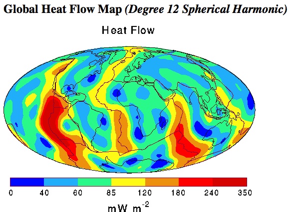
This map shows color-coded contours of the global distribution of heat flow at the surface of the Earth's crust. Major plate boundaries and continent outlines are also shown. The fundamental data embodied in this map are the more than 24,000 field measurements in both continental and oceanic terrains, supplemented by estimates of the heat flow in the unsurveyed regions. The estimates are based on empirically determined characteristic values for the heat flux in various geological and tectonic settings. Observations of the oceanic heat flux have been corrected for heat loss by hydrothermal circulation through the oceanic crust. The global data set so assembled was then subjected to a spherical harmonic analysis. The map is a representation of the heat flow to spherical harmonic degree and order 12.
What does this have to do with the New Madrid Seismic Zone? By looking at the map above, you can see that the amount of heat flowing out of the Earth is not uniform over the surface of the planet. Some areas have much higher heat flow than others and these areas are usually associated with tectonic activity such as volcanism and plate boundaries. For example, the boundaries of the North American plate, the Mid-Atlantic Ridge and the San Andreas fault system, both show up as "warm" places on this map. Heat flow measurements have been made in the New Madrid Seismic Zone to see whether this is a high heat flow area compared to what would be expected for the interior of a continent. (Conventional geophysical wisdom holds that the interior of continents should be old, cold, and stable.) If heat flow is higher than expected, this would be evidence for why earthquakes happen in this area. This remains a point of scientific contention. Past surveys concluded that heat flow was high in the NMSZ, but the most recent studies disagree with those earlier findings.
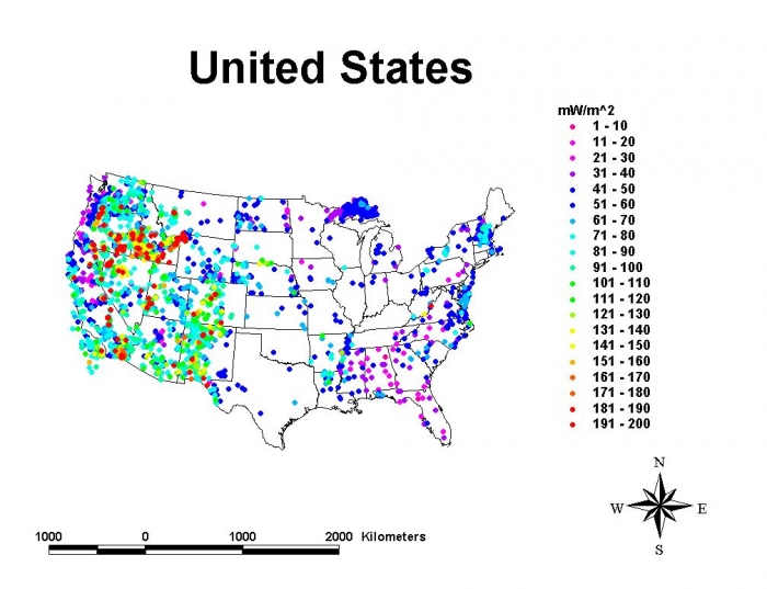
The map below comes from the Global Heat Flow Database [31], at the University of North Dakota. They have heat flow maps and data files for all different parts of the world. This particular map shows borehole data for the United States. Warm colors denote higher heat flow than cool colors (see the legend, which shows milliwatts per meter squared values color-coded). Notice that this map looks different than the global map above. It looks different because it shows exact borehole measurements as opposed to smoothed values that have been interpolated over the whole map. Where is the heat flow highest? Where is it lowest? Compare this map with the map above to see whether they are consistent for the US.
Debating GPS, Geologic, and Heat Flow Studies of the NMSZ
In this assignment, you will break up into teams to read and discuss the papers designated for you. After this, the class will regroup as a whole and discuss all the papers.
Reading/Discussion Activity
Directions
I will divide the class into 3 teams.
Each team should begin by reading their assigned readings and consider the related discussion questions as described below. Papers are linked from your team's discussion board in Canvas.
Team 1: GPS measurements
Members of Team 1 should read thoroughly the seven letters, responses, and summaries listed below to get a sense of the debate about GPS measurements of the NMSZ. Then read/skim the two scientific papers to flesh out your understanding of the studies involved in this debate.
- Letters, responses, and summaries arising from scientific papers:
- Calais, E., Mattioli, G., DeMets, C., Nocquet, J., Stein, S., Newman, A., et al. (2005). Seismology: Tectonic strain in plate interiors? Nature, 438(7070), E9-E10. doi: 10.1038/nature04428.
- Stein, S. (2007). New Madrid GPS; much ado about nothing? Eos, 88(5), 59.
- Newman, A. (2007). Earthquake risk from strain rates on slipping faults. Eos, 88(5), 60.
- Rydelek, P. A. (2007). New Madrid strain and postseismic transients. Eos, 88(5), 60–61.
- Smalley and Ellis (2008). Space geodesy and the New Madrid Seismic Zone Eos, 89 (28).
- Stein, S. (2009). Background for the Calais and Stein 2009 paper in Science [33]6pp.
- Strelich, L. (2015), Aftershocks of old quakes still shake New Madrid Seismic Zone [34], Eos, 96, doi:10.1029/2015EO040129.
- Scientific papers:
- Smalley, R., Ellis, M. A., Paul, J., & Van Arsdale, R. B. (2005). Space geodetic evidence for rapid strain rates in the New Madrid seismic zone of central USA. Nature, 435(7045), 1088–1090. doi: 10.1038/nature03642.
- Calais, E., and Stein, S. (2009). Time-Variable Deformation in the New Madrid Seismic Zone. Science, 323, 1442.
- Discussion questions for Team 1:
- How is a strain rate calculated from geodetic data?
- How can two geodetic surveys in the same region get different answers about strain rate?
- How does strain rate translate to seismic hazard? What assumptions are necessary to get from strain rate to recurrence interval to seismic hazard?
- Some scientific debates arise over the actual results of an experiment, and some arise over the interpretation of those results. In this case, we have both! Elaborate on this point with specific evidence from these papers.
Team 2: Paleoseismology
From the list below, members of Team 2 should browse Martitia Tuttle's Web site and read the Geotimes and Economist articles to get a sense of the current state of the art in paleoseismology at New Madrid. The short article from The Economist discusses a pretty new and novel way of approaching paleoseismology. Then skim the two scientific papers by Roger Saucier to flesh out your understanding of the studies involved.
- Summaries and news articles:
- Tuttle, M. P. New Madrid Seismic Zone [35]. Retrieved June 2, 2008, from http://mptuttle.com/newmadrid1.html.
- Yauck, J. (2006). River bends reveal past quakes [36]. Geotimes, 51(10), 14.
- Dating earthquakes with stalagmites: Written in stone. The Economist, 4 Oct 2008, 88.
- Scientific papers:
- Saucier, R. T. (1989). Evidence for episodic sand-blow activity during the 1811–12 New Madrid (Missouri) earthquake series. Geology, 17(2), 103–106.
- Saucier, R. T. (1991). Geoarchaeological evidence of strong prehistoric earthquakes in the New Madrid (Missouri) seismic zone. Geology, 19(4), 296–298.
- Discussion questions for Team 2:
- What kinds of geologic detective work have been done in the New Madrid region?
- What's the difference between paleoseismology here and, say, near the San Andreas Fault? (If you didn't watch the video about Kerry Sieh's work in southern California linked on the previous page, now is a good time.)
- How do you get from a sandblow or stalagmite to a recurrence time and thus a seismic hazard estimate?
- What are the uncertainties involved with dating liquefaction features?
Team 3: Heat flow measurements
Members of Team 3 should read thoroughly the two summaries and news articles listed below to get a sense of the debate about heat flow measurements of the NMSZ. Then read the two scientific papers to flesh out your understanding of the studies involved in this debate.
- Summaries and news articles:
- New Madrid Seismic Zone May Be Cold And Dying, New Evidence Shows [37]. (29 December 2006).ScienceDaily. Retrieved 22 April 2008, from http://www.sciencedaily.com/releases/2006/12/061211221056.htm.
-
Midcontinent heat may explain great quakes [38]. (1993).Science News, 143(22), 342.
- Scientific papers:
- Liu, L., & Zoback, M. D. (1997). Lithospheric strength and intraplate seismicity in the New Madrid seismic zone. Tectonics, 16(4), 585–595.
- McKenna, J., Stein, S., & Stein, C. (2006). Is the New Madrid seismic zone hotter and weaker than its surroundings? [39] In Special Paper 425 (167–175). The Geological Society of America. Retrieved June 2, 2008, from http://www.earth.northwestern.edu/people/seth/Texts/nmszhf.pdf.
- Discussion questions for Team 3
- What causes surface heat flow to vary in different places around the Earth?
- How is heat flow measured?
- How do you get from heat flow to recurrence interval to seismic hazard?
Submitting your work
Upon completion of the reading, you are to engage in a discussion of the readings, first within your team and then with the rest of the class. The team discussion component of this activity will take place over a few days and will require you to participate multiple times over that period. Likewise, the class discussion will then take place over the subsequent few days.
Team discussions:
- Enter the special discussion forum created for your team (e.g., "Debating Hazard at New Madrid - Team 1 Discussion (GPS)")
- You will see your team's discussion questions there.
- Respond to one question that hasn't already been chosen by another student. If all questions have already been addressed, then select a question where you can "further" the discussion and post there.
- Return to the discussion periodically to read your teammates' postings and to respond by asking for clarification, asking a follow-up question, expanding on what has already been said, etc.
Class discussion:
Once you have discussed these topics within your team, we will regroup to engage in a discussion with the entire class. This class discussion will take place in a separate discussion forum titled "Debating Hazard at New Madrid - Class Discussion."
- Before joining the class discussion, skim the discussions that have taken place in ALL of the team discussion spaces in order to acquaint yourself with the other topics and issues.
- Next, enter the "Debating Hazard at New Madrid - Class Discussion" forum and post a response to each of the following questions. Remember, if there are already postings there from other students, then respond by asking for clarification, asking a follow-up question, expanding on what has already been said, etc.
- Each group discussed a different technique for studying the New Madrid Seismic Zone. What are the different uncertainties associated with each one? What are the different assumptions made when interpreting the results of each technique?
- In what ways do these different techniques agree and disagree in terms of estimation of recurrence interval and seismic hazard?
- How do the results of GPS, paleoseismology, and heat flow measurements square with the results from seismicity catalogs in terms of recurrence interval and seismic hazard? (When thinking about this question, remember that you are participating in science here! You made your own calculations and estimations with seismicity data. Now you can compare your results to the work of other scientists who may have made different interpretations with a different geophysical method.)
Grading criteria
You will be graded on the quality of your participation. Please see the rubric for teaching/learning discussions. [40]
Paper Assignment
For this activity, you will rewrite the USGS fact sheet you read earlier in the lesson, updating it with the research progress that has been made since it was published.
Fact Sheet Paper
Rewrite USGS Fact Sheet FS-131-02, Earthquake Hazard in the Heart of the Homeland [1], highlighting the research progress that has been made since 2002, when this fact sheet was published. Specifically, your mission, should you choose to accept it, is to do a better job than the USGS did themselves when they updated FS-131-02 in late 2009 with this new fact sheet, FS09-3071, Earthquake Hazard in the New Madrid Seismic Zone Remains a Concern [41]. (Maybe they were worried that alums of this course would steal their jobs).
I expect your fact sheet to be well organized and coherent, with none or few grammatical and spelling errors. It needs to be completely rewritten in your own words. All references to the scientific work of others (this includes summaries of their results and/or any borrowed figures) must be properly cited and a bibliography must be included.
This fact sheet is meant to be explanatory and persuasive. It should be written for a hypothetical general audience (i.e., non-scientists). It should be clear to me that you understand the significance of the results of all the scientific studies you refer to in your paper (including your own). See grading rubric below for more details.
The successful paper should meet the following criteria (points out of 100 total in parentheses):
- be approximately the same length as the original (5)
- be visually interesting (you can use graphics made by others with appropriate citation) (10)
- be rewritten entirely in your own words without significant grammar/syntax problems (10)
- include at least three post-2002 sources (10)
- include at least two estimations of recurrence interval for the New Madrid region using different methods, should include your own calculation (10)
- include at least two estimates (using different methods) of the magnitude of the earthquakes in the 1811–1812 sequence (5)
- include some of your original research from the data analyses in this lesson (20)
- demonstrate your knowledge of the different methods of investigating seismicity in this region (10)
- demonstrate your knowledge of the different hypotheses for the causes of seismic activity at New Madrid (10)
- include a bibliography (10)
It is fine to use figures, graphics, and data from other sources as long as you cite them appropriately and include them in the bibliography. It is also fine (and encouraged!) to organize the fact sheet differently than the original or to emphasize different areas of research than the original. Be creative!
The following resources might be helpful to you in your task. (You are in no way limited to these, of course. You may use whatever appropriate sources you want to.) References that are not clickable are linked from the Canvas module for this lesson.
- New Madrid Seismic Zone: Not Dead Yet. Page, M.T. and S. E. Hough, 2014, Science 343, 762-764.
- Lasting Earthquake Legacy Parsons, T., 2009, Nature 462, 42-43.
- Long Aftershock Sequences Within Continents and Implications for Earthquake Hazard Assessment. Stein, S. and M. Liu, 2009, Nature 462, 87-89.
- Should Memphis Build for California Style Earthquakes? [42] Stein et al., 2003. Eos 84
- No Free Lunch Stein, 2004. Seism. Res. Lett., 75, 555–6.
- Uncertainties in Seismic Hazard Maps for the New Madrid Seismic Zone and Implications for Seismic Hazard Communication Newman et al., 2001. Seism. Res. Lett., 72, 647–663.
- Analysing the 1811–1812 New Madrid earthquakes with recent instrumentally recorded aftershocks Mueller et al., 2004., Nature 429, 284–288.
- Comment on “Should Memphis Build for California's Earthquakes?” Hough, S. E. (2003), Eos Trans. AGU, 84(29), 271.
- New Madrid Earthquakes Still Threaten The Central United States, Scientists Conclude [43] Reuters. ScienceDaily 29 September 2000. Accessed 13 March 2008
- When safety costs too much Stein, S. & Tomasello, J. The New York Times 10 January 2004.
- Reeling housing industry feels new jolt from unexpected quake-proof code Charlier, T. The Commercial Appeal 25 January 2008
- Earthquake Facts about the New Madrid Seismic Zone [44] Missouri Department of Natural Resources. Accessed 13 March 2007.
- Implications of Earthquake Risk in Mississippi Summary of "Addressing the Earthquake risk in central Mississippi: A forum for insurance and earthquake hazards professionals." Held December 3, 1997, Peabody Hotel, Memphis, Tenn.
- Hazus 99: Estimated Annualized Earthquake Losses for the United States [45] FEMA
- New Madrid seismic zone: Overview of earthquake hazard and magnitude assessment based on fragility of historic structures [46] NAHB Research Center, 2003. Prepared for US Dept of Housing and Urban Development, 110p.
Save your paper as either a Microsoft Word or PDF file in the following format: L4_paper_AccessAccountID_LastName.doc (or .pdf) For example, Cardinal relief pitcher Trevor Rosenthal's file would be named "L4_paper_tjr26_rosenthal.doc"
Submitting your work
Upload your paper to the Fact Sheet Paper assignment in Canvas by the due date indicated in the table on page 1 of this lesson.
Grading rubric
- An "A" fact sheet is well organized and coherent, has no or few grammatical errors, meets the assignment's length requirement, and has been completely rewritten in your own words. Additionally, an "A" fact sheet includes several detailed and clearly-explained examples of scientific studies that postdate the original fact sheet. Examples from your own work on the topic are also included. Figures are easy to read, have appropriate captions, legends and axes, and they support the arguments made in the paper. An "A" fact sheet looks cool!
- A "B" fact sheet is like that of an "A" fact sheet except that it may refer to scientific studies to back up most but not all of its assertions OR its assertions may only rely on the work of others and not on your own work. A "B" fact sheet's figures may have some minor flaws. Additionally, a "B" fact sheet may be an "A" fact sheet content-wise but it has minor grammatical errors or minor organizational problems or looks kind of boring. A "B" fact sheet meets the length requirement.
- A "C" fact sheet may have organization, coherence, or grammatical problems that hinder a smooth reading of the fact sheet, but not to the extent that the paper is incomprehensible. A "C" paper may also not meet the assignment length requirement. NOTE ON ASSIGNMENT LENGTH: Papers that significantly deviate from the length assignment by being too short (half as long as the assignment length requirement or less) OR too long (twice as long as the assignment length requirement or more) will receive a "C". A paper that has excellent organization and content, but fails to address the topic of the assignment will receive a "C." A fact sheet that does not include results and figures from your own work will receive a "C."
- A "D" fact sheet has severe organizational, coherence, or grammatical problems so that the reader has trouble comprehending what is being communicated. A "D" fact sheet may significantly deviate from the length requirement. A fact sheet that does not refer to the results of any specific scientific studies at all will receive a "D" no matter how well-written it is or how good its arguments are. A fact sheet that fails to include any figures at all will receive a "D."
Teaching and Learning About Earthquakes
Let's take some time to reflect on what we've covered in this lesson!
Teaching/Learning Discussion
Directions
For this activity, I want you to reflect on what we've covered in this lesson and to consider how you might adapt these materials to your own classroom. Since this is a discussion activity, you will need to enter the discussion forum more than once in order to read and respond to others' postings.
Participating in the Discussion
- Enter the "Teaching and Learning About Earthquakes" discussion forum.
- Post your ideas for how the materials we covered in this lesson might be adapted for your own classroom. What skills were emphasized? How do you deal with plotting data and large datasets in your class?
- Read postings by other students.
- Respond to at least one other posting by asking for clarification, asking a follow-up question, expanding on what has already been said, etc.
Grading criteria
You will be graded on the quality of your participation. Please see the rubric for teaching/learning discussions. [40]
Additional Resources and Bibliography
Various Web sites with links to resources aimed at teachers and students:
- Southern California Earthquake Center - Educational Resources [47]
- Public Earthquake Resource Center (PERK) [48]
- USGS Educational Resources for Teachers [49]
- National Geographic's Forces of Nature -- Earthquakes [50]
Nature podcast featuring Seth Stein and the New Madrid fault zone:
A good book written for nonscientists about the 1811–1812 New Madrid sequence:
- Feldman, J., When the Mississippi Ran Backwards: Empire, Intrigue, Murder, and the New Madrid Earthquakes, Simon & Schuster, 2005.
Bibliography
Newman et al. (1999) Slow Deformation and Lower Seismic Hazard at the New Madrid Seismic Zone, Science, 284, 619–621.
Boyd, O.S., R. Smalley, Jr., and Y. Zheng (2015), Crustal deformation in the New Madrid seismic zone and the role of postseismic processes, J. Geophys. Res. Solid Earth, 120, 5782–5803, doi:10.1002/2015JB012049.
Summary and Final Tasks
The New Madrid Seismic Zone is enigmatic because it has produced large earthquakes in the past, but its future is unclear. Deciding how to plan for the seismic hazard is not easy and this is compounded by the fact that large sums of money and large amounts of government intervention are involved. I want to stress that just because scientists do not agree, this does not mean that science doesn't work! The problem is that scientists and policy-makers have different training. What do you think forms the greatest barrier between science and public policy?
Reminder - Complete all of the lesson tasks!
You have finished Lesson 4. Double-check the list of requirements on the Lesson 4 Overview page to make sure you have completed all of the activities listed there before beginning the next lesson.
Tell us about it!
If you have anything you'd like to comment on or add to, the lesson materials, feel free to post your thoughts in the Teaching/Learning discussion! It's one of your final assignments in this lesson anyway. For example, what did you have the most trouble with in this lesson? Was there anything useful here that you'd like to try in your own classroom? Is seismic hazard a topic you and your students are interested in? Are there many well-known seismically active faults where you live? (Even if you don't think so, you could always try playing around with the seismic catalog search features we used in this lesson to find out.)