Syntax introduced: ellipseMode(), rectMode(), beginShape(), endShape(), vertex(), smooth(), colorMode(), arc(), bezier(), triangle(), curve()
0. Changing the default shape origins
The default for a rectangle is for its origin to be at the top left corner, and the default for an ellipse is for its origin to be at its center. You can change these defaults by resetting rectMode() and ellipseMode(). For example, if you specify rectMode(CENTER), then the four arguments taken by rect() become the (x,y) coordinate of its center and then the half-width, and half-height, respectively. To revert back to the default, specify rectMode(CORNER). Read about more options at Processing's command reference page for rectMode(). If you specify ellipseMode(CORNER), then the four arguments taken by ellipse() become the (x,y) coordinate of the upper left corner of a rectangle that circumscribes the ellipse. Then the other two arguments are the width and length of that bounding rectangle. Read about more options at Processing's command reference page for ellipseMode().
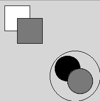
It is my personal preference not to change these defaults. I find it easier to construct my mental map of where I want to place shapes in a composition working within the framework specified by the defaults. However, there isn't a right or wrong approach, in my opinion. See the code below for a sample of code and its corresponding display window that demonstrate what happens when rectMode() and ellipseMode() are changed.
size(200, 200);
//demonstrate rectMode
rectMode(CENTER);
rect(35, 35, 50, 50);
rectMode(CORNER);
fill(102);
rect(35, 35, 50, 50);
// demonstrate ellipseMode
// demonstrate noFill
ellipseMode(CENTER);
fill(0);
ellipse(135, 135, 50, 50);
ellipseMode(CORNER);
fill(102);
ellipse(135, 135, 50, 50);
ellipseMode(CENTER);
noFill();
ellipse(150, 150, 100, 100);
Click here to see a text description.
1. Color
My compositions are more fun if they include color. The default way to specify the color of things in Processing is with (r,g,b) values. This is red, green, and blue. Remember how if you got really close to an old picture-tube television set, you could see the red, green, and blue lights in different arrangements that made up the whole picture? Same basic idea. These colors are the opposite of paint in that if you add the full amount of each one you get white, not black (or really a muddy brown if you use actual paint). You can also specify the color by its hue, saturation, and brightness (h,s,b) or in hexadecimal. To switch to hsb from the rgb default, you have to use colorMode(HSB). If you want to use hexadecimal, just use the appropriate value (which you can find in the Tools menu or probably by googling).
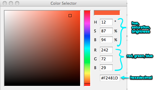
I usually just use rgb values, so the rest of this discussion assumes rgb. Each value of red, green, and blue can range from 0 to 255. Trial and error is certainly one way to come up with a pleasing color palette, but a better way is to use the color selector in Processing. Go to the Tools menu and select "Color Selector" from the drop-down menu. See figure below for a snapshot of the Color Selector. Once this is open, you can play around to find the color you want. The numbers corresponding to that color are given, and you can just type them into your program in the appropriate place.
Any function that took an argument to define its greyscale can be a color instead. This includes stroke(), fill(), and background(). You can also vary how transparent or opaque objects look by changing the alpha value. This is an optional fourth argument to specifying color. It also ranges from 0 (totally transparent) to 255 (completely opaque). Completely opaque is the default so by not specifying a fourth number you will just get completely opaque colors.
 Watch the screencast below to watch me add some colors to a composition (4:24).
Demo about adding color.
Let's explore how to add color to our compositions. This program makes this composition that you have already seen. Now let's make the background a different color than grey. The easiest way to do that is to use the color picker that Processing has. If you go up to the tools menu in Processing and select the color selector from the drop-down menu, then this color selector appears. You can move this little bar around and move this little square around. The color that shows up in this box up here is given to you in numbers down here. These numbers are the hue, saturation and brightness corresponding to this color, and down here these numbers are the red, green and blue values corresponding to this color. The bottom one is this color in hexadecimal. The default for Processing is to use RGB values. That is what I usually use. The RGB values are 8-bit color so they each range from 0 to 255. All you have to do is type the three numbers as arguments into one of the commands that sets the shading instead of just one argument and you will be able to use that color in your program. You can also type numbers into these boxes. For example here is an orange color that I like. Let's make the background this orange color. To do that, we have to modify our code and type those numbers as arguments for the background command. Then press the run button. And there is our color. Now I'm going to change the color of the two squares and show you some things we can do with those. If you want to change the colors of the squares you have to use the fill command. Let's go ahead and do that. The first rectangle is here. We set the fill first before we draw the rectangle. Let's make it blue. I already looked up these numbers using the color picker. Let's make the other rectangle yellow. We are changing the fill from grey to yellow. There we are. If I hadn't written the second fill command, they both would have been blue. I've got another fill command in here telling this circle to be black, and another fill command that makes this circle grey. Then, noFill down here makes this circle transparent. Let's make these colors a little bit transparent. The way to do that is to add a fourth number to the fill arguments. That number tells you how transparent the shape is going to be. For example, if I want the blue rectangle to be a little bit transparent and the yellow rectangle to be a little bit transparent, I type 100 for the 4th argument. Now when I run the program, I get this result. The blue rectangle turned a little purple because we are seeing the color from the orange background behind it. For the yellow rectangle, we can see the orange background behind it and the outline of the other square. That was my short demo of colors and transparency values.
2. Other shapes and custom shapes
Processing has intrinsic functions to draw several shapes besides points, lines, ellipses and rectangles. I'm just going to list several of them here along with a link to each of their reference pages on Processing's website. My goal in this tutorial is not to write a textbook. Anyway, there are several good ones already out there that I already told you about, so you should read the appropriate sections of those if you want more information about any of these:
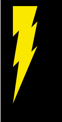
But what if you want to draw your own shape? Like, say, how about the lightning bolt on Roy Hobbs' bat that later became a patch on the whole team's uniform in The Natural? I've found a way to work a baseball reference into all my other courses, so why not? In case you don't know what I'm talking about, this is it:
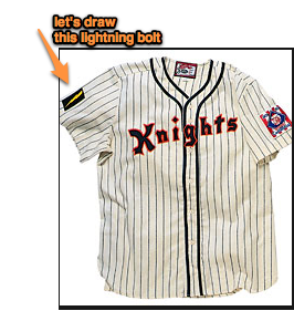
Your friends for this task are beginShape(), endShape(), and vertex(). What you do is use a beginShape() endShape() pair to surround a list of vertex() commands to draw the outline of your shape point by point. Processing will connect up a series of vertices with straight lines. If your last command is endShape(CLOSE) then Processing with connect up the last point with the first point so you can make a closed shape without having to specify the first point again. On the other hand, if you don't want that, then just do endShape(). Here's my lightning bolt along with the program that draws it as a yellow lightning bolt on a black background.
size(100, 200);
background(0);
noStroke();
pixelDensity(2);
fill(250, 230, 5);
beginShape();
vertex(20, 10);
vertex(20, 60);
vertex(30, 50);
vertex(20, 110);
vertex(30, 100);
vertex(20, 170);
vertex(60, 75);
vertex(50, 85);
vertex(60, 35);
vertex(50, 45);
vertex(60, 10);
endShape(CLOSE);
Notice in the program above there are two commands that we haven't specifically covered yet. They are pixelDensity() and noStroke().If you have a big-definition display screen on your computer, such as Apple's Retina display or Windows' High-DPI display, then using pixelDensity(2) allows your computer to use all its pixels when it renders one of your drawings. Add it in and then take it out and you'll be able to see the difference in how shapes are rendered on your screen. The noStroke() function tells Processing not to draw an outline around your shape.
Your turn!
Exercises
2.1 Create a composition out of two or more differently colored overlapping shapes
2.2 Modify Exercise 2.1 above to change the color and thickness of the outlines of the shapes and the background color of the composition.
2.3 Create your own custom shape with vertex(), beginShape(), and endShape().
Turning in your work
You don't have to turn in 2.1, 2.2, or 2.3. As before, I recommend working through all the exercises anyway, even the ones that you are not required to turn in.