1.3 Problematic Dependence on Foreign Fuel Sources
The US is highly dependent on crude oil to produce fuels for transportation. The figure below shows how the transportation sector is almost all oil-based, and the other sources barely make a dent in the hold petroleum has. Up until the last few years, the US has been highly dependent on foreign sources of oil. The US was the world's largest petroleum consumer (EIA, 2012), but was third in crude oil production. Over half of the material that is imported into the US comes from the Western hemisphere (North, South, and Central America, and the Caribbean), but we also import 29% from Persian Gulf countries (Bahrain, Iraq, Kuwait, Saudi Arabia, and the United Arab Emirates). The top 5 sources of net crude oil and petroleum imports include 1) Canada, 28%, 2) Saudi Arabia, 13%, 3) Mexico, 10%, 4) Venezuela, 9%, and 5) Russia, 5%. According to CNN Money, the US is behind Russia and Saudi Arabia in oil production for the first three months of 2016. See the following link for further information: World's Top Oil Producers. However, this situation recently changed, and the US became the world's largest oil producer in 2018 for the first time since 1973. See the following link for further information: America is now the world's largest oil producer.
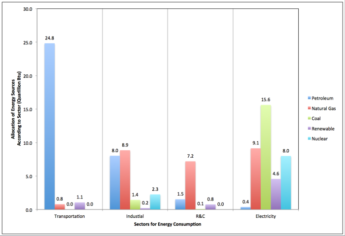
Allocation of Energy Sources in the US: Transportation Sector
Allocation of Energy Sources in Quadrillion Btus'
Petroleum: 24.8
Natural Gas: 0.8
Coal: 0.0
Renewable: 1.1
Nuclear: 0.0
Allocation of Energy Sources in the US: Industrial Sector
Allocation of Energy Sources in Quadrillion Btus'
Petroleum: 8.0
Natural Gas: 8.9
Coal: 1.4
Renewable: 0.2
Nuclear: 2.3
Allocation of Energy Sources in the US: R&C Sector
Allocation of Energy Sources in Quadrillion Btus'
Petroleum: 1.5
Natural Gas: 7.2
Coal: 0.1
Renewable: 0.8
Nuclear: 0.0
Allocation of Energy Sources in the US: Electricity Sector
Allocation of Energy Sources in Quadrillion Btus'
Petroleum: 0.4
Natural Gas: 9.1
Coal: 15.6
Renewable: 4.6
Nuclear: 8.0
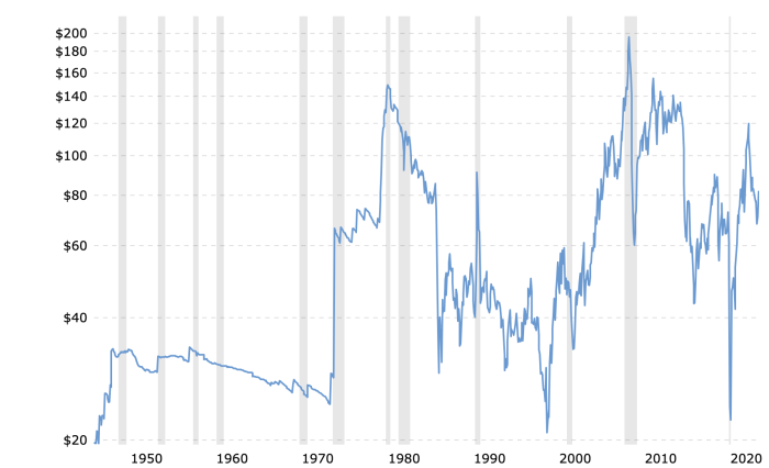
So, while oil is fairly available currently, there is extensive potentially explosive turmoil in many petroleum-producing regions of the world, and, in several places, the US's relationship with some oil-producing countries is strained. China and India are now aggressive and voracious players in world petroleum markets because of high economic growth (as pointed out in the previous section). Saudi Arabia's production is likely "maxed out," and domestic oil production peaked in 1970. While the US dependence on imported oil has declined after peaking in 2005, it is clear that if any one of the large producers decides to withhold oil, it could cause a shortage of fuel in the US and would cause the prices to skyrocket from an already high price (depending on the type of crude oil, the price of oil is currently $100-$106/bbl) (see U.S. Energy Information Administration). The figure below is a graphic showing the price level of oil from 1950 until recently. As you can see, there has been significant volatility in the price of oil in the last ~50 years. One of the first spikes came in 1974 when the Organization of the Petroleum Exporting Countries (OPEC) became more organized and withheld selling oil to the US. It was a true crisis at that point, with gasoline shortages causing long lines and fights at gas stations, with people filling up only on certain days depending on their license plates. It had a high spike in 1980, but a significant low in 1986. When the price of oil hit a significant low in 1998, the government took steps to lower the tax burden on oil companies. But when the prices went back up, the law remained in place, and currently, oil companies do not have to pay taxes on produced oil. When the reduced tax burden went into place in the late 90s, it made sense, but oil companies have continued to convince Congress with lobbyists that it should stay that way. What do you think?
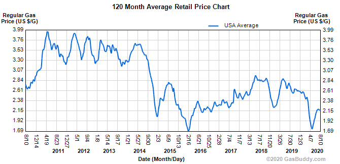
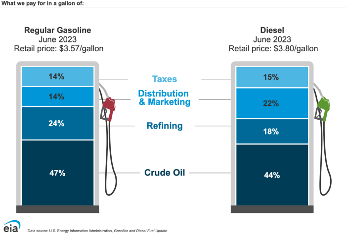
As seen in the figure below, there are major fluctuations in gasoline prices in the last few years. As we will discuss in a later lesson, there are several aspects that contribute to the price of gasoline. This is a graphic that shows the price volatility for gasoline from 2011 - 2020 and the other figure below shows a breakdown of what goes into the price of gasoline.
In recent years, petroleum became less available and more expensive, and replacement alternative fuels emerged because the economics were beginning to become more favorable. However, due to lower demand and high petroleum supply, prices drastically dropped and may affect the development of alternative fuels. There is one factor that will most likely reverse this trend; energy demands will continue to increase worldwide. For future transportation fuel needs, most likely a liquid fuel will be necessary, and no one source will be able to replace petroleum. The pie charts below, in the figure below, show the breakdown of how much of the world's energy consumption is supplied by various materials, with fossil fuels use in 2011 constituting 83%. The EIA predicts that in 2040, fossil fuel use will only decrease to 78%, even with a doubling of biomass use. If significant changes are going to happen by reducing fossil fuel usage, then a major transformation will need to happen.
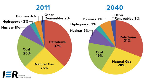
World energy consumption for 2011 and projected consumption for 2040. The pie graphs predict that fossil fuels, coal, petroleum, and natural gas, will continue to dominate world consumption even until 2040, with slight increases in the use of biomass and other renewables.
| Year | Petroleum | Natural Gas | Coal | Nuclear | Hydropower | Biomass | Other Renewables |
|---|---|---|---|---|---|---|---|
| 2011 | 37% | 26% | 20% | 8% | 3% | 4% | 2% |
| 2040 | 31% | 28% | 19% | 9% | 3% | 7% | 3% |