 Print
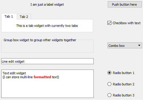
PrintWe already mentioned some of the main visible components that serve as the construction blocks for building GUIs in typical GUI libraries, like windows and buttons. The image below shows a few more that we commonly encounter in today’s software applications including group boxes, labels, check boxes, radio buttons, combo boxes, line input fields, text input areas, tab views, and list views. Others that you are probably familiar with are tool bars, tool buttons, menu bars, context menus, status bars, and there are many, many more!
Typically, the GUI library contains classes for each of these visible elements, and they are often referred to as the widgets. Certain widgets can serve as containers for other widgets and, as a result, widgets tend to be organized hierarchically within a concrete graphical interface. For instance, a dialog box widget can contain many other widgets including a tab widget that in turn contains labels and buttons on each of its tab areas. If a widget A directly contains another widget B, we say that B is a child of A and A is B’s parent. A widget without a parent is a window that will be displayed independently on the screen. Widgets can have many different attributes for controlling their visual appearance, their layout behavior, and how they operate. Methods defined in the respective widget class allow for accessing and modifying these attributes. The most common operations performed with widgets in program code are:
- Creating the widget
- Adding the widget to another widget (widget becomes the child of that other widget)
- Adding another widget to the widget (the widget becomes the parent containing the other widget)
- Changing an attribute of the widget (for instance, you may change the text displayed by a label widget)
- Reading an attribute of the widget (for instance, you may need to get the text that a user entered into a line input widget)
- Setting the layout management method for the widget; this determines how the child widgets of that widget will be arranged to fill the widget’s content area
- Linking an event that the widget can trigger to event handler code that should be executed in that case (for instance, you may want that a particular function in your code be called when a particular button is clicked)
We will explain the ideas of layout management and event handling hinted at in the last two bullet points above in more detail in the next sections. From the user's perspective, widgets can be interacted with in many different ways depending on the type of the widget, including the following very common forms of interactions:
- The user can click on the widget with the mouse to start some action, change the state of the widget, or open a context menu.
- The user can give focus to a widget either by clicking it or using the TAB key for moving the focus to the next widget in a specified order. At any time, only a single widget can have focus, meaning it will receive keyboard input which allows for typing into a text input widget or "clicking" a button by pressing ENTER. Similarly, the user makes a widget lose focus when giving focus to another widget.
- The user can enter some text into the widget.
- The user can drag the widget and drop it onto another widget, or drop something on the widget.
In addition, there are complex widgets that allow the user to interact with them and change their state by clicking on particular parts of a widget. Examples are the user unfolding a combo box to select a different value, the user clicking on a menu in the menu bar to open that menu and select an item in it, the user moving the slider component of a widget to adapt some value, or the user selecting a color by clicking on a particular location in a widget with a chromatic circle. The events caused by such user interactions are what drives the order of code execution in the underlying program code as will be further explained in Section 2.4.3.