 Print
PrintWidgets can be freely arranged within the content area of their parent widget (for instance a window widget). This can be done with the help of pixel coordinates that are typically measured from the top left corner of the content area. However, it would be very cumbersome to create GUIs by specifying the x and y coordinates and width and height values for each widget. More importantly, such a static layout will only look good for the particular size of the parent it has been designed for. When the containing window is resized by the user, you would expect that the dimensions and positions of the contained widgets adapt accordingly which will not be the case for such a static coordinate-based layout.
Therefore, in modern GUI libraries the task of arranging the child widgets within the parent widget is taken care of by so-called layout managers. This happens dynamically, so if the window is resized, all content will be rearranged again down the hierarchy of widgets by the different layout managers involved. The GUI library defines different layout classes to create the layout manager objects from. The three most common layout types are:
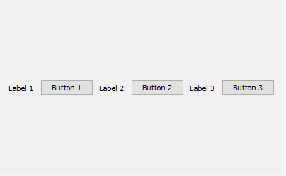
- Horizontal layout: All child widgets are arranged horizontally in the order in which they have been added to the parent
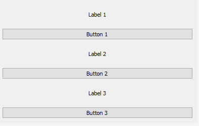
- Vertical layout: All child widgets are arranged vertically in the order in which they have been added to the parent
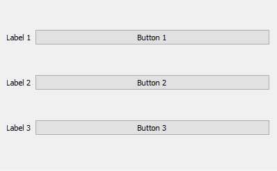
- Grid layout: Child widgets are arranged in a table or grid layout consisting of columns and rows. The child widgets are added to a particular cell in the layout by providing row and column indices and can potentially span multiple rows and/or columns.
The images below illustrate these three basic layout types for a set of three label and three push button widgets. Because of their layout preferences, both labels and buttons remain at their preferred height in the horizontal layout, but are expanded to fill the available space horizontally in the vertical layout. In the grid layout, the labels have been set up to form the first column of a grid with 3 rows and 2 columns, while the buttons have been set up to occupy the cells in the second column.
In many cases, these three layout types are already sufficient to arrange the widgets as desired because of the way layouts can be nested. For instance, you can have the components of a window organized in a grid layout and then use a vertical layout to arrange several widgets within one of the cells of the grid. As indicated above, widgets have attributes that affect their layout behavior and, as a result, how much space the layout manager will assign to them in the vertical and horizontal dimensions taking into account the other child widgets of the same parent and their attributes. These attributes can, for instance, define the minimum, preferred, and/or maximum dimensions or general size policies for width and height. For instance, as we saw in the examples from the previous figures, a standard push button widget often has a size policy for its height that says that the height should not be increased beyond its default height even if there is space available, while in the horizontal dimension the button may be expanded to fill available space that the layout manager would like to fill. We will talk more about layout management when we will start to work with the QT library later on in this lesson.