Statistical methods, as will become apparent during this course, play an important role in spatial analysis and are behind many of the methods that we regularly use. So to get everyone up to speed, particularly if you haven’t used stats recently, we will review some basic ideas that will be important through the rest of the course. I know the mention of statistics makes you want to close your eyes and run the other direction .... but some basic statistical ideas are necessary for understanding many methods in spatial analysis. An in-depth understanding is not necessary, however, so don't get worried if your abiding memory of statistics in school is utter confusion. Hopefully, this week, we can clear up some of that confusion and establish a firm foundation for the much more interesting spatial methods we will learn about in the weeks ahead. We will also get you to do some stats this week!
You have already been introduced to some stats earlier on in this lesson (see Figures 2.0-2.3). Now, we will focus your attention on the elements that are particularly important for the remainder of the course. "Appendix A: The elements of Statistics," linked in the additional readings list for this lesson in Canvas, will serve as a good overview (refresher) for the basic elements of statistics. The section headings below correspond to the section headings in the reading.
Required Reading:
Read the Appendix A reading provided in Canvas (see Geographic Information Analysis), especially if this is your first course in statistics or it has been a long time since you took a statistics class. This reading will provide a refresher on some basic statistical concepts.
A.1. Statistical Notation
One of the scariest things about statistics, particularly for the 'math-phobic,' is the often intimidating appearance of the notation used to write down equations. Because some of the calculations in spatial analysis and statistics are quite complex, it is worth persevering with the notation so that complex concepts can be presented in an unambiguous way. Really, understanding the notation is not indispensable, but I do hope that this is a skill you will pick up along the way as you pursue this course. The two most important concepts are the summation symbol capital sigma (Σ), and the use of subscripts (the i in xi).
I suggest that you re-read this section as often as you feel the need, if, later in the course, 'how an equation works' is not clear to you. For the time being, there is a question in the quiz to check how well you're getting it.
A.2. Describing Data
The most fundamental application of statistics is simply describing large and complex sets of data. From a statistician's perspective, the key questions are:
- What is a typical value in this dataset?
- How widely do values in the dataset vary?
... and following directly from these two questions:
- What qualifies as an unusually high or low value in this dataset?
Together, these three questions provide a rough description of any numeric dataset, no matter how complex it is in detail. Let's consider each in turn.
Measures of central tendency such as the mean and the median provide an answer to the 'typical value' question. Together, these two measures provide more information than just one value, because the relationship between the two is revealing. The important difference between them is that, the mean is strongly affected by extreme values while the median is not.
Measures of spread are the statistician's answer to the question of how widely the values in a dataset vary. Any of the range, the standard deviation, or the interquartile range of a dataset allows you to say something about how much the values in a dataset vary. Comparisons between the different approaches are again helpful. For example, the standard deviation says nothing about any asymmetry in a data distribution, whereas the interquartile range—more specifically the values of Q25 and Q75—allows you to say something about whether values are more extreme above or below the median.
Combining measures of central tendency and of spread enables us to identify which are the unusually high or low values in a dataset. Z scores standardize values in a dataset to a range such that the mean of the dataset corresponds to z = 0; higher values have positive z scores, and lower values have negative z scores. Furthermore, values whose z scores lie outside the range ±2 are relatively unusual, while those outside the range ±3 can be considered outliers. Box plots provide a mechanism for detecting outliers, as discussed in relation to Figure A.2.
A.3. Probability Theory
Probability is an important topic in modern statistics.
The reason for this is simple. A statistician's reaction to any observation is often along the lines of, "Well, your results are very interesting, BUT, if you had used a different sample, how different would the answer be?" The answer to such questions lies in understanding the relationship between estimates derived from a sample and the corresponding population parameter, and that understanding, in turn, depends on probability theory.
The material in this section focuses on the details of how probabilities are calculated. Most important for this course are two points:
- the definition of probability in terms of the relative frequency of events (eqns A.18 and A.19), and
- that probabilities of simple events can be combined using a few relatively simple mathematical rules (eqns A.20 to A.26) to enable calculation of the probability of more complex events.
A.4. Processes and Random Variables
We have already seen in the first lesson that the concept of a process is central to geographic information analysis (look back at the definition on page 3).
Here, a process is defined in terms of the distribution of expected outcomes, which may be summarized as a random variable. This is very similar to the idea of a spatial process, which we will examine in more detail in the next lesson, and which is central to spatial analysis.
A.5. Sampling Distributions and Hypothesis Testing
The most important result in all of statistics is the central limit theorem. How this is arrived at is unimportant, but the basic message is simple. When we use a sample to estimate the mean of a population:
- The sample mean is the best estimate for the population mean, and
- If we were to take many different samples, each would produce a different estimate of the population mean, and these estimates would be normally distributed, and
- The larger the sample size, the less variation there is likely to be between different samples.
Item 1 is readily apparent: What else would you use to estimate the population mean than the sample mean?!
Item 2 is less obvious, but comes down to the fact that sample means that differ substantially from the population mean are less likely to occur than sample means that are close to the population mean. This follows more or less directly from Item 1; otherwise, there would be no reason to choose the sample mean in making our estimate in the first place.
Finally, Item 3 is a direct outcome of the way that probability works. If we take a small sample, then it is prone to wide variation due to the presence of some very low or very high values (like the people in the bar example). On the other hand, a very large sample will also vary with the inclusion of extreme values, but overall is much more likely to include both high and low values.
Try This! (Optional)
Take a look at this animated illustration of the workings of the central limit theorem from Rice University.
The central limit theorem provides the basis for calculation of confidence intervals, also known as margins of error, and also for hypothesis testing.
Hypothesis testing may just be the most confusing thing in all of statistics... but, it really is very simple. The idea is that no statistical result can be taken at face value. Instead, the likelihood of that result given some prior expectation should be reported, as a way of inferring how much faith we can place in that expectation. Thus, we formulate a null hypothesis, collect data, and calculate a test statistic. Based on knowledge of the distributional properties of the statistic (often from the central limit theorem), we can then say how likely the observed result is if the null hypothesis were true. This likelihood is reported as a p-value or probability. A low probability indicates that the null hypothesis is unlikely to be correct and should be rejected, while a high value (usually taken to mean greater than 0.05) means we cannot reject the null hypothesis.
Confusingly, the null hypothesis is set up to be the opposite of the theory that we are really interested in. This means that a low p-value is a desirable result, since it leads to rejection of the null, and therefore provides supporting evidence for our own alternative hypothesis.
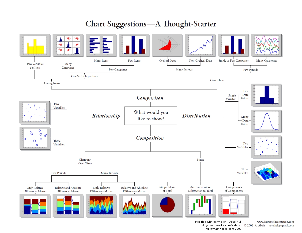
Visualizing the Data
Not only is it important to perform the statistics, but in many cases it is important to visualize the data. Depending on what you are trying to analyze or do, there are a variety of visualizations that can be used to show:
- Composition: where and when something is occurring at a single point in time (e.g., dot map; choropleth map; pie chart, bar chart) or changing over time (e.g., time-series graphs), which can be further enhanced by including intensity (e.g., density maps, heat maps),
- the relationship between two things (e.g., scatterplot (2 variables), bubbleplots (e.g., 3 variables)),
- distribution of the data (e.g., frequency, histogram, scatterplot),
- comparison between variables (e.g., single or multiple).
For a visual overview of some different types of charts, see the graphic produced by Dr Abela (2009).
For example, earlier we highlighted the importance of understanding our data using descriptive statistics (mean and variation of the data). By using frequency distributions and histograms, we can further understand these aspects since these visualizations reveal three aspects of the data:
- where the distribution has its peak (central location) - the clustering at a particular value is known as the central location or central tendency of a frequency distribution. Measures of central location can be in the middle or off to one side or the other.
- how widely dispersed the distribution is on either side of its peak (spread, also known as variation or dispersion) - this refers to the distribution out from a central value.
- whether the data is more or less symmetrically distributed on the two sides of the peak (shape) - shape can be symmetrical or skewed.
Telling a story with data
An important part of doing research and analysis is communicating the knowledge you have discovered to others and also documenting what you did so that you or others can repeat your analysis. To do so, you may want to publish your findings in a journal or create a report that describes the methods you used, presents the results you obtained, and discusses your findings. Often, we have to toggle between the software and a word document or text file to capture our workflow and integrate our results. One way to do this is to use a digital notebook that enables you to document and execute your analysis and write up your results. If you'd like to try this, in this week's project, have a crack at the "Try This" box in the project instructions, which will walk you through how to set up an R Markdown notebook. There are other popular notebooks, such as Jupyter; however, since we are interested in R, those who wish to attempt this can try with the R version.
An important part of telling a story is to present the data efficiently and effectively. The project this week will give you an opportunity to apply some stats to data and get you familiar with running different statistical analyses and applying different visualization methods.