Deriving a global, whole-map measure is often not the thing of most interest to analysts. Rather, it may be more important to know which local features in the data are contributing most strongly to the overall pattern.
In the context of spatial autocorrelation, the localized phenomena of interest are those areas on the map that contribute particularly strongly to the overall trend (which is usually positive autocorrelation). Methods that enable an analyst to identify localized map regions where data values are strongly positively or negatively associated with one another are collectively known as Local Indicators of Spatial Association (or LISA).
Again, GeoDa has a built-in capability to calculate LISA statistics and provide useful interactive displays of the results.
How LISA works
The menu option in GeoDa is Space - Univariate Local Moran's I. The easiest way to learn how LISA works is to run it through the user interface shown in Figure 4.3.
- Select the Space - Univariate Local Moran's I menu option. In the dialog boxes that appear, specify the variable to use and the spatial weights file (i.e., the GAL file).
- Request the Moran scatterplot, the significance map, and the cluster map.
- GeoDa will think for a moment and then produce three new displays.
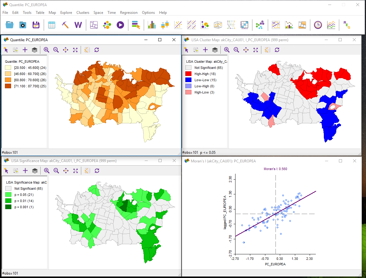
Note that the map view here (top left) was present before LISA was run. Depending on which version of the software you are using, the windows may be separate or part of a larger interface.
The meaning of each of these displays is considered in the next sections.
Moran scatterplot
This display is exactly the same as the one produced previously using global Moran's I. By linking and brushing between this and other displays, you may be able to develop an understanding of what they are showing you.
LISA Cluster Map
The LISA cluster map looks like the pattern shown in Figure 4.4.
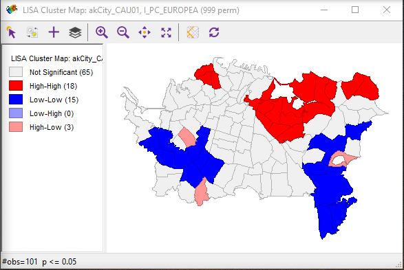
Interpretation of this map is straightforward. Red highlighted regions have high values of the variable and have neighbors that also have high values (high-high). As indicated in the legend, blue area are low-low in the same scheme, while pale blue regions are low-high and pink areas are high-low. The strongly colored regions are therefore those that contribute significantly to a positive global spatial autocorrelation outcome, while paler colors contribute significantly to a negative spatial autocorrelation outcome.
By right-clicking in this view, you can alter which cases are displayed, opting to see only those that are most significant. The relevant menu option is the Significance Filter. The meaning of this will become clearer when we consider the LISA Significance Map.
LISA Significance Map
The LISA Significance Map is shown in Figure 4.5.
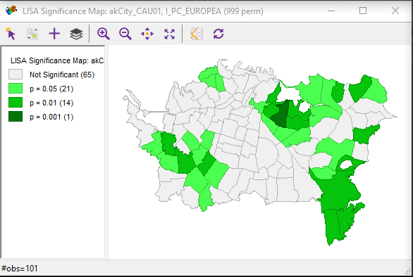
This display shows the statistical significance level at which each region can be regarded as making a meaningful contribution to the global spatial autocorrelation outcome.
This is determined using a rather complex Monte Carlo randomization procedure:
- The LISA value for each location is determined from its individual contribution to the global Moran's I calculation, as discussed on pages 87-88 of the course text.
- Whether or not this value is statistically significant is assessed by comparing the actual value to the value calculated for the same location by randomly reassigning the data among all the areal units and recalculating the values each time.
- Actual LISA values are ranked relative to the set of values produced by this randomization process.
- If an actual LISA score is among the top 0.1% (or 1% or 5%) of scores associated with that location under randomization, then it is judged statistically significant at the 0.001 (or 0.01 or 0.05) level. Note that a statistically significant result may be either very high or very low.
The combination of the cluster map and the significance map allows you to see which locations are contributing most strongly to the global outcome and in which direction.
By adjusting the Significance Filter in the cluster map, you can see only those areas of highest significance. By selecting the Randomization right-click menu option and choosing a larger number of permutations, you can test just how strongly significant are the high-high and low-low outcomes seen in the cluster map.
Note:
I know that this is all rather complicated. Feel free to post questions to this week's discussion forum if you are not following things. Your colleagues may have a better idea of what is going on than you do! Failing that, I will respond, as usual, to messages posted to the boards to help clear up any confusion.
Deliverable
For a single variable on a single map (using the same variable and a different map (shapefile) from the last one), describe the results of a univariate LISA analysis. Include the cluster map and Moran scatterplot in your write-up along with commentary and your interpretation of the results.