A rapidly growing part of preparedness is the development of geospatial tools, data analytics, and visualizations that can be put into place ahead of a disaster. This includes making sure existing datasets, like roads and other infrastructure, demographics, and critical facilities are ready to use. Increasingly, these efforts involve the use of real-time or near real-time information from data feeds including Internet of Things (IoT) devices, reports from field crews, streaming model outputs, and others. We will focus on this in greater detail in Lesson 5 and again later when we consider the emerging technology of IoT. This diverse range of information is often summarized using maps and emergency management dashboards. Below, we'll consider some interesting examples of these trends.
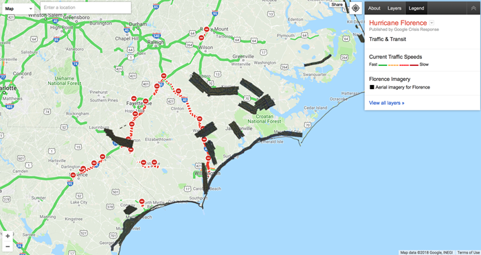
Let's start with something very familiar, Google Maps! While many sophisticated methods for modeling disaster impacts aren't yet publicly available in web tools, there are in fact a very large range of options for free platforms used to evaluate and monitor a situation in progress. The Pacific Disaster Center's Global Hazards Atlas, introduced on the previous page, is one such system. Google Crisis Response, also mentioned earlier, is another example and is more readily available and usable by the responders and the general public alike.
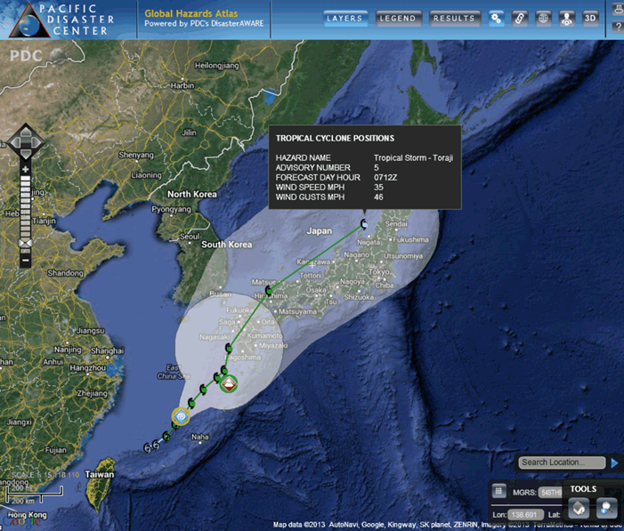
This next example is from the PDC Global Hazard Atlas and shows the position and projected path of a tropical cyclone bearing down on Japan. Note that as with the Google map, there are a lot of other layers that can be examined to gauge likely impact and help make decisions about where resources might need to be pre-positioned. Another way this data can be used is for future planning and mapping of disaster prone areas (think back to the FEMA Southern California Earthquake example). Finally, and you will see this more in the following video, these maps can help emergency managers evaluate the potential for disasters to interact. For example, some areas may be vulnerable to a cyclone and may also have a critical facility like a power station. GIS 101 but very powerful nonetheless.
Finally, check out the impressive Nationwide Operational Assessment of Hazards (NOAH) program from the Philippines. This is a good example of the trend toward multi-hazard approaches to emergency management, rather than focusing on a single hazard type. This site has a lot of functionality including the ability to map the likely impact of different hazards based on historical data. After viewing this short video, take some time to click on a few of the buttons and see what you can learn. For example, display volcano hazards alongside critical facilities to see if there are places particularly at risk.
Video: How Project NOAH helped avert potential disasters (2:14 minutes)
The Habagat 2012. One month after the launch of project NOAH, there was a warning about the imminent floods that was going to happen. The warning was provided at 2 a.m. in the morning. The warning was three hours in advance of the peak floods, and when the floods came in the people were already out of harm's way.
I think this kind of system is already being viewed as best practice in the world. Because I don't know of many other countries that have this kind of system that make use of sensors deployed all over the Philippines. All 1,500 of them streaming data every 15 minutes, and the top achievements that I can think of are these three.
The first is that we were able to map out the hazards of the country in very high resolution. These are the flood hazard maps. The storm surge hazard map is already complete for the entire Philippines for different scenarios. The landslide maps are also complete, and they're very high-detailed.
The second one is NOAH helped in raising awareness trying to change the mindset of the Filipino people. And, moreover, we were able to empower the Filipinos with a lot of information regarding weather events and its hazards impacts.
The third is, I think which is the most important, is that the instruction was delivered. The instruction was to create a program to warn the people hours in advance. And because of the methods that were used in NOAH over the past four years wherein we complemented the forecast with near real-time information for data, we were able to avert at least 13 extreme hazard events.
For further information
For more on NOAH, have a look at this journal article: Disseminating near-real-time hazards information and flood maps in the Philippines through Web-GIS. This link takes you to the abstract. To see the entire document, see e-Reserves under Library Resources in Canvas.