Prioritize...
After reading this section, you should know the origins of the Hovmöller diagram, be able to explain what the diagram displays, and be able to interpret the results.
Read...
The Hovmöller diagram is used quite frequently in atmospheric science and has evolved over time. Originally, the diagram was intended for highlighting the movement of waves in the atmosphere. But now it is used for so much more. In this course, we have never really discussed the history of a topic, but I feel this iconic diagram deserves the highlight. In addition, by discussing the origins, we can see how the diagram evolved.
History
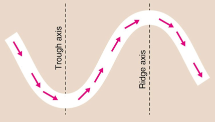
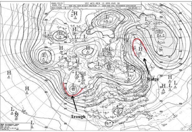
The Hovmöller diagram, as we know it today, was created by Ernest Hovmöller. One of the very first papers using the diagram can be found here. At the time (the late 1940s - early 1950s), Ernest Hovmöller, a scientist working at the Swedish Meteorological and Hydrological Institute, was studying waves in the atmosphere. Specifically, he was interested in the intensity of troughs and ridges at the 500-mb level in the mid-latitudes as a function of time. The images below show a schematic of the wave (top panel) and an example of an analysis (bottom panel).
Hovmöller wanted to visualize the movement of the wave to determine whether another scientist’s (Carl-Gustaf Rossby) theory was true or not. The concept was that energy released in storms was transported at the group velocity (the velocity of a group or train of waves, in contrast to the phase velocity which is the velocity of the individual wave) and was, thus, faster than the speed of the storm itself.
In a previous study, Hovmöller created a time-latitude diagram that displayed weather over the Arctic waters. So, he applied the same approach to this problem by creating a time-longitude diagram of latitude-averaged 500-mb geopotential heights. Longitude was plotted on the x-axis and time was plotted on the y-axis. He called this a trough-ridge diagram. Below is the original figure:
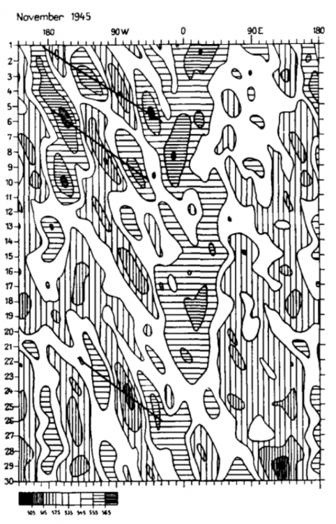
The diagram clearly showed the large-scale upper air wave pattern, along with the occasional rapid propagation eastward of the system that Rossby had theorized. He confirmed Rossby’s hypothesis!
Why is this important? Well, by confirming Rossby’s theory, Hovmöller’s diagram led to changes by operational forecasters who integrated the results into their synoptic predictions. The diagram linked theory with practice, impacting operational weather prediction. This was a big deal!
Some of this material may be difficult to understand or follow right now, especially if you do not have a background in meteorology. But what you should take from this is that data (real observations) were plotted in a way that made it easy to confirm a theory (Group Velocity). The confirmation of the theory had a profound impact (and is still used to this day) on the emerging science of weather prediction.
You can read more about the history and how the diagram became so important here.
Reading the Diagram
So Ernest Hovmöller created this trough-ridge diagram (now called the Hovmöller diagram). The x-axis had longitudes and the y-axis had time. You saw the diagram above and might be wondering…how do you read it? Before we dive in, let’s talk a little bit more about phase velocity and group velocity. Again, this is additional material related to the historical context of the diagram. You are not required to learn these concepts, but they will help in interpreting the original Hovmöller diagram. They will also help in interpreting the patterns you see in your own Hovmöller diagrams! Let's start by looking at the video below of a wave, as shared by Illinois.edu. Please note that the video has no sound.
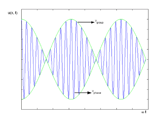
As mentioned previously, the phase speed is the velocity of the individual wave while the group velocity is the velocity of the train or envelope of waves. The figure below provides a visual of the difference between the two.
Let’s start with the phase velocity. The phase velocity of a wave is the rate at which the crests and troughs of the wave propagate. Mathematically, it is given by this equation:
where (lambda) is the wavelength and T is the period.
The group velocity, on the other hand, is the rate at which the envelope of the wave propagates through space. Mathematically, it is given by this equation:
This is the change in angular frequency divided by the change in the angular wavenumber. This may seem like quite a mouthful, but it’s just the rate at which energy shifts from one wave to the next as it propagates through a wave train.
Look at the atmospheric example below:
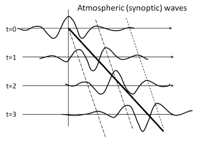
The heavy solid line is the group velocity and the dashed line is the phase speed. What we see in this figure is the mechanism of development downstream from the starting position (t=0). The central wave (peaked at the vertical line at t=0 and can be followed by the dashed black line) moves more slowly than the bulk of the energy that propagates downstream, so eventually, it dies out. The group velocity is moving faster than the phase speed, so the next wave in the train acquires the energy and, thus, grows in amplitude. This process continues from wave to wave through the wave train. This is what was confirmed in the original Hovmöller diagram.
So now, let’s look back at the original diagram with our new knowledge and see what we can deduce.
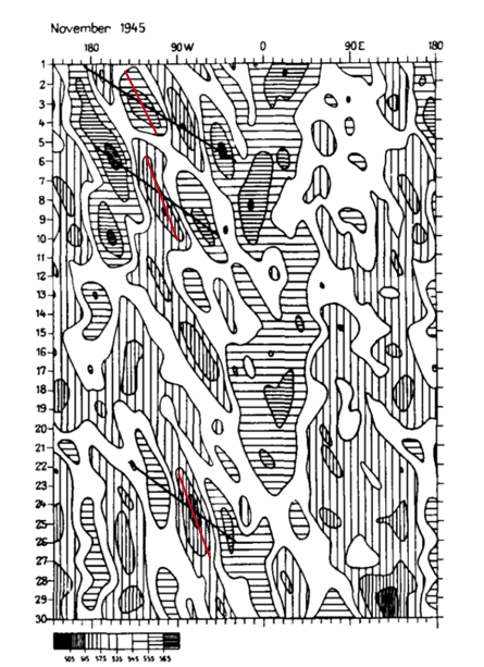
Again, the x-axis is longitude. The y-axis is time (days in November 1945). The values being shown are 500-mb geopotential heights (in decameters). The geopotential heights have been averaged over latitudes 35o- 60o N so that they capture the jet stream. High geopotential heights (in meteorology, these are referred to as ridges) have horizontal thatching. Areas of low geopotential heights (referred to as troughs) have vertical thatching. If you start at day 1 and then kind of look diagonally down (upper left to bottom right), you can see that while the individual ridges and troughs are short-lived and move slowly eastward (phase speed) before dying, strong ridges and troughs follow each other in a pattern that moves eastward much more rapidly (the group velocity).
If you start with a horizontal line as you move diagonally down, it switches to vertical lines and then back again. This is the ridge/trough/ridge propagation through the wave train. This eastward propagation is highlighted by the solid slanting lines. I have overlaid phase speed lines in red (these were not part of the original diagram). The Hovmöller diagram made it easy to see that the phase speed and group velocity differed.
We can extract the actual value of the group velocity from the diagram. The group velocity can be estimated by dividing the change in degree longitude by the change in time:
where the start and end are determined by the line drawn on the diagram for group velocity. You can also estimate the phase speed using the same equation but for the line that represents the phase.
Summary
In the late 1940s and early 1950s, Rossby hypothesized that energy released in storms was transported with a group velocity that was faster than the speed of the storm itself. Hovmöller created the trough-ridge diagram (now called the Hovmöller diagram), a latitude-band averaged longitude-time diagram, to prove that Rossby’s concept was true. This became important for forecasting and is still used today (not just for studying atmospheric waves).