Prioritize...
At the end of this section, you should be able to create Hovmöller diagrams for different applications.
Read...
As we saw in the previous section, the Hovmöller diagram was originally intended for highlighting the movement of waves in the atmosphere. Over the 50+ years since its creation, the Hovmöller diagram has been used in a variety of ways, greatly extending its utility. In this section, we will look at additional uses of a Hovmöller diagram. In each case, large amounts of data are utilized, but by using the Hovmöller diagram they are displayed in a compact and easy to interpret way. This is a skill I encourage you to try and learn.
Evolution of Cycles
Similar to wave propagation from the original Hovmöller diagram, we can use the diagram to examine the space-time evolution of any variable’s cycle. All the different patterns we discussed in earlier lessons could be analyzed or explored using a Hovmöller diagram.
For example, check out the figure below that shows the evolution of La Niña over a 12-month period from 2007/2008.
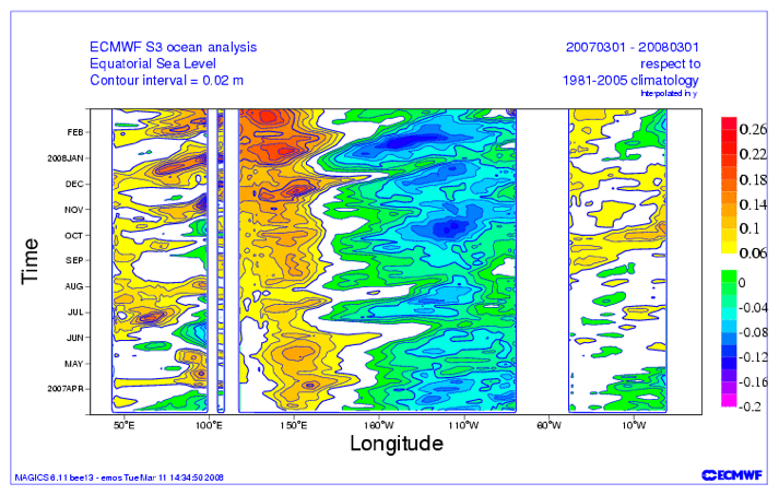
Let’s orient ourselves. Time is given by months on the y-axis and longitude is on the x-axis. The variable being shown is the sea-level anomaly with respect to a climatology from 1981-2005. As the author describes:
“The La Niña was not a continually growing event, but rather an event sustained and strengthened by the periodic intensification that would occur every couple of months.”
The figure highlights the evolution of the intensification.
We aren’t restricted to looking at only 12 months. We could see how the evolution changes over the years. Take a look at the Hovmöller diagram below:
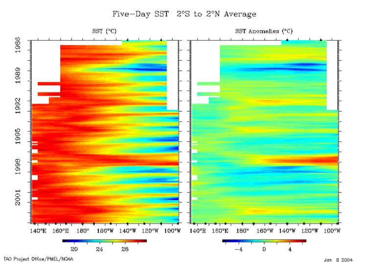
Again, let’s orient ourselves. The y-axis is time, the x-axis is longitude (note this is only over the equatorial Pacific), and the variable is the 5-day SST (left) and the anomaly (right). The data has been averaged from 2°S to 2°N. Focusing on the anomaly as it’s easier to see the strong patterns, positive anomalies (red) suggest El Niño while negative (blue) suggest La Niña. You can clearly see the ENSO cycle over the past 20 years. Particularly, you should notice the strong La Niña of 1988-89 and the very strong El Niño of 1997-1998.
By simply changing the timescale, we can either see the propagation of a particular cycle (like La Niña) or the evolution of the whole cycle (like ENSO). If you are interested in seeing more Hovmöller diagrams related to ENSO, you can check out this monitoring site from Columbia University. Yes, Hovmöllers are still used today!
Climate
As the ENSO cycle image sort of alludes to, we can use Hovmöller diagrams to look for trends. Take a look at this paper. In this study, the authors were trying to assess the trend of the local Hadley and Walker circulations. For more information on these circulations, check out the wiki pages here: Hadley cell and Walker circulation.
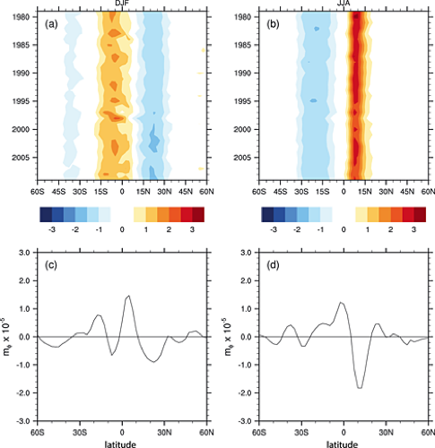
The two top panels are Hovmöller diagrams. The x-axis is latitude and the y-axis is time. The variable being shown is the meridional (north/south) vertical mass flux (rate of mass flow) at 500 mb averaged over 4 reanalyses for the months of December, January, and February (left) and June, July, and August (right). The variable has been averaged zonally (along all longitudes).
When examining a trend type figure, we want to look at how the variable has changed at one location from the start of the period (top of the figure) to the end of the period (bottom of the figure). I think the easiest example is between 15°N and 30°N for DJF. Notice how the light blue starting in 1980 is very prominent for most of the time period, but then darkens (becomes even more negative) as time goes on. This suggests a negative trend in vertical mass flux at 500 mb, that is stronger sinking motion.
The bottom two panels show the computed trend over the time period for each latitude. We confirm our initial assessment that a negative linear trend is observed over that spatial range. If you switch to the right panel, you’ll notice that between 0° and 15°N the colors are a dark red at the beginning but lightened with time. Again, this suggests a negative trend in JJA as well, which is also confirmed with the bottom panel (right).
So, when it comes to trends, Hovmöller diagrams can be used to look at multiple locations to see if one geographical region has a stronger trend over another. It does not confirm if a trend exists; it simply suggests where and when there might be a trend. Think of the Hovmöller diagram as an exploratory tool rather than a quantitative solution in this application.
Discrepancies Between Datasets
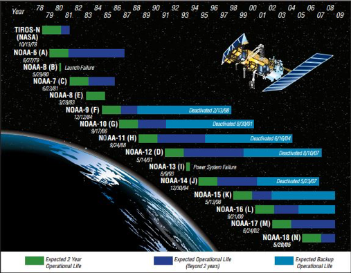
NOAA satellites have been in orbit since the late 1970s, providing consistent global observations for over 30 years! Stitching datasets together, however, can be problematic. For one, you may have the same instrument on multiple satellites, but there is no way the instruments are exact and, especially with satellites, discrepancies can occur. The same goes for ground-based instruments. For example, when the US updated their radars in the 90s; can you really combine the old data with the new?
Unfortunately, we sometimes need to combine these observations to get a sufficiently large sample size for our analysis, but we can check whether artifacts from the stitching arise in our dataset. We can do this by using a Hovmöller diagram. Take a look at this article. In this study, specific humidity from a reanalysis and in-situ observations were compared. Now, differences will occur between datasets, that’s obvious, but the authors of the study noticed that the structure of the graph changed substantially at certain times (we will see that these times corresponded to data changes). In short, the difference between the datasets was not constant over time.
MERRA utilizes satellite observations, but since the instruments are only available over certain time periods, they can create artificial changes. Here is the Hovmöller plot of the MERRA integrated water vapor (lower right panel).
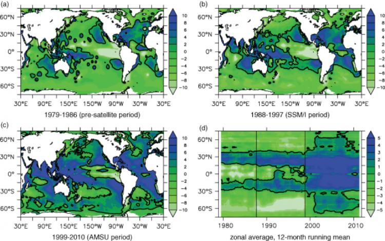
The authors created a longitudinal averaged Hovmöller. The x-axis is time, the y-axis is latitude, and the variable being displayed is longitudinally averaged (zonal averaged) integrated water vapor. Specifically, they are showing increments of integrated water vapor (time rate of change of water vapor integrated over the depth of the atmosphere); so if the value is negative the integrated water vapor was decreasing, if it was positive the integrated water vapor was increasing.
The solid vertical lines separate specific time periods with different observational systems: when MERRA didn’t have any satellite observations (1979-1986 the first line), when MERRA had SSM/I (1988-1997 up to the second line), and when AMSU was added in (1999-2010 second line to the end).
Even with a changing climate, you would not expect to see rapid changes in integrated water vapor. However, this is what you see in the figure; especially when AMSU was added. A big change occurred at the poles and the equator - an incredibly large shift from decreasing to increasing. So, here’s the question: should you use the whole dataset for climate trends? And if not, which section (temporally) is correct? That is, do I trust MERRA alone without any observations, or was adding AMSU and SMM/I, making the reanalysis more realistic?
This example was meant to show you that the Hovmöller diagram can highlight so much more than just the propagation of a wave. I also hope this example challenged you to not jump to conclusions. Your first answer may be that adding observations into the reanalysis has to be the correct thing to do…it has to make the model more realistic. Maybe yes, maybe no. There’s no sure way to tell.
Summary
In this section, we saw how the Hovmöller diagram can be used for many aspects of weather and climate. And there are more applications out there, such as vertical evolution, that we haven’t looked at. If you want to spend a little more time looking at Hovmöller diagrams of different variables, check out this site. Here you will be able to create a longitude or latitude averaged Hovmöller for a variety of variables from the ocean to the earth to the atmosphere. The data comes from remotely sensed observations.