Geography is the science of place and space. It involves the study of spatial (all stuff exists somewhere in space) phenomena of all kinds. I’m pleased to say it’s much more than just naming places on maps. I fly a lot, which means I often have to explain to someone sitting next to me that I’m a Geographer. This prompts one of several typical responses:
- Oh cool, I have a cousin who’s a Geologist!
- Haven’t all of the maps already been made?
- Oh neat, I have no idea what that is!
- Wow, that is so sad!*
*full disclosure, this didn’t happen to me but it did happen to a map nerd friend of mine who said what she did for a living to a guy hitting on her at a bar. It prompted this response.
When I talk about Geospatial stuff in this course, I’m referring to information and technology that has location as one of its key components. So Geography is the science of understanding places and spaces, while Geospatial refers to the data and technologies that allow one to explore Geographic problems. Geospatial is always a modifying term – so I’ll talk about Geospatial information, or geospatial systems, or geospatial bacon, never just “Geospatial” all on its own. This is somewhat simplified, and Geographers are infamous for having almost no ability to reach consensus on how we define ourselves or what we do, but I’ve given it my best shot here.
Maps To Tell Stories, Maps To Provide Context
There are two major categories of maps. Thematic maps are used to showcase geographic data observations. Thematic maps are almost always associated with storytelling of one kind or another. For example, let’s assume I have a dataset showing the proportion of U.S. citizens who are currently talking about something inane on their cellphones. This hypothetical data might be collected at the county-level, and I’d want to tell a story with my map about which places in the U.S. have the most insipid talkers. The pattern of those observations by county would allow map readers to understand the geographic distribution of those folks, and begin to formulate hypotheses about their causes (places with lots of teenagers, middle-aged men roaming airports, etc…).
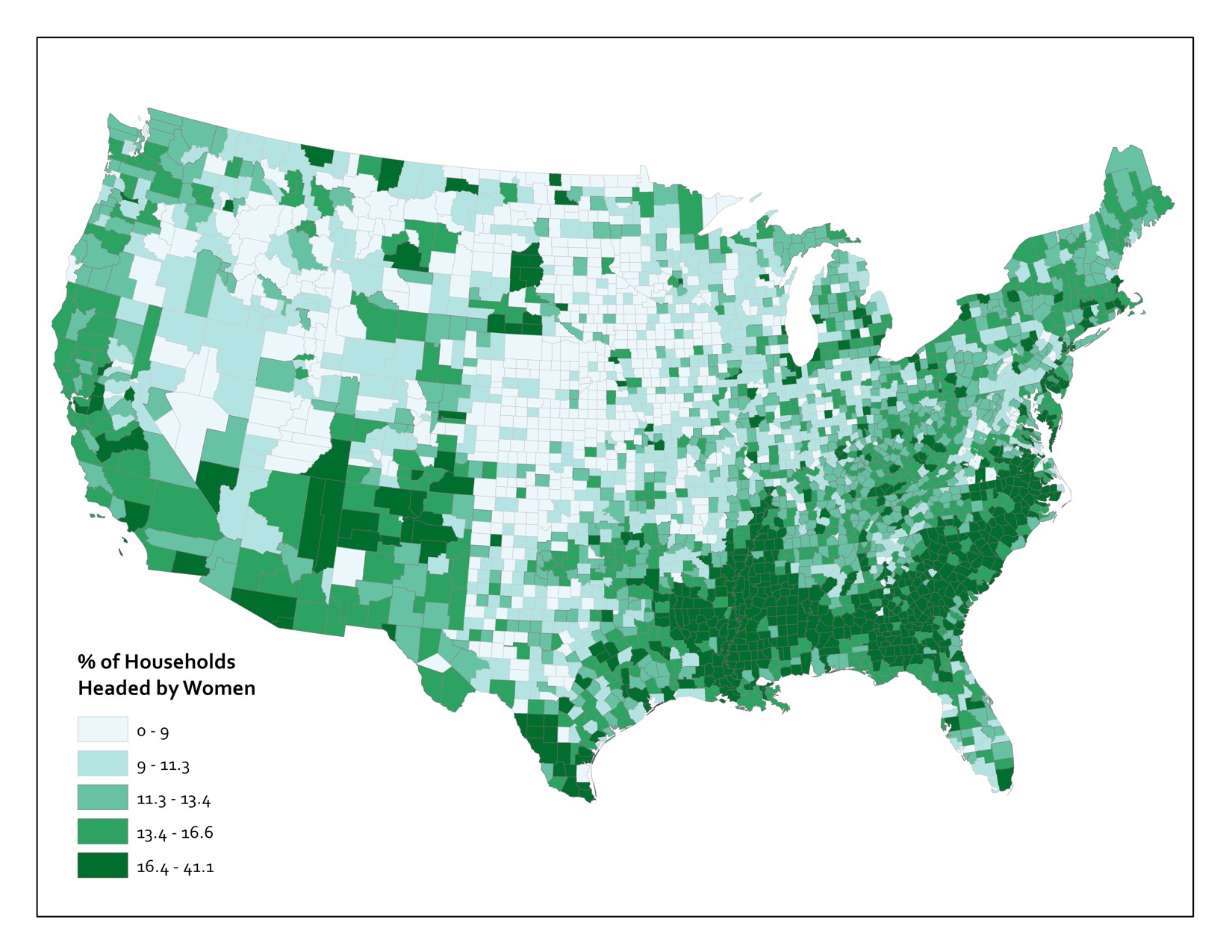
Or you could have a much more serious example, like the one shown below. This map shows the proportion of households in the Lower 48 United States that are headed by women.
Now you’re probably wondering about the kind of maps you thought I’d start with here. Reference maps (also frequently called basemaps) provide the basic Geographic context required to situate other stuff. A good example here would be a Web Map that shows roads, physical, and cultural features. Reference maps are used all the time these days as the backdrops upon which we plop all sorts of digitally-rendered map pins. If you fire up Yelp and search for a nearby place to buy a very large bag of delicious Nacho Cheese Combos at 4AM, you’ll see a bunch of these pins appear on top of a basic, multi-purpose reference map. Designing these map canvases is really hard. To give you a tiny flavor of the challenges here, check out how many named geographic features exist for just one county (select "Pennsylvania" from the state dropdown and type "Centre" into the county field). You should end up with 1177 named features. Now, poke around with the web map example here and pay close attention to which features exist, what they are named, and how they are drawn at different scales. Try zooming in to the area around Grand Canyon in Arizona and see how the labeling and symbols change as you change scales. Computers can’t do this stuff automatically (er… at least not without a lot of human intervention), so there is a huge amount of work that goes into designing these now taken-for-granted reference sources.
The Earth Is Round And Maps Are Flat
That’s really all you need to know, but I guess I need to explain a bit more, huh?
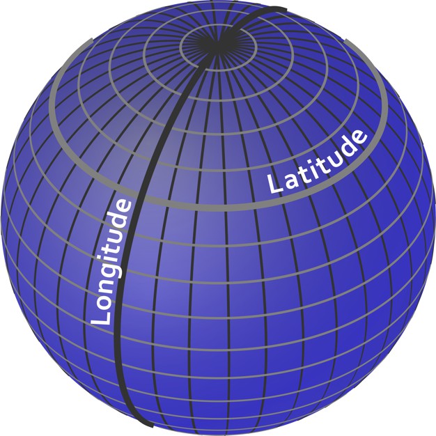
To identify a location for anything, we need to set up a reference system. The one we use most commonly is the geographic coordinate system of Latitude and Longitude. Think of it as an addressing system for the entire planet. It’s really just a grid system, with standard lines of Latitude providing North/South parallels and standard lines of Longitude providing East/West meridians. Latitude varies from +/- 90 degrees from the Equator, and Longitude varies from +/- 180 degrees from the Prime Meridian, which runs through the Royal Observatory in Greenwich, England.
Latitude and Longitude coordinates are expressed in either decimal degrees or in degrees, minutes, and seconds. Both methods are useful for different tasks, but it’s a bit beyond the scope of this class and I don’t want you to fall asleep so early in the course.
This is all well and good, but a major problem we have to deal with here is that the Earth is spherical (erm, it’s an imperfect one, so it’s actually an ellipsoid) and we need ways to take stuff off this 3D object and present it in 2D on paper or on screen (since carrying a globe around is pretty annoying). For an illustration on exactly why this is a problem at all, get yourself an orange, draw crude versions of the continents on it, and then try to peel the orange without distorting or tearing the map at all. Don’t do this on top of your iPad or while you’re supposed to be paying attention on a conference call. You’ll notice that it’s very hard to do anything that doesn’t totally ruin the map, and the best you can approximate is something like the image shown here (if you’re really good). Nathan Belz tells a neat little story about what he did to create this example.
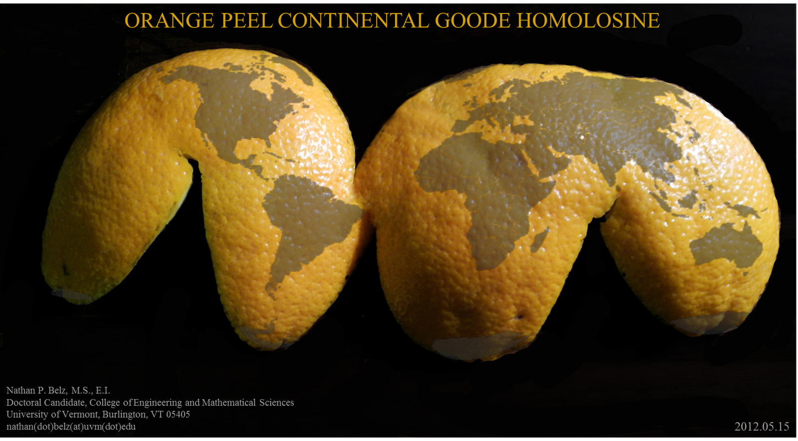
This is all a lead-up to tell you that in order to make maps, we have to flatten the Earth using math. The act of making transformations to translate points on a sphere (Lat/Long) to points on a 2-dimensional plane (a map) is called Map Projection. Because math is fancy witchcraft concocted by devious wizards, there are hundreds and hundreds of possible mathematical transformations from the Earth to a map in the form of named Projections. The one you see above is called the Goode Homolosine. I’m personally partial to the Robinson Projection, although I unfortunately had nothing to do with its creation.
What you really need to know is that Projections allow you to preserve some, but never all of the basic characteristics of Geographic relationships. Specifically, you can preserve direction, shape, area, distance, or the shortest route between locations. Alternatively, you can choose to preserve none of these attributes and instead focus on a compromise across them (as is done with the Robinson projection and many other World Map projections).