Introduction
This week, you learned that geography is the science of understanding places and spaces. You also learned that one of the ways people have sought to understand places and spaces is through maps. As you are discovering, part of what the geospatial revolution means is the advent of geospatial technology. Geospatial technology helps us create content that can be changed. In this lab, you will have the opportunity to get started with web mapping.
You probably already use cloud-based technologies when you use Google Drive, Facebook, Flickr, or Dropbox, for example. Web mapping is GIS in the cloud. Web mapping includes spatial data in the form of maps, databases, map services, and satellite images, and it also contains tools and functions such as the ability to measure things and to do spatial analysis.
Not all digital maps are dynamic; millions of maps exist in presentations, PDFs, and as static images like the ones I’ve made for this class. But unlike static digital maps, dynamic digital maps can show real-time things like weather, floods, or traffic. Layers of information can be added or subtracted from them so that you can change the map design yourself at will. The scale, colors, symbols, and the way their data is classified can all be changed. They can be embedded into live web pages, changed from 2D to 3D, and formatted for a smartphone. Therefore, they move beyond being simply reference documents (“Where is Uzbekistan? OK, great! Next?”) to being tools of geographic inquiry, used to understand spatial and temporal patterns in order to solve problems.
To give you hands-on experience making your own maps and doing spatial analysis, we’ll be using Esri’s (cloud-based GIS called ArcGIS Online). Joseph Kerski works for Esri’s Education Team and has done a ton of great work to develop these labs for you. ArcGIS Online does many of the things a desktop GIS system can do, but it has a much easier learning curve, can be used right in your web browser, and makes it really easy to share interactive maps you make with others. Esri paid me zero dollars to say that and use this stuff in this MOOC and they have been enormously helpful to make sure that you can do awesome stuff in this class using their software.
In addition to tools made by companies like Esri, there is a flourishing community of free and open-source software for doing all things geospatial (see osgeo.org for an overview and live.osgeo.org/ for tools). For the final assignment in this course you’ll have the opportunity to explore an open-source options (like CartoDB, for example) or use ArcGIS Online.
Investigating Global Population and Ecoregions
Have you heard about “big data?" Since they seek to understand the whole world and everything in it, geographers were into big data way before the term existed. With the explosion of datasets of all types, geospatial data abounds as well, at scales from local to global, and across themes ranging from natural hazards, to energy, to water, and geology. For example, in terms of population, not only can you obtain the locations of cities, but the size of those cities, and not only total population counts, but also population density, how population is changing, and characteristics of the population such as age, ethnicity, income, education, life expectancy, and other variables. You can examine the relationship of population to other phenomena, represented as map layers. In this lab, you will examine the relationship of where people have settled to the physical environment. You will also determine how population impacts the physical environment in which it exists.
Before you start using the tools, try to answer the following questions as best you can. You don't need to submit your answers, but you may want to write them down someplace.
- What is an ecoregion? You’ll probably want to fire up your Google to sort this out. That’s what I’d do.
- In what ecoregion do you live?
- What is one factor that influences population density in a given area?
- Describe the population density in the neighborhood in which you work. Make a little note of what you think this is. You’ll need it later in this lab.
Let’s Make a Freaking Map Already
When you’re ready, click here to begin building a map. You may want to open links like these in a new window so that you can switch between the lab instructions and the mapping tools.
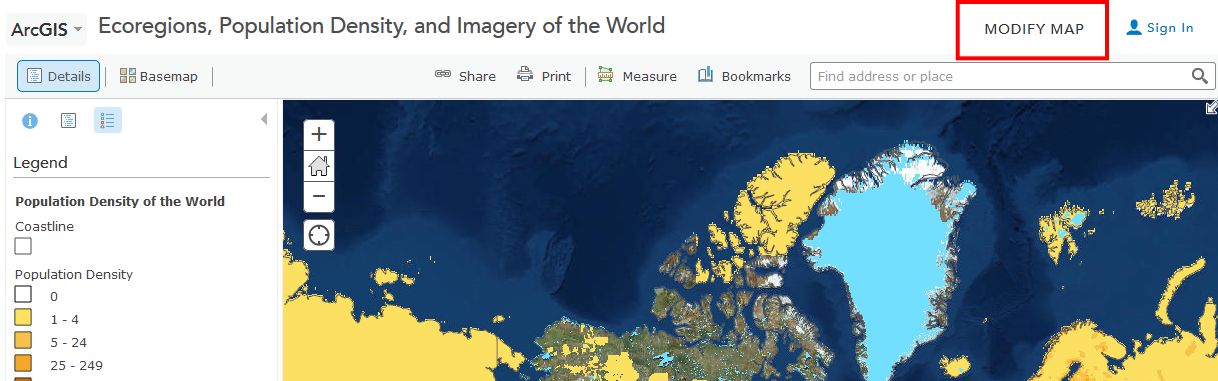
This map was built using ArcGIS Online. First, note that you have the map occupying most of the screen (as it should be!). Second, you have a set of map layers on the left. Third, you have tools—some of which are at the top, and some are available through the list of layers on the left.
This map shows Ecoregions, Population Density, and Imagery. To see these, select “Modify Map” in the upper right of the interface, then click Content above the Legend to see the list of available layers.
Take some time now to explore the About, Content, and Legend buttons directly above the Legend. Get comfortable with what these buttons do. Zoom using the vertical scale bar at the left side of the map—the middle scroll wheel of your mouse if you have one—or by holding the shift key and drawing a box on the map with your mouse. Bookmarks are another way to zoom in or out (change the map scale).
Now use Bookmarks (just left of the search bar at the top) and select World. Show the map legend. Your map should look like this:
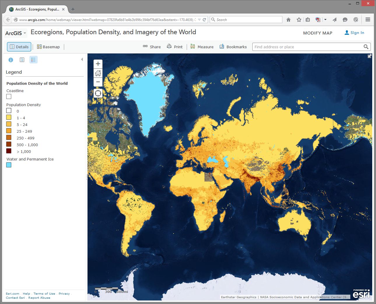
How would you describe the pattern of world population density?
Change the Basemap back and forth from Imagery to Terrain With Labels so that you can refer to country and city names that are part of the Terrain with Labels layer.
- As we will discuss later in this course, knowing where data comes from is, to put it into geographical terms, a Very Big Deal, particularly with maps. To start thinking along these lines, examine the “details” of the population density layer by clicking the right arrow next to the layer and selecting Description.
- Who created this data, and what sources did they use?
Use Bookmarks and select India-Nepal. Toggle between population density and the imagery base map. Try making the population density layer transparent by clicking on the small right arrow next to the layer name, selecting Transparency, and using the slider bar that appears.
- What is one reason you can think of for the difference between the population density in northern India compared to that of Nepal?
- Use the Measure tool and determine the distance between the area of highest population density in India to the area of lowest population density in Nepal. Be sure to note the distance units you are using (miles or kilometers).
- Switch from the Legend view to the Contents view and turn on the Ecoregions layer. Turn the Population layer on and off and note the predominant ecoregions in the most densely settled regions of northern India. Also, explore the relationship between population density and major rivers. How do you think the dense settlement here may have an effect on the ecoregions of this area?
- Describe the ecoregion and the population density in the region in which you live using the map. How does the population density compare with your earlier observation where you were asked to reflect upon the population density of your area without the aid of a map?
Exploring Population Dynamics (That’s A Lot Of Babies)
Let’s take a deeper look now at how population is changing all over the world and explore what might be driving those patterns.
Use the Add button, then Search For Layers and search for: World Bank Age and Population in ArcGIS Online. Select the one authored by “Intl_User_Community.” Then click the big blue Done Adding Layers button at the bottom to add this layer to your map.
First, select the Content button to show the map layers instead of the legend. Then, expand your newly added age and population layer by clicking on its title and then click on Age Population. You will see that this map is actually a set of 10 layers (ideally, every map should be turned up to 11 though). Uncheck any layers in this set of 10 that might already be selected - we want to start with a clean slate.
Next, select the checkbox for the Annual Population Growth Percentage, show the legend by clicking on the layer name, and note how much the growth rate varies around the world. Make sure that no other layers listed before this one are turned on, since those could obscure the layer you want to see. Now turn on Age Dependency Ratio. Age Dependency Ratio is the ratio of dependents (people younger than 15 or older than 64) compared to folks in the working age population (15-64). Click the Age Dependency Ratio layer name to display its legend. Your map should look similar to the one shown here:
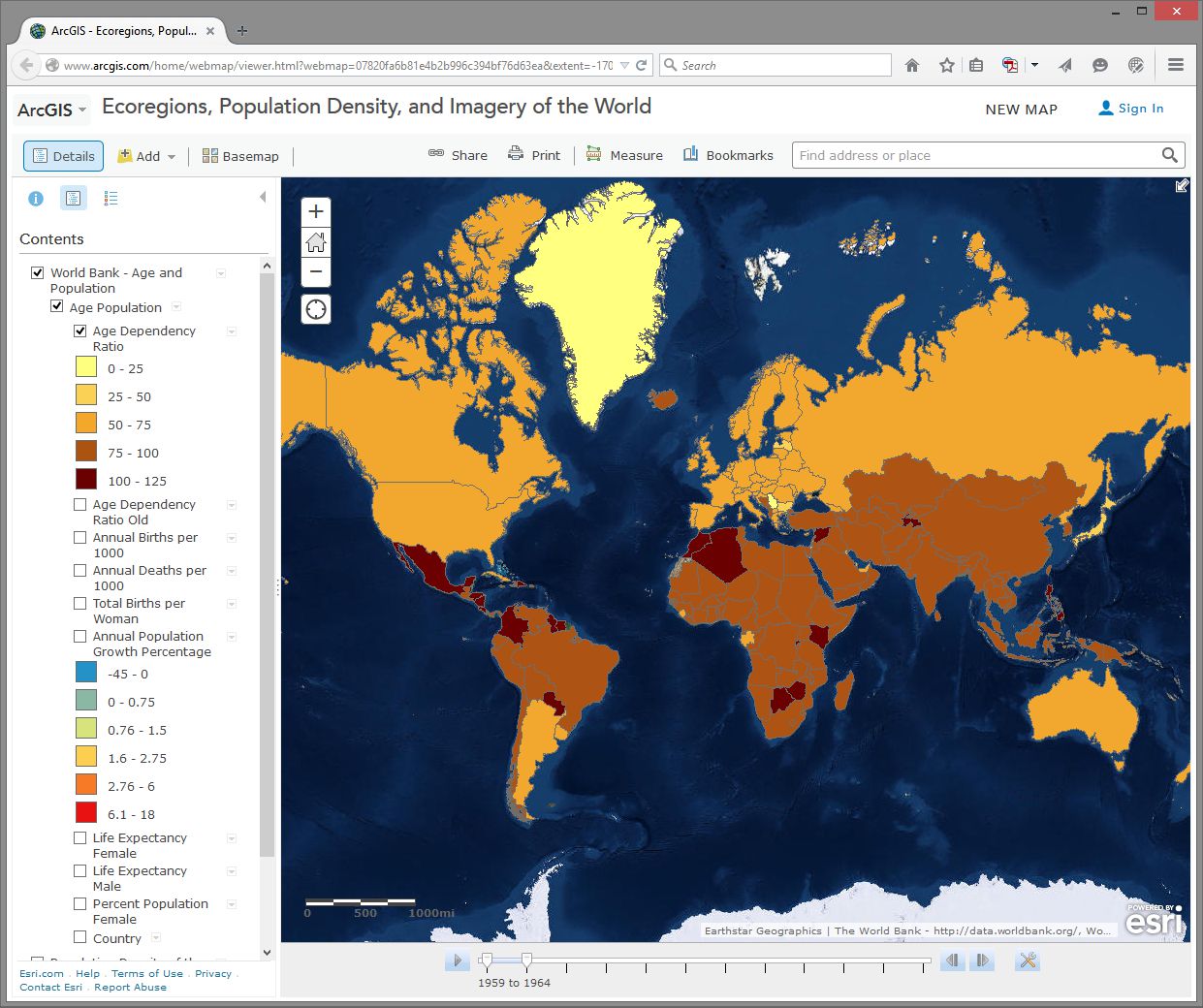
Which statement is correct?
- Countries with a higher growth rate typically have a higher age dependency ratio.
- Countries with a higher growth rate typically have a lower age dependency ratio.
Why do you suppose the growth rate and age dependency ratio are related in the way that you've indicated above? The percentage of working age population is also known as the “dependency ratio,” because this number represents how much of the population (young and old) that is dependent upon the working age population.
- What impact do you think a high population growth rate has on a country?
Note that these data sets go back in time—to 1960 in some cases. My parents were born in 1960. Every photograph automatically looked like an Instagram back then. You can use the arrows in the popup boxes to access the different years. You can use the slider bar under the map and the play button to animate the data over time, or slide the marker all the way to the right to 2014 to display the most recent data. So with these maps you can examine not only the spatial dimensions, but also the temporal ones.
Pick a country that interests you and examine the growth percentage and life expectancy in that country over time. If you’re a rockstar student you’ll share something you discovered with your peers in the discussion forums. You can always click on the Share button to get a link to embed in your post.
- Recall your recent reading about map projections. This map uses the Web Mercator projection. How are the areas near the North and South Pole shown on this map?
- How does the projection that this map is using affect your interpretation of what you are studying?
Geodemographics – Having Fun With Stereotypes
The statistics you are examining about population tell only part of the story about the people in those places, of course. People live and behave in ways that might be described with a combination of variables, not all of which are captured on census surveys. One of the ways to measure this aspect of demography is through the creation of a variable that captures a “lifestyle” by neighborhood. It is this variable that marketing folks often use to send you forty catalogs of gourmet food products and coupons for discounted hair transplant surgery (wait - you mean that’s just me?). Marketing folks use this stuff to help determine what is stocked on your local stores’ shelves, what types of cars or bicycles or breakfast sandwiches are sold in your area, what sorts of movies are shown, and a whole lot more.
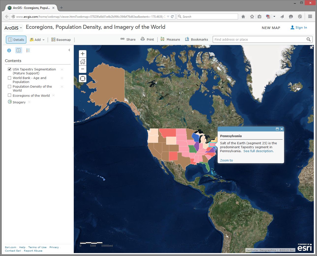
Go to Bookmarks and select the North America bookmark. Turn off all map layers. Then use the Add button and search for the data layer called Tapestry in ArcGIS Online. The “Tapestry segment” is one of these lifestyle variables we have been discussing. Add the USA Tapestry Segmentation (Mature Support) layer to your map (it should be the first result in your search results list). Zoom in and out a couple levels and watch what happens to your map (you should see counties turn into states as you zoom out to show the entire world).
Click on the state you live in (or, if you live outside the USA, pick one that sounds cool). What is the predominant tapestry segment for your state? In the popup box that appears, select See full description to learn more about how that segment is defined. Your map should look something like this:
- What is the tapestry segment of your neighborhood or a neighborhood you are interested in?
- Would you say that the tapestry segment describes you accurately? Does it describe some of your neighbors? Does the segment description make you laugh, or laugh nervously?
- What influence does the map scale have on the data you are analyzing?
Now change the Basemap in the neighborhood you are examining to Imagery and then make the Tapestry layer semi-transparent.
Is there anything on the imagery that gives a clue as to the neighborhood’s lifestyle? What do the structures and streets tell you about this place?
If you have time, feel free to explore additional data layers inside ArcGIS Online. We’ll be using it throughout this course, so if you can become more familiar with it now, it will serve you well later. Add other population data of interest to you, such as median income, median age, and median home value. Do these variables help explain the tapestry segment of your chosen neighborhood and surrounding ones?
Congratulations – You Just Made Some Maps!
Awesome job. You have just been using maps in exciting ways to explore the relationships between the environment and people and to examine components of the population, using a web mapping system. Along the way, you have considered scale, data, the map projection, and other geographic concerns.
Credit Where It's Due
This lab was developed by Joseph Kerski and Anthony Robinson.