Increasing Atmospheric Albedo

PrintPrint

Increasing Atmospheric Albedo

There are a couple of ideas for making the atmosphere reflect more sunlight, including brightening clouds and adding aerosols (tiny particles, either solids or liquids, that stay suspended in the atmosphere for a relatively long period of time).

Cloud Albedo Enhancement

The basic idea here is to make clouds brighter by increasing the concentration of tiny droplets of water that make up the clouds. It has long been recognized that in parts of the world that are dustier, the clouds tend to be brighter because of a higher concentration of water droplets. The tiny water droplets in clouds form around even tinier particles called Cloud Condensation Nuclei (CCN) — the more CCNs you have, the more water droplets form, the brighter the clouds are, the more sun they reflect. It has been suggested that spraying tiny salt crystals derived from the oceans would serve this purpose, and this, along with the fact that the oceans cover 75% of the Earth, means that this would be done over the oceans. The troposphere (lower part of the atmosphere where clouds form) is a dynamic place, which makes the effectiveness of this approach somewhat difficult to predict, but in theory, it could provide enough of an albedo increase to accomplish the cooling we might want (a couple of degrees C). It is estimated that something like 1500 ships equipped to extract the salt particles and inject them into the atmosphere would be needed — these ships do not exist at present, and they would have to be custom-made. The cost of this approach is a bit uncertain, but is probably not excessive. The main drawbacks of doing something like this include the uncertainty about how this would affect weather in cities near the oceans and the fact that this would not address the problem of ocean acidification.

Stratospheric Aerosols

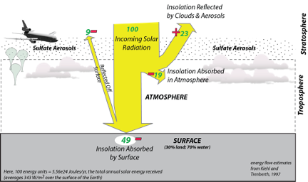
We could reduce the amount of solar energy reaching the surface and thus cool the planet by making the atmosphere more reflective through the injection of sulfur aerosols into the stratosphere (above the troposphere). We know that this works because of the cooling that follows large, explosive volcanic eruptions that inject tiny aerosols (particles) of sulfate (SO4) into the stratosphere. Based on the volcanic eruptions, we can estimate how much sulfur is needed to counteract a doubling of CO2 — about 5 Tg of S per year (one Tg or teragram is 1012 g), which is about half the amount that injected into the atmosphere by the eruption of Mt. Pinatubo in the Philippines in 1991.

Diagram on how to reduce stratospheric aerosols.
Sulfate aerosols injected into the stratosphere by planes or balloons would reflect and scatter sunlight before it hit the Earth’s surface — this would reduce the temperature of the Earth. The sulfate has a short residence time in the atmosphere, so it would have to be continuously replenished — but this would still be the cheapest way to stop and even reverse global warming. There are, however, many drawbacks to this kind of geoengineering scheme.
Click for a text description of the Stratospheric Aerosols Diagram.

The image is a diagram illustrating the Earth's energy balance with respect to incoming solar radiation. It uses various visual elements to represent the flow and absorption of solar energy:

  • Incoming Solar Radiation: Represented by a yellow arrow labeled "100 Incoming Solar Radiation," this indicates the total amount of solar energy reaching the top of the Earth's atmosphere, measured in units of energy (not specified in the image but typically in watts per square meter or similar).
  • Reflection by Clouds and Atmosphere: A red arrow labeled "23" branches off upwards from the incoming solar radiation, indicating that 23 units of energy are reflected back into space by clouds and the atmosphere.
  • Absorption by Atmosphere: Another red arrow labeled "19" branches off to the right, showing that 19 units of energy are absorbed by the atmosphere.
  • Absorption by Surface: The remaining energy, represented by a yellow arrow labeled "49," reaches the Earth's surface. This arrow is labeled "Insolation by Surface," indicating the solar radiation absorbed by the Earth's surface.
  • Surface Composition: Below the surface absorption arrow, there's a note stating "SURFACE: 30% land; 70% water," indicating the distribution of land and water on Earth's surface.
  • Clouds and Atmosphere: The background includes images of clouds and a simplified representation of the atmosphere to visually contextualize the energy flow.
  • Additional Information:
    • At the bottom left, there's a note: "Heat from the Sun = 5.67e24 Joules/yr the total annual solar energy received by and over the surface of the Earth."
    • At the bottom right, there's a reference: "energy flow estimates from Trenberth, 1997.
  • Visual Elements:
    • A small image of an airplane is shown in the top left corner, possibly to indicate human activity or perspective.
    • The diagram uses color coding: yellow for incoming solar radiation, red for energy flow within the atmosphere, and green for energy absorbed by the surface

This diagram provides a simplified view of how solar energy is distributed within the Earth's climate system, highlighting the interaction between solar radiation, the atmosphere, and the Earth's surface.

Credit: David Bice © Penn State is licensed under CC BY-NC-SA 4.0

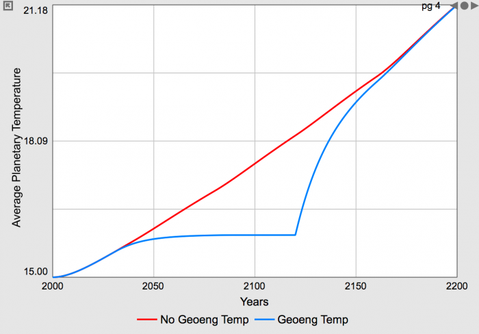
The estimated cost of this would be on the order of \$50 billion per year (consider that the US military expenditures are about \$750 billion per year). These particles have a limited residence time (1-2 years) in the stratosphere, so this would require continual injection via airplanes or balloons. The costs of doing this are surprisingly small (as low as \$50 billion per year), but it would have to be maintained — if we were to start down this path and then suddenly realize that it was a mistake and stop, we would face a truly shocking period of rapid warming. This is because we would probably continue to burn fossil fuels and emit more CO2 into the atmosphere.

This scenario is illustrated in the figure below, from a simple climate model like the one we used in Module 4, modified to include a sulfate aerosol geoengineering scheme.

Graph on Average Planetary Temperatures.
This figure shows the consequences of halting a sulfate aerosol geoengineering scheme. The red curve shows the average planetary temperature in °C resulting from continued burning of fossil fuels, with a rise of 6°C by the year 2200. The blue curve shows the temperature for a model where sulfate aerosols are injected (beginning in the year 2030) at a rate designed to keep the average temperature at 16°C — this model has the same increase in carbon emissions as the case represented by the red curve. This alteration of the climate is then halted in the year 2120, and the temperature rises rapidly to catch up with the red curve, including an early period where the temperature rises by more than 2°C in about 10 years, which is a rate of warming that is about 20 times greater than what we have experienced over the last 100 years.
Click for a text description of the Average Planetary Temperatures graph.

The image is a line graph comparing two scenarios of average planetary temperature over time. The x-axis represents the years, ranging from 2000 to 2200, marked at intervals of 50 years. The y-axis represents the average planetary temperature in degrees Celsius, ranging from 15.00°C to 21.18°C.

  • Axes:
    • X-axis: Labeled "Years," with values from 2000 to 2200.
    • Y-axis: Labeled "Average Planetary Temperature," with values from 15.00°C to 21.18°C.
  • Data Series:
    • No Geoeng Temp: Represented by a red line. This line shows a steady increase in temperature from approximately 15.00°C in the year 2000, rising continuously to about 21.18°C by the year 2200.
    • Geoeng Temp: Represented by a blue line. This line starts similarly to the red line, increasing from around 15.00°C in 2000, but then diverges around 2050. The temperature levels off for a period, maintaining a temperature slightly above 18.09°C until around 2100, after which it begins to rise again, reaching approximately 21.18°C by 2200.
  • Legend: Located at the bottom of the graph, indicating:
    • Red line: "No Geoeng Temp"
    • Blue line: "Geoeng Temp"
  • Observation: The graph suggests that without geoengineering (red line), the planetary temperature increases more rapidly and consistently over time. With geoengineering (blue line), there is a period where the temperature increase is halted or slowed down, but eventually, the temperature begins to rise again, though not as steeply as without geoengineering.

This graph visually compares the impact of geoengineering on global temperature trends over a 200-year period.

Credit: David Bice © Penn State is licensed under CC BY-NC-SA 4.0