Inefficient Use of Energy
So a country like the United States does not convert energy into useful work all that efficiently — the Sankey diagram from the last section shows that we are about 30% efficient (energy services divided by total energy — 32.7/101.2). But it is also true that we do not make the best use of the energy that goes into services — we could get those same services accomplished with less energy. As an example, transporting yourself from New York to Philadelphia is a service, and if you drove by yourself in a gas guzzler, then a lot of energy is going into that service. But, if you take the bus, then the energy used for that same service is the amount of fuel used divided by the number of passengers — so this would be a more efficient means of achieving that service. So, energy efficiency is all about getting services done with the least amount of energy. Another side to this is cutting back on the services themselves — traveling less, keeping our homes a bit cooler in the winter and a bit warmer in the summer.
First, let's consider how much energy people use in different countries. As you might expect, it turns out that richer countries (with a higher per capita GDP, or gross domestic product per person) use more energy per capita than poorer countries, as can be seen in the figure below.
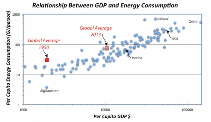
One important point from this graph is that between 1950 and 2013, the per capita GDP has increased by almost a factor of 10, and the per capita energy consumption has also increased, but only by a factor of 4.
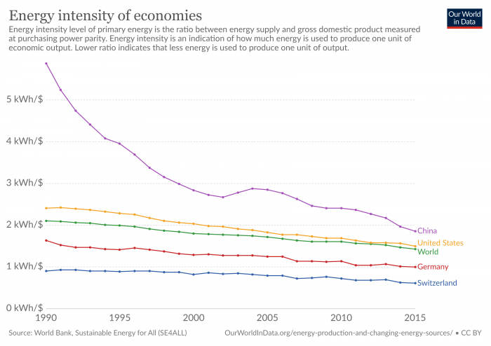
Another important question is: How efficient are these economies in their use of energy? We can look at this using data on the "energy intensity" of different economies. The energy intensity of an economy is given by the total primary energy consumption divided by the total GDP for the country (you'd get the same thing by dividing the per capita energy consumption by the per capita GDP). A useful way to think of this energy intensity is that it represents how much energy a country uses to produce a dollar of economic output — so lower values are better. A low value means a country uses less energy to make a buck.
Since most energy use globally comes from burning fossil fuels, it is no big surprise that energy use on a national basis is closely related to carbon emissions on a national basis. (There are some exceptions, like the Nordic countries, which rely primarily on hydroelectricity.) The following short video from the Gapminder Foundation (4:06) has a nice animation showing these trends over time for a number of different countries.
Video: Carbon Dioxide (4:06)
HANS ROSLING: All humans emit carbon dioxide and contribute to the climate crisis. But some humans emit much more carbon dioxide than others. Look at the statistics, where each bubble here represents a country. This axis shows the emission of carbon dioxide per person per year in tons, from less than one tone per person a year, to 10 and to 20. And the size of the bubbles, the size of this bubble up here, which is the United States, it shows the emission of carbon dioxide from the whole country, the total amount of carbon dioxide.
And this bubble down here is China. And the size of it shows how much China is emitting. The axis down here shows the income per person, $1,000, $10,000, and more. And the color of the bubbles shows the continent. The green ones are Americas, the brown one is the European bubbles, and the red one, are the Asian bubbles. And what you clearly can see is in 1975, because this data is from 1975, countries with low income have low emissions. And when their income increases, they get very high emission.
And what has happened over time? We fast forward the world here. And you can see that as countries grow richer, they emit more. And here comes China with its economic growth, it grows very fast. In the '90s, it moves this and they start to emit more and more. Whereas the United States continues to hover around about 20 tons per person. And in 2003, it's actually almost the same amount of emission as it was in 1975, 20 tons per person in the United States and in China down here, about three tons per person.
The bubbles are now about the same size. And it's because China has four times as big a population as the United States. So even if the United States emits much more per person, China will get quite a big bubble, because they are so many. But most of the countries actually are somewhere in between here in the world. They are somewhere in between China and the United States. China does not emit very much carbon dioxide per person.
Where does the carbon dioxide come from? Well, large parts of it come from coal. And why do they burn coal? To make electricity. I'll show you the statistics on that. This shows the production of electricity, the percentage that comes from burning coal. 10%, 20%, 40%, 60%. In China in 1975, they made 60% of their electricity out of coal, and the United States was a little less, about 45%. And over time, the change has been as you can see here, 75%, 80%; and China is producing more and more energy, and a higher and higher proportion of that electricity, which they produce, is from coal. And it's increasing to reach by the end of the century and the last year. Now China is producing about 80%, 70% to 80% of its electricity is made from coal. In the United States, it's about 50%.
So if we should stop the emission of carbon dioxide from burning coal, we must understand that this is the cheapest way of making electricity. And the people in China want electricity in their homes. There are still hundreds of millions of Chinese that don't have electricity in their homes. So what China needs is a technology that can produce electricity from renewable sources in a way that is cheaper than making it from coal.
Activate Your Learning
Check out the Gapminder World Website below. If you click “Play” in the lower left-hand corner, you can watch a time progression of GDP per-capita vs. total energy consumption per-capita, for a number of different countries from the 1960s and 1970s to the present. The United States and Denmark are highlighted as an interesting comparison. The animation is customizable, so if you want to highlight other countries you can go to the checklist on the right-hand side of the page.