
We will look at the supply and demand curves separately before we look at the way that they work together. We will start by looking at the demand curve. This is a Functional Relationship between the price of something and the amount of that thing that buyers (consumers, demanders) will buy at a given price. Looking at it another way, it is the maximum amount that a person is willing to pay for some amount of a good.

Where does the demand curve come from? It comes from individual preference and utility. An “individual demand curve” is how much a person will pay for a certain amount. This is calculated based upon the idea of “declining marginal utility,” which is another way of saying that the more we have of a certain thing, the less we value getting an additional unit of that good. For example, when you are hungry, you may place a lot of value on the first slice of pizza because you get a lot of utility (happiness) out of that first slice. The second slice gives you more happiness, but not as much as the first, and so on.
When you have had 3 slices, you place very little value on the 4th slice.
A person is willing to pay up to his marginal utility, but not more (because you will not give away more money than the amount of utility you get from using something).
Individual Demand Schedule
| Quantity of Pizza Consumed | Utility derived from consuming last slice |
|---|---|
| 1 | $5 |
| 2 | $4 |
| 3 | $3 |
| 4 | $2 |
| 5 | $1 |
| 6 | $0 |
Individual Demand Curve
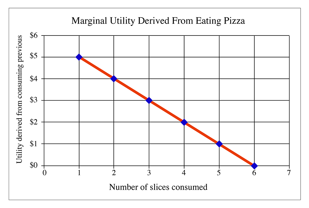
Figure 2.2 tells us that after eating five slices of pizza, a person derives no marginal utility from consuming the sixth slice. It is entirely possible that the demand curve can go negative, although economists never really examine this. However, just think about it: let's say you have eaten six slices, and are very full. Eating another slice may cause you to get an upset stomach, or may make you throw up your food. Both of these are things that people do not want to happen under normal circumstances. In this case, the seventh slice of pizza is no longer a "good," but it is a "bad": consuming it will actually decrease the total amount of happiness of the individual. A rational person would certainly not eat a seventh slice.
Figure 2.2 is the demand curve for an individual. Usually, a market consists of more than one individual, so if we want to find out what the demand curve looks like for a market in its entirety, we simply add together all individual demand curves.
What do we mean by "add together"? Well, we can construct a demand schedule for everybody in the market added together. Looking at the demand schedule, we have it written in the form "How much utility do I get from each slice?" We can reverse this, however, and say "At a certain price, how many slices would I buy? If the price of a slice is $2.50, the person described by the demand schedule would buy three slices. They would not buy the fourth slice, because this slice only gives the $2 of utility, but they would pay $2.50 for it. That means that this person would be voluntarily making himself poorer by buying a fourth slice of pizza, and this would violate our assumption about rational utility maximization. As I have said before, in real life there are cases where people do not make the proper decision, but we have to assume that people usually intend to make a utility-maximizing decision. If we don't make that assumption, there are basically no rules for examining human behavior. We are left with chaos; I would not be able to teach this course. So, the assumption of rational utility maximization gives us a sense of peace and order that allows us to study economics. We can look at the messier stuff about bad market decisions later on.
So, getting back on topic, how do we create a market demand curve? Well, let's do a demand schedule, but instead of having the number of slices in the first column, instead, we have the price in the first column. In the second column, we have the total amount of slices sold at that price. By "total amount," we want to think about the total in the market area for one pizza store, or in one town, or on one university campus. It also makes this problem easier to analyze if we assume that the pizza from every shop in town or on campus is identical. Obviously, in the real world, this is not true, but we make this assumption, called "product homogeneity," because it makes life easier for us. Don't worry, we will relax it a little later in the course and see what happens. (Hint: more chaos! I prefer to avoid chaos.)
So, let's assume that I have collected a demand schedule from every person in town and that every person knew just how much utility they got from eating each extra slice of pizza. (Maybe they are all economics students and think about every aspect of their lives in terms of declining marginal utility and rational utility maximization.) (Hey, I do. It makes me a real hit at parties.)
So, now I put together a schedule of how much pizza will be sold at each price point. Let's say it looks like this:
| Price | Quantity of slices sold |
|---|---|
| $1 | 3000 |
| $2 | 2050 |
| $3 | 1350 |
| $4 | 750 |
| $5 | 350 |
| $6 | 125 |
| $7 | 5 |
If we were to plot this, like the individual demand curve, we get the following:
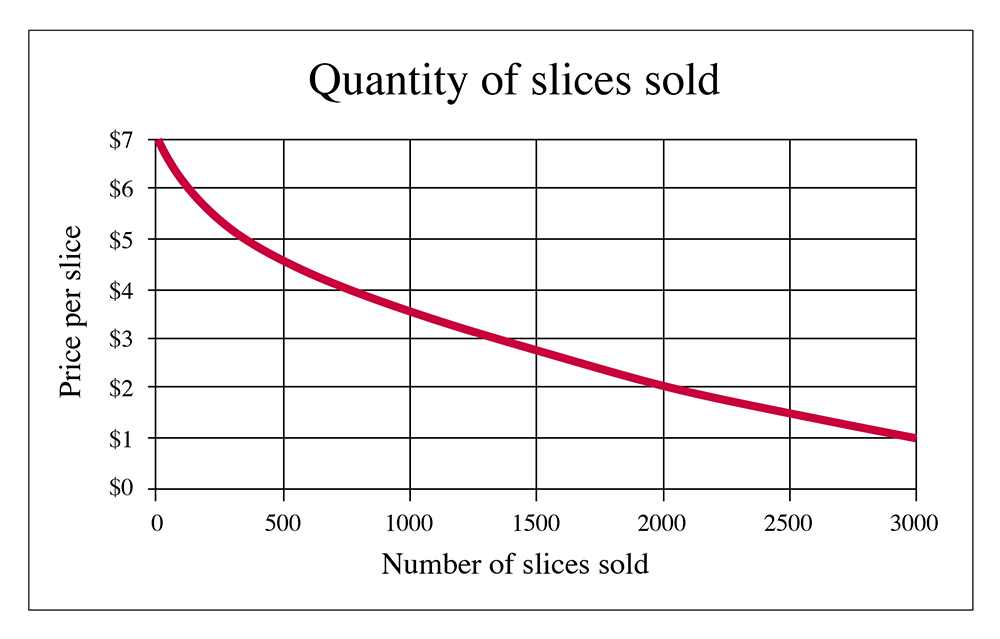
So, Figure 2.3 is what a "market demand curve" looks like. If you were the owner of the only pizza joint in town, this would let you know how many slices you will sell at each price. Of course, real life is a little more complicated for several reasons. Firstly, it is very unlikely that you have "perfect knowledge" of the demand curve. After all, how can you get everybody in town to tell you how much utility they get from each additional slice? And then, of course, we have another dimension: time. The demand for pizza on Friday night during the school year is a lot different than the demand on a Wednesday morning in the summer. And if you aren't the only guy in town, but one of several pizzerias, how much of that market will you capture? But, of course, we are making simplifications for the purpose of explaining simple principles here. As I keep promising, we can relax some of these assumptions and make things more complicated later. But, for now, let's keep things simple.
There is one thing you should note about the demand curves in both of the above graphs: they slope downwards as we go to the right. This means that as the price of a good decreases, more of it will be sold. Or you can say that as the price rises, fewer will be sold. Why? Because of declining marginal utility. After a person has consumed one unit of a good, they usually get a little bit less happiness from consuming the second unit of a good. Sometimes the difference in utility is very small, which means the curve will be very flat (more on this in the next section), sometimes it will be very steep, but in any case, it will be downward sloping. We cannot believe that somebody gets more marginal utility from consuming an additional unit. This is what we call the "First Law of Demand": demand curves are downward sloping. This means that if a seller raises the price, fewer of an item will sell.