There are several types of charting methods, but three of them are the most popular.
Bar Chart
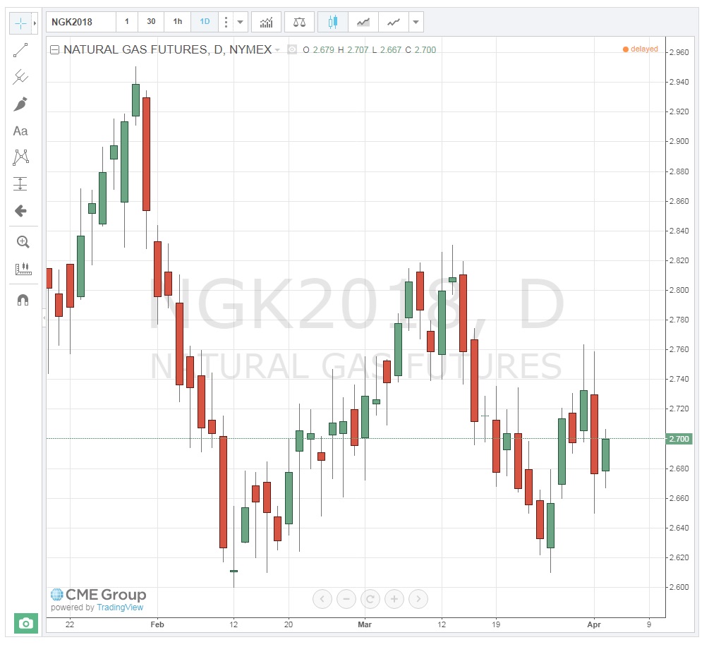
In a bar chart, a vertical line is shown for each time increment selected. In the chart below, a “daily” chart is used to show the May NYMEX contract for natural gas. Each bar shows the price results for that day’s trading. The mark to the left of the bar represents the first trade of the day, or the “Open.” This is the price of the first trade that occurs right after the bell rings to start trading. The vertical line itself represents the full range of prices for the day, that is, the High and Low prices. And the mark to the right of the bar represents the final closing, or “Settlement” price for the day. This is often referred to as the "OHLC" chart (Open/High/Low/Close). Note that if the Open price is lower than the Close, the bar is green. If the Open price of the day is higher than the Close price, the bar is red. It shows the direction of the market movement; do prices tend to go up or down?
Style of Charts
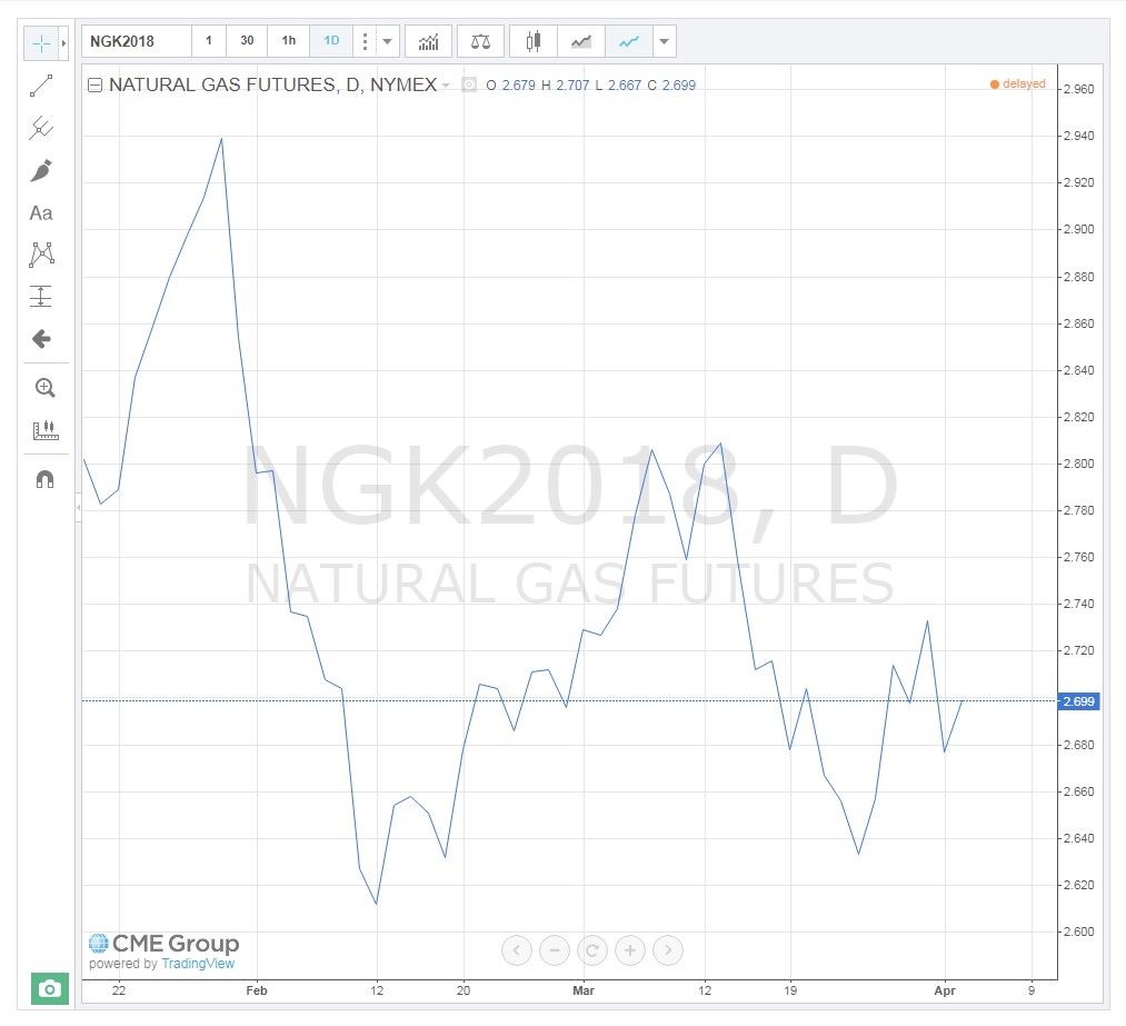
You can change the style of the chart and type of information that you want to be displayed by clicking on the Bar Style toolbar  and selecting from the list of chart options which include things like bars, candles, line, area, and point & figure. The image below is an example of a “Line” or “Close Only” chart showing the same May natural gas contract. You will notice that it only shows the daily market closing (settlement) price. It provides much less information than the Bar chart and is mainly used for longer-term trend analysis.
Candlestick Charts
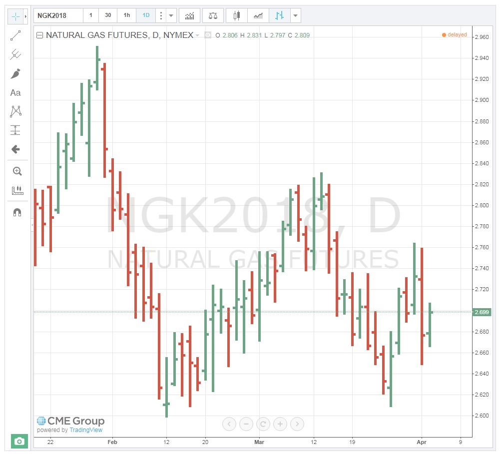
Candlestick charts were developed by the Japanese centuries ago. They provide information similar to the Bar chart, but also indicate “up and down” days. That is, they clearly show the direction the market took on a daily basis. The top end of the “candle” still represents the "High" for the day, and the lower end represents the “Low,” but the “body” indicates the Open and Closing prices in relation to one another. For example, if the Open is higher than the Close, the Open price is at the top of the “body” of the candle and represents a day where prices fell (red candle). Conversely, if the Close is found on the top of the “body,” it represents an “up” day, and on the chart below, appears with a green “body.” As you can now see, the up-and-down days are easily visible on the Candlestick chart. By counting these, we can determine the current trend. For traders, the question is, when will it reverse course?