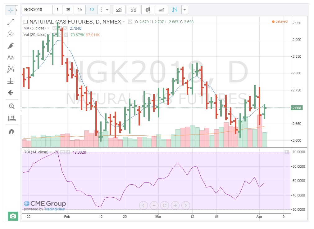
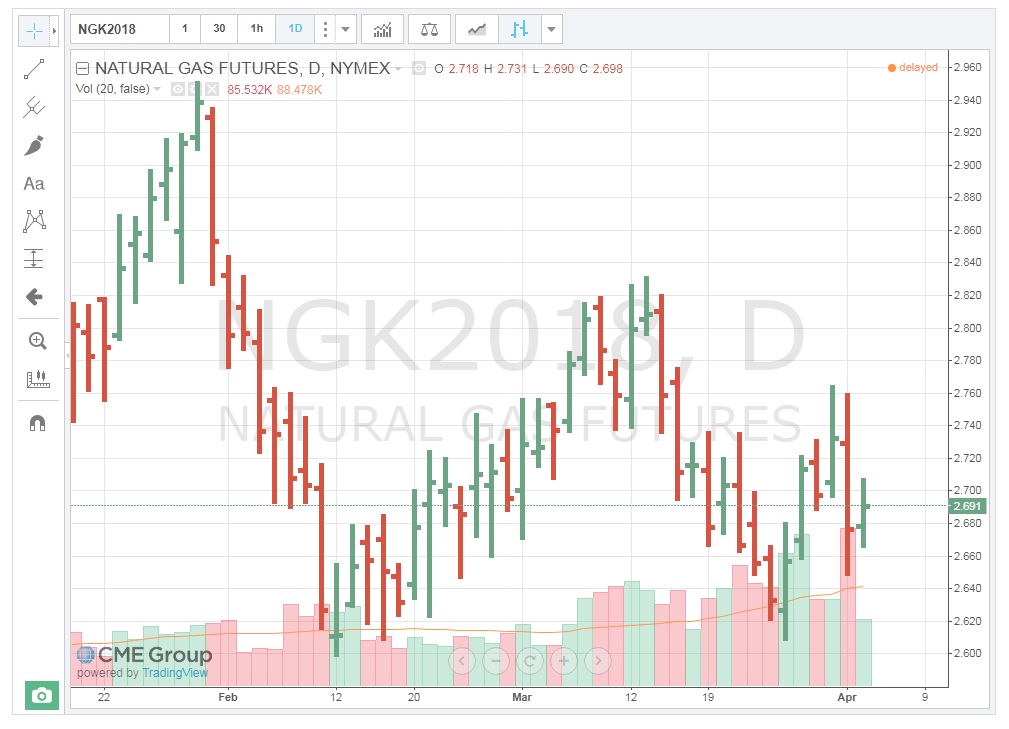
Volume
One of the simplest clues to the strength of price movement is that of the volume of contracts traded. If a price shows a large range or change in direction on a particular day, looking at the volume of contracts traded indicates how well-supported that move was by the market participants. A $0.10 movement up or down in natural gas is not very significant if a low volume of contracts is traded. On the other hand, when large volumes trade, that definitely reinforces the price action for the day. It’s as if those trading have agreed on the price outcome. The chart below is a Daily Bar Chart with volume for natural gas. Notice that on April 1st, prices traded in a $0.1 range and a very large amount of contracts exchanged hands, solidifying the move. Also, on March 27th, the second-highest volume for the contract traded. Both of these volumes add legitimacy to the price action for those days.
You can add the volume traded to the chart by clicking on “Indicators, …” on the toolbar and choosing the "Volume" from the resulting list.
We'll see this FX function that you can use to add other features to the chart. One very important thing that you want to have in the chart is the volume being traded. This is in the chart by default, but you can add it or remove it. I removed it because I didn't want too much information. I'm going to add this back again just to show you how you can add it and remove it.
You click on FX, and this gives you a list of items that you can add to the chart. That was just the volume, volume trades, and this is volume. Just click that, and you can see it will be added directly to the chart, and you can see it at the bottom of the chart. This tells you the activity in the market, and this can be very helpful to see what is going on in the market. And again, as you can see, as soon as the price dropped, there were so many trades going on that day. The color of these columns is extracted from the color of the bar. So, if that day had a downward trend, you will see the red color. If the day had an upward trend, you can see the green.
So, what is the actual volume of trading that day? Going up to the top left-hand side of the chart, you should be able to see these numbers. For example, you move the pointer to one day. This is March 19. At the top left of the chart, you can see the volume of trade. Sorry, the volume of trade is 1.192 million trades. You can see these different days, and as you move it, you will see these there. You can add other indicators, or you can hide these.
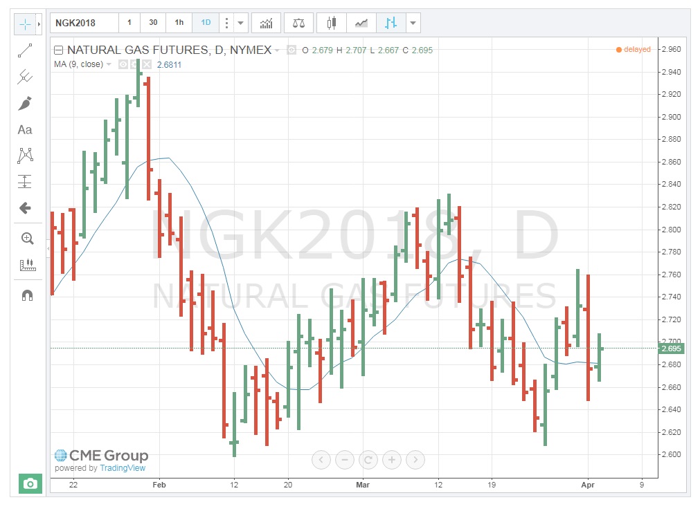
Moving Averages (MA)
For those of you who have had statistics, you should be familiar with the term “reversion to the mean.” For those of you who have not, the concept hinges on the idea that all prices will eventually return to their average, despite dramatic movements up or down. I have found this to be especially true for energy commodities, at least in the short-term. Therefore, tracking commodity moving average prices can be a good signal for a change in the direction of a trend. The chart below shows that the Moving Average (MA) for May 2018, Natural Gas. If prices go up, there is a good probability that they will eventually fall towards the MA. It may be a gradual decline which also means the average will change, but as long as the MA is lower, prices will gravitate towards it. The exact opposite occurs when prices fall below the MA.
Note that the timeframe for the MA is set to the particular trader’s needs. I have set the MA at 5 days, as that represents a full week of trading (regular session, pit trading only occurs on weekdays). See how the prices, while moving above and below the MA, ultimately return to it. This is a key sign for making buy/sell decisions.
You can add the Moving Averages traded to the chart by clicking on “Indicators, …” on the toolbar and choosing the "Moving Average" from the resulting list.

Moving average. You can add the moving average to the price, or you can add the moving average to the volume being traded. So, what is the moving average? This is simply the average of some days: five days, ten days, two weeks. It's up to you. You can decide how many days you include.
If some of you have done this before, you know that the moving average is you pick a window, you calculate the average of prices in that window, and you move this window every single day. You add the new price, you drop the oldest price from that window. We did this in the previous activity for the standard deviation. If you apply the average function, it will give you the moving average.
The idea behind moving averages is that the price tends to go back to the moving average. So, if the price goes above the moving average, it tends to go back to the moving average because every day we include that price and update the average for the new price. If the price is higher than the moving average, it can get back to the moving average. If it's lower, it tends to come back to the moving average.
We don't need to calculate that. We can just go and add it to the chart. For now, I'm going to just hide the volume, and we go to the moving average. I will add the volume back. I don't want too much information in your charts. I don't want it to be too complex. We go to the FX and we write "moving average." As you can see, there are many different types of moving averages. The simplest one is just the moving average. This moving average can be calculated exponentially or weighted, and so on. Let's skip that. We kind of learned about these weighted and exponential in previous lessons, but for now, let's keep things simple.
For now, I'm going to click on the moving average, simple moving average. As you can see, it is added to the chart. Closing it, and we can see, let me show it to you. Okay, so this is the moving average. How many days are being included in the moving average? The default of that is nine days. So, nine business days are included in each day's moving average, and this is the moving average tracking the price.
So again, as you can see here, for example, the price is below the moving average. Now we can see the price comes back to the moving average here. It is a price higher than the moving average, then it comes back to the moving average, and we can see the rest. So here, because the price drop is significant, the moving average is behind, but we can see the sharp drop in the moving average, and the price eventually will get back to the moving average. So, moving average includes the previous days, so you don't have any signal for the future. It tells you what has been the trend of the price in the last nine business days. So, by the time that these will go back to the price, the price will go back to the moving average. It means that the moving average will be updated with the new price data, and these two will merge.
Okay, things that you will need to do, and you don't need to calculate anything. We can just have the website do it for you. There are features in the moving average, not many but a few, that you can just conveniently use. Let's say you need nine days as a lot. You can just increase it or decrease it, and you can see, you can have it five days, you can have it for, let's say, 14 days. You can go up to as many days as you want. I think there was a max that, yeah, 100 days. I don't think you need that many averages, but in case you need, so the default is nine, and you can go with fewer days or more.
Okay, here are a few things that I want you to know. You can change this day, so this moving average is calculated based on the close price. You can change it to open, high, low, and any of those, or you can change it to the average of high and low divided by two, the average of high and low. This is the average of high, low, close divided by three, the average of these three. And this is the last one, the average of open, close, high, low divided by four. So, the chart provides these for you conveniently. You can just pick them from the chart. The default is close, and this is what everybody uses, but let's say for some project, for some reason, you need more, you need to include what happened during that day, so you can include that information as well.
You can also change the window that the moving average is calculated based on. You can increase it, or you can reduce the window. So, one thing that please pay attention to, what happens if I increase the number of days in the window, or if I shorten that to one day, right? What happens if the window is longer? If the window is wider, then the moving average is smoother, right? And it's kind of behind the price, right? It has a longer memory. The moving average has a longer memory. If you reduce it to fewer days, you can see it tracks the price closely because there are only two prices, today and yesterday, included in the moving average. So, it is not as smooth. It tracks the price very closely.
Relative Strength Index
Relative Strength Index (RSI) is a momentum oscillator that measures the speed and change of price movements. RSI oscillates between zero and 100. Traditionally, RSI is considered overbought when above 70 and oversold when below 30. RSI can also be used to identify the general trend. (Technical Indicators and Overlays - ChartSchool) Understanding the exact RSI calculation is not necessary to understand how to use this indicator. The next chart is a Daily Bar Chart with Volume, MA, and now, the RSI study. Note that the current RSI is over "70" which is considered “overbought". This could, therefore, be a signal to "sell."
You can add the Relative Strength Index traded to the chart by clicking on “Indicators, …” icon on the toolbar and choosing the "Relative Strength Index" from the list.

There are so many other parameters and indicators that you can add to the chart. You don't need to calculate any of these; you can just see the trends and make your decision, interpret and make your decision about the numbers and the chart behavior that you can see. There are so many of them. Many of them need some statistical background, many of them don't. We don't go into how to calculate these. We learn how to add them, how to use them.
Okay, the other day in the previous lesson, we learned about the Relative Volatility Index. I will repeat that again, but before that, I'm going to talk about another important trend or common trend indicator that the chart gives us, and it is going to be the Relative Strength Index. So, you just type "relative" and this pops up in the list. You click on that, and you can see this is added to the chart. I'm gonna close this, and this is based on the price behavior and how to interpret this.
So, this RSI or Relative Strength Index, this is a number from 0 to 100. What does it tell us? And again, as you can see, you can play around with it, and you can see this kind of area that is selected between 70 and 30. So, it is very important the time that this RSI goes beyond this pink area. If this number being calculated is below this pink area, which is between 30 and 70, if this line goes below this 30, it gives us the signal that the situation is the commodity is oversold in the market. If this line goes above 70, if this line goes above this pink area, it tells us that the market is overbought.
So, let's look at the chart here. As we can see, when the price dropped, the market was very, very significantly bearish. So, everybody was selling, right? Because everyone was selling, we can see this sharp drop to below 30, and this is a signal that the market situation is oversold. And if it goes above 70, which there were some days here where we can see maybe in some very small incident here as overbought.
Index. How do I do that? I go to the indicator and I just write "Relative Volatility Index," click it, and it is added to the chart, or RVI. This is a number calculated from 0 to 100. We learned that if RVI is higher than 50, it is an indicator of volatility in the market. So, if this number is higher than 50, it gives us an indicator for a bullish market. So, the market is bullish, we buy. If this number is lower than 50, it is an indicator for a bearish market. If this number is higher than 70, it's a strong indicator of a bullish market, and if it's below 30, it's an indicator of a strong bearish market.
We can see it here when the price dropped in early March, this significant sharp drop. You can see this number is showing us that this number dropped below 30, and it is a signal that the market is bearish.